Zippered Face in Photoshop - Graphic!
by HollyMann in Design > Digital Graphics
46621 Views, 141 Favorites, 0 Comments
Zippered Face in Photoshop - Graphic!
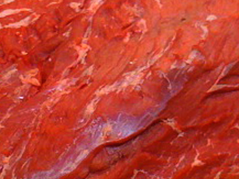
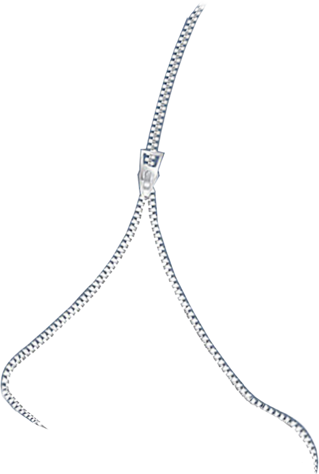
Warning, this image is horrifying! If you want to create the same effect on one of your photos, then just follow the steps in my Instructable. To create this effect, I used Adobe Photoshop, my main image, a zipper image which I altered and an image of a slab of meat. I am providing the zipper image (in a transparent .png file) and the meat image for you to download and use! If you have any issues downloading the zipper file as a .png, then you can download it directly from my site here. If you want to add drops or splatters of blood, you can download some blood effect brushes online here or another site of your choice.
Add Zipper & Select Raw Face Area
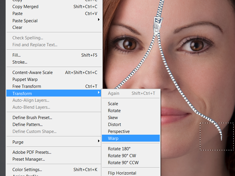
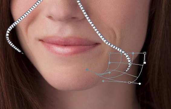
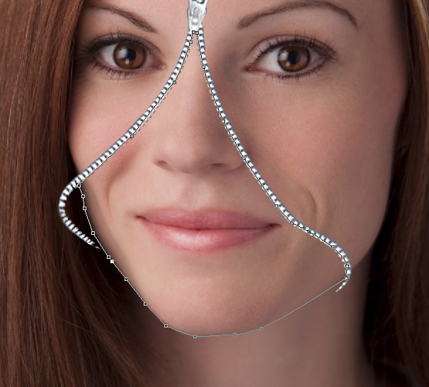
First, open your image. Then open up the zipper graphic as well and drag it into your image as a new layer. If you need to alter the placement of the zipper, you can make simple changes to it by selecting its layer, then going to EDIT, TRANSFORM. If you only need to edit the edge so it wraps around your face better, then take the Rectangular or Square Marquee tool, select only the edge (see photo for full details) and then go to EDIT, TRANSFORM, WARP. From there you can drag points to pull or push it around in any direction.
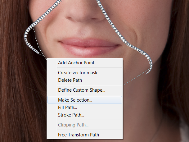
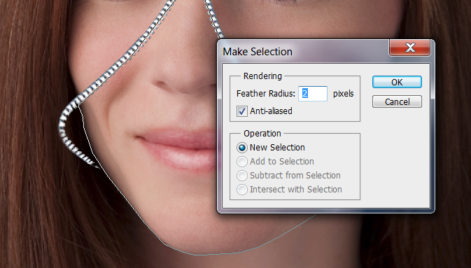
Once that's done, make sure you have a duplicate layer of the normal face. Then go to that duplicate layer, grab the pen tool and select the skin of the face enclosed under the zipper. I decided to do this part of the face separate from the neck - as the effect looked better that way. You can do it either way as you need to take the same steps to achieve the effects on both parts of the face. Once selected all the way around, then Right click, Make Selection (2 px Feather). There are a couple ways of doing the next step. To make things easier, we will then go to Edit, Copy. Then File, New - then hit PASTE to paste in this chunk of the face. Duplicate the layer.
Once that's done, make sure you have a duplicate layer of the normal face. Then go to that duplicate layer, grab the pen tool and select the skin of the face enclosed under the zipper. I decided to do this part of the face separate from the neck - as the effect looked better that way. You can do it either way as you need to take the same steps to achieve the effects on both parts of the face. Once selected all the way around, then Right click, Make Selection (2 px Feather). There are a couple ways of doing the next step. To make things easier, we will then go to Edit, Copy. Then File, New - then hit PASTE to paste in this chunk of the face. Duplicate the layer.
Bloody Face Insert - With Curves & Colors
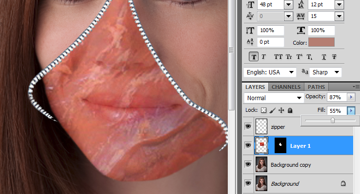
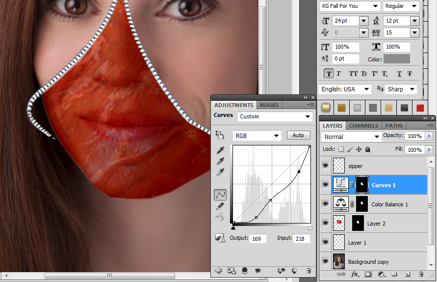
Now open up the graphic of the piece of meat - just go to File, Open and locate it. Return to your graphic of the chunk of skin and go to the Layers pallet, then locate the layer of the skin you cut out, Right click over the layer and hit SELECT PIXELS. Then return to the image of the meat. Duplicate the meat layer - then go to SELECT, ALL and COPY. Then return back to your graphic of the chunk of skin and go to EDIT, PASTE SPECIAL, PASTE INTO... and you'll see the big red slab of meat in place of that part of your face.
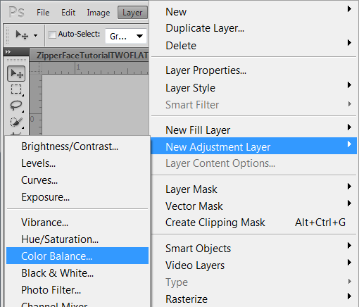
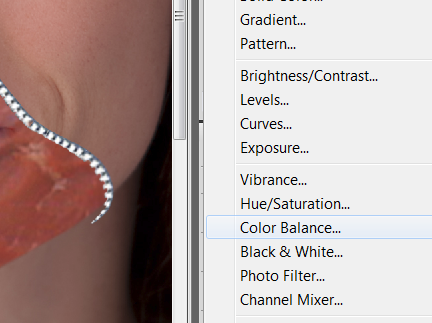
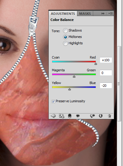
Change the meat layer settings in the Layers area - see graphic to know the settings I used. This is up to you - plus or minus in the opacity and fill area. Then on the Layers pallet, right click on the chunk of skin layer, hit Select Pixels. Then go to Layer, New Adjustment Layer & Color Balance. Change settings like the image below or adjust according to how you like it - you can easily change it more later.
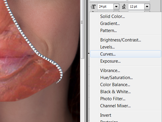
Right afterwards, click back onto the chunk of skin layer and be sure the pixels are selected, then go back to Layer, New Adjustment Layer, Curves. Check the Layers pallet and move this layer above the Color Balance layer and above the skin chunk layer - so it will be Curves layer, Color Balance layer and Skin chunk layer. Then go back to the curves layer and adjust accordingly. If you move it certain ways it will make the skin look more raw, a bit glossier with almost the look of fatty chunks to it. It's disgusting - but works!
If you noticed, my image is showing me working on this already on my main image but I recommended that you work on a separate layer to create this. One done, you could flatten your graphic and select it, Copy it and return to your main image. Your main image will already have that area you selected earlier, selected - so then go to EDIT, PASTE SPECIAL, Paste into and it will go right into place!
Creating a Larger Cheek and Flap of Skin
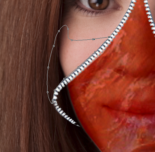
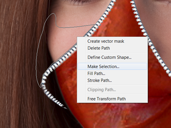
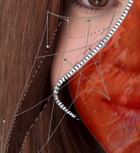
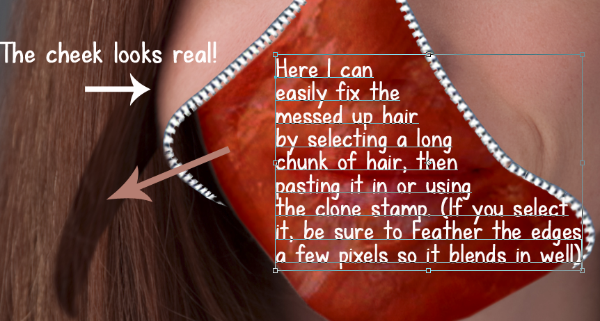
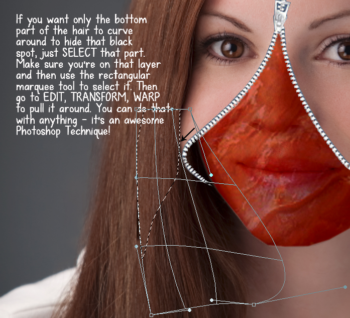
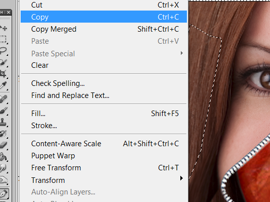
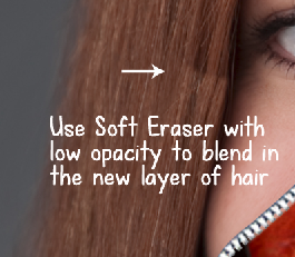
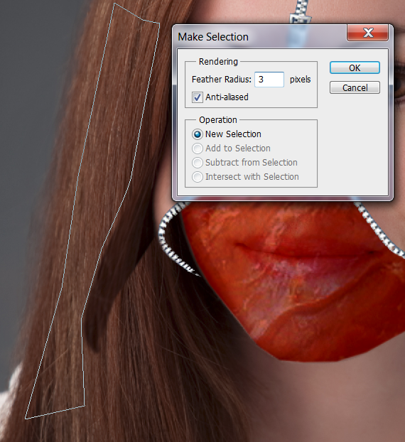
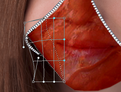
Now to the fun part - extending out the cheek! There are several ways to do this - and here is the easiest! First, please note that I accidentally grabbed more than the cheek when doing it, I grabbed some hair along with it. This is easily fixable and I'll show you how. It still looks awesome though.
Take the Pen Tool out again, and make points around the cheek where you want to extend it out. See image as to how I did it. Then once you go around to the starting point, you'll need to MAKE SELECTION and feather it 2 px. Then go to EDIT, TRANSFORM, WARP. Move the points around, pull them as needed to get that cheek curved properly without distorting it too much! If you have any issues with objects near it looking odd, like my hair problem. Please refer to graphics below on how to easily blend and fix those up.
Also, if you want your red face below to be pulled and distorted to fill in some of that space more, just do the exact same technique on that layer.
Finishing Touches
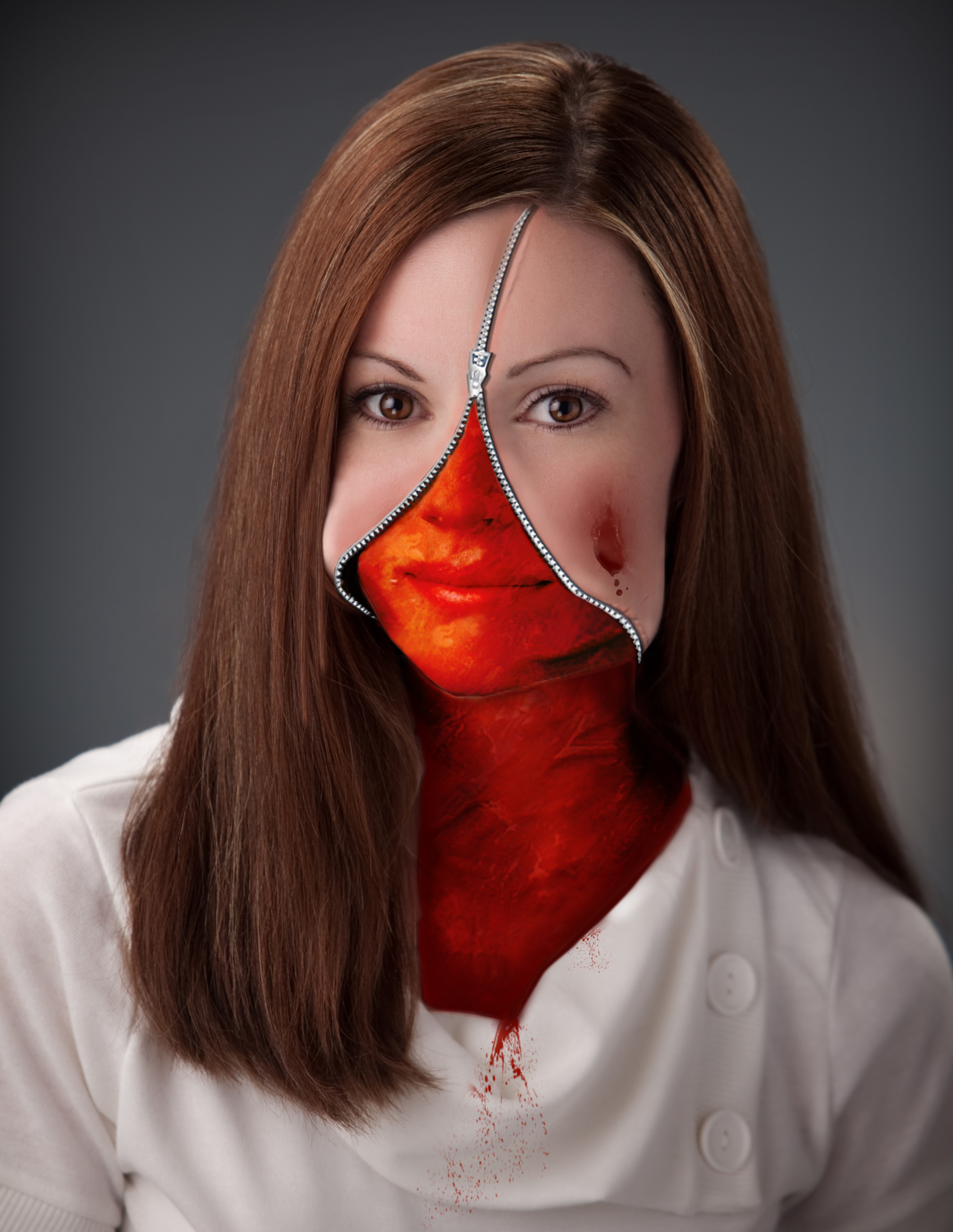

Finishing touches! At some point it's a good idea to add a drop shadow to the zipper and you can also change the effects on it to bevel it so it looks more real.
I took a soft brush with a very low opacity and 0 level of hardness, then sampled the color of the cheek where I wanted to highlight, then changed that color to make it slightly brighter - then used the brush to make some highlights on parts of the cheek. I did this to make it look more real and a little shinier in spots.
I used a "scar" brush to make the skin near the top of the zipper look a little indented. The brush was downloaded online - then I made the color of it the skin color and messed around with the effects - adding a little bevel to make it look like it does.
The scab on the cheek was also created with a brush!
If you have any questions please let me know. I tried to make a video tutorial but my software wasn't working so I tried to make these graphics as detailed as possible! Good luck!!!