Wave Laptop Stand (Making 3D Shapes in Illustrator)
by nagutron in Circuits > Computers
236142 Views, 584 Favorites, 0 Comments
Wave Laptop Stand (Making 3D Shapes in Illustrator)
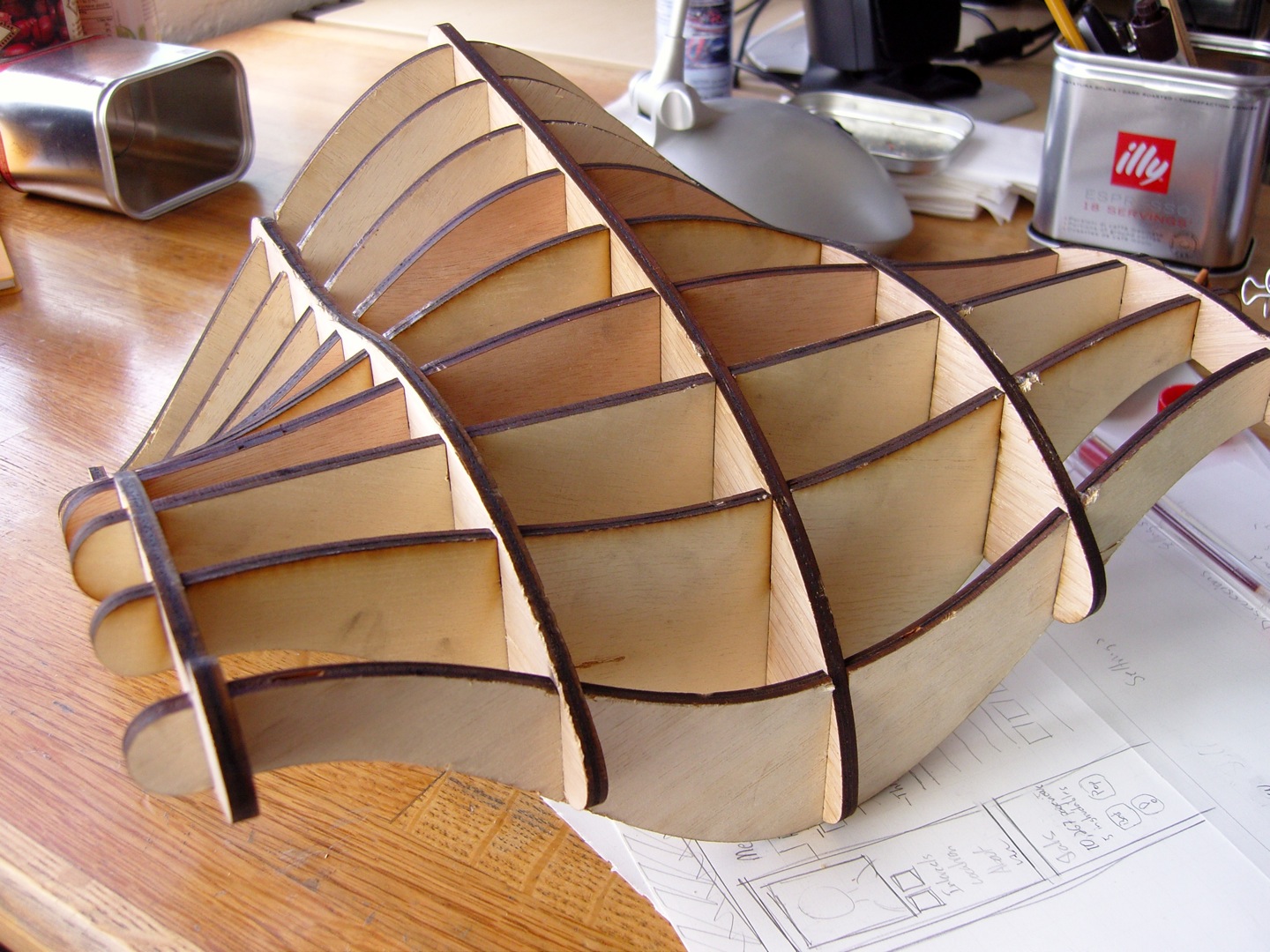
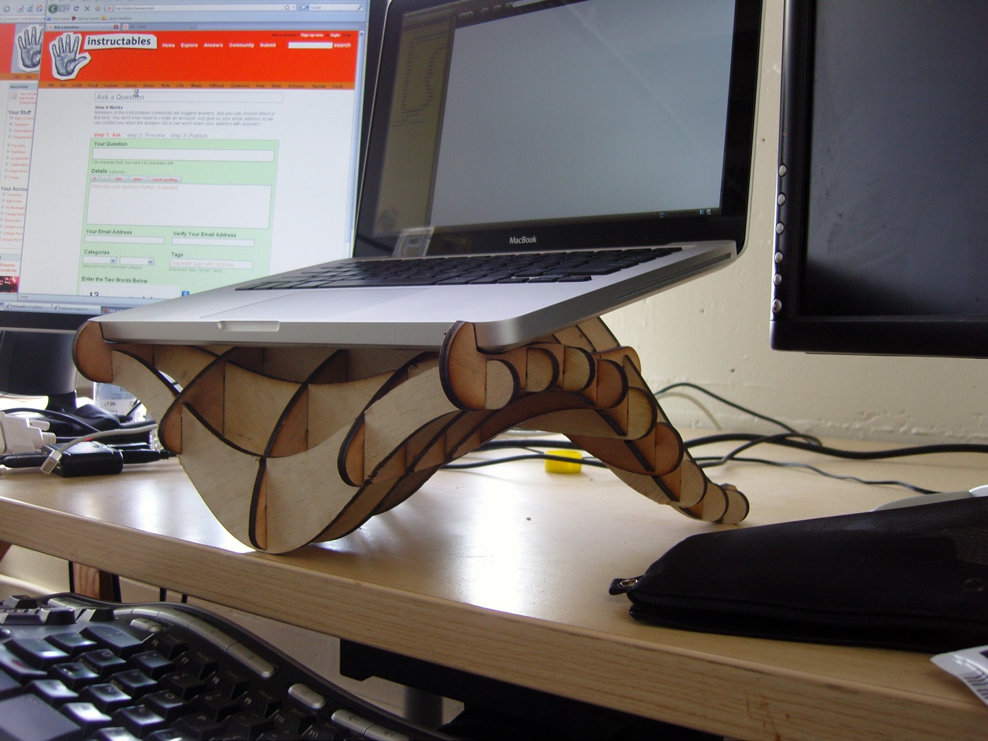
I wanted a nicer laptop stand. I wanted to to make something with a beautiful, organic form. And I work at Instructables, so I have access to an awesome Epilog laser cutter.
The shape that you see in the images below is the result. I'm pretty happy with it; it's really pleasing to the eye, and is a very stable platform for my Macbook (though it should work for most laptops 12" or wider.)
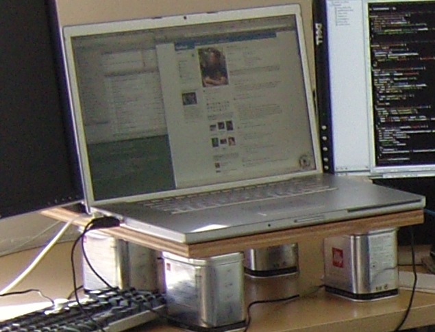
The third picture on this step is my old laptop stand, which will give you an idea of why I wanted to make a nicer one (yes, it's a piece of plywood on four coffee tins.) The new stand has a number of benefits. It:
- Raises the screen up higher, closer to an ideal height for my eyes (and putting the webcam at a more natural angle.)
- Tilts the body down, for easier touchpad and keyboard use, for the occasional times when I type on the laptop in its stand.
- Makes the desk feel less cluttered.
- Mirrors the form of my ergonomic keyboard.
Brainstorming and Initial Design
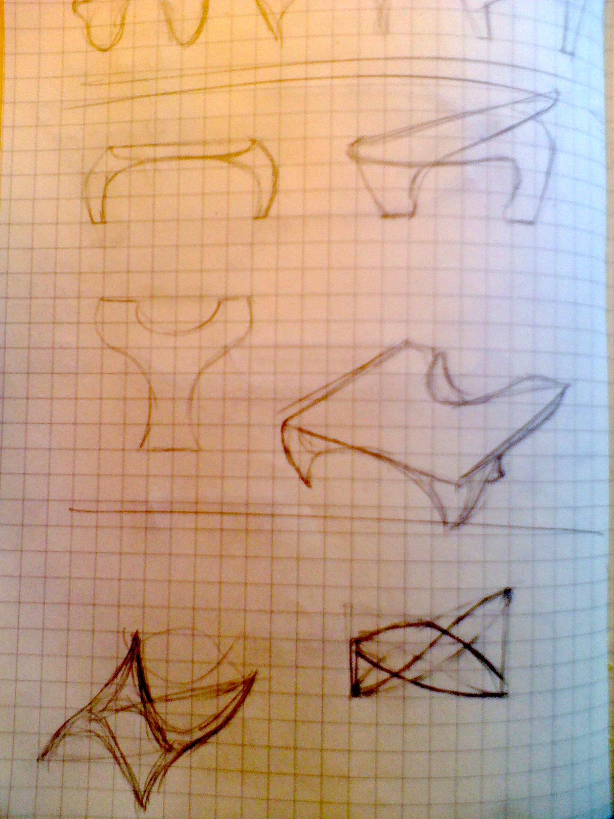
I had a vague idea of what I wanted. Waves, maybe; the intersection of two waves travelling perpendicularly. The result might be a saddle shape of some sort.
The first step was to break out a pencil and start sketching. I played with a couple of ideas before settling on the one at the bottom of the page. The basic idea was a distorted plane, with three points touching the desk surface and three points hitting the bottom of the laptop. The side view (on the right) shows how the whole thing should be squeezed to angle the laptop.
The first step was to break out a pencil and start sketching. I played with a couple of ideas before settling on the one at the bottom of the page. The basic idea was a distorted plane, with three points touching the desk surface and three points hitting the bottom of the laptop. The side view (on the right) shows how the whole thing should be squeezed to angle the laptop.
Transferring to the Computer
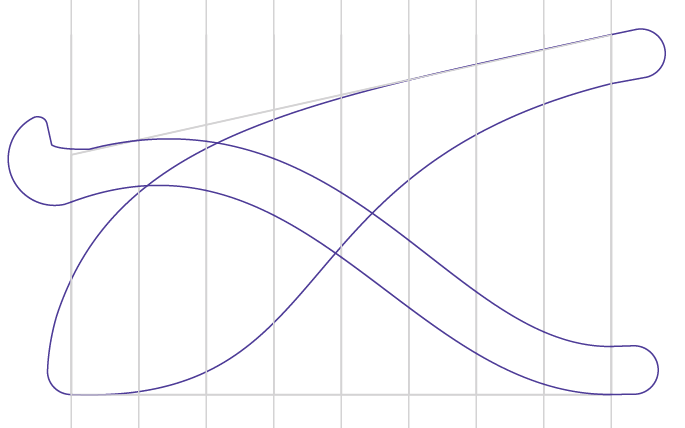
As I mentioned in the intro, This entire object was painstakingly designed in 2D. I know in theory that it could be done much faster in a CAD program, but I didn't know how. To design in 3D, one would need to:
Anyway, back to this design method. I decided to design from the side view, first. The image below shows the cross sections that I came up with. You can see the gray trapezoid around the whole thing, showing a flat bottom and an angled top for where the laptop would rest. Within that, I drew two shapes. The fat one is the plane through the center of the stand, running front-to-back. The thinner shape is the shape of stand along the left and right edges. Let's call these the "spines" of the stand.
I added vertical lines for where I was going to want all the cross-sectional slices (the ones that will run left to right.) Each of these lines would then be used as guides to make the actual cross sections.
- Design the 3D shape of the object.
- Figure out how to create slices through the object.
- Programmatically cut out interlocking slots for each intersection of the slices.
- Export the resulting shapes as 2D outlines.
Anyway, back to this design method. I decided to design from the side view, first. The image below shows the cross sections that I came up with. You can see the gray trapezoid around the whole thing, showing a flat bottom and an angled top for where the laptop would rest. Within that, I drew two shapes. The fat one is the plane through the center of the stand, running front-to-back. The thinner shape is the shape of stand along the left and right edges. Let's call these the "spines" of the stand.
I added vertical lines for where I was going to want all the cross-sectional slices (the ones that will run left to right.) Each of these lines would then be used as guides to make the actual cross sections.
Extrapolating From the Basic Shapes
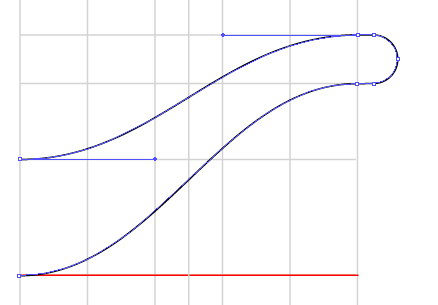
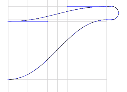
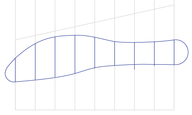
Next, I created the cross sections by measuring the slices of each part of the spines. These measurements (center spine and edge spine) gave me two parts of the cross-sectional shape, which I then used bezier curves to connect smoothly.
A couple examples are below. I started by drawing a vertical grid, once again. This spacing was to make things wide enough for my laptop (going from center to right edge) with additional guides for later use. For each vertical slice along the spine, I transferred points to this grid. Transferring points is easy: I copied parts of the shape, dragged them directly over the new grid, and marked points.
The first example below is the front-most piece. I took the left-most line from the spines and measured out the middle spine on the left side and then the edge spine on the right. Then, I played with the bezier handles until I had a curve I liked and that could be copied across the rest of the shapes. In this case, I was simply drawing out the handles to be two guides inwards, each.
The second image below is the second cross-section; I just repeated the process for all the measurements on the second spine cross section.
After a bit of work, I had all nine cross-sections mapped out. I now decided that I wanted two more spines, to go in between the center and the edge spines. To do this, I found the height of each cross section between these spines and transferred them to a new spine (side) shape. You can see it in the third image.
Adding Slots
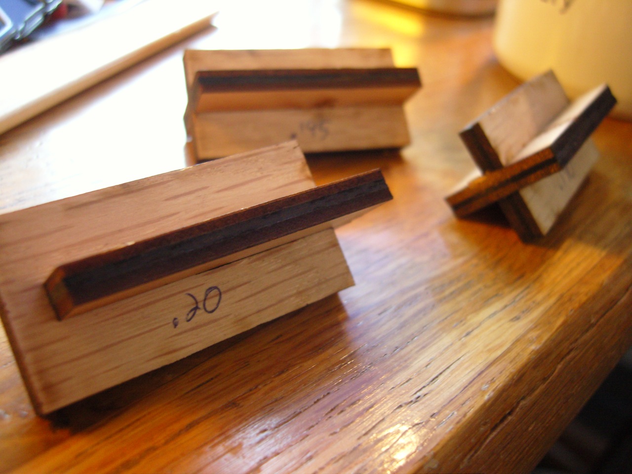
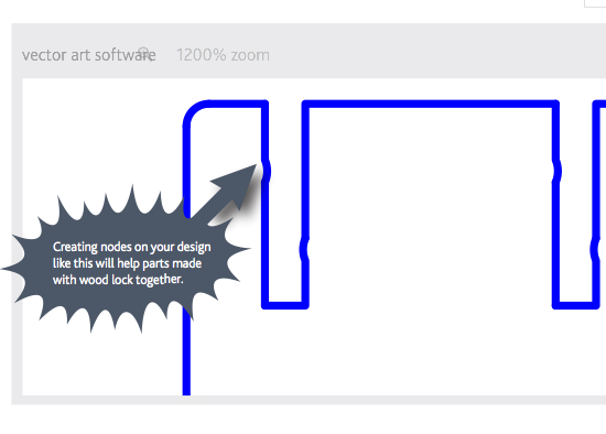
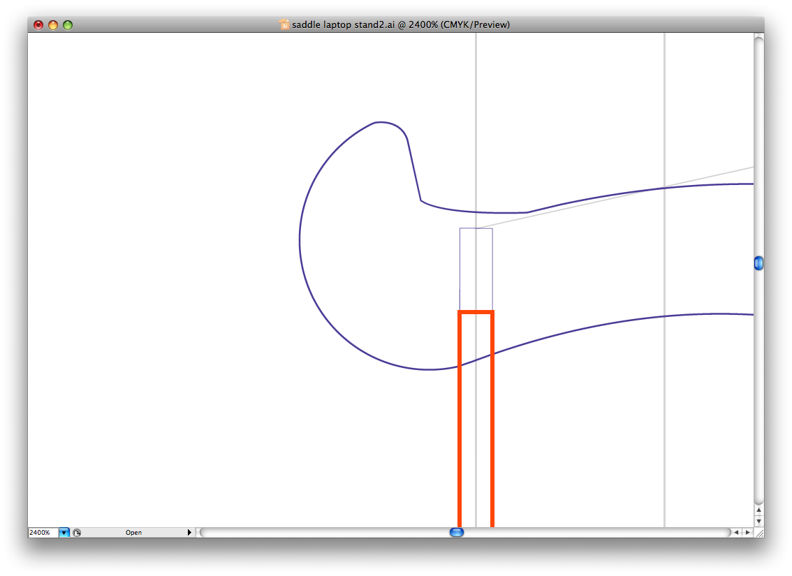
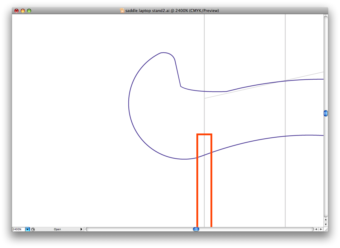
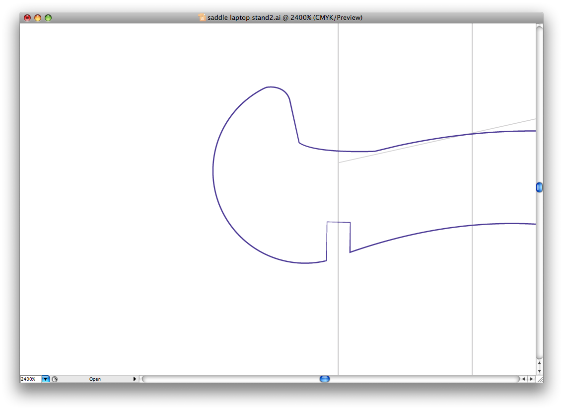
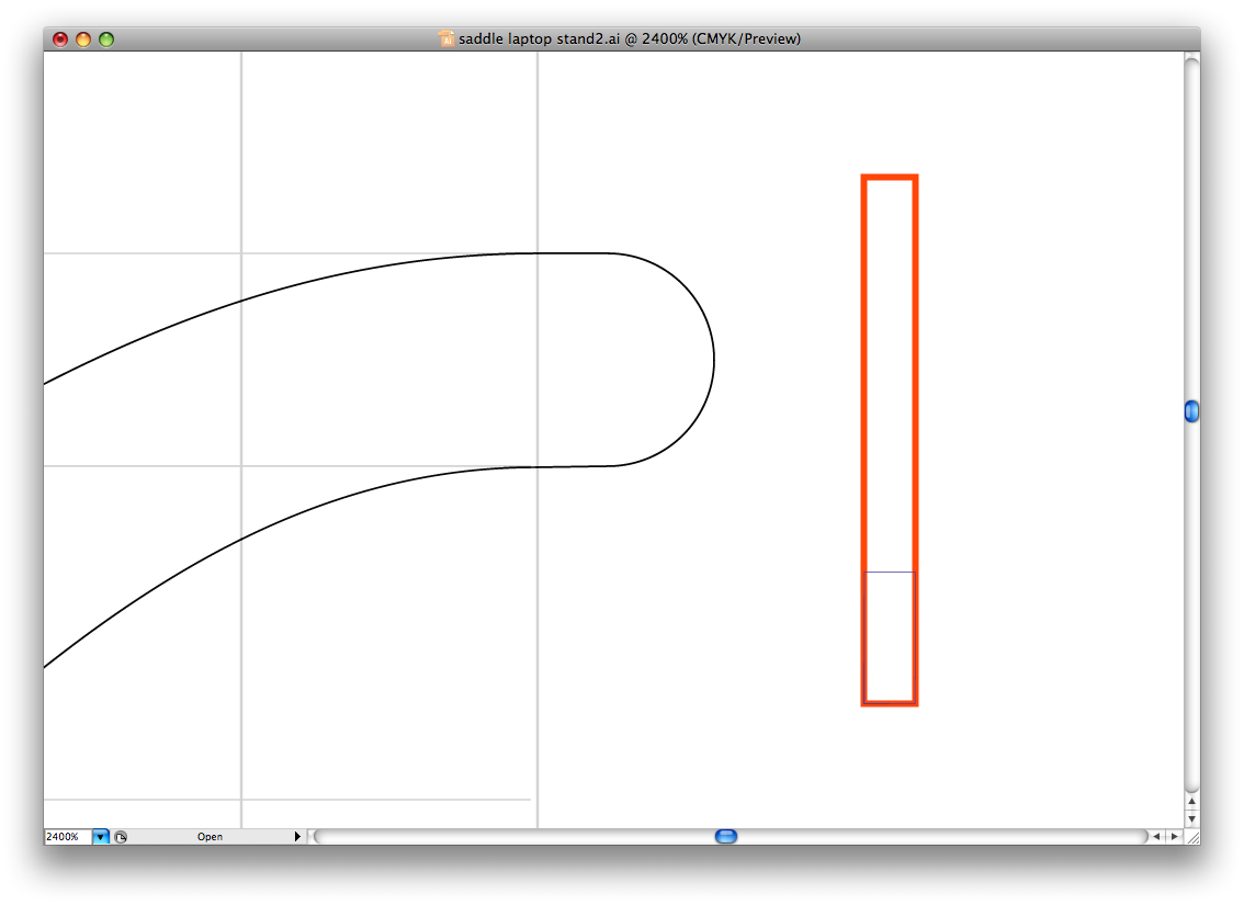
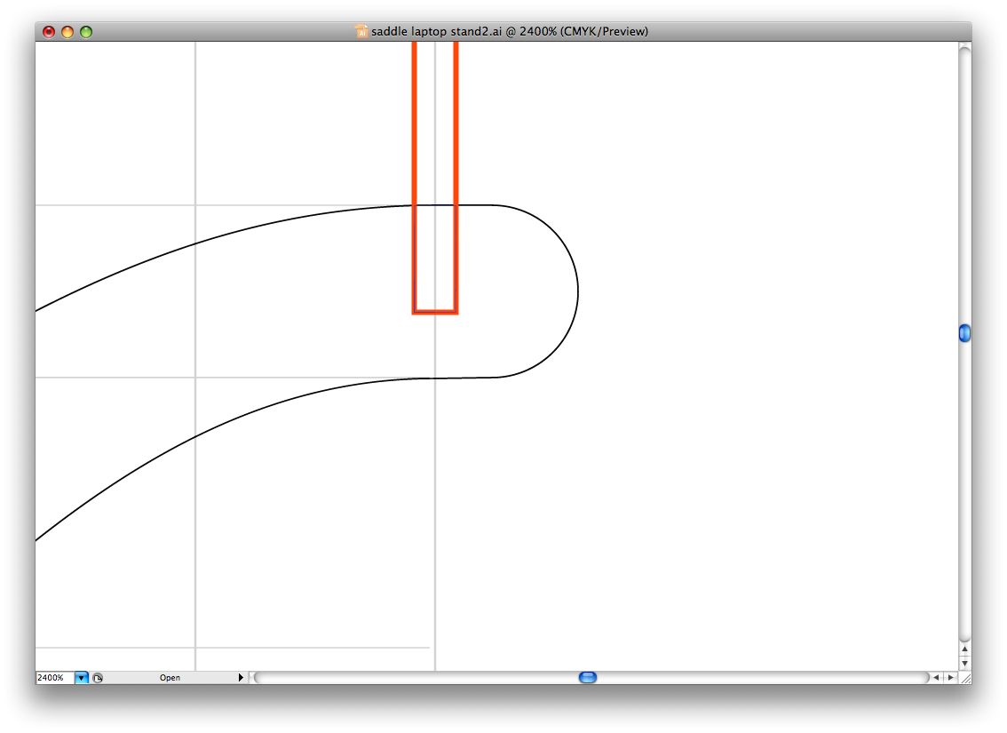
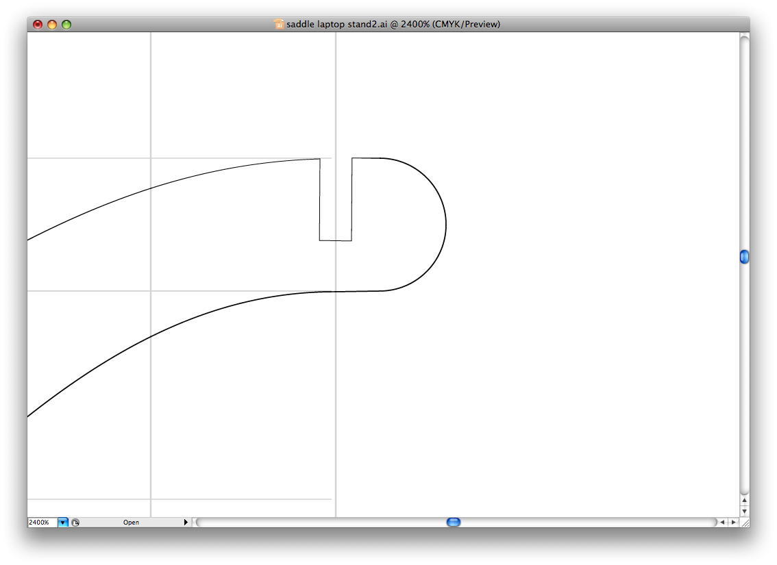
I had to do some tests to figure out how wide to make my slots. Using the same material, I cut out a bunch of rectangles with differently-sized slots and saw how they fit. I settled on slots 0.195" wide for the 3/16" plywood I was using. They were snug, but didn't require a hammer to push together. In retrospect, I should have made them looser, with "nodes" to help the slots bite. You can see an image from Ponoko's manual for this (it's the second one.) That would have allowed easy assembly without too much forcing.
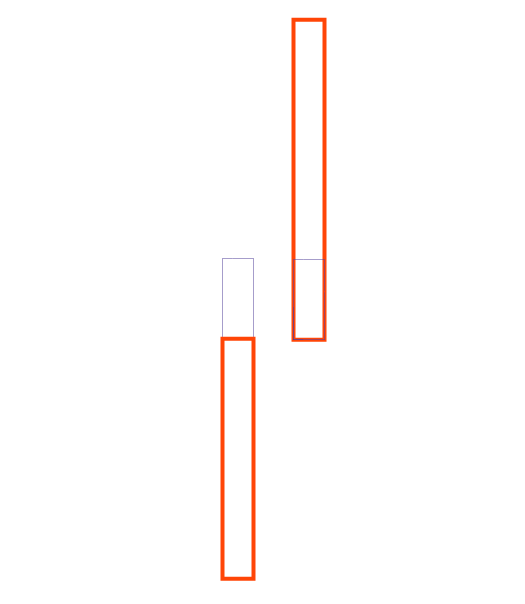
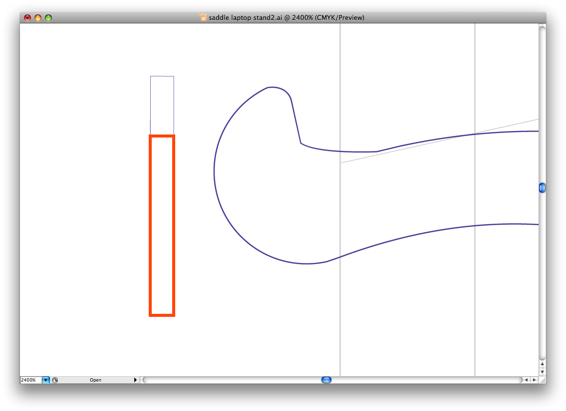
Okay, once I knew what kind of slots I was using, I made some little slot templates to make adding them to the spines and cross-sections easier. The idea was to measure the place where the slots met using the top-most curve of each shape. You can click through the two series of images, below to see how it was done. The image notes have all the details.
Okay, once I knew what kind of slots I was using, I made some little slot templates to make adding them to the spines and cross-sections easier. The idea was to measure the place where the slots met using the top-most curve of each shape. You can click through the two series of images, below to see how it was done. The image notes have all the details.
Downloads
Layout
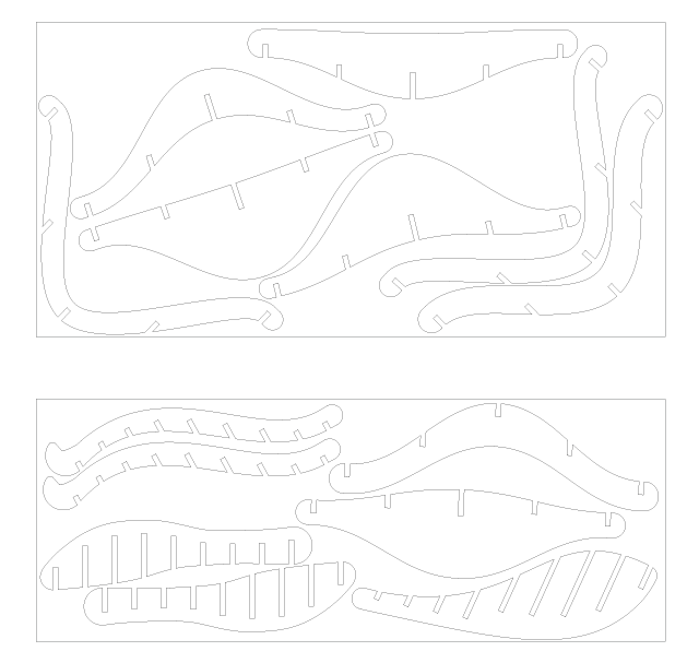
Once all the shapes were done, I tweaked them and made clean outlines of each. For the cross-sections, only the right half of them was drawn, so I doubled them over as mirror images and joined them.
I them laid out the pieces according to the size of the sheets of plywood that I had on hand. I'm not going to pretend that this is some sort of optimal arrangement; I fiddled until they fit, barely, and called it done.
On this step, you can find the vector files for these shapes in several different file formats. If you just want to download this and get to work cutting it out, one of these should do the trick.
Laser Cutting
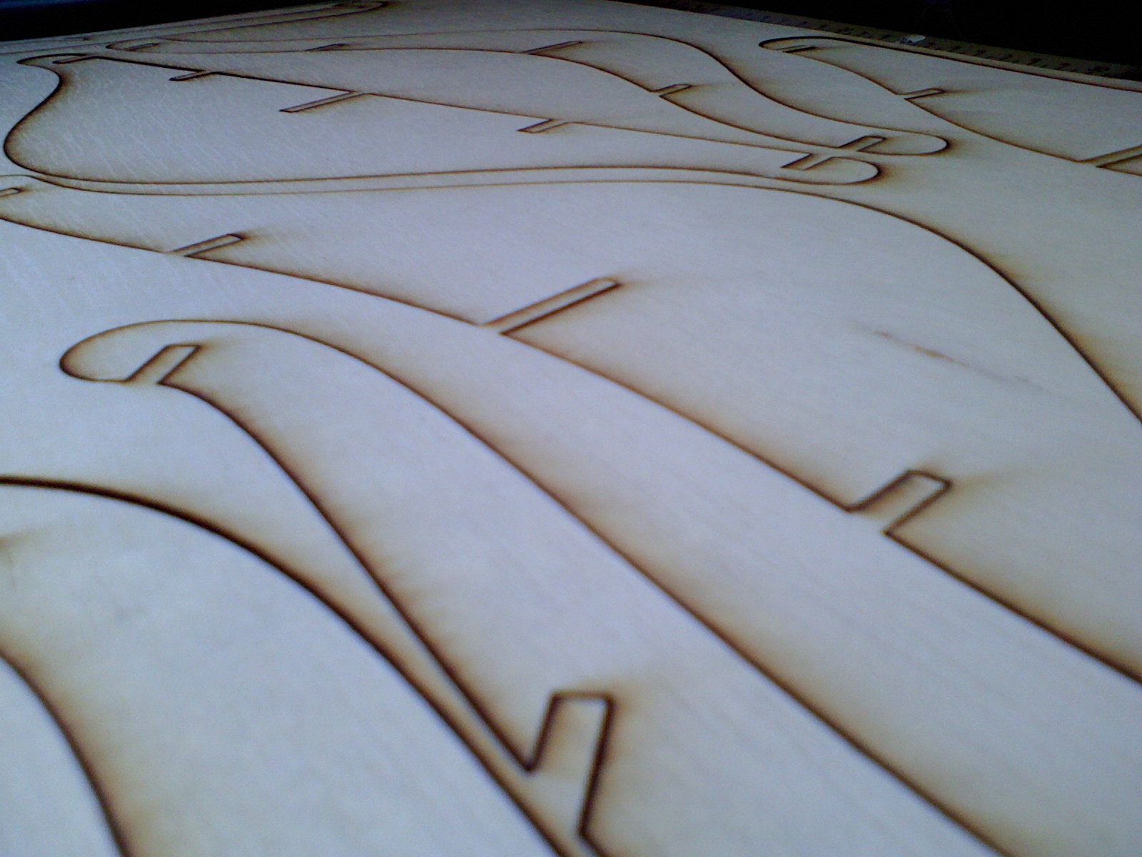
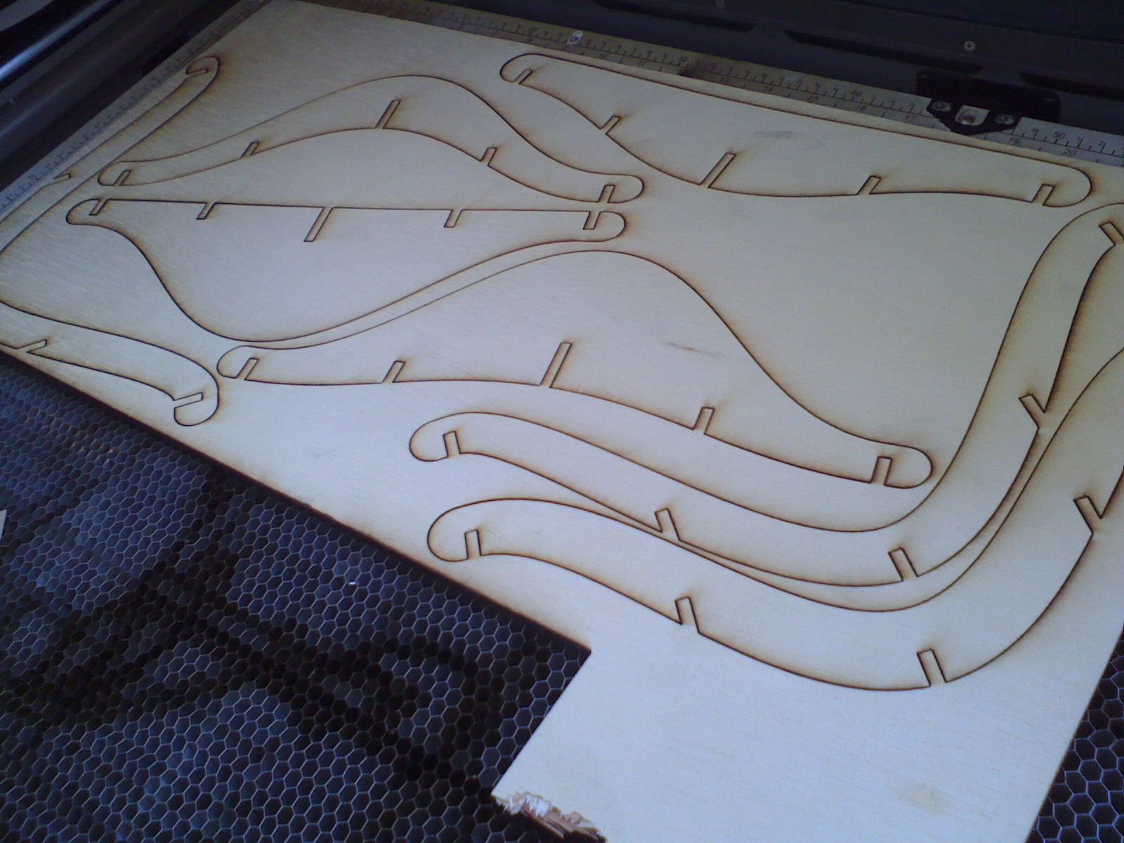
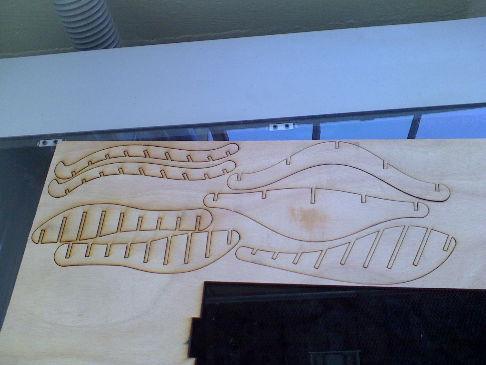
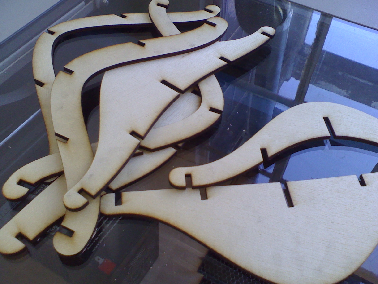
I fed the vector layout to our laser cutter, and let it rip. It took about twenty minutes to get both layouts cut out. For reference, I used 100% power at 18% speed. You can see images of the pieces being cut out and punched out, below.
Assembly
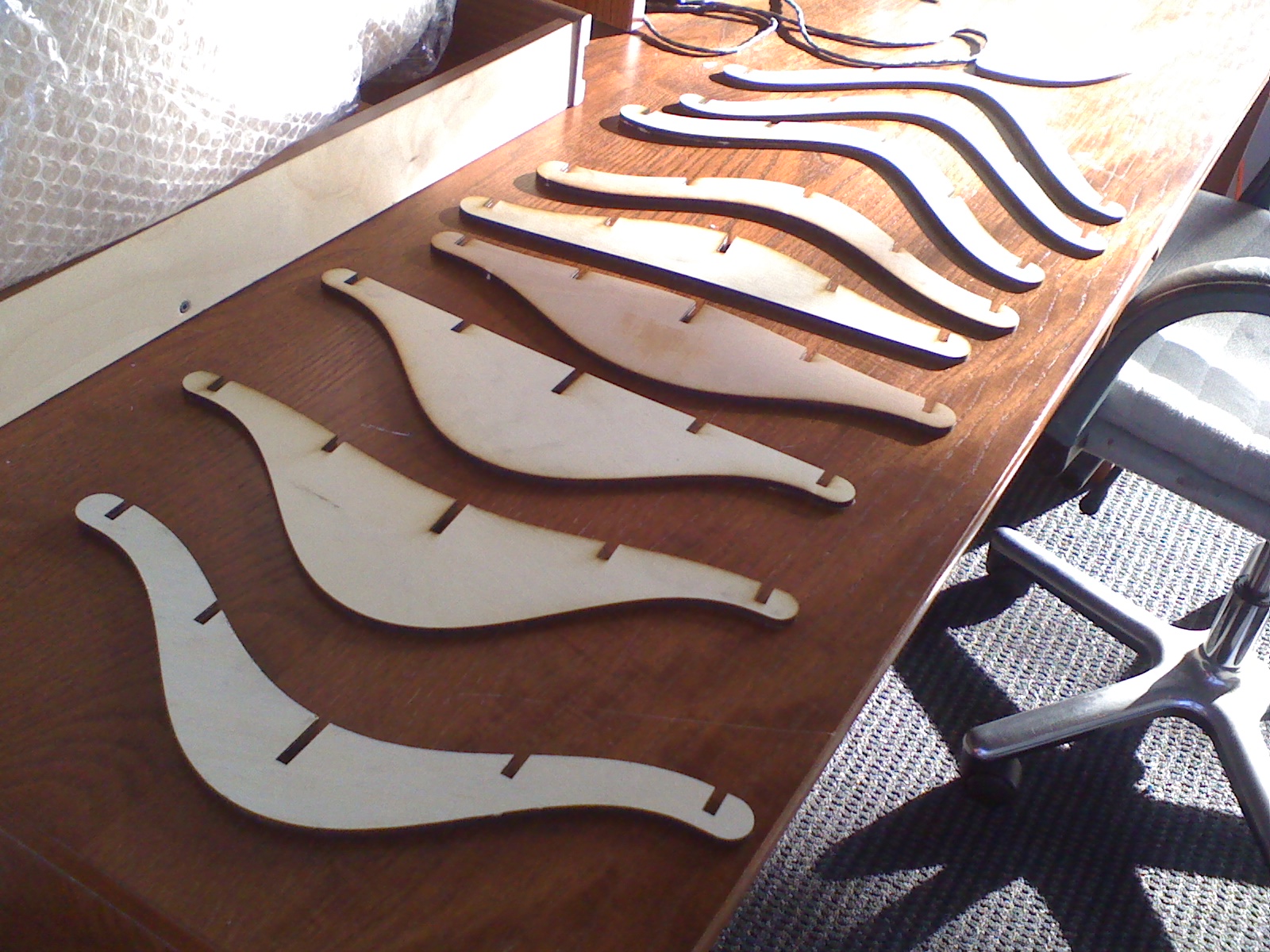
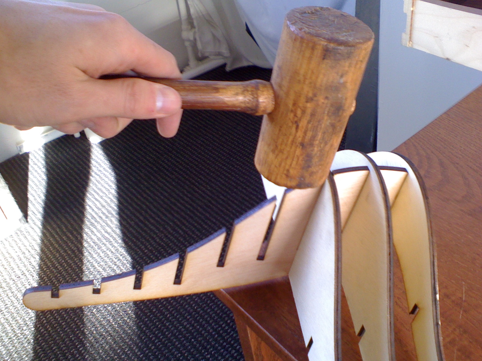
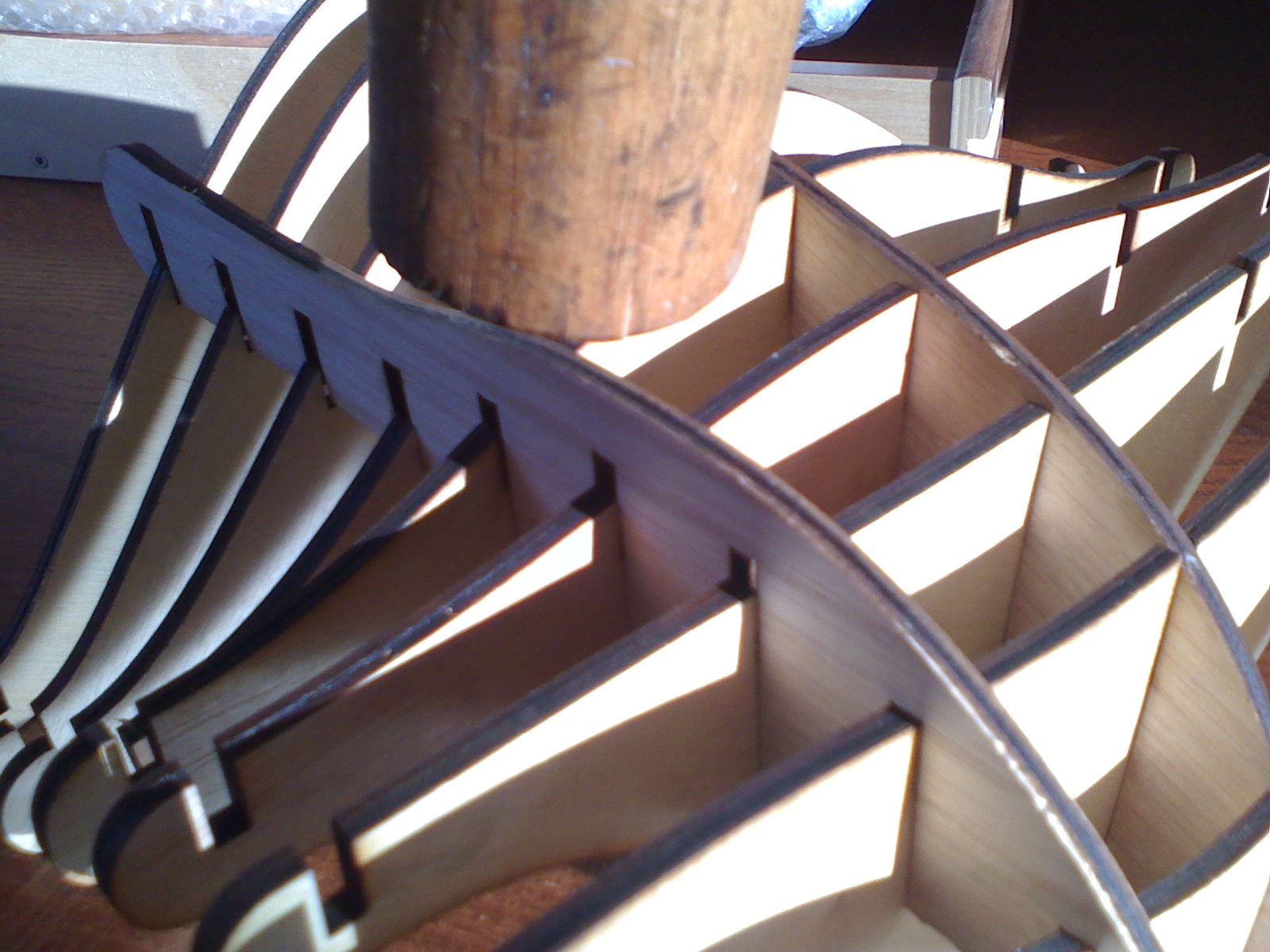
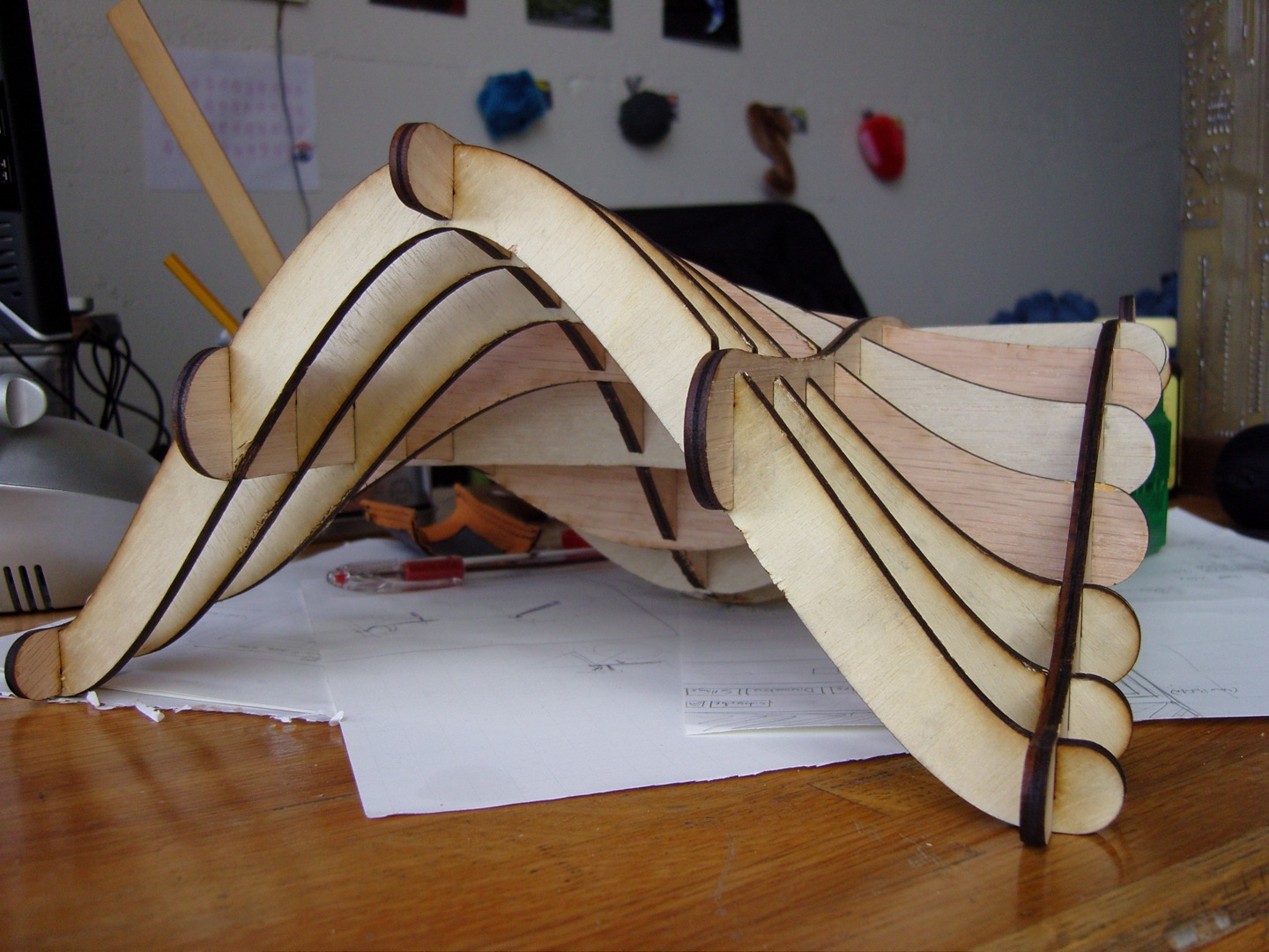
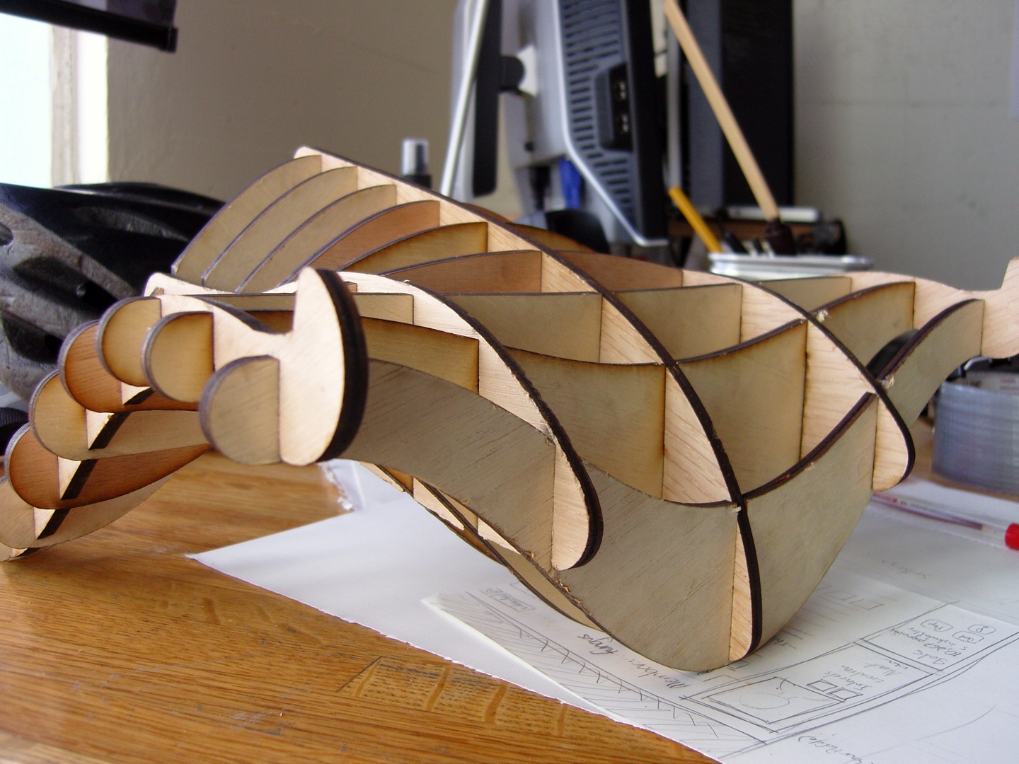

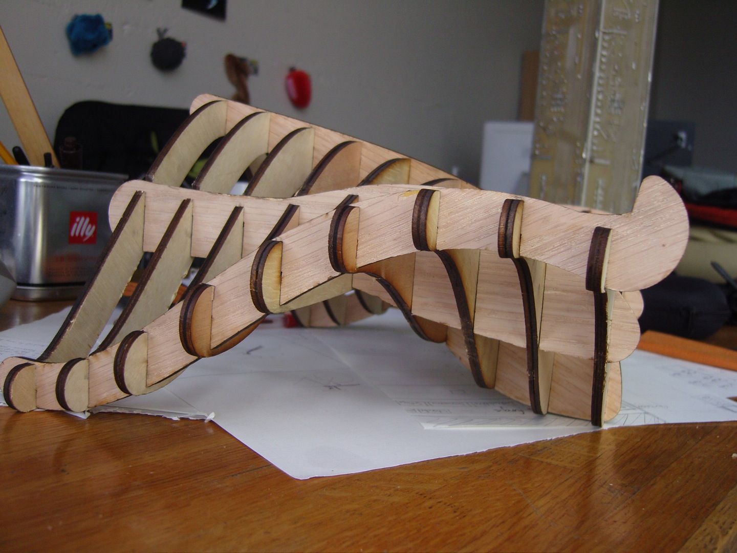
Assembling the laptop stand was actually a bit painstaking. The problem was that the slots were still too tightly-designed, and the when I had to fit nine at a time for each spine piece, I actually had to use a wood mallet to get everything squeezed together. I took care to support each intersection below with a piece of wood and then hammered everything together, going over each joint to get things flush.
After about 30 minutes, it was done! You can see the completed stand in the pictures below.
After about 30 minutes, it was done! You can see the completed stand in the pictures below.
Admire Your Work, Think of Improvements
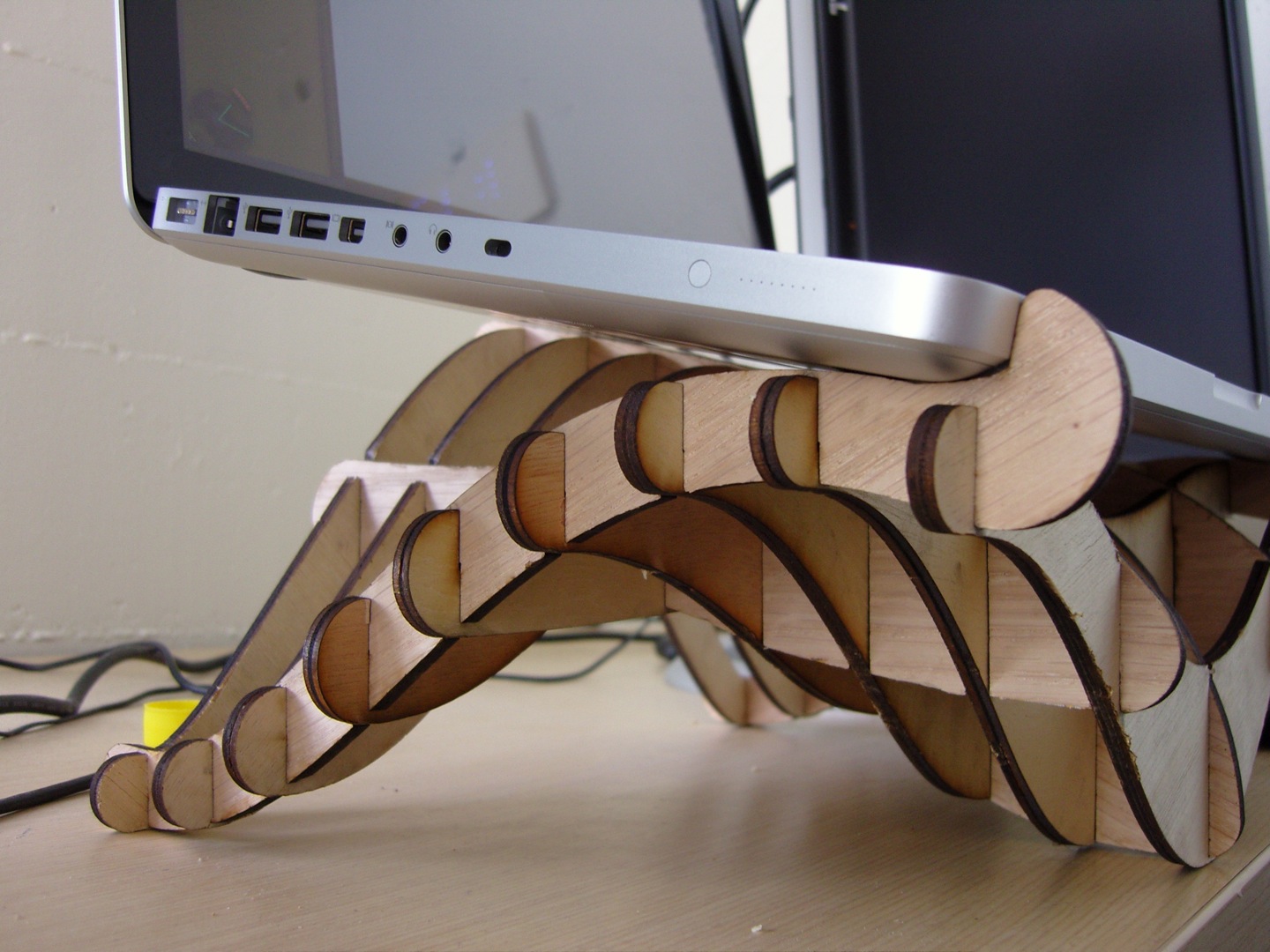
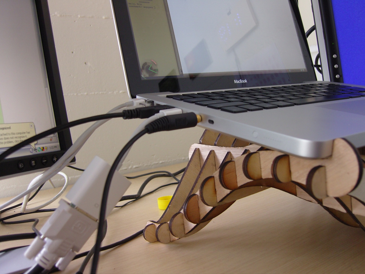
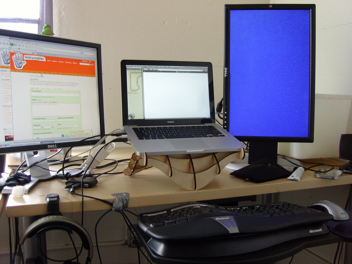
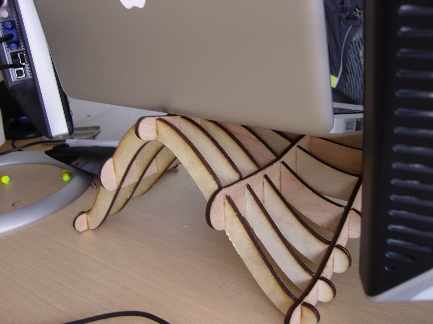
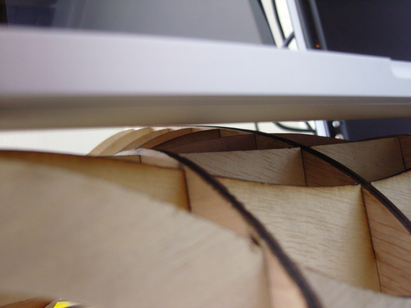
Below are a bunch of shots of the stand with my laptop on it, and how it looks in my workspace. The angle is perfect for the occasional stand and it's very stable. It also feels airier and provides a lot more ventilation when things heat up. There's plenty of room for my cables and such.
Improvements, for the future:
Improvements, for the future:
- Design it in 3D! See step 2 for my thinking on this. If you have suggestions, please leave them in the comments.
- The slots should be looser; glue can be used instead of friction to keep everything together. "Nodes" can also be used for a nicer fit. See step 4 for details on this.
- Though the stand is very strong and stable, there is just a bit of flex on the rear legs. I'd eliminate that with a thicker shape that keeps that last cross section a bit fatter in the middle.