WEST ROOM MENU - GRAPHIC DESIGN TUTORIAL
by lornjean in Design > Digital Graphics
1188 Views, 11 Favorites, 0 Comments
WEST ROOM MENU - GRAPHIC DESIGN TUTORIAL
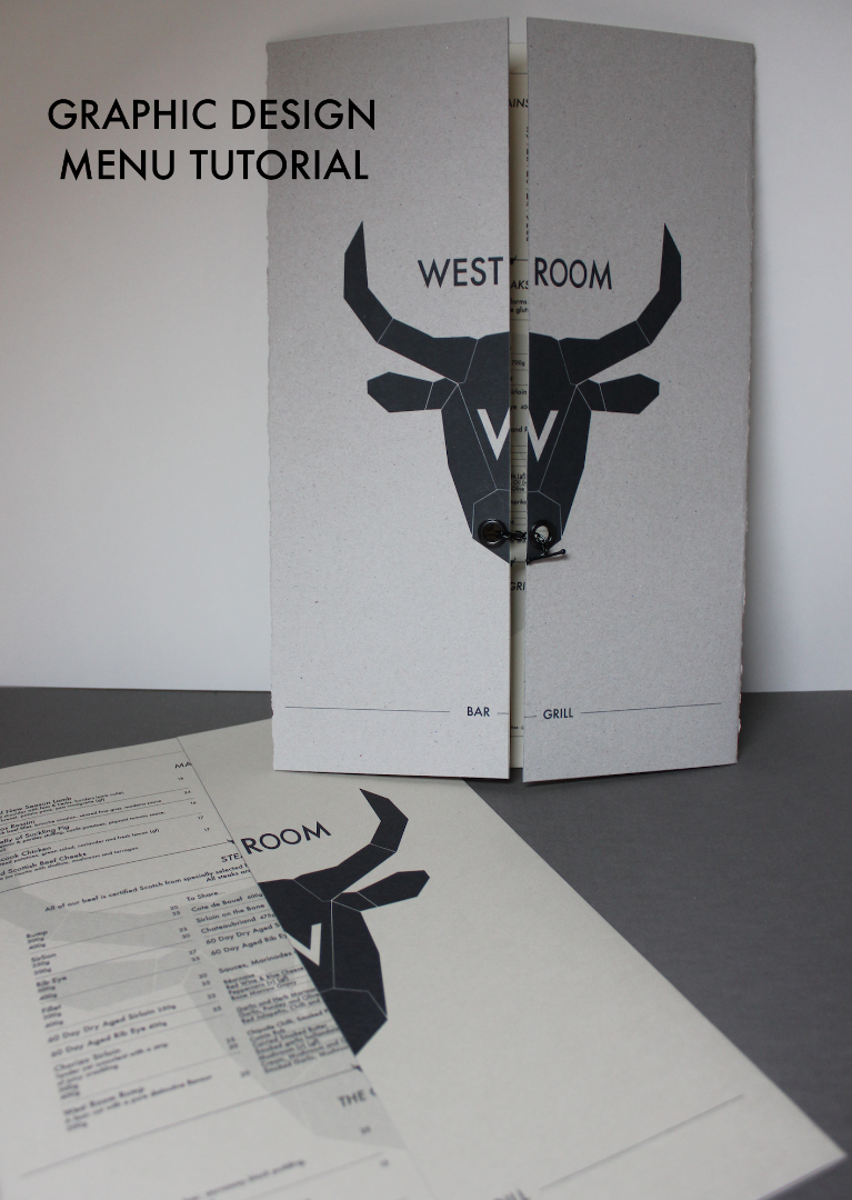
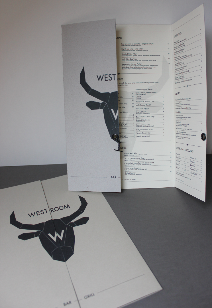
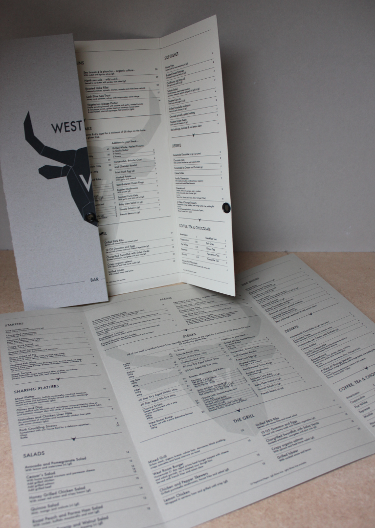
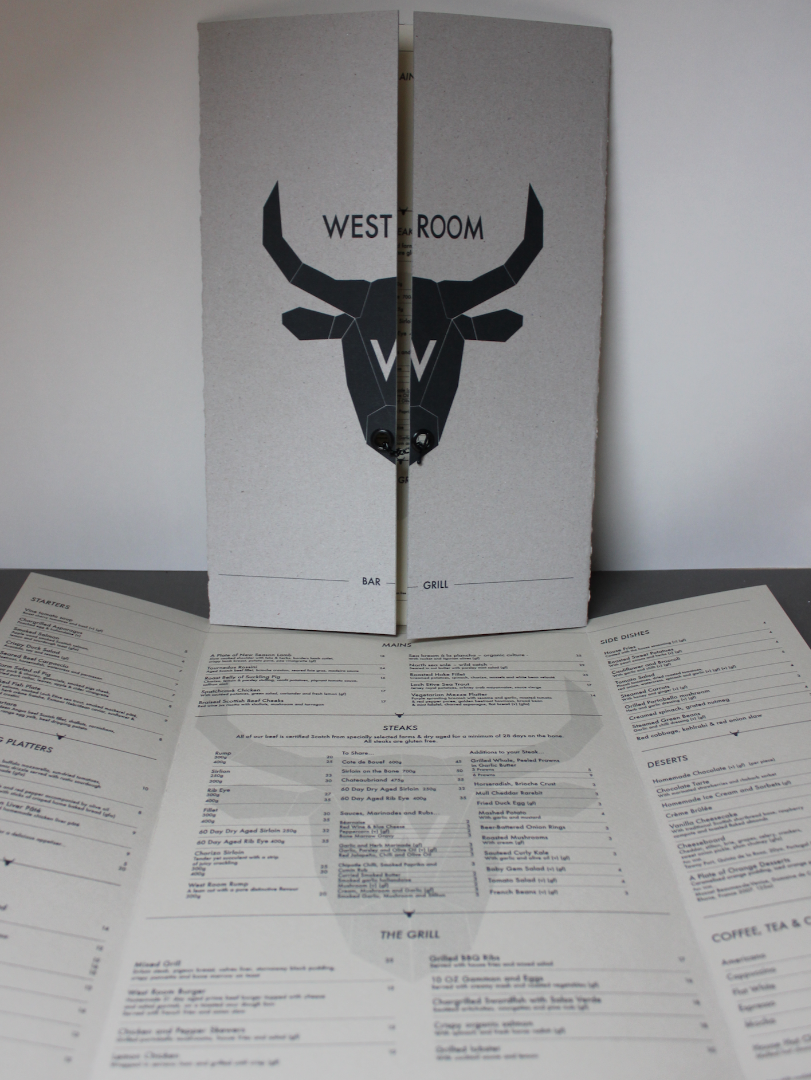
Graphic Design for a Menu!
This will explain how to...
- Create a modern style graphic/logo
- Set up a page layout within Adobe Indesign for non-standard page sizes, making it possible to create a perfectly measured gate-fold menu
- Create a watermark
- Accurate layout, using the margins and alignment tools within Indesign
- Add perfectly aligned pricing as well as division bars
- How to align both faces of the menu to each other (as this is a double-sided menu)
- How to use your home printer to print the menu in it's true scale on A4 paper by using 'tiles' (this is for design and scale purposes before sending it to the printers to be done professionally)
- How to finish the menu - cutting to size and adding additional fancies if wanted (the eyelets and chain)
Create a Modern-Style Graphic!

Open Adobe Indesign (I used version CC, if you haven't got it try get a free trial or cloud membership)
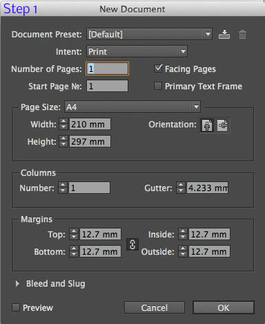
Step 1 -Create New Document
Step 2 - File → Place… (then choose the file you want to use as a rough guide) I placed the two bull pictures.
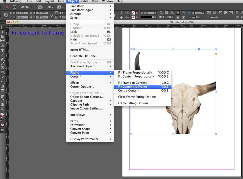
Step 3 - Resize your images to a manageable size. Use the shift key to avoid distortion when re-sizing. Then go to the menu bar up top Object → Fitting → Fit content to frame.
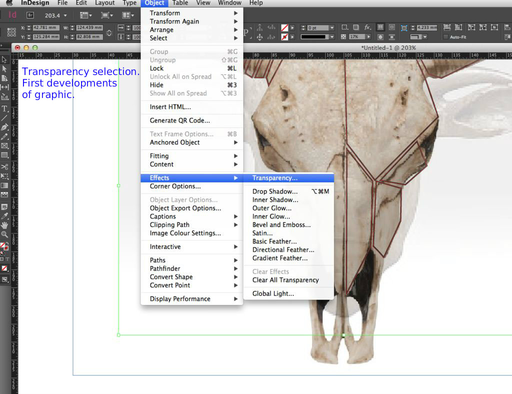
Step 4 - If using two images layered on top of each other to get the desired rough stencil, select one of the images. Go to the menu bar up top Object → Effects → Transparency and bring the opacity down between 20-50%. If you need to bring the picture forward in front of the other one go to Object → Arrange → Bring to Front.
Step 5 - Position your images perfectly and then lock the layer and create a new one.
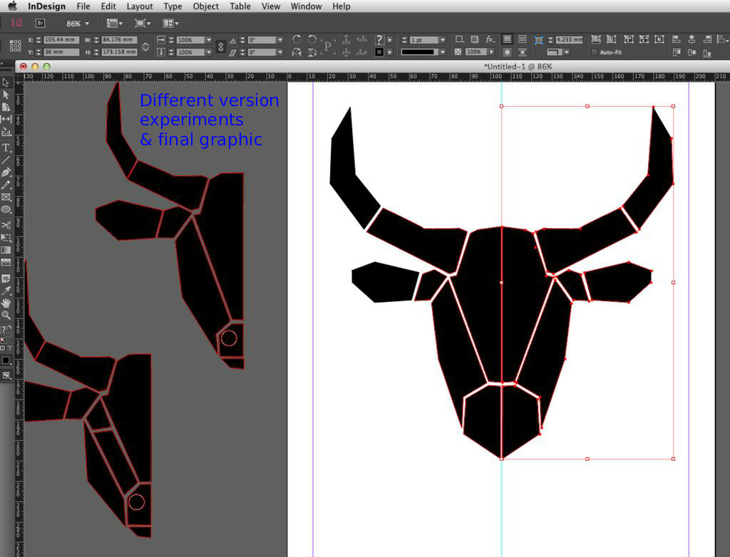
Step 6 - Select the pen tool on the left and use it to start making block shapes. When you click the pen back on your starting point, it completes one block. Build these sections up to create the shape you want, with your graphic in the background as a guide.
Step 7 - When finished, click on the eye next to Layer1 in the layers panel - this will hide the pictures and give you a clear view of you drawing. Now select the 'Direct Selection Tool' (second arrow button down on the left menu panel). This will allow you to click on the points on your drawing and move and modify it. Here you can align your edges and delete parts if you want and re-draw until you have an image you are happy with.
Step 8 - Adjust the infill for your graphic and the line weight and colour at the top of the page on the menu bar.
Note: If you are creating a symmetrical object then only draw one side, then refine it, then select it and go to the top menu. Edit → Copy. Edit → Paste. Object →Transform →Flip Horizontal.
Graphic…Done! :)
Turn Graphic Into Logo...
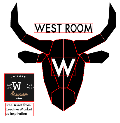
I found inspiration for my logo from Creative Market! I downloaded the free asset '20 Vintage Logos and Badges'.
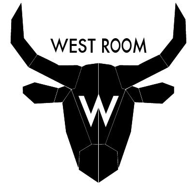
I liked the bold 'W' within one logo and decided to incorporate this within the bulls head.
'Futura Medium' is the typeface. It is a modern, clean and legible style and compliments the angular graphic of the bull.
I scaled the W to fit inline on the bull. I did not make it too oversized as this would detract from the main visual. It is important that it is directly centred on the bulls head.
'West Room' was also added to the graphic in-between the bulls horns. It is visually pleasing to have text positioned in a way that it is in-line with an element of the graphic. Here, the angle of the bulls horns on either side, if connected, would create a perfect underline for 'West Room'.
Indesign Page Layout Essentials
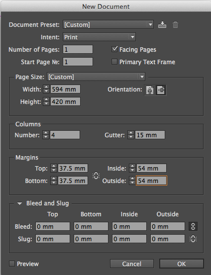
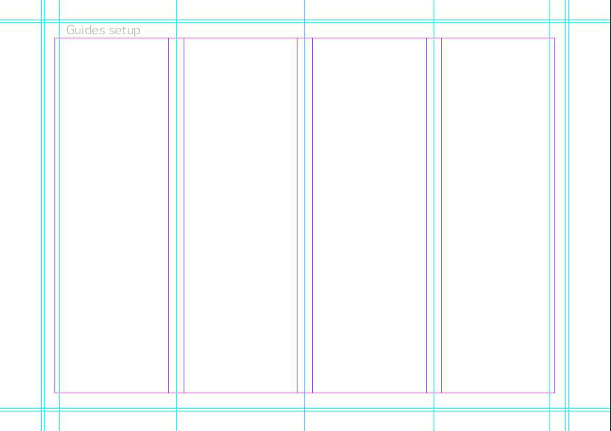
File → New Document. (See picture for setup)
I created this menu on an A2 size spread as due to its size and form, A2 is the smallest standard paper it could print on. Creating it in Indesign this way instead of entering the exact dimensions of the menu allows you to get a full overview and add information in the borders (which will be cut off), add additional fold lines, bleed guides etc.
-You will see that the pink margin lines are created from the document setup.
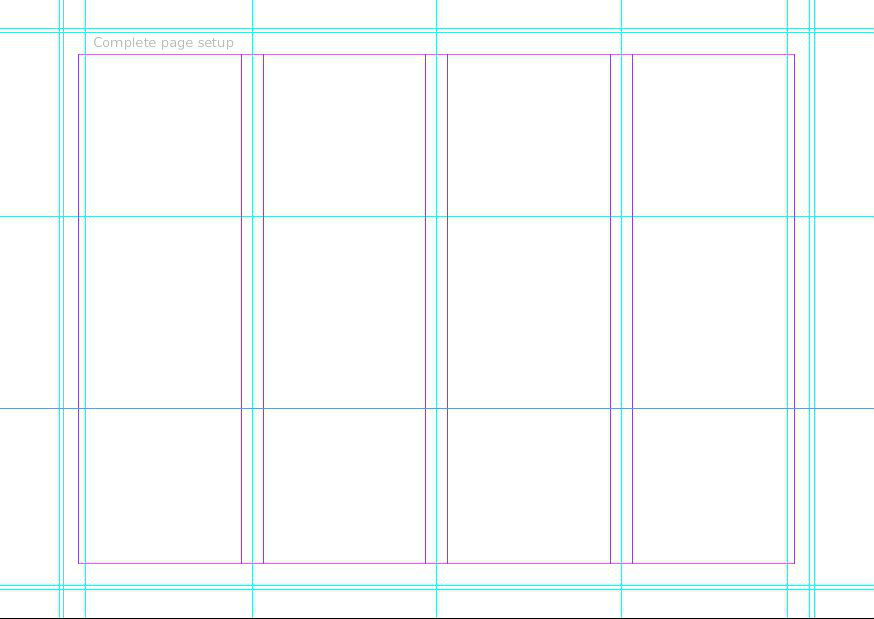
Drag guidelines into the middle of each gap between the margins (see photo).
On the far left and right margins, drag a guideline into the margin 5mm. Then from the left and right margins drag guidelines outwards 10mm (so there is a 15mm gap between the guides) From this 10mm guideline and another guide outward an extra 3mm. (This 3mm guide accounts for the 'bleed' allowance.)
The guidelines top and bottom measure 15mm from the margin and then 18mm from the margin (again, creating the 3mm bleed guide)
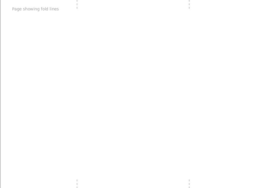
On the guidelines (in the middle of the margins) after the 3mm bleed guide, use the line tool to create 'fold line guides'. Make these dashed lines. (see photos)
Guidelines (these are the light blue lines, you can grab these lines by holding down the mouse on top of the ruler at the edge of the window and dragging into the page).
Finally, I find it always works quite successfully visually to work by the rule of thirds. Use two more guidelines to split the speed up into three sections horizontally. The page will be 3 sections of 125mm.
Menu Background - Watermarked With Logo
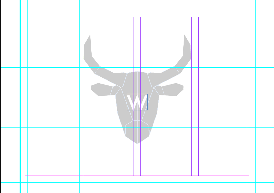
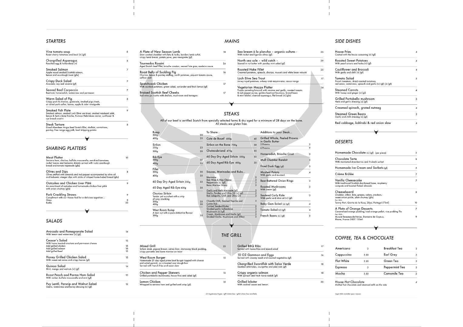
Copy and paste the graphic from your previous Indesign document which was created earlier onto the page (without the name of the restaurant).
This graphic will add a very subtle emphasis to the front cover design as it is being seen again on the inside.
Resize it by going to the menu Object → Transform → Scale.
As it is a watermark, making it almost fit the back page will be subtle but add interest.
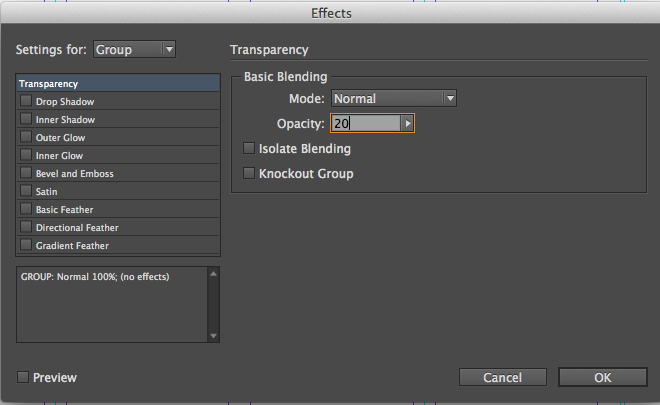
Transform it into a watermark by going to the menu Object → Effects → Transparency.
Adjust the opacity to 20%.
The Watermark is complete!
Text, Margins & Alignment
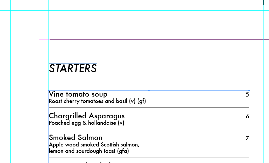
Typeface used for headings : Futura Medium Italic 16pt
Typeface used for Dishes: Futura Medium 11pt
Typeface used for descriptions and additions: Futura 8pt
When adding text, it is essential to stay within the margin borders (with the exception of the main back page). Remember that the outer margin on the left and right is -5mm and you abide by the guideline you already placed for the alignment of the text to the edges. When creating the text boxes, make sure they expand to touch both left and right of the necessary guides.
Leave 10mm between headings (i.e.. 'Starters') and the dishes which follow.
Each section of writing, (all of the starters for example) should be created in one paragraph. This keeps the alignment in check and the spacing between each dish even (8pt should be used when tabbing down to the next line).
Leave 20mm between the base of the previous dishes text and the top of the new header (i.e. 'Mains')
Start on the left side and work down. You may also want to start from the bottom right and work up too.
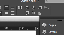
Focus on putting in the headings and body of text. The alignment buttons on the top menu (see photo) will be incredibly useful. Also 'smart guides' help snap everything into alignment. To make sure they are active go to View → Grids and Guides → Smart Guides.
Aligned Pricing & Division Lines
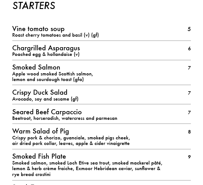
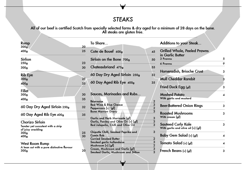
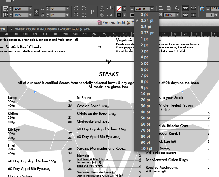
Once you have all of the text complete with the appropriate spacing (make sure this is perfect to the mm!) it is time to add the pricing and division lines between each dish.
To add prices…
- Click on the T (Text) tool and click in the text box you will add the prices to.
- In 8pt size futura medium, type a price
- Use the ⇥ (tab) key on your keyboard once. Then highlight the number, go to the alignment buttons at the top right of the screen that we saw in the previous step and align to the right. This jumps the number over to the right, directly inline with the margin. Repeat this for each price.
To add division lines…
These thin lines creating a division between each dish will make the menu much clearer, easily read and easy to match up the price.
- Select the line tool.
- Make the weight of the line (which can be adjusted by a drop down menu on the toolbar at the top of the screen) 0.25pt.
- Holding down shift (to keep the line straight) drag a line the exact same length as your text box
- Staying zoomed in, drag this line in-between two different dishes. The smart guides should help snap this in place in seconds.
- Hold down the option key on your keyboard and click and drag down on the same line you just drew. This creates a duplicate very quickly.
- Repeat this until there is a division line in the centre of the space between each dish in each section.
Menu Division Bars
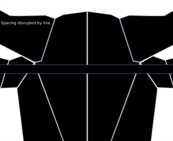
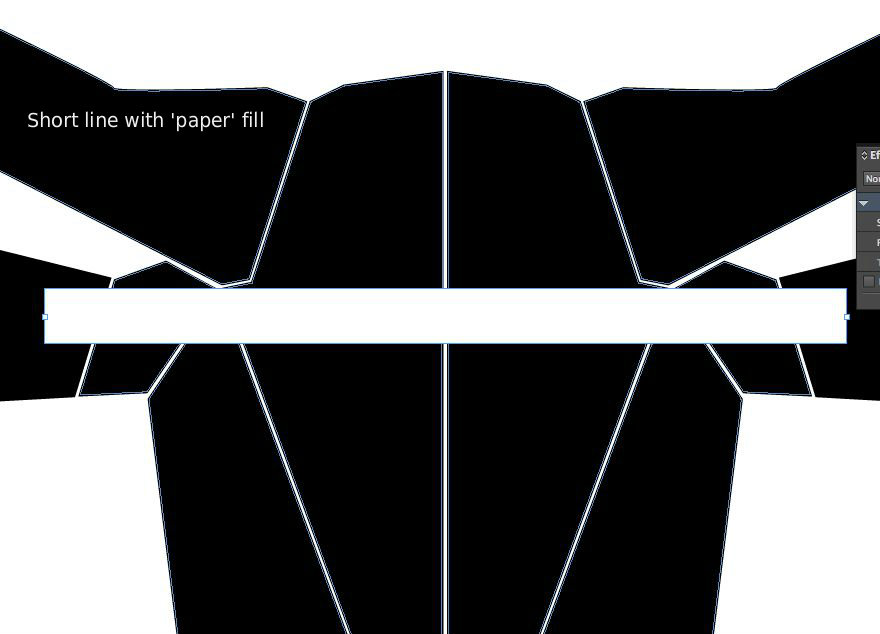
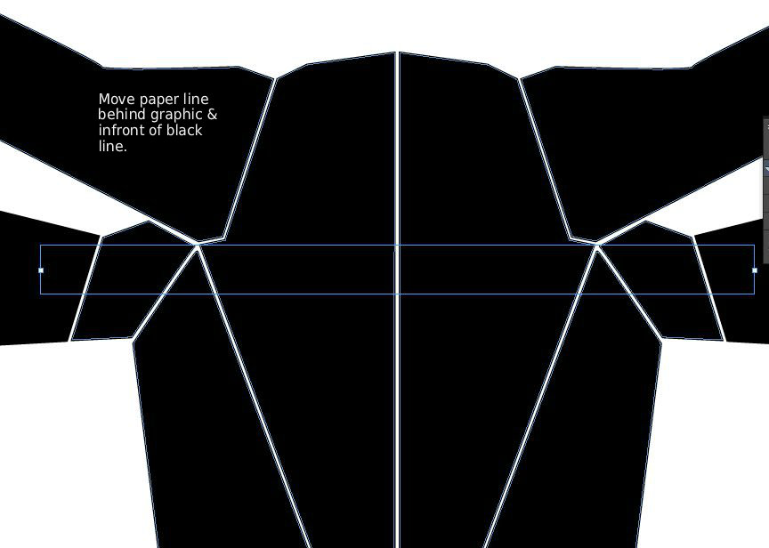

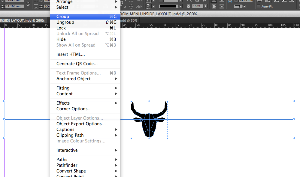
The menu sections (Starters, Mains, Salads etc) are divided up by Division Bars. This creates structure and form to the menu.
The division bars were created by simply drawing a line, as in the previous step but this time a weight of 0.75pt.
The bullhead graphic (without the 'W') was scaled right down and then aligned to the centre of the division bar. This alignment can be done by the guidance of 'smart guides' or by using the alignment panel in the top right of the screen.
When creating the division bar, it will be necessary to place a white line ('paper' fill) on top of the black line before you place the bullhead on so that the clear spacing between the sections is not turned black by the line.
Create one division bar with the width corresponding to the width of the text boxes on the sides of the menu and another one that spans the width of the text right across the main page.
Group the line and bullhead together by highlighting them and going to Object → Group
The gap of 20mm that was left earlier between the bottom of the dishes from the previous menu and the new header… place the division bar in-between this so it sits 10mm below and above from each.
Double-sided Menu : Align Both Faces
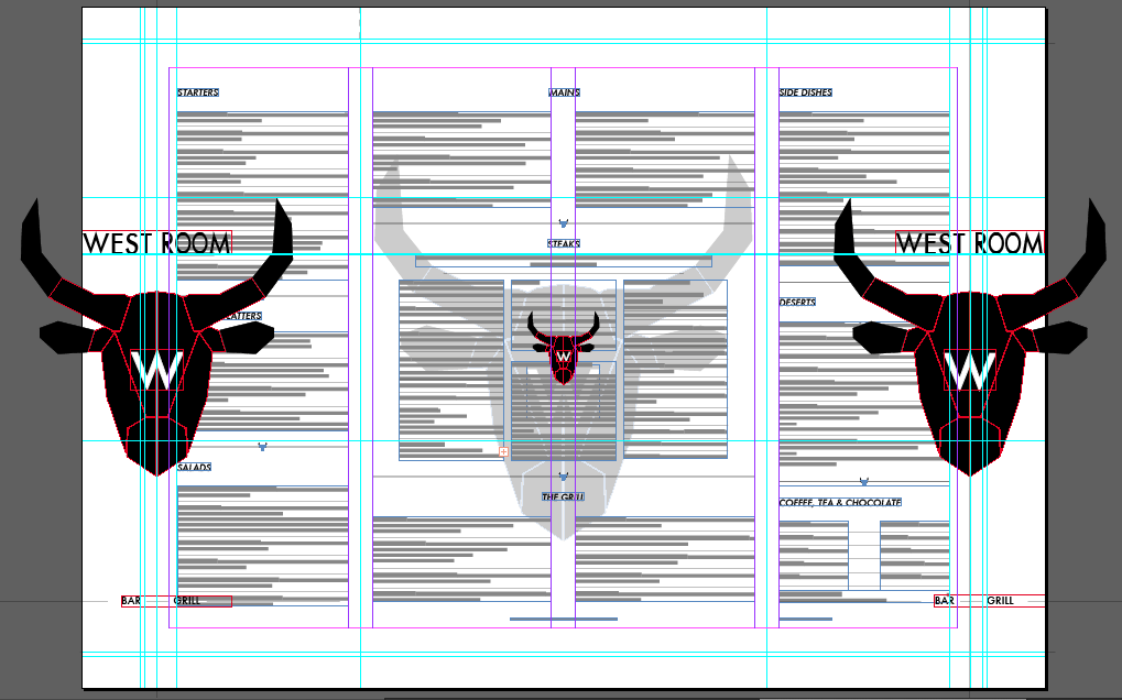
The best way to make sure everything aligns is to have it in the same document.
In the layers panel on the right hand side, create a new layer and lock the current one.
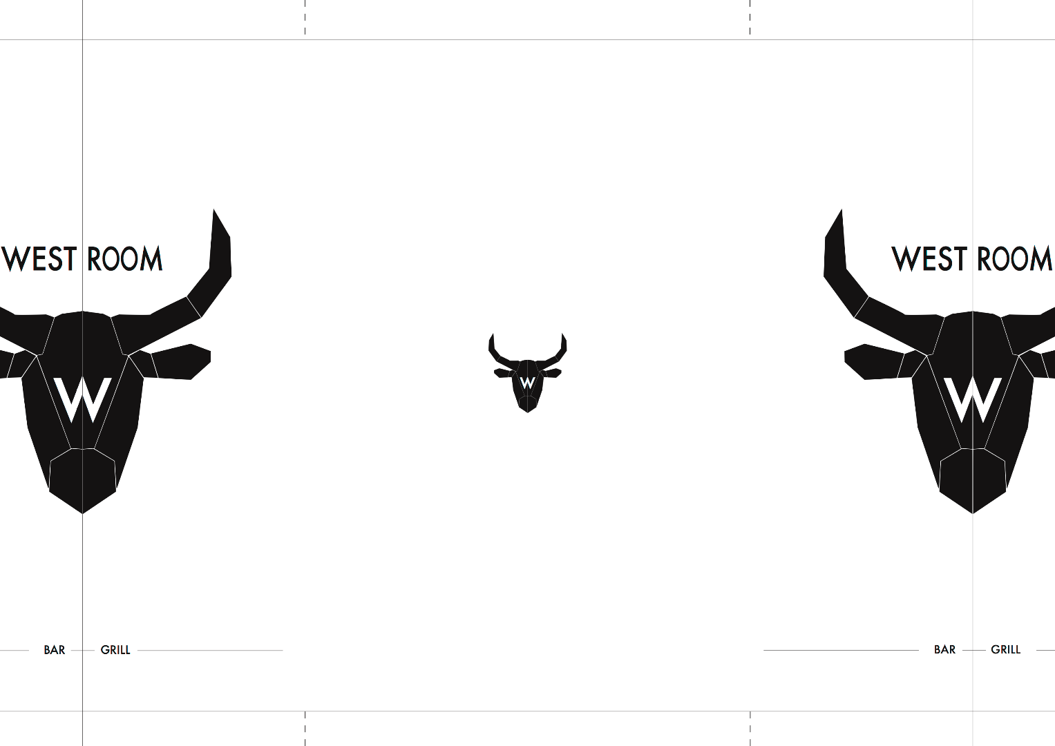
Copy and paste in the logo created in the previous document earlier. You can use the watermark on the page behind as an idea of scale and how much smaller you may want it and its position on top of it. These two elements need to be in harmony of some kind as a smaller much denser and bold image will be translated into a large soft one.
Duplicate this and drag it to both the left and right sides, positioning the logo so that the guideline (which acts as the guide for where the paper will be cut) is directly in the centre.
A smaller bullhead graphic with 'W' was centred on the back page as a branding mark.
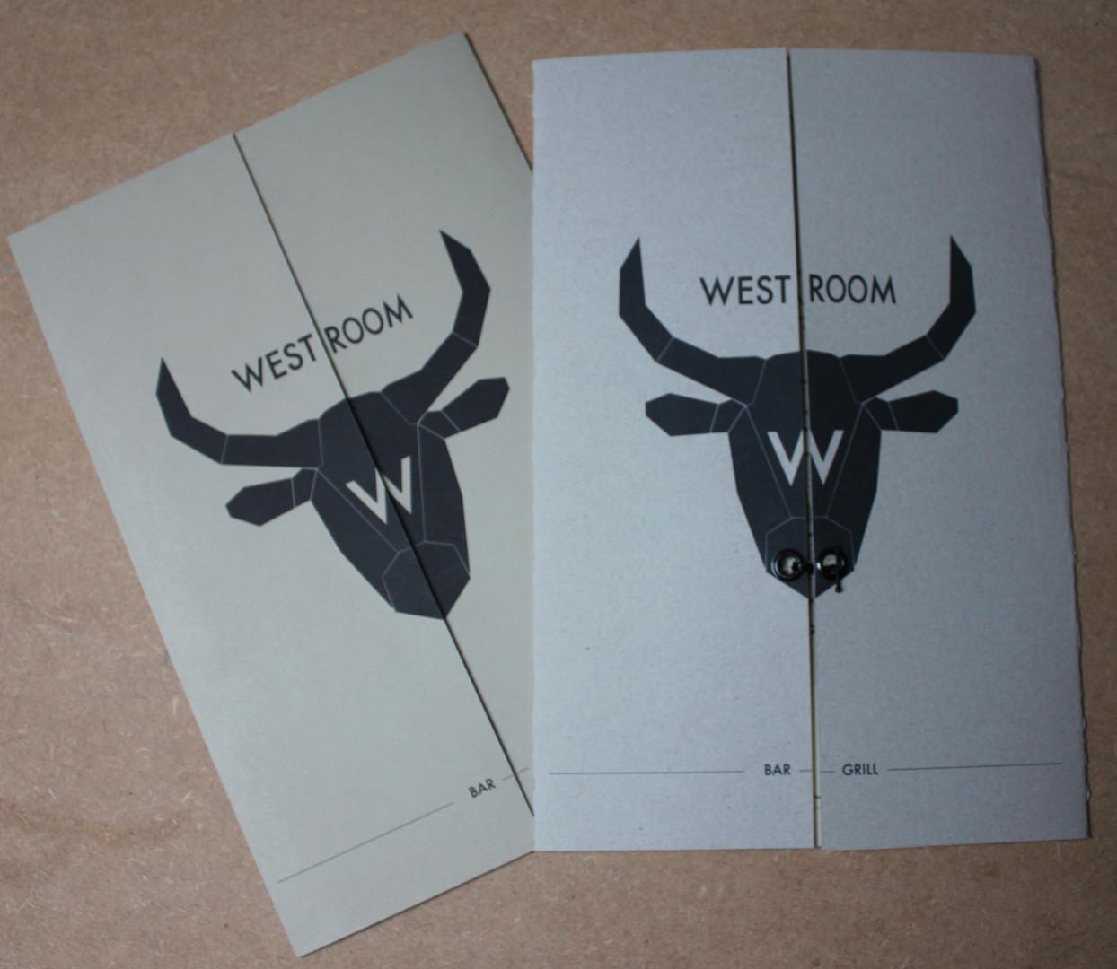
Finally 'Bar' and 'Grill' were added to the front with a 0.5pt line running across the page . This keeps it simplistic and inline with the style of the whole menu.
Save to Print (PDFs)
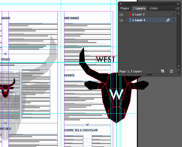
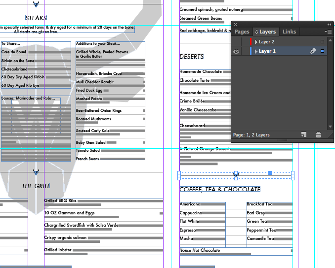
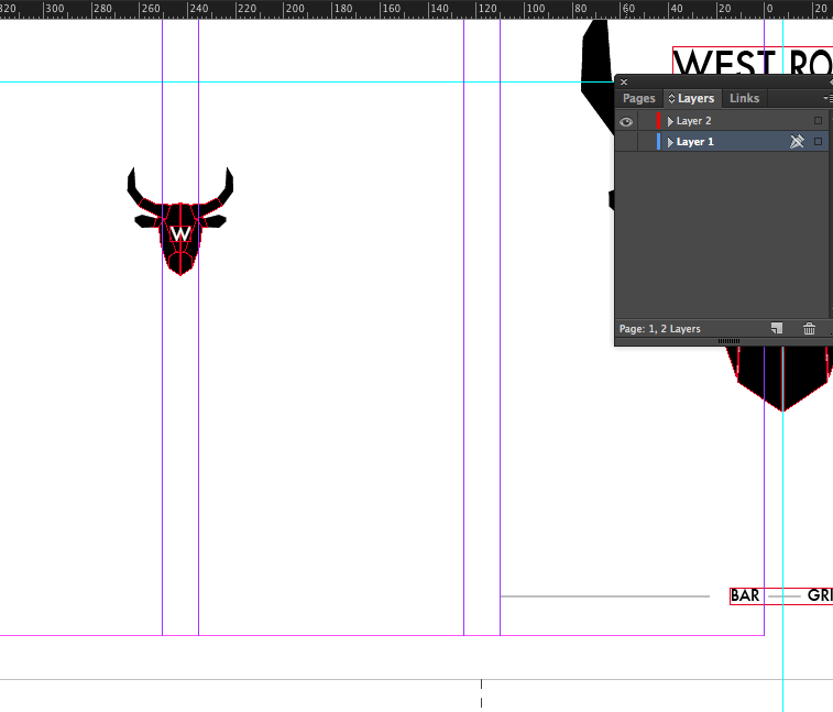
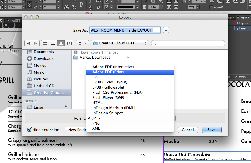
Now that you have both faces on top of one another (but in different layers) it is very simple to save them.
-Click the eye icon next to one of the layers in the layer panel and you will see that one layer disappears. You can do this the other way around too.
To save, make one layer not visible and go to File → Export . Select the file type to be Adobe PDF (print)
Now make the layer you just saved invisible and the other one visible and save in the same way.
Your menu is ready to be printed!! :D
How to Print a Mock-up on A4
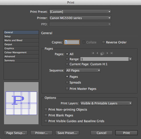
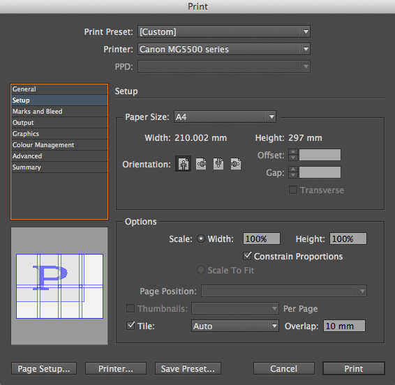
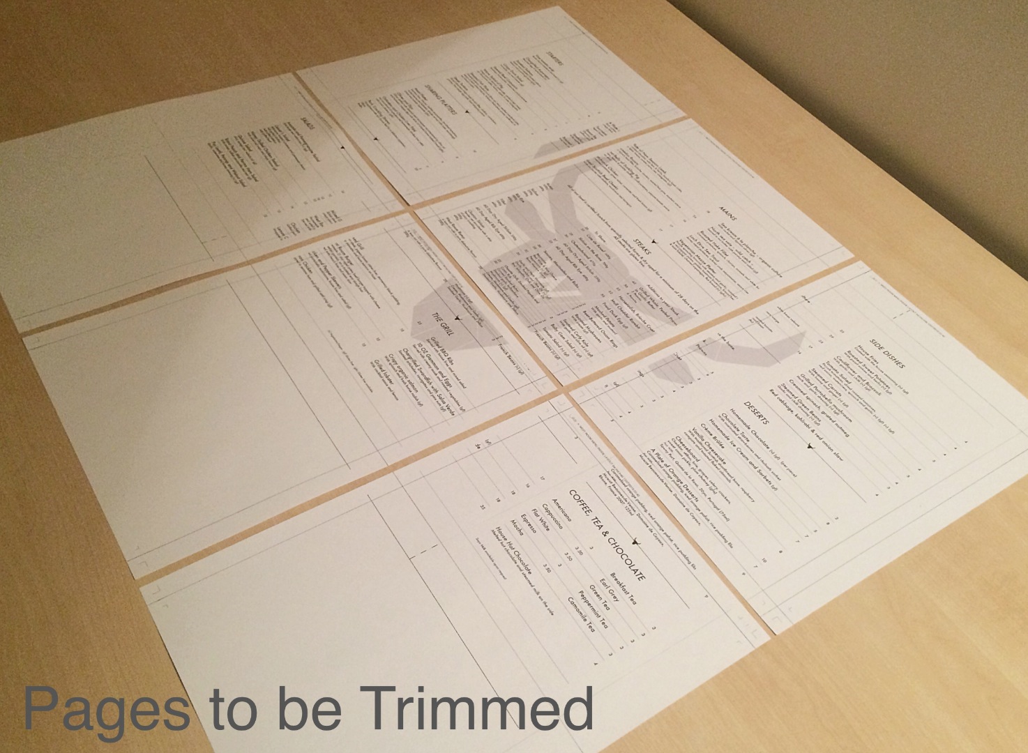
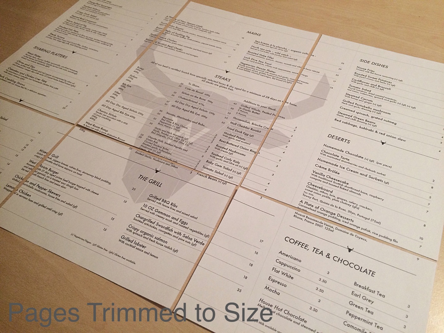
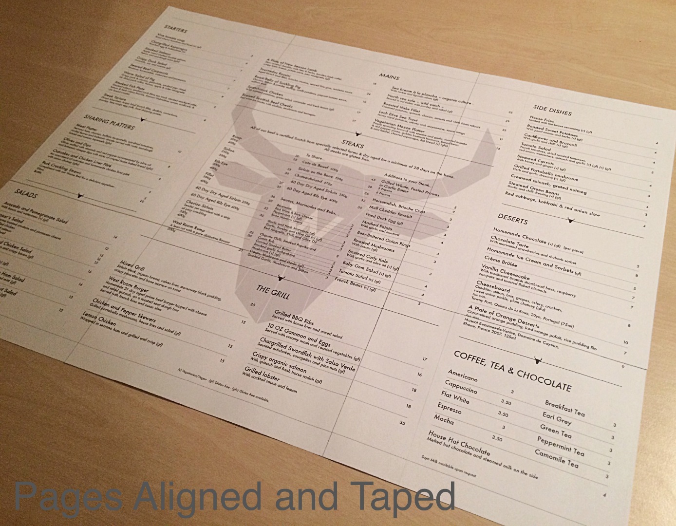
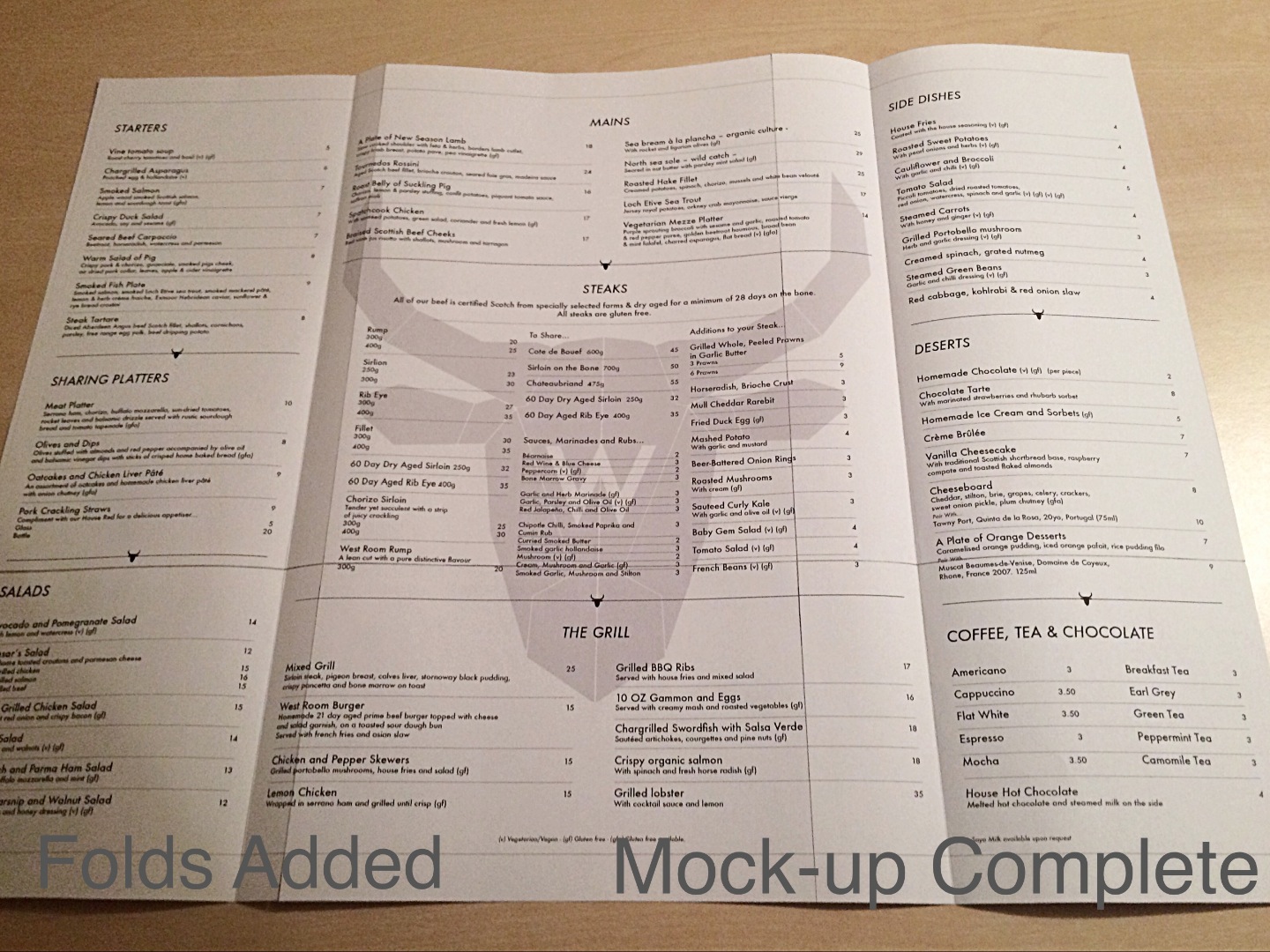
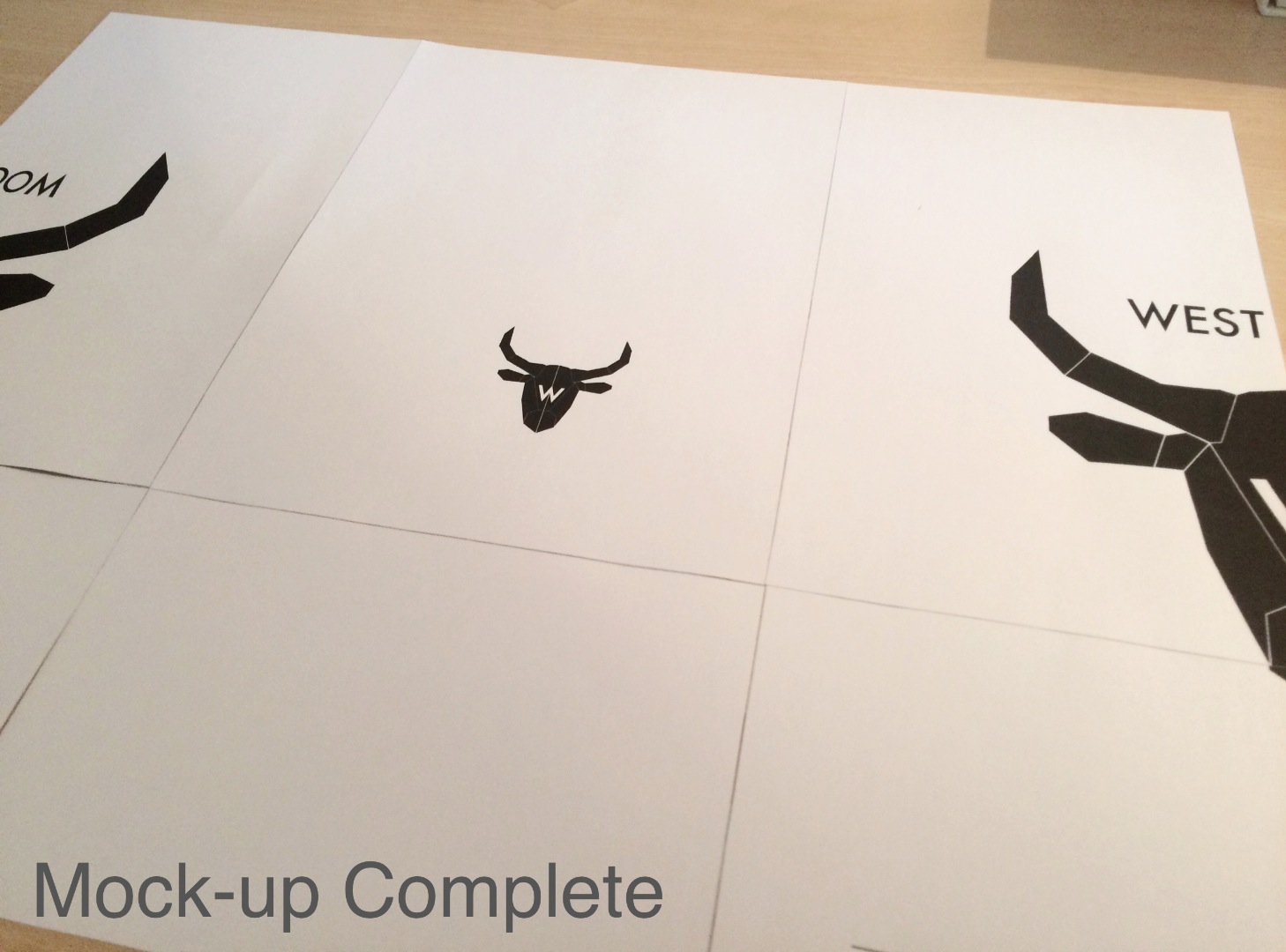
This will print your menu mock-up exactly to scale. You will simply need to trim the sections using the guidelines. I use masking tape on the back of the paper to stick the sections together.
File → Print…
See pictures for print menu setup.
If you're happy with it and everything lines up… its time to send it to the printers! :)
The Finishing Touches!
Now that you have your final printed menus, it is simply a case of trimming them to size using your already-marked guidelines.
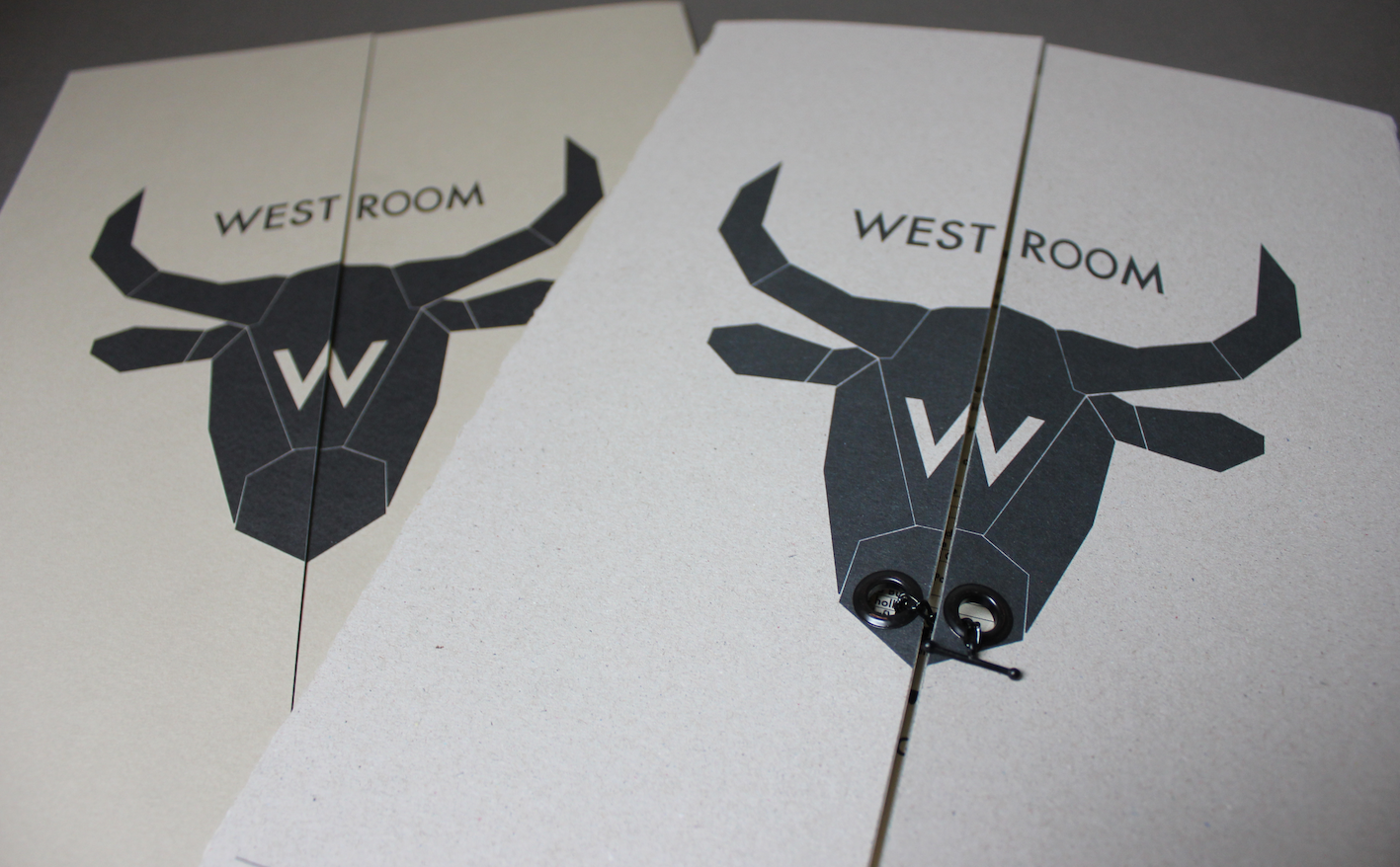
As an experiment, to create an interesting element to the menu I added eyelets through the Bulls nose to represent its nostrils and a chain with a t-bar attachment to hold the menu together and represent the typical bull-ring.
Little touches can make all the difference!
If you found this helpful, please hit that vote button to support me in the graphic design competition! :)