Using PivotTables

This set of instructions will help you use and understand what a PivotTable is.
Copy Data Into Excel Spreadsheet
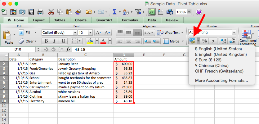
a. Copy the given data into a Microsoft Excel spreadsheet exactly as it appears below.
b. Make sure the data locations match up exactly with the provided image.
c. Highlight the "Amount" column.
d. Click the currency button and select "$ English (United States)". (Location indicated by red arrow)
Manually Creating a PivotTable
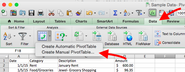
a. Click on cell "A-1"
b. Click "Data" near the top right of the screen.
c. Click drop down arrow next to the "PivotTable" icon and select "Manual PivotTable..."
d. When the "Creating PivotTable" Box appears, click "OK."
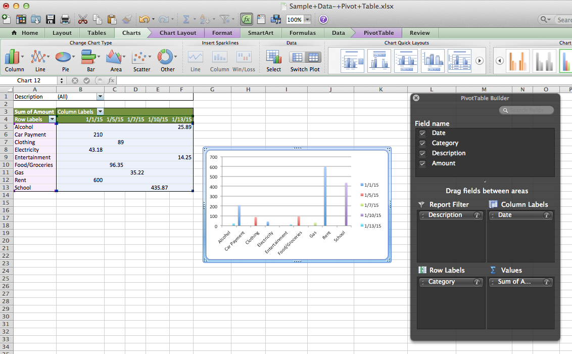
Checkpoint 1
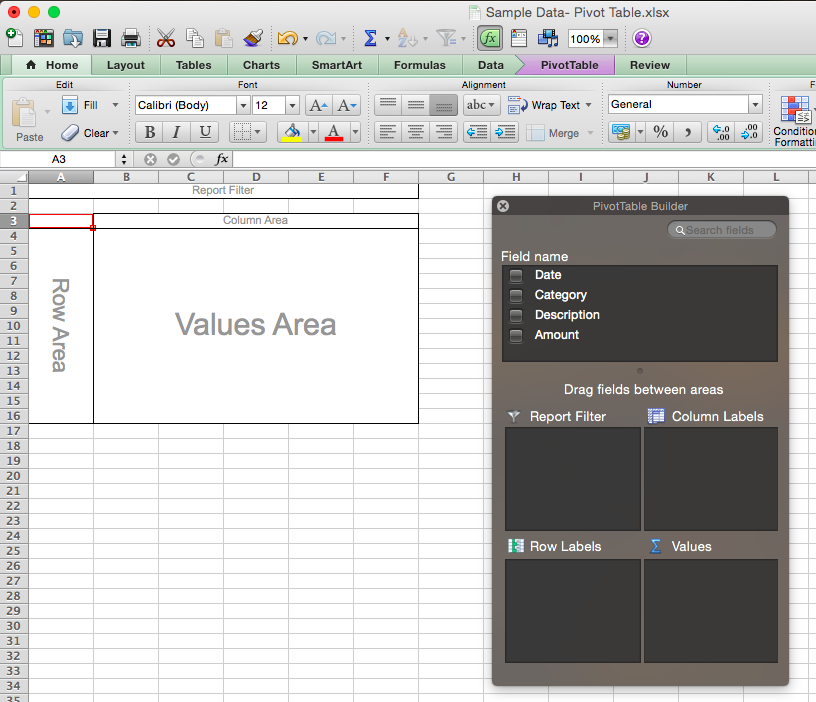
Upon completion of Step 2, this is what your screen should look like.
On the left is the PivotTable itself.
On the right is the "PivotTable Builder," which is the most important tool you will use throughout this process.
If the "PivotTable Builder" disappears, simply click anywhere within the table and it will reappear.
Drag Fields - PivotTable Builder
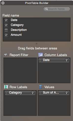
The PivotTable Builder is used to display data in different ways via the PivotTable. Changes made to the Builder will automatically change the Pivot Table itself.
a. Under "Field Name", click and drag "Date" into the "Column Labels" area.
b. Click and drag "Category" into the "Row Labels" area.
c. Click and drag "Amount" into the "Values" area.
The table will reflect the changes made to the Builder.
Checkpoint 2
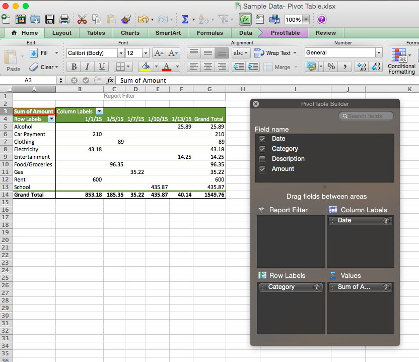
Your screen should reflect the image above. The table now shows the amount of money spent on the category on a specific date.
Additionally, the PivotTable automatically creates a "Total" column which adds up each individual row and displays the summation in a row of its own on the right side of the table.
Report Filter - PivotTable Builder
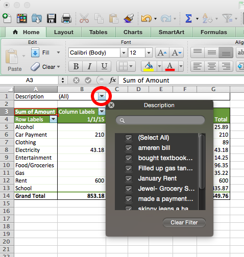
a. Click and drag the remaining field, "Description," from the PivotTable Builder to the "Report Filter" area. (See step 4 for Builder image.)
The "Report Filter" now appears directly above the PivotTable.
b. Click the drop-down arrow of the "Report Filter" (indicated by the red circle).
A list of the descriptions present in the data will appear.
c. Click the check mark next to "(Select All)" in the "Descriptions" list to deselect all options.
d. Now, click "Filled up gas tank at Amaco" in the "Descriptions" list.
The PivotTable now shows how much money was spend on gas and on what date.
Displaying "Grand Total"
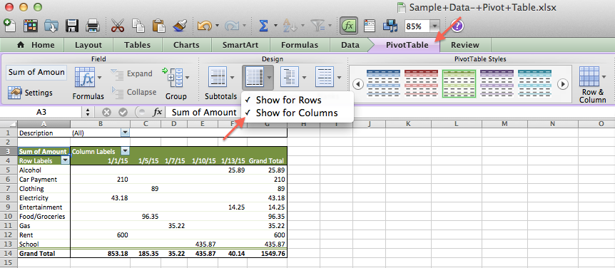
The PivotTable currently displays a "Grand Total" Row and Column. Removing this allows for a more effective use of the next step. To remove the "Grand Total" from the PivotTable:
a. Click the purple tab marked "PivotTable" at the top of the screen.
b. Then, under "Design" click the "Totals" tab.
c. To remove/add "Grand Total" Rows or Columns, simply click the desired function. A check next to the "Row" or "Column" option indicates that the "Grand Total" is present.
Creating a Column PivotChart
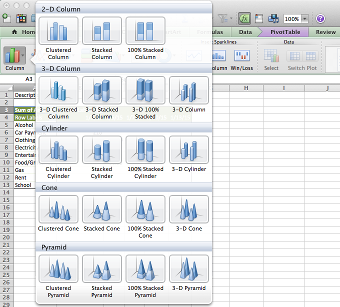
Once you have removed the "Grand Total" from the Rows AND Columns, you are ready to create a PivotChart.
a. Click "Charts" located at the top of the Spreadsheet.
b. Click the "Column" tab.
c. Click the "Clustered Column" chart in the drop down box to create a Clustered Column PivotChart.
Final Checkpoint
After creating a Clustered Column PivotChart, this is what your screen should display.
From here, you can explore the many functions of PivotTables and PivotCharts to manipulate the data in different ways.