Use Photoshop to Create Awesome Photo Effects
by harrafamily in Circuits > Art
2454 Views, 10 Favorites, 0 Comments
Use Photoshop to Create Awesome Photo Effects
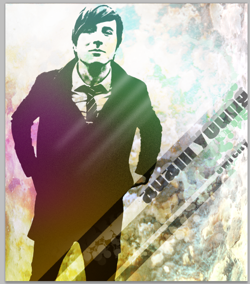
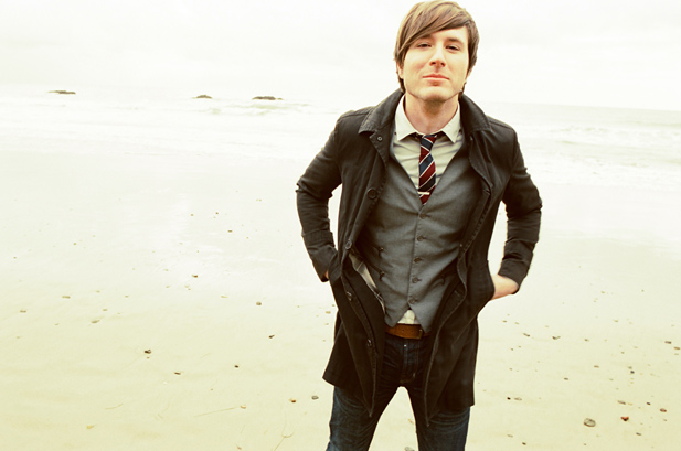
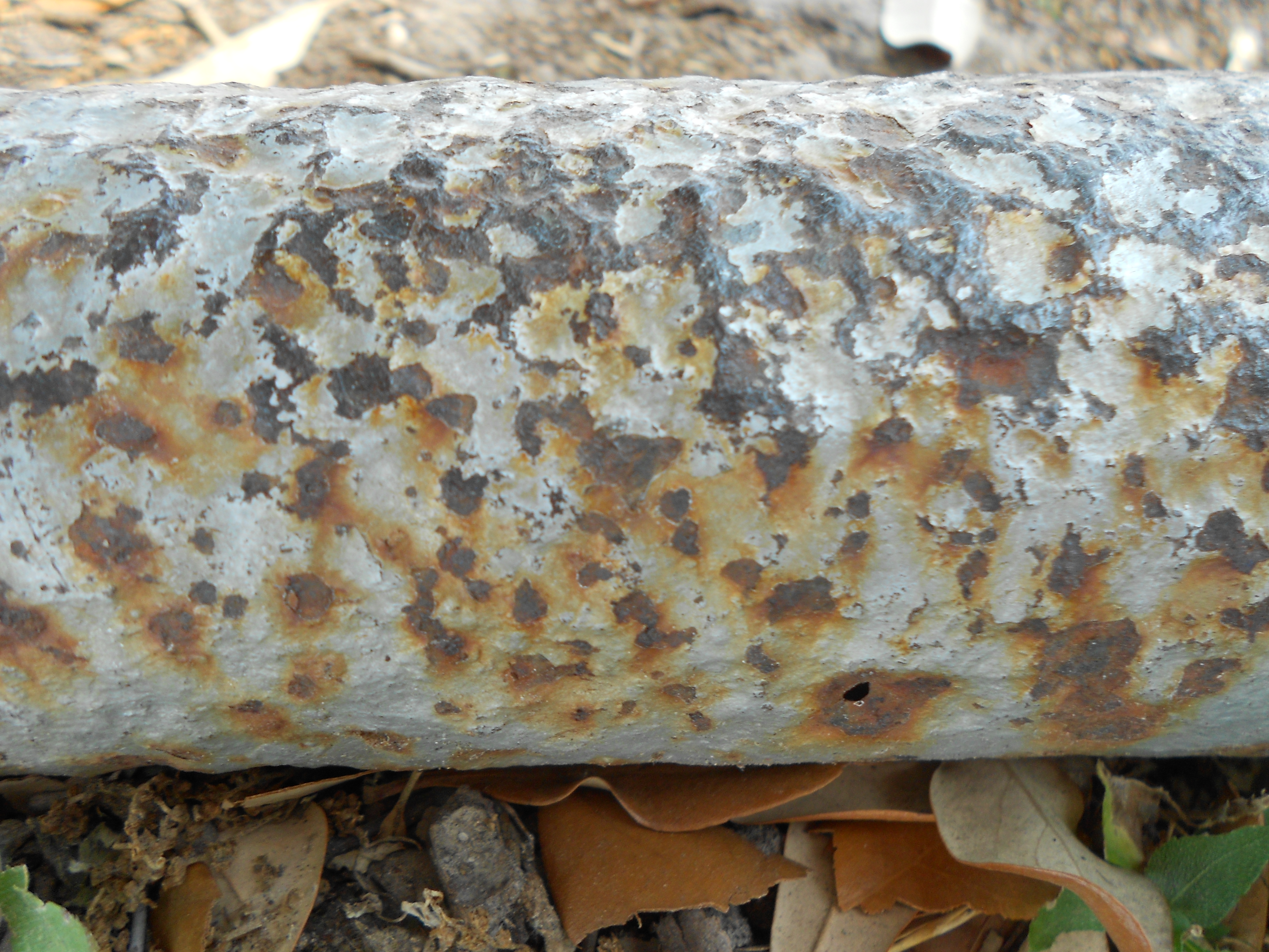
In this instructable, you'll learn to use some basic teachniques and tools to create a really awesome looking picture.
You'll need:
And that's it. So let's get started...
Oh yes! Don't forget to save and save often!
Helpful Shortcuts:
Ctrl+D - Deselect
Ctrl+Z - Undo once
Ctrl+Alt+Z - Undo Multiple times
Ctrl+I - Inverse color
Ctrl+T - Transform
Ctrl+Click on a layer - select the layer content
Shift+Draw - Create Straight lines
F5 - Brush window
Open Bracket - Make brush smaller
Close Bracket - Make brush larger
Alt+click on mask - Only show mask
You'll need:
- Photoshop - I'm using CS5.1
- A portrait or picture of someone with good lighting and background - We don't want too many face shadows or background clutter that's hard to remove - I'm using a picture of Adam Young from the internet
- A neat texture - I'm using a picture of a rusted bench leg
And that's it. So let's get started...
Oh yes! Don't forget to save and save often!
Helpful Shortcuts:
Ctrl+D - Deselect
Ctrl+Z - Undo once
Ctrl+Alt+Z - Undo Multiple times
Ctrl+I - Inverse color
Ctrl+T - Transform
Ctrl+Click on a layer - select the layer content
Shift+Draw - Create Straight lines
F5 - Brush window
Open Bracket - Make brush smaller
Close Bracket - Make brush larger
Alt+click on mask - Only show mask
Work on the Person
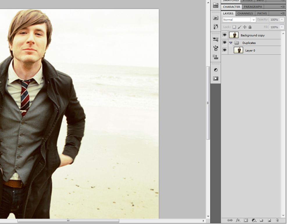
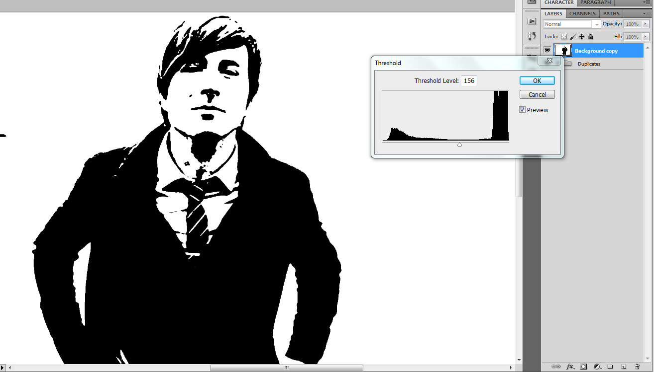
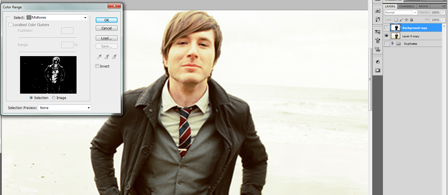
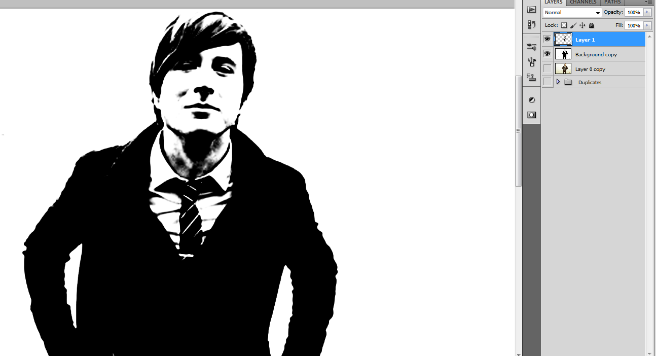
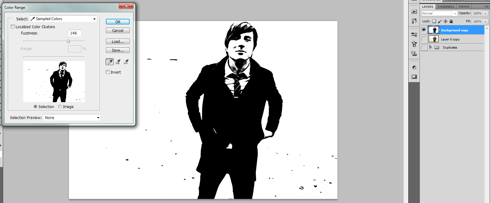
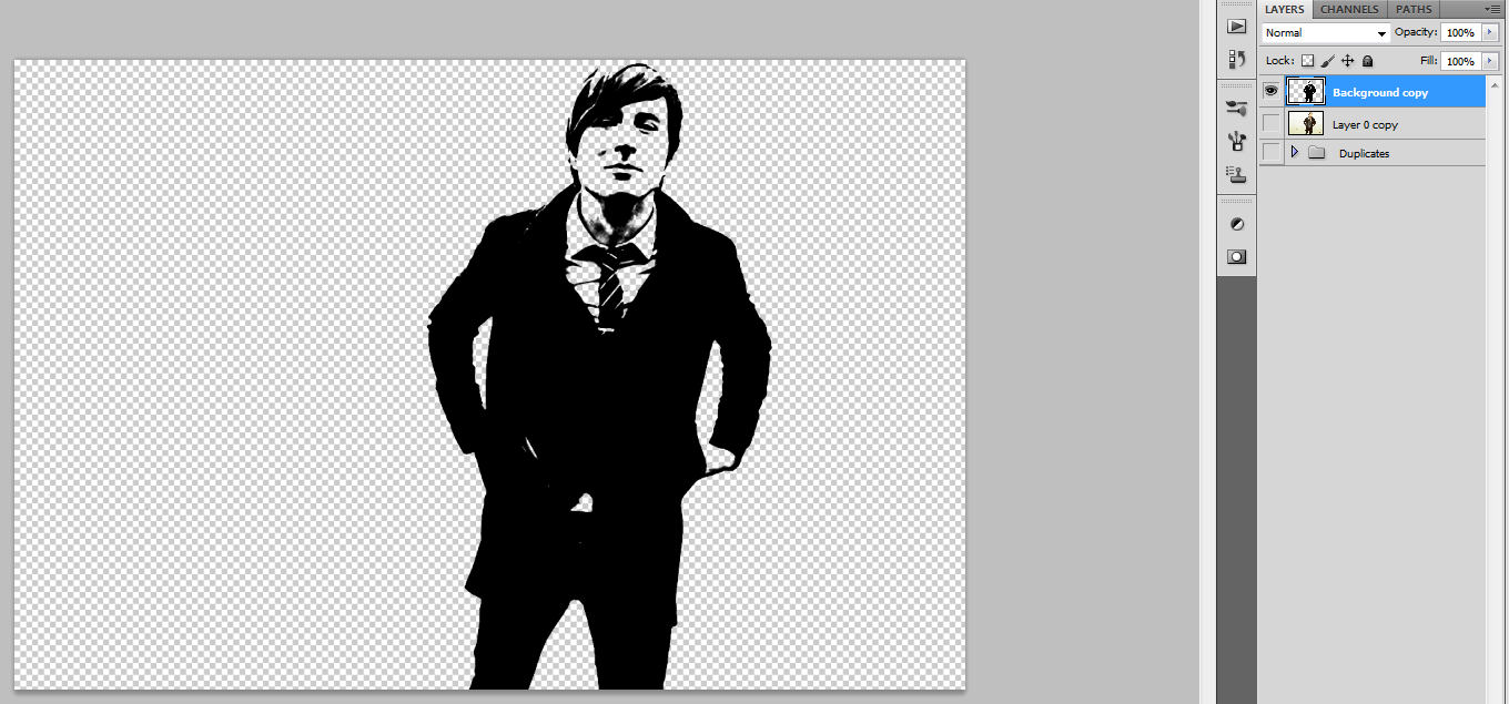
Before doing any work to the photo, it was a little pixelated, so I went to Image>Image Size and changed the resolution to 300.
First thing we want to do is duplicate the person layer and put it in a duplicates group so that we can always go back to the originals if we need.
Next, go to Image>Adjustments>Threshold and find a level that provides detail to the face and clothing of the subject, but doesn't block out the features. I set the level at 156.
To add some depth to the subject, go to Select>Color Range and set the selection for Midtones. Then with the midtones selected, go to Edit>Fill and fill the selection with black. Merge the Midtones and Threshold layers.
We don't want the white background that came with the threshold setting, nor do we want the black spots from the sand in the picture or any other background clutter. To get rid of the white, go to Select>Color Range again and set the selection to sampled colors and sample the white background. With the white selected, hit delete. To get rid of background clutter, erase with eraser.
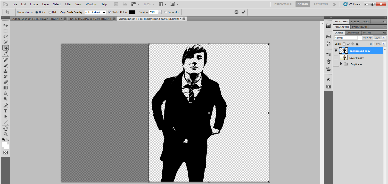
I didn't like all the space on the left side of the subject, so I cropped the picture with the crop tool.
Background
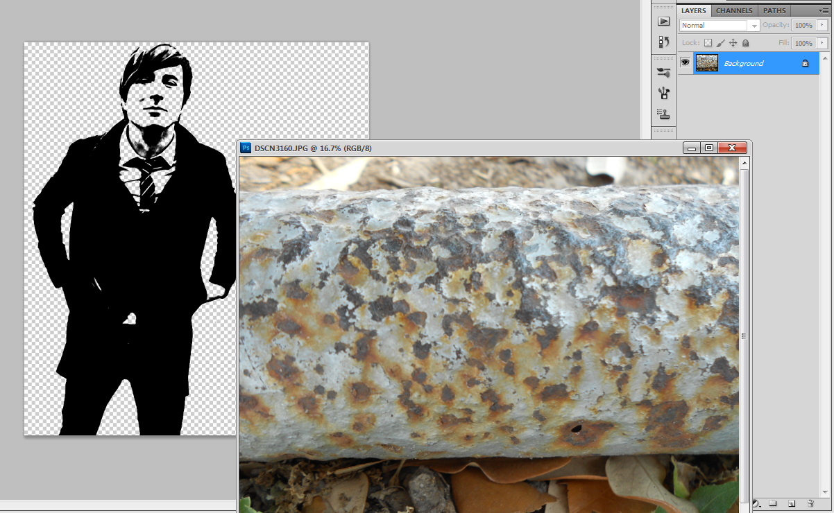
And now we will begin on adding to the picture.
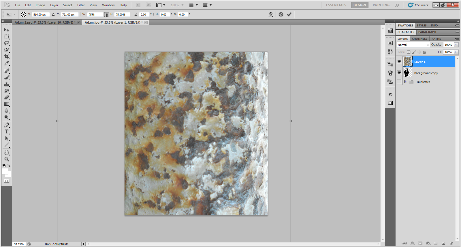
If you choose to use the rusted bench photo that I am providing, please so not use it commercially as it is my own. You should be able to just right click on the photo in the intro and save it to your computer to use. Open it up in Photoshop and drag it into the file we're working on.
I wanted the texture of the bench leg to be vertical and cover all behind the subject so I went to transform, rotated it 90 degrees cw and adjusted it to fit how I wanted.
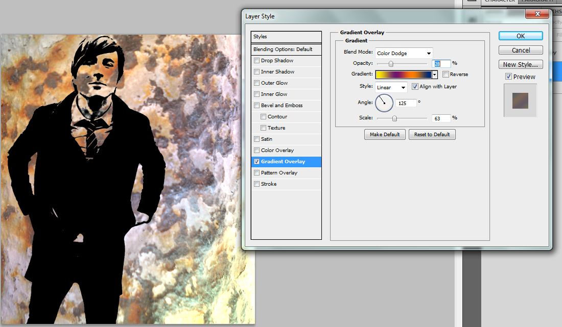
I also wanted the background to have some color, so I right-clicked on the background layer and went to Blending Options>Gradient Overlay and used the following settings:
- Blend Mode: Color dodge
- Opacity: 28%
- Gradient: Yellow-Purple-Orange-Blue
- Angle: 125 degrees
- Scale: 23%
Adding Color
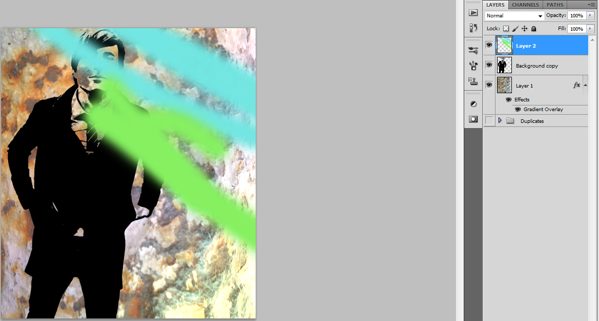
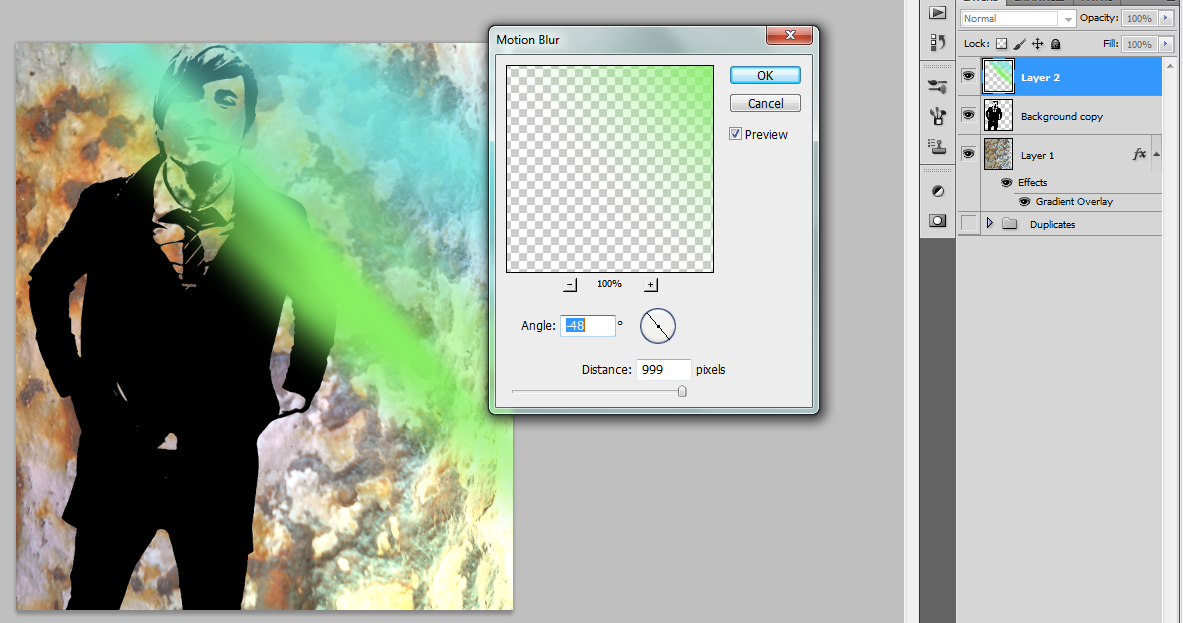
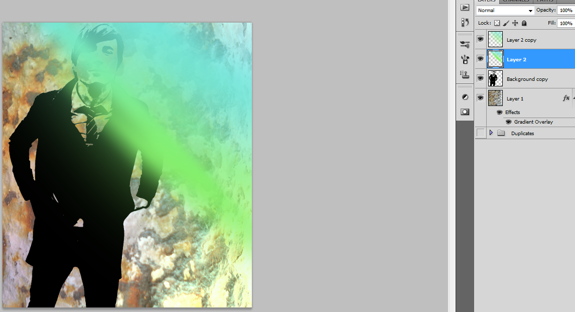
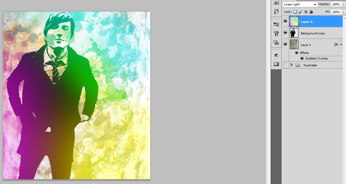
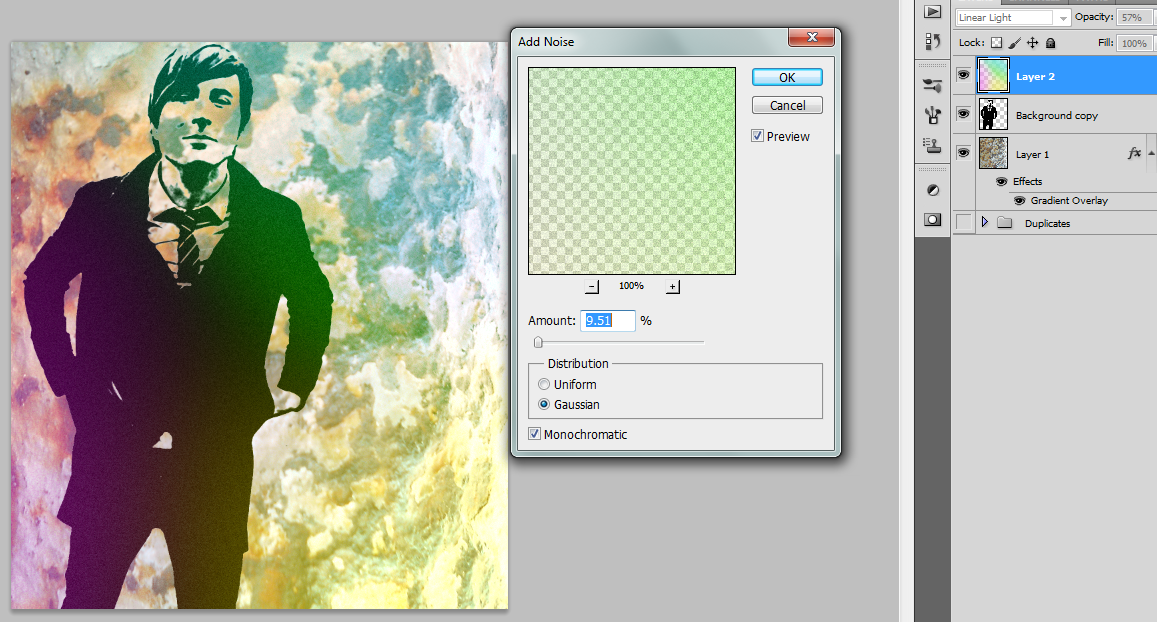
We want to add some nice, bright colors to the photo, so grab the brush tool and set it around 100 px and scribble some blue and green in the upper right hand corner. To spread the color out, we're going to blur it with Filter>Blur>Motion Blur and set the angle close to the angle of the scribbled lines and the distance pretty big. You can duplicate the layers here for more spread, then apply Filter>Blur>Gaussian Blur to both the layers.
Repeat with a purple on the left side and yellow in the bottom right side. Merge all the layers together. For a neat effect, go to Filter>Noise>Add Noise. Hit the monochromatic button on the bottom, Gaussian distribution, and add just enough noise that you can tell it's there. I set mine to 9.51%.
Set the blending mode to something like Linear Light or what you think looks good.
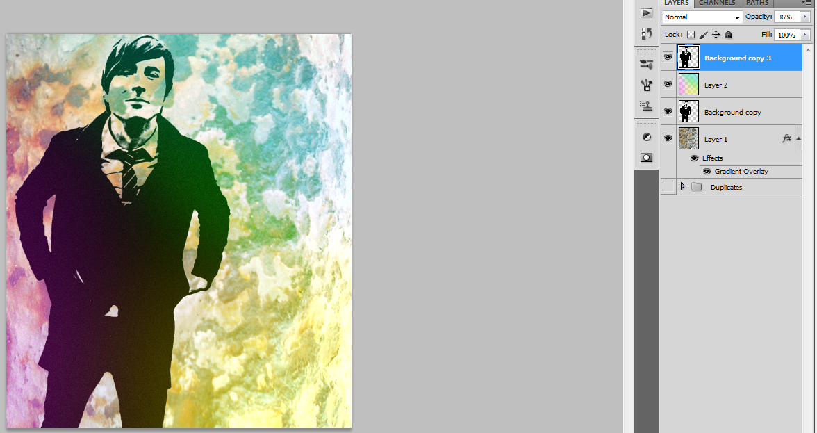
Copy the layer with the subject on it and put it above the colors layer with a low opacity. This is so the subject will stand out more.
Colors I used:
- Blue: 72e6e2
- Green: 86f061
- Purple: f48af3
- Yellow: eeec65
Reflection Lines and Embelishment
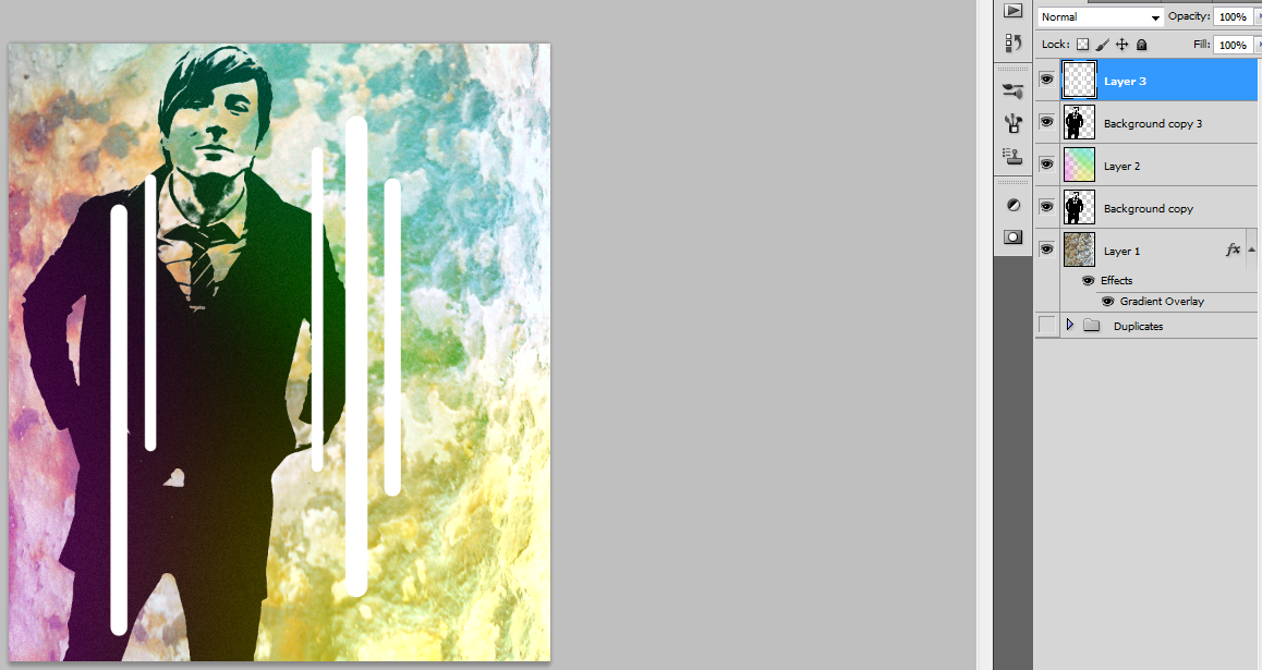
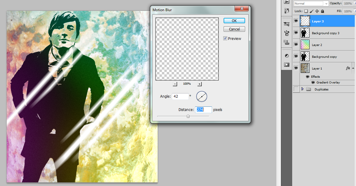
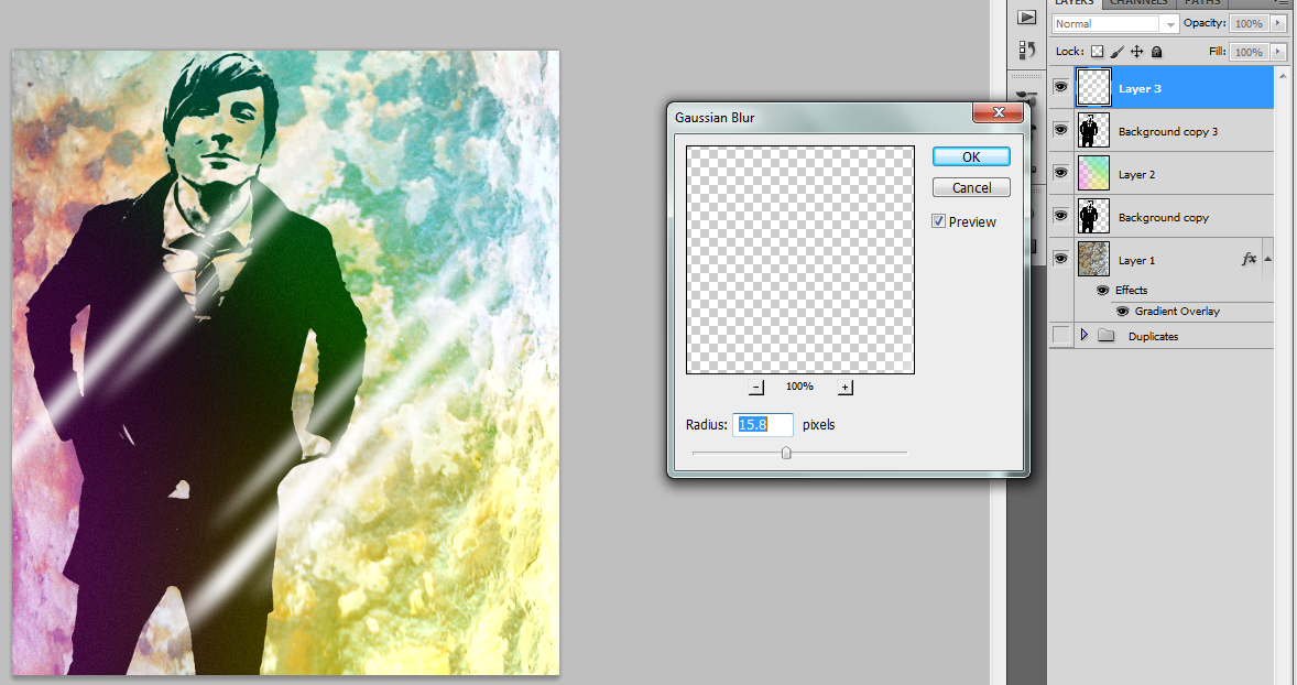
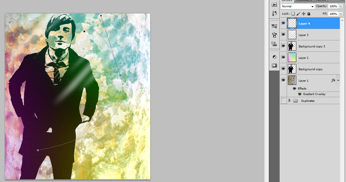
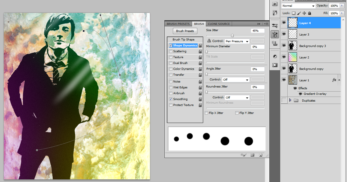
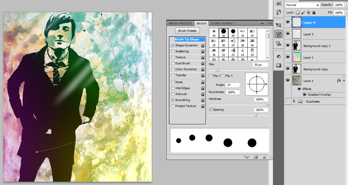

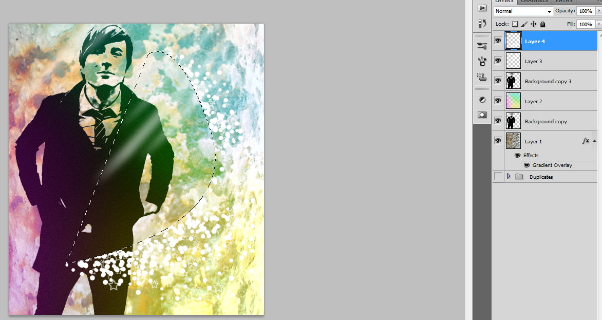
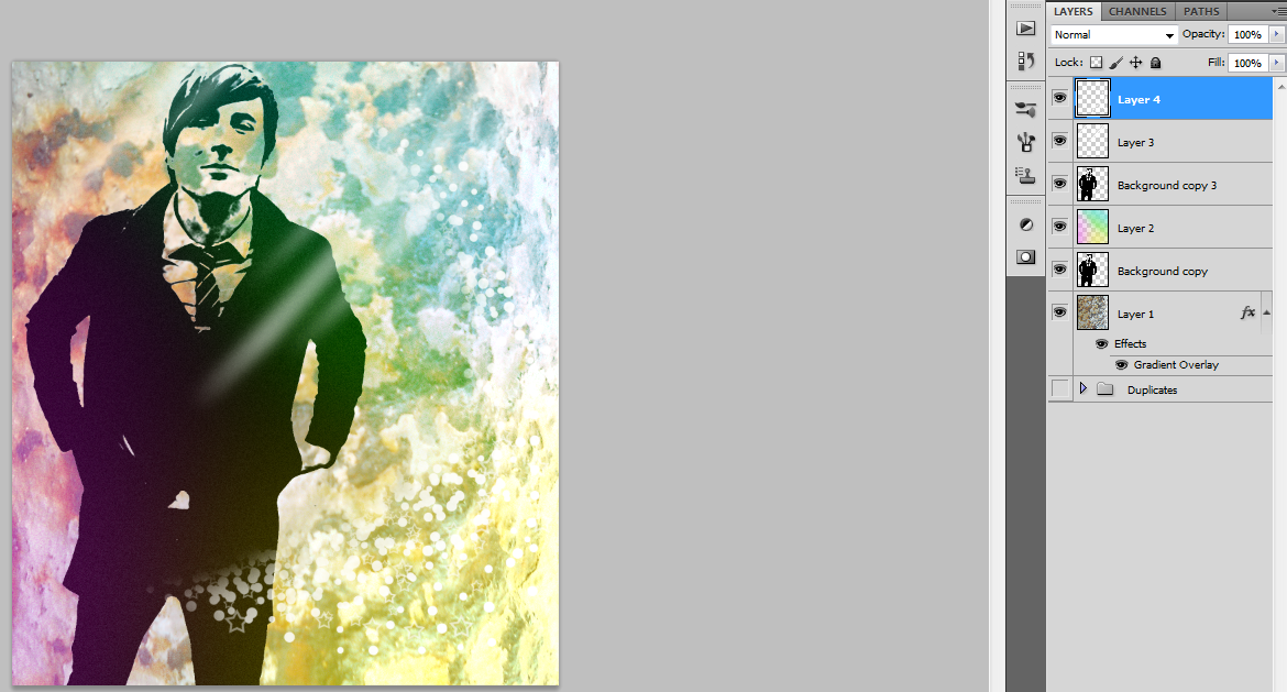
Just as some cool little add-ons, we're going to add a reflection and a string of dots and stars.
To make reflection lines, use the shift key to draw vertical lines of varying sizes, then rotate them 42 degrees. We're going to blur them twice, once with Motion blur- Angle 42 degrees, Distance 274 px - and again with Gaussian Blur - Distance 15.8 px. Then set the layer opacity to 50% so they blend better and position them to work with the subject.
To make the string, first use the pen tool to create a curve that you want the dots and stars to follow. Then, select a circle brush with 100% hardness. Go to the bush tab on the right tool bar or hit F5 and adjust the Size Jitter under Shape Dynamics to about 45% and set the spacing to about 282%. Paint on a bunch of dots along the line and repeat the process with the star brush. I put less dots and stars towards the end of the line and more in the middle.
Once you've put the stars and dots on, go to Channels and ctrl+click the pen line that you made. Delete everything inside the selection and deselect. Use a soft brush to soften the edges of the string.
Masks
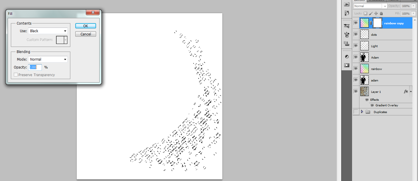
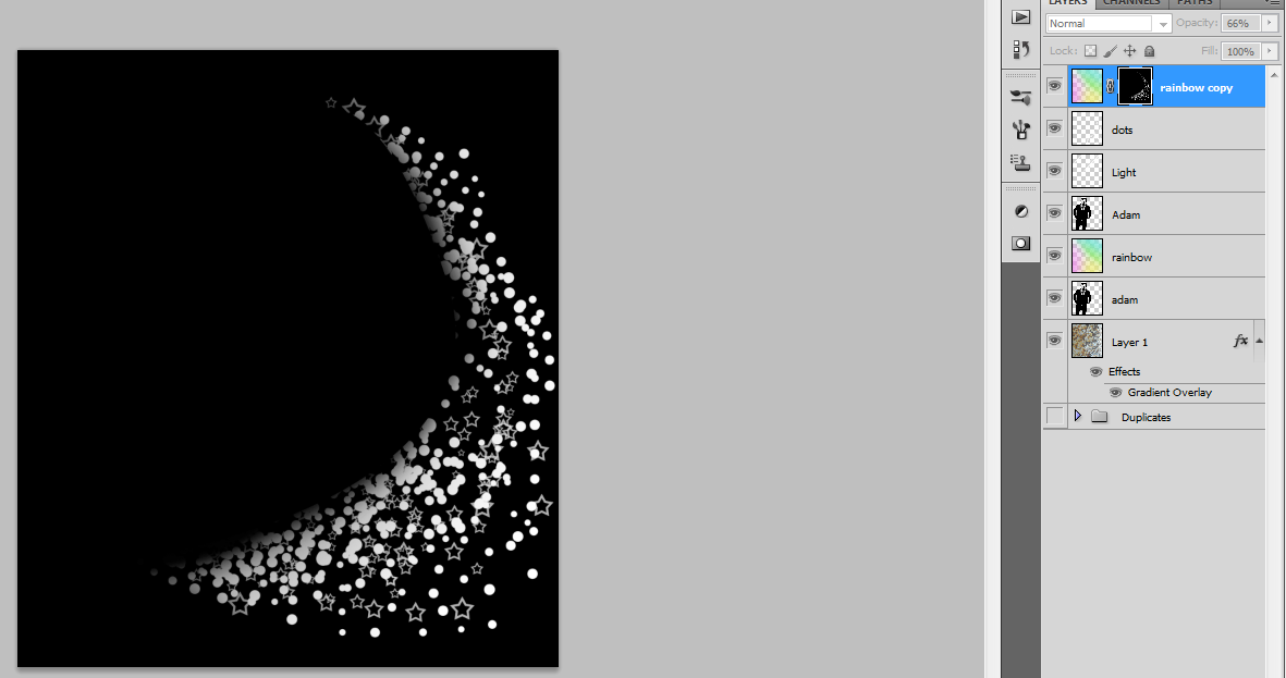
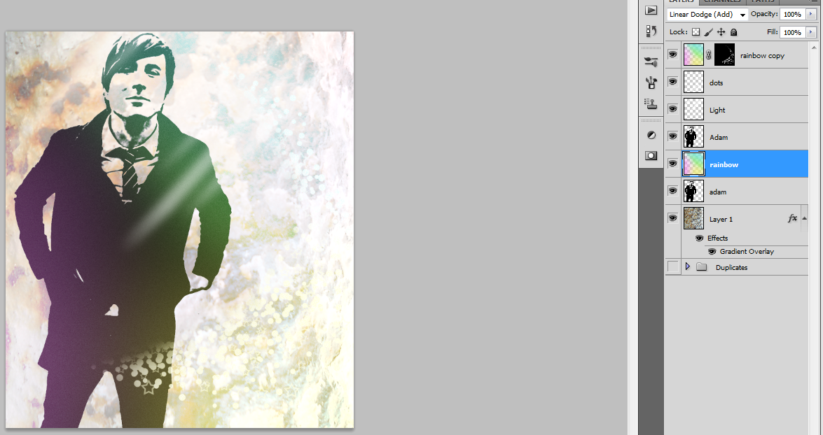
Just a quick thing on masks. We're going to use the string we made just a minute ago and do some stuff with it.
Above all the other layers, duplicate the rainbow colors layer. Then go down to the bottom of the layers window and look for an icon that looks like a black rectangle with a white circle cut out. Click it with the duplicate rainbow layer selected. This should give the layer a mask. Masks enable us to show only certain things. In this case, we want the rainbow to only show through the string. Hint: White shows, Black hides.
So, ctrl-click the string layer to get all it has selected, then Alt+click the mask to only show it. My mask appeared white at first, so I'm going to either fill it with black or go ctrl+I to invert the color, then deselect. Since we only want the string to show color, I inverted the color to show the string as white.
Adding Words
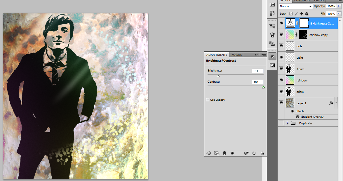
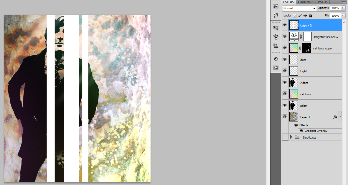
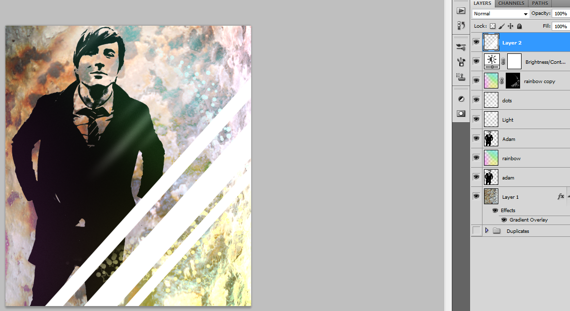
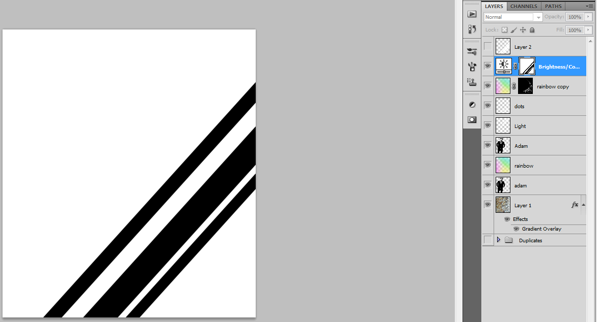
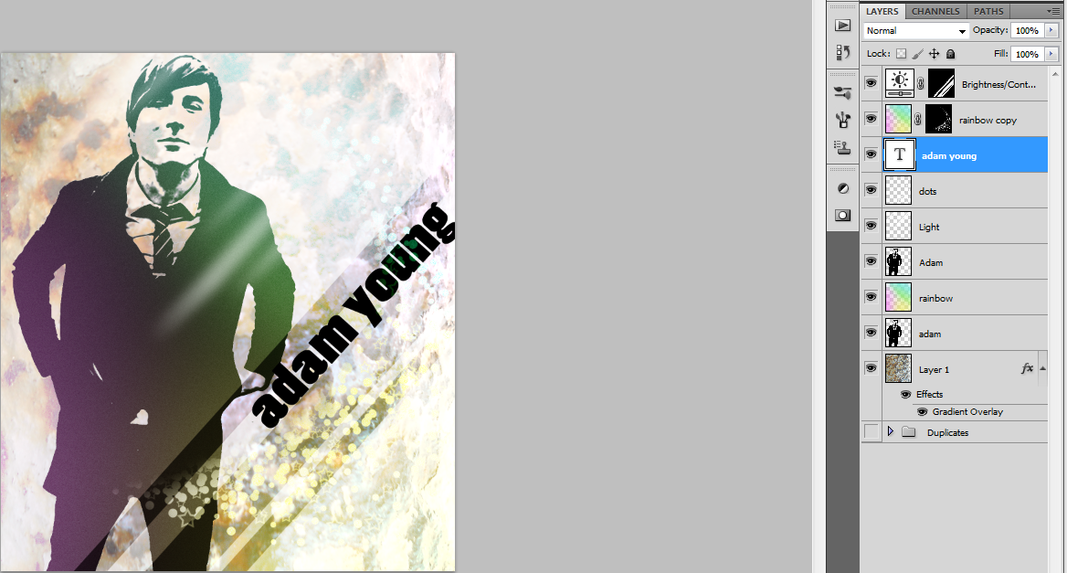
I wanted to add my subject's name and band name, but I wanted to make it look cool at the same time. So, we're going to do some more mask work.
I'm going to mask an adjustment layer. So, go to the bottom of the layers panel or go to Layer>New Adjustment Layer and select Brightness/Contrast. Put the layer above everything and set the Brightness low and the the Contrast high.
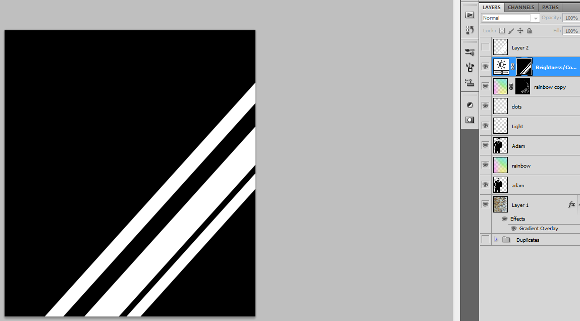
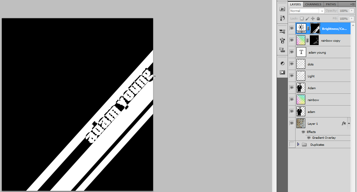
Create a new layer above everything and add some vertical lines of varying sizes (I used 80px, 150 px, and 60 px.). Turn them 42 degrees and postition them nicely. Now ctrl+click the lines layer and Alt+click the adjustment layer mask. Fill the lines selection with black and invert the entire mask so that the lines are white and the background is black. Now only the area with the lines will be affected by the adjustment layer. You can delete the lines layer.
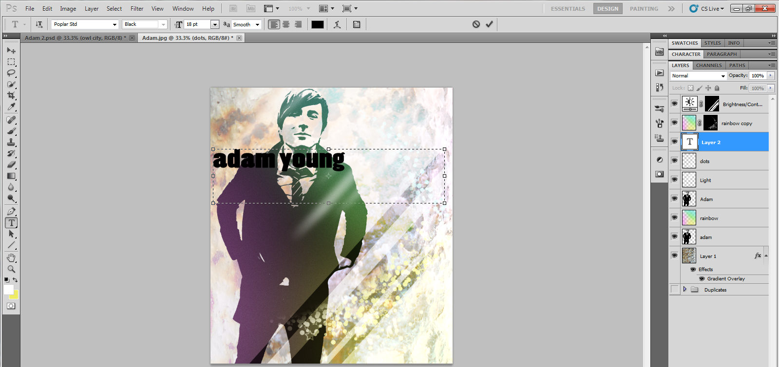
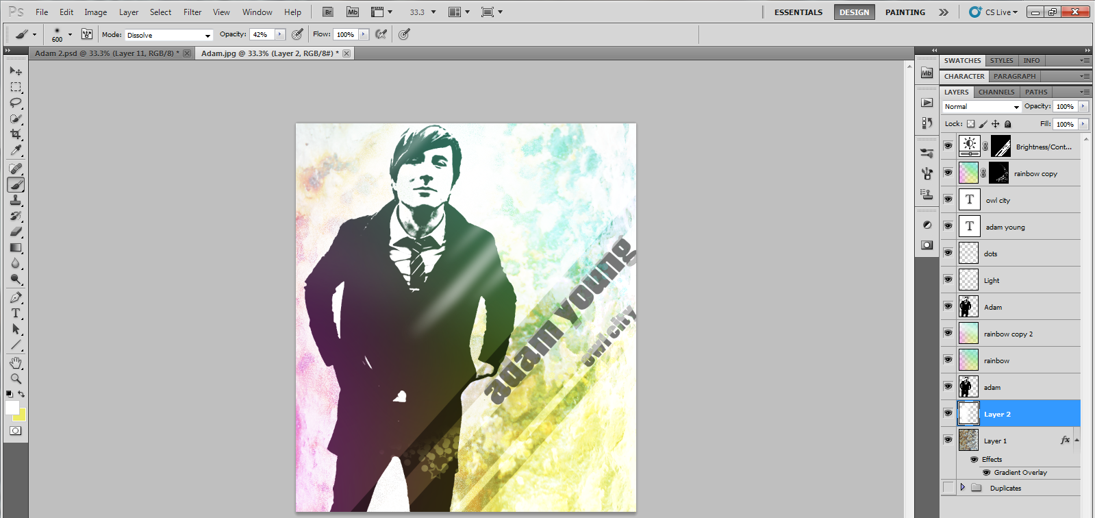
Now type the words you want to use (my font is Poplar STD) and rotate them -48 degrees. align them to sit along one of the lines and adjust the size to where the words overlap with the lines. ctrl+click to select the words and alt+click on the adjustment mask. Without deselecting, invert the color of the selelction. Where the words overlap the lines should appear black while the rest should be white. I repeated this with the band name on the lower line. Keep the words layers and lower their opacity to 25% so that they can help the words to stand out.
That's About It...
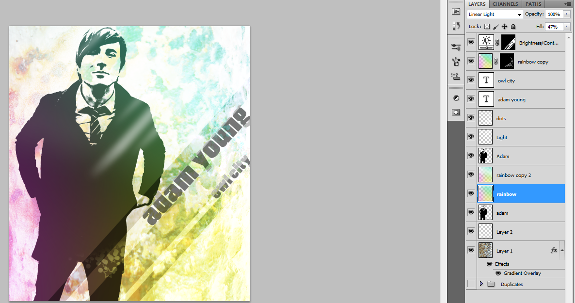
Alright, there's the finished product. I played around with the layers and blending modes a bit to see if I could lower the intensity of the color a bit.
If you have any questions, leave them in the comments and I'll try to help. Thanks!
If you have any questions, leave them in the comments and I'll try to help. Thanks!