Use Blender and Illustrator to Make Cool Technical Drawings
by theerikjohnson in Design > Digital Graphics
22893 Views, 23 Favorites, 0 Comments
Use Blender and Illustrator to Make Cool Technical Drawings

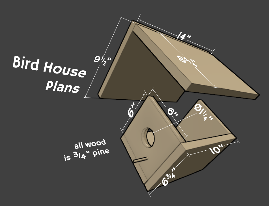
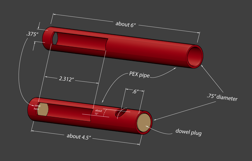
Here’s a technique I’ve been using lately in designing and sharing some of my projects. I received a few comments about how I made the diagram in my Passive Victrola iPhone Amp Instructable.
With this technique, technical labels and dimensions can added to a 3D image of your product or project. But with a couple of slick tricks we can make the text itself 3D and appear to be in the 3D space and not slapped on the surface afterwards. This can help to explain some tricky parts of your design or just make it look cool. The example above shows what I mean; I borrowed the designs from two cool Instructables that can be found here and here. I use Blender and Adobe Illustrator for this.
This is just a basic outline of this technique. I’ve gone into more detail in a blog post here for those looking for more.
In Blender - Part 1
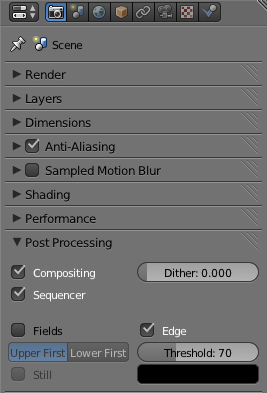
I use Blender these days to design projects. Its a free, open-source 3D modeling and animating program. There are a two main things I do in Blender to get the look of this technical drawing.
1. In my render settings of the scene, I check the “Edge” box in the “post processing” section of the properties panel. Then I mess around with the “Threshold” number until I get the edge lines I like.
1. In my render settings of the scene, I check the “Edge” box in the “post processing” section of the properties panel. Then I mess around with the “Threshold” number until I get the edge lines I like.
In Blender - Part 2
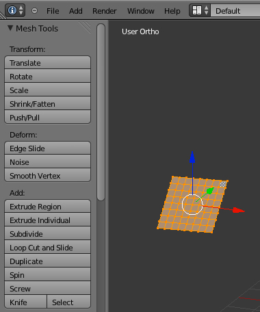
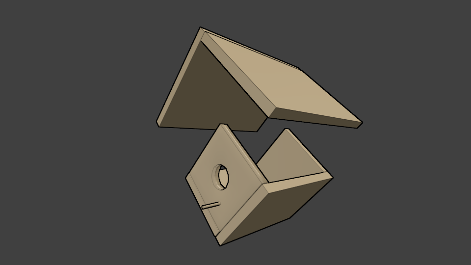
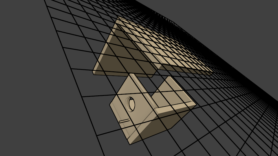
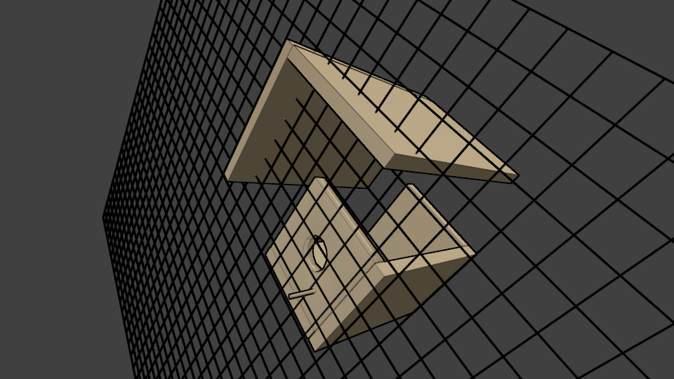
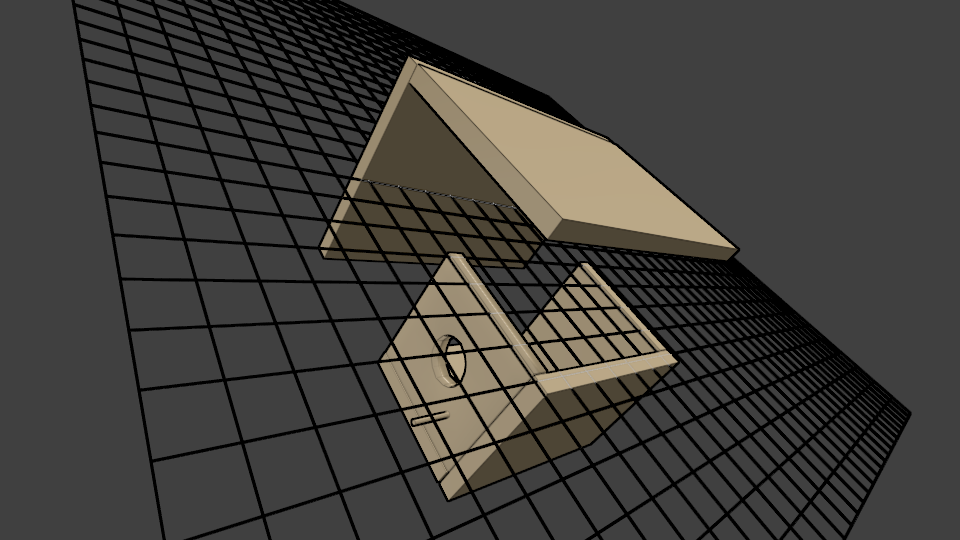
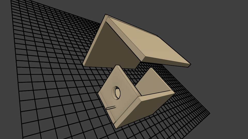
2. This the real key to this here technique, I think. I make multiple renders of the scene to use in Illustrator. One render is the one that appears in the final image. The others have grid objects that are arranged as guides for the text in the next step. I simply use a plane mesh, subdivided enough times to get a good grid. The material is then set as a wire type so its a grid when it’s rendered.
In Illustrator

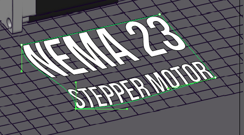
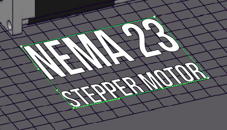
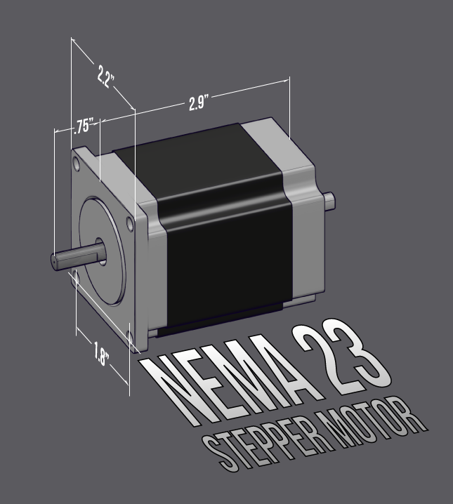
With my multiple renders from the last step, I place each of them in the bottom layer of a new file in Illustrator. The render that has no grid is on the top. I can toggle the visibly of these layers to reveal the grid I’d like to use to arrange text and lines with in the perspective of the scene.
I format my text as wanted and then use the “Envelope Distort” with a Mesh option to adjust the perspective of the text so it follows the grid lines. When all the text is as I want it, I toggle the non-grid render and export the final image.
I format my text as wanted and then use the “Envelope Distort” with a Mesh option to adjust the perspective of the text so it follows the grid lines. When all the text is as I want it, I toggle the non-grid render and export the final image.