Hand-drawn Typography Wall Art
by emilyvanleemput in Design > Art
3533 Views, 37 Favorites, 0 Comments
Hand-drawn Typography Wall Art
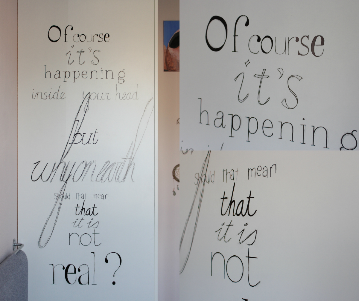
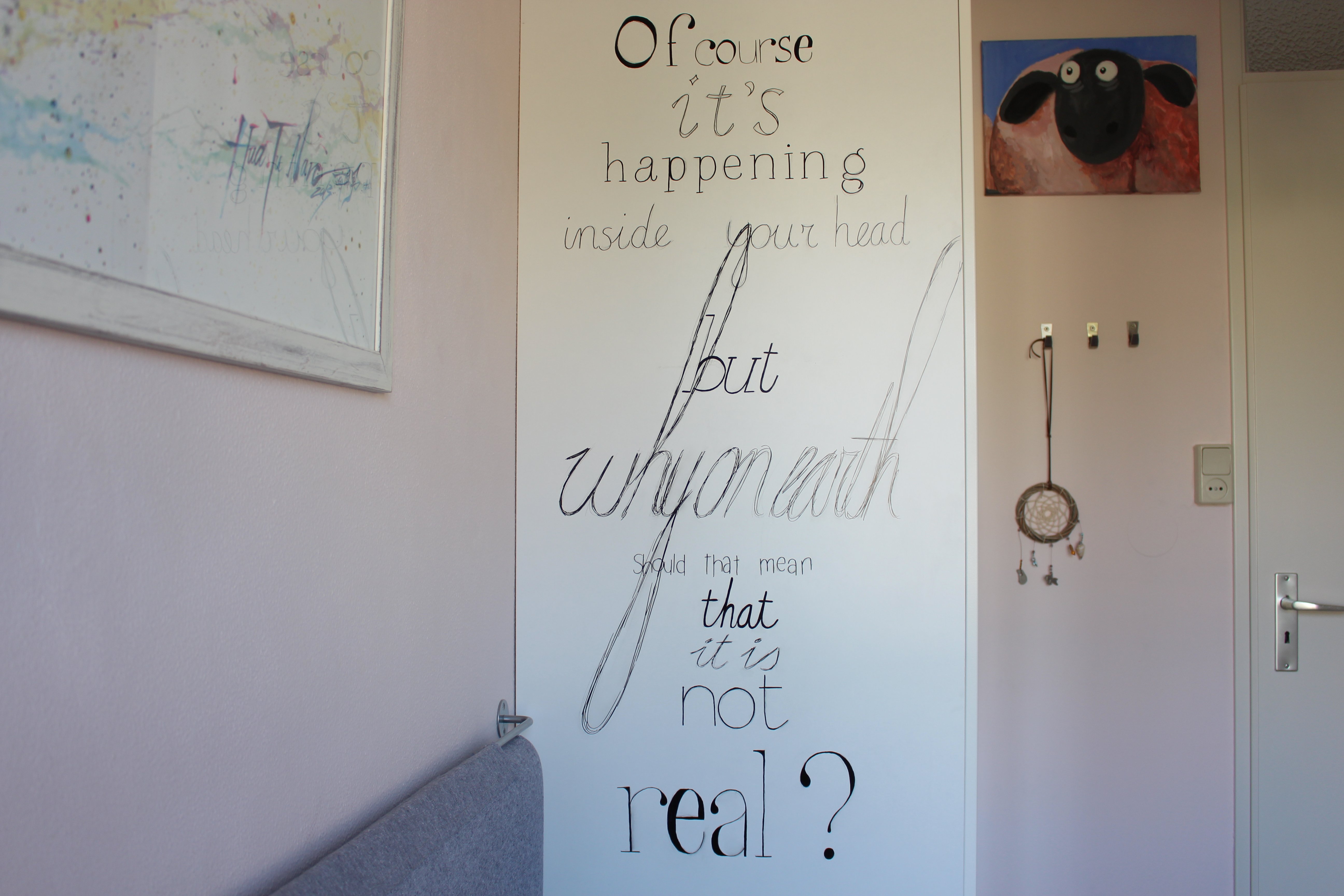
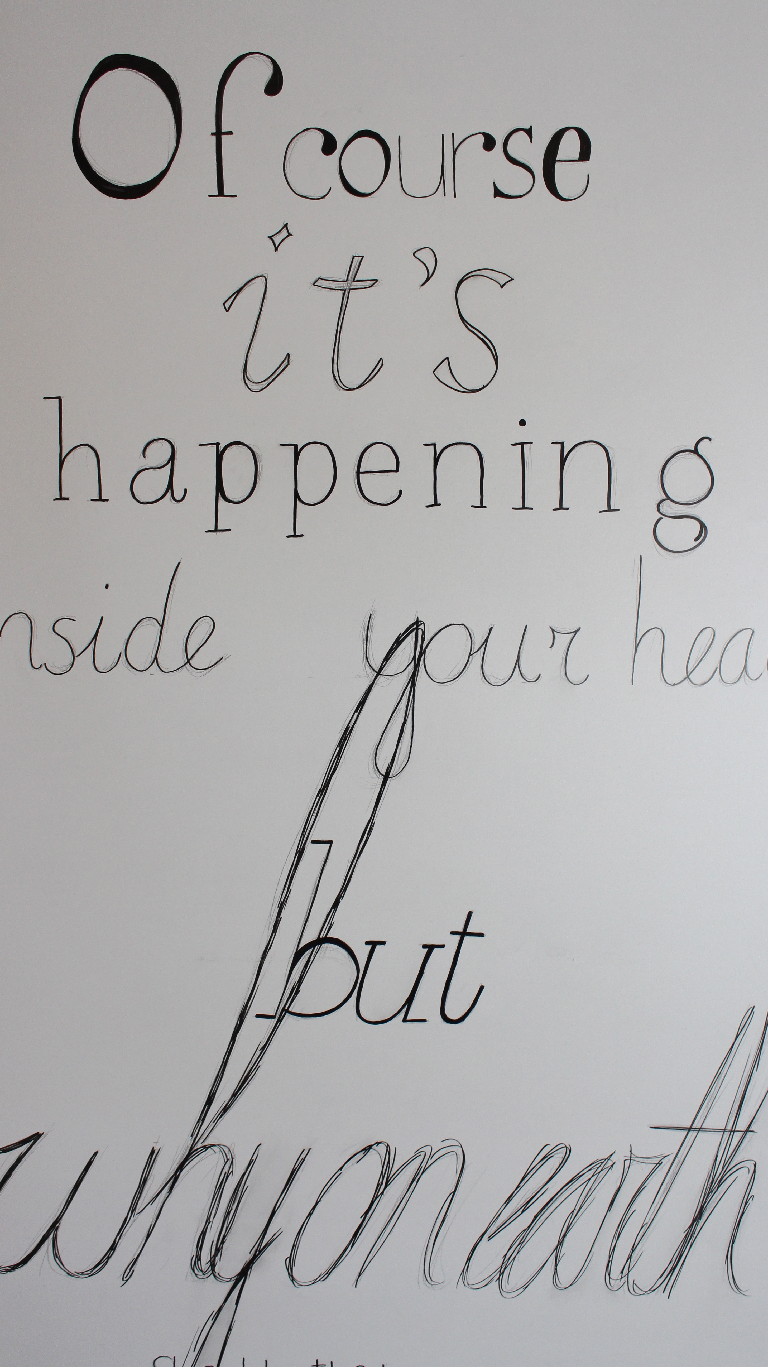
Okay, it has got to be said, I absolutely love typography. Until now, however, I've always stuck to my sketch book, pencil and fine-liners. I've tried capturing the how-to of those drawings in an instructable, but it just didn't work. A few months ago, I decided to scale it up a bit!
After replacing my fine-liners for permanent markers and finding the perfect Harry Potter quote to go along with this project, it was time to get started. And let me tell you: sketching becomes a lot harder when you can't control the position of your canvas ; ) Once the sketch was finished, I didn't immediately move on to the markers. Instead, I kept it in pencil for a few weeks, simply to see if I'd still like it once it was up for a while.
Today, talking about the day I'm typing and publishing this instructable, I just decided to go for it. I'm so happy with how it turned out, I love the quote I chose and the time it took was most definitely worth it : )
Materials
To create something like this, you'll need:
- pencil
- eraser
- something to measure with
- sketch paper
- masking tape
- permanent markers
- small sponge
- old dishcloth
- a wall
The Right Area
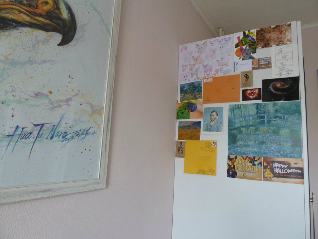
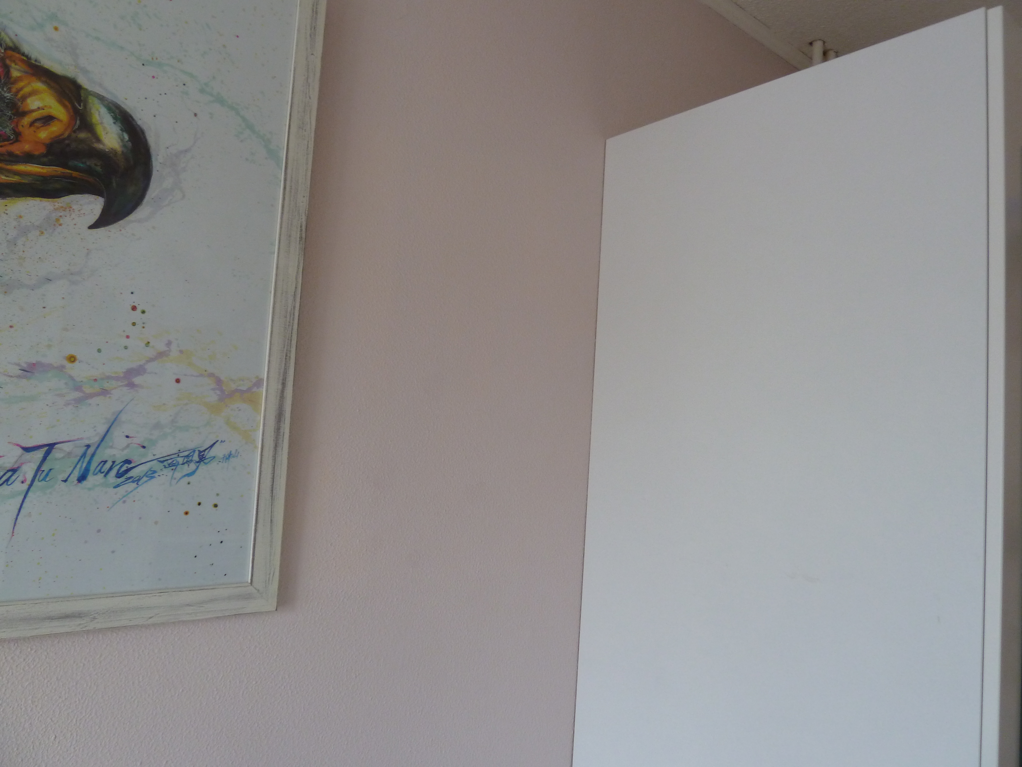
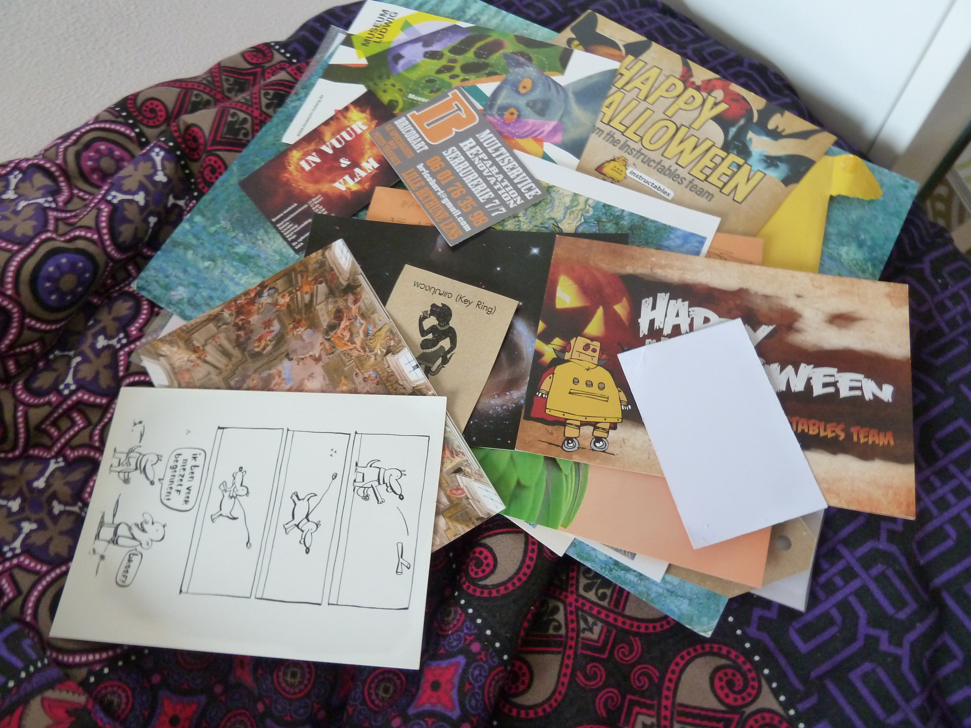
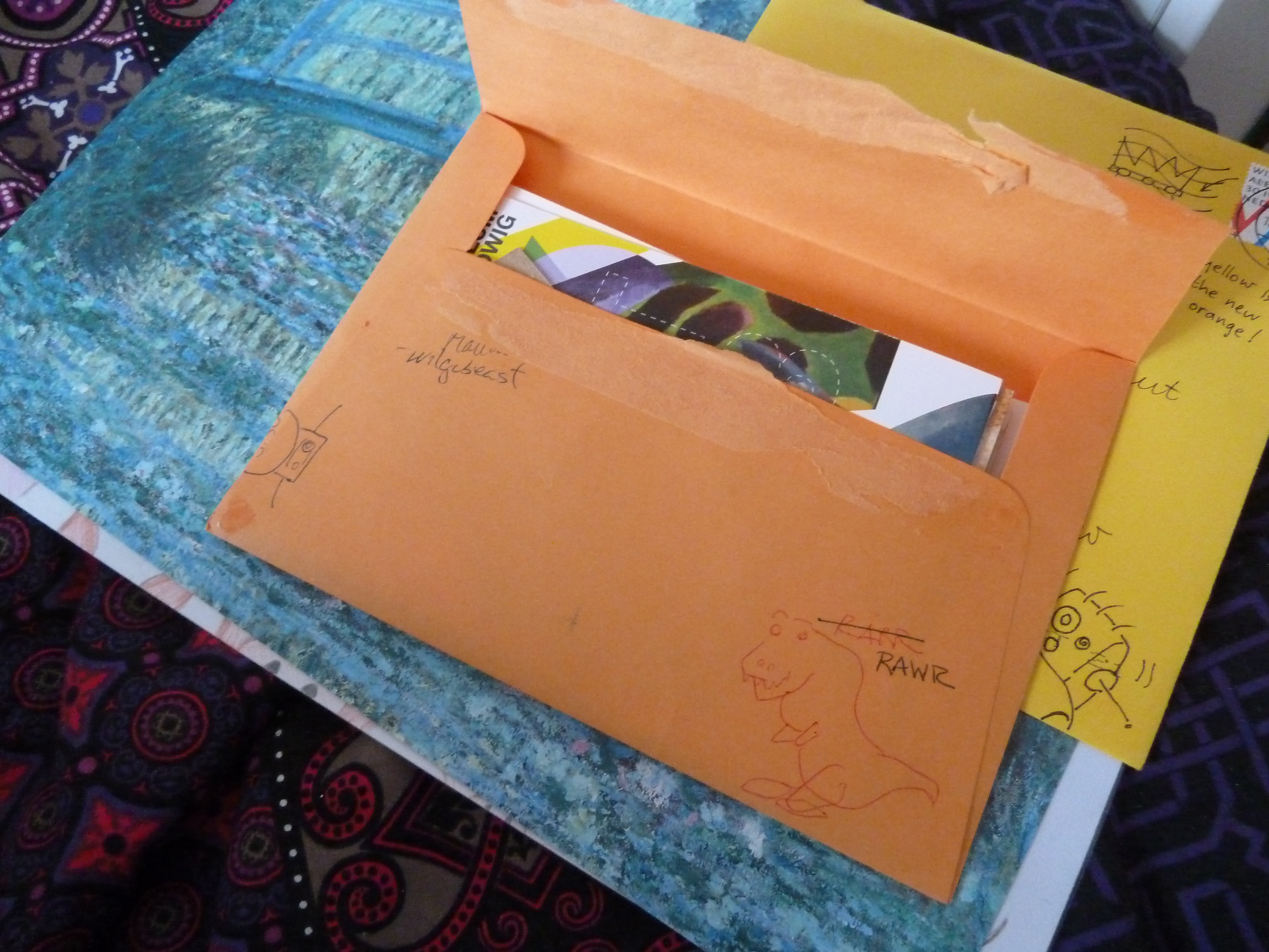
Alright - I've got to be honest: in technical terms this isn't wall art, it's closet art.
For the past few years, I've been using the side of my closet to collect all kind of stuff on. Post cards, Halloween cards, business cards, anything. Unfortunately I never got it to look the way I wanted. A few months ago I got the idea of drawing a quote on it, and then this happened!
Make sure to clean the area you'll be putting this on before starting on it, it will save you a whole lot of trouble! Basically any place will do, but do keep in mind that different backgrounds might require different materials.
Choosing a Quote
This might be one of the hardest steps of this entire instructable. The first thing to keep in mind is that you'll probably be looking at this on a daily basis. Choose a quote you don't just like, choose one you absolutely love, one that really means something to you. There are tons of sites with quotes, be sure to browse a few if you're not sure about a quote!
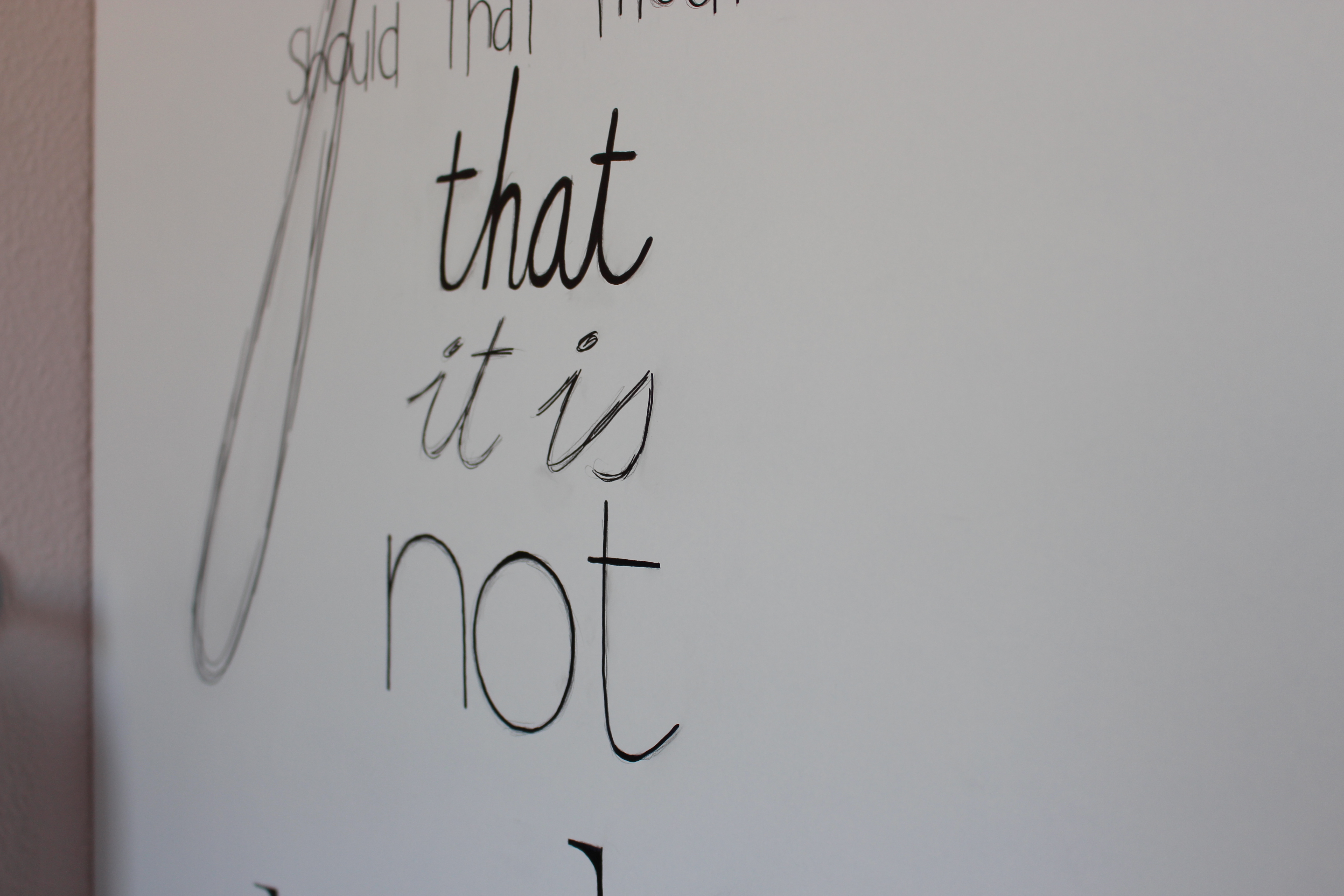
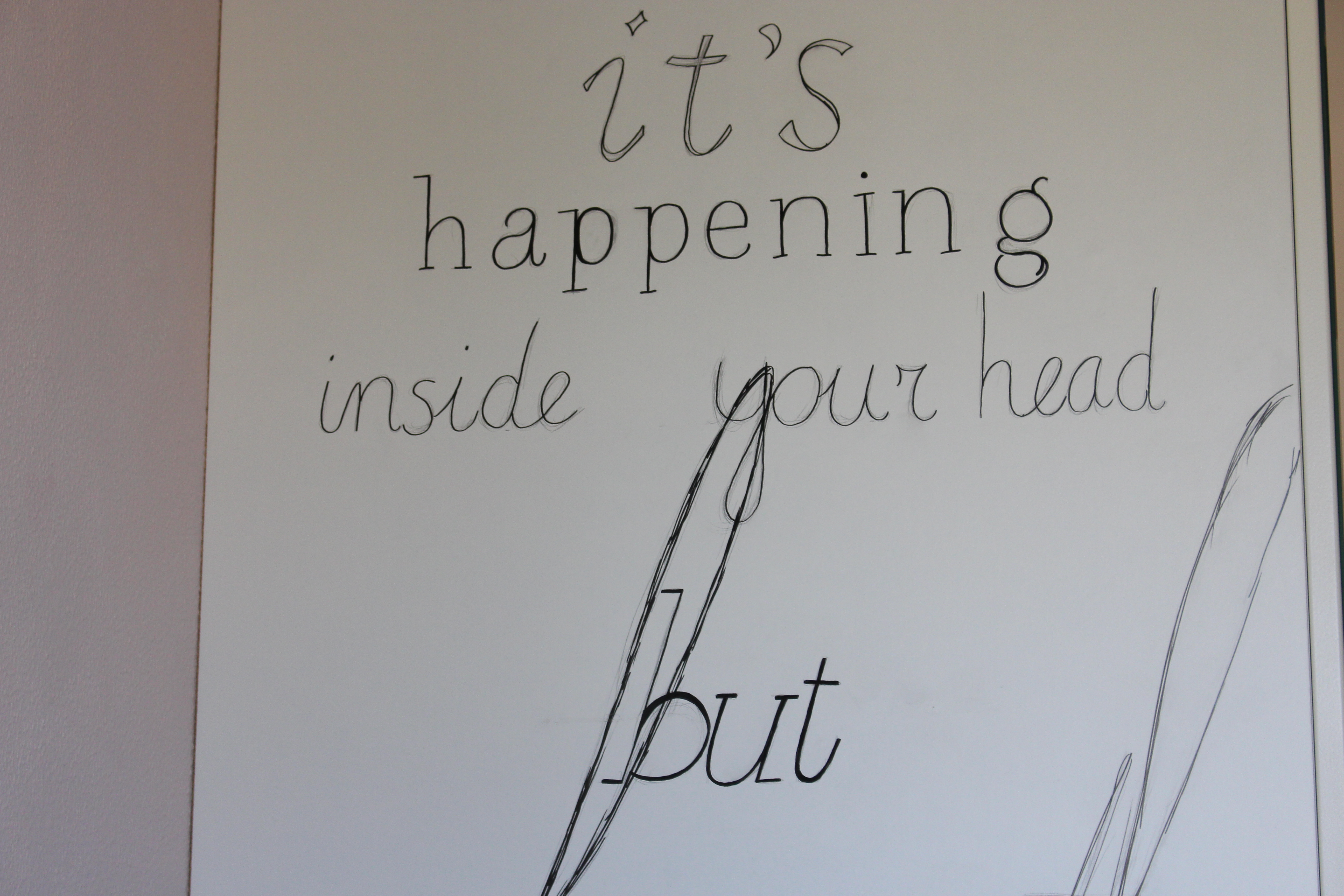
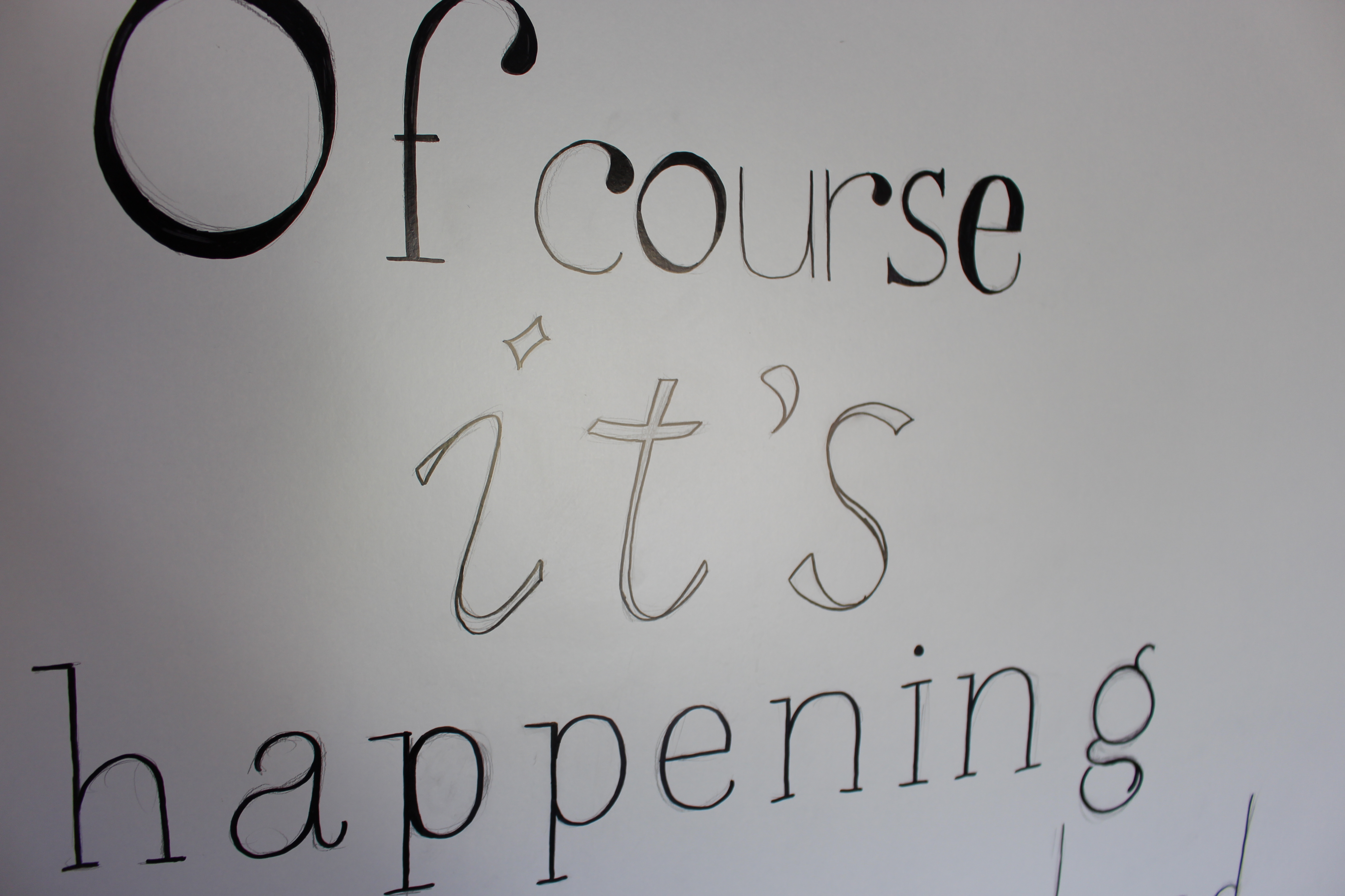
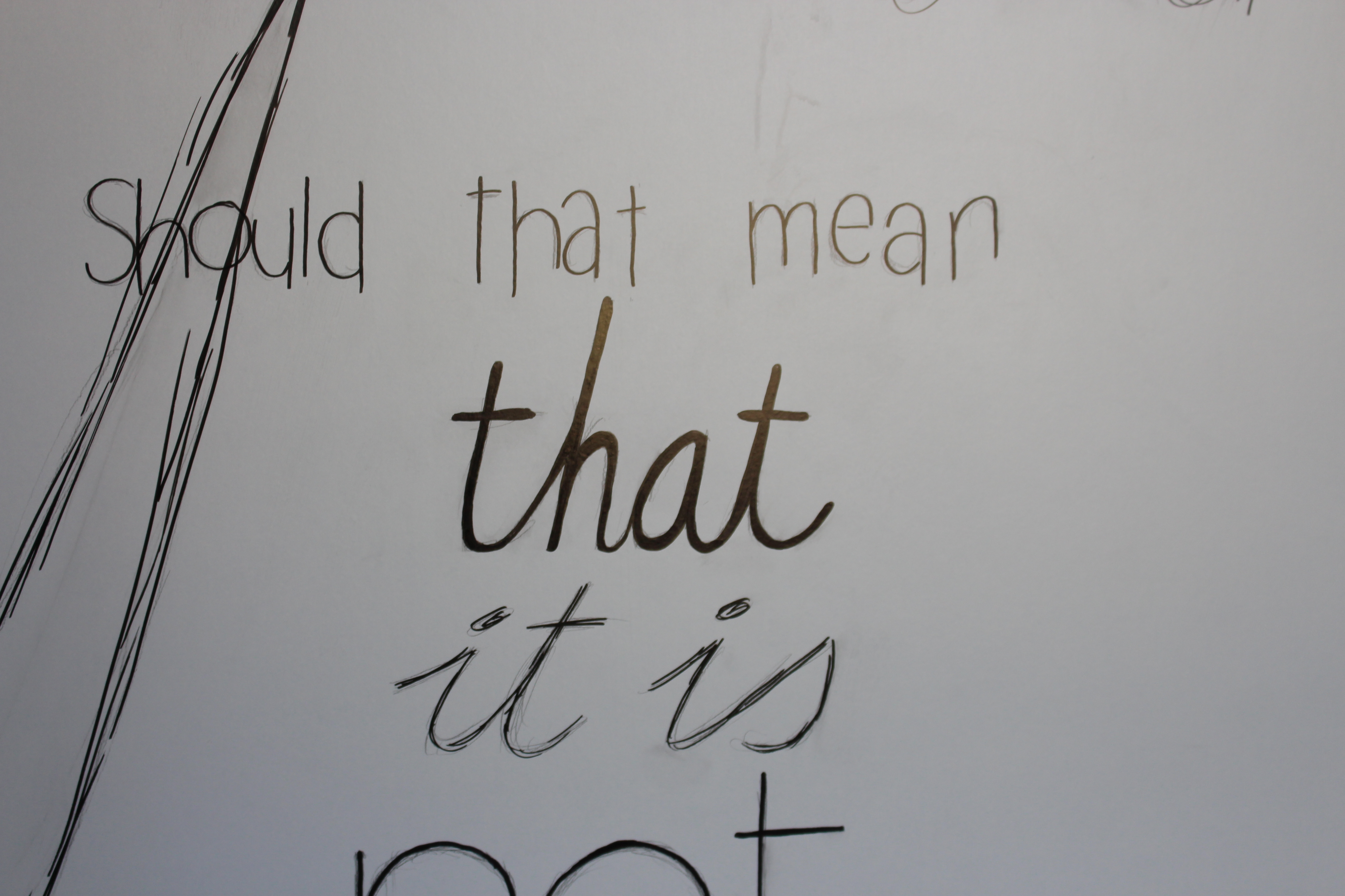
One thing I was sure about was that I wanted to use a Harry Potter quote (though I did also consider a few quotes by J.R.R. Tolkien). I put a few I really liked on a piece of paper and just started staring at them. I wanted it to be Harry Potter, yet not too obviously. I wanted it to be long enough, but not too long. And then I knew what it was going to be. Of course it's happening inside your head, but why on earth should that mean that it is not real?
Sketch
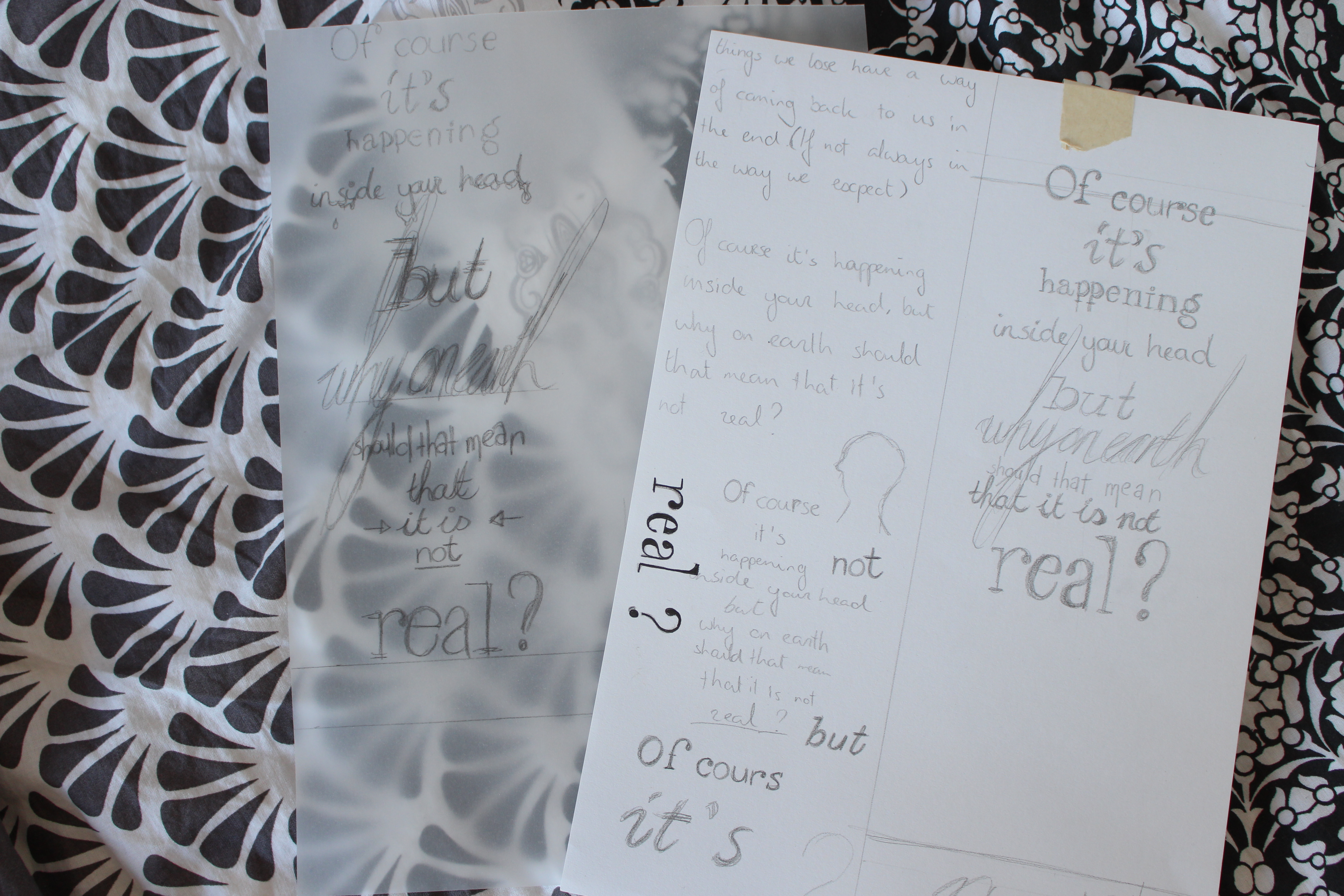
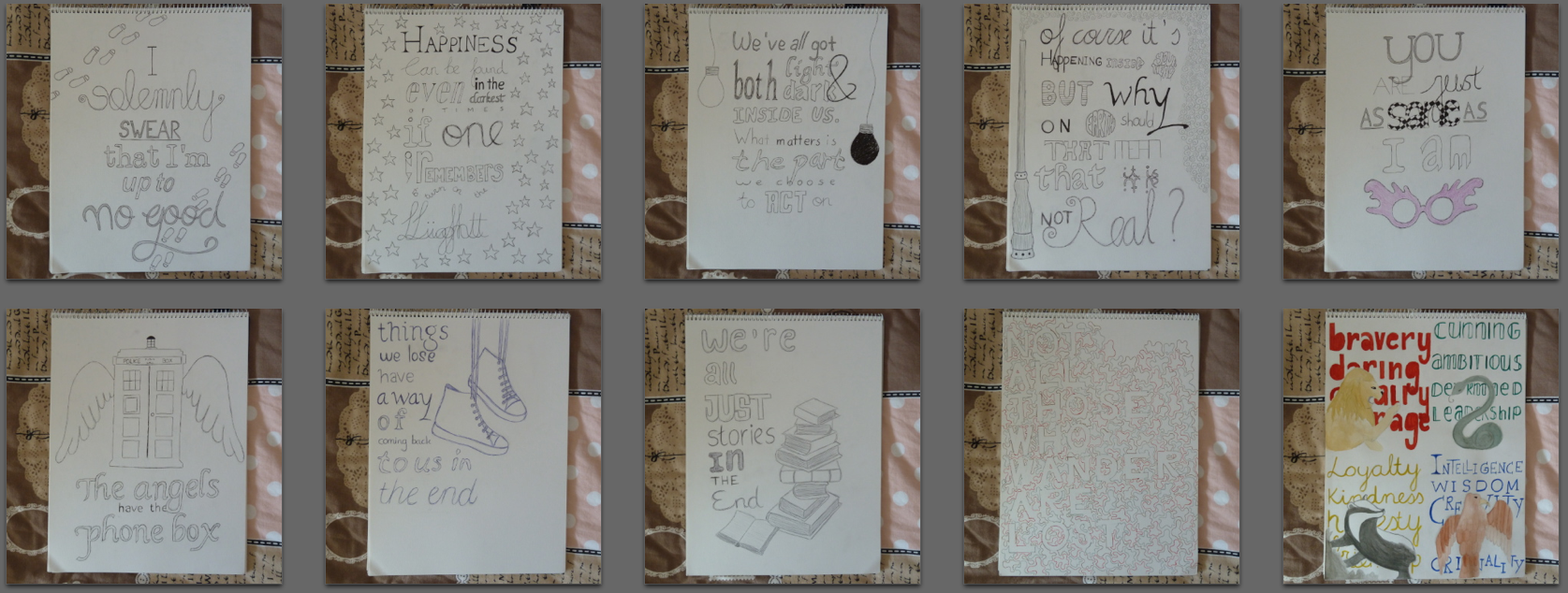
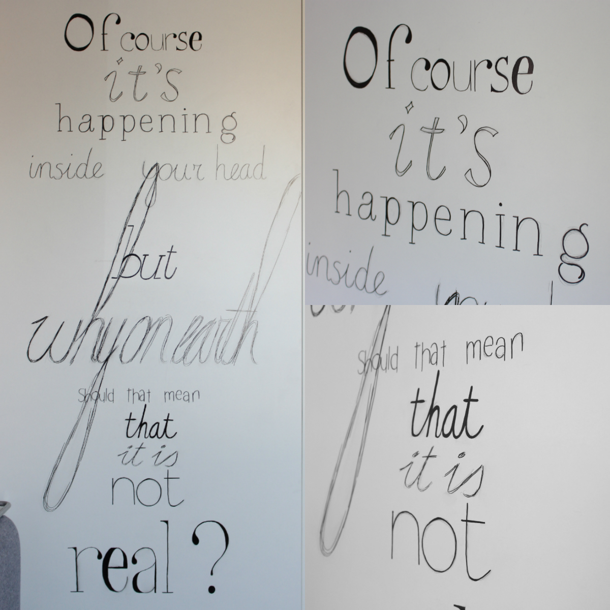
Before starting your sketch, measure the size of the piece you'll be covering and use these measurements to create an area on your paper with the right dimensions. In this area, feel free to go crazy! I went with a completely centered layout, but anything is possible. For inspiration, see the second image of this step.
Why I used a piece of transparent paper: I wasn't really happy with the way the bottom half of my sketch was looking, so I traced the top part and redesigned the bottom part.
Measure It Out
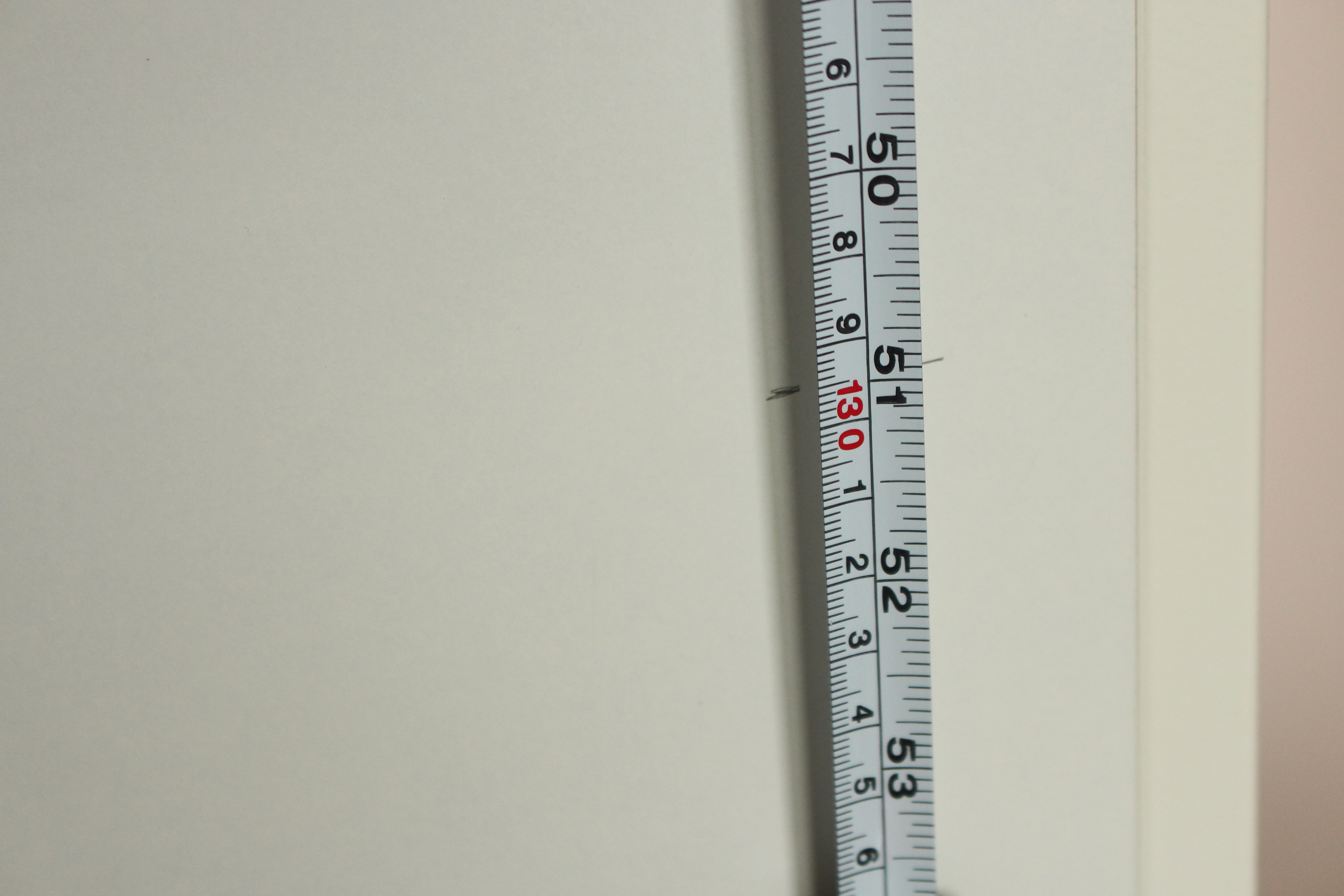
Determine the exact scale you used in your sketch. Use that scale to convert your sketch to the real size drawing: simply measure the parts on your sketch and scale them up! For this step, it's easiest to start from the bottom.
Time to Tape
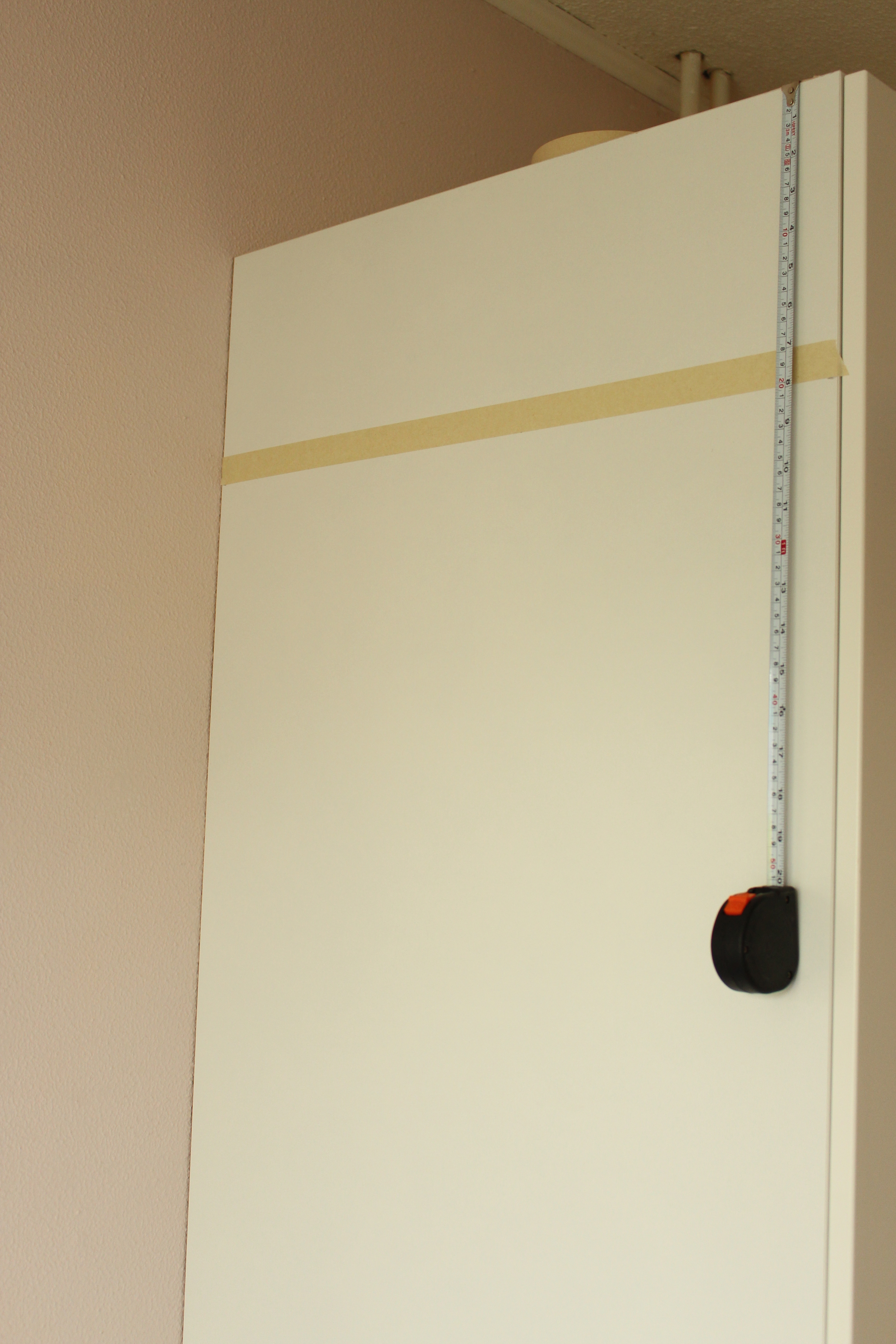
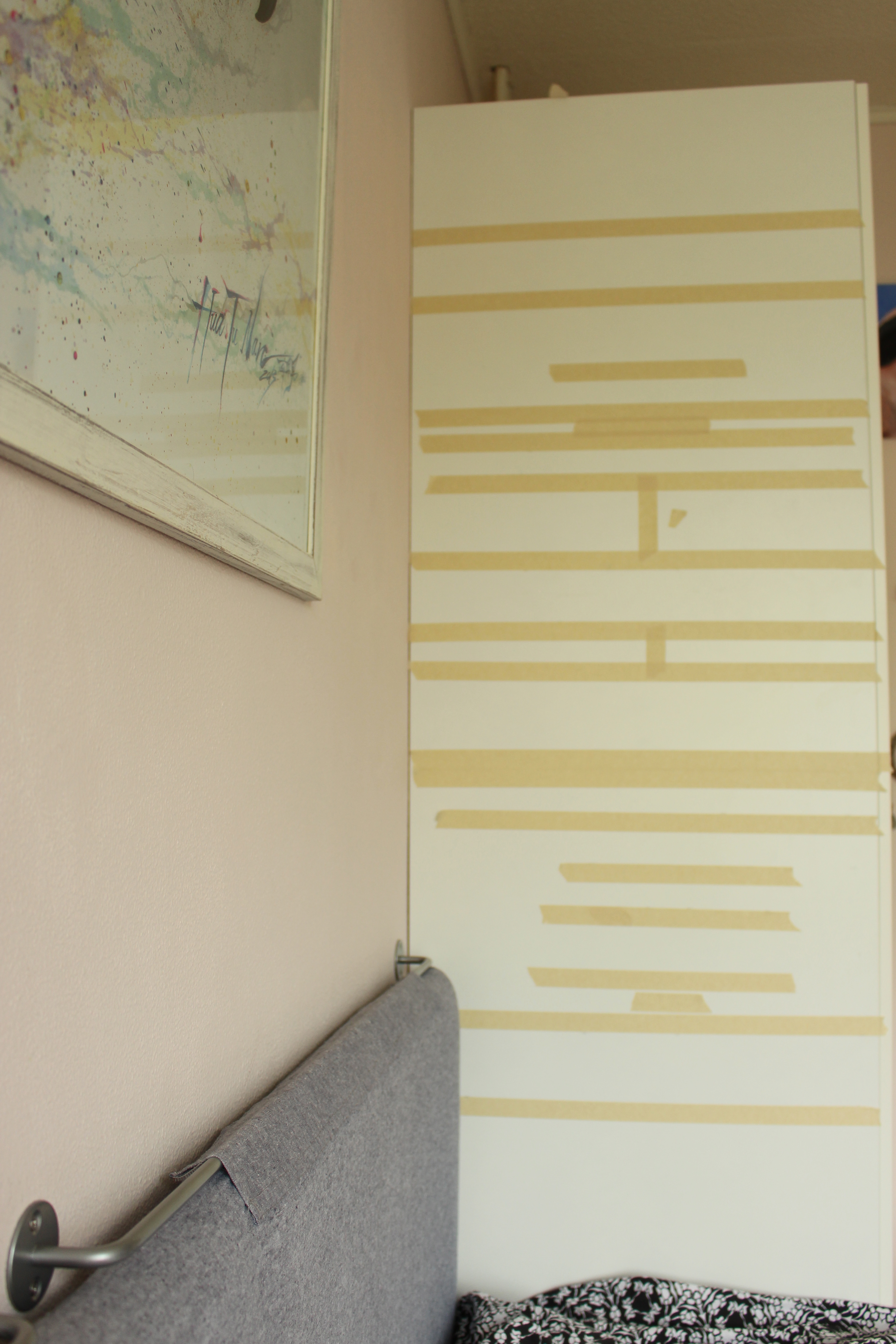
Once you've marked the correct height of a line, try to to this at two (at least) or three (recommendable) places at a line, take your masking tape and put it on those markings as precisely as possible.
The First Letter
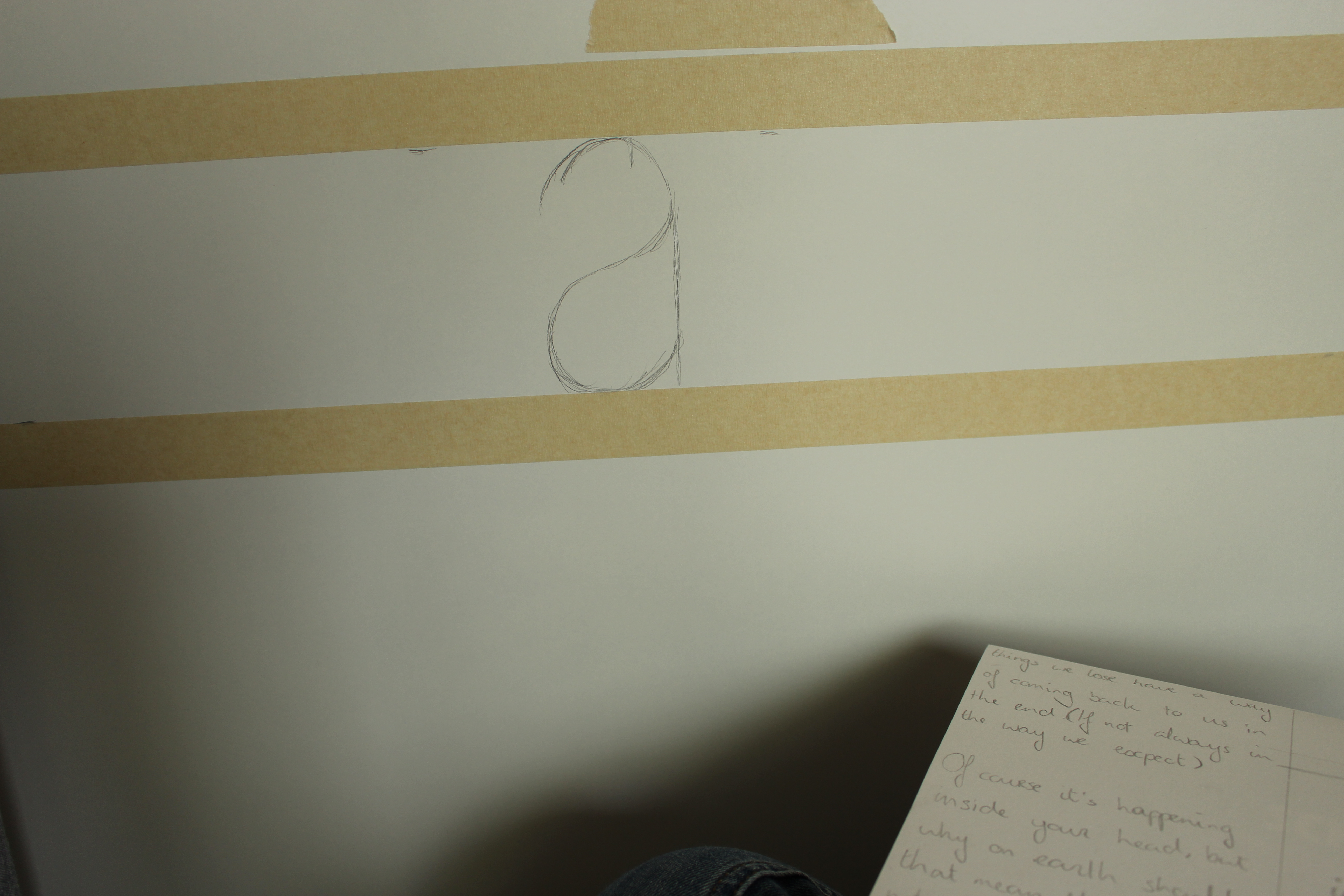
Unlike the taping, where we starting with the highest line, for the text I personally think it's easiest to start at the bottom. If using a centered layout: Mark the middle and draw the middle character of your line right there. When there's a line with spaces, be sure to include those when counting characters as well, but keep in mind they take up a bit less space.
Make It Even
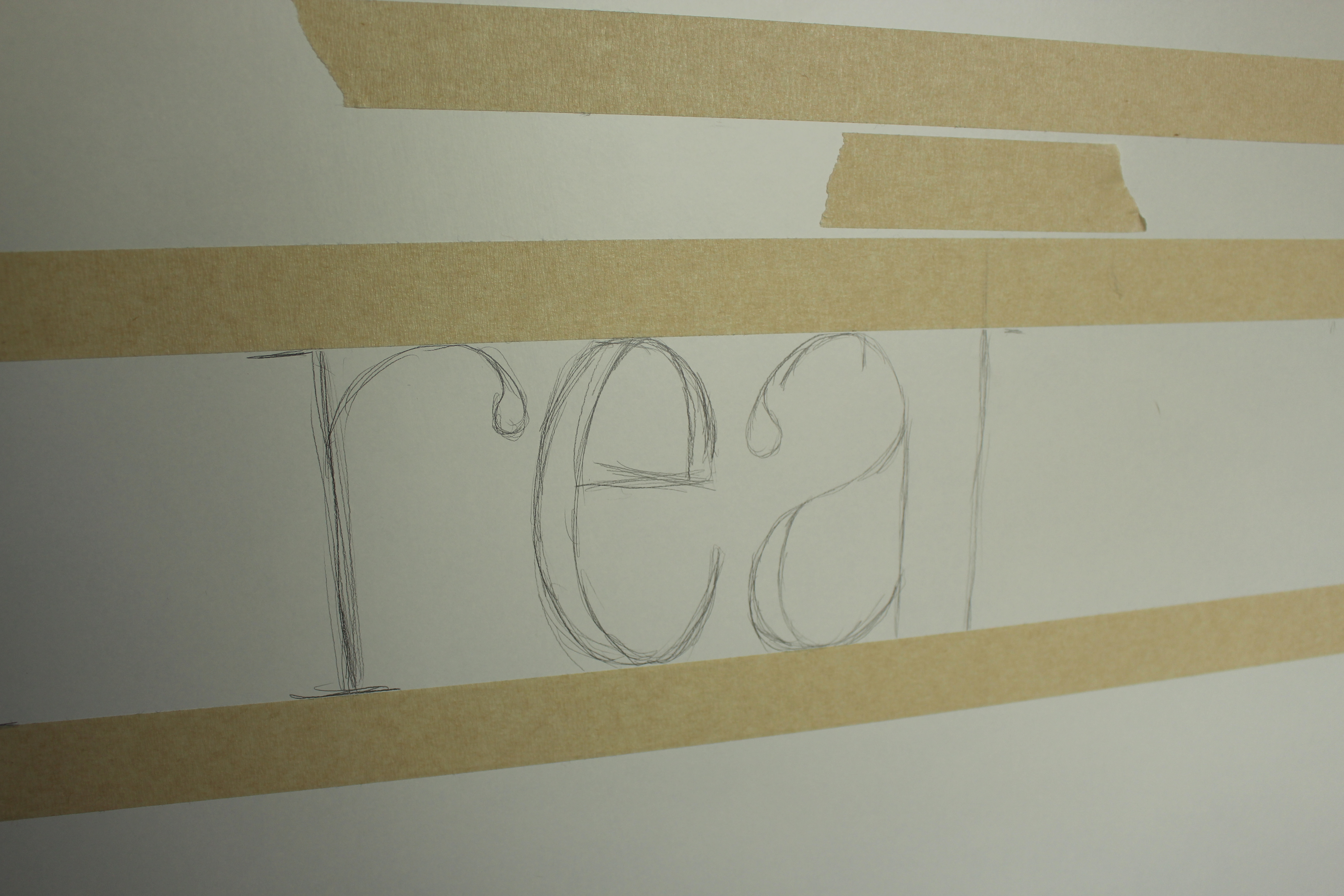
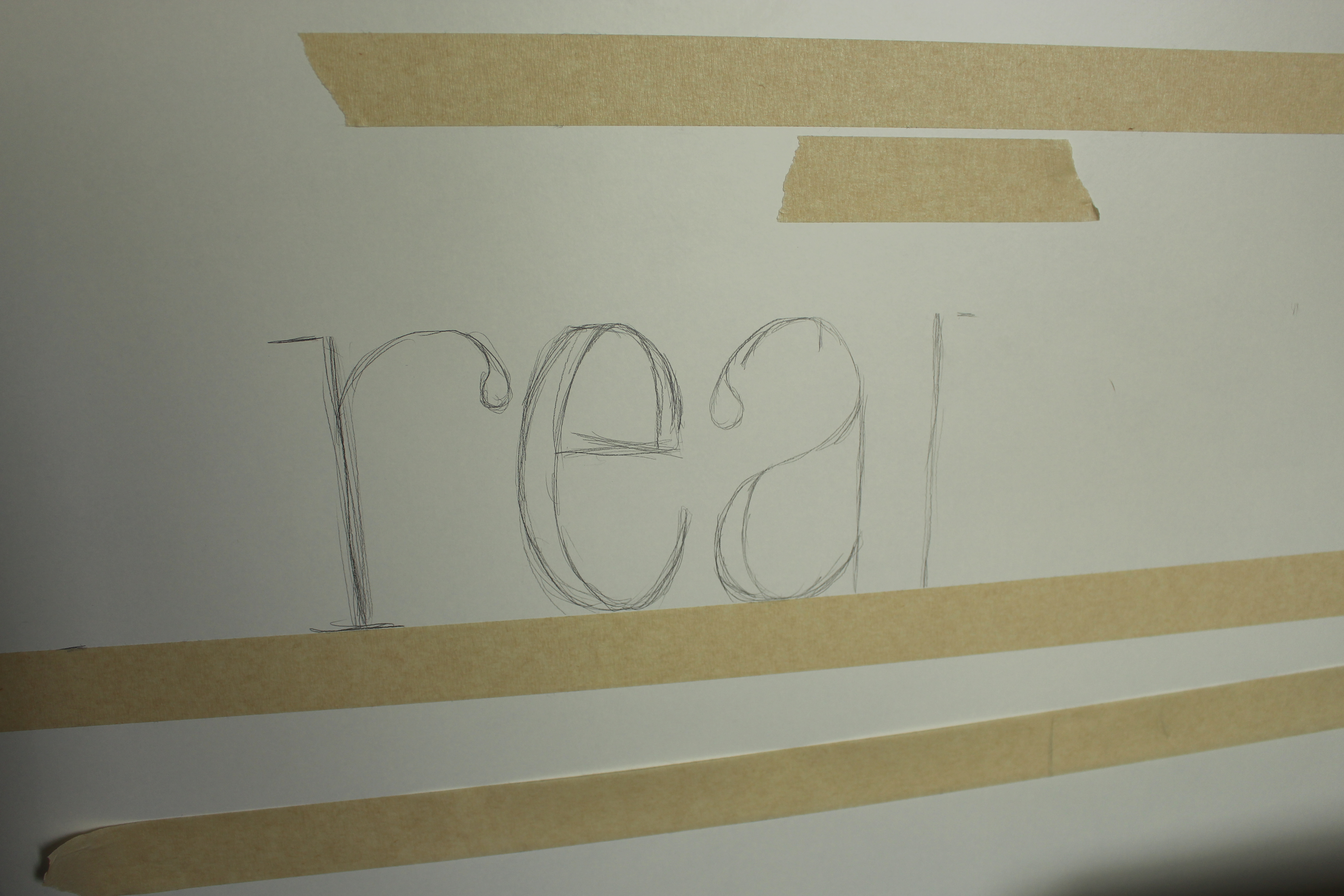
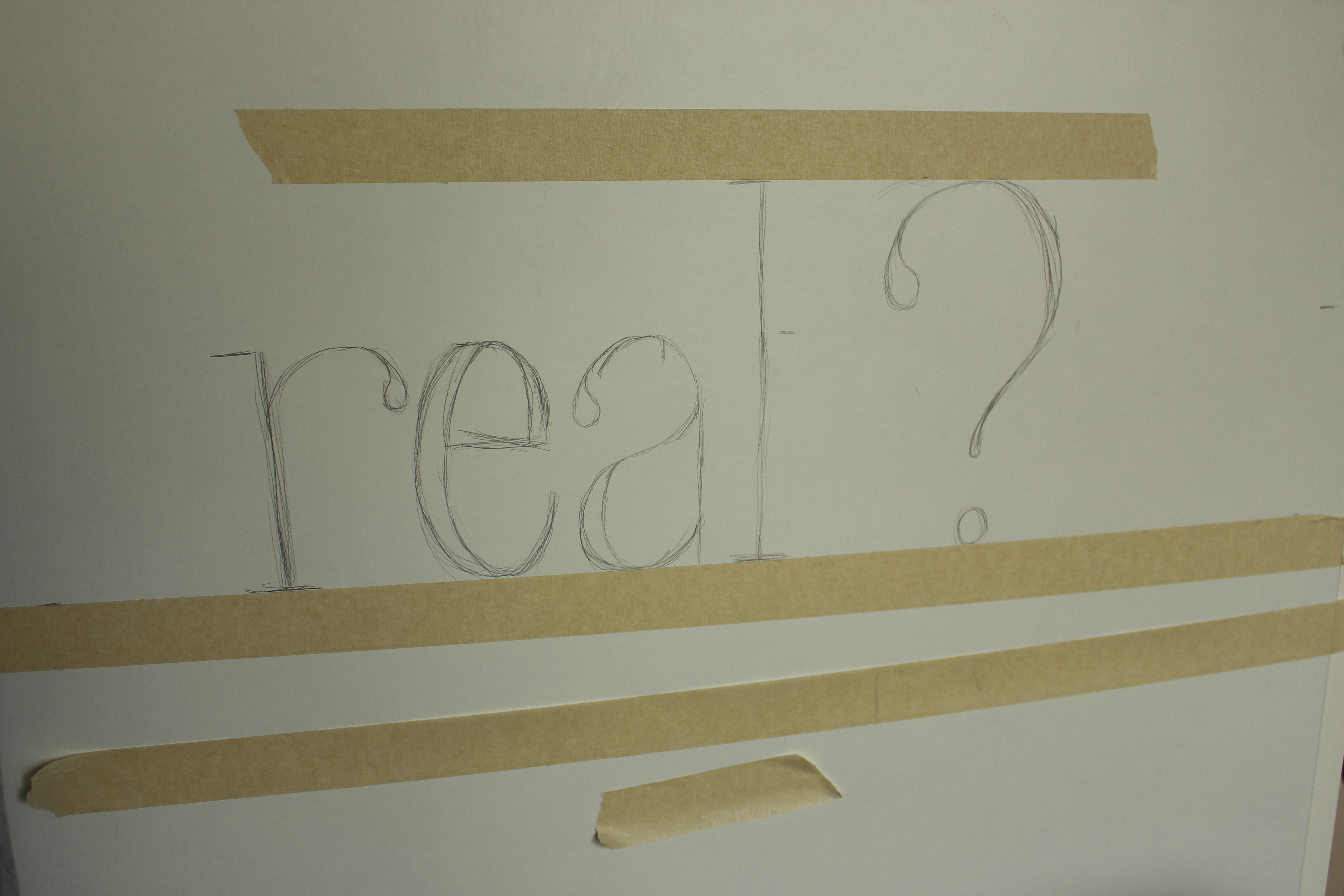
As you can see, I had to put my question mark a quite a bit away from the l to keep my text margins the same on both sides. This happened because the single line of the l doesn't take up as much space as other characters. If you don't need the tape directly above it as a bottom line for the next line of text, it might be helpful to remove it after drawing your basic line of text. The top half of the l and of the question mark fell a bit higher than the main text, so to draw those removing the tape was really helpful.
More Text
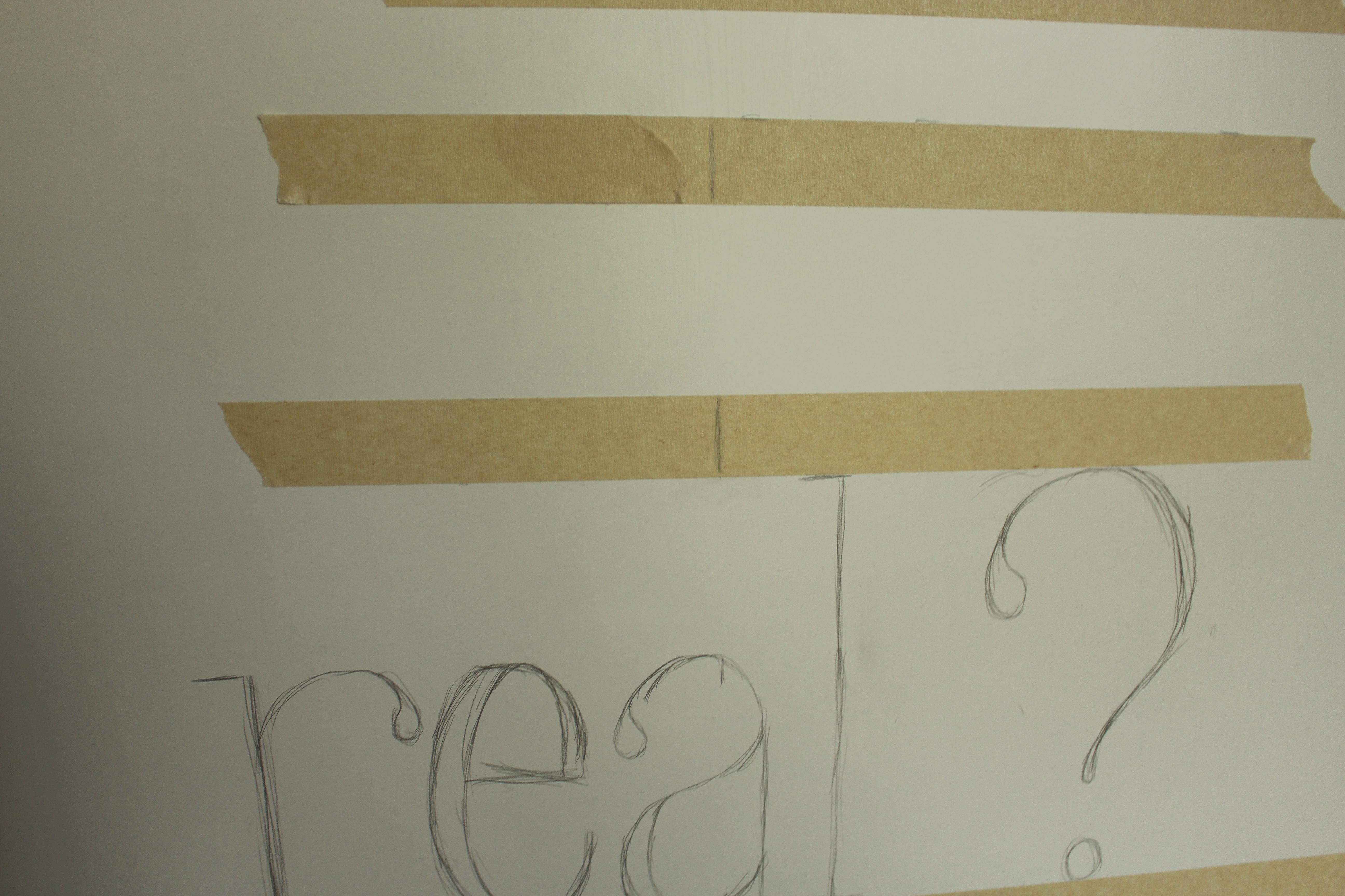
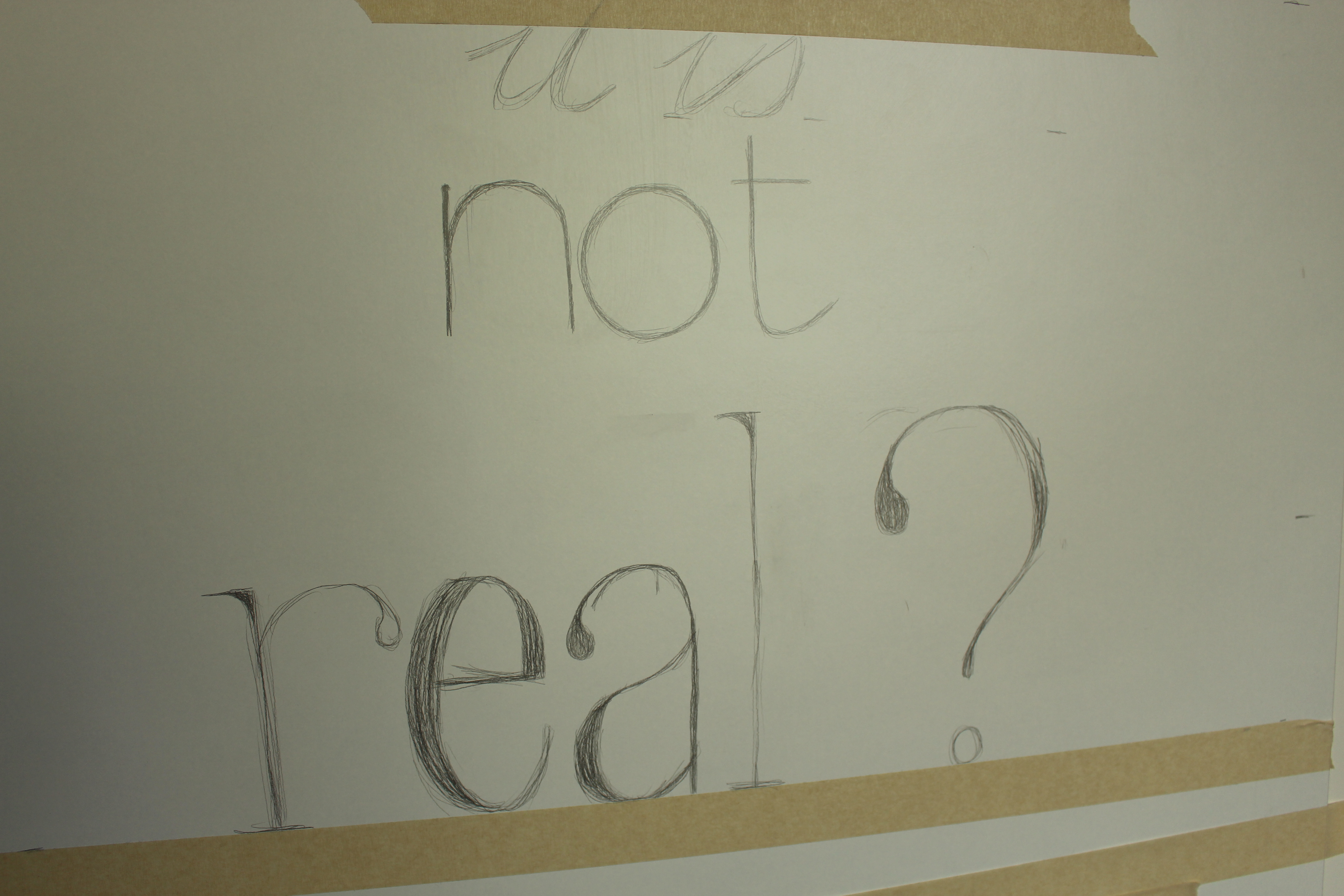
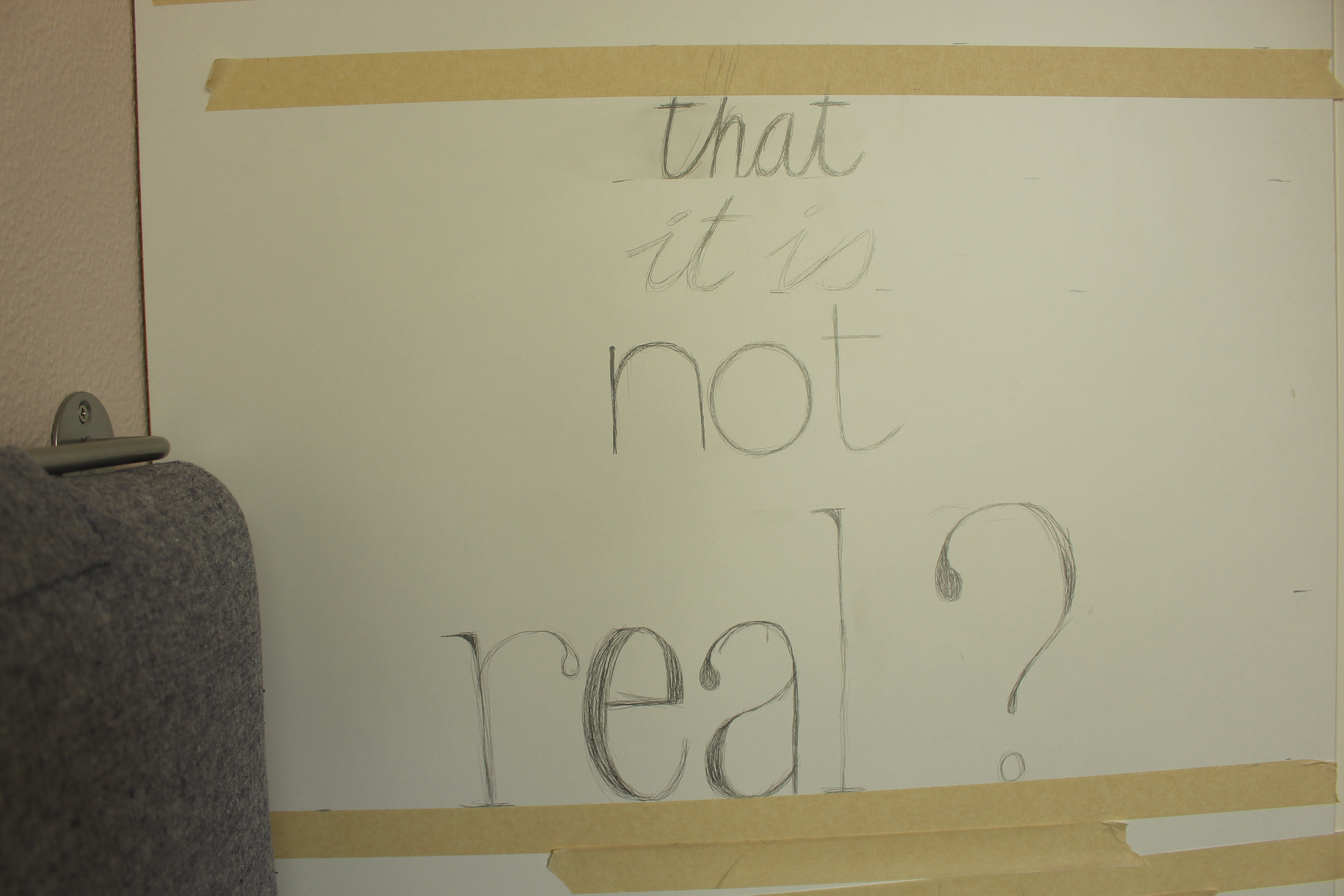
Keep following the lines you placed and move up through your lines one by one, removing the tape once you don't need it anymore.
Blocked by Tape
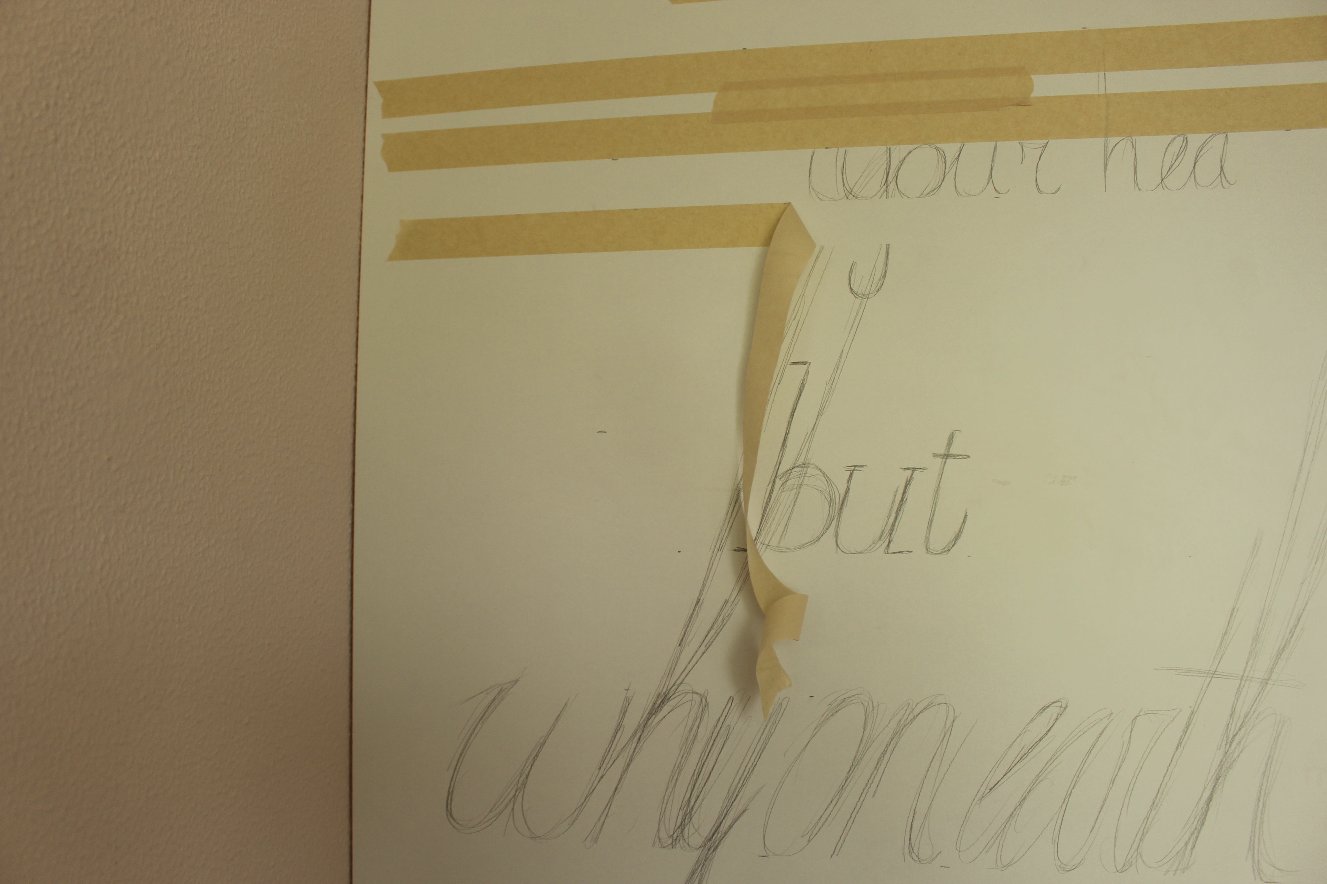
For some characters, you might find yourself blocked by a piece of tape that you still need. If that's the case, just draw what you can with the tape still on. After sketching the text that sits on top of the tape, you can take off the tape and go back to complete the part you couldn't draw before.
Moving Up
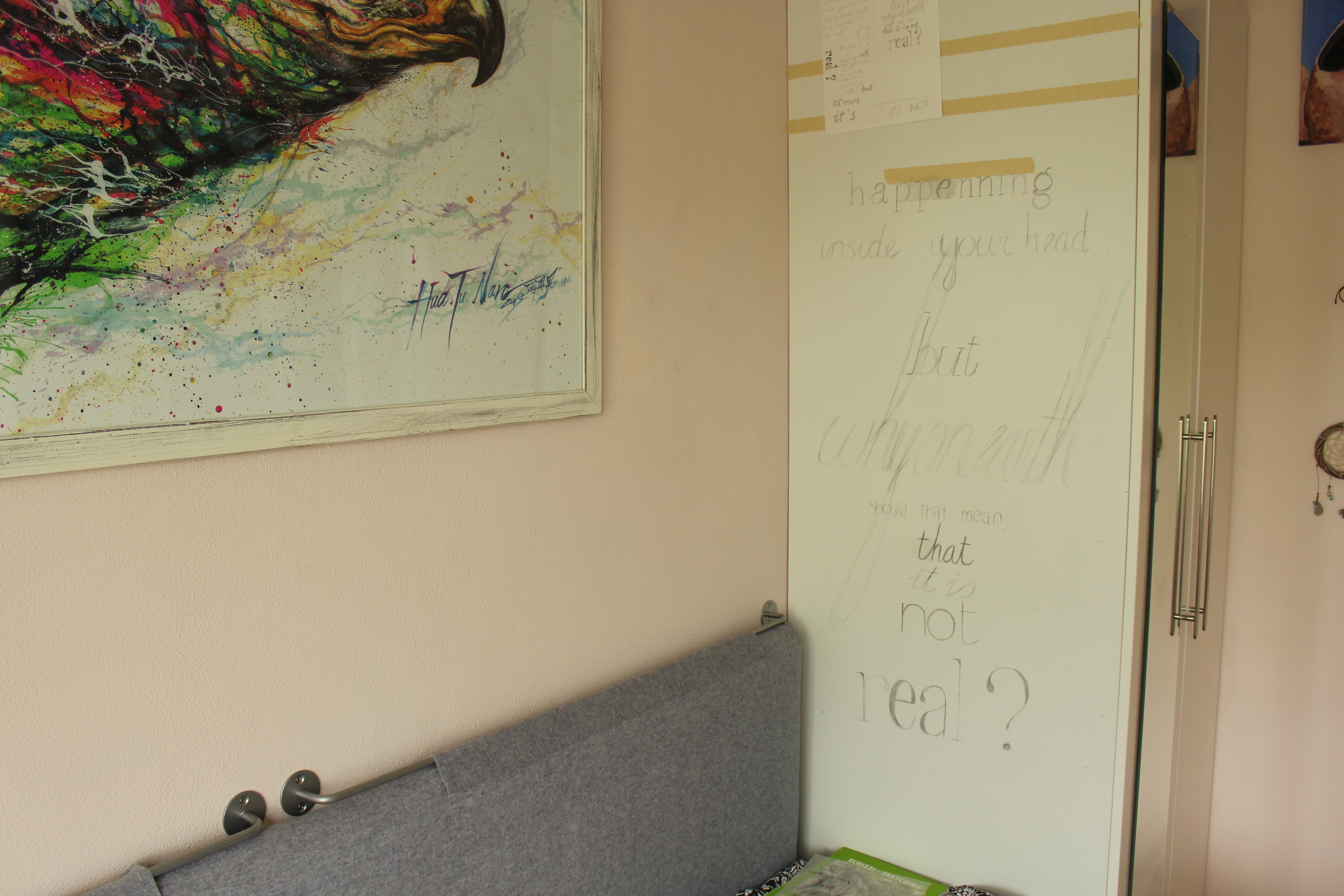
Once you start getting a bit higher, it's recommendable to stick the sketch to the area you're working on. This makes it a lot easier to see your reference image than if it's laying somewhere beneath you.
Spelling Mistake
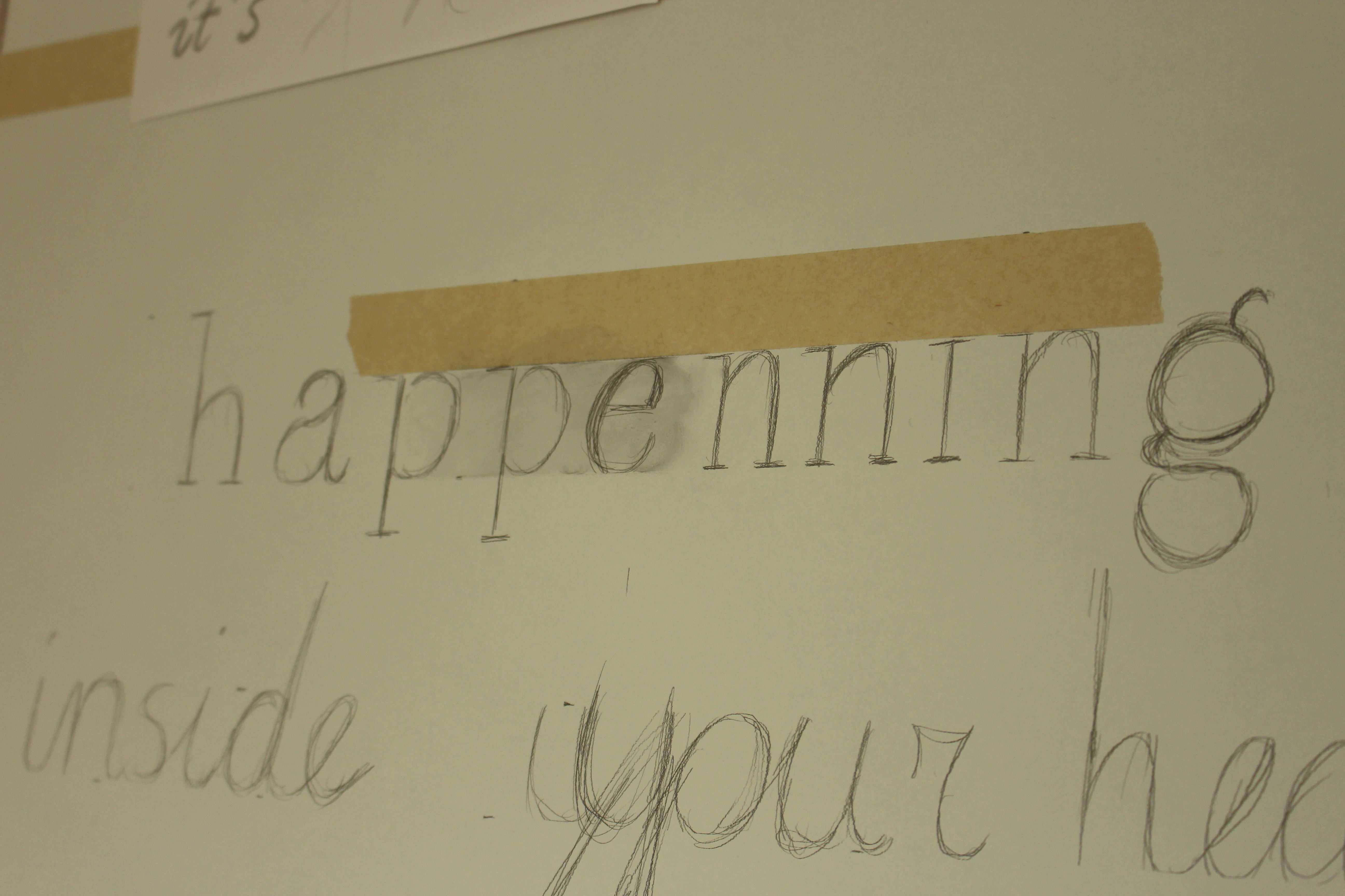
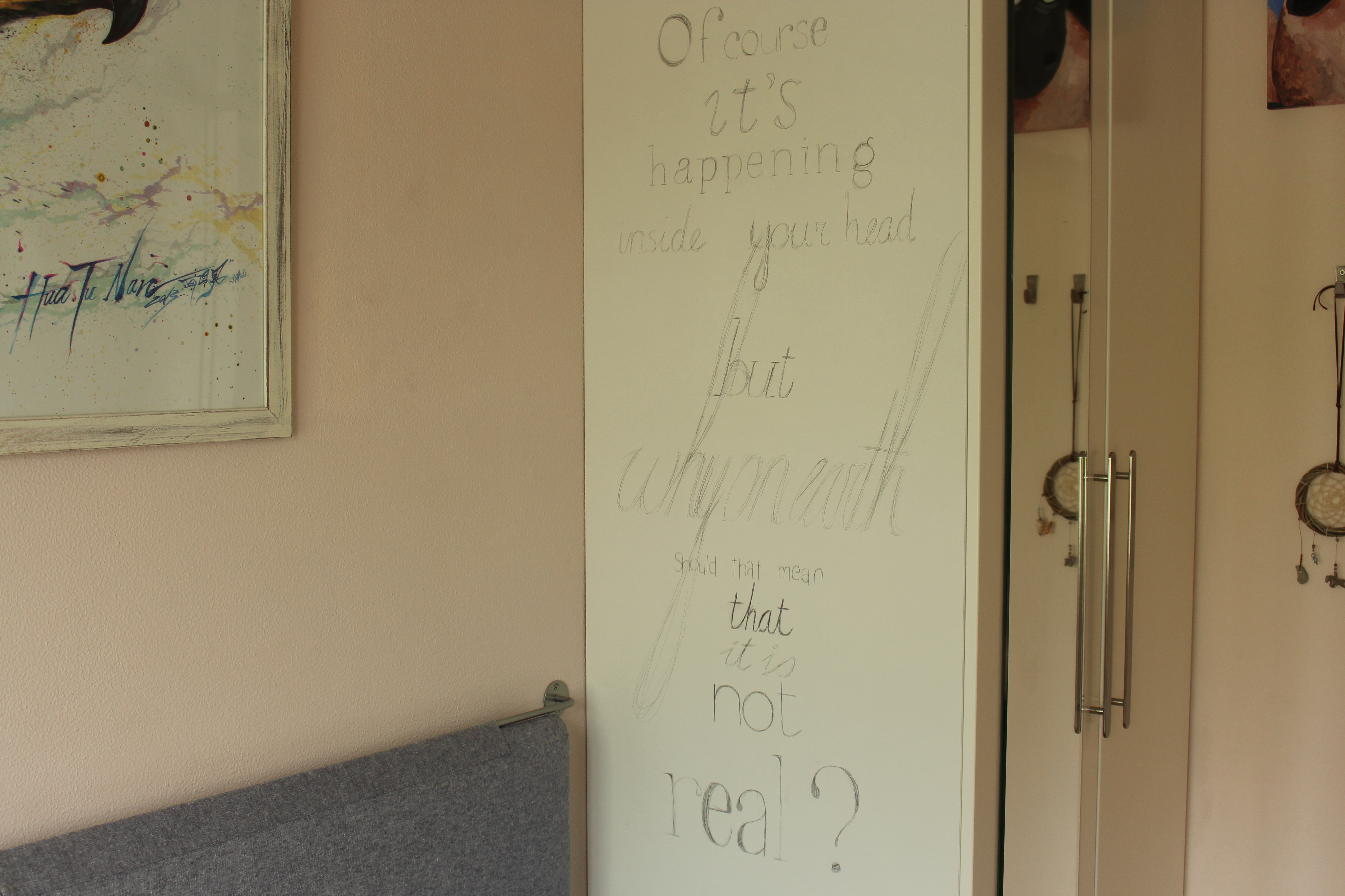
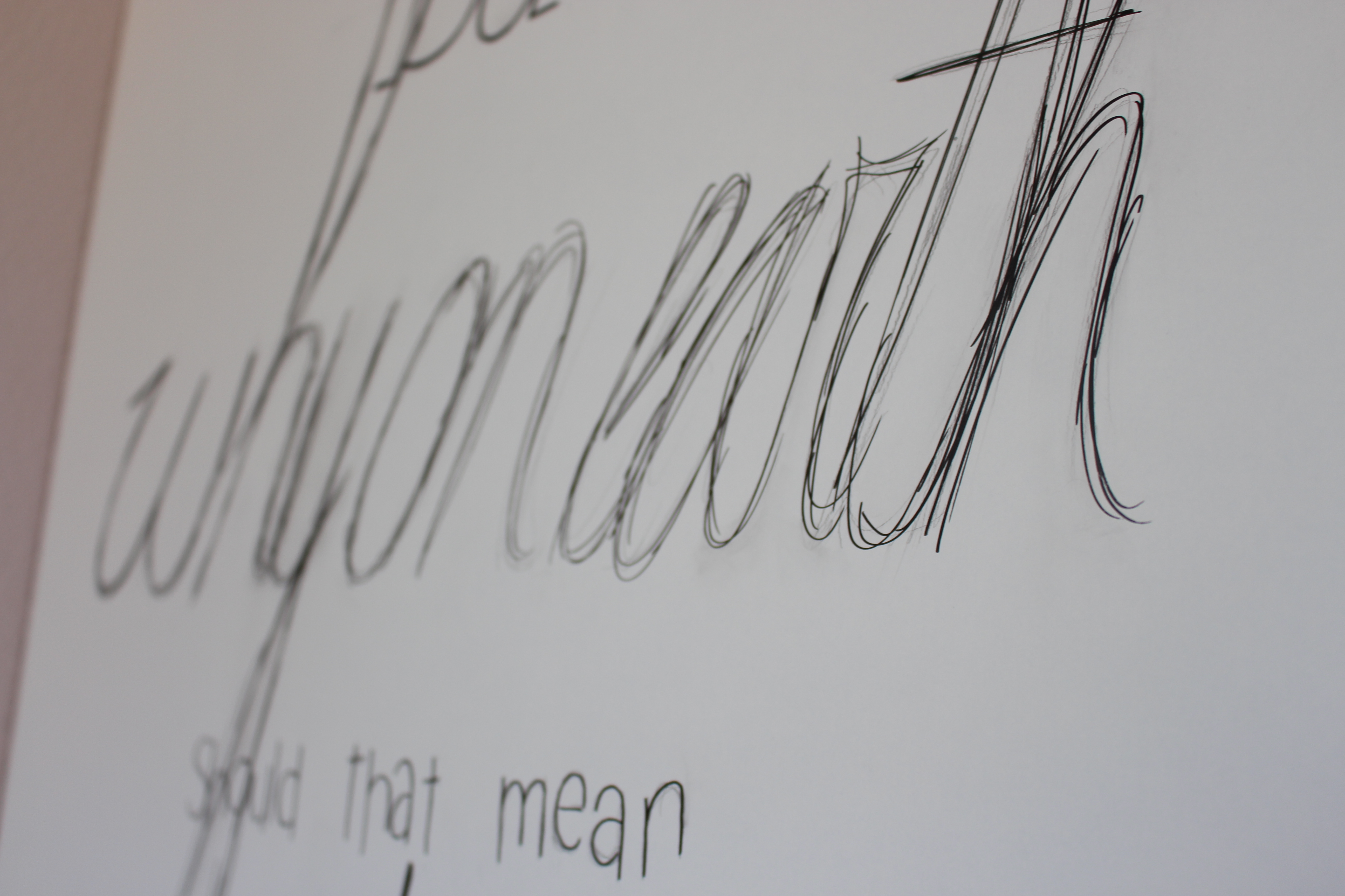
And of course, even though I spelled it correctly in my sketch, I messed up the spelling. It's a simple fix, but I mainly wanted to warn you for this. When you're working on something like this, you're really close to your work and really you just write letter by letter, forgetting that they are even words. After a while, this can lead to you making a mess up like this. Take this as a very clear advice: take a break ; )
The Completed Sketch
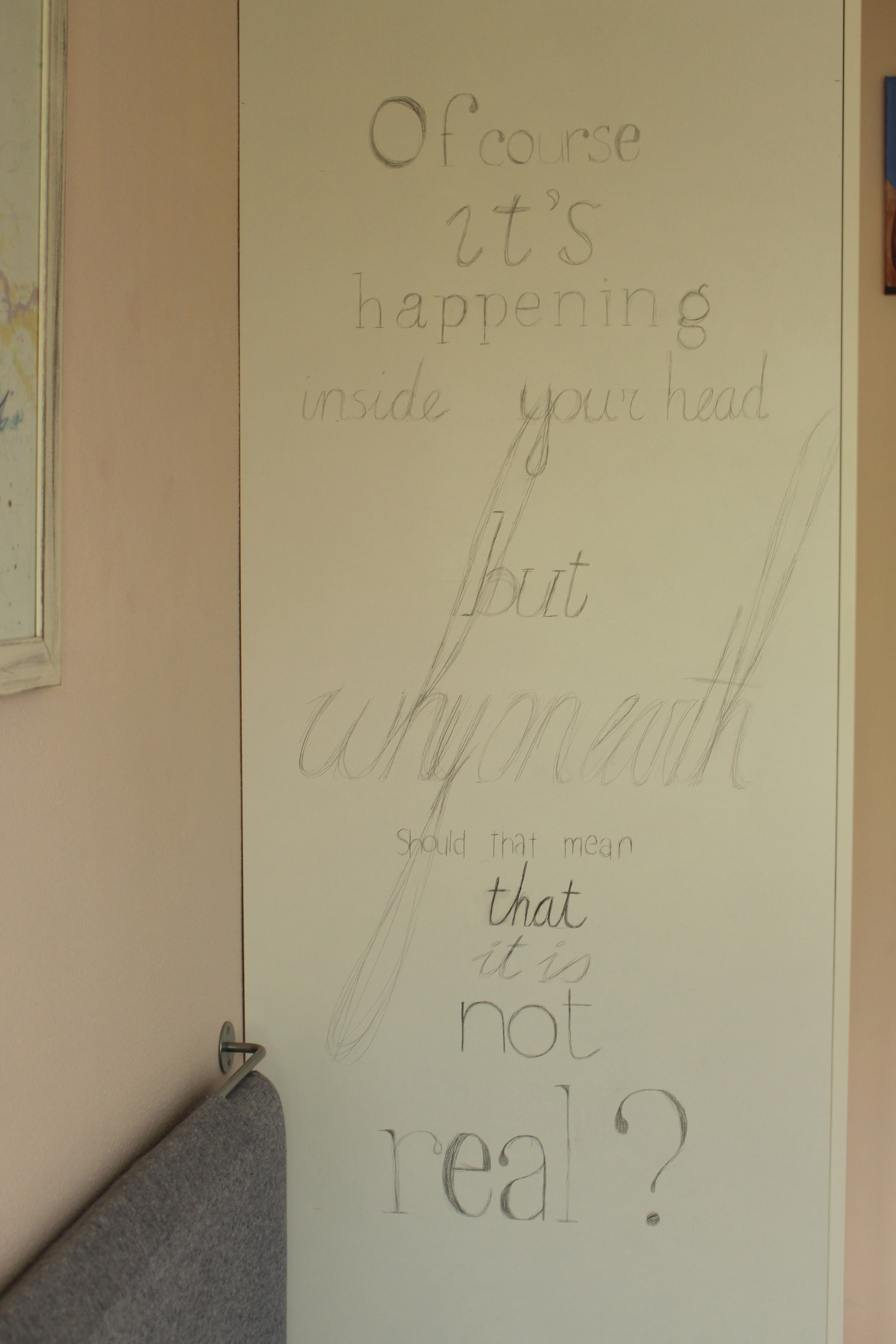
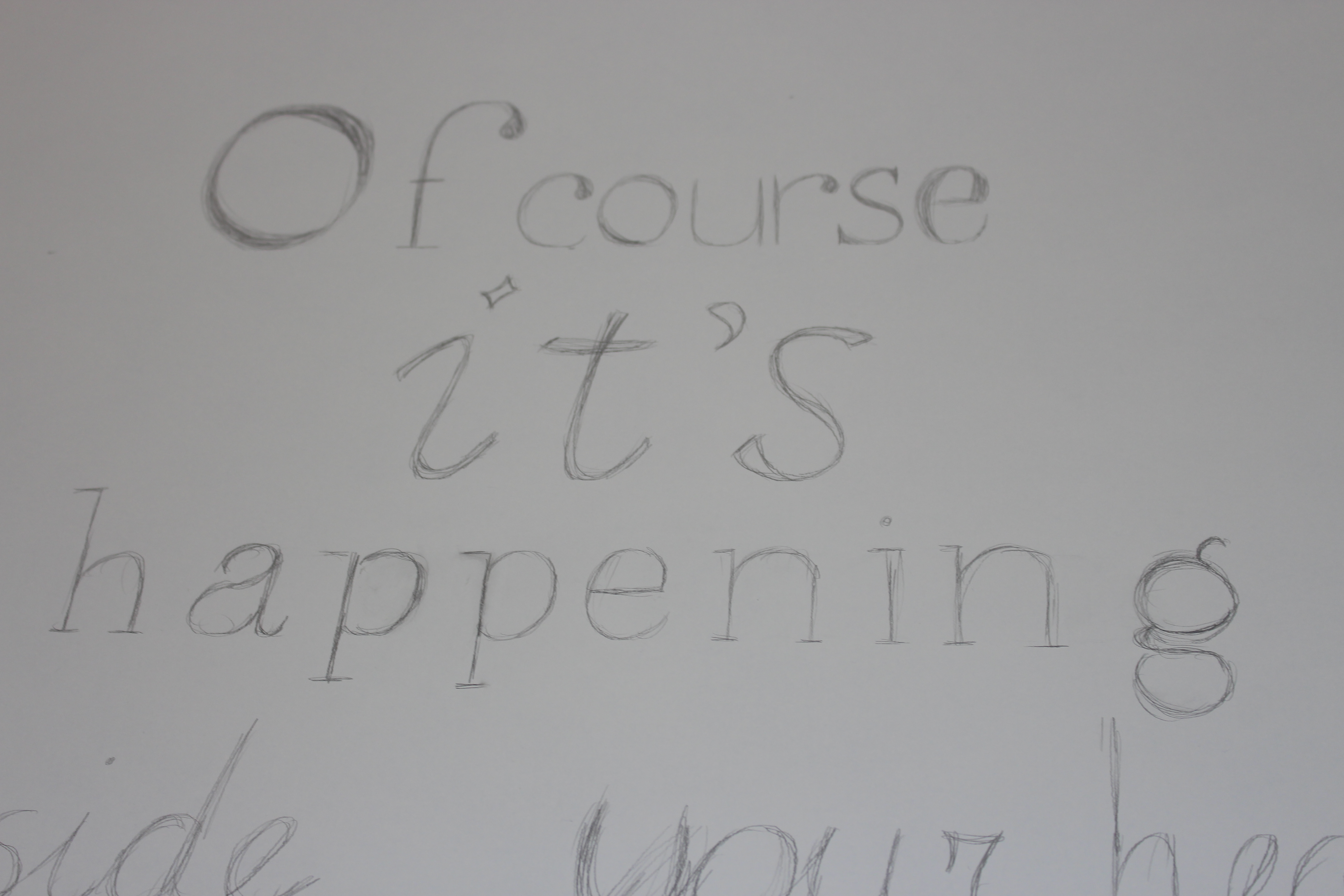
Once you've drawn on all of your text, remove all the tape and take a step back to admire your work!
Optional: Enjoy your work like this for a few weeks.
Markers
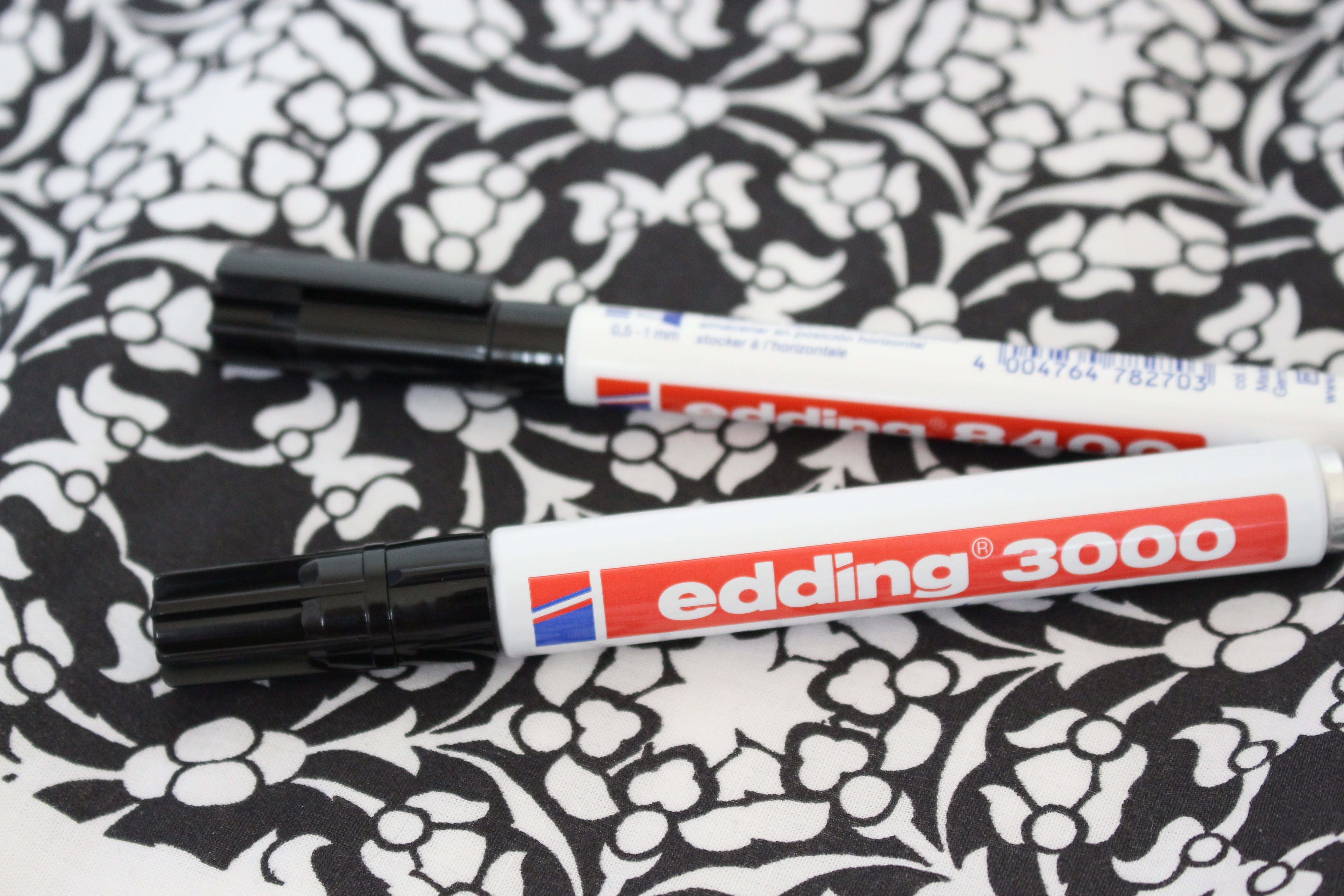
I used two different markers for this project, both black:
- Edding 8400 (cd/ dvd/ bd marker), 0,5 - 1 mm
- Edding 3000 (permanent marker), 1,5 - 3 mm
The reason I used two markers was to get two different sizes of tips.
Where Not to Mark
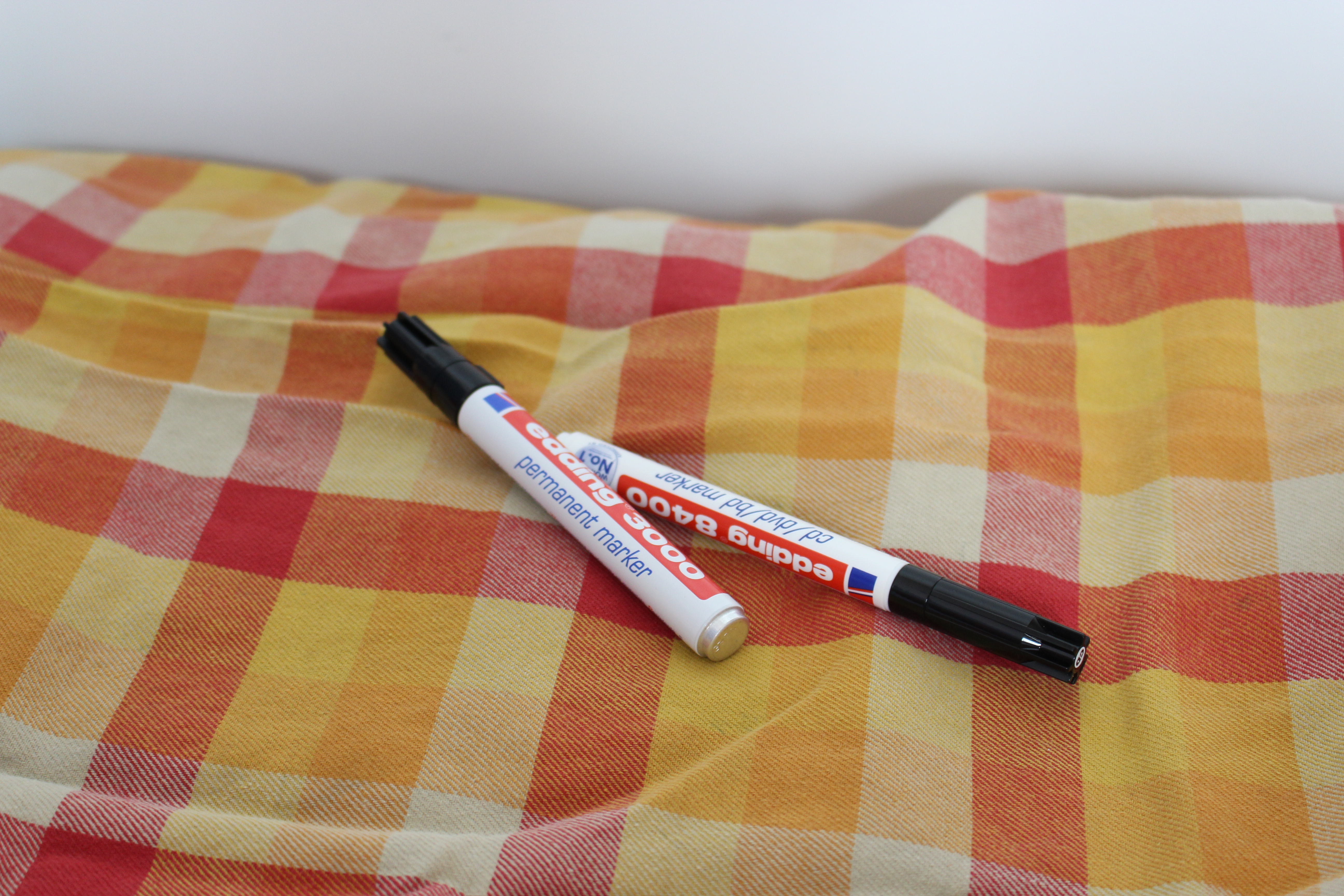
To prevent accidental ink marks on places you don't want the ink to end up, put an old dishcloth or something similar on top of it.
Keep It Ventilated
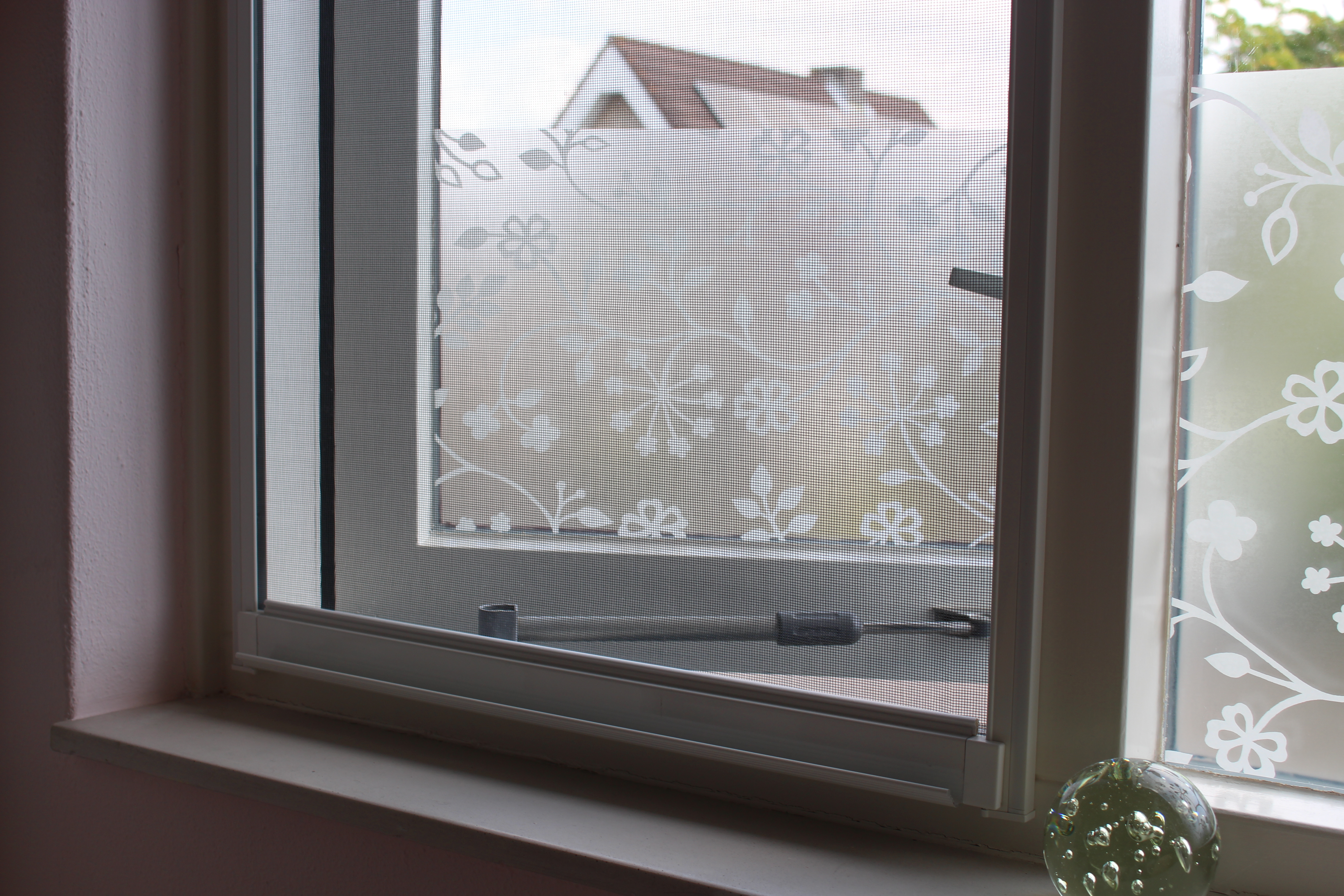
When working on a project like this, you'll spend quite a bit of time using the permanent marker. I'd recommend keeping a window/ door open to keep the room ventilated, especially when you're working in a smaller space.
The First Character
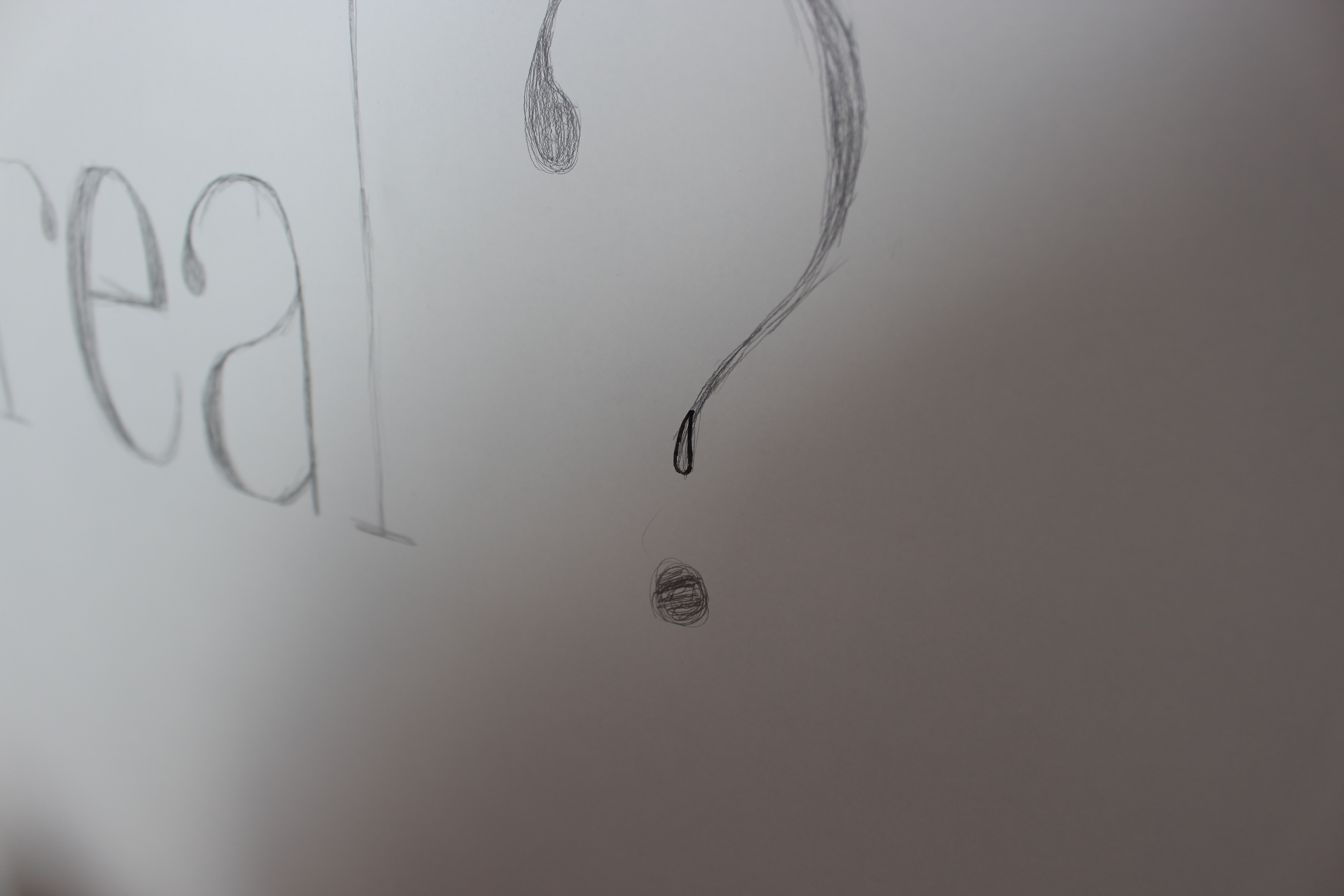
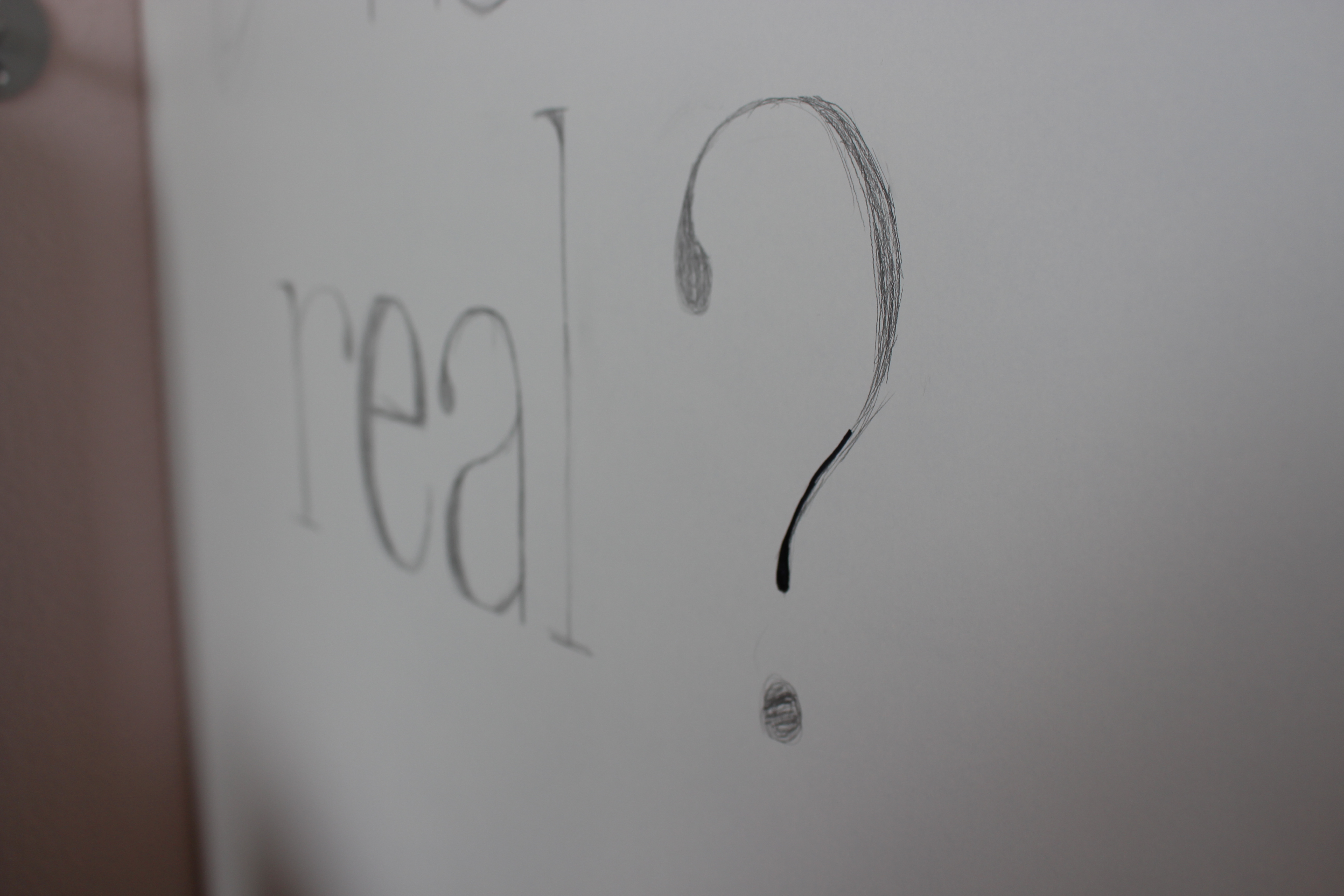
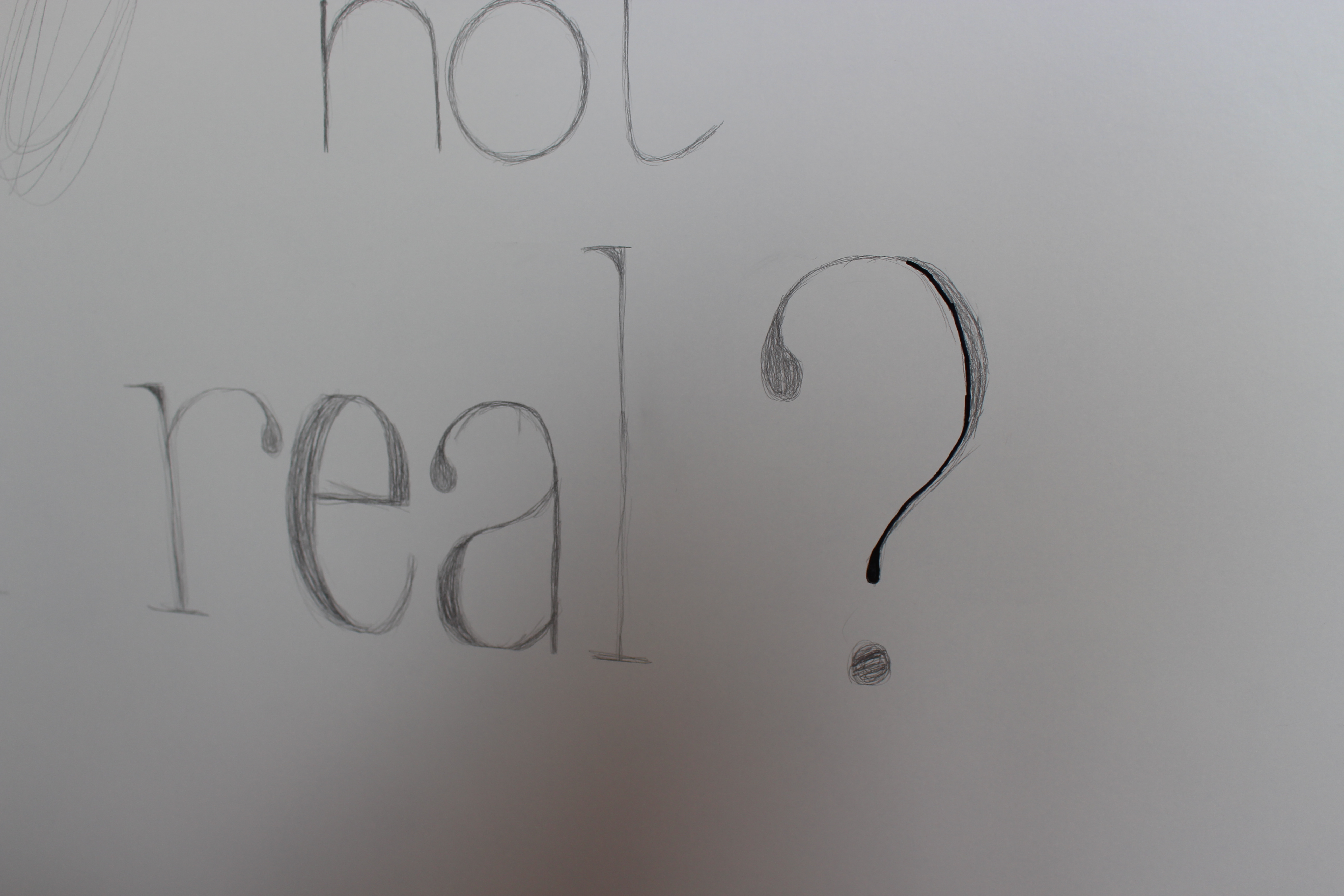
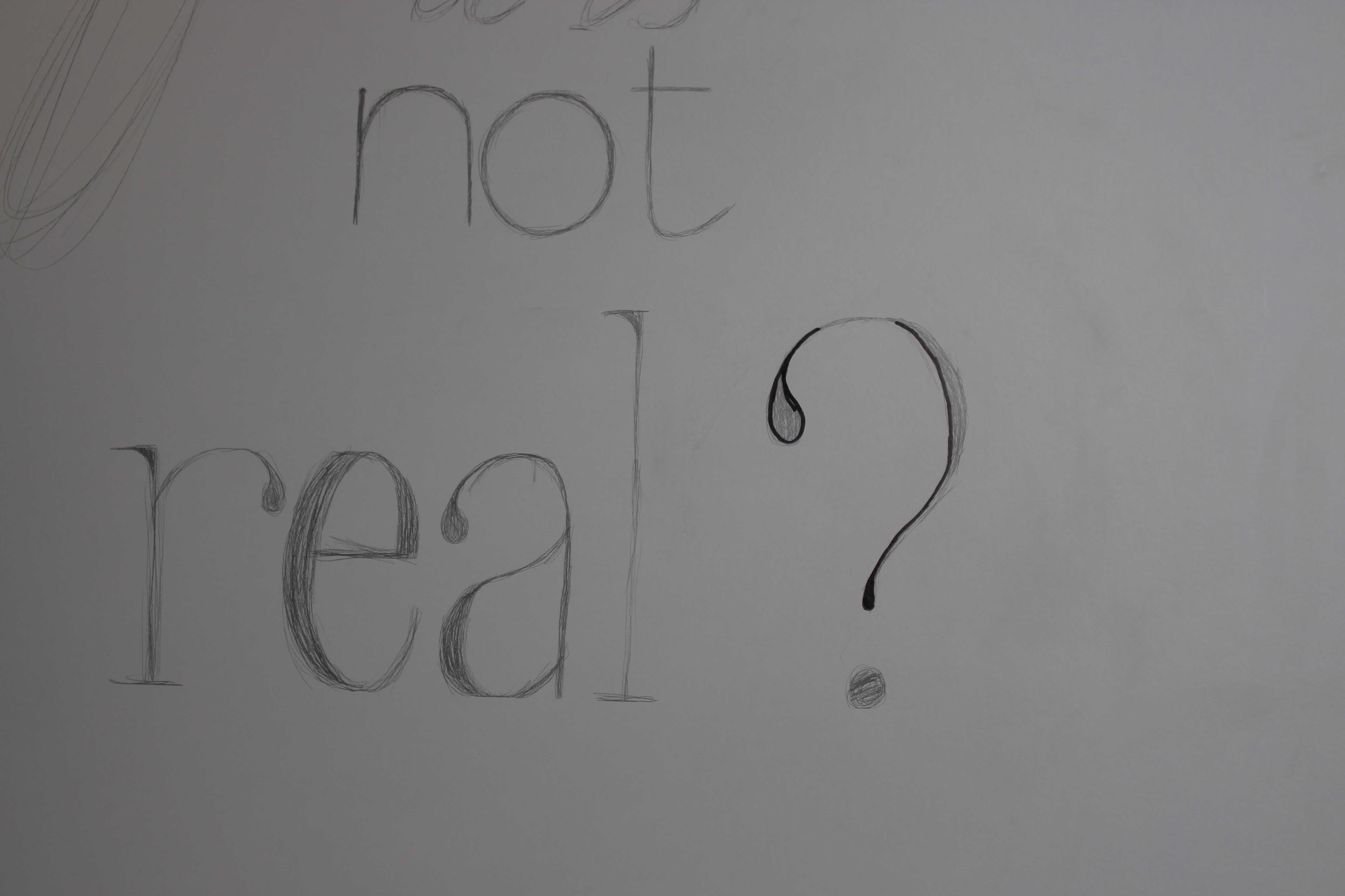
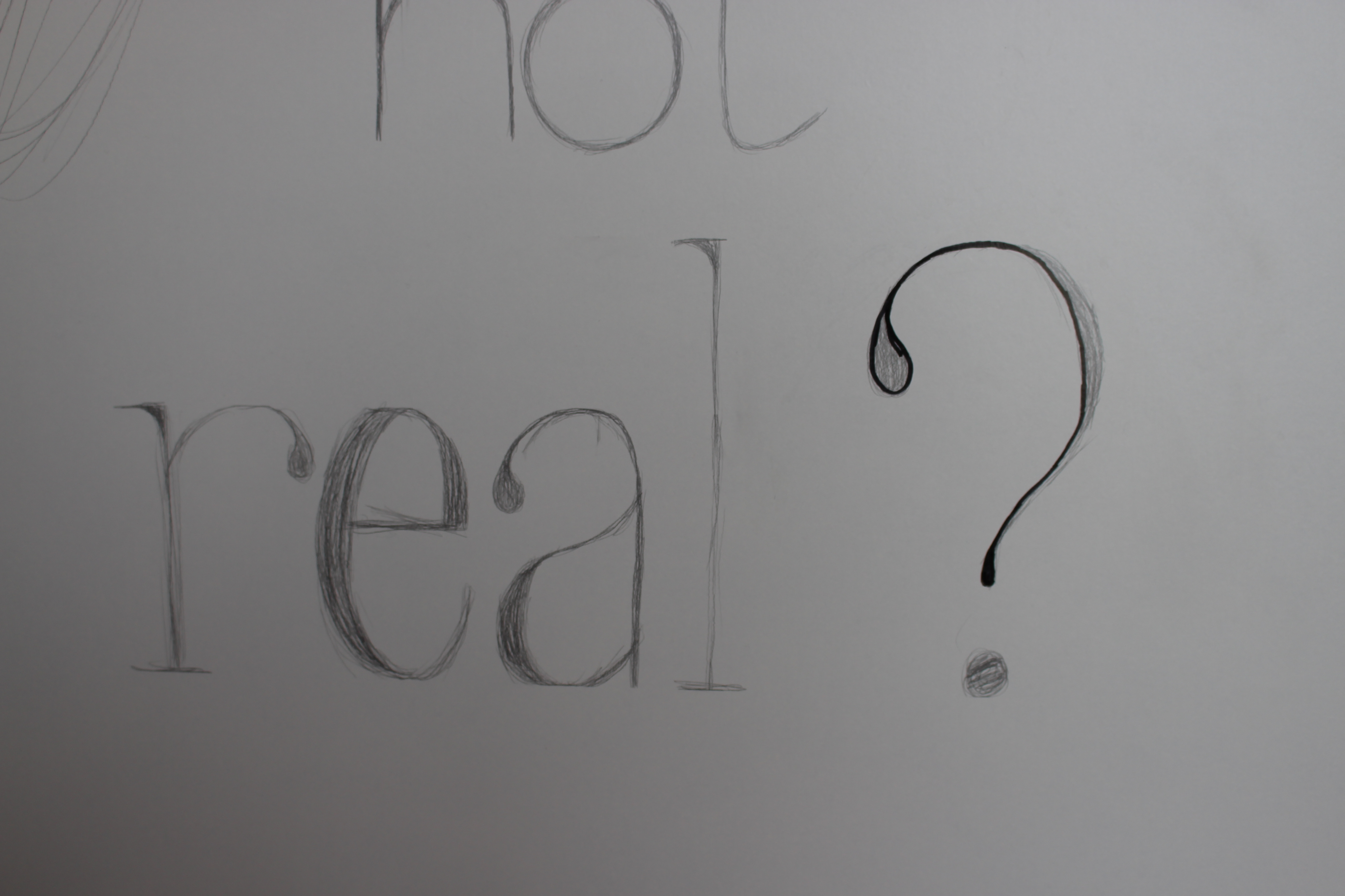
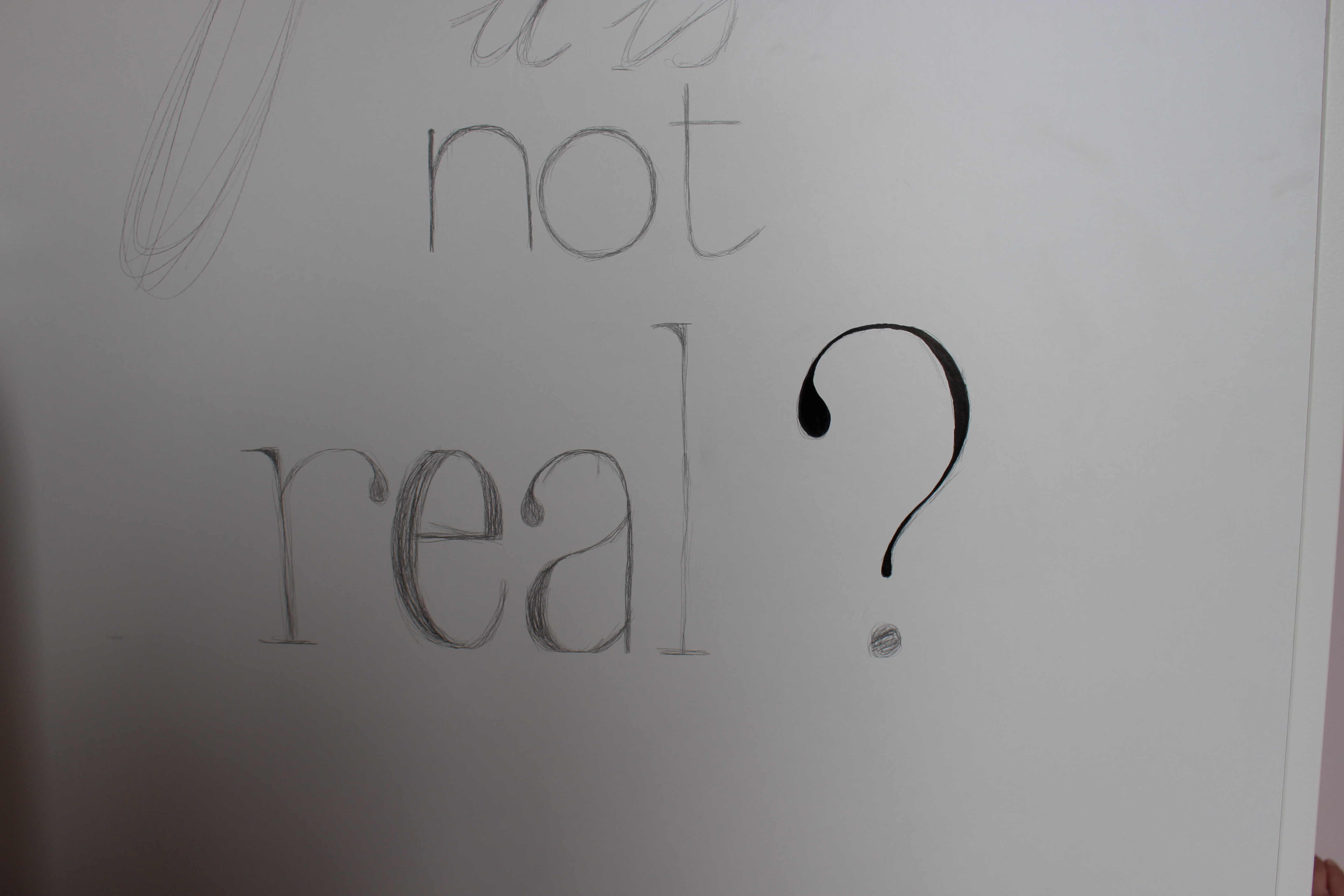
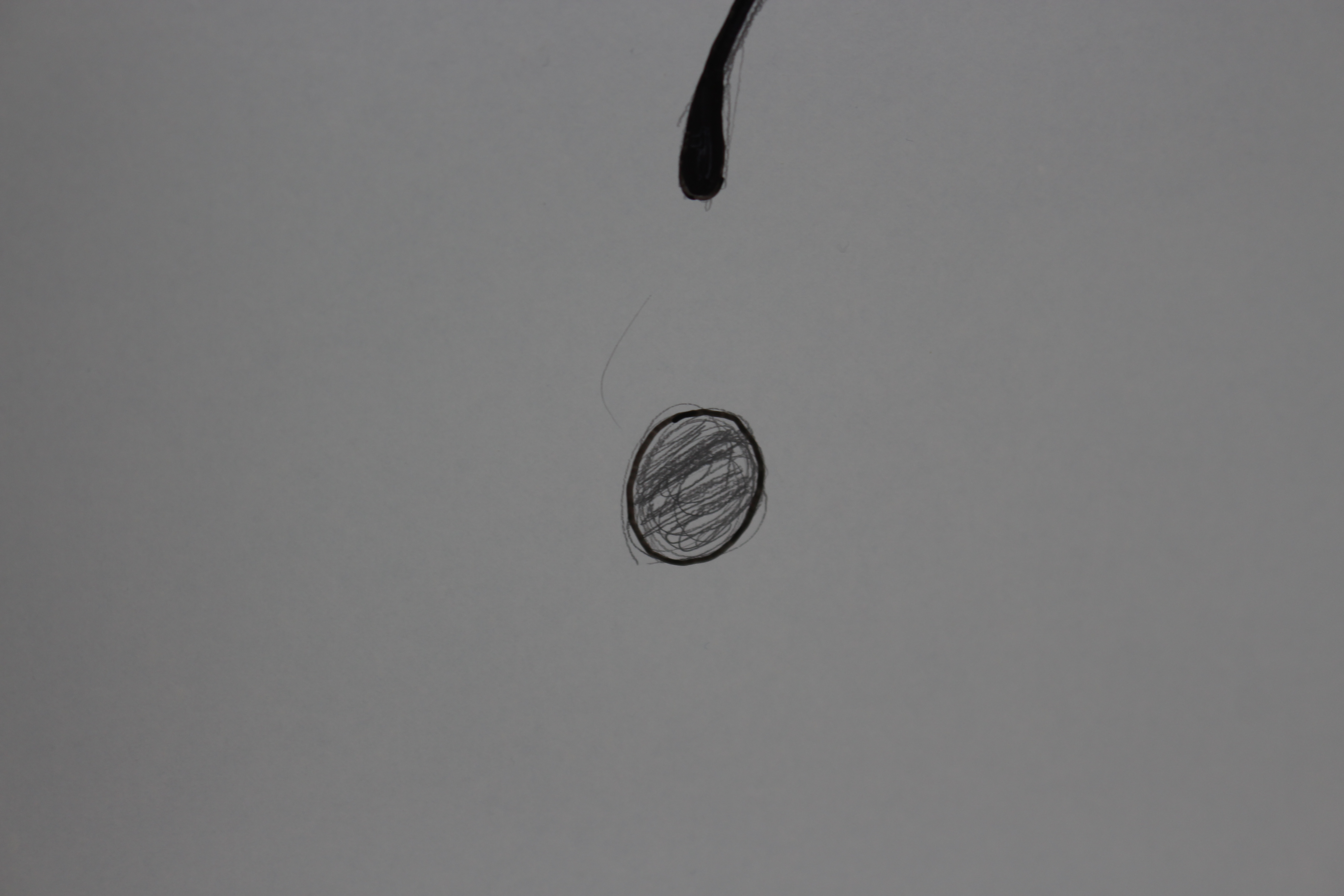
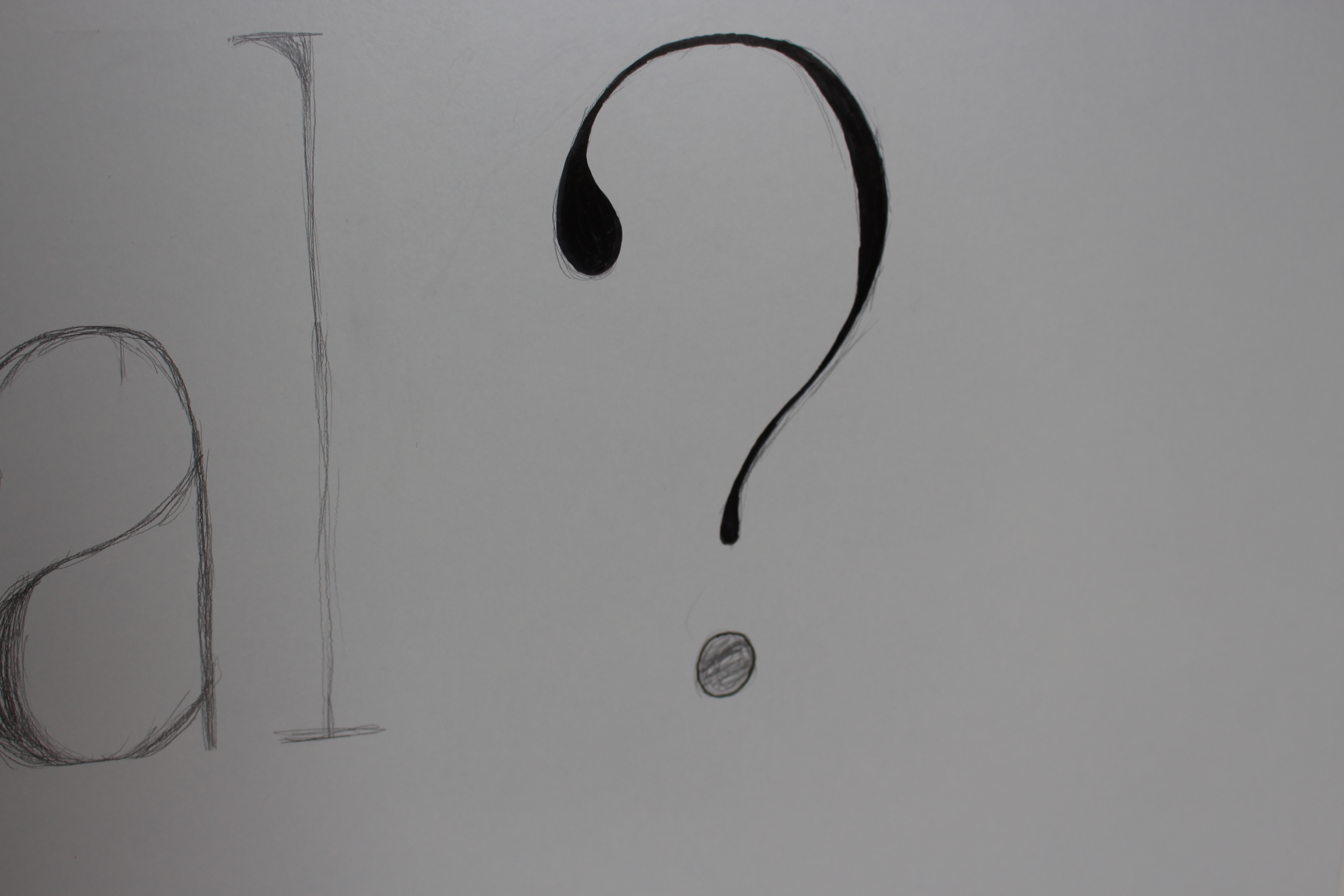
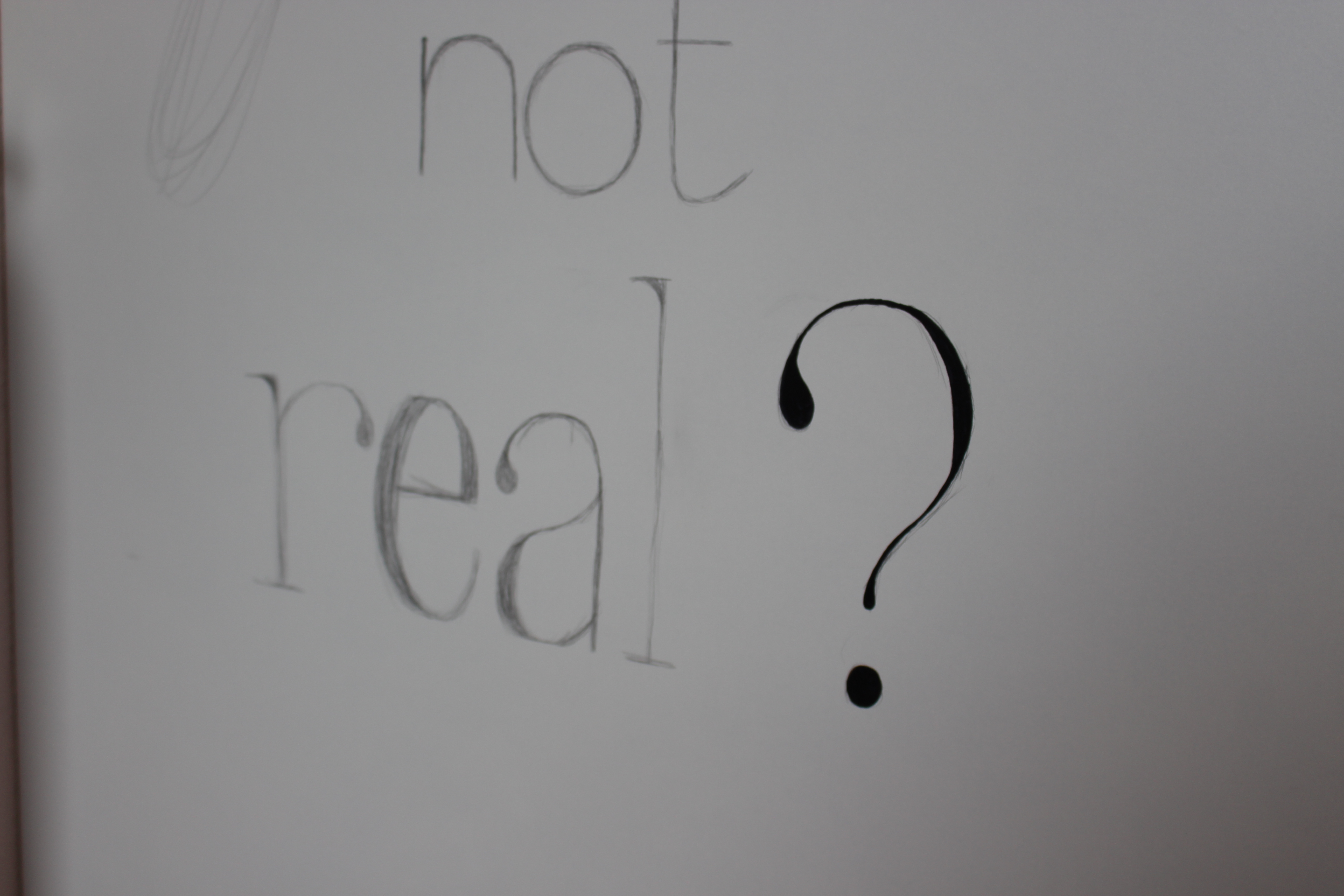
Before getting started with that marker, let me give you a warning:
This might very well get extremely nerve wrecking.
Putting on those first permanent lines can be a bit tricky, and therefore become very stressfull, but as you move along to do another and another and another line, it will all of a sudden seem a lot less stressfull : )
This depends a bit on the technique you're using (see next step), but this is what I did for the first line of text:
Start with your thin marker. Trace the outlines of your design. Next, take your thick marker and fill up the outlines you just make. Take the thin marker again to finish up the outlines if you're not completely happy with them.
Different Words - Different Techniques
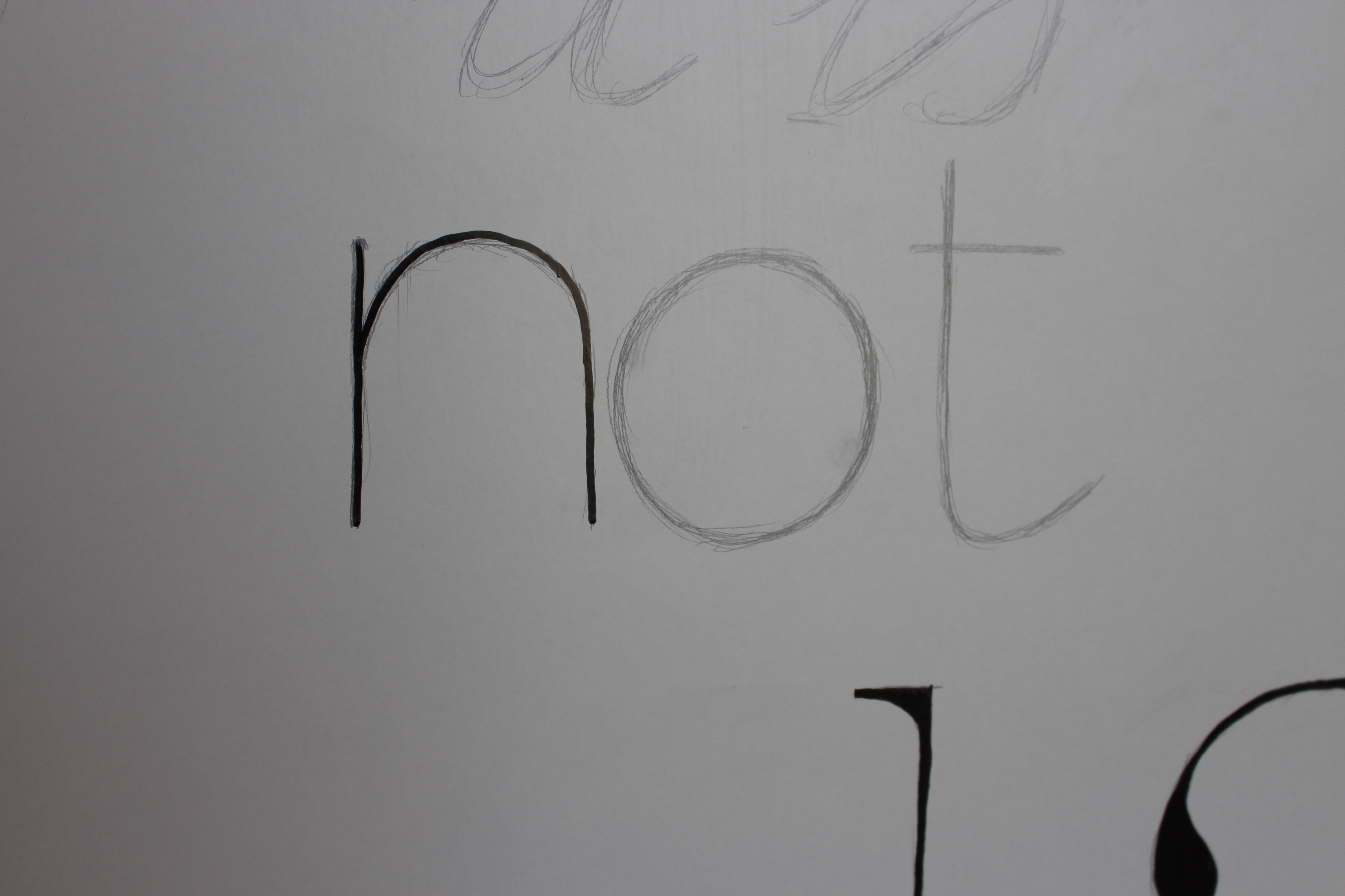
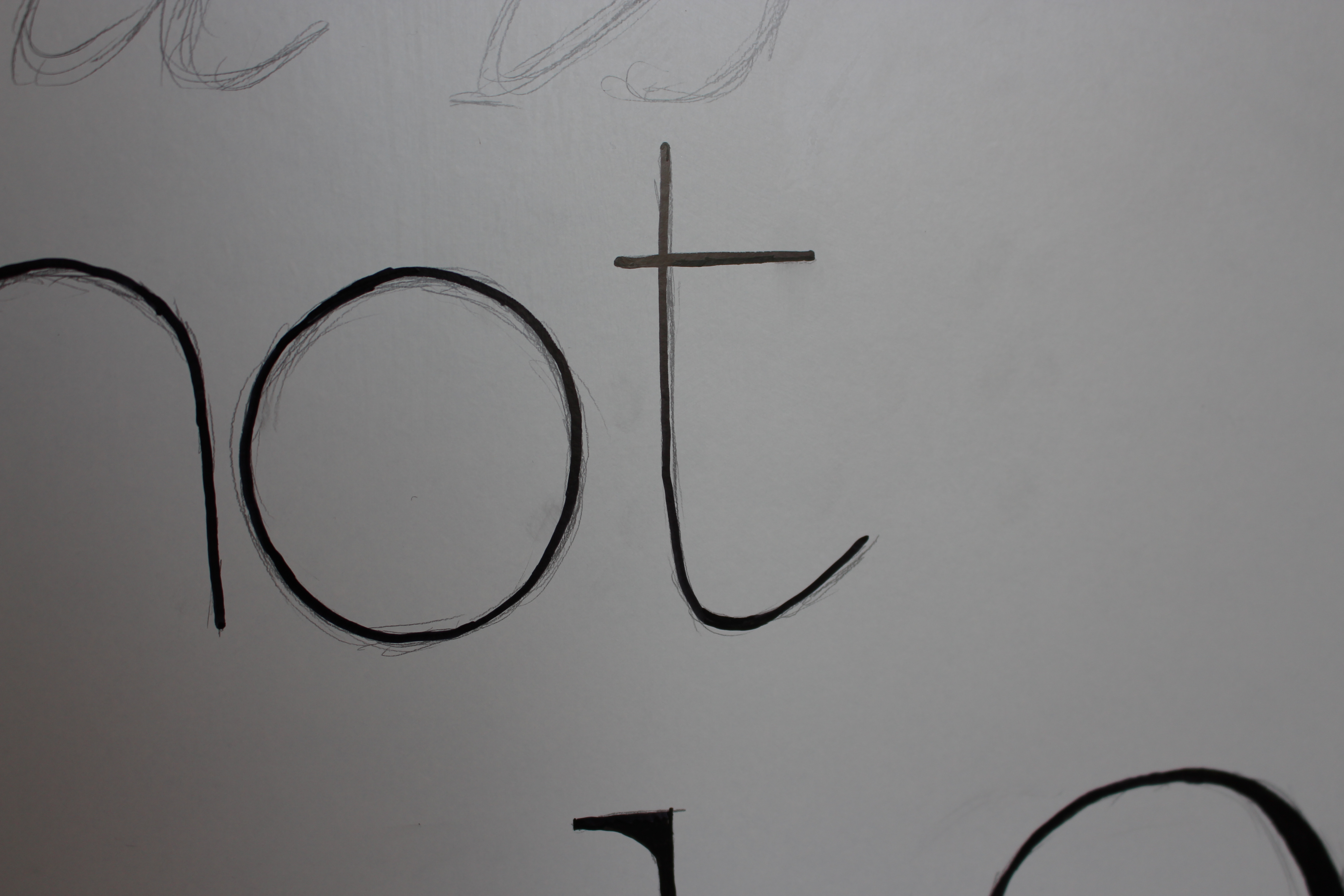
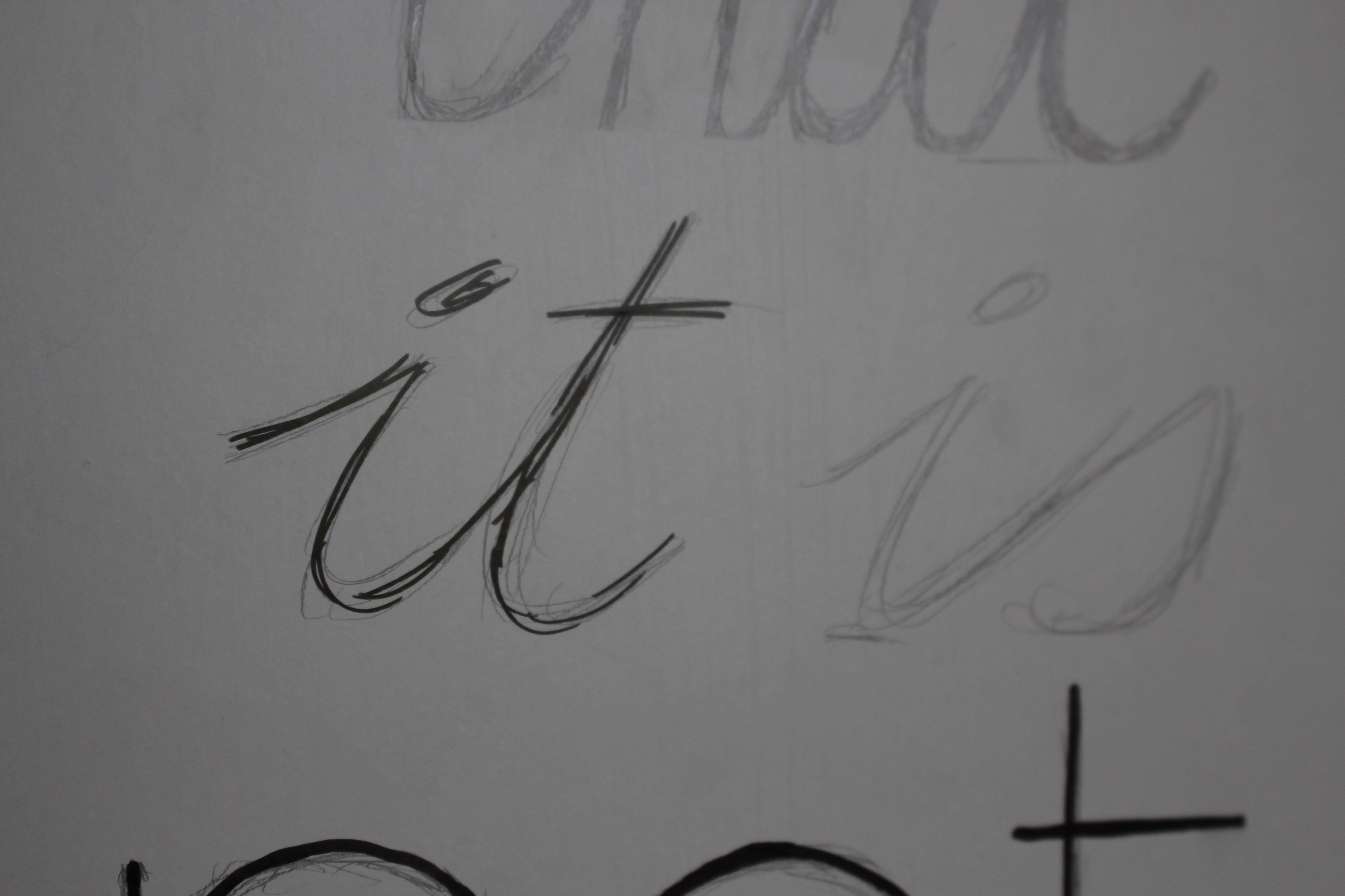
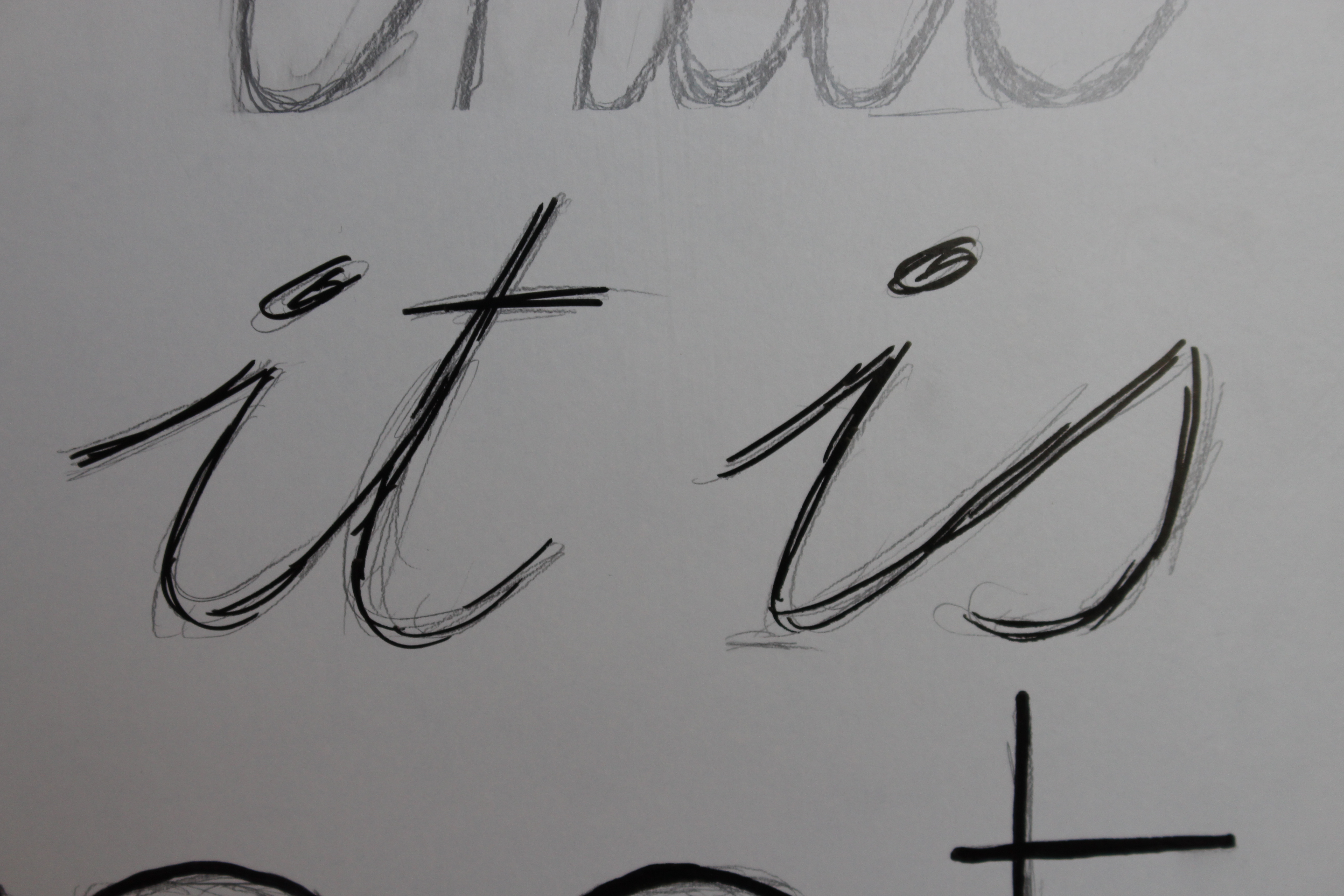
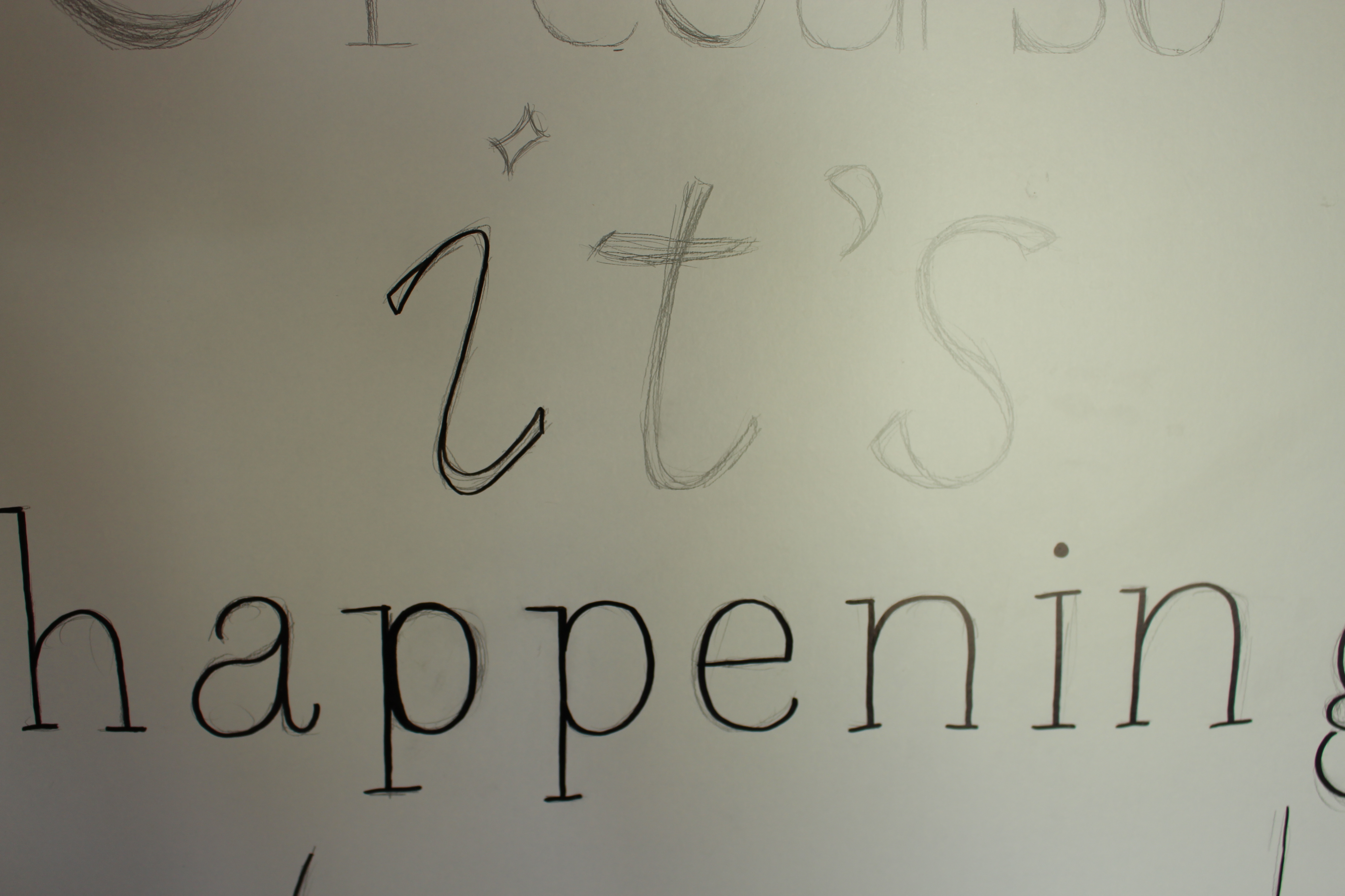
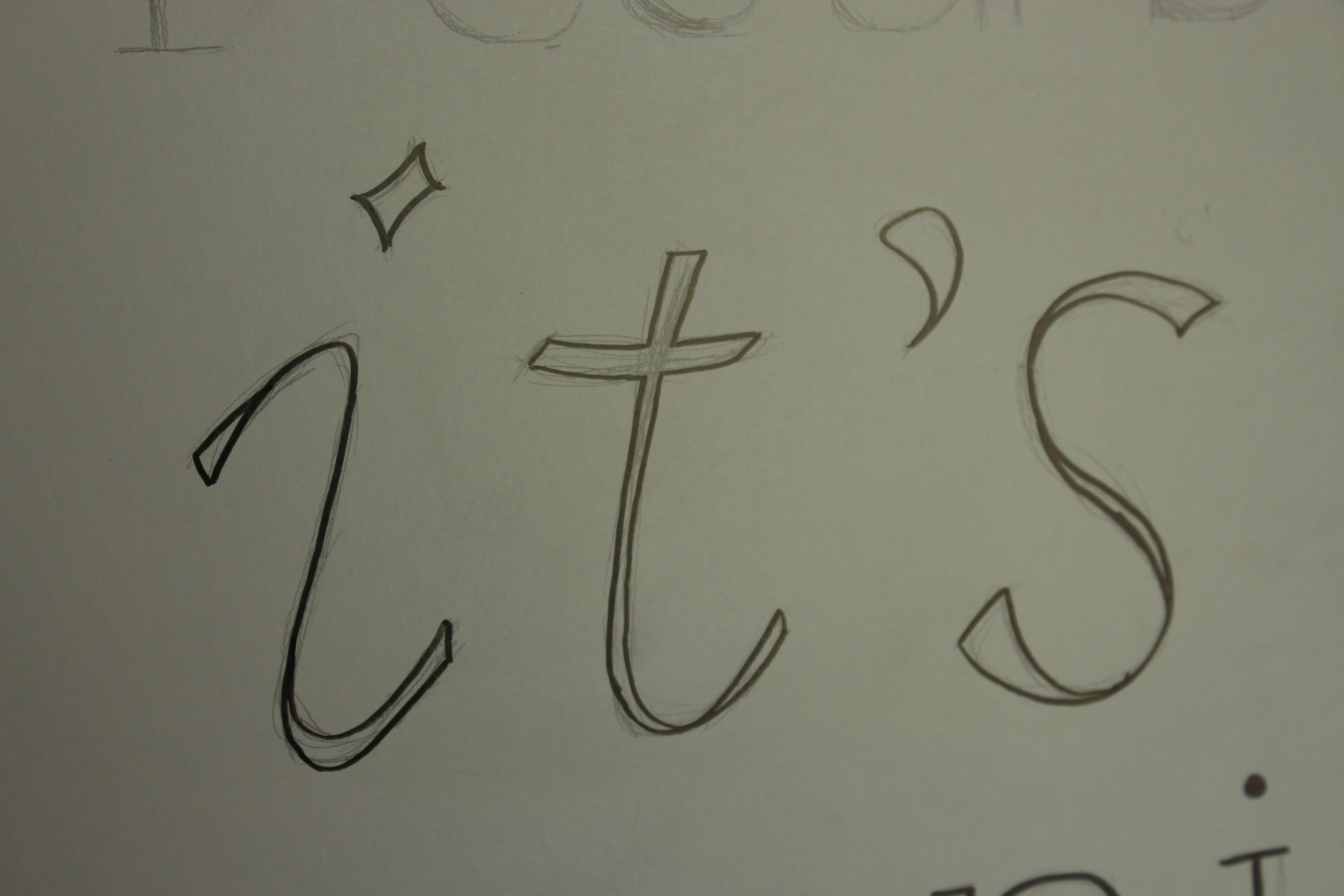
Like I said, the steps you'll need to take depend a bit on the technique you want to use. I've picked out a few of the lines I made to shortly explain what technique I used.
not - I first traced the text with a single line, using the thick marker. After that, I took the thin marker and filled in small parts that didn't look as smooth as I wanted them to.
it is - using the thin marker, I sketched over the drawn lines. Important to remember when going for this look is to lift your marker up from the background, instead of making your lines as continous and smooth as possible.
it's - to prevent your piece of art from looking too dark, it could be helpful to make a line with just outlines. Keep in mind that doing this will make it a bit harder to touch up errors later.
If there's a specific technique I didn't explain here, but you'd like to hear what I did, feel free to ask!
Clean It Up
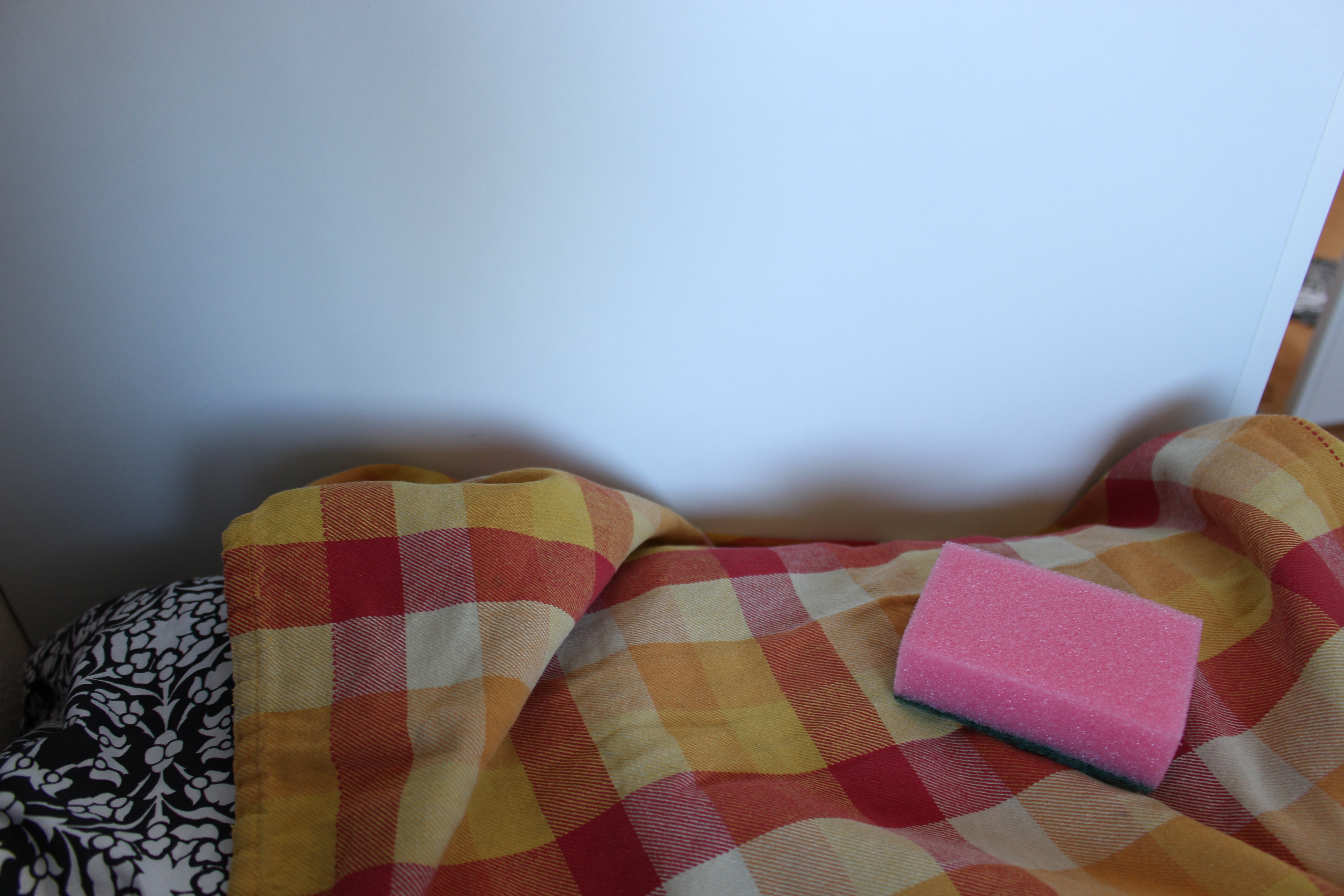
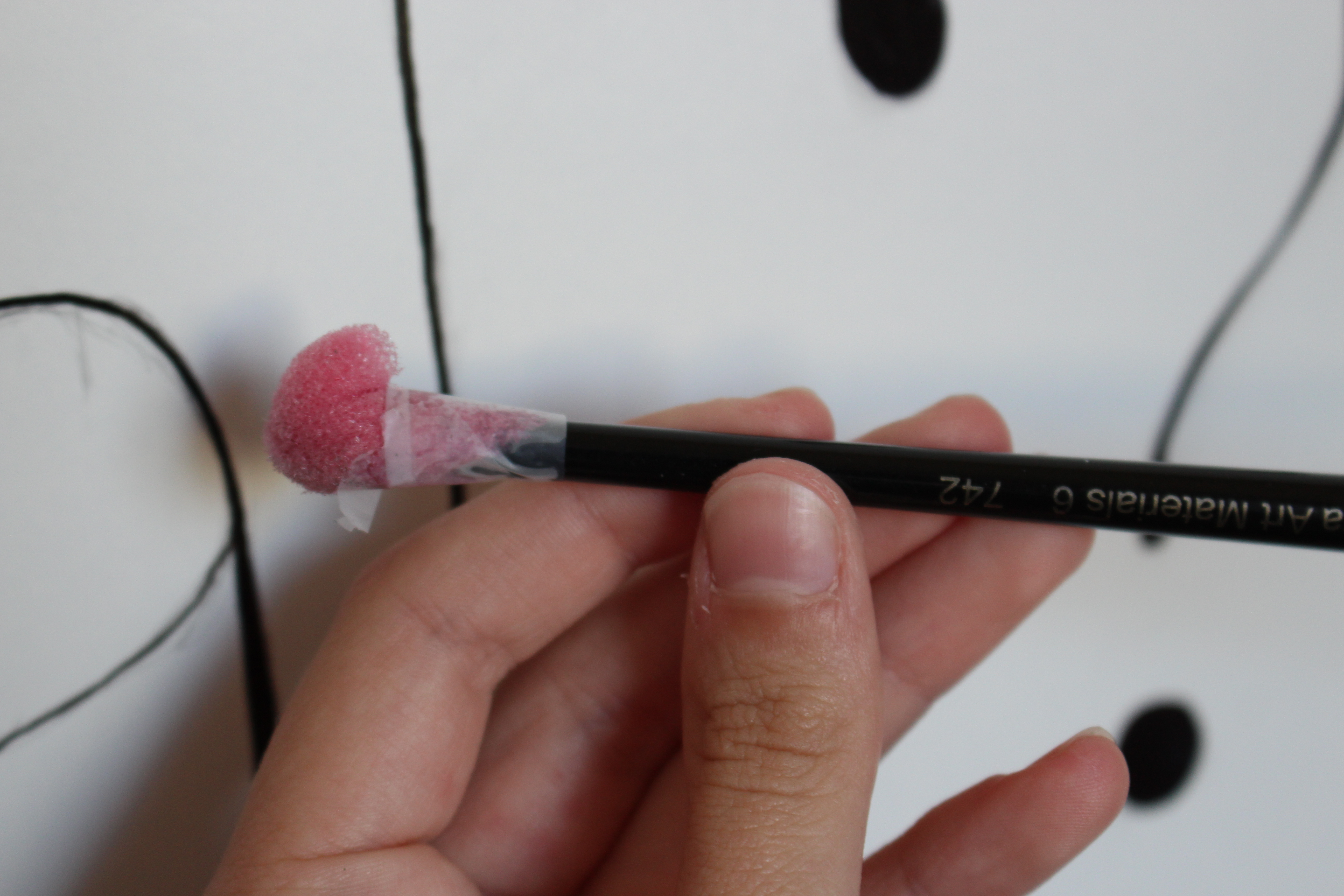
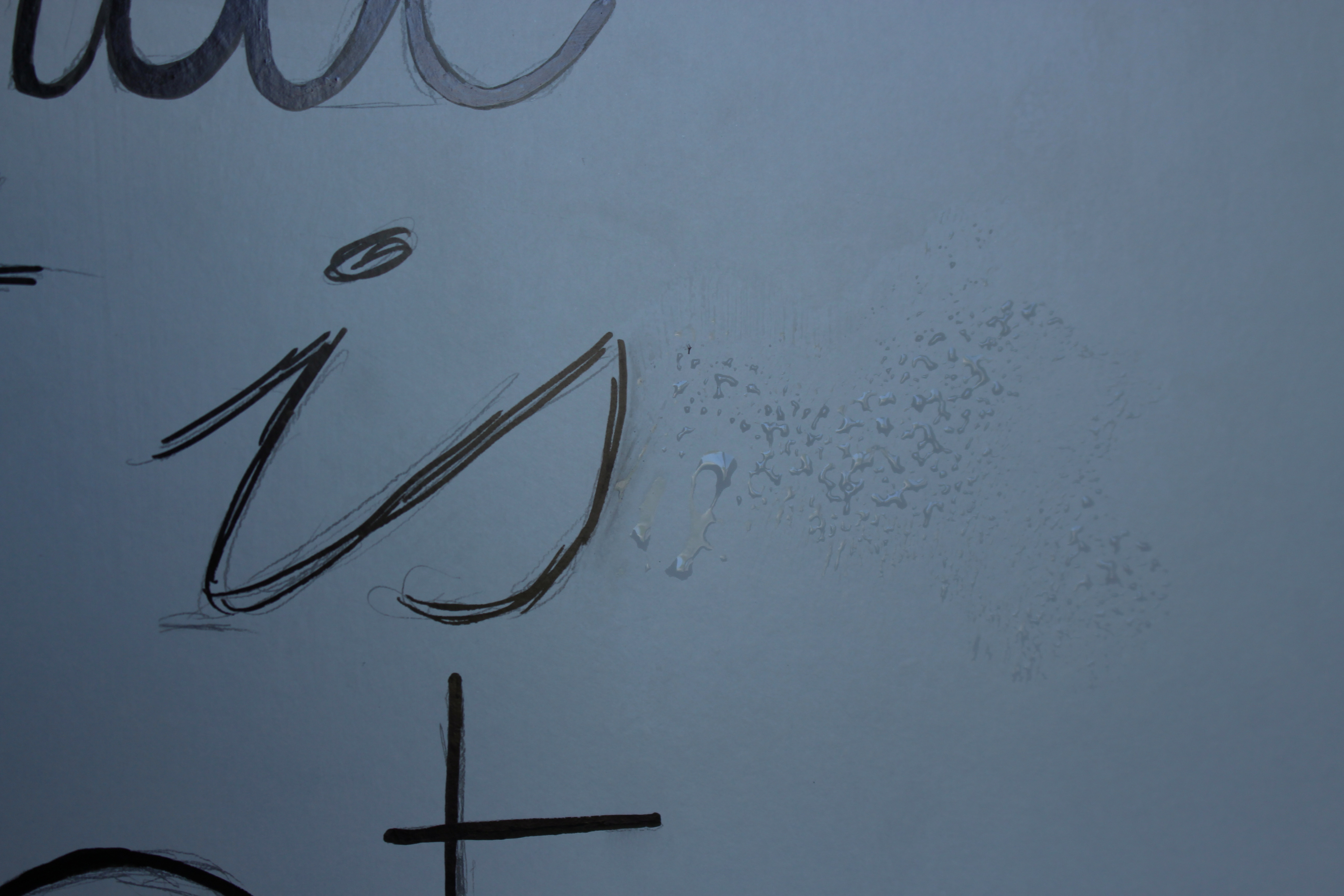
Use a sponge with a bit of water to carefully clean up the pencil markings. I ended up cutting off a piece of the sponge and taping it to the back of a paint brush to be able to work a bit more exact.
Please note: I ended up leaving on quite a bit of the pencil markings. It turned out to be a lot harder to remove than I thought, so I just removed the lines that were really bothering me.
The End Result
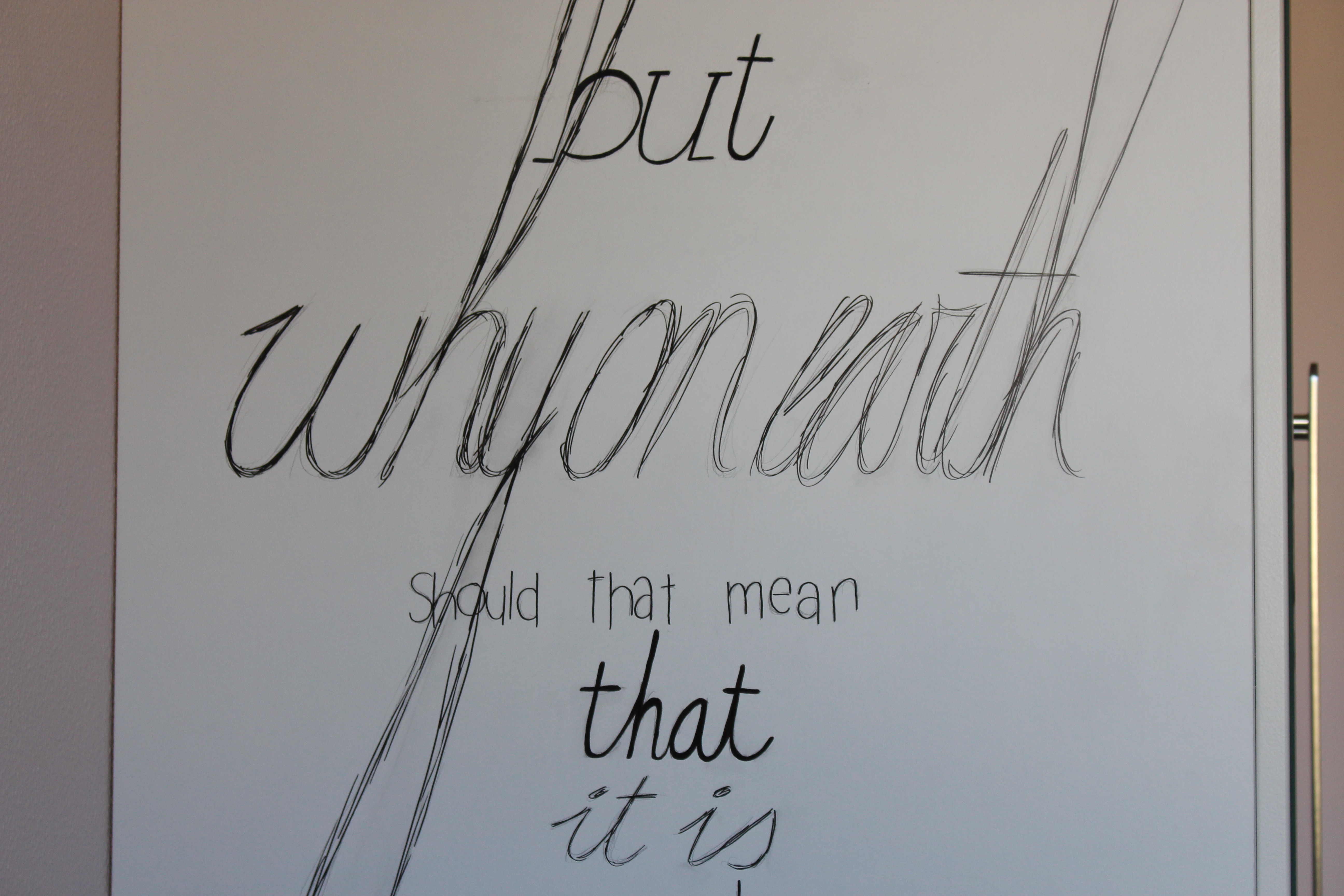
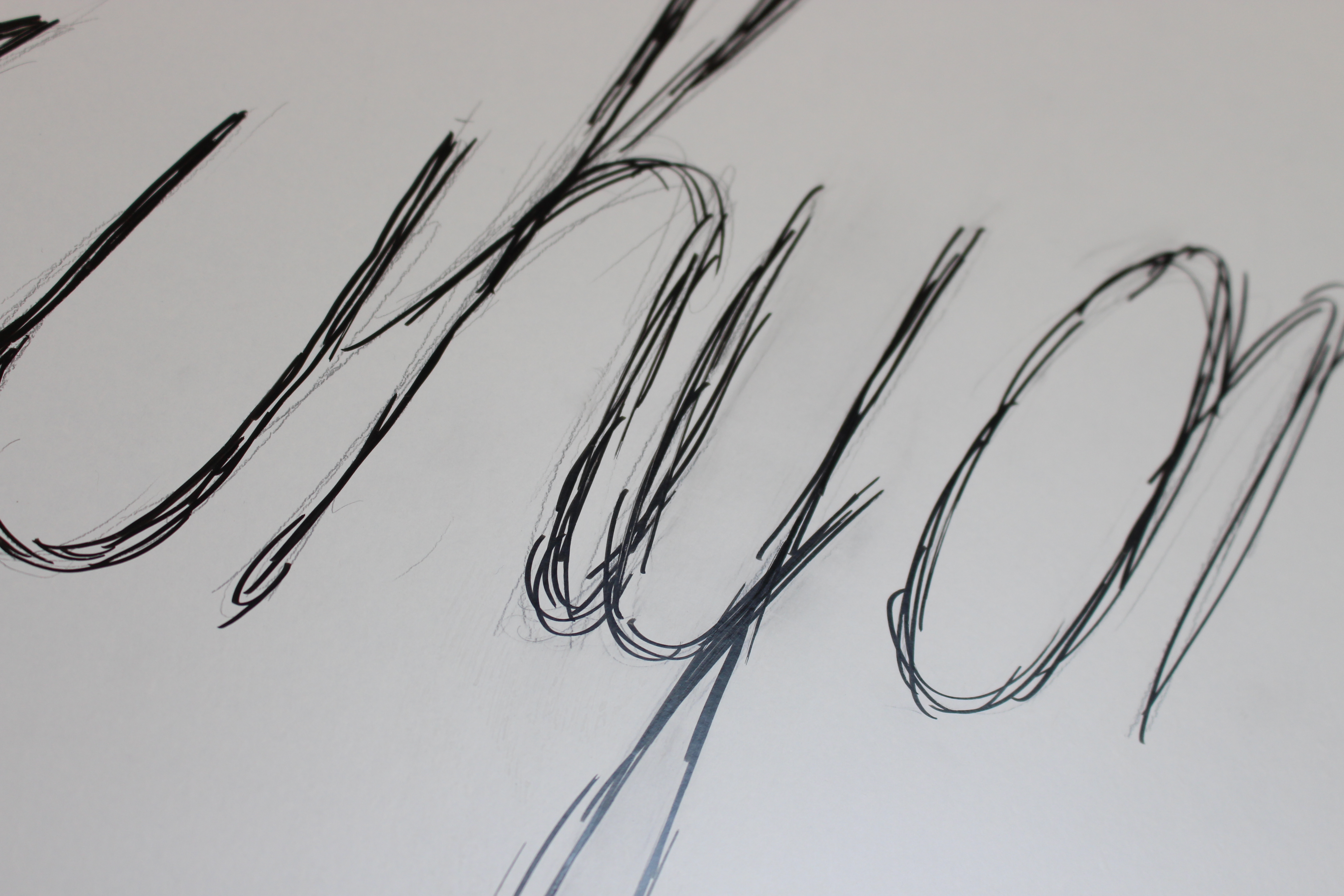
And that's it! This is definitely the biggest project I've made so far and I'm really happy with how it all worked out!
If I've left any questions unanswered, be sure to leave a comment!
And, of course, if you try this yourself, share a picture of your end result by posting an "I made it" comment below : )