Toothy Apple | Photoshop |
by Digital Flame in Craft > Digital Graphics
2580 Views, 34 Favorites, 0 Comments
Toothy Apple | Photoshop |

So.
A beginners Photoshop exercise is to cut out a lions mouth with the polygonal lasso tool and then to super impose it together with an apple.
Beginner.
I think that you and I can do better.
We will be using content aware, warp, soft brushes, colour replacement, pen and healing to impose the whole muzzle!
Also while we are on the most thoroughly read part; see that vote button in the top right? Well you know good karma and all that... OK I'll stop with the whitemail (Does that exist?) and lets get to the Graphic Design!
Image and Canvas
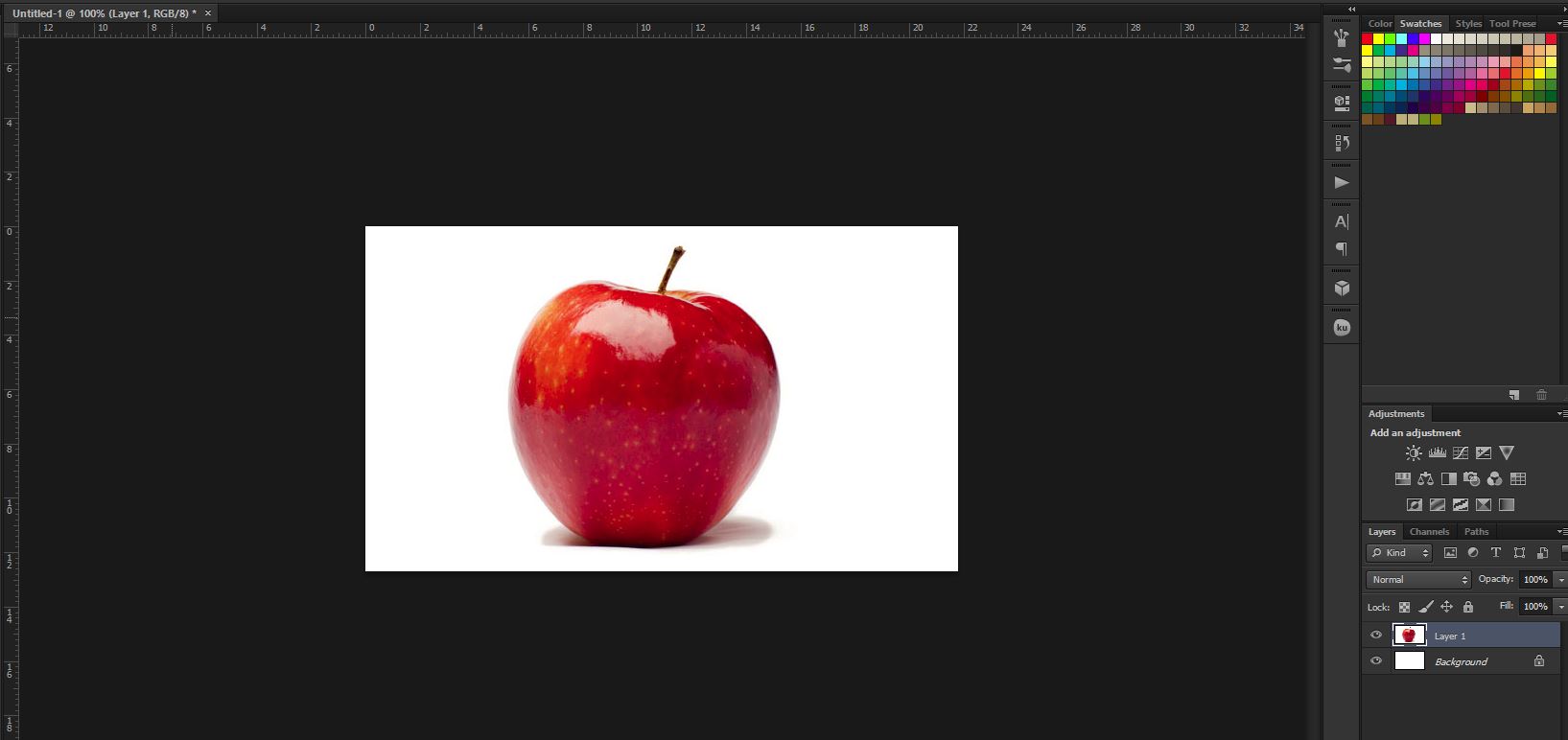
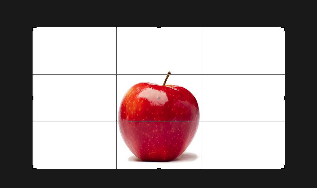
First grab an image.
Go for the largest you can get (well not ridiculous), at least 1080p, If you are doing it commercially, like I am (Publishing online), then get a royalty free one. And stay away from watermarks; they're fiddly.
Crop it larger (yes that does make sense), so that you can get the object framed well.
Go for any spherical shape. Try not to choose something with a bumpy surface (like wrinkles). Most fruit will work great! (Especially as the skin is tile-able) (You could even do a Cadb-ry's Crem- Egg*)
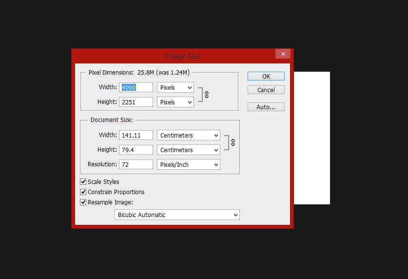
Make it BIG! You can always make it smaller at the end but making it bigger won't be optimal.
4K all the way!
*Blanked so I don't get attacked by copyright!
Lion and Flip
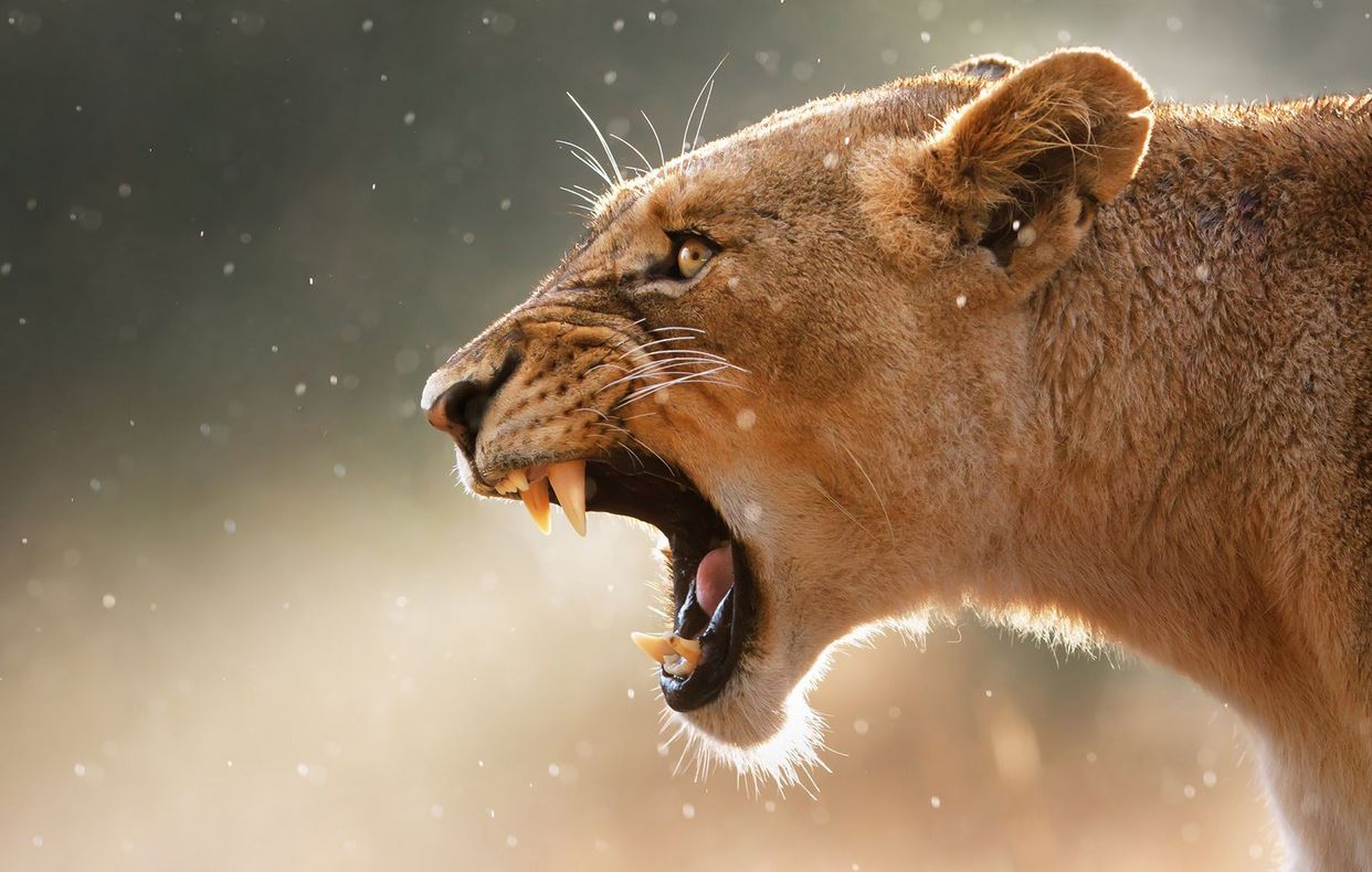

A brilliant image that I found, unfortunately even using similar image search I couldn't find the origin to give credit.
I also flipped it using
Image>Image_Rotation>Flip_canvas_Horizontal.
This is purely beacuse I thought it would look better the other way on the apple. I felt it would just flow more, flipping the final image now I can see I was right. But you can always experiment in the first half of the next step.
Positioning
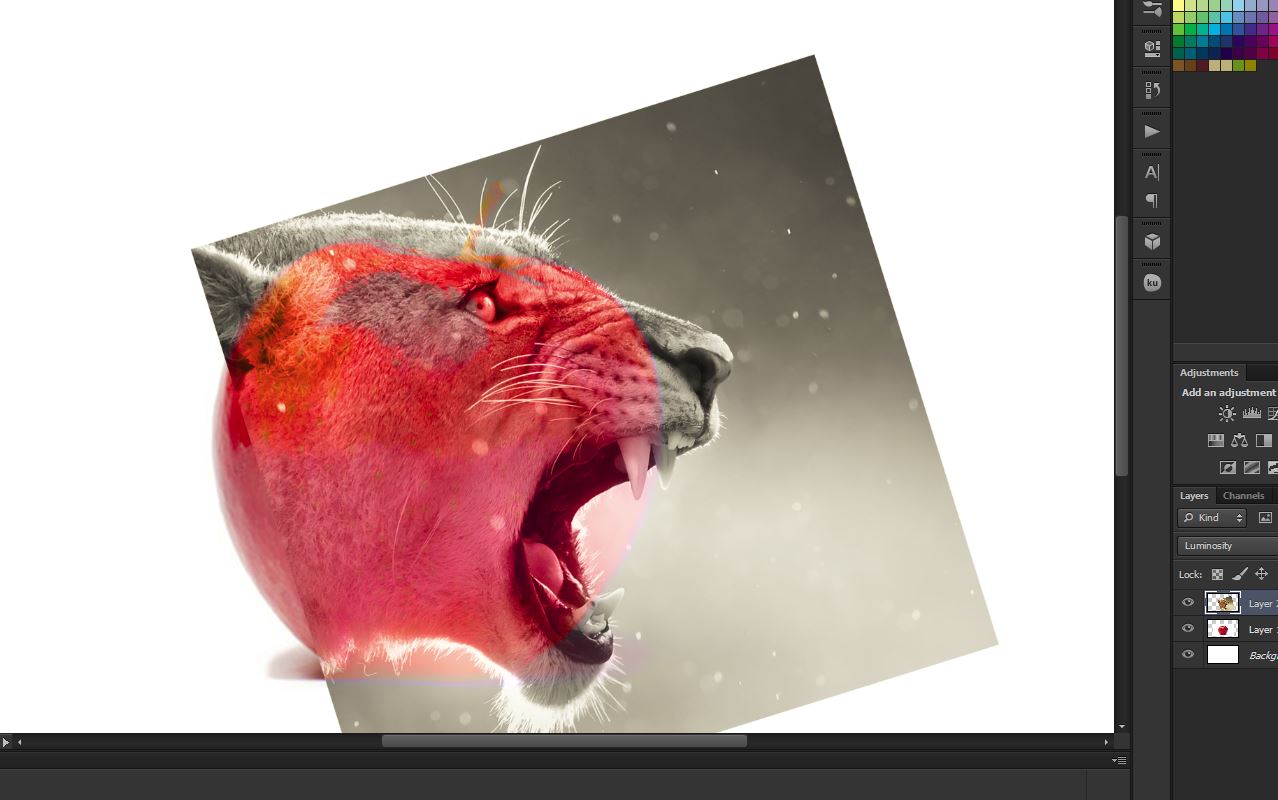
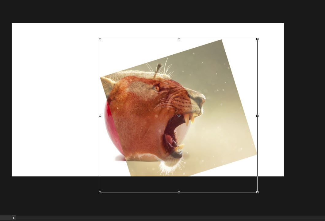
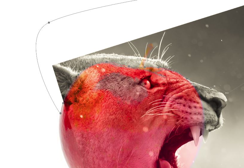
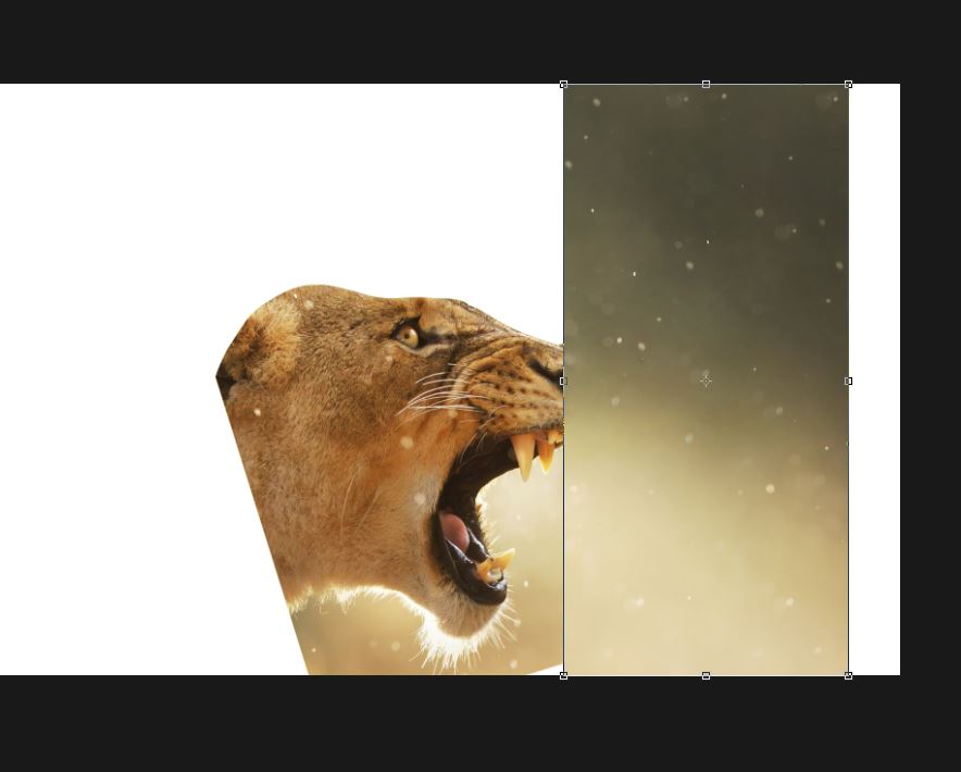
Using blend mode luminosity (or whatever works best, opacity could be used as well or instead!)
Transform around until you reach the best positsion. Then create a path with the pen tool (which is harder but much better than the lasoo tools) to erase the excess lion. (upon creating a complete path, right click and make selection. Then just delete it; using the delete button while the lion layer is active).
Quick tip!
Label your layers so that when we get more complex it is a lot easier to navigate!
Content Aware

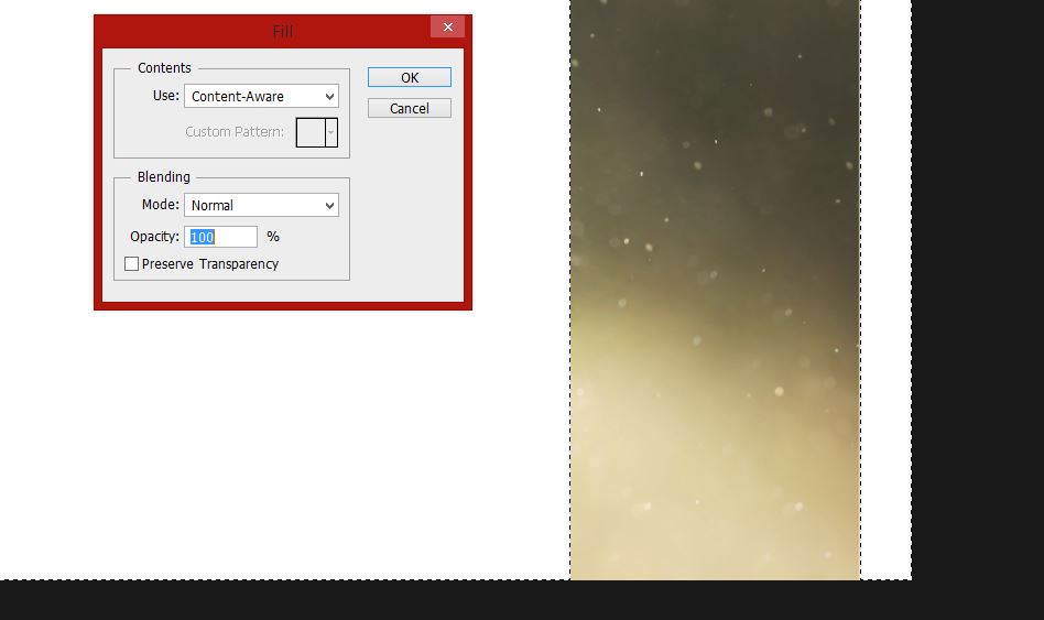
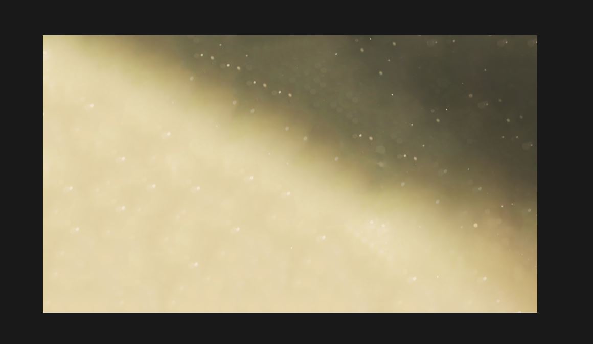
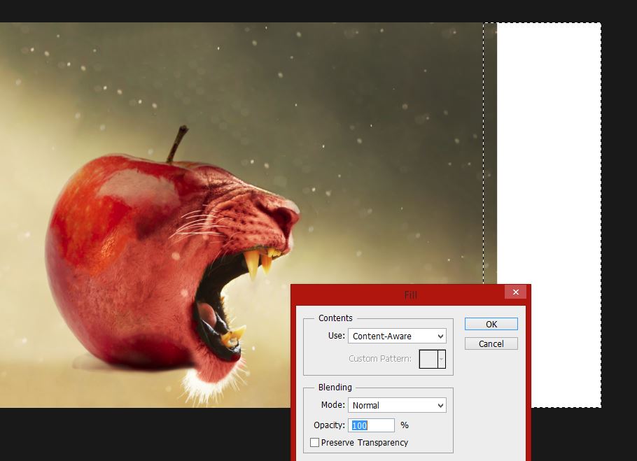
I took a splice of the original image background and put it so that it roughly aligned with the remaining part from the lion layer. Next, making sure we are on the same layer as the splice, select the parts that aren't white (hide the other layers so you can get everything in!) and us;
Edit>Fill
then adapt the settings to use content aware (second picture)
And then marvel in the fineness of Photoshop's insane intelligence; and thank it for saving you three hours with a six pixel clone stamp tool!
Erase!
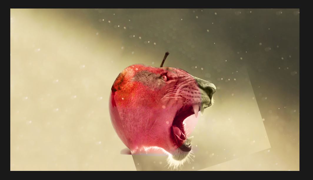
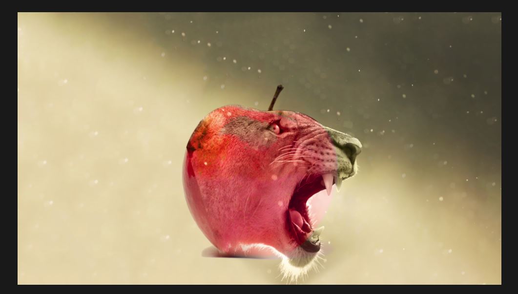
Use a soft eraser to merge the two layers (overlapping background in the splice and lion layer) to achieve the second picture.
Not much to write in this step apart from the fact that I am in need of a new watch and that five seconds to click that orange vo-- No? no? ok then.
(Also turn the lion layer to hard light)
Star Trek!
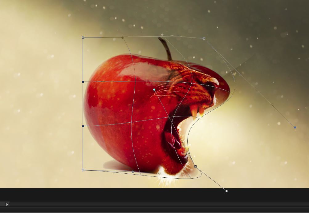
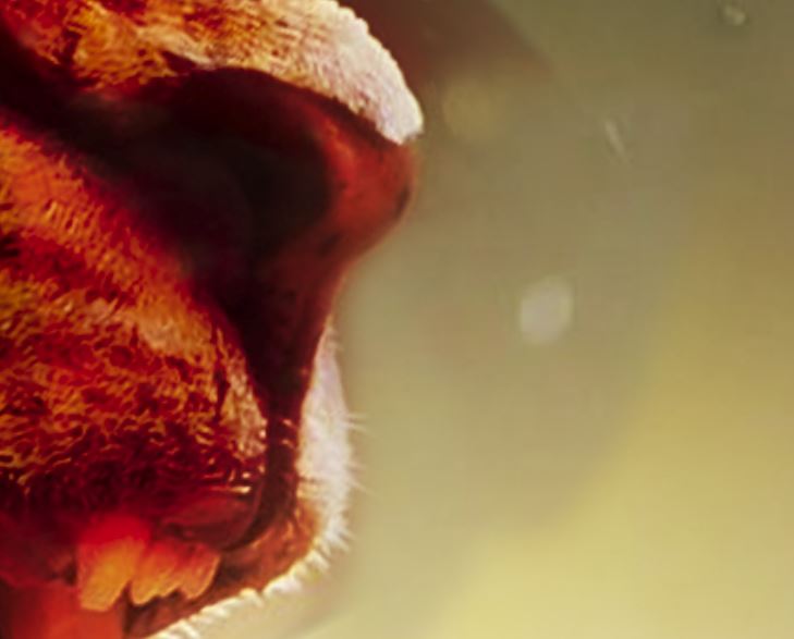
Oh wait, not that warp!
Edit>Transform>Warp
to stretch the apple texture down the muzzle. Then I used a mix of the default soft and hard brushes to remove excess apple!
Confusing bit!
You will now have a lion layer using hard light and an apple. Duplicate the lion layer and turn the new one to normal.
Call the hard light one lion light (for depth) and the new one lion colour (for colour, duh!)
Blending!
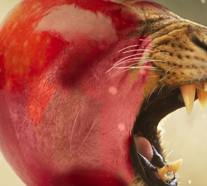
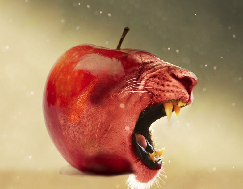
On lion colour turn the opacity down and use the colour replacement tool and a lot sample colours from the apple to create a gradient over it. This will give you the effect in the second picture so that it doesn't have the insane amount of darkness and saturation in the first picture of the last step (Star Trek).
Finishing Touches
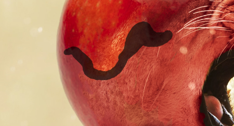
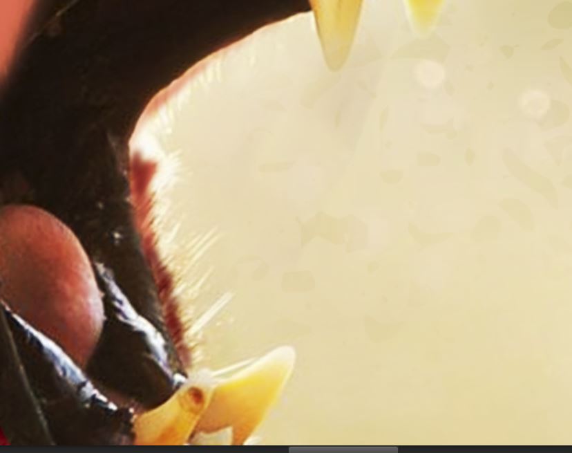
Use the spot healing tool to help blend the skin.
I increased the framing using content aware.
And filled in a bit of un-apple-fied lion with a hard red brush.
Creative Market and Even More Finishing Touches
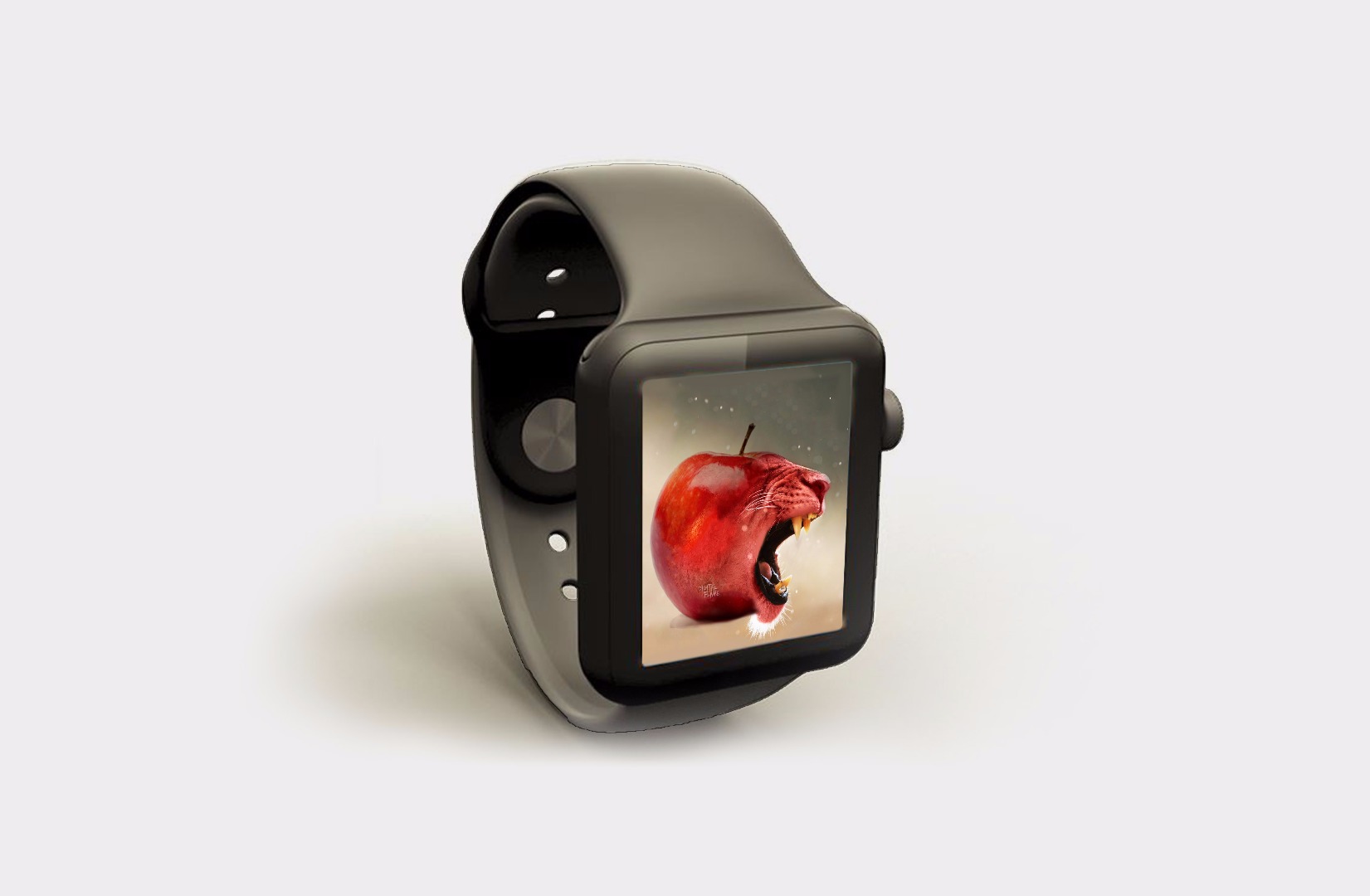
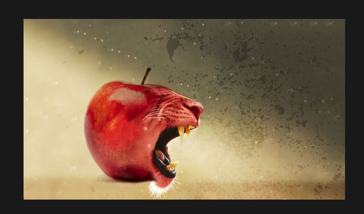
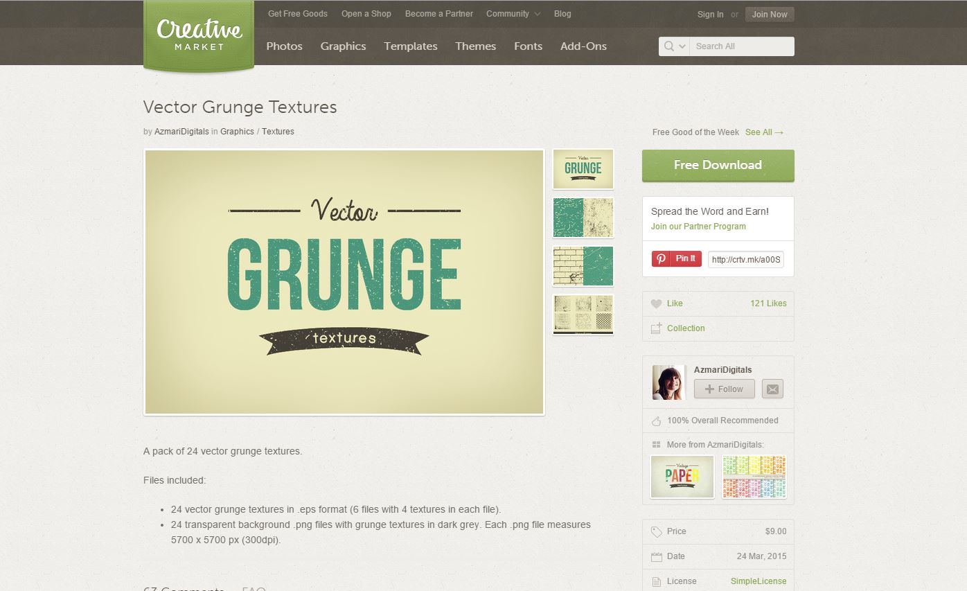
Just to make the image a bit more interesting I gave the bottom a dark colour on low opacity to act like a surface and used Creative Markets Grunge texture to make the background more interesting.
In the next step also you can see my cheesy signature.
Also I wanted to make something ironic and funny, so I slapped the evil apple onto another of Creative Market's Great products;
The Apple iWatch Mockup
Finished!
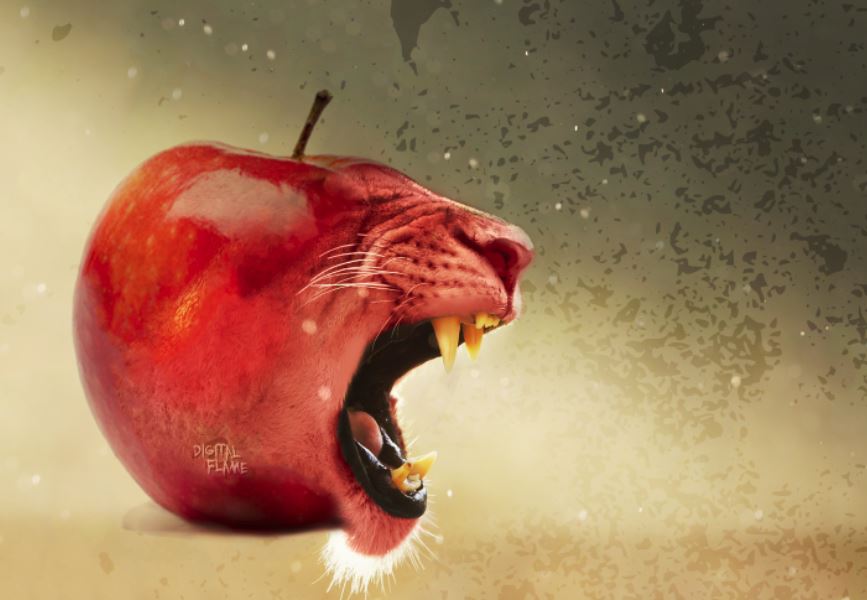
So if you've made it this far, well done!
If you enjoyed, completed, need help or can think of a way to improve this guide then please leave a comment below!
If you think this one is a winner then please vote for me in the Graphic design contest!
Thanks!
-Digital Flame