Thermometer Graph in Excel
by artworker in Circuits > Computers
4186 Views, 15 Favorites, 0 Comments
Thermometer Graph in Excel
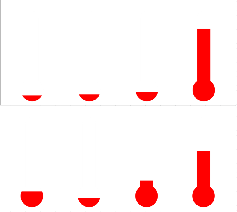
This is in continuation to my speedometer graph. I thought Why not make something that will look like a freak show? How would it look if we can represent some data in a way that will look like they are watching some temperature chart of a nuclear reactor. So I did some preliminary research and came up with this thermometer. Kindly comment for any changes required. These form of graphs can be used for representation of real life data such as some data that is arriving from arduino or any other hardware etc. This can be a good addition to any portable workstation.
Downloads
Use Any Excel
This can be done in any of the flavors of excel later than 2003.
First open an excel workbook
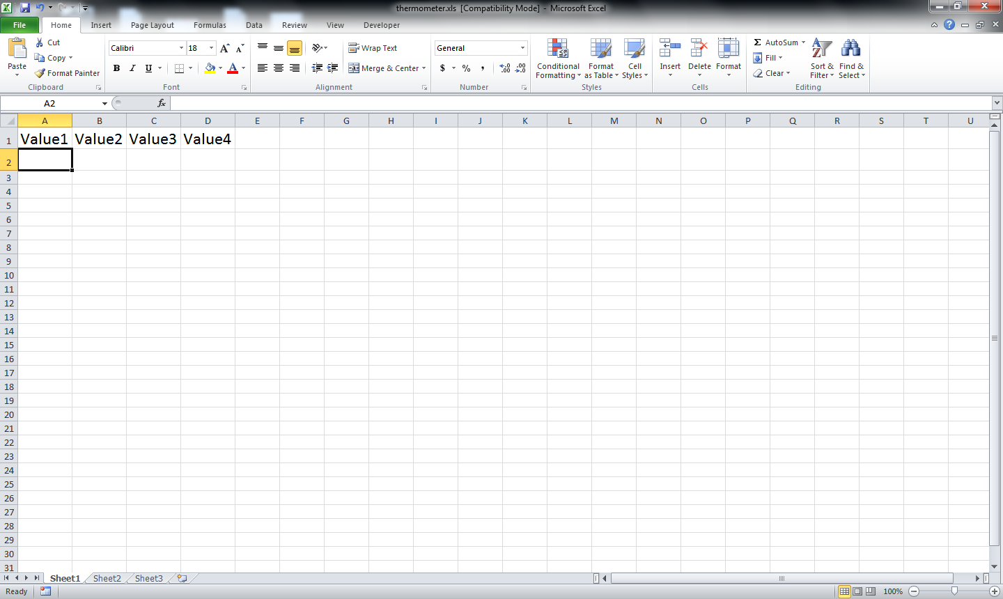
And create few columns for names. Here I am using Value1 through Value4 for ease of representation.
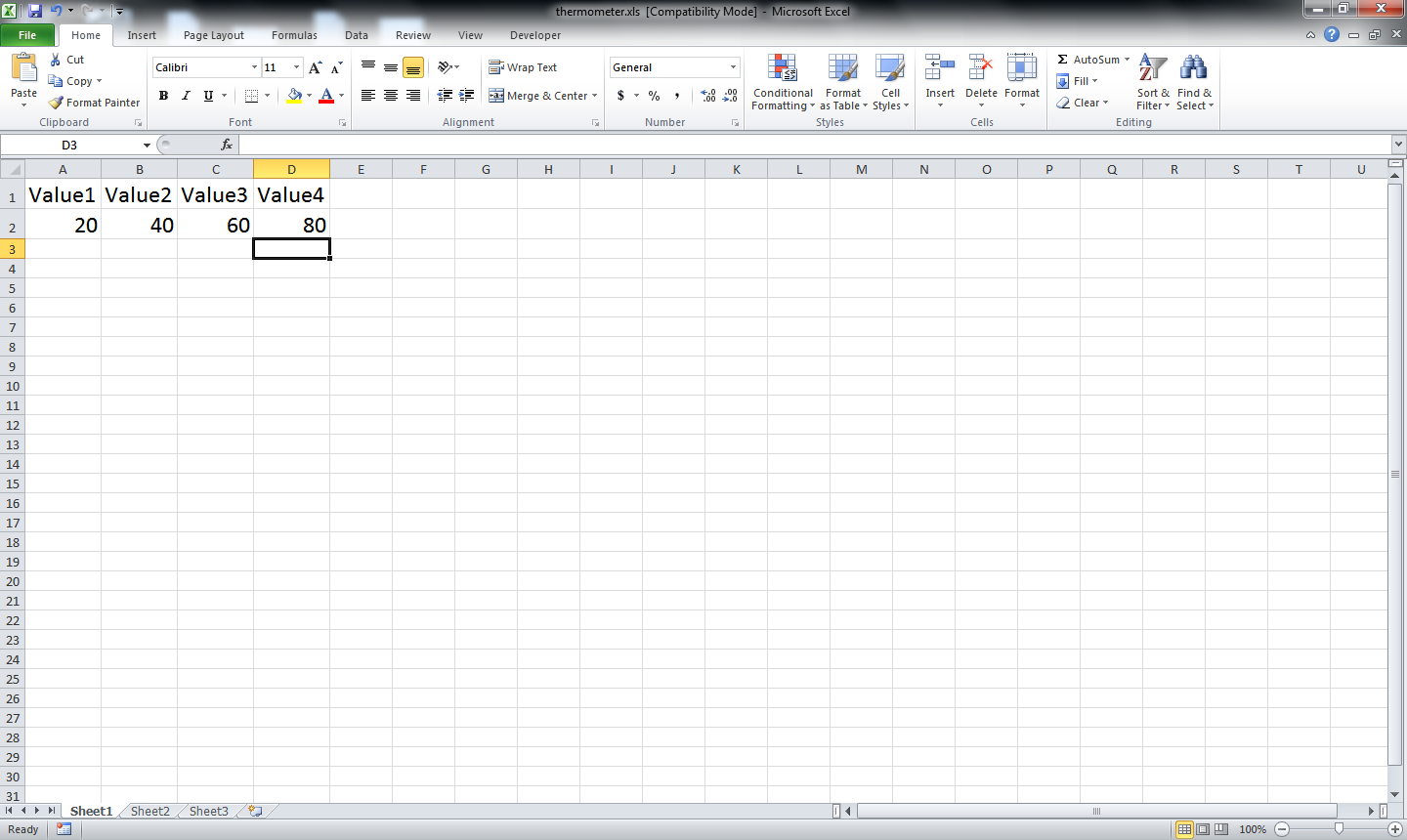
Now put real values to represent the variables. Putting values between 0 to 100 for ease of understanding. One can use any value they like, or take real time values from any data source.
Graph Appears
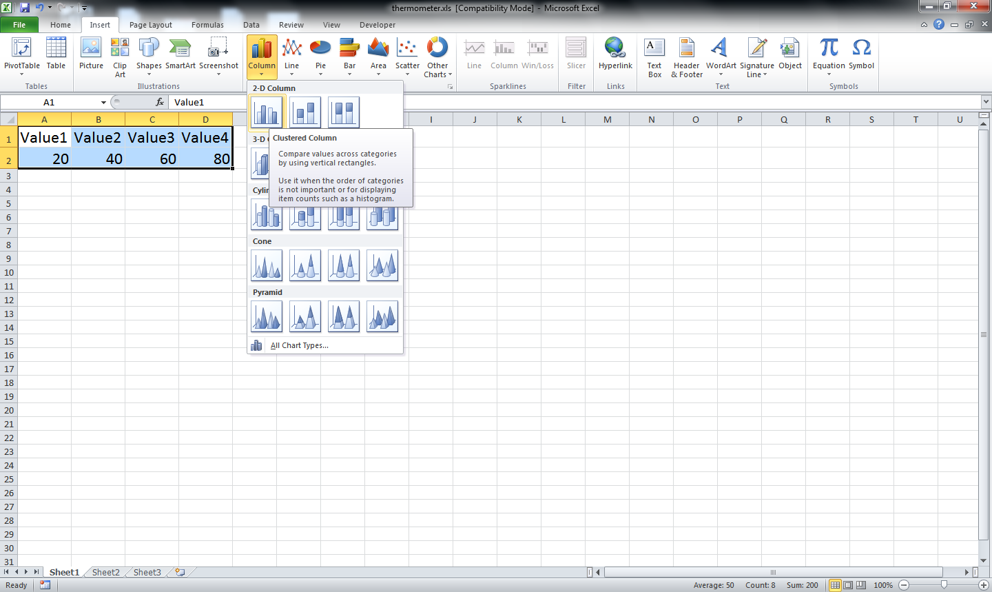
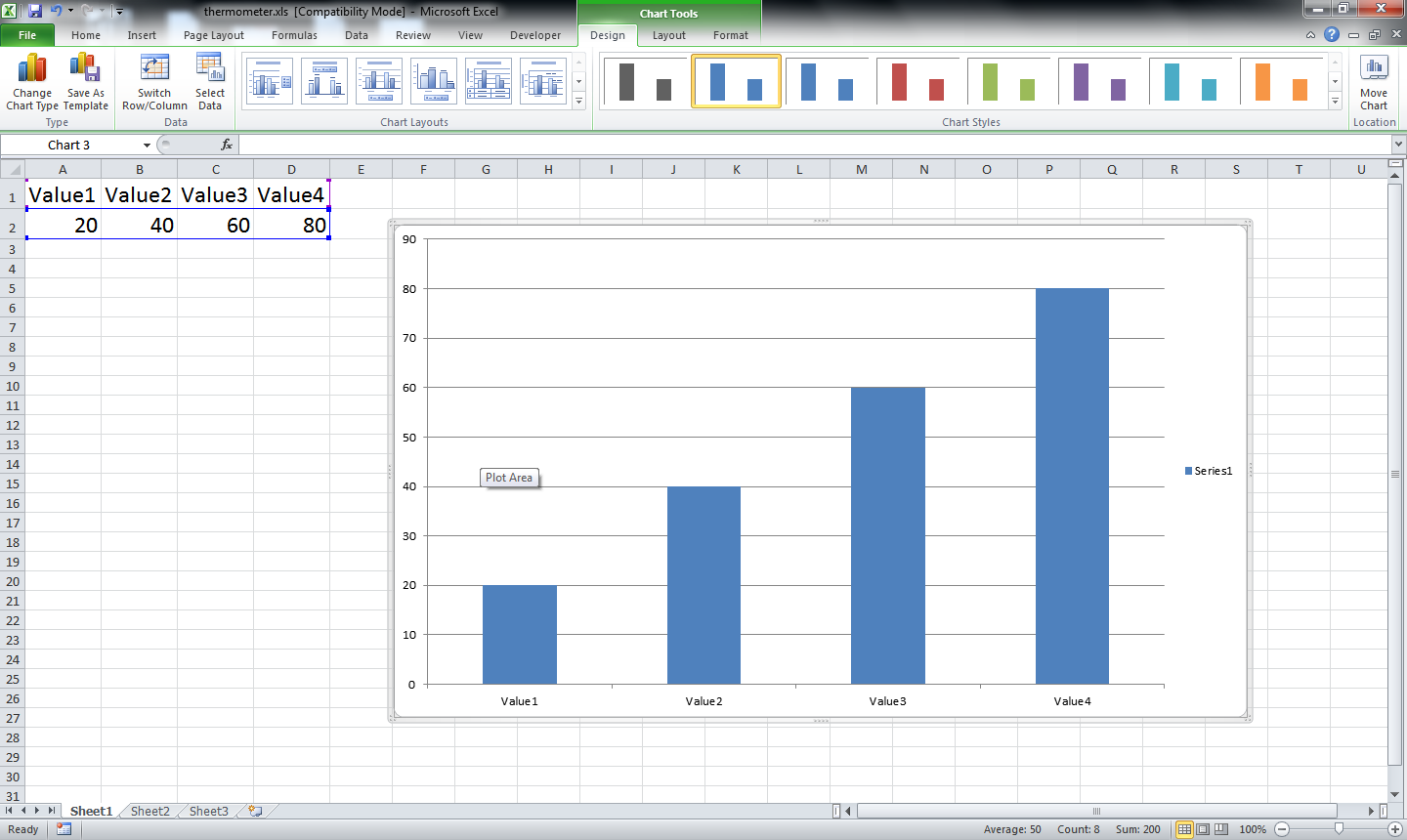
Now select the value that to be turned into graph. Insert a bar chart representing the values.
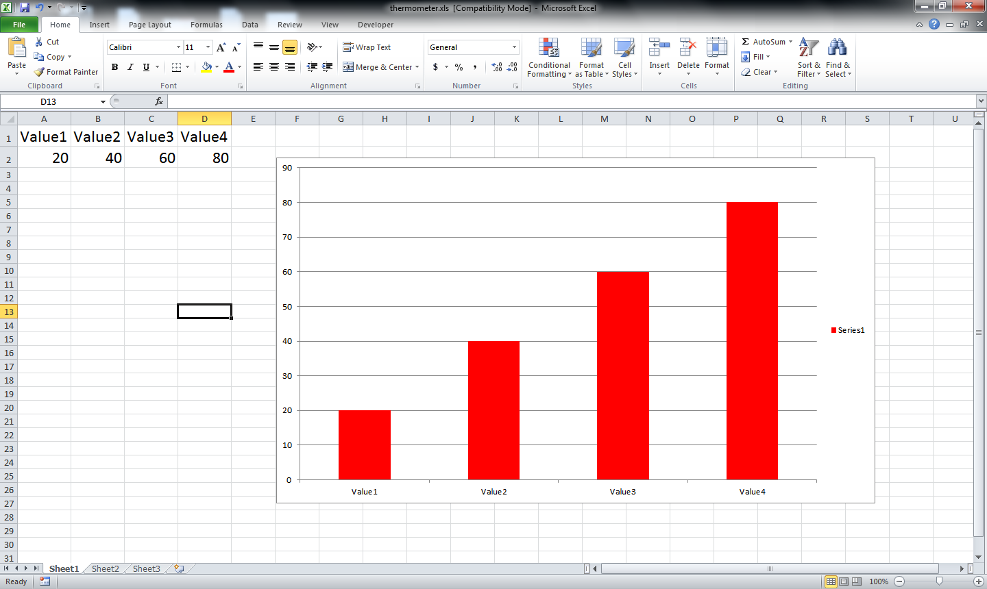
Color the bars as you like. I have used red to give some hyper activity feal.
Color the bars as you like. I have used red to give some hyper activity feal.
Stabilizing the Graph
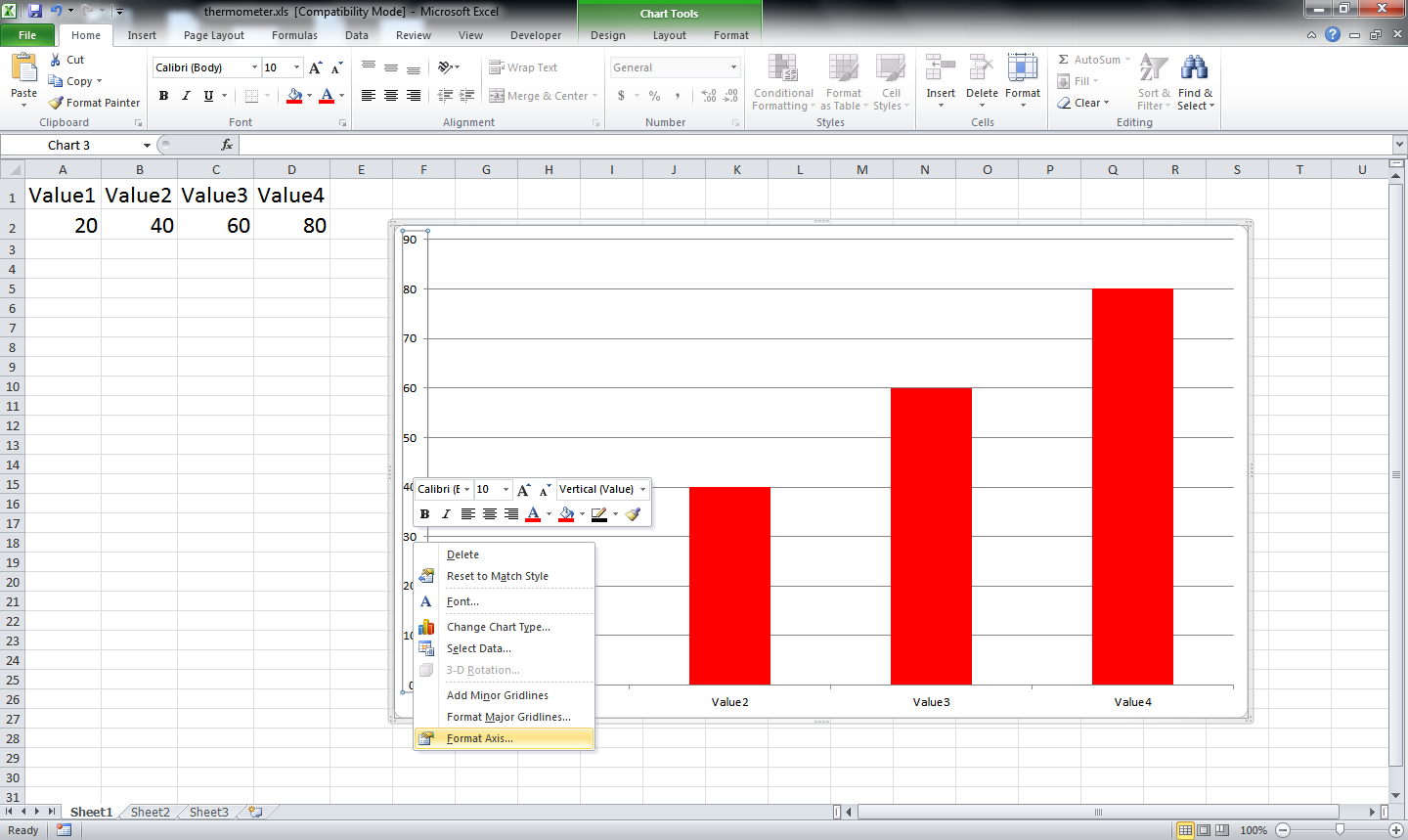
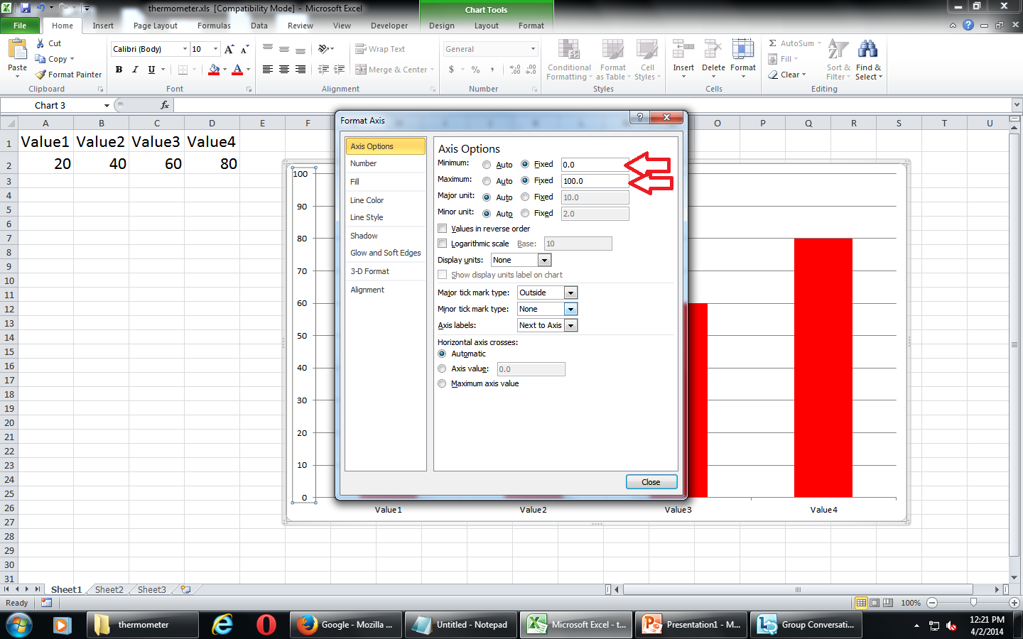
Stabilize the vertical column so that the change in values does not affect the graph.
Setting the minimum and maximum value freezes the graph. Or else the max and min value of the graph is used, which hampers the graph to a considerable limit. Skip this step if you want to see what I mean
Setting the minimum and maximum value freezes the graph. Or else the max and min value of the graph is used, which hampers the graph to a considerable limit. Skip this step if you want to see what I mean
Removing All That Are Not Required
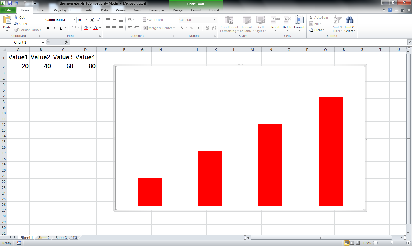
Delete the lines that are not required. Legends and all. You can keep what ever is required as per your requirement.
Masking
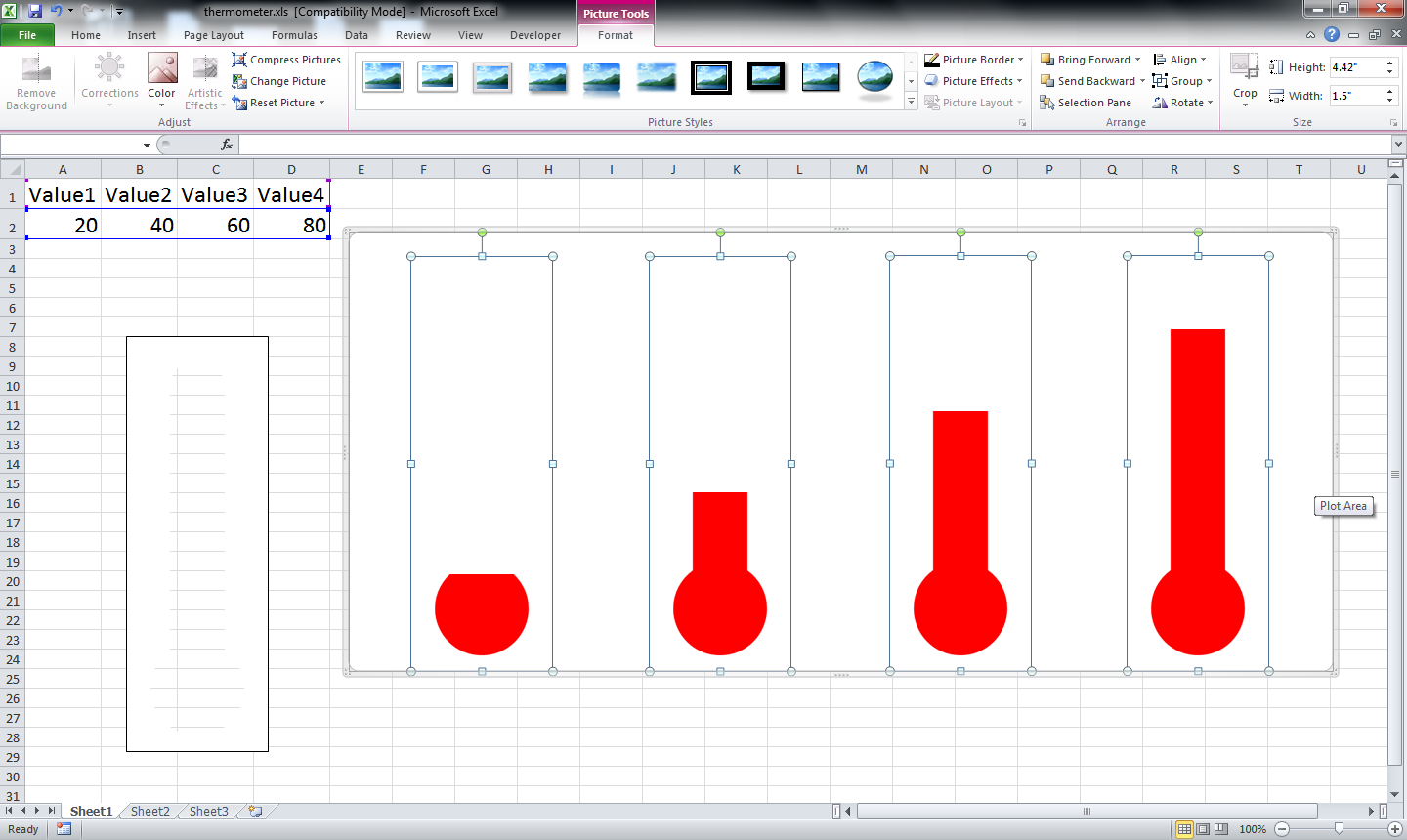
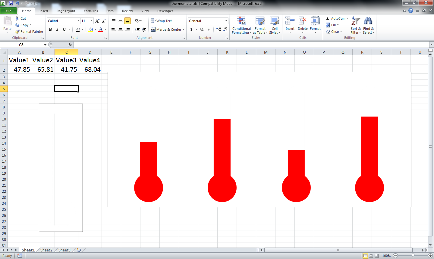

Now import the mask. Mask is just a simple png file that is used to block the graph and give it a look that is required.
I made the mask in powerpoint using the union and subtraction tool.
The mask is also provided within the excel file.
I made the mask in powerpoint using the union and subtraction tool.
The mask is also provided within the excel file.
Finally

So we are done.
Pose note:
Many other masking can be used as required. The default mask is provided within the excel.
The excel file has been changed a little to make it more dynamic. I have added the random command to show how it works. To use this just open the excel and use the (F9) button to see it work.
Happy graphing.