Text Window Greeting Cards
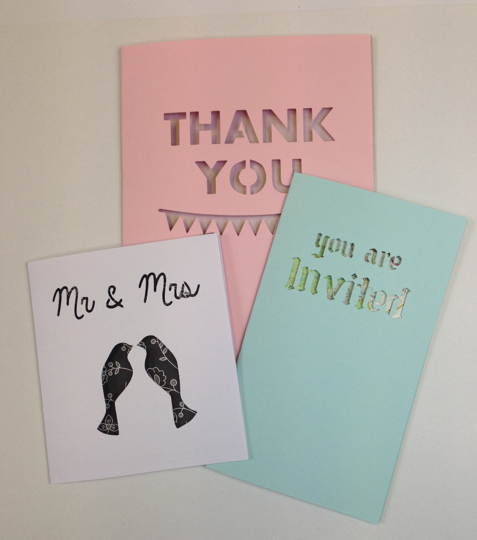
Wedding stationery can be surprisingly expensive! And it is not always possible to tailor it completely to your own theme or need. But, handmaking literally hundreds of cards, from save the dates and invites through to orders of service and thankyous, is massively time consuming... and that's before you address a single envelope! And at a time where there are a million and one other things you need to be doing as well. I have had to come to the rescue of more than one friend who took on more than she realised when she decided to make her own stationery.
When you need to produce a large number of cards, simple yet effective is the key. I love these cards, as they are infinitely customisable and easy to personalise, yet they are simple to set up and quick to make. I have made up a few different examples to show how one idea can be executed very differently. If you are planning your wedding I hope this helps you to come up with a design that is all about you!
You will need:
- Silhouette Cutter (I used Portrait)
- Use of computer running Silhouette Studio
- Access to a printer (if printing inside of card)
- Cardstock of at least 160gsm
- Bone folder if you have one
- Paper of your choice - patterned or plain
- Glue (please read notes later on)
Designing in Silhouette
I used a Silhouette Portrait cutter to cut the word windows in my designs. Don't stop reading here if you like the design but don't own a Silhouette cutter - they can be picked up fairly cheaply on auction sites (and resold afterwards to recoup your money). It makes things easy and for not a lot of money!
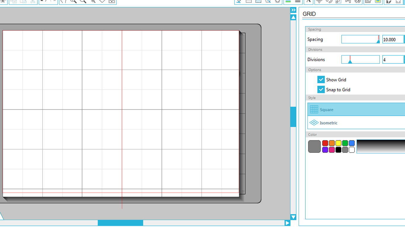
My first step designing the card in Silhouette Studio was to create a design page the same size as the entire sheet of card that I am using - not just the front of the card. Then draw a line where the fold in the card will go. We will delete this line before cutting - it is purely to be used as a guide. This card is going to be A5, which is a standard A4 sheet folded*. The easiest way I have found to create a guide line in the correct place is to create grid spacing of 9.9cm as that way it is easy to find the middle of the page, and ensure that snap to grid is ticked, for this step only! Other standard sizes may be far easier to create a guide.
*It is probably best to stick to the standard paper sizes available where you live, as this will ensure a wide range of affordable envelopes to choose from. It is much easier to do it this way then design a non-standard size then struggle to find envelopes that fit!
Once you have the guide mark in place, either change the grid to a measurement of your choice or remove the tick from snap to grid as it could otherwise interfere with your design.
The next step is to find a font that you like. If you wish to place a picture or pattern behind the text window, you want a font that is relatively heavy or bold, so that there is plenty of exposed area for this to show through. If all you want is a cut-away appearance with a pop of colour behind, you can use lighter fonts. All of the fonts I use in this tutorial were found on dafont, all of which are free for personal use. If you can, choose a stencil font (there are a wide range, not all of which look like they were designed for grafitti!) as this will make the design a lot easier to create. If not, the next step will be of use!
Add the text you require at the size and positioning you choose. This is not a graphic design tutorial so I am not going to tell you how to decide - my advice would be to experiment until you are happy, and as long as you are happy then there is nothing wrong with your design!
Countering Counters
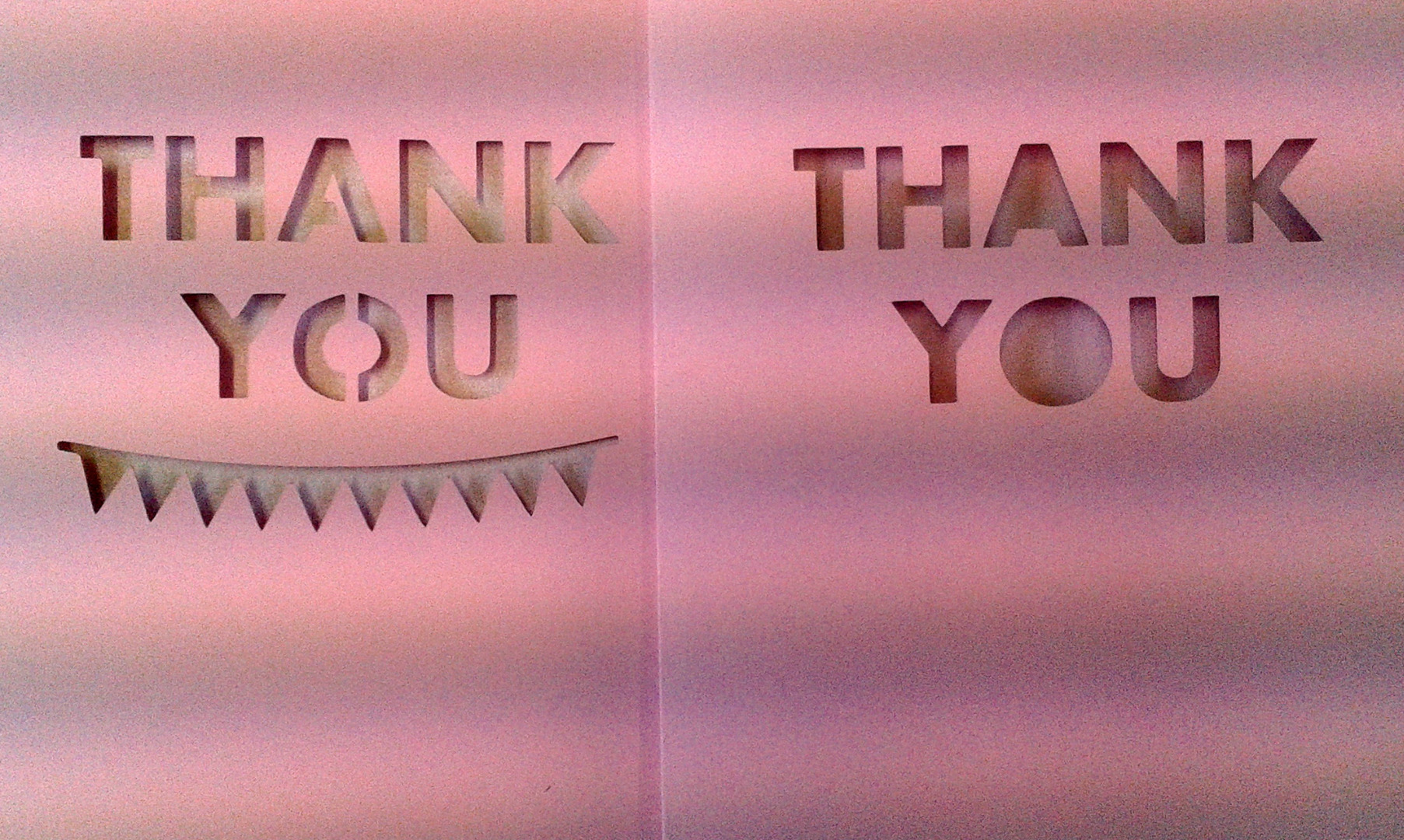
Areas of white space in letters that will end up completely cut away from the main card when the Silhouette cuts them out are called counters. If you chose a stencil font in step one this won't be a problem, as stencil fonts ensure that counters stay attached to the main card - the bits that hold them to the main card are called bridges. If the font you have chosen is not a stencil one, there are three ways you can deal with them:
1) You can choose a stencil font instead.
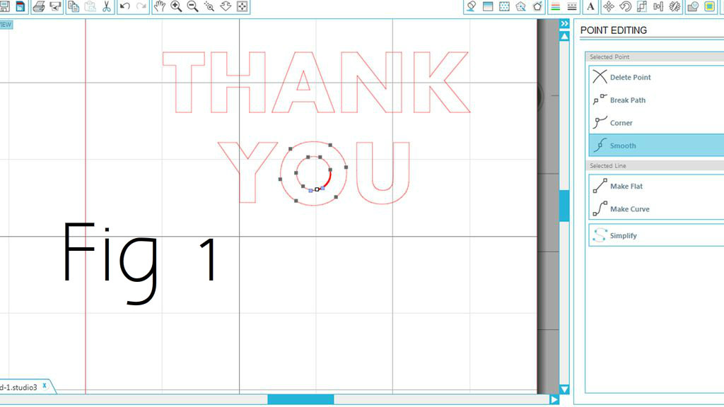
2) You can accept that the holes will be open, and incorporate this into your design. I think this can look really good, especially if it shows off pretty detail in the card underneath. To do this, you can either print as normal and discard the counters after, or you can right-click and select weld, then click on the counter and remove it by removing each anchor point. You can see this process (and the result) in fig.1.
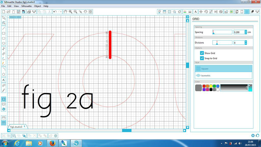
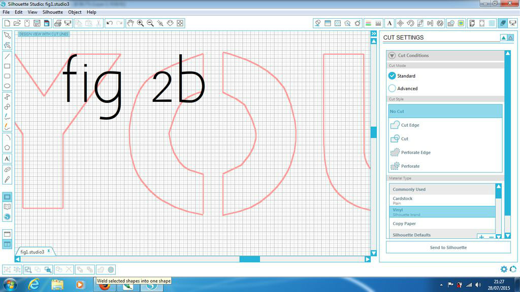
2) You can create the text bridges yourself. This can be a little tricky, but it is not overly difficult. To do this, first set the grid to a fine measurement (I use 0.1cm, which is the minimum). Select snap to grid. Then select the knife tool from the left hand toolbar. Choose where you would like the bridge to go - it depends on the font or the letter, but top and bottom of the counter is usually a good bet - and use the knife to cut two lines where the bridge will go (fig.2a). Use the line tool to draw in lines where you have cut, then use the eraser tool to erase the area between the lines. You are then left with a bridge connecting the counter to the rest of the card (fig.2b).
Add a Shape (if You Like...)
It is up to you if you wish to add a picture or not. I am including it here so that you can if you wish to!
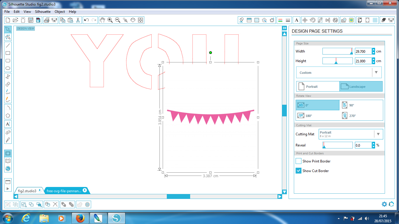
Find the shape that you wish to add. Plain black (or any colour, really) silhouettes work best. Open the image in Silhouette Studio. I am using this pink bunting that was free to download from Chicfetti. When you open in Studio, it will open as a separate file. You can just cut and paste it into position on your card, resizing it if necessary by moving the anchor points.
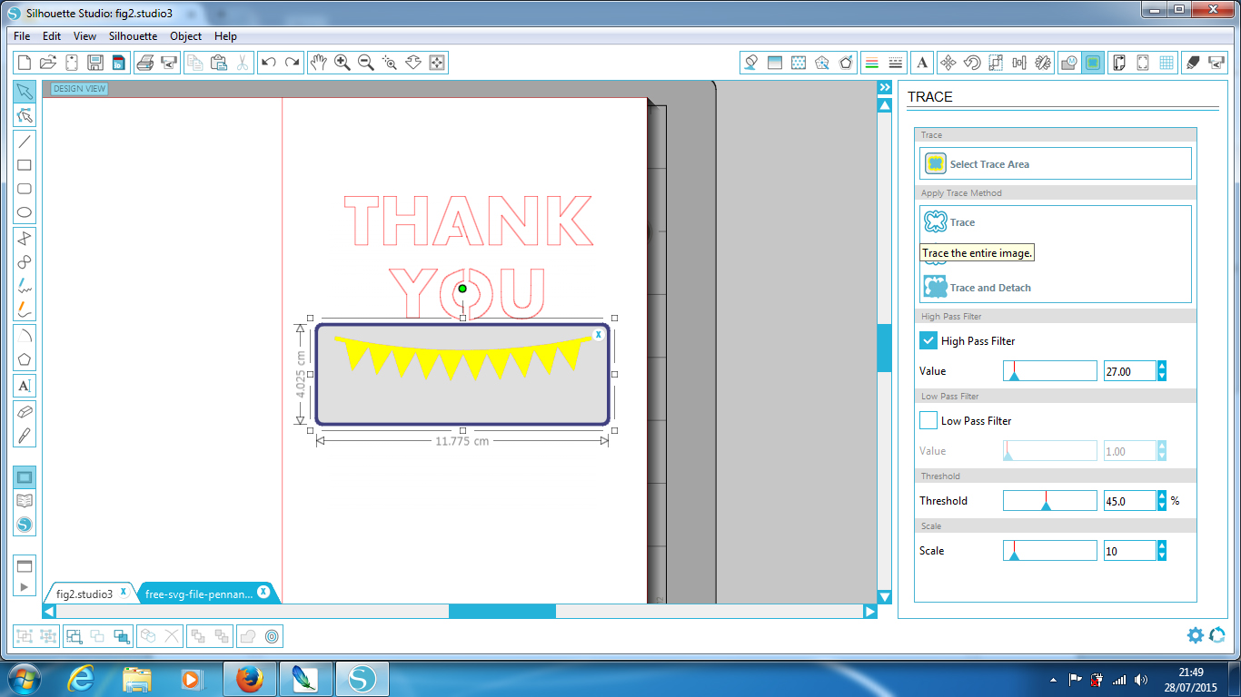
When you are happy, select the trace tool then select trace area. Select an area covering the whole of your shape, but none of the text. Increase the high pass filter so that all of the image turns yellow, but none of the surrounding area does. When you are happy, select trace. You can then select and remove the image, leaving the cut file behind, if you wish. It won't make a difference to the cut file if you don't, but may make it harder to see your work clearly. Don't forget that, just as with the text, any island areas will be left behind unless you build bridges connecting them to the card.
Cutting
.jpg)
Once you are happy with your design, remove the line you made to mark the fold line (don't forget or it will be cut!). To do this, just highlight the line, right-click, then hit delete.
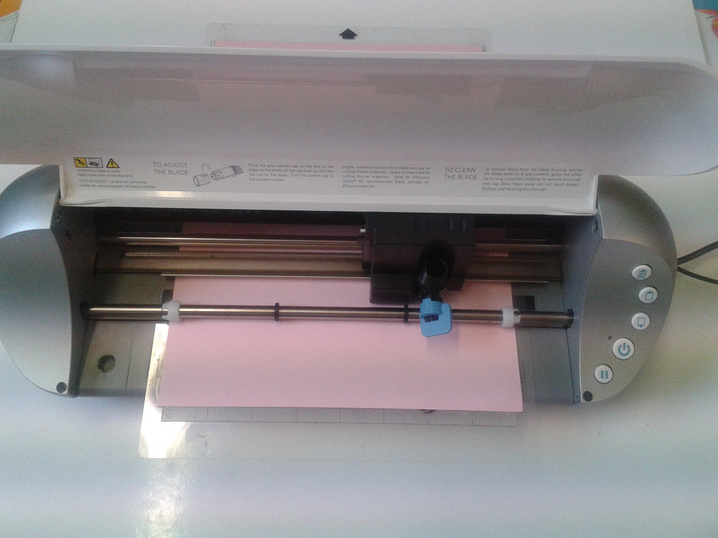
You can then check that you are happy with your cut lines by clicking on cut settings. Thick red lines will mark where the Silhouette will cut. If all is good, you can place your chosen card onto the cutting mat, check the cut settings and ratchet blade are correct, and cut your card.
Adding the Insert
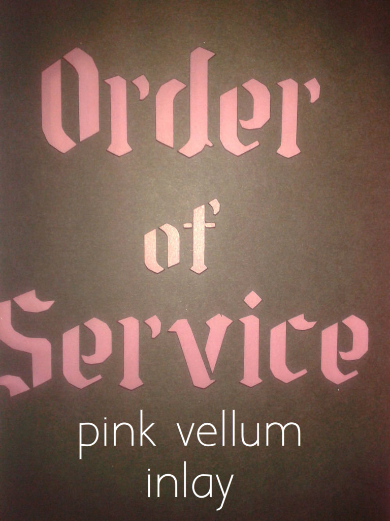
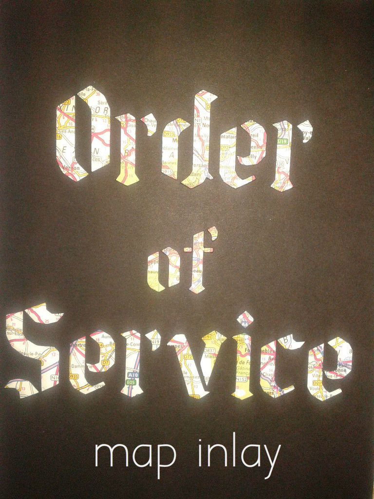
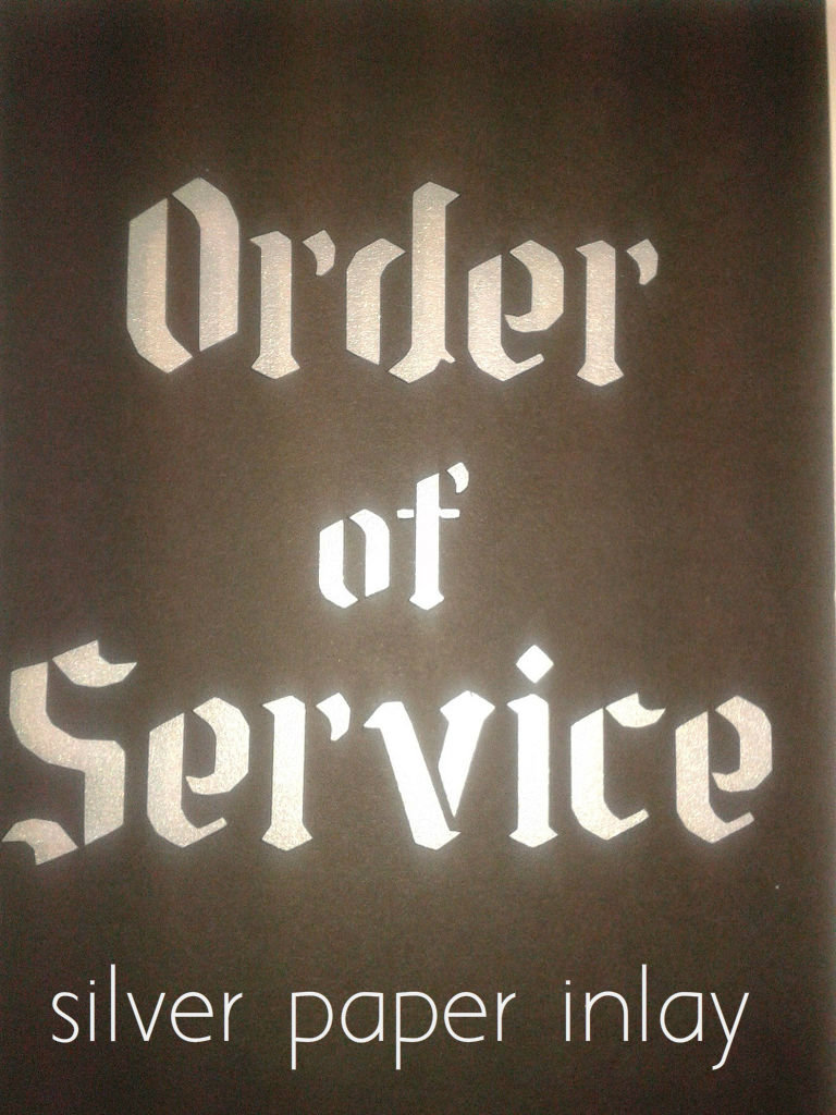
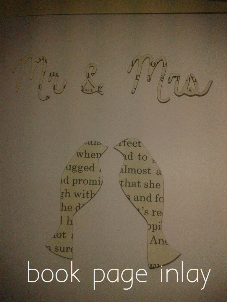
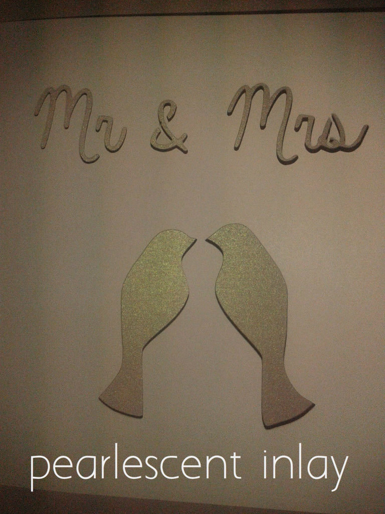
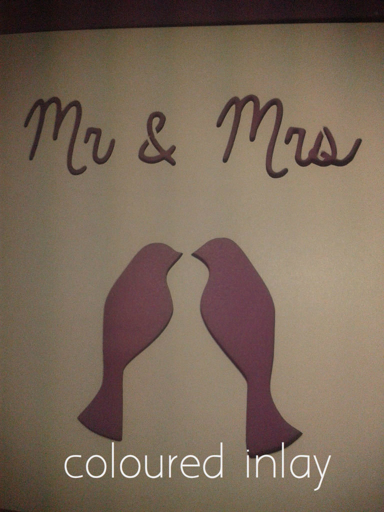
Once your card is cut, score down the centre of the card with a bone folder if you have one. If not, a pen casing will subsitute. Using a bone folder creates a clean, sharp fold.
You can now add the inside layer. For the best results, I cut the inside sheet slightly smaller than the outside card. Fold in the same way, then fix to the inside of the card. You can use your own choice of paper glue, but I prefer a tape dispenser for speed and ease (PVA is far too messy and slow to dry, and even glue sticks can be too messy when you are working at speed and making in bulk!). A strip of glue down the inside very close to - but not on - the fold is all you want. If you are printing your inserts, you will obviously need to do this before you glue it in!
This basic template will produce cards very different in character, depending on the fonts, colours, patterns and positioning you choose. I have shown a few cards with different inserts to show how even that can change the character of a basic layout. The cards you can make are not confined to wedding stationery (they make awesome cards for Christmas and other occasions too!) but I hope this tutorial has provided you with some inspiration to create your perfect wedding stationery!