Text Portrait
Graphically, there are many ways to create an image or portrait: Hatching, dots, lines, circles, squiggles, ASCII text, ...
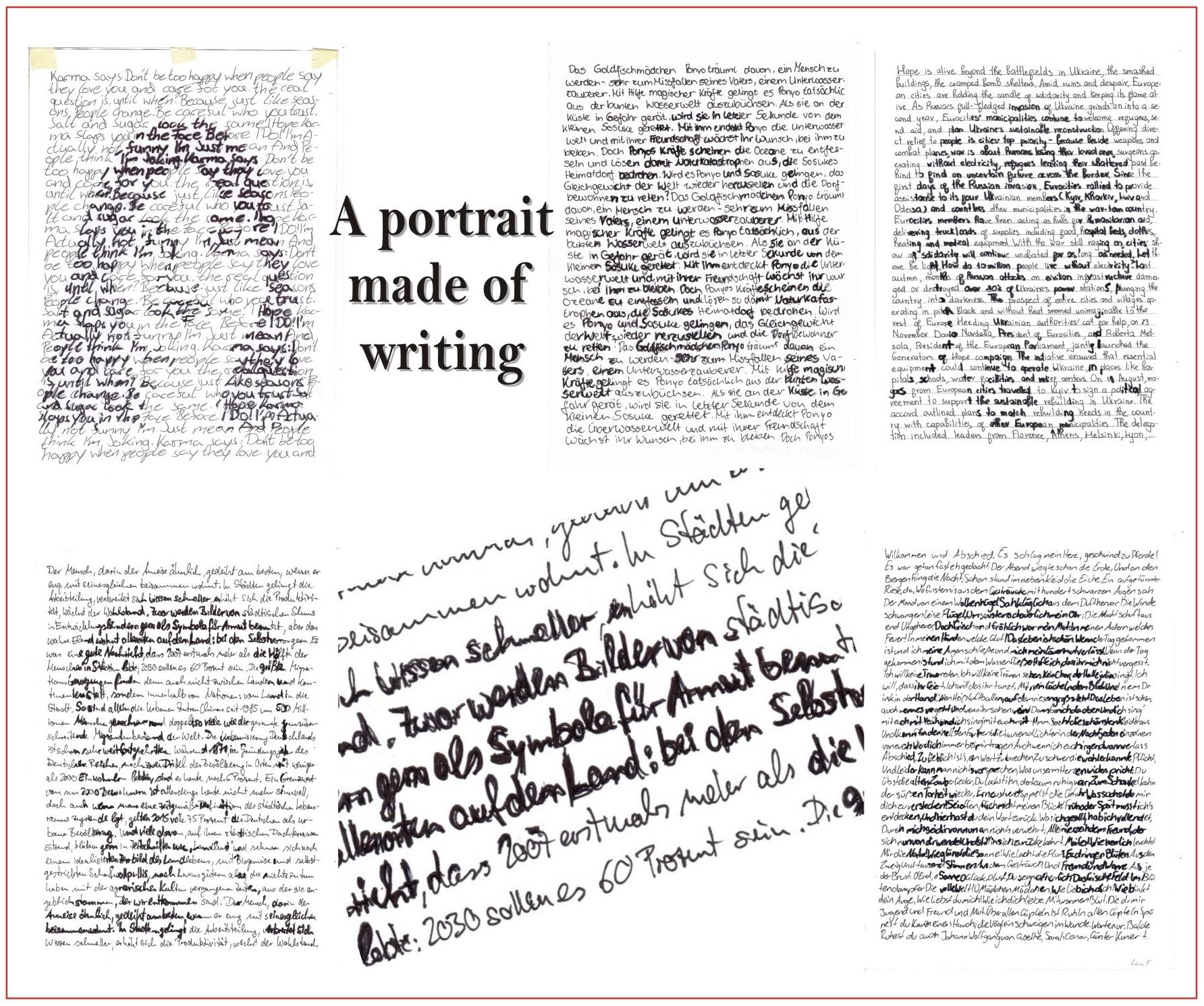
I did something very personal with my students, creating a self-portrait entirely from a favourite text. Normally my students don't like writing so much, but this time they were all enthusiastic and came up with some really nice texts.
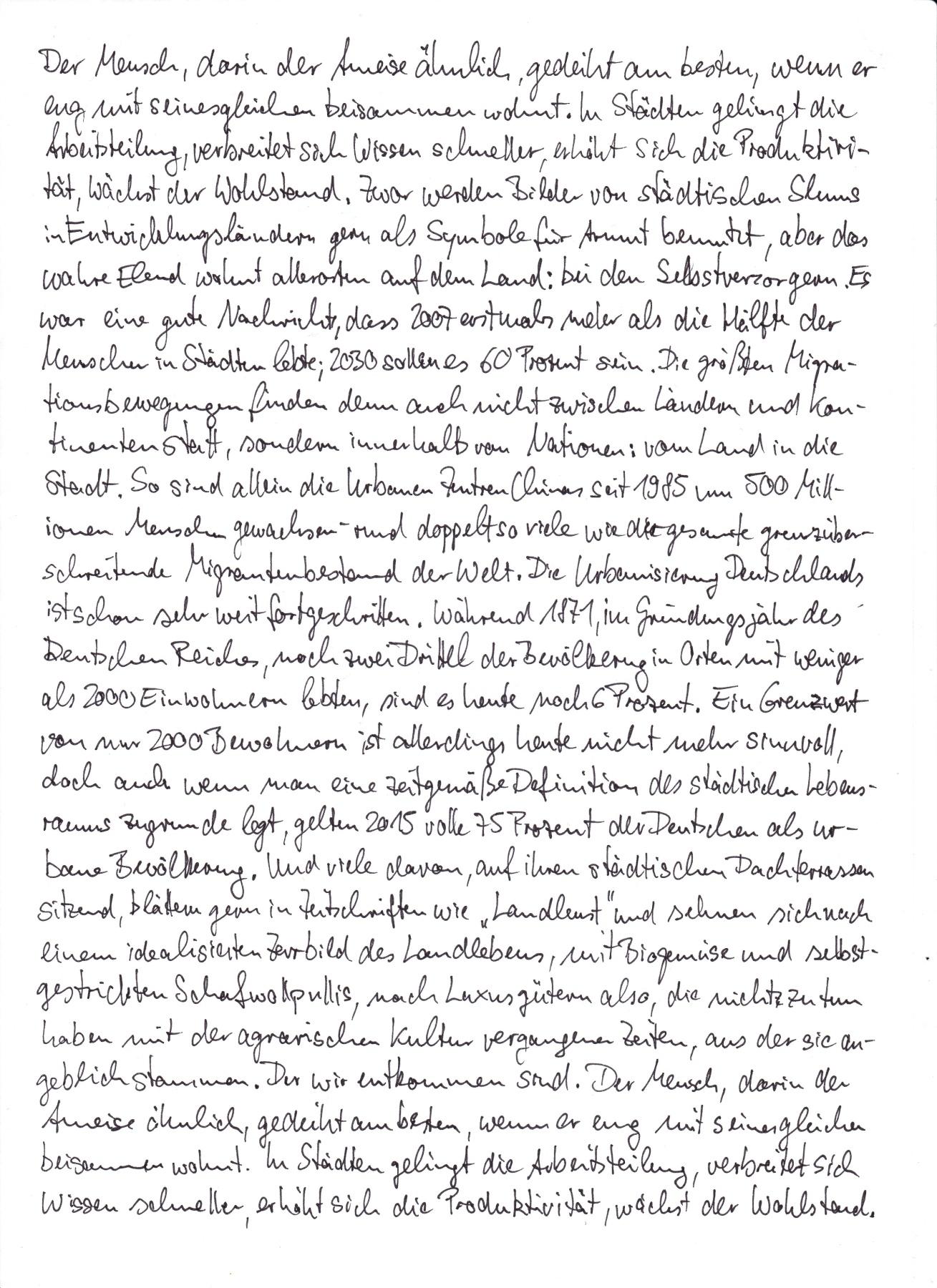
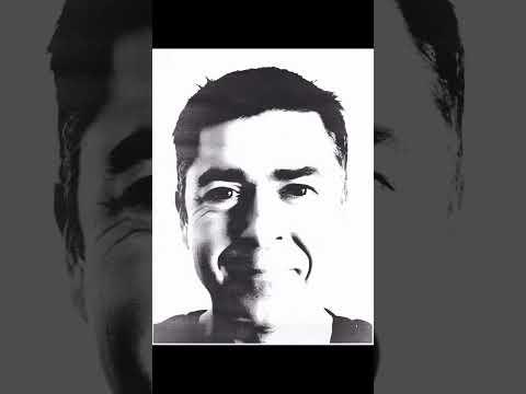
As an example, I myself found a nice essay about life in cities and in the countryside, using my own picture.
You can see some of my students' work here.
Supplies
- paper (-80g/cm2)
- black pens, 2-4 different sizes
- light adhesive tape
- camera, computer, printer, a simple image editing software like IrfanView.
- window
The Text
At first you need a nice text. This can be from your favourite book or a non-fiction text. If there are many paragraphs in the text, these should be omitted when writing to create a dense texture. Poems are not suitable, unless you write them like a prose text and without paragraphs.
The smaller the text is written and the smaller the line spacing, the better the portrait will be seen later.
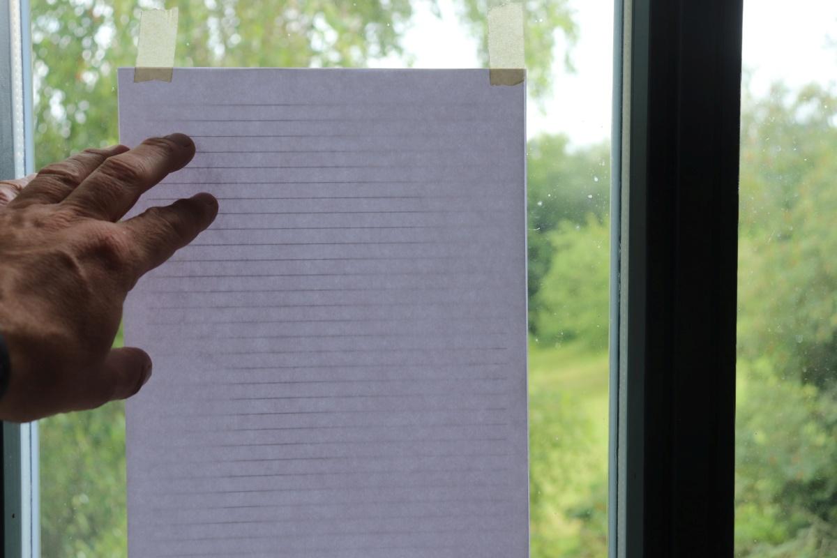
Write the text as evenly and densely as possible on a white sheet of paper. Place a ruled sheet underneath ("Lines.pdf"). If you like, you can leave a little margin. To be on the safe side, you can copy the finished text sheet a few more times.
Downloads
The Portrait
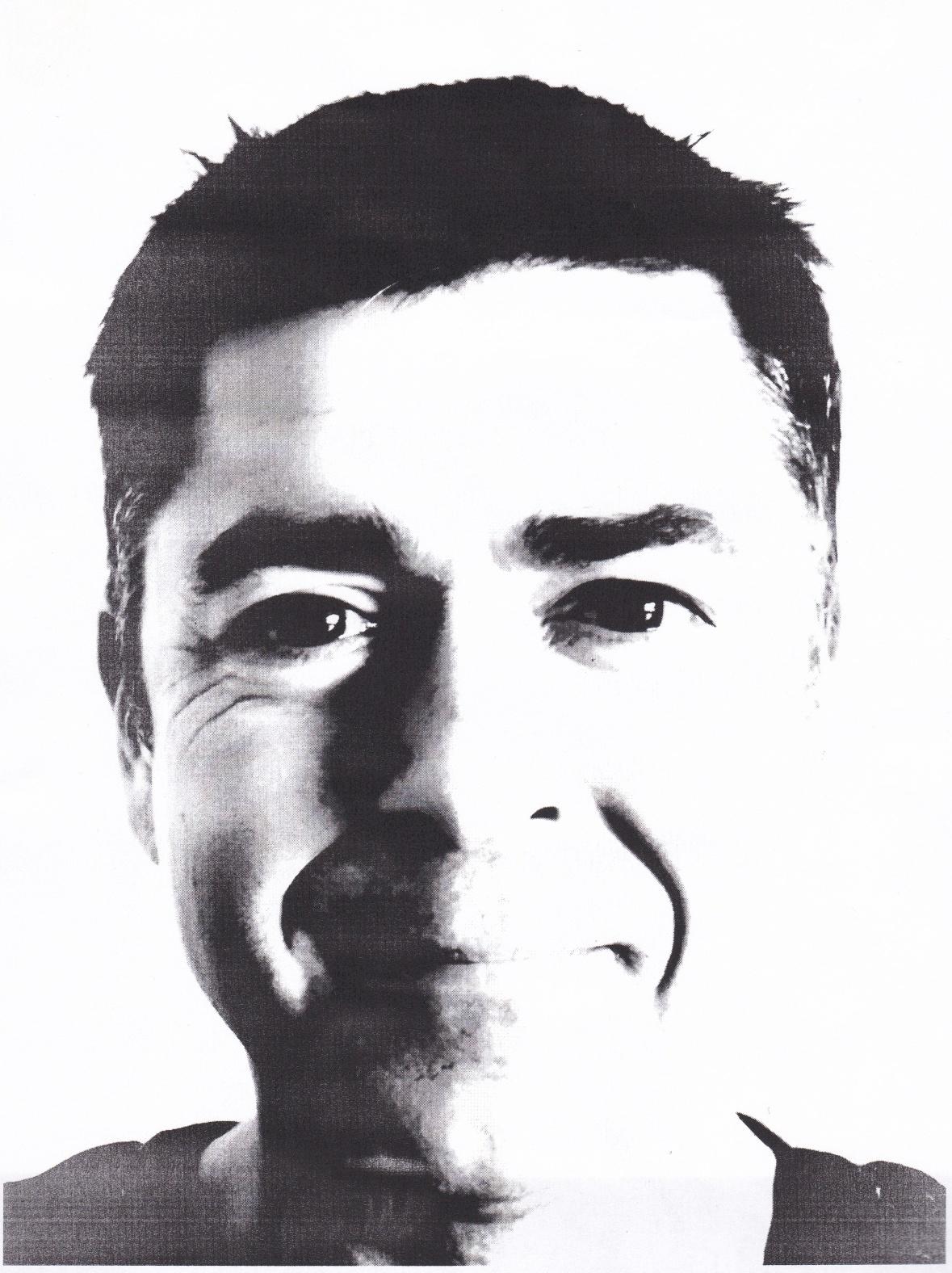
For the portrait we need an image with good black and white contrast. An image with a total of 3-5 shades of grey would be ideal. You can reduce an image to greyscale using simple software such as IrfanView *. Print the image in the same size as the text sheet.
*See Step 4 to work with IrfanView
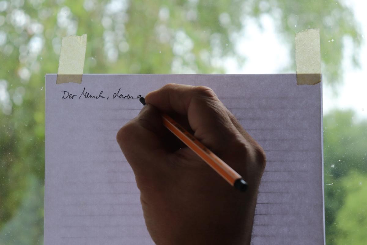
Combine Text and Picture
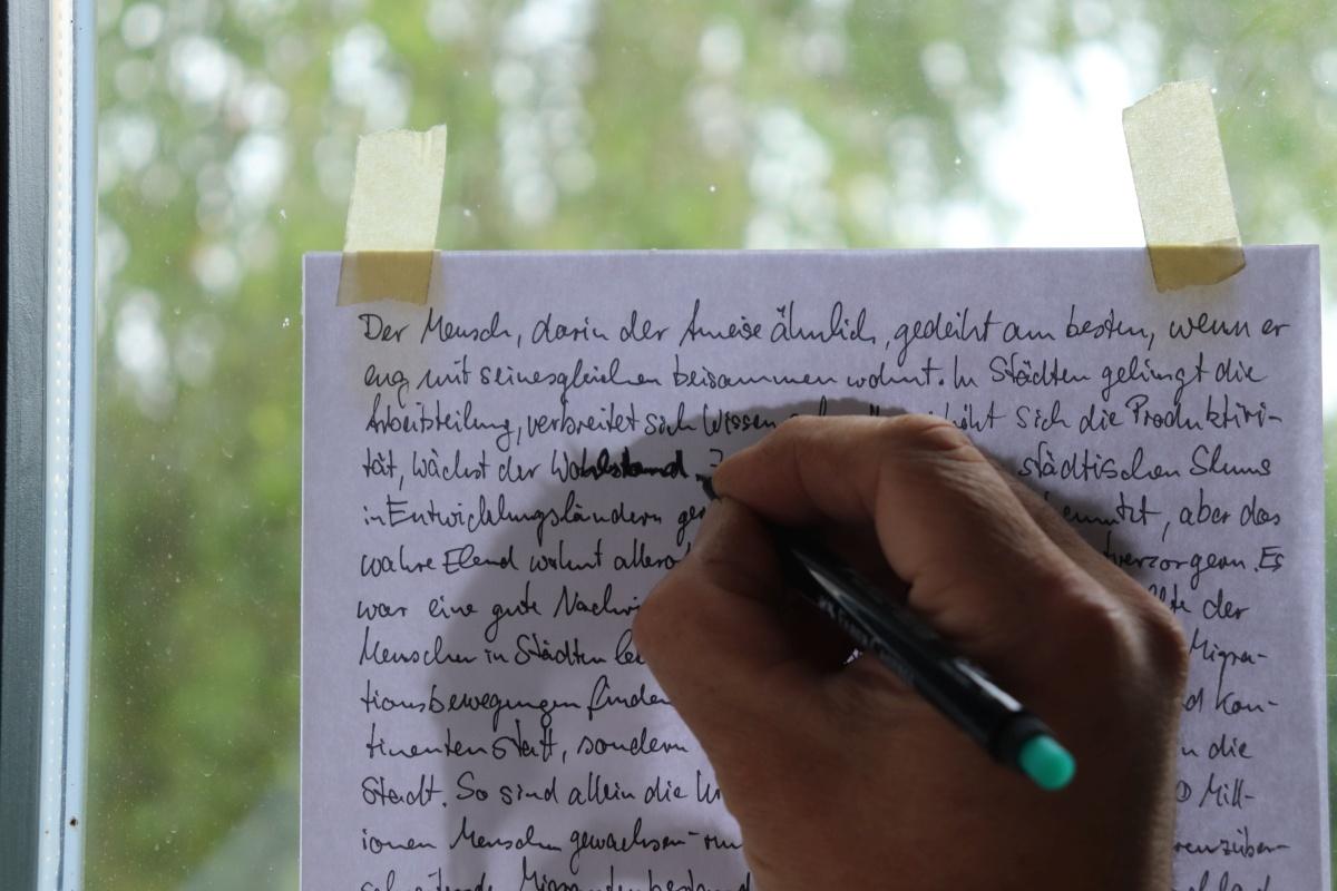
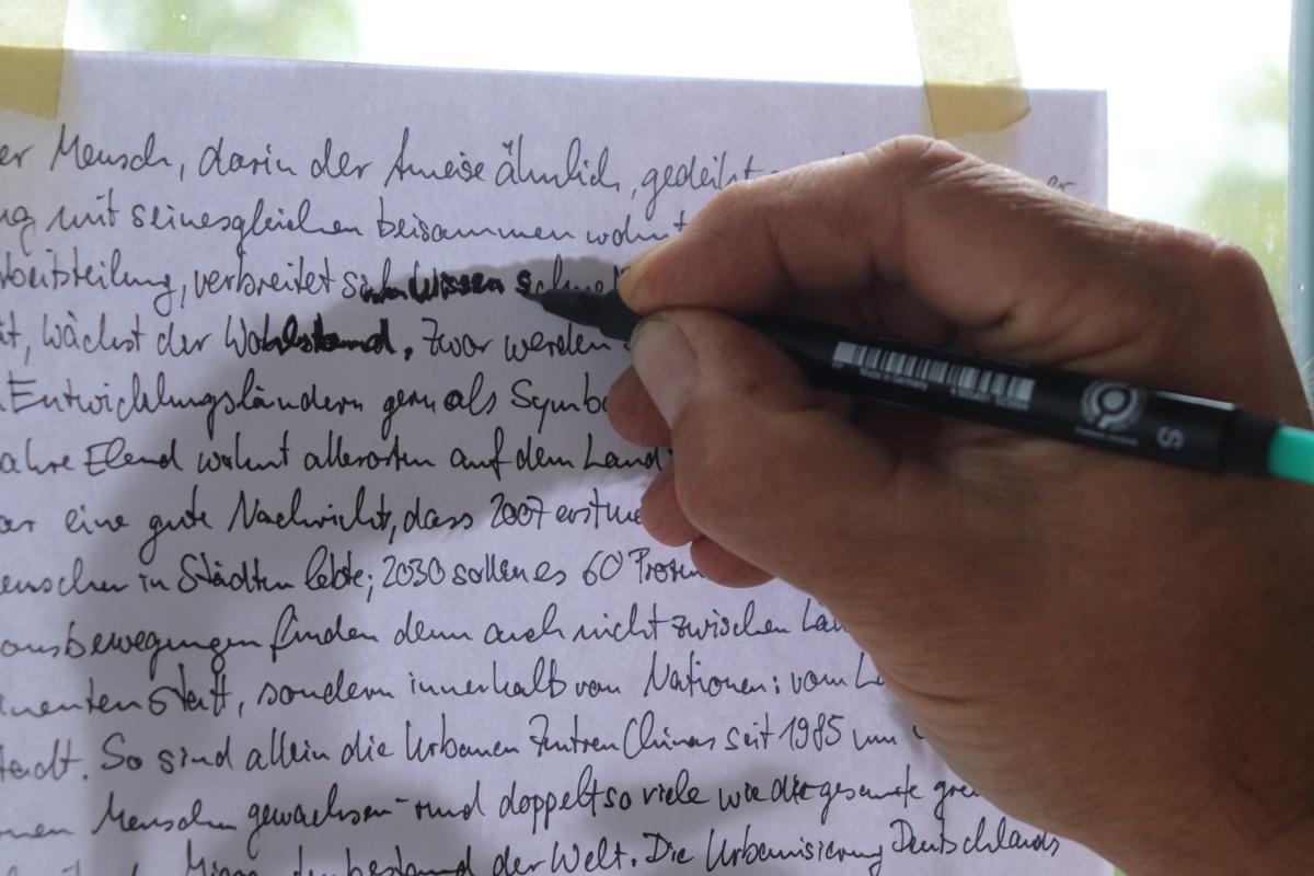
Now we need to go to the window again Place the printed portrait under the text and fix everything in place with a strip of adhesive tape. You can also stick both to the window pane.
You can see both the text and the picture and can trace the dark areas with the thicker pens. Also pay attention to individual sections of words or letters, small pixels often make a big difference.
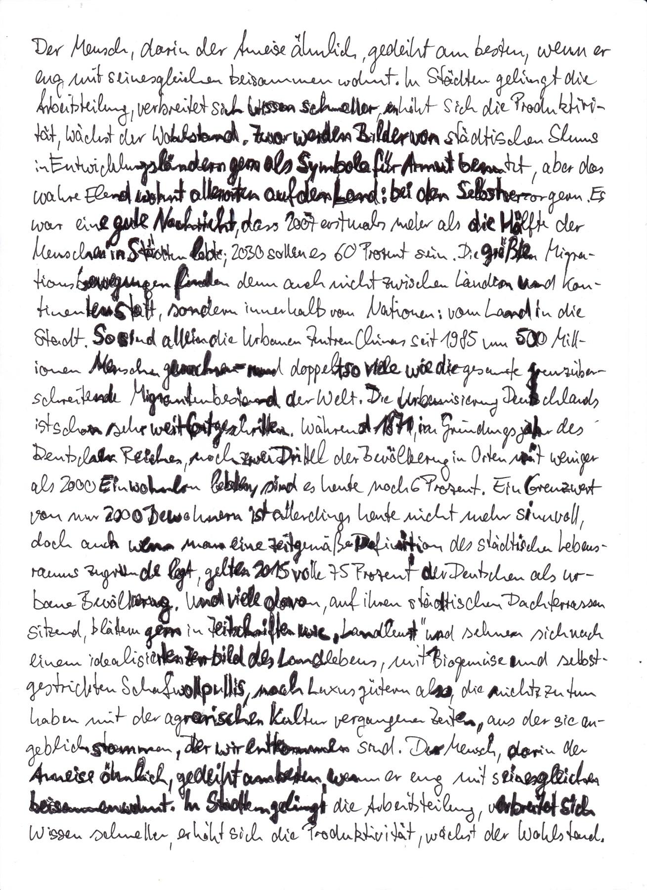
This is a lot of work, but it also looks very nice and is a personal creation.
The further away you look at the picture, the easier it is to see.
* Excursus: Working With IrfanView
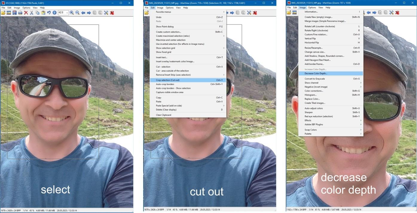
It is a small but powerful and useful program that I have been using almost daily for decades. Here is a short guide on how to reduce the color of a photo for our purposes.
- Mark and cut out the image section (--> Edit --> Crop Selection)
- Reduce colour depth (-->Image --> Decrease Color Depth)
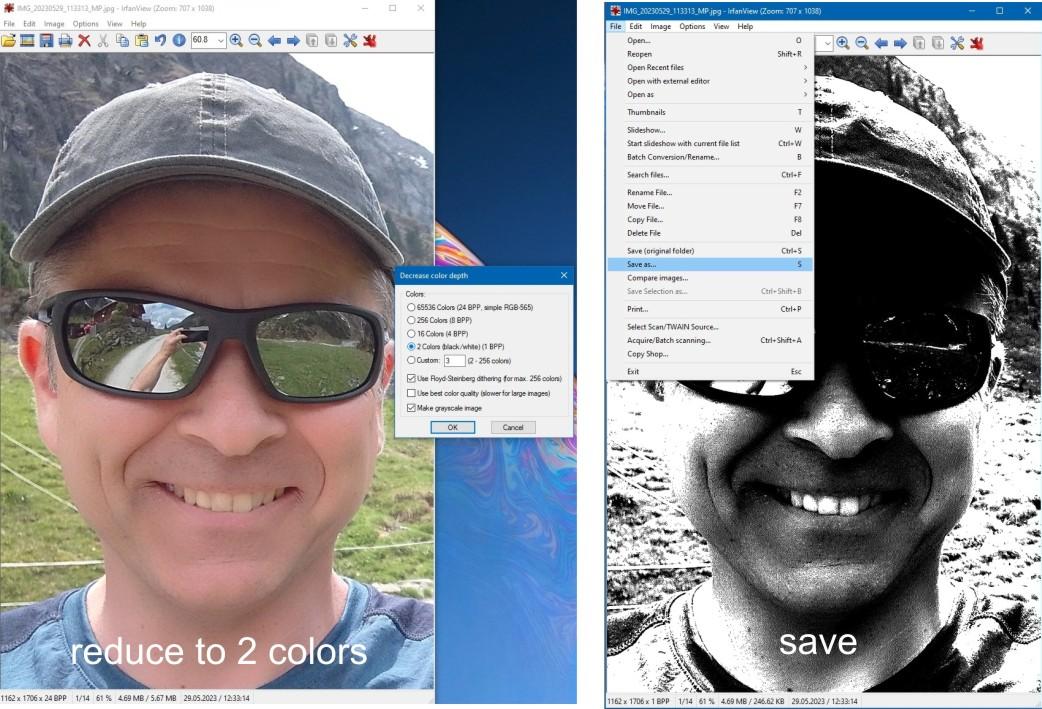
- Reduce to 2 colours
- --> File --> Save as...
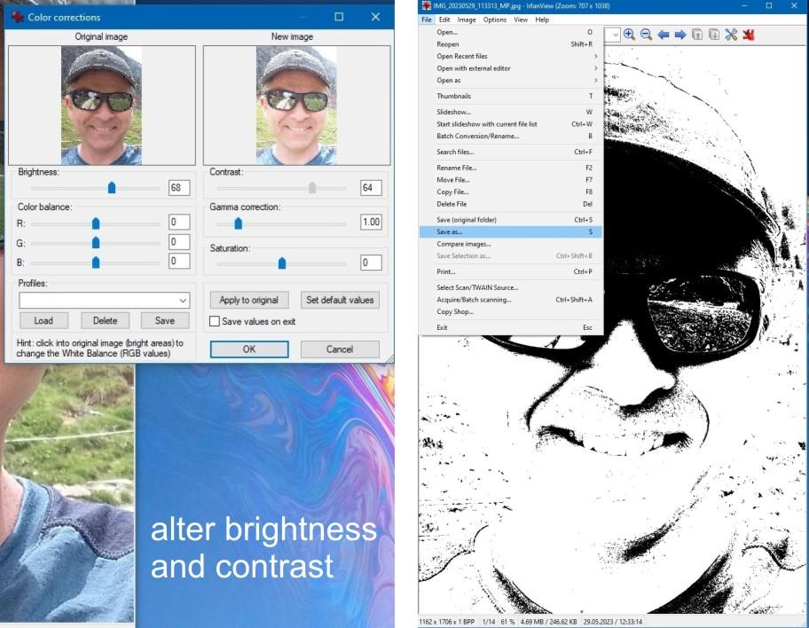
If the image is not yet satisfactory, you can still make improvements:
- Edit brightness and contrast ( --> Image --> Color Corrections)
- Reduce to 2 colours
- --> File --> Save as...