Tell a Story With Freely Available Data and Visualization Tools.
by umfalvo in Design > Websites
4091 Views, 19 Favorites, 0 Comments
Tell a Story With Freely Available Data and Visualization Tools.

This Instructable will walk you through a step-by-step tutorial to develop a visualization using open source tools and publicly available data. It was written by Mark Falvo and Andrey Talman.
Find a Story to Tell
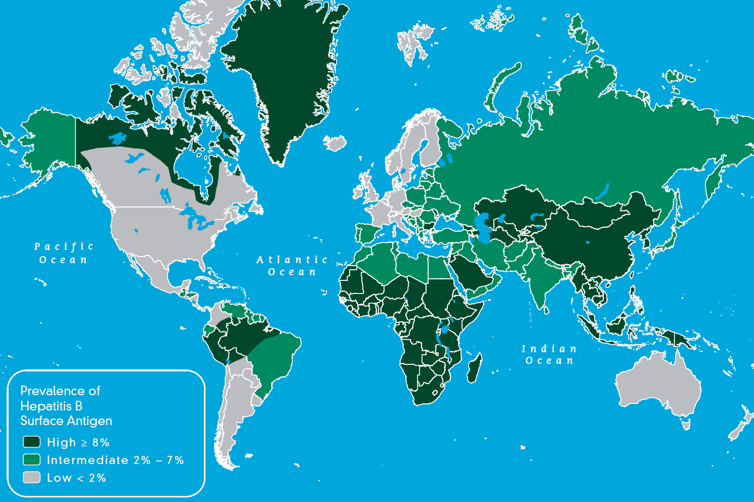
What many people fail to observe is that a data visualization is only as good as the story it is trying to tell. If there is no relevant message that your trying to communicate then even the flashiest graphics and latest techniques are a waste of your time.
A data visualization artist is a bit like a journalist. Without a good story his or her writing is wasted. So the first and most important thing you need to do is come up with a great story. This can be done my scanning news sites for headlines or relevant trends. If you are work or are involved in a specific domain you may see a trend before it becomes public and you then have an interesting point to make.
For example, if you work in the Public Health field and you wanted to highlight the incidence of a certain disease you may want to depict it on a map as shown above.
Andrey and I work in an Education aware domain, so we thought it would be interesting to depict how literacy rates have changed over the past forty years. This is the story we will be telling in this example.
Let see how easily that can be done...
Find Data to Support Your Story
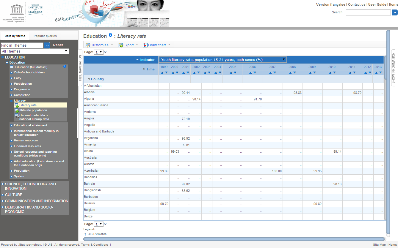
Each visualization technique differs, however most are based on some source of data. For example if you wanted to tell the story of what countries have high infant mortality rates then you need to find the rates for each country. The World Health Organization would probably appreciate you highlighting any interesting trends and so they expose their data here.
It is becoming easier to find data as organizations realize how much they can gain by sharing what they know with the world. Many agencies such as the UN, OECD and the World Bank have developed data portals or application programming interfaces (also known as API's) for people that want to use their data. Some of them can be found here:
- United Nations Data API
- Organisation for Economic Co-operation and Development Web Service
- The World Bank API
For our visualization we will need to know the literacy rates of counties throughout the past forty years. This data is collected by the UNESCO Institute for Statistics and can be found here:
UNESCO Institute for Statistics Data Portal
Interfacing with these organizations can be done is several ways. Each portal or open data source will have it's own method for doing this, however SDMX is quickly becoming the standard for the exchange of statistical information. This is what we will use.
Decide on How to Visualize Your Story
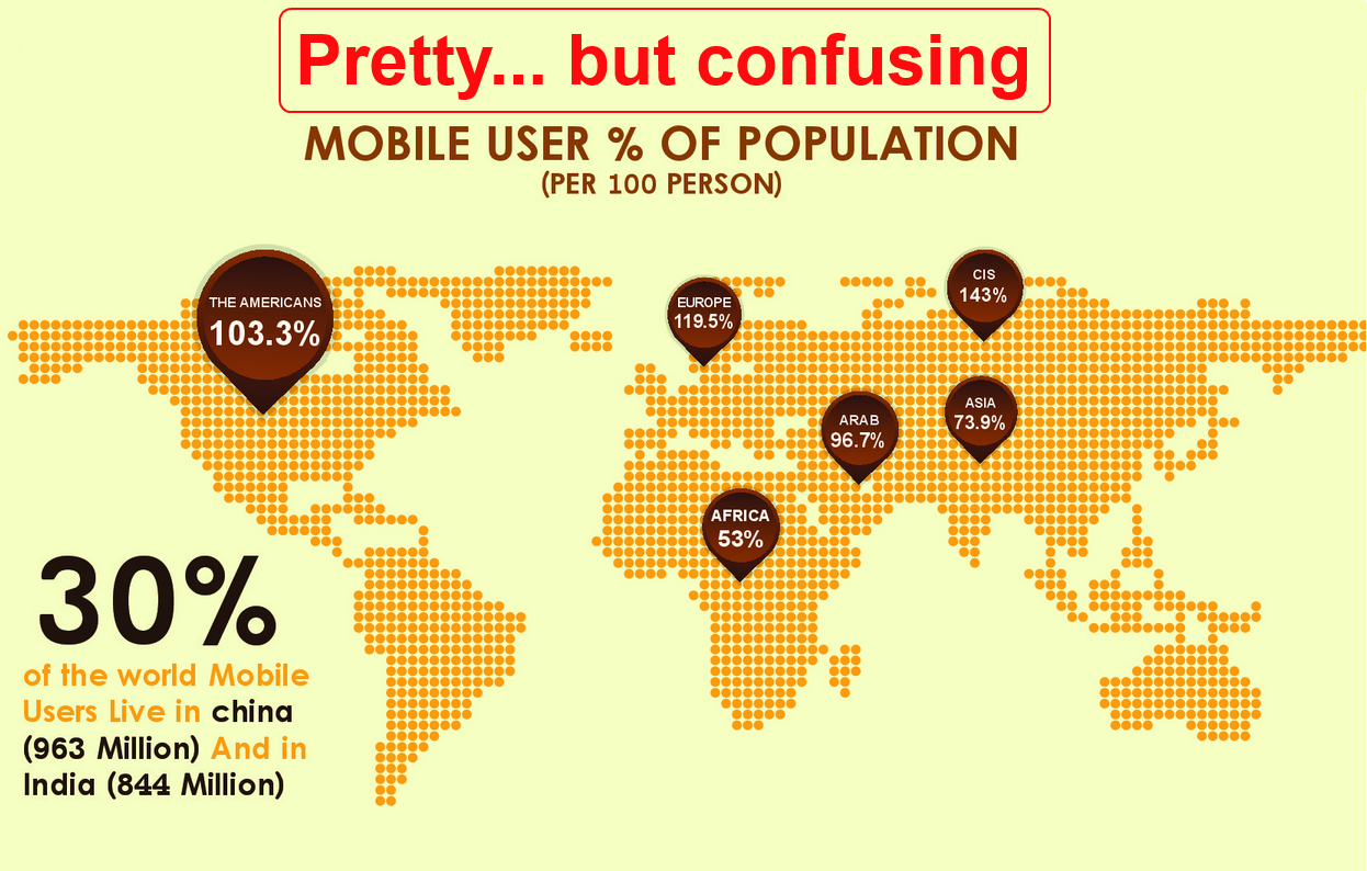
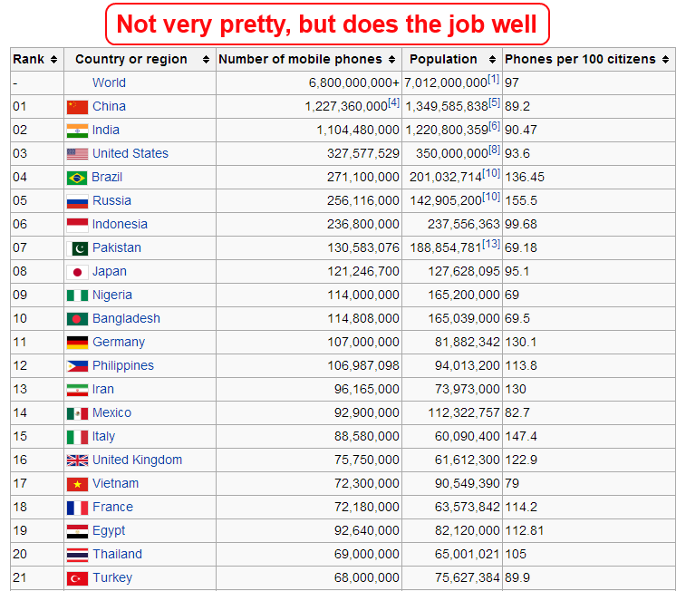
This is where data visualization becomes an art. An experienced data visualization artist knows how to create a visualization that gets his or her reader to understand the story quickly and with the greatest impact.
For example, if you wanted to tell your readers what country has the highest percentage of mobile phone usage you could use a graph or a map. However if you used a map you would need to make sure that people could easily identify a countries boundaries and compare it to other countries. Here is an example of a visualization that uses a pretty picture, but does a poor job of getting it's story across. It's followed by a very simple spreadsheet that does a much better job of getting the message across.
We've decided that in order to tell our readers that that some countries improved their literacy rates while other declined would use a geographic representation such as a map or a globe.
Setting Up Your Host
Static visualizations can easily be represented as pictures and copied all over the the web or print. However, we wanted to create a live visualization of a globe that users could manipulate and play with. Most live data visualizations require a place on the web to exist and work. This is called a host, and there are many free and paid host available. Some examples are:
000WebHost
Zymic
110MB Hosting
You can also create a host on your own computer and serve it to the world using open sourced tools. See this Instructable for help on how to do that.
Different hosts have different specifications, and you will have to choose on depending on what visualization tools you will be using. Once you've chosen and signed up for your account it onto the fun stuff.
Setting Up Your Visualization Tools
Some visualization tools are as simple as a paint program, or Microsoft Excel. However we wanted to go a bit farther and create a 3D globe that showed our data and let the user play with it by spinning it around. There are many great free Visualization tools out there such as:
D3
Tableau
ManyEyes
We chose D3 because it fit our needs well and is well documented. Setting up D3 is also quite simple to set up... you can download latest ZIP file containing the entire library here or you can directly link with d3 by including one line in your HTML code. That's all you need to do!
Access Your Data
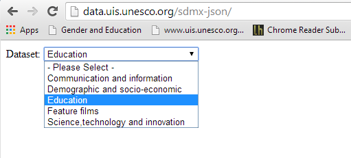
In order to access the literacy rate data for this tutorial first navigate to the UNESCO Institute for Statistic's SDMX-JSON query builder interface here:
http://data.uis.unesco.org/sdmx-json/
Then Select Dataset from available Datasets dropdown list. Pick “Education”.
Access Your Data
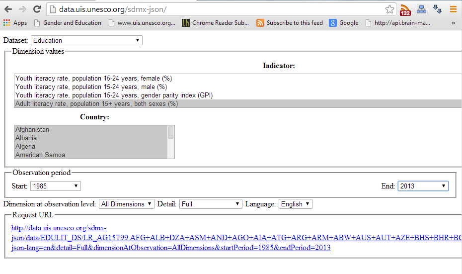
The user interface will be populated with the list of available Indicators and Countries. Scroll down the “Indicator” list box and select
“Adult literacy rate, population 15+ years, both sexes (%)”
The Request URL will be generated at the bottom of the page. By clicking on generated URL you can either download it to your machine or directly read into Javascript.
Note the way query is formatted:
http://data.uis.unesco.org/SDMX-JSON/data/EDULIT_DS/LR_AG15T99.AFG+ALB+....
Here EDULIT_DS is the dataset code for Education adn LR_AG15T99 is the indicator code.
Consuming Your SDMX Data With Javascript

The SDMX-JOSN request can be consumed directly by Jquery Ajax or Get method like this.
Consuming Your SDMX Data With Javascript
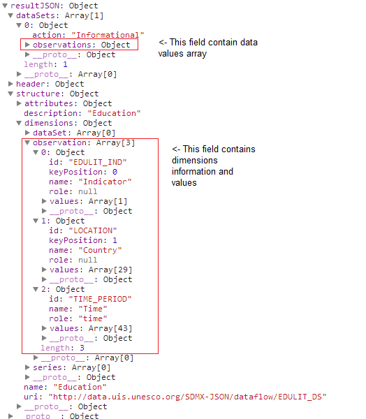
The resultant structure should look something like the figure below. The data values are contained in the dataSets->observations array. The information about dimensions and the dimension values are contained in the structure->observation array. Using the data in the structure Observation we can navigate the data array.
Consuming Your SDMX Data With Javascript
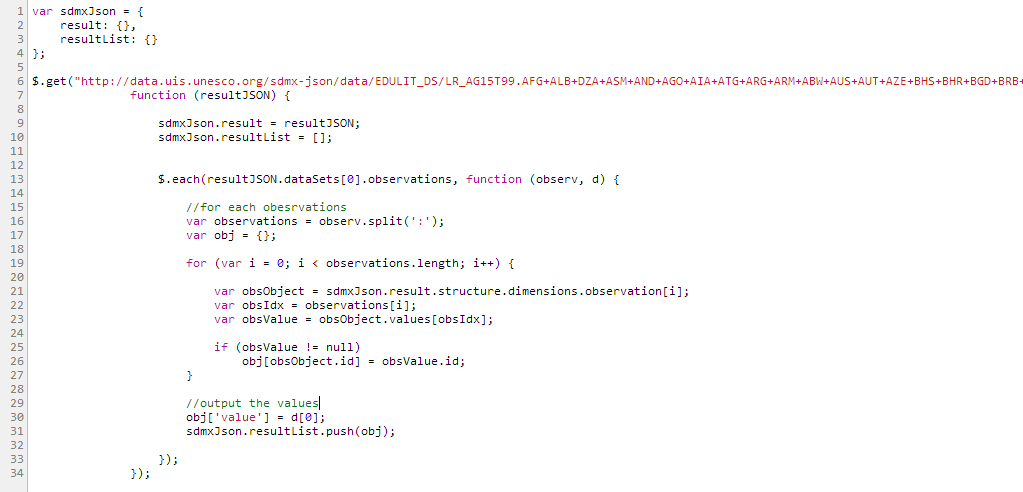
With this knowledge it becomes trivial to parse and produce something more workable, something you can easily feed to a visualization. Here is the complete code example on parsing this structure:
Consuming Your SDMX Data With Javascript
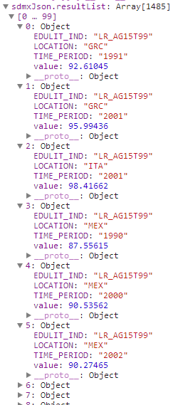
This code produces the structure which can be easily feed to your visualization.
Implementation of the Visualization Overview
As we explained earlier, we will use data from the UNESCO Institute for Statistics and the D3 visualation library.
Our visualization contains the following files:
Html Layout file:
\litrate\index.html
Data Files used for rendering the Globe view and the Map view:
\litrate\nodes.csv – used for Map view
\litrate\world-countries.json – used for Map view
\litrate\places.json – used for Globe view
\litrate\world-110m.json – used for Globe view
Styles:
\Styles\960.css – 960 Grid used for layout
\Styles\uis.litrate.css – Styles containing in the visualization
Javascript Sources:
\Scripts\jquery-1.8.2.min.js – Jquery library
\Scripts\unesco\uis.litrt.country.js – JavaScript implementation
We also link with the following libraries D3 libraries:
d3.v3.min.js - Main d3 library
d3.geo.projection.v0.js - D3 library that implements different projections
topojson.v0.min.js - D3 library for topology rendering
queue.v1.min.js - D3 library that supports asynchronous loading
Note: Zip file with all of the above files for download can be found at Step 17 of this tutorial.
Implementation Details. Main View.
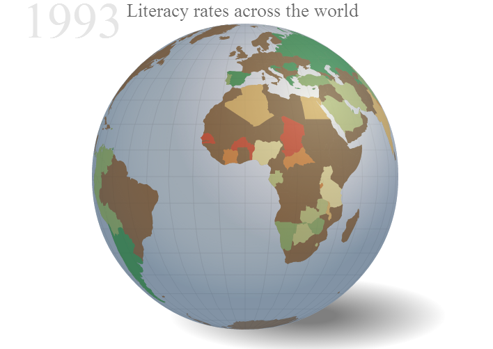
Our visualization consists of 4 Main parts.
Main View which consists of the Globe View or Map view (if selected):
- The Globe view :
The globe is was implemented based on the following article by Derek Watkins: http://bl.ocks.org/dwtkns/4686432
Further modified to add coloring of countries based on the UNESCO Institute for Statistics data.
- For Map view:
We used D3 to generate a Map. Numerous Examples can be found in d3 site. One of the map tutorial is here: http://bost.ocks.org/mike/map/
Implementation Details. Regional Data Bar Chart.
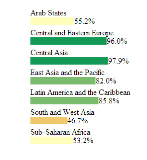
We used D3 library to generate a simple barchart based on regional data. Example of how to draw a barchart using D3 can be found here: http://bost.ocks.org/mike/bar/ .
Clicking on the region in this barchart, upates the Globe view to display this region.
Implementation Details. Animation Timeline and Play/Stop Button.

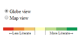
Implementation Details. Legend Control.
Putting It All Together!
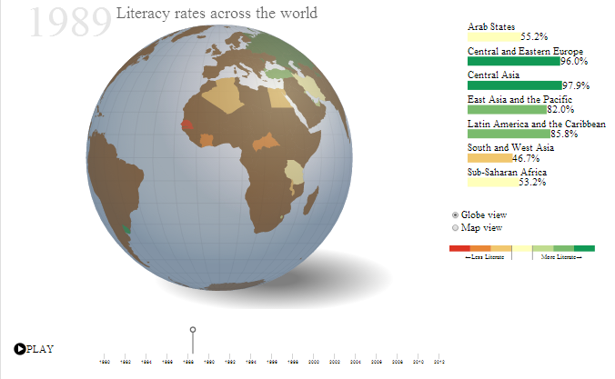
To view the result of the Visualization that we have created.
Please follow this link: http://www.atalman.com/dataviz/litrate/
Alternatively you can download the zip file containing the visualization.
Downloads
Getting the Word Out!
Marketing a visualization is just as important as creating the visualization itself. In fact, it can be more important. If you have a great story to tell, but no one ever sees it you've wasted your valuable time and effort.
Some things to try are:
- Submit your Viz to data visualization websites and blogs
- Try and contact content specific sites and blogs depending on what your story is about
- Contact newspapers and news outlets to see if they would be interested in your story
- If your Viz is related to your work environment see if they will consider adding it to their news feed
In all honesty, the marketing of a Viz can be a big job and could easily become much more work that the technical part of the process.
Good luck!