Sturdy Kusudama for the Origami-Impaired: Part 2
by watchmeflyy in Design > Art
7910 Views, 83 Favorites, 0 Comments
Sturdy Kusudama for the Origami-Impaired: Part 2
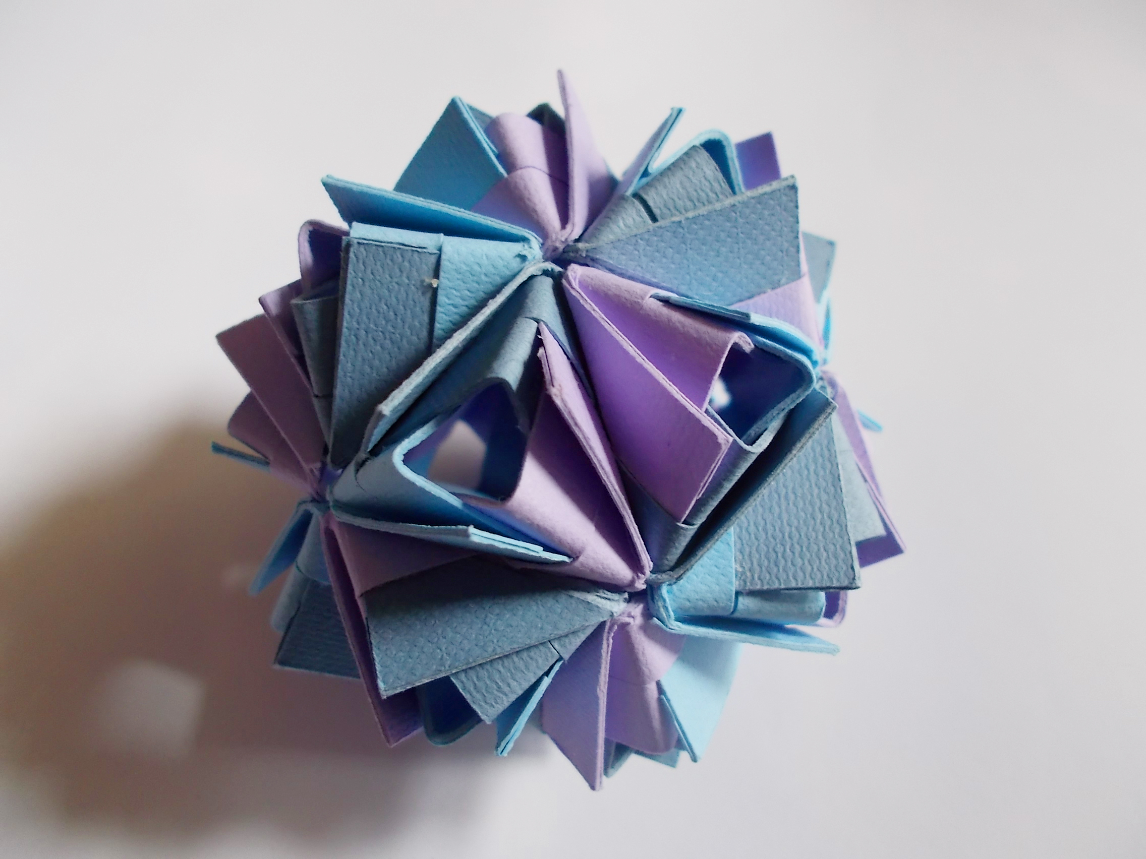
I recently made an origami tutorial like this one, and after I was finished with making the Little Island kusudama, I just had a RUSH of excitement: I really enjoy coming up with new ideas, and this idea seemed amazingly fun to mess around with. I decided that my next course of action should be to do something similar with another type of kusudama model, and after ruling out some others that required too many layers for folding, I chose the Etna kusudama model. So here's some more "lovely paperwork in action." ;)
As promised in that previous tutorial, the instructing of this part 2 tutorial is much clearer, in my opinion. See for yourself:
Materials
- cutting mat
- weeder tools for Cricut machine
- Adobe Photoshop/Cricut Design Space
- cardstock or other paper
- glue
- Cricut Explore (or other Cricut machines, or printer..)
Those are just the materials that I used; you can substitute for what you have on hand after reading on to figure out the basic process. You can use a Cricut machine or something similar to cut and score (or just cut... you'll see) or print out the pattern and fold along the lines.. either way's fine, but let's face it: using the Cricut machine is way more fun. ^^ Also, printing the design out is pretty pointless (yeah.. it was just a suggestion..). You'll have to cut all the shapes out and fold all the same, so might as well fold pre-cut paper the regular origami way. If you really want kusudama made from thicker paper though, printing is an applicable way to go. Just print out one shape with the score lines on scrap paper, cut out 30 copies, and use a pair of scissors' blade to lightly cut along the score lines.
But I digress.
Uploading Images

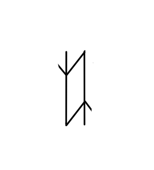
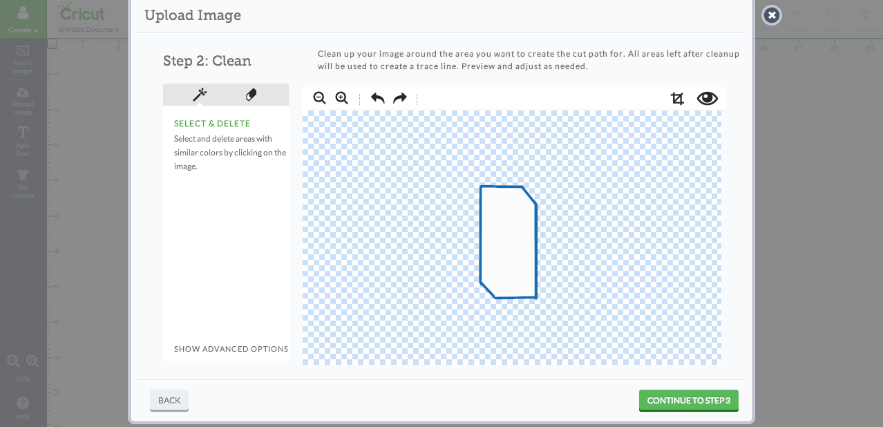
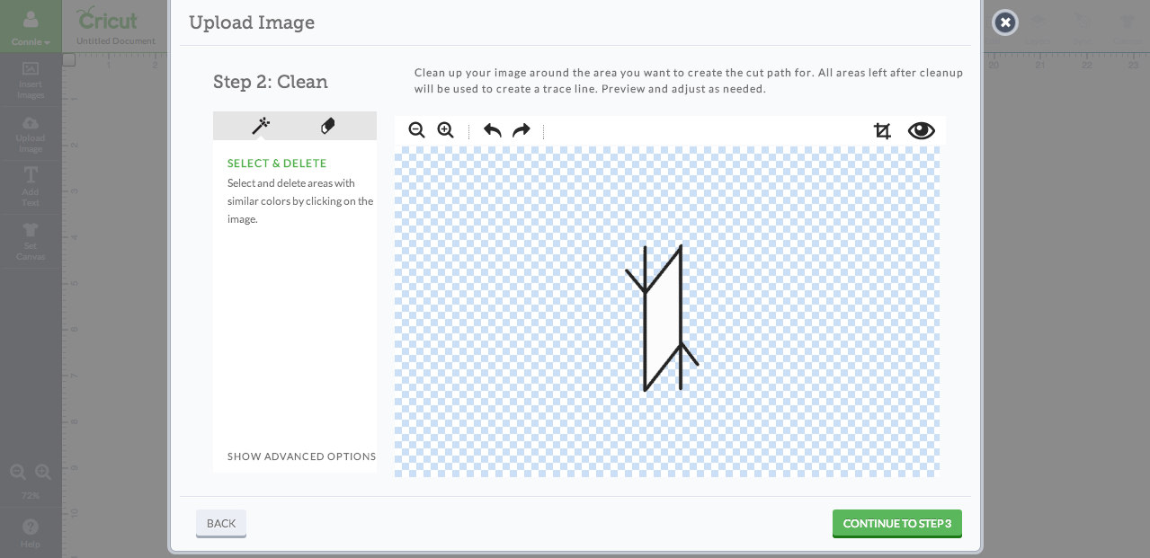
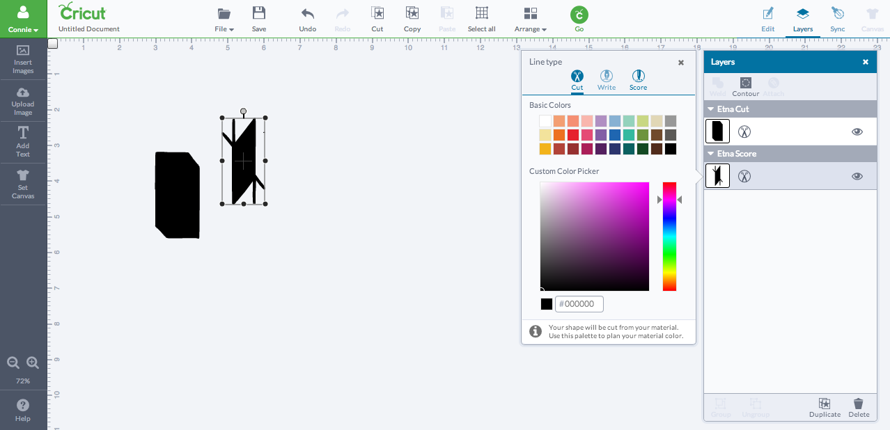
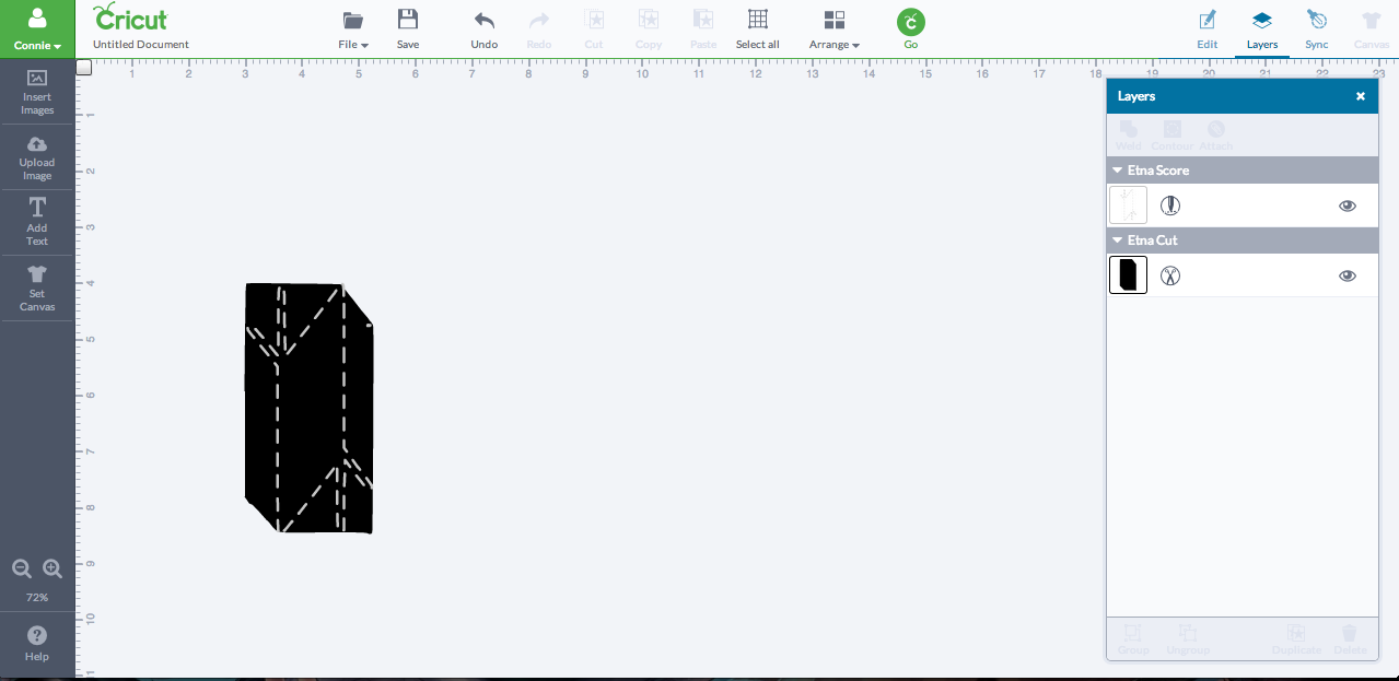
Save the first two images above as jpg's or png's (I made those images using Adobe Photoshop; I won't bore you with the details on the first step. Oh no -- I'm saving that for the LAST step, if anyone still wants to see. ^^). Then go to Cricut Design Space and upload both shapes. When editing out blank space, do NOT select and delete the inner white areas within the shapes.
Once you've inserted them into a new file, click on the layer with the scoring design and the scissors next to the mini image. Click "Score" in the resulting menu to change the layer from cut to score; this will also make the scoring design become dotted lines, which will help in the next step. Also ensure that the scoring design's layer is in front of the hexagon; if you can't see dotted lines after changing from cut to score, then the layer is behind the hexagon. To fix that, click the "Arrange" button next to the Go button on the top menu bar, and then click the icon that means send to back.
Adding Score Lines
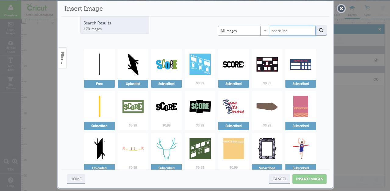
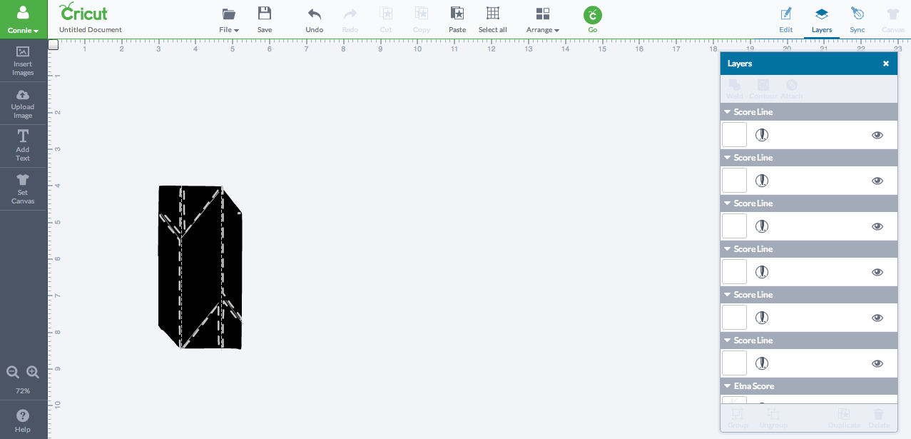
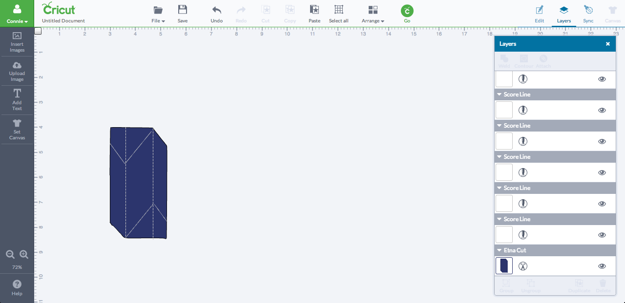
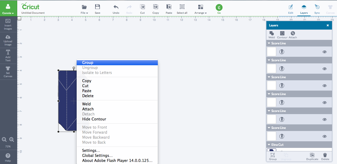
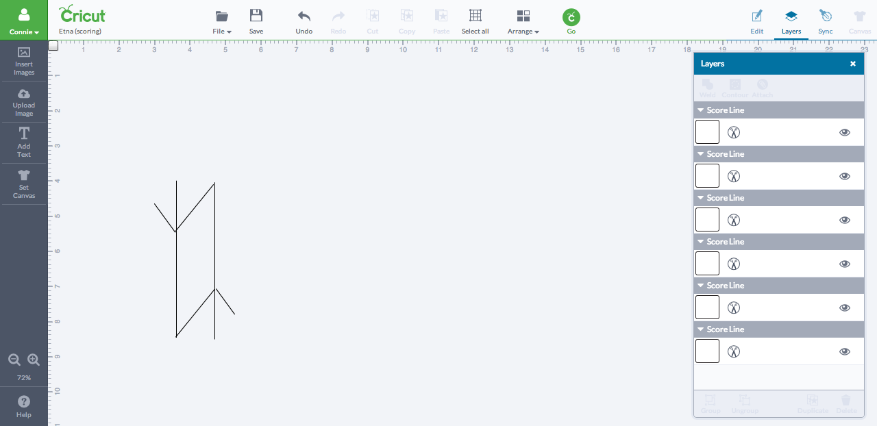
Click the "Insert Image" button on the left-hand panel bar and type in "score line" for the search engine. Click the free score line image (should just be a straight vertical line) and insert it into your file. Lengthen and rotate the score line so that it lies along a dotted line of the scoring design. Copy and paste the scoring line before positioning the new score line to lie along another dotted line. Then just continue until all of the dotted lines have score lines tracing them.
Once you're finished, select the dotted lines layer (should be second from the bottom ) on the layers panel on the right and click the trash can in the bottom right corner to delete it. Now you should be looking at the hexagon with score lines where the scoring design formerly was. You may want to change the color of the hexagon to make the lines more visible. Drag and rotate any score lines that need fixing or connecting.
After you're satisfied with the lines' positioning, hold down shift and click on all the scoring lines in the layers panel on the right. Then right-click the shapes and select "group." Go to the top of the layers panel and also click the "attach" button.
When [finally] finished, delete the hexagon layer (the last layer on the layers panel) and you should only see the score lines now.
Finalizing Files
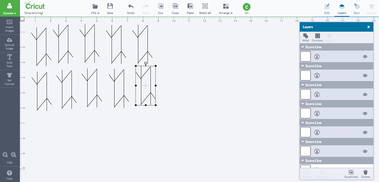
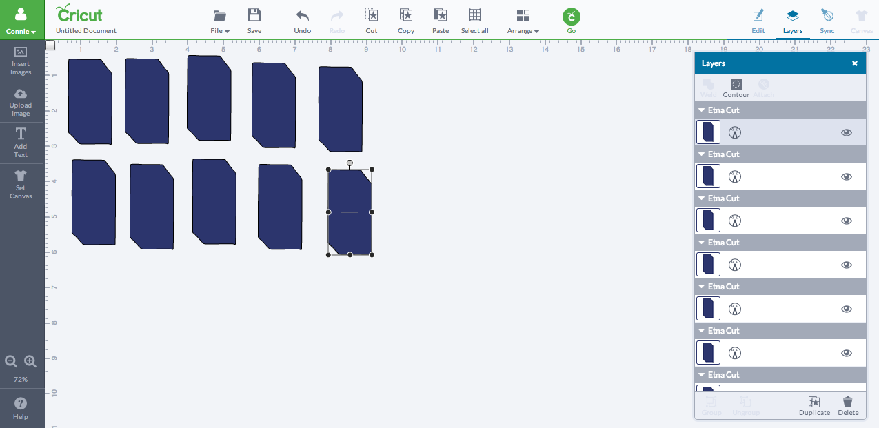
Copy and paste nine additional scoring designs into the file that you're working on. Save the file, naming it whatever you like (I just went for practical -- Etna (scoring)).
Click one of the scoring designs and then one of the black circles that pops up around the design. Record the numbers; this is the size of your scoring design, and you'll want this size to match the size for your hexagons.
Open a new file and insert one hexagon shape. Resize it to match the numbers you wrote down before copying it and pasting nine additional shapes. Save the file, again naming it whatever you like (I opted for practical -- Etna (cutting) this time).
I actually suggest you create yet another file and insert both the scoring design and the hexagon, just one of each, and do a single trial run to ensure that the cutting and scoring work just fine for folding. Read the next steps for cutting and scoring first.
Cricut Machine Sees Some Action
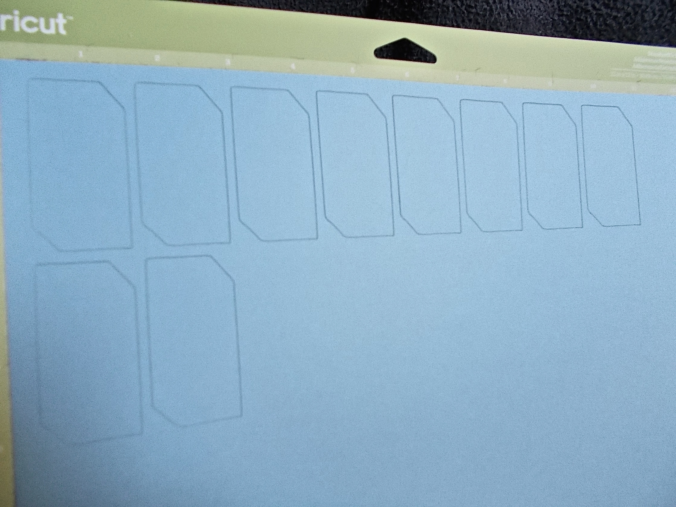
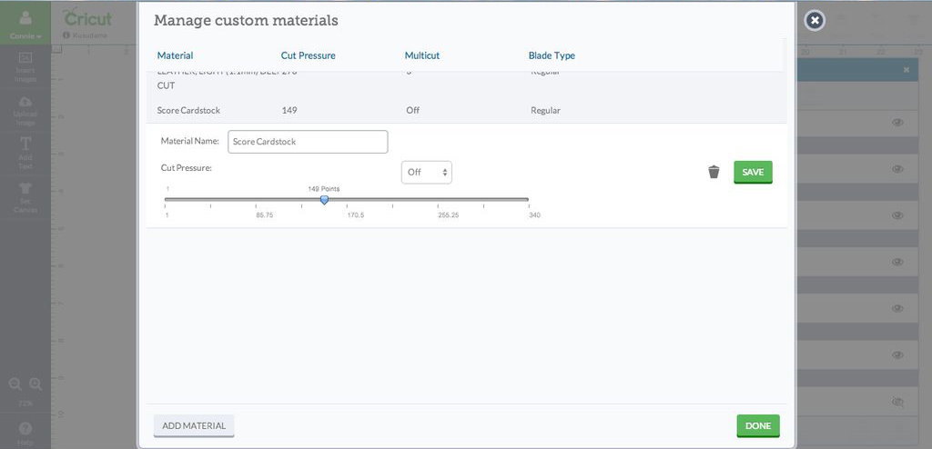
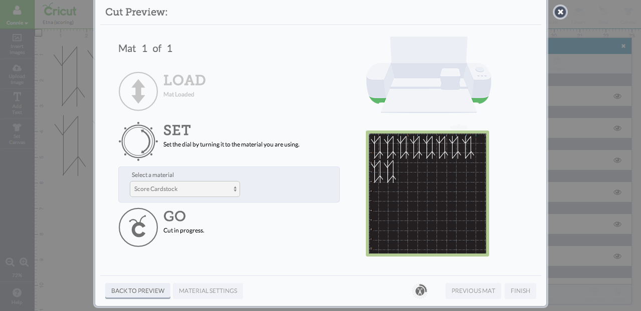
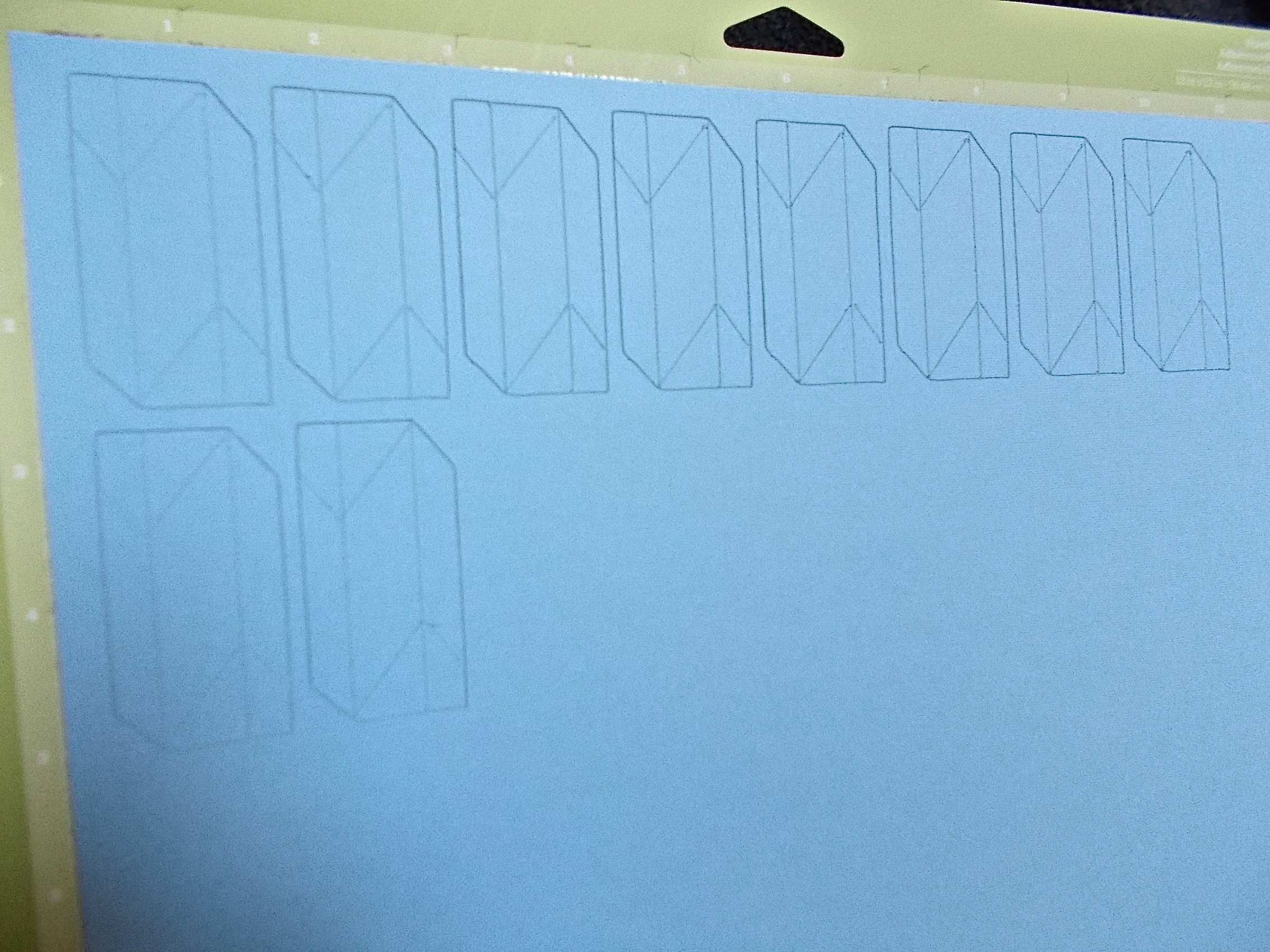
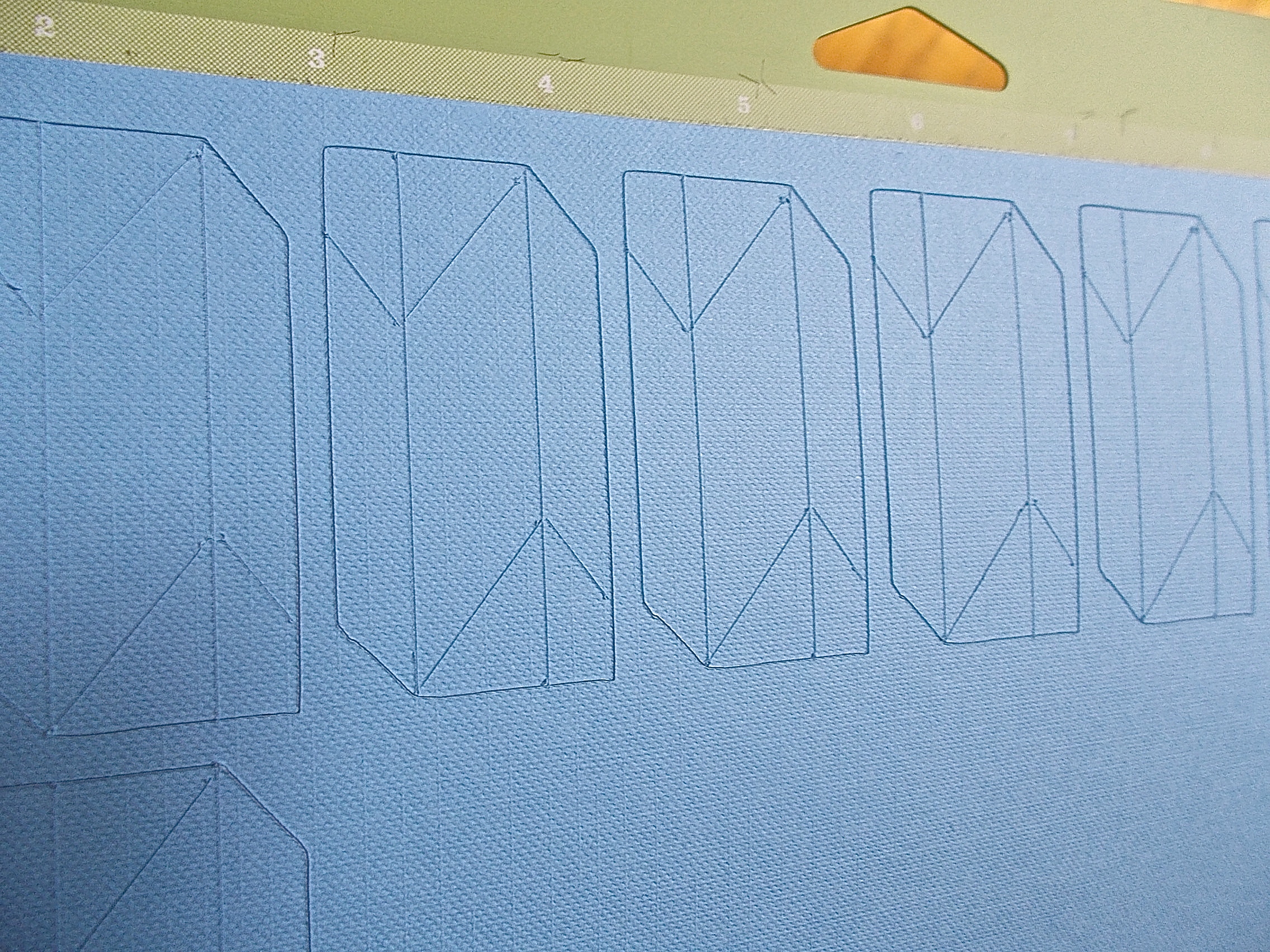
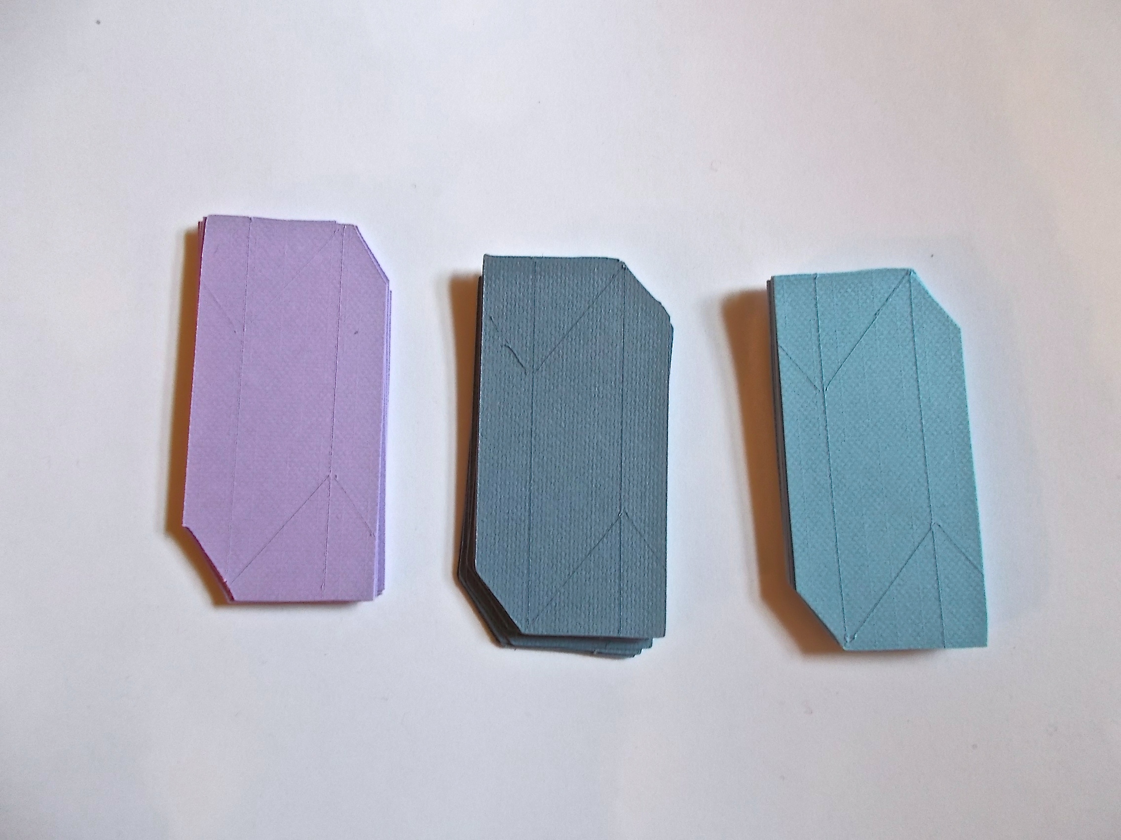
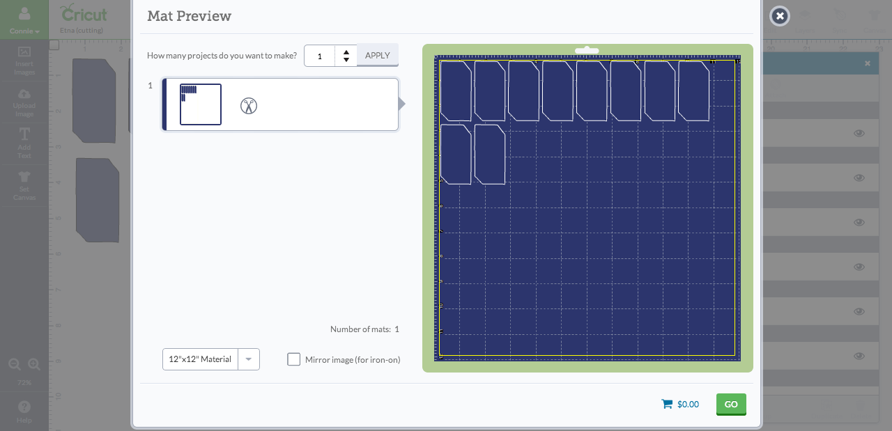
Set your machine up for some cutting and scoring, and let's GO! Press the go button in the file with hexagons (cutting), but do NOT mess with any of the positioning on the virtual mat. The machine automatically arranges everything to save paper, and it should copy this same arrangement for the scoring designs file; this way, the scoring should match up (there may be some discrepancies, though) with the cutting. Make sure your setting matches the paper you're using (cardstock, for me).
After the cuts have been made, don't take off the paper yet. Open the scoring designs file and press go again. Do not do anything to the positioning mat -- that's the general rule for this part as well, BUT BUT BUT you should look at my notes on the images above for more guidance on that point.
Now, for scoring, before pressing go, read this:
If you have a scoring stylus, good for you! Make ten total copies of ONLY the scoring lines back in your original document (the first one), and then use the machine to score along the lines on the parallelograms. If you leave the positioning mat alone, you'll be fine (mostly -- see next step..).
If you're like me and don't have a scoring stylus, you can just do lighter cuts along the lines you need scored. I experimented and found the right amount of pressure (149), and voila -- scored-lines-that-are-actually-cut-but-it's-all-good-in-the-end. In the layers panel, make sure that the score lines are CUT and NOT score anymore (click the pen-like icon and change it to scissors). Then let your machine cut. Again, if you leave the positioning alone, you'll be mostly fine, but read the notes in the pictures above. And of course, if you're just doing that trial run I was talking about (check that impatience meter...), just do the steps with ONE parallelogram and score line design.
NOTE: DOUBLE-CHECK TO MAKE SURE YOUR HEXAGONS AND SCORING DESIGNS ARE THE SAME SIZE. You can click on one of the sizing circles on the rectangle that appears when you click on a layer to check the size. My hexagons were about 2.4" by 1.2". I don't suggest going smaller than this size because the pockets for these dimensions are already quite small and difficult to manage.
Once everything's scored and cut, remove the paper. Open the hexagons file again, load in another color, and let the process commence yet again.
This sounds much more complicated than it really is, I assure you.
Folding Units
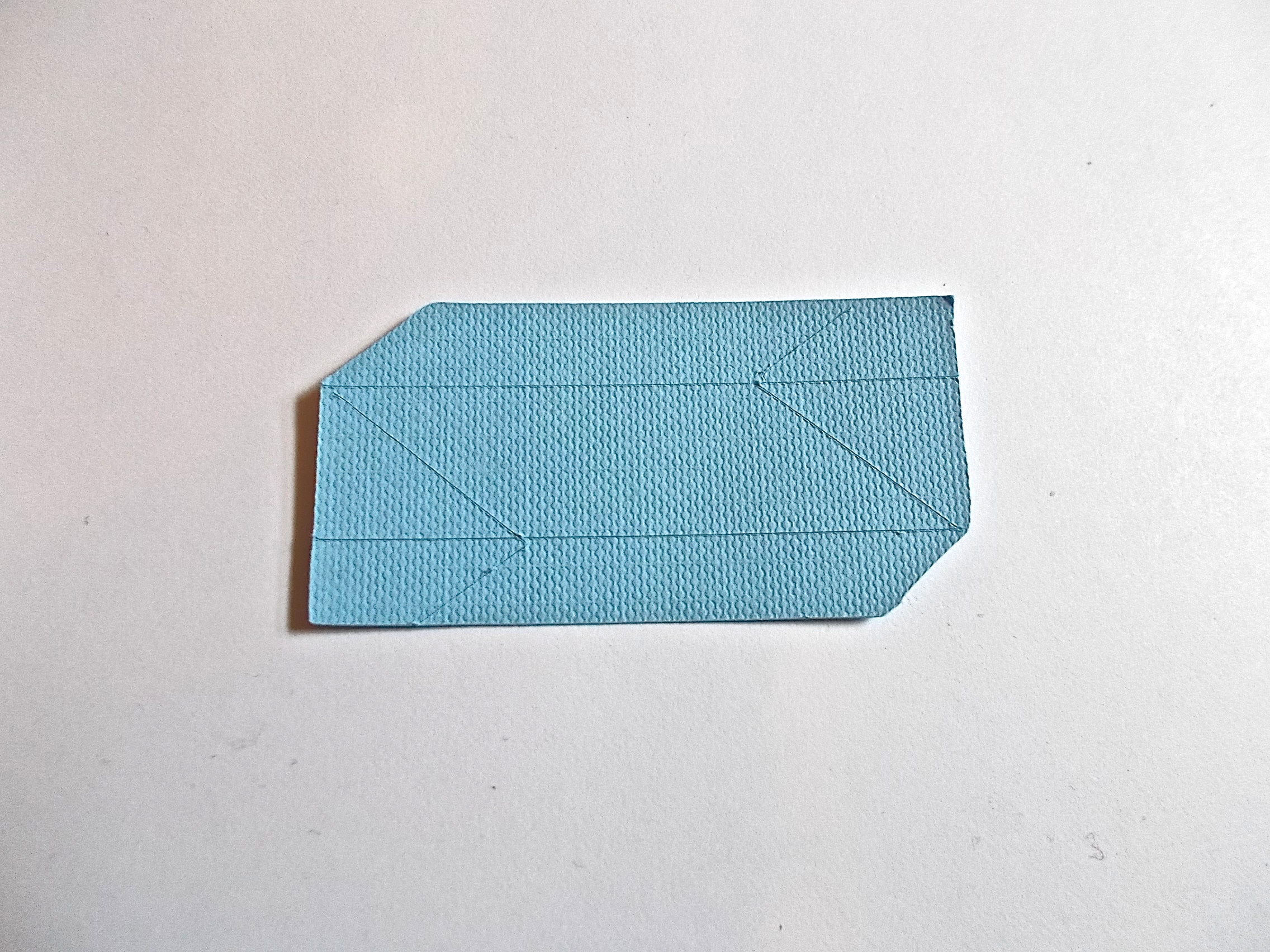
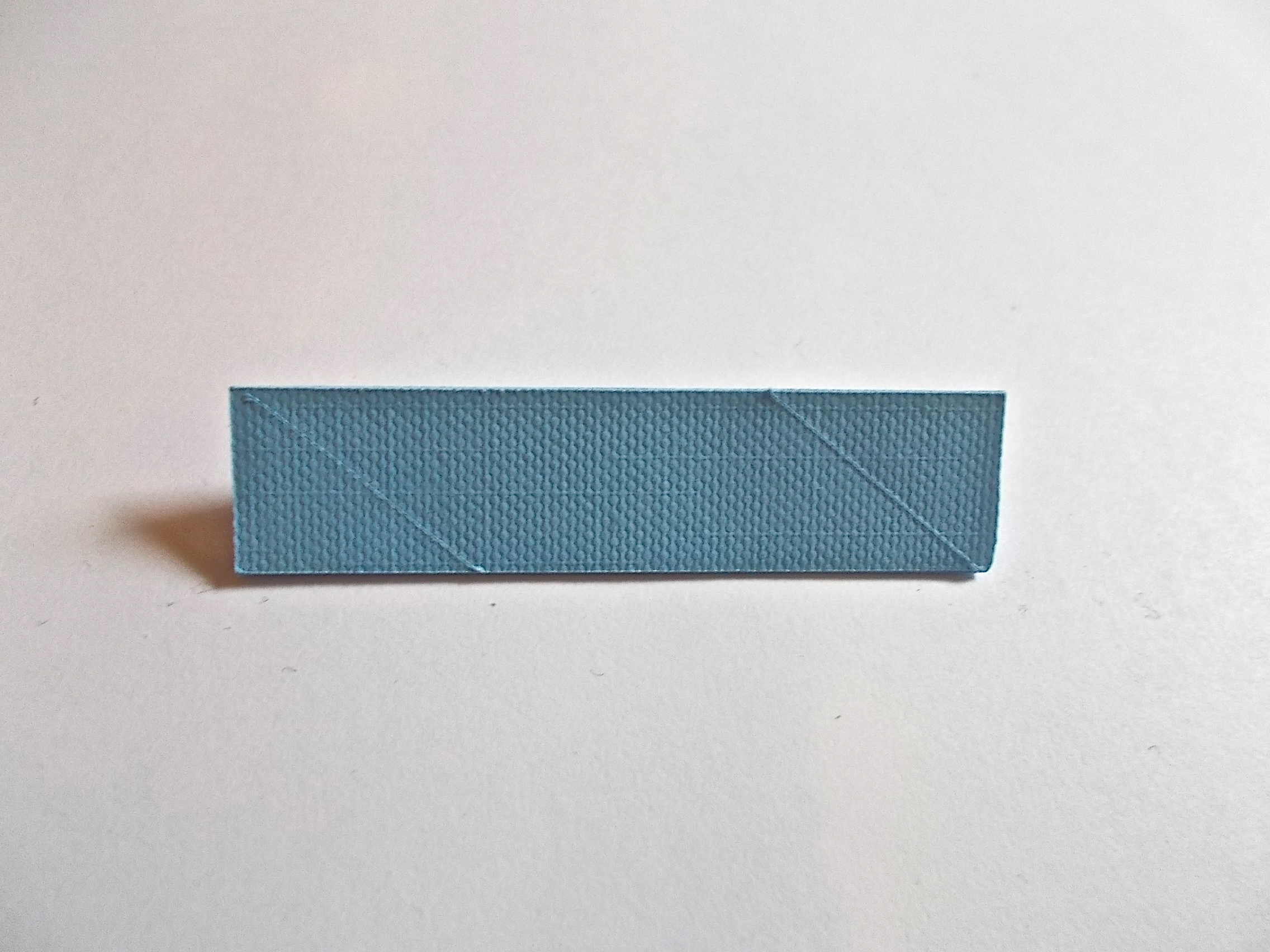
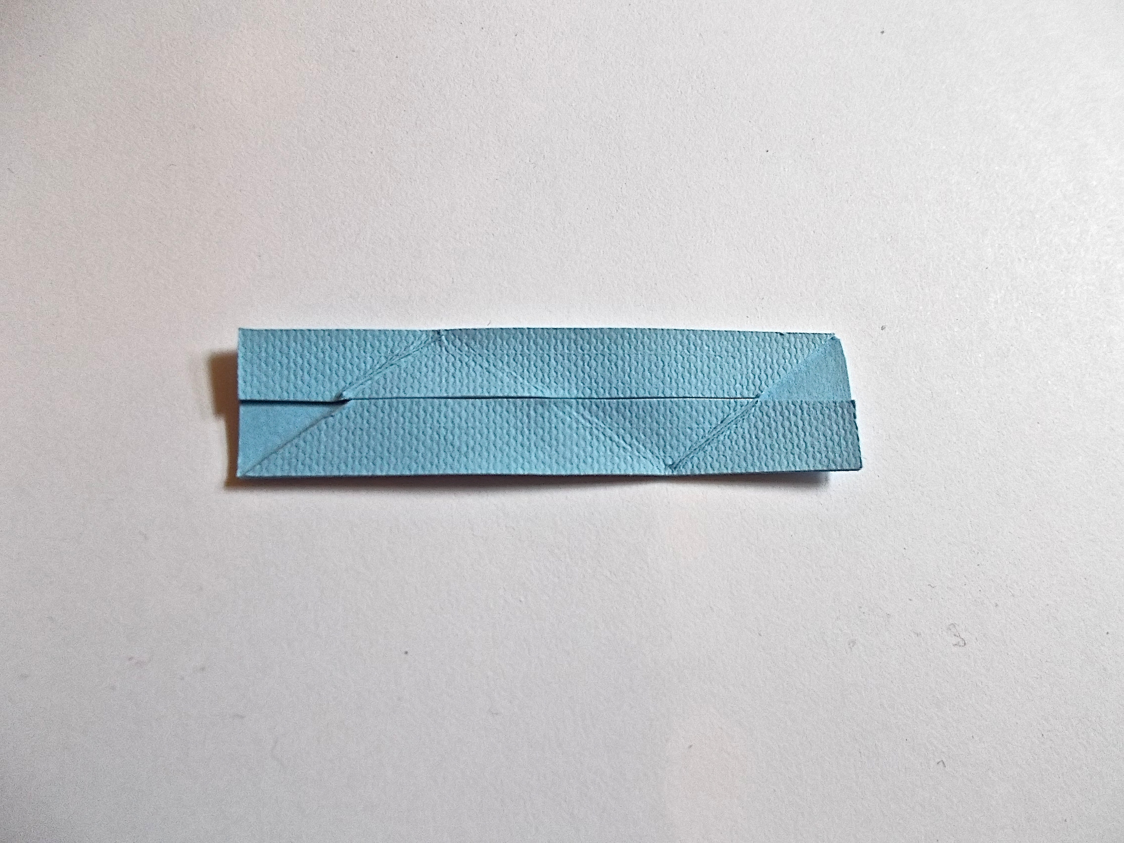
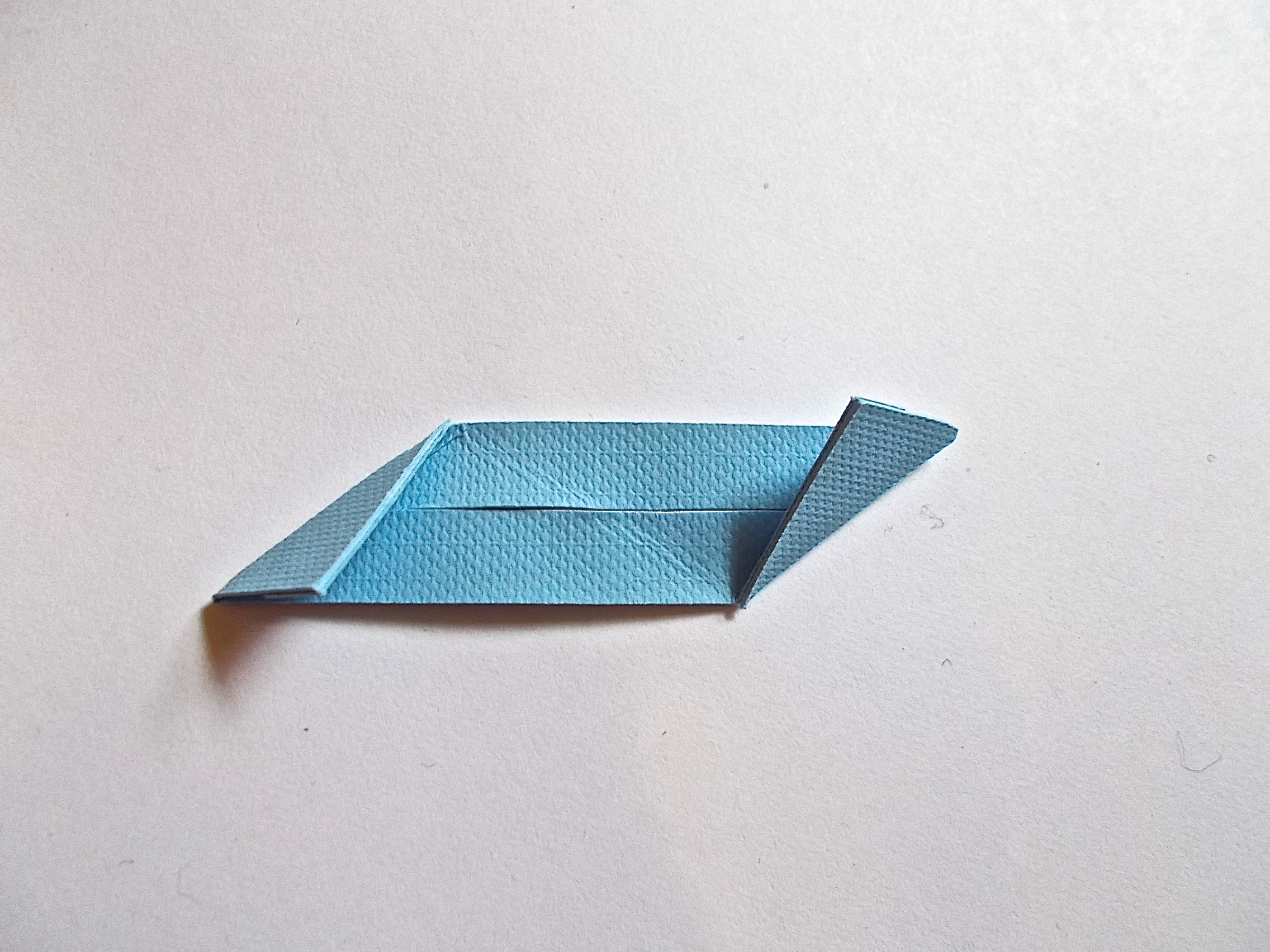
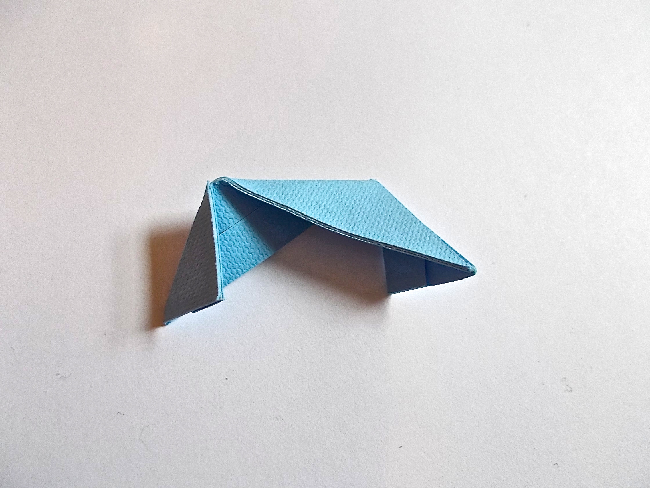
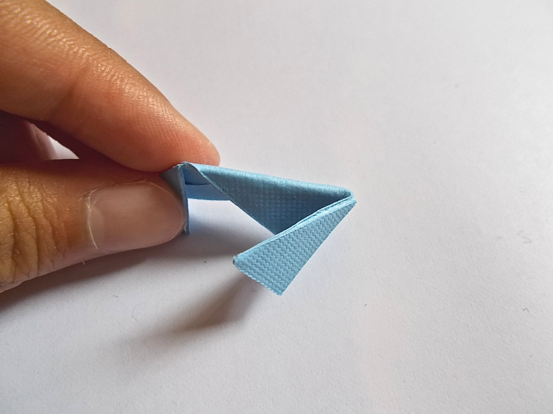
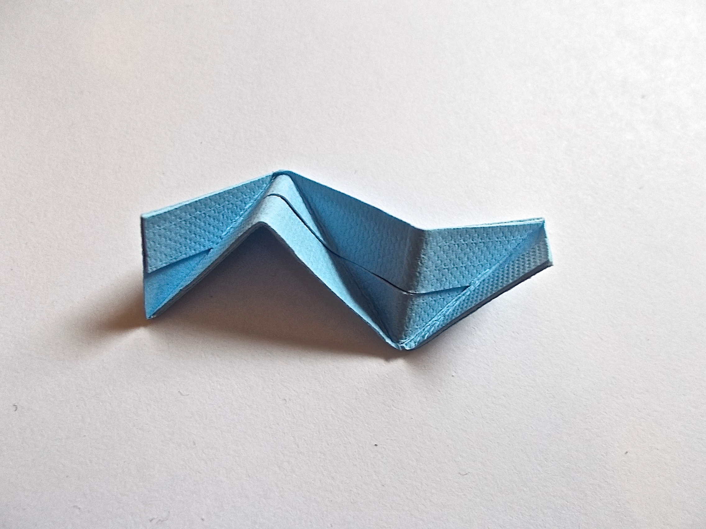
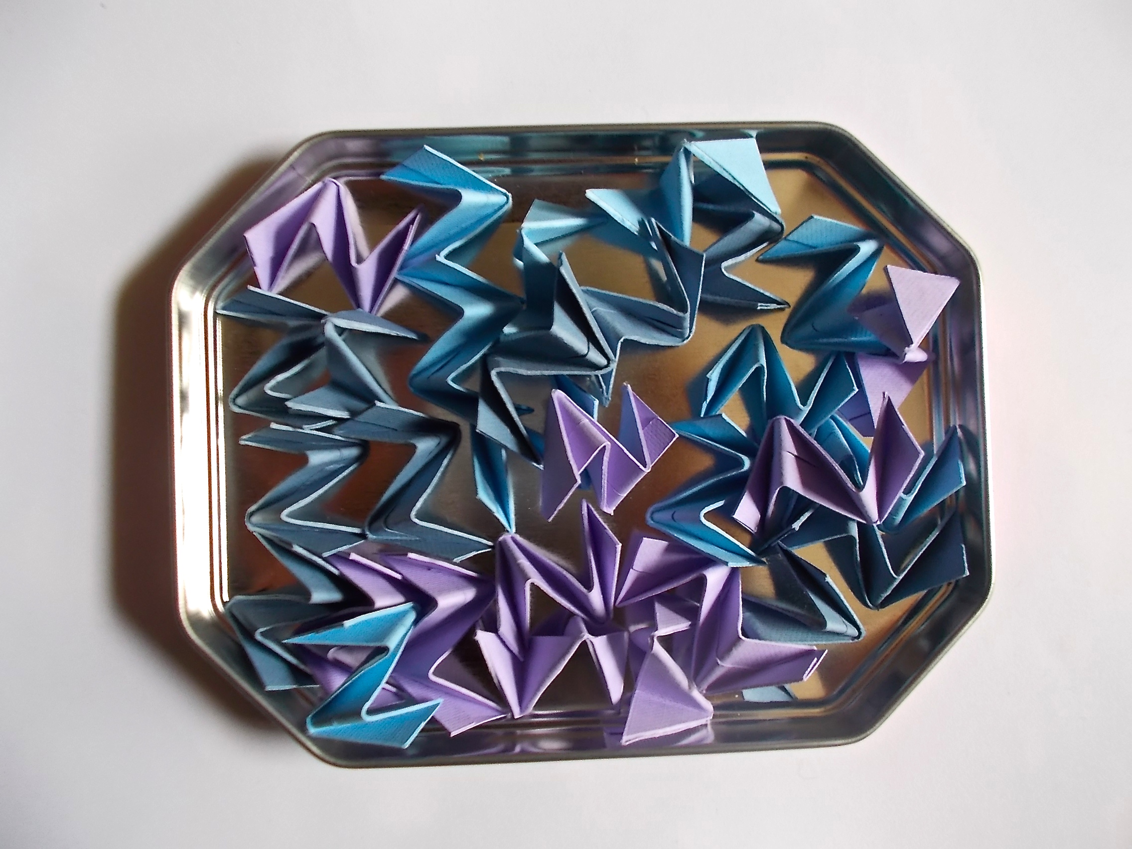
The folding for this is really quite like the regular folding for the Etna kusudama. Click the images above for step-by-step notes.
Connecting Units
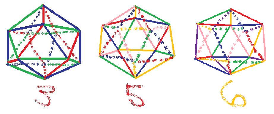
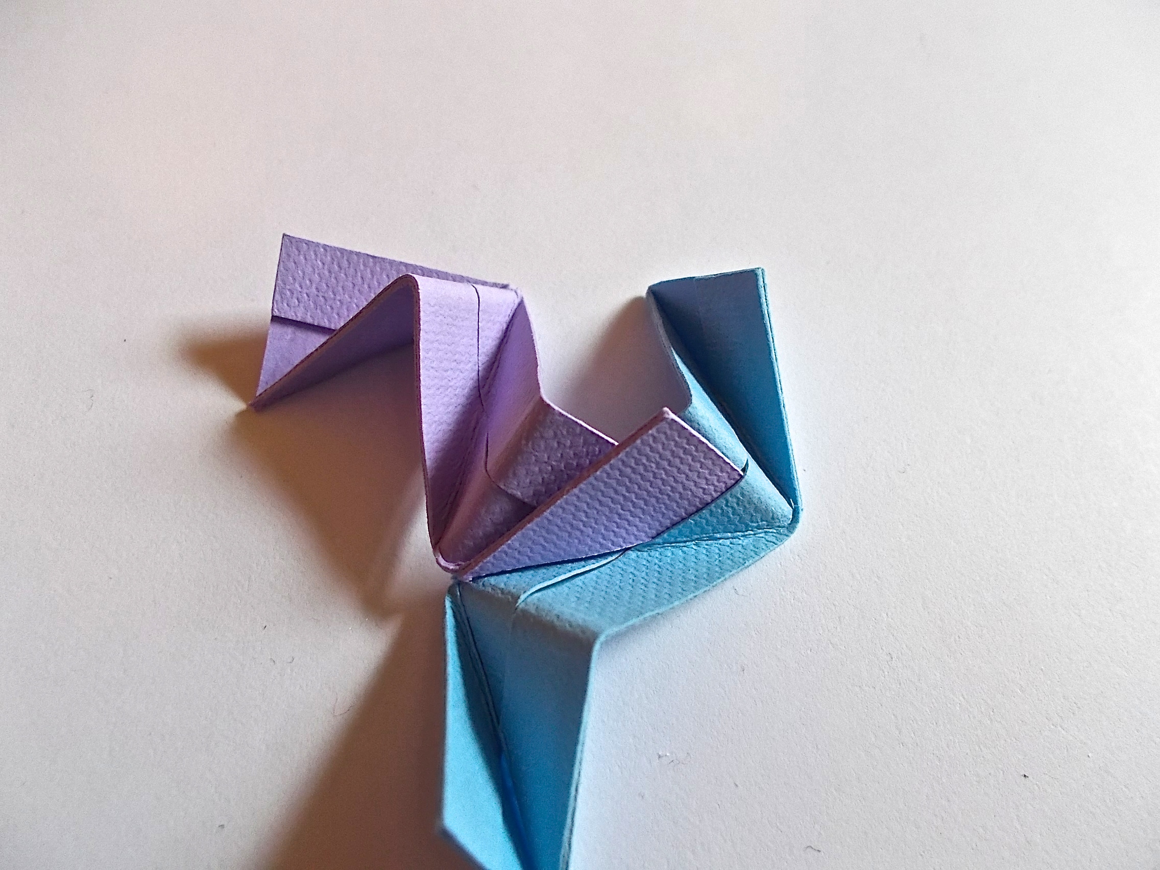
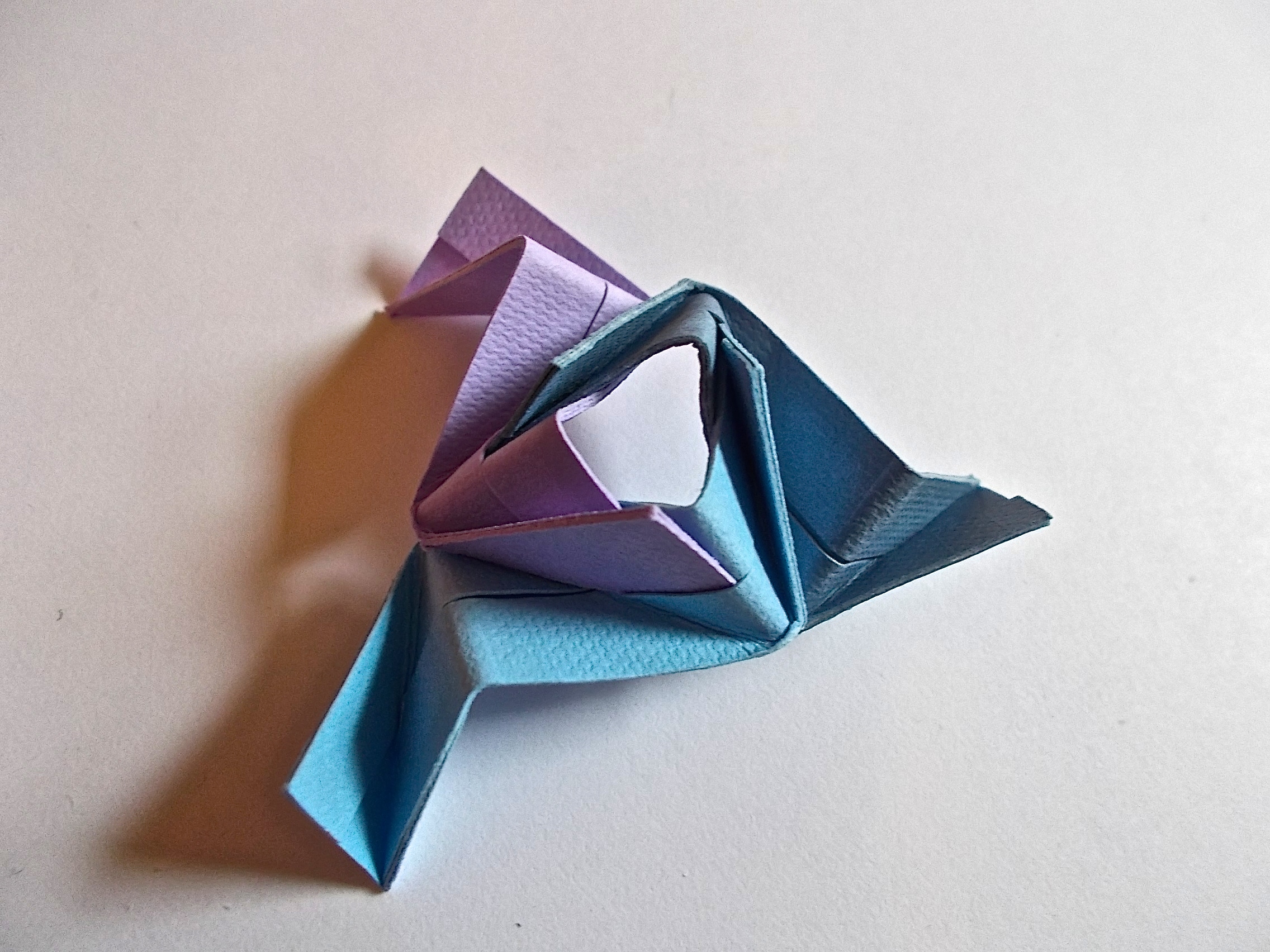
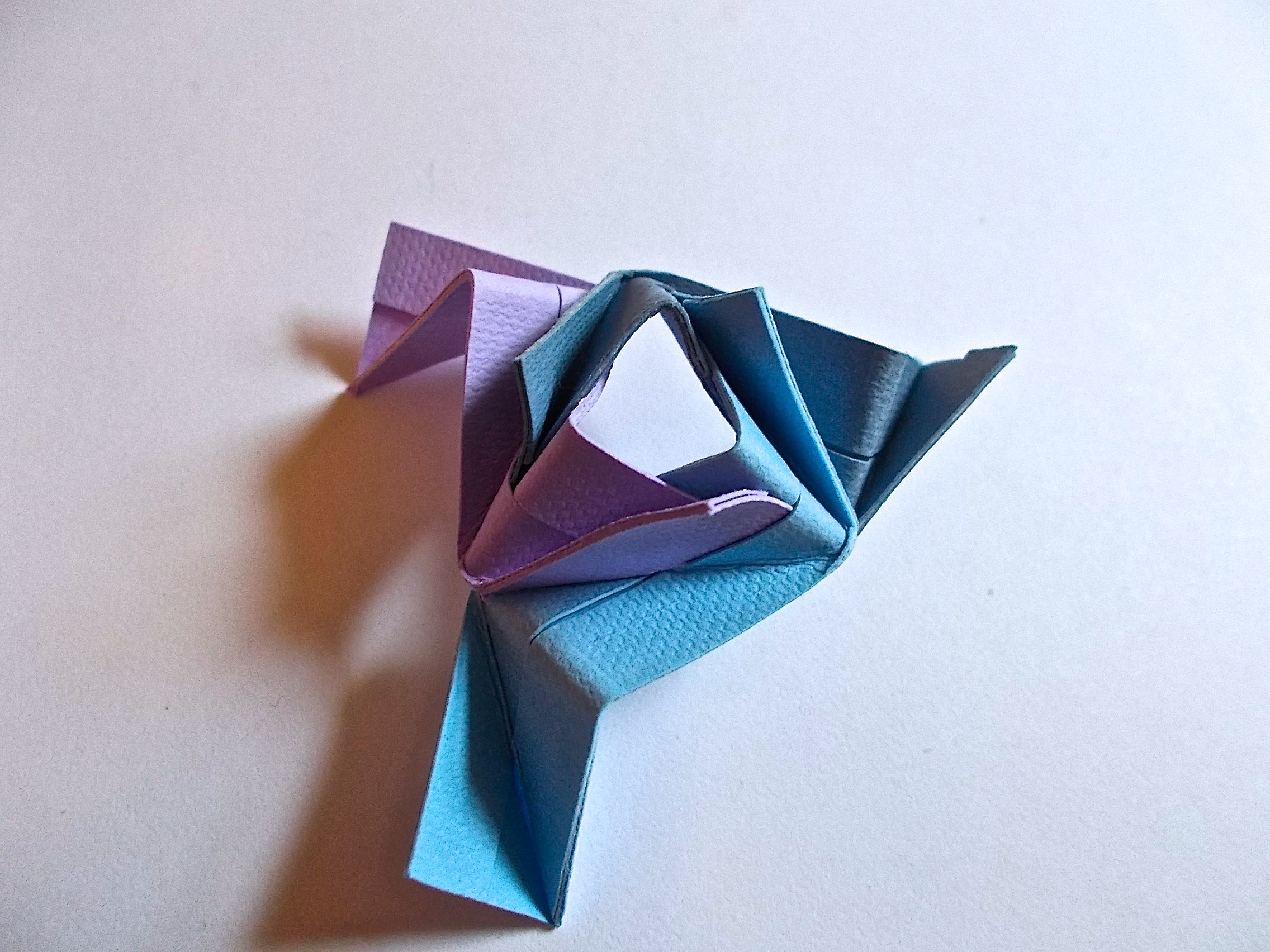

When you've folded all thirty units, use glue to connect them. Glue is somewhat necessary for the Etna kusudama; the thicker paper makes the pockets even smaller than they already are, so the kusudama will fall apart more easily if you don't use glue. So do yourself a favor and just use glue.
See the first image for a color diagram I made for making sure that no colors will overlap (basically so that all colors will be different for each "point" of the kusudama).
And that's a STRONG Etna kusudama made the lazy way! You can tweak the process to fit your needs; use five colors, for example. With five colors, you'd need six of each unit (still a total of thirty units per kusudama) so just make six copies instead of ten in Cricut Design Space.
See the next step for my photoshoping wizardry [that's really quite in need of more skill, but eh; I'm content for now].
Photoshopin'

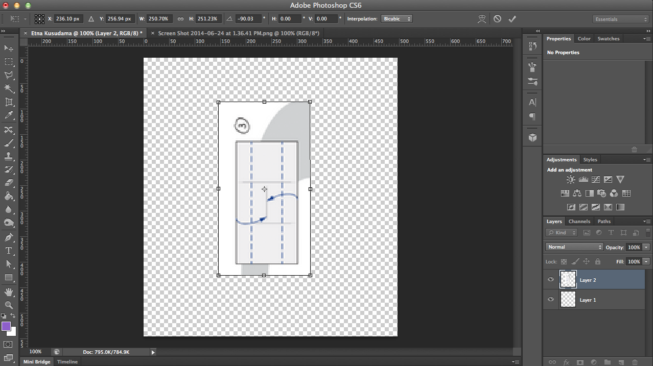
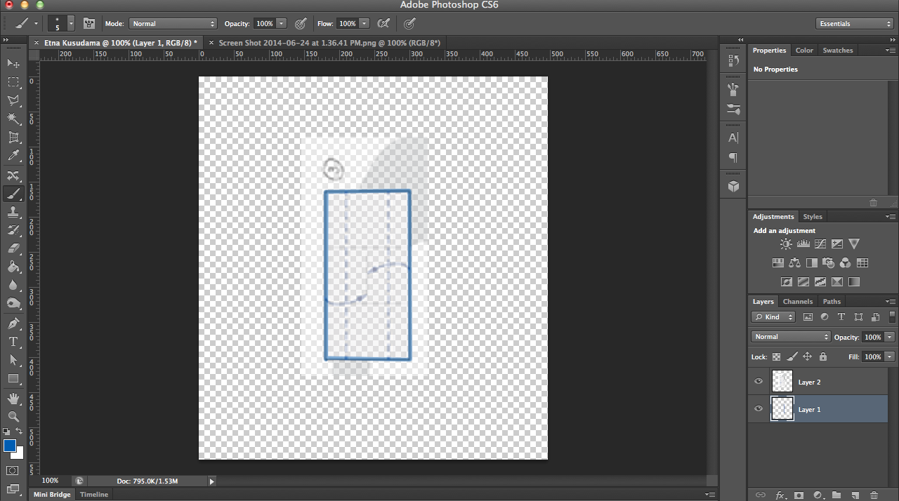
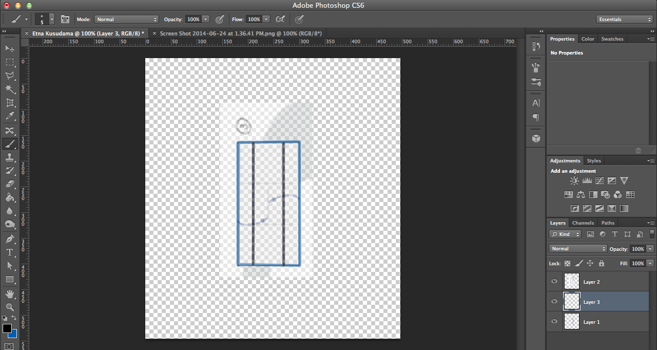

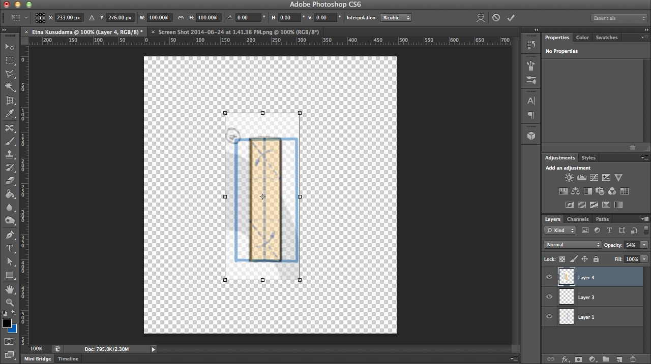
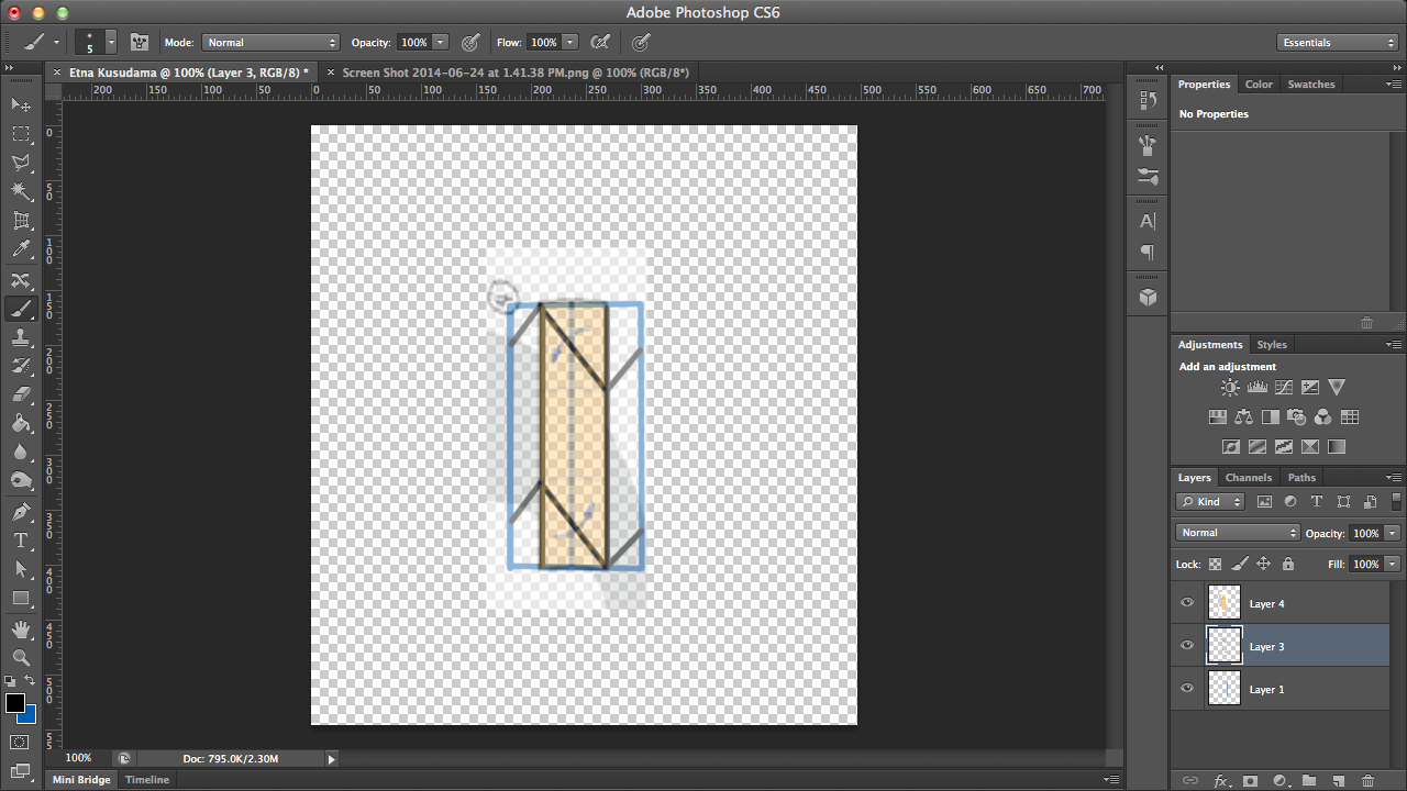
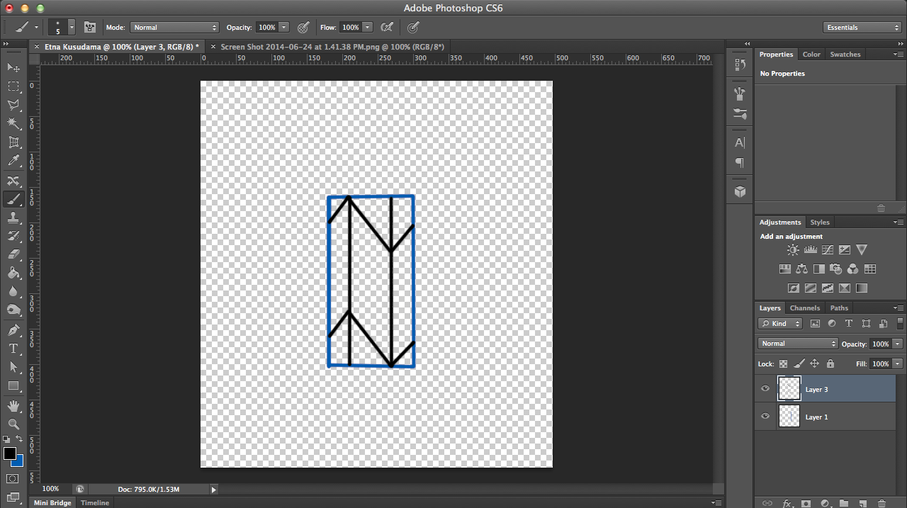
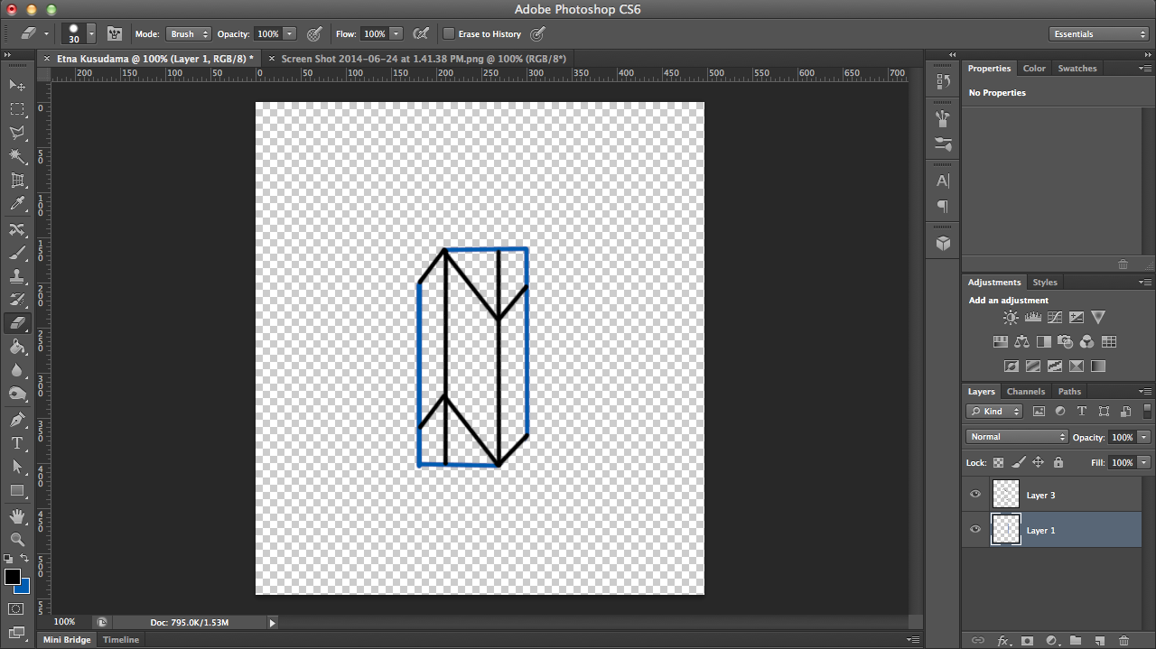
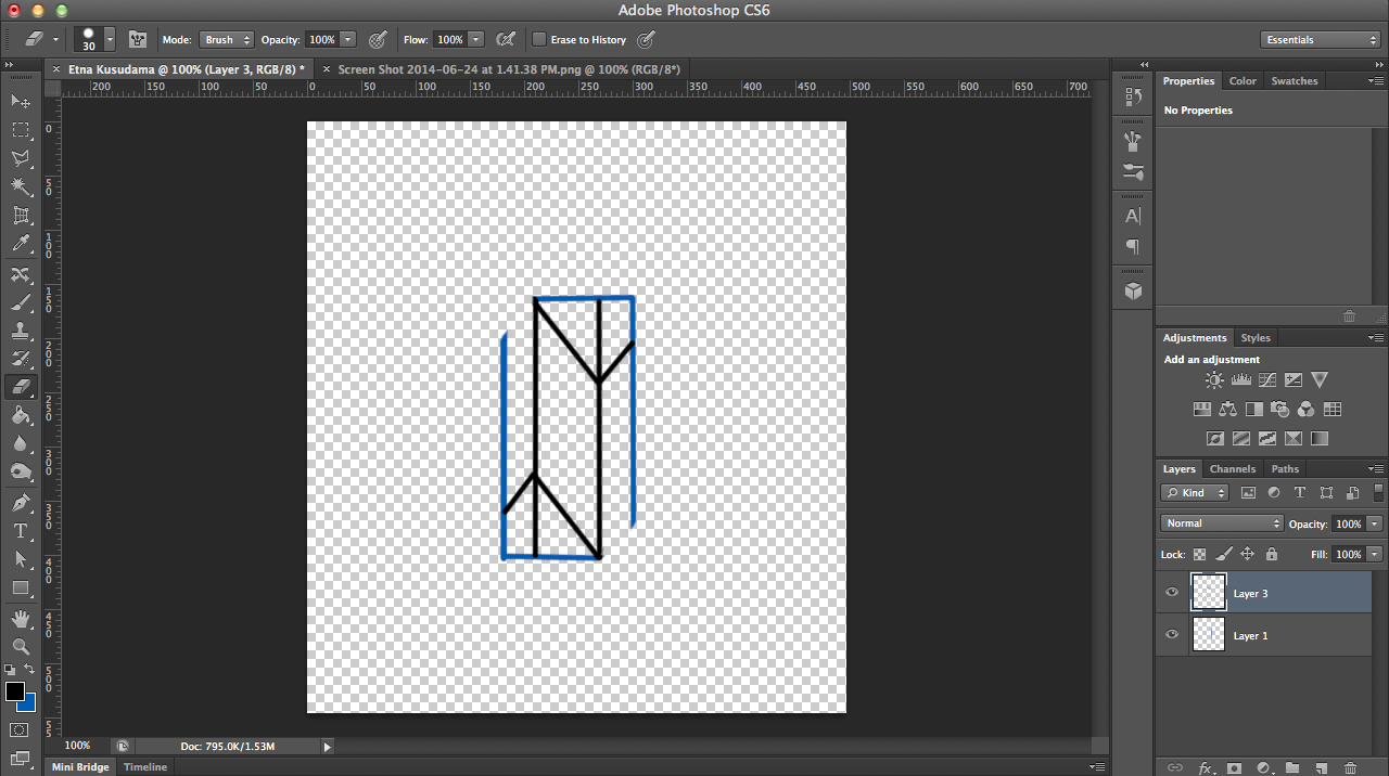
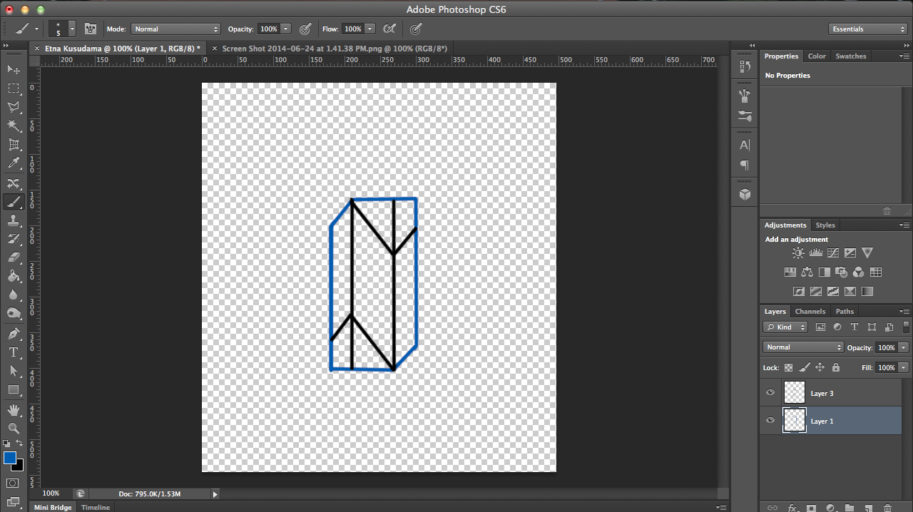
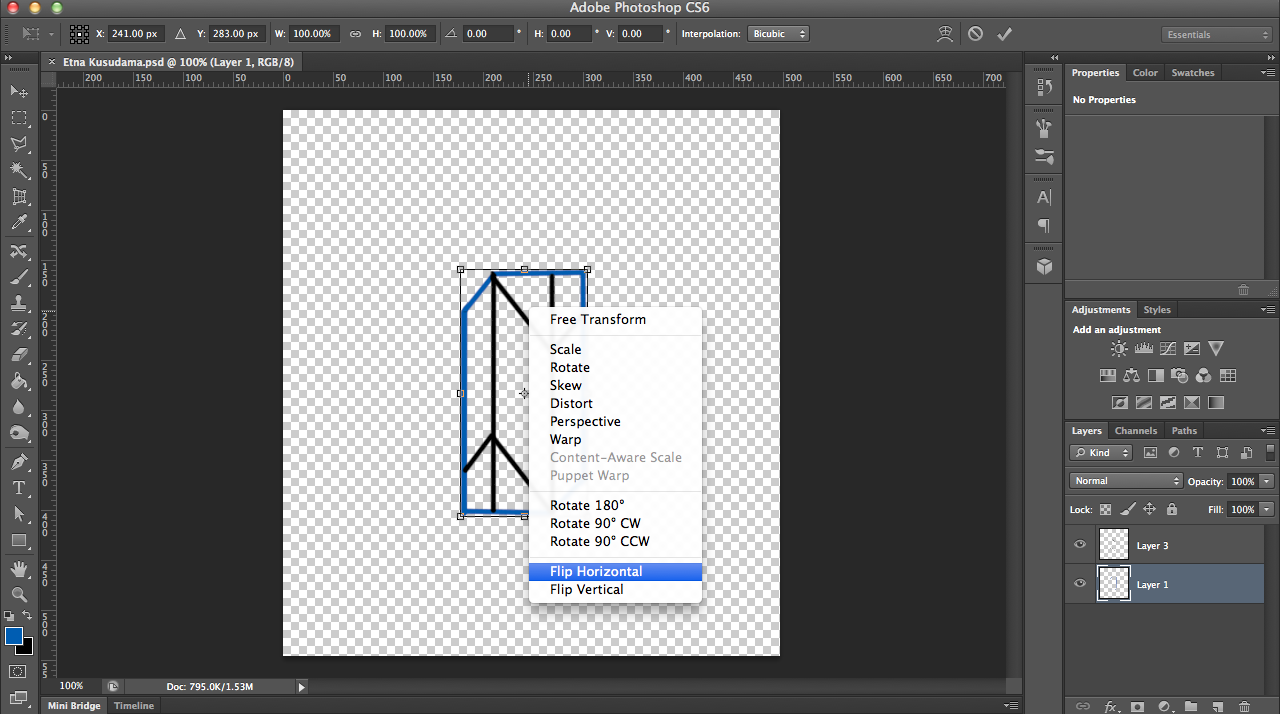
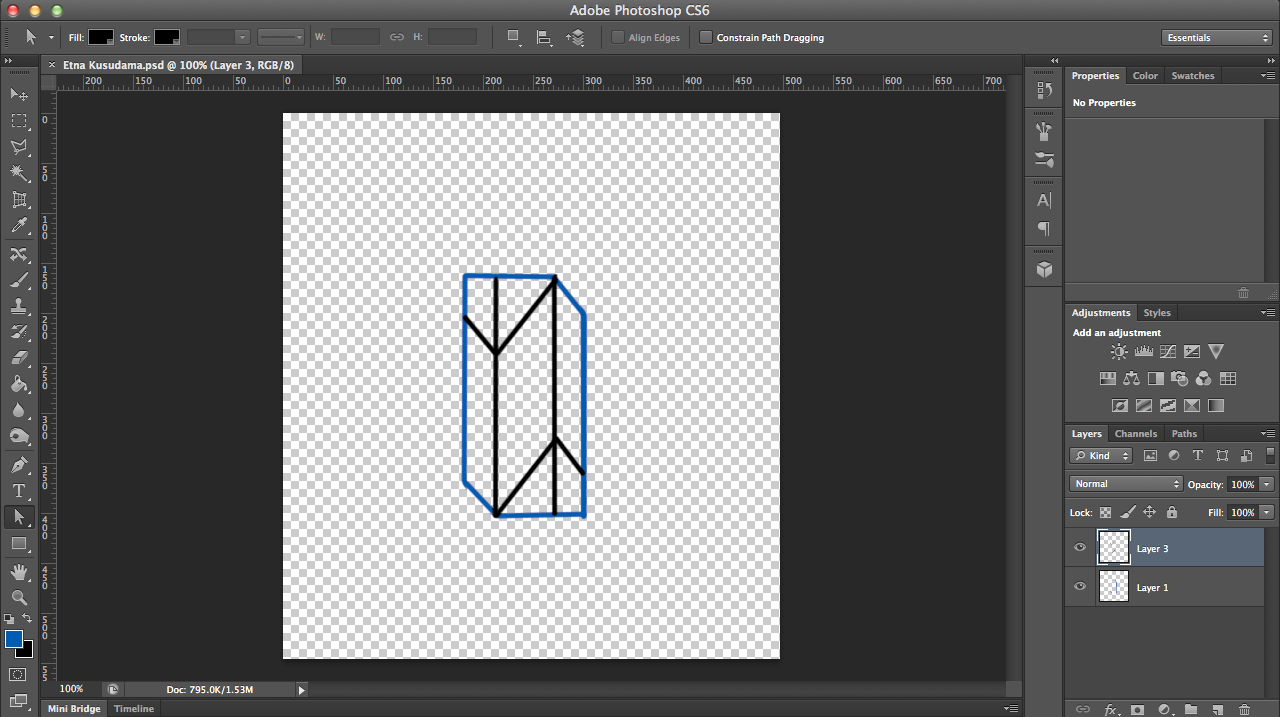
Here's the photoshoping process for the design of the hexagon and scoring lines. Just click the images above for step-by-step notes.