Sketching & Drawing Lessons
by ianbates1 in Living > Education
151044 Views, 1712 Favorites, 0 Comments
Sketching & Drawing Lessons

This Instructable will be slowly developing over a number of weeks 8 out of 10 lessons so Far
you may need to pop back to pick up new lessons.
9 out of 10 lessons complete - videos being added [these are embedded in the image sections at the start of each lesson]
So Far :
- Getting started - Lines, Points, Circles and Triangles
- 2D Sketching
- Look, Layout, Line, Shape, Shadow, Shine.
- Overlap, Texture & Detail, Drop Shadow.
- 3D Sketching
- 1, 2 and 3 Point Perspective.
-
Basic Forms - Cuboids, Prisms, Cylinders (Ellipses), Cones and Spheres
-
Combining basic forms to create objects.
- 2D USB Project [Something for you to try]
- Orthographic Sketching (Engineering Drawing very basic)
- 2D & 3D marker rendering technique - Basic
- Colour Theory
- Creativity - Exploration / Experimentation / Ideation
- Advanced 2D & 3D Sketching Techniques *Started
Coming Soon :
- Marker rendering, working on coloured paper and other enhancemets
I meet a lot of people in my job who say 'I wish I could draw like that' and they're surprised when I say 'Ok, I can teach you if you want'.
We often assume that drawing is a talent, something we are born with, some people can do it, some people can't.
But this is isn't exactly true; I failed my 'O'Level Art when I was 16. [don't get me wrong I'm not complaining I failed because I wasn't very good] and I didn't draw anything for a few years, why would I? I wasn't very good. To paraphrase a famous quote 'You don't know you are no good at something you enjoy doing, until someone tells you.' If I didn't know I was no good I'd have probably kept going and kept getting better. A couple of years later doodling away I realised I loved sketching and drawing and I wished I hadn't stopped and so I set out to teach myself how to become good at something I'd always wanted to be good at. I ended up becoming a design technology teacher/lecturer and teaching perhaps a hundred plus students these techniques.
I'm going to share here my tips and techniques for developing design drawing and communication skills. I am going to start with some very basic exercises and work through to more advanced stuff but I'll be honest, there are no short cuts, no quick tricks and no fast tracks, there's only practice, practice, practice.
Good luck, I hope you enjoy this, and don't be afraid to share your work with others.
Getting Started - Lines, Points, Squares, Circles and Triangles
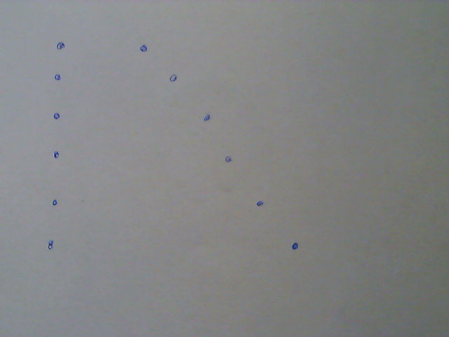
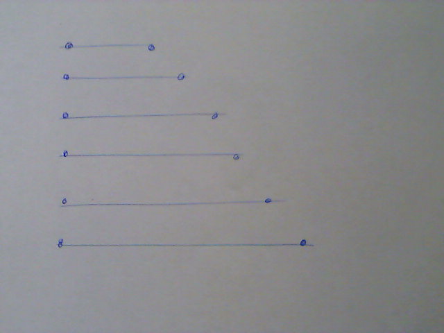
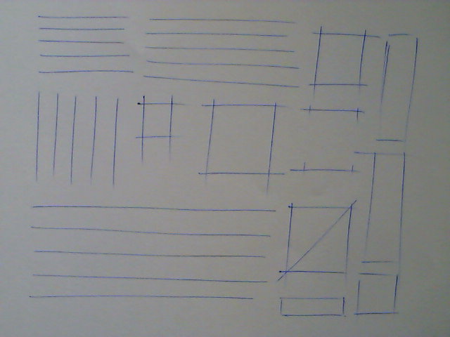
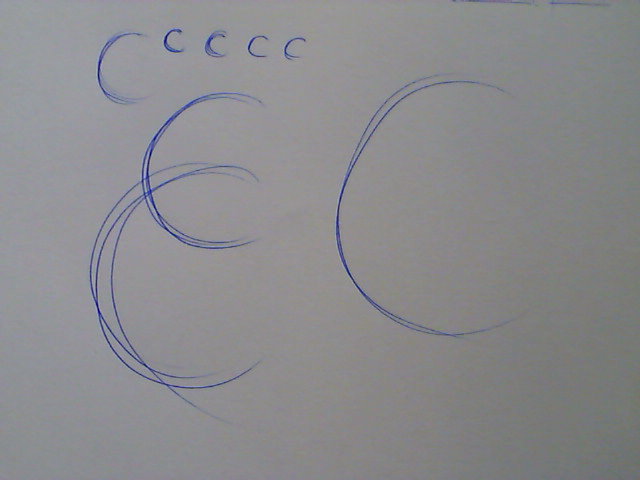
Don't go out and buy loads of equipment - Buying the best football boots doesn't make you David Beckham!
You will need :
A ballpoint pen (any colour will do)
A piece of paper or An old envelope (This is what junk mail is really for - free paper)
The key to drawing at this stage is
Lines
Points
Squares
Circles
Triangles
LINES
Straight lines are actually very difficult to draw because the human body is made up of lots of pivot points.
- Find your line - you will have a natural angle across your body with which you are comfortable. Now imagine wiping some crumbs off the table; look at the angle & direction of your hand, this is your natural angle.
- Ghosting - hold you pen the way you would normally. Place your hand on the paper so that the edge of your palm is resting on the paper but the pen is not touching the paper(no other part of your arm should be resting anywhere). Now sweep the crumbs away [Just like Karate Kid - Wax On Wax Off] do this three or four times.
- Now as you are sweeping let the tip of the pen lightly touch the paper.
- Repeat this for a few minutes.
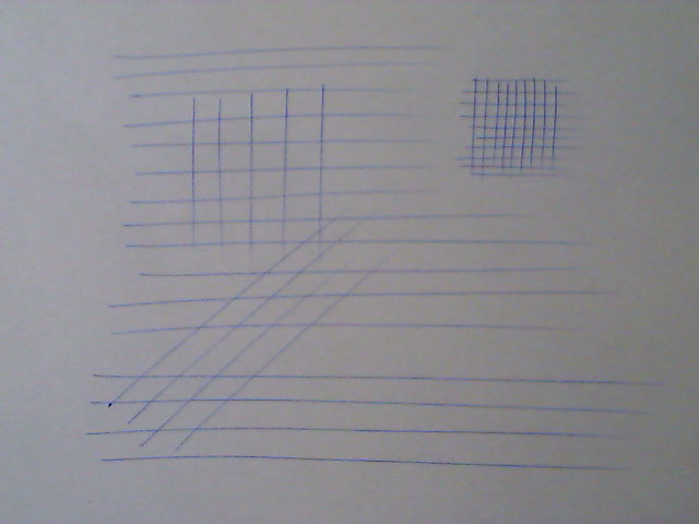
- Now try and draw the longest straightest lines you can, see if you can space them the same distance apart each time. Turn the paper and make grids, just practice, practice, practice.
POINTS
All drawings are basically lines or curves that start and stop at a certain point and once you can do that you are on your way to being able to draw anything.
- Look at image.2 - re-create this series of points which get further and further apart.
- Now using ghosting first draw imaginary lines between the points.
- Now join the lines (it doesn't matter if you start a little early or stop a little late, this is sketching) image.3
- Now you have some start and stop control fill your sheet with small groups of 5 lines each where the they are all of the same length - image.4
- If you want to do lines in a different direction don't move your arm - turn the paper instead, this way you are still 'sweeping the crumbs' moving in a way that is comfortable to you.
- You can extend this exercise by drawing SQUARES - draw two parallel lines, turn your paper through 90 degrees and draw two more parallel lines across the first two lines. Now practice, practice, practice.
CIRCLES
Earlier I said the human body is made up of a lot of pivot points, so you would think drawing curves would be easy, it isn't, the curves even from your wrist point are usually two open to be of any use.
- Write or draw the letter C. Do you start at the top and move down and anticlockwise or at the bottom and move up and clockwise. This is your natural 'tight curve' direction.
- Draw a series of letter Cs - try drawing them a bit bigger than normal and then try drawing them the size of your fist.- image.5
- Go back over your letter Cs but ghosting this time and instead of a C, complete the circle to the top but keep going round, ghosting a circle.
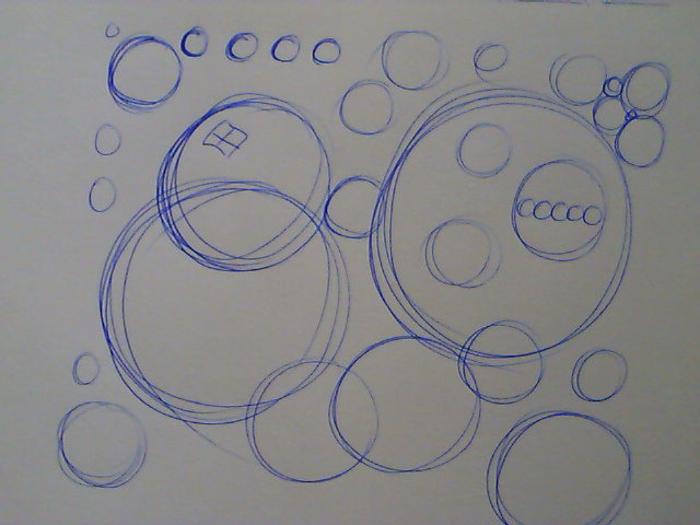
- Let your pen touch the paper and sketch in the reminder of the C to make a circle. - image.6
- Now forget the letter C and just ghost and then sketch a page full of circles. Practice, practice, practice.
PLAYTIME.
Now get some fresh paper and just doodle away sketching and drawing lines squares circles and if you look at image.7 you can add in TRIANGLES. Have fun :)
2D Sketching - Look, Layout, Line, Shape, Shadow, Shine. 2D Enhancements
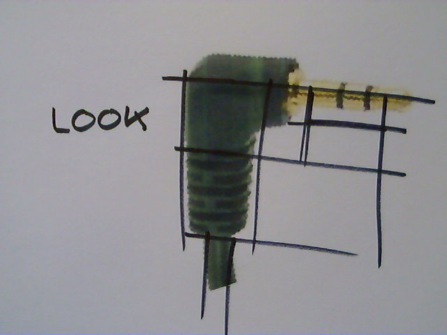
In the previous lesson we looked at mark making, that it being able to control the marks we make on the page to achieve a desired line or shape. Now were going to explore a more deliberate practice in how to draw objects.
This section is divided into.
- Look, Layout, Line, - Shape, Shadow, Shine,
- Practice Element.
- Enhancements - Overlap, Texture & Detail, Drop Shadows
- Practice Element.
This is not drawing from observation so we will not be trying to draw what we see but trying to construct a drawing from basic elements, points, lines, curves, squares, circles and triangles. We will start of with very very faint lines and slowly build up our drawing.
You will NOT need:
A ruler or straight edge.
An eraser or correcting fluid ( mistakes are good, we see the mistake, we learn from the mistake).
You will need:
A ballpoint pen (any colour will do, although black is better later on).
An A4 piece of paper - landscape (long edge nearest you)
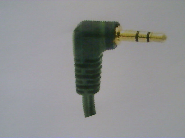
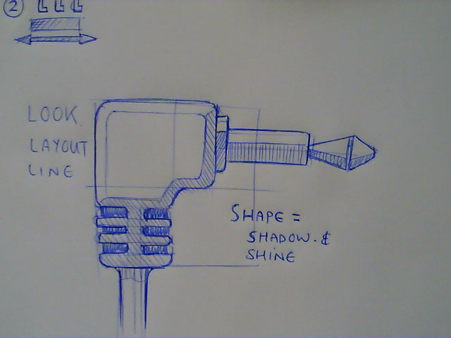
Something to draw - I'm using a head phone jack see image.2
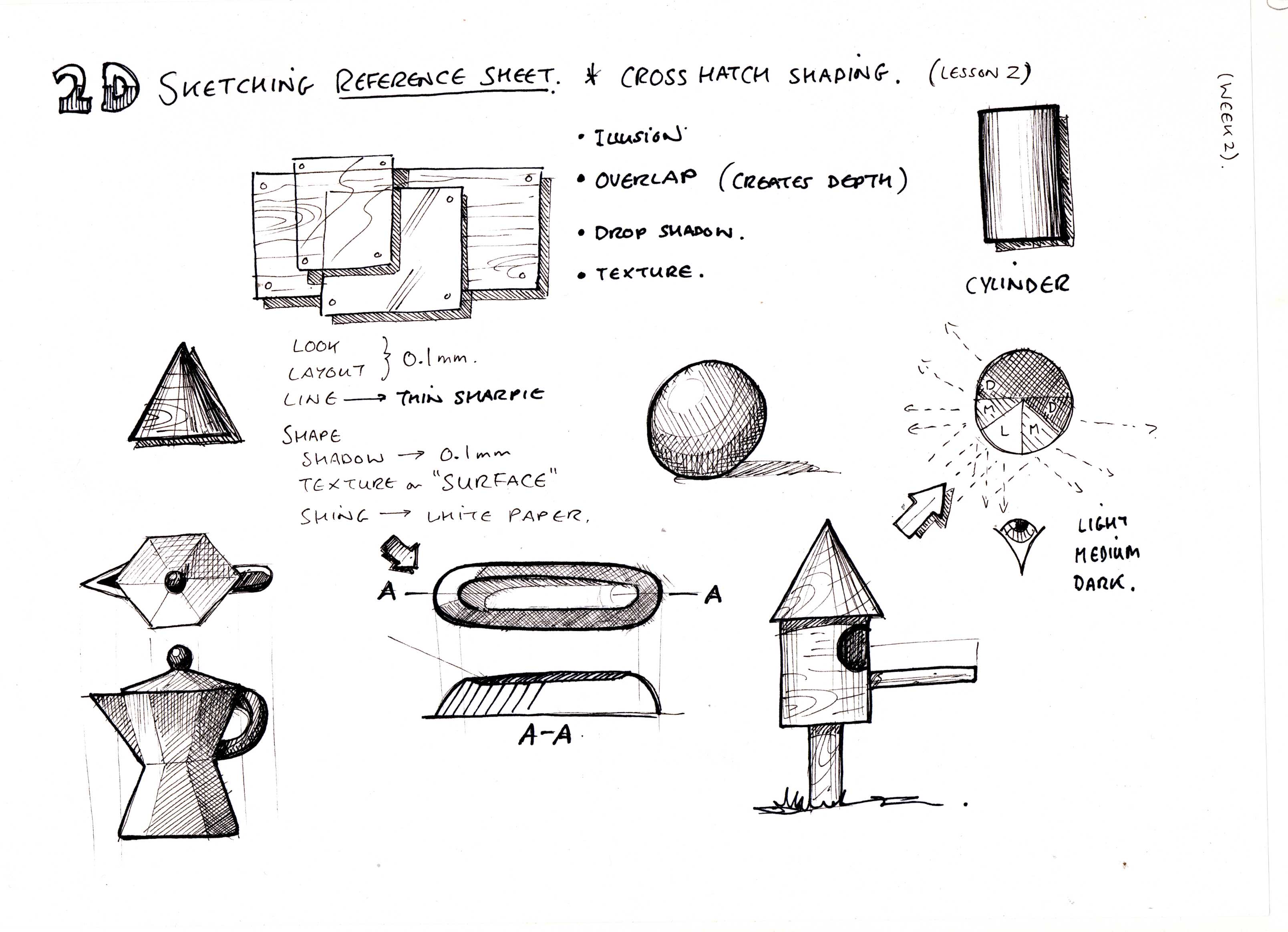
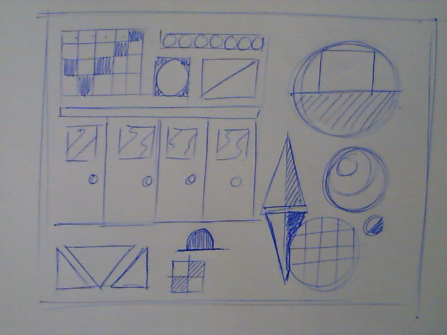
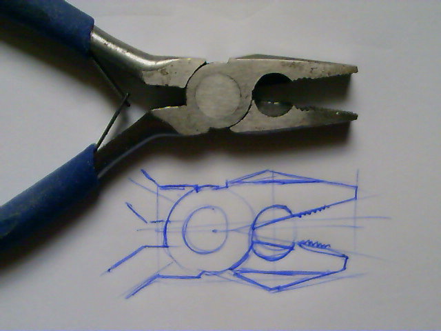
Section 1 - Look, Layout, Line, Shape, Shadow, Shine (See Image 1)
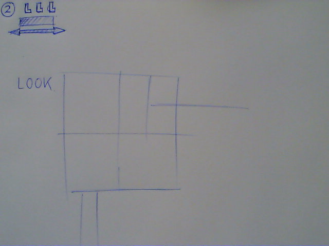
LOOK
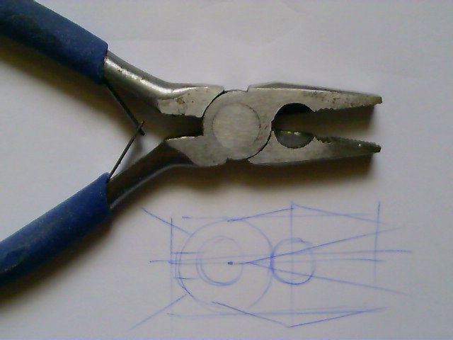
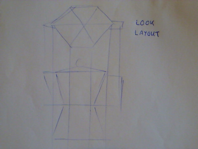
The first thing we need to do is establish the overall proportions of the object on he page we need to LOOK at it carefully. I usually sketch ideas on the page about the size of a clenched fist, big enough for detail but leaving enough room to add other ideas.- Remember keep your lines light & faint.
- Having looked at your object sketch a square/rectangle to outline the overall area of the drawing.
- Sketch in any large defining features. See image.3 and image.4.
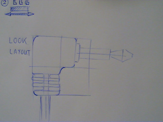
LAYOUT
The next thing to do is to examine the object carefully for details and LAYOUT where these are in relation to other features and the overall form. - Remember keep your lines light & faint.
- Using simple points, straight lines, curves and or circles - lightly mark in the features of the object. See image.5.
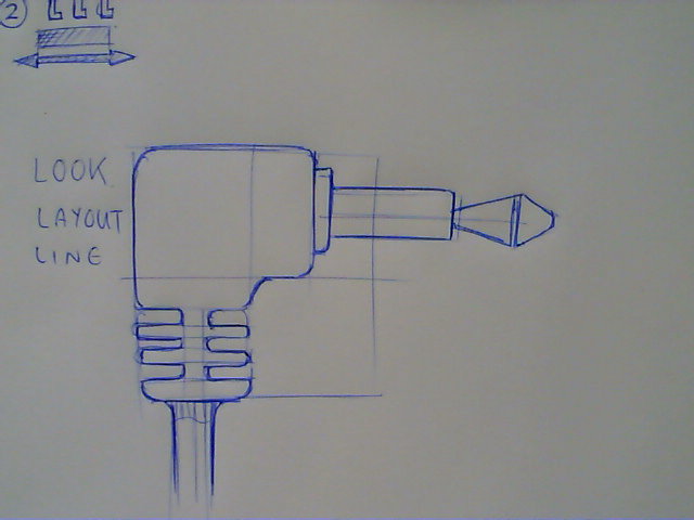
LINE
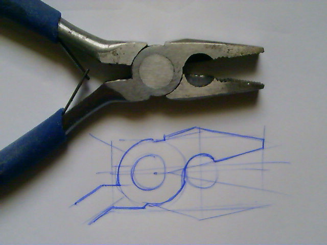
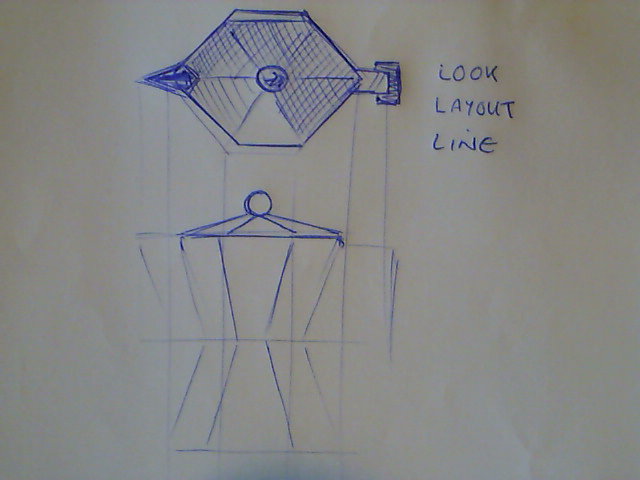
Once you have roughly marked out where everything is it is time to 'firm up' the drawing. We're going to go over the design again with a slightly heavier line marking out the outline and features we want to see on the object.
- Using the same pen but going over more slowly and with a little more pressure LINE in the design outline and features you want to keep. See image.6.
- Ignore any light construction lines these will not be noticeable against the dark LINES.
This type of drawing is known as ORTHOGRAPHIC -
SHAPE, SHADOW, SHINE.
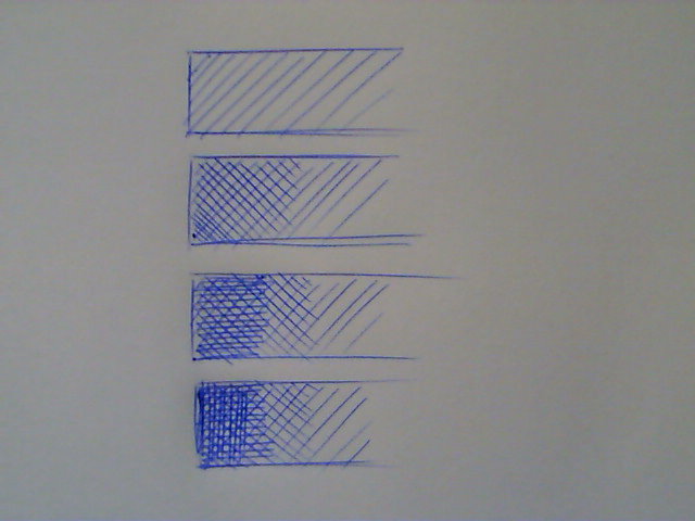
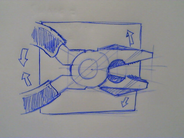
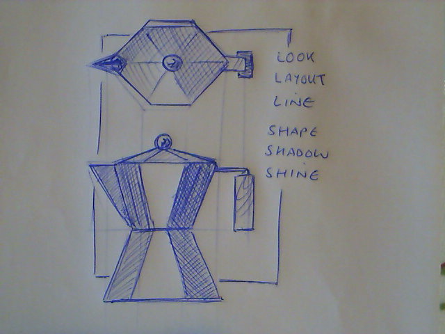
We will be discussing light and shade in more detail in the next step, but to enhance your drawing it is possible to add a little shadow using a technique called cross hatching. Cross hatching is a techniques of using small parallel lines to create areas of tone. It is usually done at alternating angles, 45 degrees one way, then the other, then vertical and then horizontal. Each layer adds more ink and obscures more paper creating a darker and darker tone. See image .7 and image.8.
PRACTICE, PRACTICE, PRACTICE (See Image 1 again for ideas)
See images 9 - 12
Don't worry if your drawings are scruffy, this is just the early stages, just keep going, it will get better - slowly :)
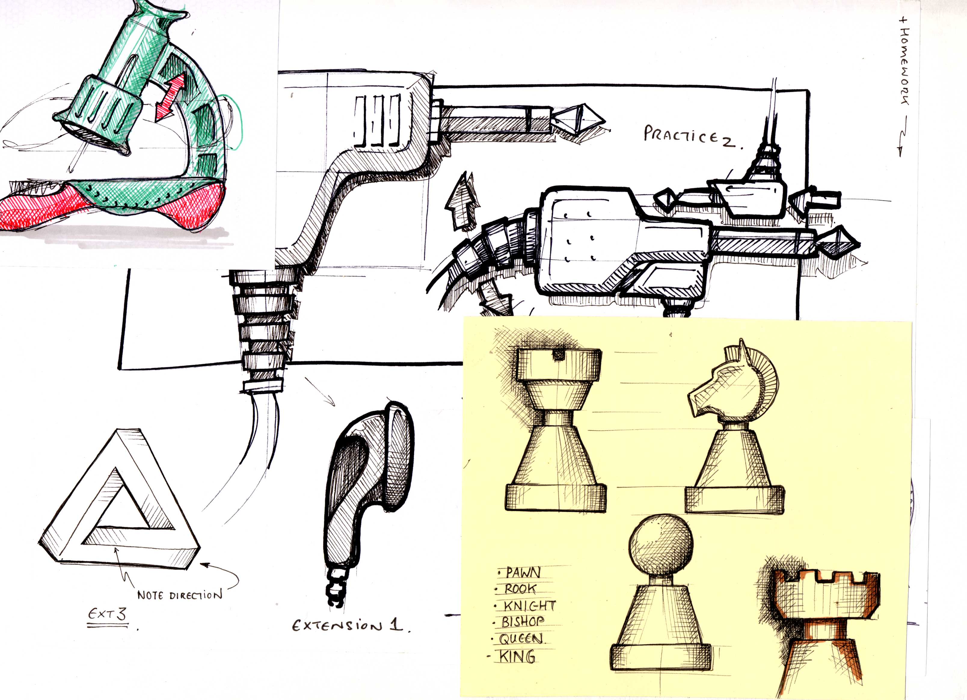
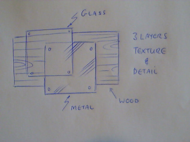
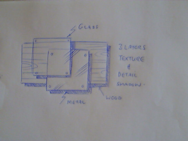
Section 2 - 2D Enhancement - Overlap, Texture & Detail, Drop Shadow. (See Image 13)
A drawing is basically an optical illusion that the artist or designer creates to fool the viewer into believing that what they are looking at is 'real' or at least resembles 'real' enough for them to think about the drawing a not the fact that it is on a flat piece of paper; some artists call this giving an image 'depth'. As a designer we can trick the viewer if we understand how their vision and their minds work together to create a perception of an object.
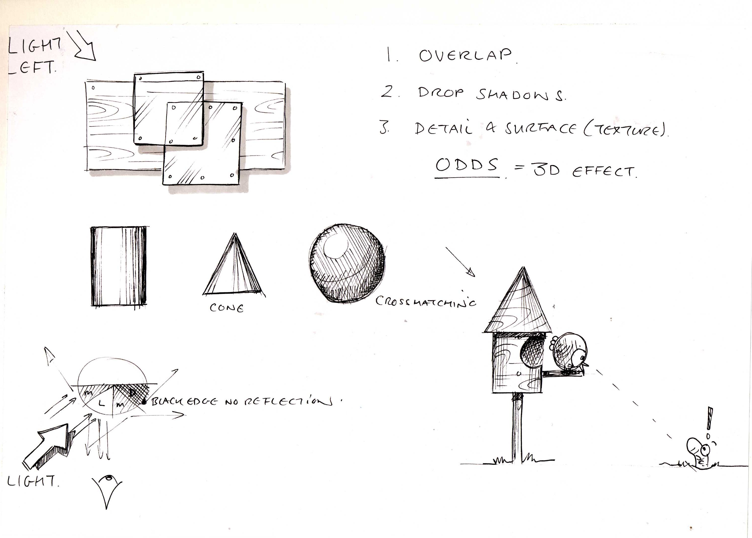
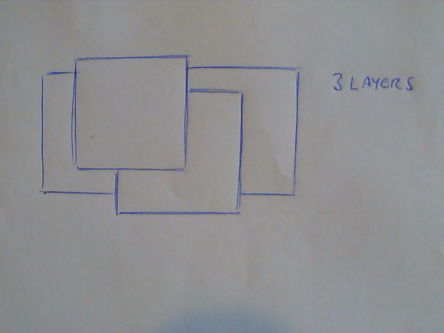
- Look at and copy image 14, notice the three squares/rectangles overlap, they look like they are one on top of another. By 'Layering objects we create an illusion that the objects exist in a 3D space because they 'overlap'.
- Look at and copy image 15, here we are using a few lines to create the illusion of texture and the little circles in the corners suggest screws or bolts, this is detail. This again meets the expectation of the viewers mind 3D objects have details we can see.
- Look at and copy image 16, here we use cross hatch shading (image.7) to create the illusion that each layer is casting a drop shadow. Only 3D objects would cast shadows, so this again adds to the illusion.
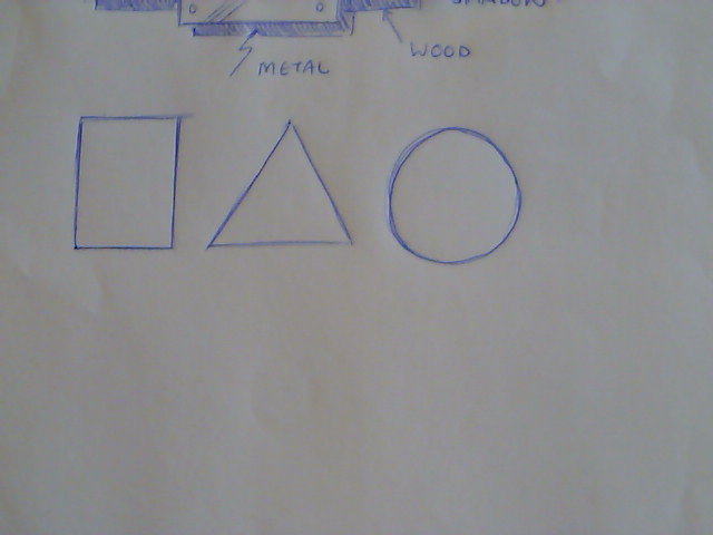
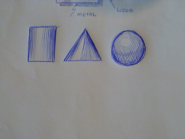
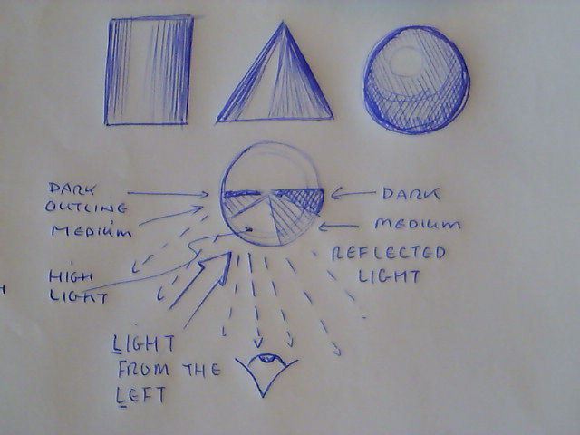
Image 17, 18 and 19 show how shading can be used to create the illusion of light falling on a curved surface e.g. a cylinder. Image 19 explains in more detail. Light falls on the object and some light is reflected, where the reflection is directly back towards the viewers eye, the viewer will see a highlight (Light). Where the light starts to fall away from the line of sight, less light reflected means a darker tone is seen (Medium) and where light isn't reflected towards the viewer we have very little light seen meaning a darker tone still (Dark). So any representation of an object will need you to think about where the light is shining from and where the reflections are. In design we often simply this by assuming that light shines over the viewers left shoulder. Light from the Left.
So we have;
- Look
- Layout
- Line
- Shape
- Shadow
- Shine
- Overlap
- Texture
- Detail
- Drop Shadow
- Light from the Left
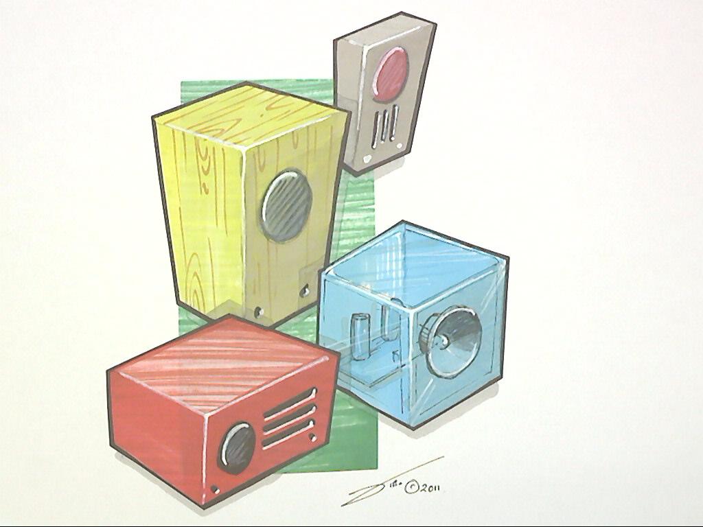
And if we remember to apply this to all our drawings it will enhance the illusion of 3D, even if it is only an orthographic sketch. Images 20, 21 and 22 show these steps in action - notice the overlap is provided by adding a rectangle background which isn't quite big enough so that the object 'overlaps' the background.
PRACTICE, PRACTICE, PRACTICE (See Image 1 and 13 for ideas).
3D Sketching - Perspective - Forms - Combining Forms.


Hopefully by now you'll be feeling a little more relaxed about your drawings - again don't be worrying about loose lines or scruffy scribbles this is all part of the learning process.
This section is divided into:
- Perspective - 1,2 and 3 point
- Sketching basic forms - Cubiods, Prisms, Cylinders, Cones & Spheres
- Combining basic forms to create objects.
Perspective.
One Point Perspective.
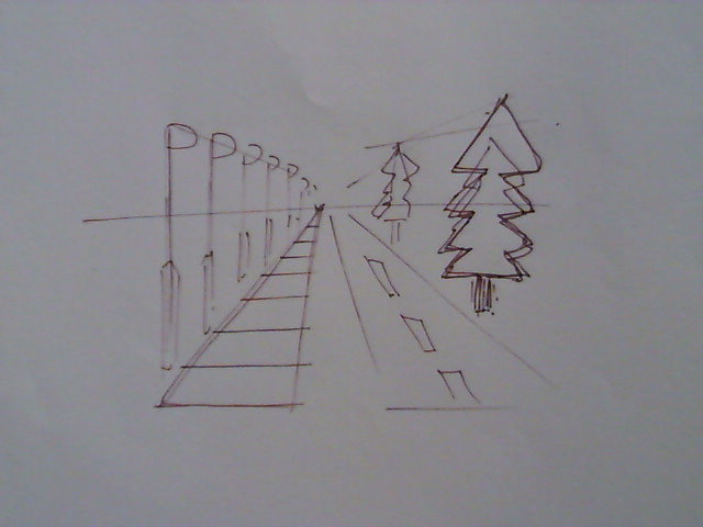
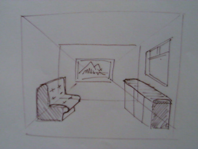
When you look down a road, or a rail way track (from the side not the middle !) you'll notice that the lines going off into the distance seem to move closer together (they converge) and as they reach the horizon (horizon line) they meet and vanish (vanishing point), see image 2. This is how we see the world and how we measure visually the size and distance of objects. Image 2 is an example of One Point Perspective - that is one vanishing point at which some of the horizontal lines converge. It is a useful technique for interior design, see image 3, but it does have limitations when drawing smaller objects e.g. for product design.
Two Point Perspective.
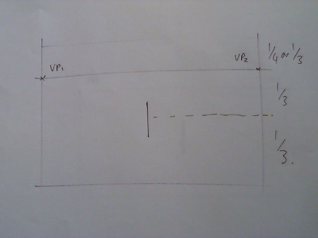
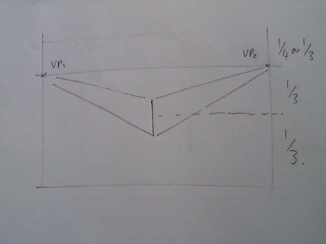
I want to take you through drawing in two point perspective, look at images 4 - 8.
- Image 4 - Sketch a Horizon Line all the way across you page about 1/3 of the way down.
- Mark a dot at each end really close to the edge of the paper, these are your Vanishing Points
- Draw a vertical line in the centre of your paper about 2/3rds of the way down about half the length of your index finger.
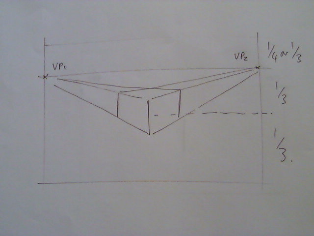
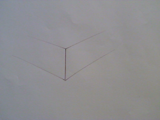
- Image 5 - from the top of this line and again from the bottom very lightly sketch lines that go to the vanishing points - notice how they converge.
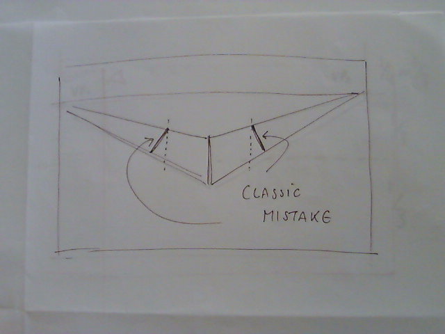
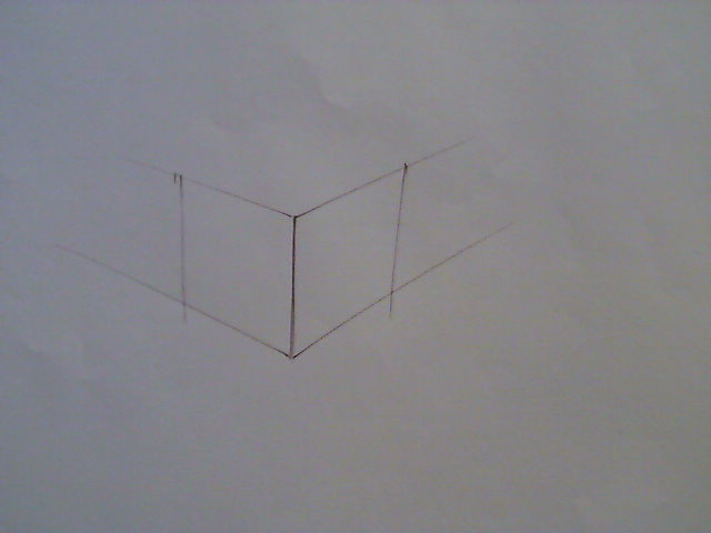
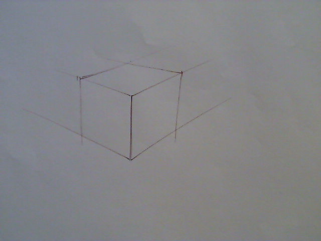
- Image 6 - Now draw to more vertical lines [Be careful this is where some people make a classic mistake see image 7] and then from the top of each line again very faintly sketch a line to the OPPOSITE vanishing point.
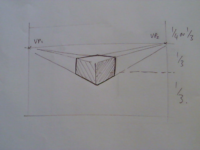
- you should have a sketch that resembles a cube image 8 - draw round the outline of the cube and maybe shade it if you want. Image 9
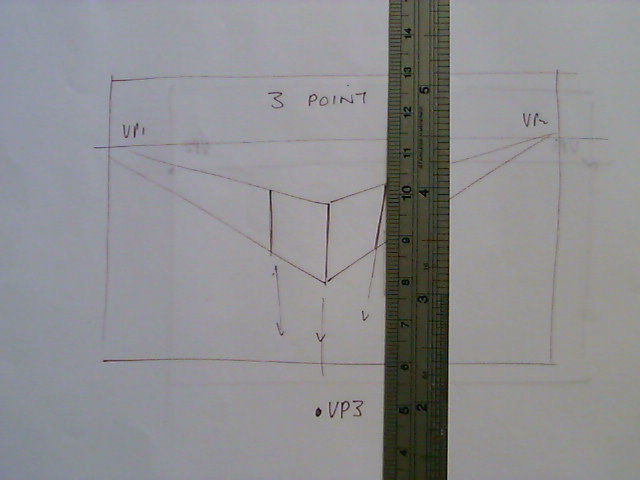
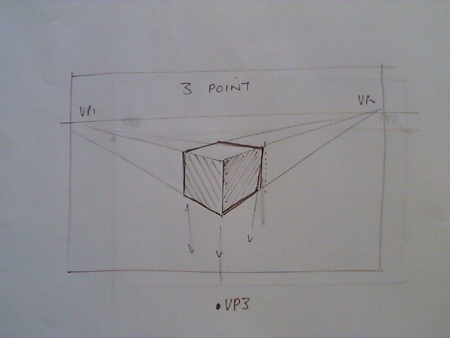
Three Point Perspective, is very similar except for step 5. Instead of two vertical lines these two lines converge on an imaginary vanishing point well below the bottom edge of the page, image 10 & 11 . This third point take into account that when we look slightly down on an object, parts that are further away will be every so slightly smaller.
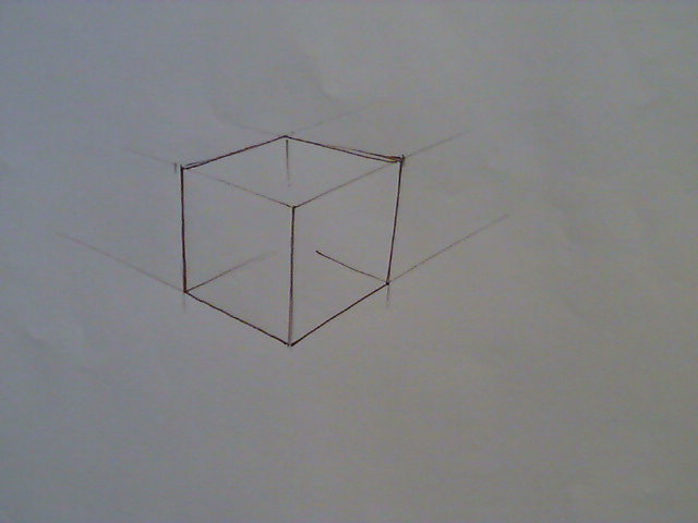
We don't want to have to construct horizon lines and vanishing points every time so it is important to practice drawing cubes without the need to set up a complete construction. See images 12,13 and 15.
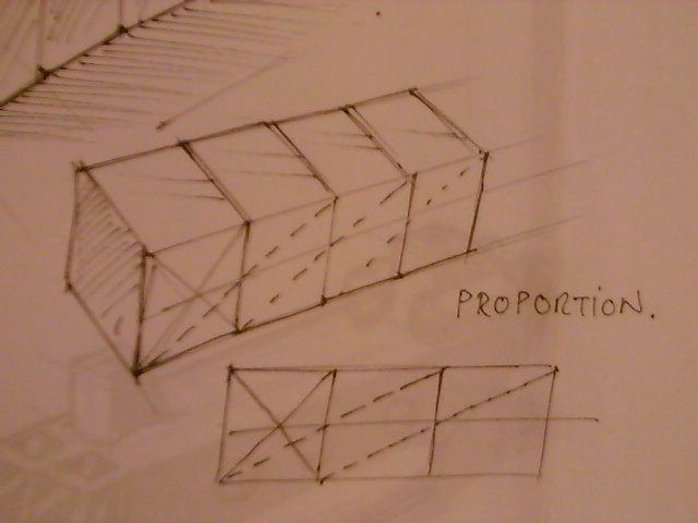
In the same way that a square formed the basis of our 2D drawings the cube is the basic form from which we can construct all other basic 3D forms an shapes and establish proportions in our 3D sketching se image 16.
3 point perspective cubes are hard, this is going to need a lot of PRACTICE PRACTICE PRACTICE.
BASIC FORMS
The basic forms are the 3D shapes that act like the Lego bricks of drawing, once you have mastered the basic forms you'll be on your way to being able to draw almost anything. We have introduced you to the cube already but there are 4 other basic forms to learn.
Prisms - by this I mean triangle shapes rather than the true meaning of prism - a 2D shape extruded into 3D.
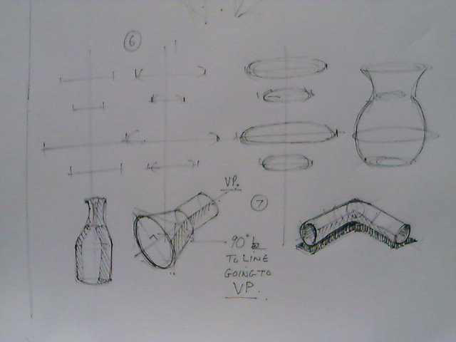
Cylinders - here we will have to explore ellipses in more detail first.
Cones - A combination of a pyramid (see Prisms) and a Cylinder base (see ellipses)
Spheres - Get practising those circles from step 1 and you'll need ellipses again here.
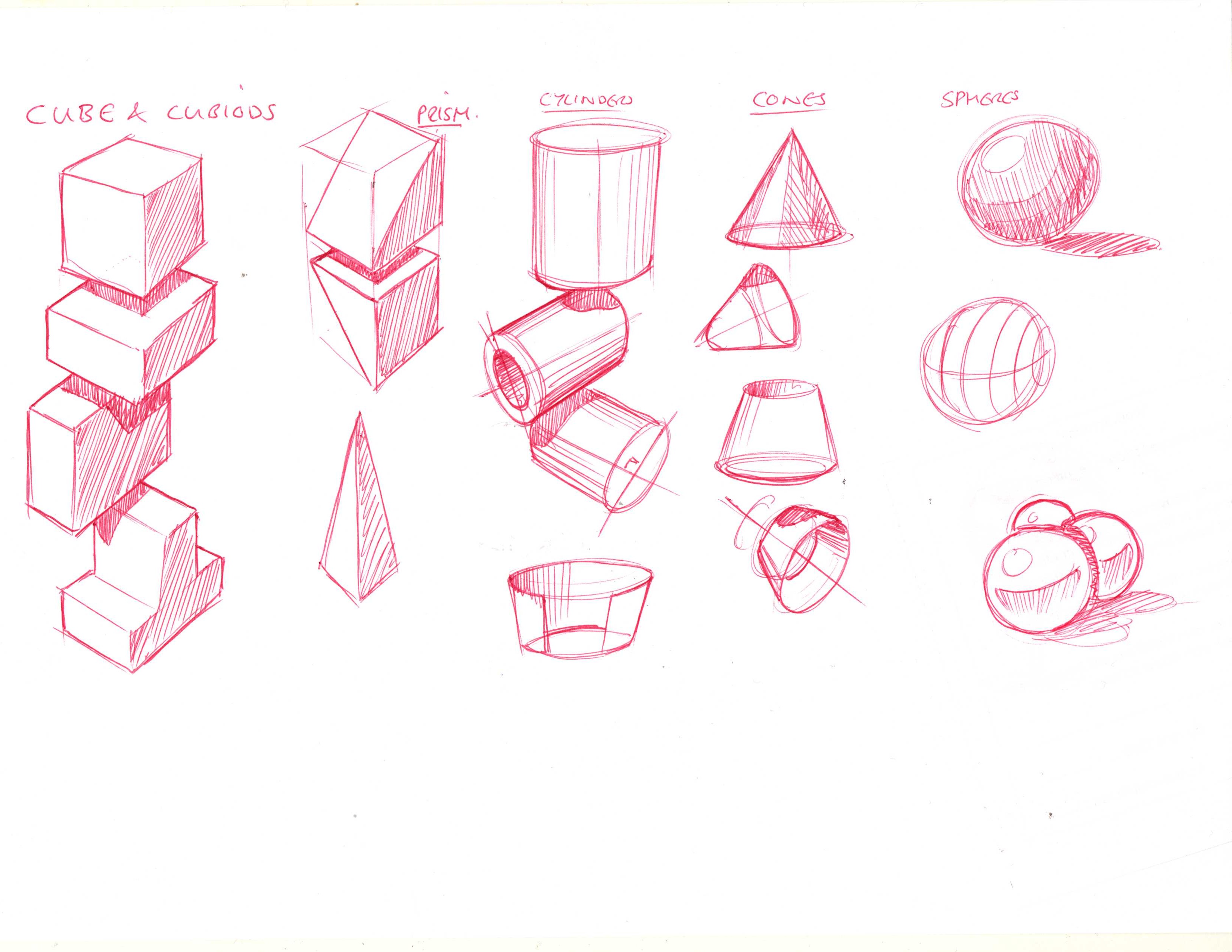
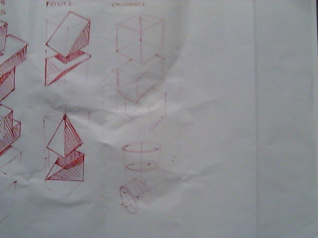
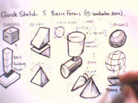
We're going to start by producing a reference sheet see image 17. A reference sheet is a practice sheet but it is also a sheet worth keeping which you can refer back to as you work on other drawings.
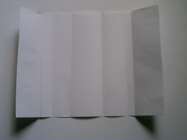
Start with Piece of A4 and fold it into five columns - see image 18.
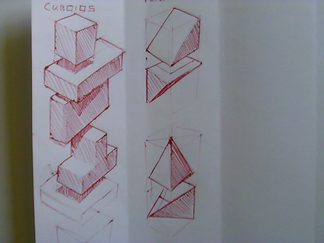
Cubiods
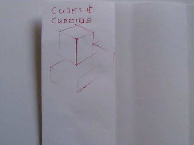
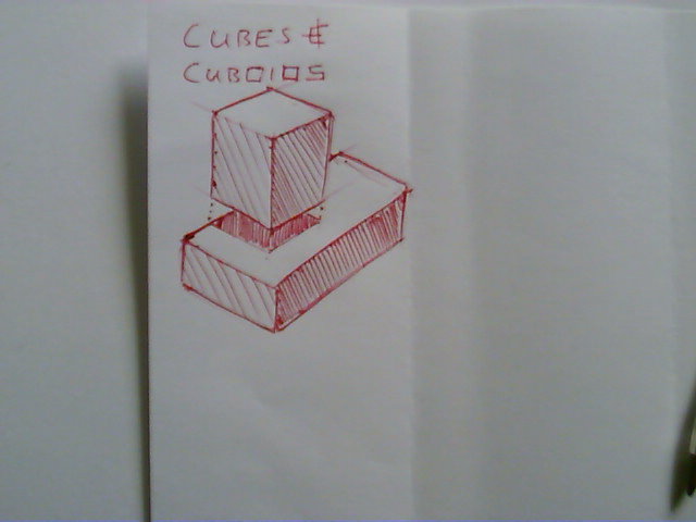
- In the first column at the top sketch and shade a cube - see images 19.
- Now sketch a cubiod (rectangle square shape) below this cube [note how the two forms overlap] see image 20.
- Now we add a drop shadow - here we imagine a light source directly above the cube shining down so that the cube casts a shadow on the rectangle cubiod below - see image 21 - use dark vertical tone lines close together to create the shadow.
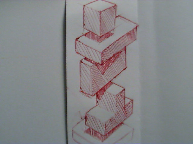
- Continue creating a stack of cubiods - watch your perspective lines though.
Notice how the light shading is represented on the upper faces by no tone, on the faces to the left by an open diagonal shading to create a medium tone and on the faces to the right by a close diagonal shading to create a dark tone. The drop shadow is a very close vertical shading to give that sense of coming down from above.
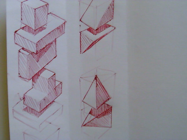
Prisms
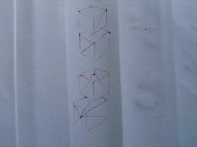
- Prisms are based on cubes so we sketch cubes first and then layout the triangle elements on the cube's faces, the pyramids are constructed by adding a line from corner to corner on a flat face to find a centre point which is then joined to the opposing face corner. Note I have looked and layed out the column first, see image 22.
- Now Line in and shape shadow and shine, image 23.
- Now look at your overlaps and add drop shadows - you'll need to think a little about how the shadow would fall on a sloped surface but it doesn't have to be perfect, image 24.
Cylinders
Before we deal with cylinders we're going to have to go of on a tangent and deal with ellipses first and then we'll come back to cylinders.
Ellipses.
Ellipses are notoriously difficult to sketch but once you understand them there are a number of tricks that can help you out. First we'll look at the structure of a ellipses and then we'll look at techniques to help us sketch them.
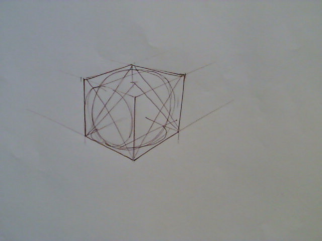
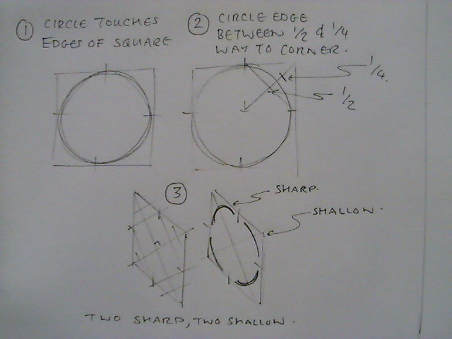
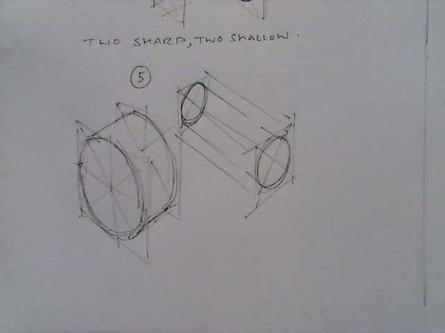
- Image 25 shows a deconstruction of a circle. A circle fits inside a square where the edges f the circle touch the mid point of each edge of the square. see (1)
- The edge of the circle also passes through a point under half way from the corner but over a quarter of the away. see (2)
- This deconstruction can be reconstructed onto a 2D flat face square which has been drawn in perspective. see (3) Note that the ellipse unlike the circles even quarter shapes the ellipse has two sharper curves and two shallow curves - two sharp, two shallow.
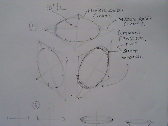
- Image 26 takes this a little further, note the shallows are on the minor axis (the short distance across the ellipse) and the sharps are on the major axis (the long distance across the ellipse). Also note the two axis should always be at 90 degrees to each other.
- A common problem with ellipses are drawing the sharp curves two flat - watch for this in your early practice.
- Image 27 shows a technique where by we draw a center line to represent the minor axis and then sketch ellipses free hand across this on the 90 degree major axis.
Ellipses are difficult, they are going to take a lot of PRACTICE PRACTICE PRACTICE.
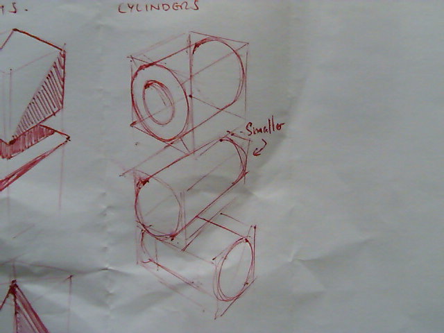
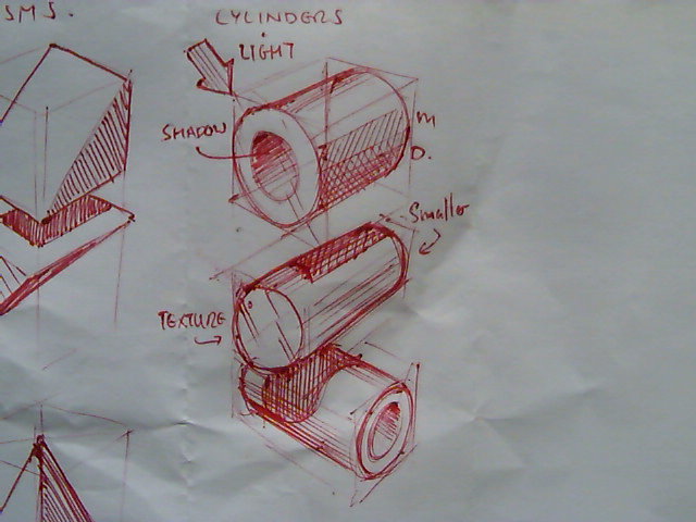
Cylinders then can be constructed using two ellipses drawn on opposites faces of a cuboid image 28.
- Start with a Look, Layout of a number of cuboids, image 29.
- Follow up with Line, image 30.
- and then Shape, Shadow, Shine image 31 - Note the shading inside the cylinder is opposite to the outer shading.
Cones.
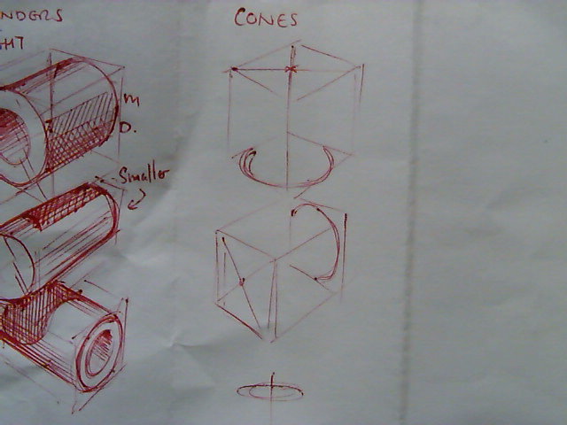
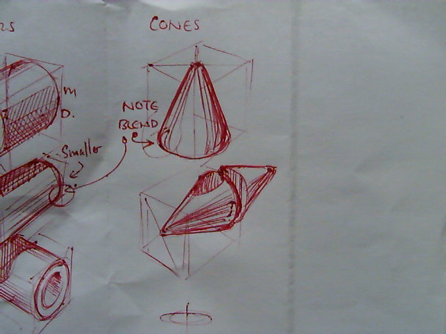
Cones are a combinations of a pyramid style prism at the top and an ellipse at the bottom.
- Sketch out a cuboid and use a cross from corner to corner on one face to find the center point. image 32
- Sketch in an ellipse on the opposite face.
- Carefully blend the lines from the center point into the edges of the ellipse, image 33
Spheres
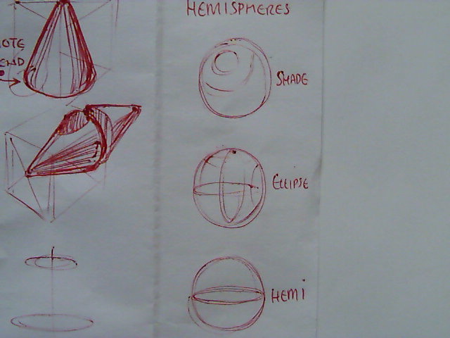
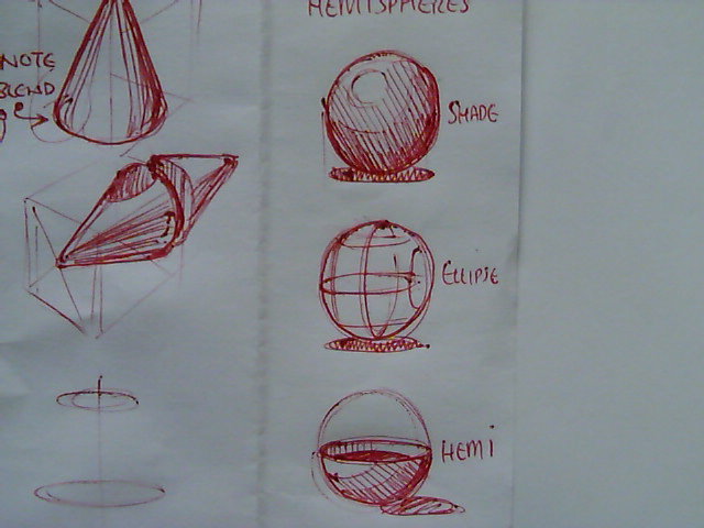
Spheres don't get there form from a basic construction they are inherently circular, they get there form from their shading, lines or details. Image 34 and 35 show the two main different approaches to illustrating a spherical surface, tonal shading or the use of elliptical lines across the surface. there is also an illustration of a hemisphere.
As with all of these exercises PRACTICE, PRACTICE, PRACTICE.
Combining basic forms to create Objects.
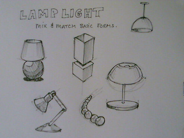
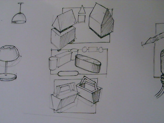
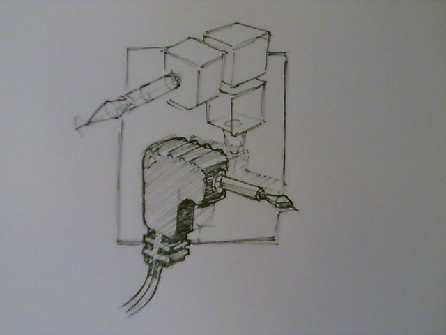
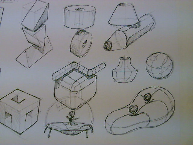
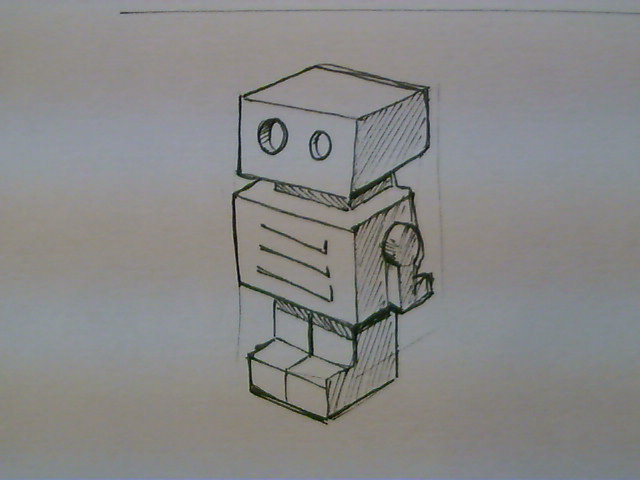
These last few images show examples of how basic forms can be combined to create various different objects and really now what you need to be doing is analysing every object you see to identify the basic forms that make up the object.
2D - USB - Project - Something for You to Try.
I realise at this point that you may have been doing a lot of copying so now I want you to have a play and explore what you can do with your new techniques.
The Brief is :
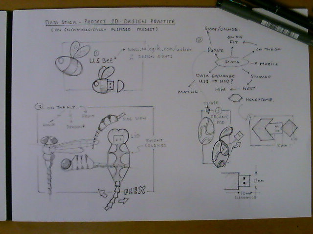
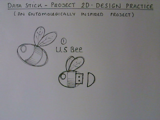
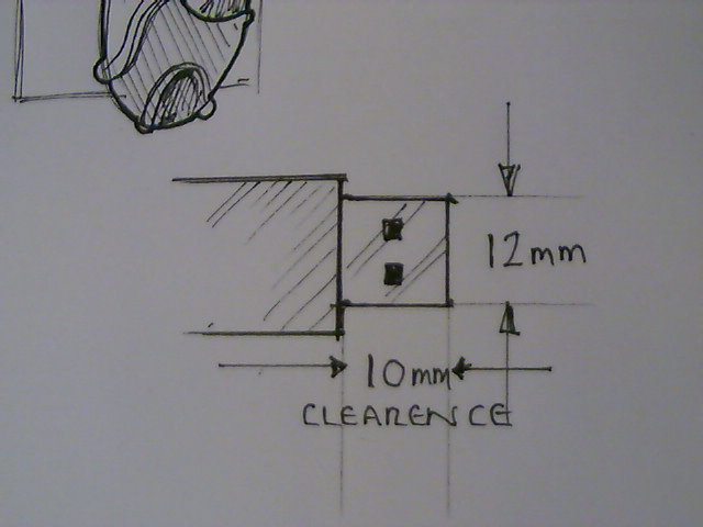
You are a product designer and you've been asked by a Natural History Museum to design a USB data stick as a marketing tool for their new insect collection. It needs to show some connection / inspiration from nature, preferably insect based but it doesn't have to look like an insect, so it could just have a design or pattern on it, or it could just use elements of a part or shape you like. You need to produce 1 A4 design sheet of 4 or 5 ideas. Key elements are the USB connector is 12mm wide and needs at least 10mm clearance to go into the socket - see image 4.
Guidance
I have completed an example sheet and I'll walk you through my process, but remember there's no right or wrong here, it's what ever works for you, works. Here are the images explained
- This is the final sheet, so this was what I was aiming for. I usually have a vague idea of areas on the page and sort of work in the quarters to have a bit of a layout to work to.
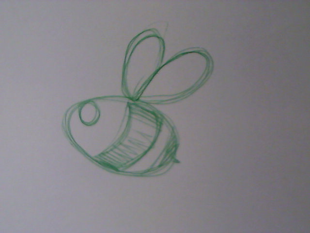
- I doodled this a couple of days ago with no idea it would be the inspiration for the project.
- My first 2D LLL - I've added a second view and shown I'm thinking about function ( how will the lid work )
- I like to sketch important dimensions just so they're in my mind while I'm designing.
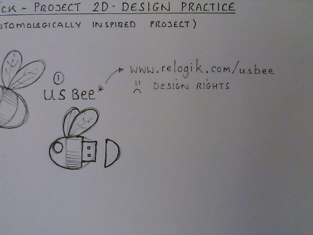
- I'm big on intellectual property and I checked USBee - it already exists, a company called relogik has one and it's a good design. No matter...
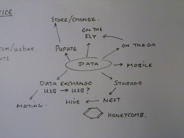
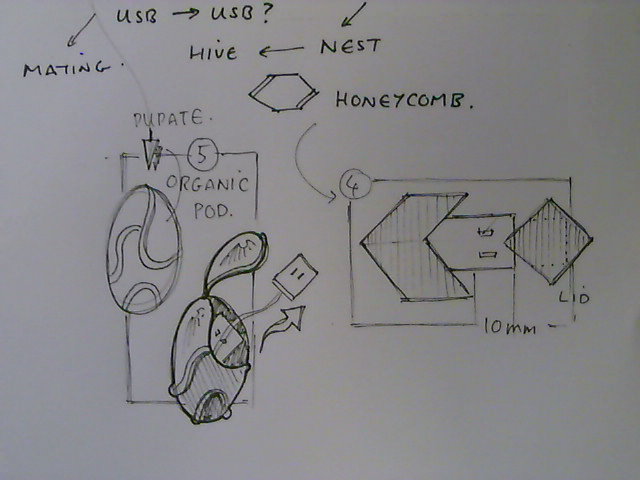
- The internet is full of great ideas that I had, too late :)....So here I brainstorm / mind map / word associate.
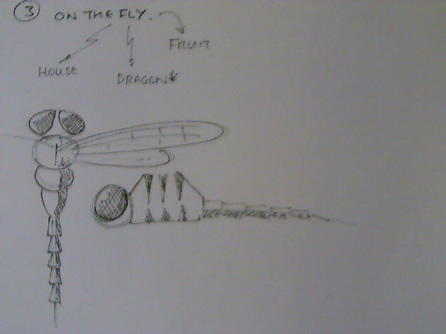
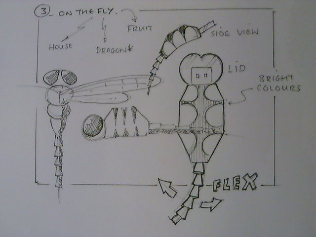
- I like the idea of 'data on the fly' and I like dragon flies so I start sketching from some research....
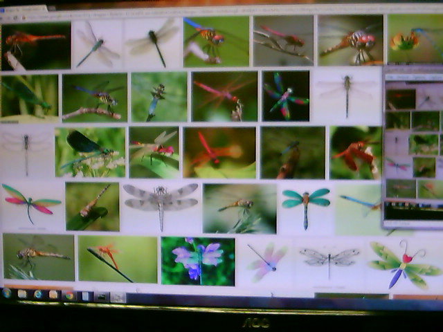
- Internet images as research [shameless plagiarism I know]
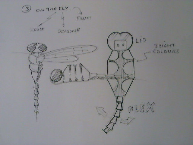
- Sketching a possible design.
- A little look at a side view and finishing up the overall presentation of the idea.
- I'm not loving my dragon fly so I go back to the mind map and look for other possibilities - a cocoon type pod thing and a honeycomb (stores nice things)
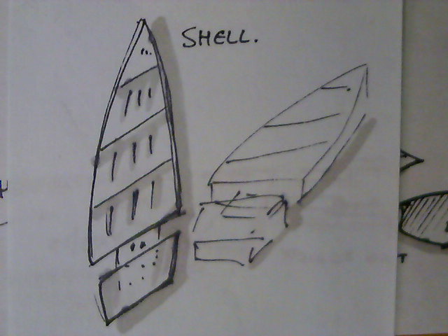
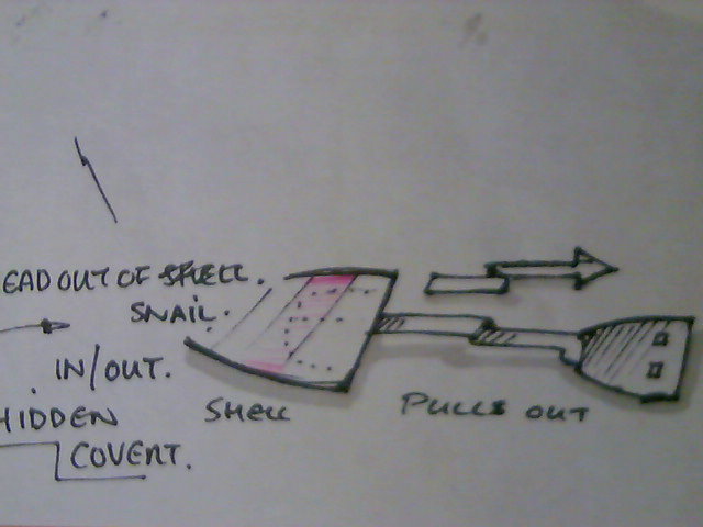
- A snails shell, but more a pond snail than garden snail - I don't mind stretching the brief...a lot :)
- Just playing with functionality.
Your turn
If you don't like insects, just pick something else;
- Sea Life
- Wild Life
- Park Life ( Yes the song - if you want to do a music inspired USB that's up to you )
- Your Choice Listed Here...
THE MAIN THING IS HAVE FUN - REMEMBER THERE ARE NO RULES, IT DOESN'T HAVE TO WORK, ITS ONLY A SKETCH AFTER ALL, SO LET YOUR IMAGINATION HAVE FREE REIGN FOR A WHILE :)
Orthographic Sketching (Engineering Drawing)
One of the reasons people are put off drawing up plans is that Technical Drawings / Orthographic Projections / Engineering Drawings can appear very very complicated. They are formal language that engineers use to communicate with each other but like any language used for communication once you understand a few words you can start to say what you want. This section is designed to give you some basic vocabulary to get you started.
Technical Bit :-
These concepts are drawn from the British Standards for Engineering Drawing for Schools & Colleges
You will Need :-
Some Squared Paper really helps at the beginning.
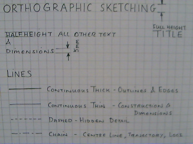
Image 2 - Shows some writing in capital letters, it is a good idea on all drawings to make notes and it is recommended that you use CAPITAL LETTERS to aid clarity. It also shows 4 of the 5 different sorts of line, unlike normal drawings, in engineering drawing the type of line carries with it a very specific meaning.
- An unbroken dark line denotes the outlines / edges of an object.
- An unbroken feint line denotes construction lines, projection lines and or dimension lines
- A dashed line with the dashes all short and the same length denotes a hidden detail line e.g. being able to see inside an object (X-Ray Vision)
- A dashed line with alternating long and short dashes (Chain Line) denotes a centre line, a path or a trajectory.
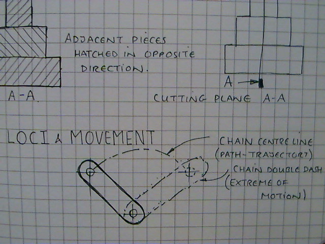
- A chain line with two short dashes alternating with a long dash is used as an outline to denote the extreme position of part of an object if it moves, see image 6
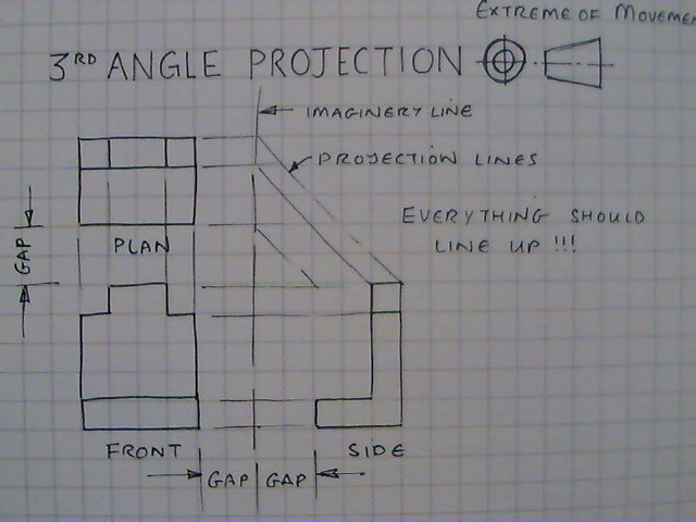
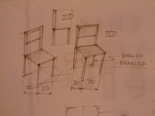
Image 3 - Shows three views of a chair/car seat as an example object sketched in orthographic sketching. There are 3 views usually drawn, sometimes more and sometimes less depending on the amount of information needed to be displayed.
- The main view or 'Front' elevation is usually drawn in the lower left corner of the sketch area to allow for the other views to be added around it.
- The view sketched directly above lines up with the front elevation and represents a view looking directly down on the object from above, hence the name, 'Plan' view, as though looking at a map.
- The view sketched directly to the right lines up with the front elevation and represents a view looking directly at that side of the object [Where the sides have different shapes/different features an additional view would be required on the other side]. This view is the side Elevation
Notice the feint projection lines from the original front elevation, the idea of orthographic engineering drawing is actually not to be as complicated as possible but to use the least amount of drawing to communicate the most amount of information.
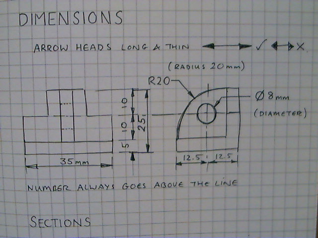
Image 4 - Shows an object with its associated dimensions.
The process of describing an objects dimensions usually starts with some short feint construction lines coming off the object to be dimensioned (note there is a small gap between the object and the dimension line).
Another feint/construction line is drawn between these two lines and the ends of these lines are indicated with thin narrow arrow heads which touch the lines projected from the object.
Finally the dimension is indicated in clearly written hand writing - note the general rule is that the line underneath the number is the line being described by that number.
It is useful for the viewer to also clearly indicate if a scale has been used and if so what ratio and most importantly what system of measurements are being used e.g metric - millimetres, meters or imperial, feet and inches.
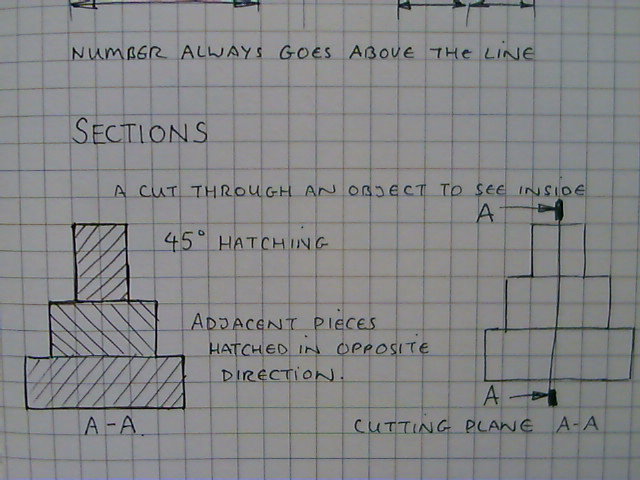
Image 5 - Shows a cross section through an object, a slice as though the object was cut in half and opened up along a line so the viewer can see inside.
The view shown with the diagonal lines is the 'Sectional View' and is labelled A-A the A-A denotes the plane of the line and the direction of the view from the main drawing. The diagonal lines are sketched at 45 degrees and can be used to indicate differing materials by altering the distance between the lines.
See the image to the right, note the thin line through the object with two dark end markers, the thin line is the plane of the section (where the cut was made).
The arrows pointing to the dark end markers indicate the direction of the view.
The Letters A and A indicate what the sectional view will be labelled else where in the drawing A-A.
Image 6 - In some objects there are components that might move and you may wish to show the extent and path of this movement, for this we use LOCI & Movement lines, see notes for image 1, 4 & 5.
The original object is drawn and the position of one extreme extent of the motion is therefore shown.
The alternate position of extreme extent is then drawn where the outline uses a double dashed chain.
An appropriate point on the object is selected and a centre line, long dash short dash, is drawn between the two positions of extreme extent.
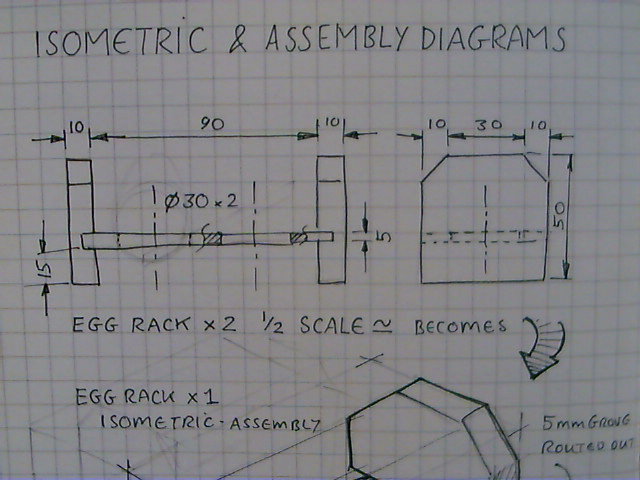
Image 7 - Here is an example of orthographic sketching for a 'single egg' rack.
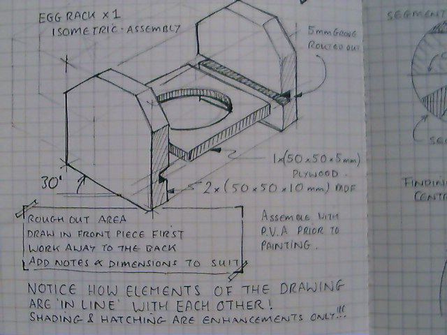
Image 8 - And here is that information translated into a 3D Isometric assembly diagram.
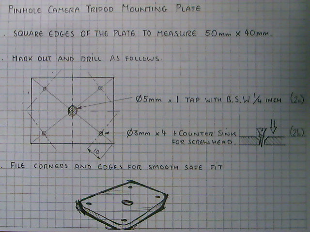
Image 9 - Another example of engineering drawing for a Pinhole Camera Aluminium Tripod Mount.
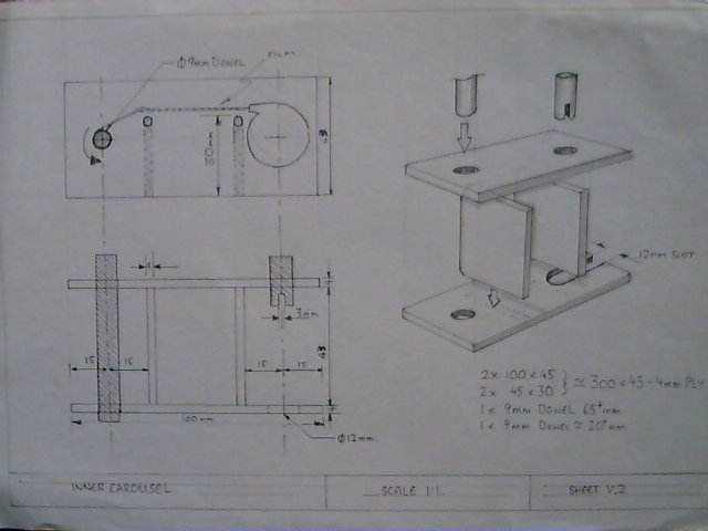
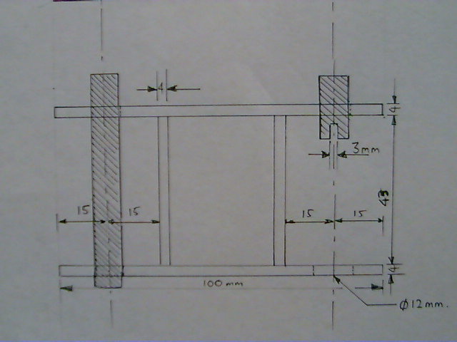
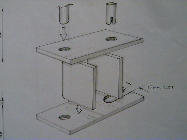
Images 10-12 - Pinhole Camera 35mm Film Carousel.
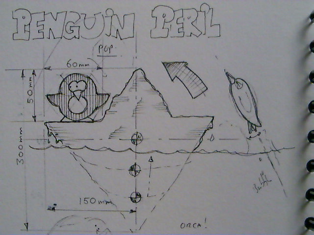
Image 1 - Don't take it too seriously :) but PRACTICE, PRACTICE, PRACTICE.
2D & 3D Marker Rendering
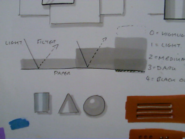
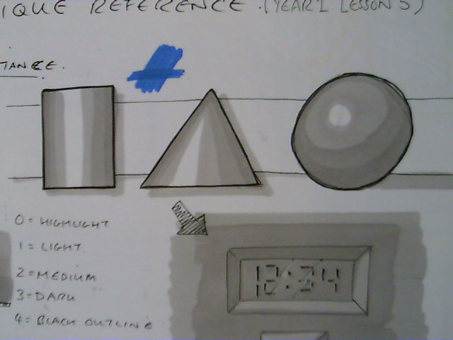
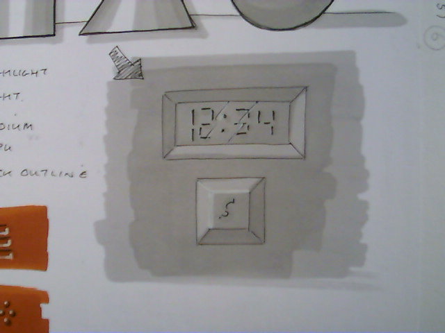
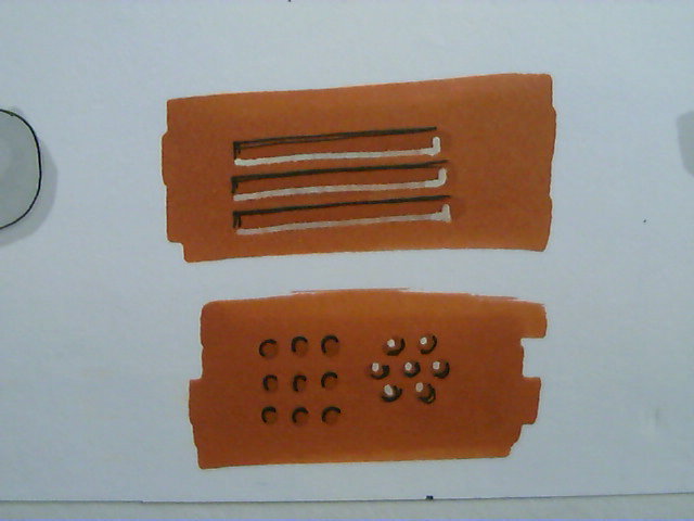
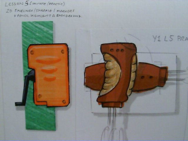
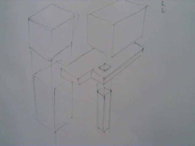
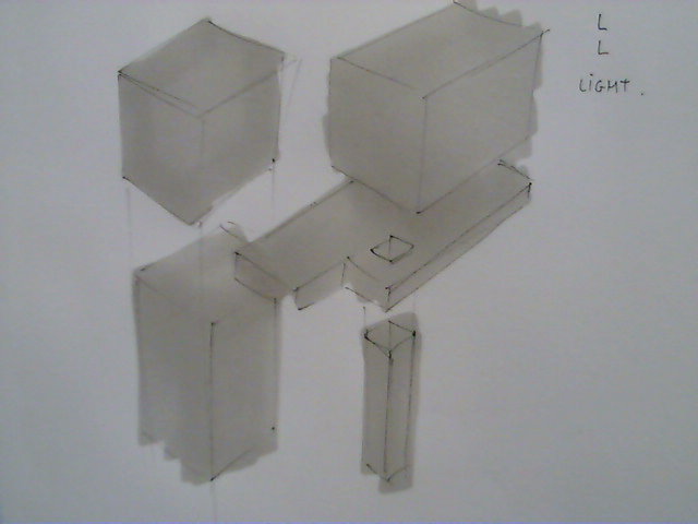
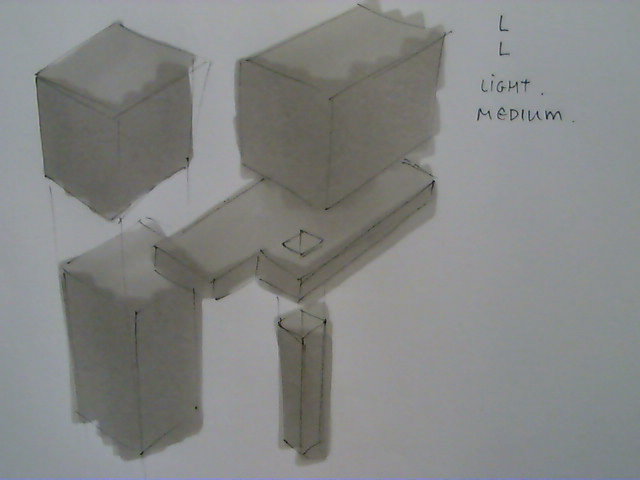
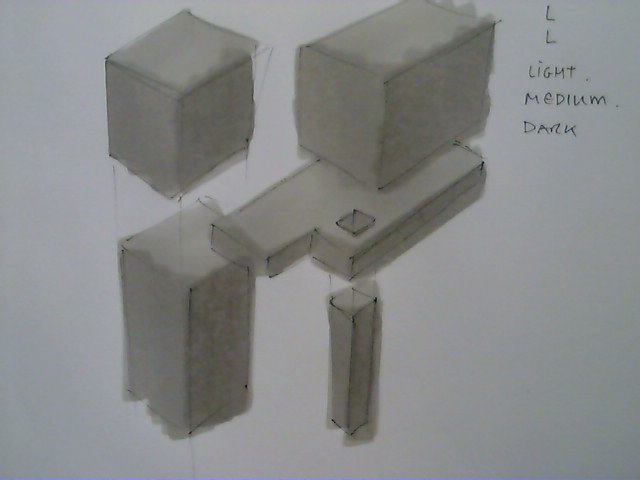
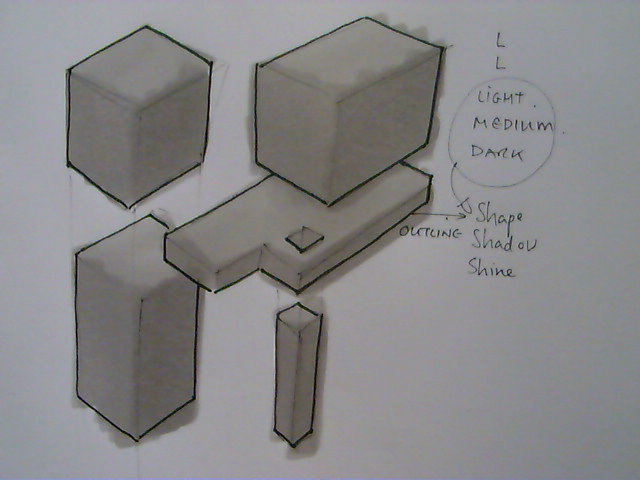
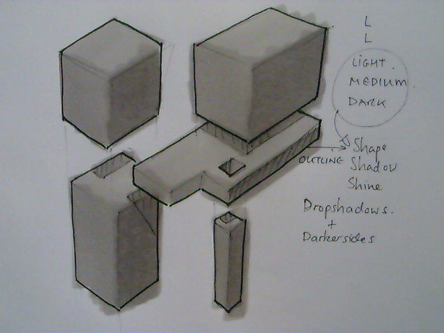
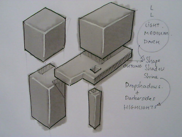
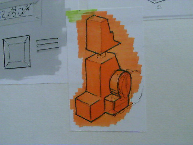
Markers are the preferred method for most product designers when not working digitally and so here is a basic introduction into the use of markers and some basic technique.
You will need :
Water proof, pigment ink, permanent fine-line drawing pen. I prefer a thin nib 0.1mm
White Pencil Crayon (optional but useful)
White paint pen or white out (optional useful - can be temperamental be careful)
Cool Grey Number 2 marker (or closest equivalent)
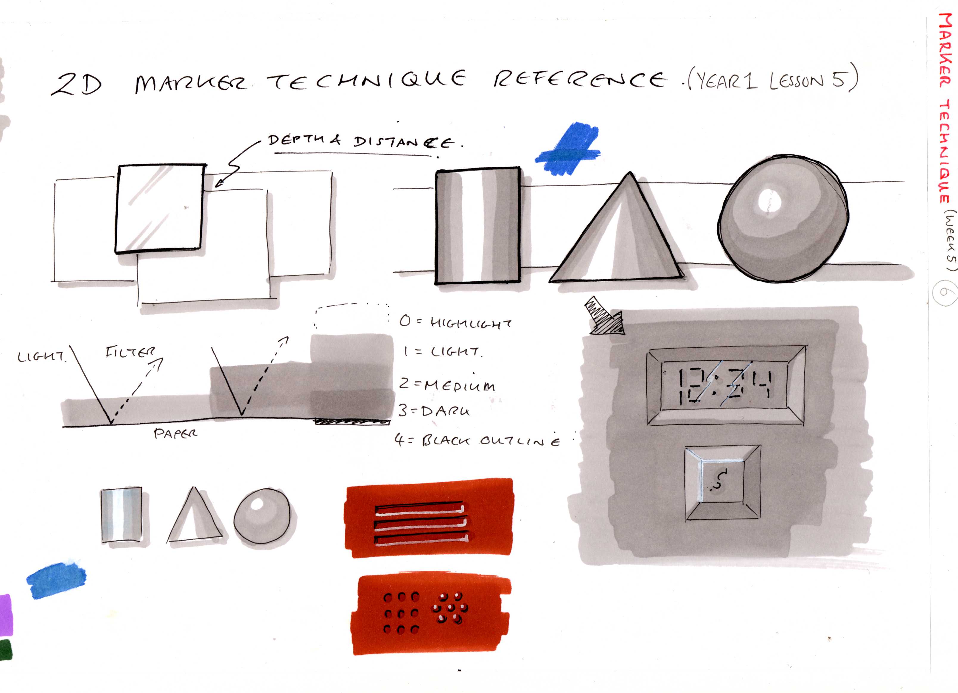
Image 1 and 2 - Reference Sheets
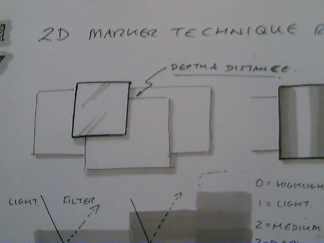
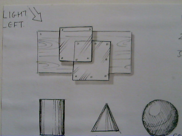
Image 3 and 4 - You may remember the exercise we did from step 2, section 2, image 13 - this is a very similar exercise.
- Sketch three overlapping squares/rectangles so they look like they are one on top of another. By 'Layering objects we create an illusion that the objects exist in a 3D space because they 'overlap'.
- Use a few lines to create the illusion of texture and the little circles in the corners suggest screws or bolts
- Here we use the cool grey number 2 marker to outline the lower and right hand side edge as though a shadow is being cast. Note that we have a number of levels here and so if you look very closely you will notice the fore most square (glass) casts a shadow on both the metal square and the wooden plank. Where the shadow is cast on the wooden blank it is a little thicker this is because the glass is further away from the wooden plank than it is from the metal. The thickness of the drop shadow indicates the distance away from the object the shadow is cast on.
You will see the drop shadow used a lot from now on to help objects/sketches etc. seem 'off the page' a little.
Image 5 - Light Medium and Dark shading - the advantage to using markers is that when you overlap the colouring of the marker on the page you get increasingly darker tones of the same colour. It is a bit like overlapping lenses from a pair of sunglasses - more layers = darker colour .
Image 6 - Here again we repeat the exercises from a step 2 but this time we use the cool grey number 2 marker to create tonal values for the shading to give shape and shine.
Image 7 - Here we are showing how shading can create indents into a surface like the LED readout or create raised surfaces like the button.
- Sketch a rectangle within a rectangle.
- Join the inner rectangle's corners to the outer rectangle's corners using short diagonal lines.
- Using your cool grey number 2 shade one layer over the whole area covering both rectangles. This is your first layer - light.
- Repeat this shading but try to miss out the bottom and right hand section of the spaces between the rectangles. This is the second layer - medium.
- Now shade just the Left hand side and upper section of the space between the rectangles. This is your third layer - dark.
- The numerals are drawn in using a fine-line drawing pen and then a drop shadow is added using your marker.
- Reflection lines have been sketched across the inner rectangle to suggest a glass like surface.
- White pencil crayon has been used to create highlights and lighten areas that are reflecting light.To c
To create a button the highlighted and shaded surfaces are reversed.
Image 8 - Here a single layer of marker has been put down and then a second layer used to add details such as a grill, small holes or bumps. Dark lines to the left and top cast shadows on the edges of the grill and holes while highlights are picked out on the right hand and bottom edges. The bumps are the reverse of this.
Image 9 - Here we have some examples of 2D coloured rendering technique which will be covered in more detail after we look at colour theory.
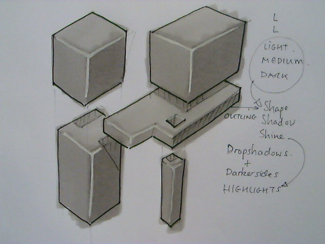
Image 10 to 16 - 3D Marker Rendering technique - Step by Step Basic.
- Image 10 - A look and Layout of some overlapping cuboids.
- Image 11 - First layer of cool grey number 2 all over each surface - light
- Image 12 - Second layer on the vertical surfaces only - medium
- Image 13 - Third layer on the vertical right hand faces (light comes from the left) - dark
- Image 14 - Outline used to define shapes more clearly (no light reflected from outer edges)
- Image 15 - Drop shadows rendered in.
- Image 16 - Highlights on inner edges are added where those edges would reflect light.
Image 17 - Process repeated as an example in a different coloured marker.
Colour Theory
Now that we are looking at markers & rendering we need to develop an understanding of colour and which colours work well together and why.
There are well researched an published theories on colour but here I am going to just present some basic concepts and ideas.
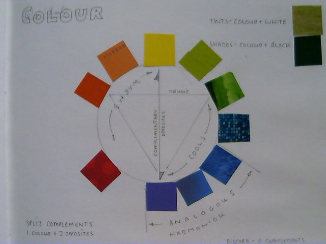
Image 1 - When starting a project using a colour medium (medium = paint/marker/pencil) it is often an idea to do up a colour wheel using that particular medium. There are three primary colours (hues) often used in Art & Design but there are two ways of mixing colour.
- Additive - This is where coloured light is mixed - Red, Green, Blue (RGB) and when added together, more light = white.
- Subtractive - This is where colours are mixed as pigments on paper - Red, Yellow, Blue, and the more colour you mix the less light = black.
As we are working on paper mostly we will look only at the Subtractive Colour Wheel - Red, Yellow, Blue.
It doesn't matter where you start on your circle but I usually go for a clock face layout - with a primary colour at 12 o'clock, 4 o'clock and 8 o'clock.
This colour wheel is actually made up from cuttings from magazines. I've...
- Yellow at 12 o'clock,
- Blue at 4 o'clock
- Red at 8 o'clock
In between those I have what I think is a 50/50 mix of the two primaries - a secondary so we have
- yellow & blue giving us green at 2 o'clock
- blue & red giving us purple at 6 o'clock
- red & yellow giving us orange at 10 o'clock
I then have the secondary mixed with a primary to give a tertiary -
- 1 o'clock - Lime
- 3 o'clock - Aquamarine
- 5 o'clock - Purple Blue
- 7 o'clock - Mauve
- 9 o'clock - Deep Orange
- 11 o'clock - Sun Orange
These names are made up, you can call colour what ever you want (look at some of the names paint companies use :) ).
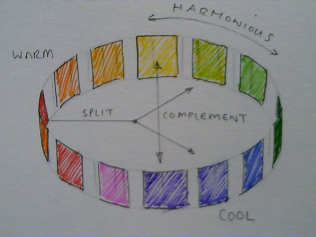
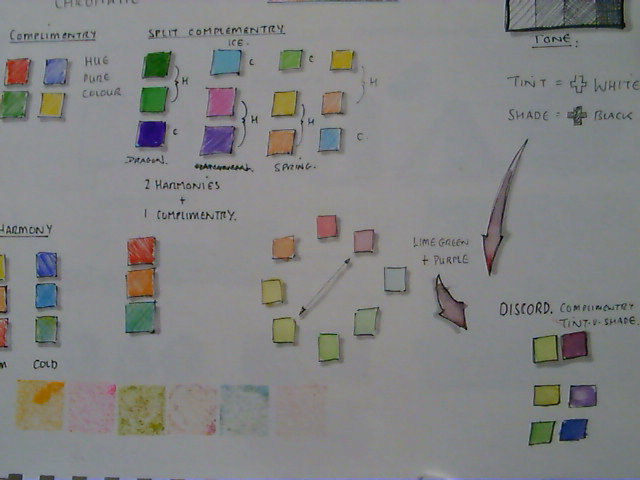
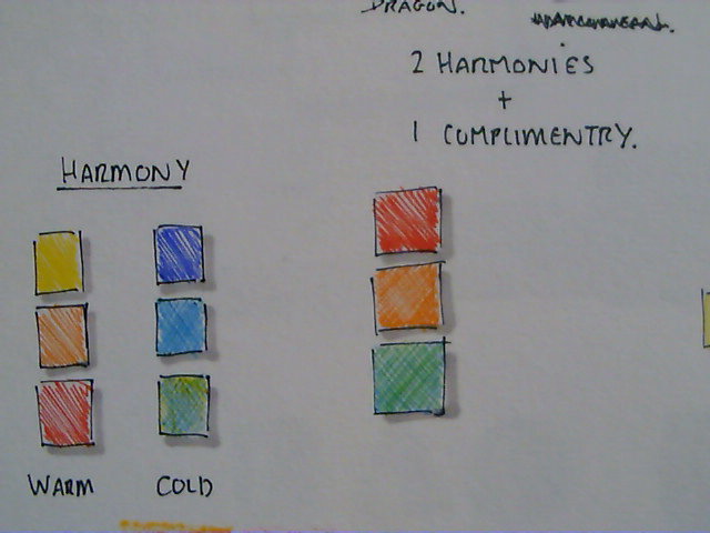
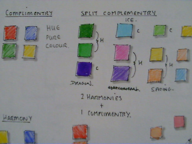
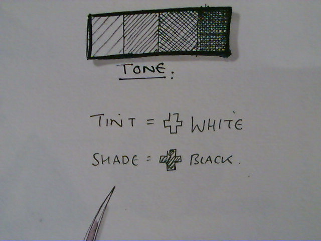
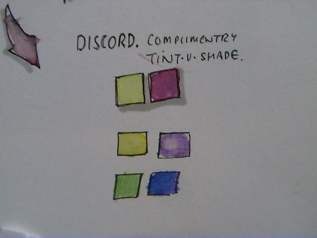
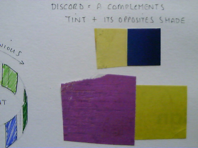
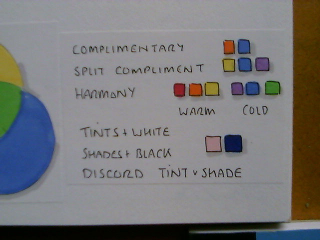
Image 2 and 3 - Here's another wheel and a set of tests for a different project but here I want to introduce a couple more concepts. Colours can be chosen that work well together or compliment each other. These are usually opposite each other on the colour wheel. Colours next to each other on the colour wheel are said to be harmonious. Colours in the red to yellow area are often described as being warm colours while the blue green colours are said to be cool, see image 4. You can choose two harmonious colours to work with their compliment this is known as a split-compliment, see image 5. Image 6 shows us tones which we are already familiar with from our shading and shadows practice but we can modify basic colours, by adding white they become tints and by adding black they become shades. The use of a tint with a shade where they are of their complimentary hues is known as discord, see image 7 and 8.
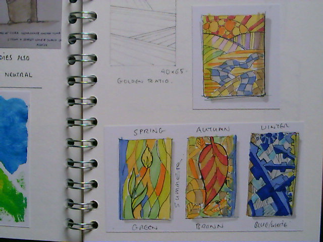
Image 9 and image 10. - Here is another quick colour pallet prior to drawing out some seasonal sketches.
- spring - yellows & greens moving towards a warmer summer pallet
- summer - warm yellow orange moving towards autumn shades
- autumn - orange & reds moving towards cooler blues of winter
- winter - tints of blue moving towards pale yellow green of early spring
Try some colour wheels and pallets of your own, explore & experiment with combinations to see what works and more importantly what doesn't.
Creativity - Exploration / Experimentation / Ideation

Isn't it frustrating when you ask creative people how they do it and they say they don't know. And if they don't know how they're doing it they can't tell you how you can do it....frustrating.
You can do it.
It is a lot like learning to sketch and draw though - it takes...PRACTICE, PRACTICE, PRACTICE.
What you are actually trying to do is to teach your mind to work in a way which is different from how it is used to working and this is very difficult but there are some tools and tricks out there that can help you.
First I'll talk you through SCAMPER which is a nice technique for playing with initially but also can be a powerful creative thinking tool, then I'll talk in more detail about creativity and how to develop other techniques.
Section 1 - Scamper
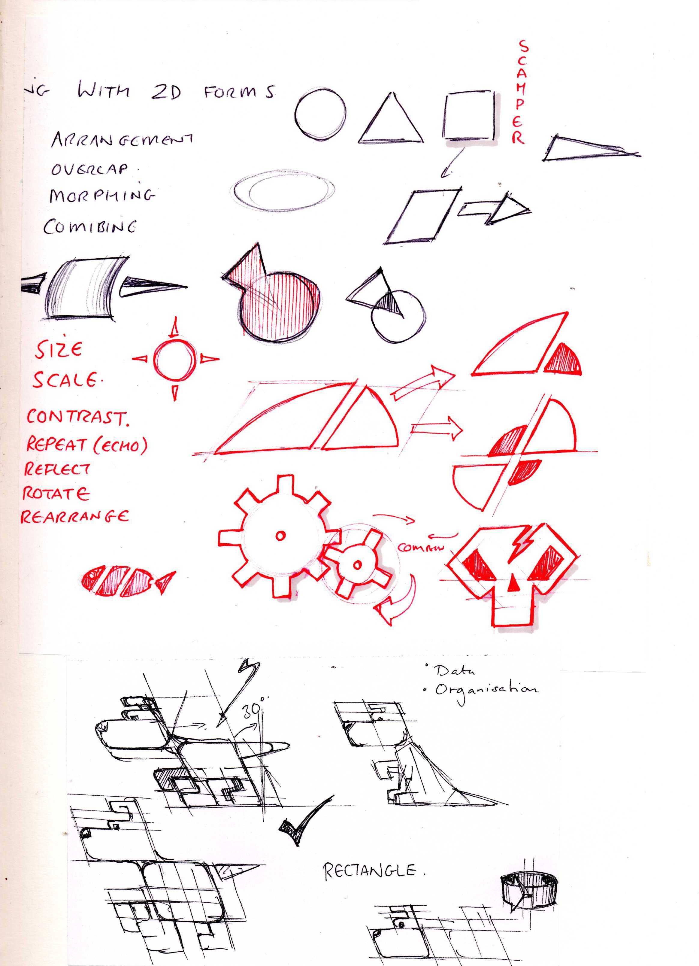
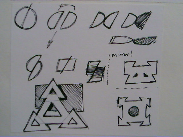
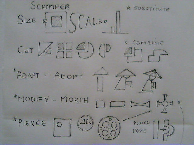
Image 1 & Image 2 - These are examples of a technique which is loosely based on SCAMPER. Scamper is a sort of mnemonic of letters that can be used to stimulate creativity. There is an 'official version' but here I use a very much modified approach.
I had to separate these out so I'll look at SCAM first then PER.
Each Letter can be applied deliberately in order, one after the other, preferably with no real goal in mind - just do it because it is the next step to follow and be open to what happens.
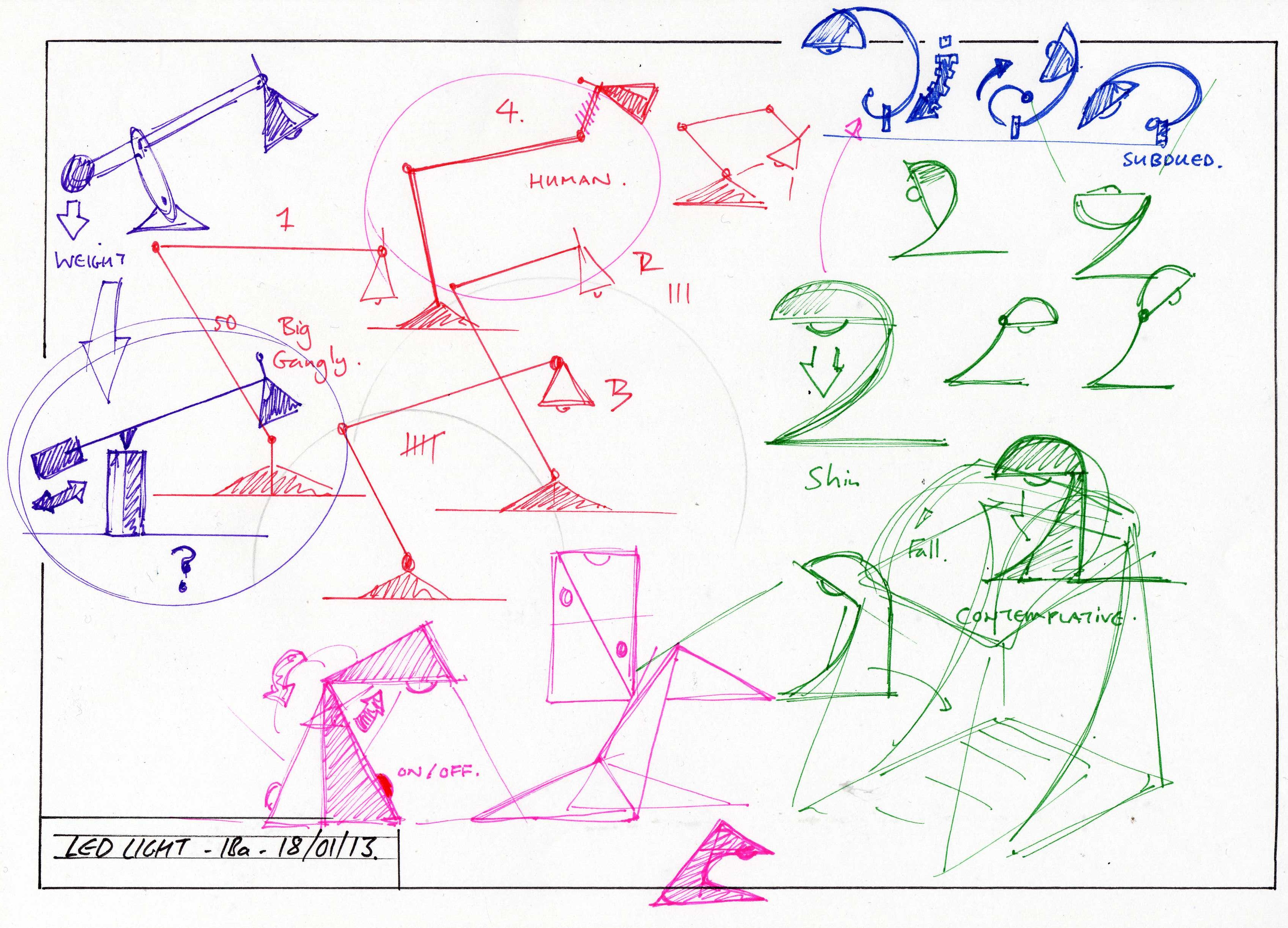
Image 3 - SCAM
S - Size, Scale - Explore your sketching by zooming in and out, re-scale & re-size elements of the sketch.
C - Cut, Chop, Carve, Connect, Combine, Collect - Explore elements by cutting & or combining elements in different ways.
A - Adopt, Adapt - This is about looking around and adopting shapes/ideas and adapting them to suit.
M - Modify, Morph, Mangle, Mush, Mash, Mirror - Take elements and re-shape & re-form them.
Can you see how we're just using the letter to create action words which prompt us to 'do' something 'random' to create new concepts/ideas/shapes/forms with no real 'control'.
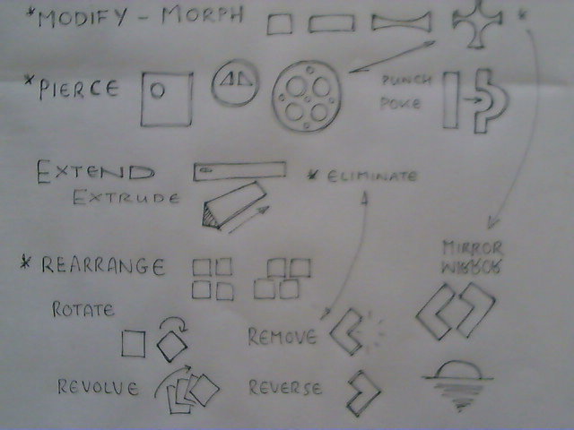
Image 4 - PER
P - Pierce, Punch, Poke - Add Holes, Groves, Indentations
E - Extend, Extrude, Eliminate - Stretch elements, make 3D forms though extrusion, remove obvious elements.
R - Rearrange, Revolve, Rotate, Remove, Reverse, Reflect.
The great thing about this form of SCAMPER is you can just keep adding words and keep playing with shapes and forms until you see something you like.
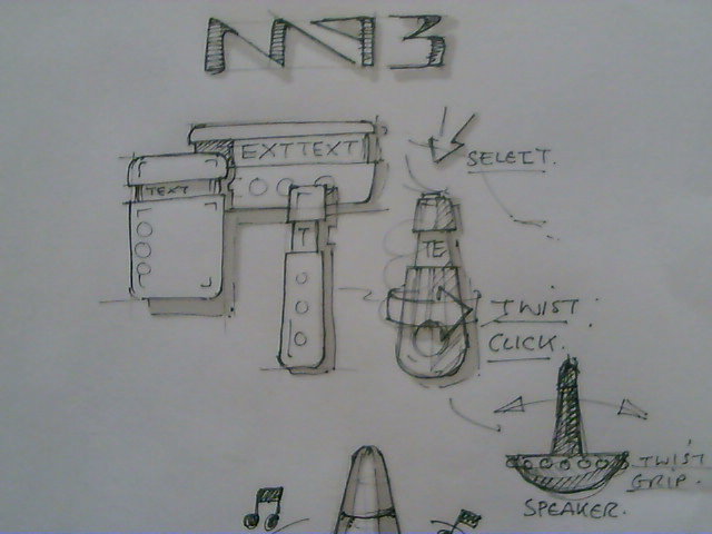
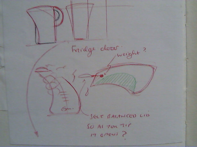
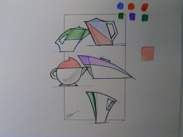
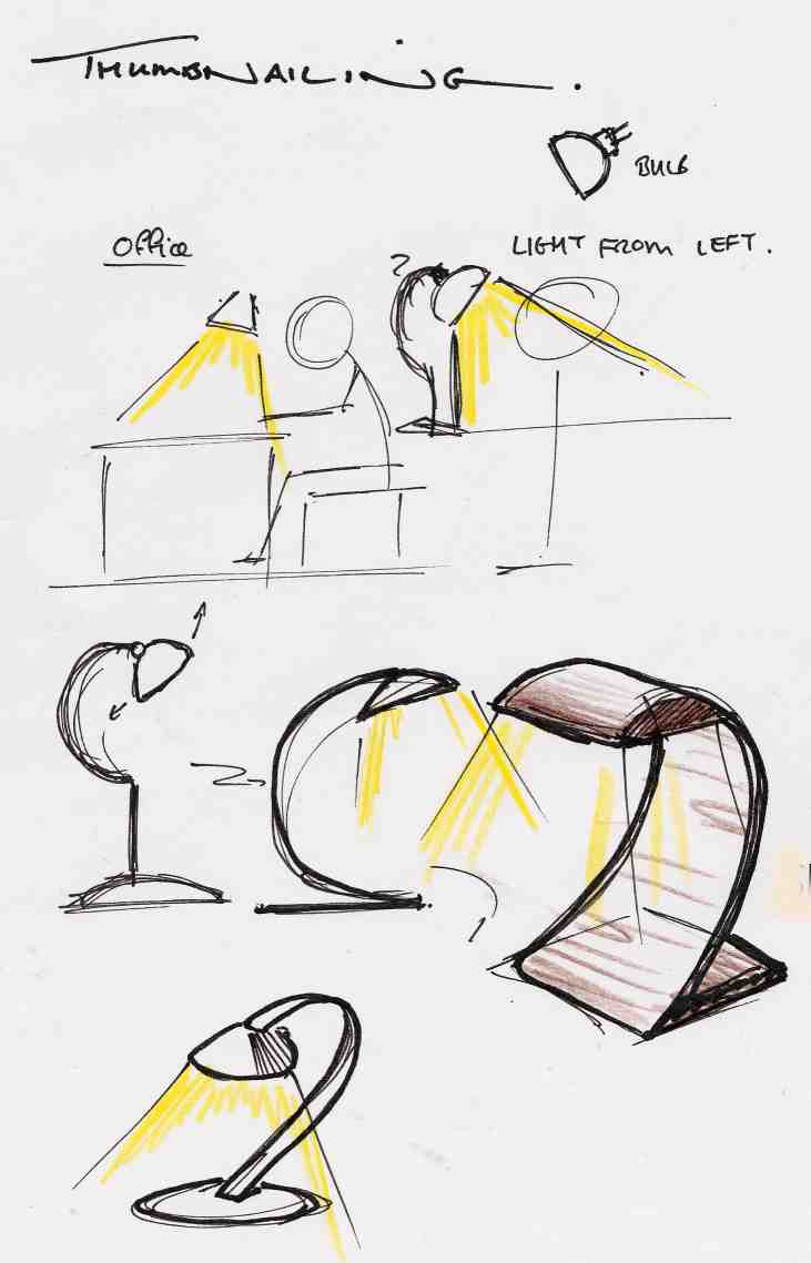
Images 5 - 9 - Exploring and Experimenting MP3s / Kettles / Task Lights
Section 2 - Creativity
There are many great thinkers out there who have struggled with explaining this, I am not one of them but I do know what works for me and what has worked for my students and what may work for you.
I have done a lot of reading and it boils down to...
Having an open mind. Don't judge an idea (it's just a sketch remember it doesn't have to work - it doesn't even have to be sensible) Edward De Bono has some fantastic writing on lateral & creative thinking and I take from him the idea of PO - a provocative operation - forcing thinking by deliberately choosing to try and think differently hyPOthesis, supPOse, POssibility. What if cars had no steering wheels? What would you get if you thought about penguins & the education system? How would a kettle with no handle function?
This seems like odd behavior but it frees up the mind from preconceived notions and so allows exploration and experimentation without worrying about what other people think - we worry a lot about that - but if we only did what other people thought possible we'd never have had cars, trains, planes etc. don't be afraid to suggest silly ideas and more importantly really explore them.
Creativity is about (hippy alert) achieving an altered mental state - shifting perception to allow the exploration and experimentation which might lead to a new concept or idea. How do you think about something that doesn't yet exists until you think it?
Here are some other concepts / ideas / thoughts on creativity.
Aleatory Techniques - Introducing randomness into the process -
Creative Problem Solving Process
Russian TRIZ
Edward De Bono
Final Word
You may have had fun with the SCAMPER but I'm guessing you are probably still left thinking 'Yeah but this doesn't make me creative, I still struggle for ideas...'
There used to be a comedy show - 'Whose line is it anyway' - in the show the comedians had to improvise a play using a random object they had been given and they got points for the most different ways of 'seeing' that object. Creativity in part is not a 'doing' thing as much as a 'seeing' thing.
Here's the PRACTICE -
- Most words can have more than one meaning e.g. set - set things out, concrete sets, a collection of things....look for these additional meanings where ever and when ever you can.
- Like words objects can have more than one use, try to start to think about objects and consider possible alternative uses (you don't have to start combing your hair with a fork) it's just a thought experiment.
- Be deliberate in your thinking. Suppose....What if.......If this was here.......If that didn't exist.......If this could just......If that went........
You cannot defy the laws of physics.....but you can bend them a little :)
Advanced 2D & 3D Sketching Techniques
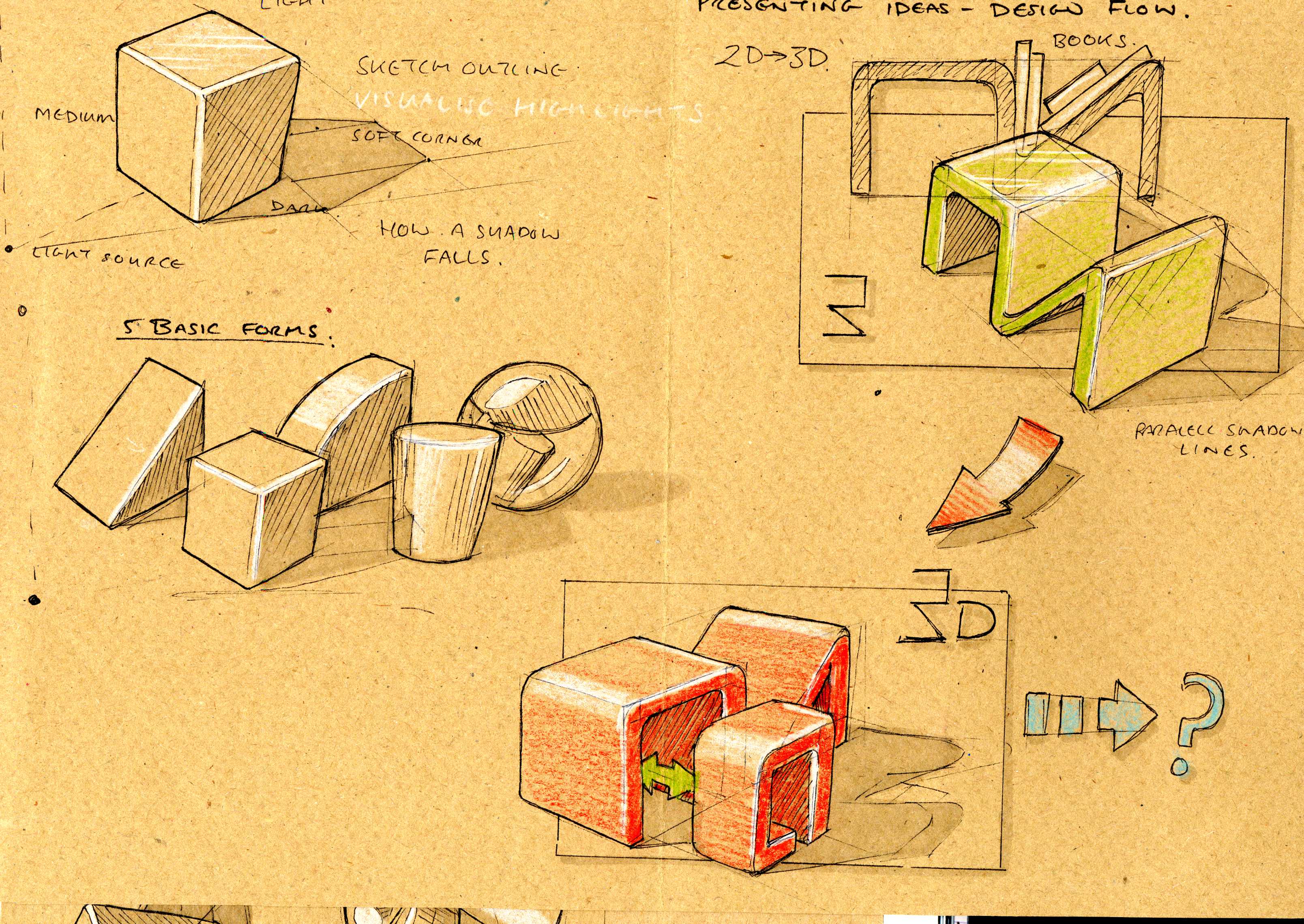
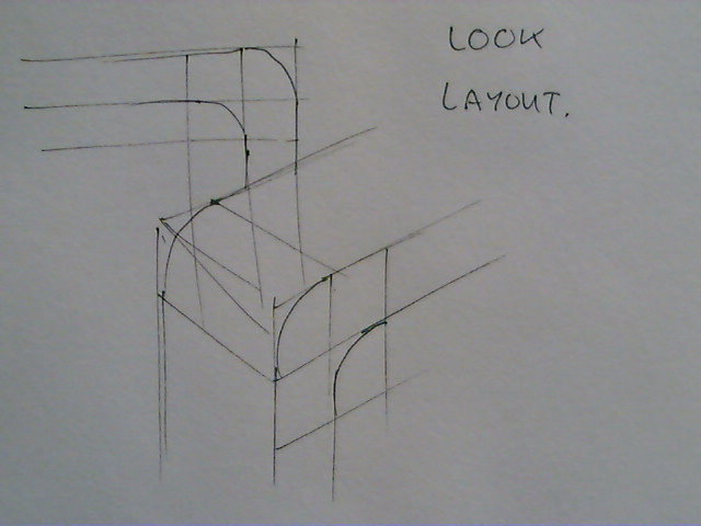
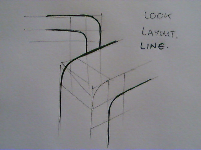
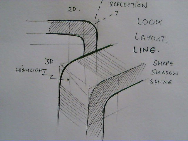
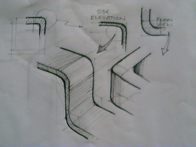
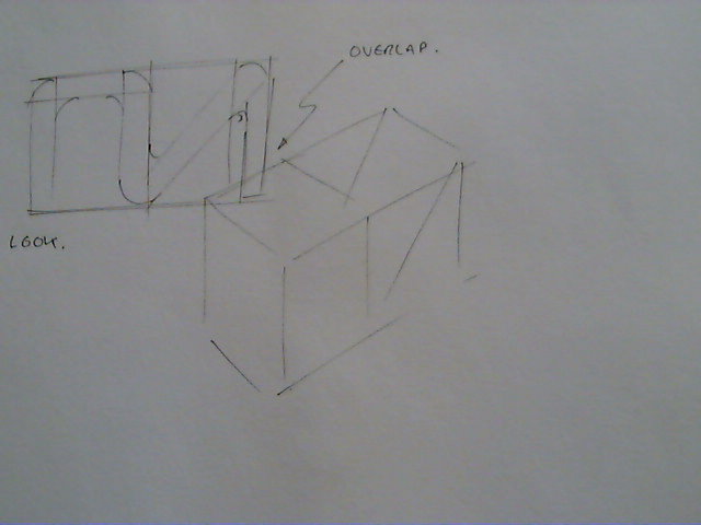
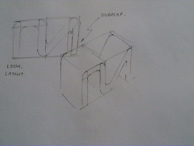
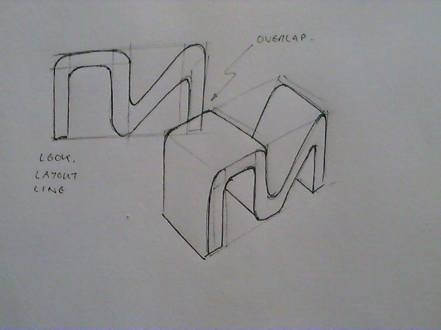
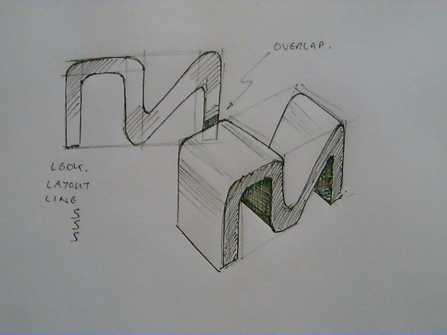
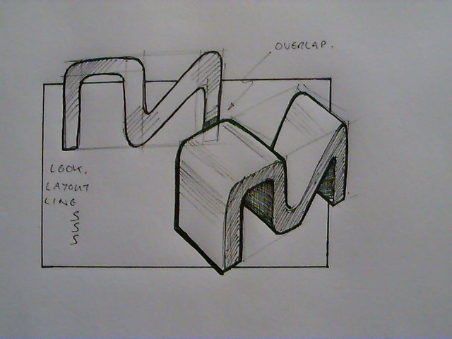
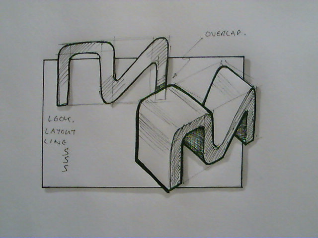
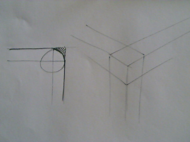
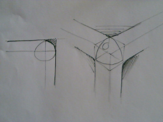


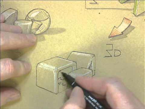
Hopefully you've had time to practice and develop your technique. This section is about adding subtle layers to your technique to enhance the quality of your sketching. We're going to cover quiet a number of techniques so I'm going to break this down into the following : -
- Simple Rounds
- Complex Rounds
- Casting Shadows
Simple Rounds.
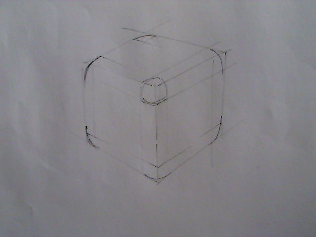
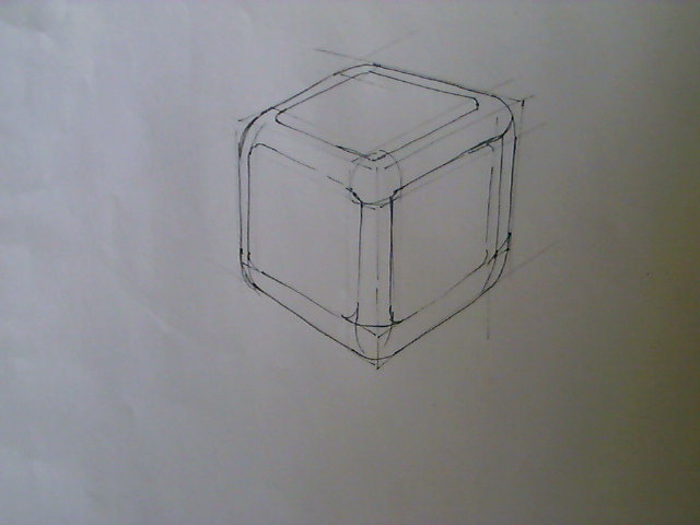
Nearly every object has rounded edges, there are very few objects that have perfectly sharp corners. Look around you and see these rounded edges and notice the highlights that they reflect.
Image 2 - Look & Layout a 2D & 3D grid for the corner [you may remember how we analysed a 2D circle when we worked on ellipses in lesson 3 this is the same sort of thing - a corner in 2D is usually a quarter circle and in 3D it will form part of an ellipse]
Image 3 - Line in the outer edges of your round.
Image 4 - Cross hatch shading is used to define the shapes not the position of the highlights on the round.
Image 5 - Some Practice Images
Image 6 to 11 - Practice Exercise - Design a reading station.
Complex Rounds
Complex rounds...are, hence the name - we effectively have three simple rounds (count them three!) all meeting at one point and this gets tricky especially when you start thinking about the other 6 visible corners you're likely to get.
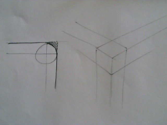

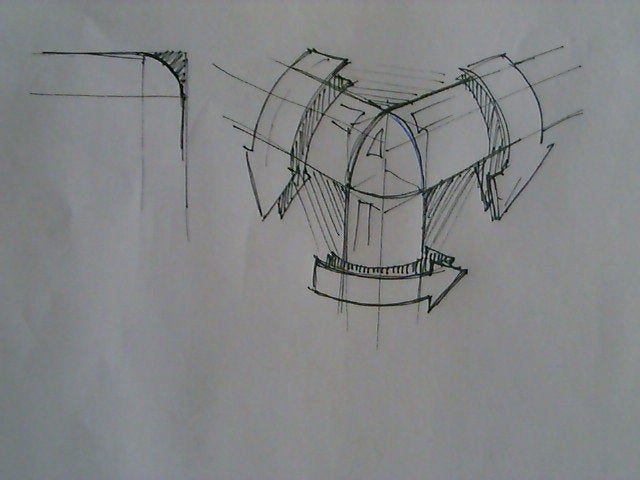
Image 12,13,14 - here we see the developement (Look, Layout, Line) of the front corner. Note that the corner is effectively a quarter hemisphere, and each other corner will have another part of the overall sphere as corners. The last image here is just emphasising the difficulty in shading these curved edges.
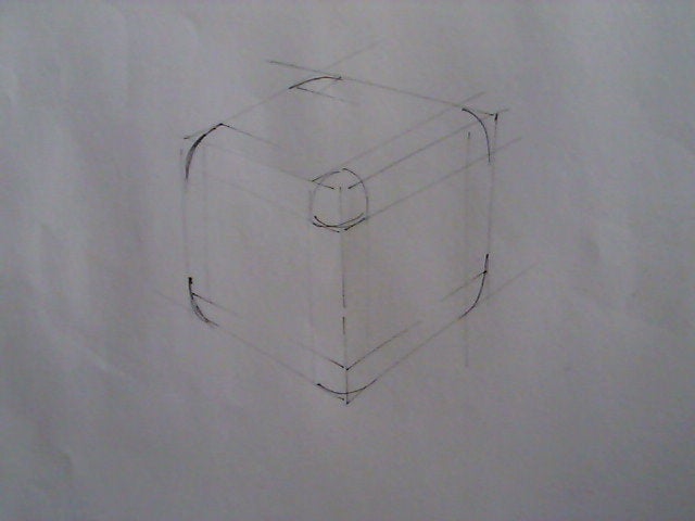
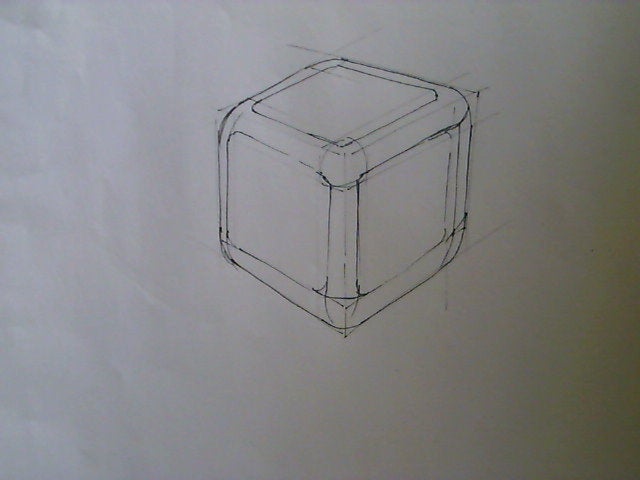
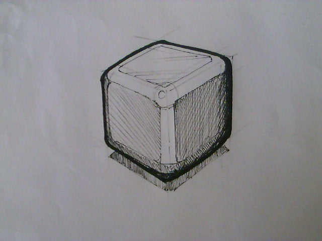
Image 15,16,17 - Here we look at sketching and shading a cubiod, you have to think very carefully about where the light is falling on these curved surfaces - this is easier with markers than it is with cross hatch shading.
Casting Shadows
- You will need.
- Fine-Liner 0.1
- White Pencil
- Marker Cool Grey No2.
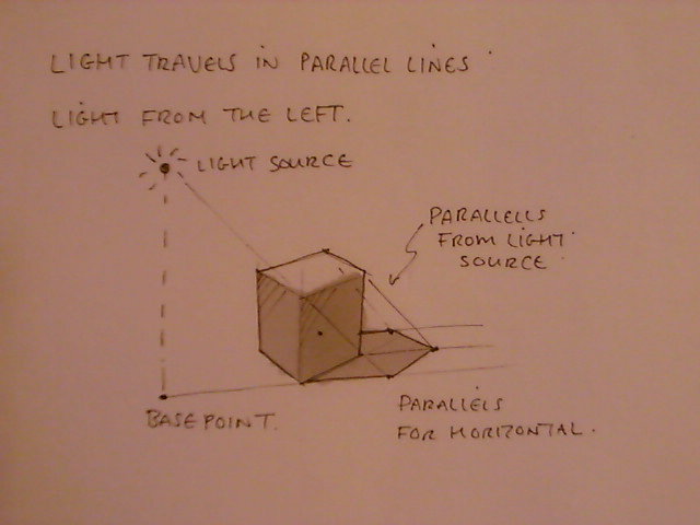
If you look at this image you'll see I have drawn a sort of lamp post for the my light source and this lamp post generates two sets of parallel lines. One line goes from the base of the lamp post through the first {closet} corner and out the other side for some distance. Each subsequent base corner has a line moving away from the light source parallel to this first line.
This is repeated with a line from the highest point of the lamppost.
Where the lines from the base corners and the lines from the top corners meet is where those corners would cast a shadow to. There area can then be shaded.
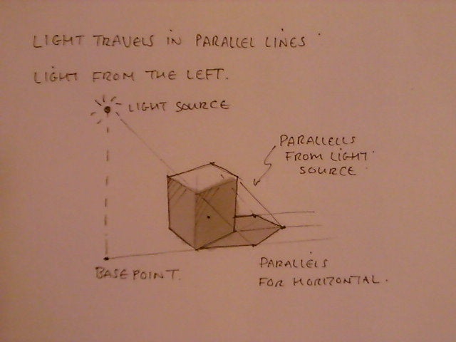
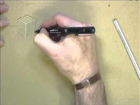
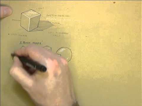
There is a video to illustrate this embedded, see the images at the beginning of this section - sorry there's no voice over yet.
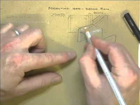
There are three more video clips which practice the above techniques using white pencil for highlights on a brown envelope [use the inside of the envelope, it has a better texture].