Simply Advanced Minecraft Art
by Digital Flame in Design > Digital Graphics
1869 Views, 11 Favorites, 0 Comments
Simply Advanced Minecraft Art


I used to do a lot of Minecraft art.
A lot. I'd show you my first but... Fine.
But only if you vote for me! (Warning GORE) (LINK)
So above you will see some examples of more recent ones. (Still half a year ago!!)
Look difficult? Look like you need a 24" graphics tablet? No you need a mouse and this Instructable! It's that easy!
Minecraft Skin Viewer
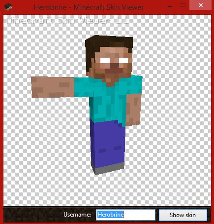
Use a minecraft skin viewer to take the skin you wish to use and position it.
http://minecraft-skin-viewer.en.softonic.com/ (I use this) You don't have to use a skin viewer, you could do a mob, but would be a bit more difficult without a 3D render-er. So either get some practice with skins then move onto mobs, or look for a tutorial to render Minecraft with blender. Or just screenshot a picture straight from Minecraft! >:P
Then just plop it into Photoshop or any other photo editing / painting software.
E.g paint.net, gimp, Corel painter or Photoshop.
I'll be using Photoshop CS6!
Going Ham With Lines
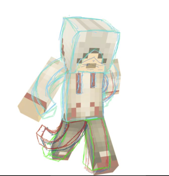
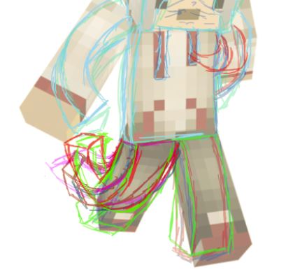
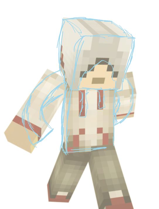
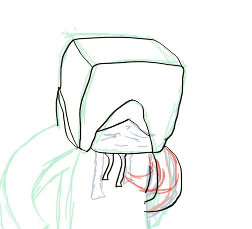
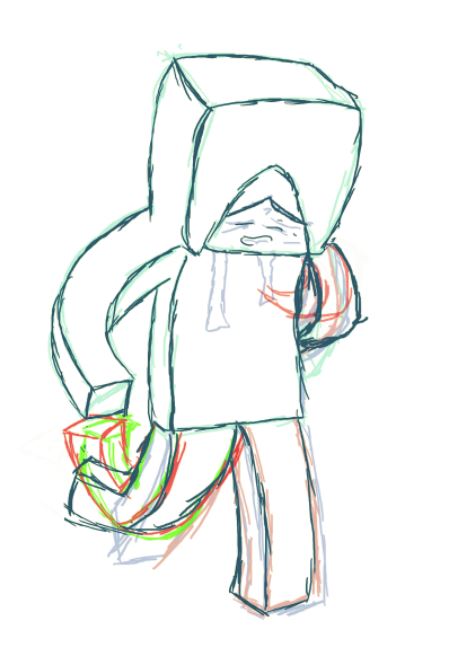
go ham
verb) to act in an outrageous manner.
Yep. Just go crazy with lines. Make the straight edges more of curves and develop them into 3d cubes being augmented. Also we needd to connect the arms instead of just having then being attacked by their edges. Try looking at your own arms bending (the right way!) in a mirror to get the hang of how everything flows.
If it doesn't look right. don't rub it out. Finish it then lower the opacity and draw over it in a high opacity with a another colour. This is shown well on the right leg (viewers left). It is most hard to draw things going directly away without it looking weird so try to avoid it.
Don't rush. You can see that on the left arm (viewers right) I just gave up. In the end you can see how it looks weird; showing that I should have stuck with it.
Make sure you do every set of lines on a new layer. Using a thin slanted brush on a 4K canvas (4000x2500) also helps!
A graphics tablet might help but this is just a guide. We will do the neat lines in the next step.
Do as many line layers until you think it looks good.
Reduction
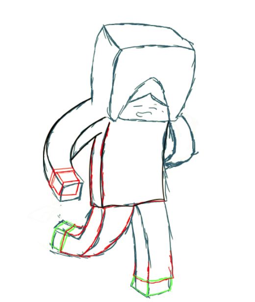
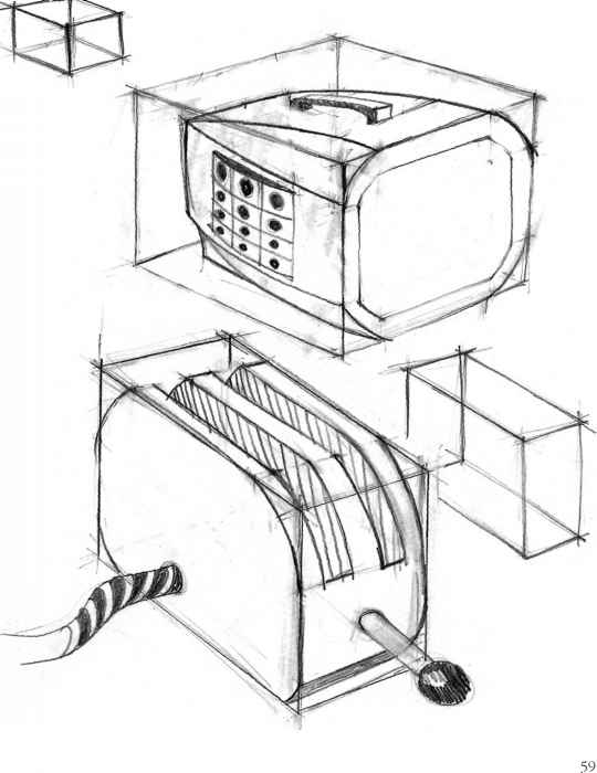.jpg)
Quite easy and self explanatory. Make large blockiness into more precise detail, e.g
On a player or zombie's hands and feet or a creepers eyes (Make them go into the head)
Like in my image, though a better example is in the other image (credit Joshua Nava) where the boxes hold all of the space of which the object will take up, and in this step you just draw he inside.
Background and Pen
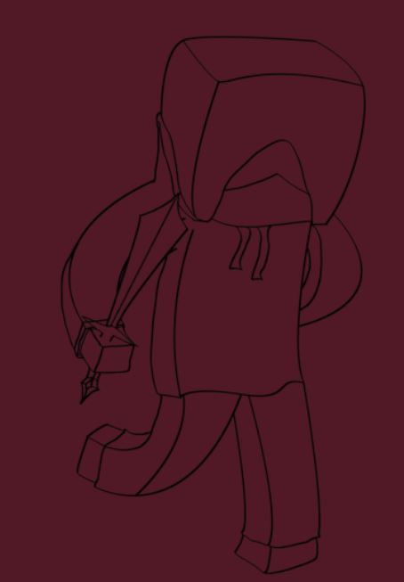

OK, now we are going to go for the final line set! These will be the neat ones! You don't need a graphics tablet as we will be using the pen tool for a ultra smooth appearance.
Now you can create the background layer using colour (RGB) 78(R), 18(G), 33(B).
Type that into the colour menu and fill the background with the paint bucket tool. This creates contrast and also means we can see if we've missed any spots when colouring, whereas white would just blend and you would get quite a shock when adding your own background to see how much it comes through on your character!
OK; the pen tool.
Click once for the starting point of the line.
Click and hold again for the end.
Drag to create a curve in the line. Don't do straight edges, create a slight curve with the peak in the middle of the line. (The dot on the other end of what you have dragged should be on the top of the line.) Make it curve out not in.
For doing more than one line in a row, I wouldn't recommend but faster. Alt + Click the other dot away from your line and create another line.
Either way when you have created your path (name for your line) right click stroke path (Use brush) then right click delete path. Done!
Tidy up your outline with a small, hard eraser brush
Colour
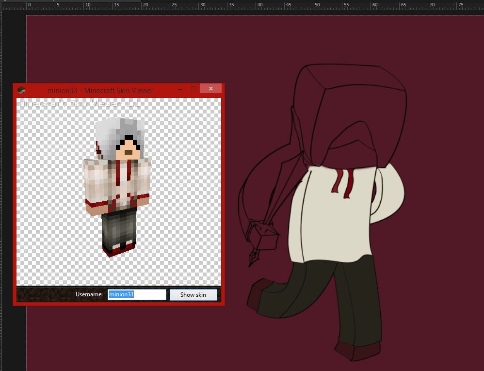
Colour (I'm British)
Not much to write on this step, anyway use the paint bucket tool and reference from the actual skin.
Then take the lightest colour and the darkest colour on one shade of the skin and use the linear gradient tool (click and drag with the area to colour selected (magic wand) (It must have already been coloured with the paint bucket).
A good trick is to do all of the bucket colour on one layer, and all of the gradients on another. Then turn the gradient layer opacity down a bit. (e.g 90%)
As there's not much to say I'm going to discuss the possibilty of on- *cough*-vote!- leaving a comment if your confused.. Yea...
Shadow and Highlights
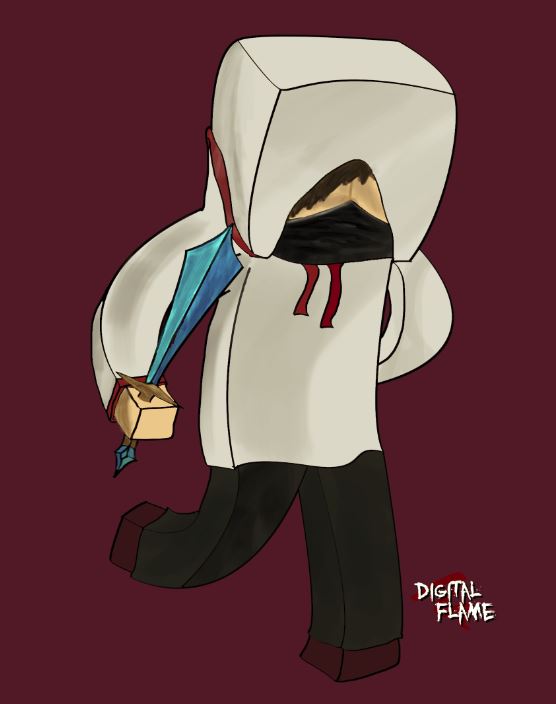
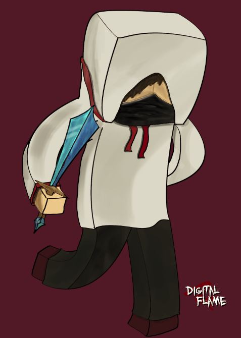
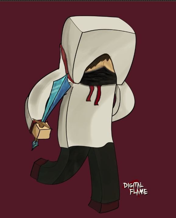
Five layers, on the blend mode and opacity that works best.
Layer 1: Glaze.
White soft brush particular shine and areas that pop, e.g sword glare and hoodie strings.
Layer 2: Depth Shadow.
Black soft brush beneath objects that hang like underneath the hoodie strings and cuff
Layer 3: Overall Shadow.
Lighter than the precious layer (opacity lower), Fill bucket parts facing away from chosen light source like sides of head and body. Also curves on mid light surfaces (mid light is not facing directly towards, but not directly away).
Layer 4: Texture.
Water colour brush of a slightly darker tone than the chosen surface on low opacity to give a slight more realistic texture.
Layer 5: Extra detail.
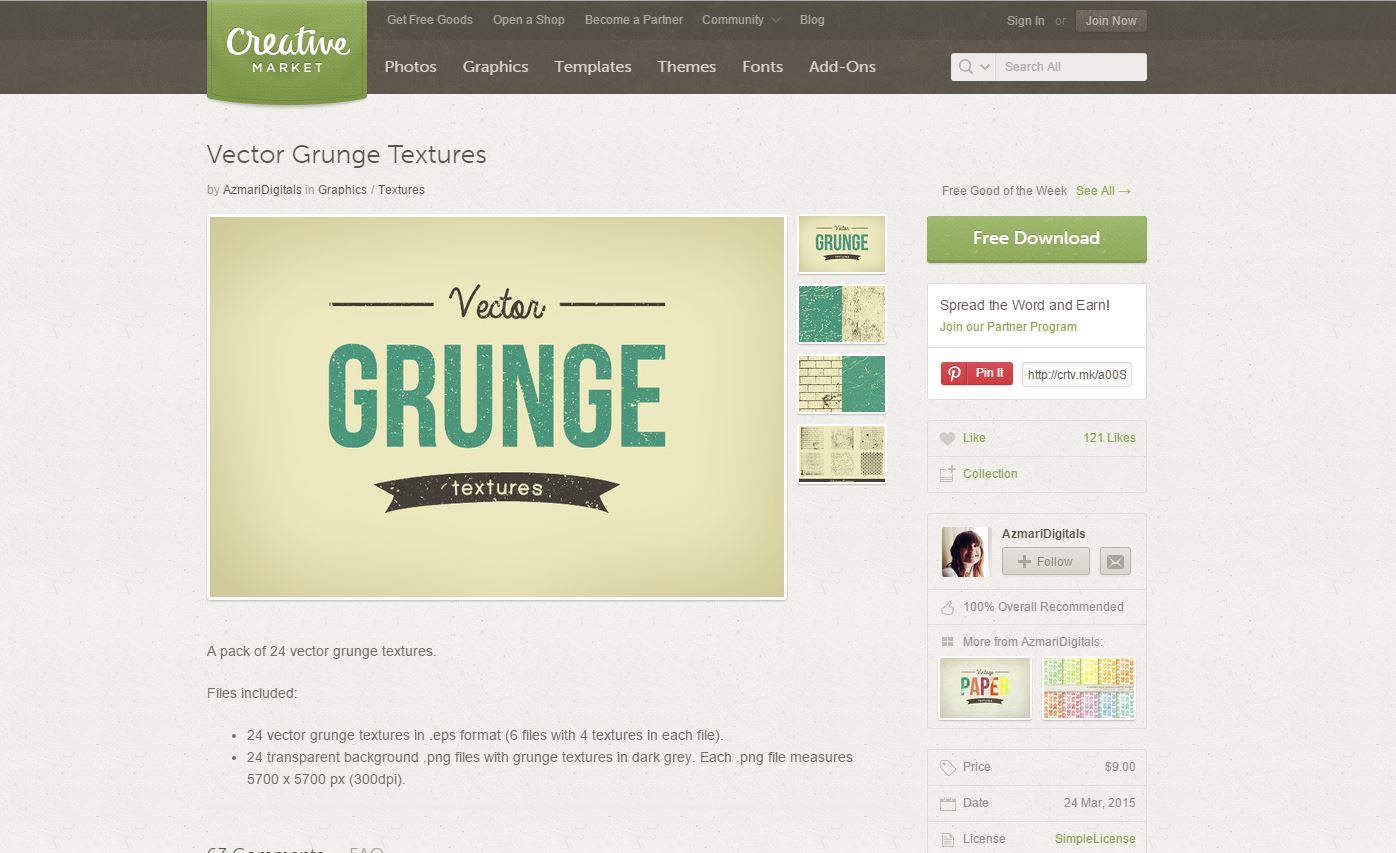
What ever else you want to / can do! Like hair or scuff marks. I used creative markets grunge texture on the sword to give a slightly worn look.
And Your Finished!
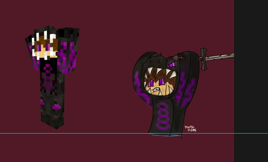
That wasn't so hard was it?
Well if it was leave a comment below and I would be happy to help!
If you want, I do custom work for £3 ($4.62) for anything that takes under 4 hours (any thing over is 50p more every hour). Though now that you know the way I do it, there is no way you couldn't do it just as well, or even better than me! So I would discourage you from getting me to do it!
Hope you enjoyed, if you thought it was interesting or have anything to say please also feel free to leave a comment!
And as always, *cough*-vote! Huh? What?
-Digital Flame