Seeing the Atmospheric Tide in METAR Data
by gasperi in Circuits > Software
388 Views, 2 Favorites, 0 Comments
Seeing the Atmospheric Tide in METAR Data

The Atmospheric Tide
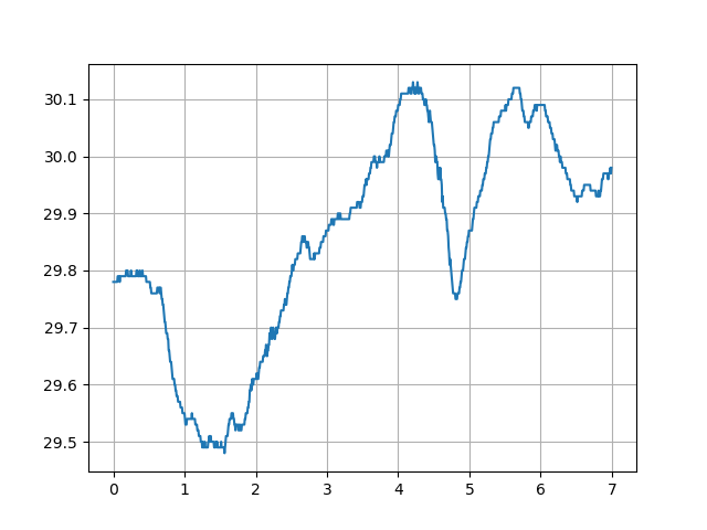
Most people are familiar with the ocean tide, but there is a tide in the atmosphere as well. The ocean tide is driven by the moon's and, to a lesser extent, the sun's gravity. It occurs twice daily but at shifting times due to the asynchronous nature of the moons orbital period and the earths rotation speed. However, the atmospheric tide is caused primarily by solar radiation and occurs with daily regularity. This tide can be seen in surface barometric pressure where it has a semi diurnal pattern much like the twice daily ocean tide but for entirely different reasons. It is a small effect compared to the large changes caused by the weather. Below is a graph of barometric pressure for the first seven days of 2020. Changes in pressure of several percent in a day are common, but the variation caused just by the atmospheric tide is less than 0.1%. Seeing the tide requires averaging out the larger but essentially random variations caused by weather. This requires hundreds of days of pressure data that was taken hourly and preferably more often than that.
Getting Historical Pressure Data
The good news is that high quality historical atmospheric pressure data is available free online. The United States has thousands of airports and most of them have an automated meteorological data collection system. Weather conditions like pressure, temperature, and rainfall are constantly recorded and reported into the system. Generally they are updated every five minutes so pilots have instant access to the current weather conditions at any airport using a system known as the Meteorological Terminal Air Report or METAR.
Historical METAR data is maintained on the Iowa State University - Iowa Environmental Mesonet and its ASOS-AWOS-METAR Data Download page. https://mesonet.agron.iastate.edu/request/download.phtml It isn't too hard to figure out how to use the page so I'm not going to produce a tutorial here, but I will provide an example of how I use it.
Switching Networks
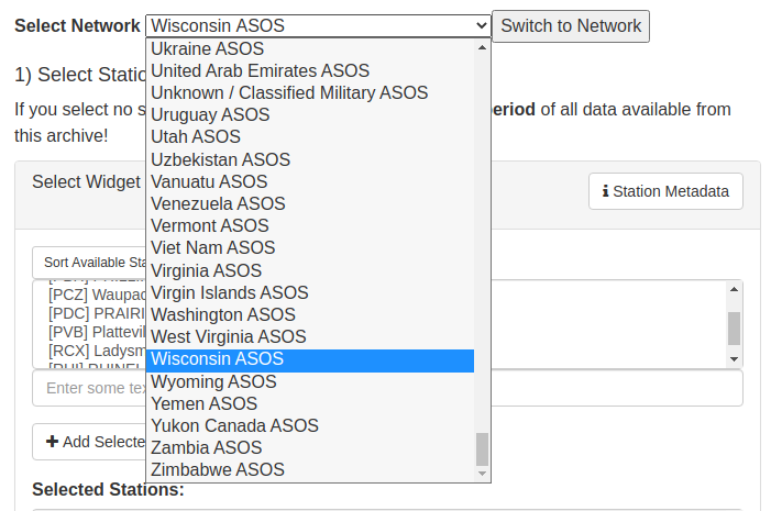
The first time you go to the site it will likely be on the Iowa ASOS network and will show airports in that network. I live in Wisconsin so I highlight the Wisconsin ASOS and then click the Switch to Network button. You can see that there are networks all around the world. I have not played with anything but airports in the USA, so I don't know if they all work the same. Anyway, after selecting the network, you select the particular airport you want and then click the + Add Selected button. For our purposes, you only want to select one airport at a time, and in my case I use the [RAC] RACINE airport.
Selecting Altimeter and Date Range
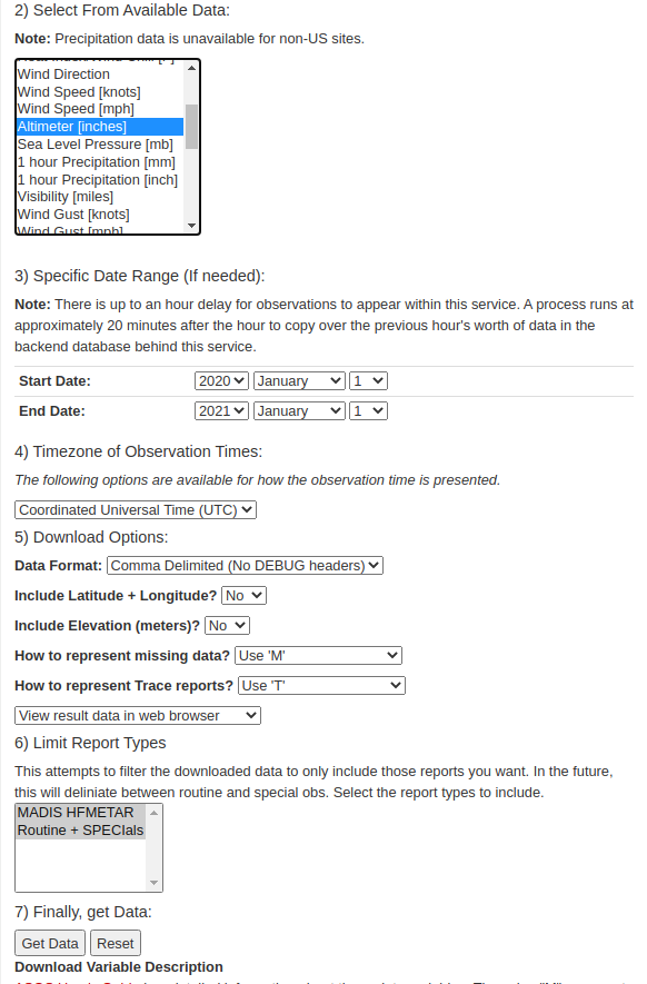
You might think you would want the Sea Level Pressure [mb] data, but it doesn't seem to be recorded as often as the Altimeter [inches] version of the atmospheric pressure in the data. The Altimeter value is of major concern to pilots since it was used to establish a plane's height above the runway before the invention of GPS. At least for the airports in my area, the Altimeter value is recorded every 5 minutes while the Sea Level value is only hourly.
You can see that I've selected a Start Date and End Date to cover the entire 2020 year. Everything else is defaulted and then you click the Get Data button at the bottom.
Downloading the Data
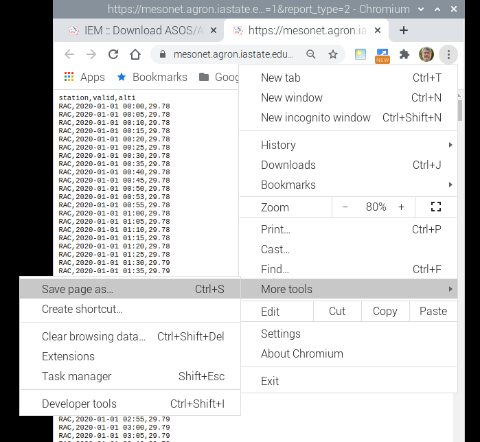
A new tab will open and the entire years data will be fed into it. It can take quite a while as this represents over 100,000 lines for a full year. At least with the Chrome browser, to save the data to a text file, you click the three dot vertical ellipsis menu on the top right of the page, scroll down to More Tools and then Save Page As. This should save a text file named ASOS.TXT if everything goes right. Make sure to note the directory it uses so you can find the file later.
What the Data Looks Like
The data is basically coma delimited with a space separating the date-time field. In my case I use the Racine airport data which has the station ID RAC. The date-time of the measurement comes next with YYYY-MM-DD HH:MM format. Note that the time is in UTC so 12:00 is not solar noon. I live in the central time zone so solar noon is actually 18:00 UTC. Then the altimeter value which is the barometric pressure in inches of mercury. If for some reason the altimeter data was missing for that time, there will be an M in place of the value. The time progression isn't always exactly 5 minutes as you can see in the example below there is an extra reading at 00:53. Actually there are many odd times thrown in beside 0 and 5. There are also blocks of entirely missing data lines so working with the data requires a little caution.
Extra data line example:
station,valid,alti
RAC,2020-01-01 00:00,29.78
RAC,2020-01-01 00:05,29.78
RAC,2020-01-01 00:10,29.78
RAC,2020-01-01 00:15,29.78
RAC,2020-01-01 00:20,29.78
RAC,2020-01-01 00:25,29.78
RAC,2020-01-01 00:30,29.78
RAC,2020-01-01 00:35,29.78
RAC,2020-01-01 00:40,29.78
RAC,2020-01-01 00:45,29.78
RAC,2020-01-01 00:50,29.78
RAC,2020-01-01 00:53,29.78
RAC,2020-01-01 00:55,29.78
RAC,2020-01-01 01:00,29.78
RAC,2020-01-01 01:05,29.78
RAC,2020-01-01 01:10,29.78
Missing data example:
RAC,2020-01-16 21:50,30.69
RAC,2020-01-16 21:53,30.70
RAC,2020-01-16 21:55,M
RAC,2020-01-16 22:00,M
RAC,2020-01-16 22:05,M
RAC,2020-01-16 22:10,30.72
RAC,2020-01-16 22:15,30.72
RAC,2020-01-16 22:20,30.72
RAC,2020-01-16 22:25,30.72
RAC,2020-01-16 22:30,30.73
Missing data lines example:
RAC,2020-05-21 18:15,30.13
RAC,2020-05-21 18:20,30.13
RAC,2020-05-21 18:25,30.13
RAC,2020-05-22 03:40,30.10
RAC,2020-05-22 03:45,30.10
RAC,2020-05-22 03:50,30.10
RAC,2020-05-22 03:53,30.10
RAC,2020-05-22 03:55,30.10
RAC,2020-05-22 04:00,30.10
RAC,2020-05-22 04:05,30.10
Processing the Data
I use a little program written in Python to process the data. I would guess you could use most any language to do this, but it just doesn't seem like the kind of task that a spreadsheet like Excel handles easily.
import matplotlib.pyplot as plt

f = open('asos.txt')        # name of txt file with weather data

p = [0]*24                  # pressure

c = [0]*24                  # count press

x = [0]*24                  # plot x values

l = f.readline()            # label line

l = f.readline()            # first data line

while l != '':              # end of file?

    w = l.split(sep=',')    # separate line into values

    i = int(w[1][11:13])    # make index from time string

    if w[2][0] != 'M':      # if data not missing

        p[i] += float(w[2]) # sum pressure

        c[i] += 1           # increment count

    l = f.readline()        # next line

f.close()                   # close file

for i in range(24):         # fill out plot arrays

    x[i] = i                # time in hours

    p[i] = p[i]/c[i]        # average pressure

plt.plot(x,p)               # make plot

plt.xticks(x)               # tick lables

plt.grid(axis='both')       # lines

plt.show()                  # display plot
Program Description
The while loop is the most important part of the program. Here I split the data line into 3 elements separated by comas using the built in Python function. w[0] is the station ID. w[1] is the date-time string, and w[2] is the pressure. The idea is to total all the pressure values within the same hour for all 365 days. That amounts to several thousand values for a full year. The two character hour part of the string w[1][11:13] (see illustration below) is converted to an integer which is used as an index for the hourly value storage. I just keep summing the values and keep track of the number of samples in each hour with the variable c. This allows for missing data, extra data, and even missing blocks of data to be handled without causing too much trouble. After reaching the end of the file, I fill an x array with hour values, and compute the average which is just the total divided by the number of samples.
w[1] string elements 11 and 12 are the hour value:
111111
element#: 0123456789012345
string: YYYY-MM-DD HH:MM
Program Output
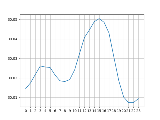
The pressure values are plotted using the mathplotlib in Python. You could just print them out or put them into a new file and plot the results using a spreadsheet program. There is enough data in the original file to break up the values into 5 minute intervals instead of hourly, but the program gets a bit more complex without much gain in quality.
Conclusion
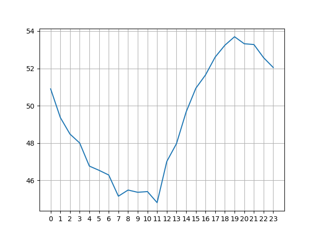
It is easy to see a semi diurnal pattern in the pressure plot above. Even today, the exact causes of this pattern are not well understood. Average daily temperature, as shown below, has a single peak a couple hours after solar noon. (Remember, solar noon is 18:00 UTC in Racine.) This is probably driving most of the pressure variation, but it is thought that early morning heating in the upper atmosphere causes the smaller pressure peak around 4 UTC.
Diurnal Temperature Plot
