Rainbow Pointillism Portrait
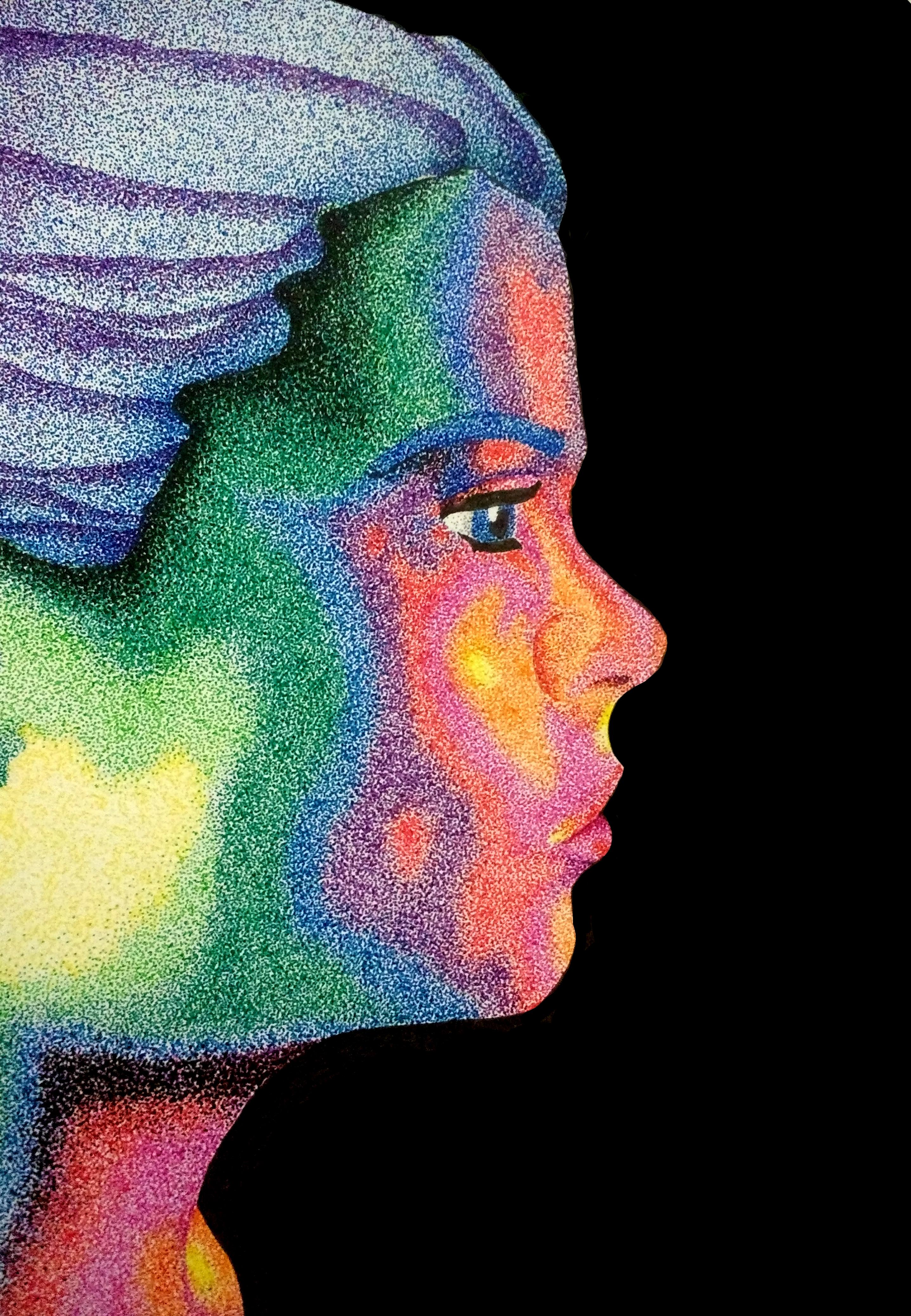
Recently I was teaching my students about pointillism and how the artists used tiny dots of color, traditionally oil paint, to create an image. I then decided to try my hand with an easier (though equally unforgiving) medium: fine-point ink pens.
This tutorial will walk you through how to create a piece of art similar to the one seen here. I'll begin with the basics of using fine-point pens, move on to editing a photo for usage, transferring the photo to your paper and then using the markers to bring your image to life.
Time estimate: 20 hours
Supplies
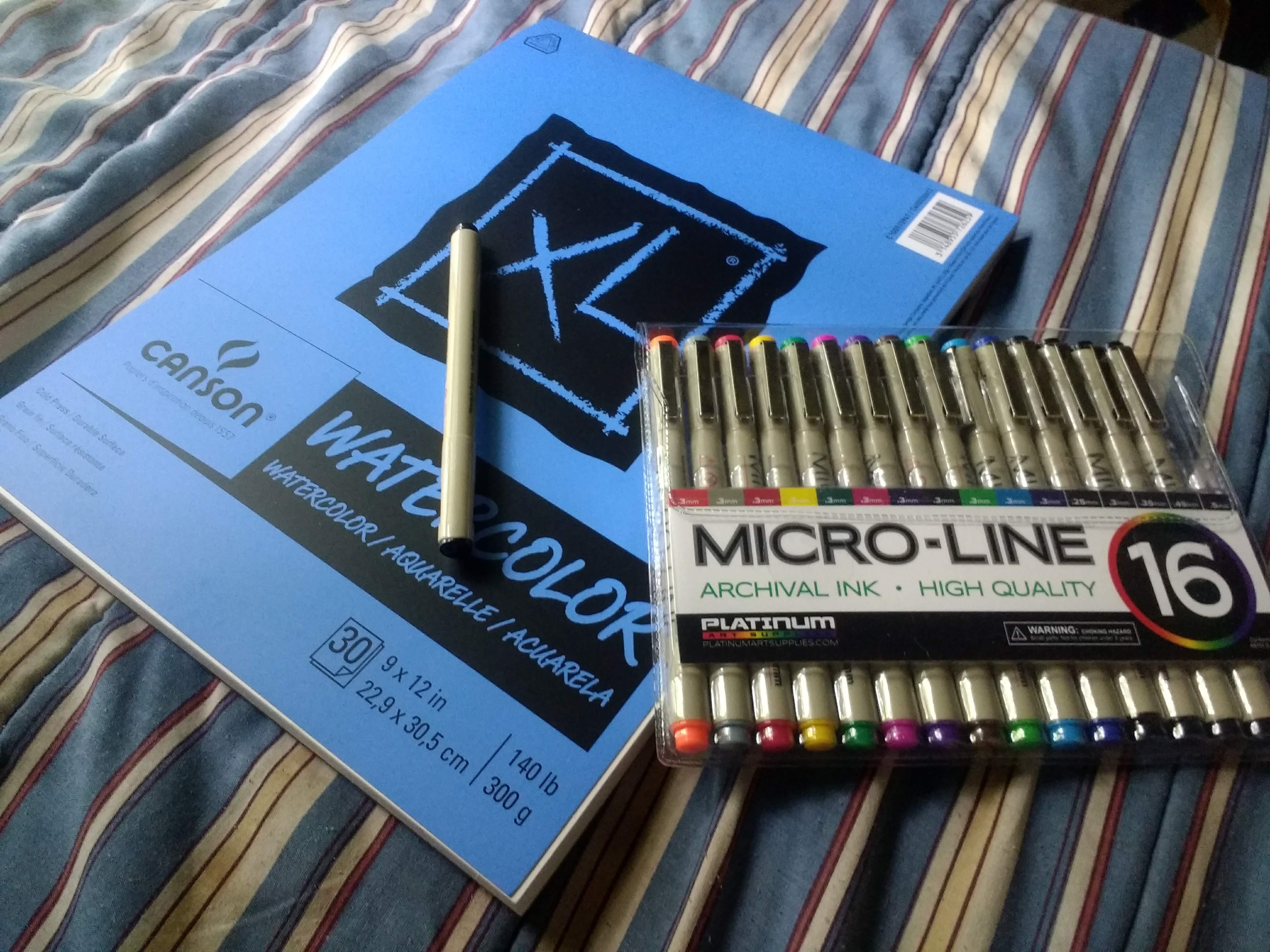
-Fine point pens in numerous colors (I used Micro-Line Ultra Fine Point Ink Pens, but there are many similar brands that you could use.)
-Heavy weight paper (I used Canson Watercolor paper, but any card stock or Bristol Board will do. The important thing is that the paper be thick. You are going to be applying a lot of dots to the paper and you want it to withstand some wear and tear.)
-Pencil and eraser
-Photo editing software such as Photoshop Elements (Technically this is optional, but having this will make the process easier)
-A reference photo
-Colored pencils
-A light box
Practice With Your Materials.
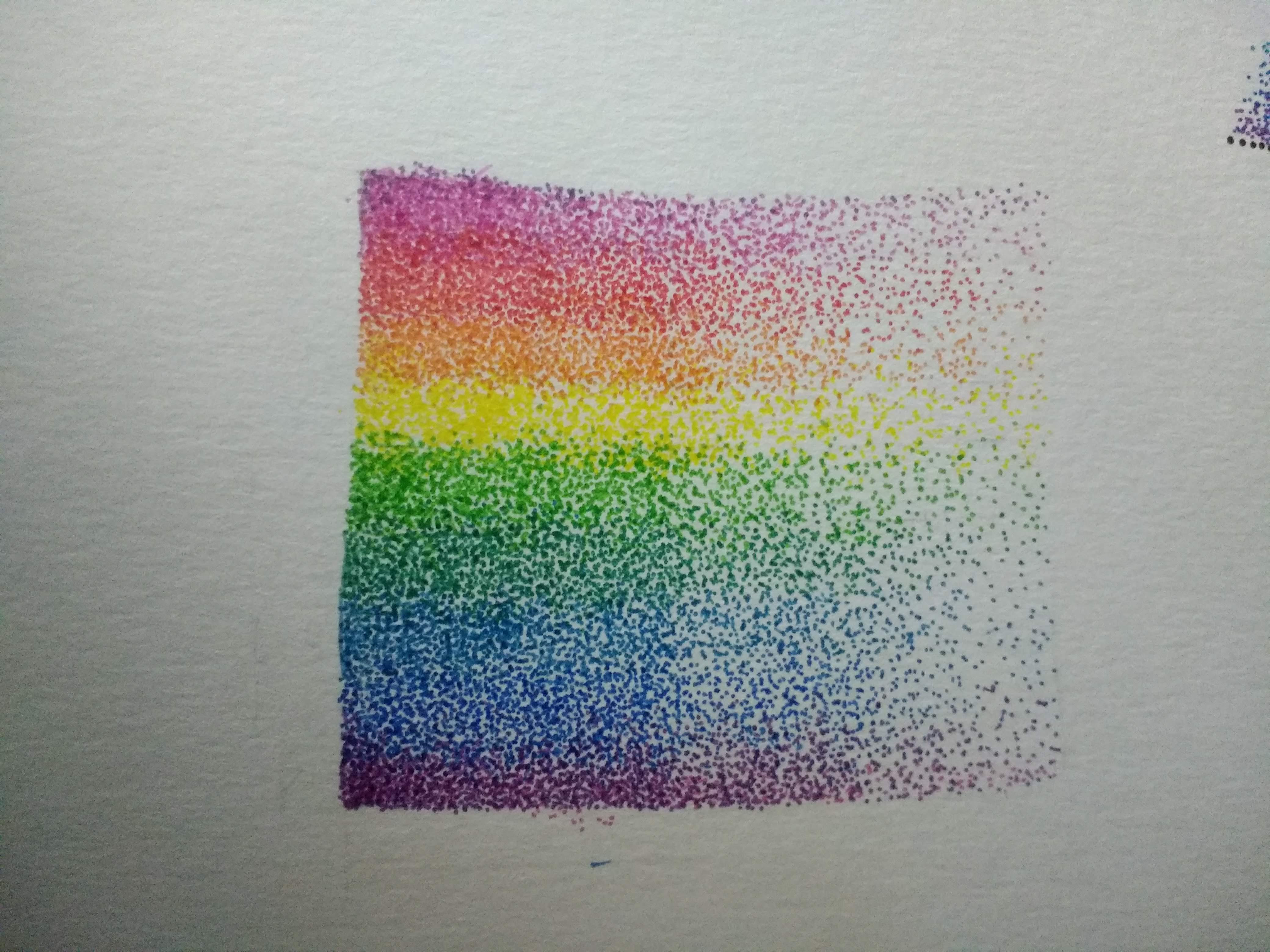
As with any new medium, I like to practice before I start on a project. This serves several purposes. First and foremost, it allows me the opportunity to mess things up in a low-stakes setting. Second, practicing allows me to determine if I have the patience and interest in committing to a larger project. If I hate using the medium during a short, low-stakes practice session, then there is no point to attempting something larger.
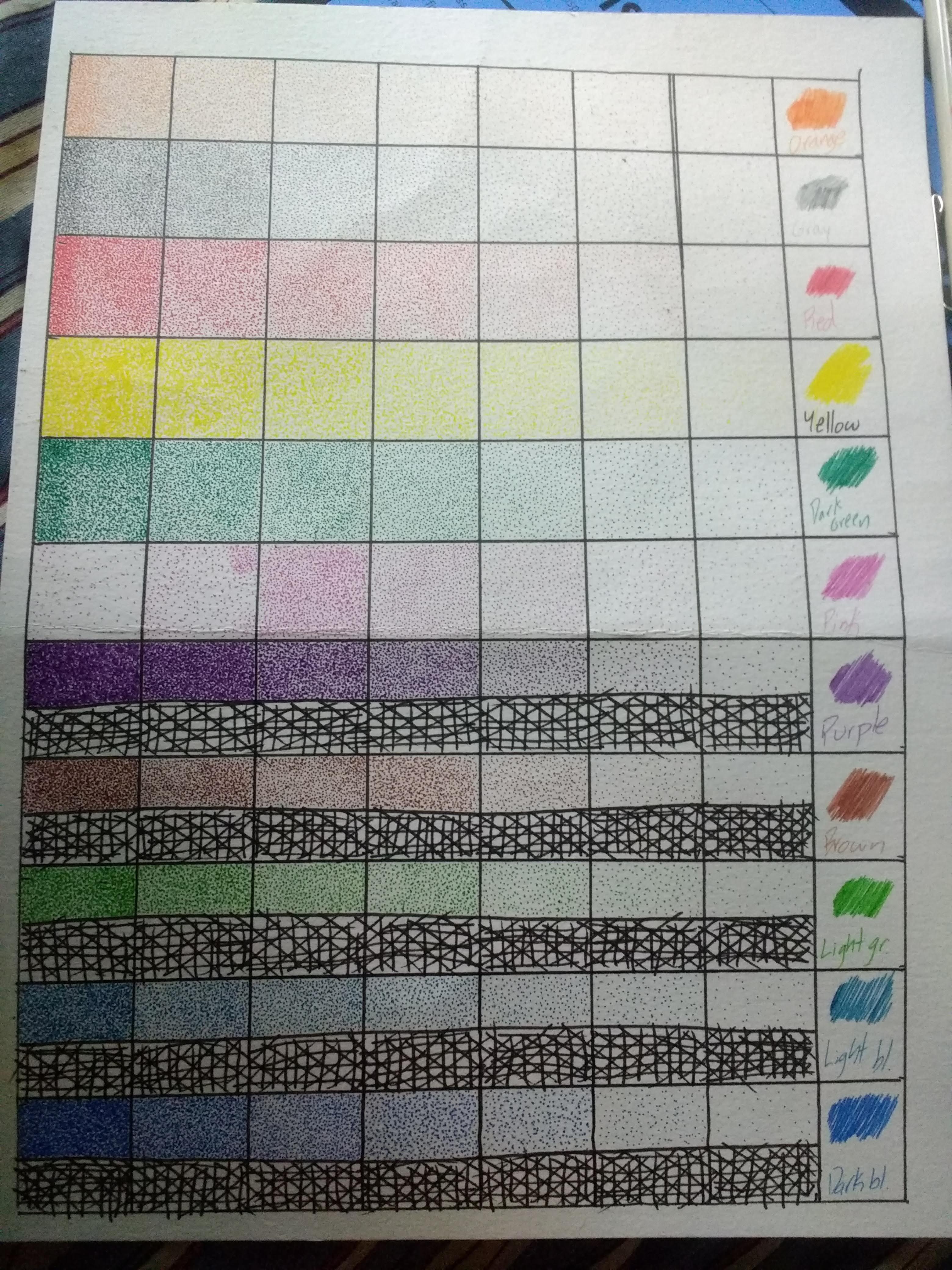
Practice Session One: The first thing I practiced was simply making dots. I created a grid of 1 inch x 1 inch squares, with one row for each color that I knew I would be using. The fewer dots in each square, the lighter and less saturated the color. The more dots in each square, the richer and more vibrant the color. This was a boring task because all I did was draw dots in paper, there was no blending or shading. Despite how boring it was, this was an important step because it allowed me to see what each density of dots looked like when complete. For instance, I learned that in order to make the yellow appear as rich and vibrant as the other colors, I needed to use a much higher density of dots. Blue and purple, however, did not require as many dots to achieve the same "look."
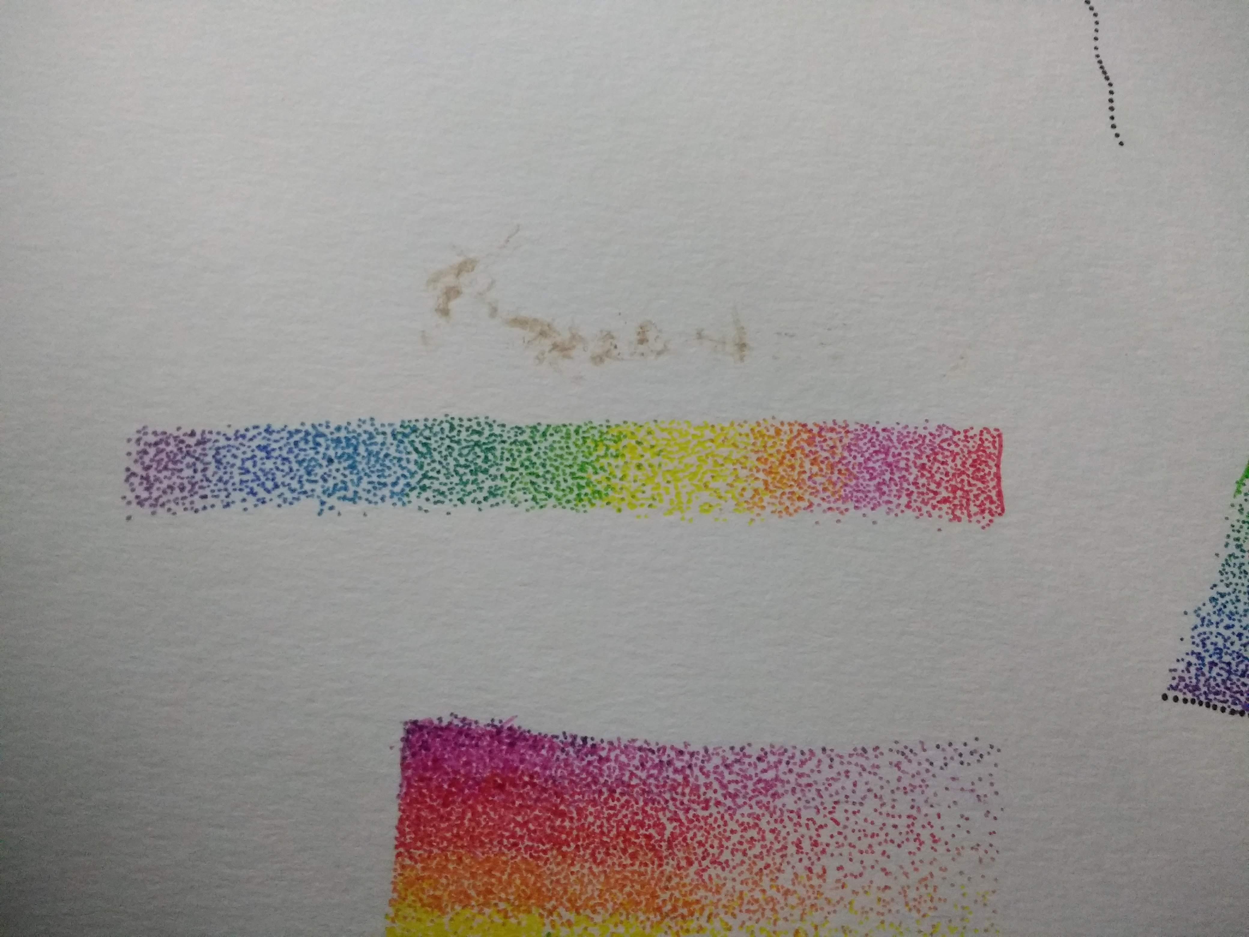
Practice Session Two: The next thing I practiced was a simple rainbow gradient. Using R(Pink)OYGBIV, I applied a light layer of dots. When making these dots I drew lines to divide each color into its own section. This helped me keep each color separate, for the time. I added a second layer of dots to create a smoother gradient. Instead of keeping the green dots isolated in their own section I added a scattering of green dots in the yellow section and visa versa. By doing this for all of the color transitions I was able to make the transition from one color to another appear more natural and smoother.
Practice Session Three: This task was essentially the first task and the second task combined. Instead of just creating a rainbow gradient OR experimenting with dot density to create a more vibrant look, I did both. I began by creating the rainbow gradient and then added additional layers of dots to make the colors more saturated.
If you are attempting this, I strongly recommend the second of the three activities, as it was very helpful to practice transitioning from one color to another, which will be very important later on.
Prepping Your Reference Photo
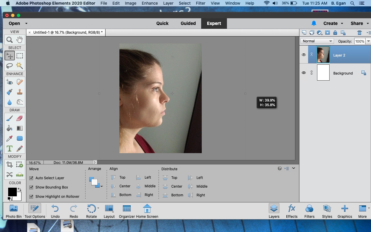
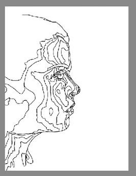
I am not good at capturing the likeness of a specific person unless I am using a reference photo. Even then it's a struggle for me. In order to better capture the specific likeness of your subject, I recommend you make a few alterations to your reference photo.
1) Select a photo. Select one that you like, you will be staring at it for some time. Open the photo up in a photo-editing program of your choice. I used Adobe Photoshop Elements.
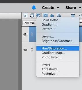
2) Select the icon that looks like a half moon, this icon allows you to "create a new fill or adjustment layer". This will open up a drop down menu of options, select "Hue/Saturation".
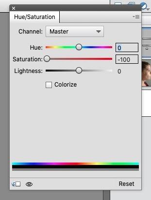
3) Move the slide bar for Saturation all the way to the left or "-100". Do not adjust the other sliders. You have now removed all color from your image. Merge this adjustment layer with the photo layer.
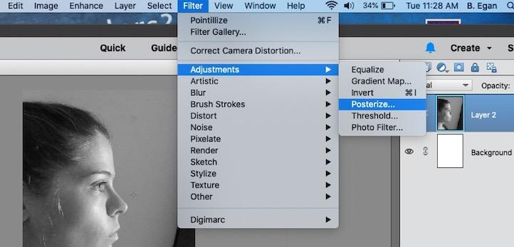
4) At the top of the screen, select "Filter", then "Adjustment" and then "Posterize".
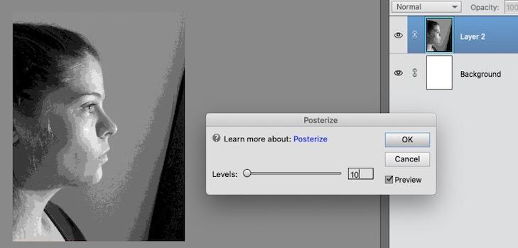
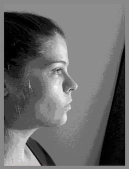
5) Set the levels for the Posterize filter. I'm using ten colors, so I set the level at 10. The lower the level, the less detail and the higher the level, the more detail. Experiment with different levels until you get the look you want.
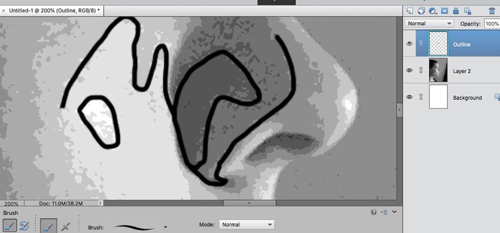
6) On a new layer, using a small hard round brush, I outlined the edges where one shade of gray met a different shade of gray. I did this for the entire image.
7) Turn off the visibility of the non-outline layer. Save and print the image.
Transferring Your Image
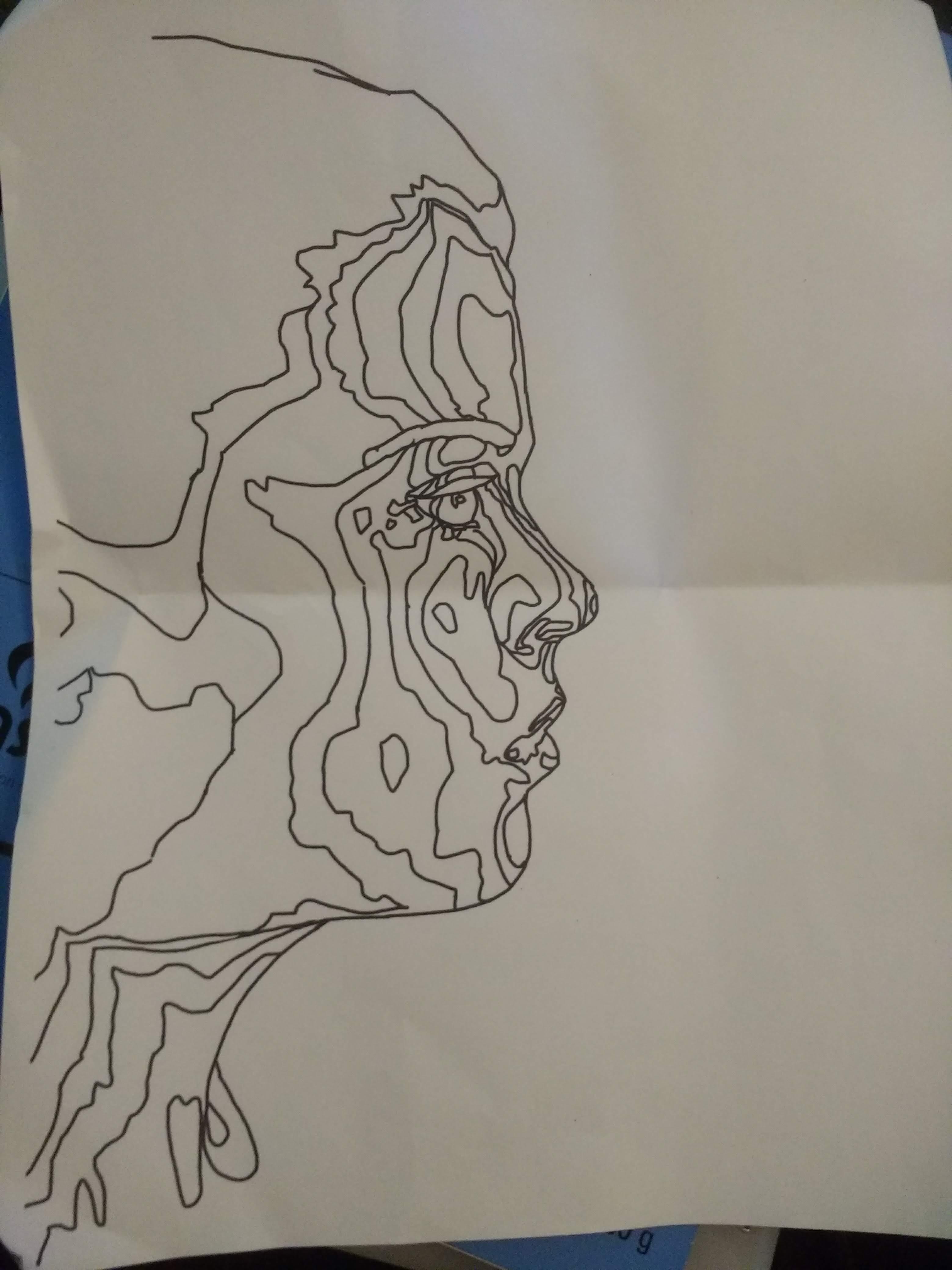
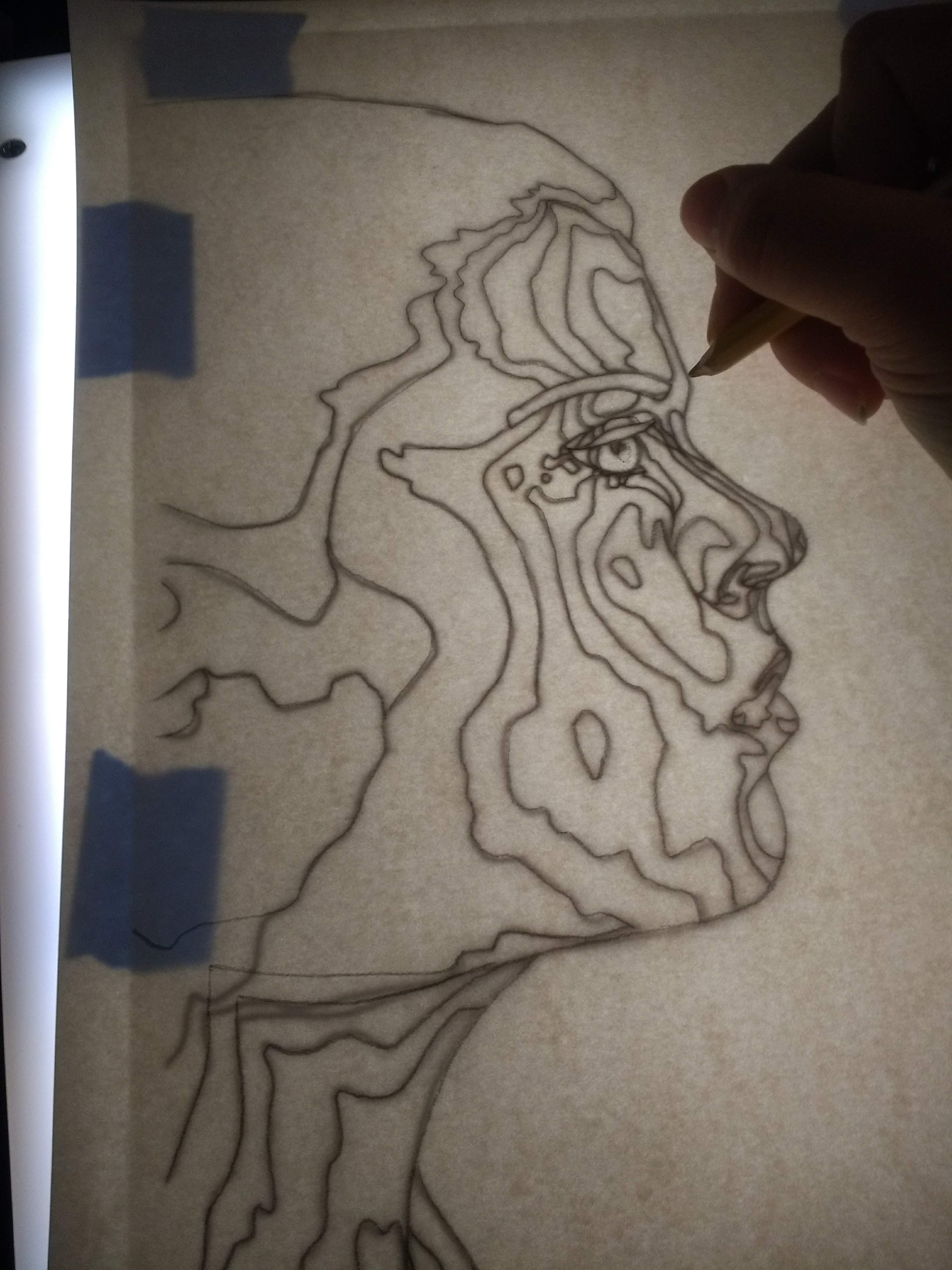
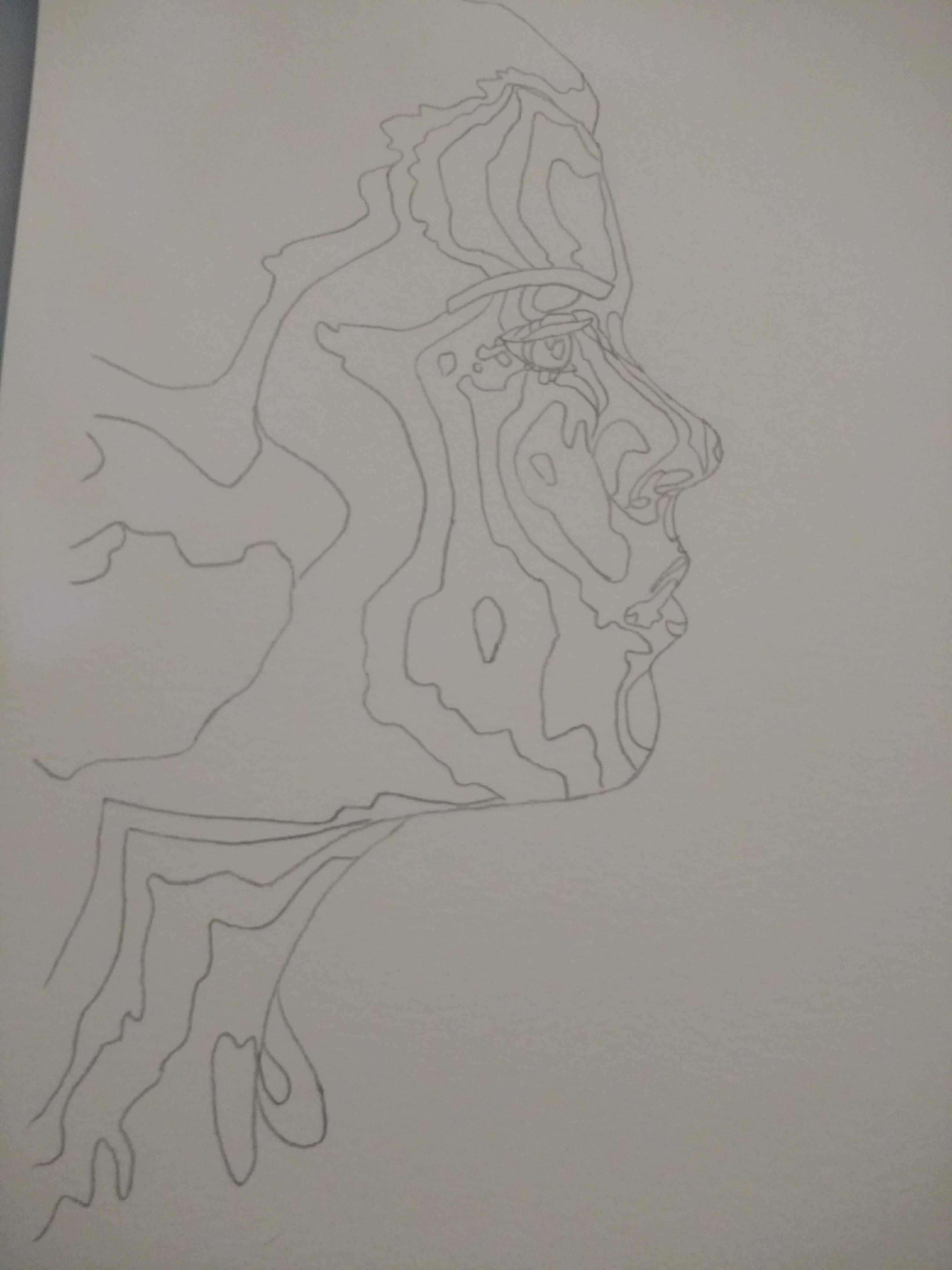
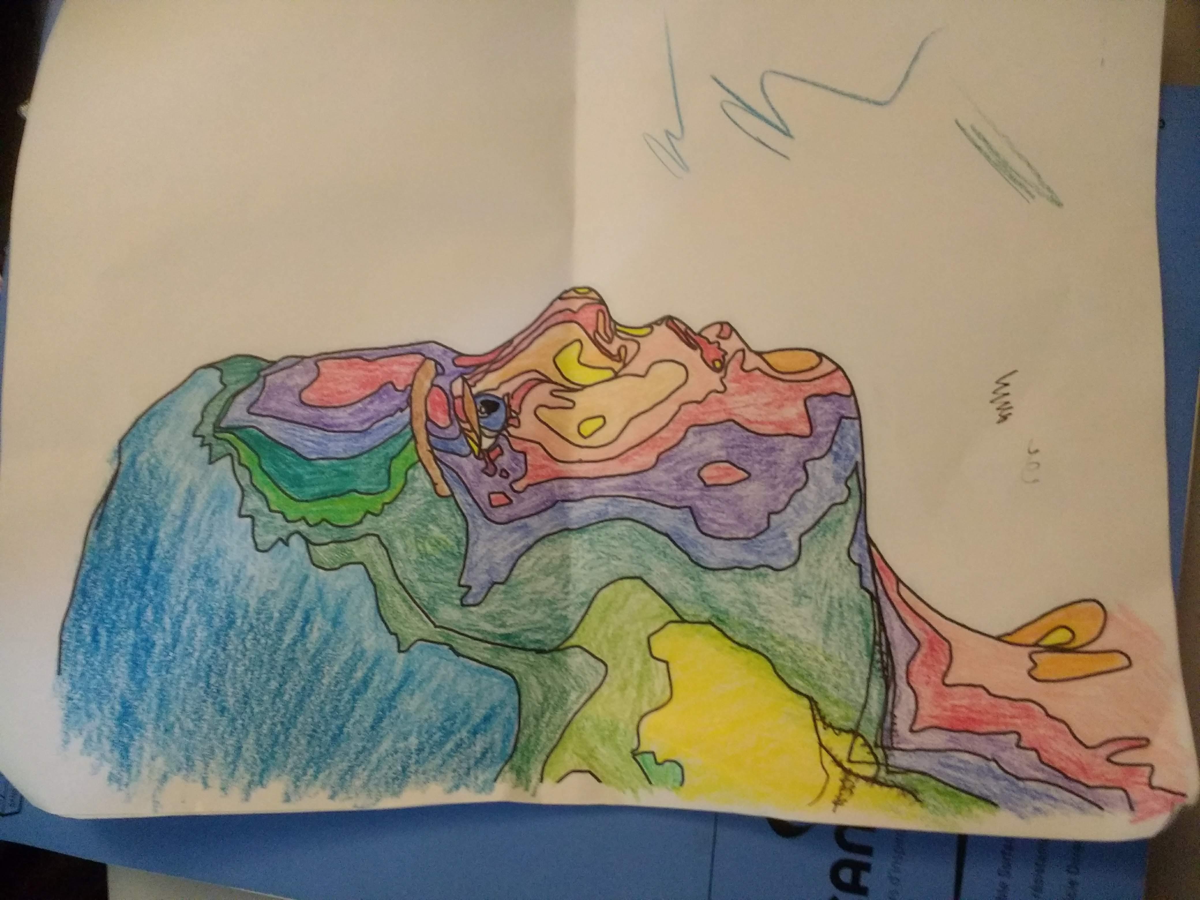
1) Tape your printed outline underneath your card stock. I used painters tape since I didn't want the tape to damage the paper when I removed it.
2) Using a light box, trace the outline of your subject onto your card stock. Use light lines, as this will be erased later.
3) Remove the tape from the two pieces of paper and double check that you transferred all of the details from the outline to your card stock.
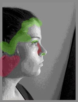
4) Using colored pencils, plan out what color each "section" of the subject will be. I began by identifying the highlights, or the parts of my skin where the light was hitting the most. As you can see, that was my nostrils and part of the cheeks. These two sections I colored yellow. Yellow, if mixed with blue, can become green and, if mixed with red, can become orange. Since the rest of my cheeks are rather highlighted in the reference photo I decided to transitioned to the brighter of the two options, orange. After shading in the adjacent section orange I shaded in the next section red and so on.
Adding Color
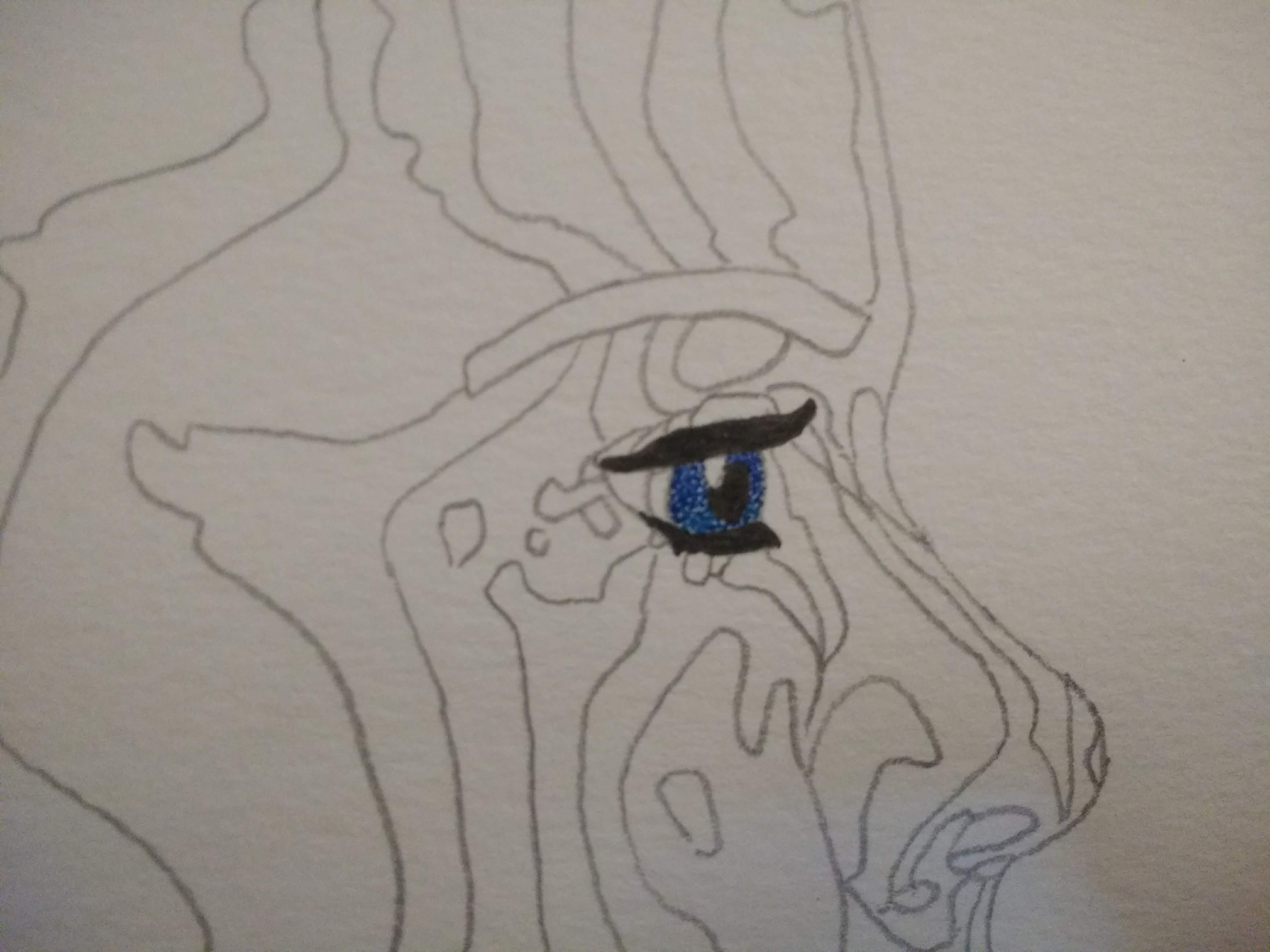
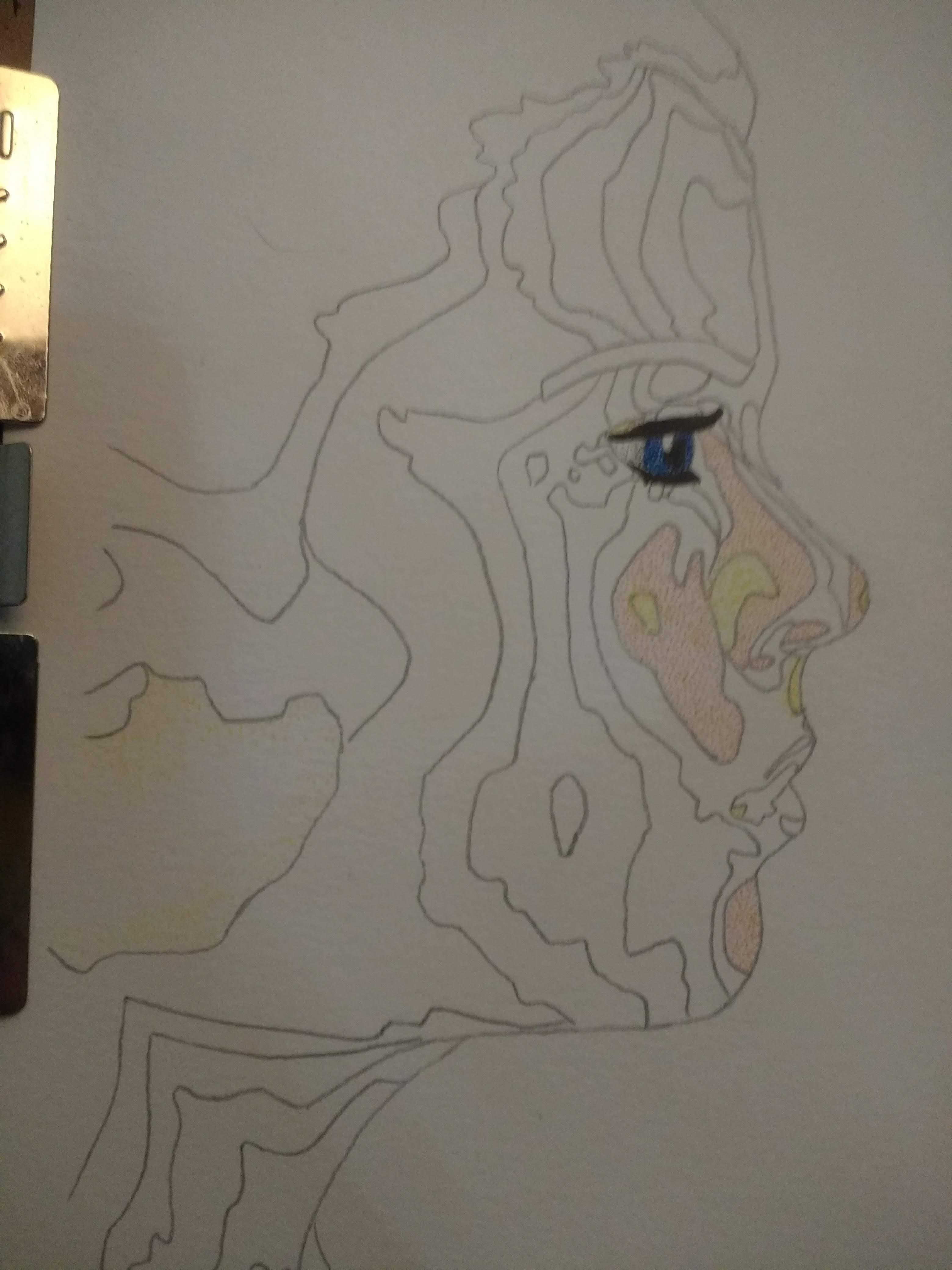
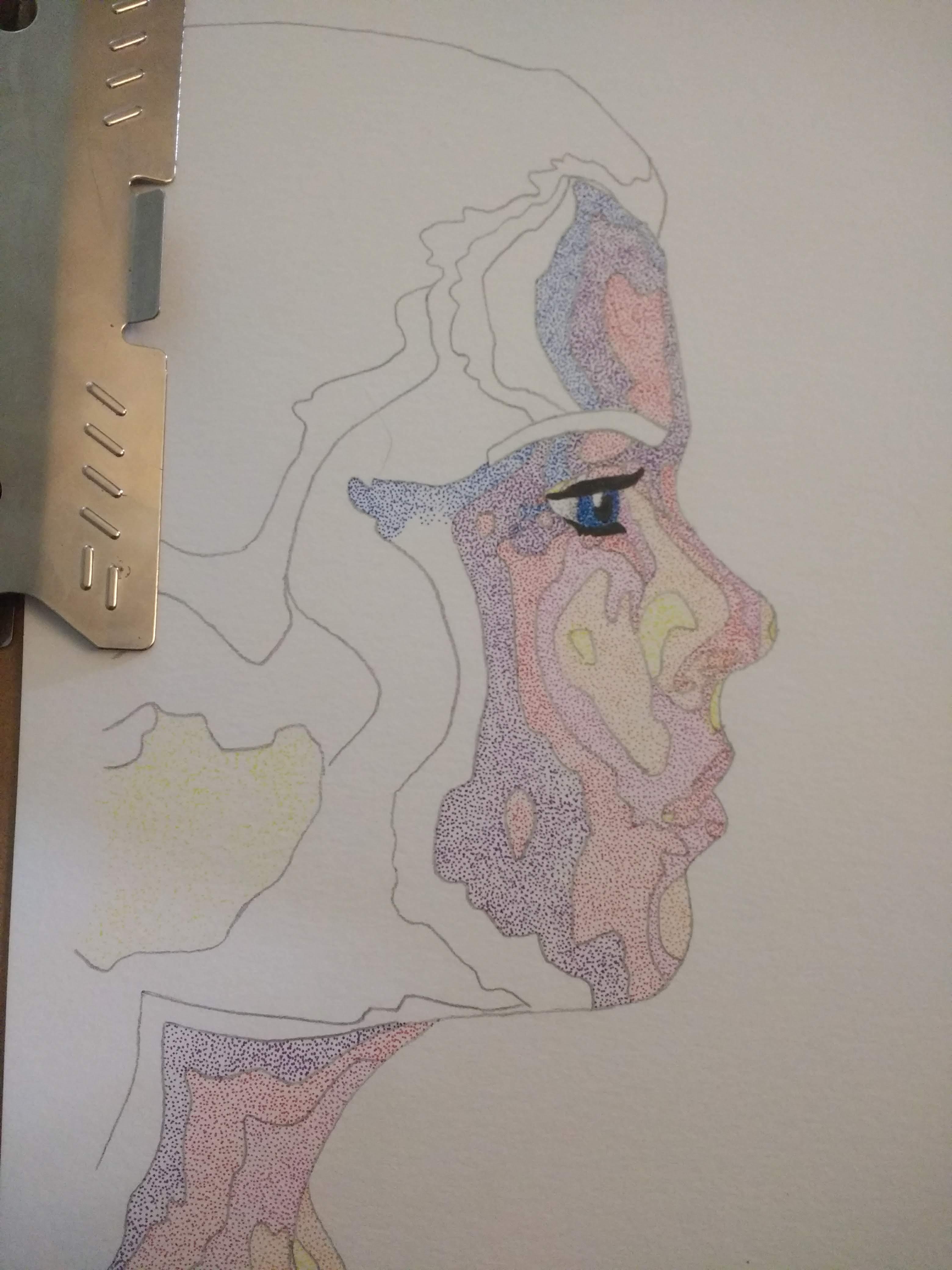
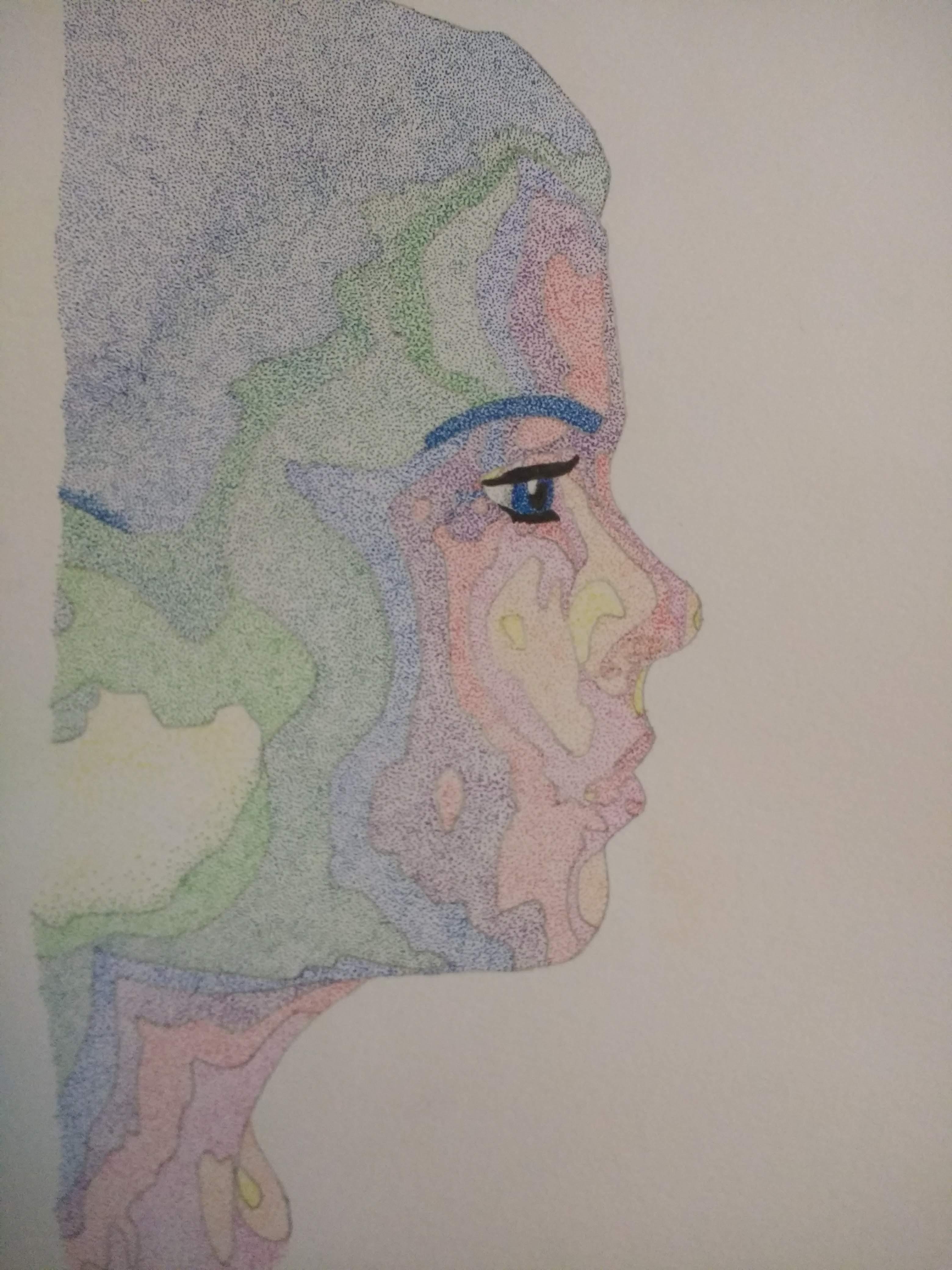
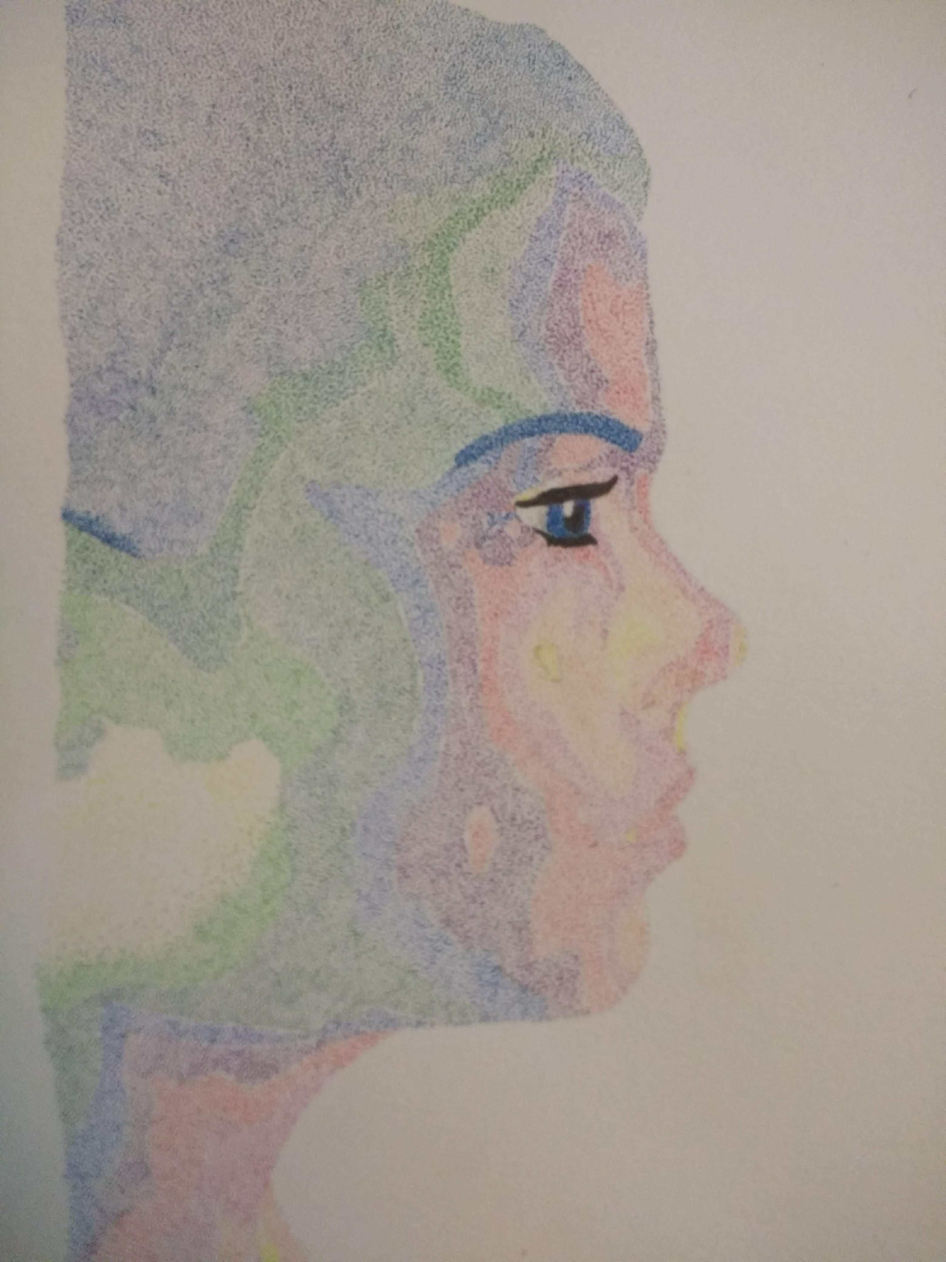
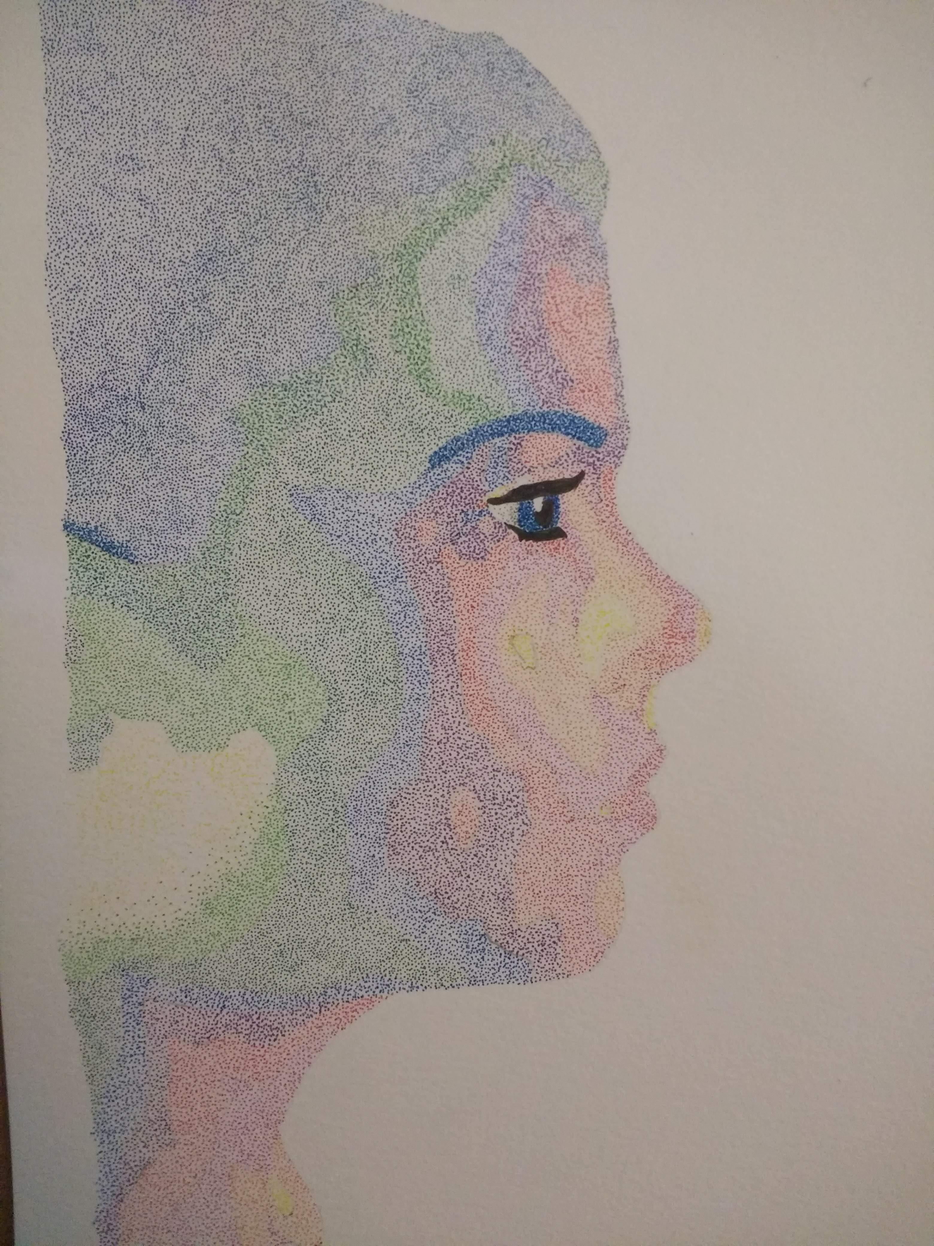
1) Add color to the eyes. I began here because I knew that it was going to be the part of the portrait that would make or break it. I used the light blue and the dark blue to create a "bright" look. I left a small oval on the eye blank to represent the light reflected on the surface of the eye. I used a black pen to shade in the pupil and the eyelashes.
2) Once I was satisfied that I had not messed up the eye, I moved on to adding a layer of dots in each section. Just like with the colored pencils, I began with the warmer colors (yellow and orange) and then moved on to the cooler colors (green and blue).
3) Once you have added a layer of evenly-spaced dots to all sections, you need to erase the pencil lines.
4) If you are like me, you likely did not apply any dots on top of the pencil lines. Now that the pencil lines are gone, fill in the space left behind with dots that match either adjacent section.
Increasing Color Density and Blending
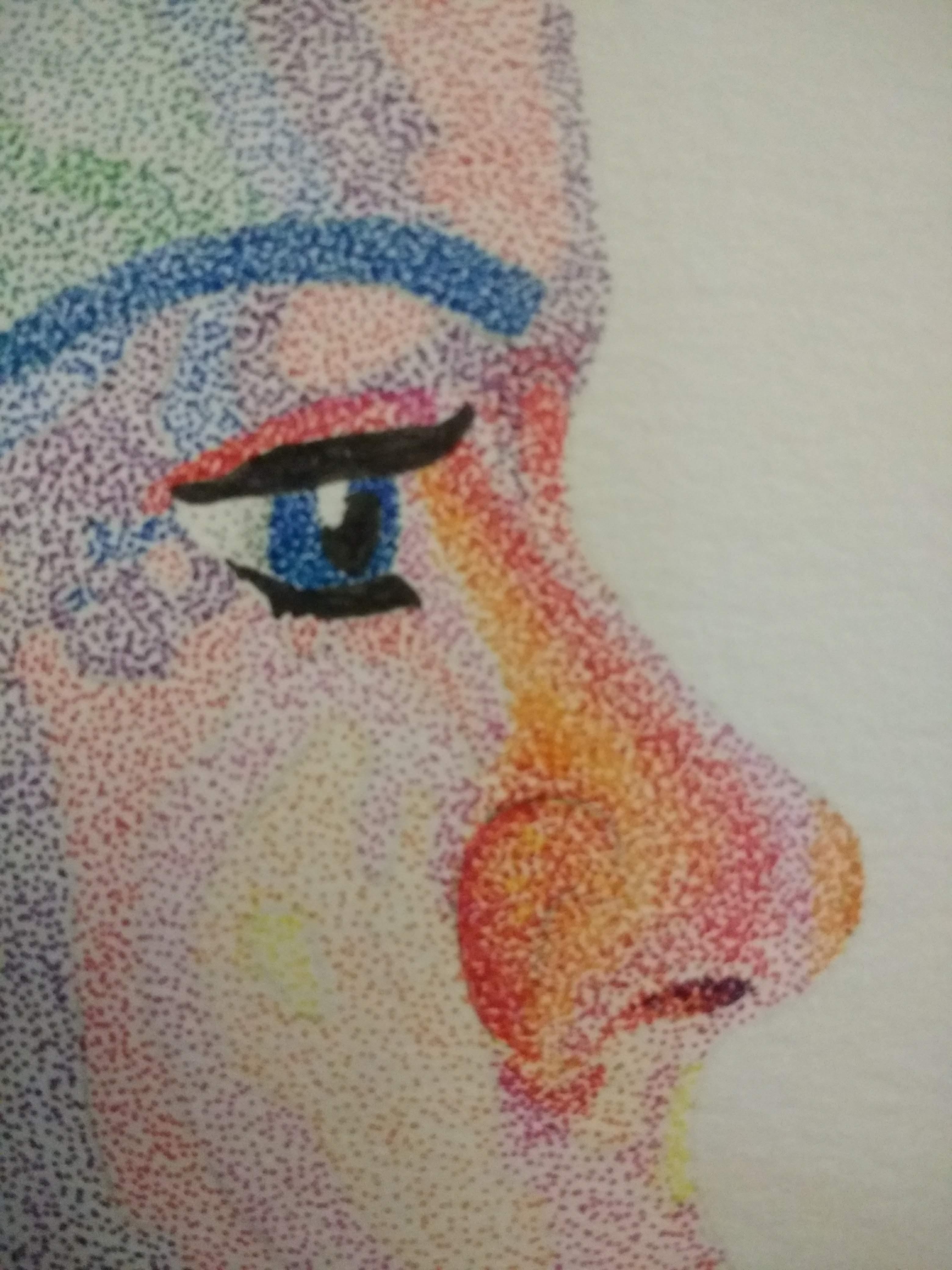
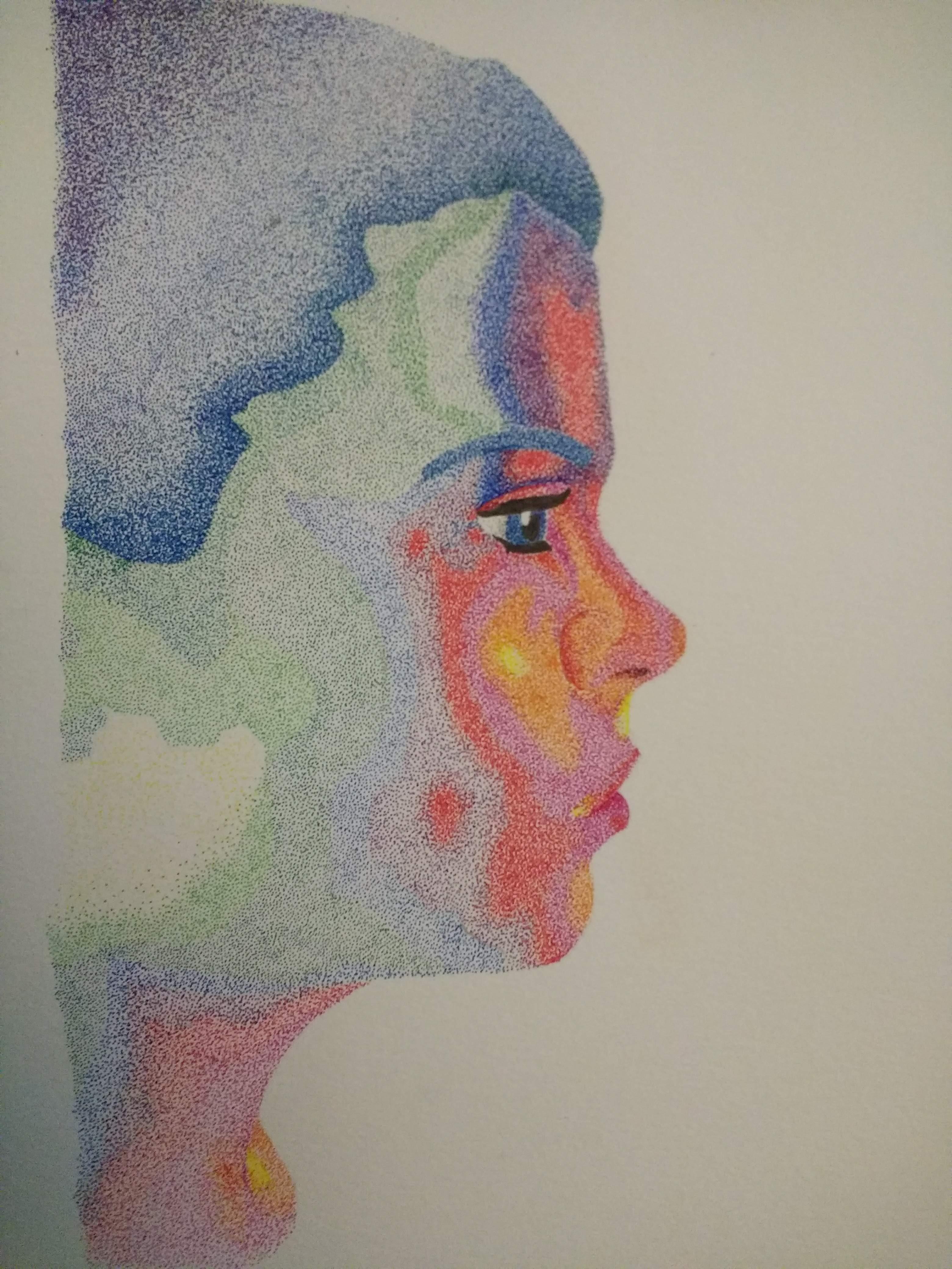
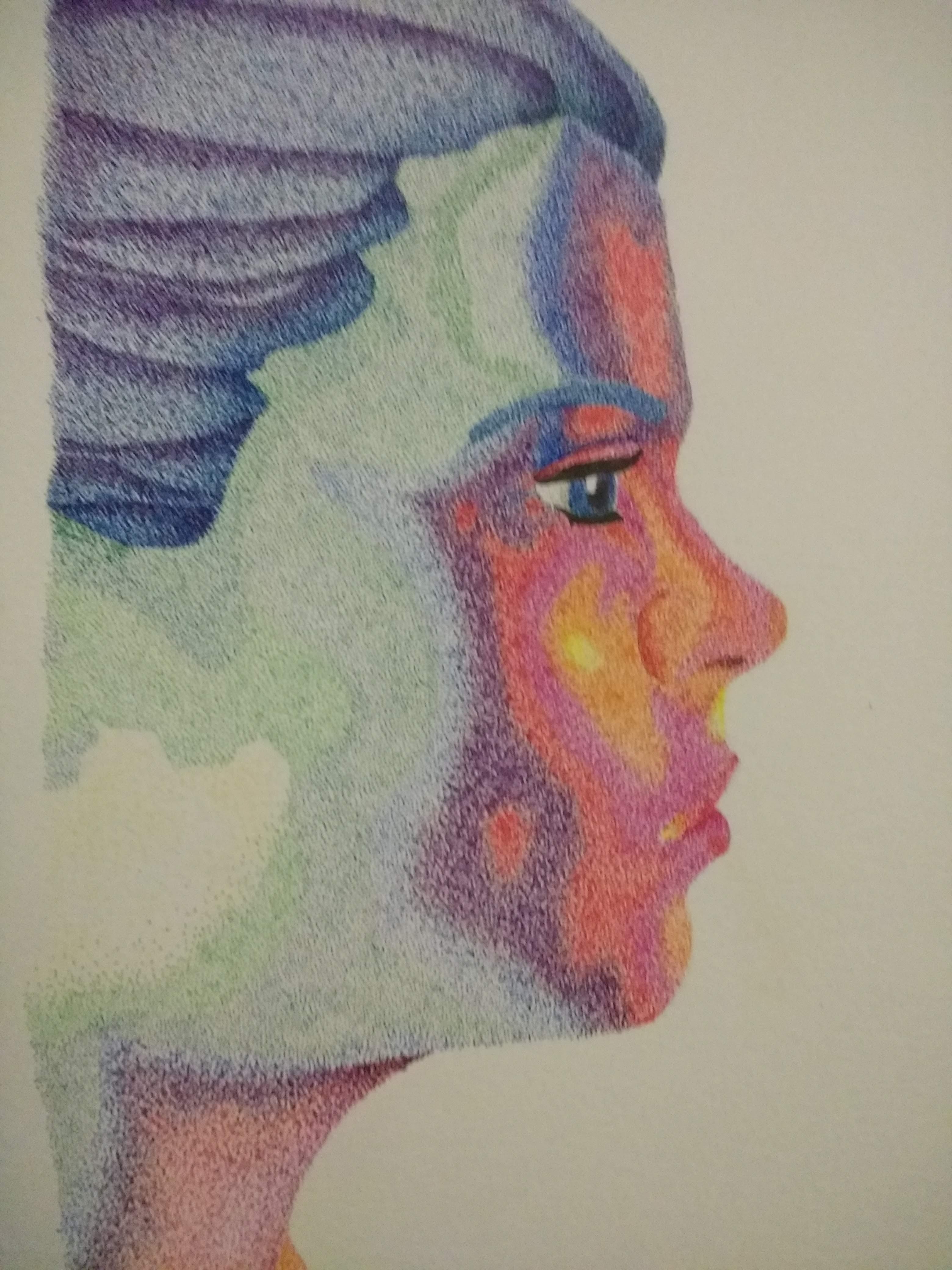
Beginning, once again, at the areas colored yellow, I simultaneously started to increase the color density and blend the adjacent colors.
Increasing color density: I achieved this by simply drawing more dots in areas that I wanted to have more color. Occasionally I would make the dots larger or apply light cross-hatching to an area. As I said previously, the more dots there are in a specific area, the more statured the color will appear.
Blending: Most of my face is composed of smooth curves, there are very few sharp edges. If I were to transition from green to blue, without blending, it would look very sharp and abrupt. In order to avoid this, you need to blend adjacent colors into one another. As you can see on the nostril in the portrait, I did not just draw red dots in the red "section". I added a scattering of red dots on the orange "section" and added some orange dots on the red "section". While adding red dots in the orange "section" I added more red dots the closer I got to the red "section" and visa versa. I used this same method to blend the edges between each section to create a smooth transition from one color to another.
Adding Shadows
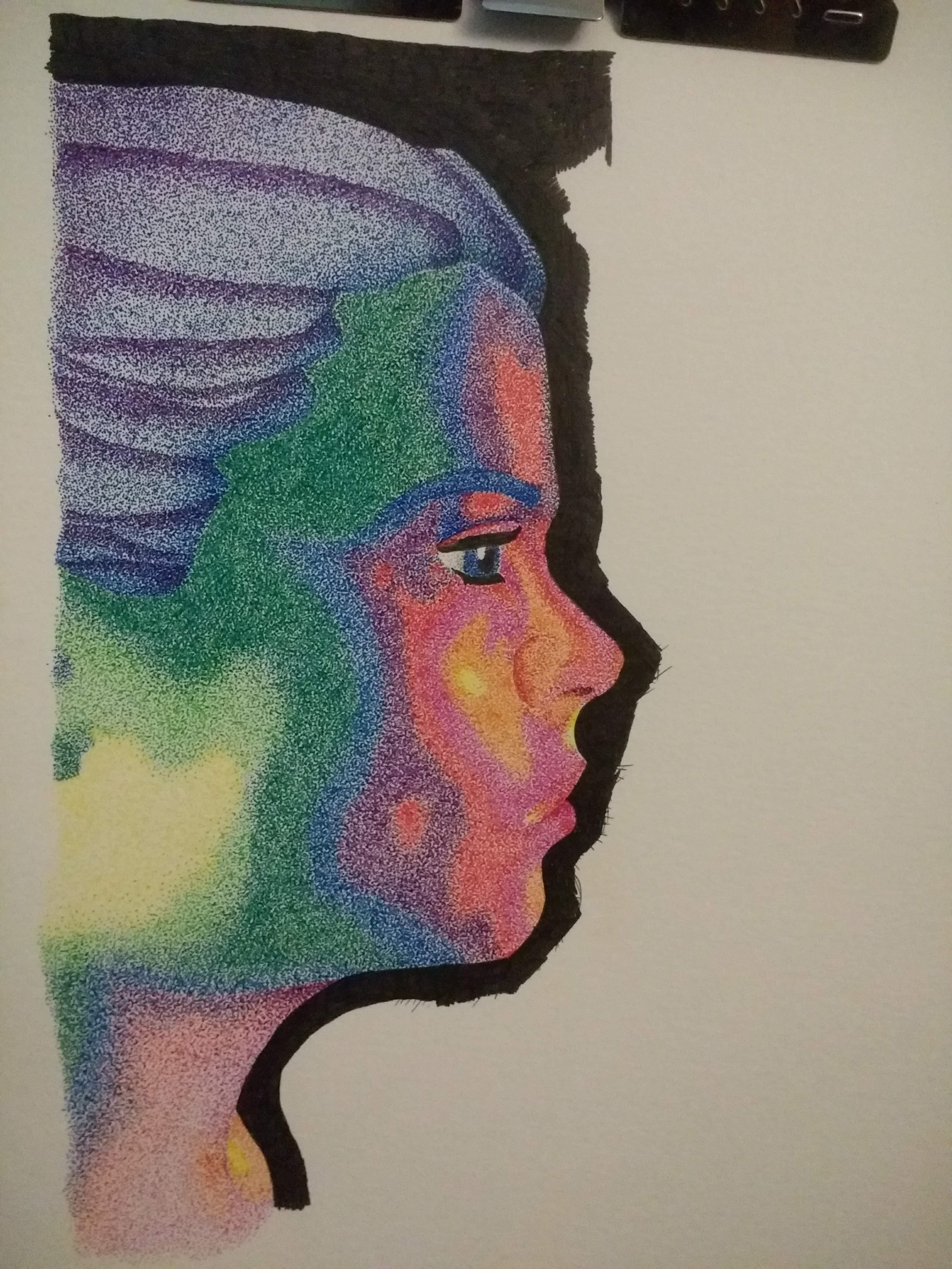

My final step was to use a fine point black ink pen and add a layer of dots to areas of the portrait where shadows ought to be. I had not initially planned on doing this, I had originally planned on increasing the density of dots to make the color more vivid. Unfortunately, this worked exactly as expected. I ended up with a very intense shade of green along the hairline which, unfortunately, did not resemble the natural shadows that you can see on the curves of a forehead.
1) Referring back to your reference photo, identify the areas of your portrait that would benefit from emphasizing the shadows. I had a few areas that I opted not to add shadows to because I thought it would be unbalanced (jawbone and nose). For instance, I did not add any shadow to the yellow jawbone area because I thought darkening the yellow would defeat the purpose of having the yellow there in the first place.
2) Using a fine point black pen, add small dots the areas you have identified. Add more dots to make the shadow appear darker. Check your reference photo frequently to make sure that you are not over-doing it.
Once you have done this you are done! I shaded in the background of the image to make the colors of the rainbow pop more. You can always go back and add more dots to adjust your image if you want to.