Pure White Background Photography Using Smartphone
by Antzy Carmasaic in Circuits > Cameras
369710 Views, 1628 Favorites, 0 Comments
Pure White Background Photography Using Smartphone
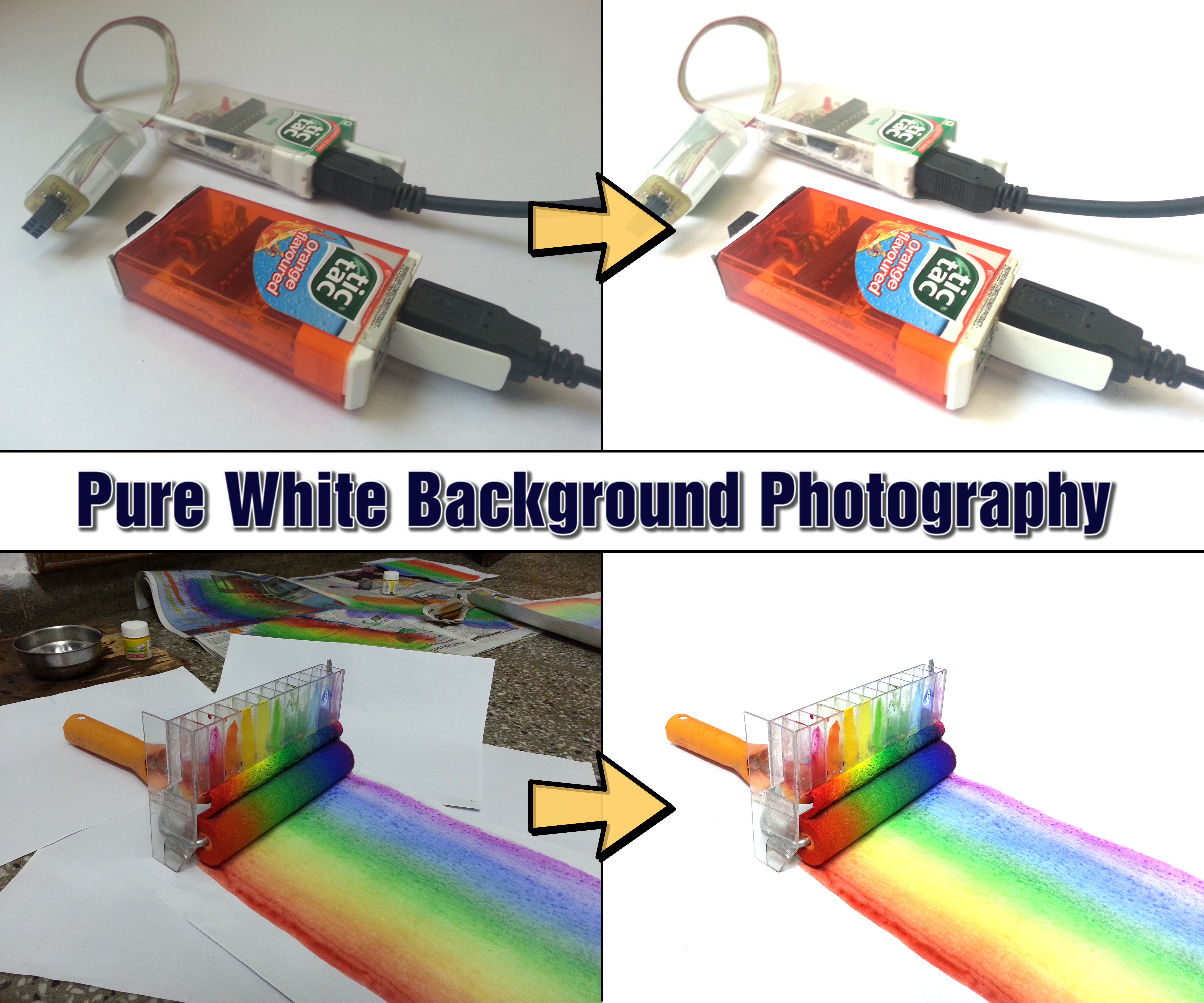
.png)
A picture is worth a thousand words, but not without some effort on your part. My first instructable was so ugly with dark and unfocused images that I never published it. I decided to go for quality over quantity and setting randofo's instructable quality as benchmark, I started exploring how to get photographs that can do most of the explaining for me.

Unlike most guides out there which assumed a lot of equipment, I had a few constraints:
- No DSLR camera: The only camera I had was the one in my smartphone.
- No light tent: I just want good images without much investment.
- No dedicated light source setup: I cannot turn off room lights also in use by others, or place a directional light.
- No Photoshop: It's pretty costly. So had to go with GIMP.
- No patience: When in flow during a build, it's very hard to stop at every step, setup the scene and try taking that perfect photograph. The process needs to be quick and effortless.
To overcome these constraints, I have read and improved upon information from the net and discovered a few tip-n-tricks, which are provided in detail in this instructable, along with instructional GIFs in every editing step. Believe it or not, every image I've taken for every instructable(except Speed Control for Hand Drill Press for which I borrowed a friend's DSLR) is taken using my old but trusty Samsung S3's camera. So professional looking photographs do not necessarily require costly professional equipment.
*All the images used for examples(except for the pear ones) are from my previous instructables.
** These steps are for Windows, Linux or Mac based GIMP. The mobile versions for Android and iOS are a pain. Will update the instructable with good mobile apps for getting the same results soon.
The Question Is, Why?
.jpg)
Q: Why go for a pure white background?
A: Because it looks super cool.
Q: Why does it look super cool?
A: Because...
- A white background bring the main object in sharper focus. There are no background items to distract the viewer's attention.
- Colors pop out! Everything looks more vibrant in contrast to white.
- Saves the hassle of choosing a background. Instructables like cooking recipes can easily use the kitchen counter as a background but not all fields are so lucky. The best background for an electronics project is a workbench. Unfortunately, during a project, there won't be a square inch of it devoid of clutter. So good luck getting a clean background. A white background eliminates the need for setting up the background and so images can be taken quickly.
Q: Where can these steps be used?
A: It can be used for showcasing products with great looking images on ebay, etsy, amazon etc. I use it for making my images beautiful for projects on instructables. Basically any place you want professional looking images for objects, this instructable can be used.
Attribution: Image taken from https://www.flickr.com/photos/21496790@N06/5065834...
Stuff Needed
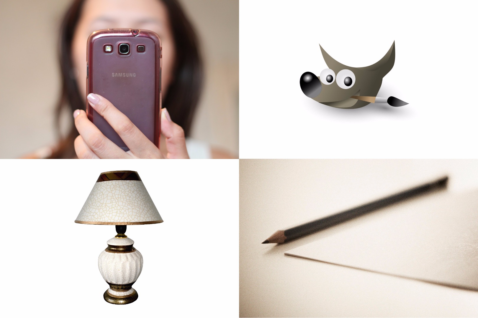
- A camera. Anything from your smartphone camera to a DSLR will do.
- A white sheet of paper. Size depends on the size of object to be photographed. A small object can make do with an A4 sheet but a larger object may need a larger sheet.
- A light source. You can borrow the sun.
- A PC or Mac with GIMP installed. GIMP is a free open-source alternative to photoshop. It is available for all major OS platforms. Download here.
- A pinch of perspective and creativity.
Taking Pic: Choosing a Spot
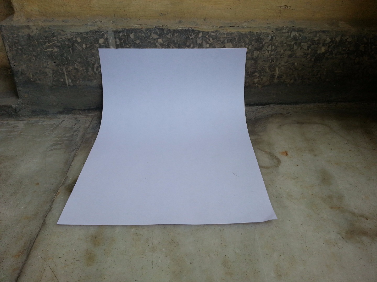
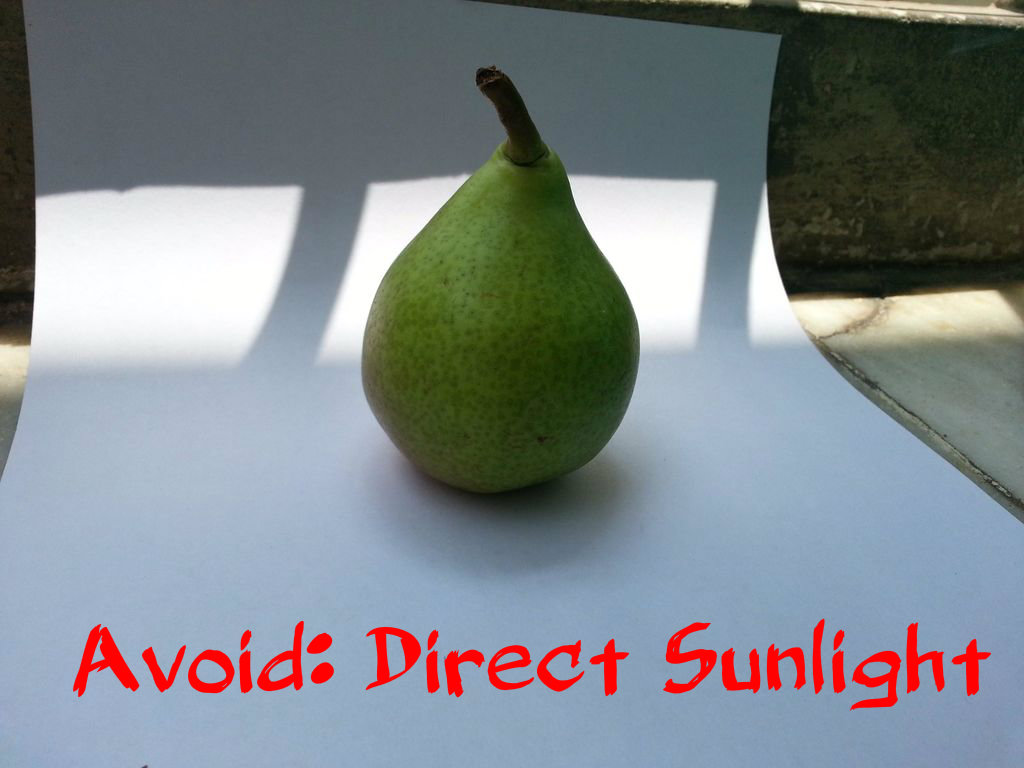
The most important aspect of taking a good photograph is lighting. I've found natural light to be the best source. Not direct sunlight(as shown in 2nd image) but a shaded area with enough diffused light from mostly single direction. If not all the images, I make sure to take at least the finished product images outside in natural light. The main image should be nothing less than the best.
Since most projects go on in workshop and taking the product outside every time is a hassle, I take almost all images indoors. Most of the time I do not have control over the lighting. The source is almost always a wall affixed tubelight, so instead of adjusting the light source, we must adjust the object and ourselves according to the light source.
- Choose a well lit spot. I've chosen a neglected corner of my balcony.
- There should be no objects casting shadow on it. In the image, notice there is a shadow on the right side but I've kept the sheet away from it.
- Choose a place where the wall meets the floor or table-top. We just need some vertical surface to prop the sheet against and walls work well. Alternatively, you can place an object of some height on a flat surface to provide support to sheet.
- As shown in image, place the white sheet of paper on the surface such that it curves gently and provides backdrop in both horizontal and vertical planes.
Here's an instructable to make a DIY photography backdrop.
Taking Pic: Place Object
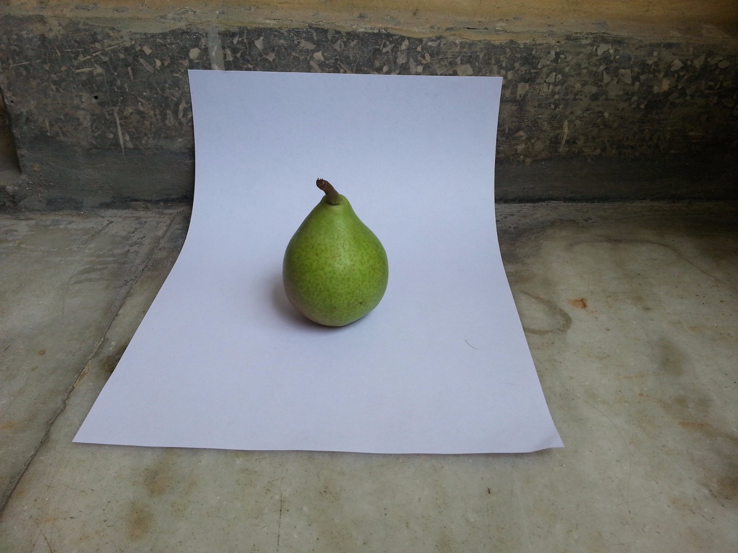
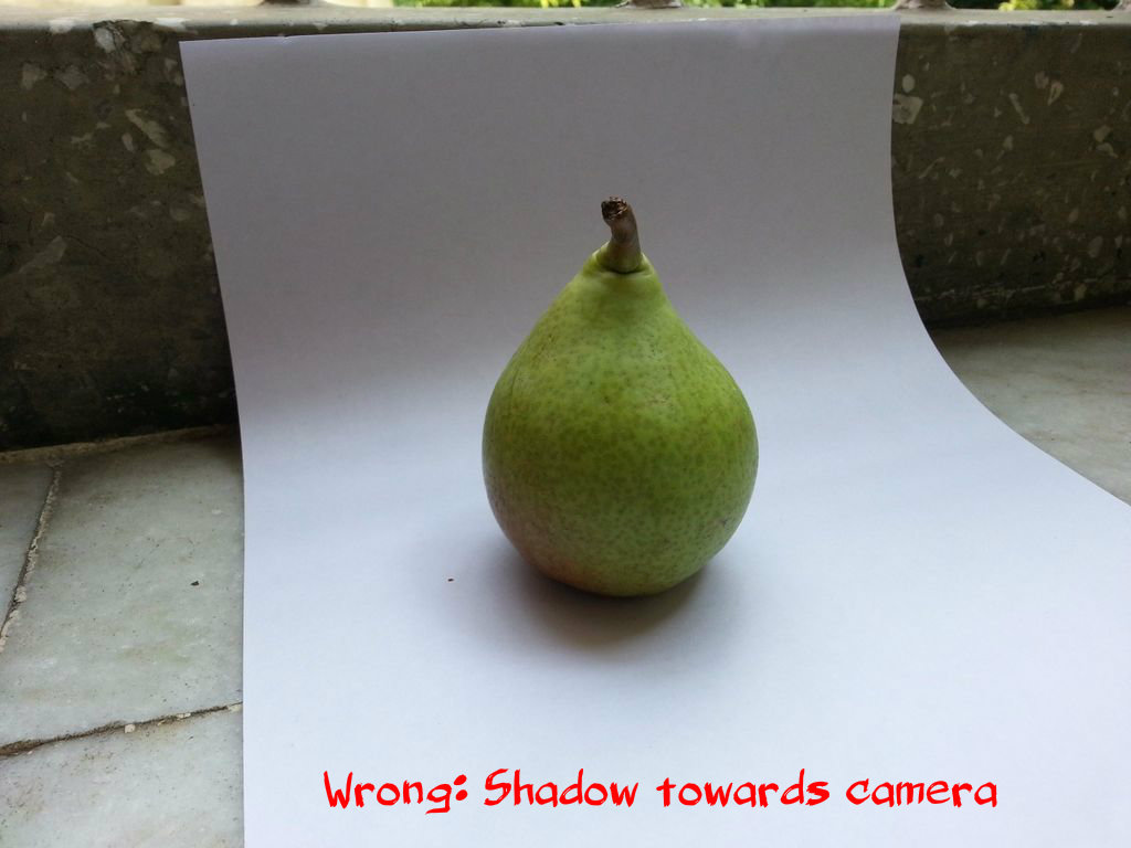
- Place the object in the middle of the white sheet. The face you want to capture should be towards you and should be getting direct light.
- Keep light above and behind you so the shadow of the item doesn't fall towards the camera(as shown in 2nd image), else you'll have the dark face towards you and an unappealing shadow. The best is a shadow that falls behind the object and slightly towards left or right. If you can't move the light source(especially if it's the sun), you need to move or rotate your spot.
-
Make sure the shadow of the item completely lies on the white area. If the shadow falls outside the sheet, you need to adjust the object's position on the sheet or get a bigger sheet.
- Try not to have multiple shadows. Turn off extra lights in the room if you're getting unwanted shadows.
Taking Pic: FOCUS!
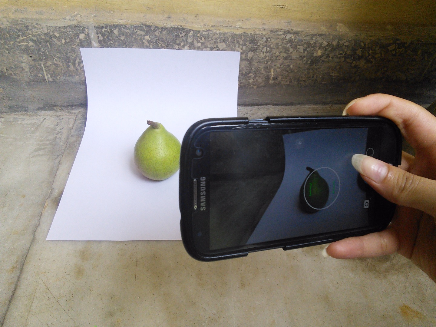
I can't focus on this issue enough, so I made a whole step for this. Keep the object in frame and tap on it to bring it in focus. Yes, your smartphone will bully you with it's amazing cutting-edge auto-focus technology, especially when trying macro shots, but keep it in perfect focus no matter what. If the auto-focus refuses to cooperate, try try try until you succeed. But don't take even a slightly blurry out of focus shot.
No matter how much of a great angle you got, if it is blurry, it is of no use. I've wasted countless beautiful shots to this demon. You find a great shot you took or find a need for later on(sometimes this is a single shot taken by mistake) but on opening the thumbnail, it comes out to be out of focus. So even if you think the shot you are taking is not the best, still keep it in focus. It might turn out of great use later on.
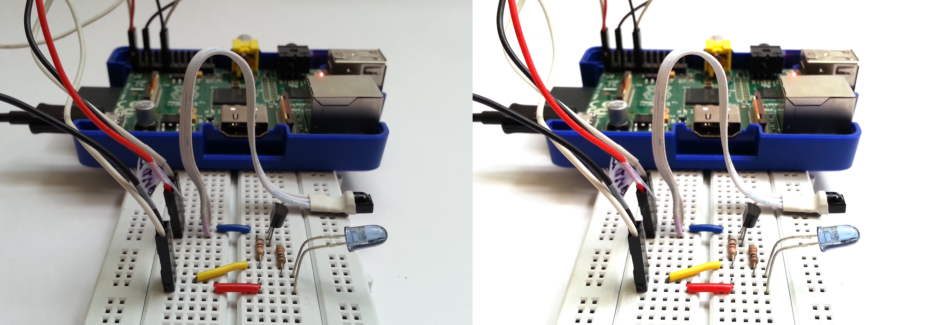
It's better to take a farther but in-focus shot, than to take up a close-up blurry shot. You can crop it later to get a digital zoom. The Raspberry/Arduino IR Instructable had really tiny components and whenever I tried taking a close-up, the camera wouldn't focus on it. I backed away a bit so the auto-focus can lock in properly and then cropped it to the area I wanted.
Taking Pic: Camera Placement
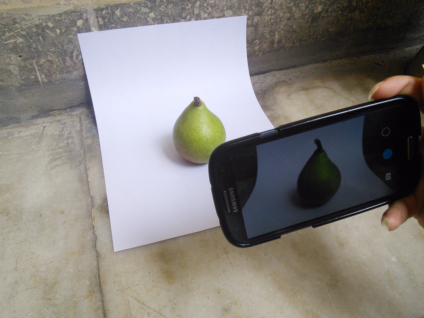
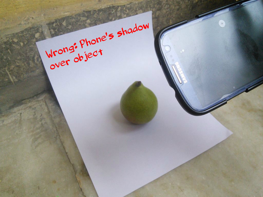
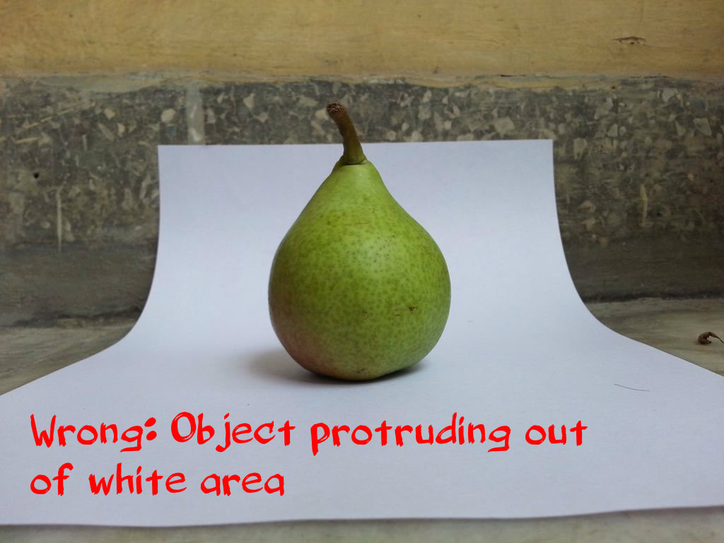
Time to get to the interesting part: actually taking the pic. But where should your camera be? It can be anywhere as long as it takes care of a few things:
- Before you start shooting, try out one thing right now. Pick up your phone and look at its camera. I'm pretty sure you'll see fingerprints on it. So clean those oily prints and dust with a clean cloth(i.e. your shirt) before picking up the phone to take a photograph. It obviously causes visible deterioration in your photograph quality.
- Make sure your camera's or your own shadow doesn't fall over the object or its shadow, as shown in the 2nd image. If you are taking a close up, and the light is behind you so the lighted face of objct is towards you, move the object and yourself closer to the light source so it is somewhat above and slightly behind you. That way your shadow will fall short of the object.
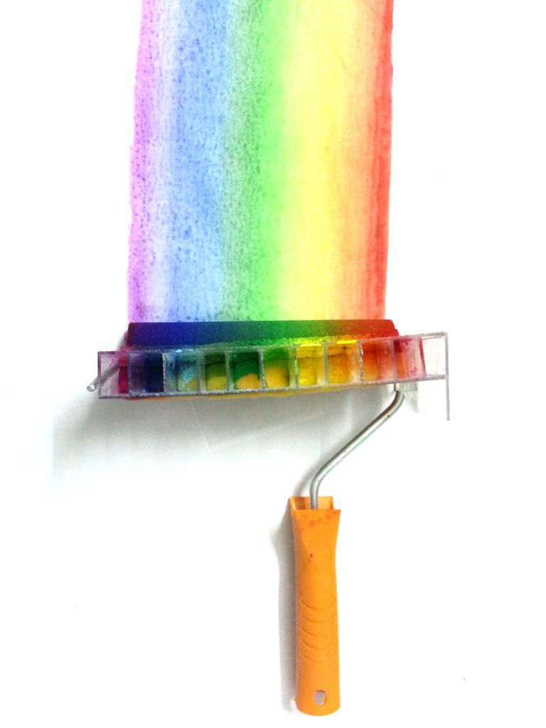
- Keep the object in front of white area in the picture. No part of it should protrude out of the white area in the image, as shown in image-3, else you'll have a difficult time removing the background while keeping the outline of item in shape.
- Take multiple images from all the interesting angles and even from non-interesting angles and keep them in focus. Sometimes the items in the step are impossible to bring to the exact current state once we move on with the project(e.g. a piece of carved wood which gets cut in next step). So it might not be possible to get images for this step once past it. So take as many images as possible. Sometimes the shots I thought would be boring came out the best after editing(the latest example is the top view shot of Rainbow Roller. I didn't like it while taking it so only took a single image and moved to other angles. After editing, it came out looking so good that I made it the thumbnail for the video). And you'll curse yourself if it is out of focus, so KEEP IT IN FOCUS!
That's it for taking the photograph. On to image editing. If you're making a cooking project, you can devour the delicacy now before editing, especially if hot. The pear was juicy sweet by the way... ;P
Editing: Whiten
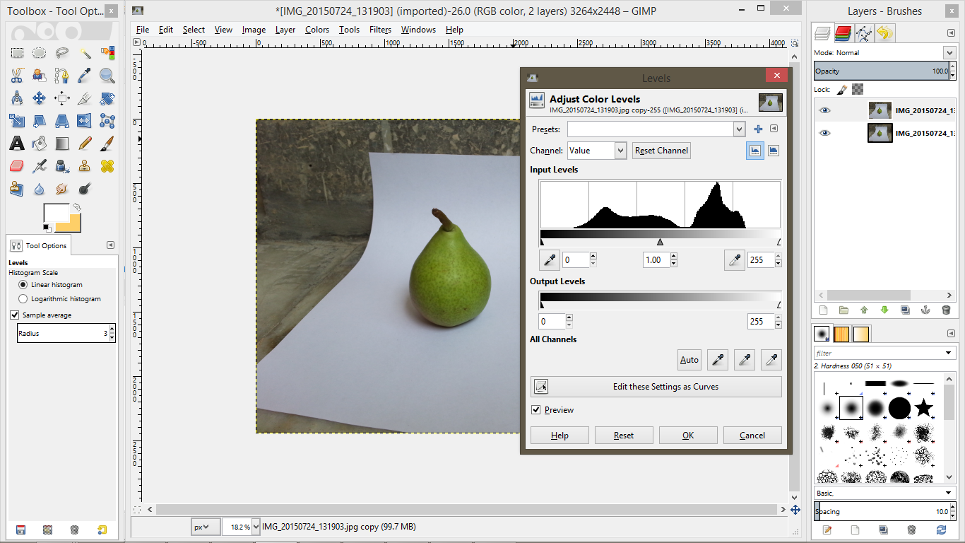.png)
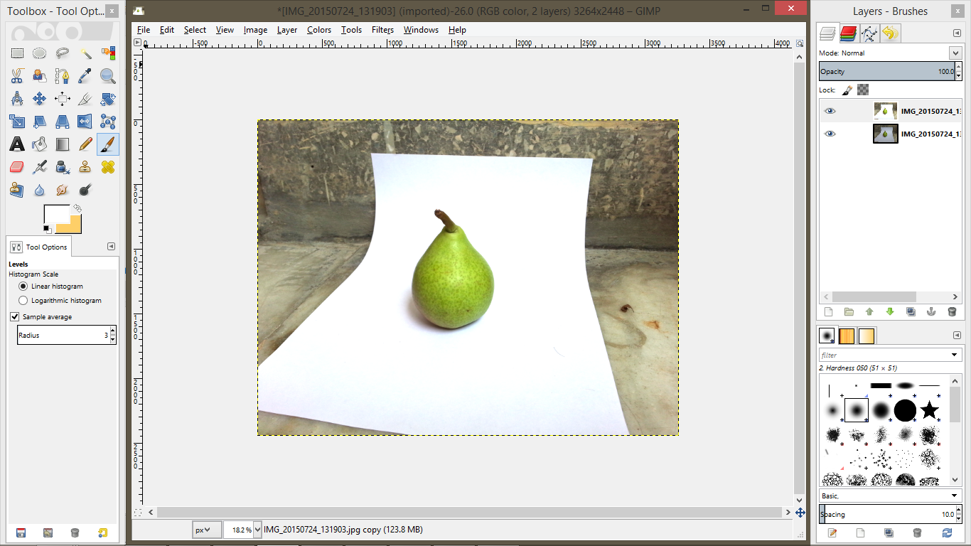.png)

- Install GIMP. Open the image in it.
- Right click on the image layer in the panel on right and duplicate it(for safe-keeping).
- Select the topmost layer(should be selected by default after duplication).
- Go to Colors->Levels.
- Drag the rightmost triangle under the graph towards left slowly. As it is dragged, the image becomes whiter.
- Drag till the area surrounding the object becomes perfect white.
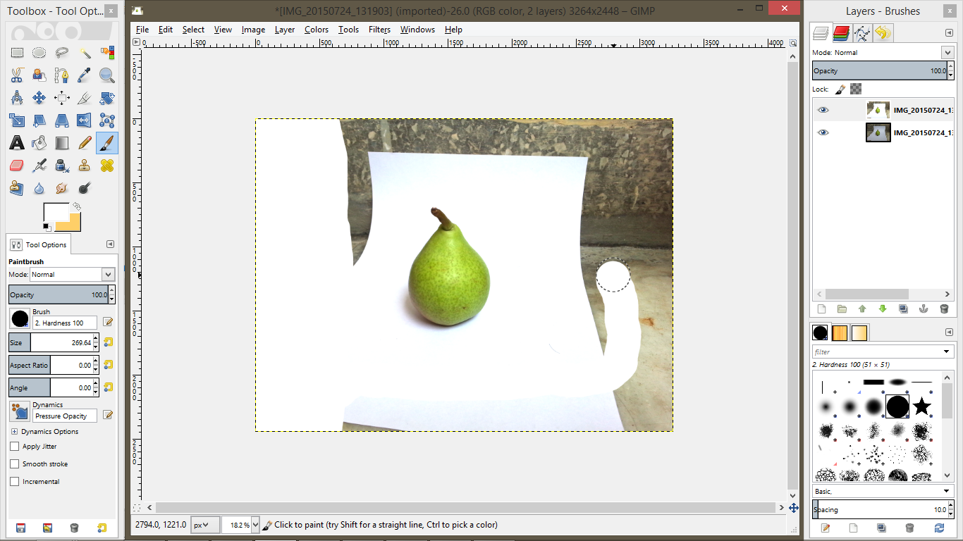
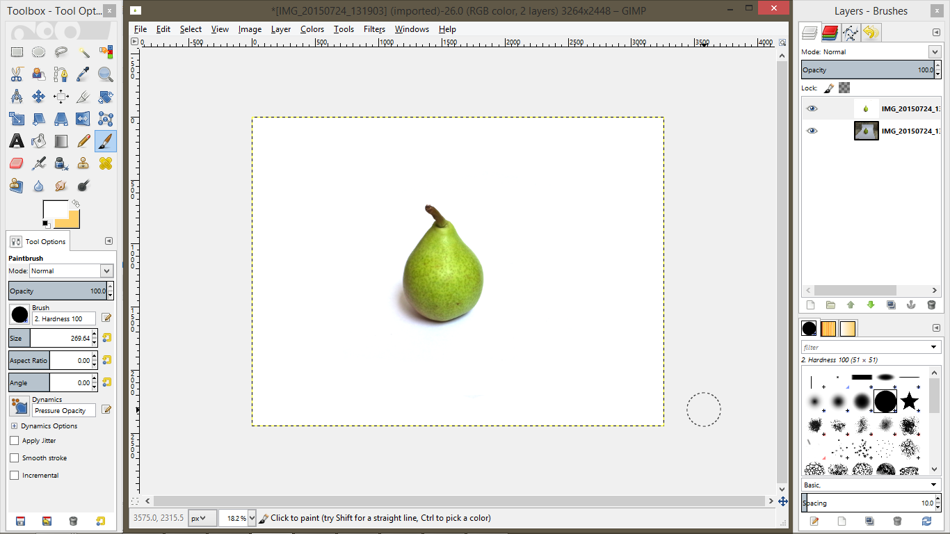
Editing: Clean Background
.png)
.png)

- Select the paintbrush tool or just press P.
- Make sure Opacity is 100%.
- Select the hard round brush.
- Increase size to something comfortable.
- Start cleaning the area around the object till everything is white in the background.
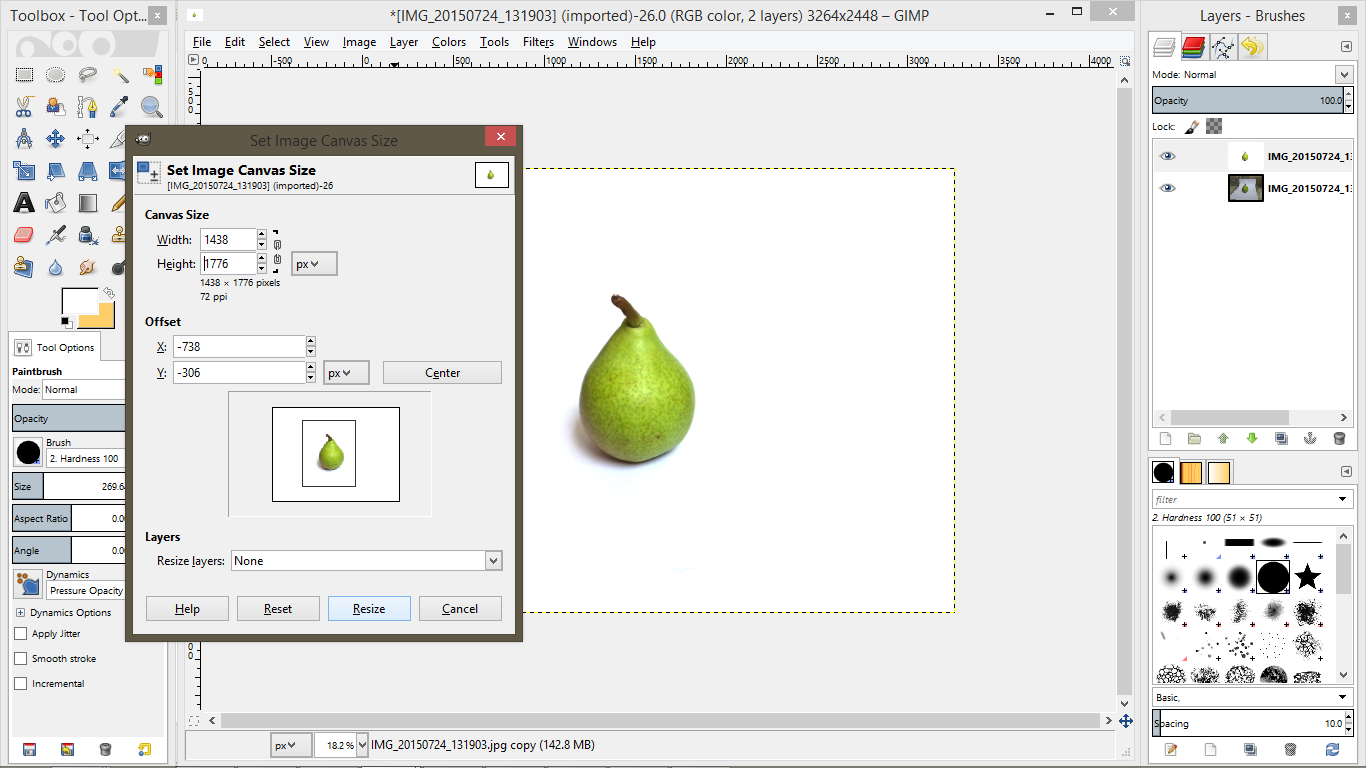
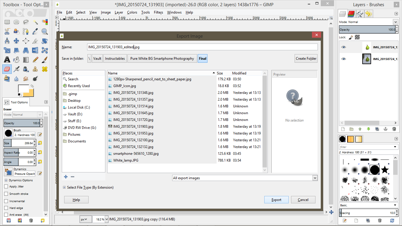
Editing: Resize and Export
.png)
.png)

If you have a lot of white space left about, like in the pear image, crop it to size and export the image to the format of your choice.
- Go to Image->Canvas Size.
- Reduce the height and width according to taste.
- Move the crop window to get the object within the window(watch GIF for detailed info).
- Click Resize.
- Go to File->Export.
- Select the folder to export the file.
- Give a file name you like. The extension at the end decides the type of file. Use .jpg, .png, .gif etc.
- You're Done!
Editing: Shrinking Image Size for Web
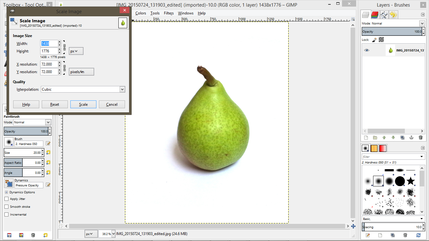.png)
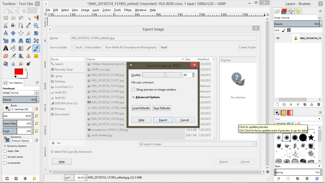.png)

If you require a smaller image for uploading to the net, there are 2 options:
1. Go to Image->Scale Image. Reduce the width or height and the pixel width and height will change. Keep the link icon to the right of width-height textboxes linked(should be linked by default). This ensures the width and height scaling maintains their ratio and the image doesn't shrink in only a single dimension. The final image will have lesser pixels and so lesser size. But reducing it too much will reduce picture quality as fewer pixels can only hold lesser image data.
2. While exporting the image to .jpg format, the next image format window lets you change the final image quality. Change the value to a lower one to get a smaller image size. The pixels size of the image will remain the same, only the image will get kinda blurrier as you reduce quality.
You can use a combination of these 2 steps as well.
Editing: Transparent Objects
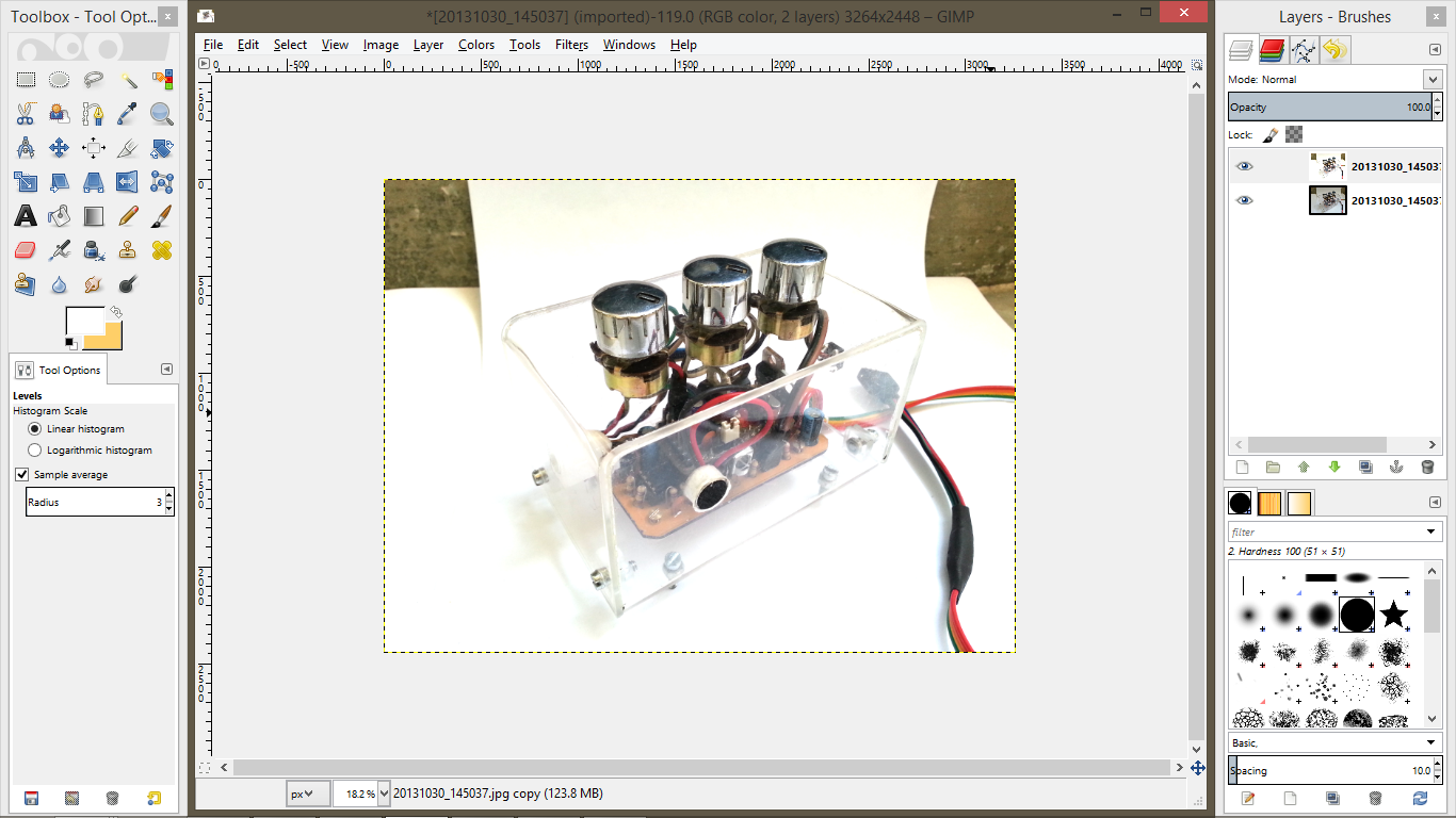.png)
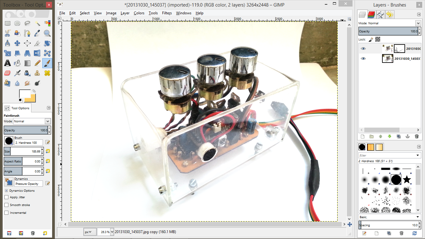.png)
.png)

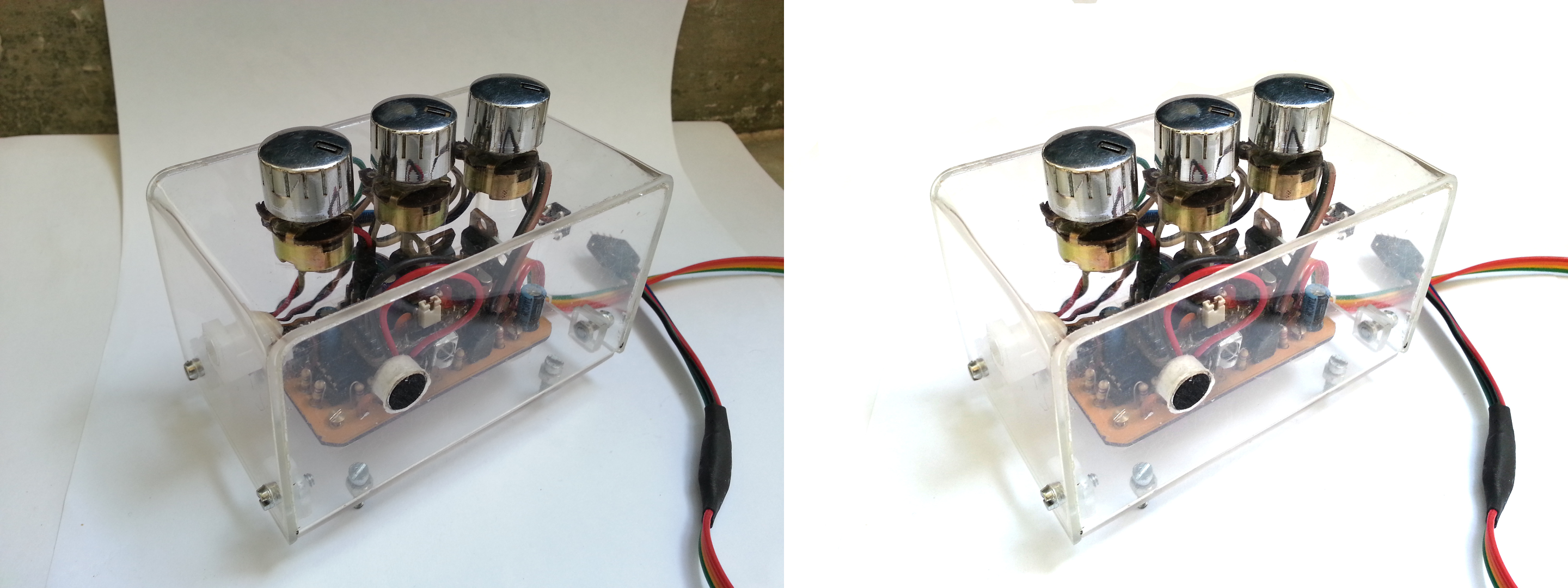
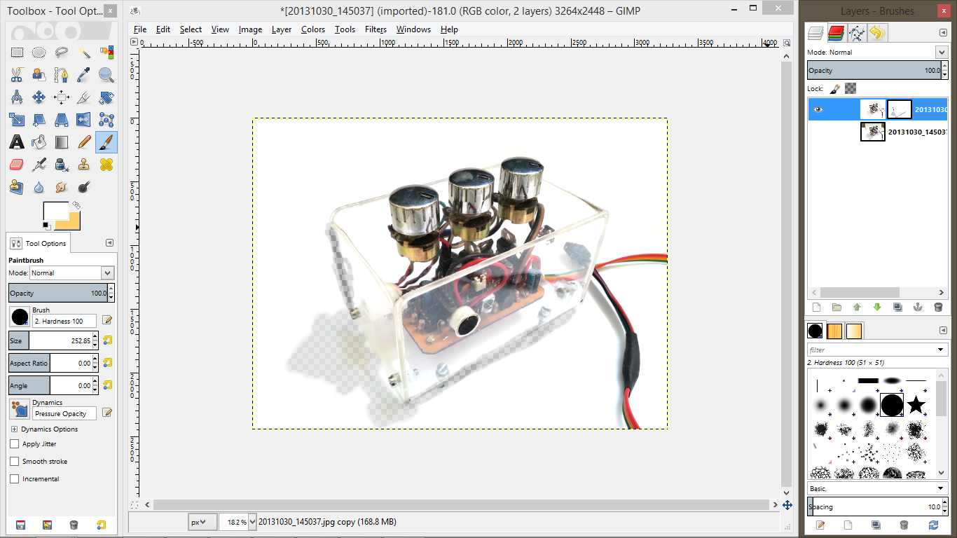
This is a slightly complex technique. When photographing transparent objects such as acrylic or glass, whitening the image also makes parts of the object invisible. This can be more or less fixed by using masking:
- Start by the duplicating the image as usual. The mystery behind image duplication will be revealed here.
- Go about the usual steps for whitening the image. You'll notice that when you try whitening the area around the transparent object, some of its areas fade to white and turn invisible. Don't fret about it.
- Click on the eye icon on the current top layer to hide it from view. You will see the original darker image.
- Select the other original layer so edits will be made to that layer instead of the new hidden one.
- Now whiten this layer as well. But choose to keep it slightly dark by opting for a slightly greater whitening value. I chose 170 for the first layer and 188 for this one. Make sure the previously invisible area is now visible.
- Unhide the top layer and select it.
- Right click on the top layer and select Add Layer Mask. A new white box appears next to the layer's thumbnail and is selected by default.
- In the window that pops up, select White (full opacity). Click on Add button.
- Click on the Paintbrush Tool.
- Select the softest round brush.
- Keep the brush size to a small value so you do not darken the area around the intended one by mistake.
- Set opacity to a value below 50%. 25% is a good safe value.
- Set foreground color to black.
- Zoom in to the invisible area you want to fix.
- Pass over the area to be fixed a few times with the brush. The hidden parts of the image will slowly appear.
- Zoom out and repeat for any other areas you wish to fix. I darkened the shadow a bit as well.
- Now select the layer thumbnail for the whiter upper layer. You will now switch from editing the layer mask to the image.
- Whiten the useless background areas as shown in Clean Background step. Remember to set the foreground color back to white, opacity to 100%, set the brush type to hardest round brush and increase brush size.
- We're Done!
Explanation is in order for the steps above. Layer masking is the technique of turning parts of a layer transparent. The layer mask will cause selected parts of the upper image to become transparent and reveal the darker layer underneath. Just like masking in physical world, you cut away(or turn transparent) parts of a layer to reveal the layer underneath. But you also have the option of setting the amount of transparency to add by setting the opacity of the brush.
White in the layer mask means full opacity, the bottom layer completely hidden by top layer. Black pixels in layer mask will turn those very pixels in the upper layer transparent. As mentioned, grey means partial transparency and setting lighter or darker grey sets the amount of transparency. If you turn the darker layer invisible, you'll see the checkered background representing transparency through the layer masking parts which you blackened.
Tip: Quick White Backdrop
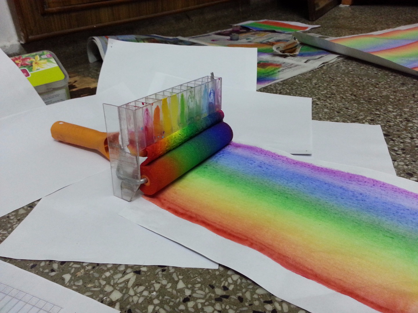
You're in the middle of a project, need to take images of the current step but your project has become bigger or you need an angle which requires a bigger sheet of paper. But there's none available and a trip to the store means a break in the flow. Asking someone to bring it for you means waiting for them to return and til then unable to move to next step.
Here's a trick I found out for such a situation. Lay down multiple A4 sheets to create a bigger white backdrop. But there are a few things to keep in mind:
- the places where the sheets overlap, there will be dark lines. Make sure these dark seams aren't intersecting with your object. For that, keep the object in the middle of a single sheet and then spread others around.
- No part of the shadow of the object should fall on the seam. Cleaning up a line passing under the object is much simpler than one passing through a shadow. The shadow is a dark area and the line makes it darker. I've tried lightening, blurring, smudging but have been unable to remove these from shadows.
The second image shows these dark lines passing through the shadow. Since this was the picture mentioned before which I took without much thought but found appealing later, I didn't really look at this aspect until I reached the editing stage. As I only had one shot of this angle(the alternative being filling up roller with paint again and setting up the shot again), I tried slightly lightening the lines. But the lines in shadow are clearly visible.
badideasrus left a comment suggesting that the shadow area around the lines can be copied and pasted over the lines on another layer to remove them. You can then blur the edges to merge the copied area with the original. Another alternative to blurring is to right click on the new layer with the copied portion, select Add Alpha Channel, and then use the Eraser Tool with soft brush type and low opacity to gradually merge the edges with that of the original.
Tips From Comments
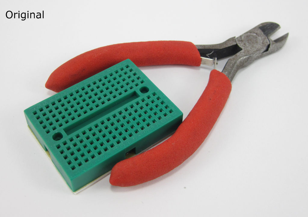

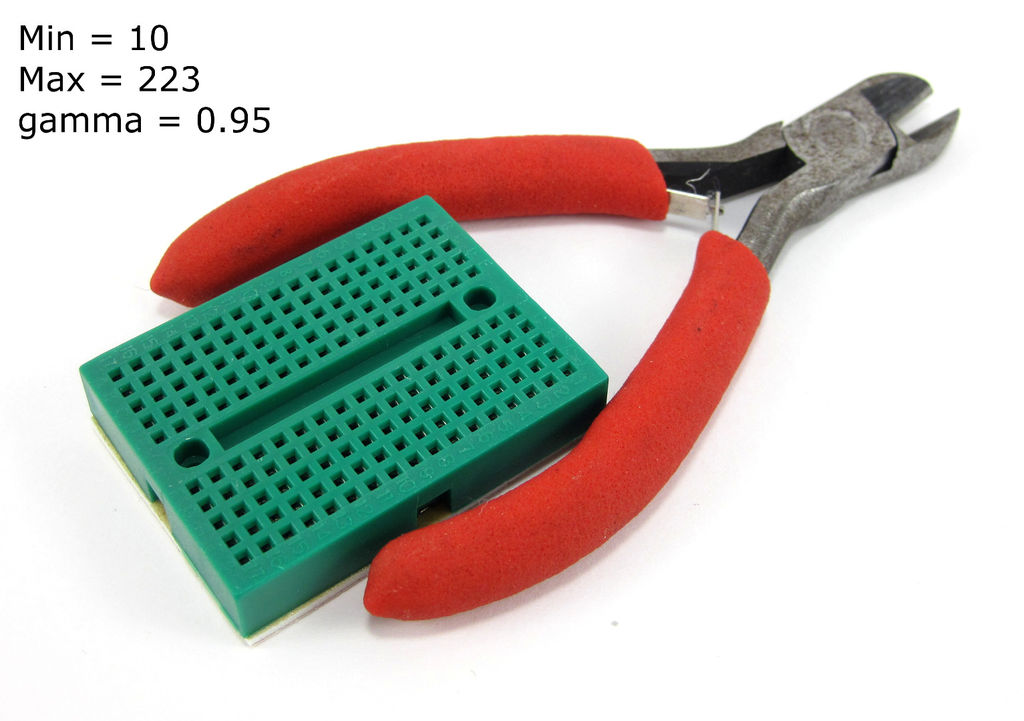
The overwhelming comments I've received made me add this step for collecting all the great tips provided by other members and prevent them from being lost in the comments section. Here are some of the best tips and tricks shared in the comments:
As discussed in comments, the edited images seem slightly over-exposed when compared with the original, but look ok in isolation. So keep the try to whiten the background in the Step-7 Editing: Whitening while keeping the value to max to prevent over-exposing it.
Ben Finio provided a useful tip if you're finding your image to be over exposed. In step-7, in Colors->Levels window, increase the value of leftmost triangle to around 10 to reduce over-exposure. You can also reduce the value of middle triangle(aka gamma) to around 0.95 to get a better looking image. These values were used by him and I tested them to be working pretty well. The 3 images of green breadboard with wire cutter are also provided by him.
He also helpfully suggests that some newer smartphones have a manual mode using which you can manually increase the exposure while taking the photograph. That helps you get a whiter background to begin with instead of the grayish background you'll get if your lighting isn't good.
badideasrus also provided a few nice tips. For Step-8 Editing: Clean Background, you can use lasso tool so select the area around the object and then click on Select->Invert. This will select the area around the object which you can now delete using the delete key. If the deleted area turns transparent, paint it white using the Bucket Fill Tool. This is quicker than using a big brush for cleaning area(but I like the dramatic effect of the background being wiped clean).
aRBemo explained file formats:
- GIF : use when pictures only use a few colours (like buttons or graphics) as it only stores up to 256 colours. Also allows you to make animated images like the ones used in the Editing steps of this instructable.
- JPG or JPEG: use for photos if you can afford to lose detail due to compression (i.e. for the web). Most widely used format and provides smallest size image with almost all detail.
- PNG: use when you want to keep all the detail and pin sharp lines with no pixellation. Images are larger than jpg.
Some Examples


.png)
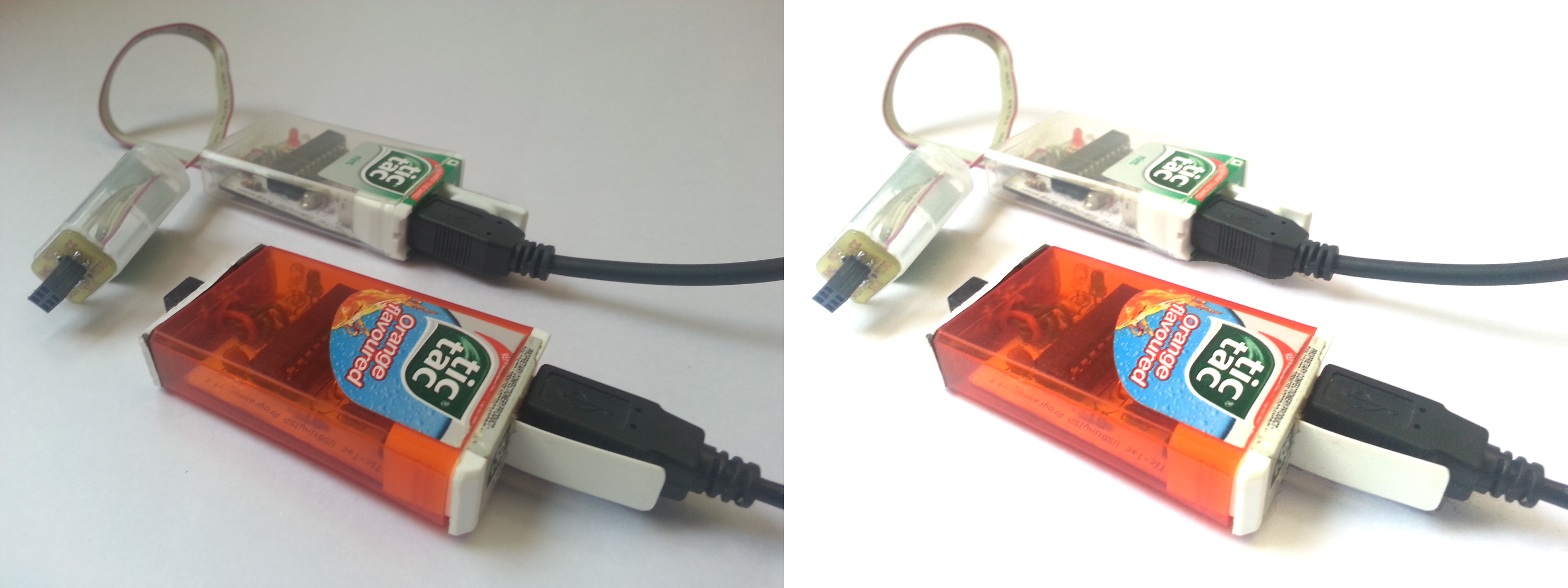
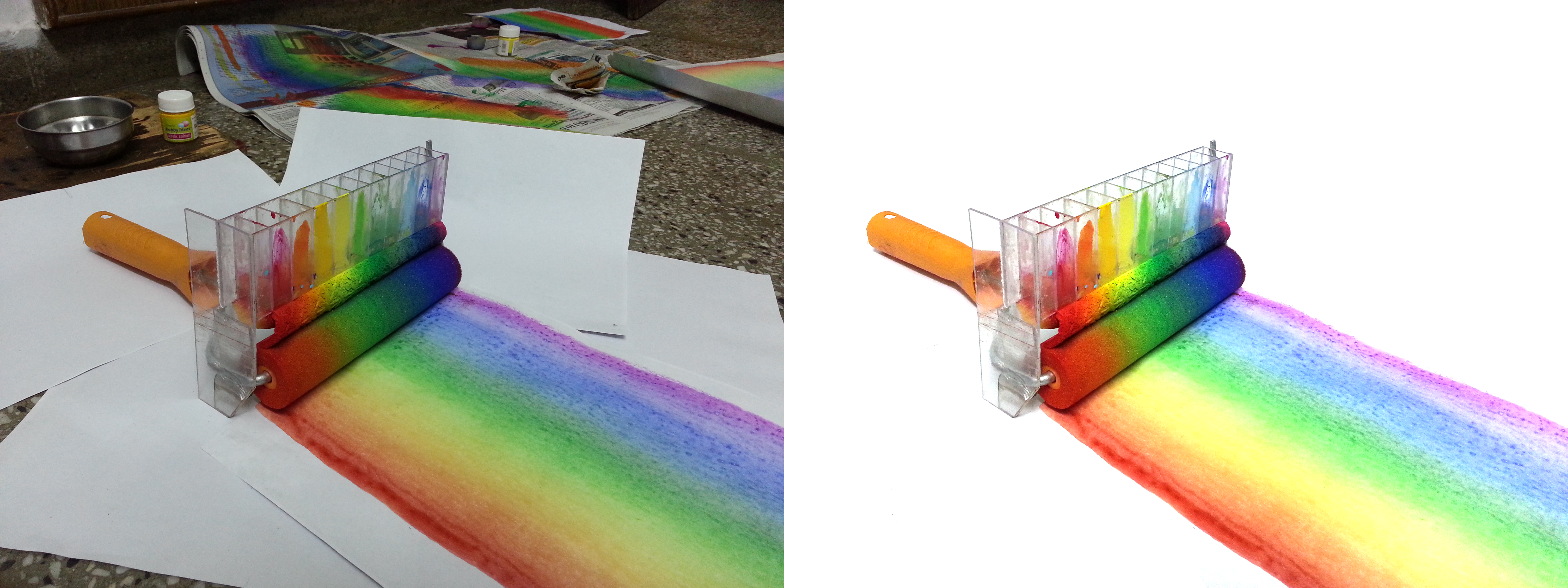
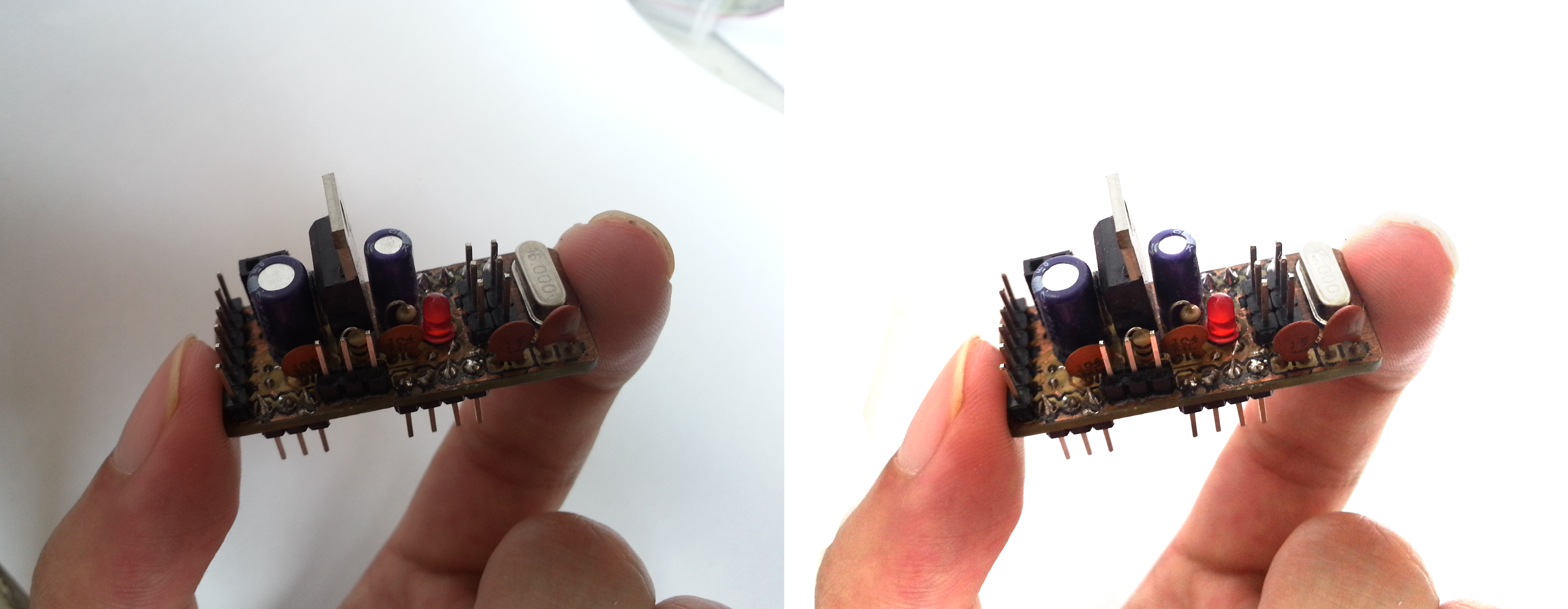
Here are some finished images from my projects vs their originals.
I'm not a professional(or even a talented) photographer and these are my own views and methods developed over the years, which I find extremely useful but might be seem trivial or useless, but hopefully not incorrect, for knowledgeable experts.
Thanks for reading my instructable. Hope you find it of some use.