Pop Up Greeting Card on Silhouette Cameo
6066 Views, 12 Favorites, 0 Comments
Pop Up Greeting Card on Silhouette Cameo
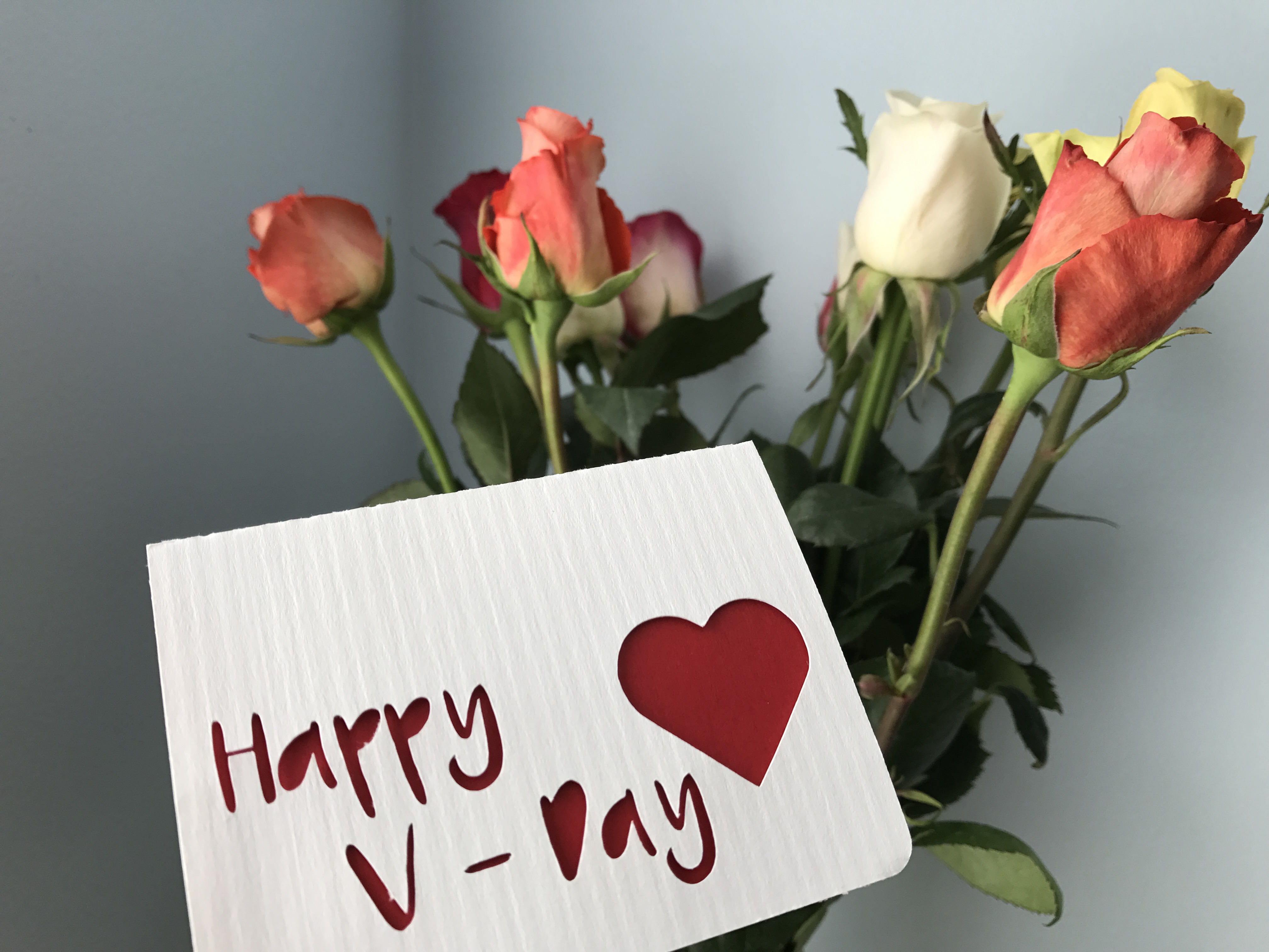
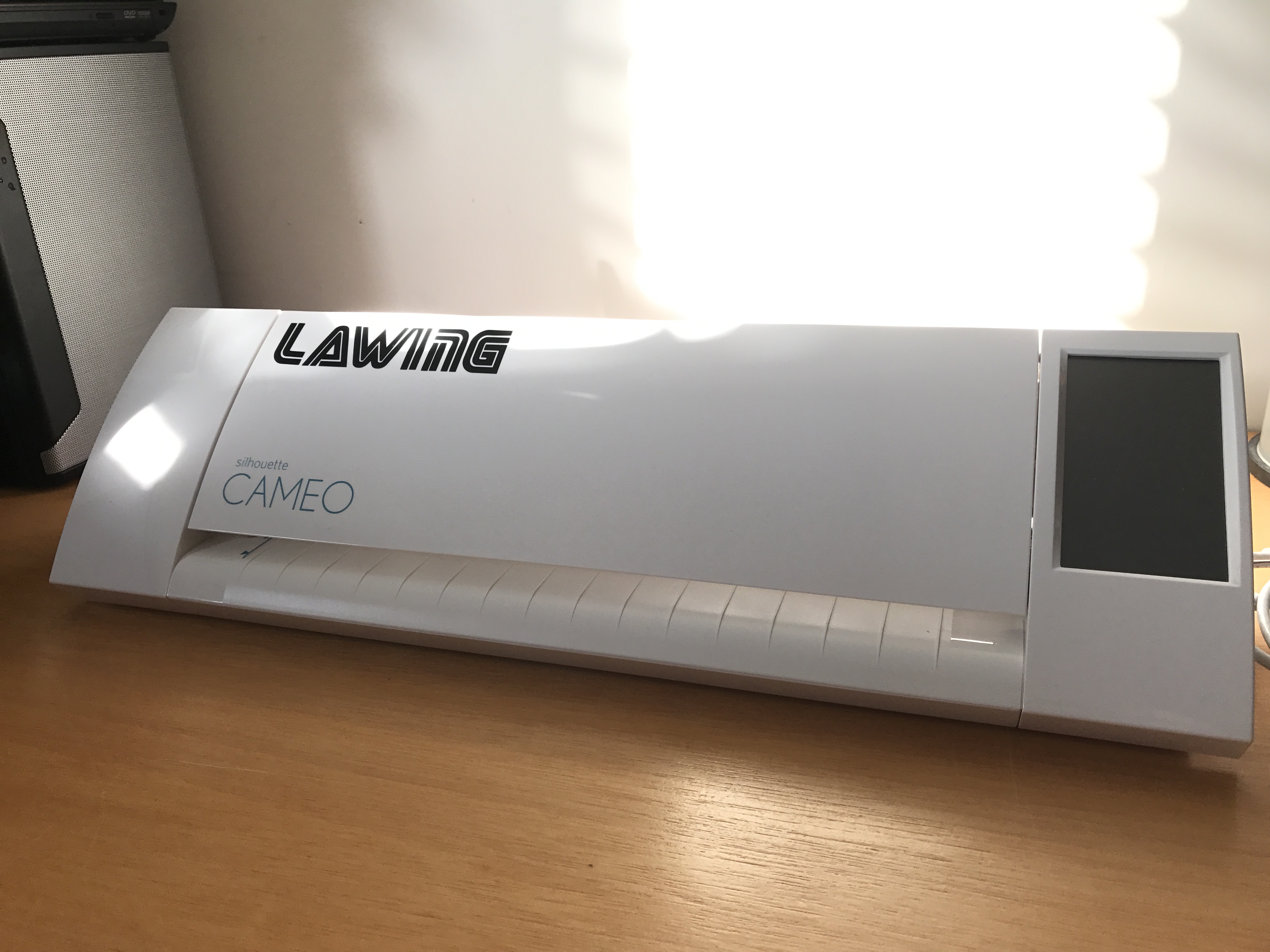
This year for Valentine's day, I thought I'd make my sweethearts some cards on my vinyl cutter. I'm a newb when it comes to the cutter, having just received it at Christmas, but after some searching and several hours deep into youtube videos, I was ready to design and cut. I'll walk you through my process - I don't claim to be an expert. If you have a suggestion for improving this, definitely leave me comment!
I'm including a free cut file for this, so if you don't want to go through the whole process, you can still cut your own. You could also follow the design with scissors or an X-ACTO knife if you don't have a cutter!
For this project, I'm going to use:
- Silhouette Cameo (referral link)
- Silhouette Studio (free)
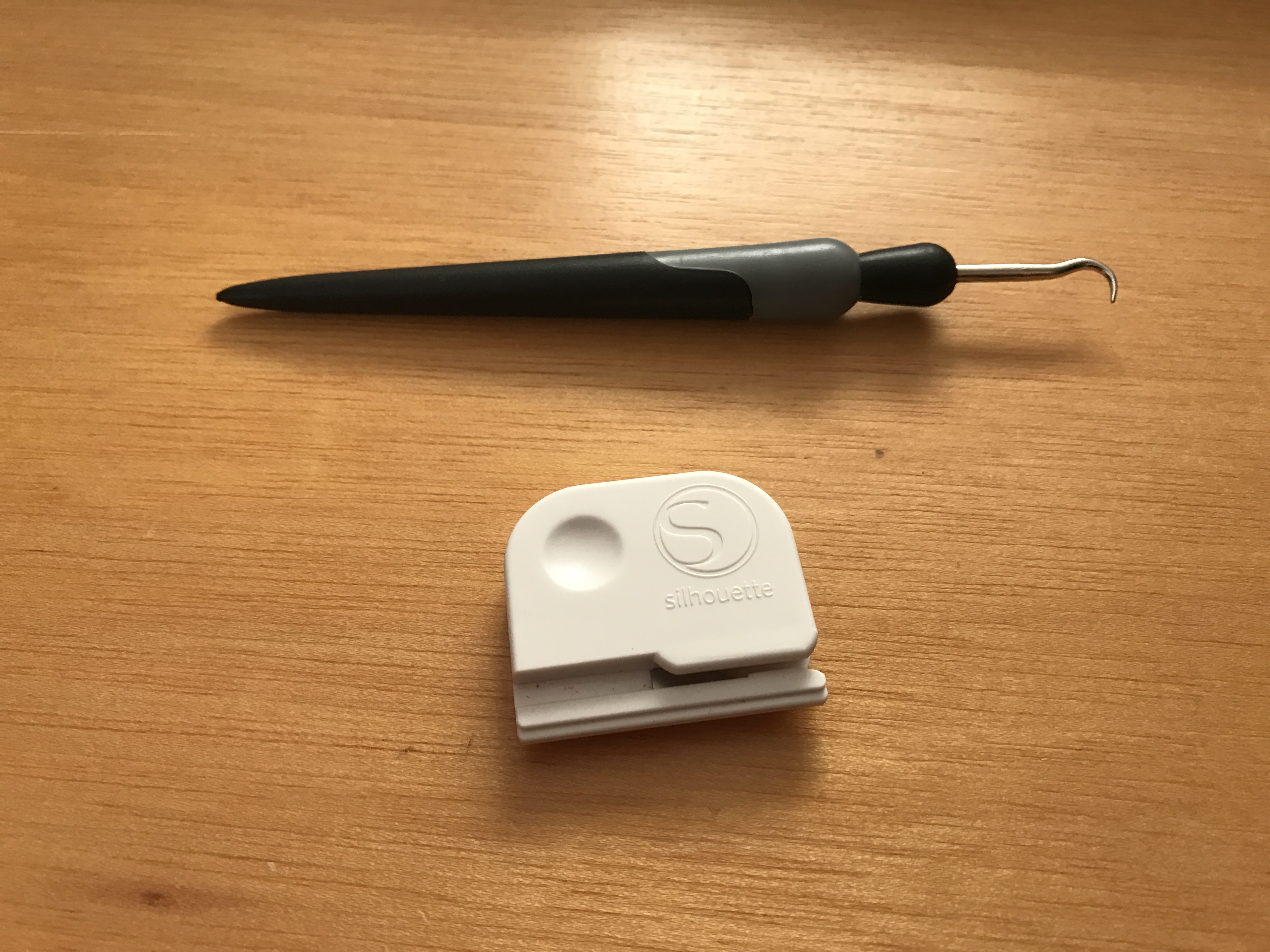
- Silhouette Hook (referral link)
- Cardstock - Neenah Creative Collection 80lb in Verde, Rosa, and Solar White
- Glue stick/spray adhesive/tape
Youtube video for this project: https://www.youtube.com/watch?v=edX5G5HOVHw
Design
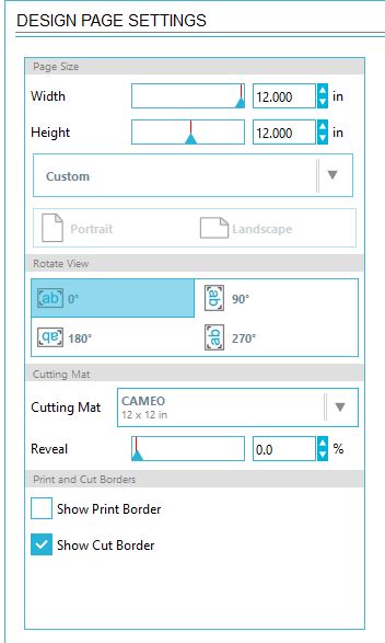
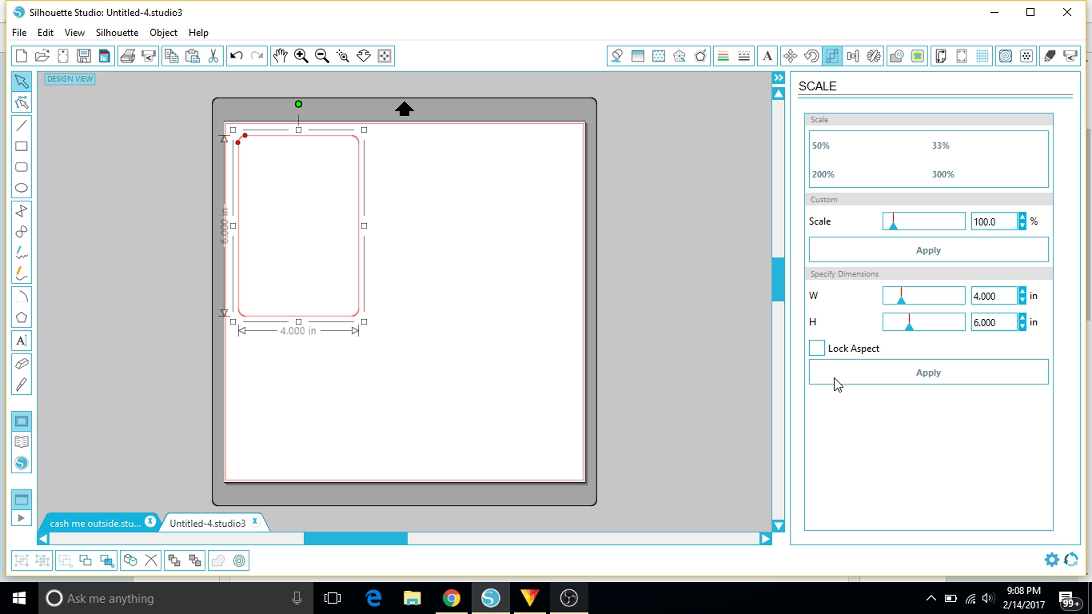
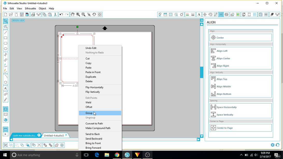
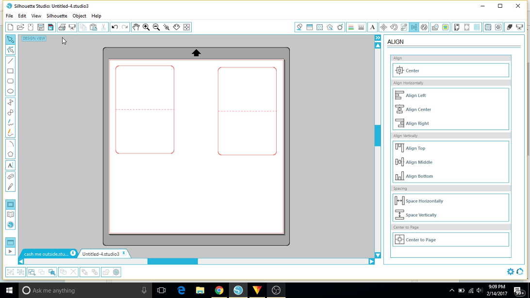
Let's start by designing the card itself. My document is set up for the 12x12" mat, even though I don't plan on using the bottom of it. Adjust this for your own cutting mat.
We'll create a rectangle freeform with the rectangle tool. Don't worry about getting it perfect by hand, because we can go into the scale tab and fine tune it. Be sure that the aspect/ratio lock is turned off while you set it and locked once you're done. I chose to use the rectangle with rounded corners. You can tweak these to your liking, but the default shape suits me.
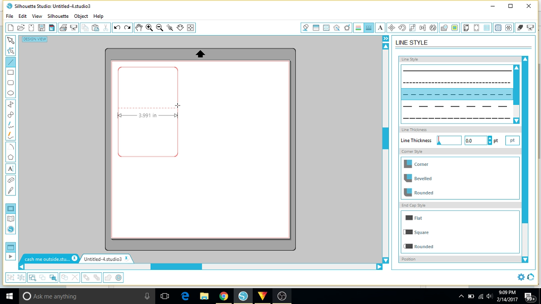
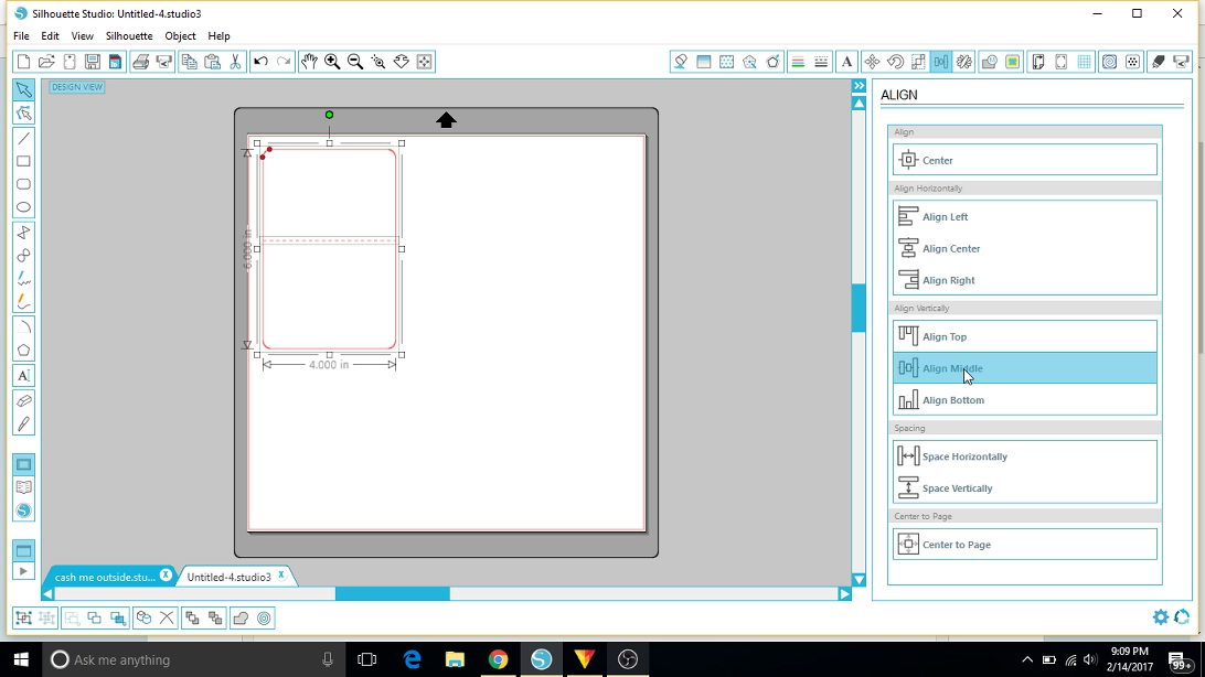
You can toggle the gridlines by pressing the "G" key. I like the line my card up on the grid for the rest of the layout. At the midpoint, let's draw a line from one side to the other. This will be our crease. We don't want to cut this like out outline, so go to the line tab and change it to a perforation/dash. Select the crease line, then hold shift and select the rectangle. Go into the align tab and align vertical - align middle.
With the outline and crease selected, right-click and press "group." This will lock them together so that we can reposition everything at one time. Select it again and duplicate it (Ctrl + D). Paste it elsewhere on the screen - we'll come back to it later.
Creating the Pop Up Tab
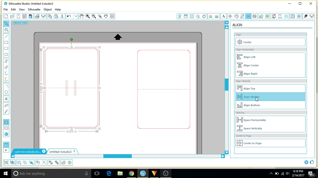
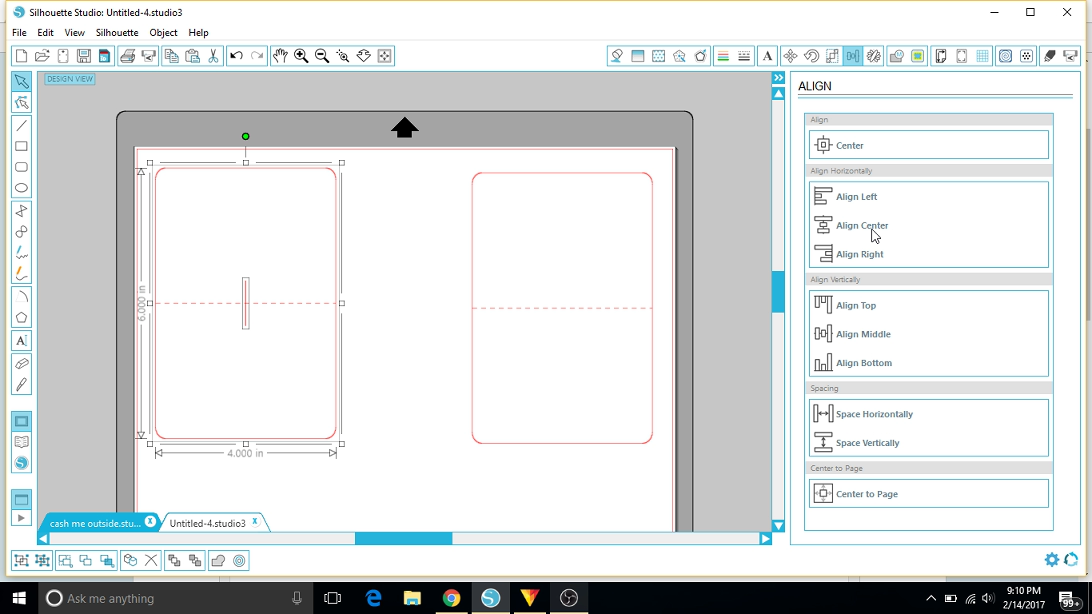
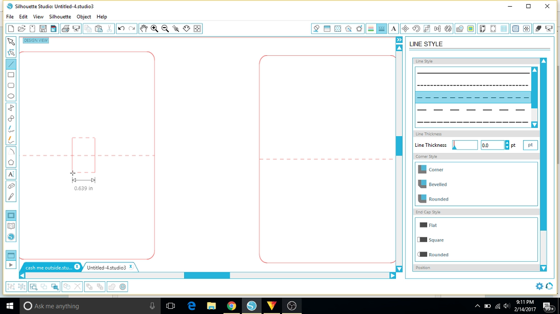
On one of our cards, we'll draw two identical, parallel lines near the center, crossing the crease. These should be centered on the crease so that it's the same length on both halves. You can draw one, duplicate it, and move the copy over with the arrow keys. We can select them both, then align on center. Select the box as well, then align vertical - align middle. You can see in the third picture that aligning center will put the lines over top of one another unless they've been grouped prior to aligning. These lines should be solid cut lines.
Let's do the same thing, but with lines perpendicular to these to close them into a rectangular box. These two horizontal lines will be perforated though, since we'll fold here for the pop up. Once you're satisfied with this, select all of the components of this card and right-click, group. Yes we've created a rectangle, but we needed half the lines to be perforated for our creases, so we need to do this manually.
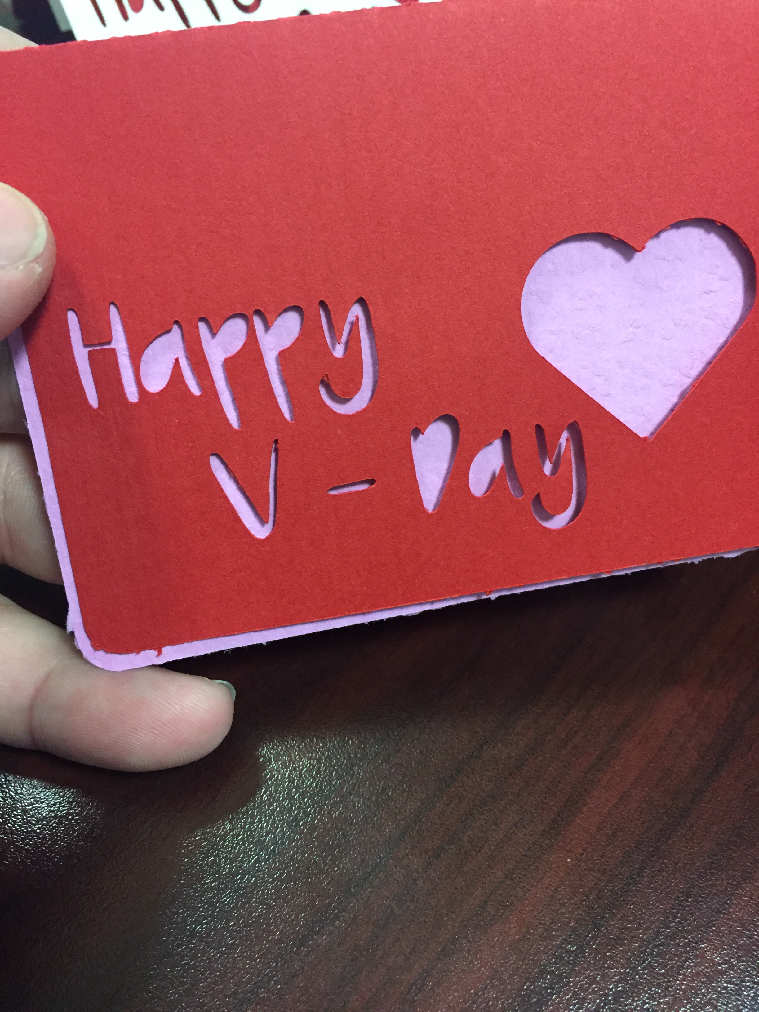
After cutting my test pieces (red on purple, pictured above), I realized that the cards would work better if the inner layer was a little smaller. Select the card we just added the pop-up tab to and scale it down just a smidge.
Text and Hearts
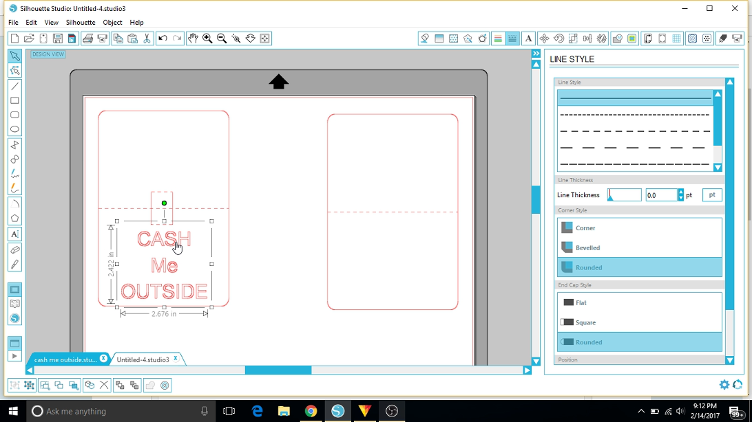
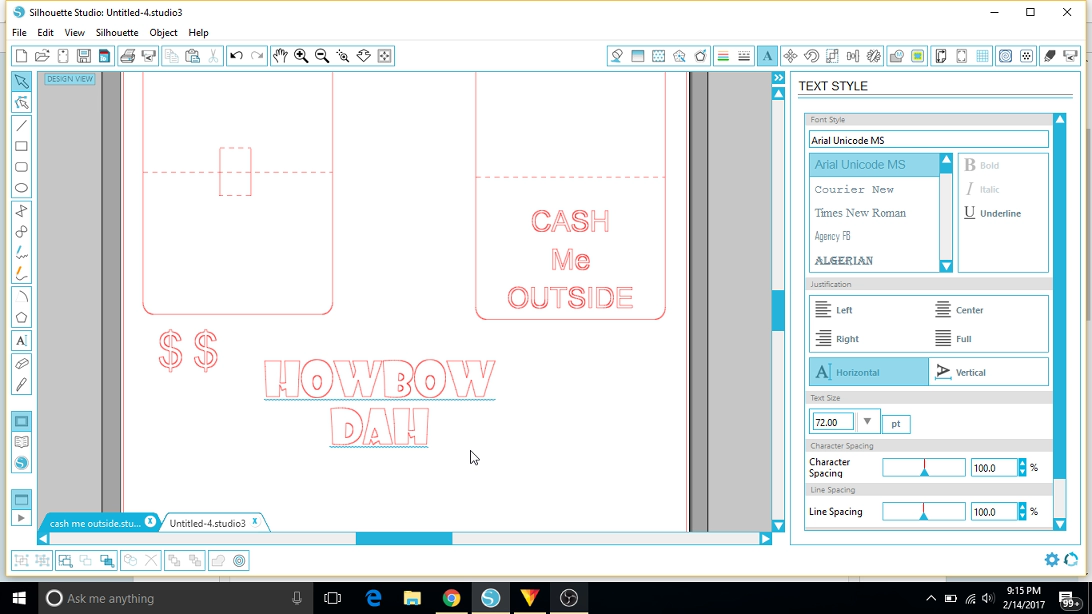
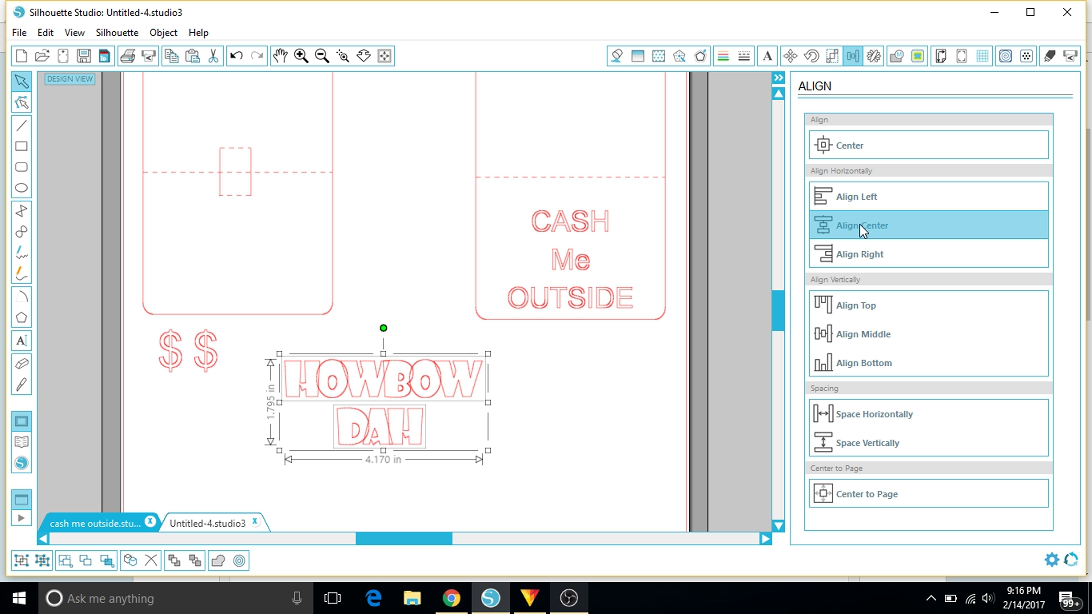
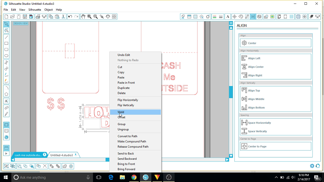
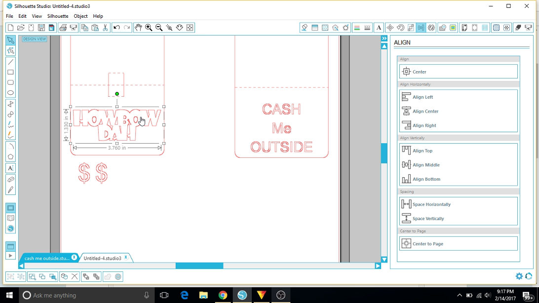
On our other (outside) card, we can cut out some text or hearts (or whatever - go crazy!) to show through. We'll be sure that the cut-outs don't cross over into the pop-up portion. My heart shape was a creative commons licensed heart shape .png file found from google images. Import your png, then use the trace function, turn off the high-pass filter, and trace the outside edge. Select and delete the original image and then you can duplicate the new heart-shaped cut line as many times as you want!
We also need to cut out the design for our pop up! Grab the text tool and a cool blocky font, like Showcard Gothic. Write your text, then select, right-click, and ungroup. Now we can individually scoot the letters until they touch, align, select them all, right-click, and weld. This will merge the letters and clean up the cut path. Be sure to check that the scale of the letters does not exceed the space on half of the card. The pop-up feature is a surprise, so we want the letters fully concealed by the card. I didn't make mine very big to begin with, but after seeing it in person, I maximized the scale to just under the maximum and it makes a much bigger impression when the card is opened.
For bonus points, you could select the text and create an offset, then ungroup the offset and cut it from a second color, creating more depth on the lettering. I erased the center hole of the "o" in the word "love" and replaced it with one of the heart cut-lines above, sized it, then grouped it with the rest of the lettering.
Setting Up the Blanks
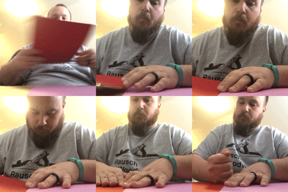
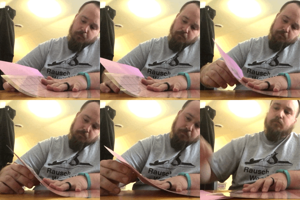
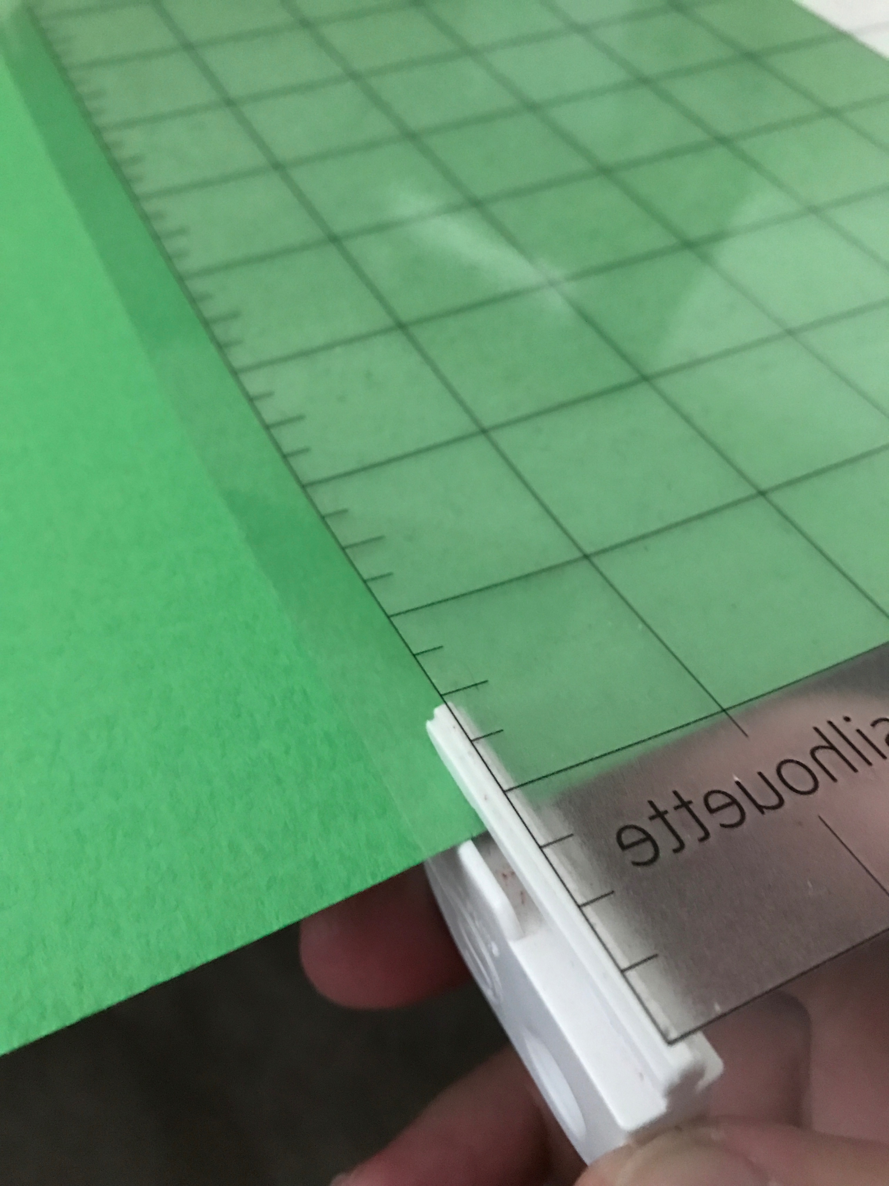
I'm cutting in two colors for each of my cards. You could do two separate cutting tasks or make a bunch, then mix and match. I've chosen to mount two sheets on my cutting mat. Line each up at the midpoint, aligning along the top edge as well. I don't have a dedicated paper cutter/slicer yet, so to trim off the excess, I'm using the cutting tool that came with the cameo. My cutting mat is transparent, so I flip it over and use the edge of the cutting area as a visual guide. It's not perfect, but it keeps me from cutting away paper in the cutting area, and doesn't leave any overhang, which might alter the machine's ability to feed.
I've aligned the inside text on the same color as the exterior so that it also contrasts with the interior color. If you're adding an offset color, remember which colors it will rest between.
We're ready to load and cut! Your machine may vary from mine, so I'll refer you to your own documentation, but mine is as simple as lining the edge of the mat up and pressing "load cutting mat."
Cut Settings
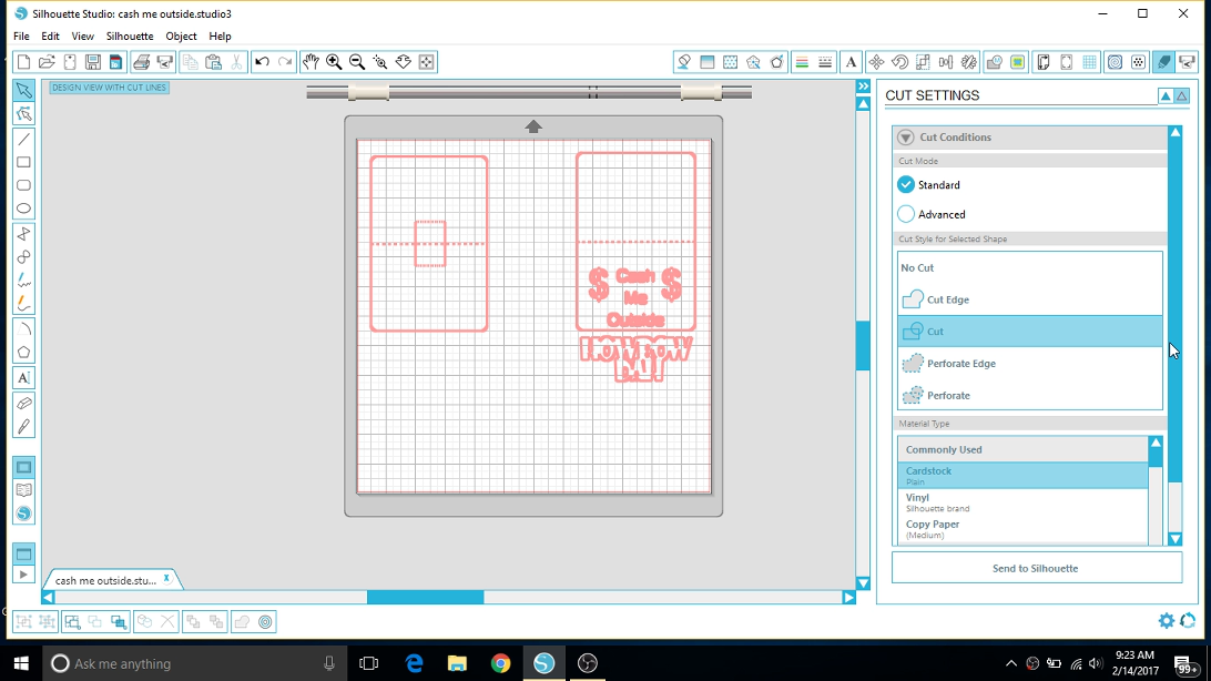
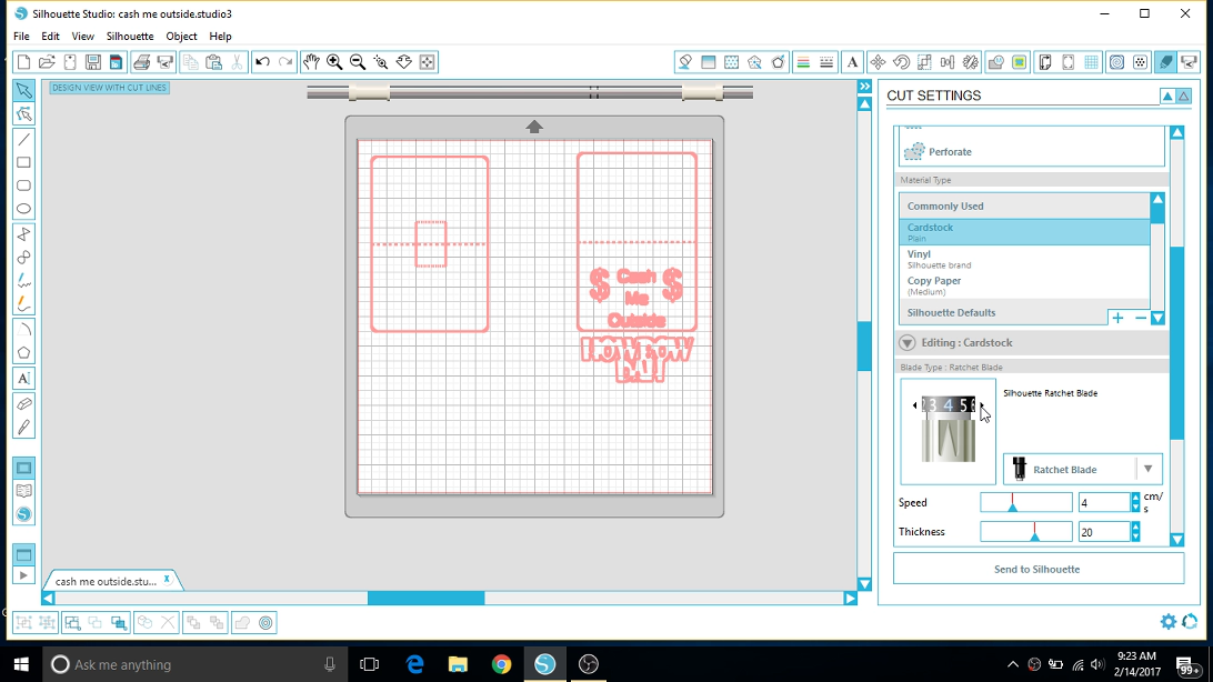
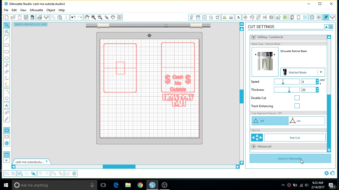
The defaults for "Cardstock" recommend a blade setting of "3." I found this to be a little shallow and had to change to a "4" for the 80lb cardstock I had purchased. Test runs are always a good idea!
We'll be selecting "cut" for all of our lines since we drew perforated lines in the design. No we don't have to run multiple passes!
Something I learned during this process was to clear my entire working area before running a job. Something moved between runs and kept the mat from feeding straight in the rear of the cutter. Don't repeat my mistake - clear a path at the back of the cutter!
After all of this, we should be ready to send the job to the machine.
Cutting (with Gif's!)
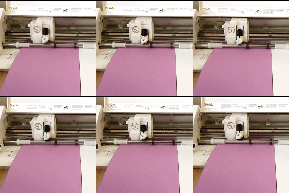
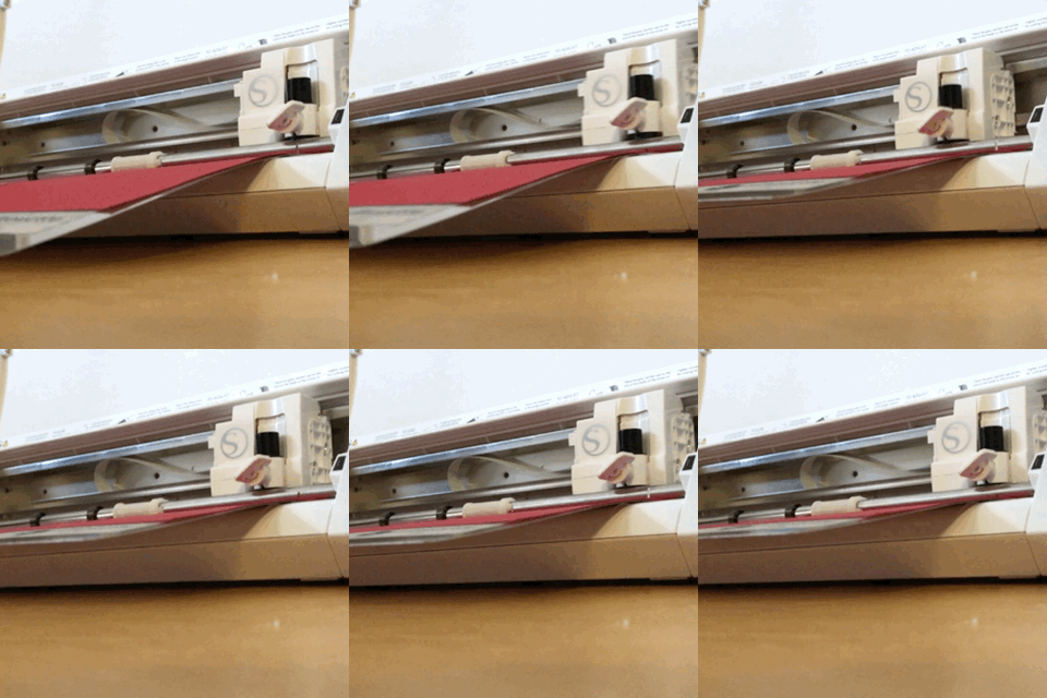
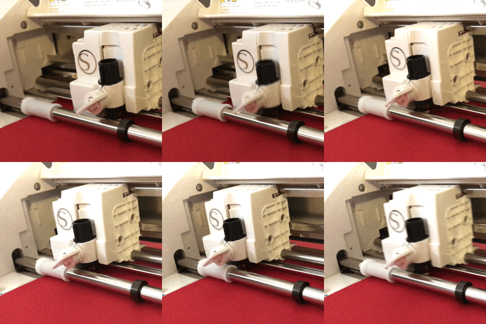
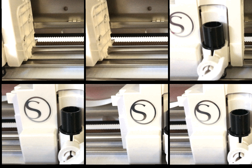
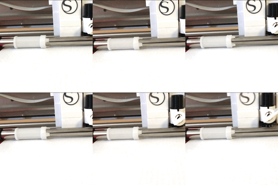
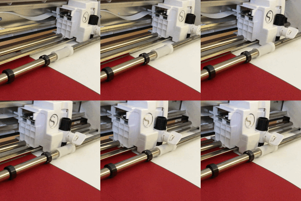
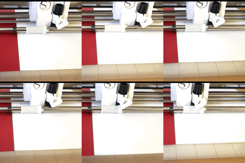
There's something really satisfying about watching the cutter head travel back and forth, cutting out the design.
Weeding
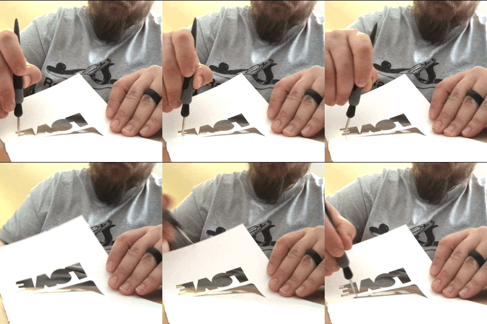
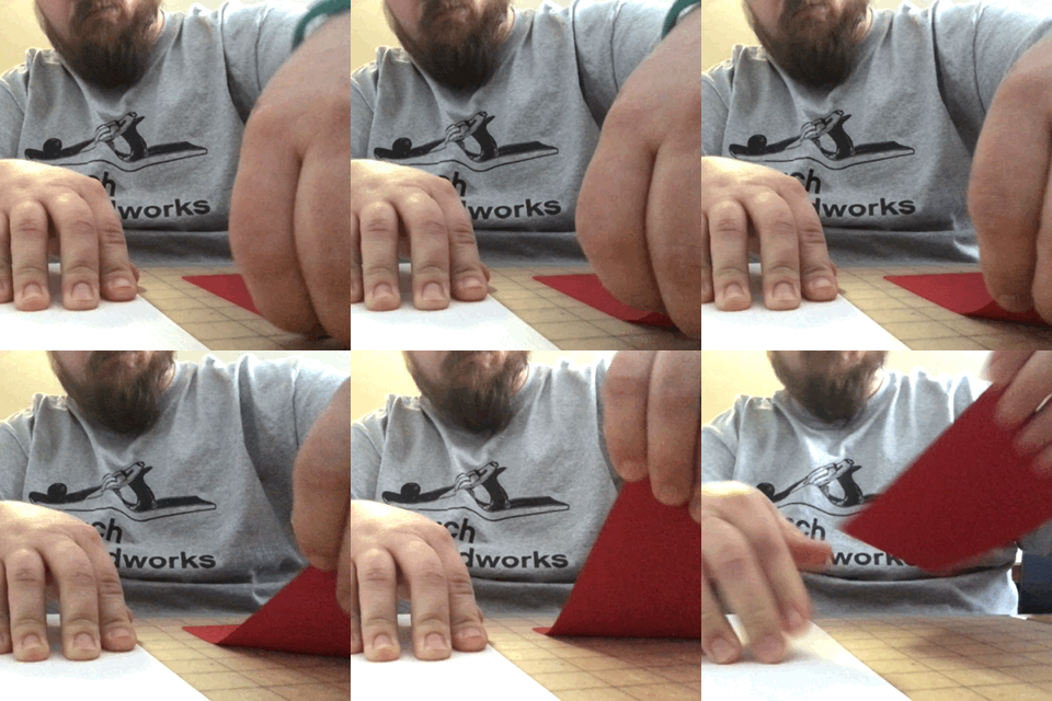
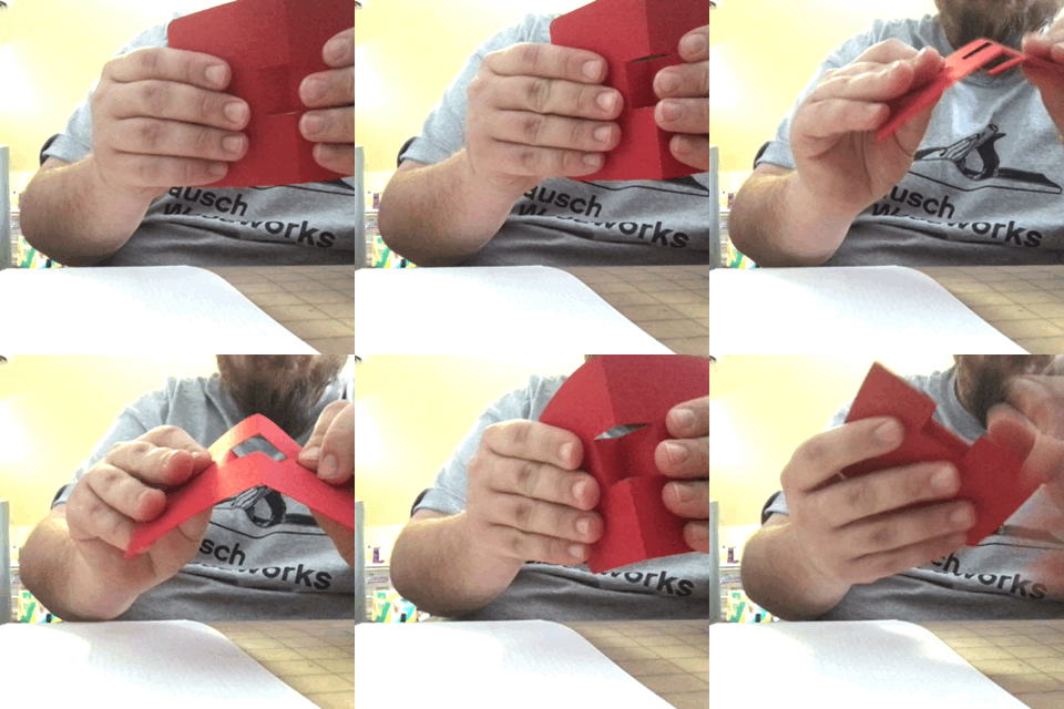
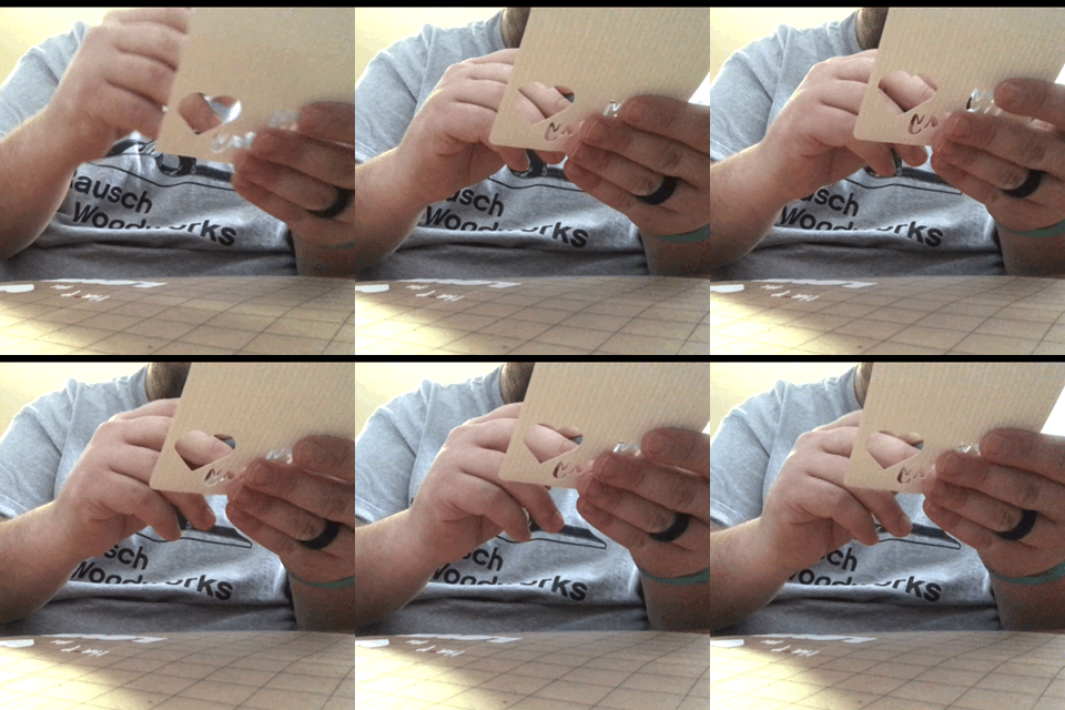
Now that it's cut, we can hit "unload" and begin weeding. For text, it might be easiest to use your hook tool and weed it before it gets hung in the rest of the card. I tried it both ways and didn't have a clear favorite. If your cut settings aren't deep enough, you may risk tearing the card by weeding after leaving the mat. For parts that are small or difficult to peel, flex the mat so that it when the stock pulls away it doesn't reattach.
There's not much to the assembly - just fold along the creases, free the pop-up tab, and glue the two pieces together. The whatever adhesive you choose for the pop-up should be applied to the smaller of the two - the text or the tab- so that excess adhesive doesn't show through.
Save all of the excess card stock, save for the tiny bits of lettering. This waste material is great filler for other projects! Plus, the cut out hearts can be tacked on the envelope or used as confetti with your cards.
Glamor Shots and Alternative Designs
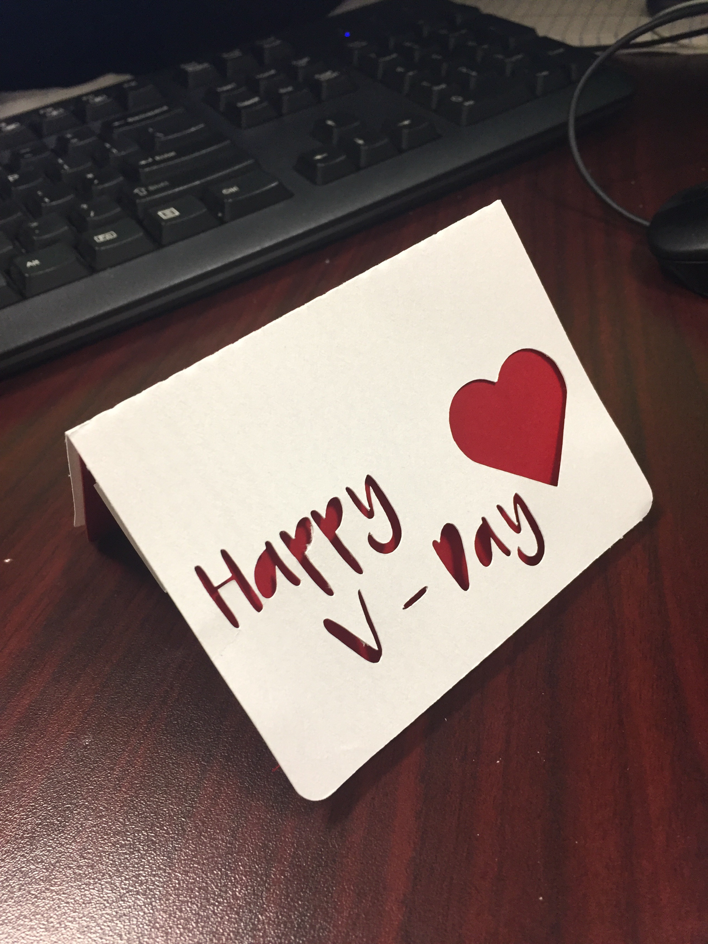
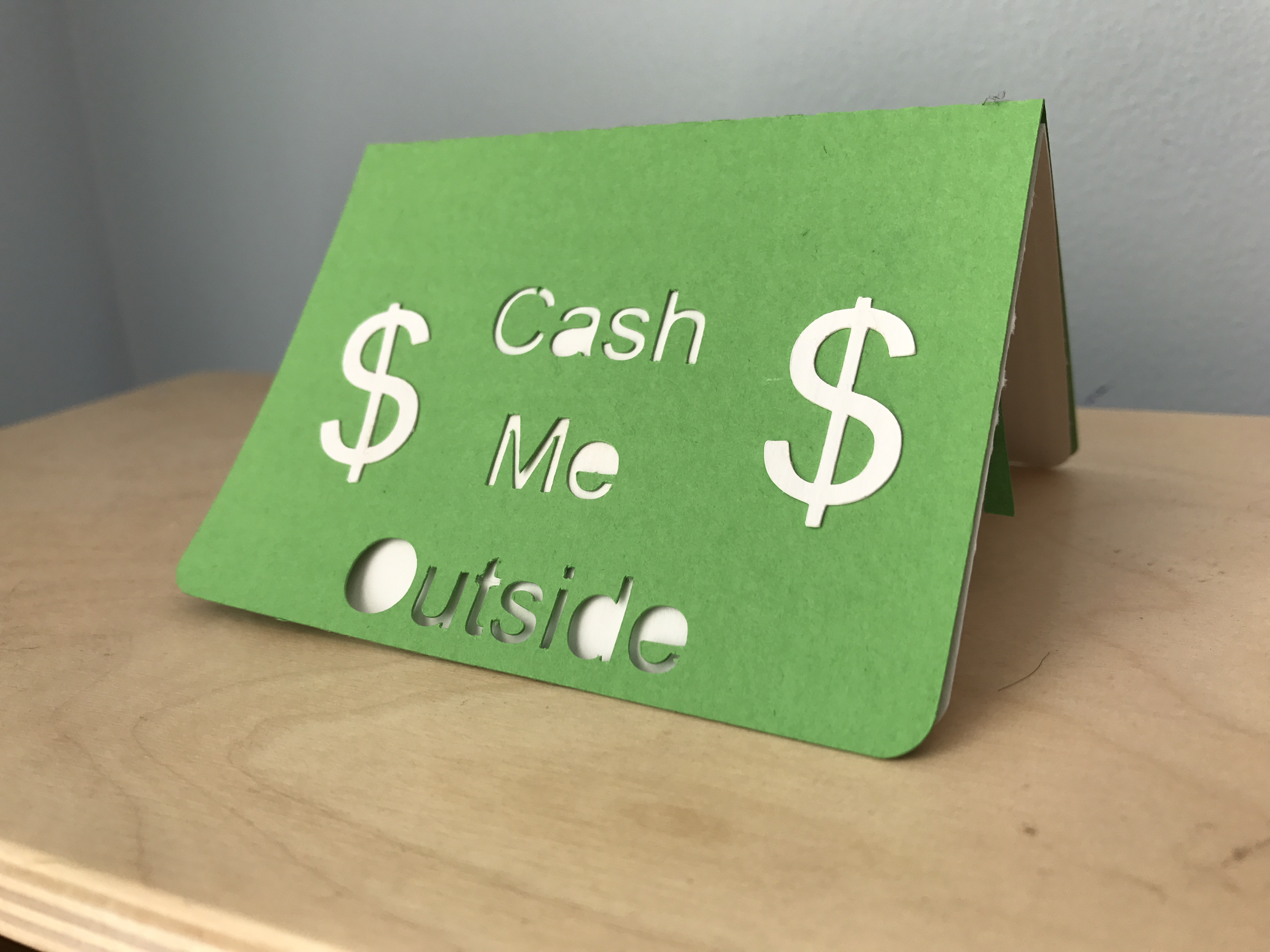
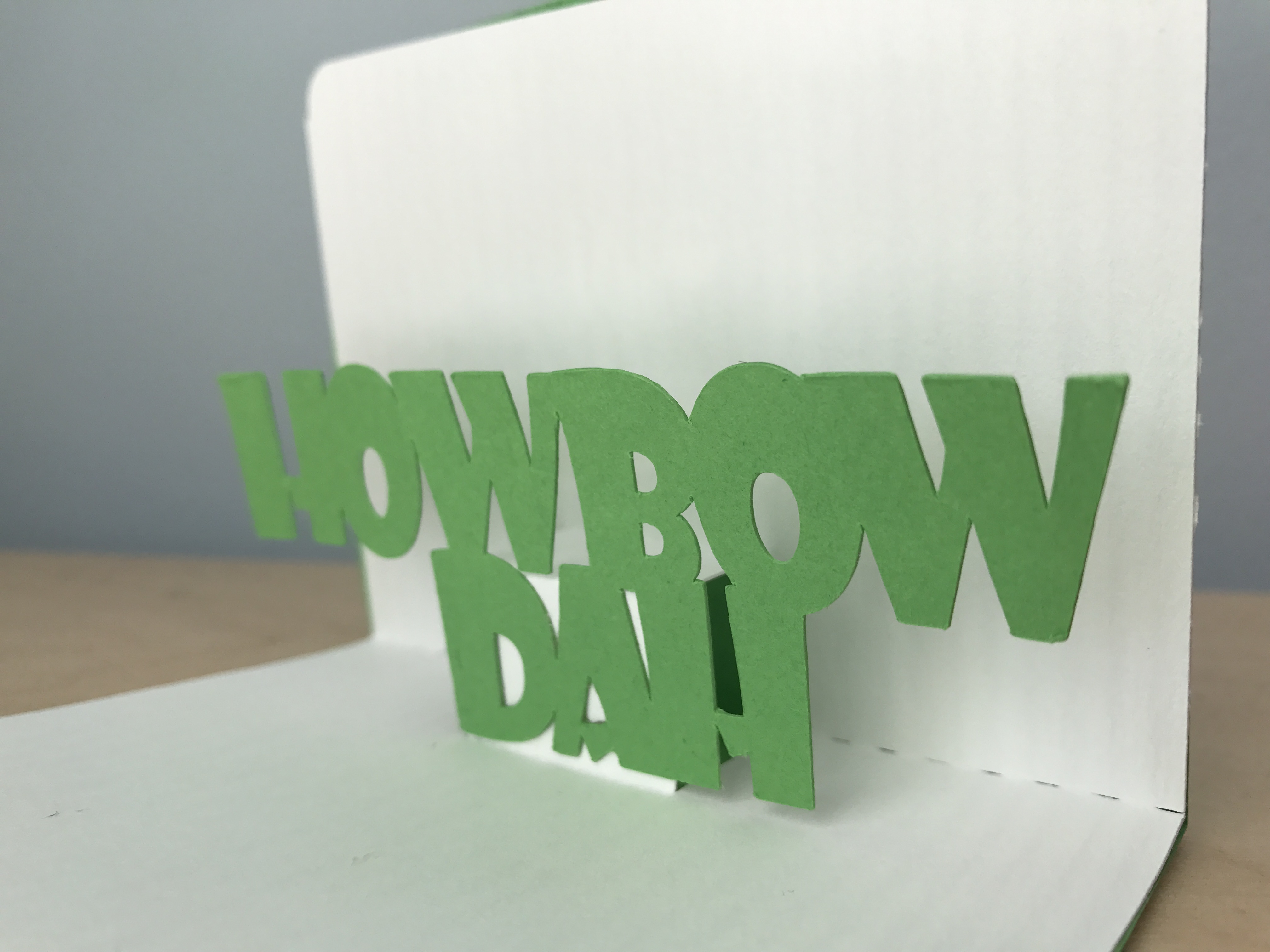
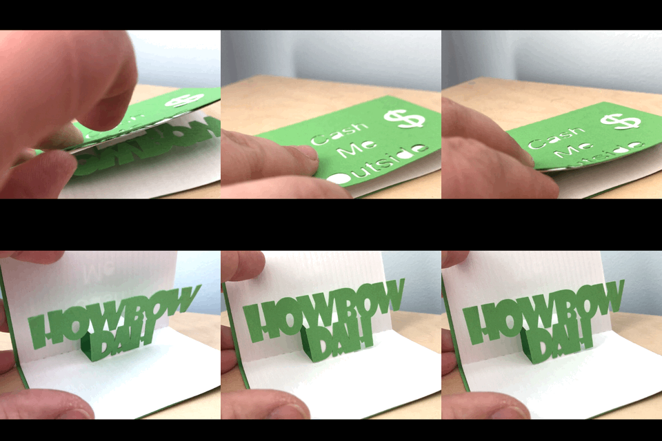
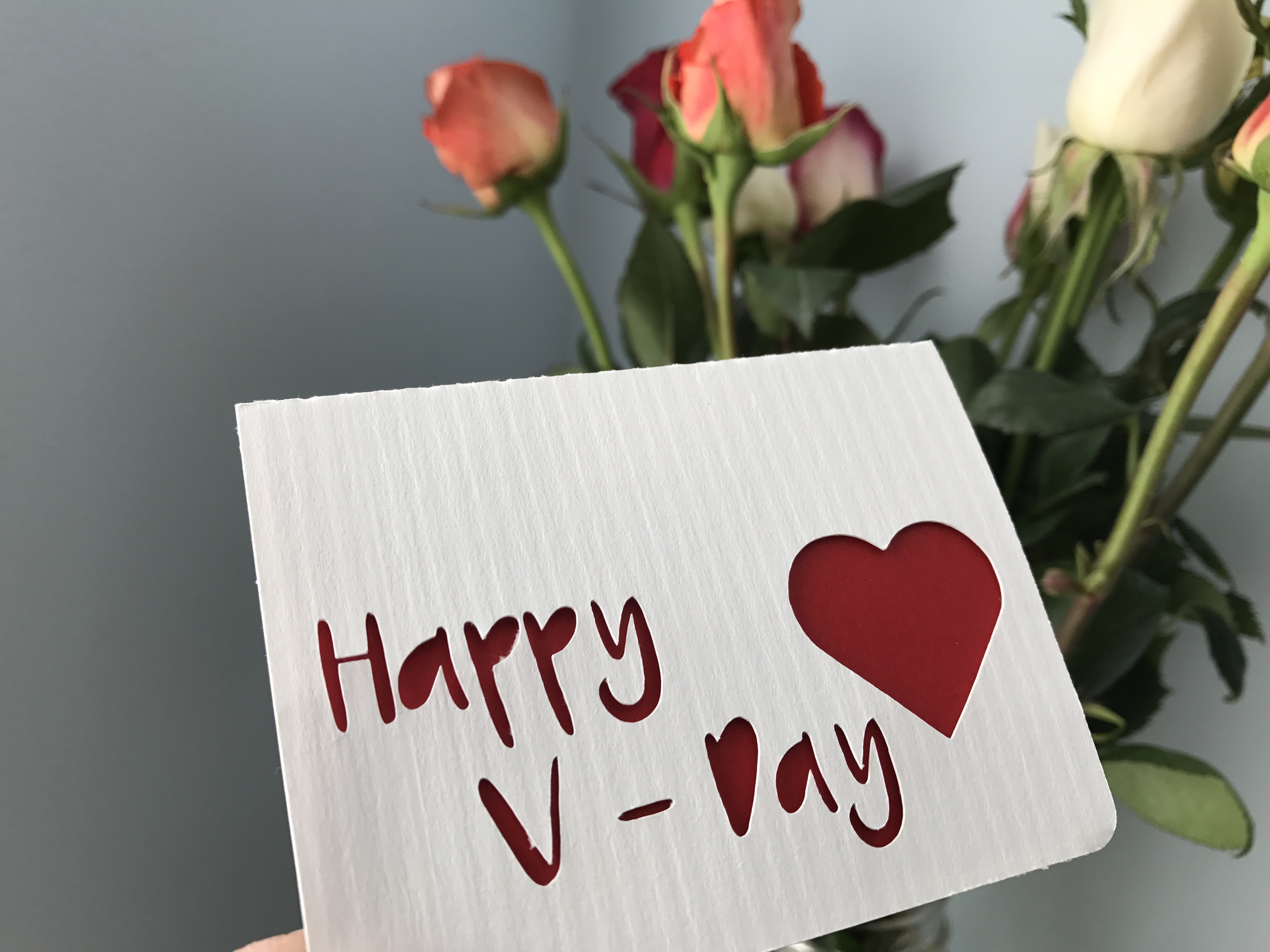
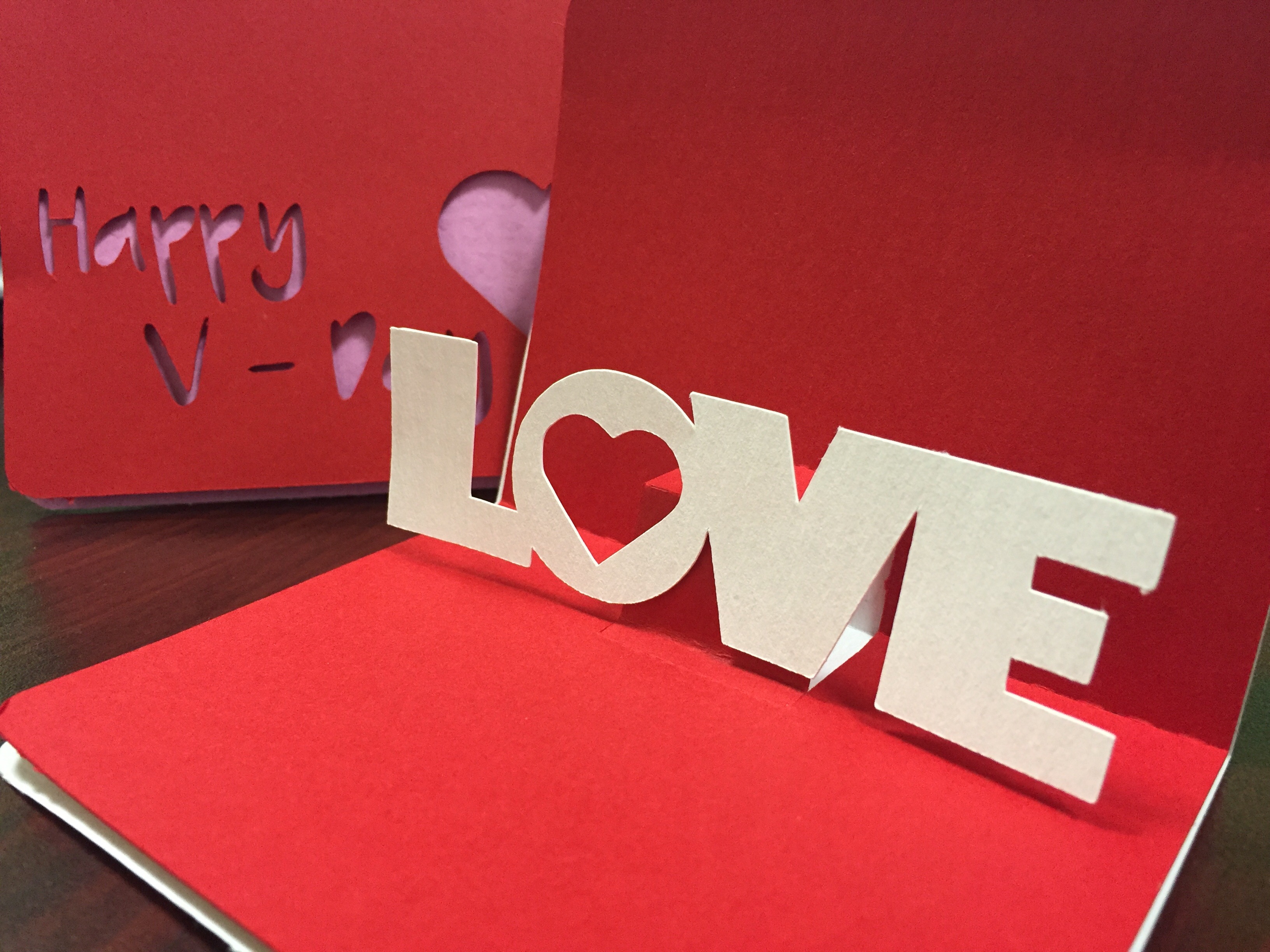
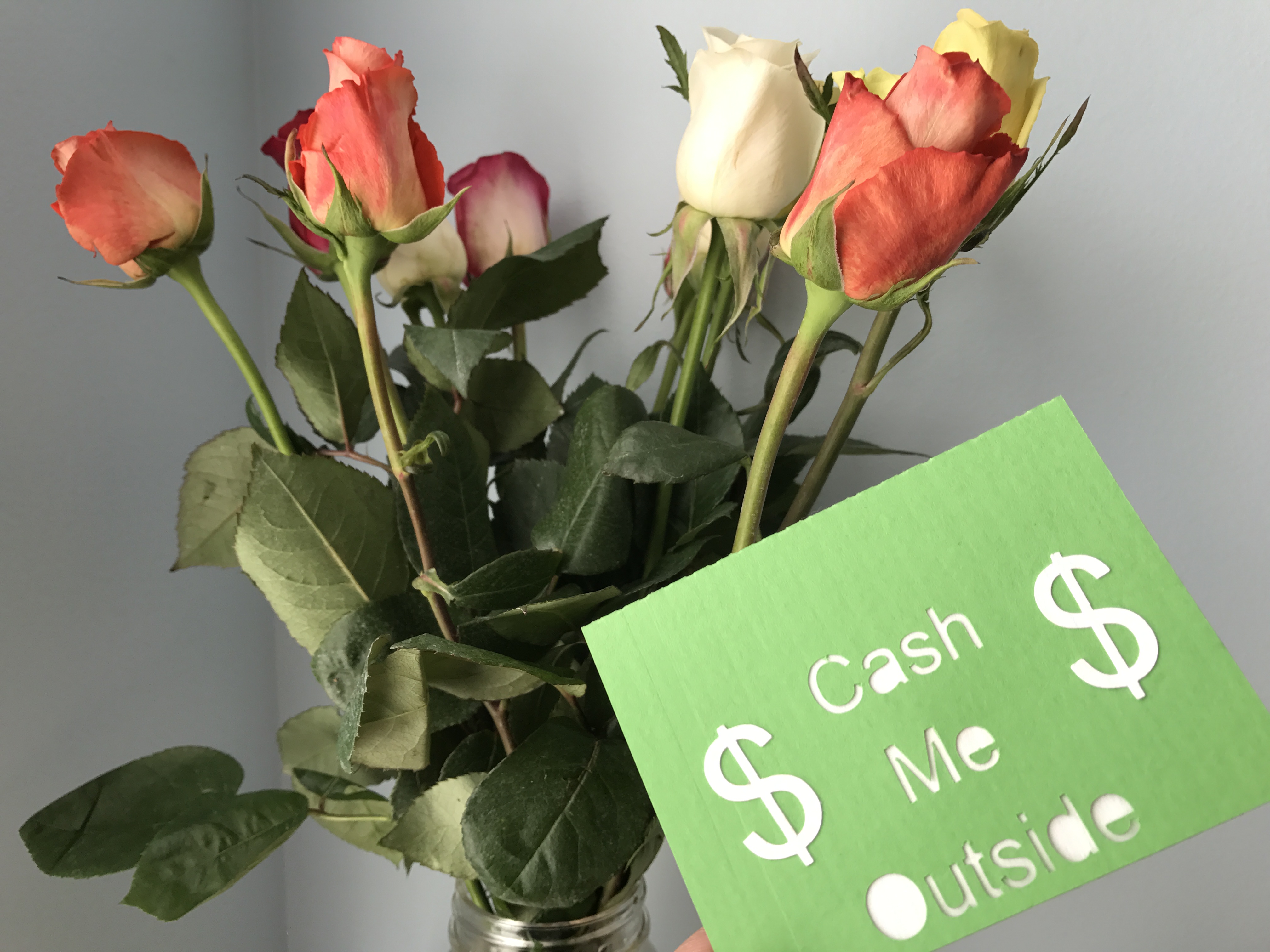
I had a ton of fun making these. It was a very approachable project for learning different tools in the software and a great skill builder on the cutter. Card stock is definitely different than vinyl, so I'd encourage you to try it if you've just been doing decals thus far. The pop-up is super fun and a great surprise - my daughter can't get enough of it!
I'd love to hear from you in the comments - what did you think? If you make some, I'd love to see! If you liked this article, please comment and vote. You can also follow to see more projects. I've done articles on everything from sock puppets to storage benches and homemade laundry detergent!
Follow me on social media: