Pop-Up Birthday Card
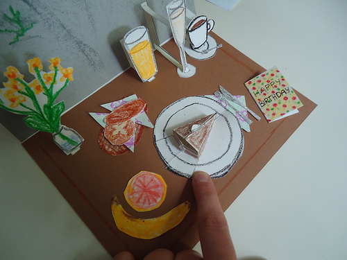

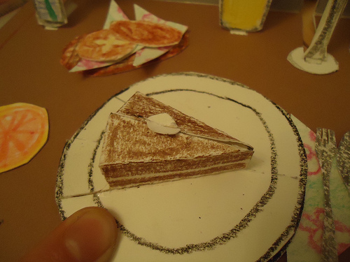
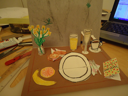
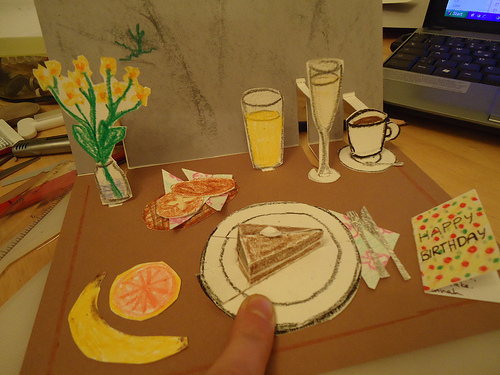
- Have you ever made something so cool together with someone else that you wished there were a commemorative birthday card for it?
- Do you love pop-up paper crafts?
- Are you not easily despaired by exact mm measurements and craft knives or alternatively have the patience for multiple trial and error?
I'll explain some basic techniques for pop-up cards, and show you the extremely specific design example of my card in more detail. I'll also show you a slightly more transferable way to use one of the individual pop-up designs (the cake) in a card.
Materials
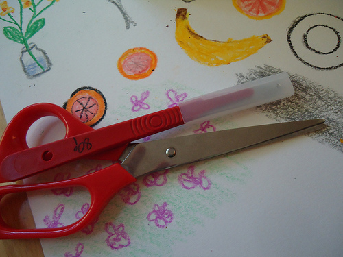
This is an extraordinarily cheap project. Well, compared to the one it's commemorating, it is. For a birthday card, it's doing alright.
For one DIN A5 card (double postcard size) I bought:
3DIN A4 pages of white cardstock, 300g/m2
2 DINA5 pages of contrasting background colours, in my example grey and light brown.
1 extra tacky birthday card (optional alternative: 1 DIN A4 page of contrasting colour)
That's it.
I also used:
crayons
all purpose glue
craft knife
cutting surface
ruler
pencil
Design
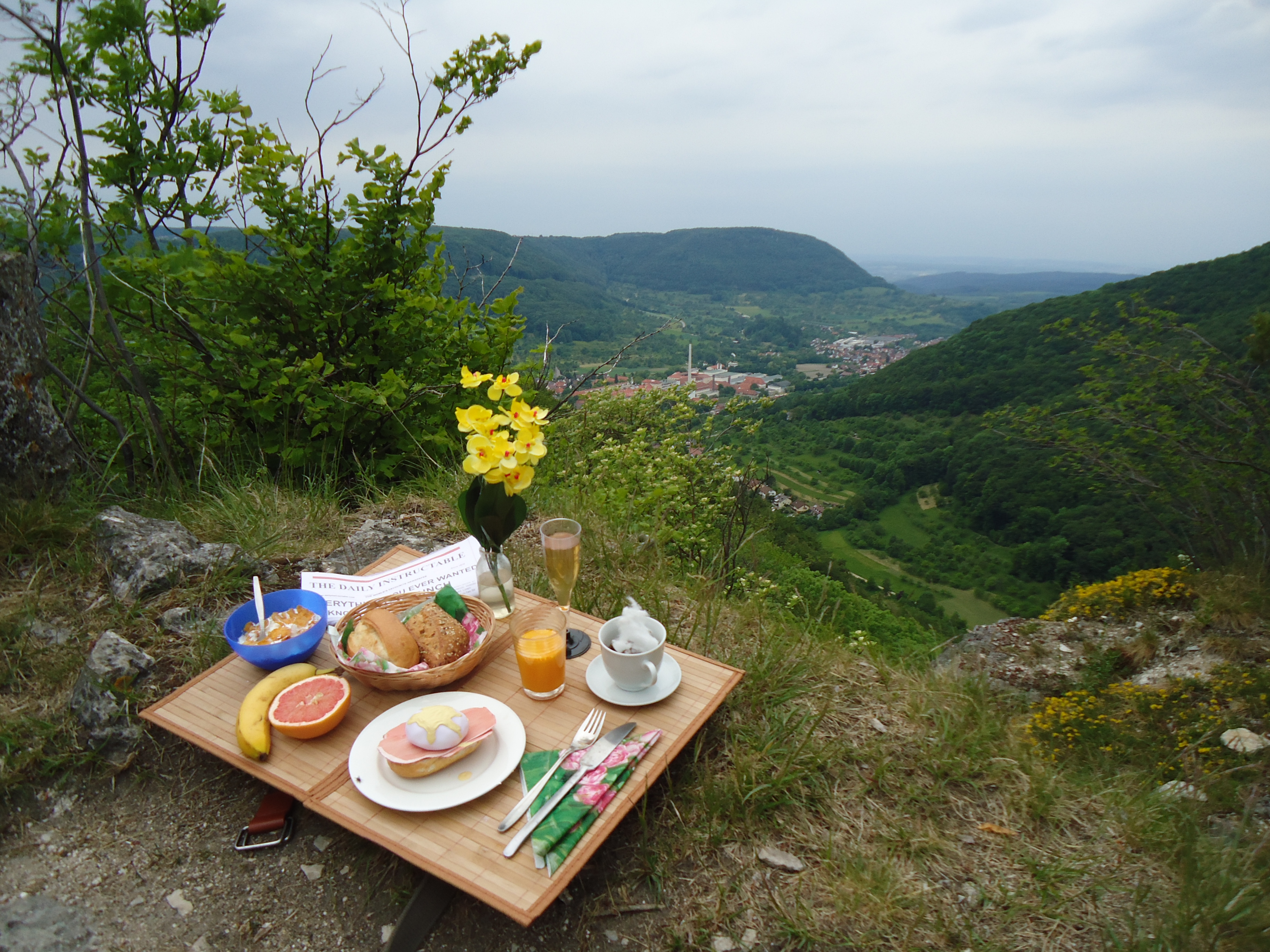
I got my inspiration from the project "Brunch on the Rocks" that PenfoldPlant and I did a while ago.
I'm not able to spend his birthday breakfast with him, and this is hands down the coolest breakfast we had so far. The card was meant to revoke that spirit, and serve as a token that we'll have another fun breakfast in the future.
This means that I had a very precise image I wanted to model: half of the card would represent the rockface, with the other half being the tray with food on it. The card will be opened at 90° to display the full pop-up effect.
In order to find your own design, I'd suggest something pretty straightforward *ahem*, or alternatively something that you have a very accurate representation of (like working from a photograph).
For this project to be fun, it's crucial to define your vision very clearly, and not get lost in details until later. Don't worry about what kind of cake you're making, worry about how you're going to make cake pop up.
Mock-Up
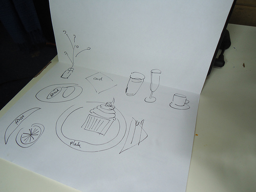
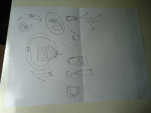
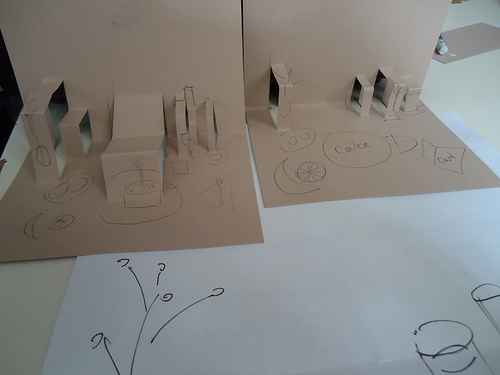
In order to help me visualise the individual parts and measurements, I made a mock-up of normal paper in the same size.
I just drew out the things in the locations I wanted them, checked for their relative heights and the arrangement for largely empty space.
For a pop-up design with V-fold mechanism, the objects on the stands will be running from the back to about the middle. This means you shouldn't place any flat items in this area, but instead stick them in the front. This is also more visually pleasing.
In my case, this meant I had to change the original layout ever so slightly, moving the flat newspaper/birthday card to the forefront, allowing the flowers and drinks to be in the background.
Also note that objects on stands shouldn't be too close together, because if they touch or overlap (which can happen if they're wider than their stand) it's possible for them to get entangled and ruin the pop-up effect.
Pop-Up Ressources

Although I designed this card myself, I got inspired by others I've seen and used several websites (and an afternoon cutting slits into folded paper) as an introduction to how paper can be forced into 3D shapes.
I recommend this awesome website for a quick intro in the mechanics of simple popup techniques and Robert Sabuda's website on specific examples to use these simple techniques in.
My cake specifically got inspired by the designs (flat-fold) of the ingenious Rich. I didn't use one of his templates in the end, but the design of my own was much easier once I'd seen his ideas and the mechanics behind them. If you feel daunted by 3D construction, are strapped for time, or can simply admit that his designs are much, much better than anything me or you could come up with, feel free to browse his website for his ace tutorials and templates.
Making the Base Card
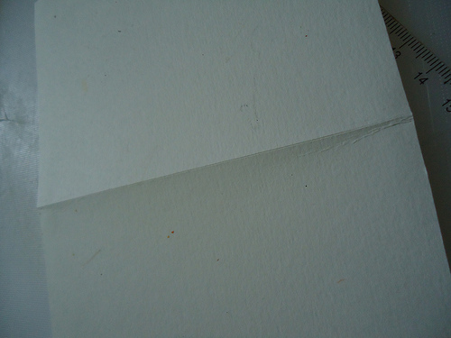
I made the base of the card from a A4 sheet of white carstock (300g/m2), which I scored in the middle, and folded over once. It's slightly bigger than an average birthday card, but gave me more room to play with.
Making the Stands
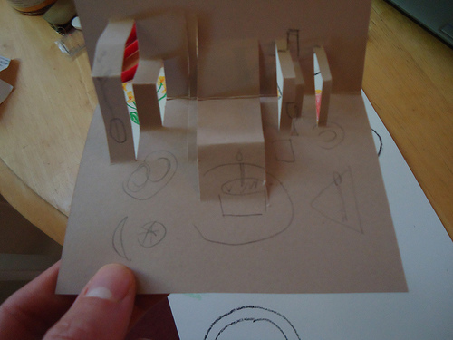
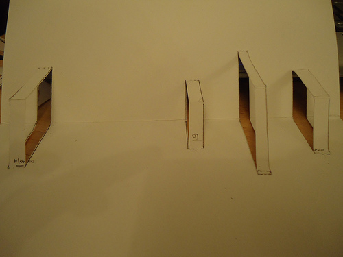
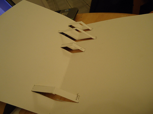
After looking at my sketch, I made a mockup of the stands, and cut more or less random slots in a waste card. In a more thoughtful second design, I settled on four stands in the background (flowers, OJ, champagne and coffee) that left room between for other things.
I also decided to make the cake pop up in a different technique, using a flat fold, so I wouldn't clutter the foreground up with a massive stand.
My four stands all fold at the midline of the card, which means that they couldn't be further out towards the front than the objects are high. This means that the shallow coffee cup had to be quite towards the back, whereas the tall champagne glass could be a little bit more forward.
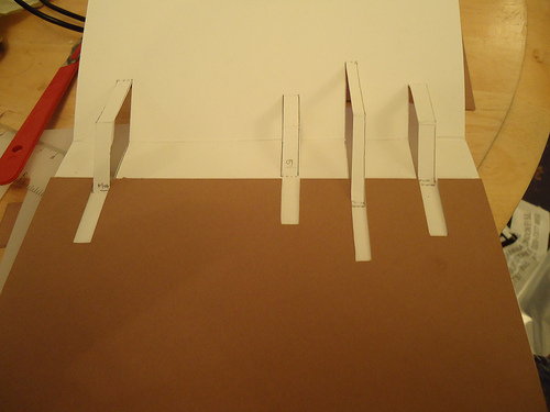
I marked the position where I wanted the objects to be on the card, and the minimum width of the object (don't make them too slender!). The I cut two slots from this (parallel at this width) to the fold of the card and exactly the same distance into the other half of the card.
You can score the base of the stand very carefully, to make sure it folds easily. Take care not to cut through it though.
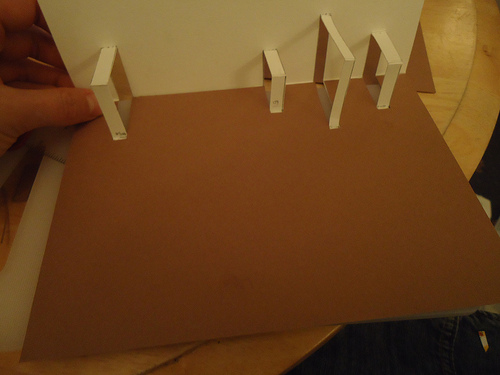
Do the same for all your stands, then carefully push them onto the inside of the card, while folding it, so they fold through.
Lean back, admire your first step of working on the actual card. Have a cup of tea, cause if you're like me, this took you roughly two hours.
Making the Background.
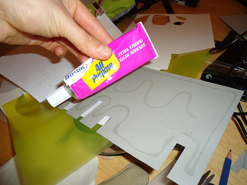
This step is optional. If you only need one background colour for your design, you can use this as the base card.
However, if you want the two halves to be different colours, you'll need to follow this procedure.
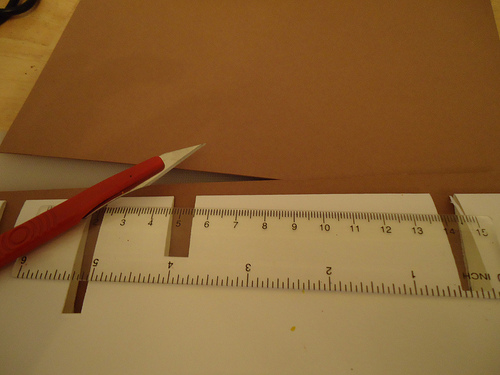
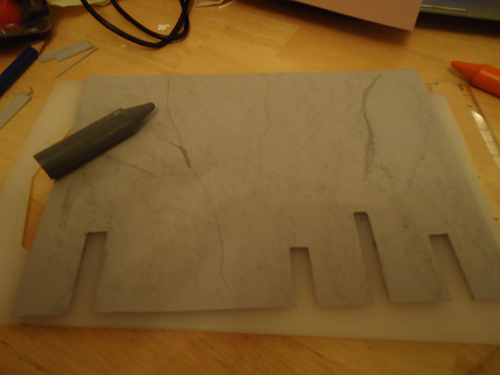
Take your A5 sheets of contrasting cardboard, and, using the base card as a template, trace the same slots that you scored on the base card. Cut them out, possibly making them about a millimeter wider and longer to ease the fit somehow. With the contrasting card, also cut through the base of the slot and throw away the punchout.
You can decorate the background before glueing them down, I made my grey cardboard look a little bit more like rock.
Check that the card slides easily over the base card, allowing the stands to move freely. When that is the case, glue in place. Take care to glue the two colours onto the right sides, so the stands are aligned correctly.
Making the Decorations
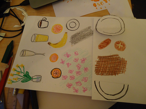
This is where your own creativity comes in. I decided to draw all the objects with crayons on white cardboard, but you could use coloured cardstock, work with stamps, use photo cut-outs, etc. etc.
In my case, I simply drew the following objects on white cardstock and cut them out after.
In my case, I simply drew the following objects on white cardstock and cut them out after.
- Vase with flowers
- Glass of champagne
- Base for glass
- Glass of orange juice
- Cup of coffee
- Saucer
- Bread basket
- Two bread rolls
- Set of cutlery (actually I only filled a space with silver crayon, and simply cut out the shapes)
- Three napkins
- Birthday card
- Grapefruit
- Banana
Making the Cake
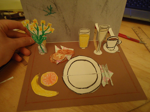
After I had already embarked on the adventure of making my first pop-up card ever, I decided that simple stands were not going to cut it, and I needed something way cooler.
I had a few more design liberties with this step, as I decided to replace the original eggs benedict in the project with some sort of birthday cake.
Initially, I thought of just cutting out another shape. and pasting it onto another stand. However, as the cake is in the middle of the card, I didn't want it to be overshadowed by a massive stand.
A little bit of research brought me onto flat fold pop-up techniques. This tutorial even explains how to make a birthday cake. Please watch the instructions and have a glance at his template. It's so perfect!
Well, except that the cake is a whole square cake, while I was looking more for an individual piece of cake.
I guess I had to design my own template after all.
Cake Template
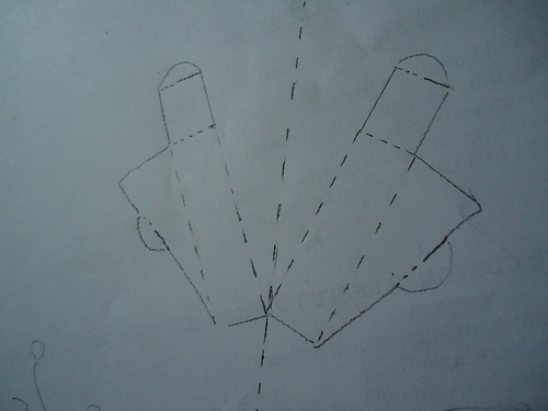
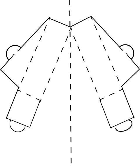
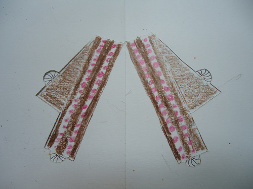
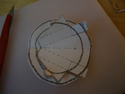
This is the template I made for the piece of cake. It folds flat down the centre of a card.
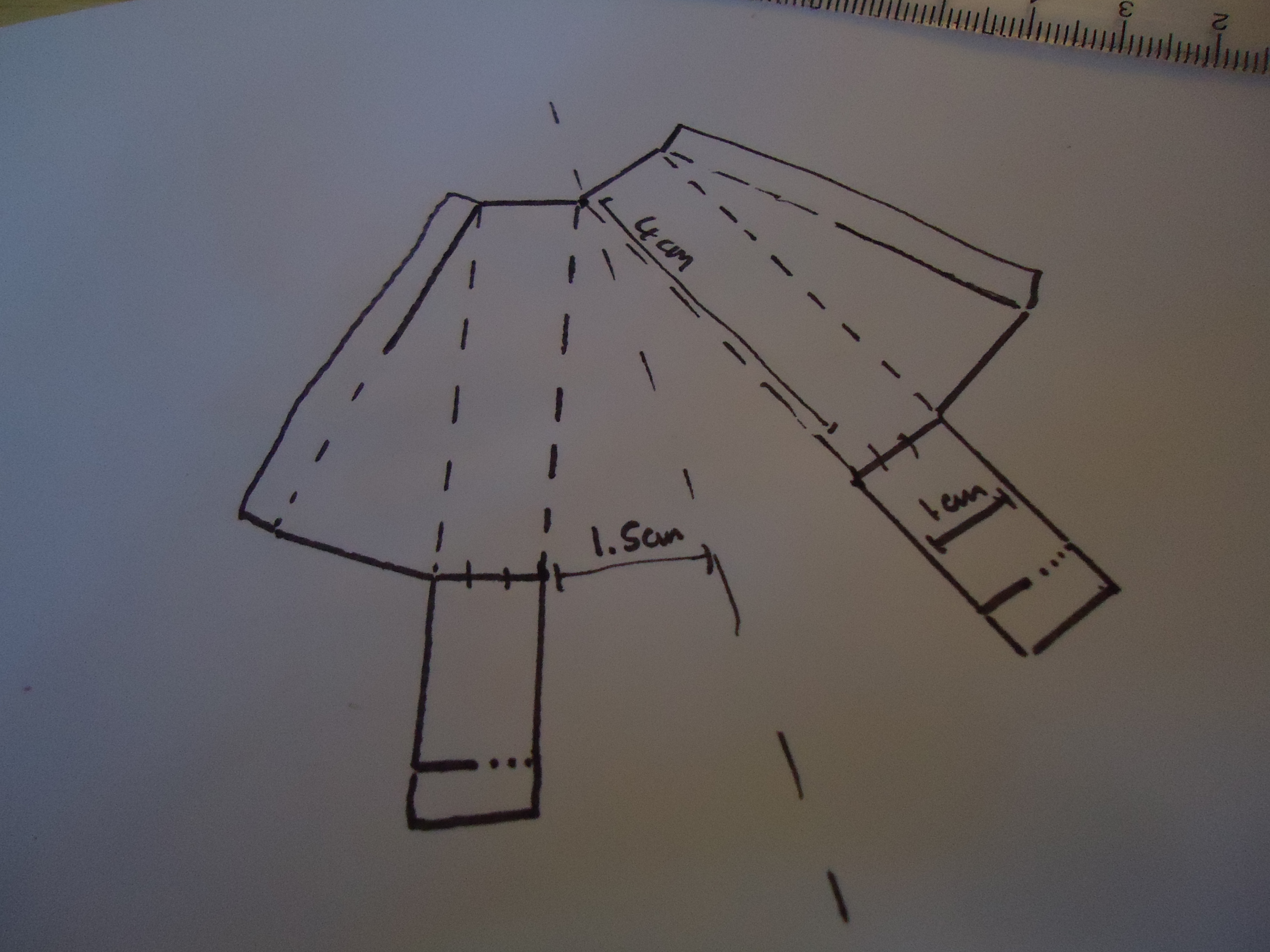
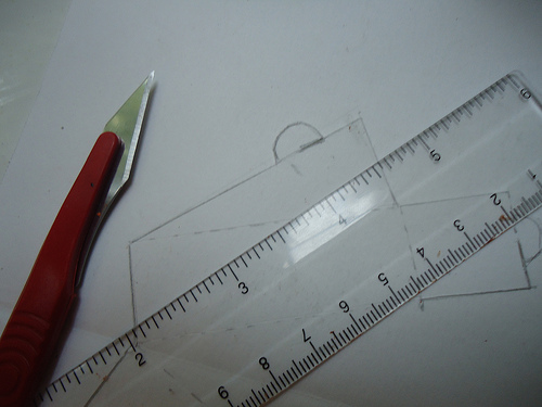
It's easy to change the size of this cake. I've included pictures of my first draft (image 3) with the original measurements but with slightly different latch design, the picture of the template I actually used (image 1), plus a more clear version which I drew in Inkscape (image 2).
I have annotated the first image with the dimensions. If you keep A., B and C constant, then you should be able to resize this without any problems. A determines how long the slice of cake is, B determines its height and C its thickness.
Slight glitch: remember not to cut off the latch at the back of the cake. Inkscape turned out a bit pernickety with getting lines drawn at the correct angle while also being dotted. The correct latch cutting/scoring relation can be seen very clearly in image 1 and 3.
Between the three templates, you should be able to figure out how to draw your own.
As usual with paper crafts, solid lines mean cutting, while dotted lines means gentle scoring, to facilitate folding creases later on.
Cake Assembly
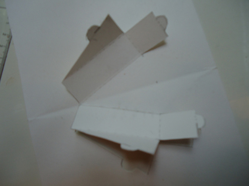
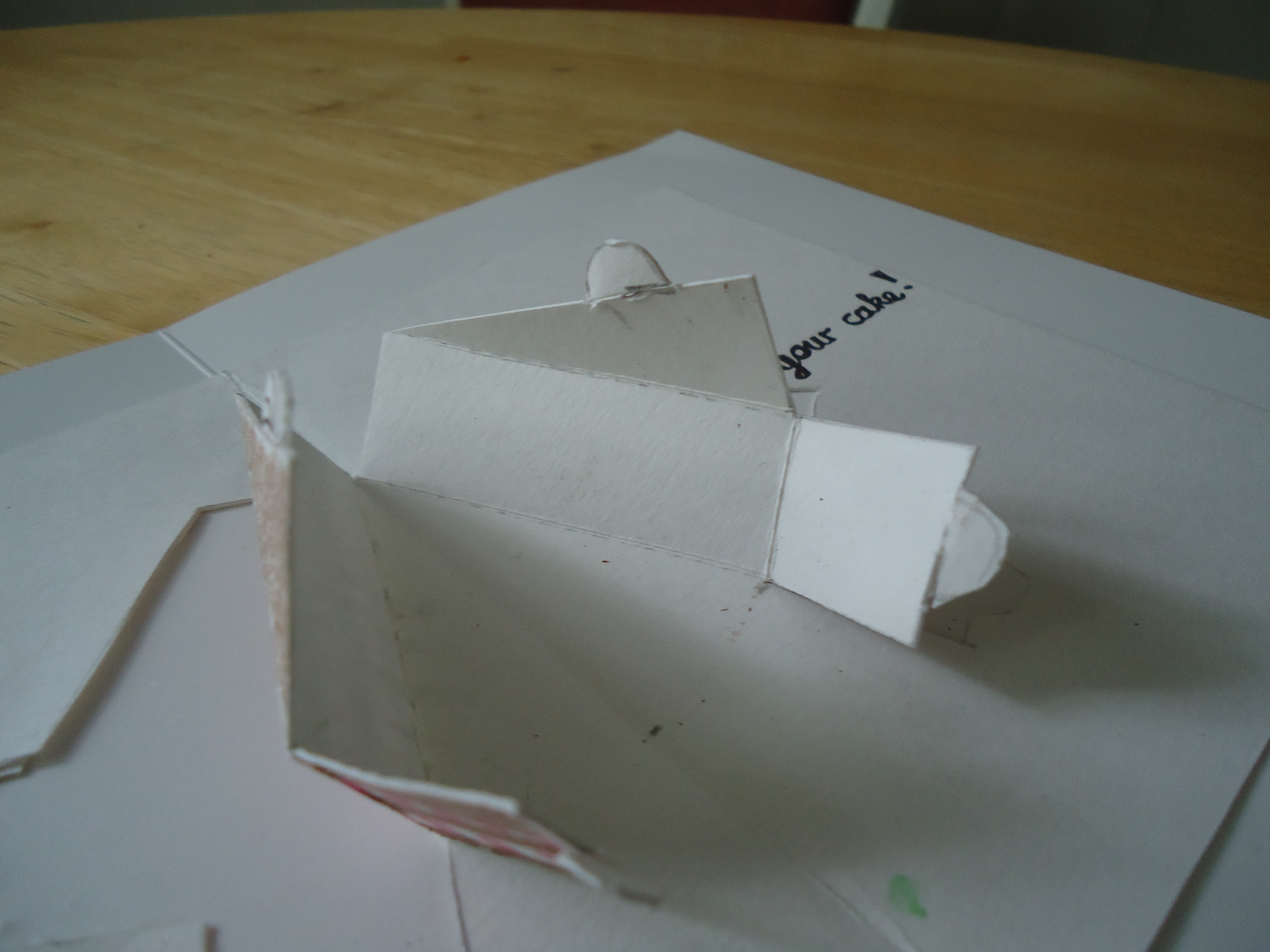
Cut out out the cake shape out of white cardboard, cutting through all the solid lines and scoring the connections that are dotted in the template.
Carefully bend all the creases.
Then fold the cake completely into shape interlocking the latches.
Carefully bend all the creases.
Then fold the cake completely into shape interlocking the latches.
Embellishing the Cake
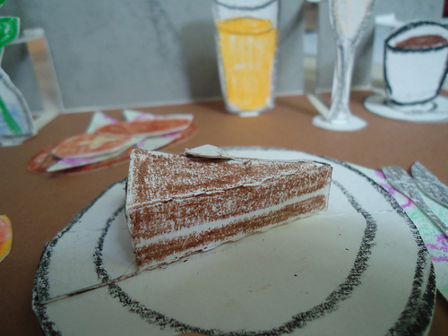
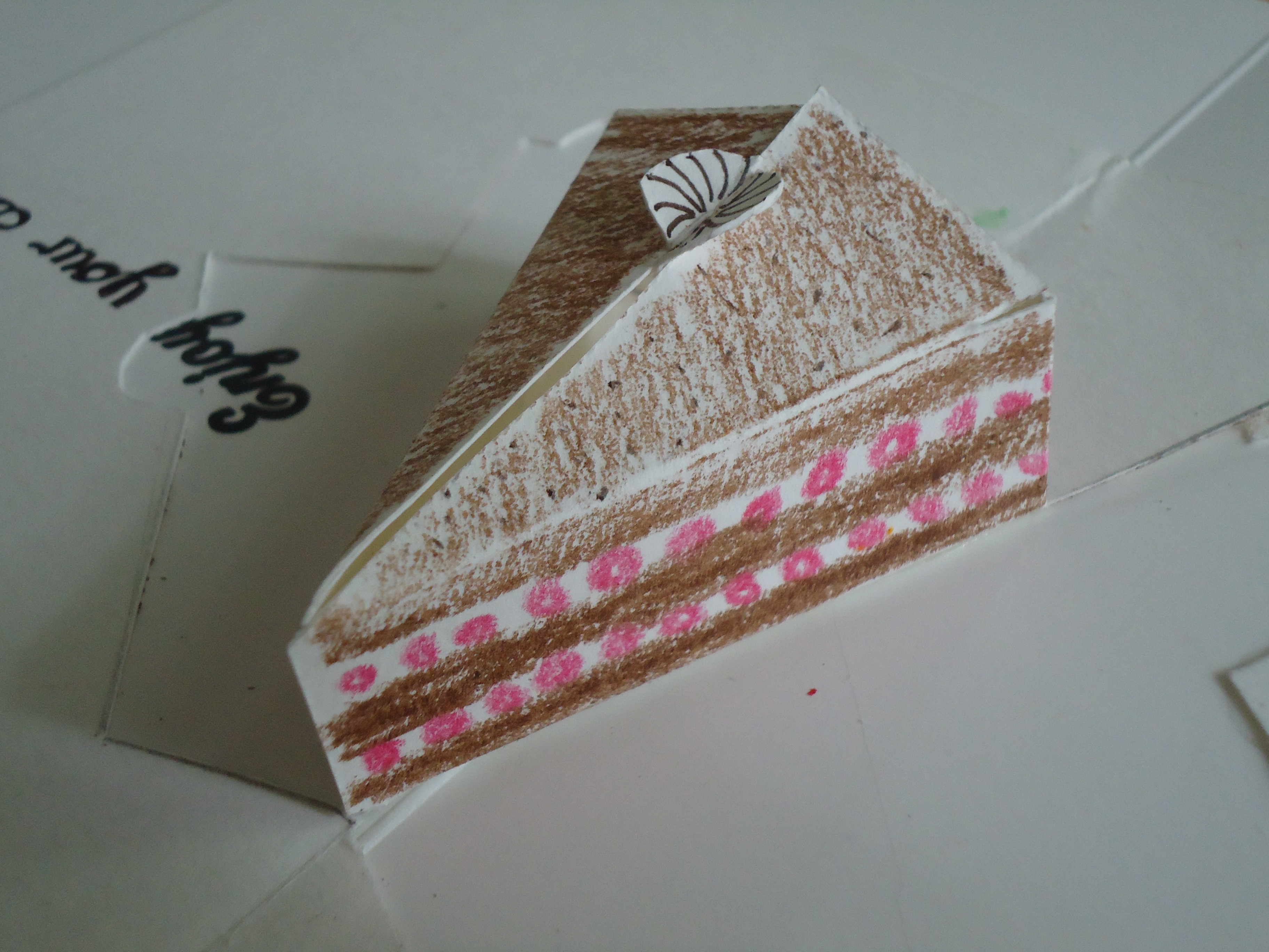
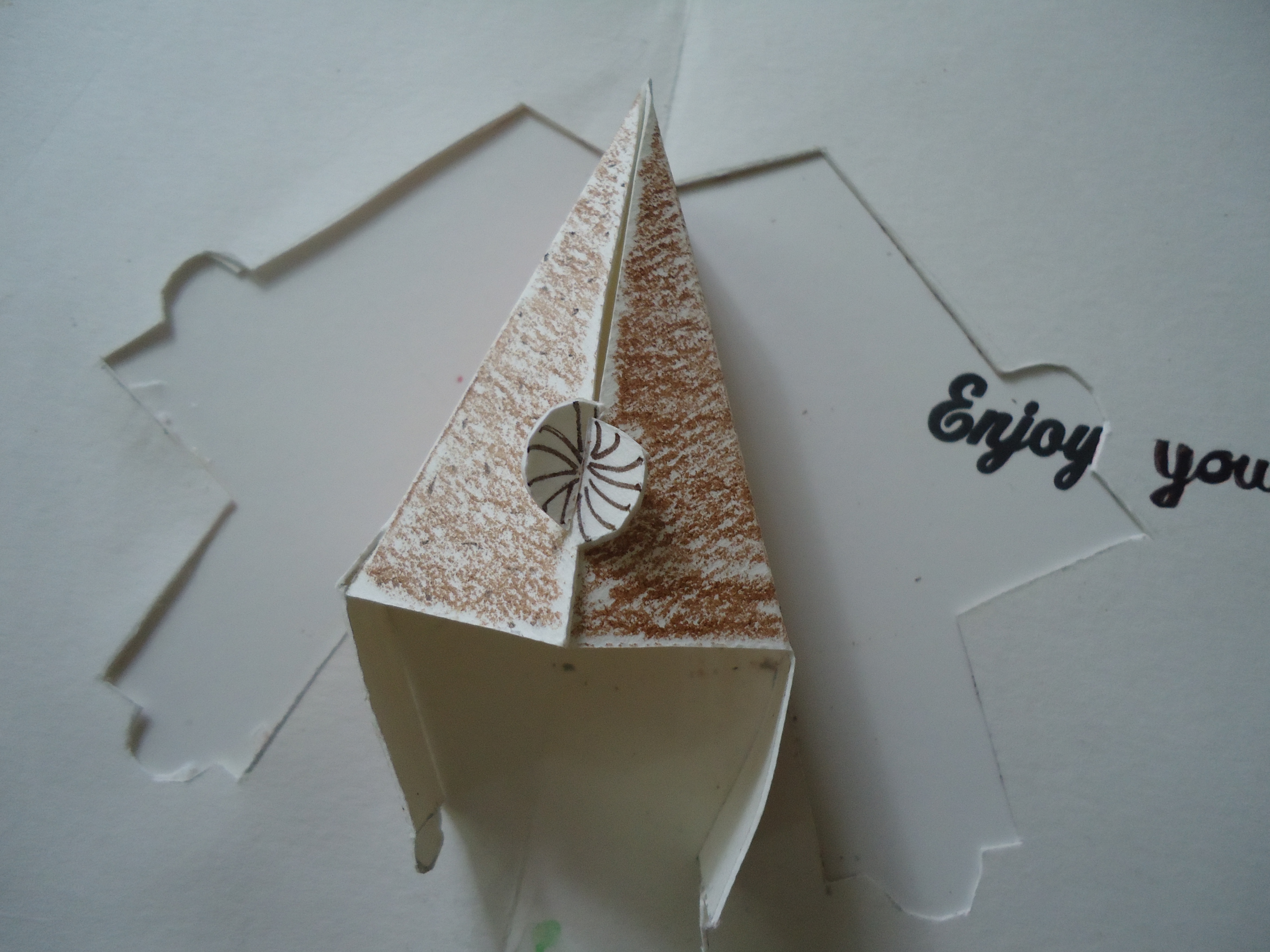
I coloured the outside of the cake. In the original card, I made a chocolate cake with cream filling.
This meant brown stripes with a white stripe in the middle.
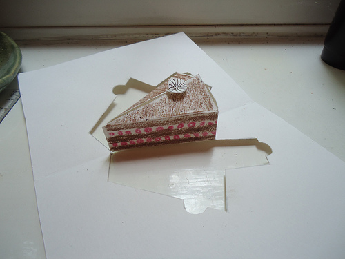
For a second card, I increased the size of the cake, to be able to work with more details. As the recipient is a great fan of black forest gateau, I created a slice of that.
I drew brown stripes for the chocolate sponge, "layered" with white stripes with red circles for cream and cherries. I also used the little flaps that connect top and back, cut them into a rounder shape, and decorated them to look like little cream puffs.
Final Assembly
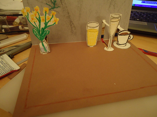
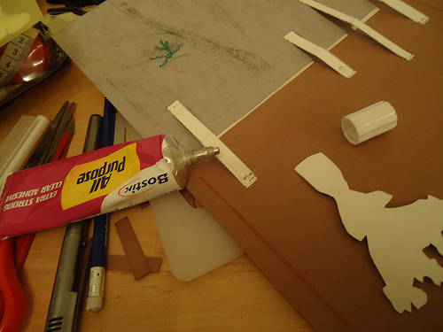
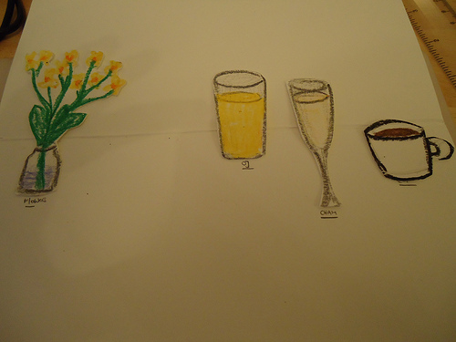
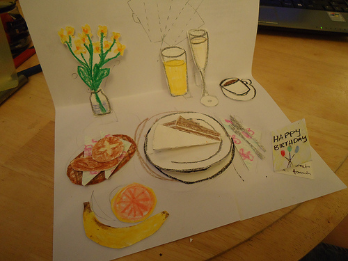
At this stage, you have a card with the delicate stands in the right places, a cool looking background, and and envelope (or dining table) full of fiddly paper bits.
You're ready for the home run: the assembly of all these bits into the finished card. I advise for a steady hand, and excellent lighting conditions, and against doing this at aforementioned dining table at 3am. It'll probably work either way though.
I played around with my little objects for a bit, arranging them on the mock card to decide on a final line up.
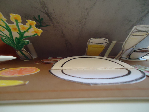
I then carefully applied glue to the length of the stands, and applied the flower vase, the OJ, champagne glass and coffee cup.
Assembly II
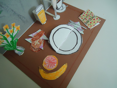
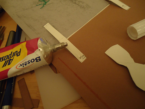
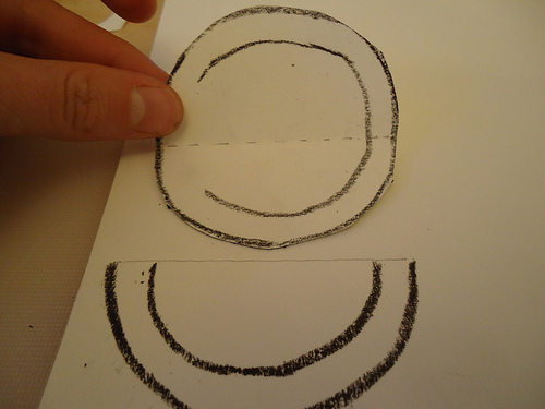
Arrange all the parts on the card, and glue them down with all-purpose glue.
For the cake, glue down the cut out cake itself onto the shape of a plate. The fold this plate+cake into half, and the glue the top half of the folded plate to the tray. Add a complementary second empty half plate to complete. This means that at first glance, the plate will appear empty, until folded down to reveal the cake.
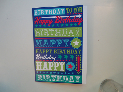
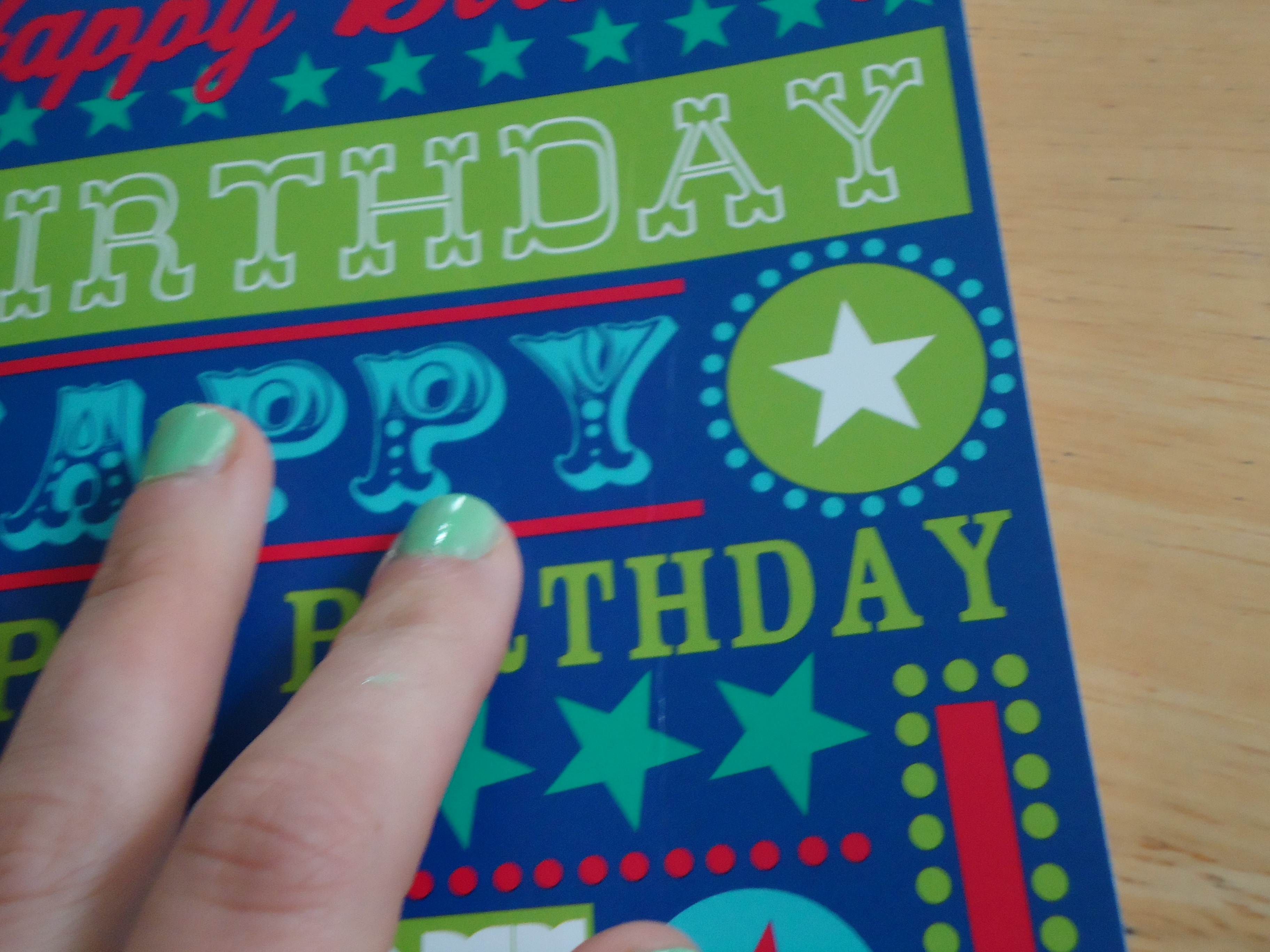
Optional step: slide the card into a storebought birthday card and glue it down. Take care not to glue down the stands.
The Final Product


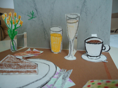

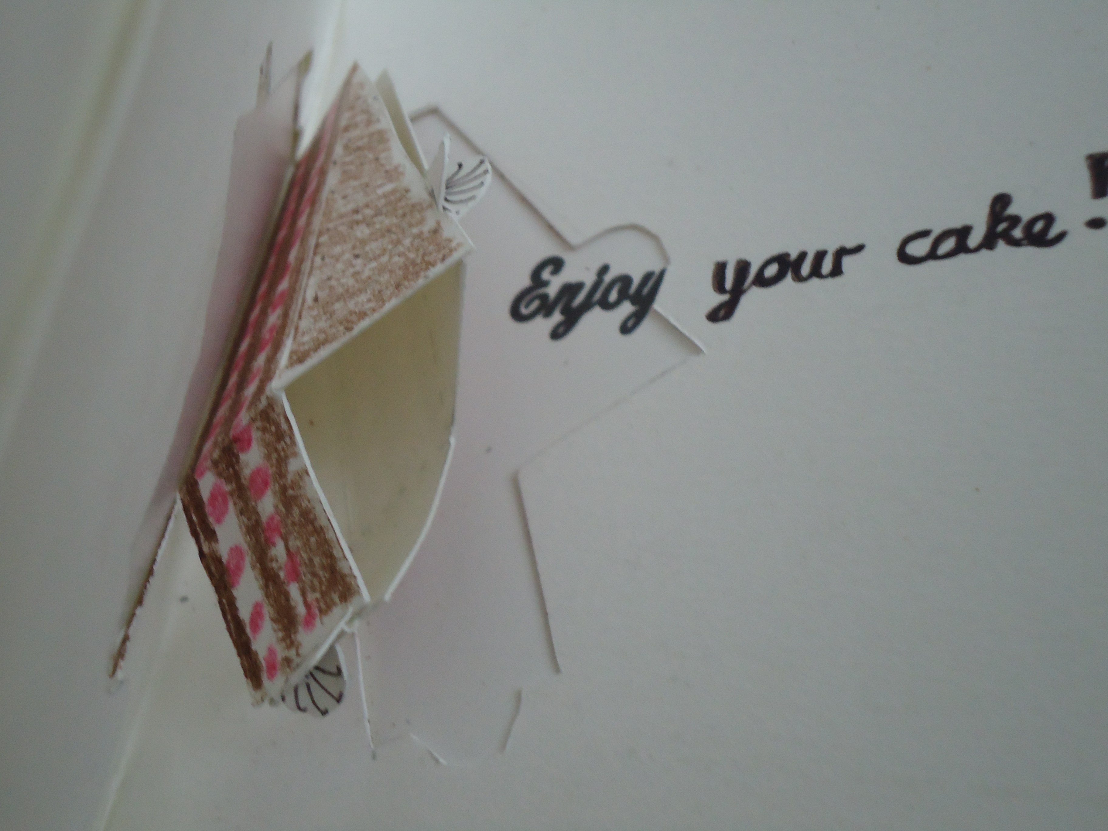
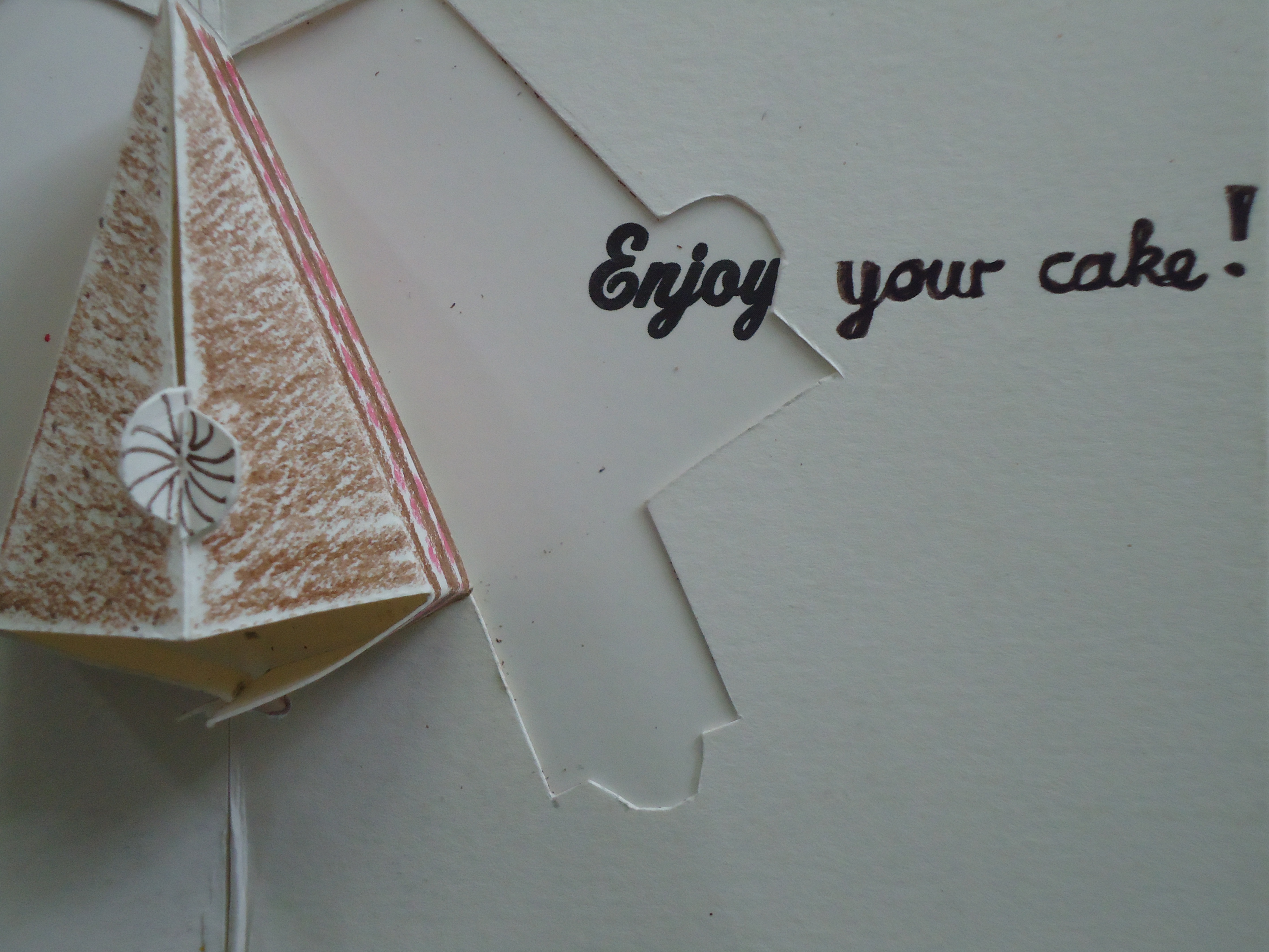
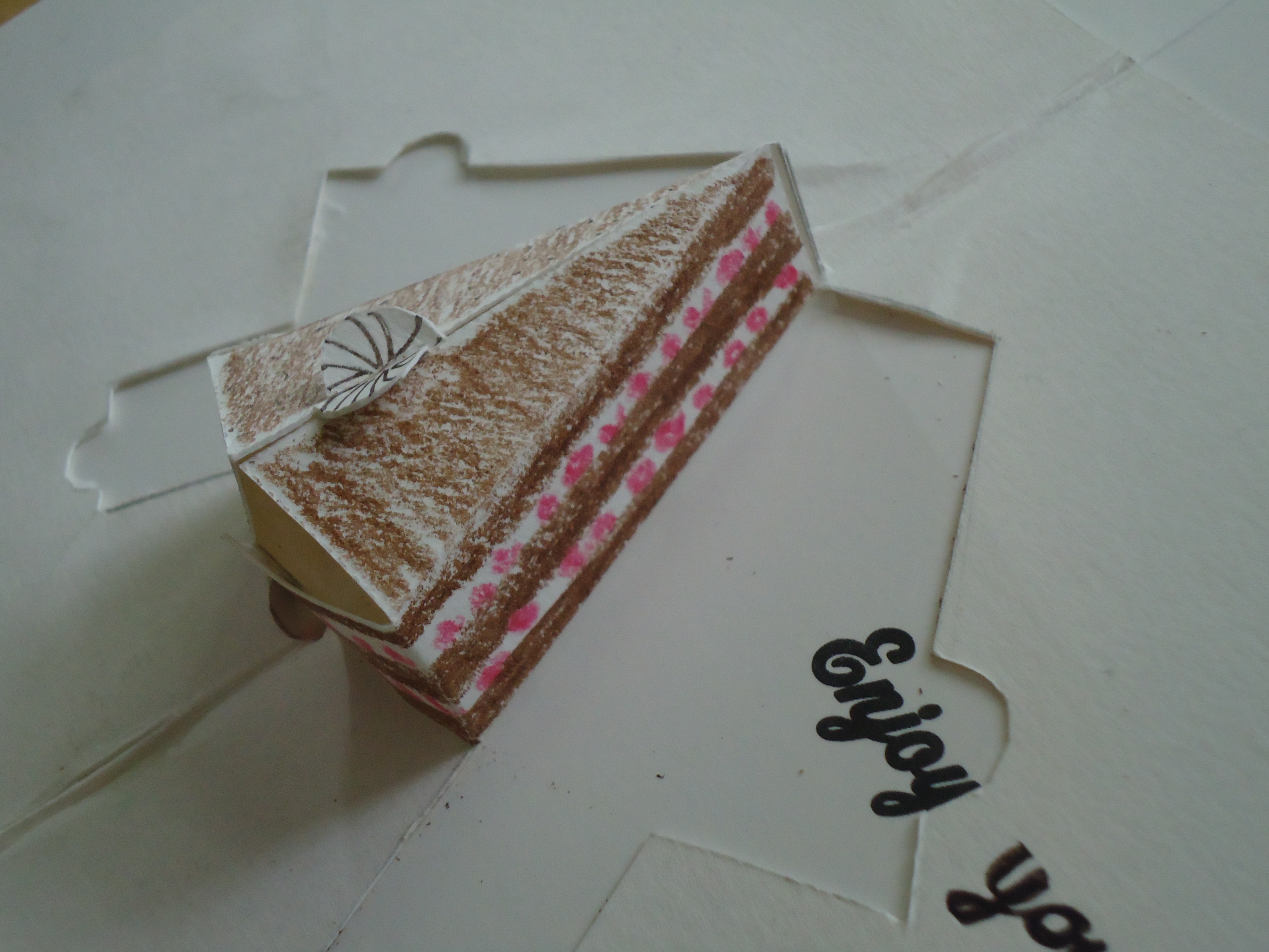

You've just finished a beautiful pop-up card. When opening it to 90° it reveals the "Brunch on the Rocks" scene, and on second glance you discover that the plate once more folds up, this time to reveal a slice of delicious cake.
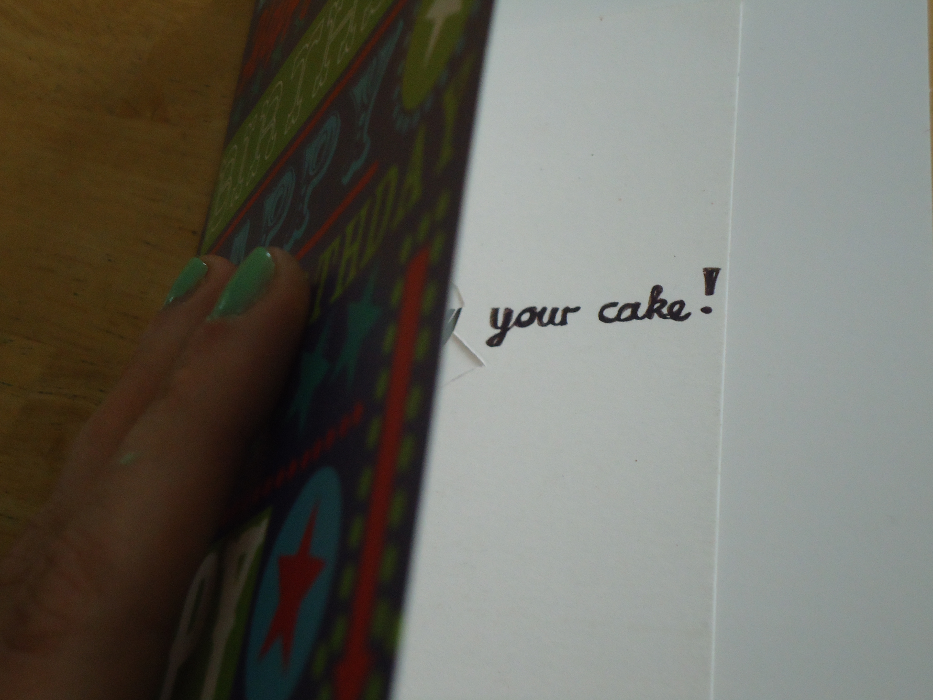
The cake pop-up design itself can also be upsized an employed in a more simple and generic birthday card. It opens up, folds flat, and reveals a fantastic slice of black forest gateau. Yum!
I hope this project can inspire you to take a stab at paper art. I had a lot of fun making it, and will probably play with more pop-up designs in the future.