Photoshop an Old-Timey Business Card With Imported Fonts and Elements
by gtrachel in Craft > Digital Graphics
6275 Views, 189 Favorites, 0 Comments
Photoshop an Old-Timey Business Card With Imported Fonts and Elements
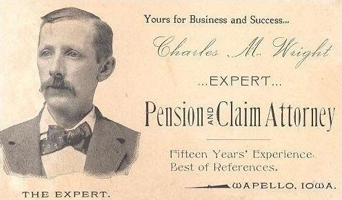
When I saw this 19th-century business card on Wikipedia, I thought, "That would be a super fun Photoshop learning project." It's not too complicated, but it does require a variety of important Photoshop skills: getting rid of a background in a photo, using layer effects, some brush work, and playing with text.
For this project, fonts are going to be important in capturing the old-timey look we're going for, so I wanted something beyond what's already available. Photoshop comes with a selection of fonts, and if you have Adobe's Creative Suite, like I do, you can get access to even more fonts online for no additional cost through their TypeKit site, which has very well-designed search functions but not as many font options as you'll find elsewhere. Furthermore, there are tons of really cool free fonts available for safe download on the internet. That said, font design is hard, time-consuming work, and I'm fully in favor of paying for design elements now and then. I'll be using a couple of fonts from Creative Market, the contest sponsor, in this project, including Brixton.
I'll be using Photoshop CC 2014 for this project, the current version, on my Windows system.
Set Up Your Canvas
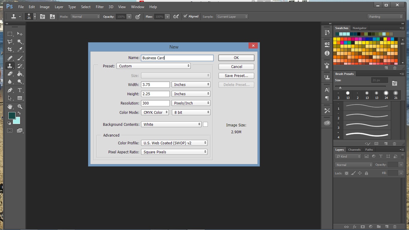
You'll want to start with a blank file sized for the business card. Leave room for bleed, so that when the card is cut (if you decide to have it printed), you don't have white edges.
Crop a Portrait
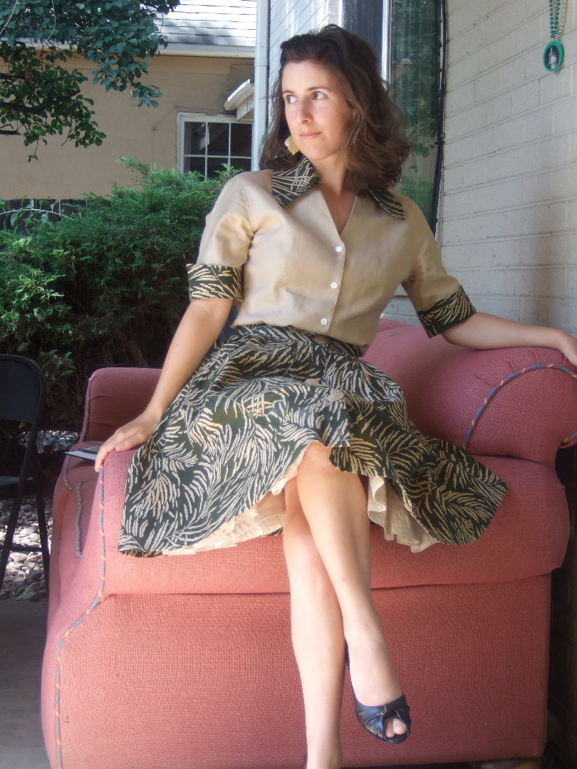
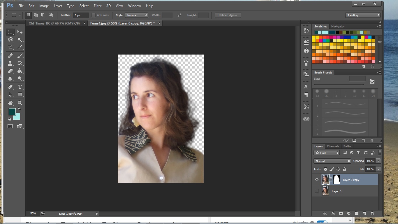
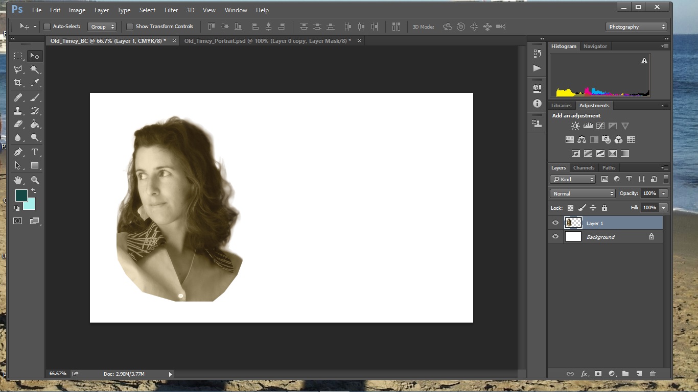
You'll need a photo of yourself next, preferably one in which you have a thoughtful, neutral expression on your face, like you're waiting several minutes for the camera to expose the film in 1895. Ditch the background. If you don't know where to start, I find this video very helpful, but there are a couple of things you might need to do differently. He uses the magic wand to select the background, which works because it's all more or less the same color and the model isn't wearing any green at all. If your photo, like mine, has a busier background, use the magnetic lasso tool to select yourself.
Once you've cut the background out, add a sepia layer to what remains. You can get this effect by checking the "tint" box on the black-and-white filter. Make a copy of this image (be sure to copy layers, not just what's selected, or you won't get the effects you created), and paste it onto your business card layout.
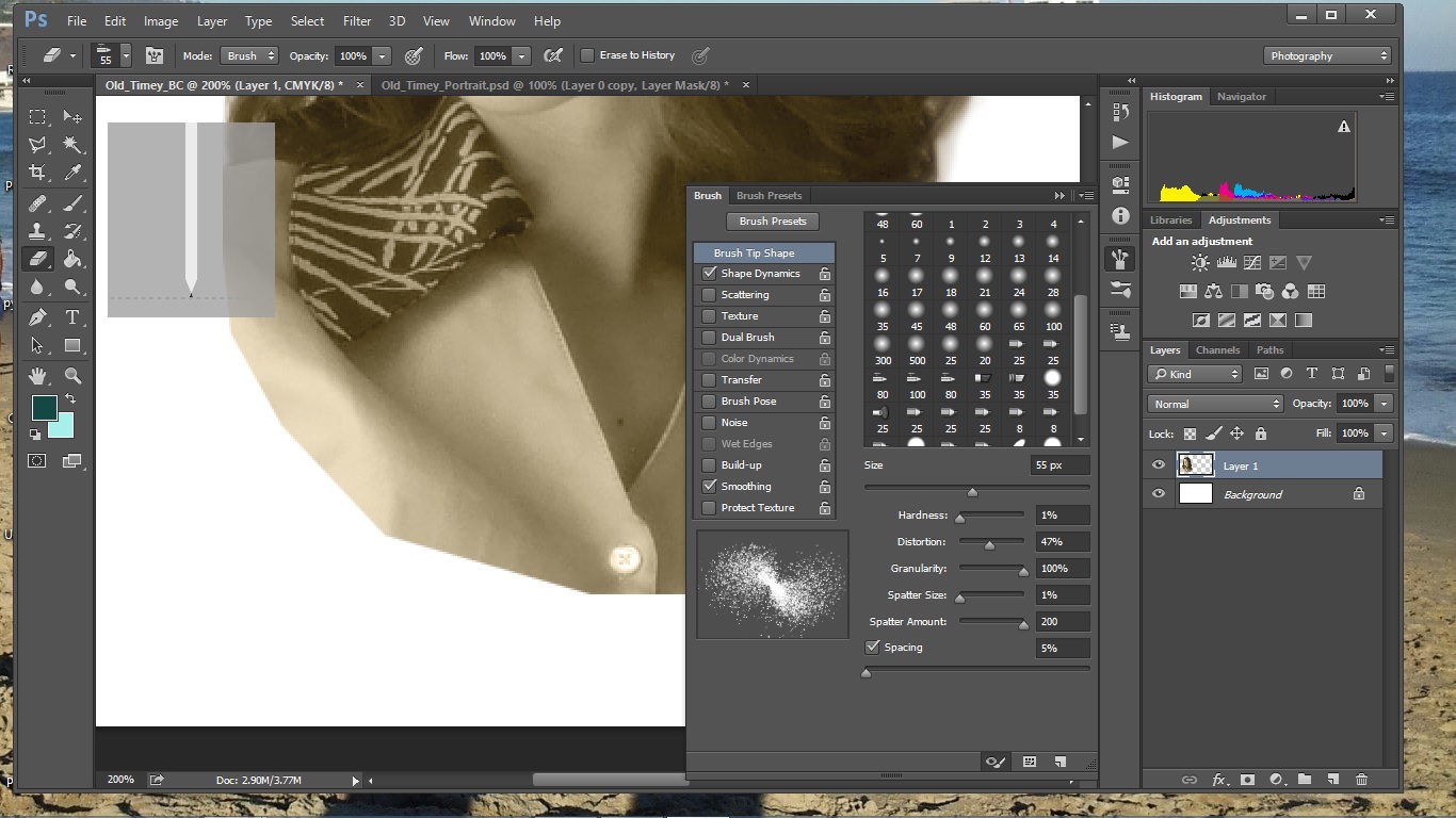
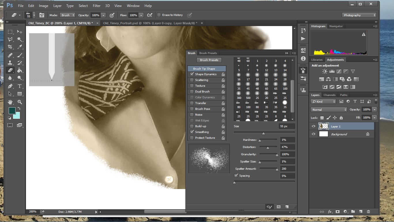
You might notice on our original old-timey business card that there's kind of a stipple effect happening where the lawyer's bust is cut off. We can get a similar effect by using the eraser, and setting to stipple effects. My attempt doesn't look as rudimentary as the original, which is pretty rough, but I'm happy with it. You can see the exact settings I use in the images.
Add Some Text
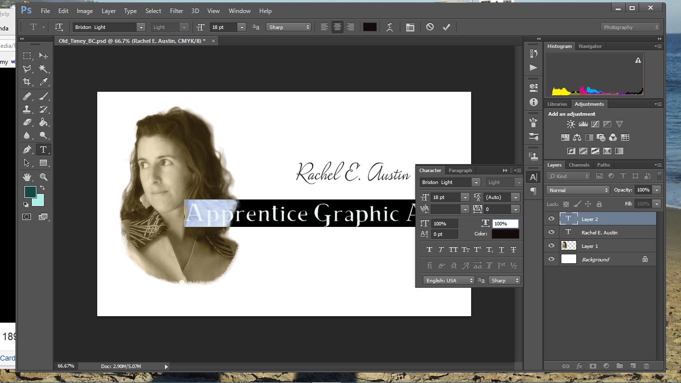
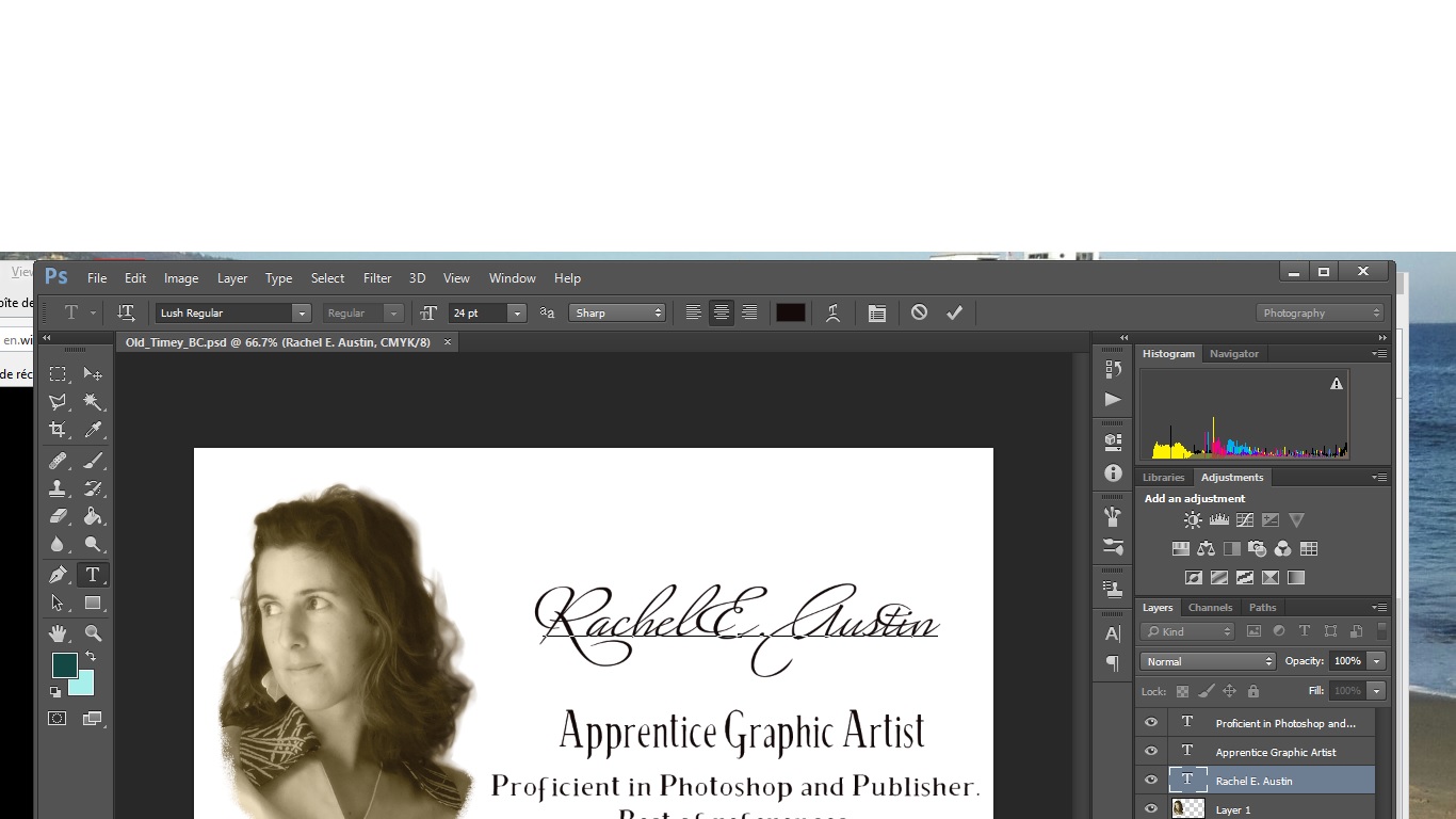
This is where we have ultra-fun, because Photoshop can do so many really cool things with your text, and it's probably the fastest, easiest editing there is. I'm using "Lush" for the script, which is from TypeKit, and "Brixton" for the serif, which is from Creative Market.
To begin with, I just want to get the text on there. I'll reposition it and edit it both as I go and when it's all on there. I'm trying to get the same look as the original, so I've put my name in script, and I'm using the serif font for the job title and little blurb underneath. You'll notice that the job title on the original uses taller, narrower letters, while the blurb has wider letters. Photoshop can take one font and change it to have different characteristics. Open the character panel you see in the first image by clicking on the icon in the toolbar that looks like a square folder with writing on it. Play with those settings to change the height and other characteristics of selected text. For script, you can get fancier individual letters by checking the "swash" option in this panel - see it in the difference between my name script in the first and second images. (It works for whole words, but they lose legibility.)
Background: Color and Noise
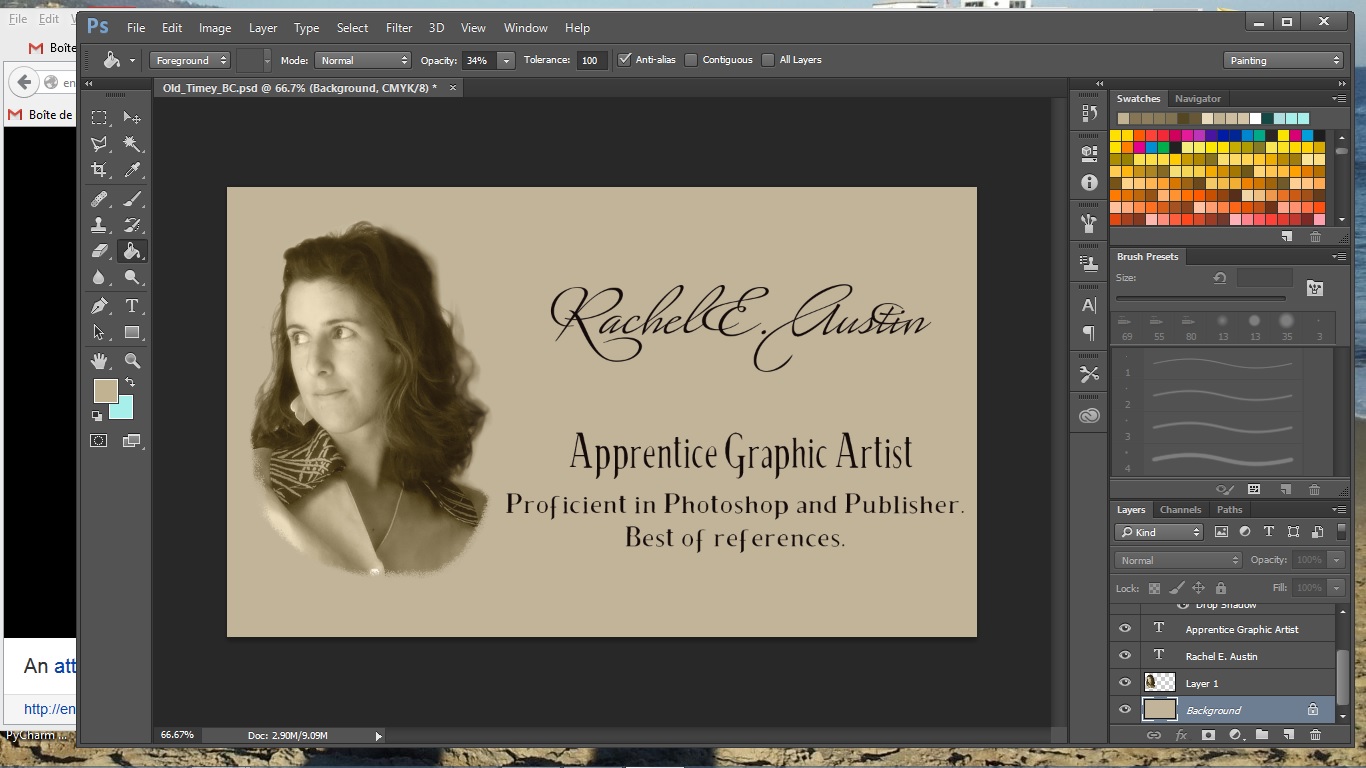
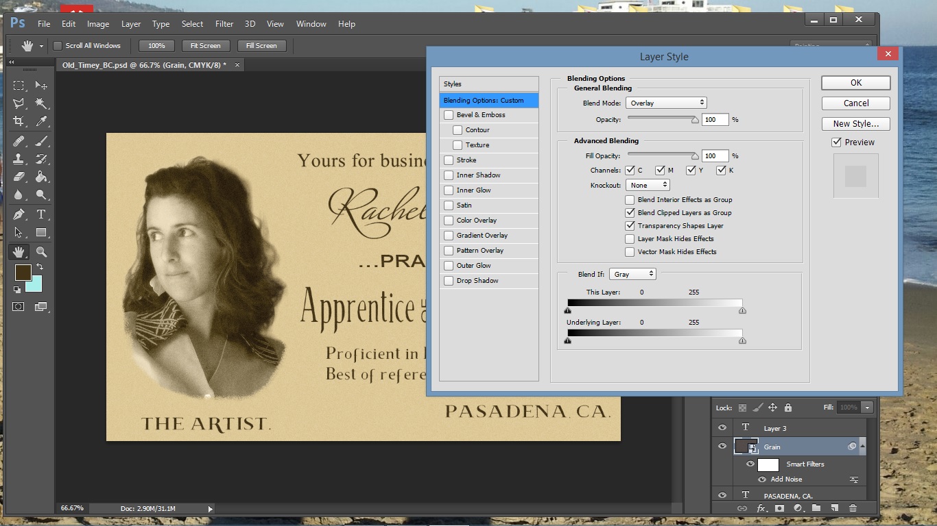
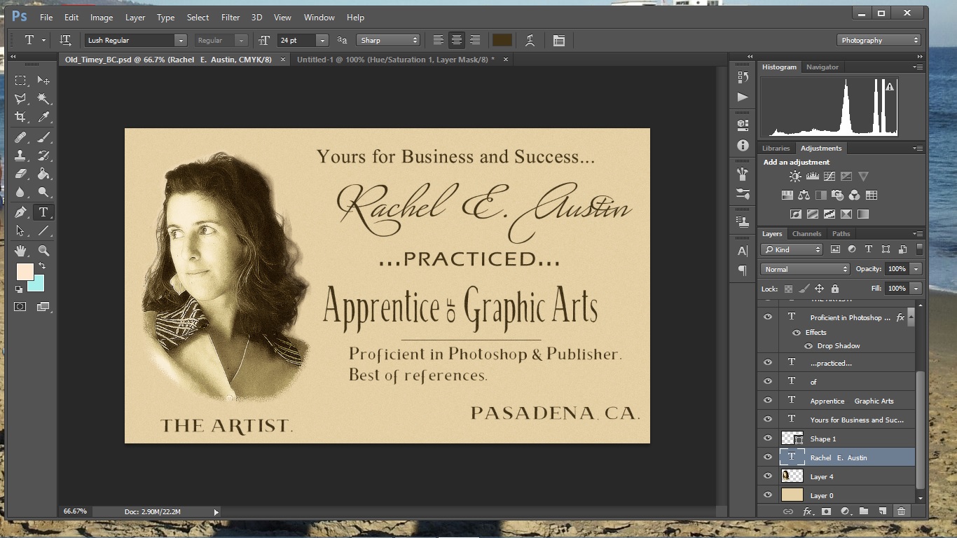
For the background color, I sampled from the sepia-toned photo area and then, upon reflection, went a little bit warmer. Upon further reflection, I sampled the background of the original card. The quality of the whole card is pretty grainy, not just the photo, so I added a grain layer on the whole project (check out this great little tutorial for details).
I adjusted the color of the text at this point as well, and also sampled from the photo area for a dark brown color. I decided at this point that I wanted to re-edit my photo area, because I had originally cut it with soft, feathered edges, whereas the original has a much harder edge, and there's more contrast and even more graininess going on. I hadn't saved the photo I was working on (bad practice!), but never fear: Photoshop had my back here. Select the layer with the photo, and simply copy it to a new document. I re-edited it, deleted the existing layer and re-copied in the new layer, grainier and harder.
Adjustments
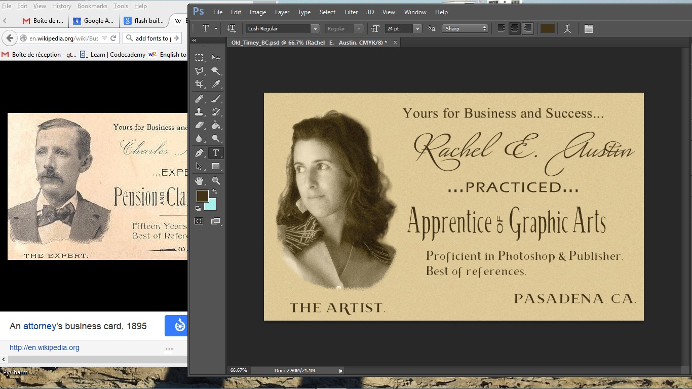
More moving stuff around, changing the sans-serif font I used in the middle (it's a pre-loaded font), and moving everything in a bit more off the edge of the project, to make sure nothing would be cut off if it were printed.
More adjustments made after publishing the instructable:
I desaturated the sepia image completely and boosted the contrast and darkness, so that I could then make that layer partially transparent, to get the washed-out gray look from the original. I used the "blend if gray" slider to let some background show through on the lightest parts of the image, which also gets it closer to the look of the original. I also changed the font color to a dark gray and, for the script, used a color overlay in dissolve mode to make it look like the ink was a little broken. Results compared to the first draft in the next step.
Open for Business and Success
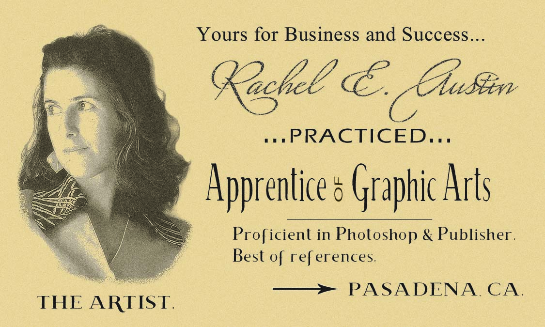
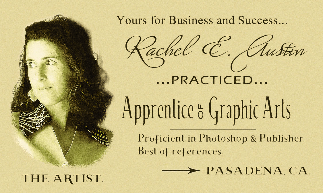
And there it is.
If you actually wanted to print these up, it would be more economical to do the image in grayscale only and then print on cardstock of the color you want. I'm... not going to have these printed, as much fun as they are, but I will keep the image around for my portfolio, so color it is.
I'd love to see your work, if you'd like to share!