Smart Phone Drawing With Sketchbook Mobile
by John Induna AD in Design > Digital Graphics
47282 Views, 14 Favorites, 0 Comments
Smart Phone Drawing With Sketchbook Mobile
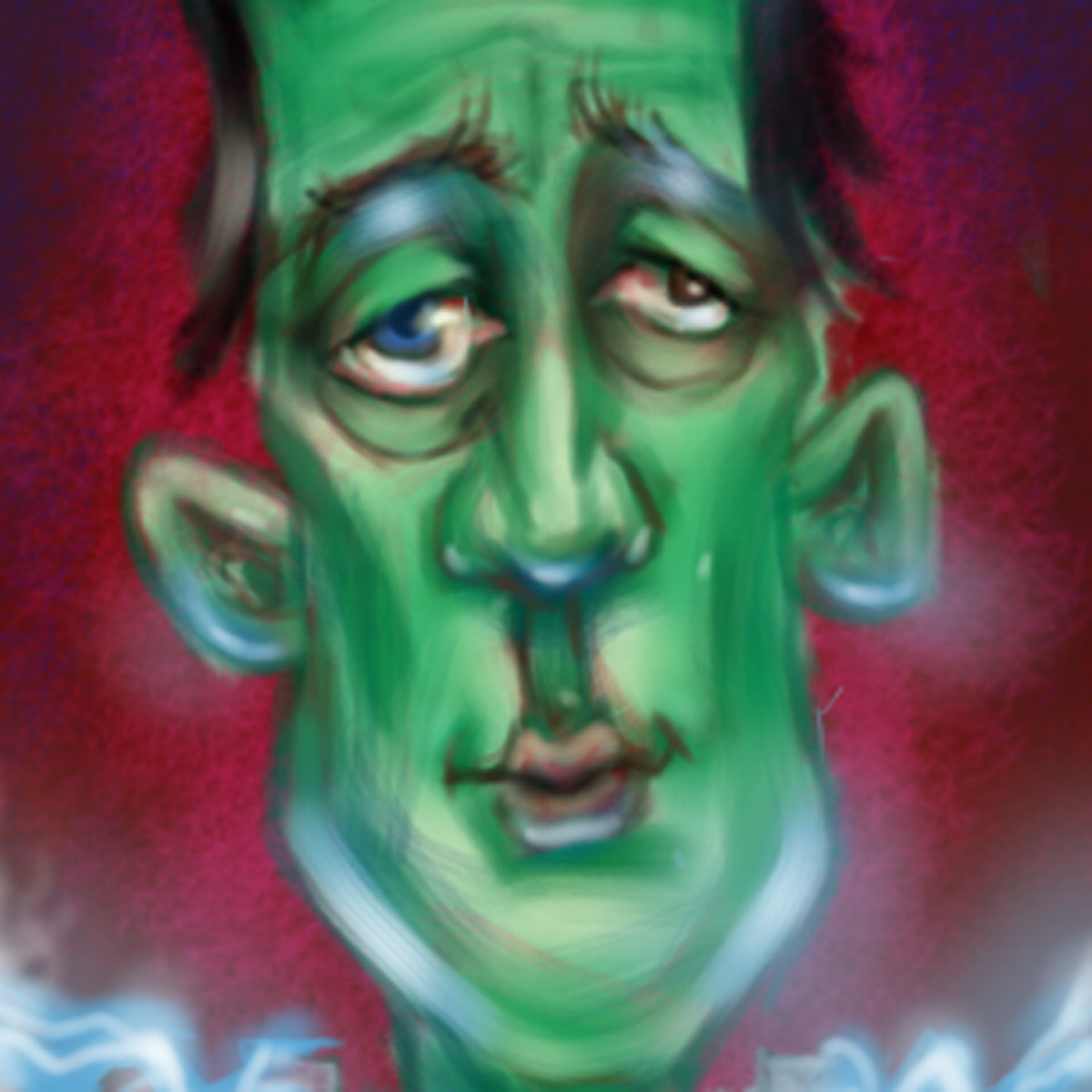
Can you believe we can draw on our Phones?
I realize we have been able to do that for a while and saying..er, typing that just make me sound old but I use to carry around a sketchbook...(I still do, but back to my story) A sketchbook turned out to be a handy thing to carry around. You could of course sketch, but you could also take notes, record some of your ideas, get a few phone numbers. It never seemed to matter if I had to take public transit, wait to see someone or show up early somewhere because I could draw.
These days if you have a smart phone and Sketchbook Mobile, there is almost no reason to carry around an old sketchbook.
Getting Started
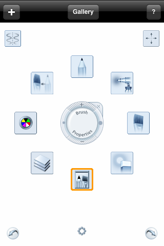
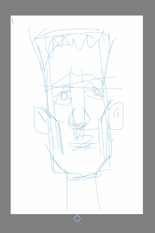
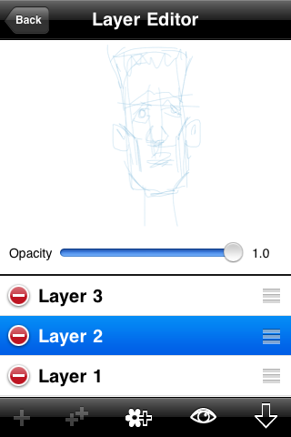
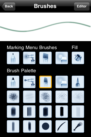
So here it is Sketchbook Mobile on an iphone. Can't remember when it came out but when I saw it in the app store I snapped it up right away. I was familiar with the PC version and was excited to try it out.
I often begin a sketch with some kind of rough drawing. Once I have an idea of what I want to draw I start out by drawing some very basic shape. I tend to block things out with straitish lines, this frees me from trying to get the right curvy lines until I see things start to take shape. When I am drawing for fun or from my imagination, I will deliberately start my drawing loose and almost crappy to see what flows out. This give me something to work with that is not too contrived or predictable and pushes me to be more creative to be able to pull it all together in the end.
I often begin a sketch with some kind of rough drawing. Once I have an idea of what I want to draw I start out by drawing some very basic shape. I tend to block things out with straitish lines, this frees me from trying to get the right curvy lines until I see things start to take shape. When I am drawing for fun or from my imagination, I will deliberately start my drawing loose and almost crappy to see what flows out. This give me something to work with that is not too contrived or predictable and pushes me to be more creative to be able to pull it all together in the end.
A Line Drawing
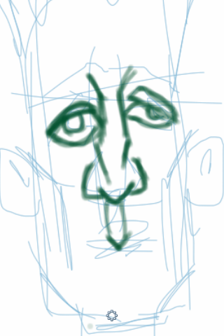
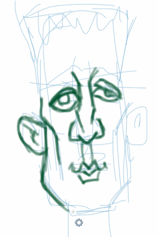
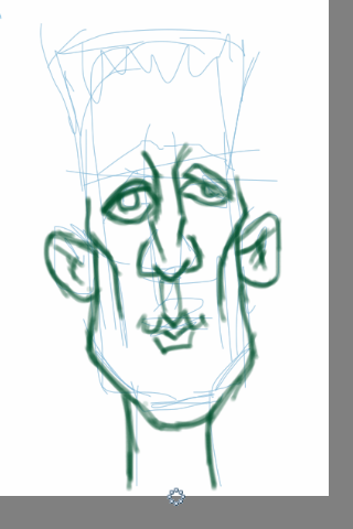
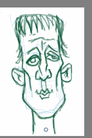
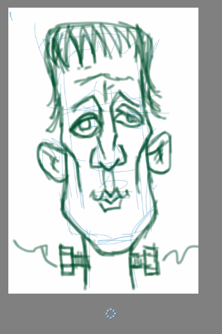
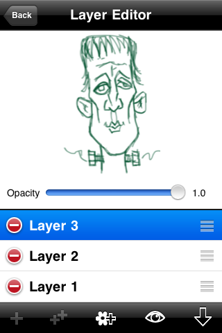
Once I have blocked out the placement of the features I create a new layer to start my line drawing. Here I decide that this guy is going to be mostly green so I make a guess at a darker version of that colour to start drawing with it. Because I am still not sure on how this guy is going to turn out, I continue to draw loosely to see what I get to work with. It's nice if I see some good things starting to develop here but if I don't, I don't panic and just keep working on it. knowing that I have a couple more steps before I expect it to start looking like something.
Dead Colouring
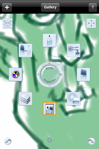
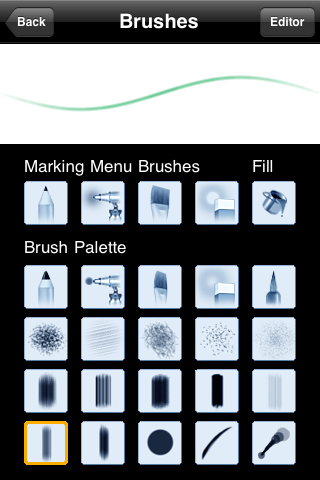
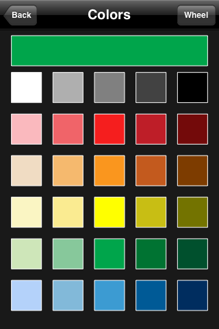
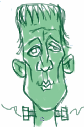
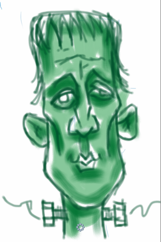
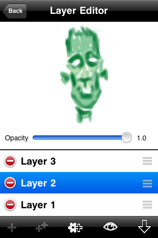
When the line drawing is at a point where I feel I have something to work with I move on to dead colouring which is simply laying in the base colour. For this I dump my rough sketch layer and replace it with this colour layer. This layer lies below the line drawing that has just been finished. I do this because I don't what to lose the line work to early.
If there were more characters, clothes or other parts to this drawing I would lay a colour in for each major object. The colours I pick would be what I would guess to be a mid tone for that object.
With that done I want to establish the form by adding shadow and eventually hi-lights.
Tip: When deciding on your shadow and hi-light colours make the colour temperature of your shadows the opposite of your hi-lights. in other words, Here I will make the green in the shadows not only darker but bluer/cooler and the green in the hi-lights lighter and more yellow/warmer.
The warmer/cooler thing not only makes your colours look richer it happens to be something right out of your physics books...has something to do with chromatic opposites.
Creating Form
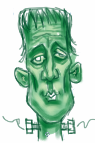
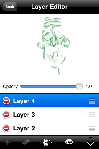
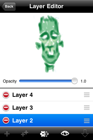
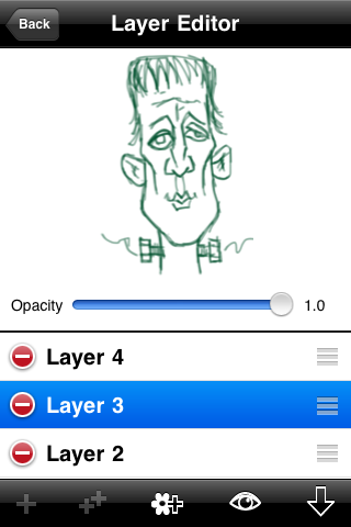
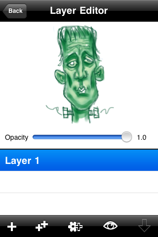
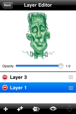
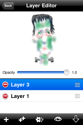
At this point of the drawing I am imagining the primary light source to be above and mostly centered on the face. The shadows are place with that in mind. Then I create a new layer for the hi-lights and I place this one over my line work. Here is where the painting really begins. In this series of images I show each layer, what's on it and the order that they are stacked on top of one another. When I am satisfied that the drawing is starting to take shape I flatten or merge all the layers into one, create a new layer on top and begin a process of drawing and paint in the details.
Moving Right Along
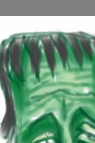
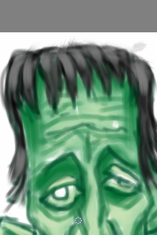
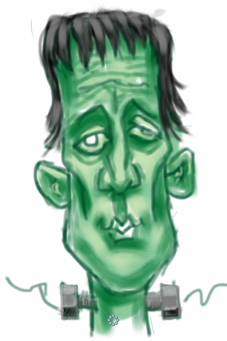
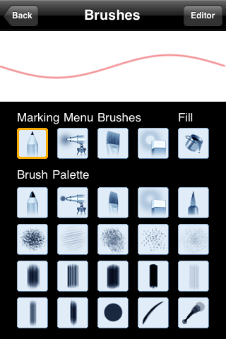
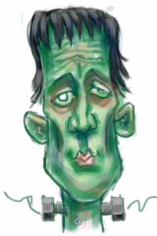
I paint with economy in mind. I choose the largest brush I can get away with and I choose one that matches the texture of the part I am painting. If I can do something with one stroke with a large brush instead of many with a smaller brush I will do it not only for inefficiency but also for the look.
Adding Detail and Adding Tones
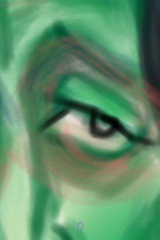
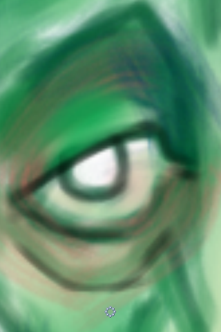

I have started to zoom into areas and start to work them up to a finish. Again I work on a layer above my painting this acts as a safety net of sorts. If what I am doing starts to get away from me and head in the wrong direction, I can erase the new parts leaving the established parts undisturbed. If things are really bad I can dump the whole layer and start again.
In this series of images I add some detail using a pencil tool, cool down the shadows and add some texture with a rough blue brush and homogenize some of the patchiness with a large soft transparent green airbrush tool. The transparent pink brush adds some life and a touch of soreness to Frankie. Below you can see the two layers separately.
In this series of images I add some detail using a pencil tool, cool down the shadows and add some texture with a rough blue brush and homogenize some of the patchiness with a large soft transparent green airbrush tool. The transparent pink brush adds some life and a touch of soreness to Frankie. Below you can see the two layers separately.
Another Pass at Some Detail
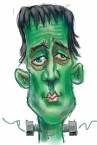
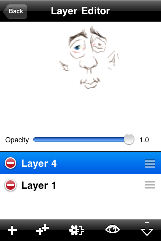
This is the part that can go on and on. Zoom in and work on an area, then pick another. I like to pick and choose what I finish in a sketch like this. I like the overall sketchy look. Here you can see the layer with the parts I decided to work on.
Adding a Back Ground Colour
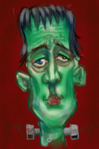
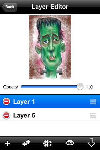
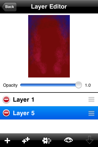
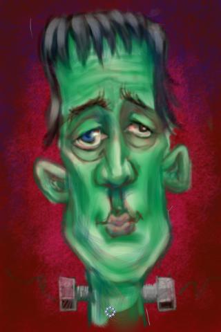
Before I can start making final adjustments to this sketch I need to see it in context. On a new layer behind my drawing I added my background. Here I used red to complement the green and I chose a dark value to set some contrast. I like to add some texture to my digital art to make it look a little more analog and also put in a little haloing to hold the viewer eyes in the picture.
Light This Sucker Up
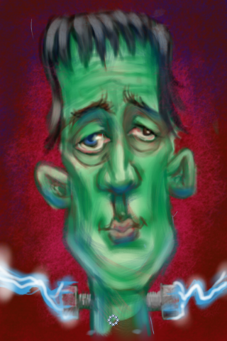
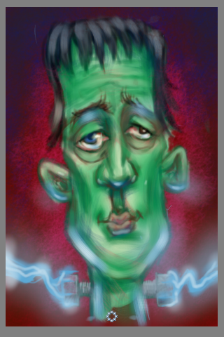
Looking at this picture I thought it needed something more to add a bit of zip to it. Those bolts in his neck were just begging to be lit up. So like everything else I have done in this tutorial, I added a layer and started with a blue pencil then some airbrush. I added some of the same colour as hi-lights on the sides and bottom of the jaw, ears, nose and eyes.
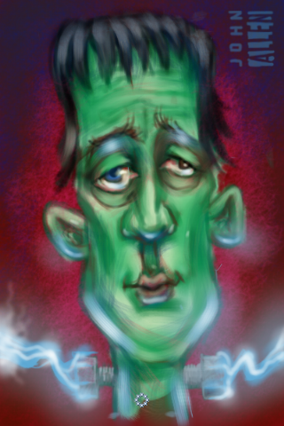
Then I signed it.
Looking at it now I see things that I would add and maybe change but I think it does the job.
Hope you enjoyed reading me rattle on,
Best,
John
Looking at it now I see things that I would add and maybe change but I think it does the job.
Hope you enjoyed reading me rattle on,
Best,
John