Personal Branding (logo, Business Card, Letterhead, Mockups)
by jayludden in Craft > Digital Graphics
7574 Views, 52 Favorites, 0 Comments
Personal Branding (logo, Business Card, Letterhead, Mockups)

This Instructable details how to design a logo, business card, and letterhead using Illustrator and inDesign.
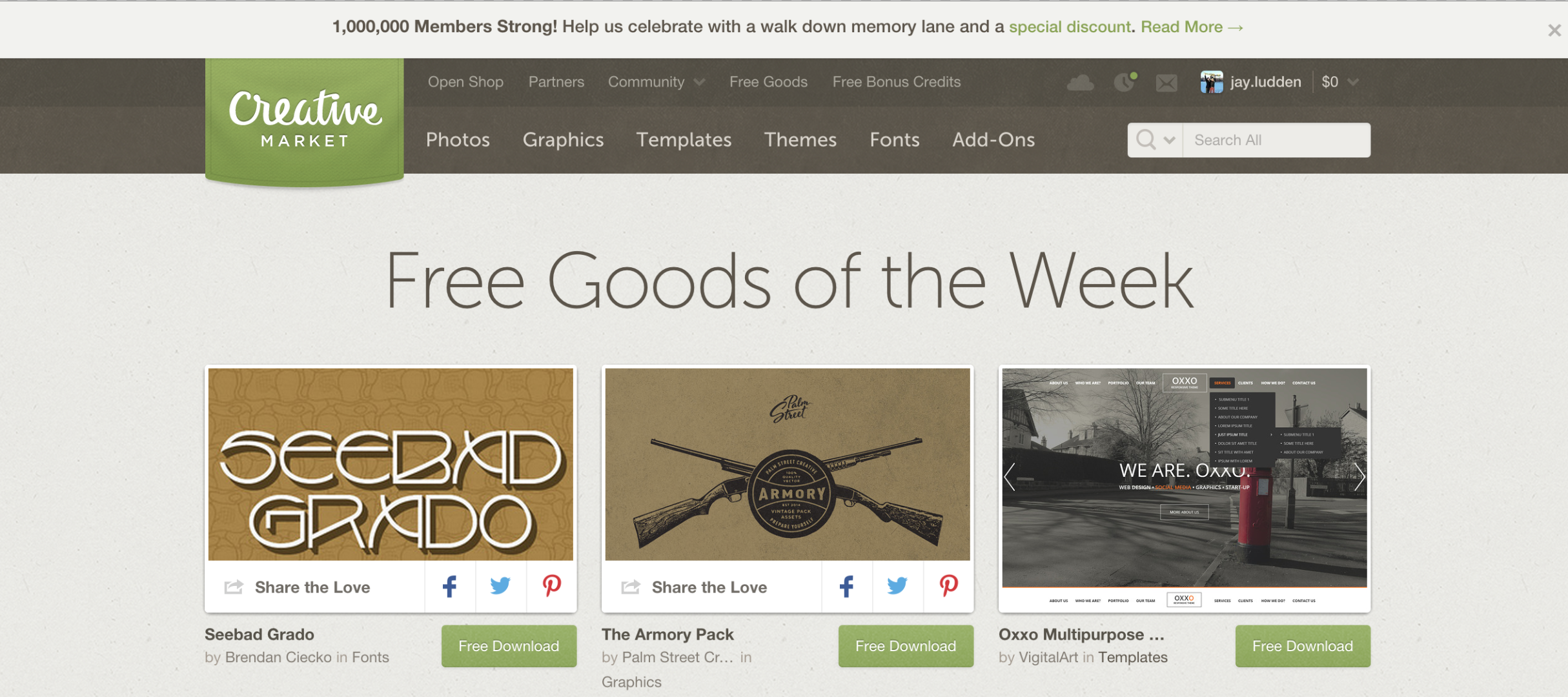
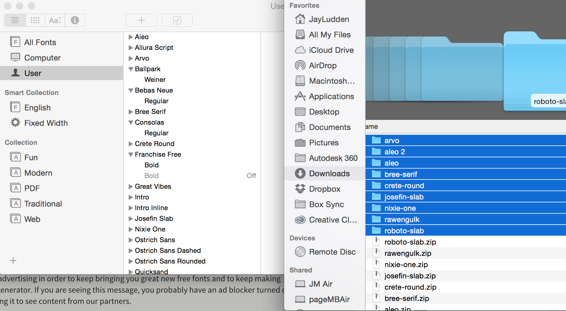
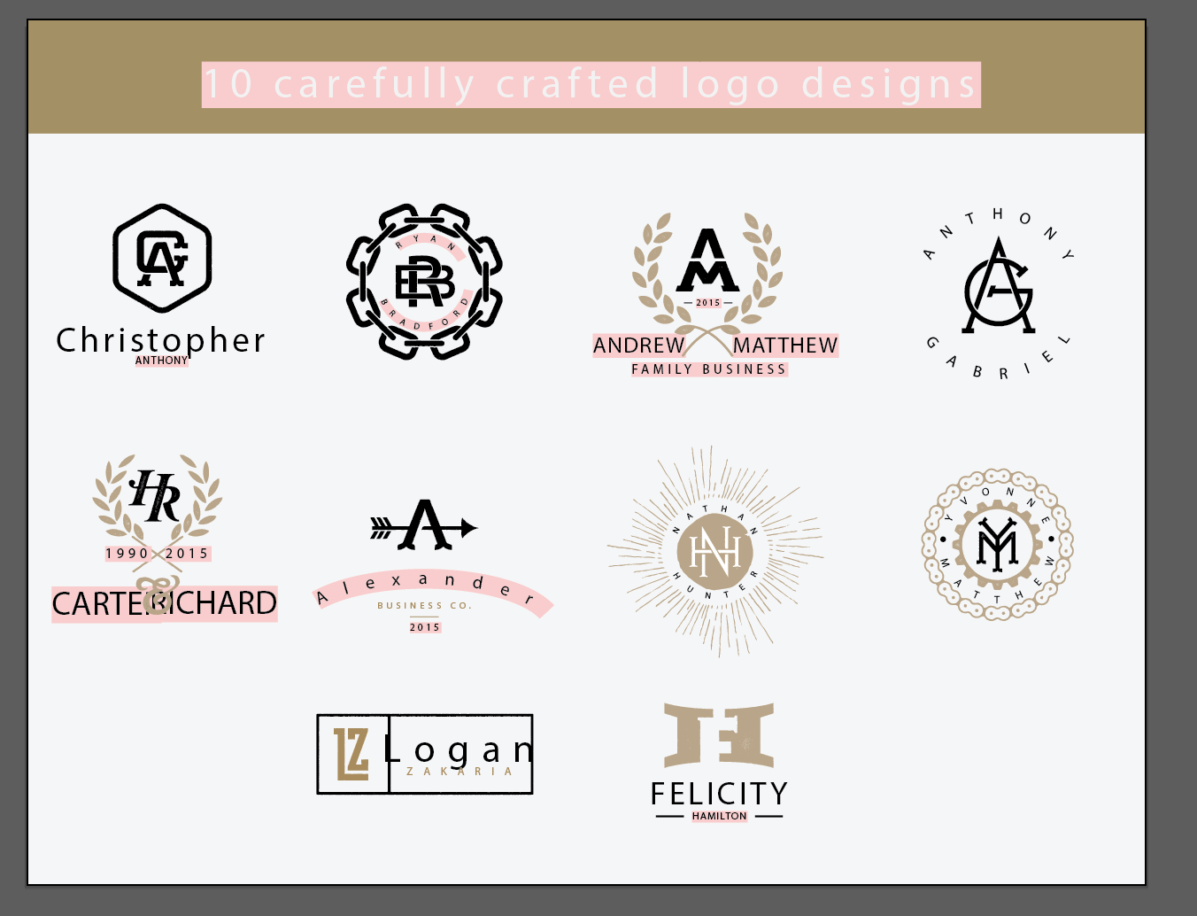
First, find some assets or inspiration for your logo. I went to Creative Market and downloaded some of their weekly free goods including the typeface Seebad Grado and Monogram Pack. Open the Monogram pack in Illustrator. I didn't have all of the fonts used, but that's okay because I'm just using these as a starting point. Add any fonts you might like to use. On a mac, you can drag typeface files directly into Fontbook and they will appear immediately in the Illustrator drop down menu.
In a new document (I went with business card size -- 3.5"x2" is pretty standard, but other sizes exist), paste one of the monogram images. I selected the text, chose a typeface, and changed the name to my own, but it was looked pretty awkward to me since my first name is shorter than my last. My initials also didn't look quite right when I tried stacking them in a couple different sans serifs, so I went a different route.
Logo

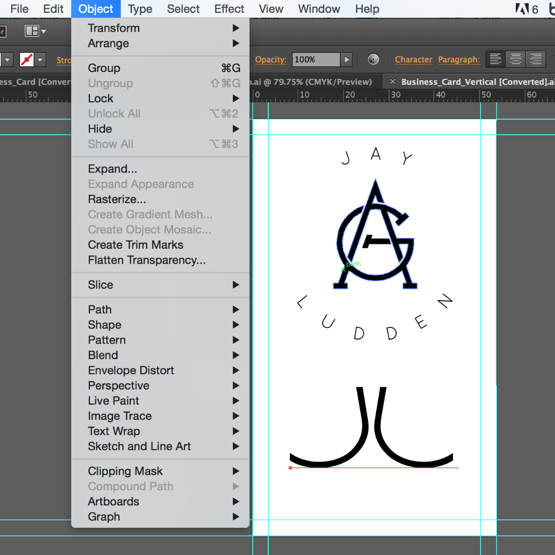
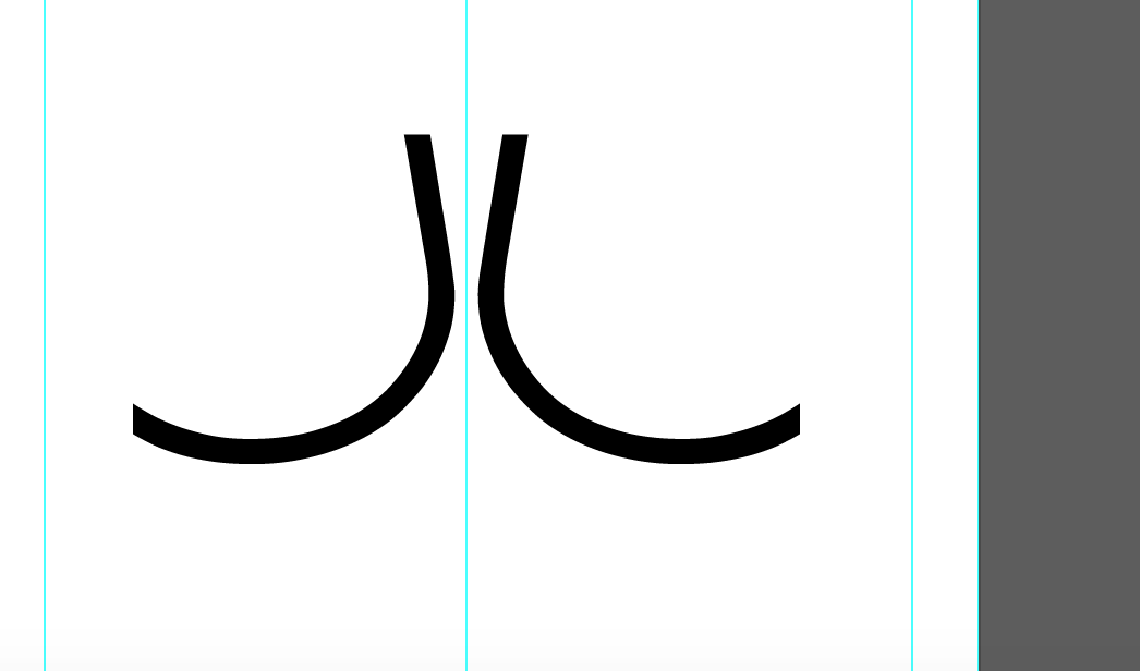
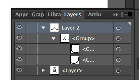
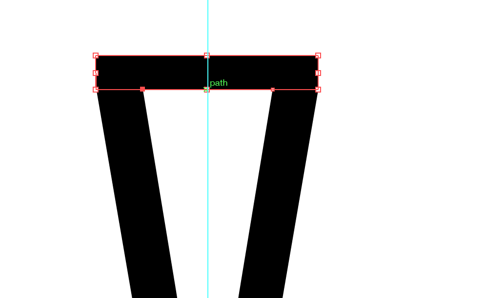
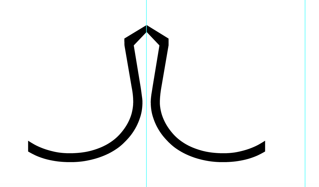
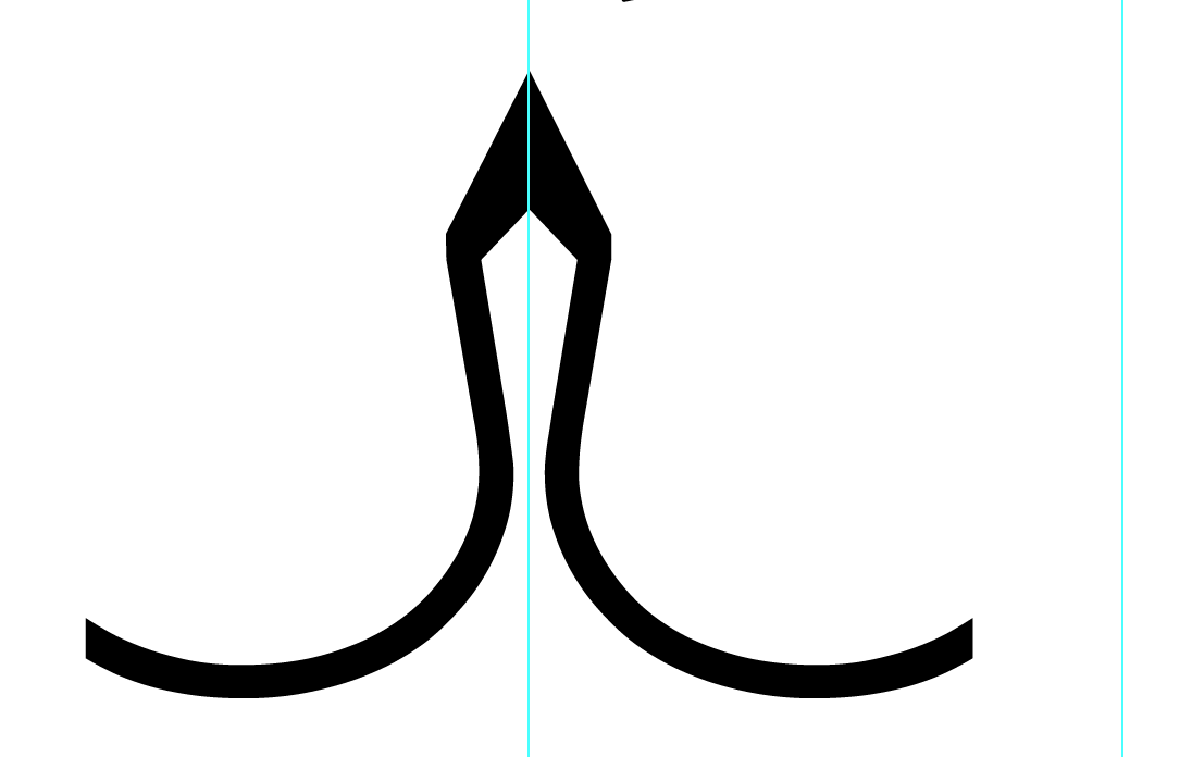
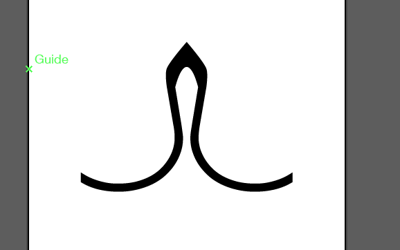
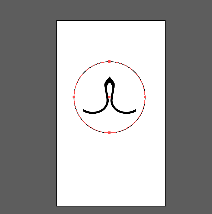
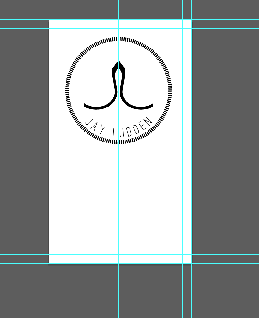
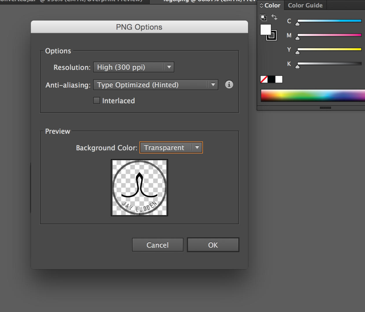
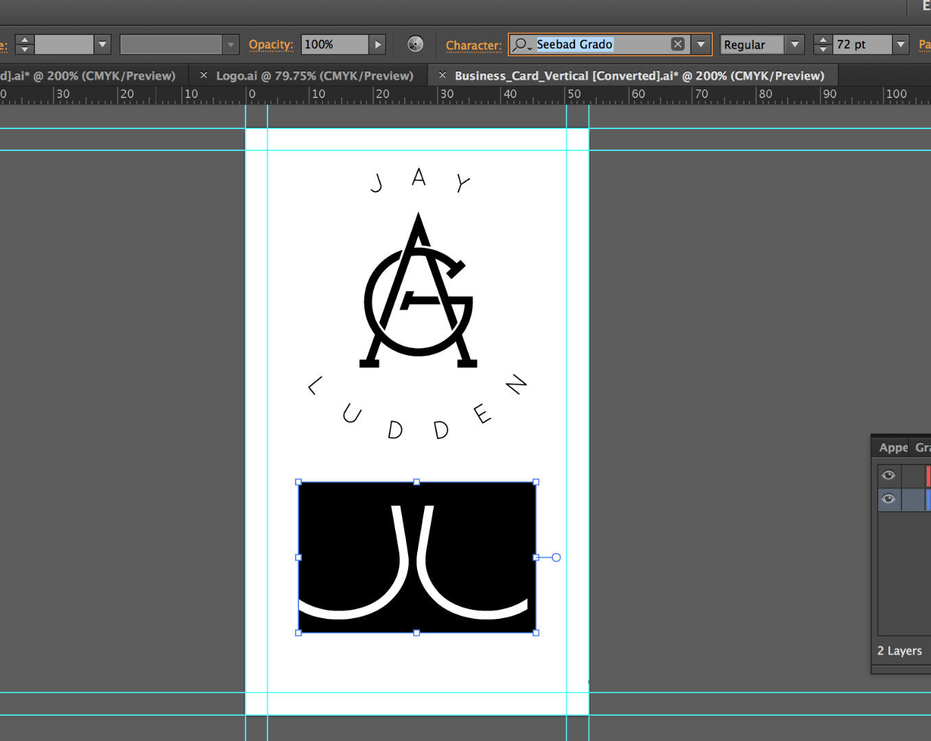
Seebad Grado is pretty cool because the J and the L are mirror images of each other. I didn't want to just have the two letters, so I decided to connect the J and the L. To edit the type as a shape rather than text, group the text objects, then go to object -> expand.
Make a guide through the center so you'll have something to snap to. You can either drag from a ruler at the side or make a line with the line tool then go to view>guides>make guides (command+5/ctrl+5).
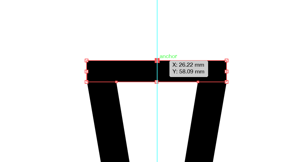
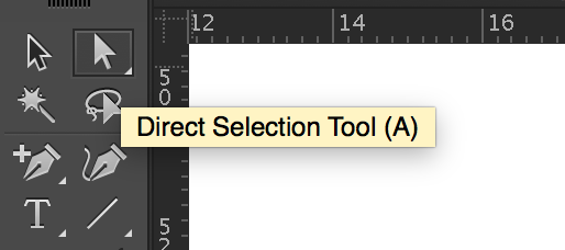
Now use the pen tool (p) to draw a shape on top of the letters. You could also use the rectangle tool. Use the add anchor point tool (+) to add anchor points in the center of your top shape. With the direct selection tool (A) select and grab just those two anchor points, then drag up. I tried a couple different configurations with varying amounts of space as well as making some of the anchor points curves. When you find something you like, group (command+G/ctrl+G). Select the layer and effect>pathfinder>add. Then go to object>expand so you have a single path.
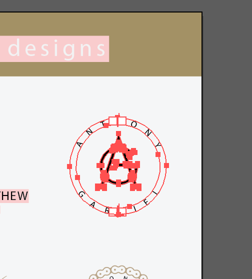
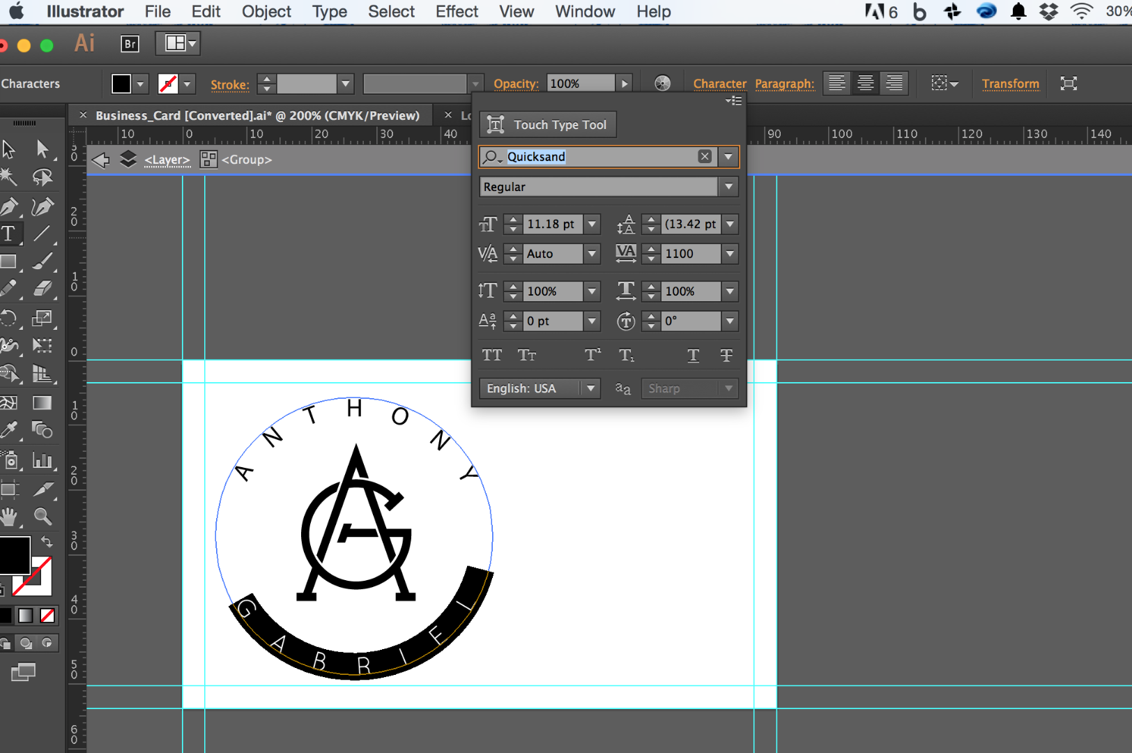
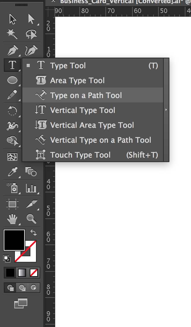
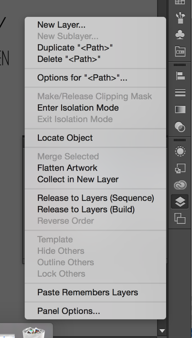
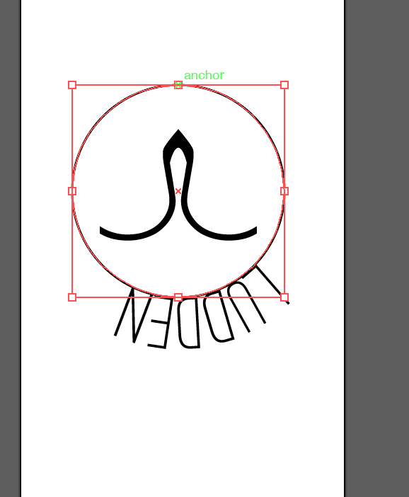
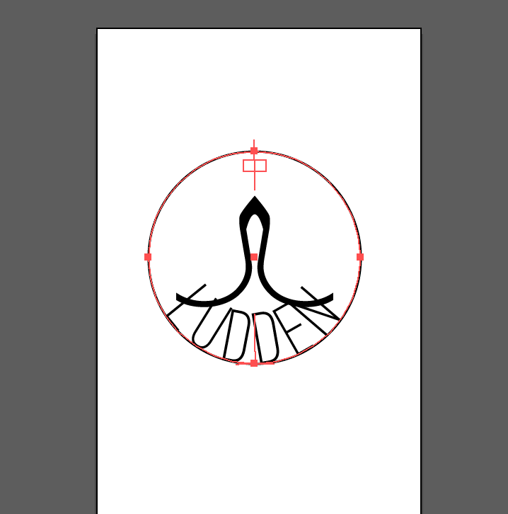
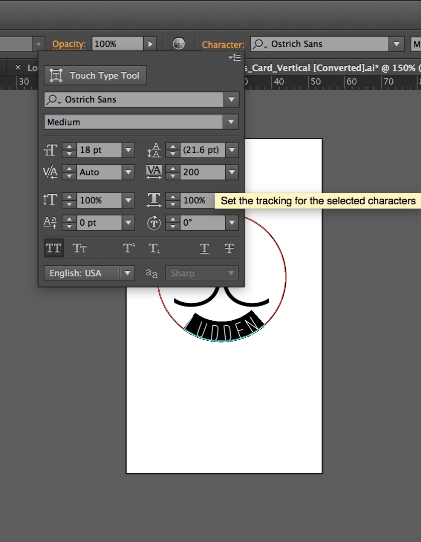
Now I want to make a circle to place my name inside of. After making a circle and aligning your logo element inside, duplicate your circle layer. Use the "type on a path" tool and click on one of the circle paths. Type your name or organization name. Click and drag where you typed to flip or move your text along the path. I put my name inside the circle and decreased the font size.
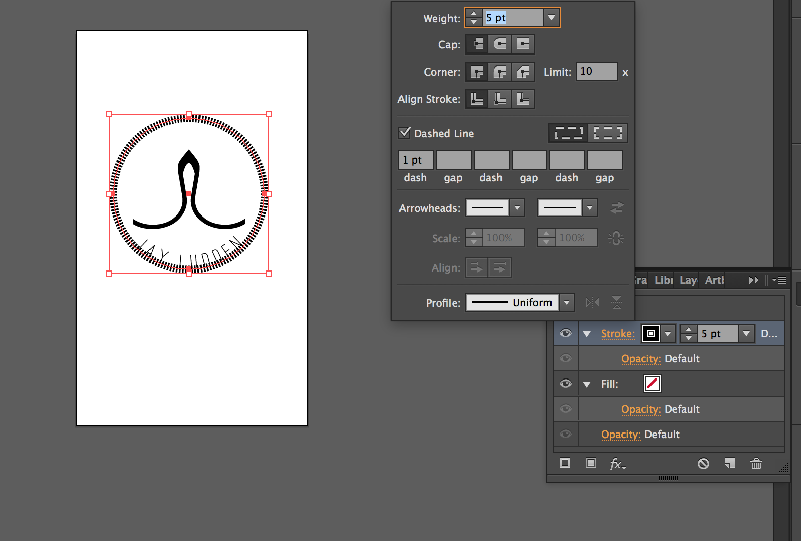
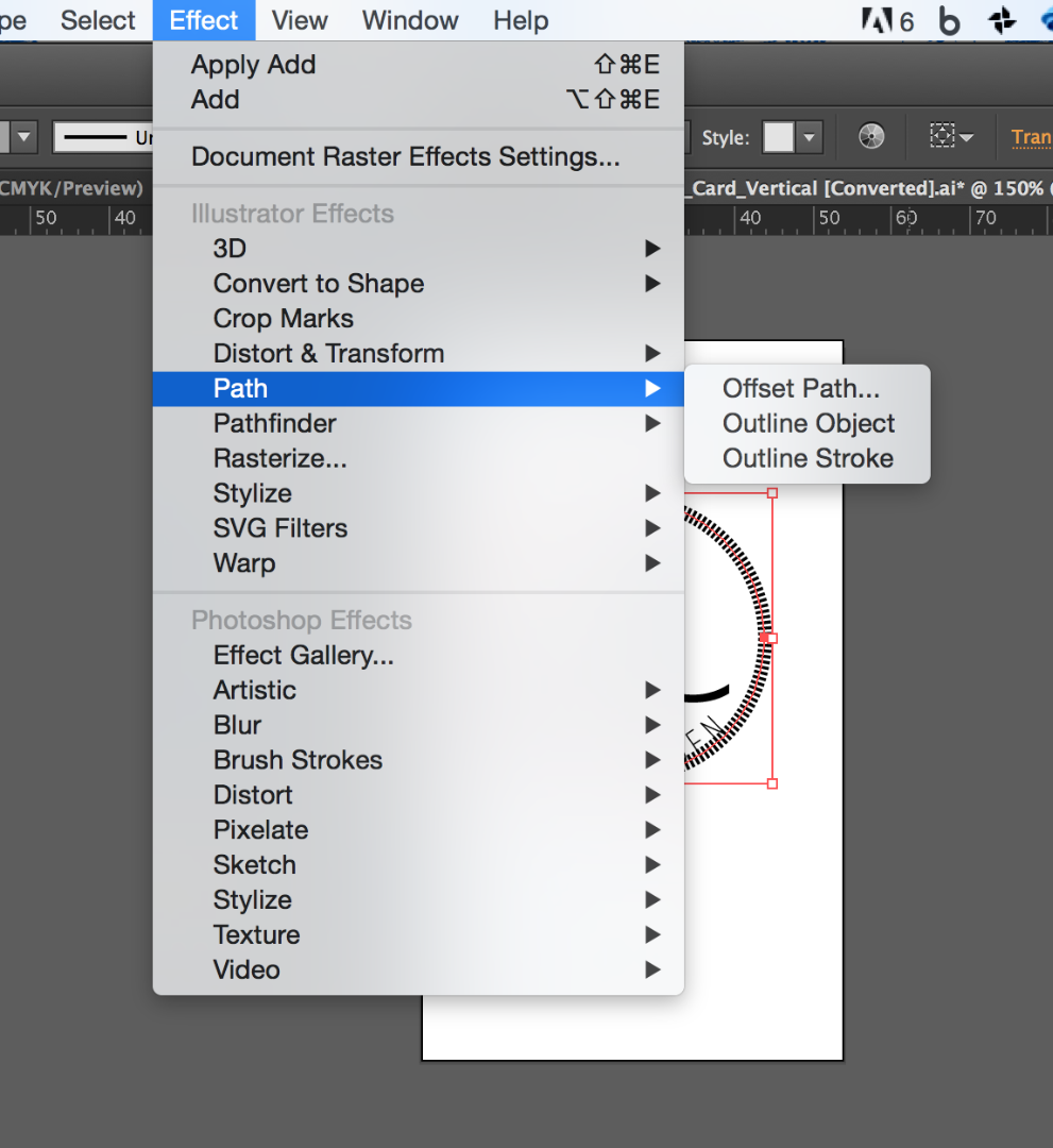
With your second circle, I wanted a decorative circle on the outside. I selected that layer, then went to the stroke tab. I made a dashed line at 5pt with 1 pt thickness, but there are lots of options to choose from. I didn't want the outline to overlap the text, so I made sure that layer was selected, then went to effect>path>offset path and selected a distance of 5 px. Save both as an AI and as a transparent png.
Business Card
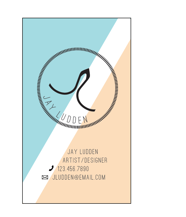
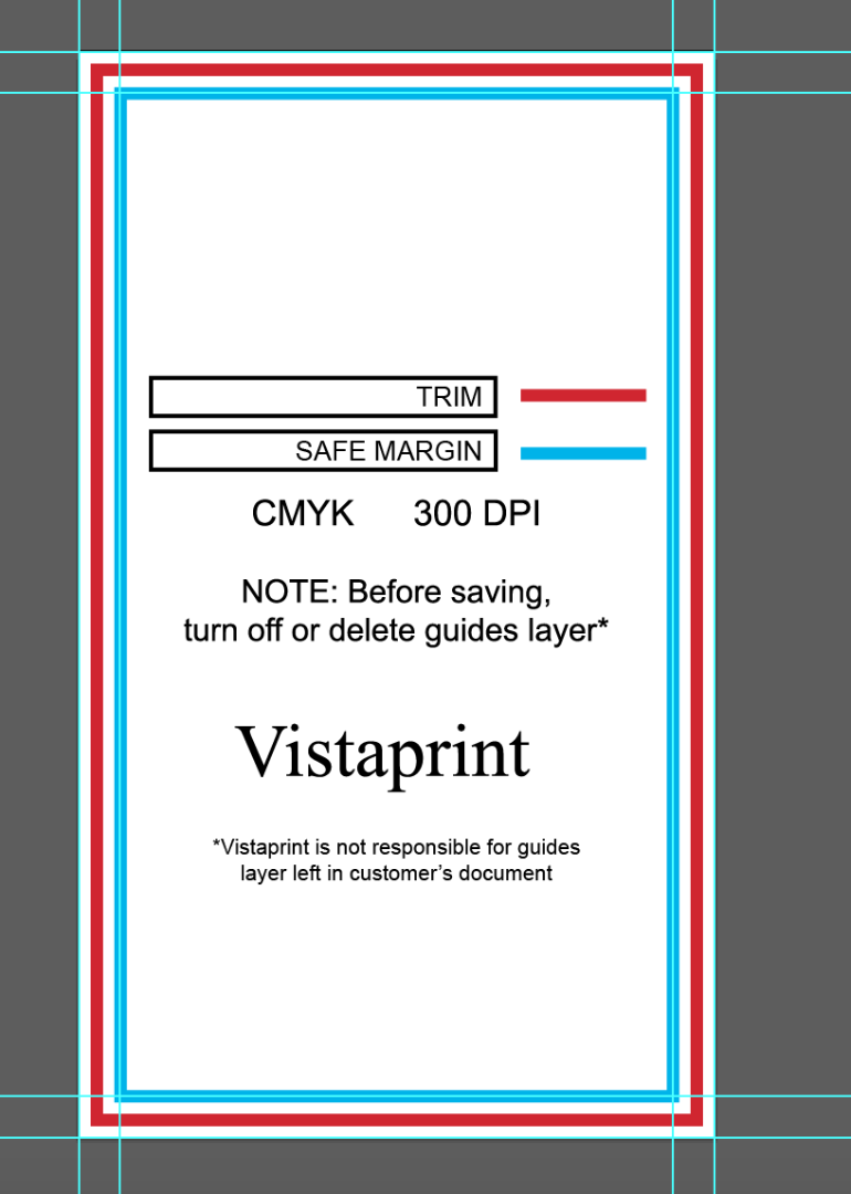
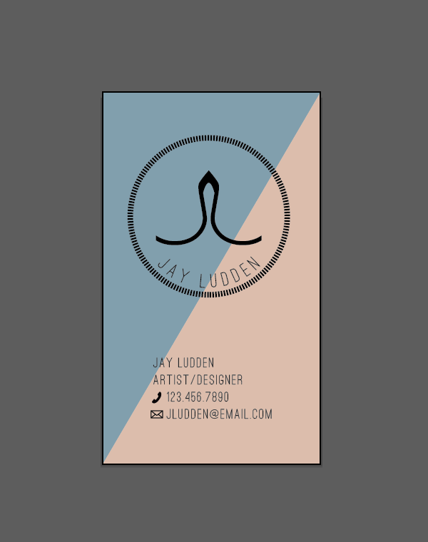
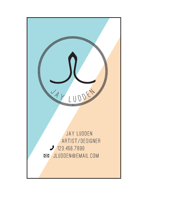
There are plenty of places to get business cards printed either at a local print shop or online. Vistaprint is a very inexpensive option. Most places will give you a template with overprint guides.
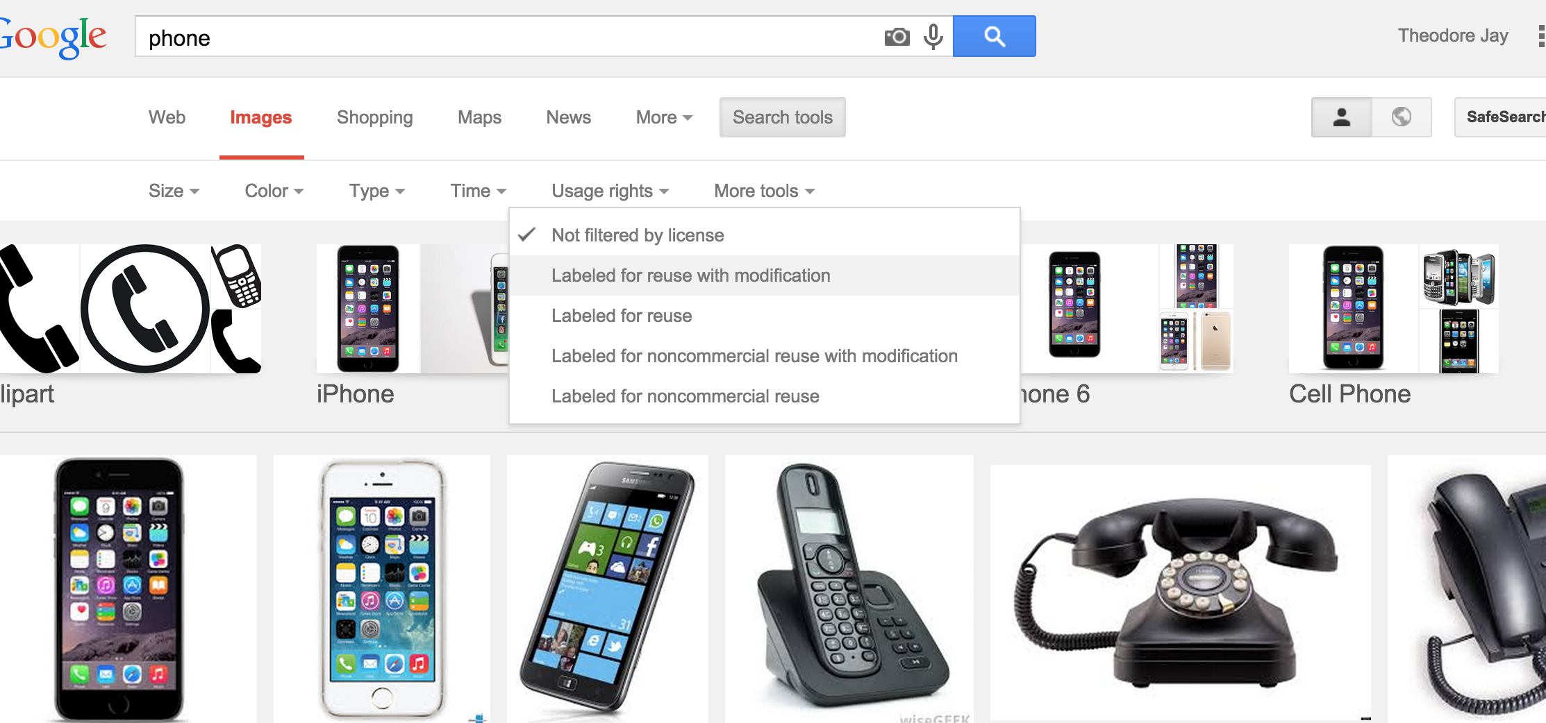
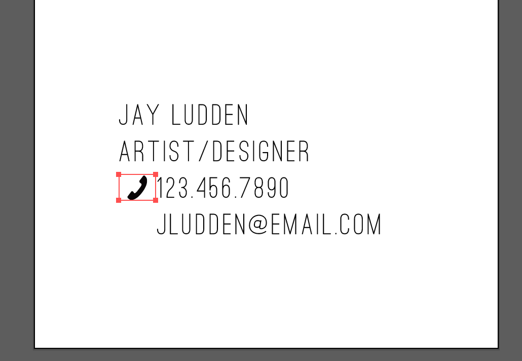
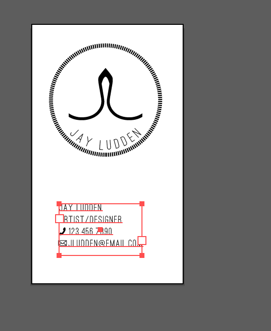
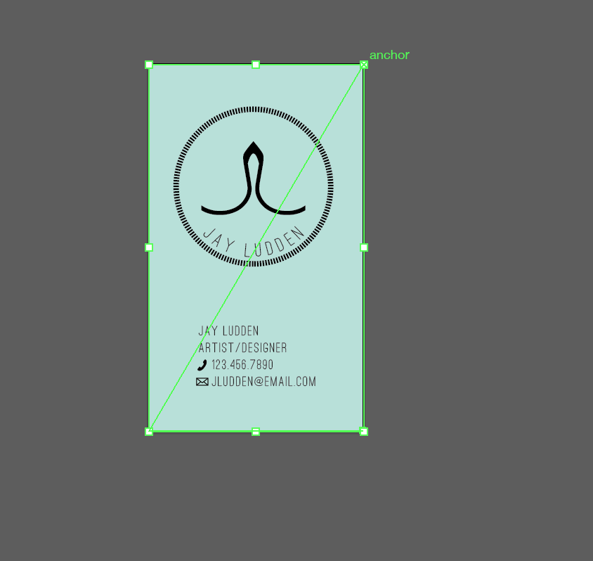
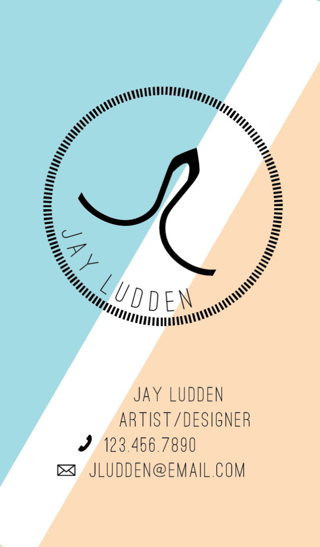
I wanted some icons for email and phone number. Creative Market has some really nice icon sets, but I wanted to make this particular tutorial with free assets, so I googled phone images. Be sure to sort labeled for reuse with modification. I went with icons from pixabay, which has tons of free public domain images. Place your icons into your image and resize. Leave a couple spaces next to the lines of text you want your image next to. I played around with colors for a while before deciding on light blue and creamsicle orange. I used the direct selection tool to change the shape of the text box to match the vertical line I placed down the center. I then decided to rotate the logo to line up better with the diagonal line.
Just do lots of fiddling. Try different options until you have something that feels right.
Letterhead
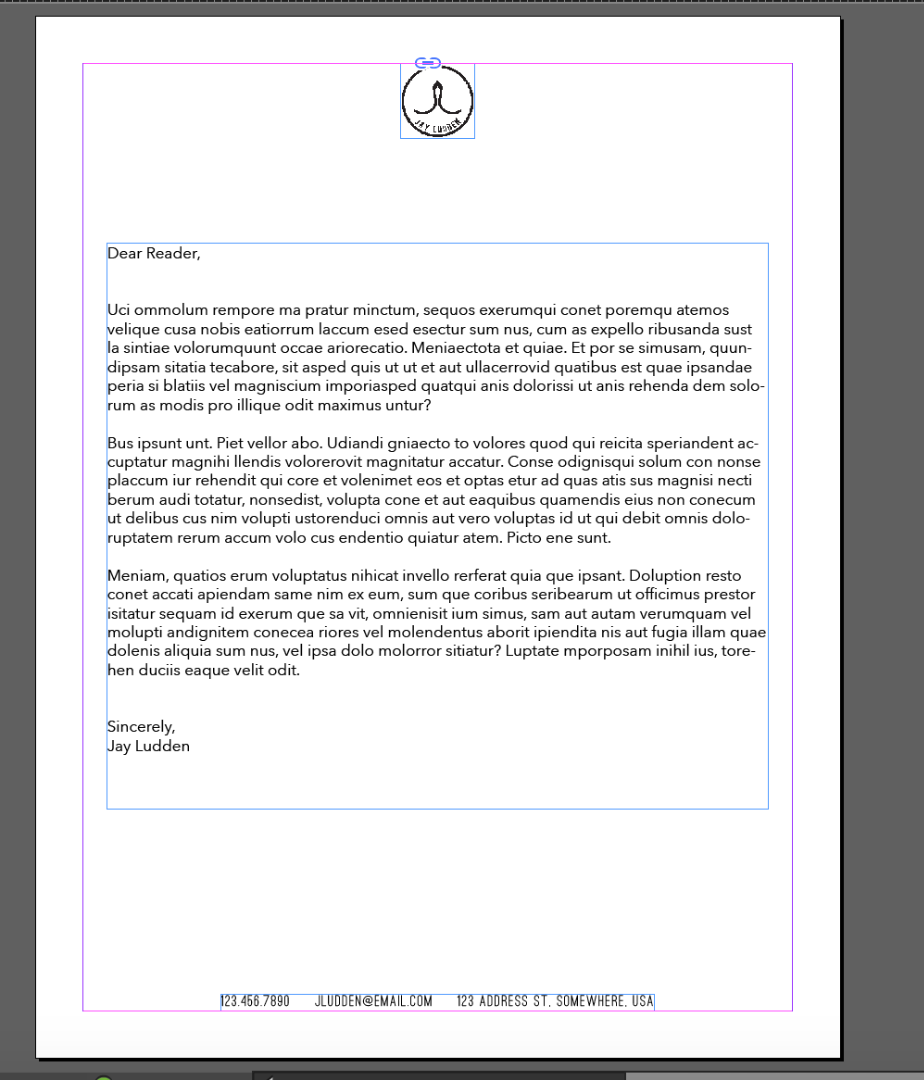
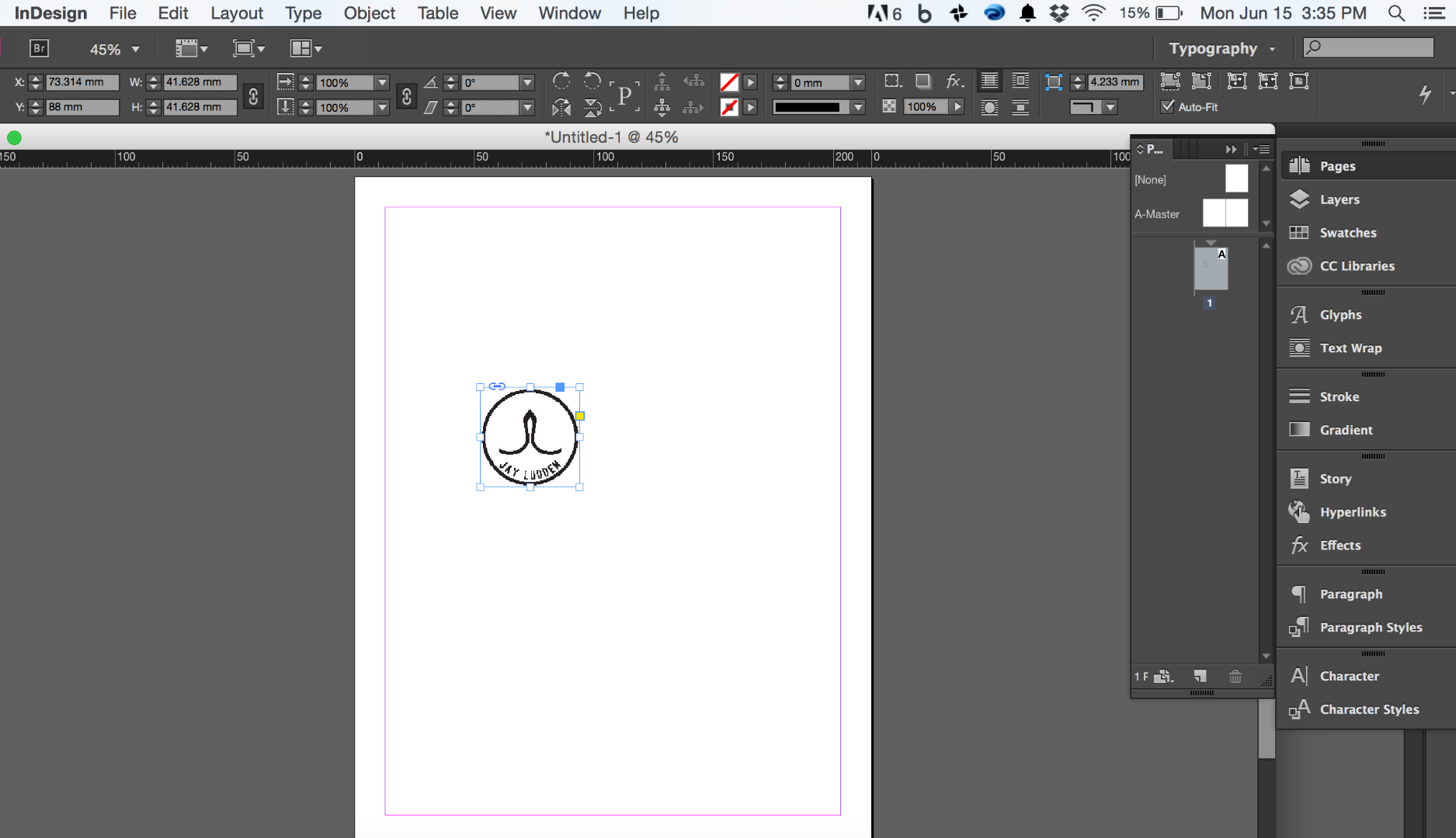
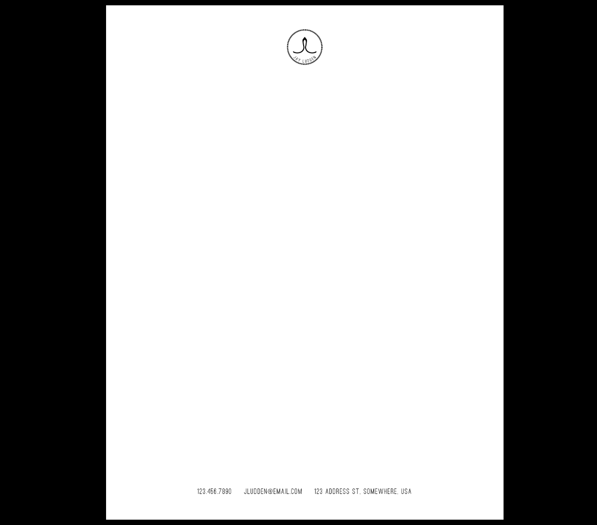
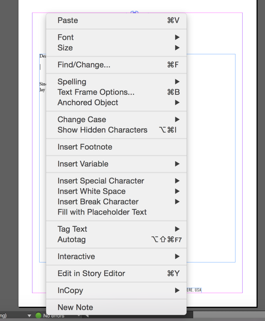
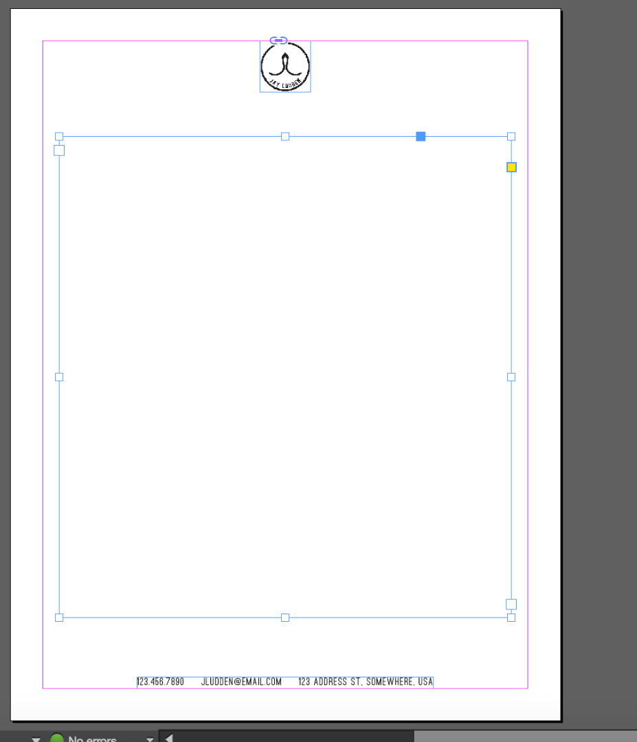
Open InDesign and place your logo. Add any other elements you wish, like a footer with return address and phone number. I made a text box and wanted to see what it might look like in letter format, so I filled with lorem ipsum placeholder text by right clicking on the text box and clicking fill with placeholder text. I got rid of extra text I didn't need.
Making a Mock Up in Photoshop
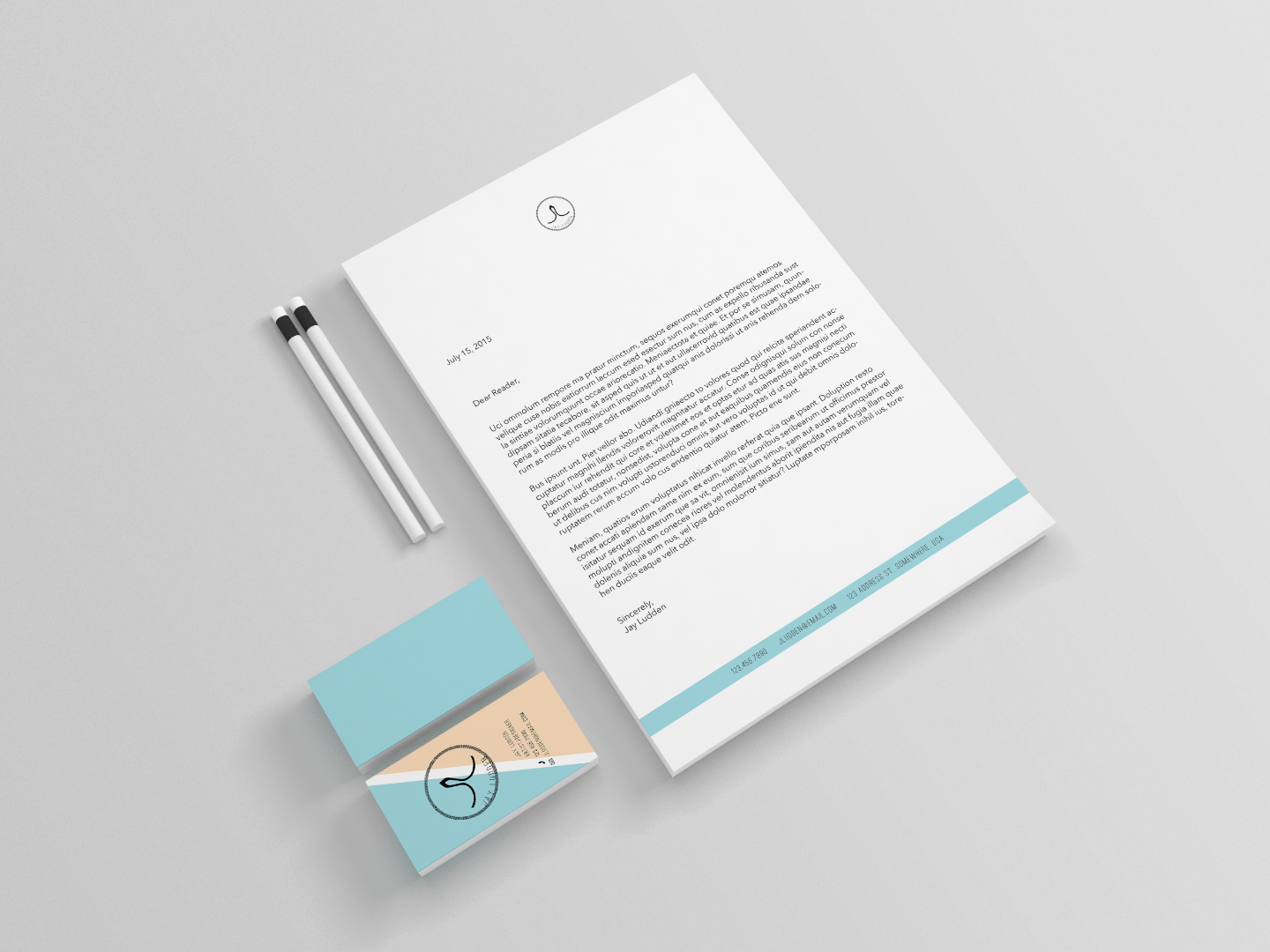
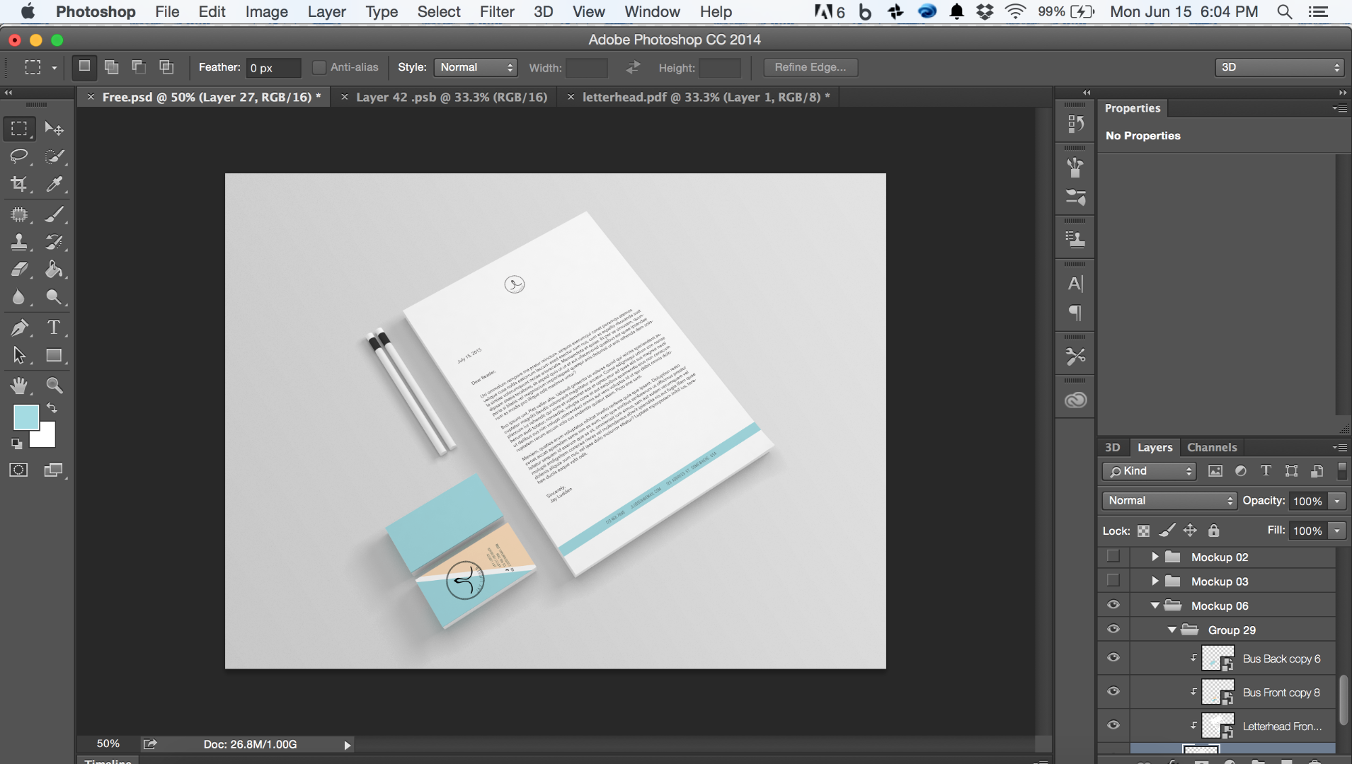
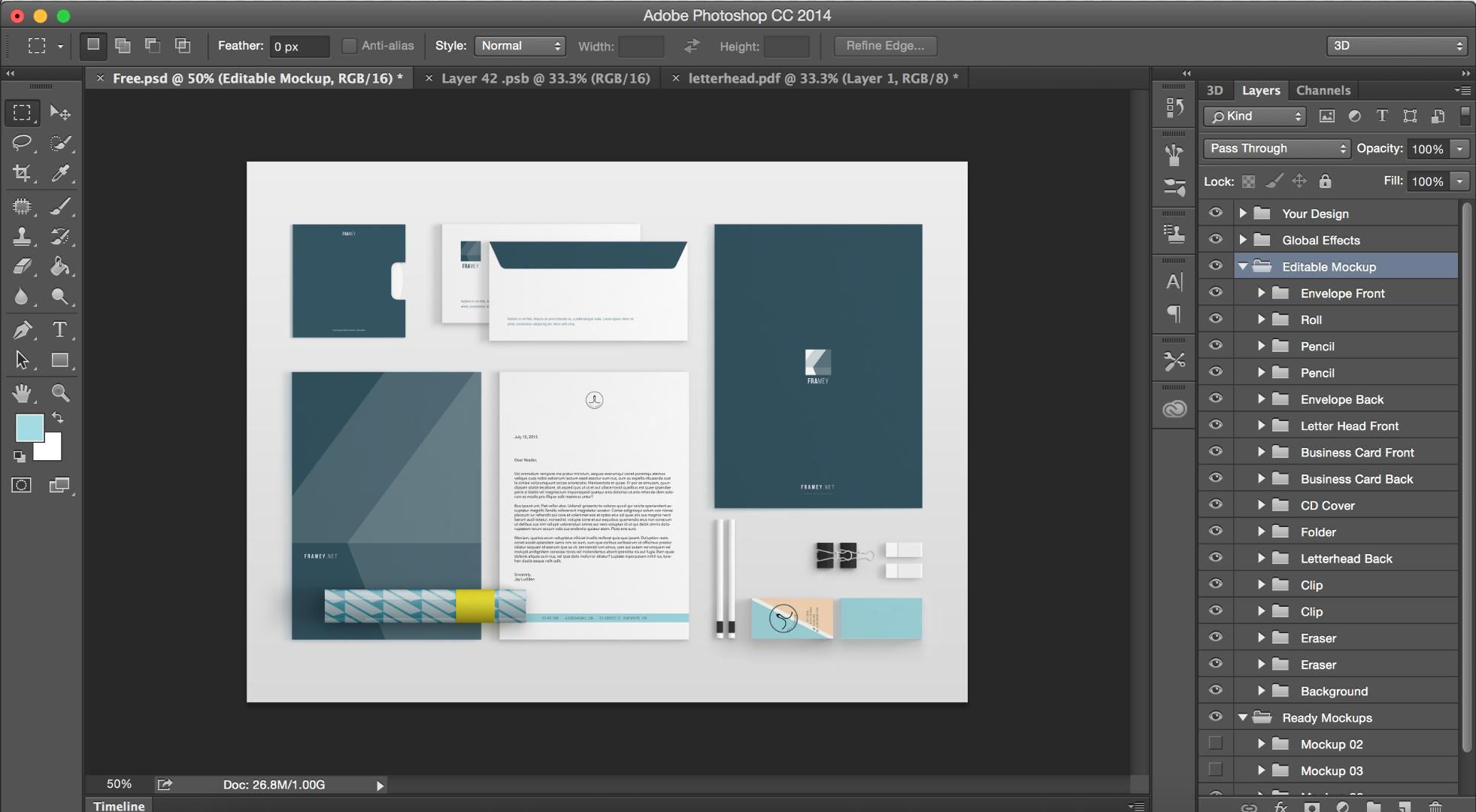
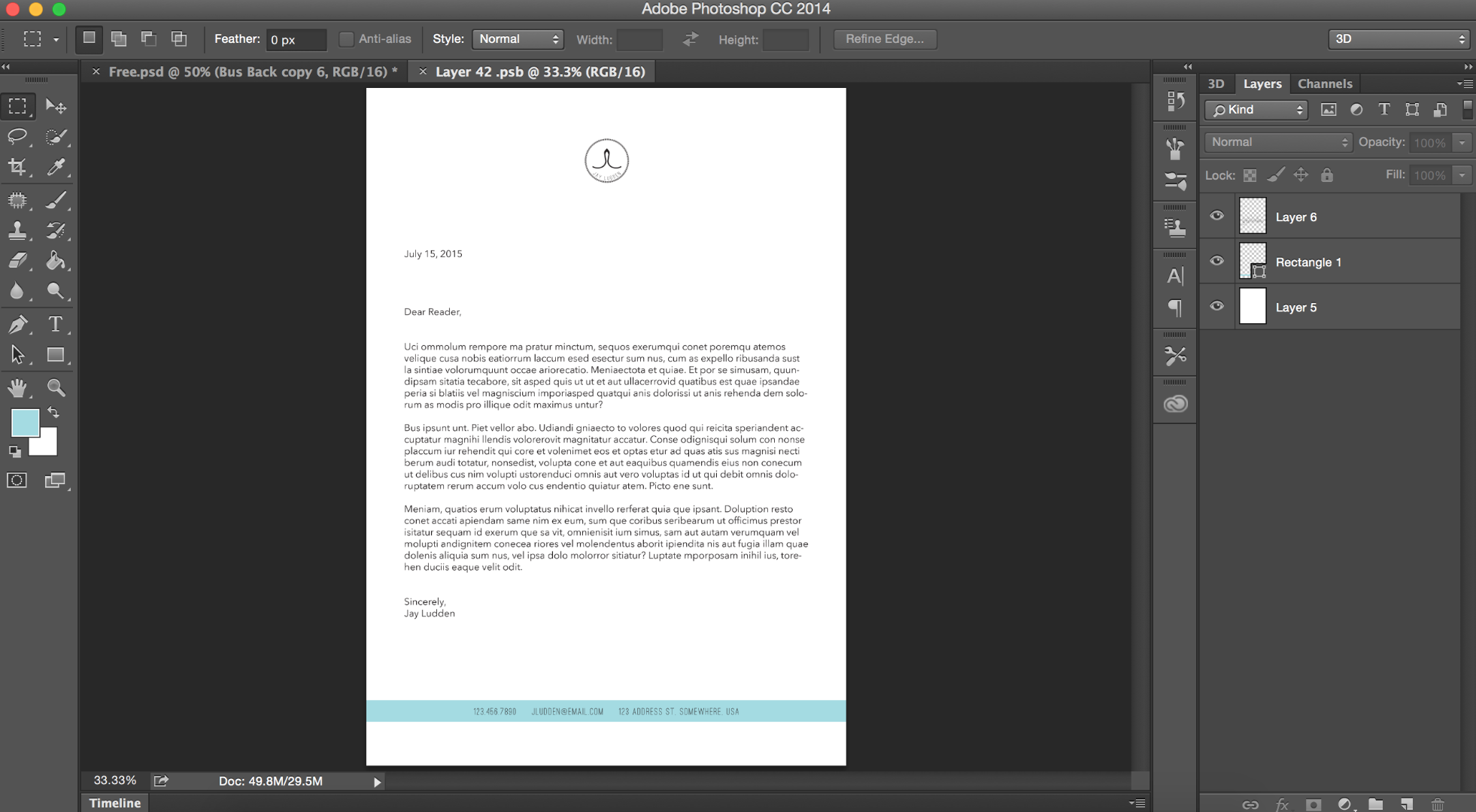

I downloaded a Mock up template. These are super convenient because they use smart objects.
This stationery mockup is from Wassim Awadallah (Blugraphic) & Themeraid.com. It comes in a free and paid version. Creative Market also has some great mock up templates.
When you download your mock up template, unzip and open the psd. Choose your template and find the PSB files. Double click the smart object to open it. Paste your own images on top and save. They will automatically update in Photoshop.
All done! Let me know if you have any questions. Lots of files attached. Feel free to use anything you'd like, as this is a made up logo that I'm not using for anything.