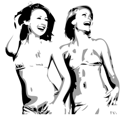
Part 2: Converting a Two-tone Stencil Into a Vector Using Illustrator
by jshhndsd91 in Design > Digital Graphics
17356 Views, 29 Favorites, 0 Comments
Part 2: Converting a Two-tone Stencil Into a Vector Using Illustrator

Welcome to part two of my tutorial on how to create a two tone cut-out stencil using Illustrator. This part is relatively short and simple because we’ll just be converting the two tone raster image we created in Photoshop, to a scalable vector image for a smoother, cleaner look.
Step 1: Setting Up Images for Export.
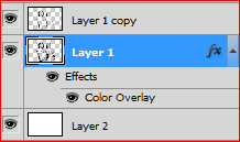
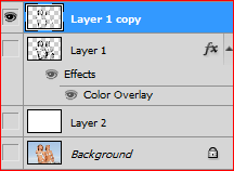

Before we start importing the two tone image into Illustrator, we need to first save each color layer as separate images so we can import them separately into Illustrator and work on each layer individually.
So open up the PSD document containing your two tone image and turn off the visibility of the white background layer and the grey image layer.
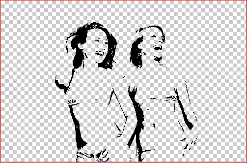
Now you should be left with just the black image layer visible.
We need to save this image in a PNG format so we can preserve the transparent background so head on up to the menu bar File > Save As or (Shift + Ctrl + S) for the keyboard shortcut.
Give your image a name and change the Format by clicking on the drop down Format menu and selecting PNG. Leave all other default settings unchanged and hit Save.
To save the grey image layer just repeat the previous instructions.
Note: Ensure the black image layer’s visibility is switched off while saving your grey image layer. This is to ensure that you save just the grey layer instead of the black and grey layer together.
There is also no need to save the white background layer because we do not need it.
Step 2: Importing Images Into Illustrator
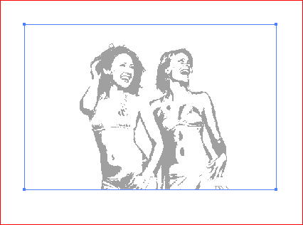
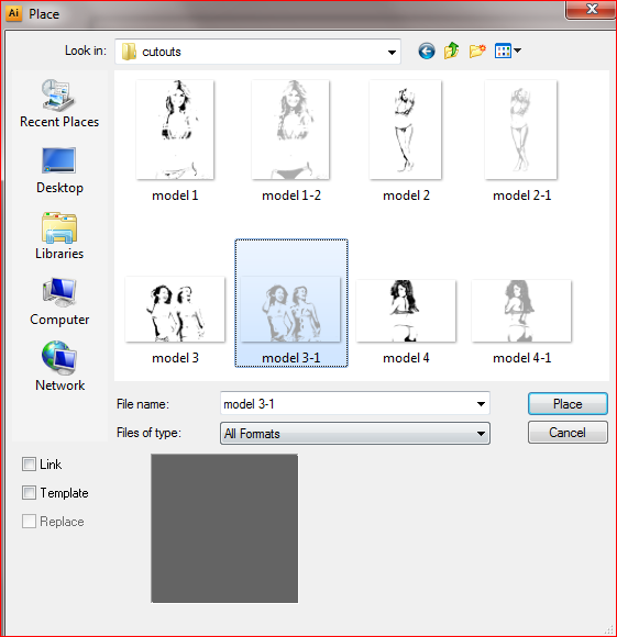
Go ahead and open up Illustrator and create a new document. File > New (Ctrl +N)
Set a width and height according to your preference. I’ll be using a width and height of 1000 pixels by 1000 pixels.
Note: The reason I created a big canvas was so I could enlarge the image after converting it to a vector.
To import the images into Illustrator go to File > Place
In the Place Dialogue box, navigate to the location of your saved images click on either of your images and click Place.
Note: I prefer to place the images according to the way they were created in Photoshop; that is, black on top and grey underneath. You could also place the black image first and just correct the layer order later on.
We’ll be working on each layer one at a time so just place only one image at first.
Step 3: Converting Your Image Into a Vector Using Live Trace
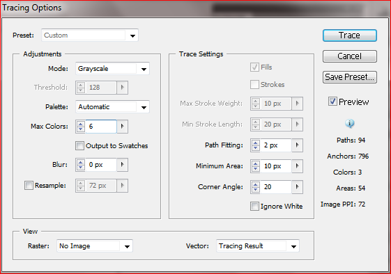
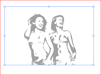
Now comes the part where we make our image look cleaner and smoother by making it a vector. To do that, go to Object > Live Trace > Tracing Options
Note: Ensure your image is selected so you can apply the changes as you make them and view them when we preview it in the Live Trace Dialogue Box.
First check the Preview box. We want to see the changes as we make them.
Next, select Grayscale from the Mode drop down menu under the Adjustments section. Leave all other default fields unchanged. And click Trace.
This is the result, a cleaner, smoother image.
Step 4: Removing White Space
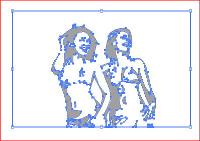
Next we want to expand the image so we can divide it into two separate parts. In this case, after we expand the image, we should be left with editable white and grey areas. White being the background and grey the image outline.
Note: Expanding an image divides it into separate objects or layers that can be changed individually. So if you wanted to change the fill color of just one section of an image, you could do so without having to change the color of the entire image. Remember, while expanding divides the image, it groups them together so to edit each separately, you have to first ungroup them (Shift + Ctrl + G).
Ensure your image is selected and expand it by going to Object > Expand.
Next we’re going to remove the white space so just the image outline remains. To do this, Select your direct selection tool (A) and click on the whitespace of the image to select it.
Then go on up to Select > Same > Fill Color.
Note: When we first selected the white space we selected the white areas that weren’t closed in by any of the grey areas. So by selecting the Same Fill Color we select all the white areas in the image.
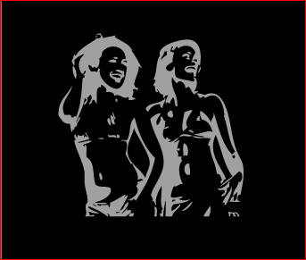
Now hit delete or backspace to clear the white areas and you should be left with just the grey areas.
Note: I put in a black background to show that all white areas have been removed.
To convert the black image layer to a vector, just follow steps 2-4. Also make sure that your black image is on top and the grey image underneath.
Step 5: Finishing Touches
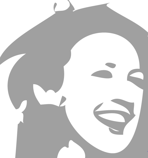

This last step is very important and is needed to make a functioning stencil.
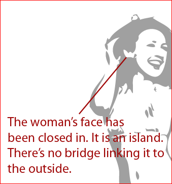
We are going to check for ‘islands’. Now islands are areas of an image that are trapped or closed in by another. Like my image below:
So if I cut away the grey areas surrounding her face, she will have no face.
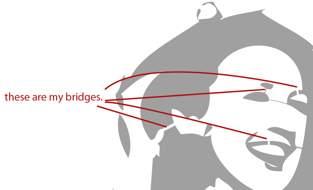
The grey areas are the areas I’m going to cut out, so I need to make sure that no white areas are enclosed by the grey. So in order for me to do that, I need to create ‘bridges’ (breaks).
The image of the wheel chair demonstrates the idea of creating bridges so that there are no islands. You can see on picture 1 that if I cut out the white region I would lose the wheel. In picture 2 you can see the bridges (breaks) which stop the loss of the wheel detail.
Bridges also make your stencil stronger. If you have large areas to cut out you might want to consider adding bridges to maintain the strength of the stencil.
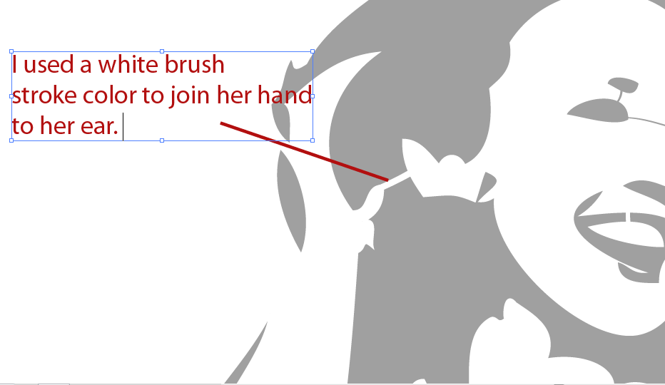
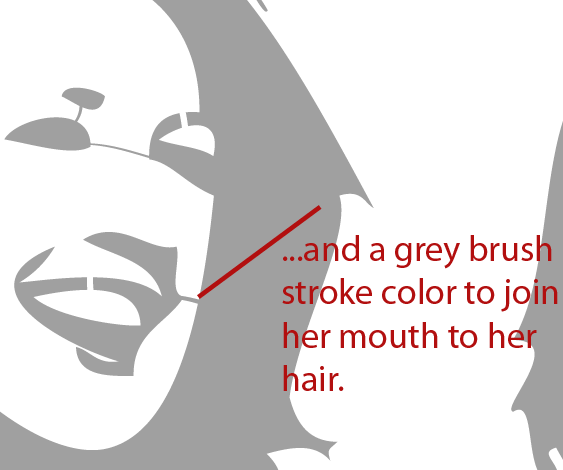
So to create a bridge, just use your Brush Tool (B) to create joining lines. Also ensure your fill color is turned off and only your stroke color is turned on.
Note: Use the same brush stroke color to join an area of the same color. So if you’re joining a white area to another white area, use a white brush stroke color. Likewise use a grey brush stroke color to join one grey area to another.
Refer to my images.
Step 6: Final Result
