Paradise Inspired Bedroom!
by Drew Paul Designs in Design > Art
9681 Views, 61 Favorites, 0 Comments
Paradise Inspired Bedroom!
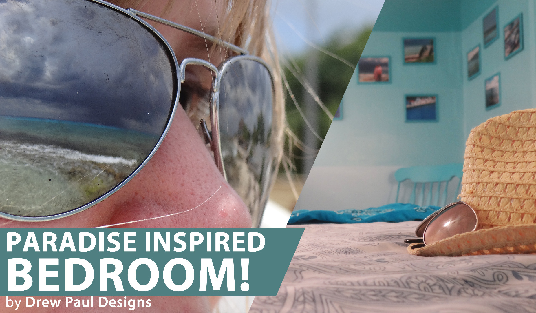



After experiencing paradise first hand, you'll get the feeling that you never want to leave. Whether your version of paradise is your favorite shore, a particular mountainside, a deep forest, or even the backdrop of a bustling concrete jungle; some views just make you feel at home.
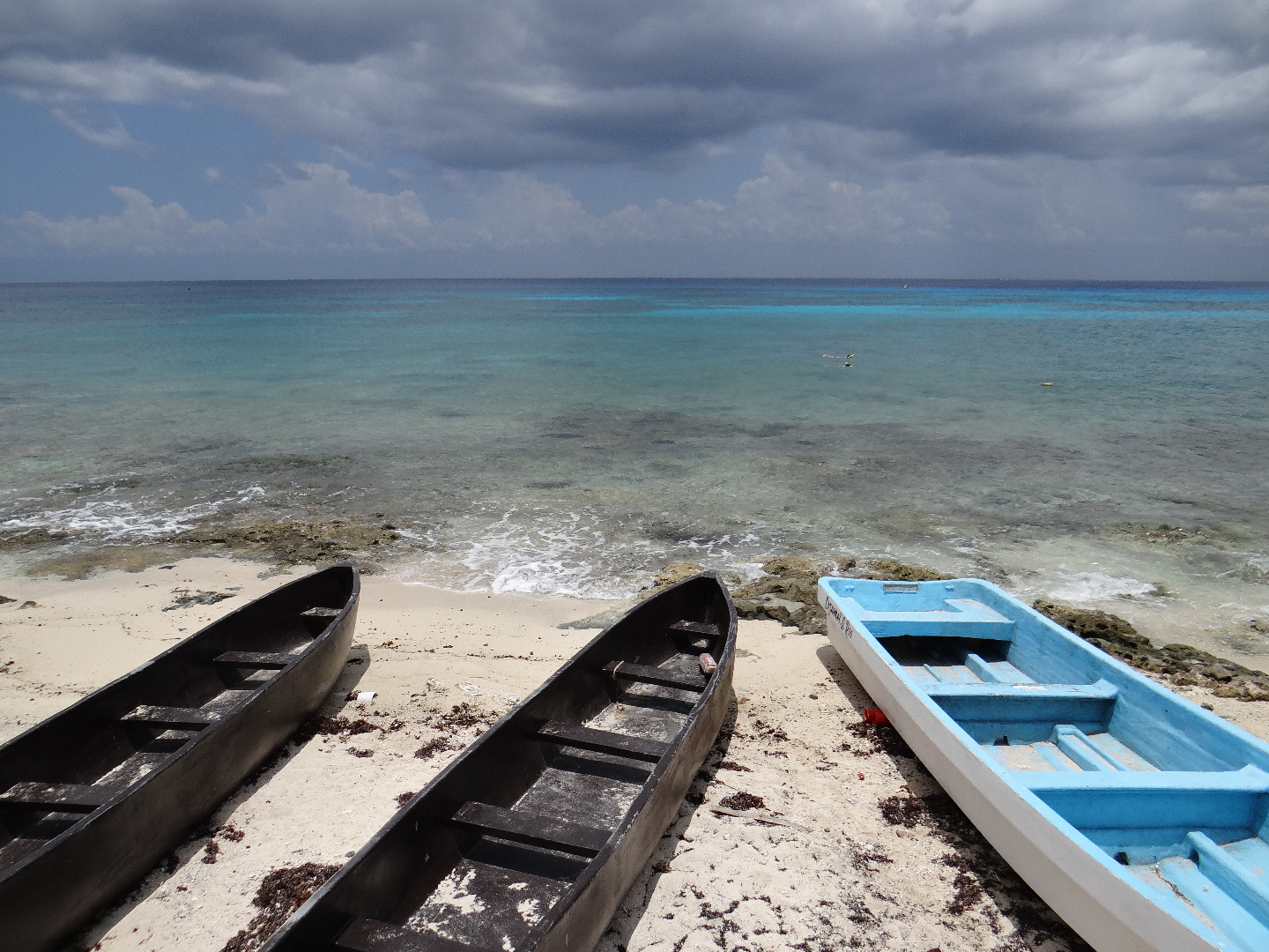
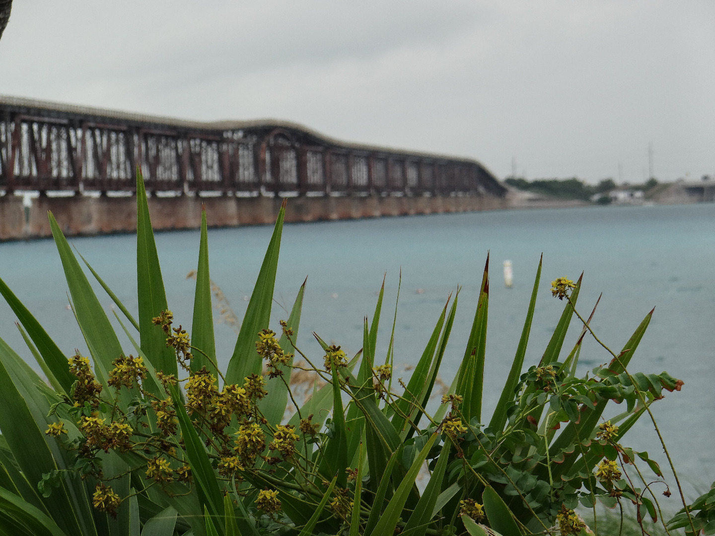
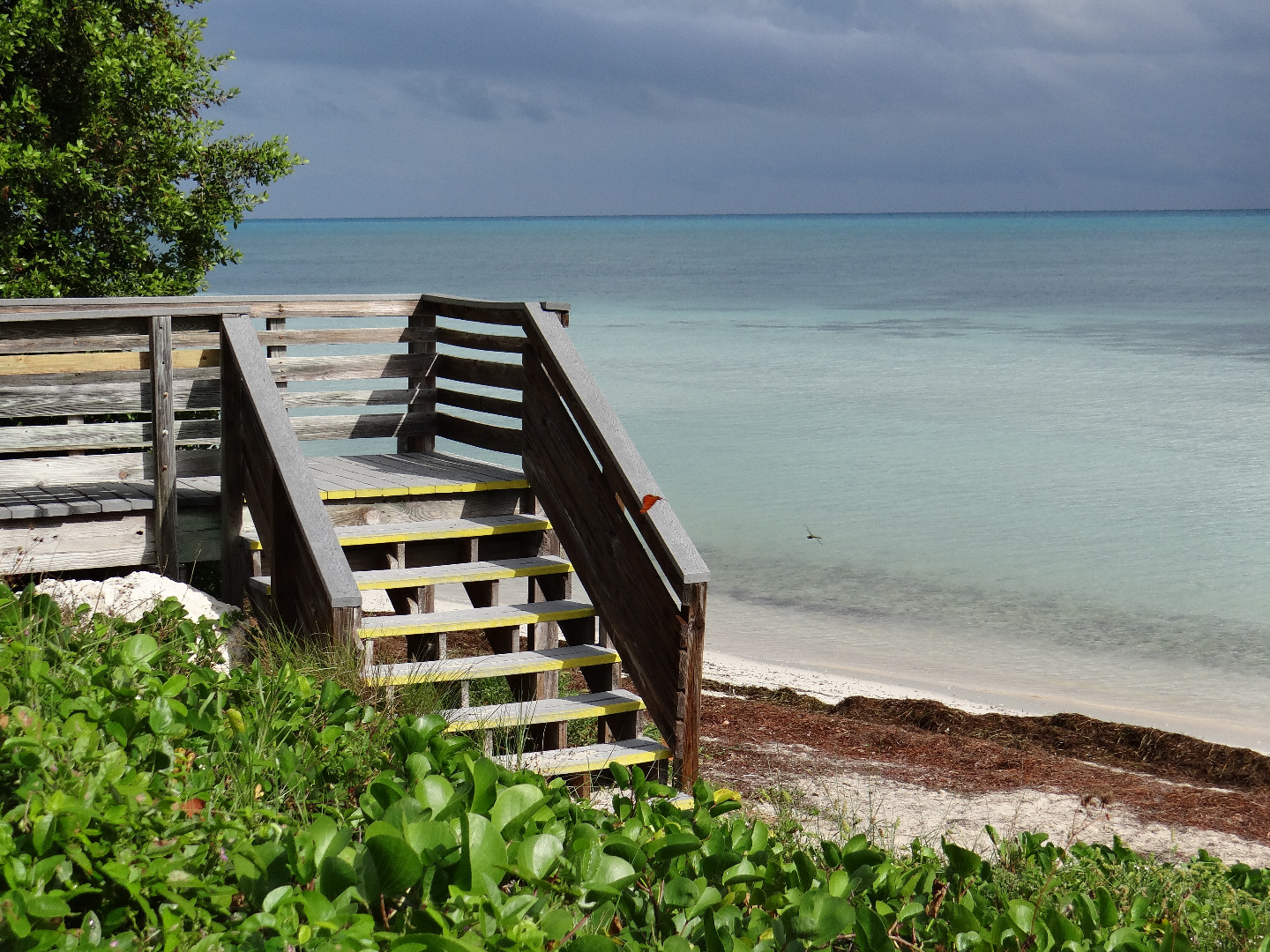
In our case, we were awestruck and inspired by the glistening, turquoise waters of Bahia Honda Beach in the beautiful Florida Keys. Unfortunately though, her work as a computational physicist working on nanotechnology and mine operating www.DrewpaulDesigns.com, www.Blabor.com, www.DrFission.com and five other businesses oblige our attendance which required us to eventually bid adieu to the paradisaical views of our favorite landscape.
Nevertheless, my artistic sensibilities, coupled with her addiction to the Home & Garden channel, led us to discover a fun and simple method to style a bedroom to remind us of our favorite spot on a daily basis. Each room is designed to showcase graphic artwork, photography and paintings and makes use of all refurbished furniture that was otherwise headed to the dump. This technique is part graphic design, part interior design and all original. Several variations of these techniques can also be viewed at the end.
Planning the Theme

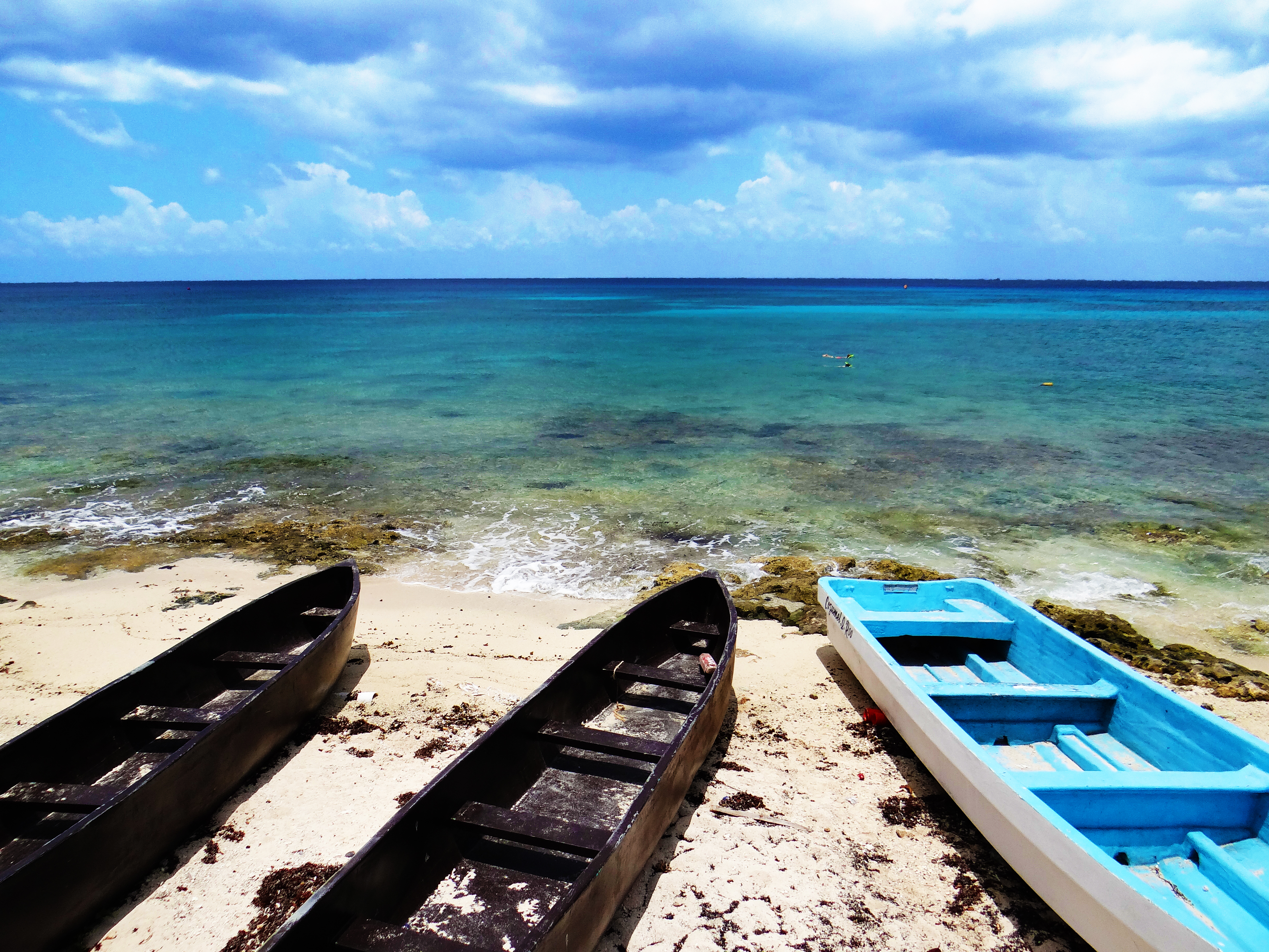
If the wondrous and exotic views of the Caribbean could be captured in one image it would surely include the crystal clear turquoise waters unfolding as frothy white splashes on the beach sand, an image that makes you feel like you're on the edge of the earth.
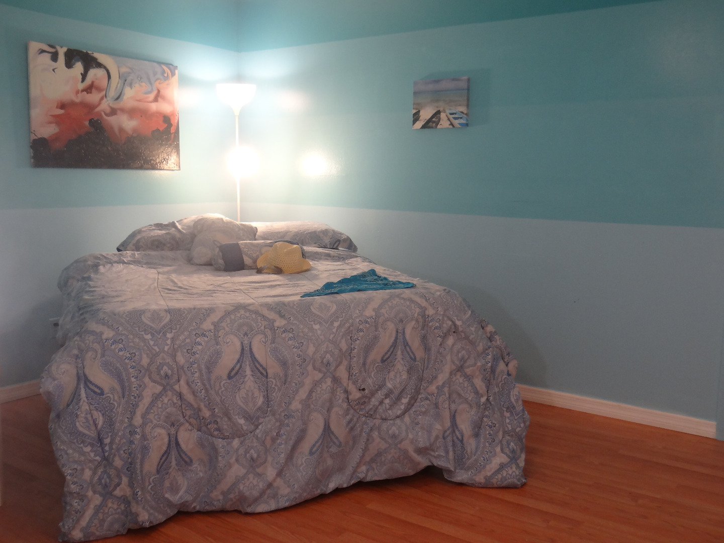
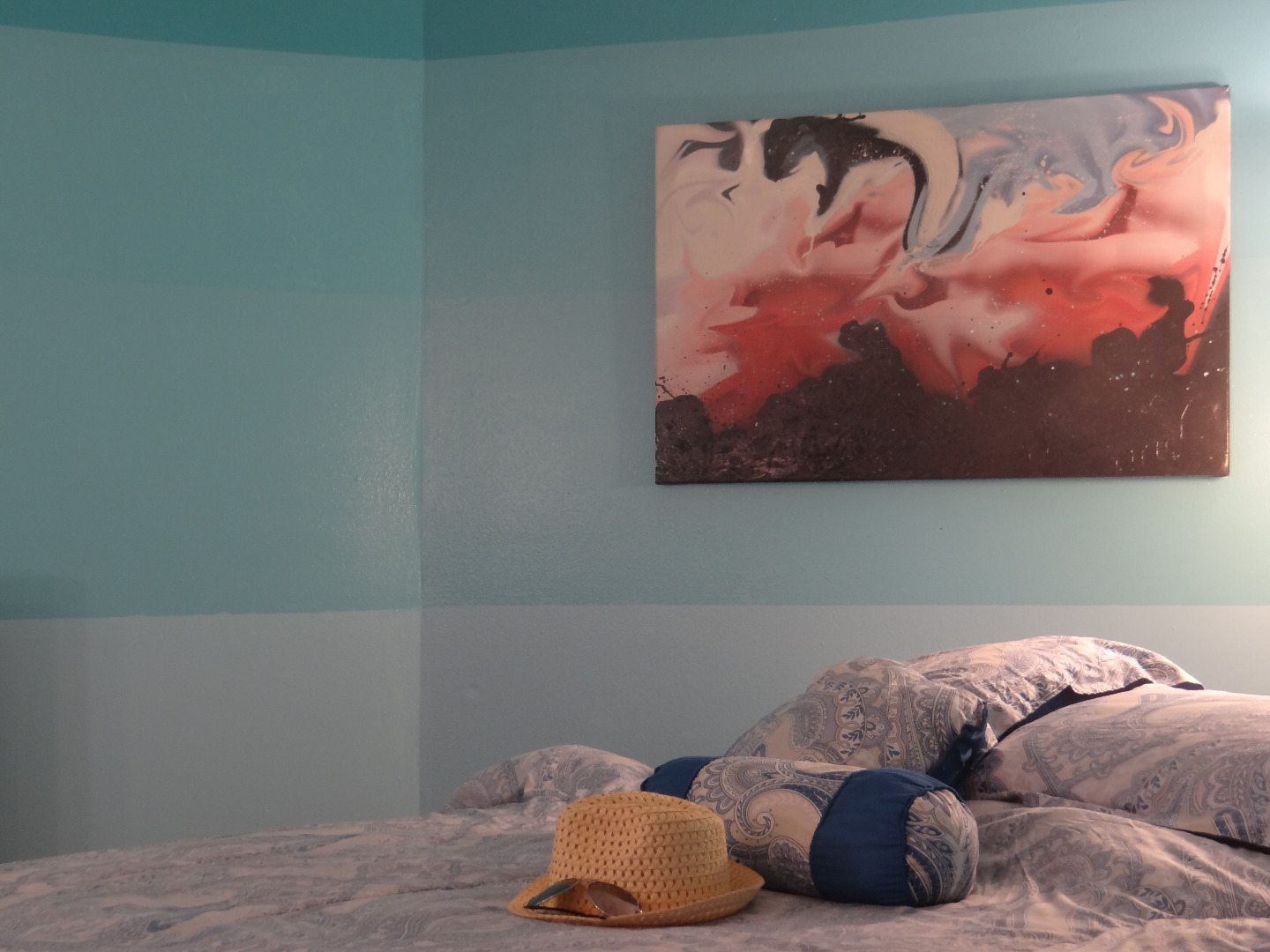
To represent this, in this bedroom remodeling project we chose to design the room to showcase the artwork shown above by fading the paint from rich turquoise on the top to light blue on the bottom in distinct sections similar to how the color of the water fades as you gaze into the depths of the tropical sea. This technique creates an illusion of depth as it makes the room look larger as you gaze into the faux horizon. With a white trim on the bottom and sand colored wood flooring and a rug, the illusion should be very effective while drawing the viewers eye to the artwork on the walls. Instructions for creating the artwork and customizing furniture come in later steps.
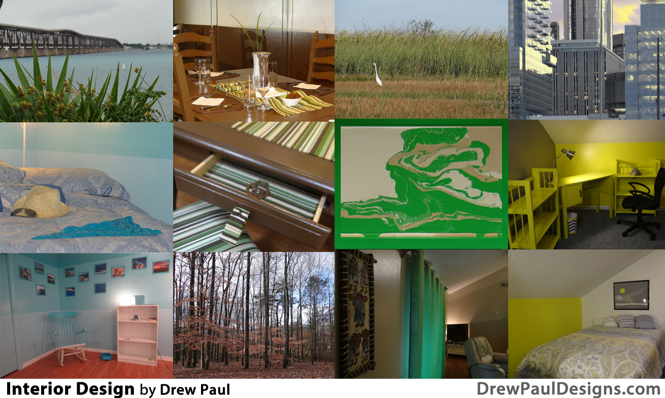
Check out the image above for other inspirational options.
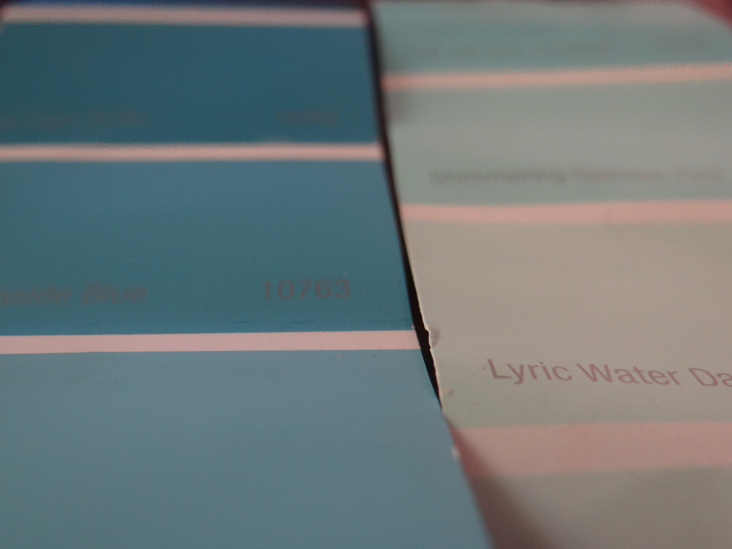
We begin by selecting a reference image and choosing the two extreme colors. From there the fade can be created by careful mixing of these two hues which we will cover further in a subsequent step.
MATERIALS:
Two Paints of Similar Hue- 1 Gallon Each
Paint Rollers and Pan
Paint Brush
Blue Painters Tape
Level
Scrap Canvases and Frames
Scrap Furniture
OPTIONAL:
Spray Paint
Fabric/ Sewing Materials
Accessories
Preparing the Walls and Paint
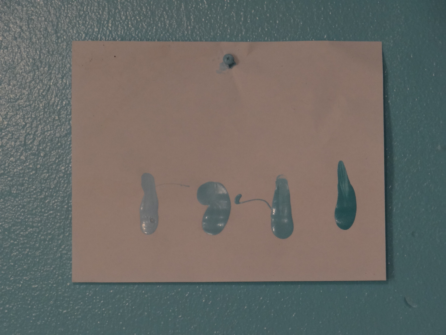
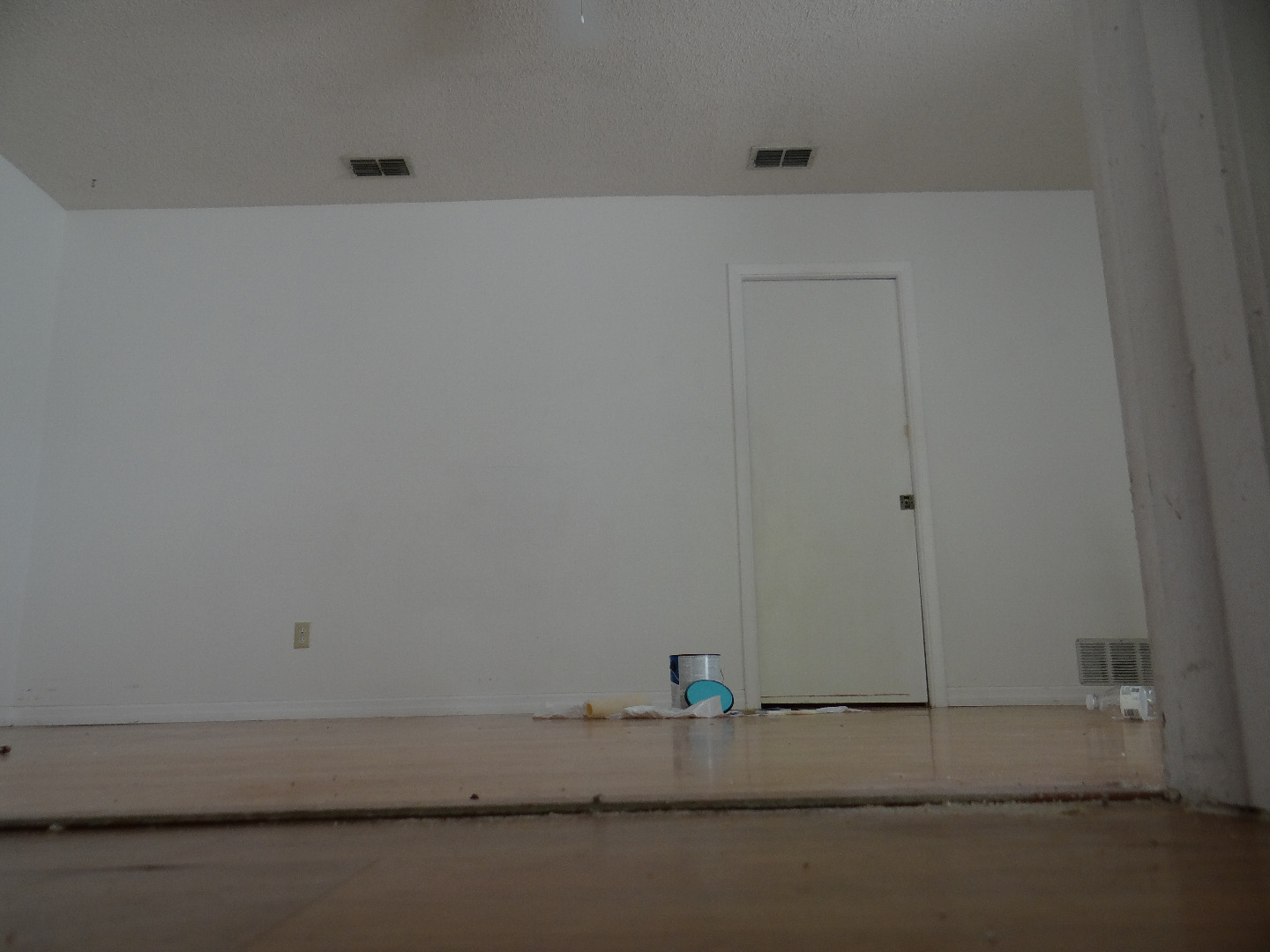
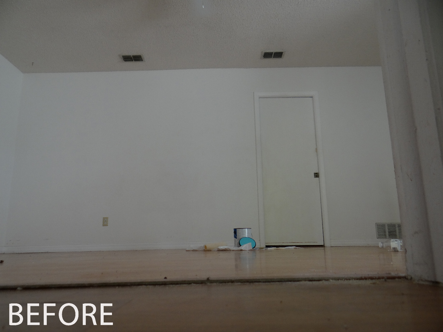
Now that we have selected our colors, we can plan and prepare the walls for painting. Before getting started we will mark a piece of paper with the two colors that we selected and mix two intermediate colors which will compose the fade.
To mix the intermediate colors, we will use a measured portion of paint 1 and of paint 2 for the first intermediate color and a measured portion of paint 1 and of paint 2 for the second intermediate color varying the mix as follows:
COLOR 1: 100% Paint 1
COLOR 2: 75% Paint 1, 25% Paint 2
COLOR 3: 25% Paint 1, 75% Paint 2
COLOR 4: 100% Paint 2
You'll want to mix as you go making sure to prepare enough paint for two or more solid coats.
We will then mark the paper to check to ensure that a smooth fade occurs and that we are satisfied with the results.
Next, we'll prepare the walls by lightly dusting any residue and fixing any scratches or dents with putty. Once the walls are smooth, clean and dry we can continue to the next step.
Paint the Trim
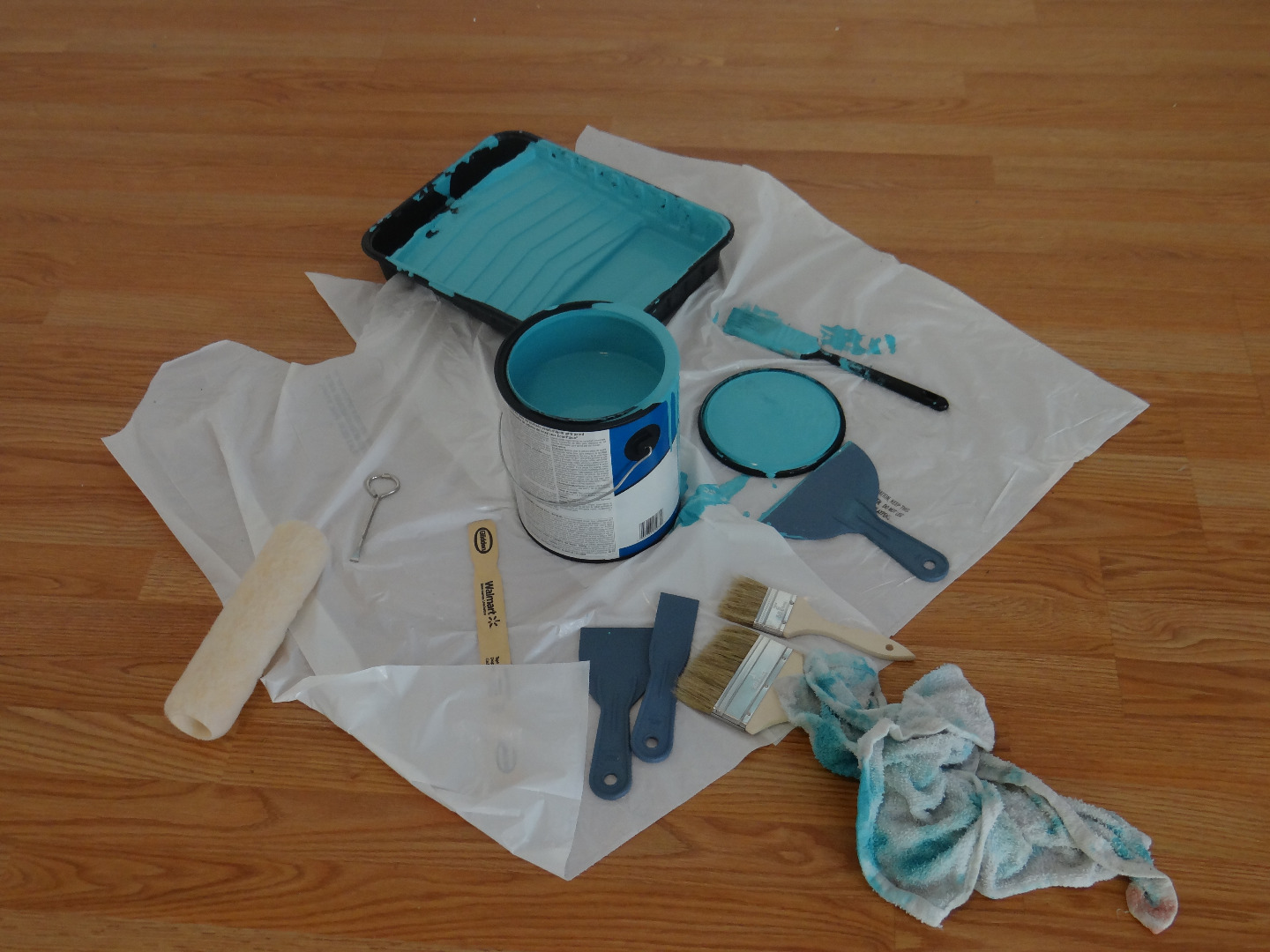
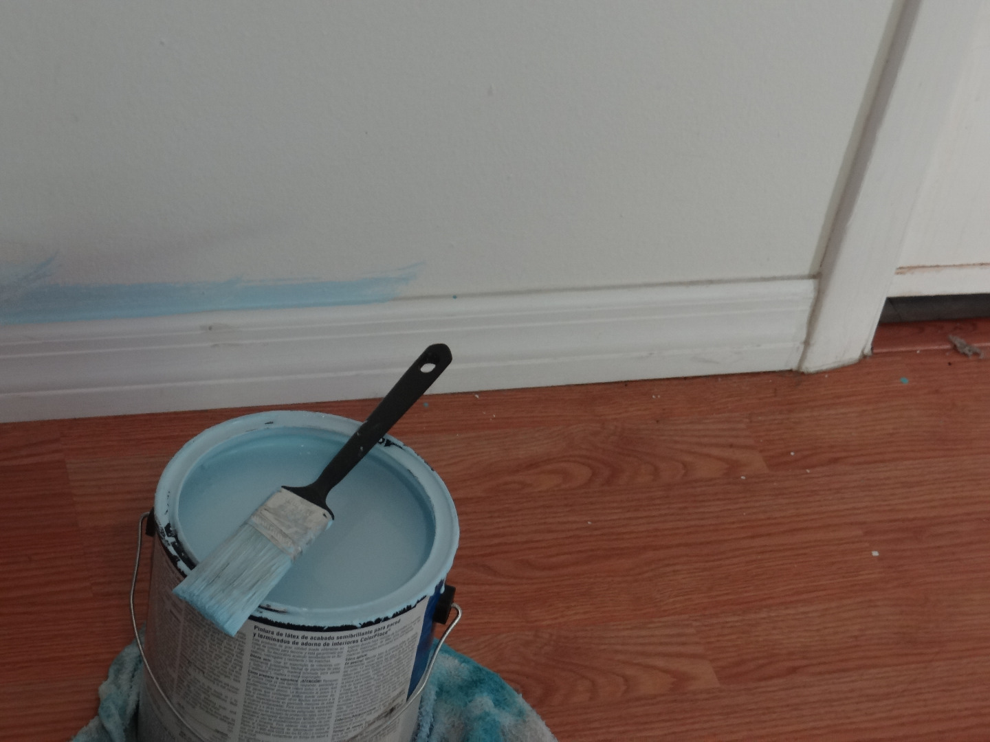
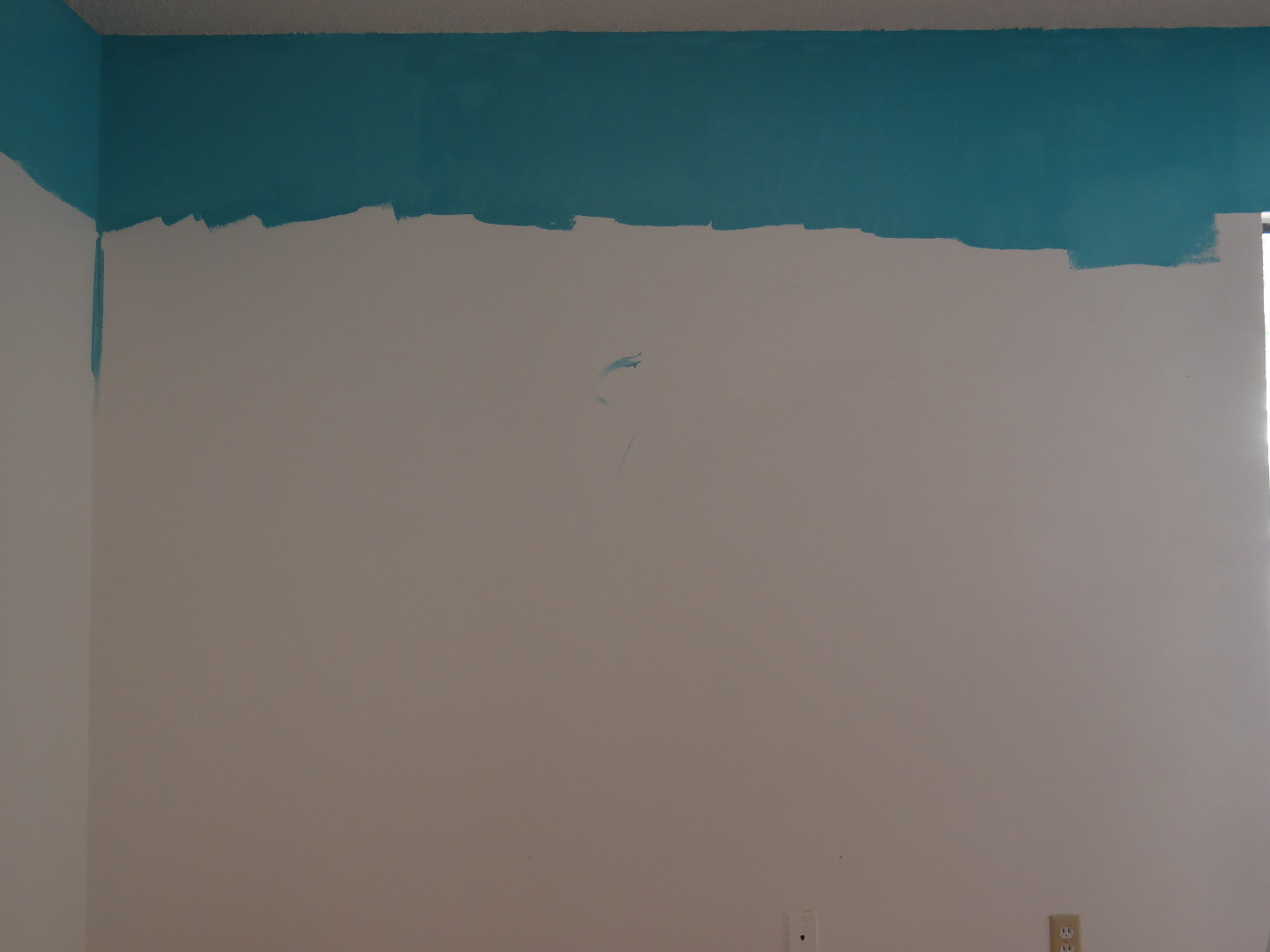
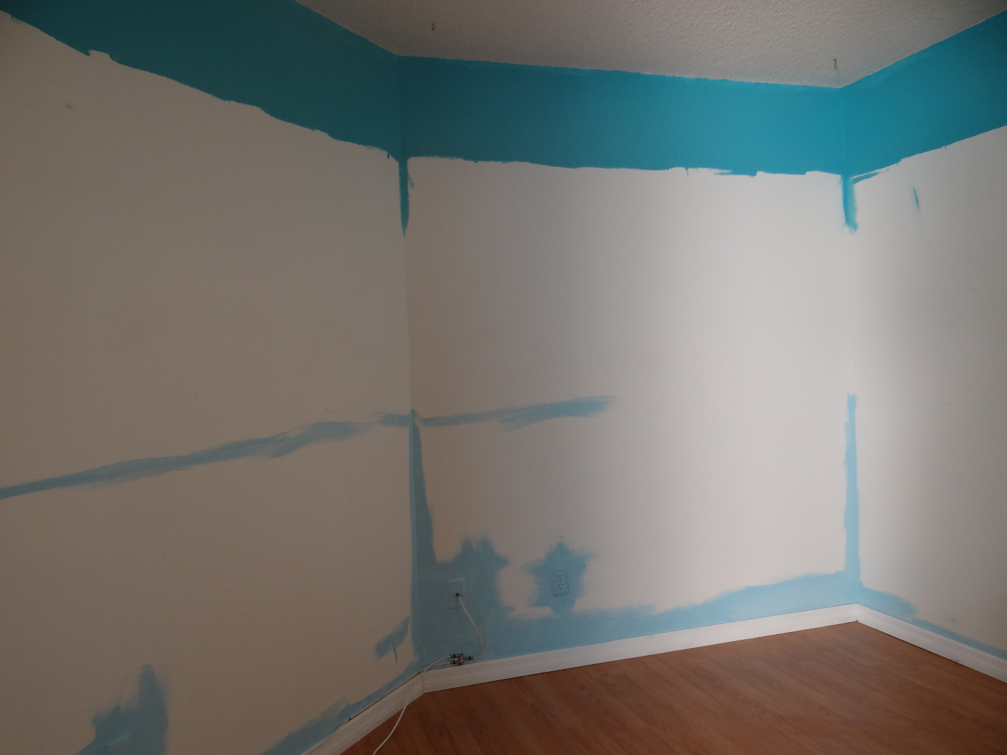
To reduce the time waiting for paint to dry we will paint the top color and the bottom color first and allow them to dry before continuing.
Typically, as you gaze into the distance colors will become lighter; so, for replicating the perspective of many landscapes, a darker color on bottom and lighter on top would be appropriate. However, in our reference photos we find the opposite; the crystal clear waters along the shoreline fade into the distance as rich blues and turquoises.
We will then trim along the molding with our bottom color and along the ceiling with the top color, making sure to get the corners as well, and allow to dry.
Measuring Paint Lines and Painting First Colors
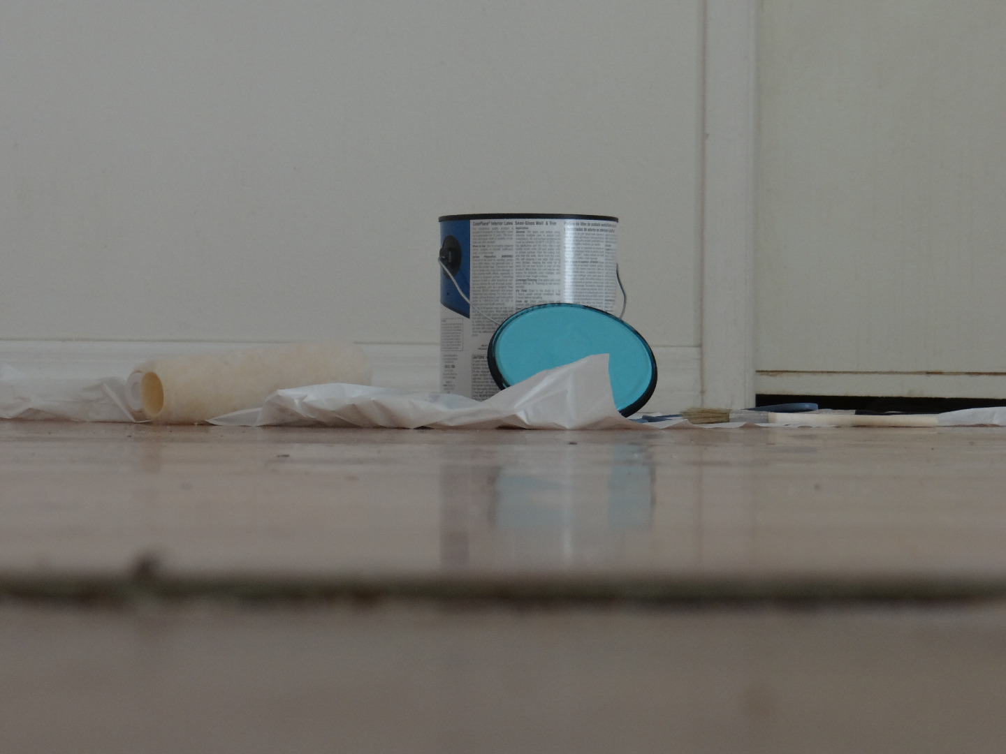
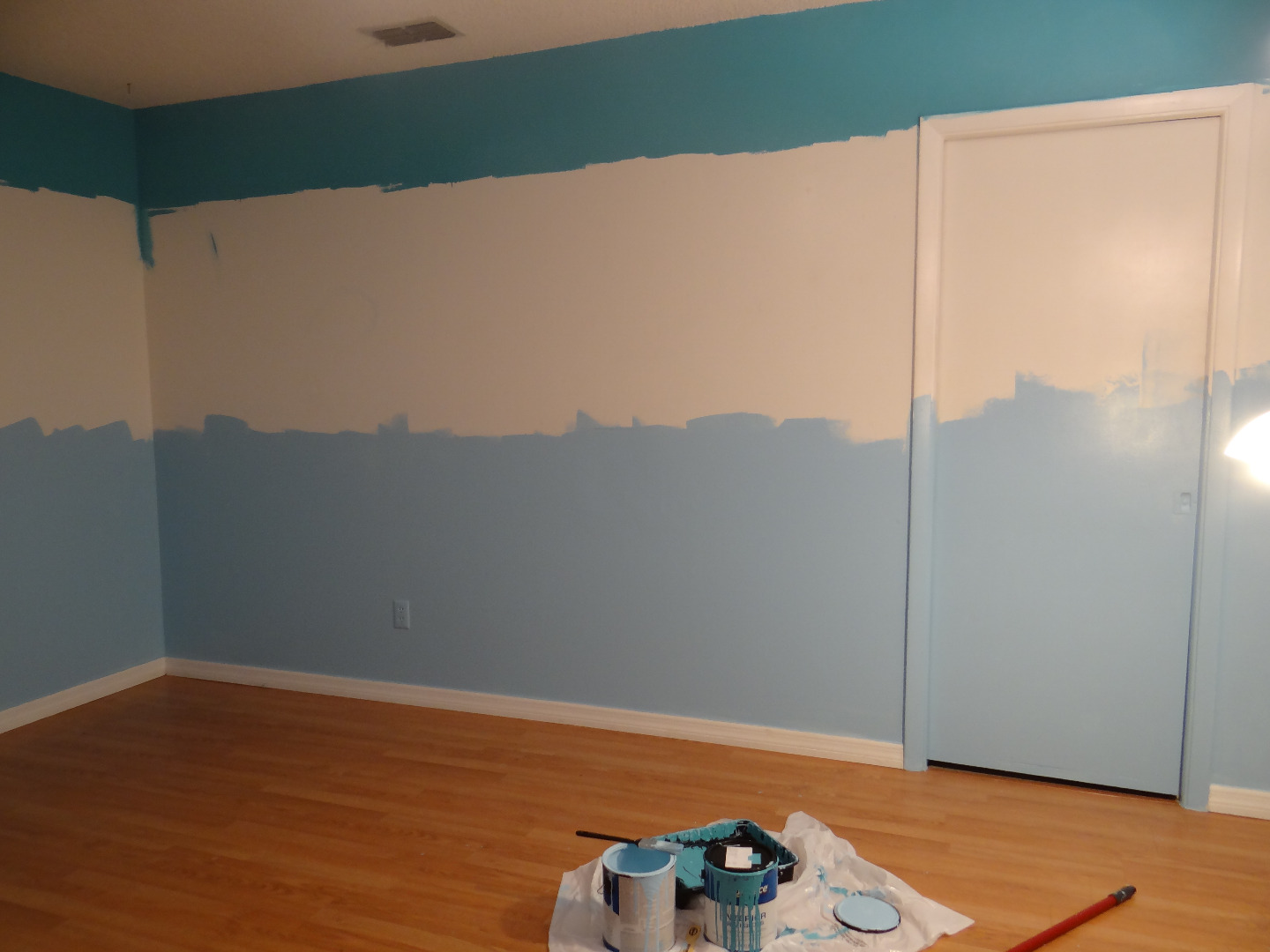
Things appear smaller as you look into the distance and we will use this concept to make our graphic illusion more convincing. Applying this means that the stripes on bottom will be taller, fading to smaller on top. In an 8 foot tall room, we went with stripes that are 3 feet, 2 feet, 18 inches and 1 foot, respectively.
Once the measurements are decided upon, mark the wall with a pencil. On every corner and about every 2-3 feet make a small tick mark with a pencil at the measured distance, starting from the floor and repeating for every stripe.
Now, if your trim is reasonably dry, paint the bottom color being sure to extend beyond the first set of pencil marks and do the same for the top. Allow to dry slightly and apply a second coat if necessary.
Allow to dry thoroughly before continuing.
Tape and Paint Intermediate Colors
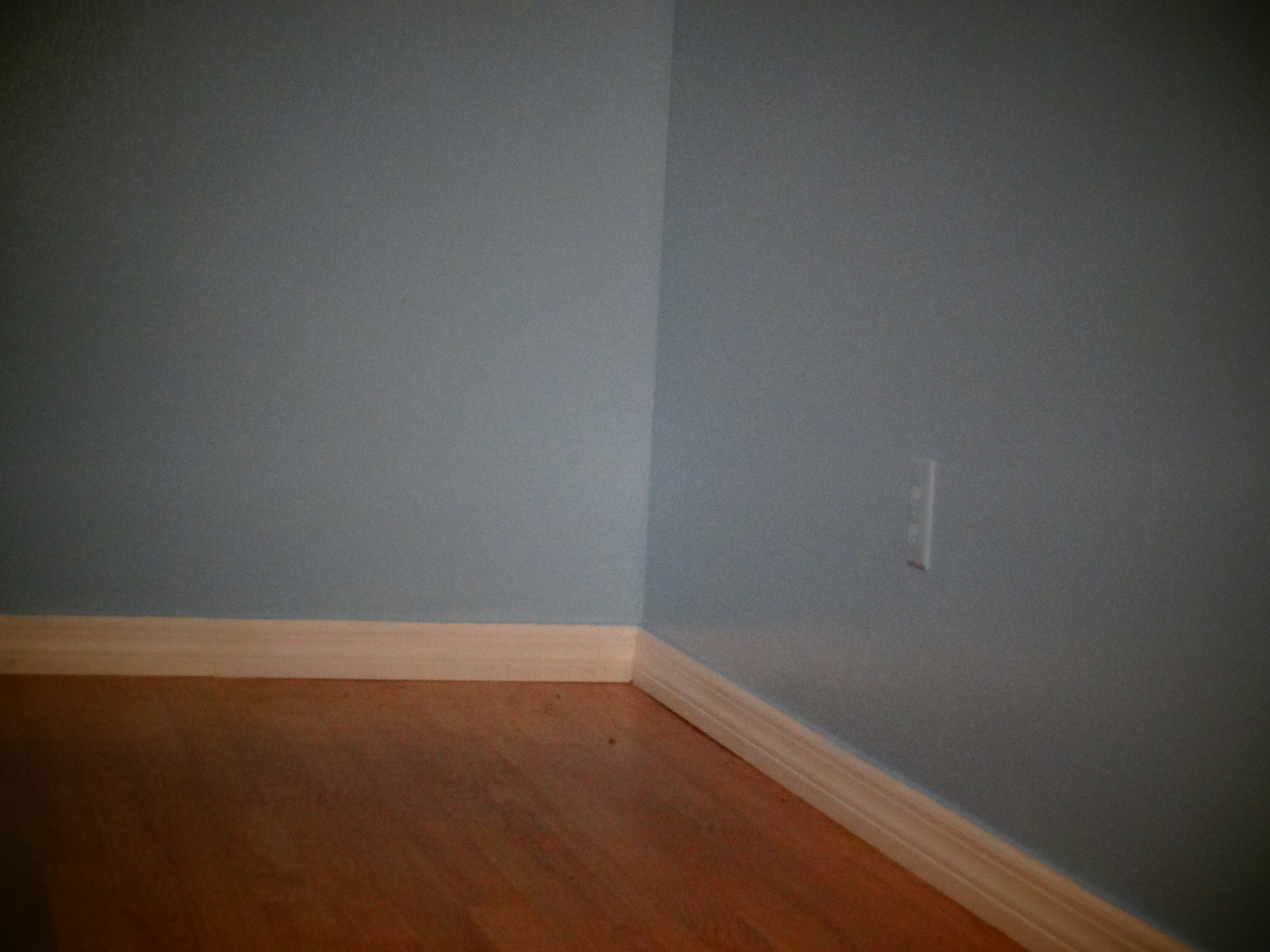
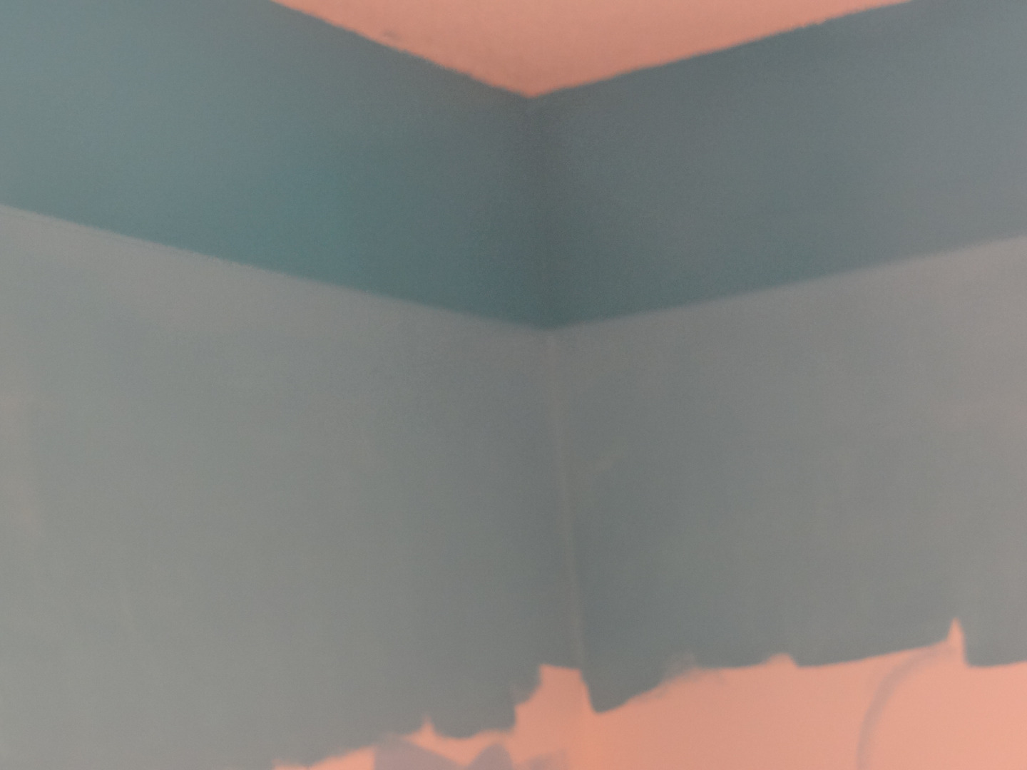
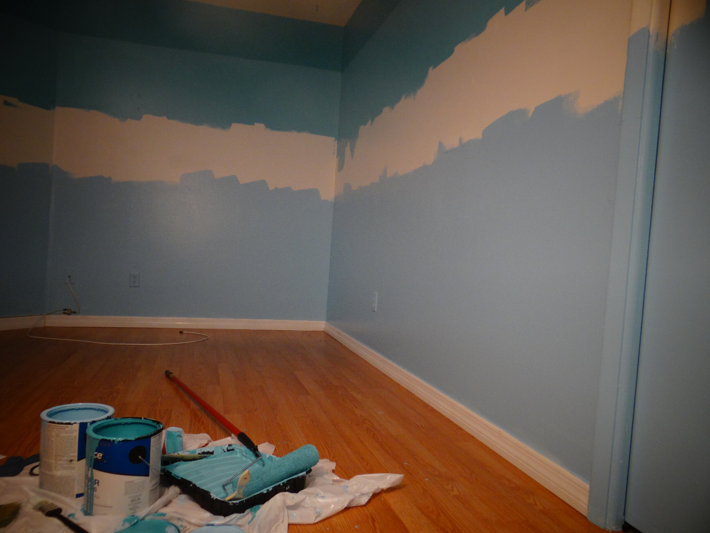
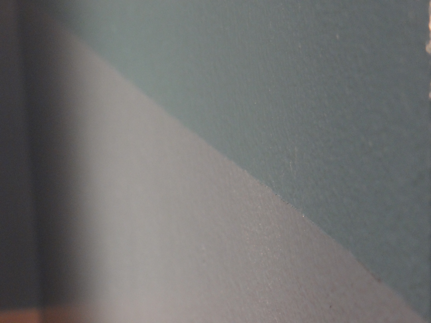
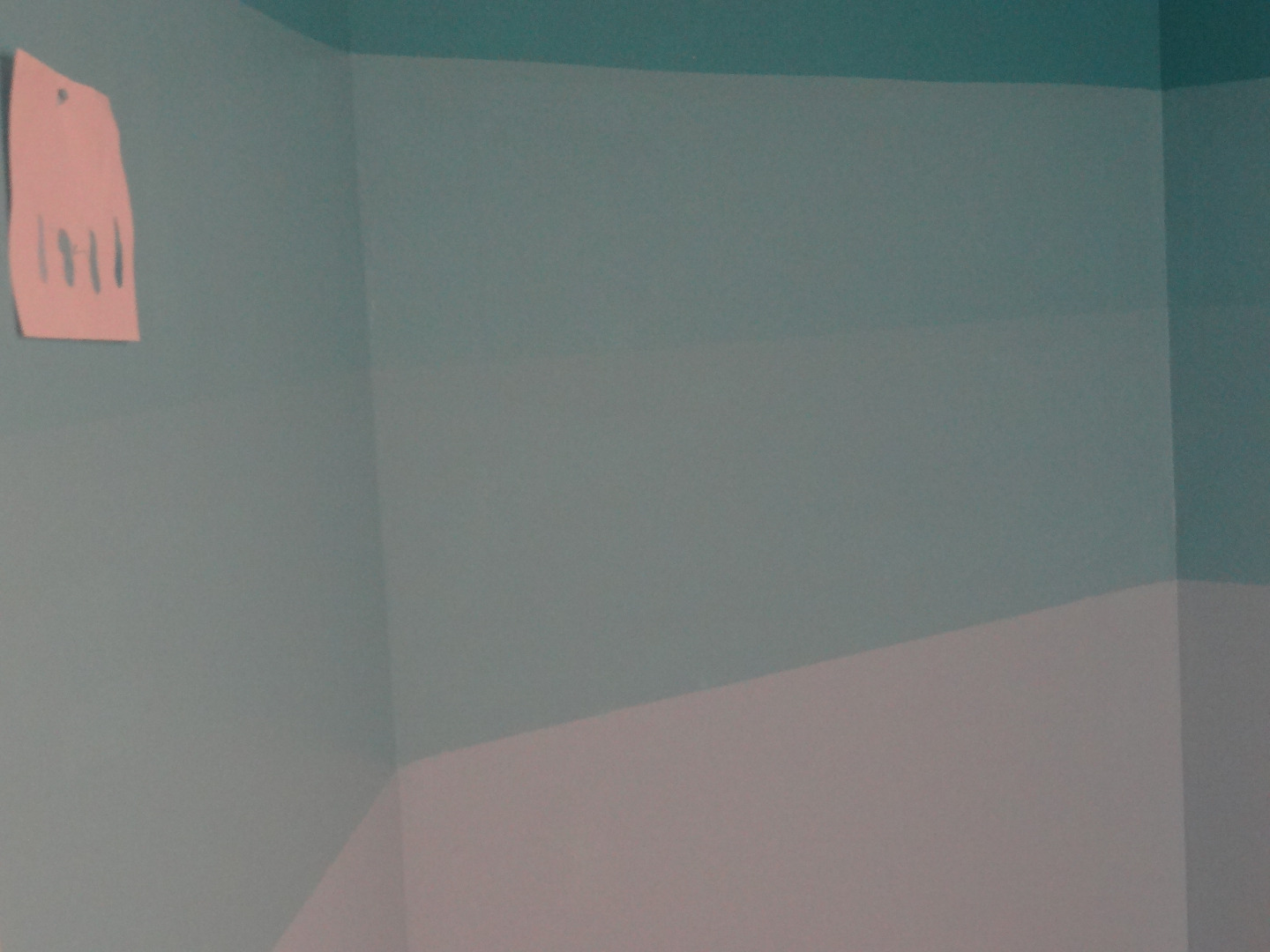
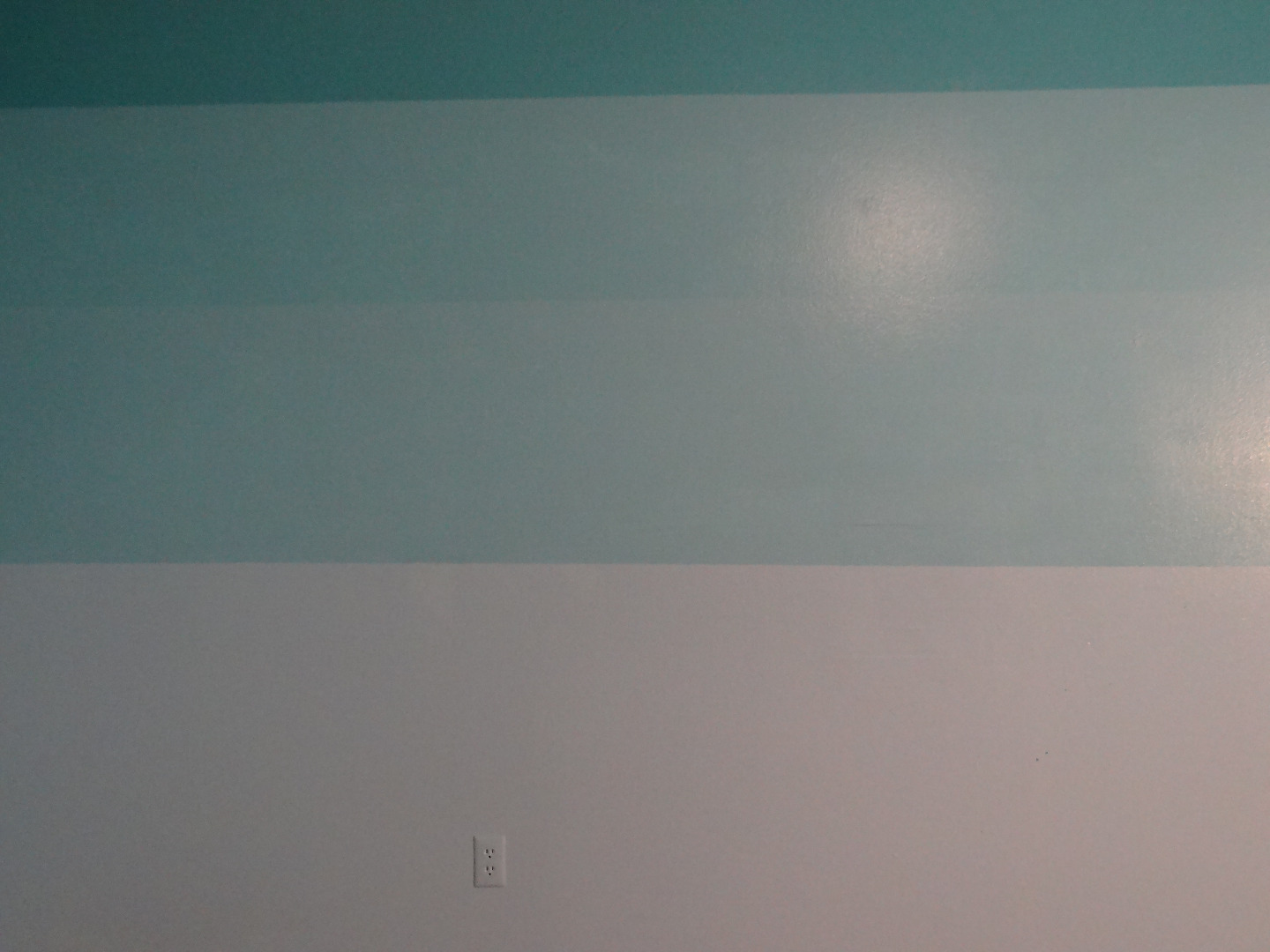
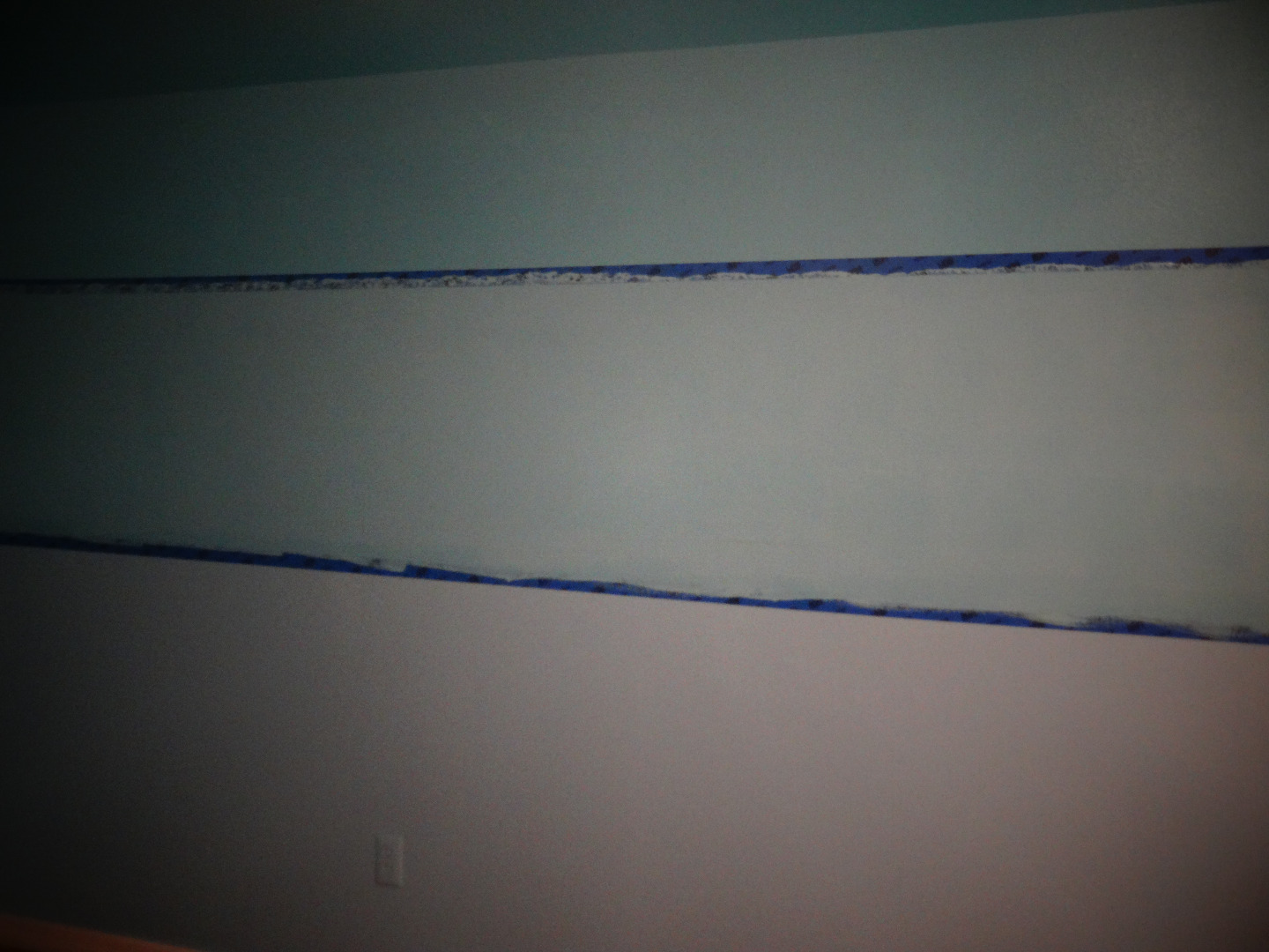
This step will include an important part of transforming your old drab room to a graphic masterpiece, crisp lines.
Once your top and bottom colors are completely dry we can prepare to paint the next stripe.
Following the pencil marks that you applied earlier apply blue painters tape around the room in a straight and level line. If marks are no longer visible, you may need to remeasure and re-mark.
To apply the tape, start with one corner and pull the tape all the way to an adjacent wall's corner. As you walk, ensure that you are lining up the tape with your marks. Be sure to be consistent; always line up the tape below every pencil marking. Before you're finished, double check the line is straight with your level and press down lightly. There is no need to cut the tape at the corners either. One continuous piece of tape makes for a cohesive line.
Repeat this process around all the walls of the room. When you reach a door jam, window or molding, take time to wrap the tape around neatly and level.
The first trick to creating crisp, flawless lines is to rub and press the edge of the tape with a clean, dry towel. Rub vigorously and focus on the edge of the tape adjacent to the unpainted area. Be sure the tape adheres fully with no wrinkles or bubbles.
Now we're ready to apply the next color. The next trick to achieve crisp lines is to carefully trim along the tape line with a brush or roller by starting on the tape and lightly stroking the brush toward the unpainted wall. Don't go from the wall to the tape because this will press paint under the tape line. Also trim any corners, windows or door moldings. Allowing the trim around the paint line to dry will result in a barrier so that further coats won't seep under your perfect line.
Once dry roll on a coat or two of this color making sure to extend above the next set of pencil marks. Painting vents, light sockets, etc. really adds to the effect!
Allow to dry completely.
Once your last application is dry we can apply the final color which
will now be in between two already painted stripes. This means we will apply tape both on the bottom of the top stripe and the top of the stripe below. It is important that your previous colors extend completely over the pencil mark line so that there is no white exposed when complete and, again, the previous coats of paint must be completely dry.
We will now apply two more lines of tape as we did before. We will trim the tape using careful strokes as described in the last step and allow to dry.
Once the tape lines are trimmed and dry, apply a coat or two of the final color.
Remove Tape and Admire!
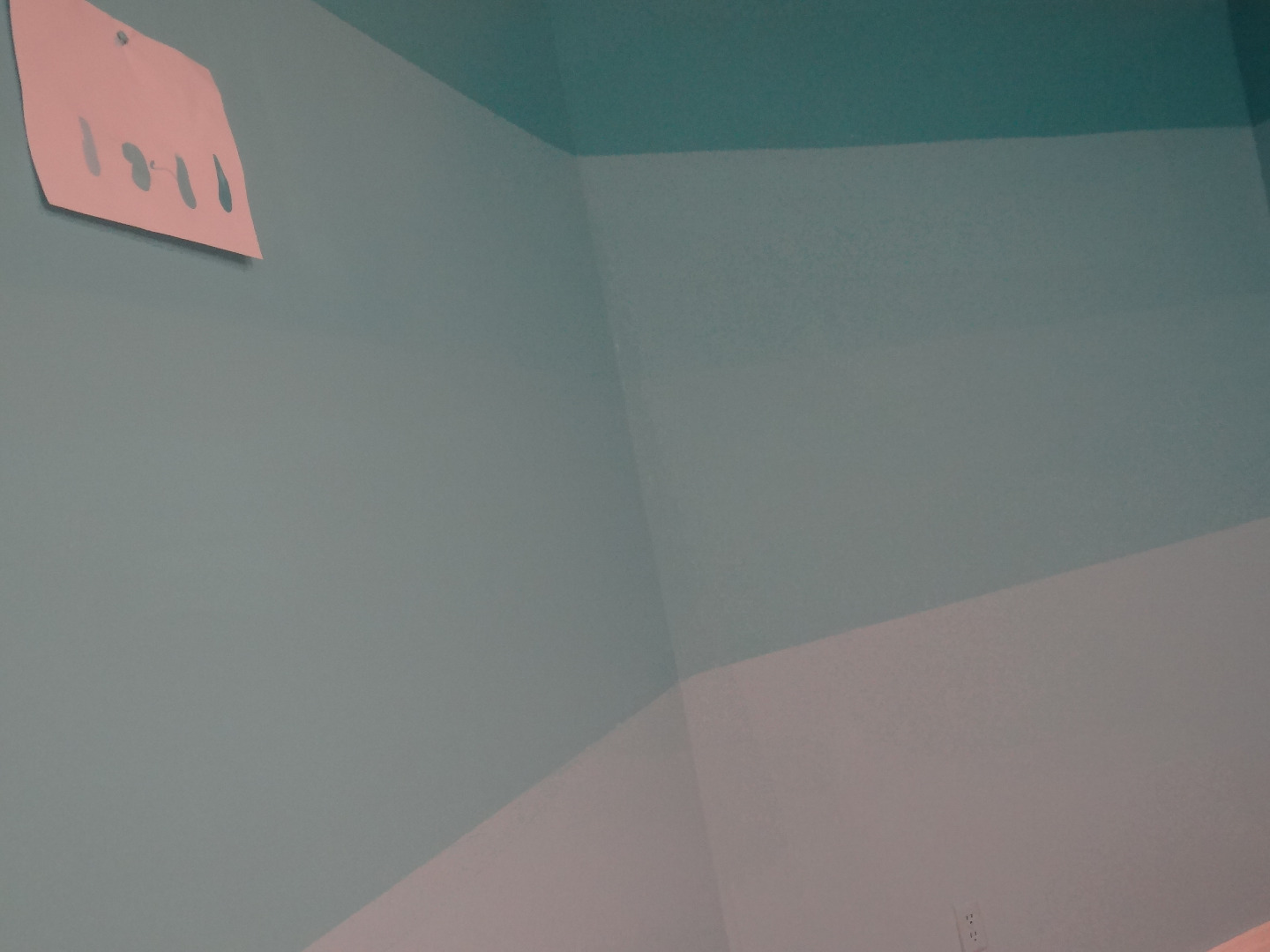
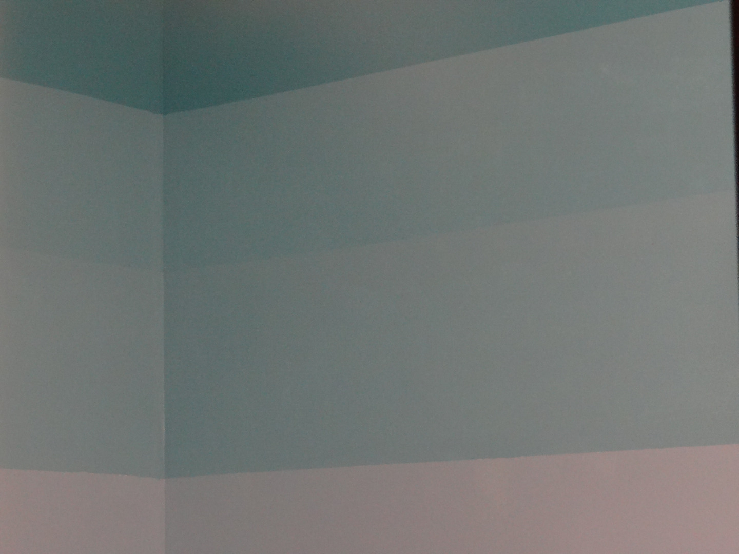
Once you are sure all coats and all colors are completely dry, you may remove the tape. You may want to even leave it overnight if you aren't too anxious to see your masterpiece!
When removing tape, pull smoothly along the line in one continuous motion until all tape is removed. You'll inevitably have one or two or more areas to touch up, it happens to the best of us.
Clean up all spills and materials while touch ups dry and we can continue to decorate the room.
Furniture and Window Coverings
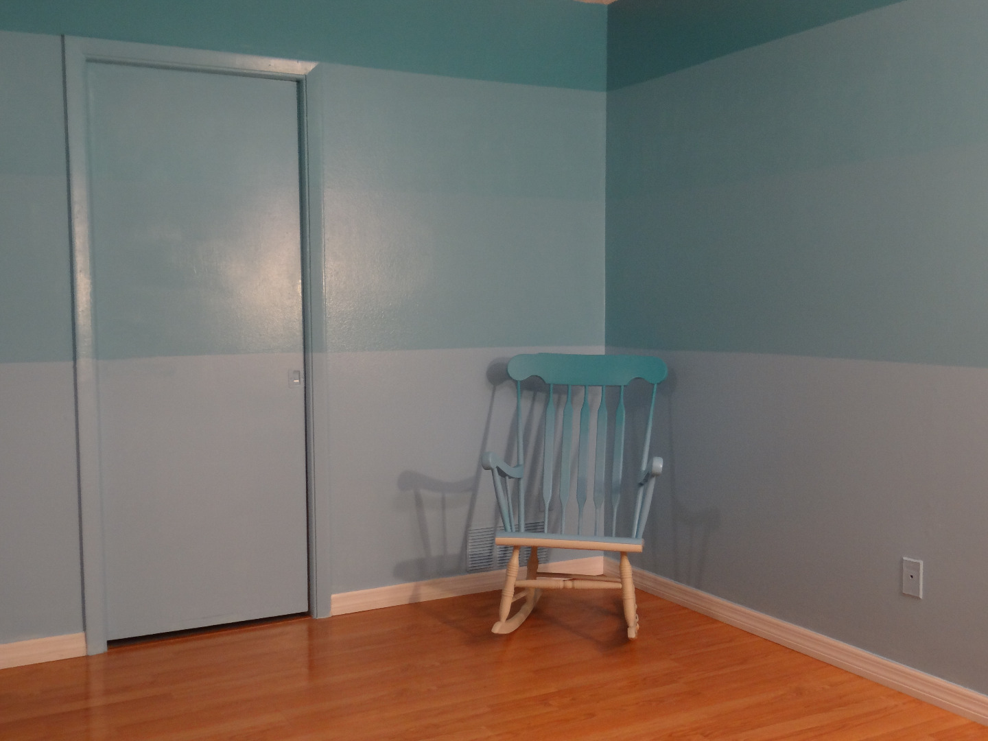
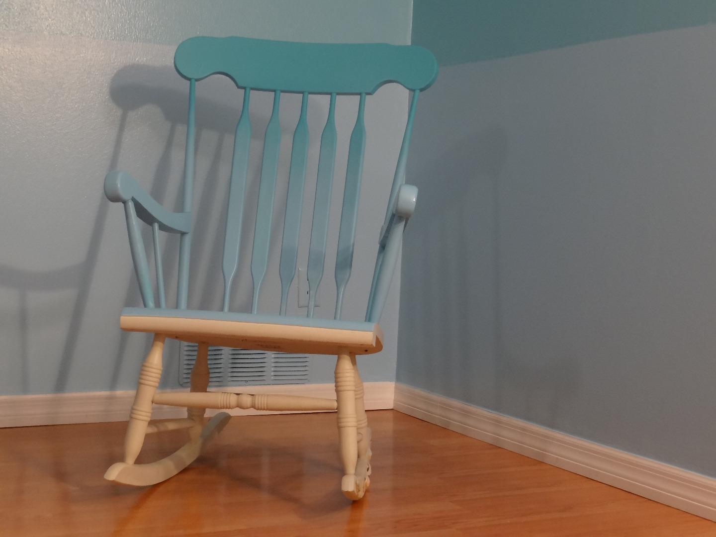
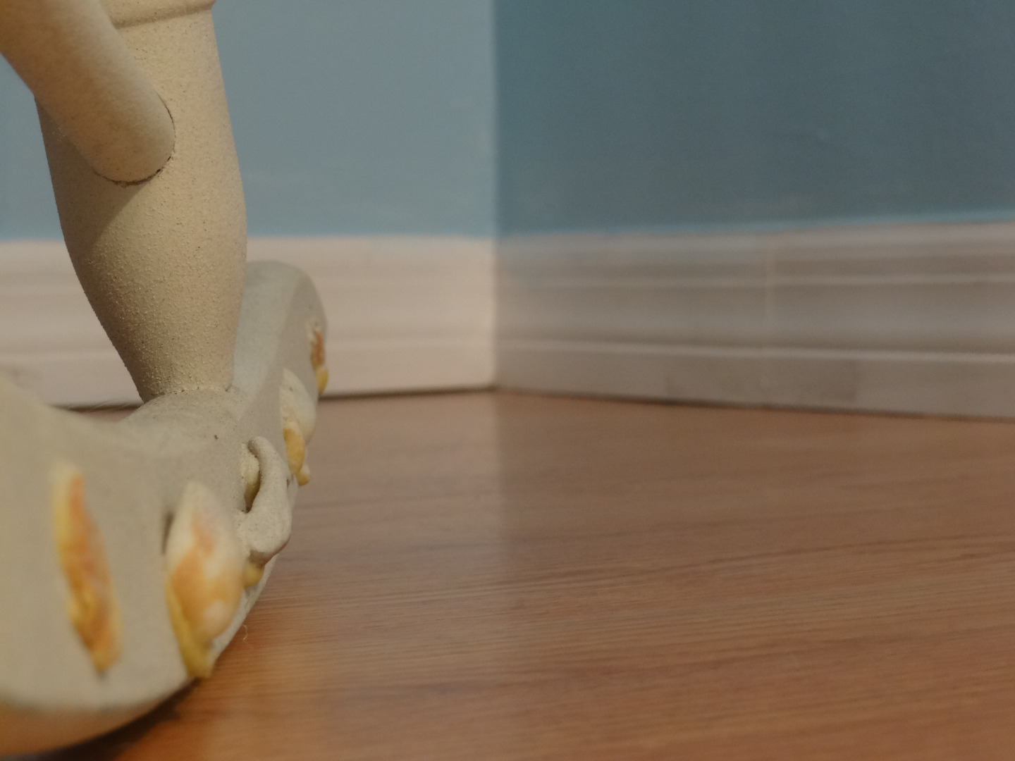
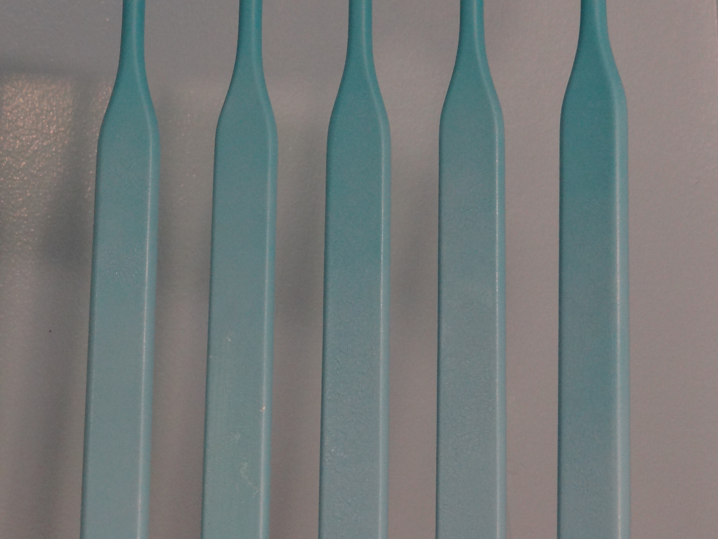
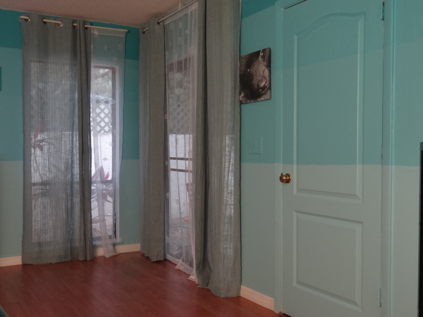
To finish the transformation, the right furniture is important. White tables and shelves, we decided, would match well without drawing attention away from the wall pattern. We also chose to include a Key West style rocking chair painted with the same concept in mind.
To make the chair we painted the bottom with a faux sand spray paint and applied shells with glue. For the back of the chair we found the same colors as the wall in spray paint, painted it one color and then sprayed the top lightly creating a smooth gradient which matches the wall behind. To finish the effect the lip of the seat was painted white just like the froth of a wave rolling onto a beach.
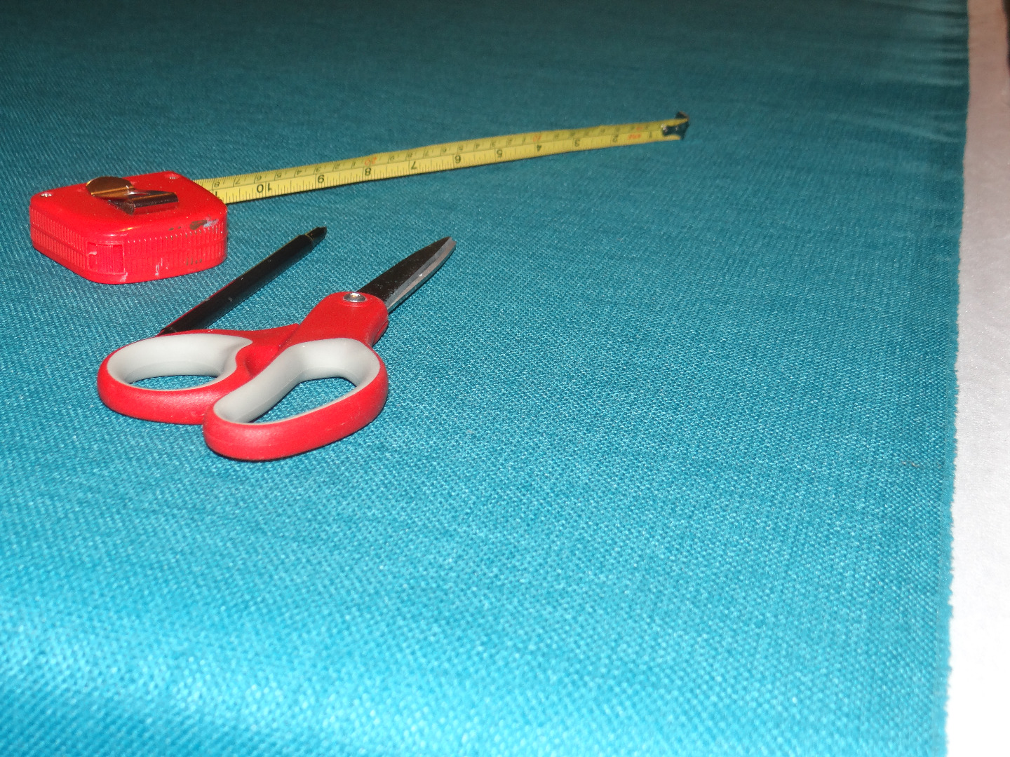
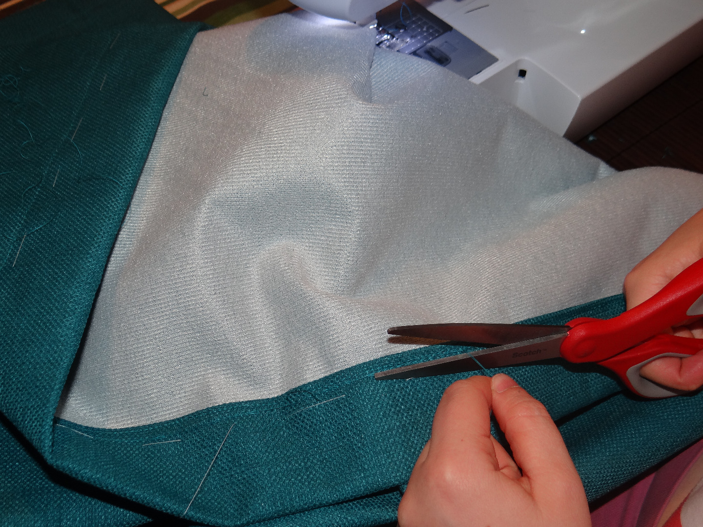
An appropriate color fabric of fabric scraps was also chosen and then sewn into matching drapes to further emphasize the concept.
It's All in the Details
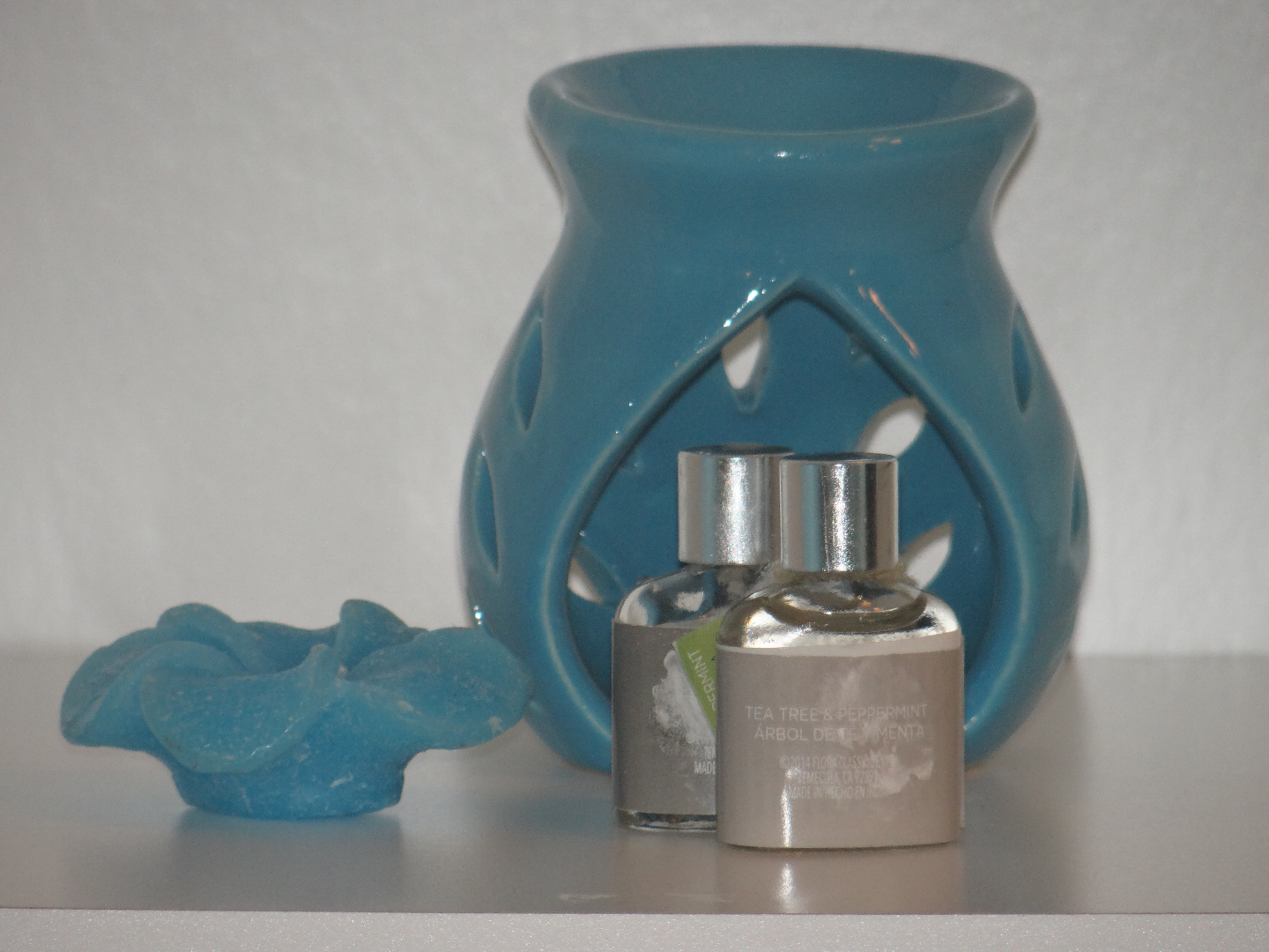
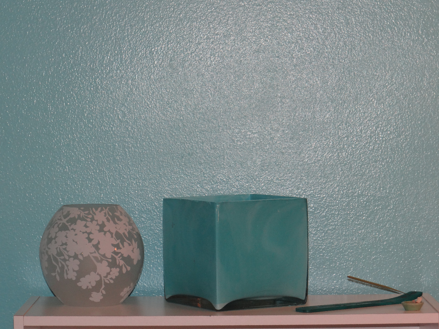
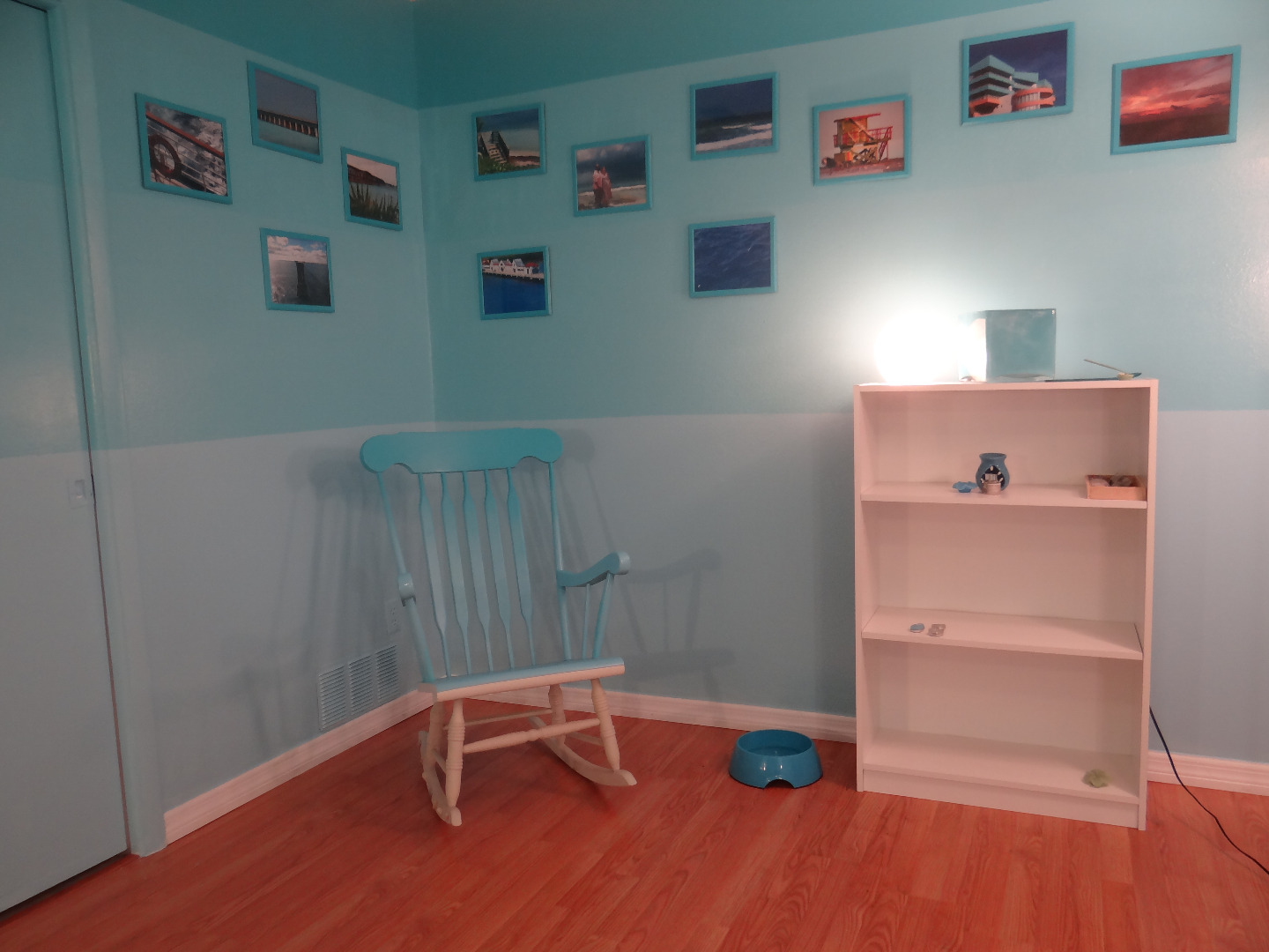
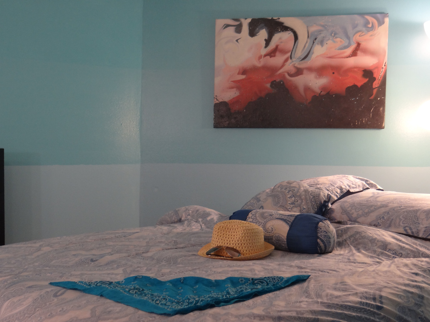
To complete the project, we chose a variety of cheap and found knickknacks to compliment the effect. A turquoise candle holder and a blue dog dish fit in nicely.
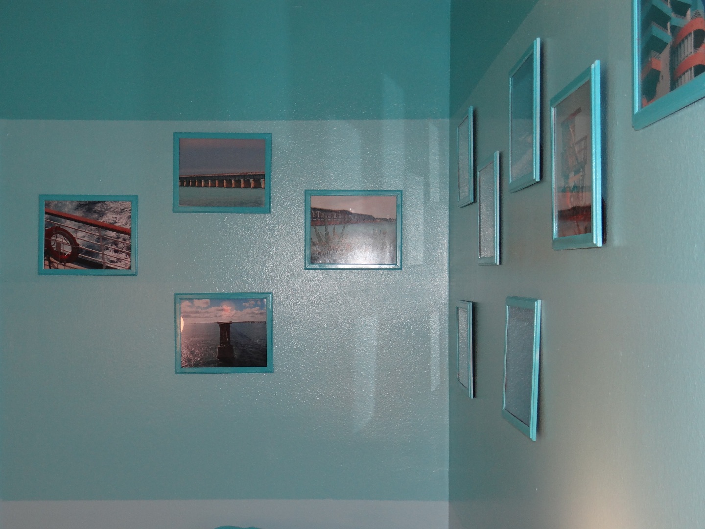
Some old frames were painted with leftover paint to match perfectly and were used to display photos of some recent Key West and Caribbean adventures. Use extra wall paint whenever possible to refurbish old materials while maintaining and emphasizing harmonious graphic balance.
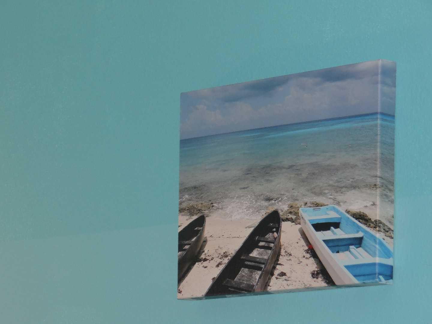
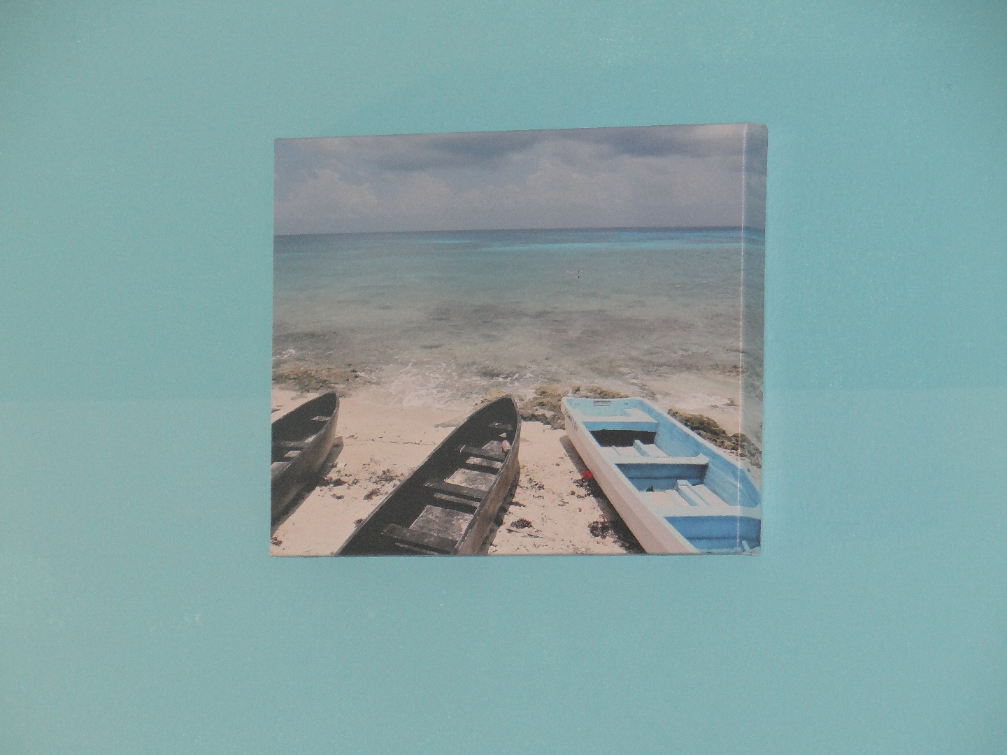
One photo of the Caribbean's shore really stood out so we had it printed on a beautiful canvas by www.Blabor.com. You can get artist quality canvas prints at https://blabor.com/products/canvas.html We'll discuss two ways how custom artwork can be prepared to precisely match your room in the next step.
With the last of the paint, I poured and swirled two colors inside an unused and boring glass vase. This results in an impressively complex yet subtle flowing pattern which can be seen from the outside of the vase and, again, precisely matches the walls.
Custom Graphic Artwork

We will be exploring a few methods for creating custom graphics to define the appearance of any space. The common element here is color: hue and tint.
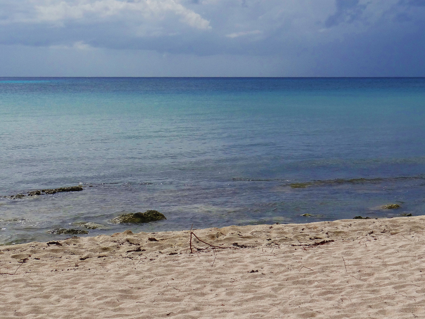
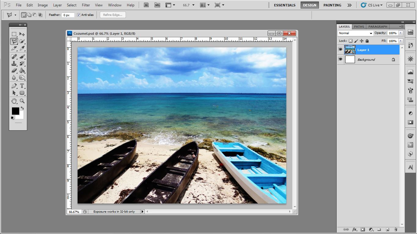
The first image above is an original photo of the Carribbean seaside from which the inspiration for this room's design came. Because cameras cannot always capture the true colors of nature accurately we'll make a few adjustments before preparing for print. First, we need to convert to colors to print ready by selecting IMAGE>MODE>CMYK. Next, we'll select IMAGE>ADJUSTMENTS>BRIGHTNESS/CONTRAST and bump up the contrast a bit and we'll also lighten it up with the brightness slider to compensate. Then, we will select IMAGE>ADJUSTMENTS>VIBRANCE and increase to nearly 100% in most cases or until it looks good. To prepare for print we'll first select a print size from a place like this and then adjust he image size in Photoshop by selecting IMAGE>IMAGE SIZE. Place your order for canvas and upload your custom matching artwork!
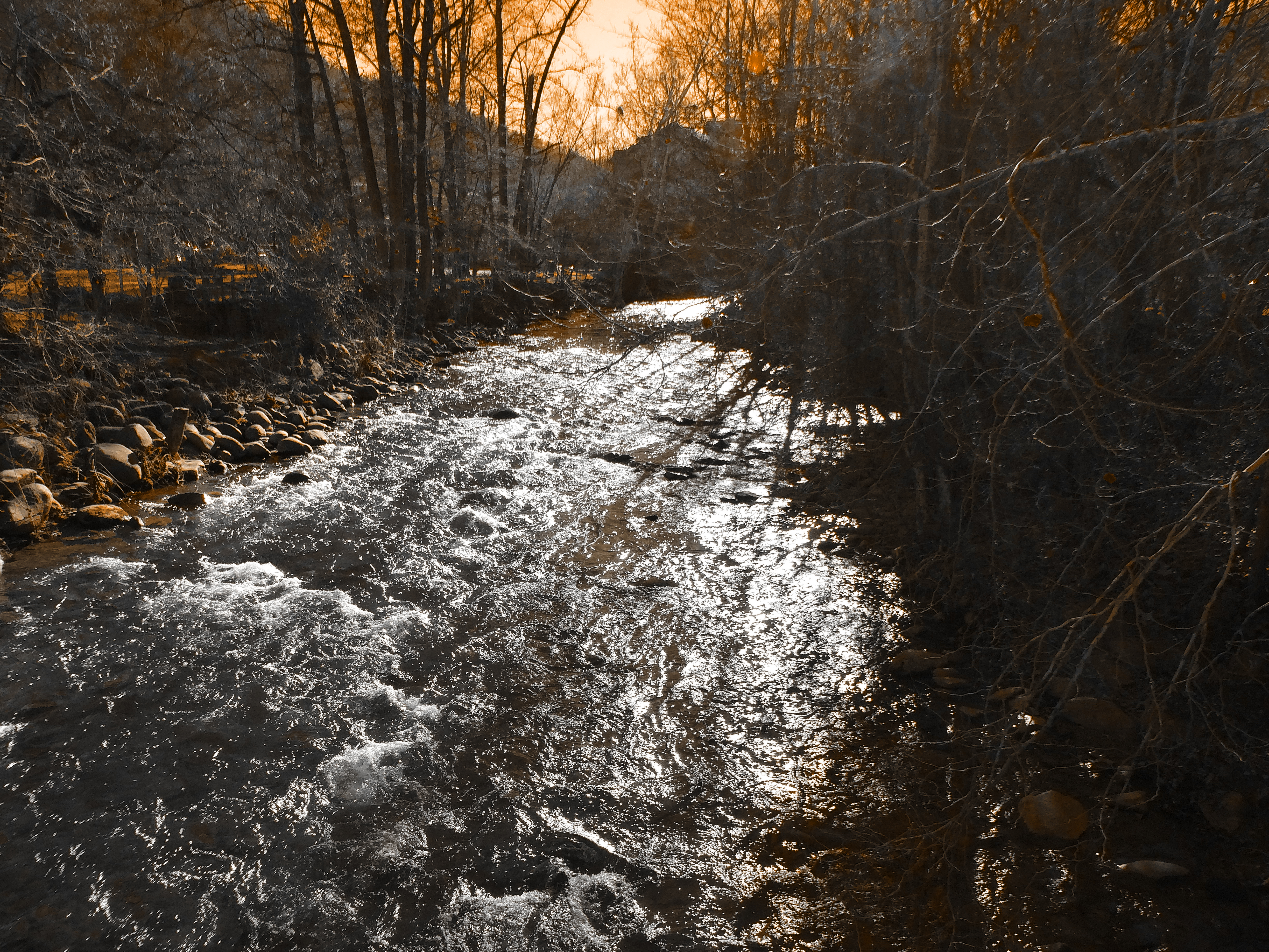
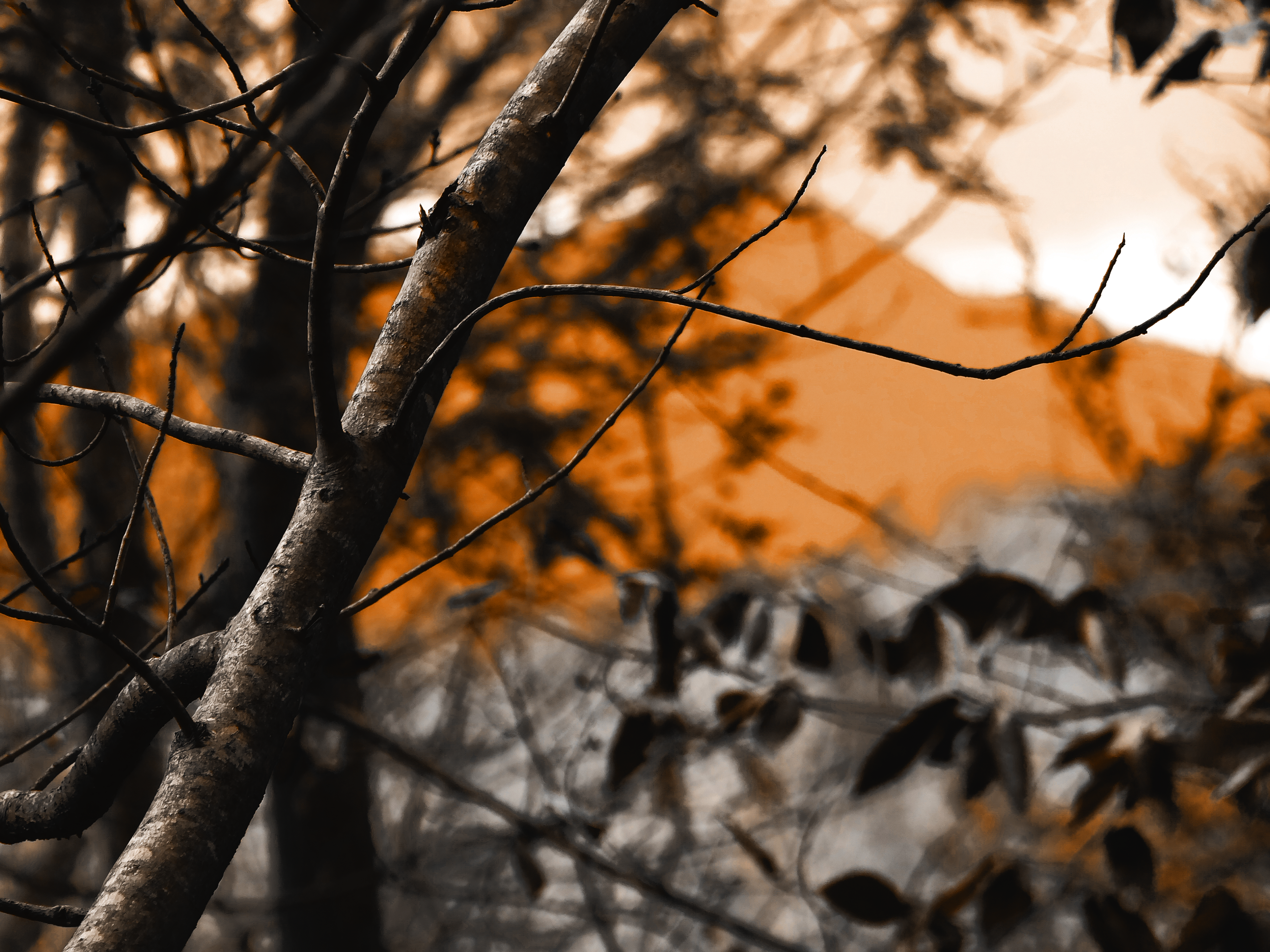
To make a photo or image's graphics match a predetermined color, this method works great. Open the photo in Photoshop, create a new layer and fill that layer with your desired room color. Then set the the layer's Blending Mode to HUE or COLOR depending on your desired effect. Check out the original woodland photos to see the result!
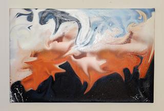
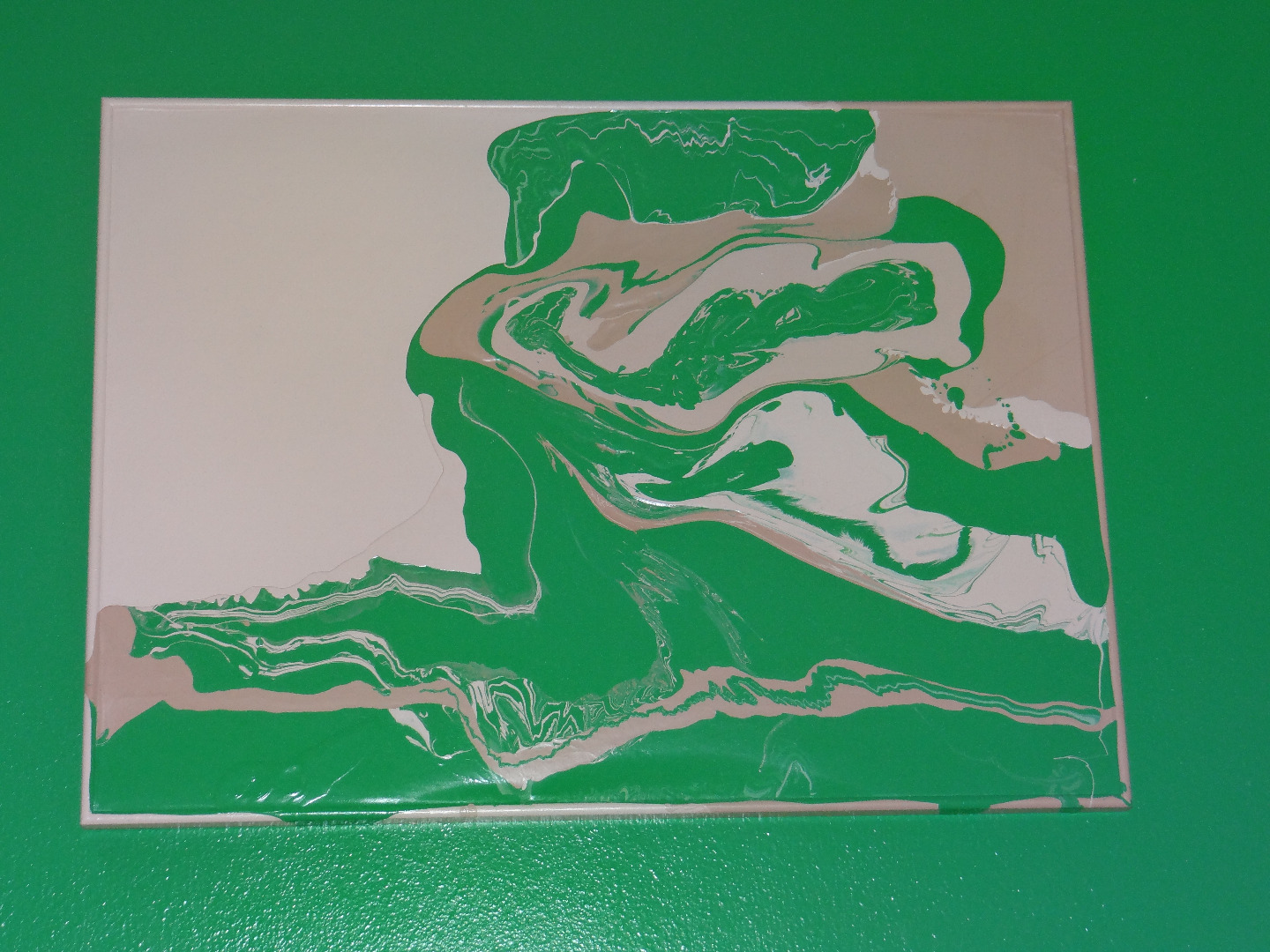
In this next method we're going to get a little messy! After painting your room with this technique your leftover paints can be used to create something amazing! Lay an old picture frame or dated poster, a ruined old painting or canvas on some newspaper on the floor. First paint the whole canvas, frame and sides with one of your room colors.By using the same paint as your walls, you're painting is going to match perfectly! One technique is to swirl the paints in a cup and pour onto the canvas for a detailed modern marbled pattern that results in an infinitely complex and beautiful pattern. You can also pour right from the can, swirl and overlap the paint to create other patterns.
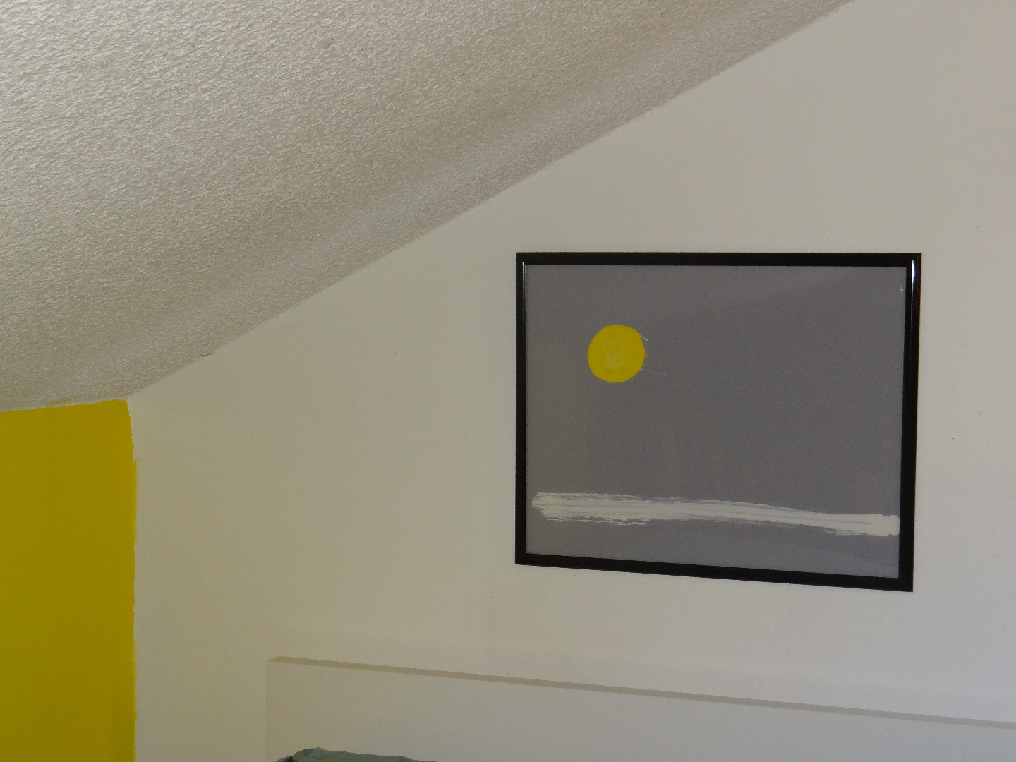
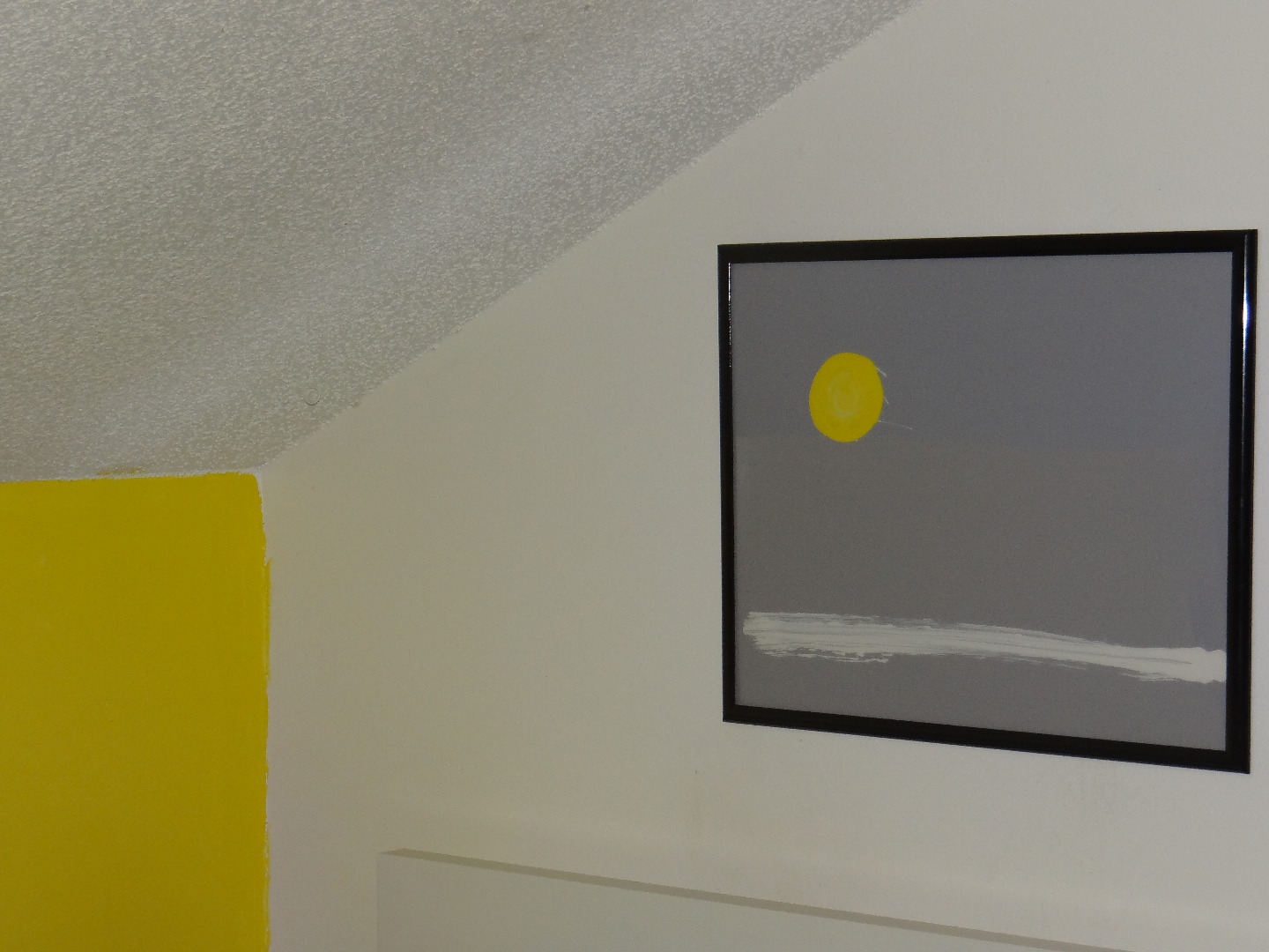
The last method we'll discuss is another great way to use leftover paints and old frames with a glass insert. Remove the insert and paint directly on the backside of the glass. Simplicity is key here. Once dry, use your second color to paint over it completely. Once dry, reinsert the glass into the frame to reveal super glossy artwork with bold crisp lines that again matches your room perfectly!
Relax and Enjoy!

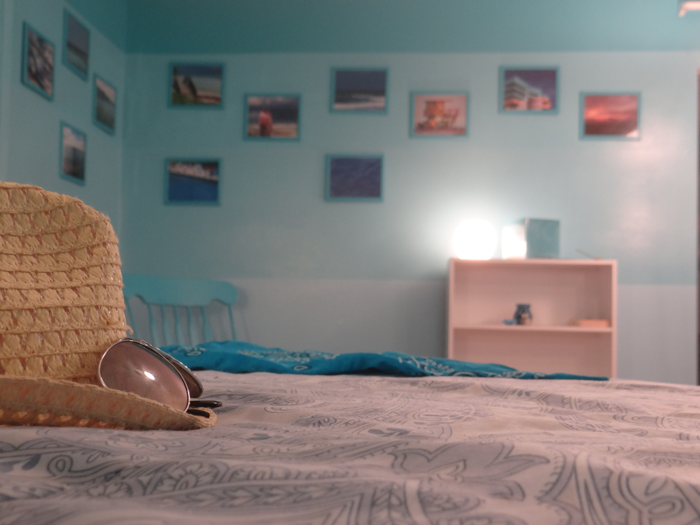
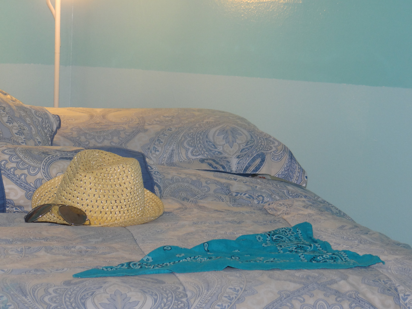
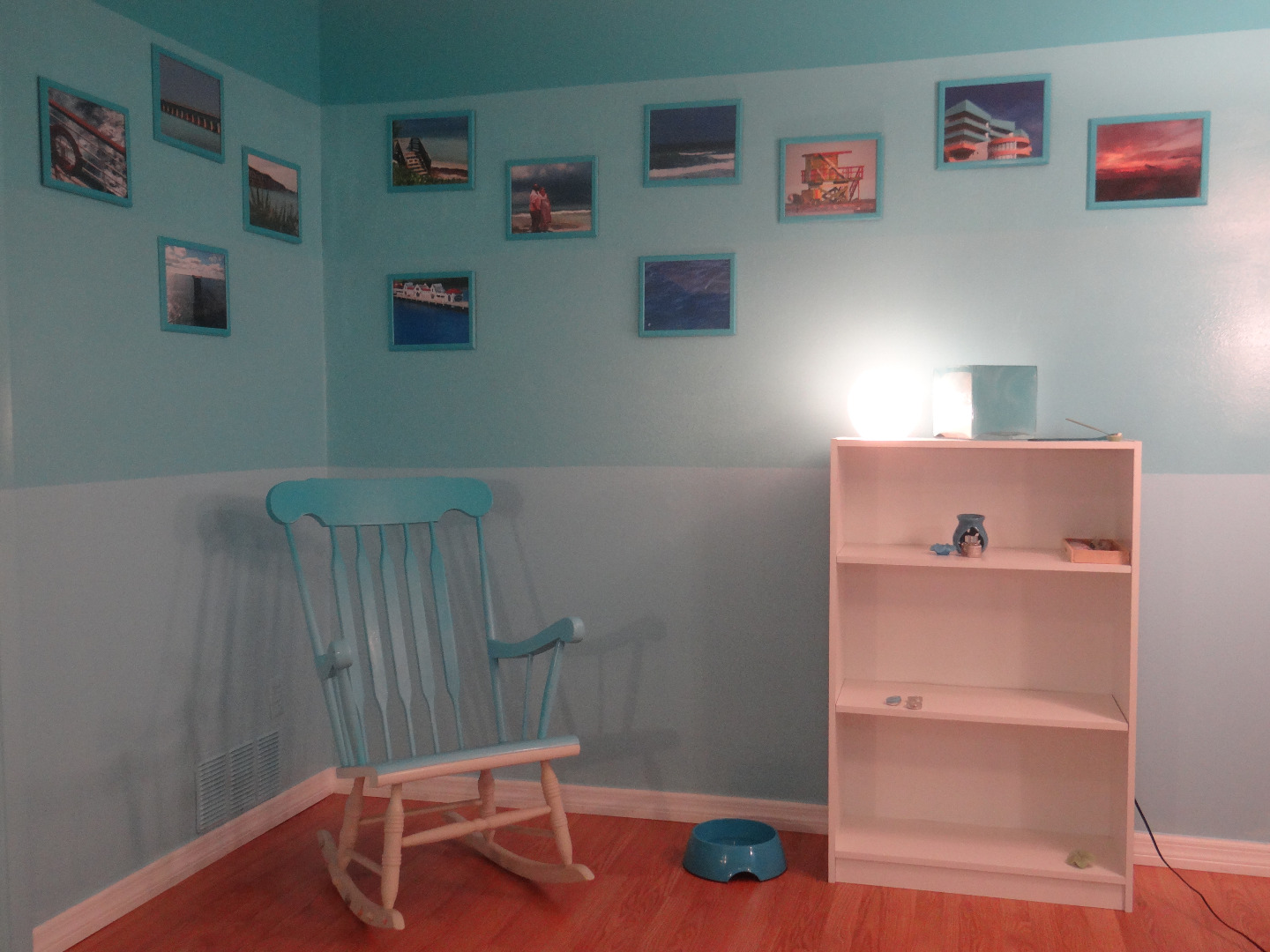
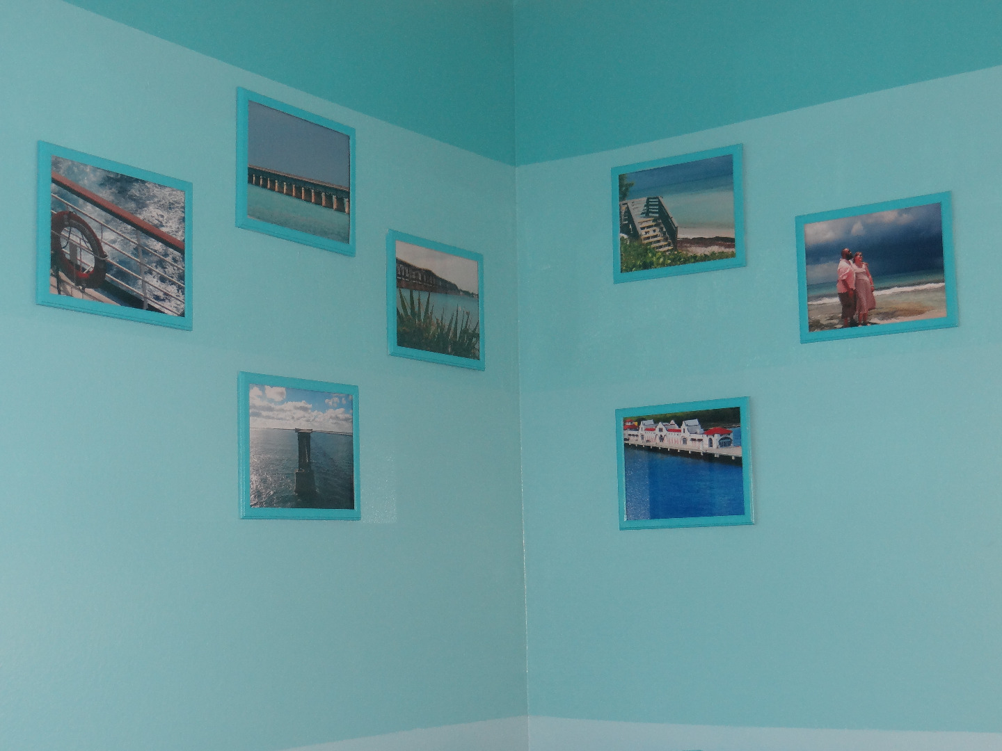
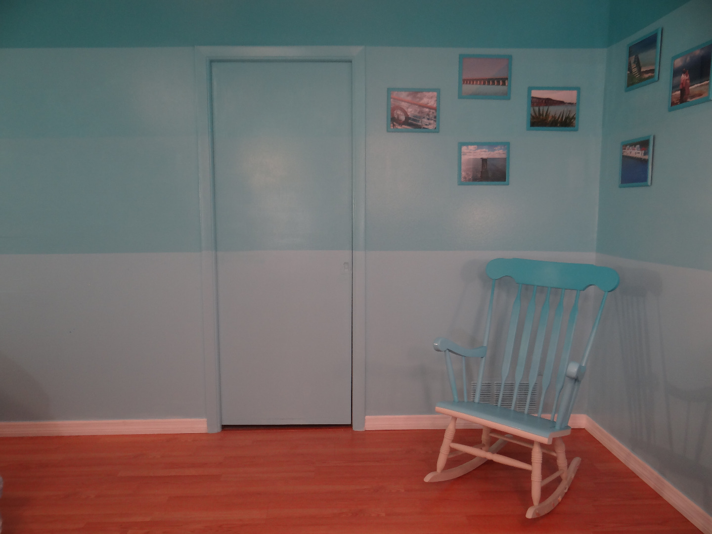
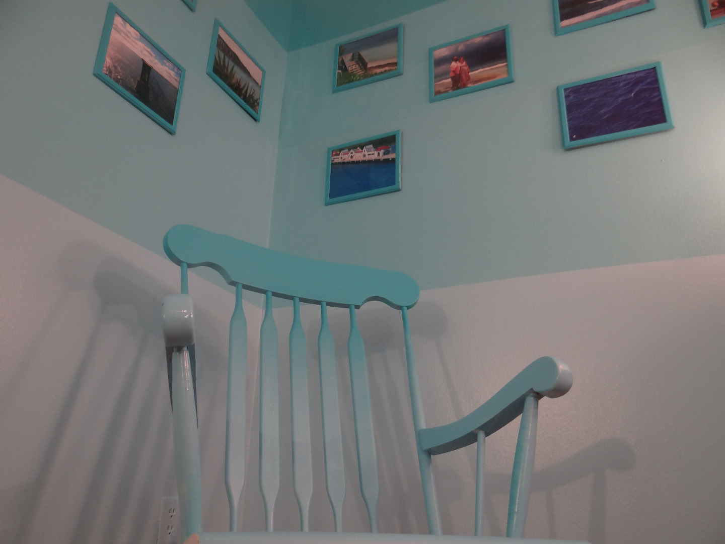
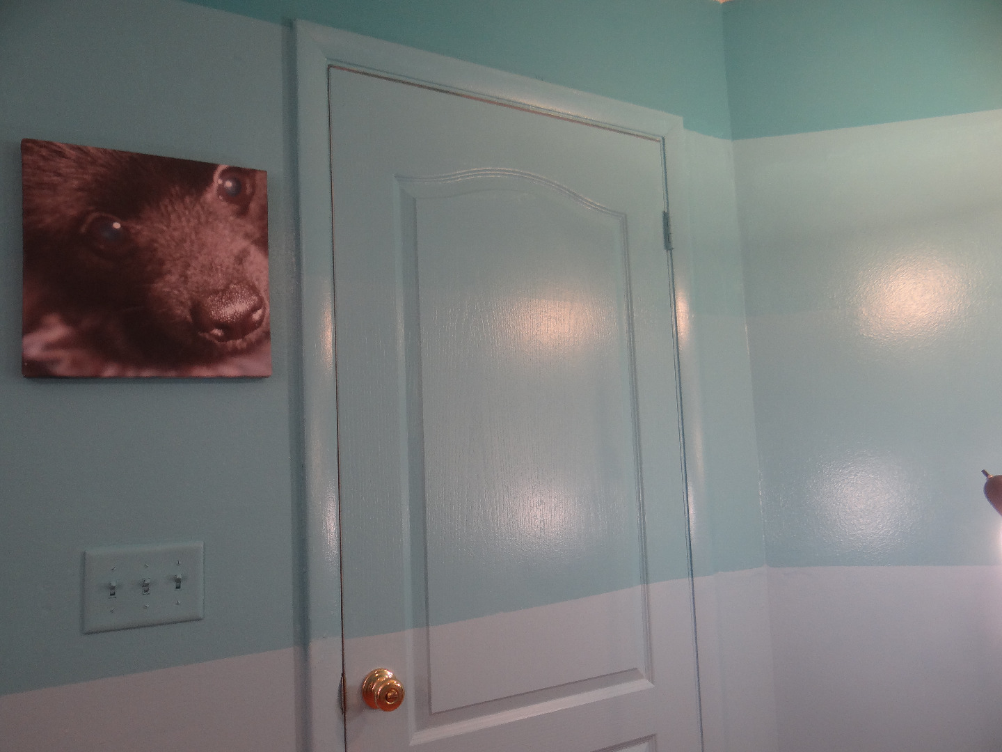
Every time someone steps foot in this room they are transported to paradise. Waking up in this room is nothing short of a thrill and we find guests admiring our artwork and design with open mouths and wide eyes!
Not only is every inch of this room fun to look at but the technique creates an undeniable sense of perspective making the space look new like a pristine Caribbean island and feel huge like you are surrounded by a seemingly never ending sea.
Try It in Different Styles!

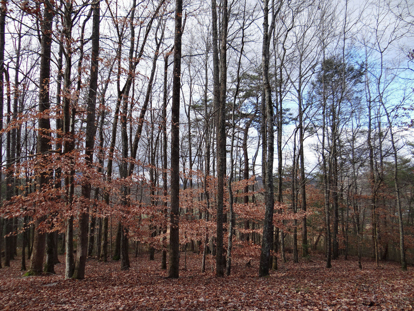

This same concept can easily be applied to other landscapes as well.
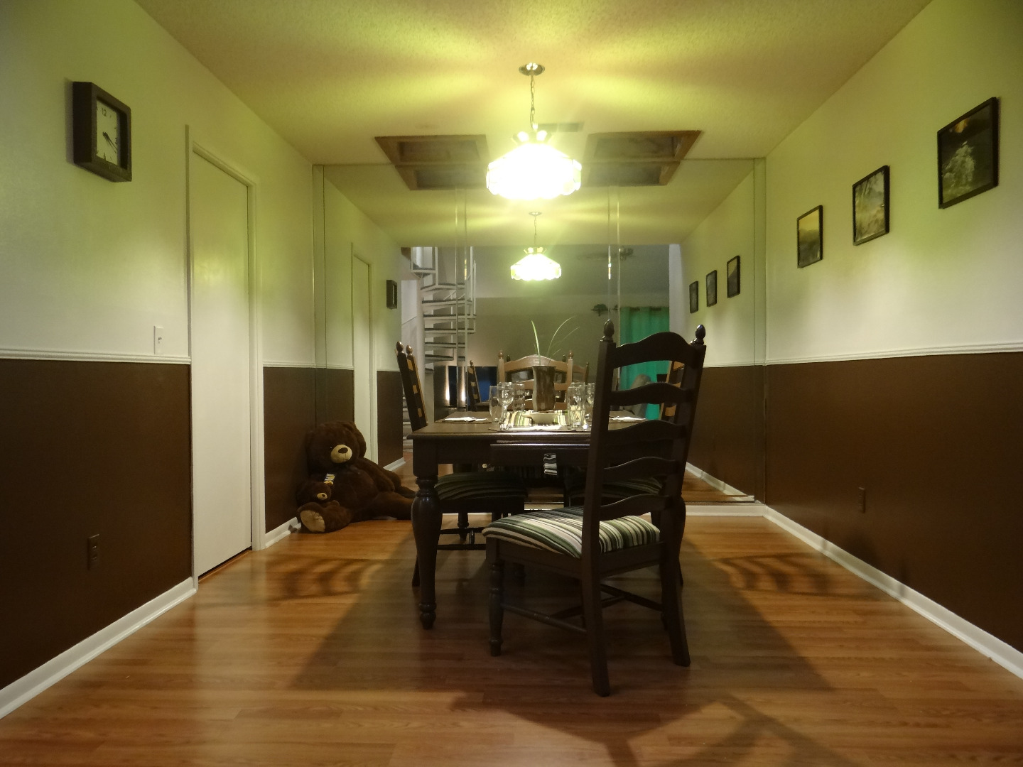
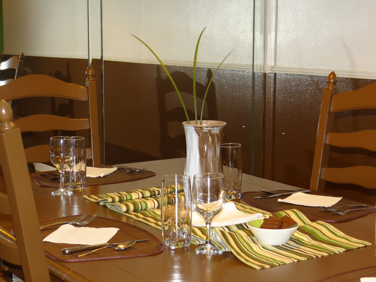
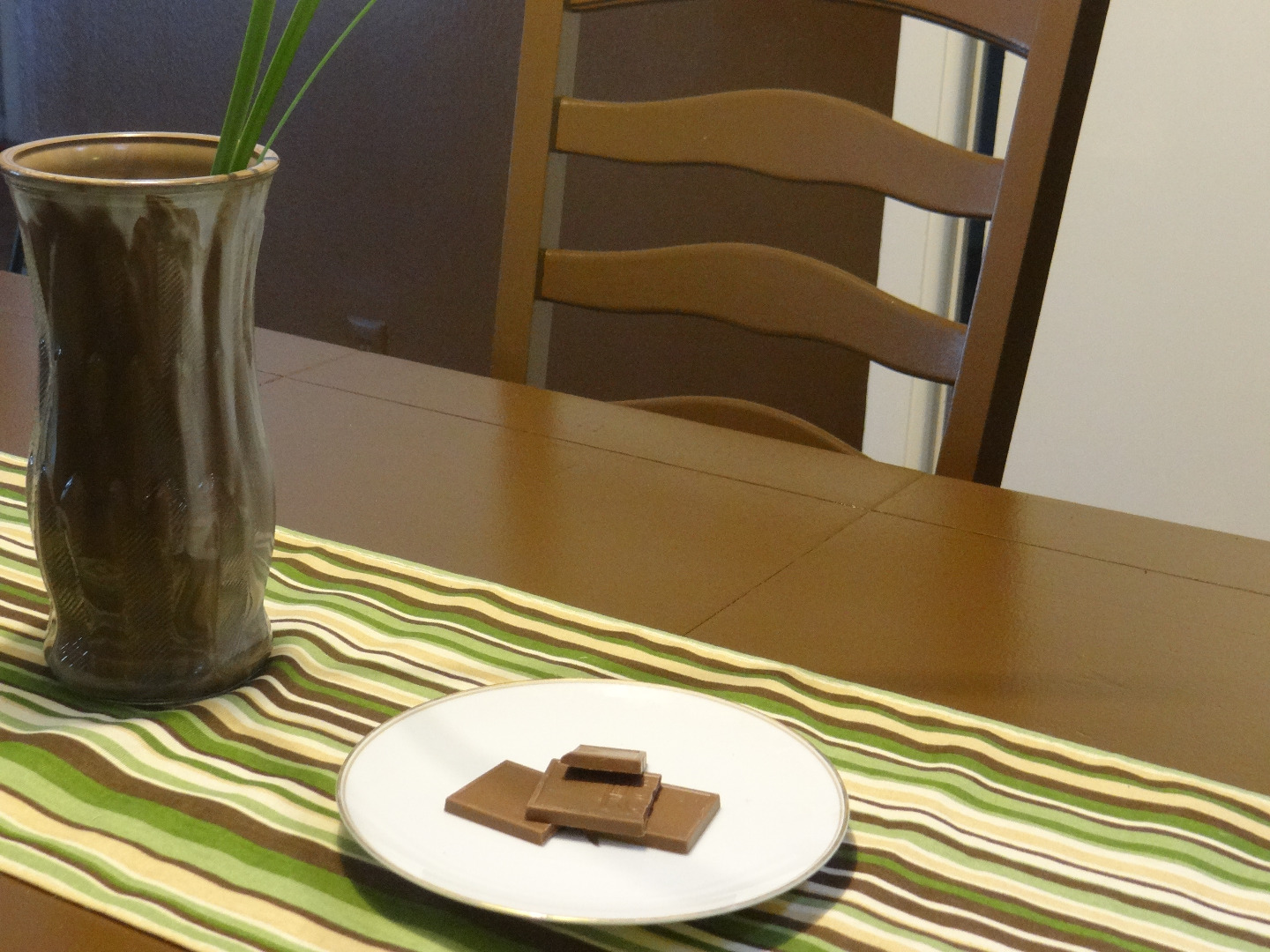
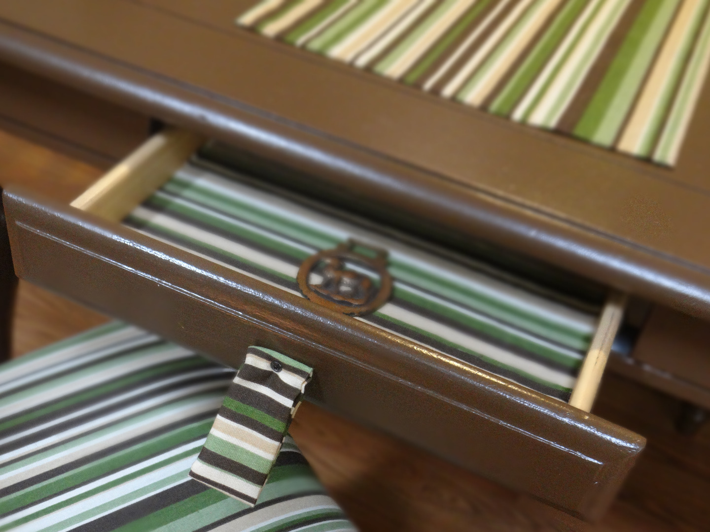
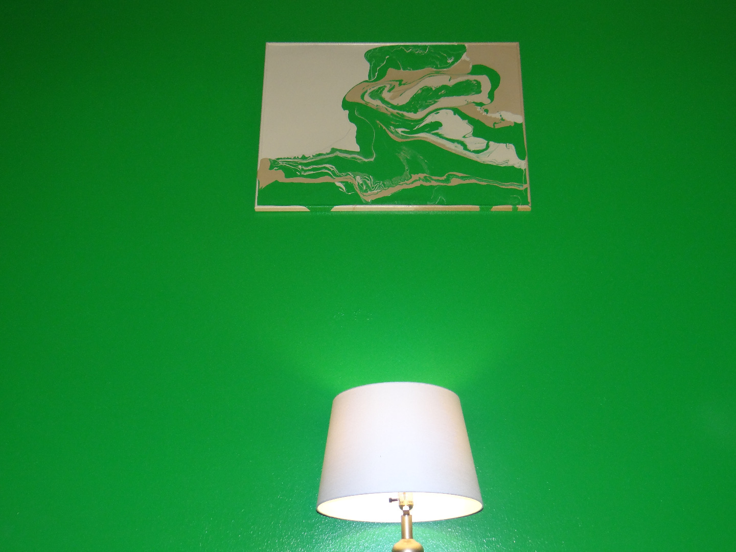
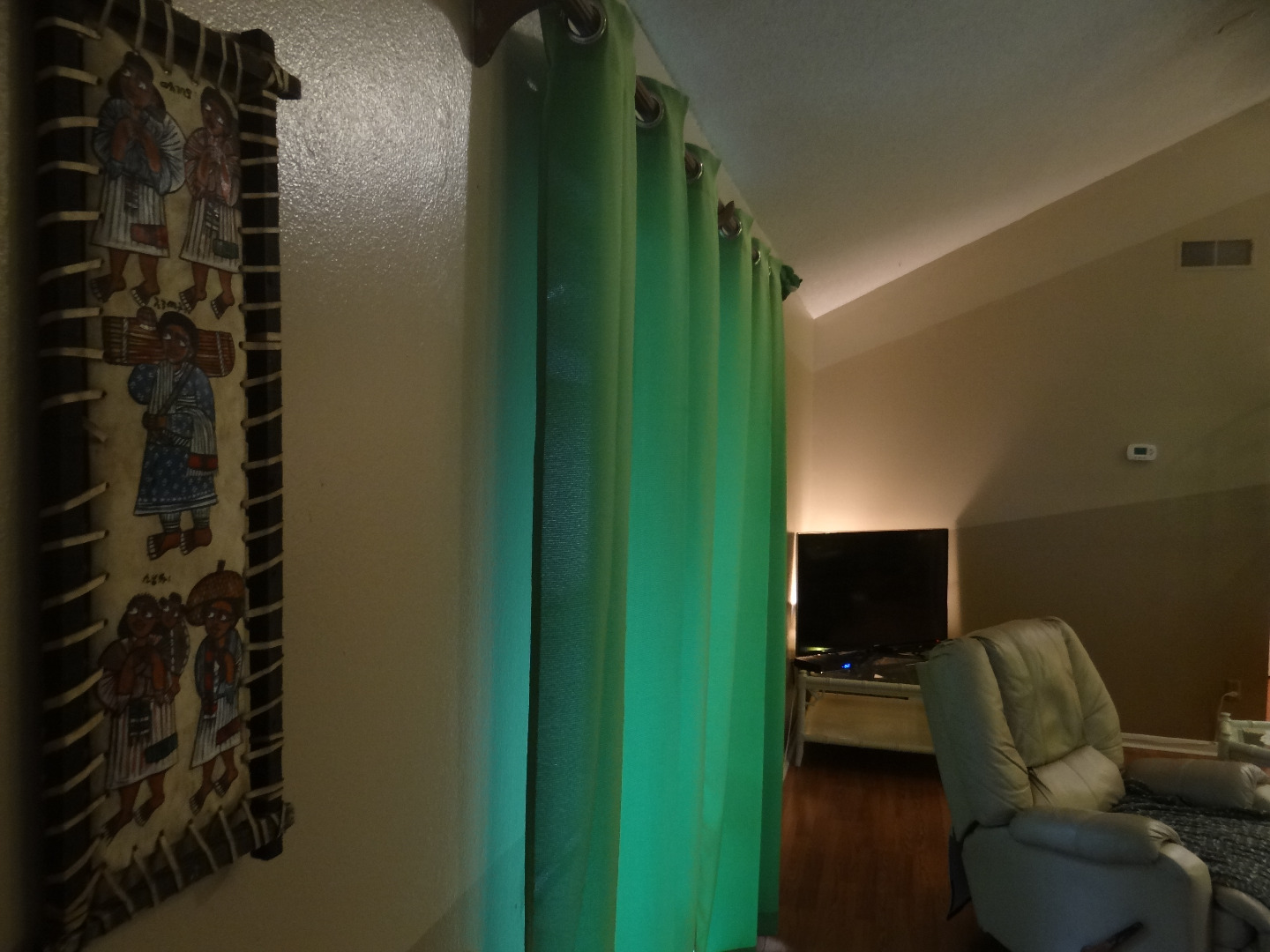
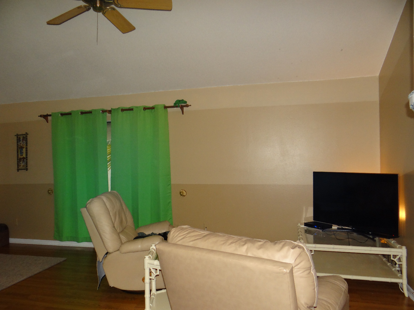
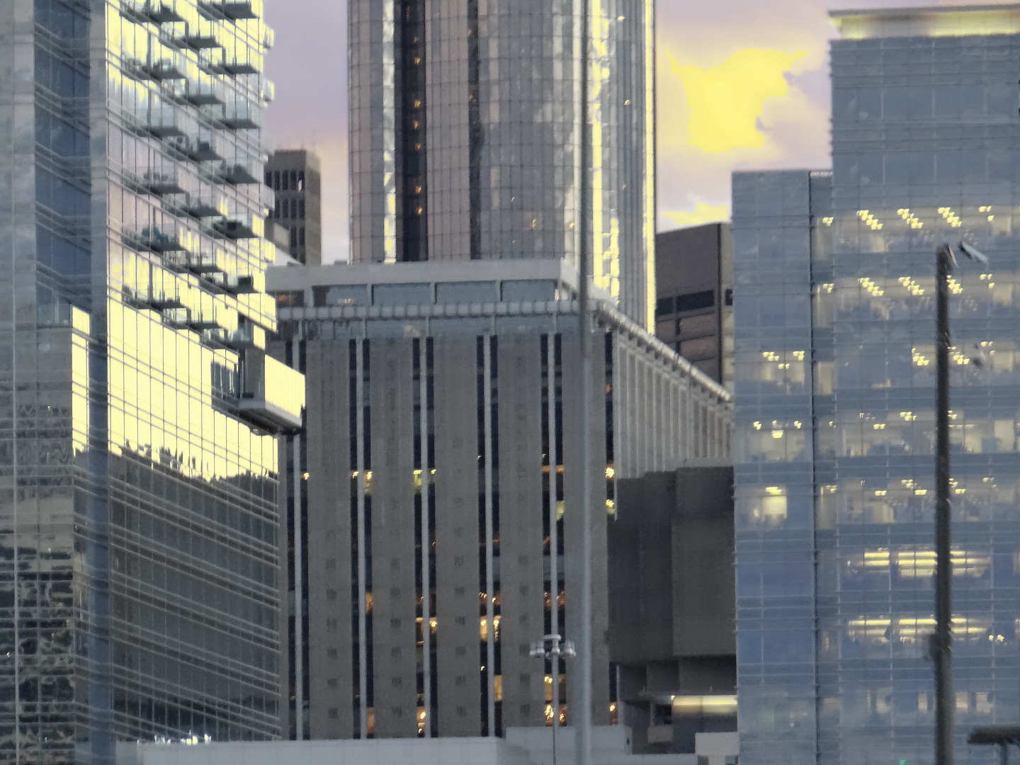
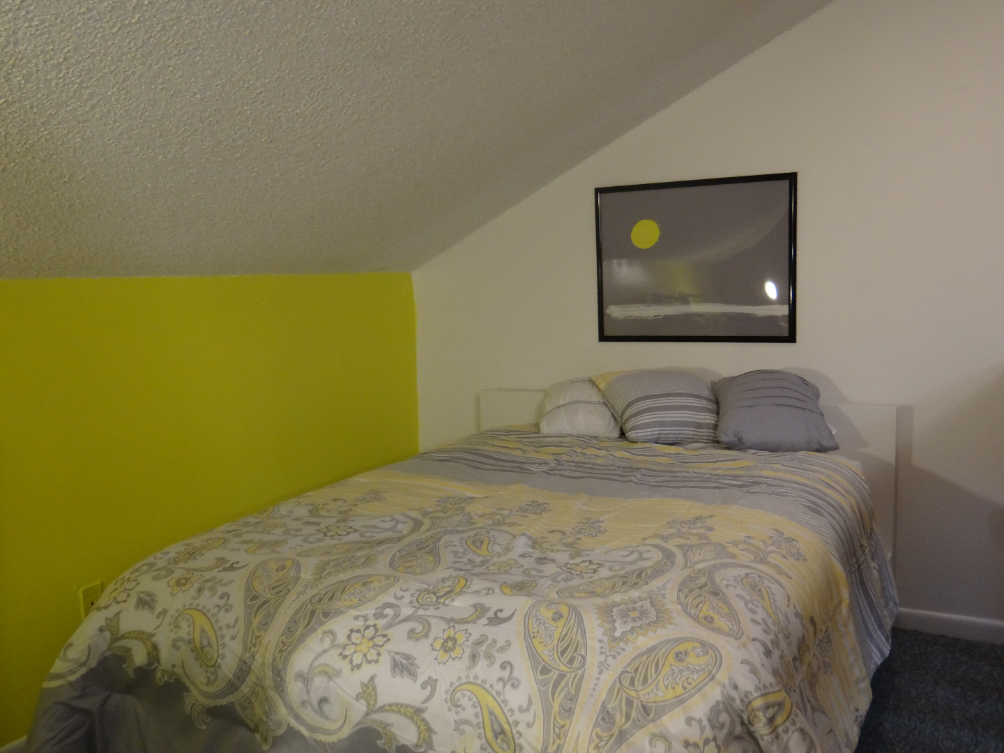
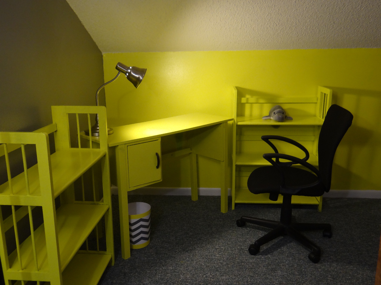
View the photos of the living room based on the color palate of mangrove filled coastal waterways, the dining room made to match the wooded forests of the Tennessee highlands and of the Grey and Yellow loft that reminds me of the yellow sun shining through the concrete skyscrapers of a downtown skyline. If you're feeling especially artistically ambitious, extra paint can also be used to create wall paintings that match with precision, a detail that can really tie the room together. Whether using software to design the artwork or paint, matching the colors perfectly turns the whole room into a work of art and is the ultimate way to showcase any artwork.
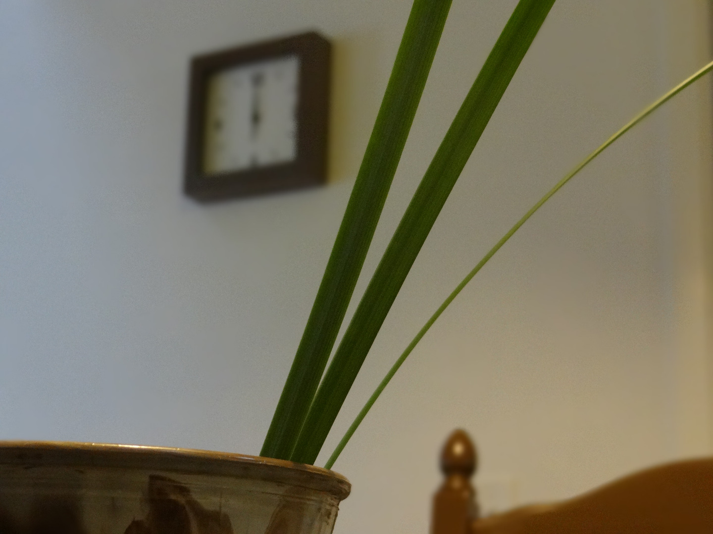
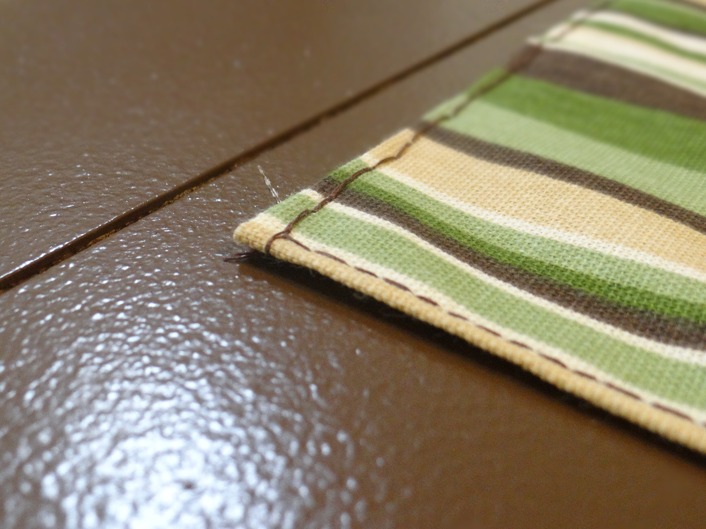
The centerpiece of the Tennessee inspired dining room shown above is the "chocolate" table. This table was all but scrap before it was tightened up, leveled sanded and primed. Next, the table and chairs were painted with the leftover paint from the walls for an exquisite match. Finally, from some scrap fabric, the cushions were recovered and secured with a few staples, a piece of fabric was cut and glued in the drawer, a small fabric handle was attached and a hand stitched tapestry was strewn across. This resulted in a high end designer look for only a few dollars in supplies. This room was then ready to showcase the artwork. The photos in this room are all from a little town in mountainous Tennessee which, when edited in Photoshop (New Layer>Fill with Matching Brown>Set Blend Mode to Overlay), become the focal point of the room.
In the Everglades inspired living room shown above, after spray painting the bamboo furniture and applying the paint technique the leftover paint was used to create a painting to again be the center of attention in the room's design. This graphic design inspired paint technique involves mixing the paint in a cup to achieve a marbled pattern, then applying the paint to a canvas by pouring.
The contrasting color combination of the vivid sun over a concrete cityscape has always been inspiring. I captured the essence of this by painting on the back of the glass cover of an old poster frame. By painting on the back of the glass the foreground colors can be painted first, then the background applied and when the glass is reinserted in the frame a perfect glossy image is revealed with sharp lines and high contrast; a simple technique that yields great results. When that was complete, the rest of the paint was used to paint an old desk and two shelves to make a custom matching set for this brilliant yellow room.
Let me know what you think in the comments and by voting, give it a try and upload your photos under "I Made It" in the comments and share the link with your friends.
NEED AN INTERIOR DESIGNER OR CUSTOM ARTWORK?
SEE MORE PROJECTS AND CONTACT ME AT: www.DrewPaulDesigns.com