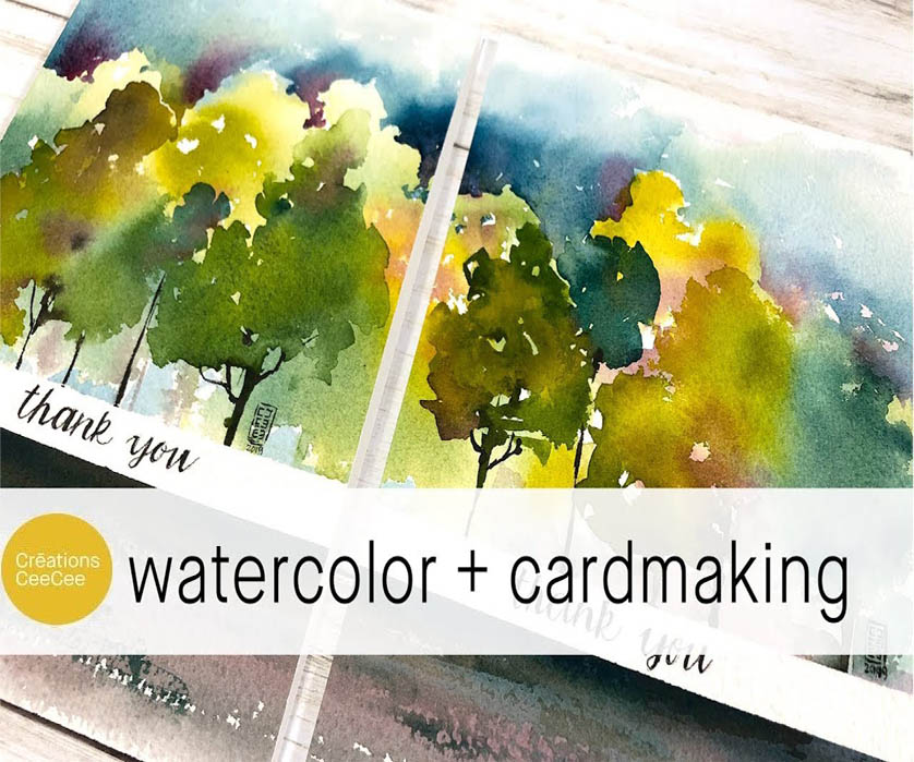
Painting Custom Cards With Watercolors
3690 Views, 58 Favorites, 0 Comments
Painting Custom Cards With Watercolors
You know that feeling, when your browsing the overpriced card section of your local drug or hallmark store, looking for a card that actually looks nice and conveys your message in a way that isn't a poorly drawn cartoon or a picture of a dog in a hat.
Most cards feel either garishly ugly or too plain and boring, not enough heart or personalization to feel fitting for the occasion. What if I told you that making your own cards was not only far more meaningful, but also less expensive than most off the shelf cards?
You don't have to be a master, or even a painter at all to make quick, easy and beautiful cards, its easy to do with little to no artistic skills or talents. I also have a YouTube video for you to follow along with here!
Supplies
- 1/2" artist tape (ProTapes https://amzn.to/2LDORVX )
- Rough watercolor paper, 100% cotton (https://amzn.com/3UYF)
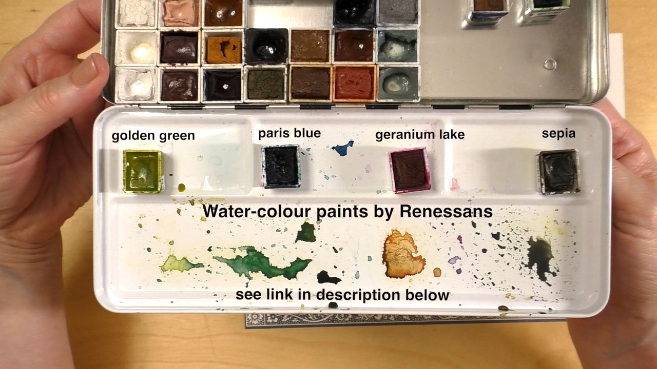
- Watercolor paints: golden green, Paris blue, geranium lake, sepia (Renesans https://www.etsy.com/shop/alittlecrea... )
- Watercolor paint bruhes: 1/2" oval, No. 12 round
- Black Pigma Micron pens, sizes 01 and 03 (Sakura)
- Pencil, eraser, craft knife, 2-way adhesive
- Two jars or cups full of water
- Water spray bottle
- Rag for cleaning
- 10" X 7" white cardstock, folded in half at 5" on the long end
The Basics
The reason I love making landscapes in watercolors so much is that its forgiving in terms of mistakes and alsoopen to your interpretation, watercolors look good no matter what.
When working with watercolors, keep in mind they aren't like other paints like acrylic or oil, watercolors are actually translucent, meaning they are somewhat see through, and the more water you use, they less visible the colors become. This allows for greater control of color gradients and mixing, but also create a relaxing, soft look that is pleasing to the eye.
The better quality the watercolor paint, the stronger the pigment will be, giving you richer colors but requiring more water. It is important to know that watercolors dry lighter than they appear when wet, so keep that in mind as you are painting.
You may be wondering why there are two jars, well, I have been using watercolors for years before I learned this trick, having two jars of water allows you to have one fro rinsing off paint, and the other to aid in mixing paint. This way you are not constantly changing out your water, and you will have sharper colors.
Let your watercolors dry between layers, to keep colors from running together and mixing in ways you don't want. Giving your colors time to dry will give you better accuracy and vibrancy.
Canvas Prep
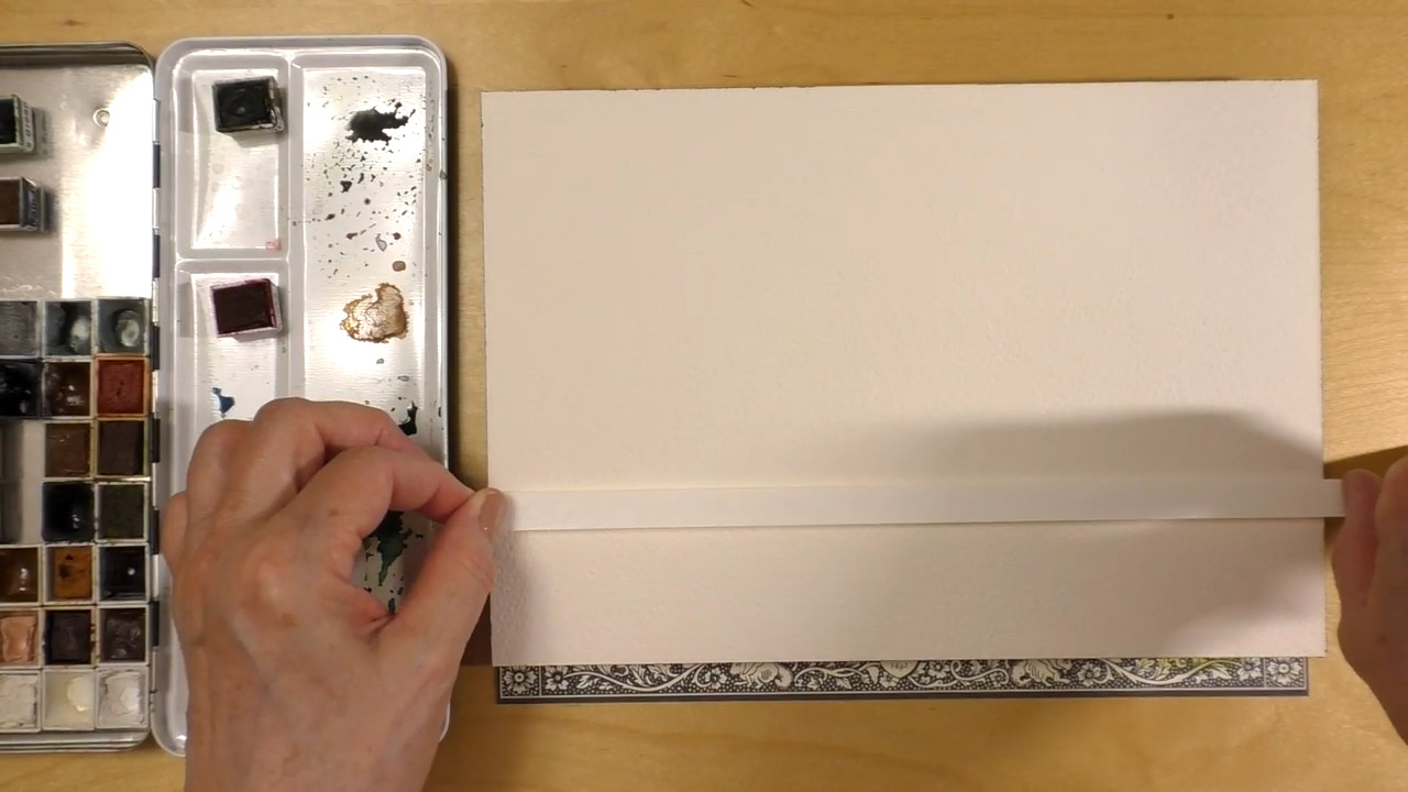
Start by masking off the paper 3/4th the length of the paper to create room for writing your sentiment on the front.
Take the water spray bottle and gently mist both your paints and paper. You don't want to soak them, just use enough to give them a slight glisten. Make sure you are working on a completely flat, level surface. This may seem obvious but I have made this mistake many times in the past, and been left wondering why all my paint was running to one end of the paper. Tape down your paper with more masking tape.
Another good tip I wish I had known before I started working with watercolors, having a wrinkled and warped paint is not fun. I recommend keeping the paper in place until it has completely dried to avoid ruining your work. To get the various shades of greens I mixed the gold-green and the blue paints, and for the brown I mixed the sepia with the magenta. You absolutely do not have to do this yourself, you can simply find colors you like and use them was you wish.
Painting the Background
Now that you have everything set up and ready to go, its time to start painting.
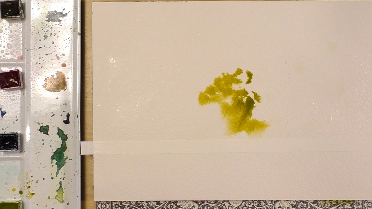
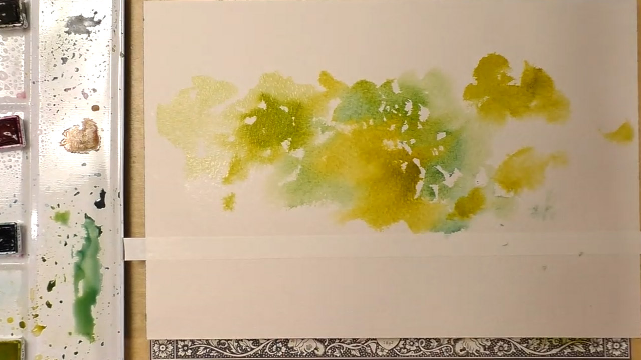
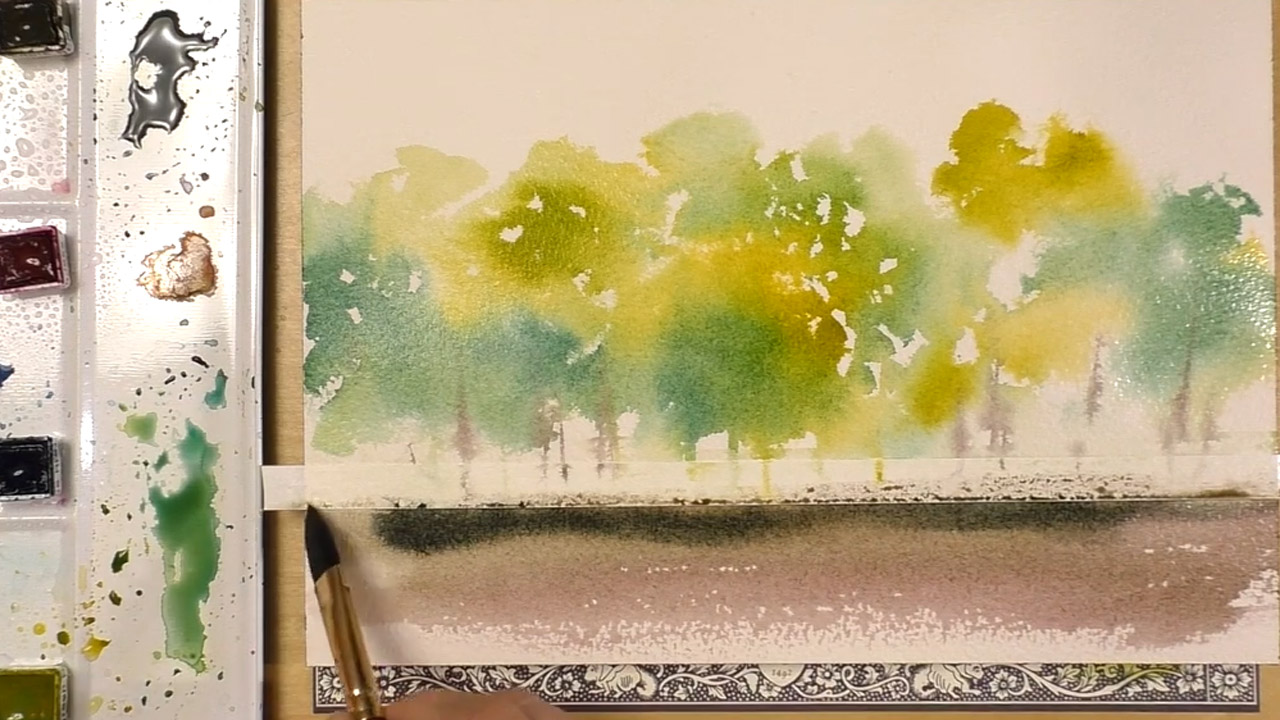
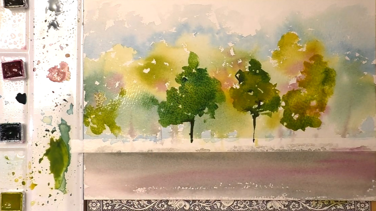
Take the 1/2" Oval Watercolor brush (I am using the Princeton 'Neptune' but any similar brush should work) and gently dip it into the Golden Green. The brush is good for loose, blotchy shapes that can mimic foliage easily. You'll actually be painting with the edge of the brush, not the tip.
Now here comes the fun part. Since the painting we are doing is very impressionistic, worrying about how it looks isn't important, you aren't going for photo-realism.
Begin by making several blots with the brush, not hard enough to spread out the hairs of the brush, but not too soft either. These shapes could be grouped together to create the impression of dense foliage. You aren't drawing with the brush, rather, you are creating the feelings of organic growth and branches covered in leaves.
The only real design you have to adhere to is a roughly triangular shape, to suggest a tree's canopy, then than that, it all up to you! Keep this part small, as you will be using other paints to create darker branches. If you are following along with either the pictures or the video, you will see the watercolors becoming fuzzy at the edges like you would expect from the outline of an actual tree. If you have hard edges, you are not using enough water.
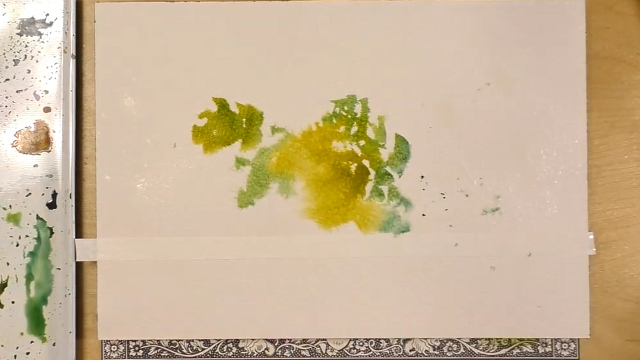
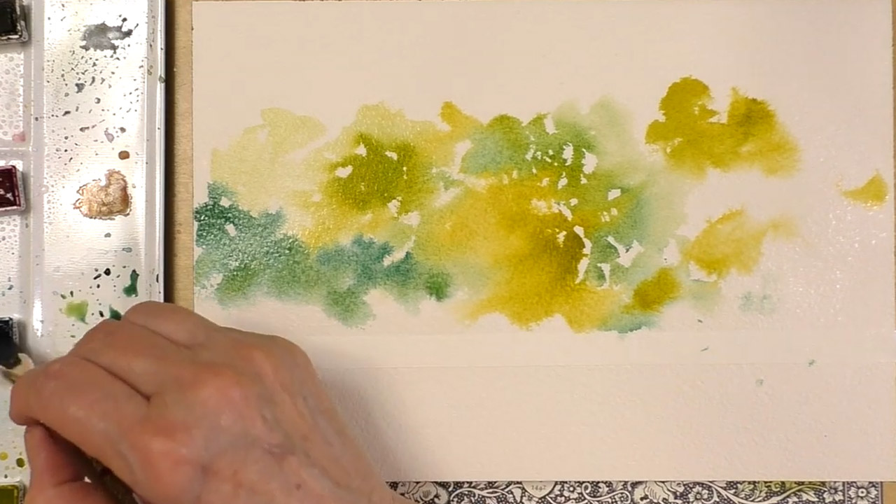
Switching Paints

To create the illusion of definition and depth, we will be layering a second shade of green over and around the first. Take the brush with the previous color and dunk the brush into the jar of water and then use the rag to absorb any remaining water.
Do not pull or tug in the hairs of the brush when cleaning, as that can damage the brush, simply dab at the rag as if you were painting with it until you no longer see it being colored by the pigment.
As you are painting the background, you won't be doing much layering or overlapping, that will come later. Don't worry about the colors bleeding and mixing with the others at the edges, as this creates an effect similar to that of the human eye's perception of far away colors.
At this point your landscape should be nothing but a number of close or overlapping formless, abstract shapes, that is what it should look like at this stage.
Finishing the Background
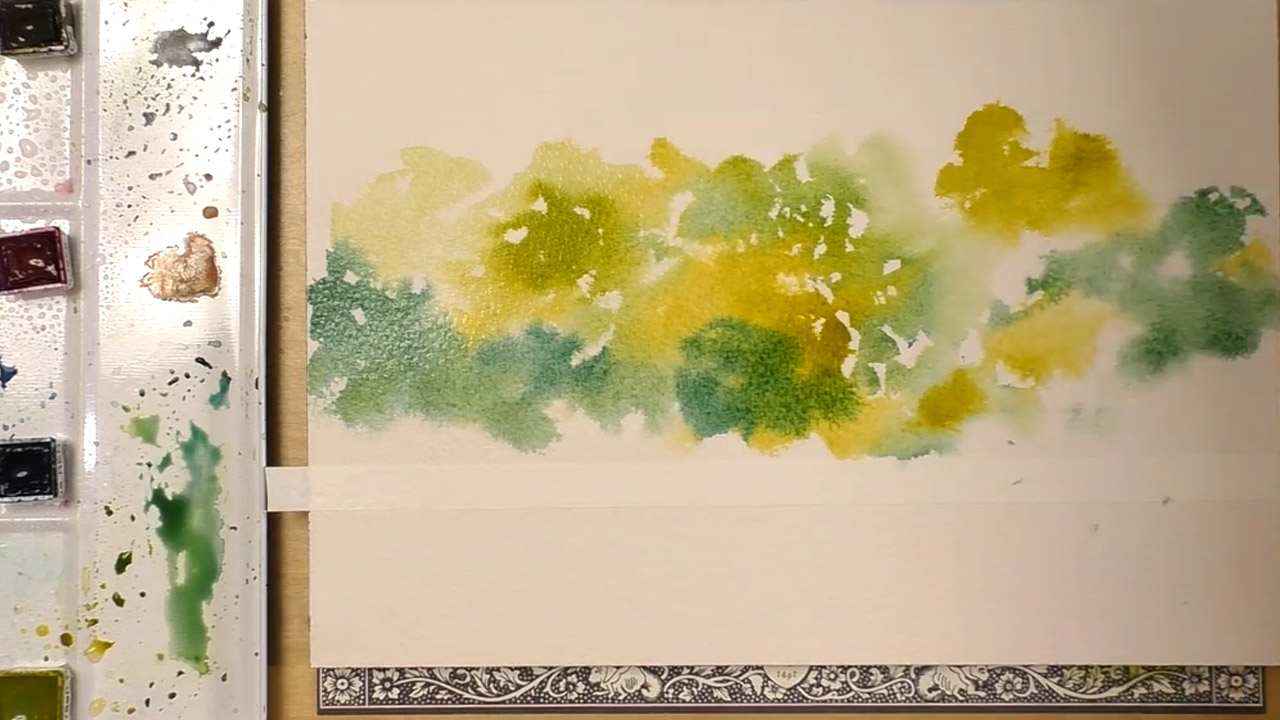
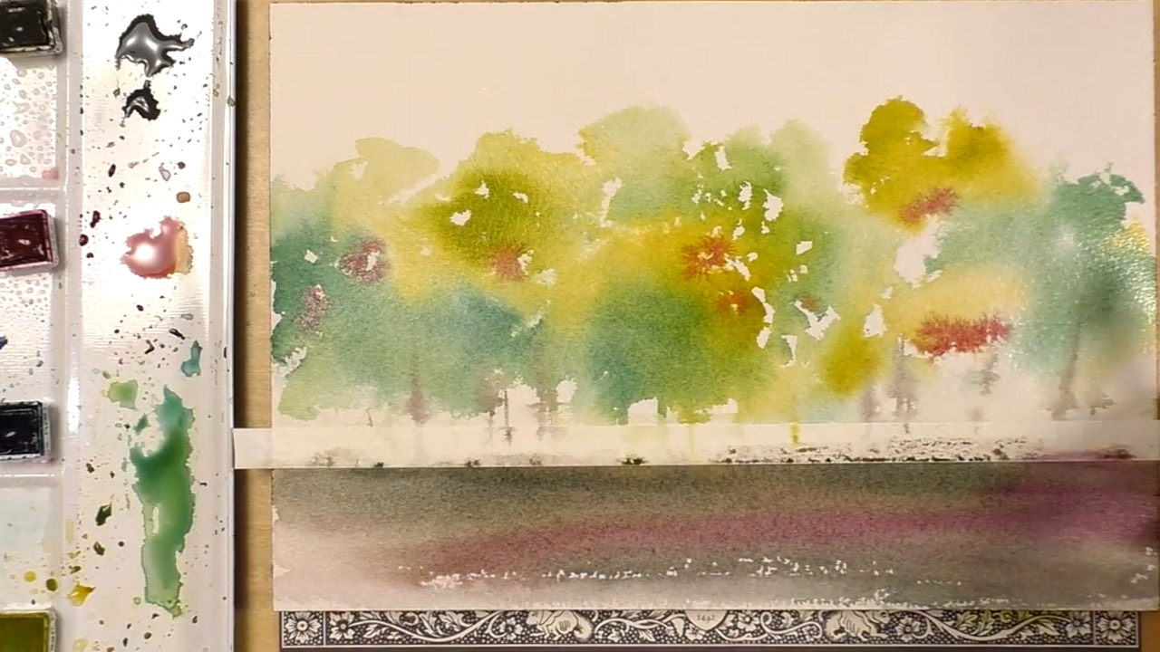
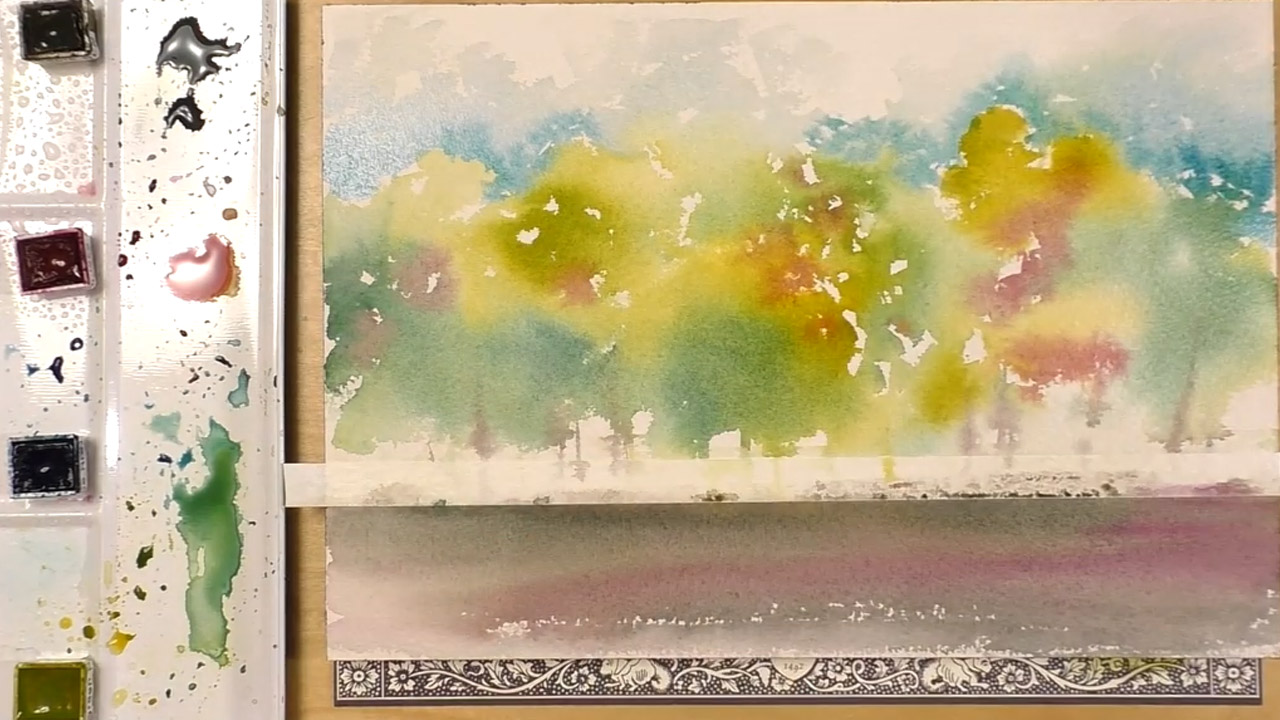
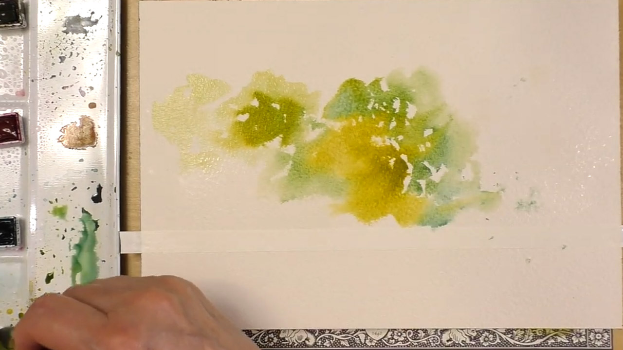
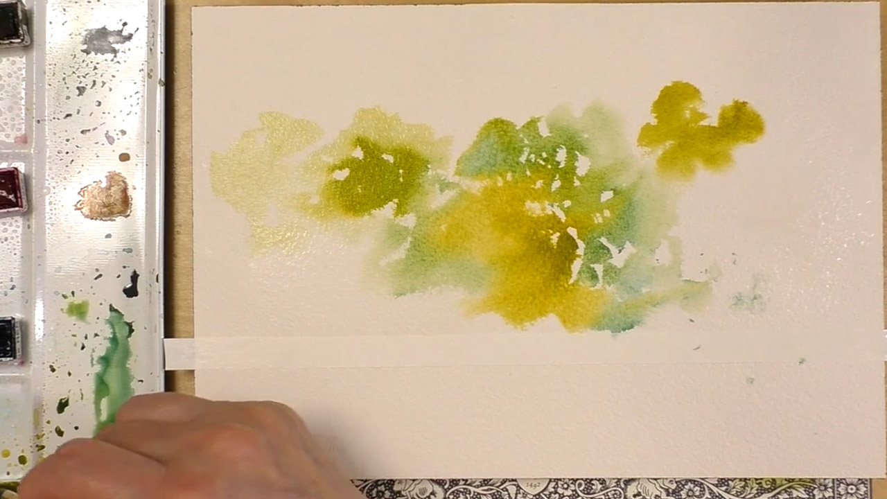
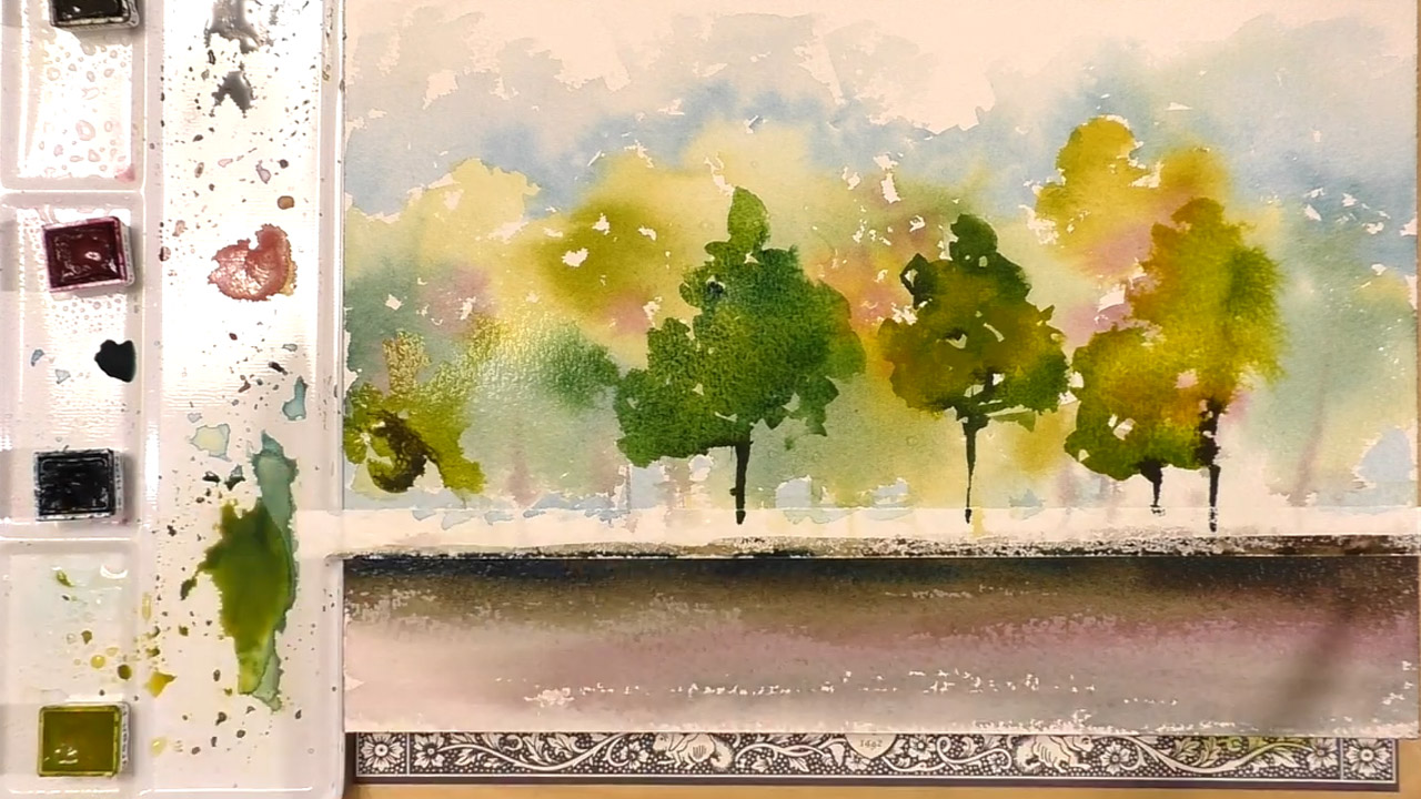
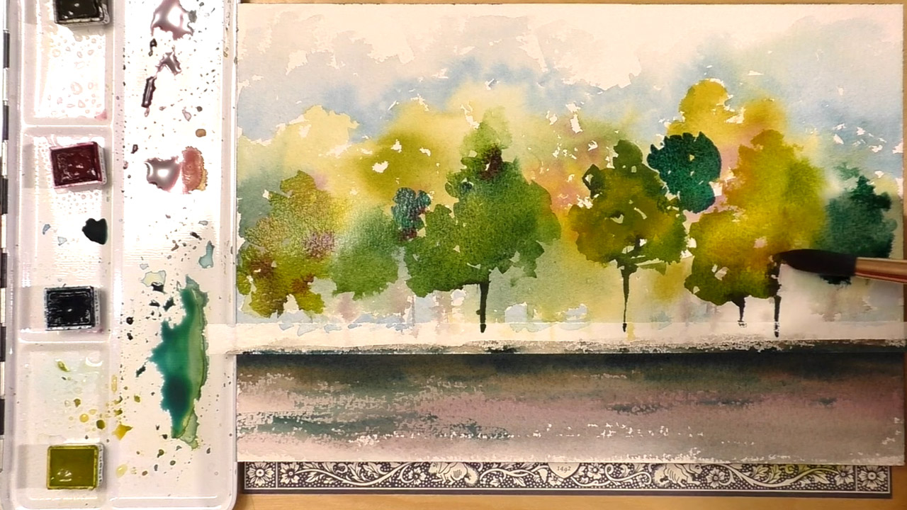
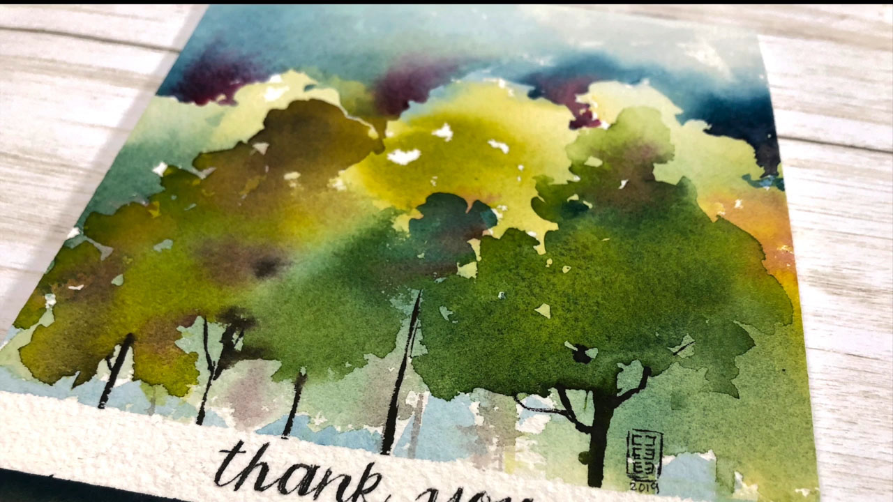
Once you create your grouping of trees in the background, do a few vertical strokes to mimic tree trunks in the background.
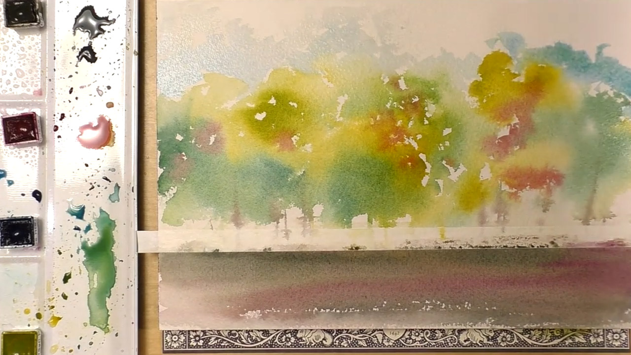
Create the ground below the painter's tape by making a gradient of earthy colors with the mix of magenta and sepia, or use an already mixed brown. Mix a few splotches of magenta into the trees to give then an early fall look of leaves beginning to turn orange and red. Use the Paris Blue and the tip of the brush to create the sky. Make sure everything is dry first so there is a distinct difference from the trees and the sky.
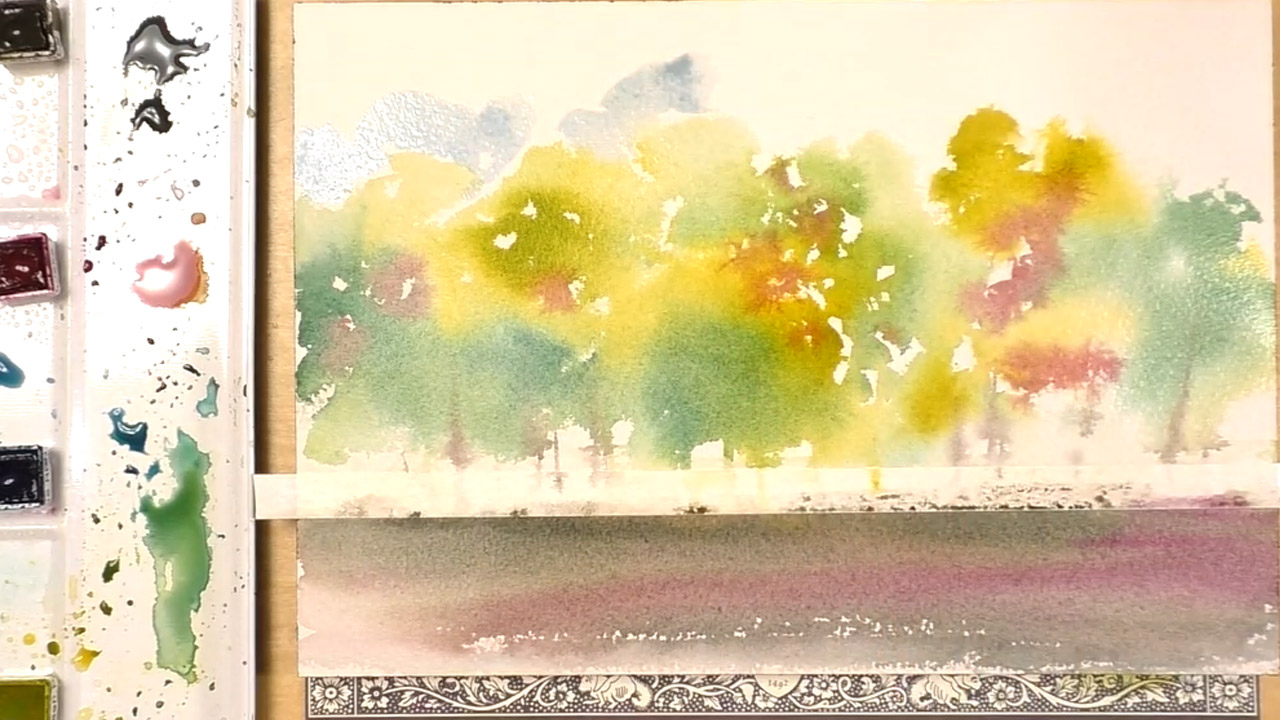
Don't paint a flat blue sky, instead, leave some areas very lightly colored to give the impression of clouds in the distance. Add a little blue between the trees as well.
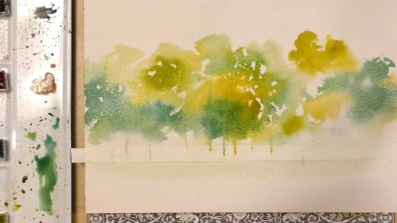
Creating the Foreground
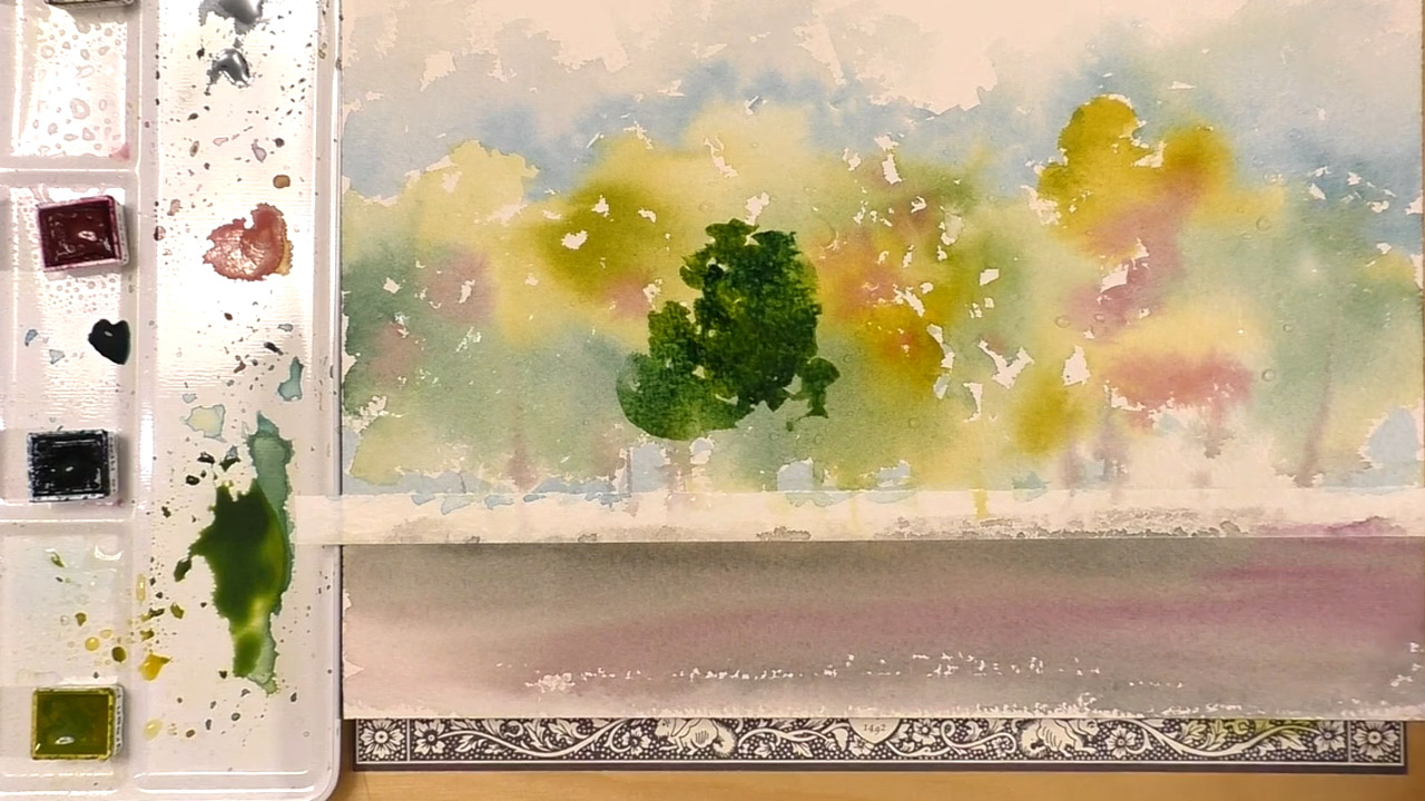
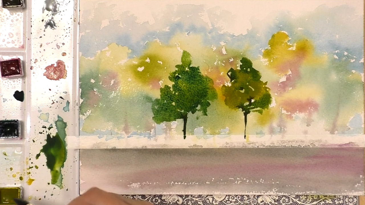
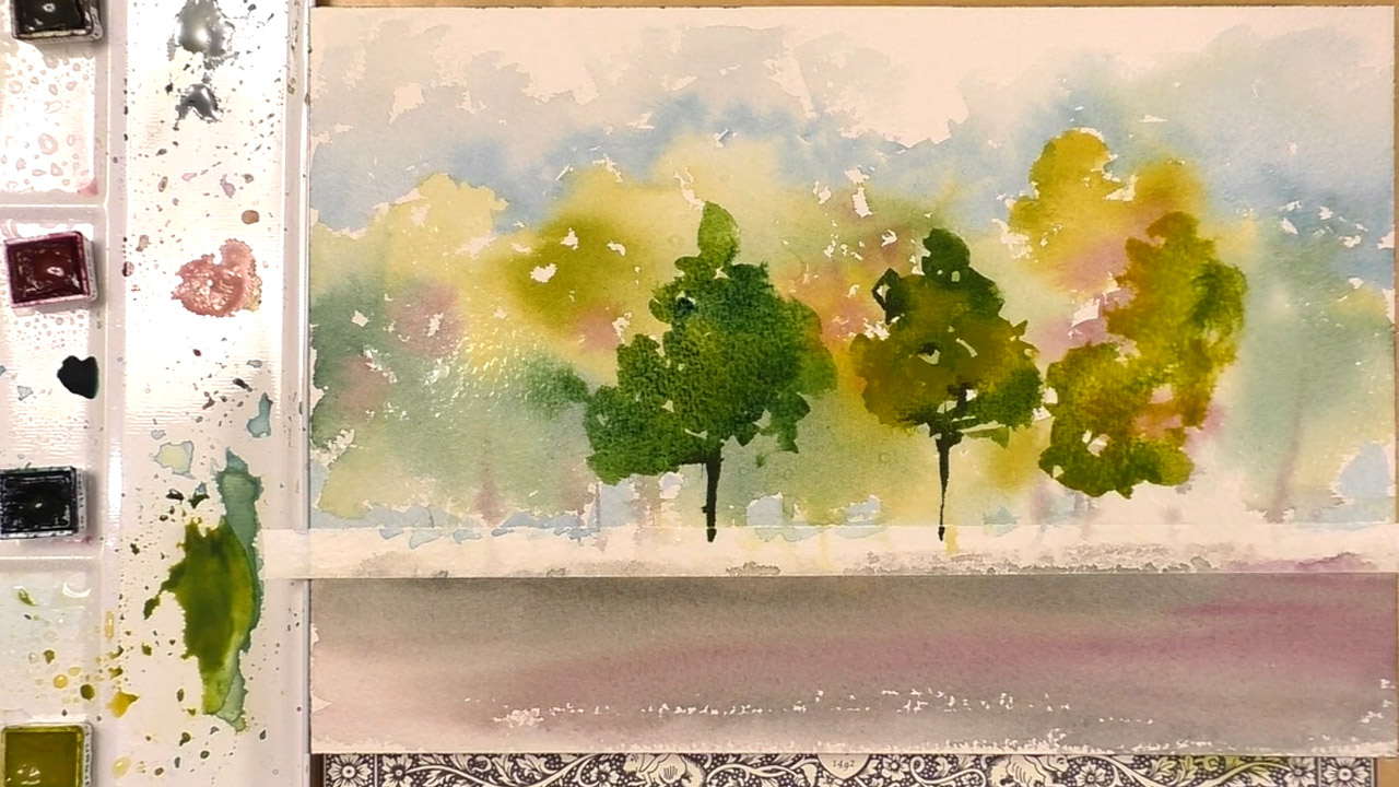
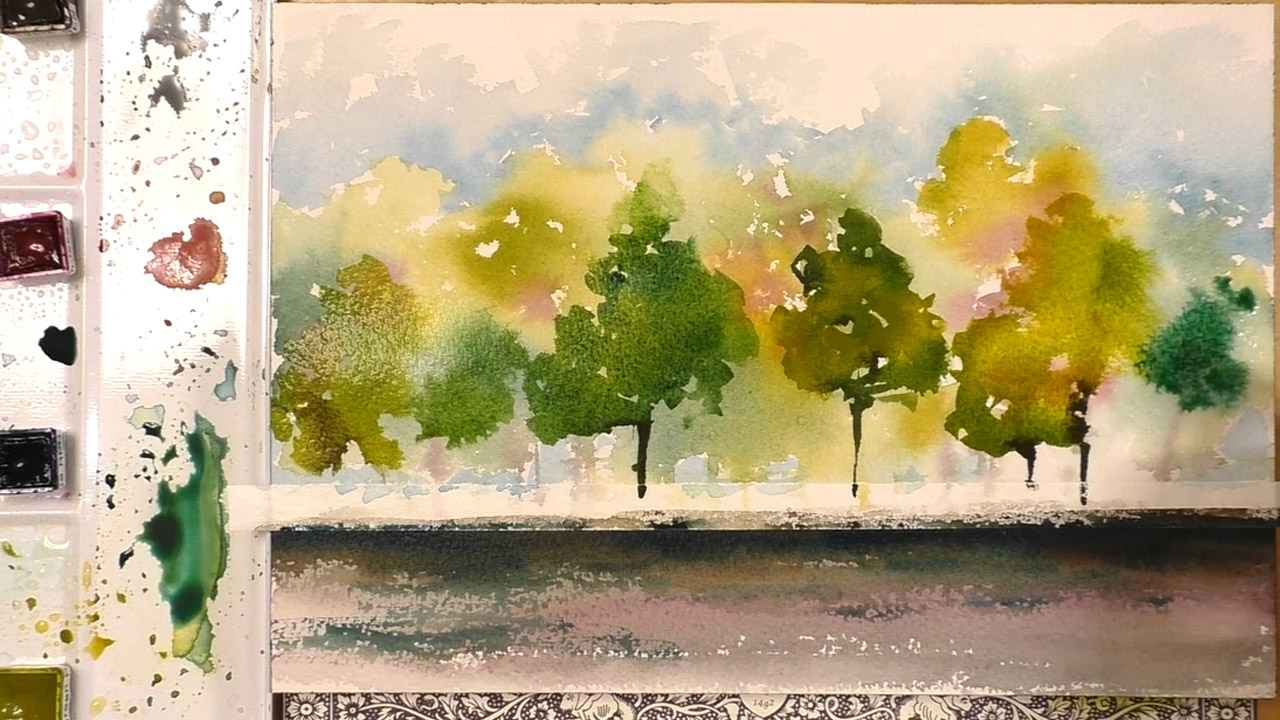
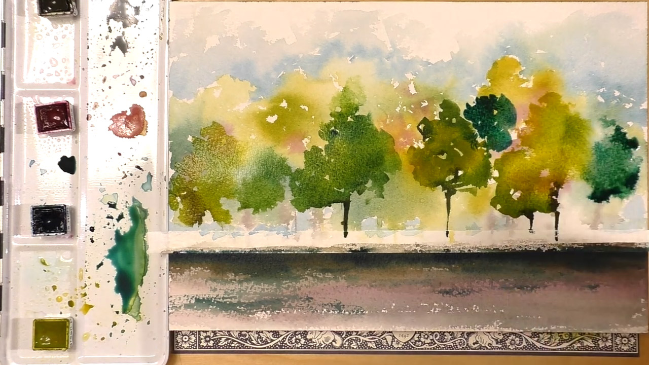
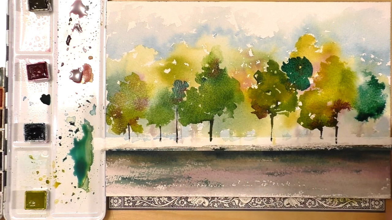
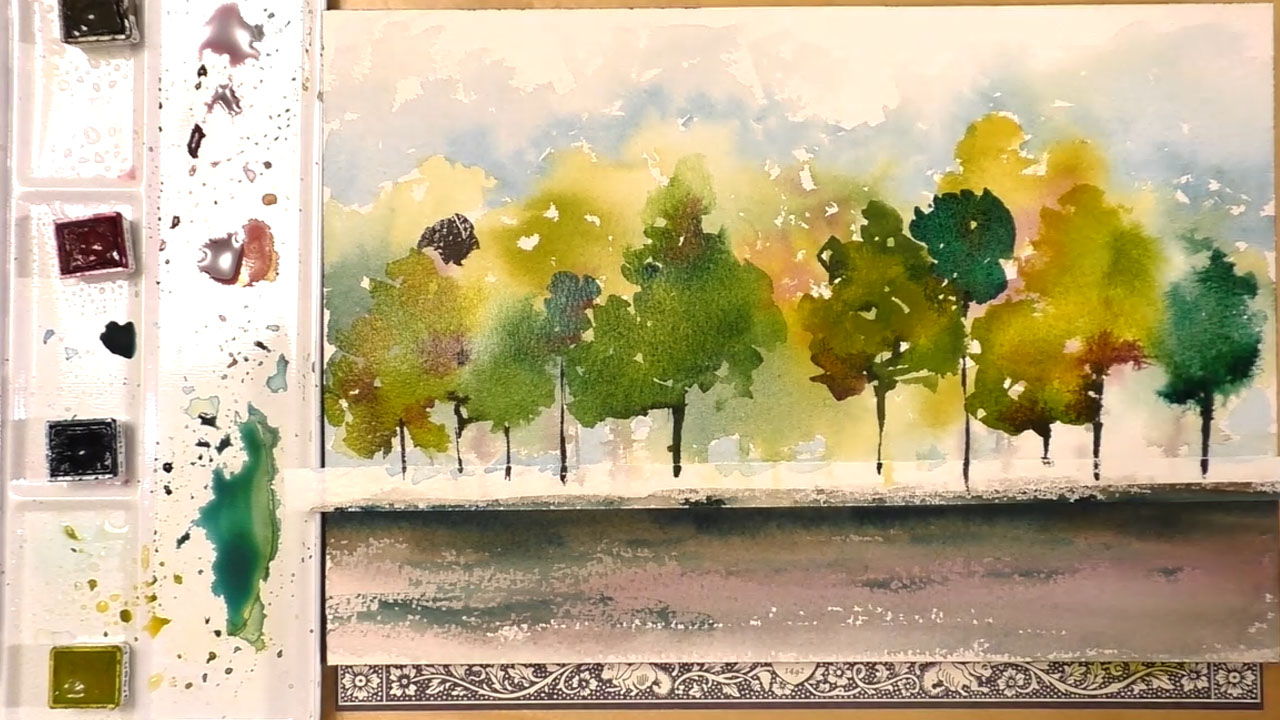
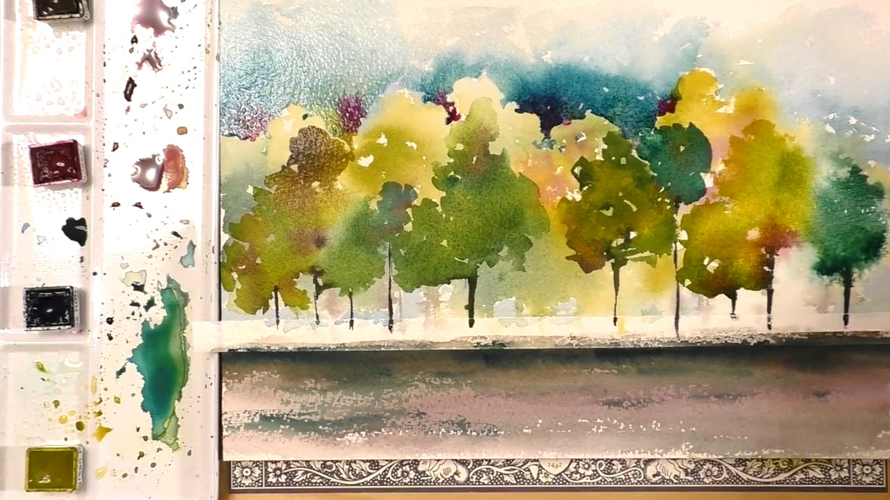
Use the no.12 round brush to paint in a tree after all the paint has completely dried to create a distinct foreground. The trees in the front are less abstract, but are still impressionist. Trees are generally in either a misshapen triangle or a somewhat round shape, so stick to those general ideas is you want more realism.
Use the brown to create the tree trunks. Tree trunks are generally straight, and with a few large branches with the micron pen. I always paint branches as 45 degree angles, so each branch should be more or less at that angle.
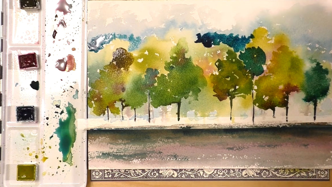
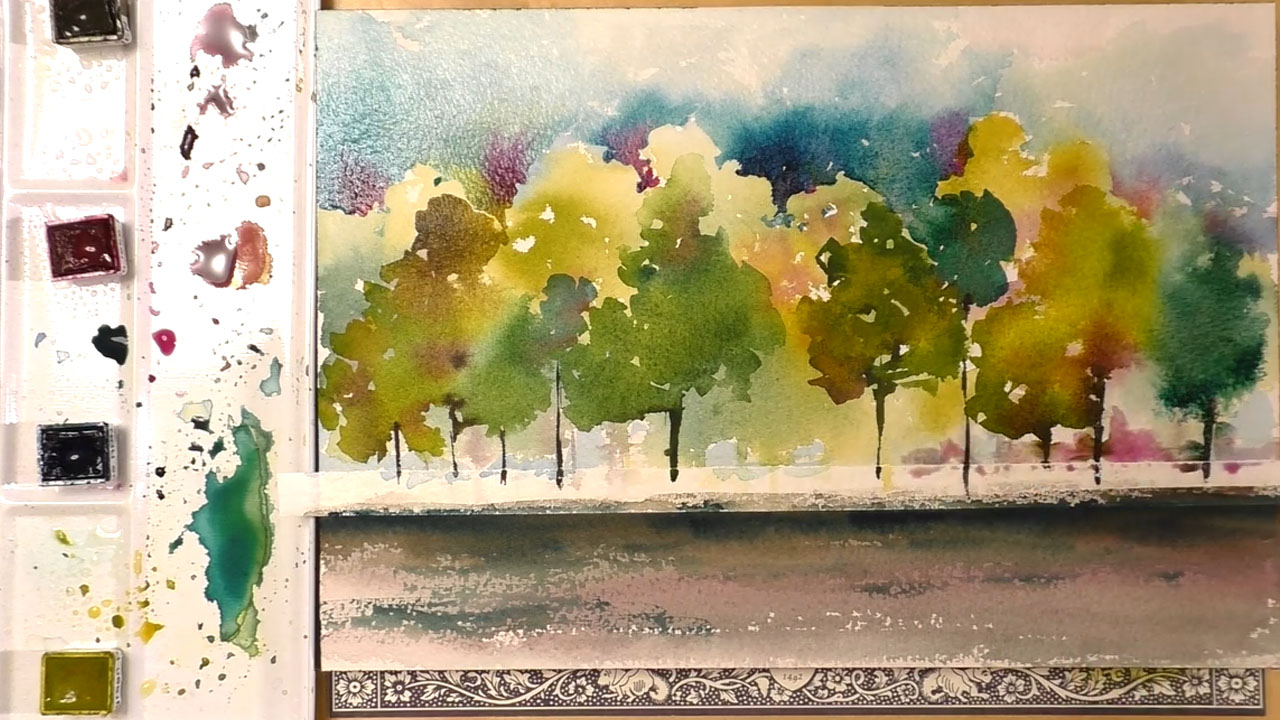
Again, there is no right way to make art, so add trees as you see fit. Watercolor is a forgiving medium and any mistakes can easily be made to look intentional with just a few brush strokes. I also took this time to add another layer of paint to the sky to give it more definition. Layering watercolors create a more complex, visually interesting picture.
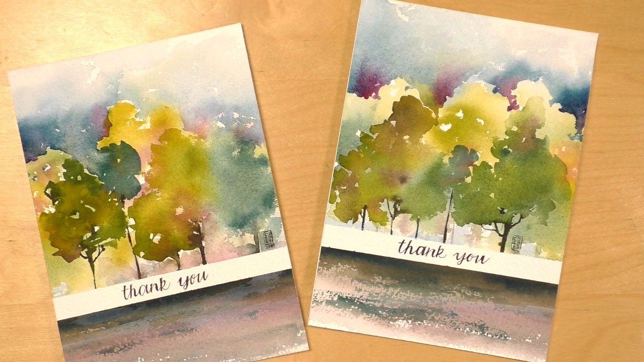
Creating the Card
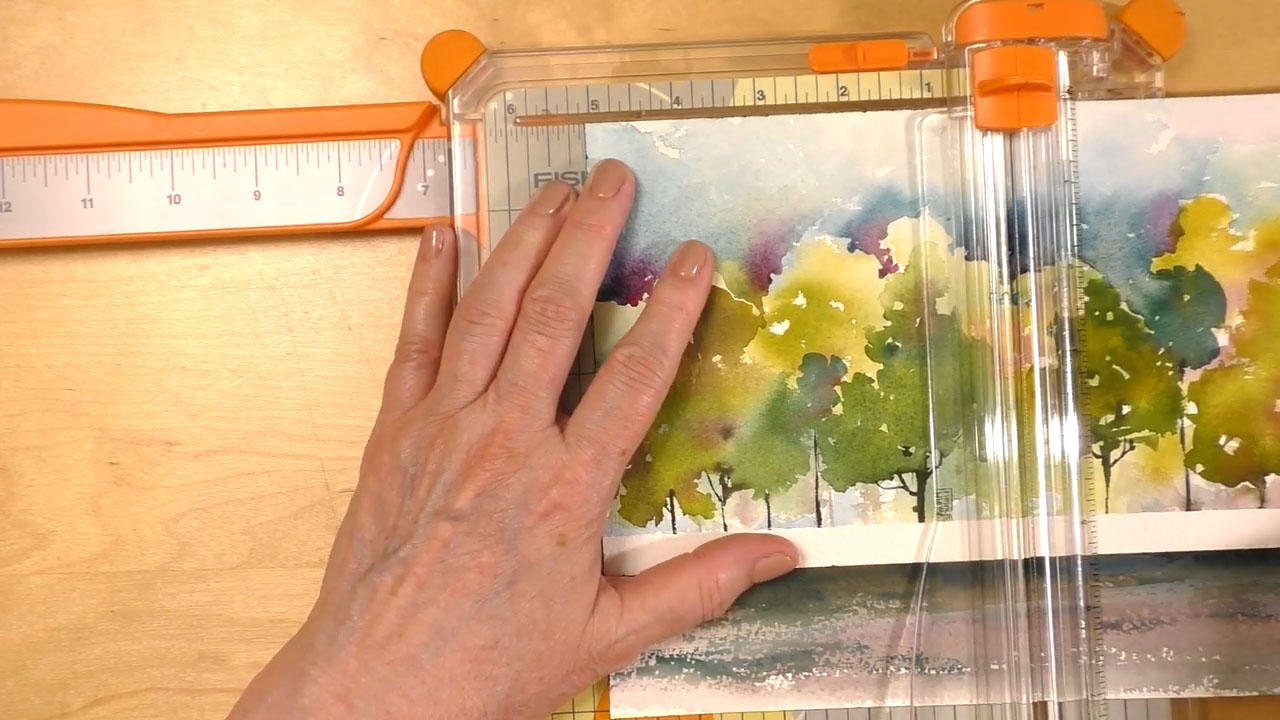
I used a paper slicer to split the image in half to make two cards, and removed the masking tape. You can use scissors or any other cutting tool, but I recommend using a tool designed for the job to avoid jagged edges.
Use the micron pen to trite your message in the white space where the masking tape was. I attached the art to the cardstock card with strong double-sided adhesive. I do not recommend using liquid adhesive as it may absorb into the art and ruin your image.
Done! Now you have a one of a kind card perfect for any occasion, that really says just how much that person means to you! If you liked this instructable, be sure to check out creationsceecee for more tutorials like this!