My Life in Photographs
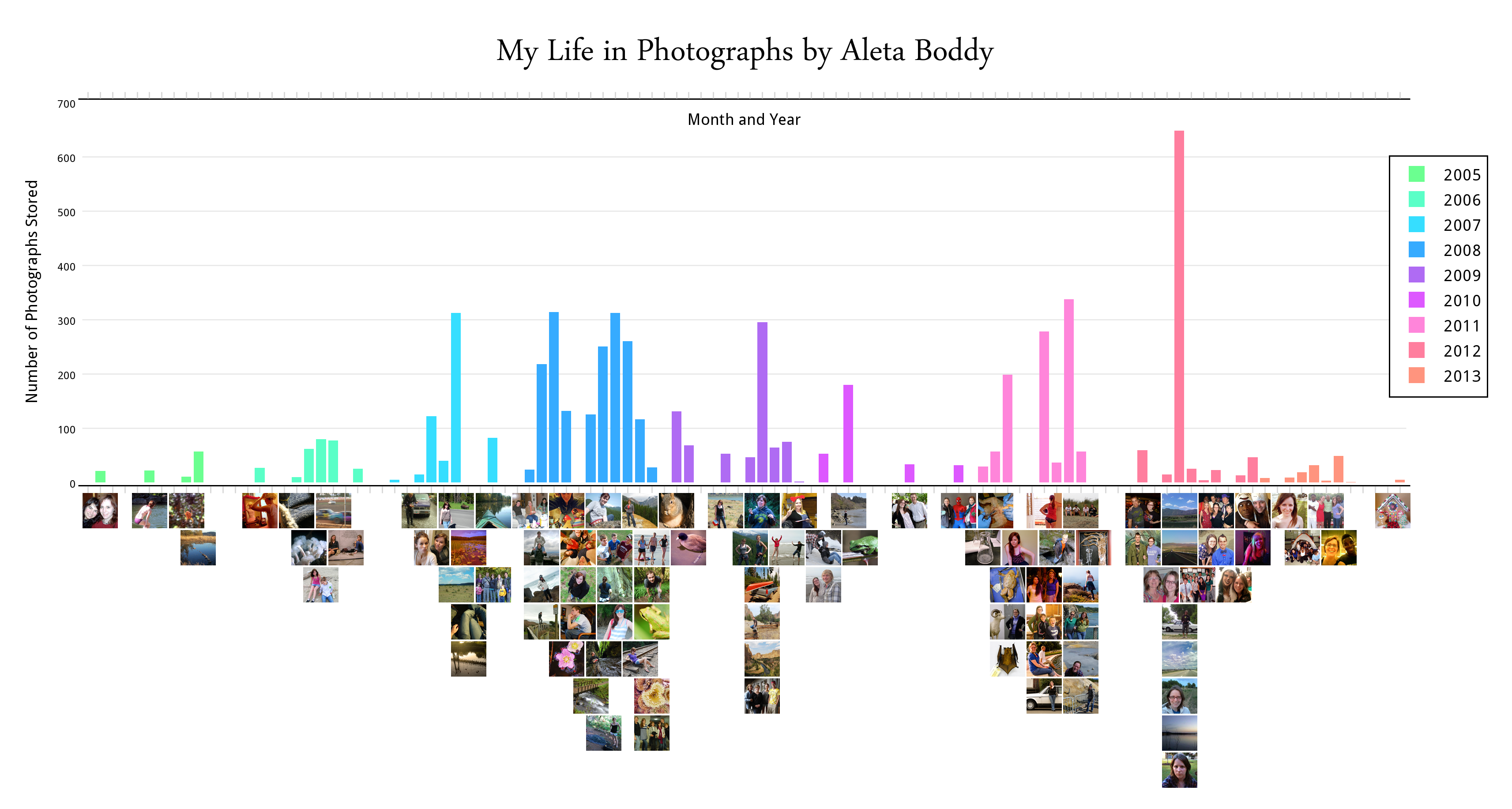
Over the years my use of a camera has waxed and waned. I find it interesting which years and months I've taken the most photos during, and how the subject matter has changed (or remained the same) over the years.
I decided to make a bar graph of the number of photos I have on my computer for certain months. Below my bar graph I included example photos from each month.
I decided to make a bar graph of the number of photos I have on my computer for certain months. Below my bar graph I included example photos from each month.
Step 1 - Plotly
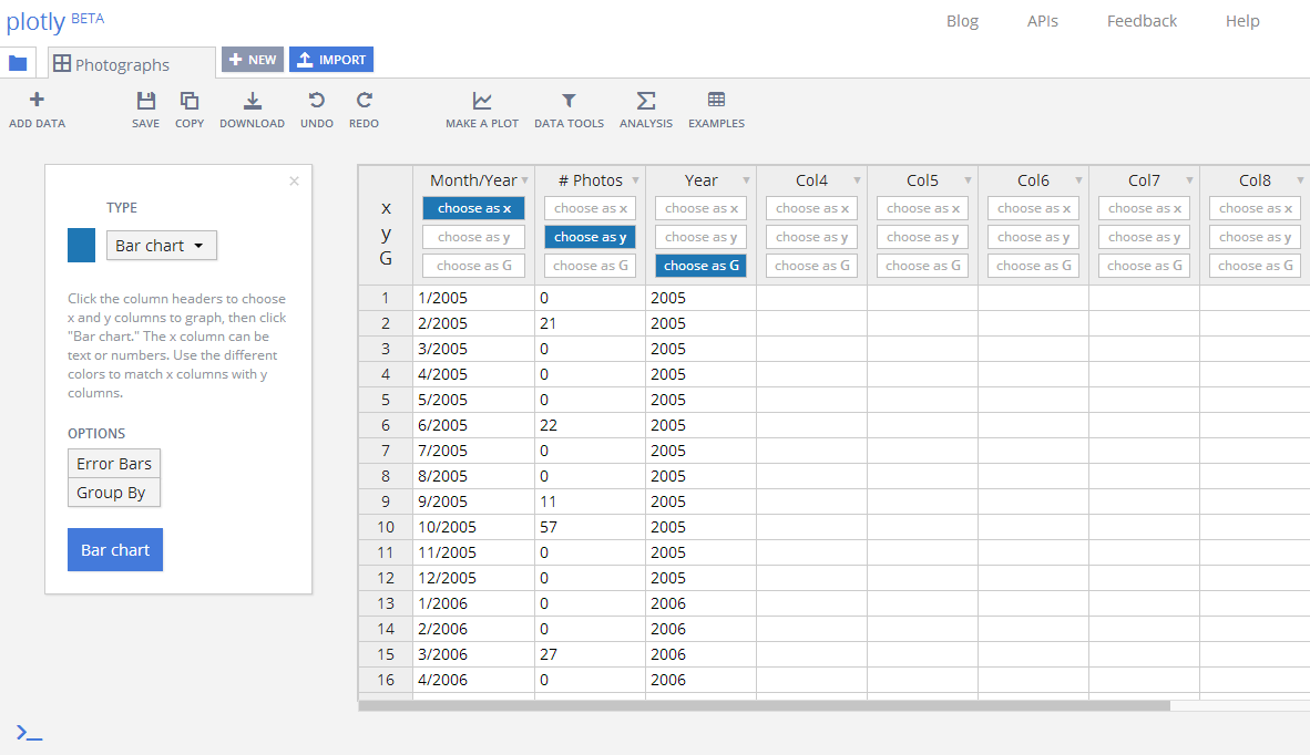
I entered my data about how many photographs I have on my computer in plotly. I had the month/year in column A, the number of photographs for that month in column B, and the year again (for grouping) in column C.
I made a "bar chart" by selecting column A as "x," column B as "y," and column C as "G."
I made a "bar chart" by selecting column A as "x," column B as "y," and column C as "G."
Step 2 - Edit the Bar Graph
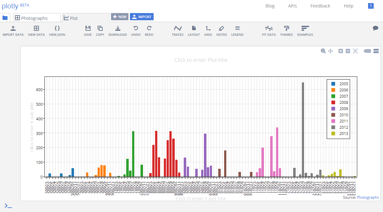
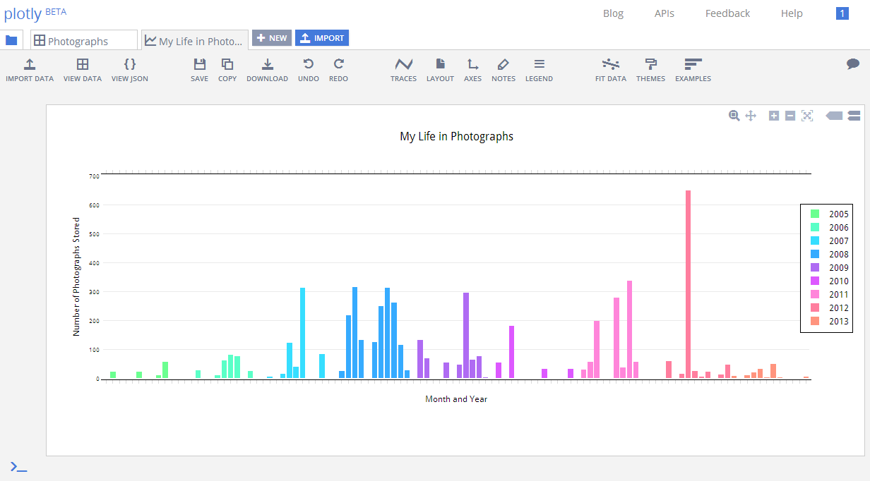
The two images shown are the automated bar graph that plotly created for me, and the edited version that I made after playing around with the traces, axes, title, etc. to make it look how I wanted.
Step 3 - Adobe Photoshop
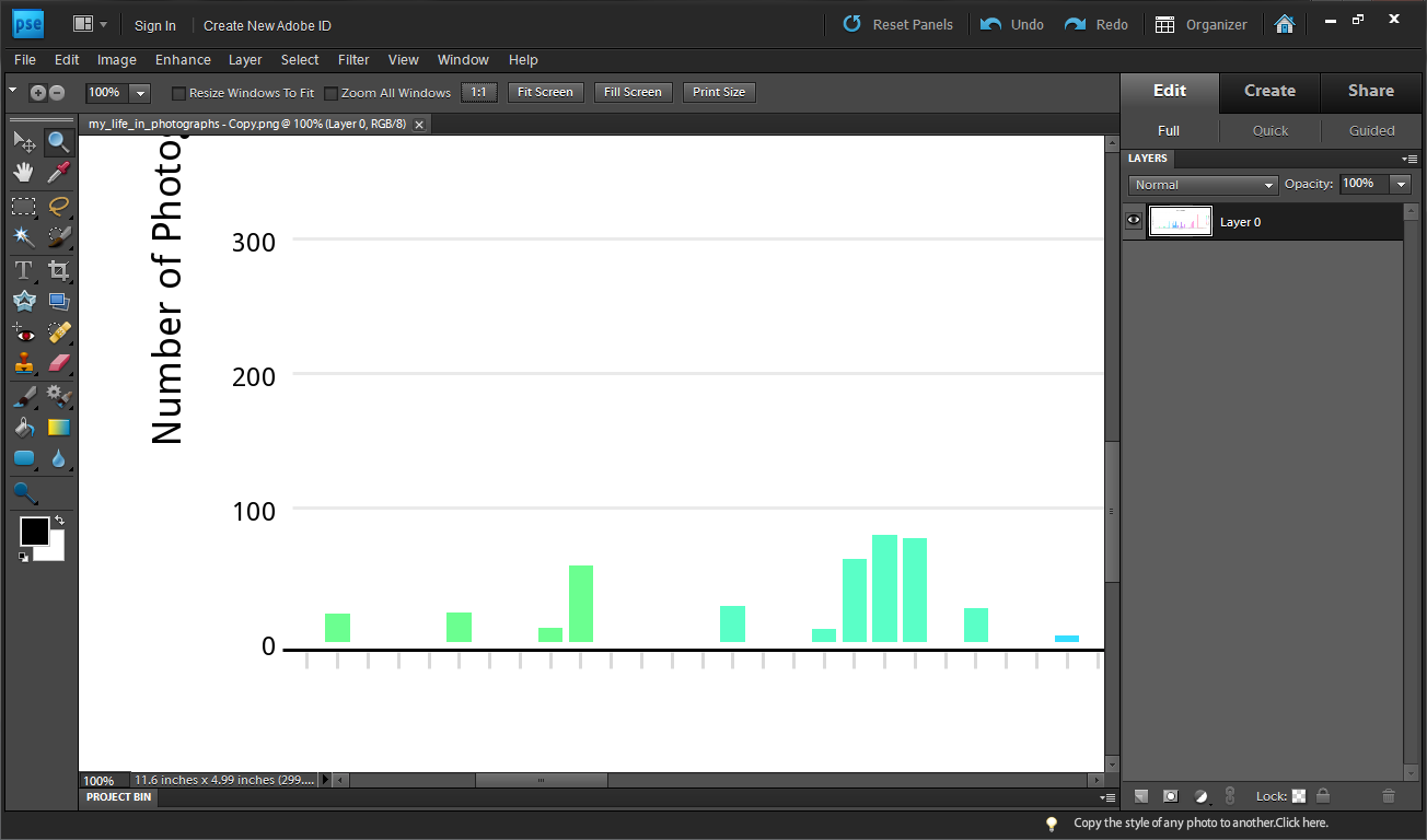
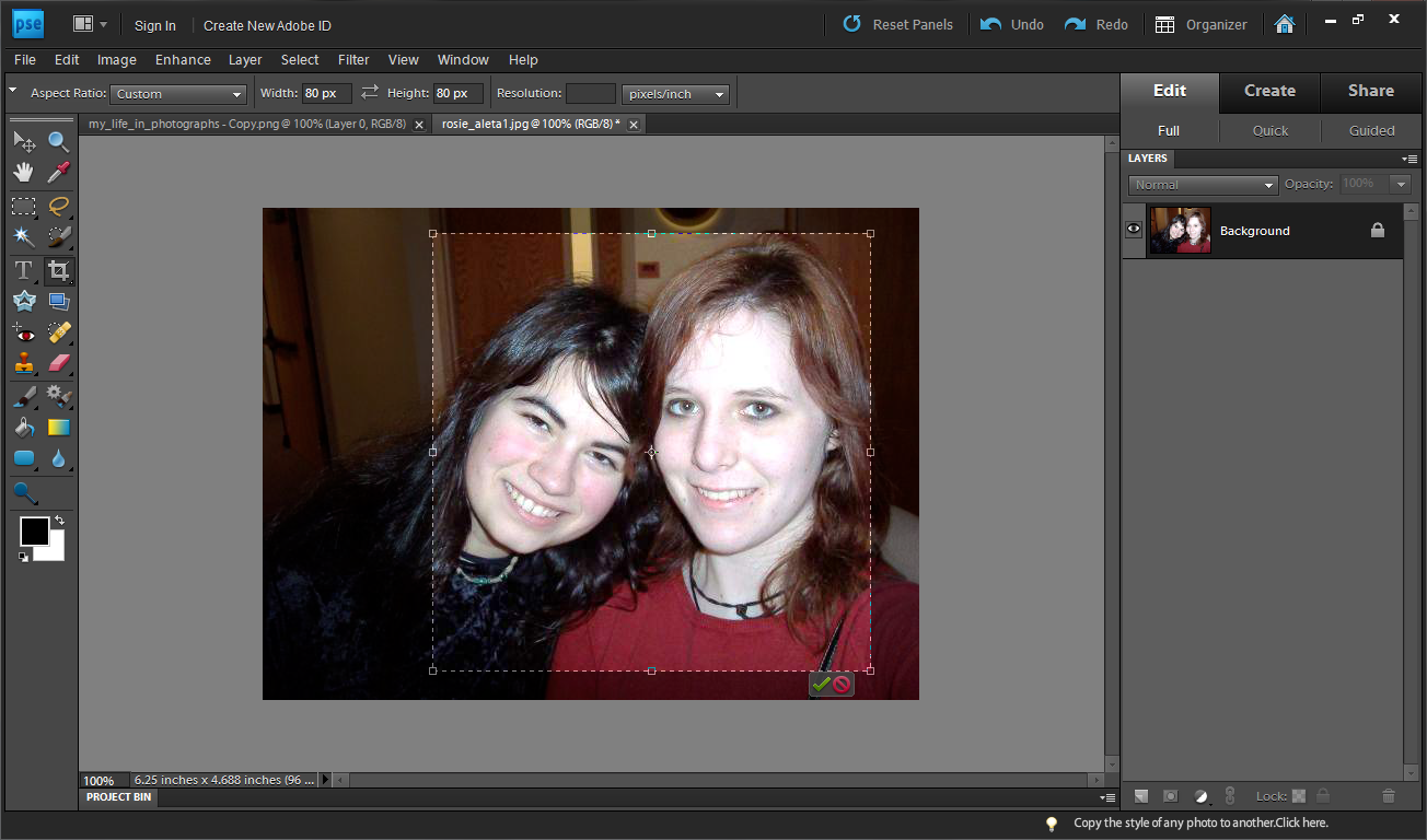
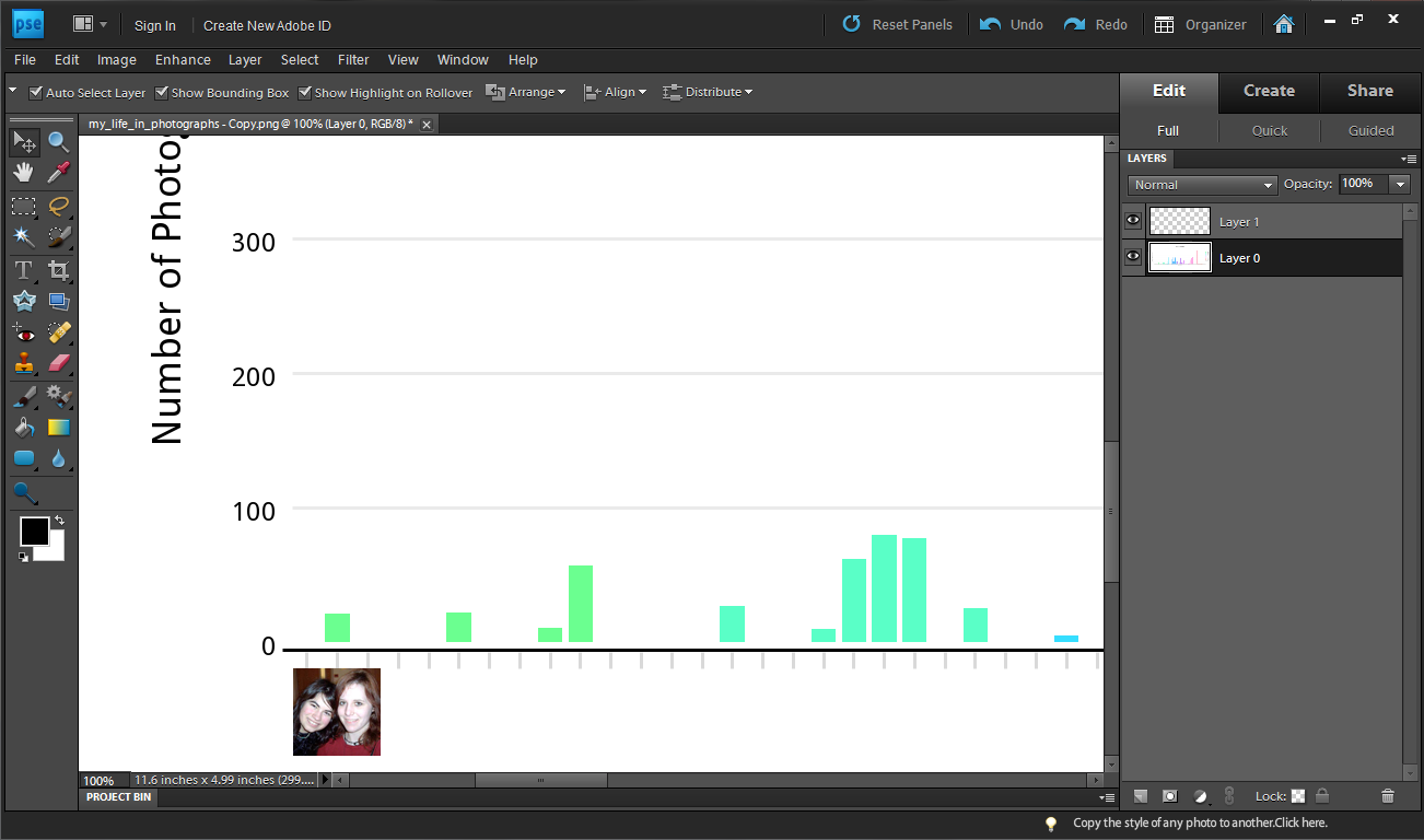
I downloaded the file (png, original size) from plotly and then opened it in Adobe Photoshop.
To add photos, I opened photos from my computer one by one and cropped them to an 80px by 80px square. I then copied and pasted each one below my graph.
After about 3 hours... I was finished!
To add photos, I opened photos from my computer one by one and cropped them to an 80px by 80px square. I then copied and pasted each one below my graph.
After about 3 hours... I was finished!