Map Making Online
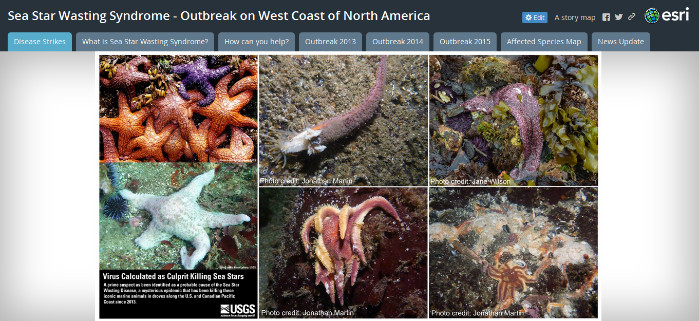
With the great wealth of information and easy communication, maps are increasing in demand. Following this demand and interest for maps of all kinds, several platforms have been developed that make mapping easy. This tutorial will explore one platform, ArcGIS Online, to create a map that plots crowdsourced data (data generated by and volunteered by citizens). You will also see one method for displaying maps with additional information and a request for continued crowd involvement.
Explore ArcGIS Online
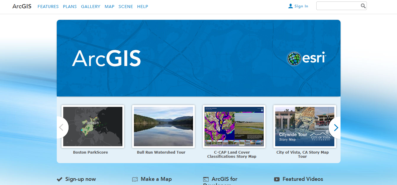
What is ArcGIS Online?
ArcGIS Online is an online community and map building site. It allows users to create and share maps using a variety of different data layers used by mappers. It is an easy interface for sharing maps and allows more customizing than many other free online mapping programs.
How is it different from ArcGIS Desktop?
ArcGIS Online, while a powerful tool, does not have the same analytical capabilities as ArcGIS Desktop. You cannot manipulate large data files to create new ones.
Spend some time exploring. Click a few maps to see the variety of mapping options available. There are three general types of products you can create with ArcGIS Online:
- Basic Map
- Basic Application
- Story Map
For examples of each type search for the following maps:
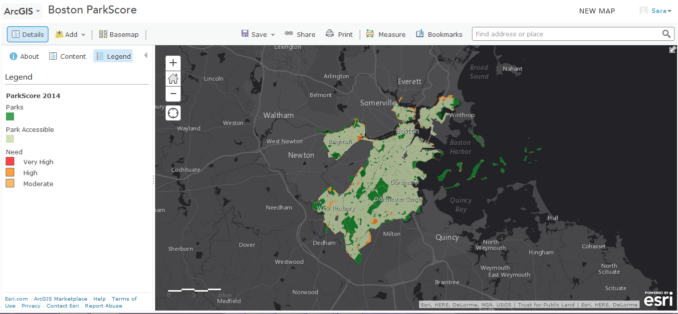
- Boston Parkscore
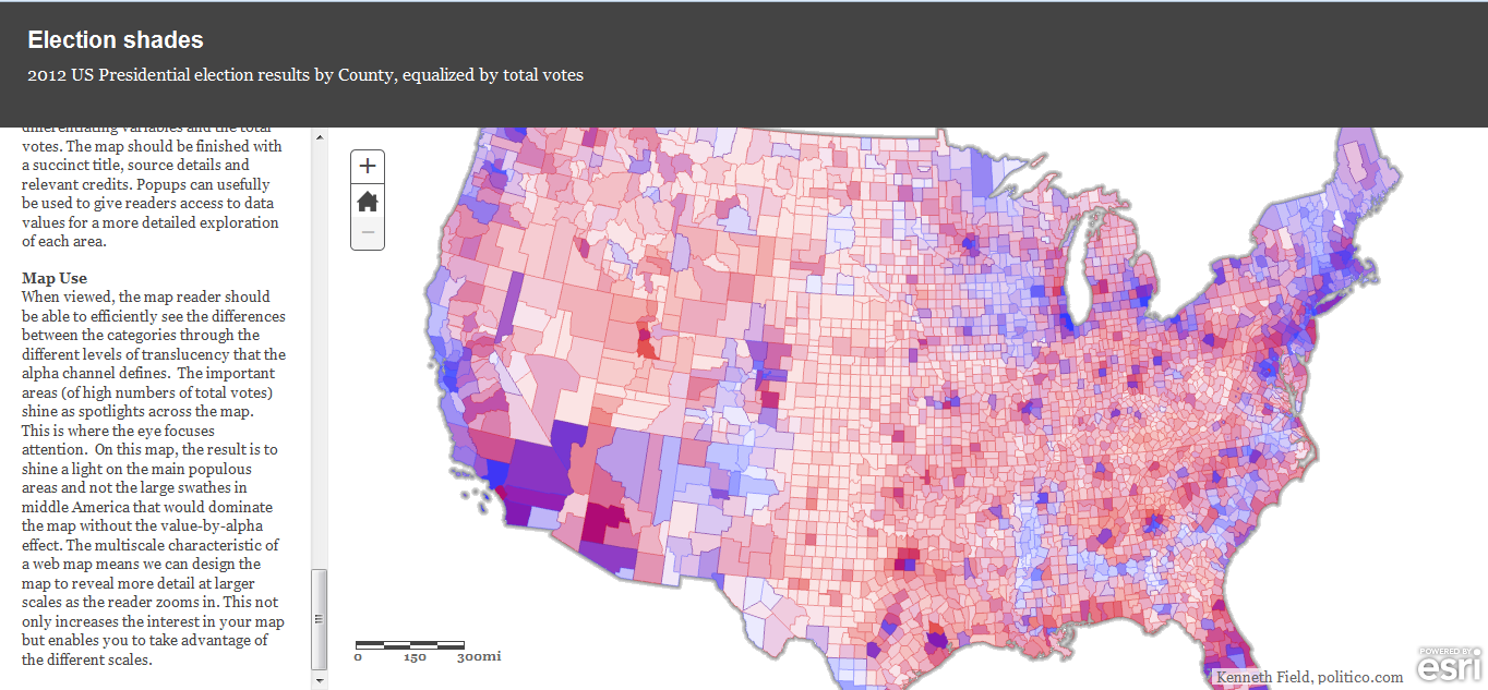
- Election Shades
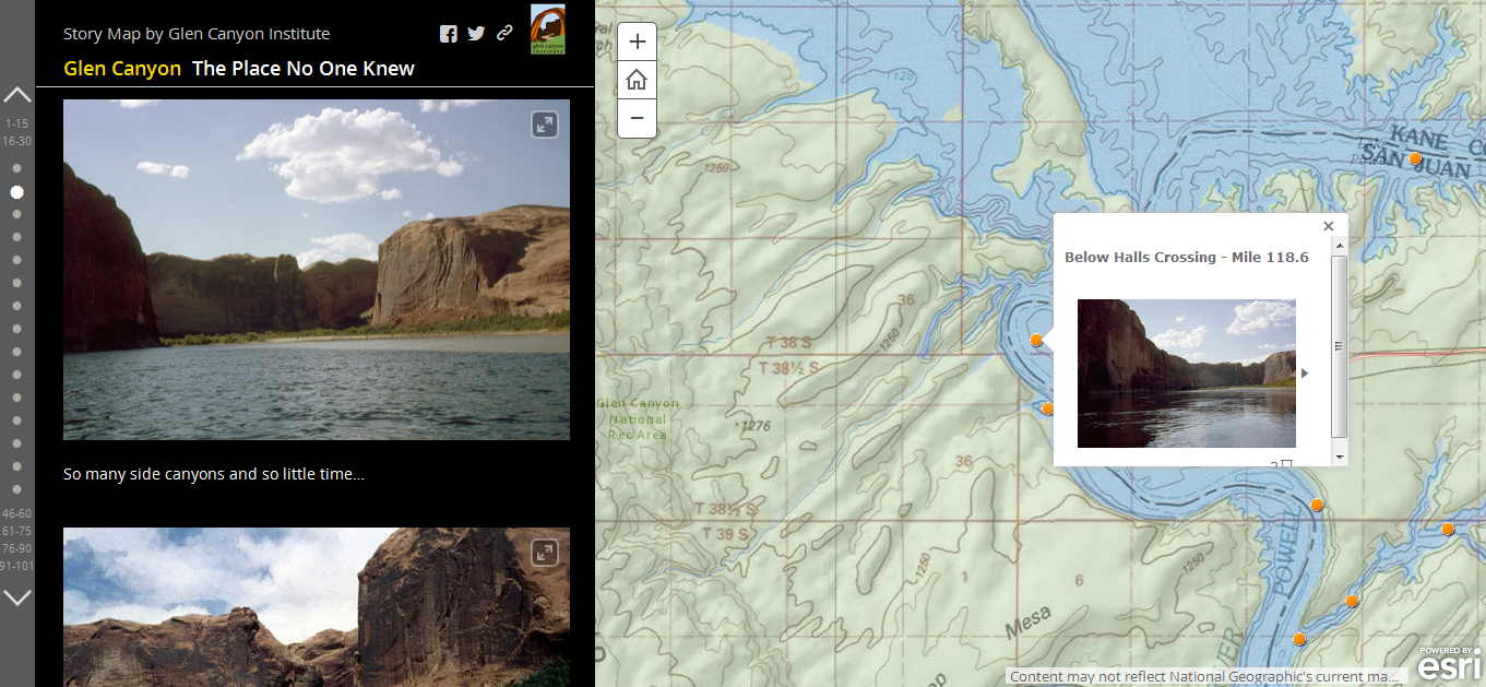
- Glen Canyon the place no one knew
Note the "description" which provides information about the map and the "map contents" which provides a list of the different data layers on the map. You also have the option here to open the map using the online viewer or ArcGIS desktop (if you have the software on your computer).
Make a Map
The first thing you'll need to do is create an account. There are two account options:
- ArcGIS Subscription
- Public Account
The ArcGIS subscription account gives you access to more features and control over map accessibility. For example you can make parts of your map public while keeping other parts locked. For most purposes the public account works.
Select "Create Public Account" and fill in the necessary information.
Now let's make a map.
Think about what kind of map you might want to make. For this demonstration we are going to build a series of maps displaying the recent outbreak of sea star wasting disease on the west coast of North America (from Alaska to Mexico). We are going to build two maps plotting crowdsourced observations of sea star wasting disease in 2013 and 2014. We will then create an application that allows the display of the maps along with other information about sea star wasting disease.
Let's get started.
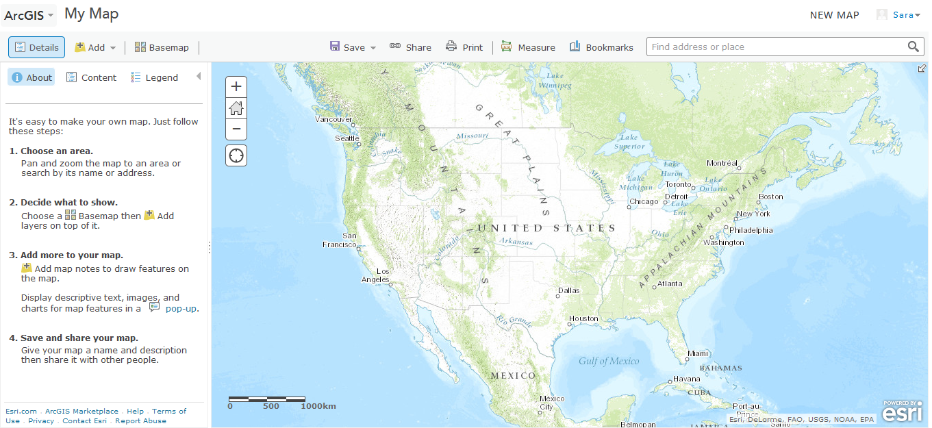
Click the "Make a map" link. This should bring you to a base map upon which we will build.
Base Map
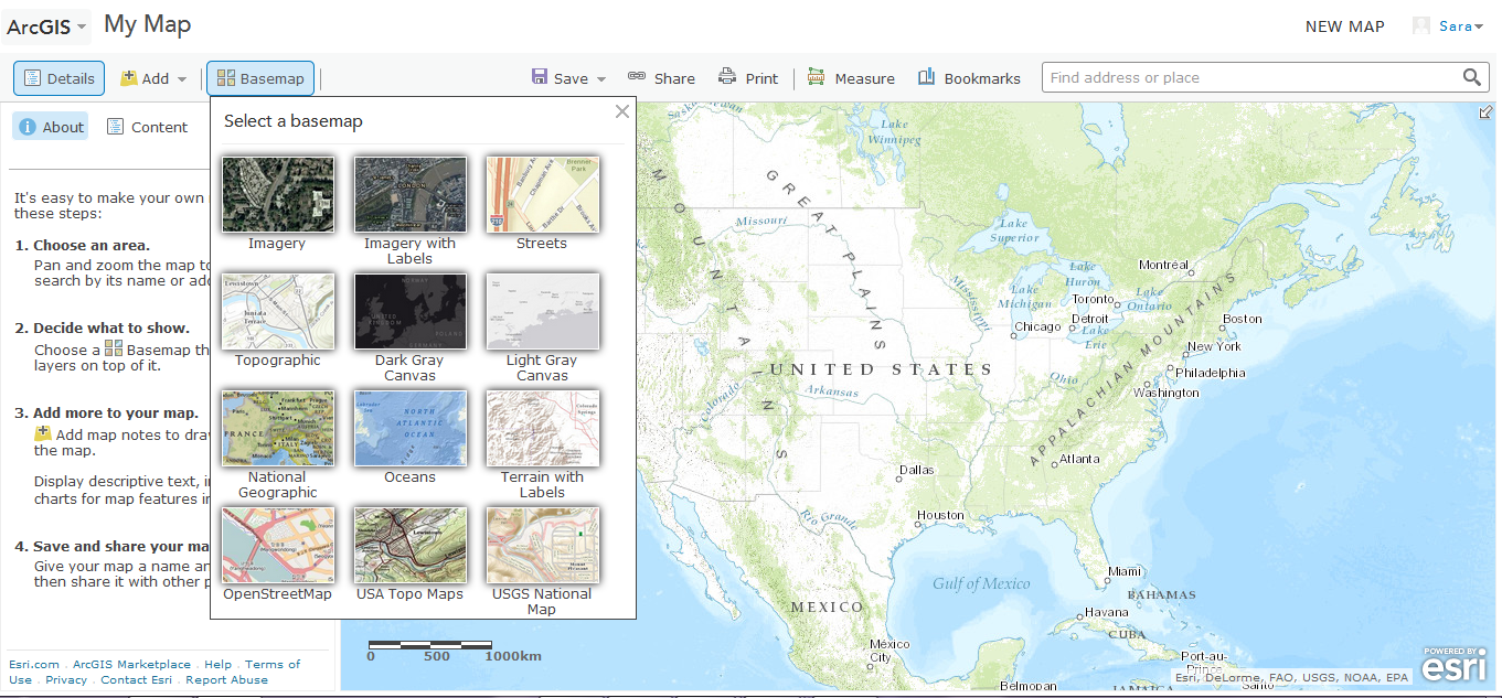
Base map: The base map is your foundation. All of you data will be overlaid on the base map. You have a few different options for the base maps. Along the top of the map click "base maps". Explore some of the options and select a base map that you like. I've selected the topographic map.
Bookmarks: You can also set the spatial extent for your map now. Zoom out so that you can see Alaska and Mexico. Click "bookmarks" and "add bookmark". Give a title for the current view. This is not bookmarked. If you move around the map, zoom in or out, you can always go back to your bookmark and reset to this view. You can create as many bookmarks as you'd like.
Save the map: It is good practice to save often so that you don't loose your progress should you lose your internet connection. Click "Save" and give your map a title, some keywords (tags), and a brief description.
Map details: If you click on the "Detail" button on the side bar, you will see that it has changed to reflect the information you just input. Click "more details" and you will be brought to a new page. From here to can select "edit" to provide more information about your map.
Adding Data Layers - ArcGIS Online Gallery
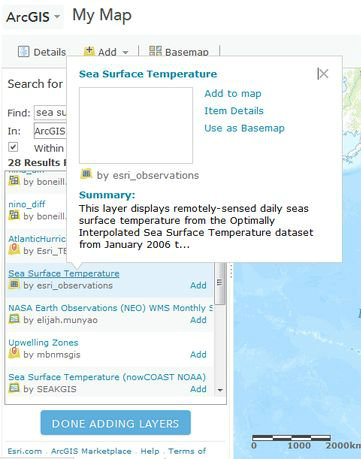
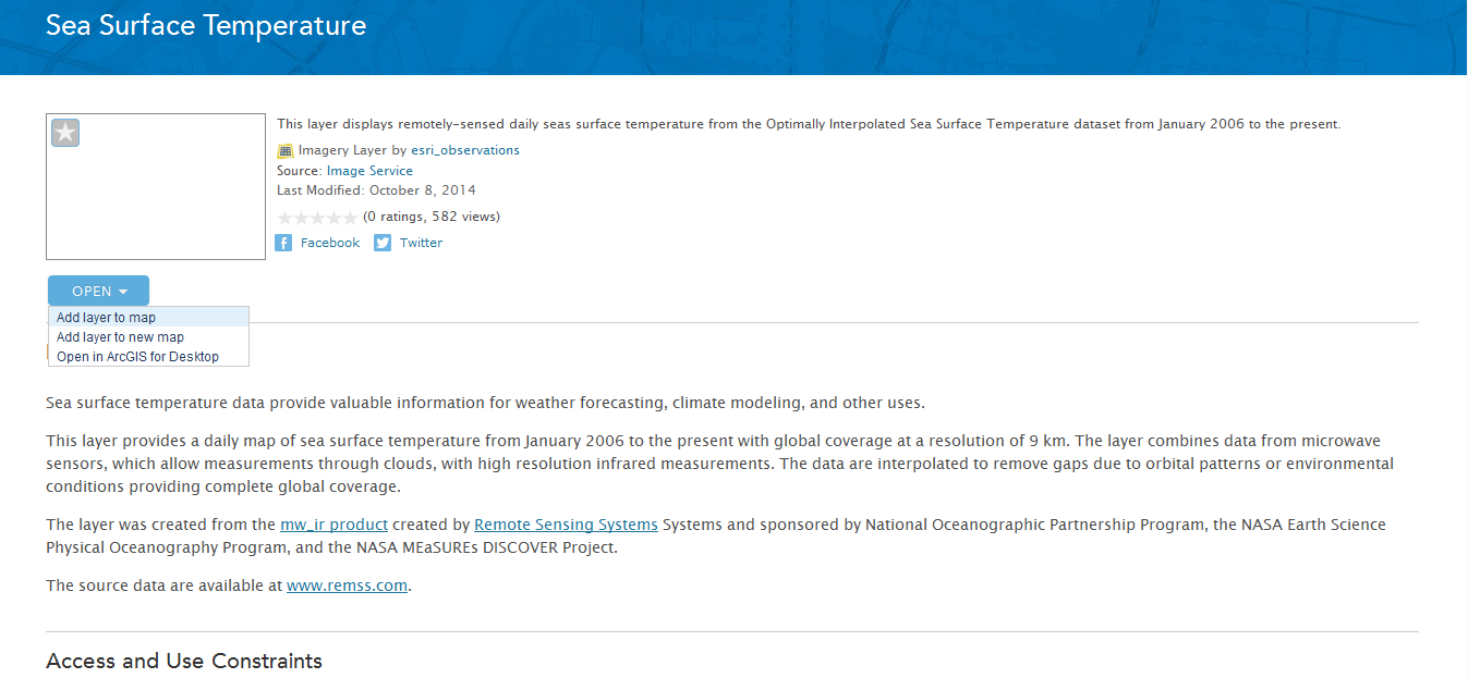
Now that we've selected the base map, we will add the first data layer. This first layer is going to be the background data upon which we will display the rest of the data. For this example, we are plotting observations of diseased sea urchins. Water temperature is one factor that has been implicated in the disease outbreak, so we want to visualize sea surface temperature.
Sea surface temperature (SST) can be obtained from a couple different sources: buoys logging temperature at regular intervals at a single location or satellite imagery. If you do a general internet search for "sea surface temperature data" you will find this data available through sources such as NOAA. This data will be raw or pre-processed, but in either case require some further modification before we can import into into our map. Alternatively, many data layers have already been imported into the ArcGIS Online Gallery and made publicly available. We will explore this option.
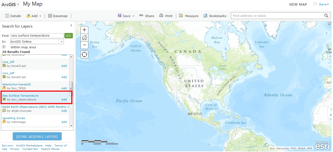
- Click the "Add" drop menu and select "Search for layers"
- In the "Find:" box type "sea surface temperature"
- Leave the "In:" box as ArcGIS Online
- Leave "within map area" checked. Zoom out the map so that you can see Alaska and Mexico in the same view (remember we will be plotting data across this broad extent so we need to make sure the data covers the full area).
- Click "Go"
- You will see many results found. The title should give you some information about the data layer. To get more information click on the title and select "item details".
- You should now see more detailed information about what the data represents, how it was created, and where the original data was sourced.
- Click back in your browser and we'll find a data layer that has the information we want. The disease outbreak started in 2013, so we want data that covers 2013.
- Scroll down until you find a data layer titled "sea surface temperature by esri_observations". View the item details. You should see that this layers had data from 2006 to present which covers our desired time period.
- Click the "Open" drop down menu and select "add to map".
- This should add the data layer to your map and bring you back to your search results. Feel free to explore other layers. When done select "Done adding layers".
Data Layer: Time Animation
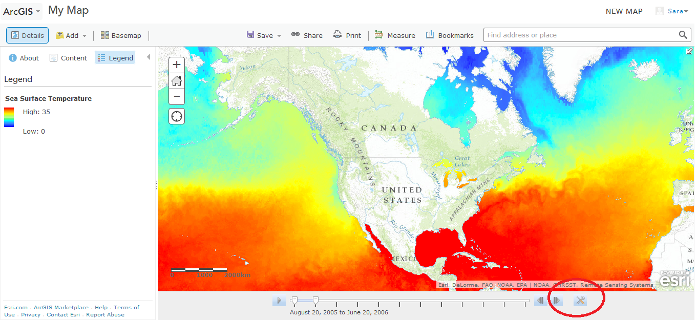
Before we continue, take a moment to explore the data layer you've just added.
Click on the "legend" tab and you'll see the color meter related to temperature.
Notice along the bottom of the map there is a sliding bar. If you move it you'll see it reflects specific date intervals and the color map will change as you move the bar around. Let's set the time interval we want to play.
- Next to the bar is an icon with two tools crossed (configure icon) - click this icon
- A pop up box allows you to adjust the play speed. Select "show advanced options".
- Now you can set the date interval you want to see. Set it to span 2013. Notice you can also set the interval - months, year, etc. Select an interval that makes sense to you.
- Click "Apply" and "Done".
You should now see an updated sliding bar and SST image.
Data Layer: Static Image
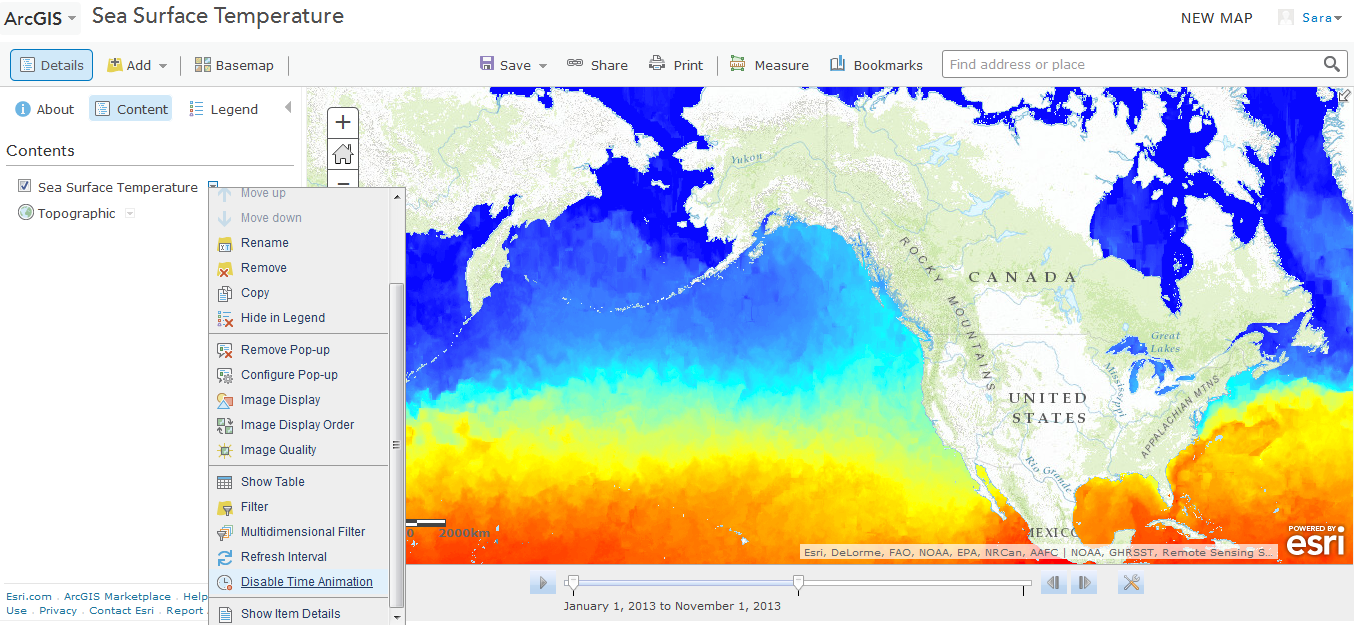
Most data layers you find will be static images. You can also convert a time animation data layer to display a static time interval.
- Click on the "Content" tab to show a list of your data layers.
- Click on the "Sea surface temperature" drop down menu arrow.
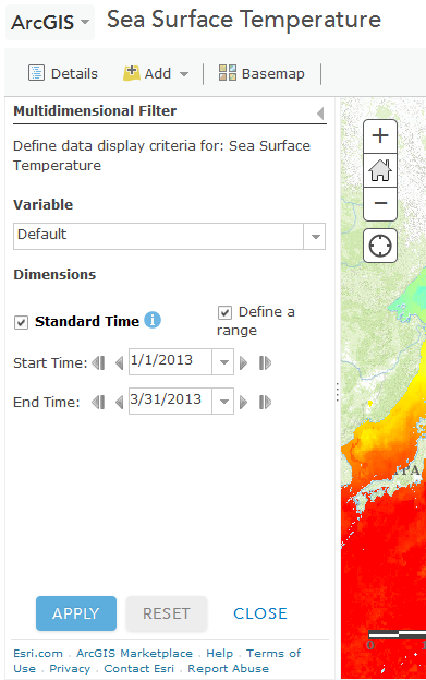
- At the bottom click "disable time animation". Notice now that the scrolling bar is gone. You are currently seeing an average of the complete data set from 2006 to present.
- To set the time interval click on the sea surface temperature drop down menu again
- Click "Multidimensional filter"
- On the popup menu you can define the time range. Select the "define range" box and set the dates to 2013*.
- Click "Apply" and "Close"
Notice that the SST map has changed again. It should now show a static image reflecting the dates you selected.
*I defined the time range as 1/1/2013 - 3/31/2013 in anticipation of my 2014 map. Since the 2014 data only goes through March, I selected a similar time range to be displayed for 2013 to be consistent.
Be sure to save your map!
Adding Data Features
Features could be specific locations (e.g. address or GPS coordinates of a place or event), geographic areas (e.g. county or town), or routes (e.g. roads, city town line). There are two ways to add data features (points, areas, lines) to the map.
Features can be manually added individually using the "Map Notes" feature or bulk added from a spreadsheet. First we will explore how to use Map Notes.
Adding Data Features - Map Notes
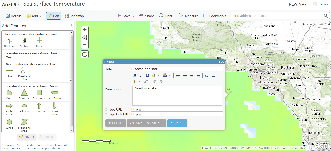
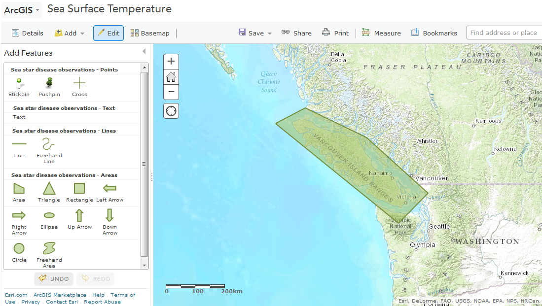
The Map Notes function will allow you to manually add data features using pre-designed icons and legend. One advantage of using this function to individually add features is that it doesn't require you to input GPS coordinates. You visually identify the location of the feature you would like to mark and draw it.
- Click the "Add data" drop down menu and select "Map Notes".
- Give your data layer a title. Notice here that you can select from several different templates for your data features. Click on a few to see the options. We will use the basic "Map Notes" template.
- Click "create"
- You'll notice the side bar change to show several different points, text, line, or area options. Let's create a point feature first.
- Zoom in on to a specific location on the map (I chose Los Angeles, CA). Click on one of the point options (stickpin, pushpin, or cross).
- Click on a location on the map to play your point marker.
- A popup box will appear in which you can identify the point and add a description. If you had an accompanying file or image specific to that point that you would like to include you can do that as well.
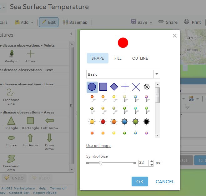
- Click "change symbol". From here you can customize the marker. When done click "OK" and "Close".
- You should now see your point on the map.
- Repeat steps 5-8 except this time select an area. You will draw the points of your area.
Be sure to save your map!
Adding Data Features - From File
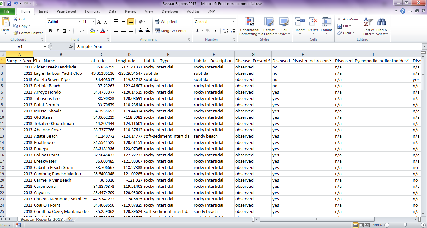
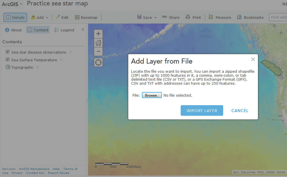
The second way to add data features is by uploading a file. This method allows you to upload a large number of related data features simultaneously. To use this method you need to know the GPS coordinates for each feature.*
*If you don't have the coordinates, but could pick the location on the map visually, you can use the "measure" tool. Select the "measure" tool. Select "location" icon (a box with a small cross on it). Click the location on the map and the coordinates should appear in the popup box.
Create the data file: The first thing you need to do is create the data file that will be uploaded. We will create one for reported observations of sea star disease. Consider what information you might want or need to include. I've included the following:
- Observation year
- Site name
- Latitude**
- Longitude**
- Habitat type
- Habitat description (more detail about the habitat)
- Disease present?
- Disease present in a series of species
**Latitude and longitude must be included as this is how each data point will be mapped. These categories represent columns. The rows represent different observations.
Column titles should not contain any spaces or it will not import correctly. For example instead of "Site name" write "site" or "site_name"
Once you've created a data file save it as .csv
Upload the data file:
- On your map click "Add" and then "Add layer from file"
- Browse your computer to find the .csv file that you just created. Click "import data layer"
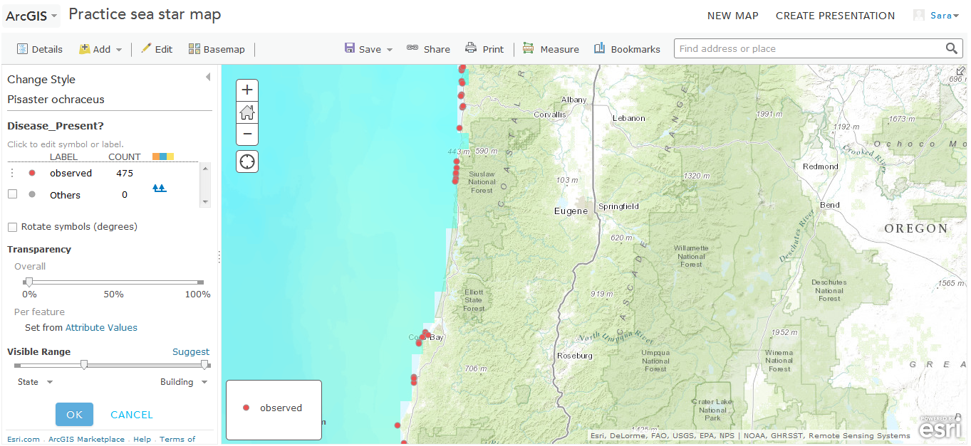
- You should now see your side bar change to display formatting options for your data.
- First select what field by which you want to distinguish data points. We have several options. We may want to distinguish points by year, habitat type, or whether disease was observed. Select from the drop down menu the "attribute to show". I selected "disease observed".
- Now select how the differences should be visualized. If you have a quantitative field (e.g. population size or number of infected sea stars), you may want to use the counts and amounts option which uses different sized points to represent the value of each point. Hover your cursor over the different options for more information about each.
- We are going to select "types (unique symbols)" because we have different categories we want reflected (disease observed v disease not observed). Click "select".
- Click "options" on the same box (the button was previously "select"). You can now customize your symbols.
- If you need to modify the label text do so by double clicking the text. For example, the label for year may appear "2,013" and I want it to show as "2013".
- Click on the symbol (default is a small red dot). You can now customize the icon.
- Set the visible range by adjusting the sliding bar. This will determine at what "zoom" the points will be visible (more on this later).
- When done click "OK" and "Done".
You should now see many points populating your map. If you click on any one point, a table will pop up with the complete information about that data point (more on how to customize this coming up). If you click the "legend" tab you should see the symbols and labels for your new data layer.
Be sure to save your map!
You Have a Map!
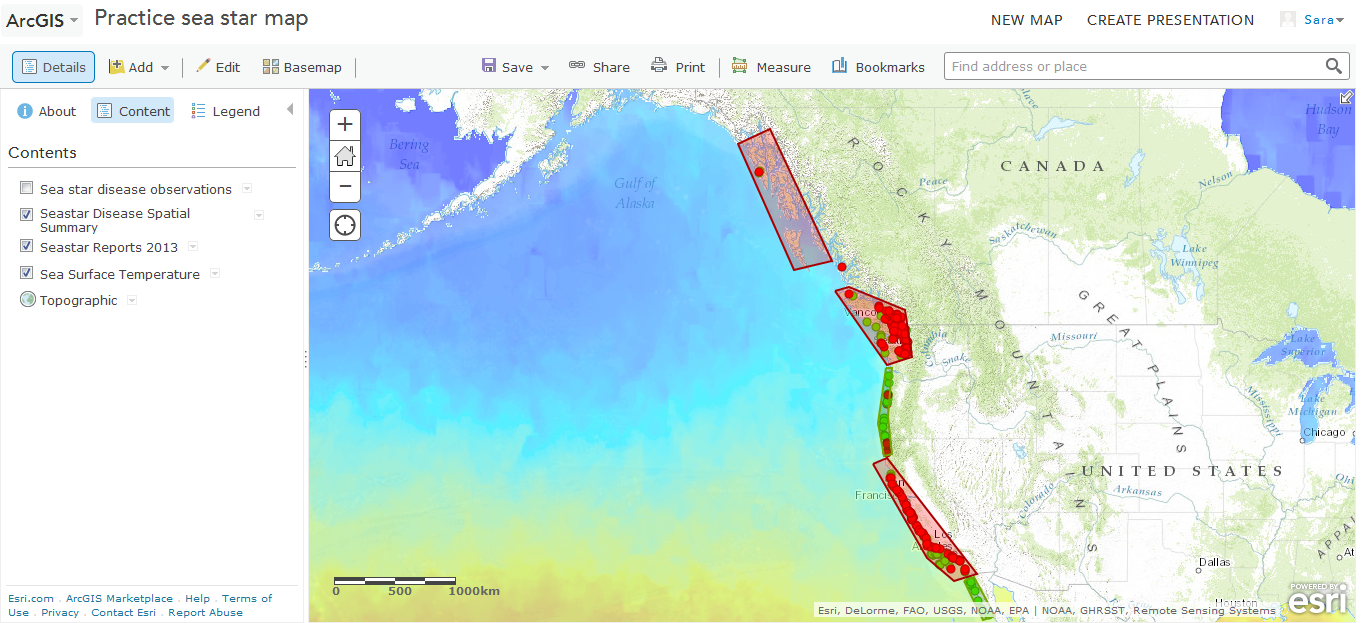
Now you have a map! You have sea surface temperature on top of a base map. On top of this your have sea star disease observations. Now you may look at your map and notice some spatial clumping patterns that you want to highlight. For example, I notice that there is a clump of red points (sites with disease present) around Washington and a clump of green points (sites with disease absent) around Oregon and Baja California.
Remember that area feature you can create using Map Notes? Now you can use it to create polygons around those areas and apply different colors. Try to create color coded polygons with some description information for each.
You have all of your data layers, now it's time to customize.
Customizing Data Layers - Transparency
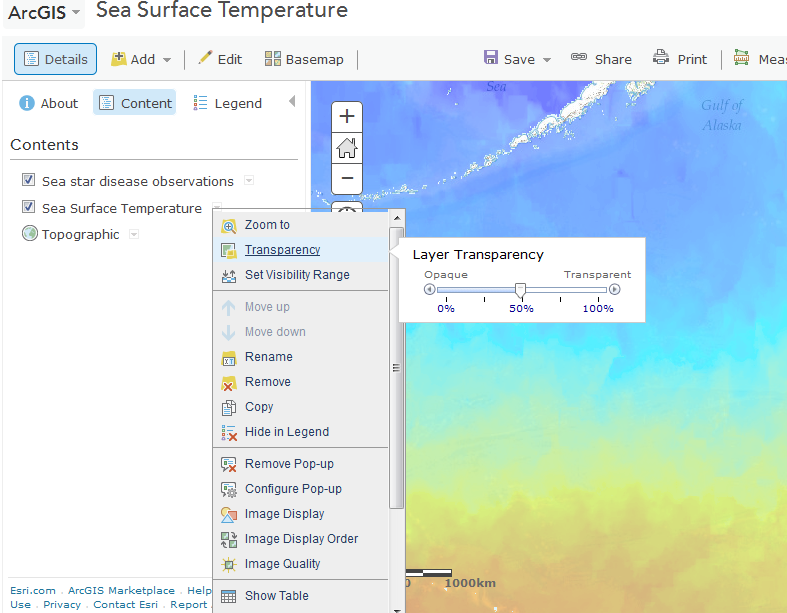
In the next few steps we'll work to customize your data layers in a few different ways:
Transparency: You can make data layer transparent so that layers below can be visualized. For example, let's adjust the transparency of the SST layer so that location names and topography of the base map can be seen.
- Click on the SST data layer drop down menu
- Click "Transparency"
- Adjust the slider bar so that the layer becomes semi-transparent.
Customizing Data Layers - Visibility Range
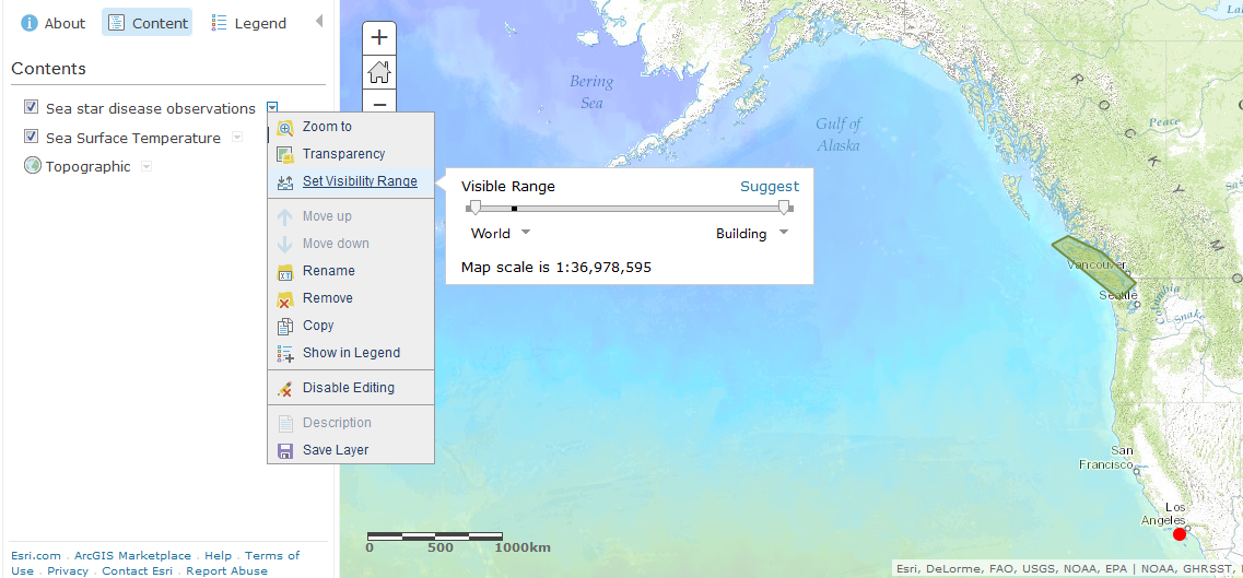
Visibility Range: Some data you may only want to be visible at certain "zooms" or scales. You can adjust the scale so that features are visible only at the level of the continents, cities, or both. We'll try this on the polygon features.
- Click on the polygon feature drop down menu (I named mine Disease Summary)
- Click "set visibility range"
- Adjust the slider bar from either end so that the layer is visible for the range you'd like; you can also adjust by selecting from option via the drop down menus at either side of the slider bar (I set mine to be visible from world to large countries). You can make a similar adjustment for the disease observations. I set mine to be visible from continents to streets.
Now if you zoom out, the polygons are visible and if you zoom in the polygons will disappear. Similarly the points will disappear at the global scale but appear as you zoom in.
Customizing Data Layers - Popups

Pop-ups:
You can customize the popup box that appears when you click on features. You can adjust the specific information for individual features as we did when creating the map notes features. You can also make whole scale adjustments that will be applied to all features within a given data layer. We'll try this for our uploaded disease observations.
- Click on the disease observations data layer drop down menu
- Click "configure popup"
- Click the "+" next to the "title" box to select which field you'd like source for the popup title. I've selected "site name"
- Click "configure attributes" to select which fields you would like to be seen. For example you may want habitat type, but not the more detailed description. You may or may not want the latitude and longitude to display.
- Under the "add" box, you have the option to include images or charts that would be appear for all features within that data layer. For example, if we were to plot only the data from one sea star species in a data layer (and maybe a different data layer for another species), we could include and image of that species in the popup.
- When done click "save popup"Now if you were to click any given point, a popup box should appear with only the fields you selected.
Saving Data Layers
You can save layers so that they can be used for other maps. For example, you may want to save the polygon features we created for this map to overlay onto the 2014 map.
- Click on the drop down menu for the layer you want to save (e.g. polygons - disease summary)
- Click "save layer"
- Give the layer a title, some keywords, and a brief description.
Don't forget to save your map too!
Share Your Map
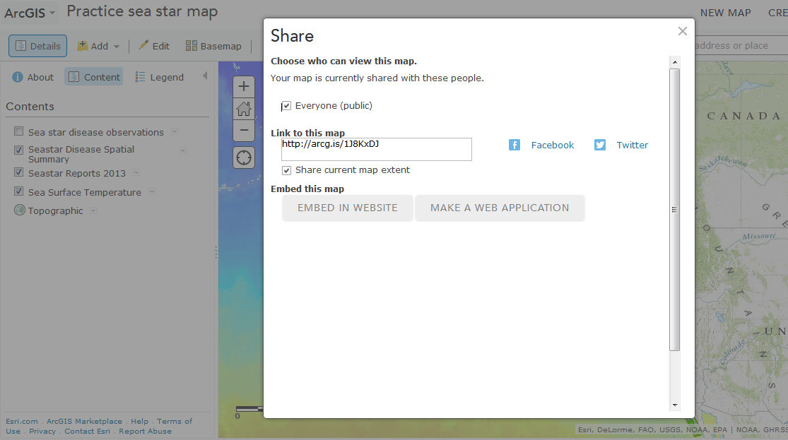
Now that you've customized your map, it's time to share it.
Click on the "share" button at the top of the map. Select "everyone". Now anyone with a public ArcGIS account can view your map.
Create a Second Map

We've now made a map of the sea star disease outbreak in 2013. Unfortunately, the outbreak continued through 2014 as well. Try to make a similar map for 2014.
A few things to consider:
- You'll need to set the SST data layer for 2014
- You may want to use the same polygons you created for you 2013 map (disease summary).
- Click "Add"
- "Search for layers"
- Change the drop down menu from "ArcGIS online" to "My Content"
- If you saved your polygon data layer it should be there.
- Do you want to use the same or different symbols for your 2014 data?
Don't forget to save and share your new map!
Presenting the Maps: Creating a Story Map
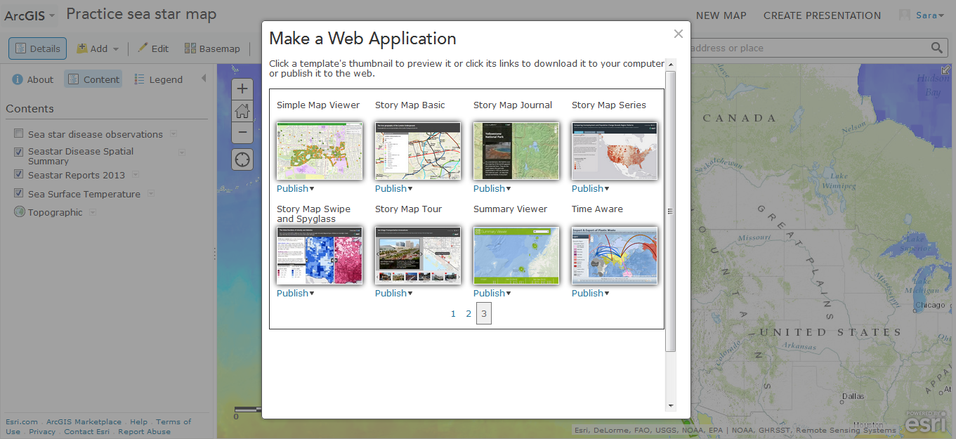
ArcGIS Online has several different ways to share and present the maps you've created. You explored some examples at the start of this tutorial. Now we are going to make a story map.
Go to one of your maps (If you've navigated away, you should be able to find you maps again under "my contents").
- Click "Share" and "Make a Web Application"
- You will see several options for web applications spanning from the basic application to story maps. Explore the options. Click on any one and select "preview". Depending on your goals, different applications will be better.
- Now that you've explored a bit, lets make a story map. I'm going to select "Story Map Series".
- Click "publish". A popup window will appear. By default it will be population with title and description information from your map. Since we are planning to present two maps, you should adjust this information. (You can always update it again later.) When done click "save and publish".
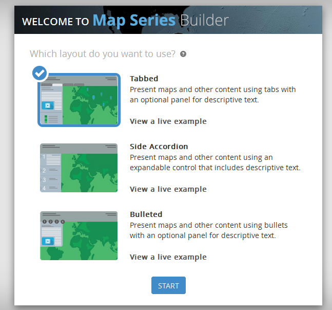
- For this story map you have three layout options. Select your preferred layout. I'm going to select "tabbed".
- Click "start"
- Give your application a title (this will appear on the application).
- Give your first tab a title.
- Select your first map and click "Add"
- Now you have a basic story map ready to be populated with maps and information.
Story Map: Adding Maps
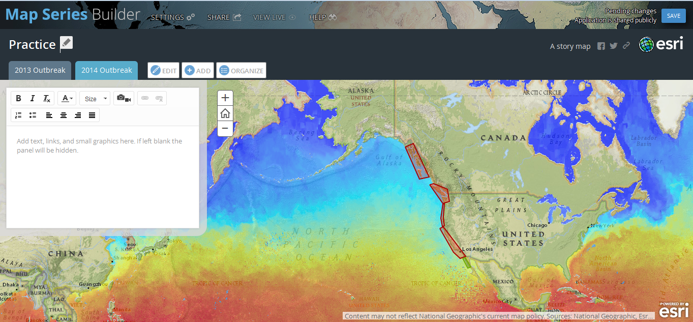
You can have multiple maps displayed on different tabs.
- Click "Add"
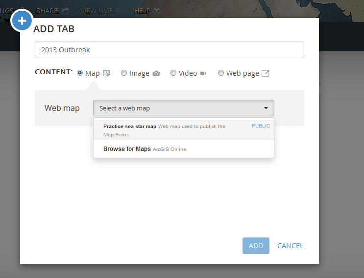
- In the popup window, give the new tab a title.
- Select from the drop down menu browse for maps. The default will be to search "My Content". Find your other map and select it.
- The first map you added will set the spatial view for the following maps. For our maps this is perfect. However if you wanted to emphasize different regions on different maps you can reconfigure this default. Hover over the "?" next to "Location" for details.
- Click "Add"
You should now have to map tabs. You can provide information about your map in the side bar. What information would be helpful for your audience to understand your map, what it contains, and how to use it?
Story Map: Adding Images, Videos, and Webpages
In addition to maps, you can have tabs that show images, videos, or other webpages. All of these are added through the same "add" function. You should see that for each of these, the item must already be hosted by a website such as facebook or flickr (images) and youtube or vimeo (videos).
For each of these items you also have formatting options: fit, stretch, or custom.
Find some relevant images, videos, and webpages to add. Play with the formatting options to find something you like. As with the maps, you can add text to the side bar if you'd like.
I found images and videos showing diseased sea stars and a website detailing the current research and monitoring efforts surrounding this disease outbreak.
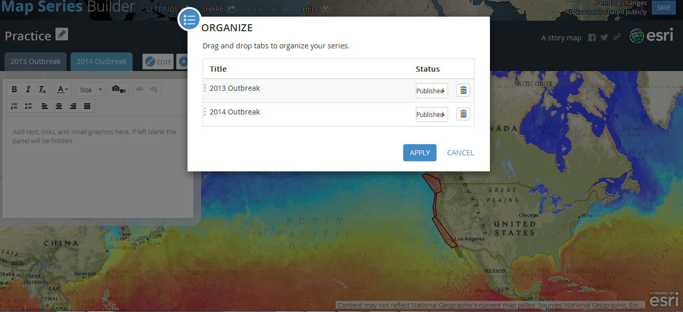
Organizing: After you've added your tabs, you may want to reorganize them. Click the "organize" button. You can move layers around to the order you like. Notice also that you can hide tabs if they are still under construction and then publish those tabs when ready.
Story Map: Save and Share

When you are done creating and modifying your story map, click "save" in the upper right corner. Click "view live" to see what your application looks like. I encourage you to do this because it often looks different then you expect based on the editing page.
When you are satisfied and ready to share you application, click "share". You will see several options for sharing including a shortened link.
Congratulations! You've made a story map. To see a completed story map of sea star wasting disease:
There are more options with ArcGIS online and story map then we explored. Hopefully you at least have the basic tools to explore some more and make some great maps.