Mandalorian Wall Art (Rainbow Edition)
682 Views, 2 Favorites, 0 Comments
Mandalorian Wall Art (Rainbow Edition)
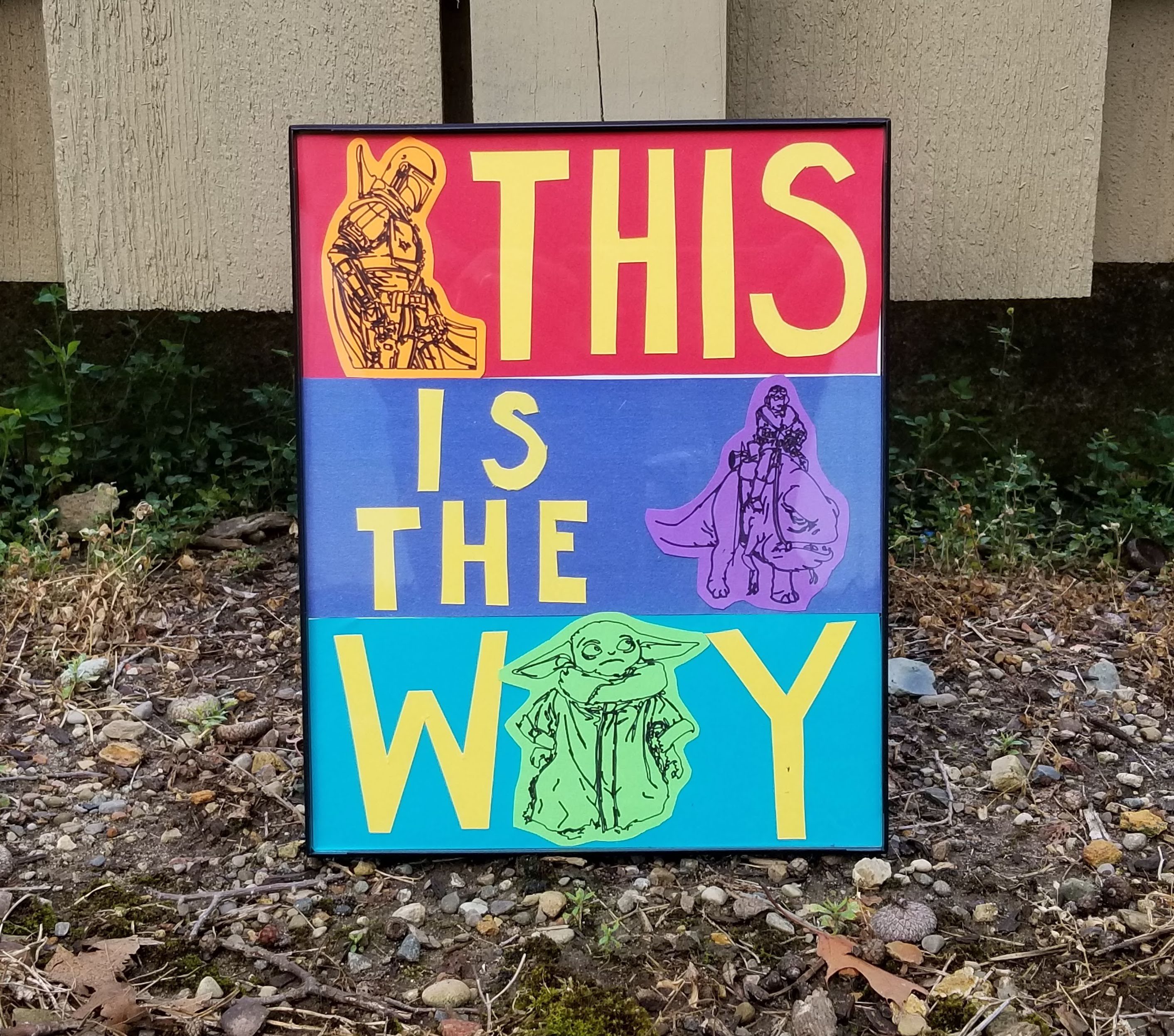
I am a HUGE fan of baby yoda. Huge. Of course, the Mandalorian overall is a great show, so I wanted to make something about it to have on my wall. I knew I wanted it to be full of color, and using the rainbow and fandom contests as inspiration, I got to work combining my love of color and the Mandalorian (what could go wrong). What happened is this piece of wall art! My office decor is really starting to come together...
If you want, you could also change the theme to be something else, and use the basic idea. Either way, I hope you have fun making this!
Supplies
I used a Cricut Explore Air 2 and the accompanying software to make the drawings of baby yoda, mando, kuiil and blurrg.
- 1 piece of white paper (to glue the other things to)
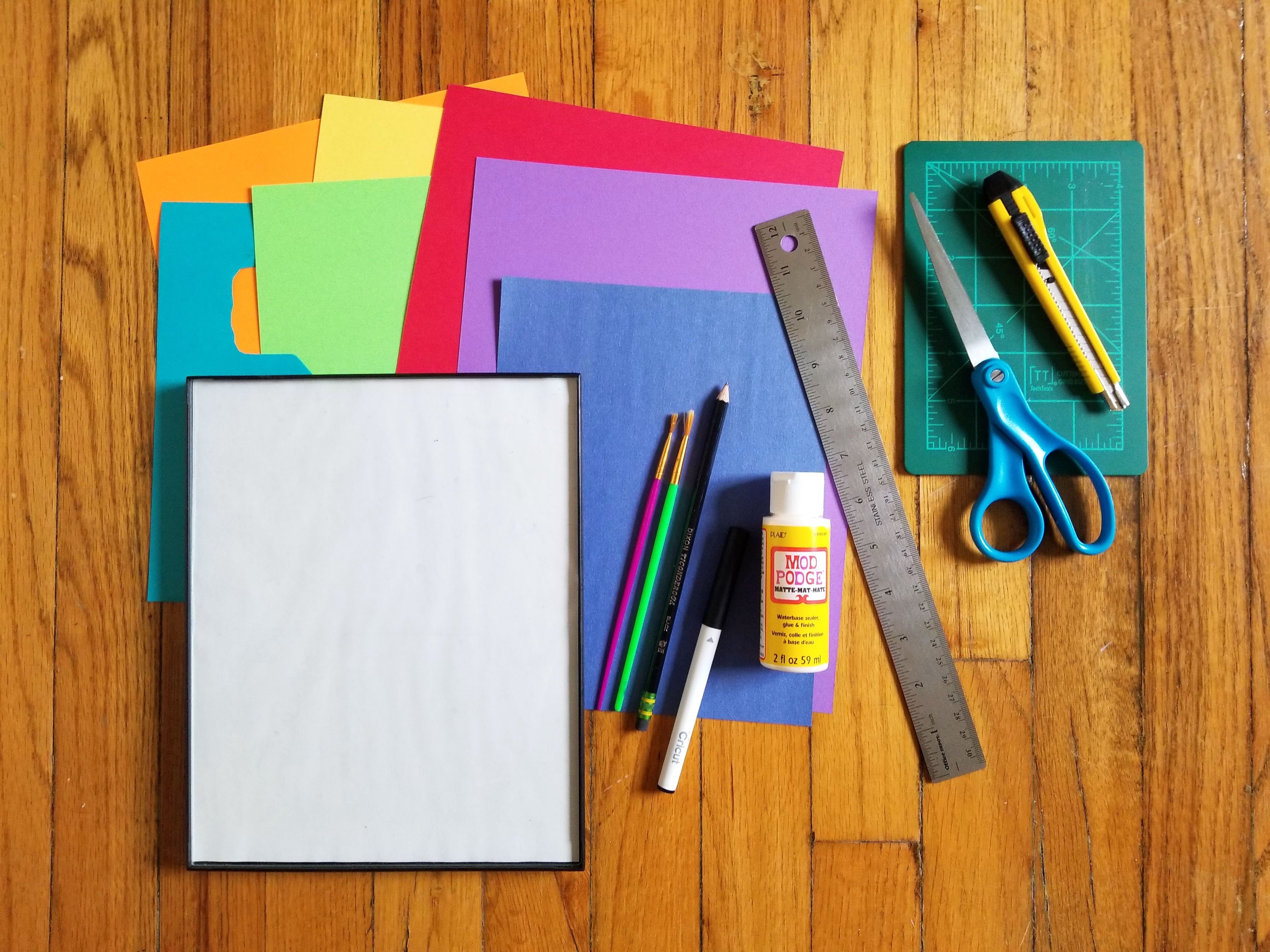
- 6 pieces of colorful paper/cardstock (I used Red, Orange, Yellow, Green, Blue, Indigo(ish), and Violet)
- Scissors, an exacto knife, and cutting mat
- Mod podge (or a glue stick)
- Assorted brushes (you only need like one, unless you are using a glue stick)
- Ruler and pencil (for measurements)
- 8in x 10in frame
Make a Plan
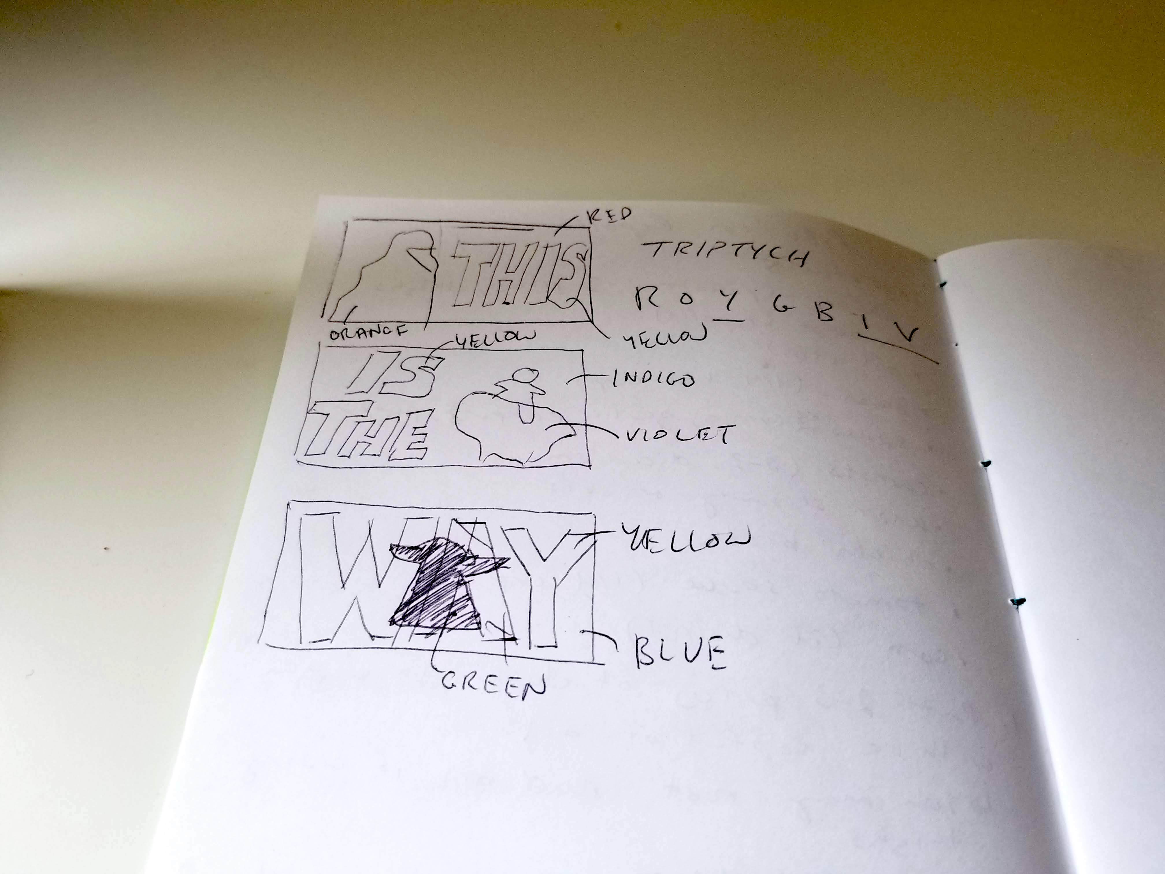
If you are not going to use the exact images that I did (or even if you are), it will be really helpful to first plan out 1) what characters you want, 2) what colors you want, and 3) what characters you want to be what color. I just did a quick sketch of what I envisioned, and labeled each part. It helped me stay on track and bring to life the idea I had in my head from the beginning!
Preparing to Draw the Characters Using a Cricut
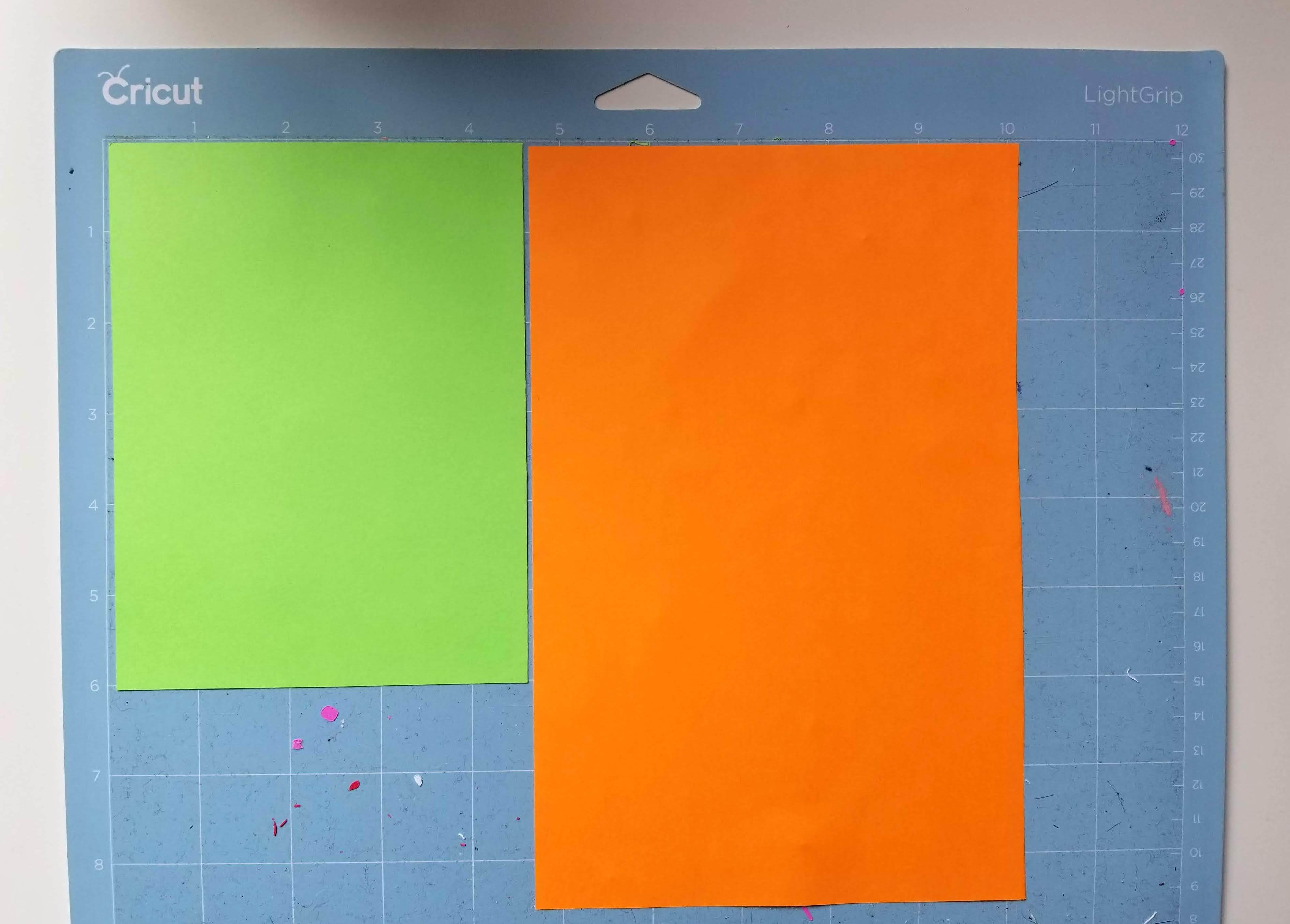
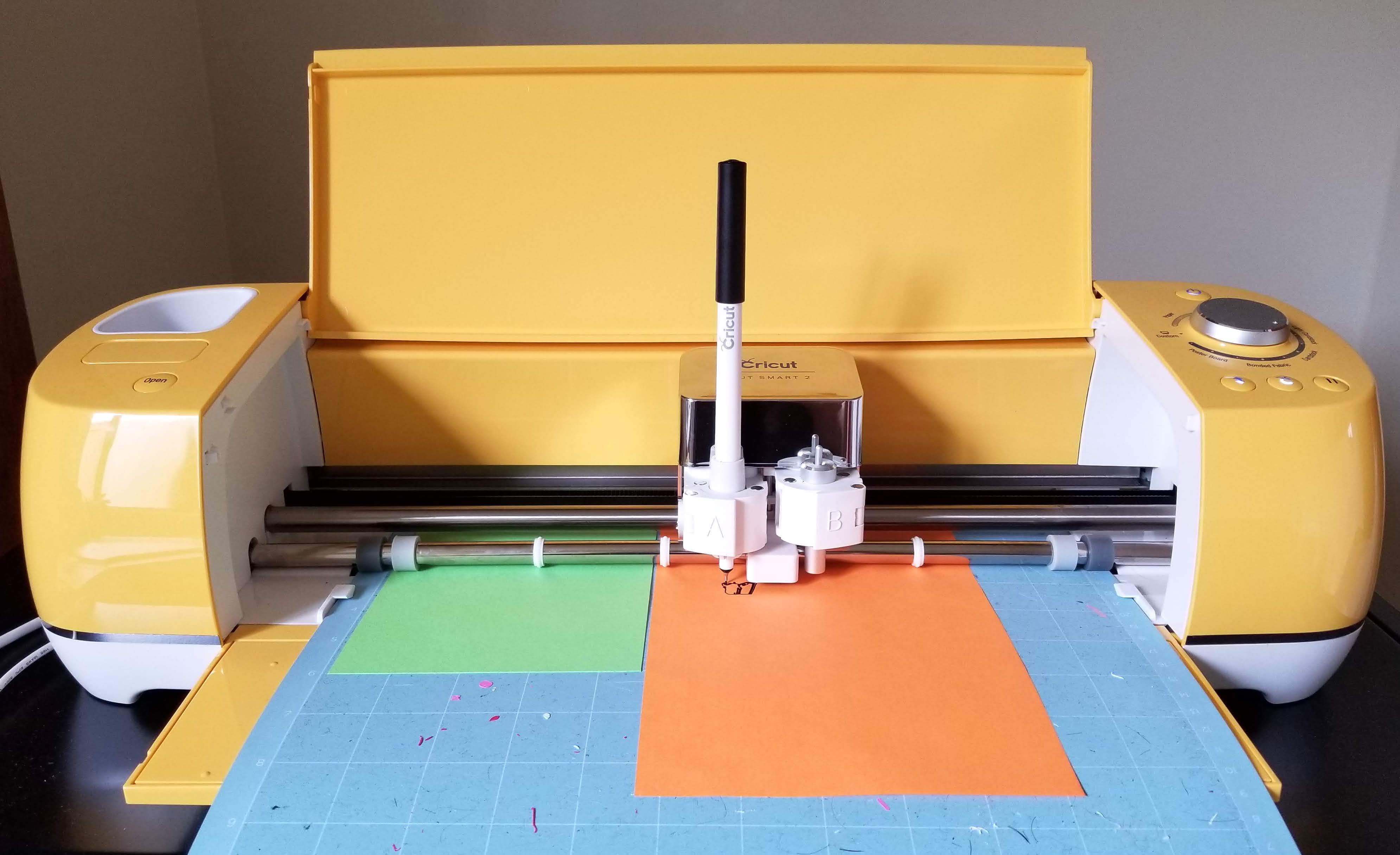
First, make sure you decided in the last step what color you want each character to be. I chose green for baby yoda, orange for mando, and violet for kuiil and blurrg. In this step I will illustrate using just two of the characters, but do the same thing for the third one (I ran out of room).
If you are using the same characters, you can use the template I made on the cricut design space here. The images for this are based on a coloring book I originally bought from Target and scanned so I could use them again later. They are the size that you would need for a 8x10in frame (they are all around 3.2x3.2cm) presented in the same way I did here.
Once you have the colors, place them on the mat. When positioning your drawings in the design space, make sure that they align with the colors that you have the way they are on the mat! Once you're ready, load the cricut with your paper and let it draw! It might take a while, so you can move on to the next step while that is going.
Fitting the Background Colors Into the Frame
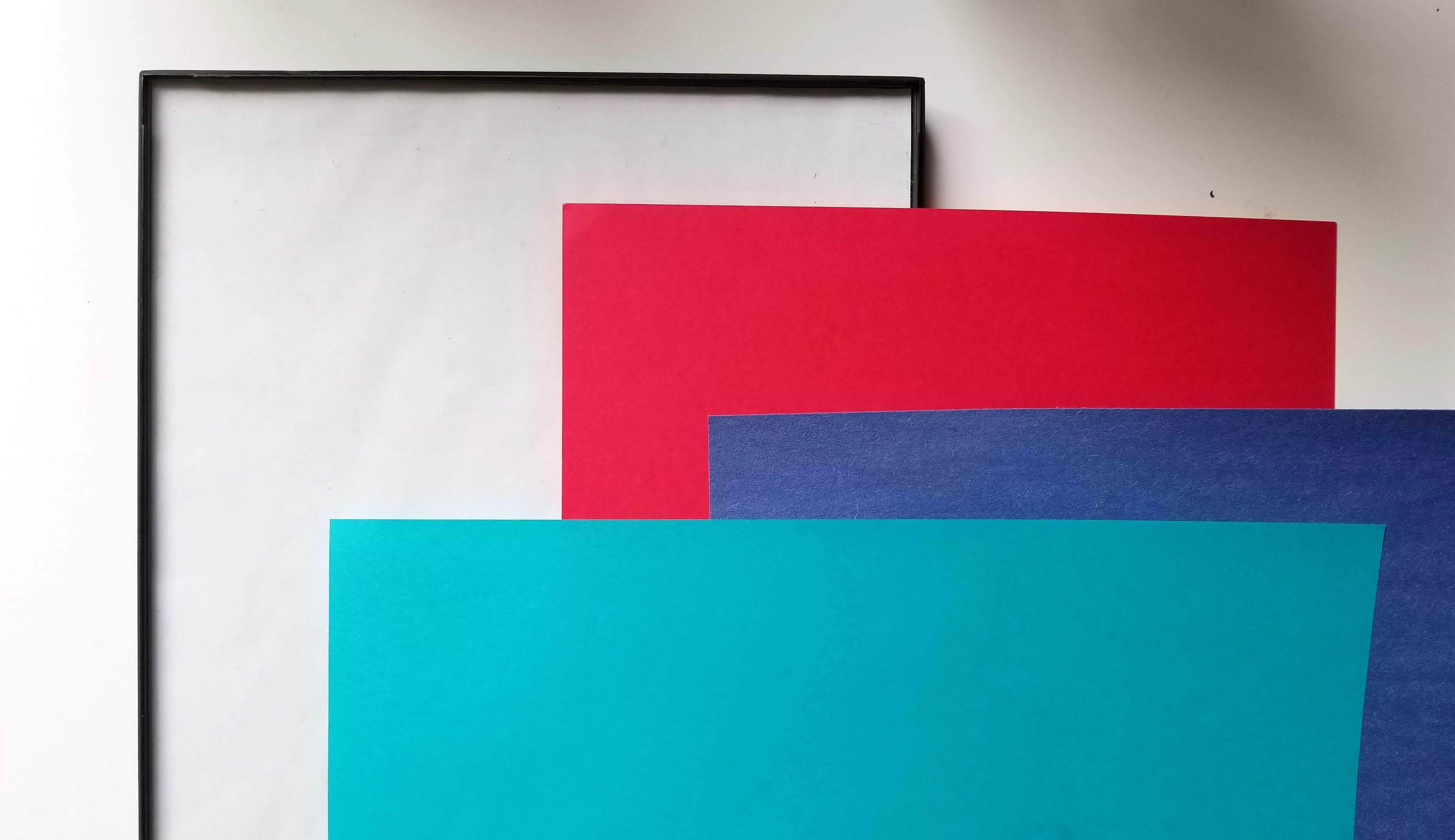
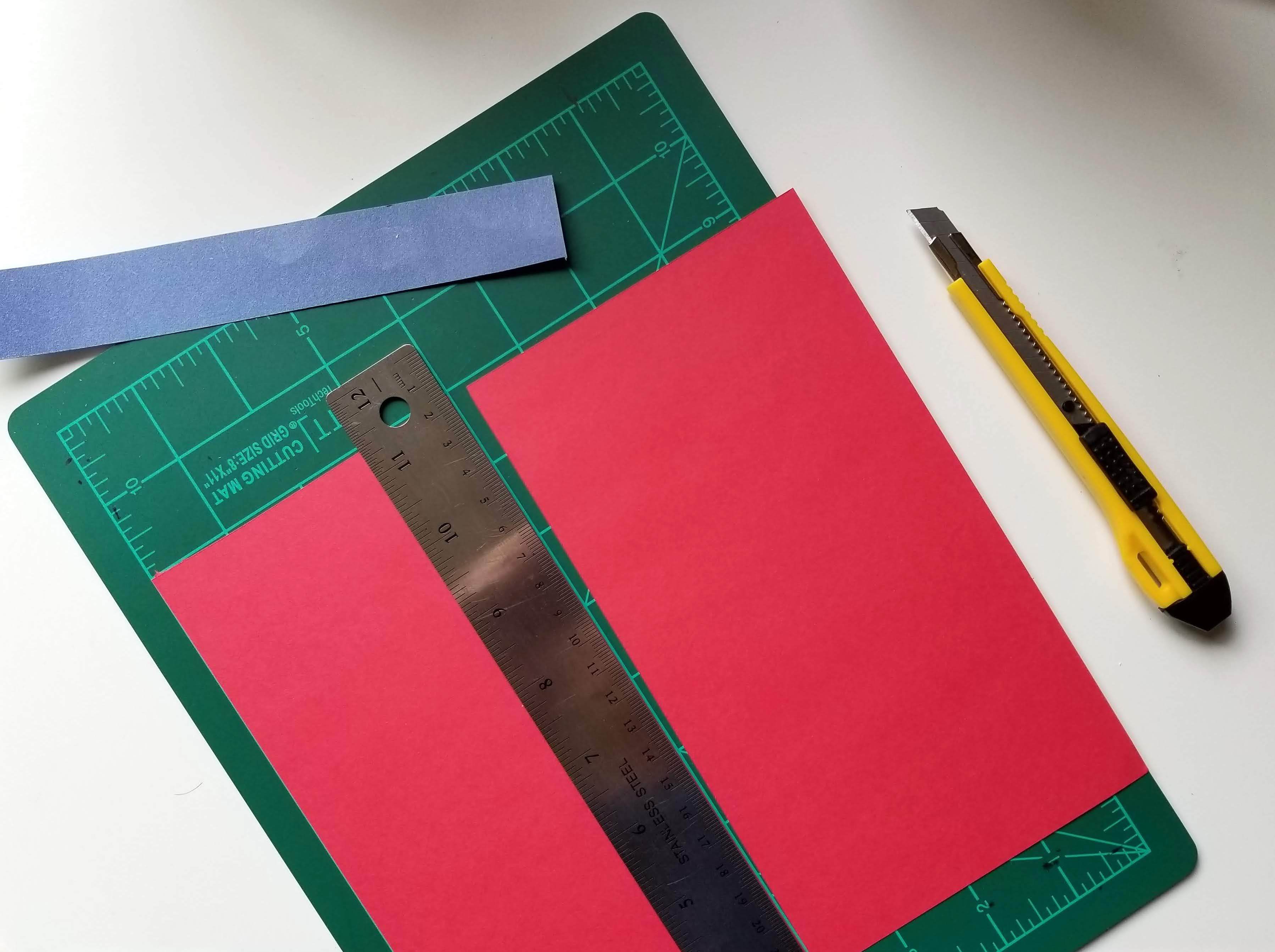
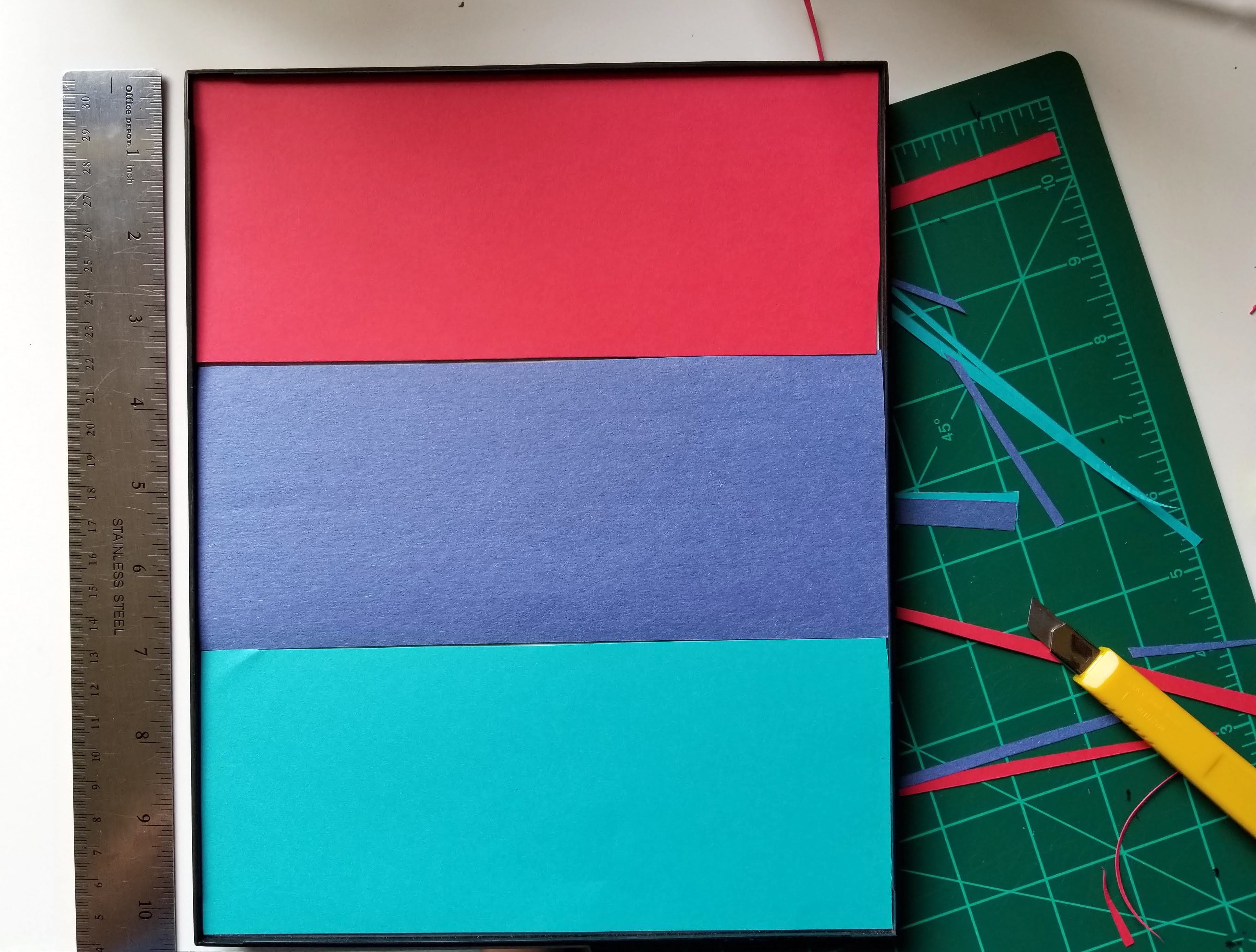
While you are waiting for your characters to appear through the cricut, start working on making sure the background colors you plan to use are cut into shape. I used an 8x10in frame, and had 3 identical rectangles as backgrounds for each of the colors. I chose red, indigo(ish), and blue for my backgrounds.
If you are using the same size frame, you'll want each rectangle strip to be about 3.3x8in (roughly). You can use the ruler and pencil to measure it out, or the cutting mat and an exacto knife. It's really up to you! When you're done, it should look something like the third picture above. I had to go back a few times and reduce the height because I made them a bit big (3.5 instead of 3.3in), but if you're precise the first time it shouldn't be a problem.
Hopefully, by the time you are done here your characters are done! When they are, you can move on to the next step.
Cut Out the Characters
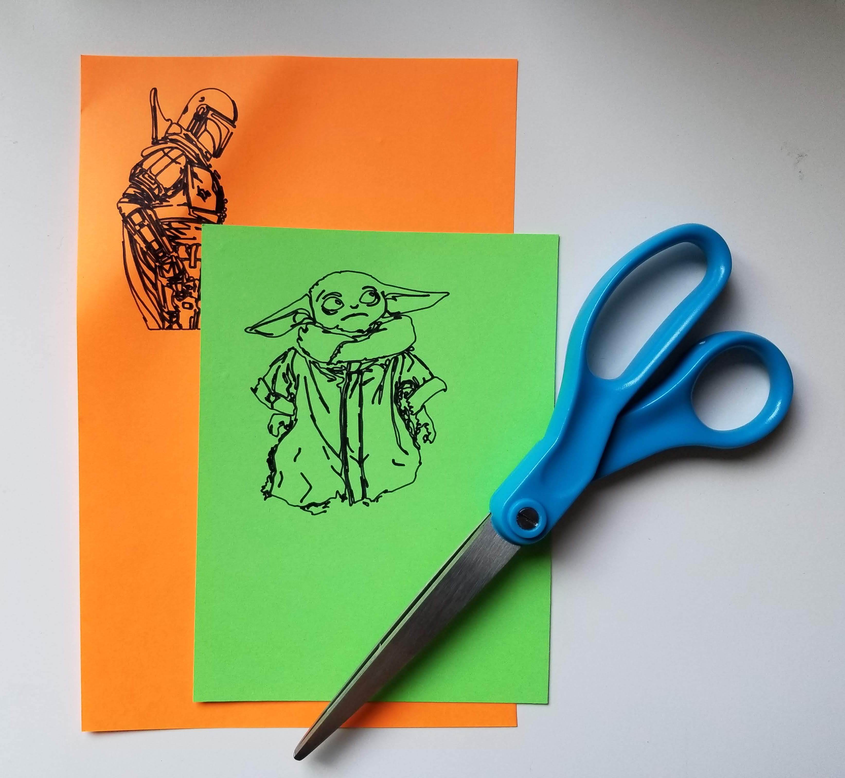
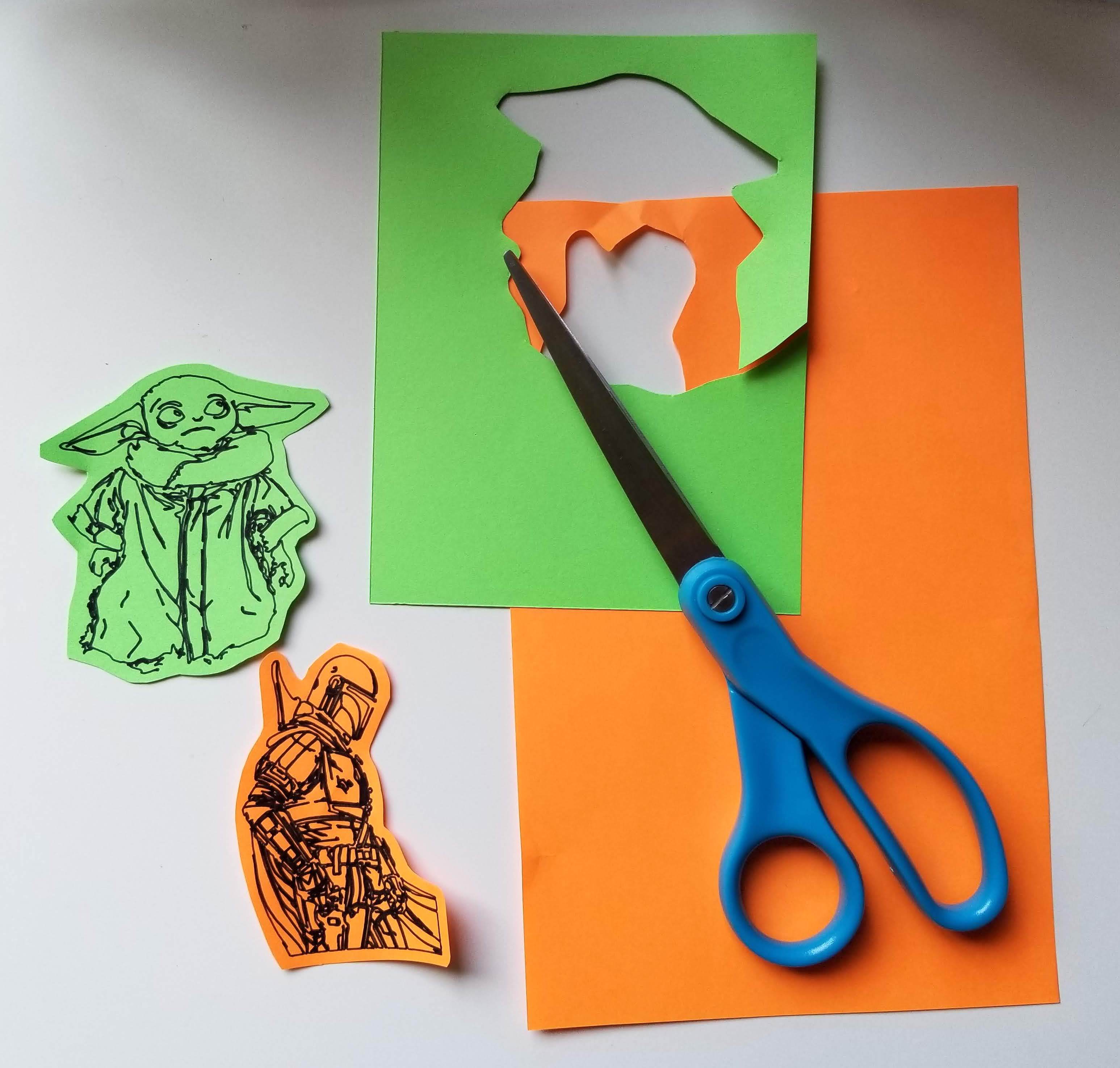
Now that your characters have appeared on the color paper you want them on, its time to cut them out. I wanted to leave a lot of the background color around the images, so I cut far away from the lines of the character. You can cut them however you want! Just make sure it will mostly stay on the background you chose for it.
Cut Out the Letters
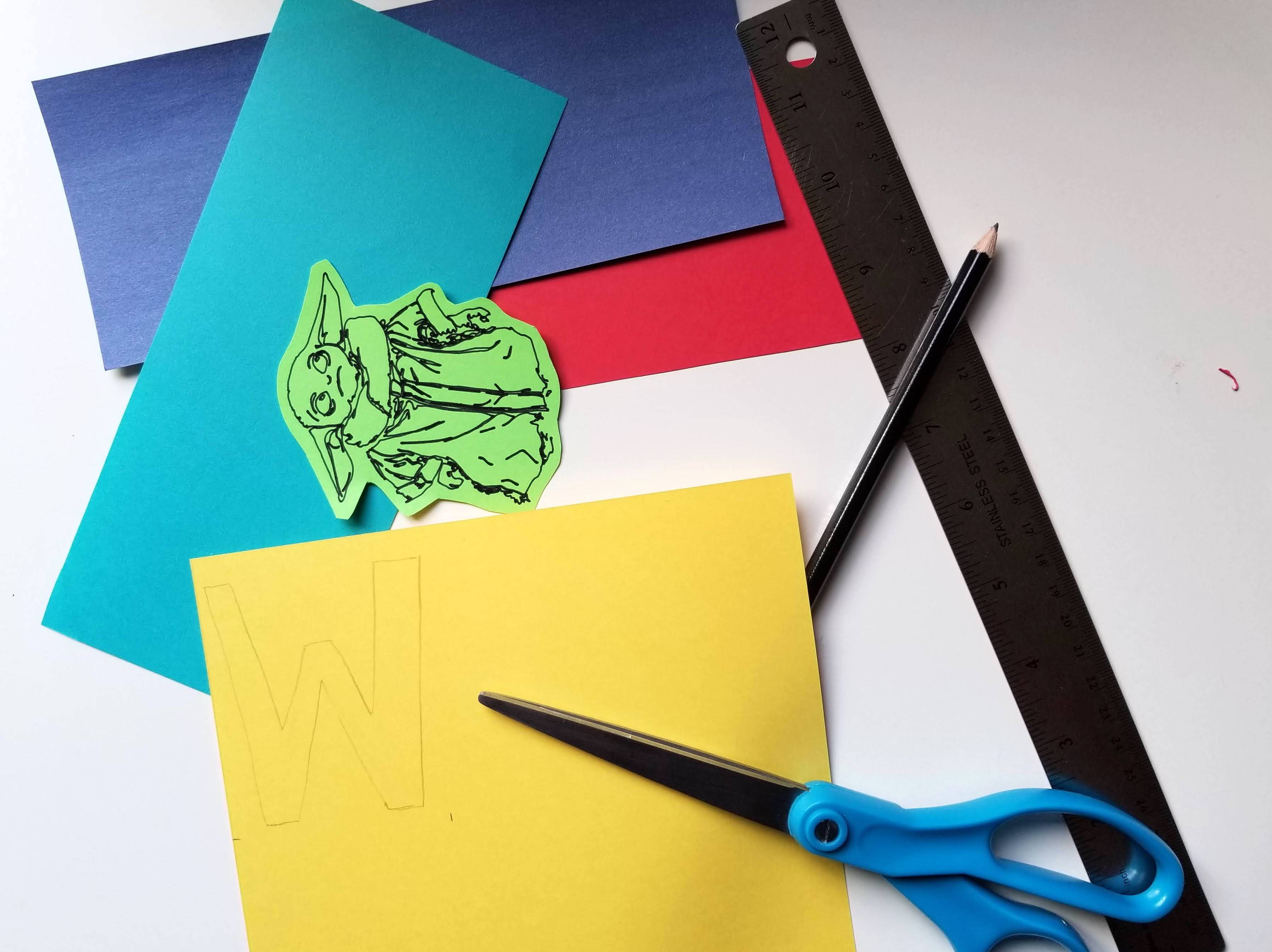
This part was a bit tricky. I wanted to cut the letters out by hand because it's easier to see how everything will fit together, but this method sacrifices a more uniform look. I went for it anyway, and to do so was less than scientific. Here is the gist of it, once for each background/character:
- With a pencil, trace the outline of the background on to the paper you are using for letters. This helps give you an idea of how much space you have to work with.
- In that space you marked on the letter paper, trace out the character where you would want it to be placed. This will also give you an idea of how much room you have for the letters.
- Draw the letters in the remaining room. I chose to do block letters, but you can make it as similar or different as you want. I drew them freehand, so I do not have a template to offer for the exact lettering.
- Once you have traced out the letters, cut them out (I used an exacto knife, but scissors will also work for this).
Repeat for each background and you should be done with this step!
If you have a cricut, you could always cut letters out there so everything will have a cleaner look. I wanted to see how it would look if not, and it's not too bad! I would try to cut it out of the cricut next time, which will require more measuring of the background space and characters ahead of time.
Glue the Characters and Letters on the Background Pieces
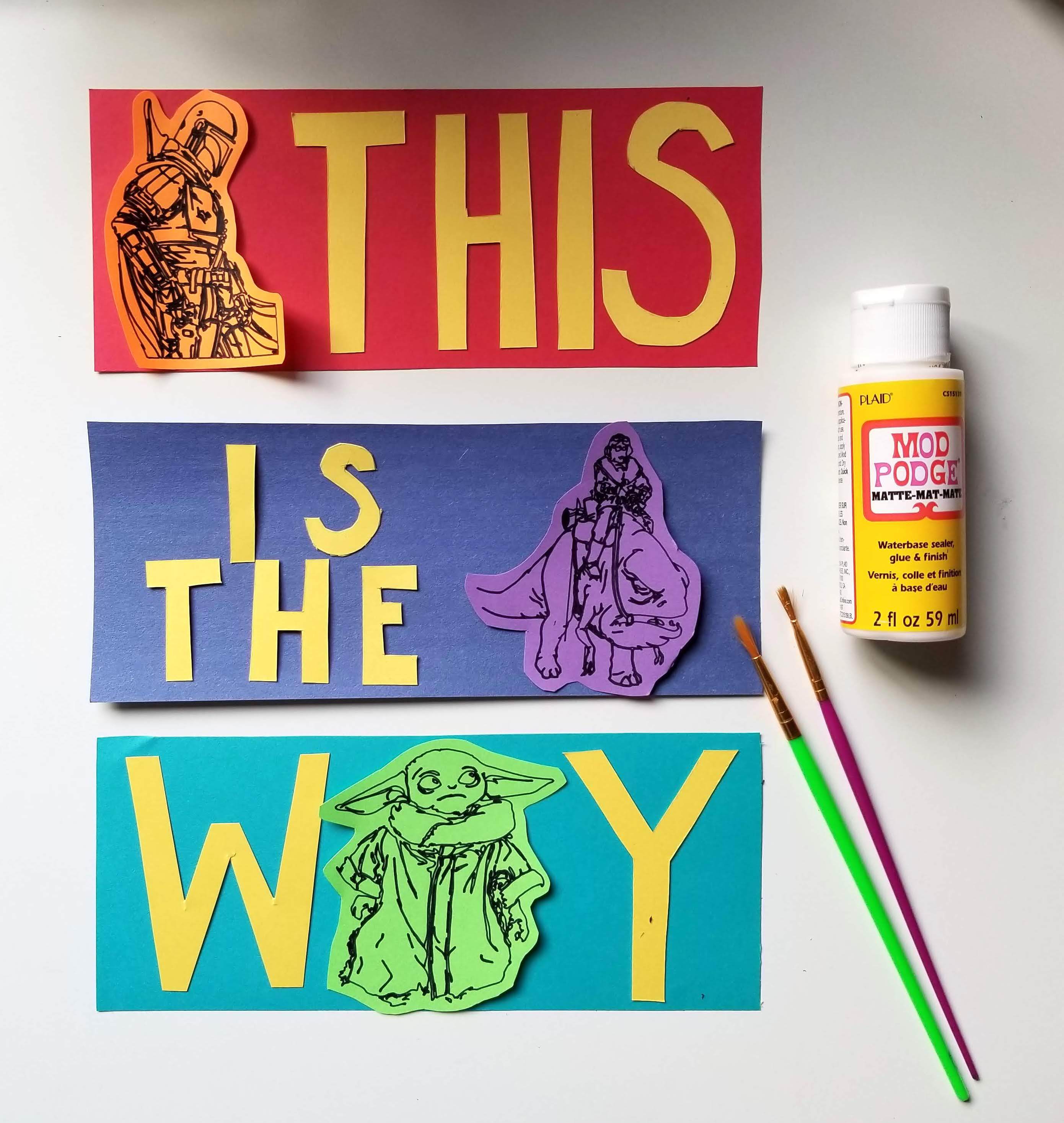
After this step, you will be done! For each background/character:
- Position the letters and character where you want them on the background.
- Starting with the character, glue down the image on the background (if you are using mod podge be careful, because if it touches the ink of the image it might smear).
- Glue down the letters.
Once you have done that for each panel, you can then glue them in the order that you want onto the white piece of paper, and you're done! Wait for it to dry before placing it in the frame that you are using.