Making a Web-Comic: Scanning, Cleaning, and Publishing Lineart
by technosapien in Design > Art
29668 Views, 36 Favorites, 0 Comments
Making a Web-Comic: Scanning, Cleaning, and Publishing Lineart
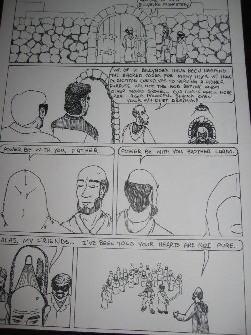
Good day, and welcome to the second of my "Making a Webcomic" series of tutorials.
This instructable deals with another of the useful mechanics of webcomics production: how to take a sketch on paper, and make it into a nice-looking image for web - and possibly print - presentation. The process I use cribs parts from a dozen other webcomic processes, and of course doesn't apply to work drawn entirely on the computer, say using a tablet. I do that also, and will create an instructable for my fully-digital production methods if you folks would like to see one.
So let's get started! I am going to scan, clean up, and color the artwork I drew for the first tutorial in this series. For other resources related to webcomic creation, I recommend checking out the links in the intro to that Instructable.
Onward!
UPDATE 12/29/2008: after reading this tutorial, do yourself a huge favor and check out the flatting photoshop plugins from BPelt. It is a tool that helps you do much of what this tutorial is about, and you will probably be VERY HAPPY to use it instead of having to tediously flatting your comic by hand (as this tutorial sort of shows you how to do).
If you don't use Photoshop, you can always try the PS plugin with The GIMP by using the PSPI Gimp Photoshop Plugin plugin, another one of my own tutorials. I will try it myself and report back.
Tony Piro taught me something today... I need to re-learn color flattingg and update this tutorial. Whee!
UPDATE 1/23/2009: I love the Open Source community.
I tried the PS plugins above in the PSPI plugin for GIMP, and they didn't work. And so I posted about my plight to a GIMP scripting wiki about needing help replicating these plugins in the scripting language that is native to GIMP.
and someone came through. Hopefully his script will be accepted into the official GIMP Plugin Registry as Flatting Tools, until then if you would like to try the script yourself, let me know and I'll see if I can redistribute it to you. Thank you, Rob!
UPDATE 2/12/2009: The GIMP plugin is now part of the official registry: http://registry.gimp.org/node/14051
This is the best GIMP plugin ever. Thank you Rob and Saul!
Sidebar: I Am a Linux Geek

Since I am a Linux user, I can really only demonstrate how to scan images in Linux using The GIMP and xscanimage/XSane. However, the same general principles apply anywhere, so Windows and MacOS users shouldn't have trouble translating this tutorial. If it means anything, I used to do the scanning under Windows, back when I had a scanner not supported under Linux, and there's really no much difference except in the way the software looks.
Where I can, I will address major differences in the process for Linux users and Windows users, as long as it's not too confusing. Sorry MacOS users, I have never done this with a MacOS-based computer. If and when I do, I'll update this tutorial.
Another caveat here is that under Windows, every scanner has its own software package and no two are alike. There's a standardized way to do this under linux OSes because scanning is always done with the same software package, SANE. I will try to address this complication for my Windows-using readers when I can.
Sidebar: Why All This Trouble for Lineart?
Before I move on, I want to give a little bit better explanation of why we are about to go to all this trouble creating crisp lineart -- if you're an experienced graphic artist feel free to skip ahead (but then, feel free to skip this instructable entirely, really ;-) ). The rest of you might benefit here... it's a pitfall I myself fell prey to when I was just starting out, and so many new webcomic artists do this that it's worth discussing.
Many new web'toonists start by scanning their artwork as color or grayscale, at low resolutions, and don't pay much attention to their lineart, wanting to jump ahead and get their images colored and on the web as soon as possible. Please don't do this! Take your time, you want this to look terrific. There's a good reason for it.
Black lineart is not REALLY black on white, even if that's what it looks like to your eye. No ink is going to scan perfectly black, and no paper will scan perfectly white. Grayscale and worse yet color scans will include all of the natural variations in ink and paper in the scanned image that exist in real life.
The work we're about to do involves cleaning up the image as much as possible to a pure digital binary color palette -- black and white. No grays, no colors, no variations.
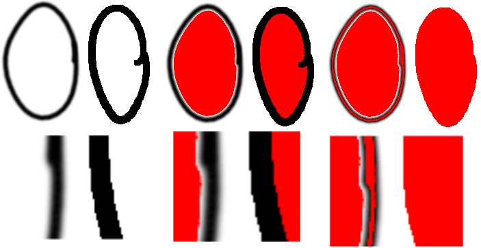
The reason why, is something called antialiasing. A black pen line on a piece of white paper, scanned at grayscale, will actually have a gray "halo" around it. Where the black flows into the white, antialiasing makes the edge softer on the screen. The problem is, your traditional area-function tools like the magic wand select or bucket fill tools don't see this antialiased area as contiguous with the black or the white. So if you try to bucket fill red up to the black line, you'll get this space of gray around the black line and it'll look terrible. However if you bucket-fill red into a clean, white area that is bounded by a black line with no anti-aliasing, it will look quite sharp.
See the screenshots below for a visual understanding of what I'm talking about. Bear with me, because instructables' image upload thing thrashed the quality of this image, but you should get the general idea.
Scanning Your Lineart
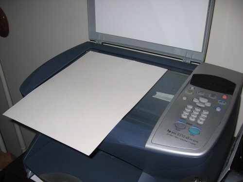
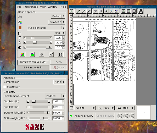
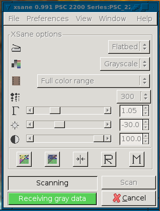
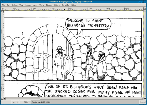
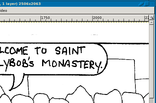
So you have your comic, you have a scanner, you have a computer with a scanning program and a graphics program.
Note, This particular instructable expects you to have produced line art. If your comic is pencil-shaded, colored, or anything more complicated than simple black ink on white paper, then this tutorial may not be for you. I will be publishing another tutorial in this series dealing with images where more work is done to the image prior to scanning, such as pencil/charcoal or coloring... stay tuned.
My scanner is an HP PSC2210 All-In-One device, a very nice printer/fax/copier/scanner that has the benefit of being made by HP, a company that is very linux-friendly. In the past I have used Pioneer Paperport scanners, but since they're unsupported by linux I've used them under windows, with terrific results. In such cases I scan the image under windows, and then copy the file to my linux computer to finish the work.
I would also recommend a computer with a decently modern processor and a good chunk of memory. I recommend working with your images at a very high resolution, from 300 to 600 DPI, and that can be very resource-intensive. It's especially important you have memory for this -- you want to be able to undo mistakes, and your memory size will set the limit for how many levels of "undo" your graphics program will remember. I have an Athlon 1600+ processor running at 1400MHz (wtf, that's not 1600+...) and 1 gig of memory. I've had the same processor for a while, but I do try to upgrade memory when I can afford it.
My scanning software, as I mentioned, is SANE: Scanner Access Now Easy. My graphics program is The GNU Image Manipulation Program, or The GIMP.
Note, GIMP is very much like Photoshop (which you could also use for this). These are raster or bitmap image editing programs, which are a class of image editors well-suited to graphic work with high-res images with lots of detail in them. Many of my comics meet these criteria. There is another type of image program - vector graphics editors, like Inkscape, XaraLX, or Illustrator. I need to learn more about these programs myself, but once I do, I will create another instructable that details how to get your scanned lineart into vectorized format.
Vector graphics have many benefits, such as being infinitely scalable, meaning once the image is vectorized, you can resize the vector images to any size without losing any of the image quality or increasing the filesize by much. Vector graphics formats are also lossless (meaning you don't lose image quality when you save them). By definition and nature, scaling bitmap images will usually cause a loss of detail, and once scaled down, you can't scale back up - so there's special attention to the order you do things that needs to be paid. Many webcomic artists use vector-based graphics at some intermediate step of the process to clean their lineart and perhaps to color their images before exporting to a raster/bitmap format for web publication. I'm not skilled at that yet, but once I feel I am, you'll all know about it.
Let's begin.
Place the image to be scanned on the glass of your scanner. Because my scanner's glass is just a quarter inch short of 9" wide (the width of my art paper), I need to scan my images in two pieces and assemble them later. This is not hard, as long as you line up the paper on the glass precisely then combining the images later will be a piece of cake. If your images fit entirely on the glass, it's WAY easier to scan them in all at once. However the resulting scan will be twice as large, meaning operations on the file will take that much more processor/memory resources. Working on half the image at a time may be more resource-friendly if you have a slower computer or less memory.
Start your graphics program. If you cannot access your scanner software from the graphics application (which would be HIGHLY unusual) start your scanning software as well.
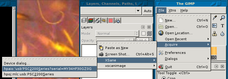
Linux users: From the GIMP main window, open the "File" menu and expand "Acquire...", then expand "XSane". In there you may have one or two listings for your scanner. If you have one, select it. If you have more than one, select the one that looks better. If it turns out not to work, use the other one.
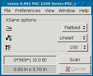
When you first start XSane, it usually assumes you want to scan a color image. Disabuse it of this notion right away, and select "Greyscale." The window will change to display only the options you need. At this point you don't really know what options you need yet, but here are some thoughts, based on experience. Yes, there is a "lineart" setting in XSane but it does not let you control the contrast of your scan. It assumes the item you are scanning is perfectly black and white. While your drawing may look that way to your eye, it is not. We will use GIMP to convert the image to pure black and white soon.
Windows users: From the main window, open the "File" menu and expand "Acquire...". The next option is usually Twain, and selecting that should launch your scanner's software (for instance, ScanSoft PaperPort if you have a Pioneer scanner). Otherwise, you should also be able to see your scanner in the Acquire menu.
When you first start your scanner software, it may assume you want to scan a color image. Disabuse it of this notion right away, and select either Grayscale, or Lineart or Black & White. NOTE: if selecting Lineart or Black & White as a scanning mode disables your ability to change the scan contrast, change to Grayscale.
All Users:
Next you will set the scan resolution. I scan my images at 300 DPI. Recommended for print is no fewer than 200 DPI, so that' usually a safe number. If you want really high-quality images you can go up to 600DPI, but keep in mind - the higher the DPI, the more memory you need in your computer to manipulate these images in your graphics program. I go a little higher because I can, and because it just means slightly better print quality. If you need to know what DPI stands for, check out this Wikipedia entry which explains what DPI really is, and how it is (mis-)applied to scanners and monitors.
When you select a DPI, your scanning software will (usually) tell you the dimensions of your final image, and what size the file will be.
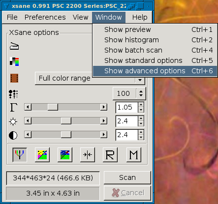
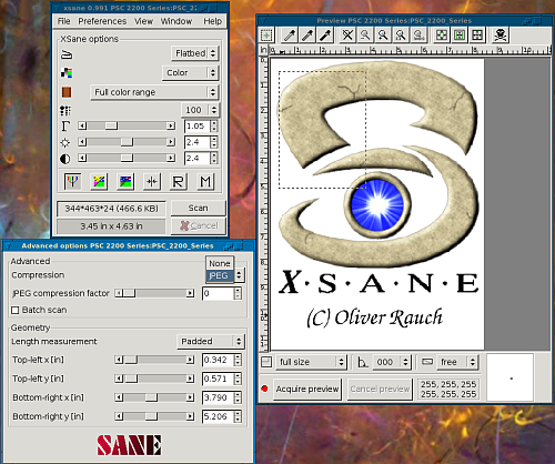
Linux Users: Turn on the advanced preferences and the preview window, under XSane's Window menu. In the advanced options, you may notice that compression is set to JPEG. Change that to "None". We want no compression for now, your graphics software will do that later. We want raw data.
All Other Users: Read the paragraph above and please interpret for your own software. That is, be certain you are using RAW image data, no compression. Compression could produce a loss in image quality which will defeat the purpose of a high-resolution scan.
All Users:
If you do not already have a preview window or preview view open, click the "Show Preview Window" button (or similar feature) until the Preview window opens. Then click "Acquire Preview" (or similar). In XSane, the "Acquire Preview" button has a red dot next to it indicating it has not been clicked yet. Once you have acquired a preview, it turns green. Always preview before you scan. Listen to your scanner purr, and when it's done you'll see your drawing in the preview window. Most scanner software allows the selection of an area of the preview. If yours doesn't then skip ahead a little. If it does, click-and-hold just outside one corner of the actual image itself, and drag the mouse to create a bounding box around the whole image, plus a little whitespace on all edges. If you are scanning your drawing in two parts, always select enough of each scan to use as alignment guides for rejoining the image.
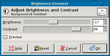
Once you have selected your scan area, go back to the scanner software's main window (if it has multiple windows -- do not close the preview window) and tweak the brightness and contrast settings to get good, sharp lines in your scans. I generally set my contrast to the maximum value, and drop the brightness a few dozen values. Once you're satisfied, click "Scan" or "Acquire Image". A progress bar pops up telling you how the scan is going, and when it's done the scanned image will open in your graphics editor.
Note, when jacking around the contrast and brightness with Grayscale scans, it's possible that you end up with a scan that doesn't have any white. Don't sweat it - we can tweak that later.
Fix and Finish the Lineart

Your next step has a small description, but will take the most amount of time. You need to clean up the lineart you just scanned, but first you need to ensure beyond the shadow of a doubt that you have only black and white pixels in your image.
Before changing the image mode, you can go into the Layer menu and open the Brightness and Contrast dialog to tweak the values here some more if you want. I did not have to, since the scan came through pretty well and there'd be no added benefit. Feel free to experiment with the tool, though, so you're familiar with what changes cause what reactions in the image. If you do this, though, always take one final step before proceeding, and be sure to use a function called Auto-Stretch Contrast in the Layer -> Colors -> Auto menu. This ensures that your image contains a white point and a black point, so that the next step will work correctly. Always auto-stretch in Grayscale mode only, at this point.
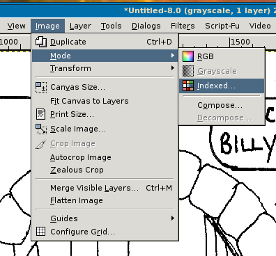
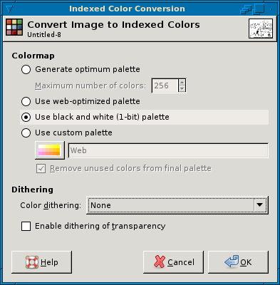
Change the image mode to "Indexed." In The GIMP, you do this by opening the Image menu and selecting Mode, then Indexed.... On the Indexing dialog, change the palette type to Black and White, and change the Dithering algorithm to None. You do not want any accidental gray areas to become dithered in a black-and-white palette, it will just cause more stray marks to clean up.
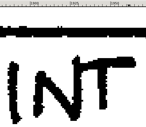
Change the image to indexed, and then zoom in on your lines to take a look. As you can see, the lines are crisp against white backgrounds, albeit a bit jaggedy. Don't worry too much about jagged edges, as to a large degree this will disappear once you reduce the image to web-presentation resolution.
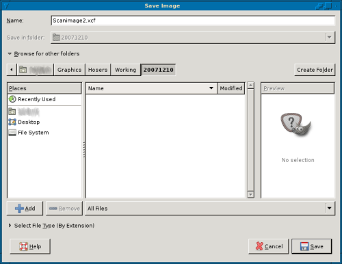
At this point if you have two halves of a scan, don't re-join them. Save one of your images in a lossless format, preferrably one that will save project information as well such as GIMP's XCF file format. This way the image quality won't be degraded through any kind of compression algorithm.
Next, select a hard-edged pencil tool from your toolbox, and select white as your foreground color, black as your background color. Go into your image and examine every line closely, cleaning up any stray marks as you find them, and cleaning up the black lines as you need to. You may want to - but do not have to - close any areas where the pen lines did not meet but should have. This may take a long time. You can also erase and re-draw any artwork with which you're unhappy. I always have something to change here. Ultimately, only you can decide when you're done with this step.
Some tips and tricks for GIMP:
Zoom in on your image by scrolling the wheel of your mouse while holding Shift.
Scroll left and right by holding Ctrl while scrolling the scroll wheel.
To free-hand move the image, middle-click (usually click the scrollwheel) and hold, and drag.
Alternatively, in the lower-right corner of the image window is a symbol like a + with arrows at all four points, click on this to bring up a preview of the whole image, and you can use this to move around to any location on the image itself.
While using any kind of painting or drawing tool, use X to swap the foreground and background colors. This is very useful if you're cleaning up lineart by drawing in white, and notice you need to draw in black... X to make black the foreground, then X back when you're done.
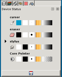
Also, if you have a tablet device configured properly, each device on the tablet can be configured differently, and GIMP will remember the configurations. For example, if the stylus device is set as a pencil, and the eraser device is set to the eraser tool, you can actually flip the stylus around to erase mistakes the same as you would a real pencil on paper. Try THAT with your ink pens! This is really useful when you're in advanced stages like coloring, highlighting and shadowing.
Once your lineart is fully cleaned up and ready to move on, the next step is to create separations. Working in layers is an invaluable tool to the webcomic or indeed any graphic artist. I'm not really the BEST flatter, but this is what I do, and hopefully it's enough to get you started. Note, if you do not intend to color your comics, then you can skip steps 5 and 6.
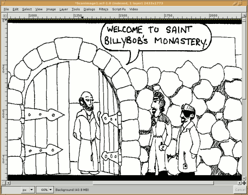
See the last two screencaps (one re-used from step 3) to see the difference after the lineart is cleaned up.
Create the Lineart Layer, Prep for Coloring
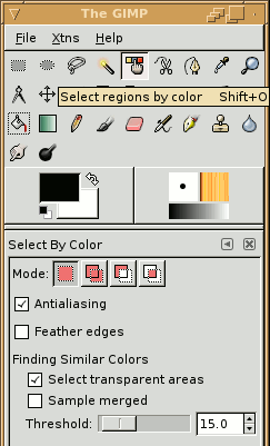
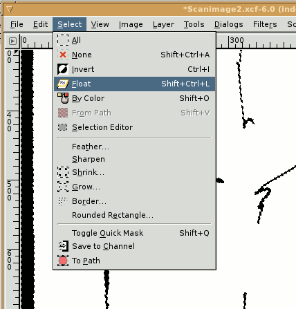
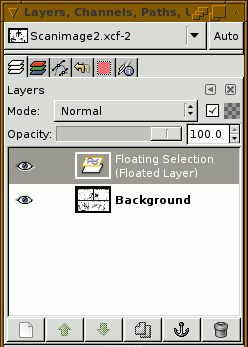
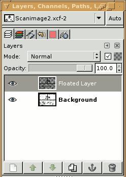
Typically, you'll be creating layers on-the-fly as you need them. The better webcomic artists (of which I'm probably not yet a member) will have dozens of layers in a single comic -- lineart, flats, shadows, highlights, word bubbles, text, and sound effects among them. I know of an artist that keeps a separate layer for every conceptually different item, like a skin layer, a clothing layer, a background layer, a "props" layer, etc.
Let's get started.
Step one is to ensure your lineart can't be destroyed. Before I do this I usually make sure all of my small black areas are filled in, like Agent FallenOne's sunglasses, or the agents' boots. I also bucket-fill the area around the frames (the "gutters") to black, since my website's background is black. This way the image will blend smoothly into the website.
Set the background color to BLACK.
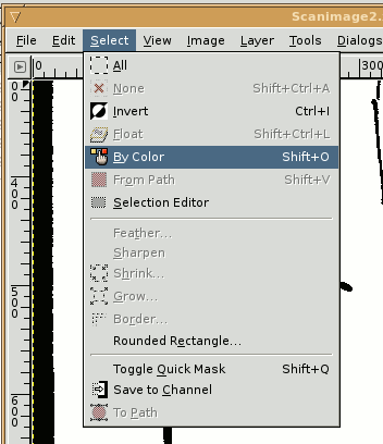
From the GIMP main window or from the "Select" menu pick "Select by Color". The dialog for color select appears in the toolbox in the main GIMP window. The default settings for this tool should be adequate. Click on a black space in your image, and the tool will select all of the lineart and black-filled areas.
Once the lineart is selected (you'll see what I call "marching ants" around the black areas, indicating they are selected), open the "Select" menu and select "Float".
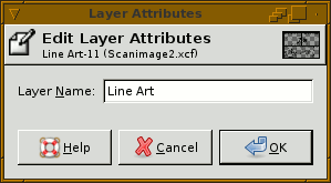
On the Layers dialog, select the floated layer, and then click the "New Layer" icon. The floated layer will become a new layer named "Floated Layer". Right-click on the layer and select "Edit Layer Attributes..." and change the layer's name to "Line Art" or something similar to help you keep track of it.
Always, always keep this layer on top, unless or until you no longer need it. NEVER make any edits to the background layer -- lock it if you have to. This preserves your original lineart in case you ever need to recall it. Save your work. Save frequently. I have spent hours on artwork in GIMP without saving only to lose it all at a critical moment. (And oddly, I never seem to learn from my mistakes, hopefully you will.)
Also, on the layers dialog near the top and to the right is a grey checkerboard with a checkbox next to it. Ensure this item is checked -- it preserves the transparency of the layer, which ensures you can't accidentally draw anywhere that is transparent.
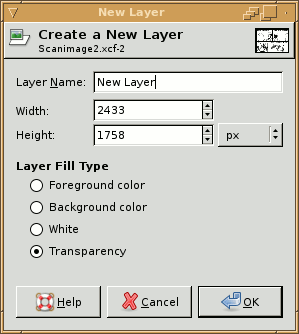
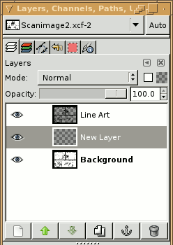
Once you've done all this, (save,) go back to your image window, select the "Image" menu, select "Mode" and then "RGB". You're now ready to begin coloring your comic. Start by selecting the background layer in the layers dialog, and click the "new layer" icon. In the "New Layer" dialog, give the layer a meaningful name, or just leave the default name and change it later. Set the background to transparency (which is the default setting). Accept the defaults for width and height. Click OK. In the layers dialog, you should see your new layer appear above the background, but below the Line Art layer. This is where all of your color layers should go. The only layers that will go on top of the lineart will be your word bubbles later on, if you choose to make new ones instead of using the ones you drew into the image.
Coloring the Comic
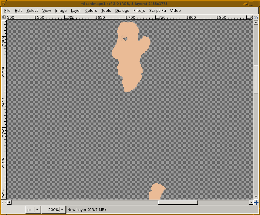
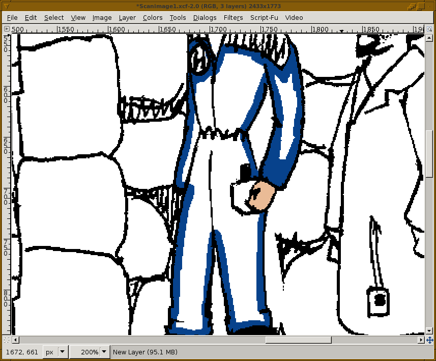
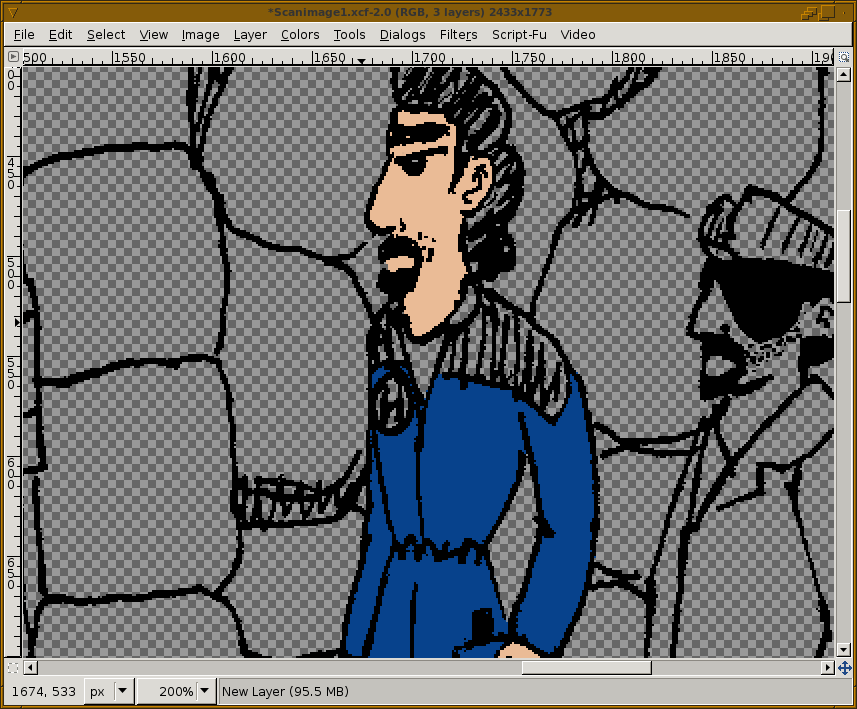
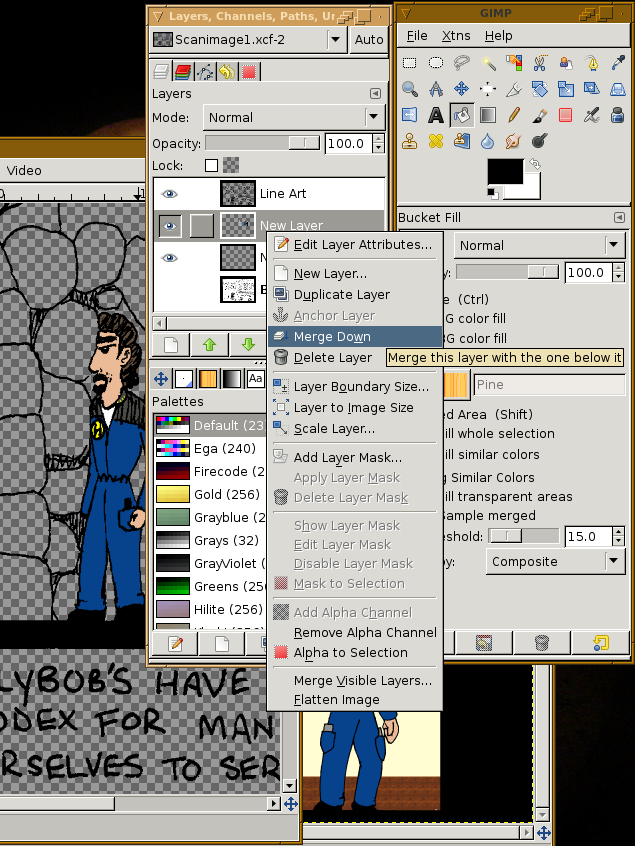
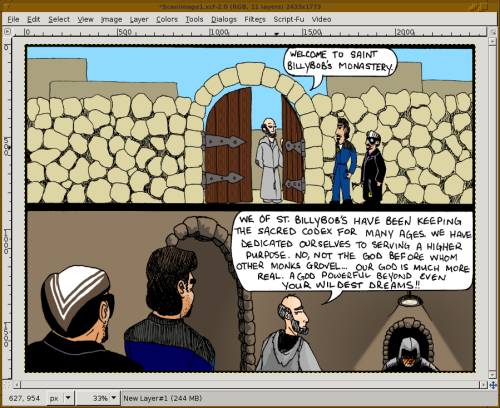
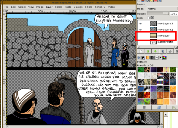
My comics are not that complicated, and I'm not skilled yet at highlights and shadows in digital art, so unfortunately I won't have those more advanced concepts in this instructable (a little bit, of what I know, but not much). When I figure them out, I'll add a new tutorial for them. But, you can find them yourself with google, probably. Plenty of other web'toonists have done tutorials.
Coloring the comic is a very detail-oriented and time-consuming process. In order to keep this instructable manageable, I have tried to simplify as much as I can where possible. If you have any questions, please leave comments and I'll try to reply with the best of my ability.
Despite that, I still go through a lot of explanation below for the coloring process - and I know the best instructables are short, simple, and concise. So to meet that goal, here's my "short, simple, concise" summary of the information below:
I always keep my lineart layer on top. Work in layers between the base layer (the original image) and the lineart. When I say layers, I mean to actually add layers to the image, and to place colors on layers ordered by where those items are in the comic's "space". Buildings in the background would be on a layer lower than (or behind) the layer containing your characters, which would be on a layer behind any foreground decorations. Working in layers is the single best advice I can offer you, something to keep in mind. Anything else is details. Not that details are unimportant... but this is a concept that has saved me lots of headache in the past.
Picking color schemes for characters, props, and environments can be fun. You never want to do it more than once, though. Use older comics as palettes for newer ones to keep colors consistent from comic to comic. Use the dropper tool to help you out here. Or, create a "pallette" file to hold the most commonly-used colors for your comics.
My only other bit of imperative advice is to SAVE OFTEN. If you have an auto-save feature, use it. If not, then every few minutes, click save. I have lost HOURS worth of work before by not following this simple bit of advice.
Here's a sample video:
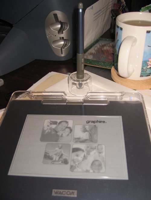
(Video notes: I use keyboard tricks along with a wacom graphire tablet to do this work. You may notice some stray lines at the beginning, which ctrl-Z undoes. Holding shift with the pencil tool creates straight lines. X switches the foreground and background colors. Wacom tablets are capable of transmitting pressure data to GIMP; it's hard to see, but while coloring in the monk's right ear (your left), I noticed the pencil tool was set to "opacity" for pressure sensitivity, leaving some areas that didn't fill properly... check your tools' options if things don't behave correctly. I used the dodge tool at the end to create some shadows on the monk's face. All of this is mentioned below.)
Onward with the details....
You want to create the flats for the image. These are going to be the basic areas of color that sit under the lineart layer and give your image overall visual appeal.
The process I use is somewhat difficult to describe, but here goes.
My first step is to select the background layer and create a few new transparent layers on top of it (for colors, word bubbles, etc.). In the lowest transparent layer, I'm going to select an entire comic frame and bucket fill the major background color, in this case a shade of brown for the walls. The second frame gets a darker shade of brown. Then I turn off that layer, and move up to the next layer to color my main characters in. I'll need to open an older comic to select the proper colors for the flats. Using older comics ensures the colors are consistent.
I select the dropper tool, aka "Color Picker Tool" and pick a foreground and background color from the old image (in this case, a blue for clothing and skin tone for the character in the jumpsuit, in the middle of the three). Using the pencil tool (with hard edges), I'll draw colors around the inside edges of the outlines. For smaller areas (such as the skin areas in the image) I'll just color them in. For larger areas, (like Agent Denim's jumpsuit) I'll just sketch the outlines, then use the bucket fill tool to fill in the empty areas. Remember to work on the new transparent layer - this will prevent you from drawing on your lines.
Also remember to use the pencil tool. You do not want soft, feathered edges to the coloring, as you may accidentally leave some half-transparent areas that will haunt you later. the pencil tool leaves hard edges, and is best suited at this time along with the bucket fill tool. If you need to erase any stray marks, use the eraser tool and turn on "hard edges". By default the tool has soft edges, which may interfere with bucket fills.
When coloring, remember to work from the background forward. On AgentDenim's uniform, there are yellow accents that I want to draw in, but his uniform is already all blue. In this case, I'll add a new transparent layer over the coloring layer, and use this layer to draw the yellow accents. Once I'm done, I'll merge the yellow layer down, so that the coloring is all on a single layer again. Only merge down when you are done with temporary layers. Don't merge your main coloring layers yet.
Another tip: if you're filling a large area black and doing so hides the lineart (such as with Agent Fallenone's trench coat) you can color the lineart. In this case I picked a shade of purple that complements the color of Agent Fallenone's shirt, and selected the lineart layer. I turned off the clothing color layer so I could see the lineart. By turn off, I mean I clicked the eye icon for the layer, making the layer not visible. I then selected the lineart layer, and made sure the "Preserve Transparency" option was ON. Then with a pencil tool and a large brush, I can color over the lines themselves right on the lineart layer, and since preserve transparency is on I won't damage the lines -- they'll just change colors. When I'm done, I turn the clothing color layer back on to be sure it looks good.
Other things you can do are use the burn and dodge tools to add shadows and highlights to the images with strong lighting scenes, as I did a bit of in panel 2. As I said, I'm not very good with shadows and highlights yet, so I don't use them much... but this particular comic calls for some dramatic lighting, and flat-filled blocks of color will look unnatural.
I do know that shadows and highlights should never be done using black and white - they will muddy your colors and look unnatural. In real life, shadows aren't black and light sources aren't white. I usually will use the burn tool with the skin color of the character, which darkens the skin color to a suitable shade. For highlights, you would use the color of the light source, such as pale yellow, with a dodge tool or with a normal tool using some transparency effects. Skin isn't very reflective (unless it's wet) so don't make highlights very bright or large. In my comic, I didn't use any highlights, as I felt the shadows were enough.
Using other tools to aid in the work (eraser tool when I accidentally went outside the lines, a gradient fill tool for shading in panel 2, and a pattern fill for the wood doors in panel 1) I completed working on this half of the comic image, as shown below. Next, I'll complete the coloring for the other half of the image (not shown as a process since it's not much different). You'll see finished products in next steps. And after that, I'll stitch together the two halves of the comic, and then resize the comic for web publishing.
Next step: stitching the image together.
Stitching the Image
If you were able to scan your entire comic in one pass and work with it in a single file, skip this step.
Once I have both parts of the comic colored, I save both files one last time. Save often!
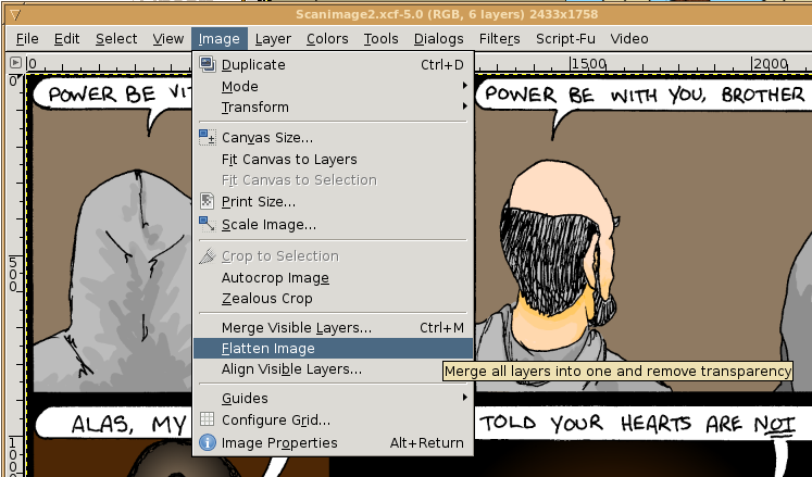
In the GIMP tools, I set the background color to black (you will set it to the appropriate background color for your website). Then in both images, I flatten each image by going to the image window, and selecting "Image -> Flatten Image" in the menus. DO NOT SAVE after flattening the images! You will lose your layer info, making it difficult to come back later to make corrections, if you need to.
Notice at the top of each window, the image dimensions are displayed in pixels. In the screenshot below, scanimage2.xcf (which is the bottom half of the comic) has a height of 1758. Keep this in mind.
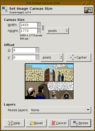
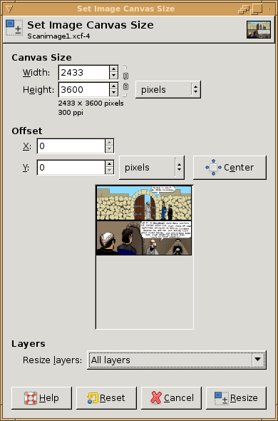
Switch to the first half of the comic. In the menus for the image window, go to "Image -> Canvas Size..." to open the "Set Image Canvas Size" dialog. The width and height at the top of the dialog are locked together by default, such that if you change one, the other will also change appropriate to scale. Note for the first half of the image, the image height is 1773. Click the chain button/icon next to the width/height text areas, and then enter an approximate, new height that is more than the sum of the heights for the two comic parts. I used 3600 in my example. Do not change the image offset. Note that you get a preview of your canvas when you change the number. At the bottom of the dialog is an option for "Resize Layers" -- you will set this to "All Layers". Click "Resize" to apply changes. When the image processing is complete, you'll have the first half of your comic, with a large background-colored area below.
Switch to the second half of the comic, and go into the Select menu and select all. Ctrl-C to copy, or do Edit -> Copy.
Switch to the first half of the comic, and Ctrl-V to paste, or Edit -> Paste. Switch to the Move tool by tapping the M key, or by selecting the four-directional arrow from the toolbar area of the main GIMP window. Click on the pasted layer in the first image, and use the arrow keys to bump the pasted layer to the proper location so it aligns properly with the first part of the comic. Alternately, click and drag the pasted layer into place. When you're done, right-click and select "Layer -> Anchor Layer."
I will usually do a tight crop using the crop tool to eliminate as much unused space on the left and right sides of the image as I need. You don't have to, but it helps improve visible resolution when you do your final publish, and/or it keeps filesize down.
Only a few steps left. Next I need to title and copyright the image, but before I do that, I save the image with a NEW NAME (I do not want to overwrite my older files). I will then close the second half of the comic, and I will discard changes. The last save I made of both halves of the comic contained layer information which I don't want to lose in case I need to make corrections for some reason later on. I lost that info when I flattened the images, so I don't want to over-write the old files.
Final Touches: Title, Copyright, Date

Using the Image - Canvas Size tool one more time, I add 200 rows of pixels to the image. This is done by clicking the chain icon to unlink height and width, and then adding 200 to the height.
In the Canvas Size dialog, there is a section for "Offset". Because I want text at the top and bottom of my image, I will click the "center" button after changing the Height value. Alternatively, you can change the Y offset to 100 - it's the same effect.
Again, set Resize Layers to All Layers. Click Resize. When the process is complete, you'll have space at both ends of the comic to add any text you like. Incidentally, this is how you'd do it to add text at the top and bottom; if you want to add text to the left or right sides, adjust accordingly.
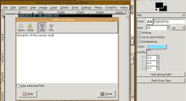
I then use the text tool to add the title of the comic to the top of the comic is a nice, easily-readable font that is a bit larger than the text size for the comic's dialog. I'll use a pale color for the text, since my background is black (in this case, pale blue). The font is Digital Strip, which is a freeware font from Blambot Fonts.
Please note, if you make money from your comic, or intend to, then you'll need to pay a fee to use the font. Since I don't make money from the comic (and therefore from the use of the font) I don't have to pay. I have, however bought a BlamBot font before, since I did use it for a commercial application in a business logo.
The text tool has a few options available to it, here are the ones I used:
In the text editor:
LTR (left-to-right, standard for English; if your comic is in a font that reads right-to-left, pick RTL)
Then the content of the text.
In the tool options (usually attached to the main window once you select the tool):
Font: DigitalStrip
Size 60 px for the image title. Can't recall what I used for the copyright and datestamp info, I just bumped down the size one px at a time until all of the text fit on the image. I'm guessing around 40.
Hinting ON -- you want this, don't argue.
Force Auto-Hinter ON -- try this on or off, it's up to you. Whatever looks better to you.
Antialiasing ON -- you definitely want this on.
Color: for the title, pale blue. For the copyright and date info at the bottom of the comic, light orange.
The rest of the options I didn't use, but can be useful - I left them at default.
One neat feature in Text along Path, which allows you to draw a curved path in the window and then have the text follow the line of that curve. It can be useful for sound effects or other, similar text effects. I don't demonstrate it here, but if there's interest I'll do a mini-instructable or a slideshow on it.
Once I'm done with the text and all looks good, I will go back to the space I left after the word "Copyright" and place a small letter C, then place a large letter O (both in the DigitalStrip font) to create the copyright symbol. With the text work done, I flatten the image, and save it.
The last steps are scaling the image and selecting a filetype.
Last Steps: Scaling and Selecting a File Type
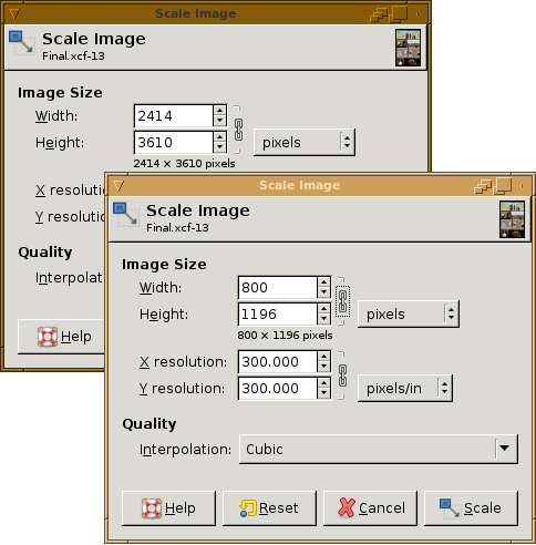
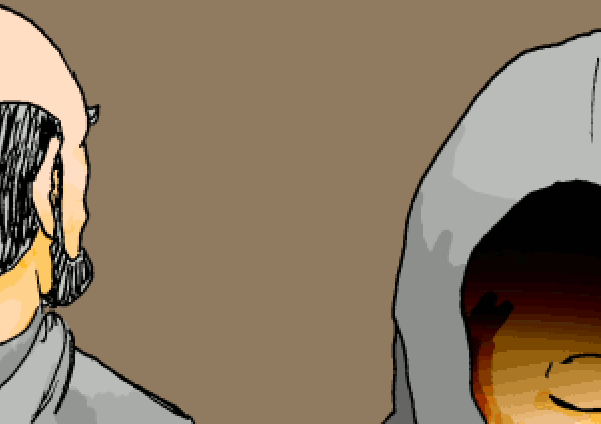
To scale the image, simple go to "Image - Scale Image...".
Again, the width and height by default are linked, and for this task you will leave them linked.
Likely you designed your comic's website to hold an image of a certain width, height, or size. Mine is designed to hold comics up to 800 pixels wide of any height. I will therefore scale my image by typing "800" into the image width field, clicking into the image height field so the value will calculate automatically, and then clicking "Scale".
I have never used or changed the "Interpolation" setting, but feel free to experiment.
Once the image is scaled, you have basically three image formats to choose from. GIF, JPG, and PNG. There are benefits and drawbacks to each.
GIF: excellent image compression for comics with large areas of the same color, for perfectly horizontal gradients, with very little or no "dithering" but requires images to be "indexed" color which can lead to loss of image/color quality. GIFs do support transparency but at last check did not support partial or dithered transparency and support animation (which should be used never or sparingly in comics).
PNG: decent compression depending on settings used, experiment. Supports "alpha" or partial transparency meaning smoother edges between images and website backgrounds (however, older versions of Internet Explorer do not properly interpret alpha-channel transparency in PNG images without help). There is an animation-supporting analogue called MNG but is not widely accepted, GIF is preferred for animation.
JPG: excellent compression of images with a lot of color variation and detail, such as comics with photorealistinc quality (or comics made of photos). Very poor choice for undithered gradients and large areas of flat color fills, as the colors will become distorted at the edges, especially at lower compression quality (which is generally required for manageable filesizes).
For a while, GIF was a bad choice because Compuserve held patents on the compression used in GIF images, and was trying to enforce it by getting money from websites using GIF images. However all relevant patents have expired as of 2004, meaning GIF is now free and safe to use.
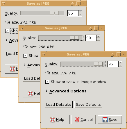
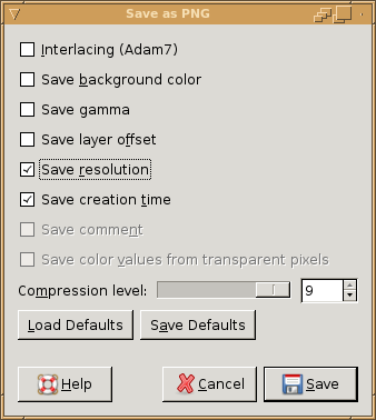
for PNG and JPG images, you can leave the image in RGB mode, and simply Save As... with the appropriate extension. I'm not 100% sure of all of the options with PNG files or what works best to make the smallest, best-looking file, since I don't use PNG much. I also don't use JPG images since they're never smaller than GIF images considering the tradeoff in image quality; see the screenshots to see what I mean. Remember for JPG images, if you don't want distorted flat-fill colors, you needs high-quality compression.
My file format of choice is GIF, generally because it makes the smallest filesizes with the best tradeoff in image/color quality. Before I save as GIF though, I I need to change the image to indexed.
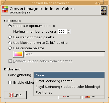
I go to Image - Mode - Indexed... to open the "Index Color Conversion" dialog. I do this manually, because I don't trust GIMP to do it properly using the default settings.
In the tool, I select to generate an optimized palette with 256 colors (if you have transparency, you can only have 255 colors as the transparency is a color itself). If I am making a black and white comic, I will index to a one-bit palette - which may be familiar, I used the feature when I digitized the lineart to clear out the image irregularities. In general, you want to index to the smallest palette possible, as this will decrease image size. If you know your image is a grayscale image with only eight shades of gray counting black and white, then just index to an 8-color palette.
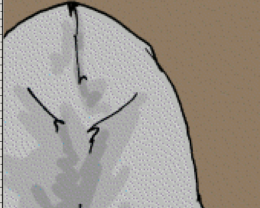
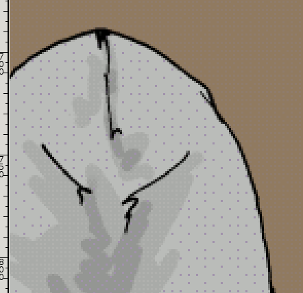
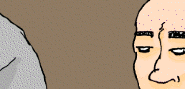
For dithering, you have several options, and what you use will depend largely on how they look when they're done. I always run them all, then use Ctrl-Z to undo the indexing and re-do it with a different dithering algorithm until I find one that looks good. Sometimes, the best one is No Dithering - which was the case for this comic. I very often use Positioned Color Dithering as well, as it tends not to speckle large, flat-filled areas. Other dithering methods tens to cause some flat-filled areas to "speckle" -- that is, a large area of a skin-tone may also have scattered, darker pixels added in while converting to indexed. This is because the conversion ran out of colors in the palette and is trying its best to approximate the color in the area using colors it already has in the palette, by mathematically averaging the color values out over the area. Well, that's a gross oversimplification but suffice it to say, it usually looks horrendous.
I used "None for color dithering in my comic, and simply accepted the banding of the gradients (Which isn't too bad, I don't think, at the image's normal viewing size).
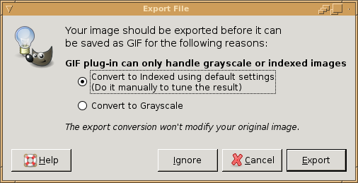
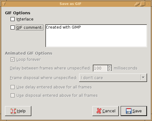
I then saved the image as a GIF. If you forgot to convert the image to indexed beforehand, you will be warned to do so now. Otherwise you'll go to the "Save as GIF" dialog. Not many options. I don't interlace, I remove the comment, and I Save. If you have animation, you'll set additional options here.
How do the filesizes compare?
Using the GIF options I set, JPG quality of 85% with no advanced settings changed, and the PNG settings I mentioned above:
357K 20081213.gif
242K 20081213.jpg
596K 20081213.png
Note, the JPG got the best compression, but it looks the worst of the three when I posted it to the web, so I won't use it. The PNG image has the best image quality, but it's a bit large and I have bandwidth limits and disk quota on my webserver, so I won't use it (as it will use more of both). The GIF image, as I predicted, is the best compromise in this instance, and is what I will use.
Click Here to see the final version of the comic.
That's it! Feel free to ask questions and provide constructive comments. I'm still learning too, and you may know something I would find useful.