Make Your Own Zoolander Calendar
by msraynsford in Living > Organizing
5814 Views, 3 Favorites, 0 Comments
Make Your Own Zoolander Calendar

Zoolander is an awesome film, if you haven't seen it I thoroughly recommend you watch it until you can quote 90% of the lines from it.
We were chatting about Christmas presents and a friend stated how he didn't care to see calendars of other peoples children and another friend loves Zoolander as much as we do etc so we combined all these things together to make these awesome gifts.
This is a guide to making the images required for such a calendar, starting from with the initial image and modifying it for the full calendar.
The Base Image
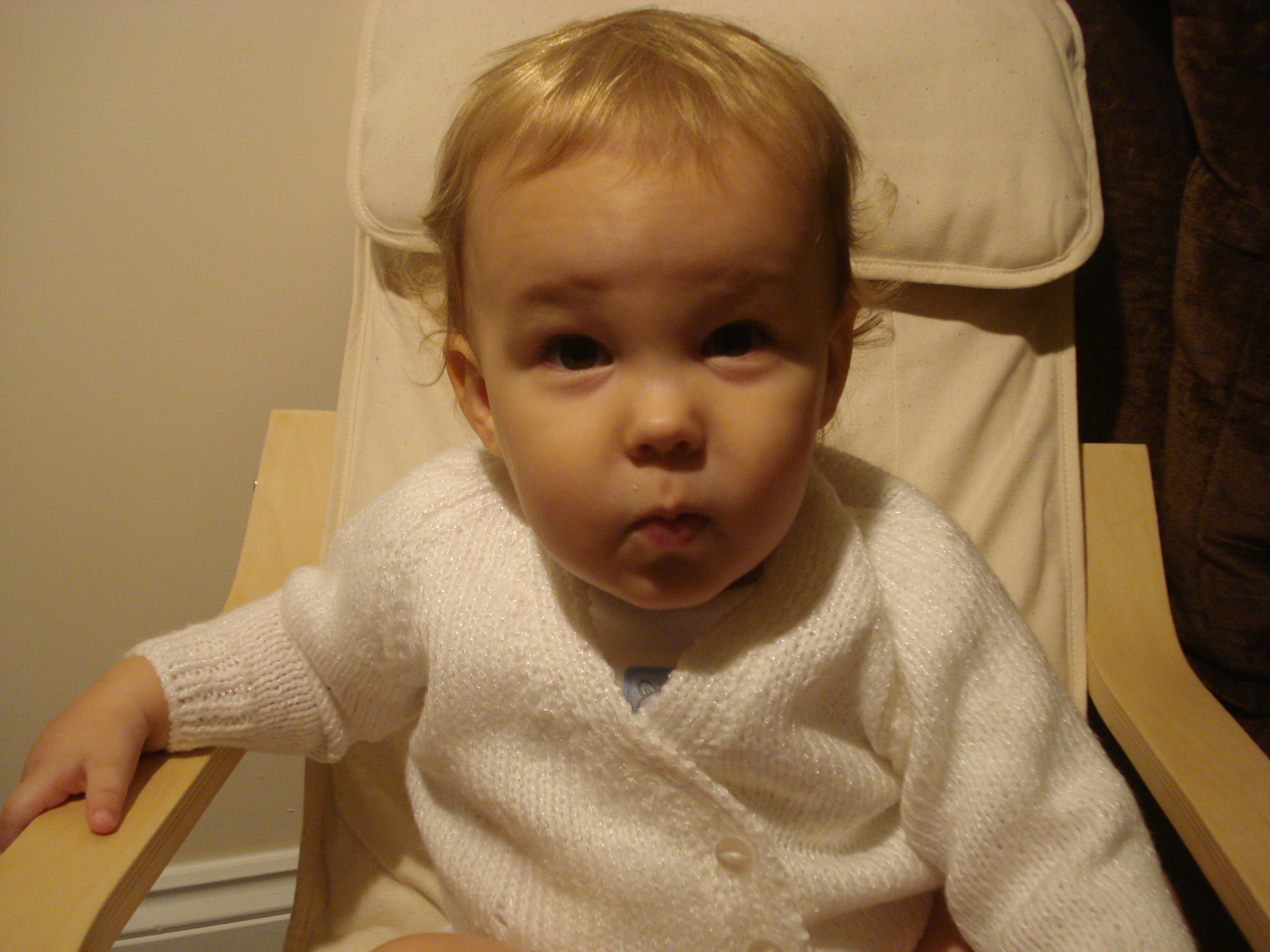

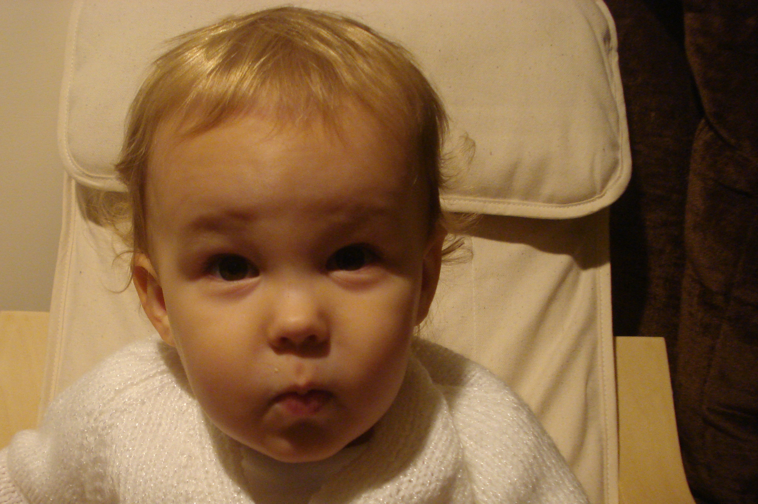
The base image can be taken in such a way that makes it easy to create the other parts from.
The 'Blue steel' pose is all important, thankfully for me Eli pretends to blow out candles so a dozen shots later and I managed to catch one of him just before he puffed his cheeks out.
The background is a very plain colour, I thought about using blue screen but it gets complicated around the hair. A plain background can be easily cut away and any bits that you miss don't show up too badly in the final image. Having a little blondy baby too means that the white merges with the hair.
The shirt should also be a plain white colour, again it will make it easier to separate from the background and a white jumper can easily be colourised for all the different shots.
Take the image as big as you can possibly take it, then crop the file down, leaving your subject slightly to the left of the image.
Separate the Image Into Parts
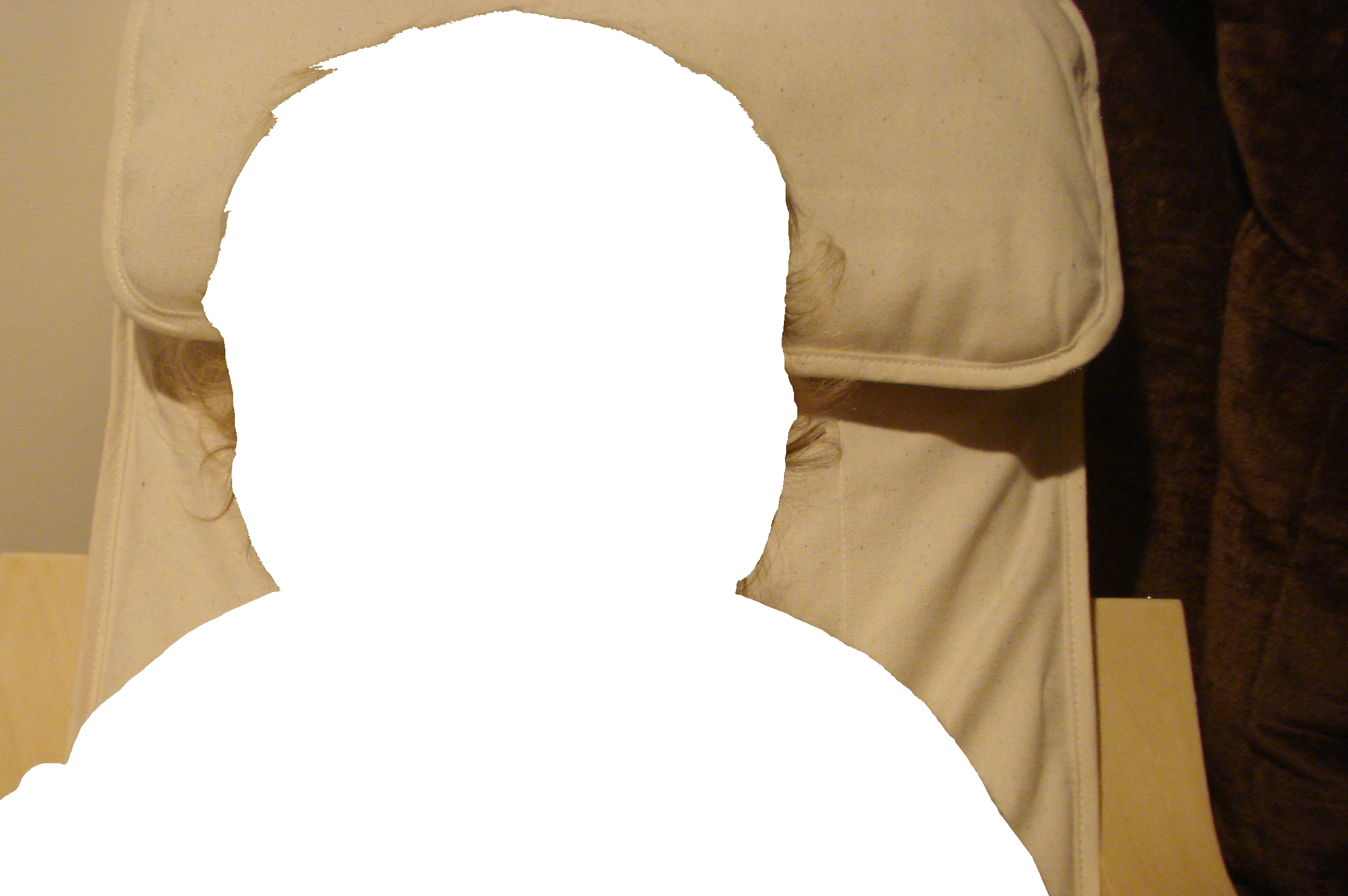
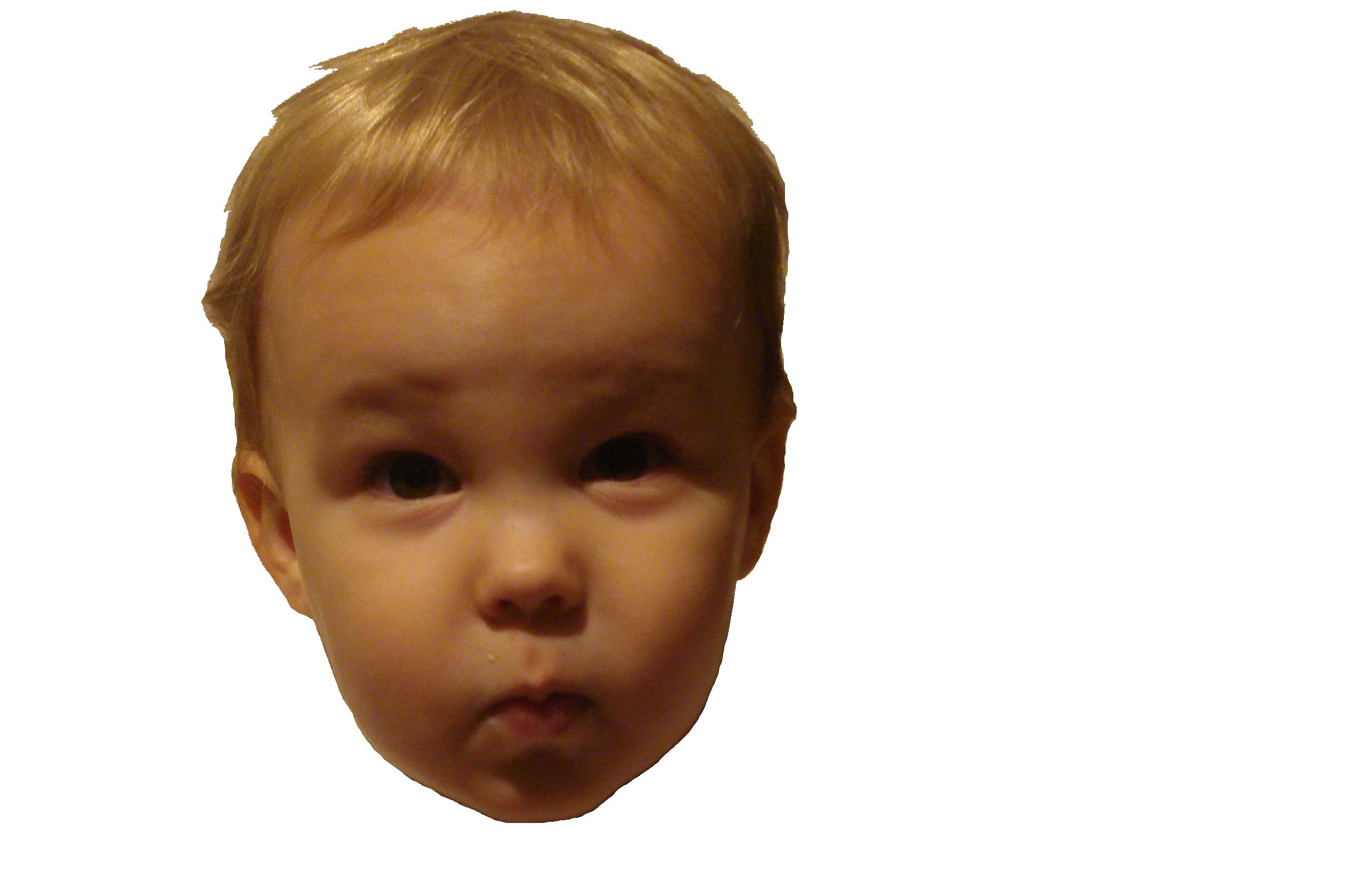
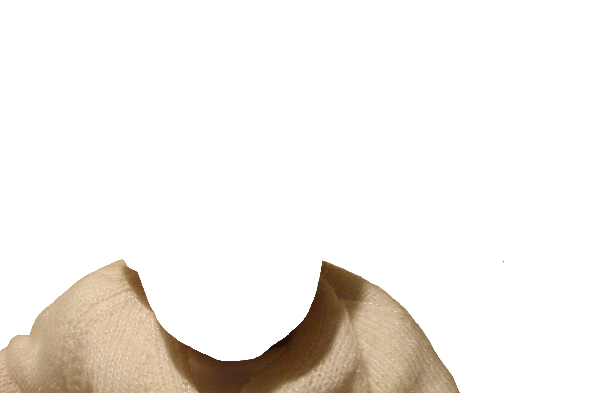
All my image manipulation was done in Paint.net, it's very functional and it's free which makes it pretty cool.
Once you have your basic image you need to separate it up into 3 parts (although I guess only 2 of these get used). This isn't a professional job of splitting the image, I was looking for something functional so I'm sure more could be done with alpha blending and other fancy settings.
I tried all sorts of magic lasso and other options but ultimately I settled for erasing a line around the head, which leaves a gap between the head and the image and then selecting the background and deleting it all. Make sure you copy the image first and keep one unmodified in a separate layer, this way if something goes seriously wrong you can start again.
Repeat the process to separate the jumper from the image and you will end up with 3 layers in your image. One for the head, one for the jumper and one for the background. It is important that you do not move these layers in relation to each other so when you combine them all back into one image the parts still line up.
As you can see from the background image I cut out the larger curls and wispy bits, they are very hard to separate from the background and the final image doesn't really lose anything by not having them there.
Composing Final Images
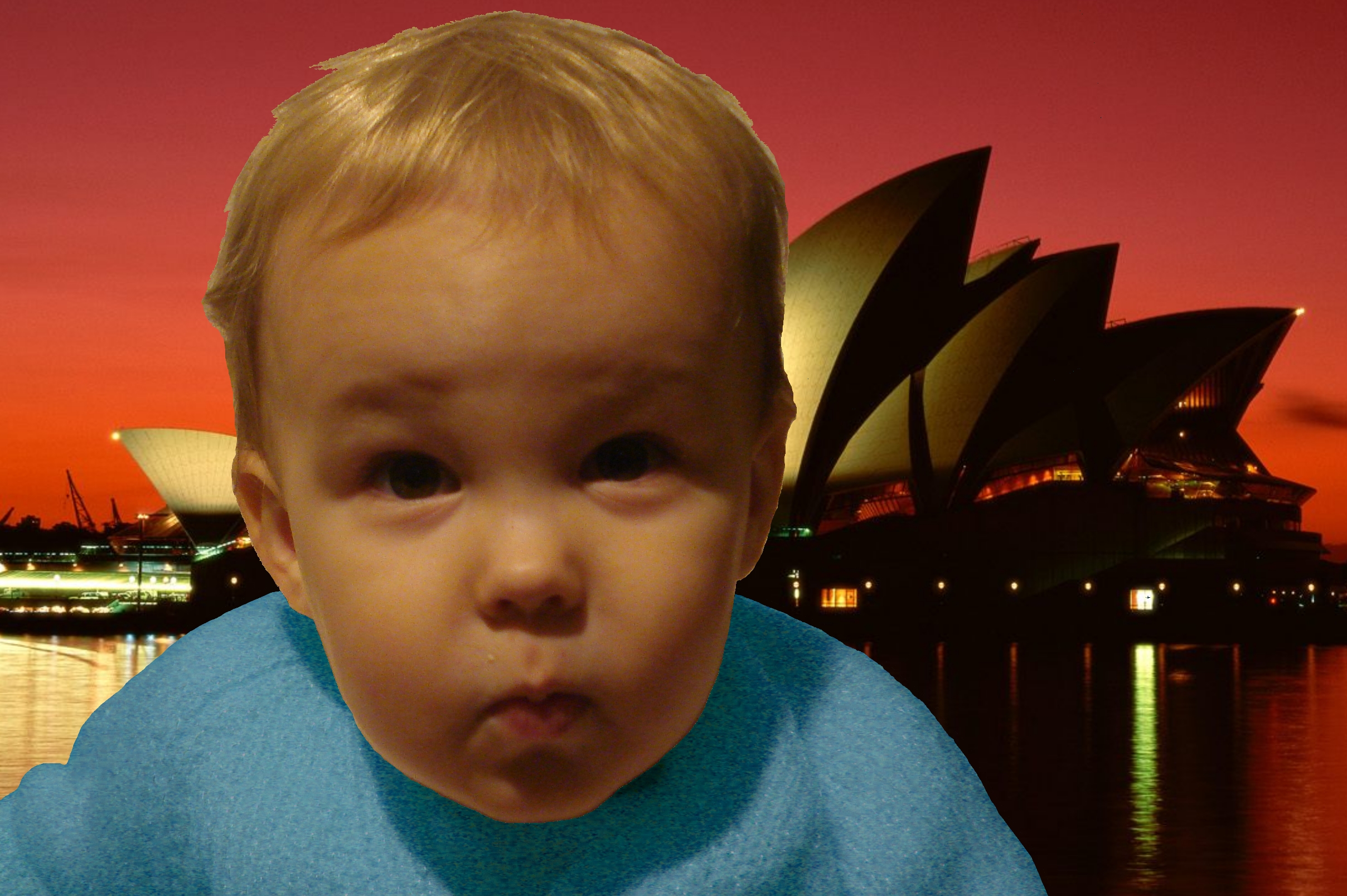
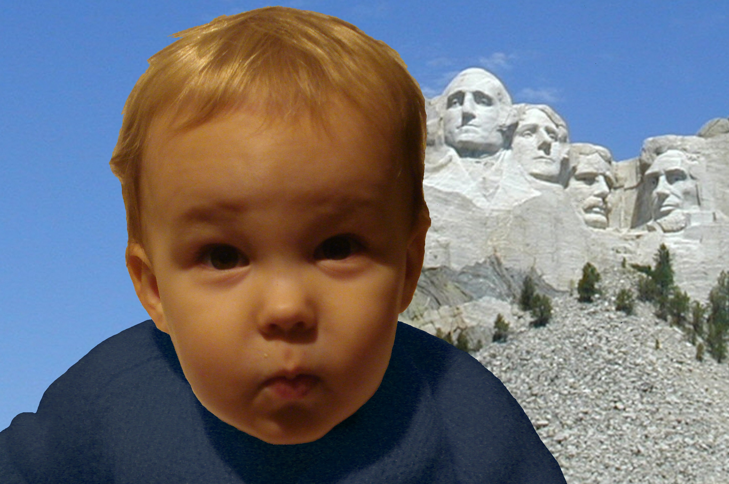
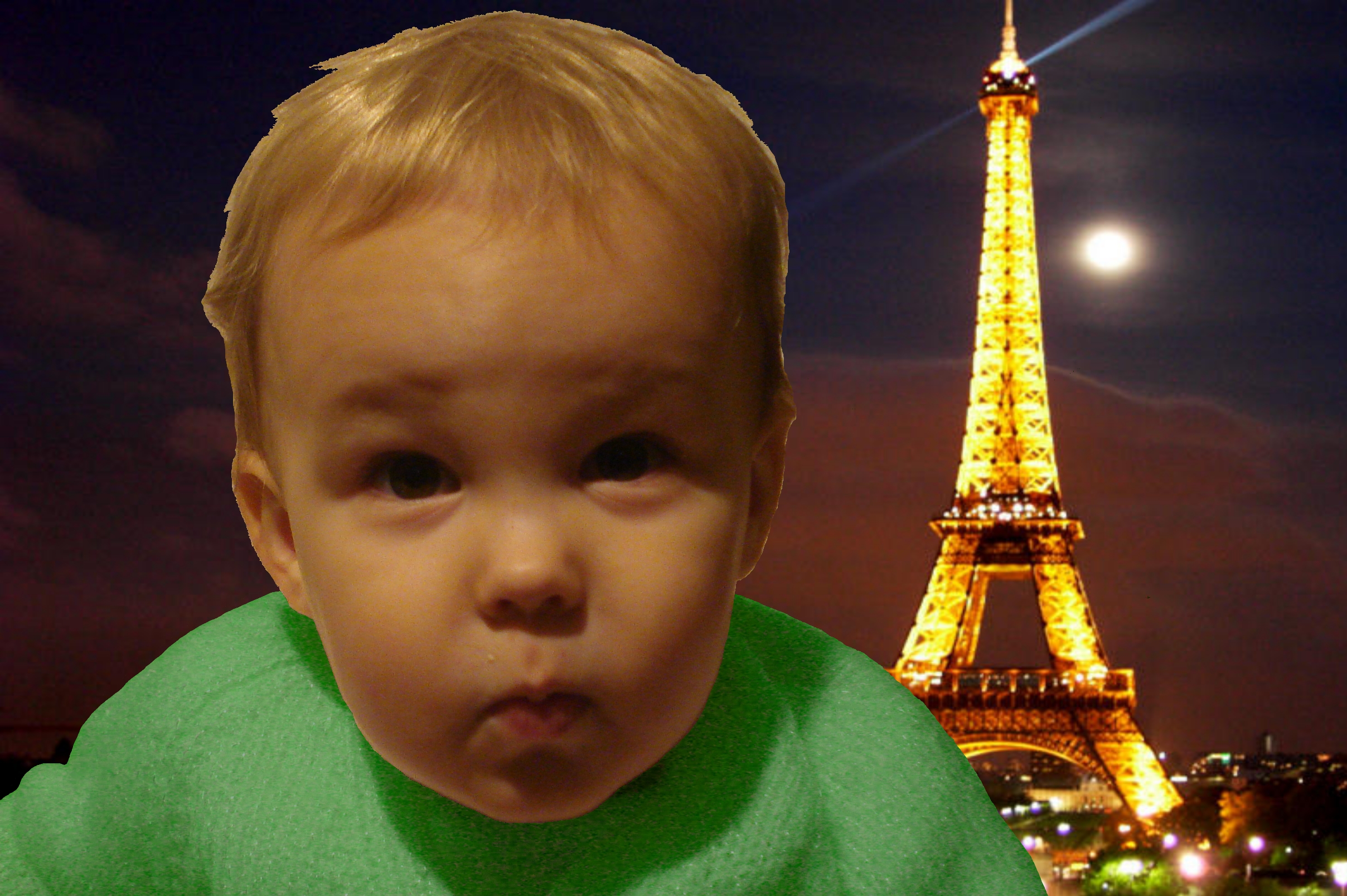
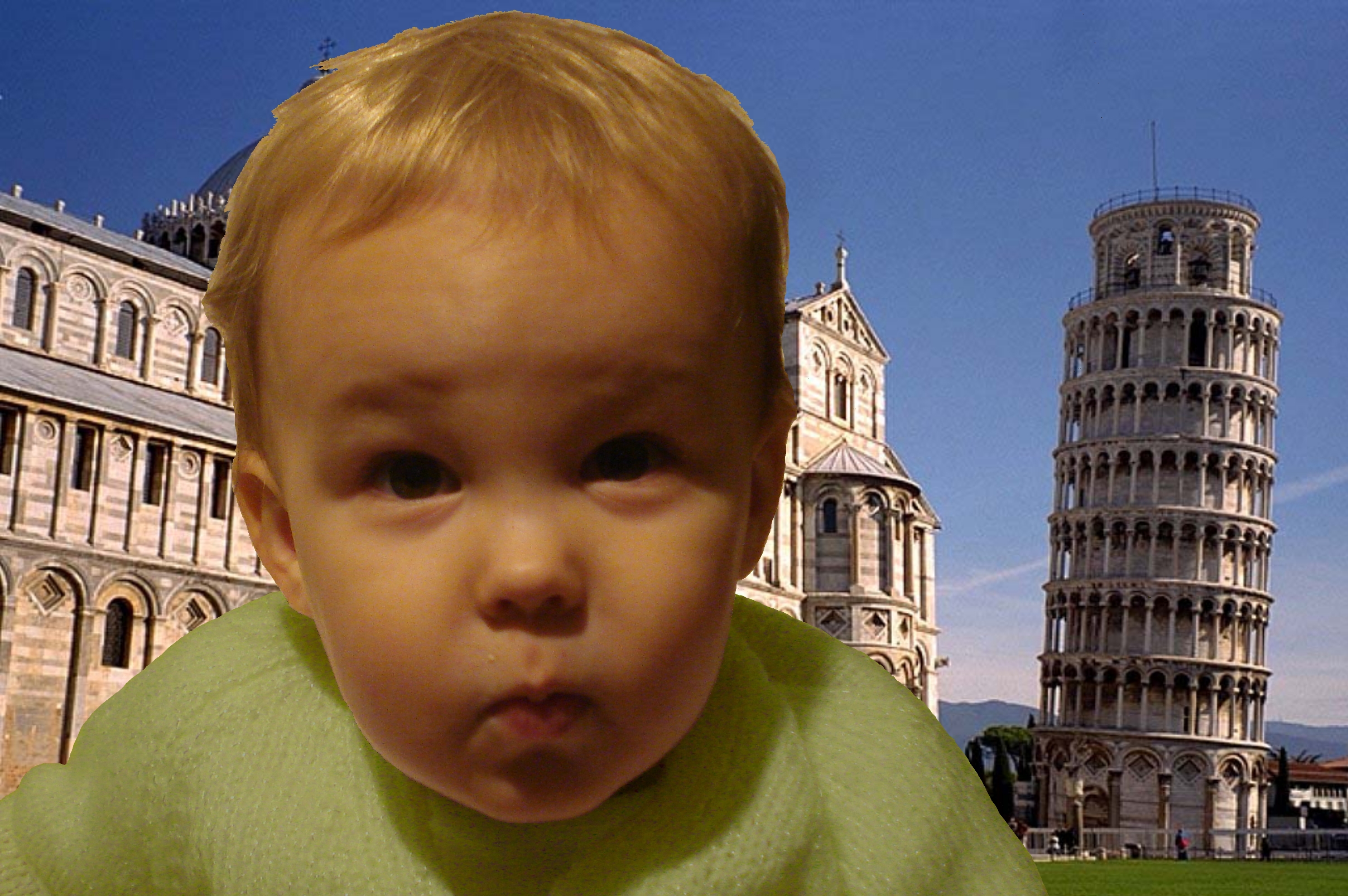
Now that you have the parts you can start to merge them back together into the final images.
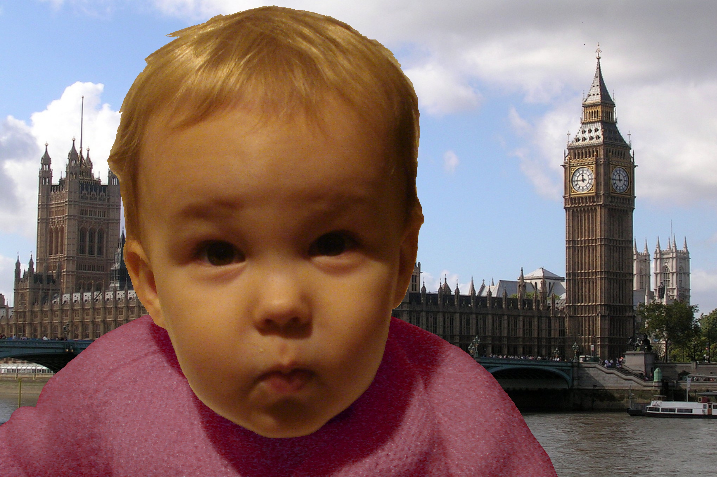
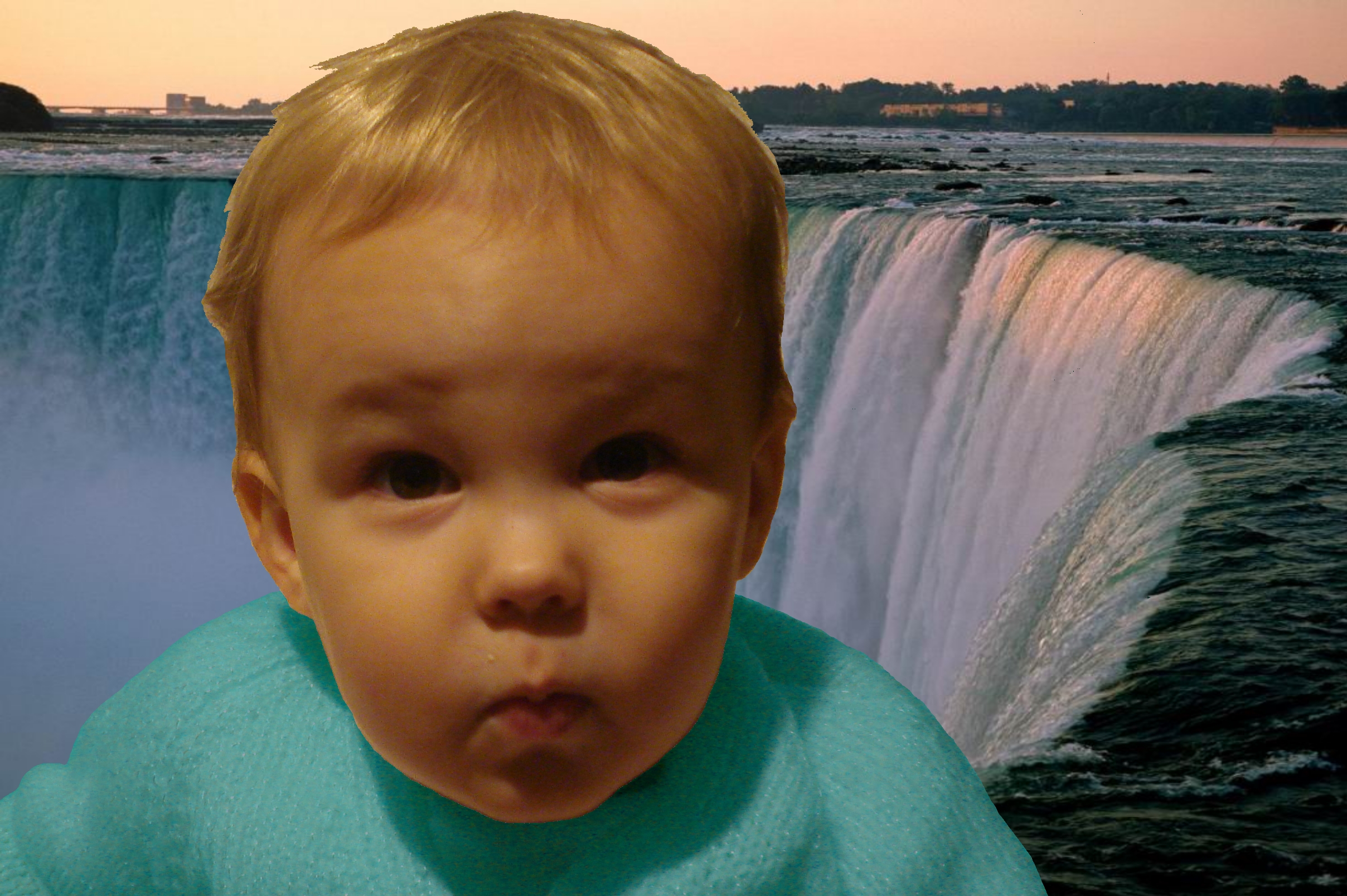
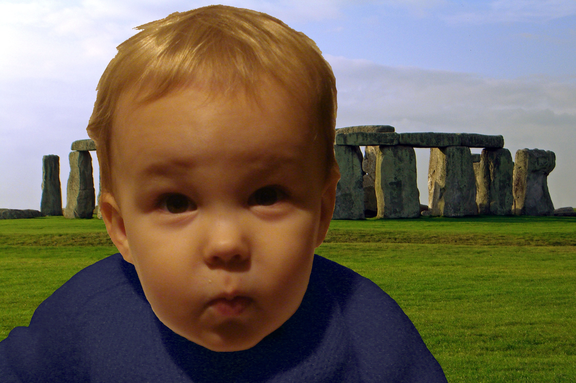
Select a new backdrop for your model. I chose some pretty recognisable landmarks from around the world, found by a quick bit of googling and possibly breaking some copyright, but for personal calendars it should be ok. Obviously it would be far better if you have your own images for this purpose.
To modify the jumper you need to colourise the layer. You're looking for a function to adjust the hue of the image (adjust->Hue/Saturation for paint.net). Hue is basically the colour of the an object, independent to it's brightness and saturation (colourfulness). This means you can shift the hue of the layer which makes the jumper appear to be a different colour but doesn't change the lighting and shadows, so the jumper will still look like a jumper, rather than a blue blob.
Finally you need to flatten the image down a single layer and save it. Repeat this process for all of your different backgrounds. I only needed to do 11 images for the calendar because I decided to include the first image as well, just as a reminder towards the end of the year.
Next submit your images to one of the many calendar providers on-line. I'll give a quick plug for Vistaprint who were doing 99p calendars at the time, and still are with a valid link.
Voila, one personalised calendar that everyone will enjoy, and yes it might be a little bit late for this year, but unfortunately I couldn't post this before people had opened their presents :)