Make a Bar Graph in RStudio IDE!
by aayaanshaikh6 in Design > Software
224 Views, 1 Favorites, 0 Comments
Make a Bar Graph in RStudio IDE!
R is a powerful data visualization language and environment. It is the standard in data science and offers countless tools to generate and customize graphs and plots quickly and easily. While learning to use the full scope of R's capabilities will require significant study, this guide can help you set up your R environment and get started on using some of its capabilities.
In this Instructable, I will walk you through how to take some simple tabular data and transform it into a bar graph using the RStudio IDE. I will demonstrate each step of downloading and installing the software so that this guide is accessible to beginners who have little software or programming knowledge. All you need to know is how to navigate windows folders and install software.
I am a Computer Science student and have written some short programs in R, my area of expertise is software. With this guide I hope to demonstrate even just a fraction of the power of data visualization in R so as to make the idea of using the software more accessible. Just having detailed instructions on the instillation process and having your first simple bar graph will help you get through the intimidating parts of using this kind of software.
Difficulty: Easy-Novice
Time: 15 minutes
Notes: I'm using Windows 11 but these instructions should apply to Windows 10 users as well.
Supplies
All you need is a working PC/Laptop that runs Windows, a web browser, and an internet connection. We will also be using google sheets to create a dataset. Google sheets is free.
Download and Install R for Windows
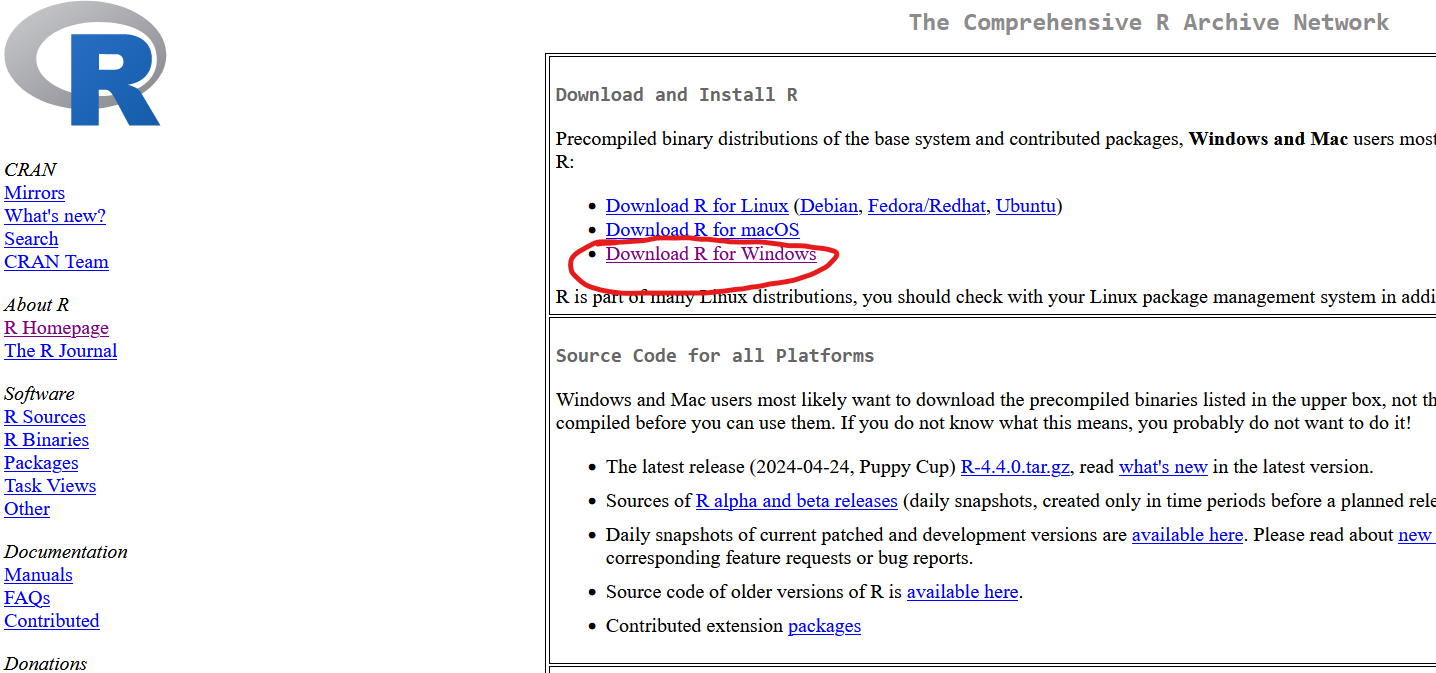
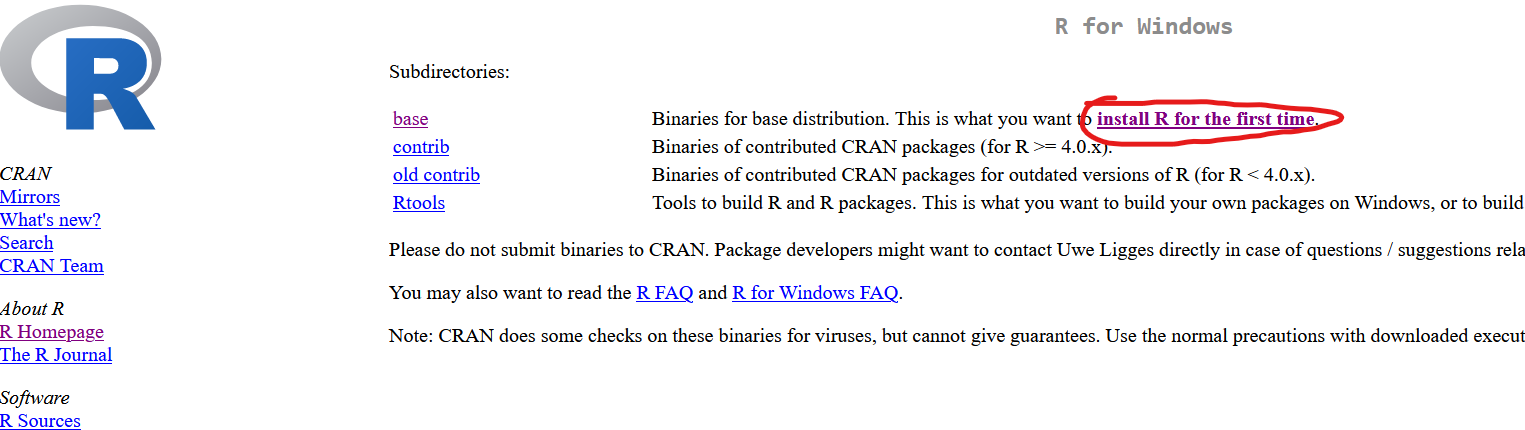
Firstly we are going to download and install each piece of software we need.
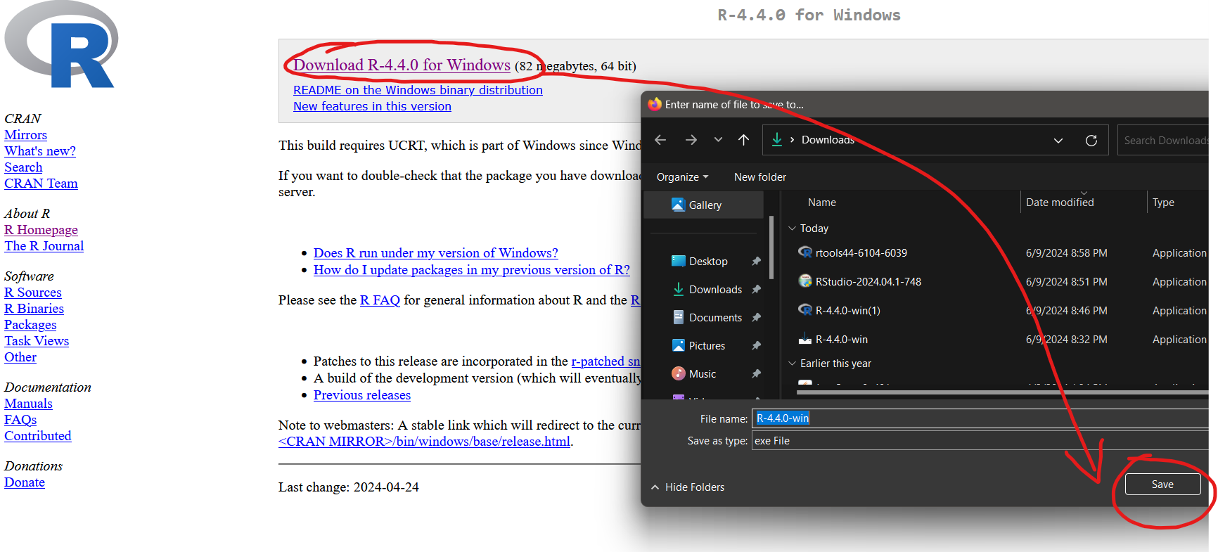
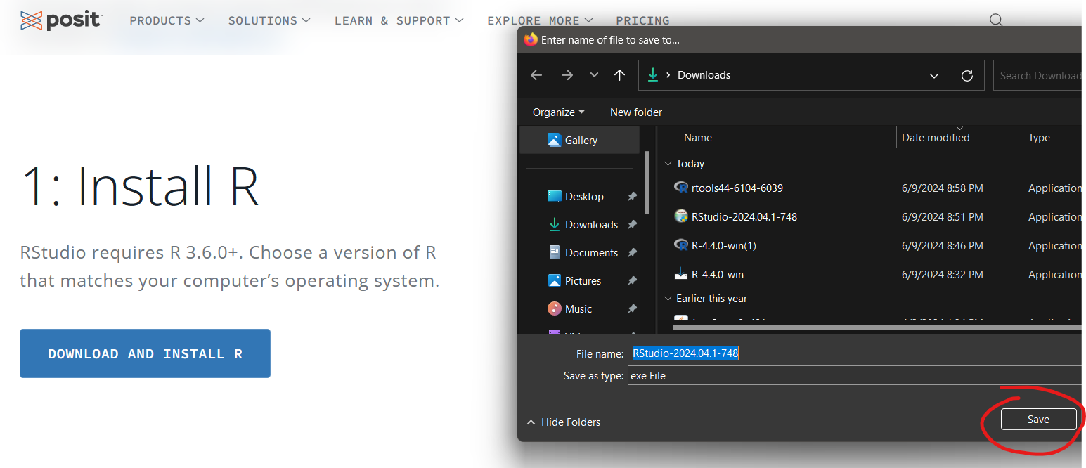
Install R for Windows here:
https://cran.wustl.edu
Follow the images and click the links circled in red.
MAKE SURE TO CONSULT THE IMAGES IN ORDER TO HELP DOWNLOAD.
Click on the images and scroll to see the links you are supposed to click.
Once it has been downloaded, open the installer and ONLY CLICK on ACCEPT or OK or NEXT for all the windows that pop up. Don't change any setting, for best results we need to install to the default location.
Download and Install Rtools for Windows
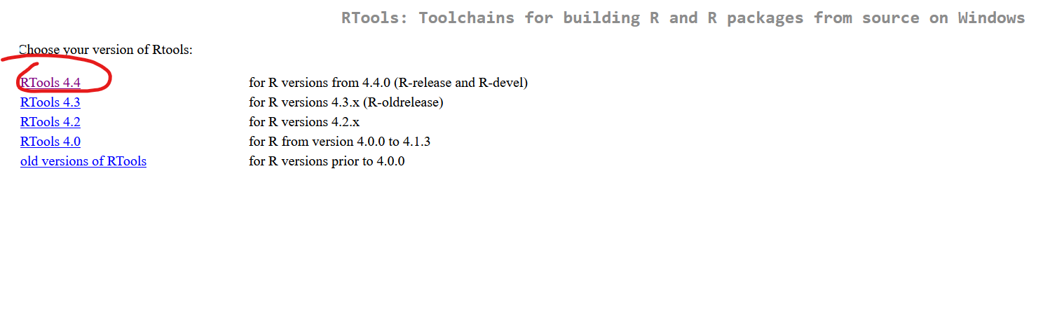
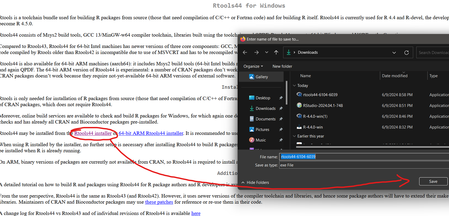
Install Rtools(some crucial functions not in basic R) here:
https://cran.r-project.org/bin/windows/Rtools/
Again, follow the images and click the links circled in red.
Once it has been downloaded its the same deal as before, open the installer and ONLY CLICK on ACCEPT or OK or NEXT for all the windows that pop up. Don't change any setting, for best results we need to install to the default location.
Download and Install RStudio for Windows
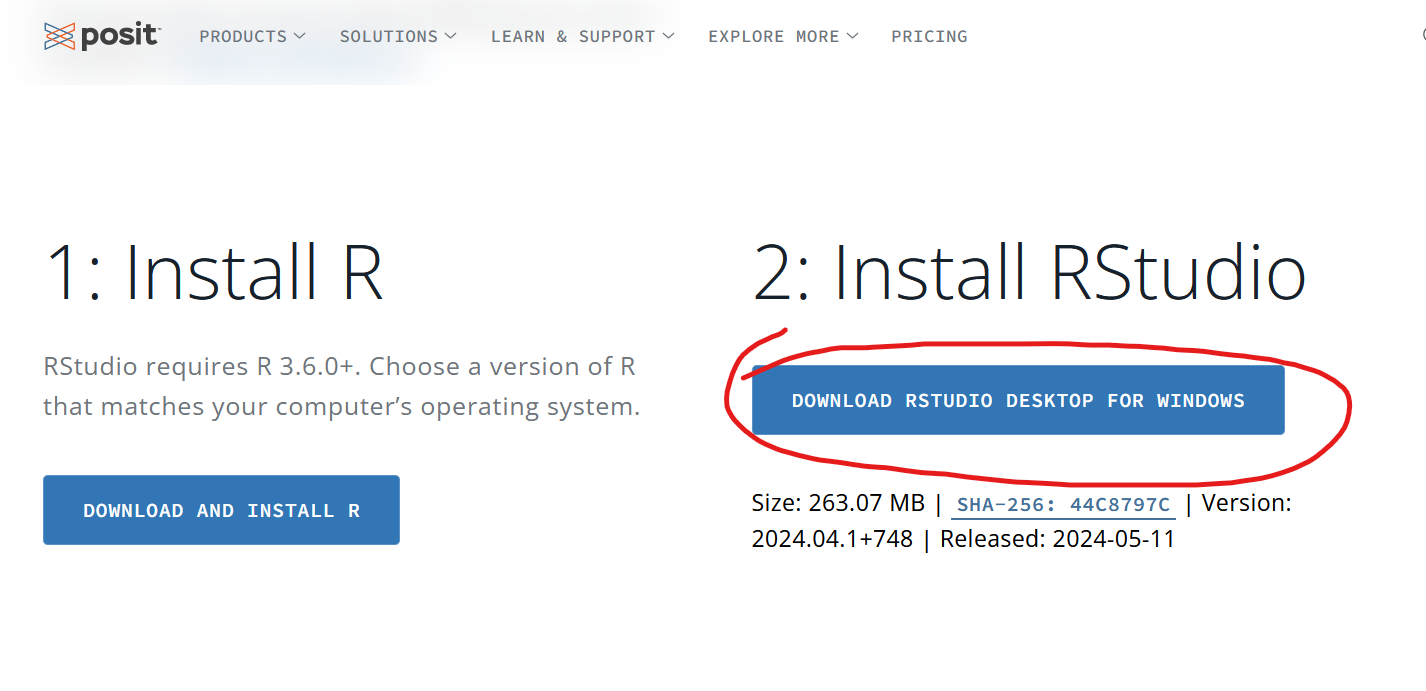
Install RStudio( the IDE or programming environment and text editor most easily used with R):
https://posit.co/download/rstudio-desktop/
Again, follow the images and click the links circled in red.
Lastly, once it has been downloaded its the same deal as before, open the installer and ONLY CLICK on ACCEPT or OK or NEXT for all the windows that pop up. Don't change any setting, for best results we need to install to the default location.
WONDERFUL!!! We have now finished the tedious downloading and installing get ready for the meat and bones of it.
Dataset
Now it is up to you to make or find a simple data set that we can make a bar graph out of. Bar graphs are best used for discreet data, like letter grades in a class, rather than contiguous data like height. For contiguous data, a histogram would usually be more appropriate. For the purposes of this short hands-on intro into R, please use a dataset that uses discreet data.
https://en.wikipedia.org/wiki/Continuous_or_discrete_variable
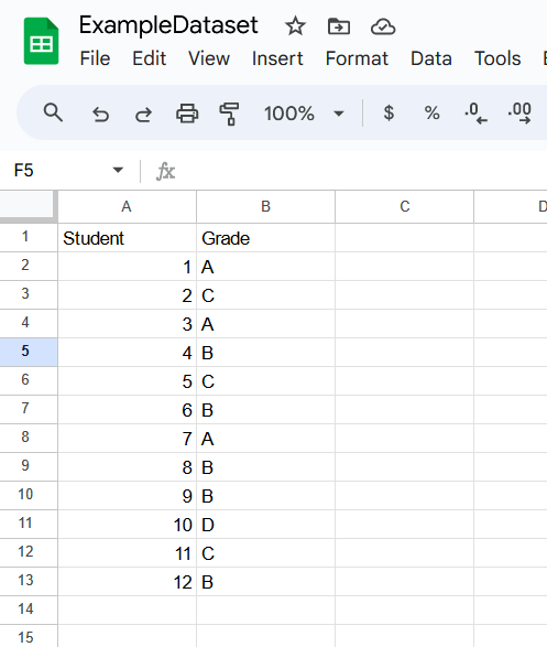
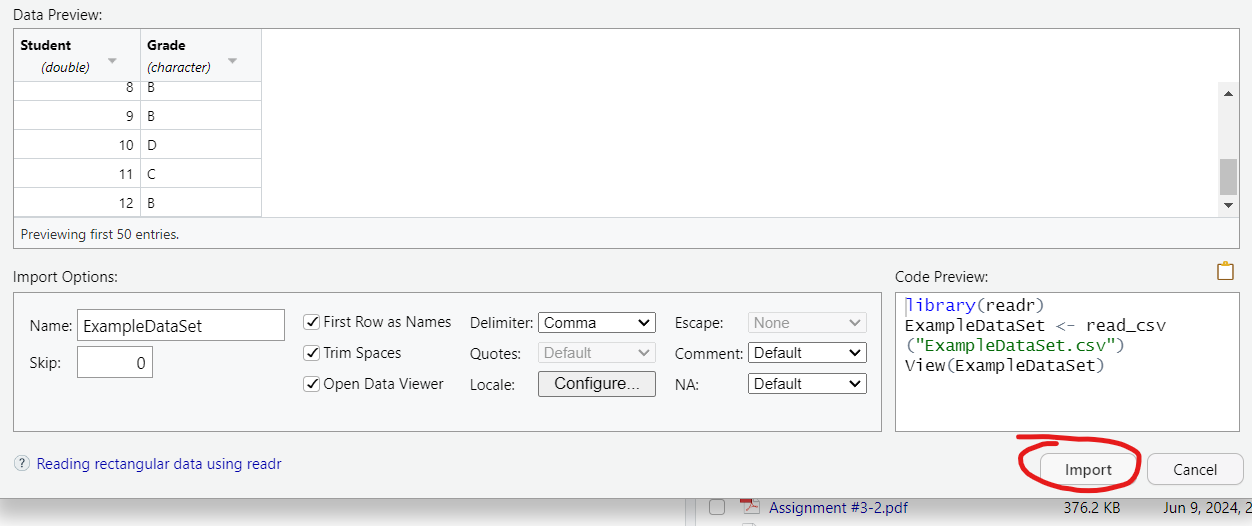
Here is the example data I will be using. Make sure that the data is as pushed up and to the left as possible or else R might not recognize the column and row names. Name your columns well as they will label your graph automatically.
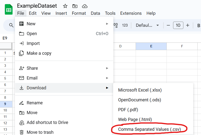
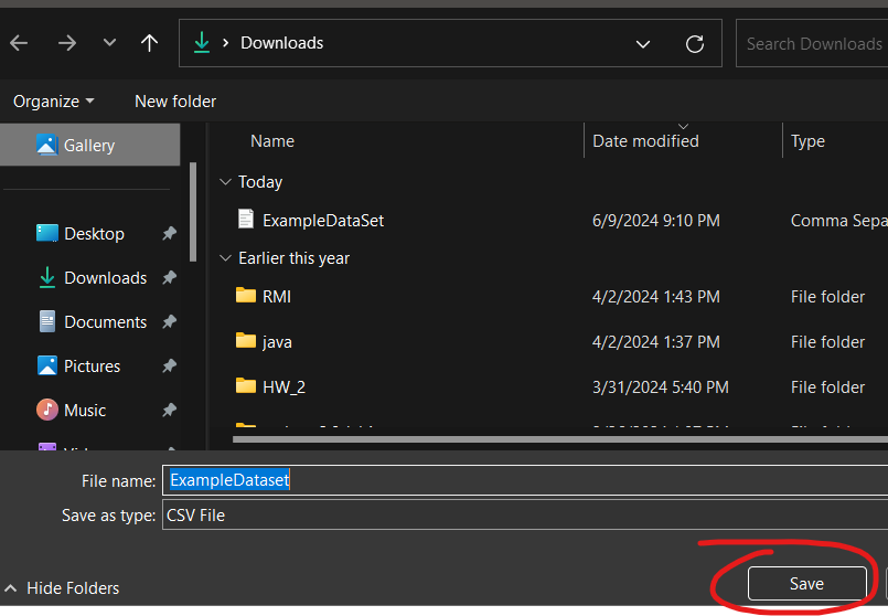
Once you have the data download it as a .csv(comma separated values) file.
Feel free to use my example dataset.
Downloads
Generating the Graph!
Now open up RStudio and let the fun begin.
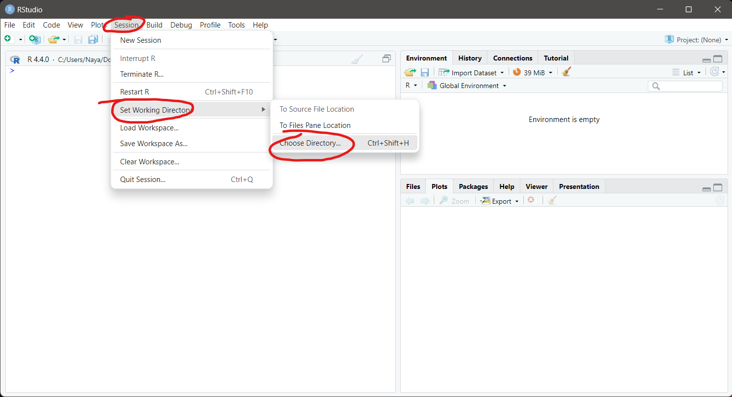
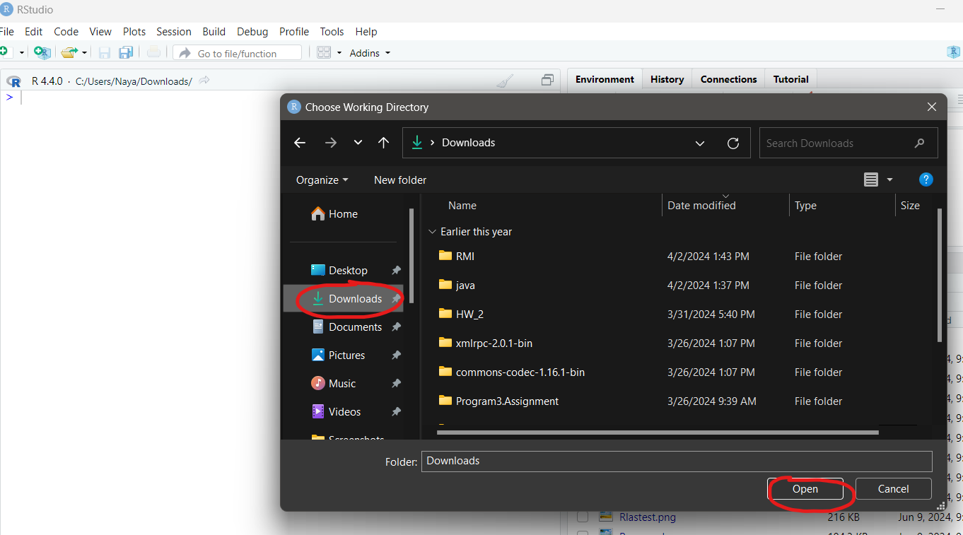
First you want to change your default directory to your downloads folder where your data which is in the form of a .csv file should be. This is so the file shows up in the bottom right window.
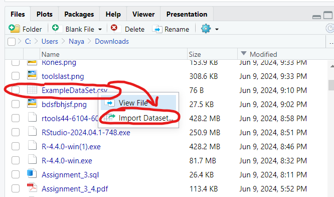
Click on the data file and hit import. Then ignore all the options and hit import again.
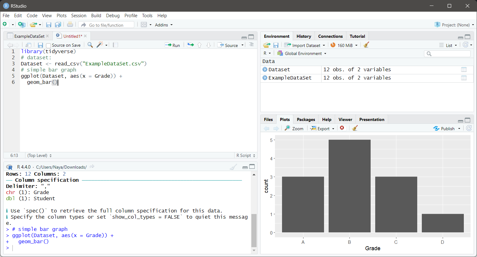
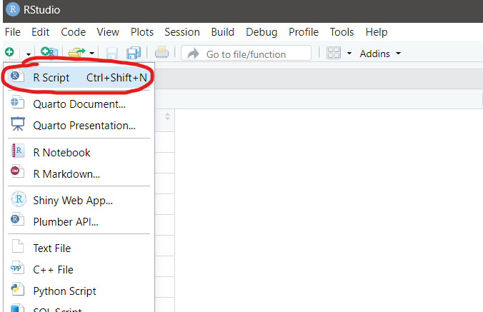
Now click new R script so we can input our code to graph. Inside of the script:
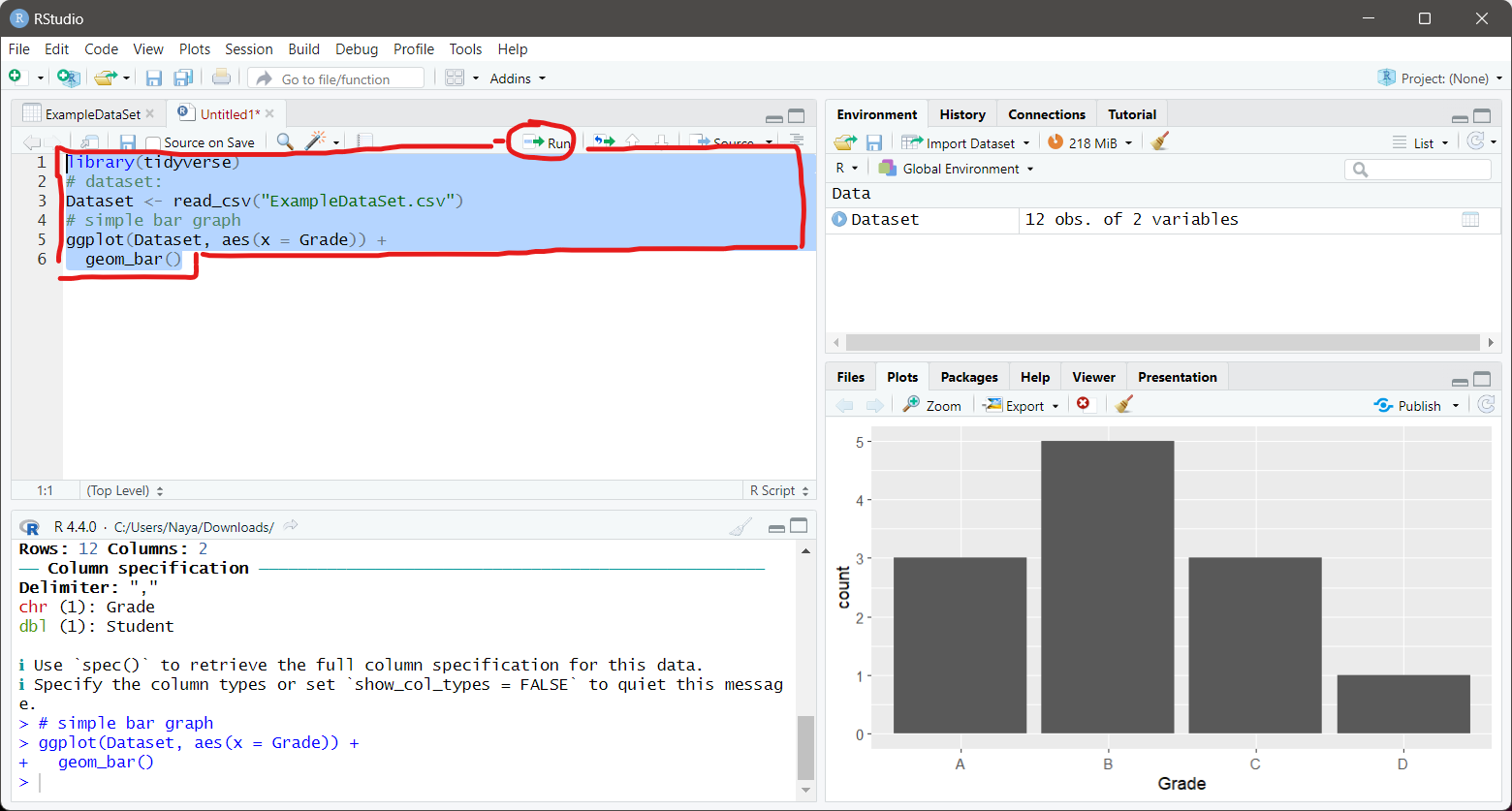
Copy and paste this simple R code which makes a Bar graph:
library(tidyverse)
# dataset:
Dataset <- read_csv("ExampleDataSet.csv")
# simple bar graph
ggplot(Dataset, aes(x = Grade)) +
geom_bar()
Change the Grade in "aes(x = Grade)" to whatever your x-axis label is.
You will notice some loading time as RStudio installs the various packages in the tidyverse library. The most important of these is the ggplot2 library which does the rendering of the graph.
Finally, select all the code in the script and click the run button and watch as a simple bar graph with already filled in labels generate in the bottom right window.
You just got your first taste of R data visualization. I hope you grew the appreciate the functionality of a programming language that is so well suited for data visualization. The corresponding Java or python code to render a graph would be much more complex and involved while R allows data scientists to generate elegant and powerful graphs at a moments notice.
Consult these resources for further learning: https://learn-r.org/