Make Digital/truth Table Graphs in Excel
by artworker in Circuits > Computers
25941 Views, 12 Favorites, 0 Comments
Make Digital/truth Table Graphs in Excel
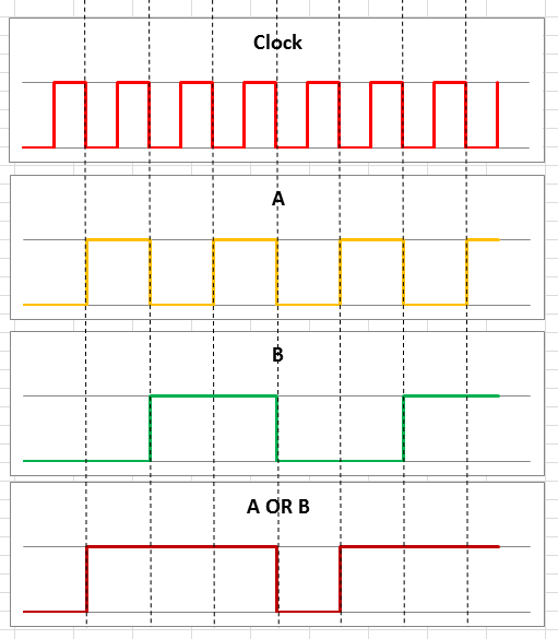
How many times have you tried making a digital graph for truth tables on excel? I have tried innumerable times thinking that excel is useless! Now I can finally say that I can make one quite easily from a truth table or digital data.
Downloads
Put the Data
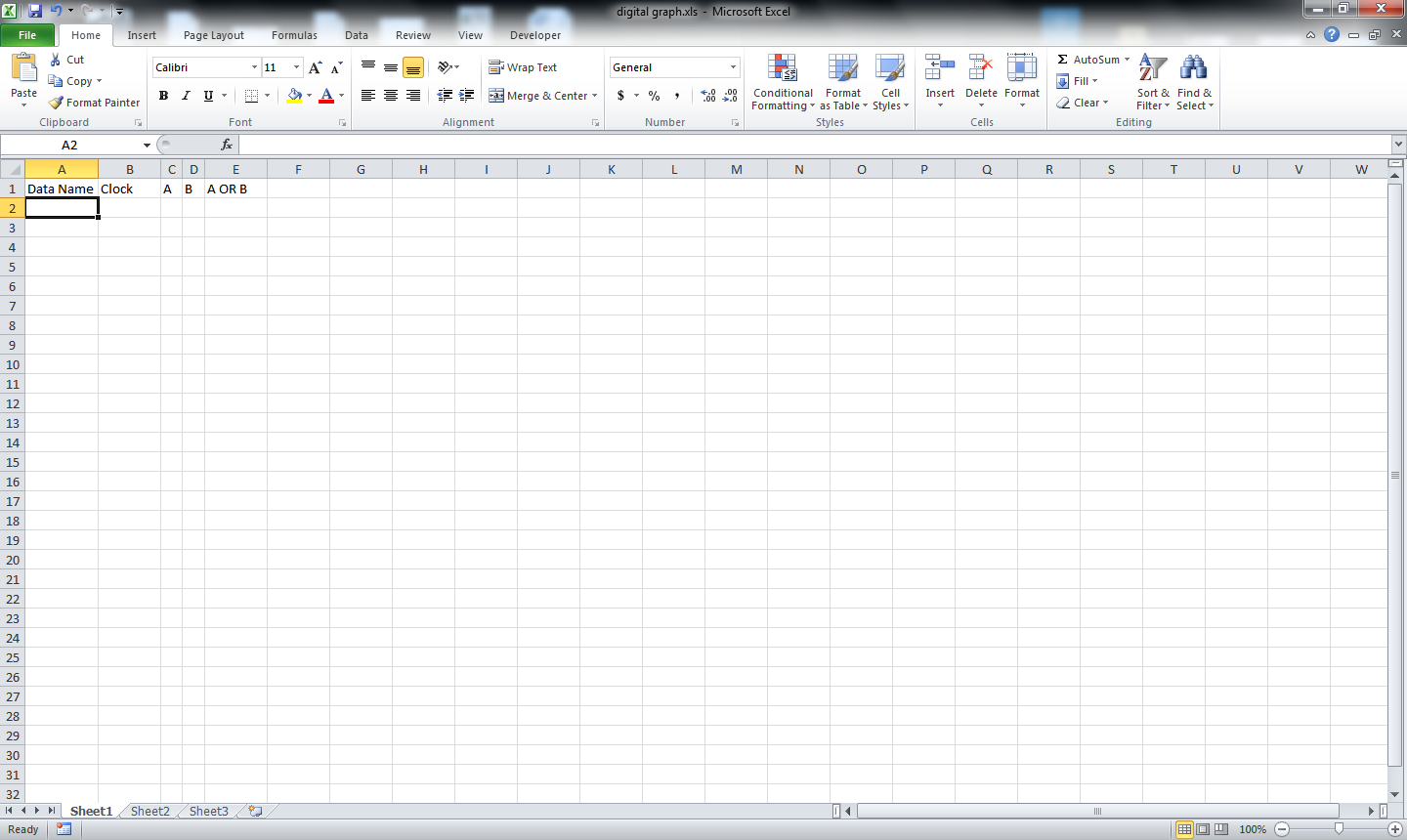
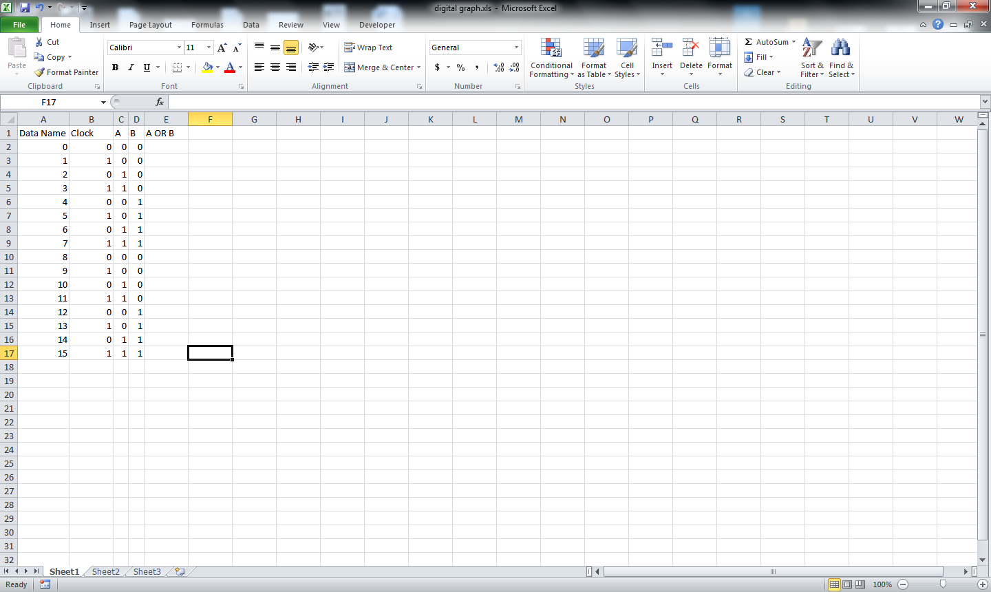
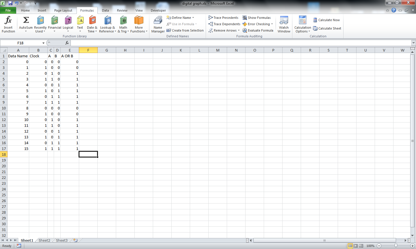
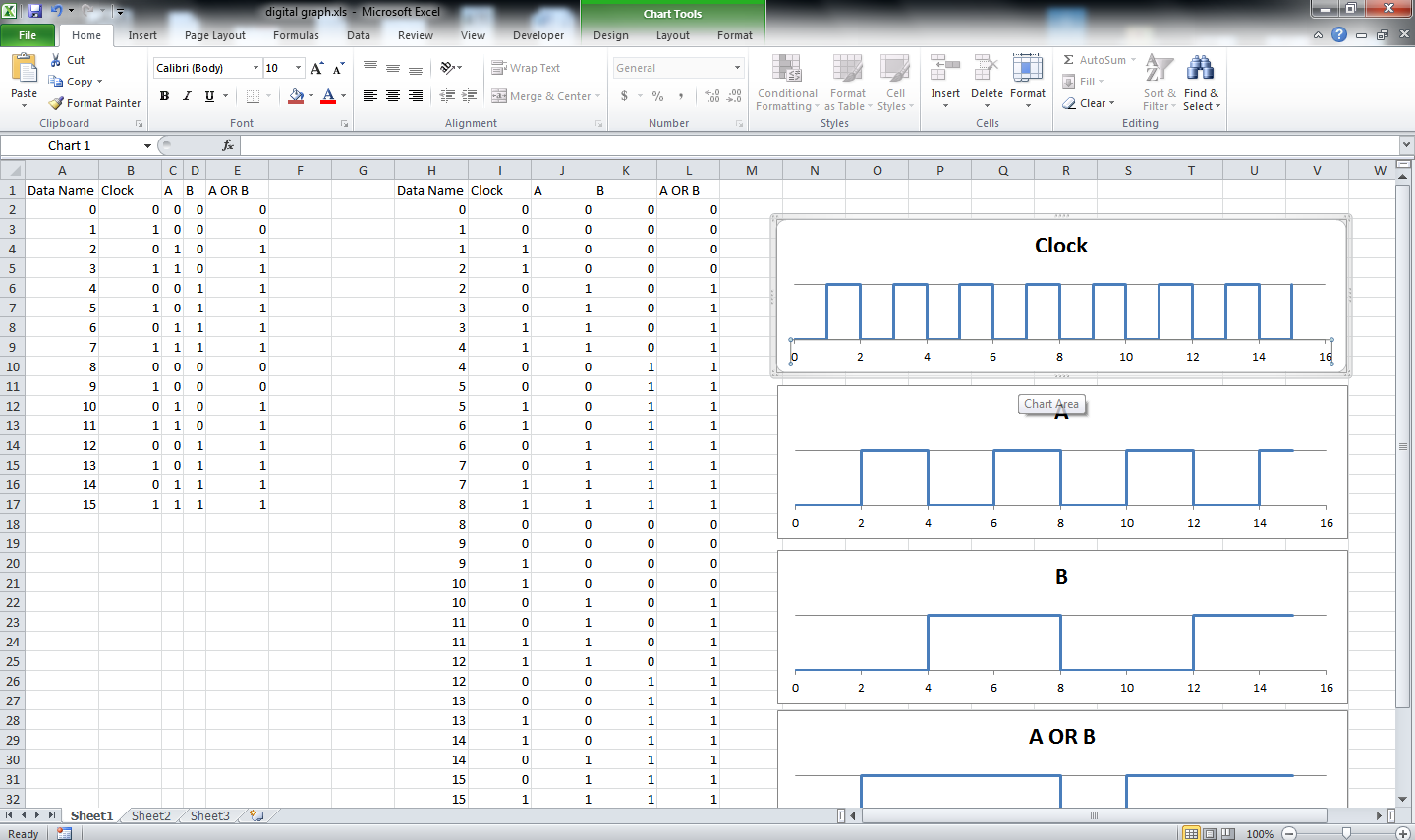
Enter some data of the table. I am using 16 data i.e. 2 to the power of 4. there will be a clock cycle, 2 data sets A and B and one manipulated/derived data A OR B. Data name is put just to use it while drawing the data.
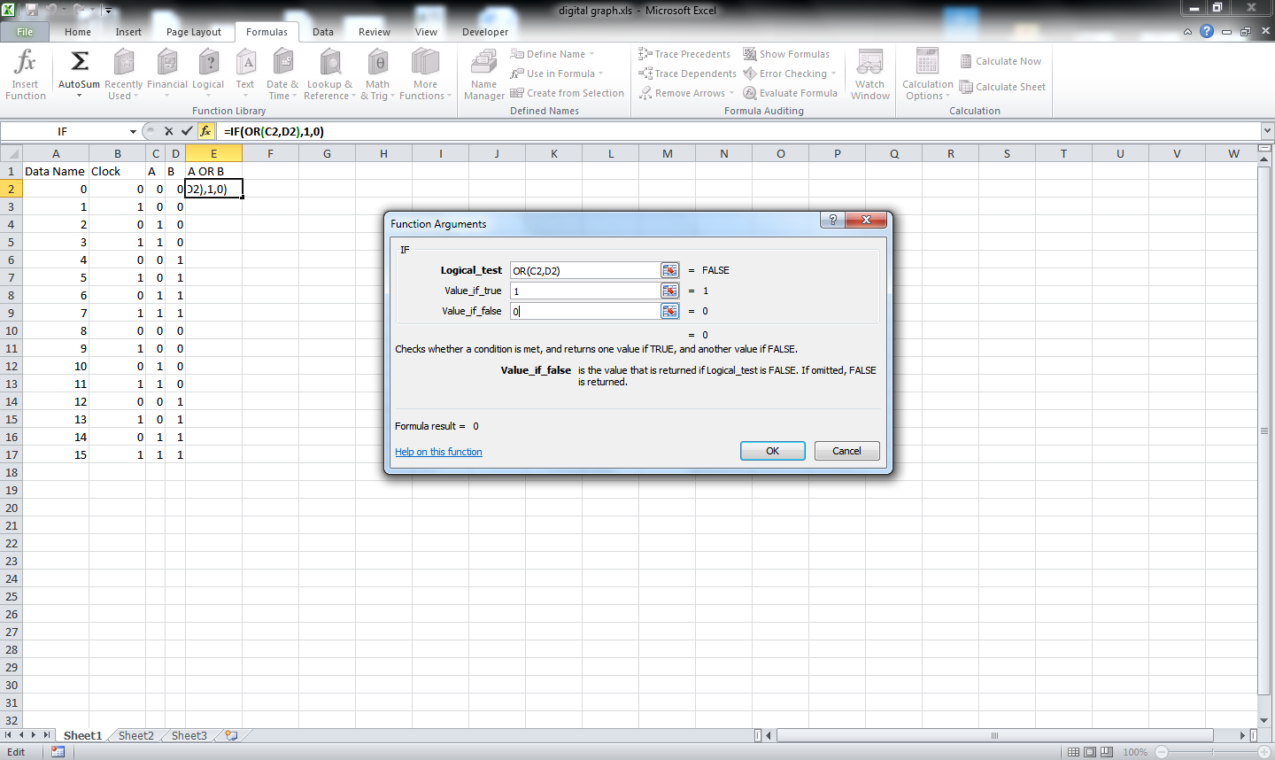
Using an IF statement for the derived data because using an OR gives us TRUE or FALSE which is much unusable.
Using an IF statement for the derived data because using an OR gives us TRUE or FALSE which is much unusable.
Manipulate the Data for Drawing
This is the most important part. This part defines how the table will be drawn.
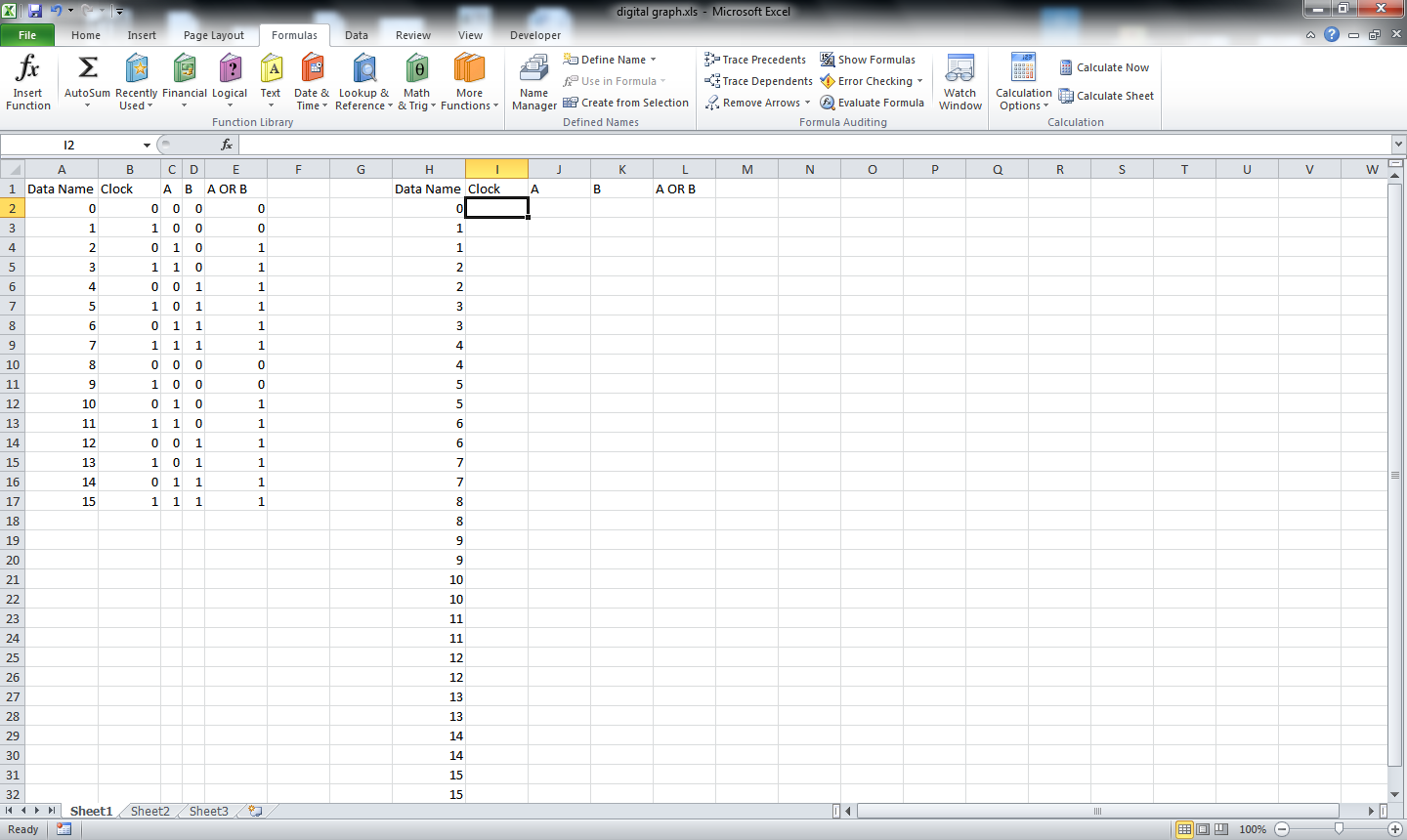
Start with the Data Name. Put a 0 at the start. Now start putting all the data in the Data name. Use each number twice.
such as
1
1
2
2
3
3
.
.
.
Now for the rest of the column just copy each data twice.
Such as for the clock
0101010101...
becomes
0011001100110011...
starting from 0
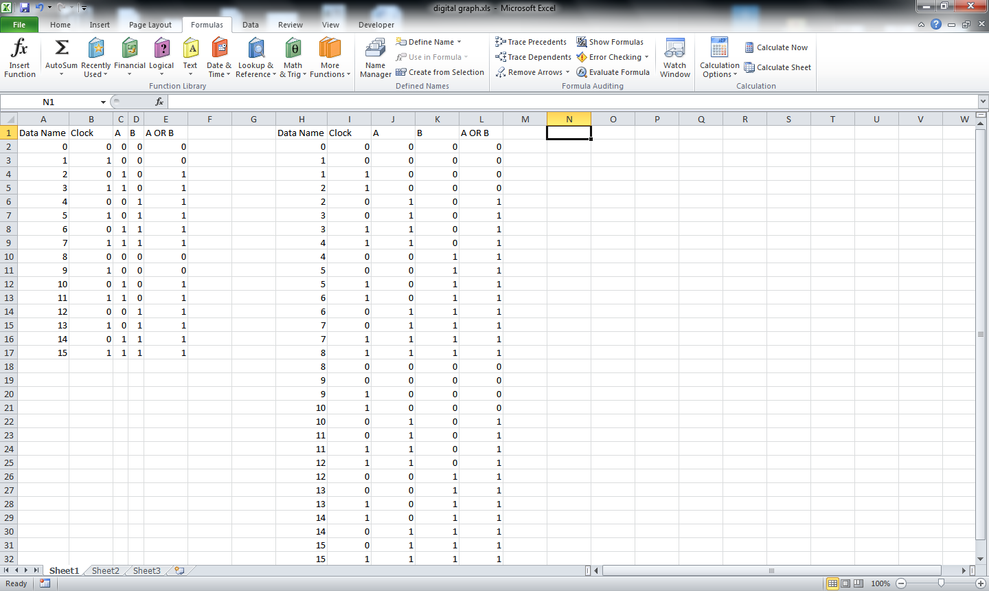
Do the same for all the other data series.
just for an example
010001
becomes
001100000011
Start with the Data Name. Put a 0 at the start. Now start putting all the data in the Data name. Use each number twice.
such as
1
1
2
2
3
3
.
.
.
Now for the rest of the column just copy each data twice.
Such as for the clock
0101010101...
becomes
0011001100110011...
starting from 0
Do the same for all the other data series.
just for an example
010001
becomes
001100000011
Chart It
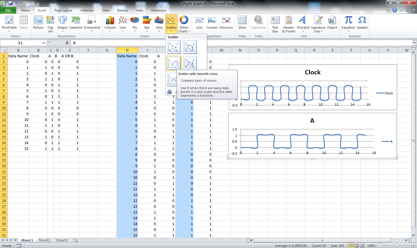
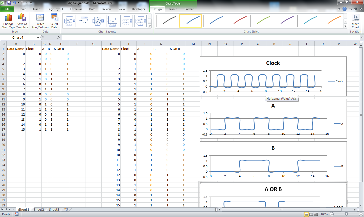
Now by selecting the Data name column and clock create a scatter chart.
Same way create scatter charts with the Data Name and other columns.
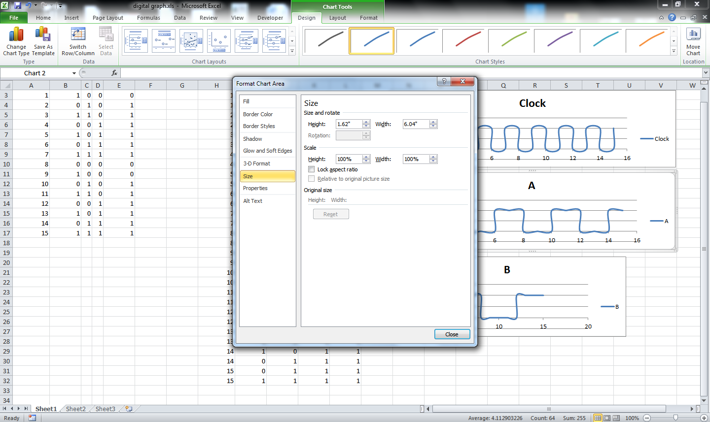
Edit the charts to make them of the same size.
Same way create scatter charts with the Data Name and other columns.
Edit the charts to make them of the same size.
Standardize It
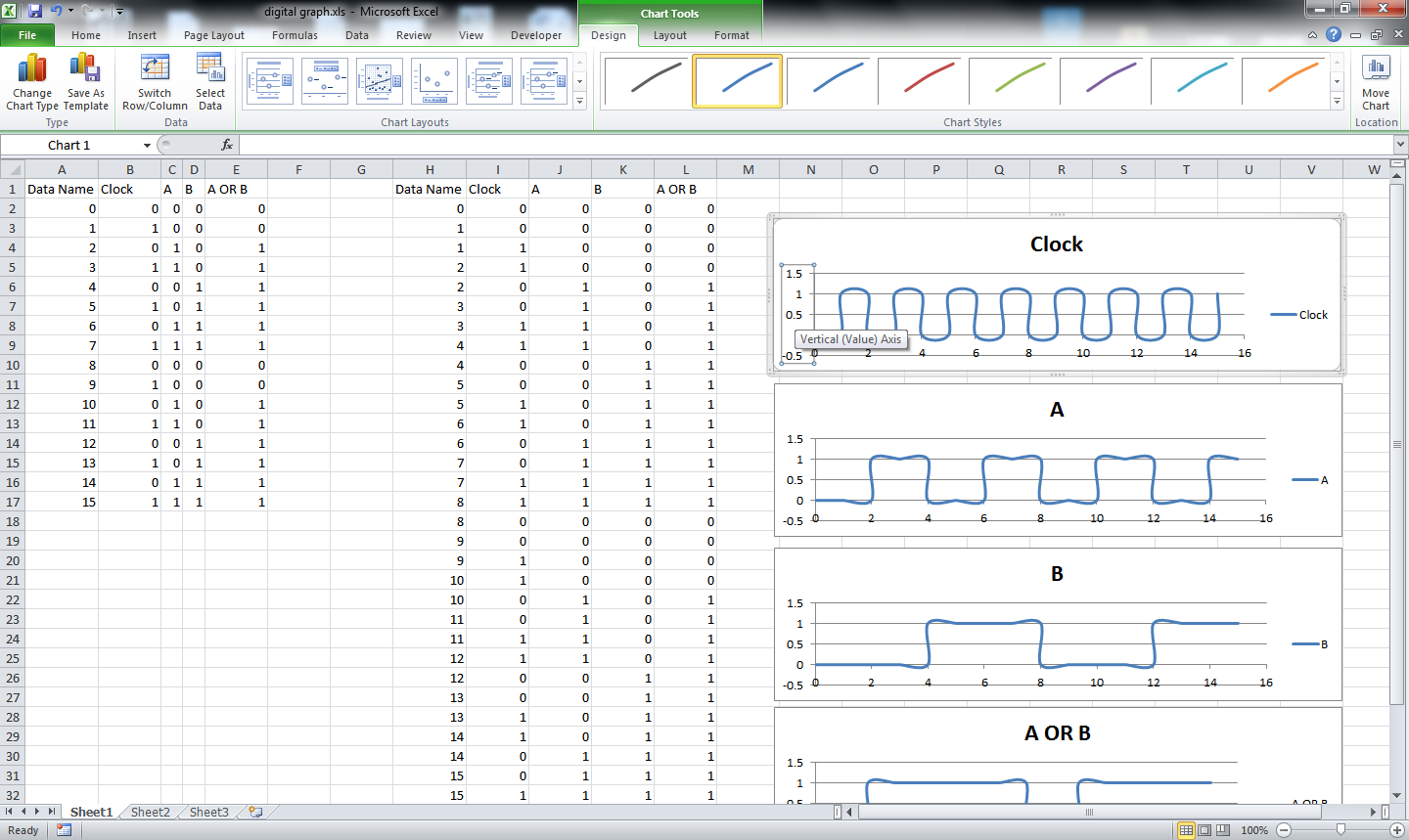
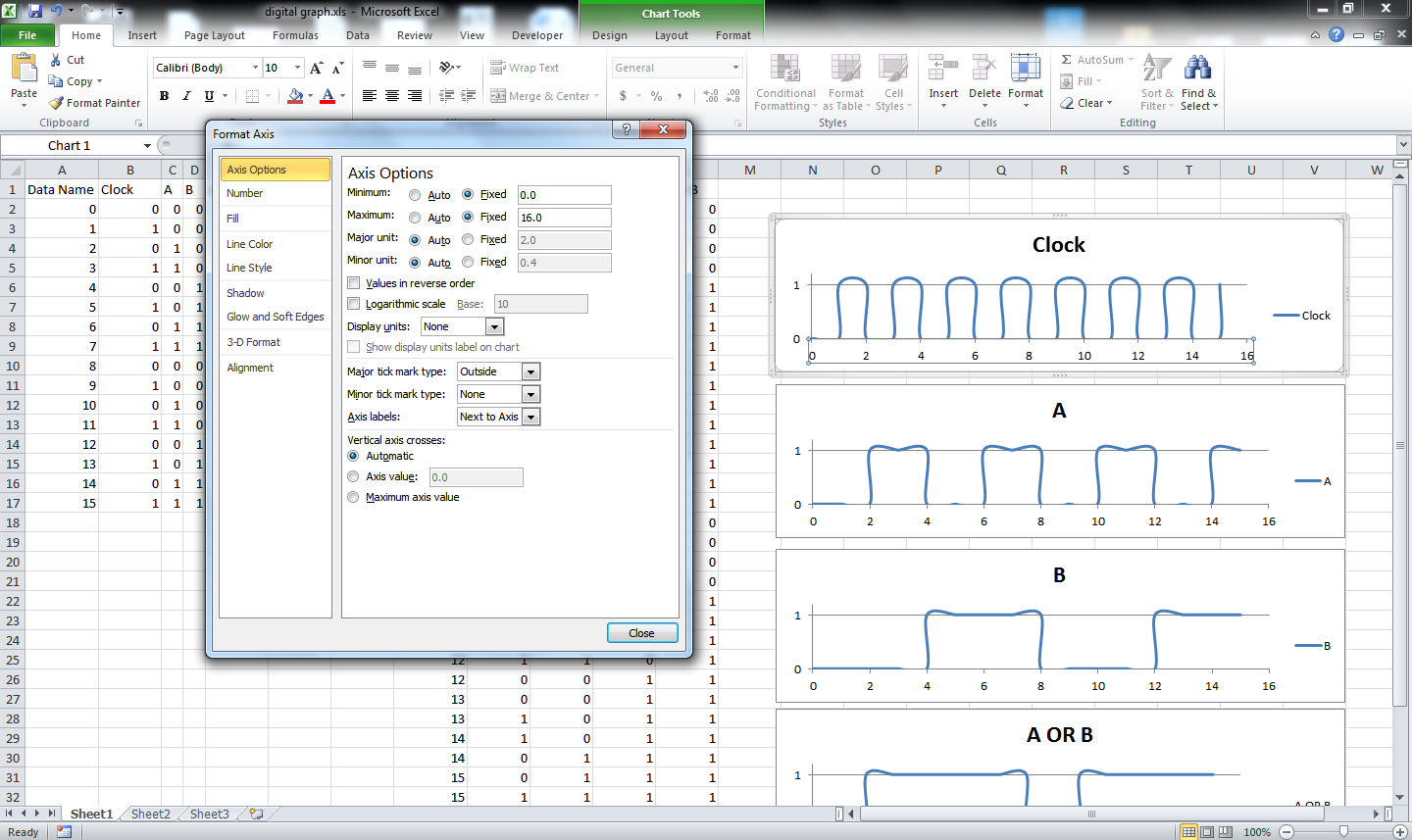
Now standardize the vertical columns and horizontal columns of all the charts of same.
Such as
Vertical is
Min=0
Max=1.2
Horizontal is
Min=0
Max=16
Such as
Vertical is
Min=0
Max=1.2
Horizontal is
Min=0
Max=16
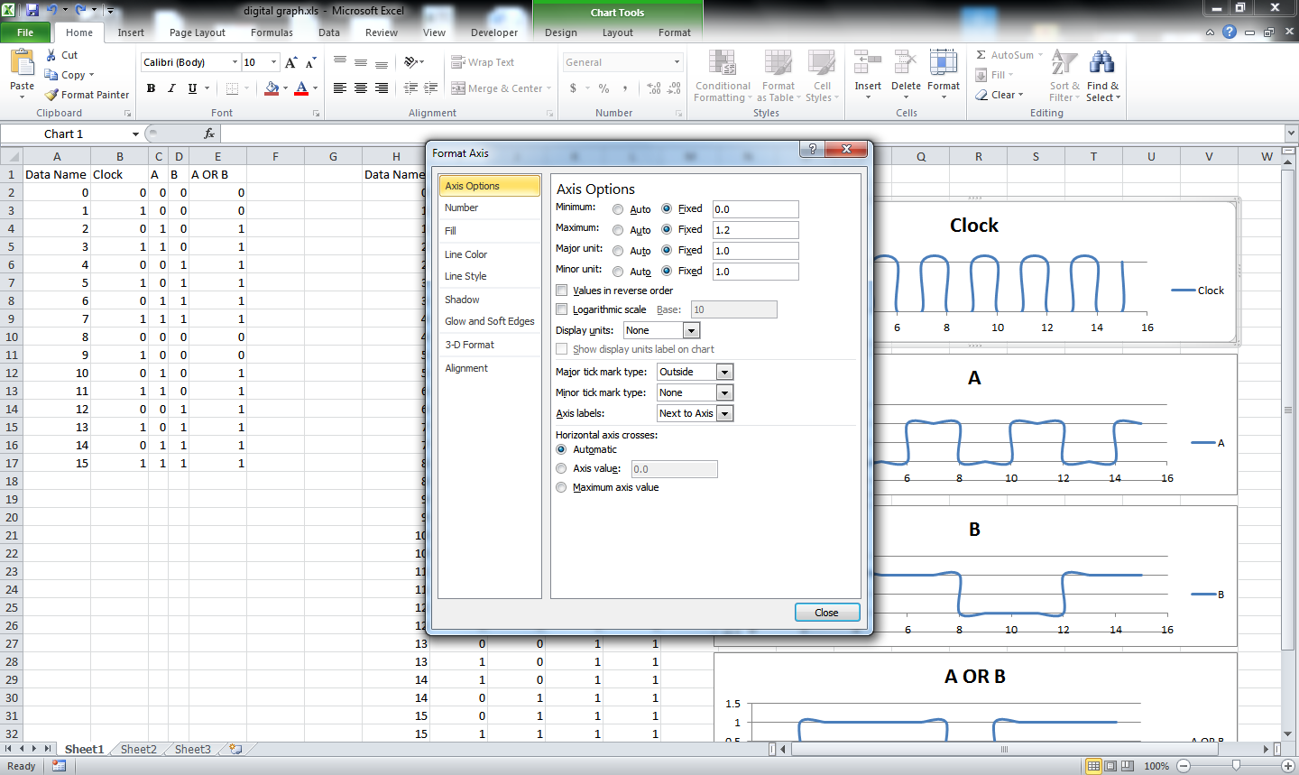
Smooth It Out
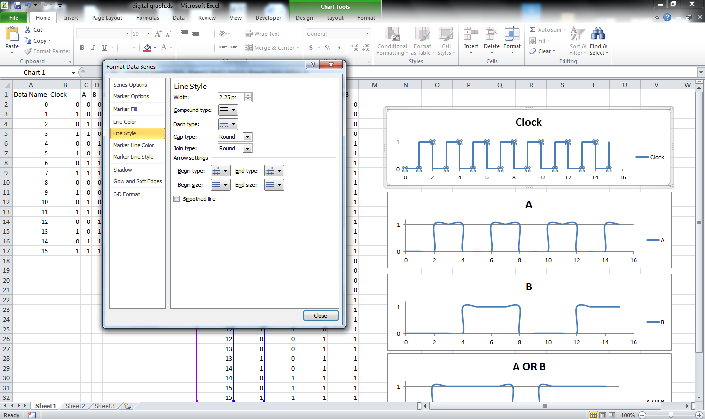
Remove the check box named Smoothed line to get a digital graph look from all the graphs. See the image for the detail.
Final Touches
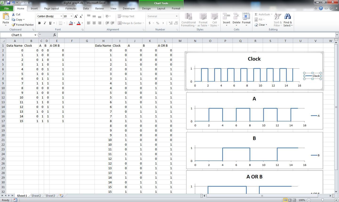
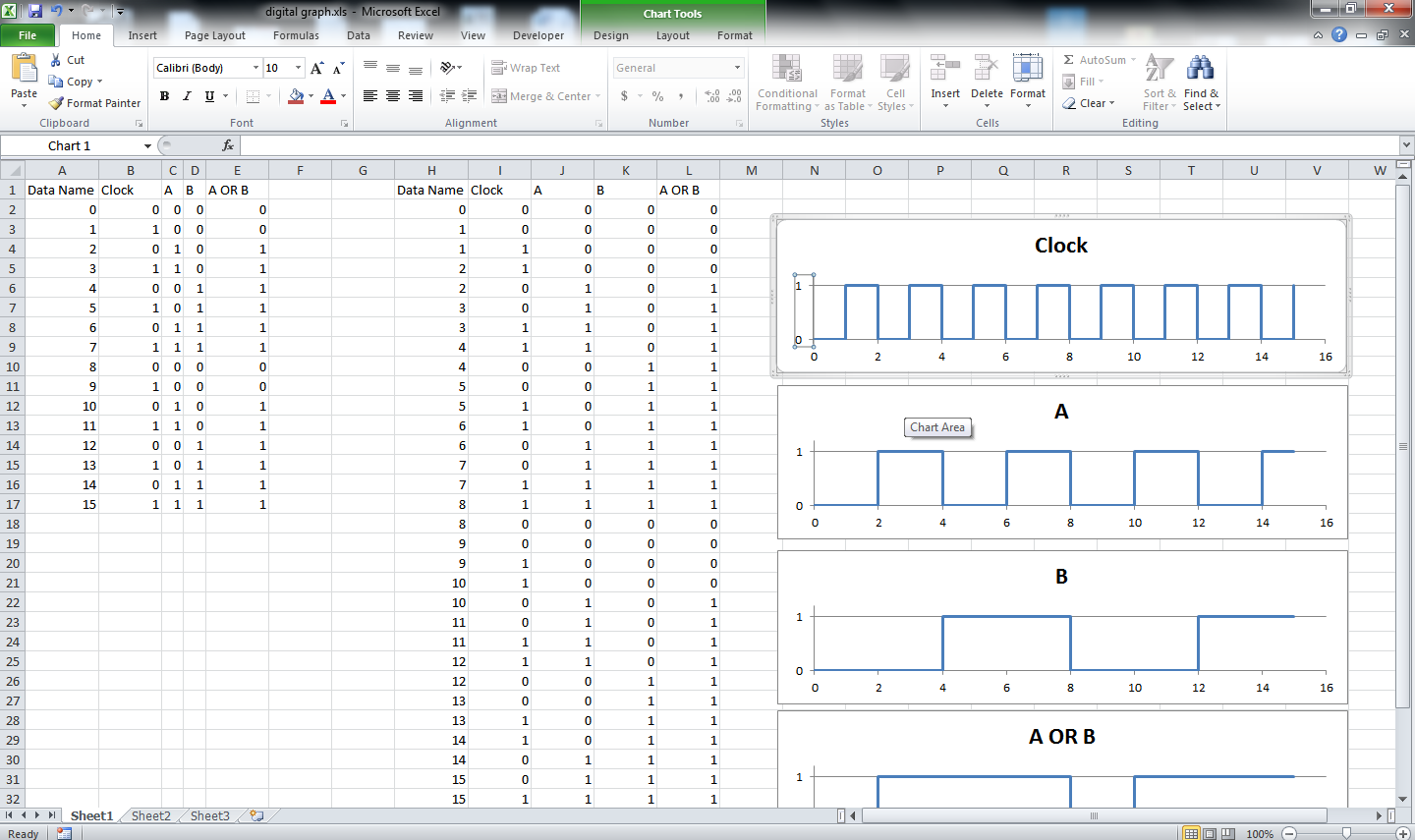
Remove the Legend, vertical and horizontal indents. This is optional and can be used if required.
Decoration
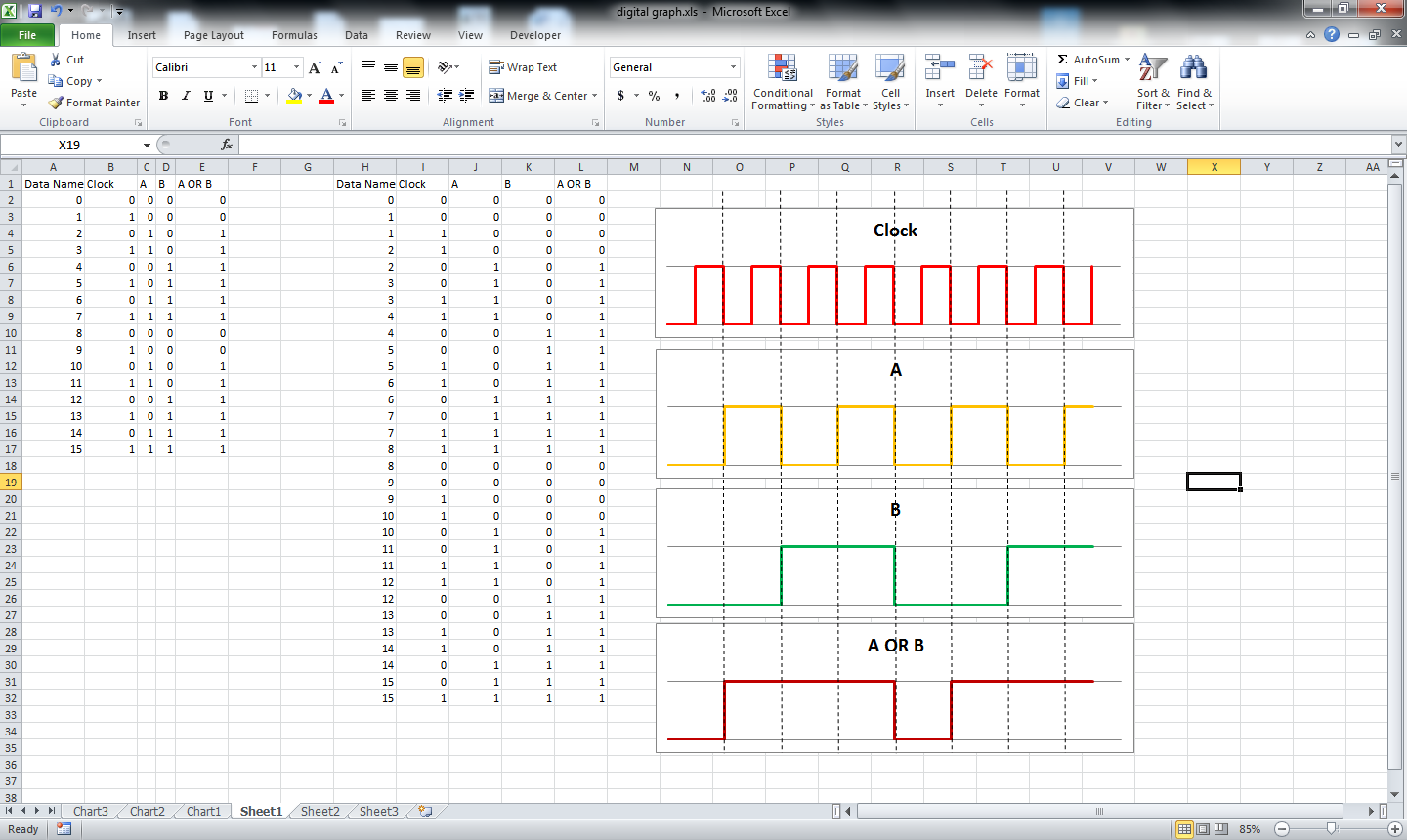
Finally color each graph to separate them in looks. The lines can be thickened. You can add dotted lines if required and many more decorations.
Thus your digital graph is ready to be showcased.
added is the excel that I used for this ible. Use it to further understand the scenario. Feel free to comment if need help or want to say something.
Thus your digital graph is ready to be showcased.
added is the excel that I used for this ible. Use it to further understand the scenario. Feel free to comment if need help or want to say something.