Maintaining Consistency in Icon Sketches Made Using the P5 JavaScript Library
by christinejac in Design > Digital Graphics
498 Views, 1 Favorites, 0 Comments
Maintaining Consistency in Icon Sketches Made Using the P5 JavaScript Library
Icons are visual representations that serve to express qualities of ideas or objects in an easily recognizable manner. They are important for communicating in an aesthetic and clear way, especially when aiming to seamlessly convey information to people. As such, it is equally important to maintain consistency when creating them.
This guide covers instructions on how to brainstorm ideas for consistent icon design in three sketches and how to implement said ideas using the p5 JavaScript library and Web Editor.
Supplies
Because we will be using the p5 Web Editor, there is no need to install anything. All you need is at least two pieces of graph paper, a pen/pencil, a computer, an internet connection, and the most recent version of a browser (Chrome, Firefox, Safari, or Edge are recommended).
Brainstorming
- Theme
- To begin, we must first come up with a theme for our icons. Our theme will be the dominant idea we want our icons to focus on. As we progress, the icons will become more individualized, but for now they will share a common subject matter. For example, I will choose to centralize my icons on the idea of “Ice Cream”.
- Narrow-down ideas
- Once you choose your theme, write down ideas that could stem from the theme into more specific objects or ideas. For instance, since I chose a “frozen desserts” theme, I would think of items that are related to frozen desserts, such as a popsicle, a sugar cone, or a cake cone.
- Notice that because these items stem from the same idea, they are quite similar, maintaining a consistent theme.
- Pick three of the specific items you came up with. These will be your icons you will visually represent later using javascript.
Drafting
- Draw out your ideas
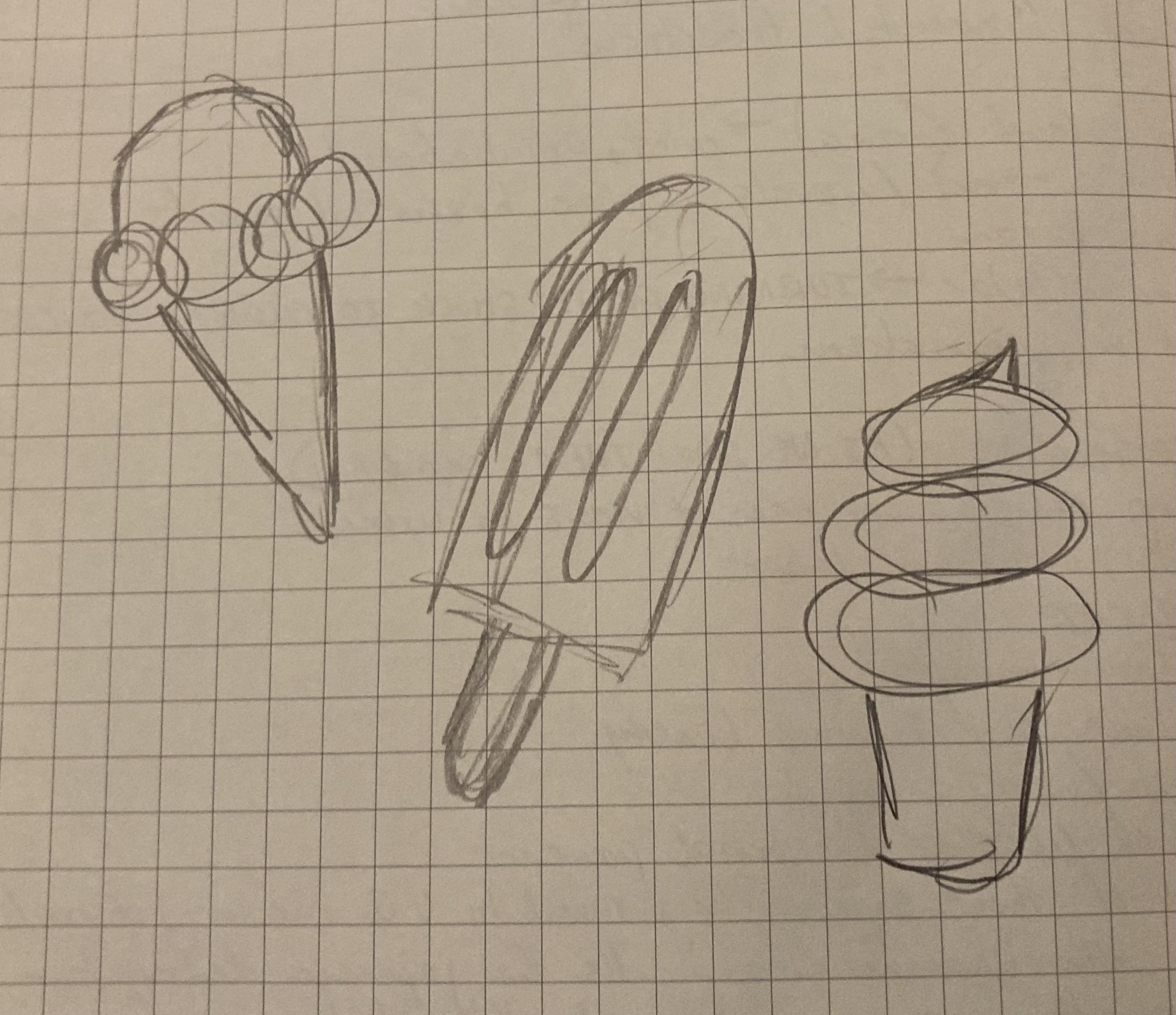
- Take a moment to roughly sketch out your three items on the graph paper.
- More Precision
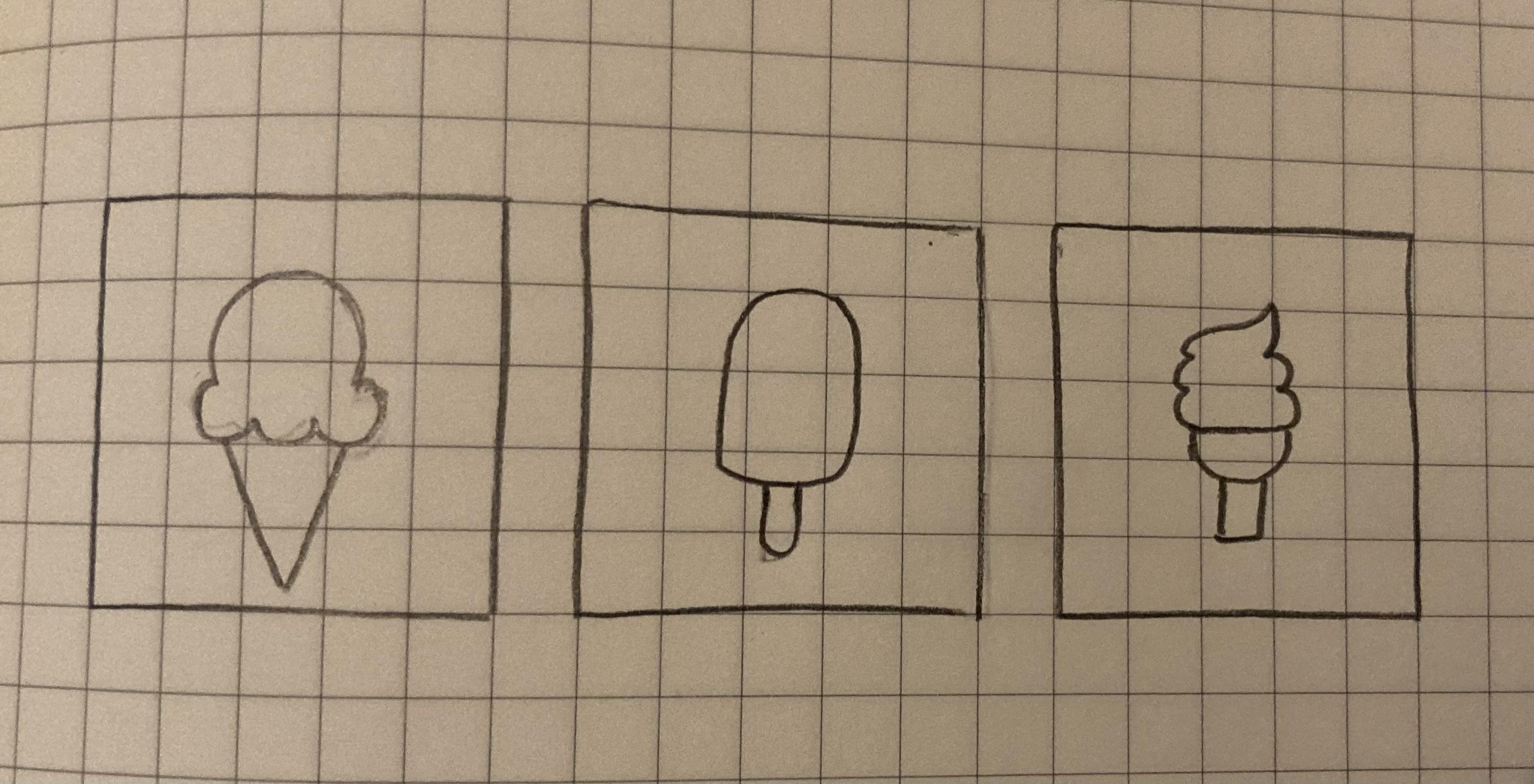
- Now take another piece of graph paper and draw three 5 by 5 boxes.
- Look back on your rough sketches. Icons are meant to be simple, while still conveying an easily recognizable message. Think about the most important parts of each individual sketch. Usually this includes the outline of the object and minimal details.
- Taking these ideas into account, draw each icon within a respective box. The icons must fit within their boxes. The idea behind this is that if they are still recognizable with the details you give them within the small boxes, they will also be aesthetically pleasing once scaled to a different size.
Creating the Sketches in P5 Web Editor
**The images above are annotated for further reference**
- We can access the p5 Web Editor through this link: https://editor.p5js.org/
- Note that in order to save your sketches, you will need to make an account (button found on the upper right corner)
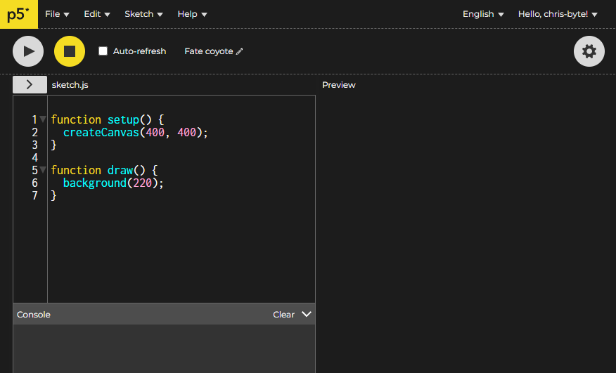
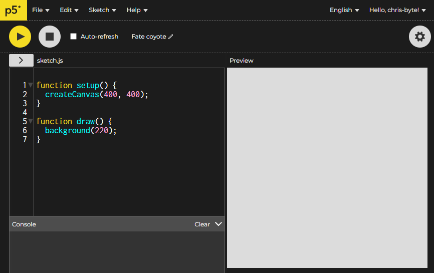
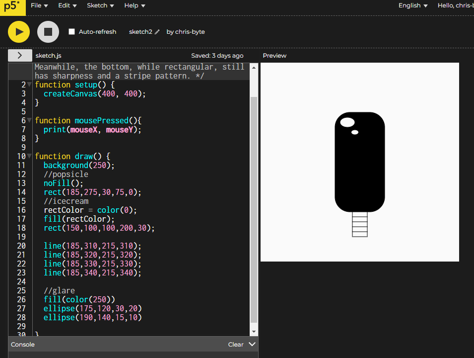
- Once you create your account and return to the Web Editor, you can see there are two functions already in the new file: setup() and draw(). These functions are explained above in the image 2 notes. For our purposes we will mostly use the draw() function.
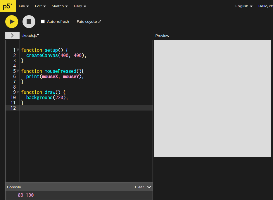
- Before we work on draw(), we can create a function mousePressed(), which will print the x and y position of your mouse when you click on a position on the canvas (refer to image 3). This is helpful when determining where you'd like to place certain shapes on the canvas later.
Using the P5 Reference
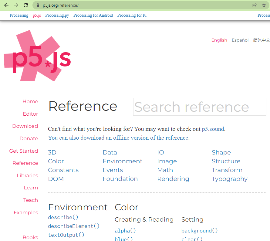
- The p5 reference can be accessed here: https://p5js.org/reference/
- The reference is very helpful in seeing what functions and tools you would like to use in drawing your icon. The functions under “Shapes” will be the most important because they will give you the shapes available to create your icon.
- The reference can also inspire you to choose functions to later add minimal details to your icons that can help to keep them visually consistent
Drawing Your Icon
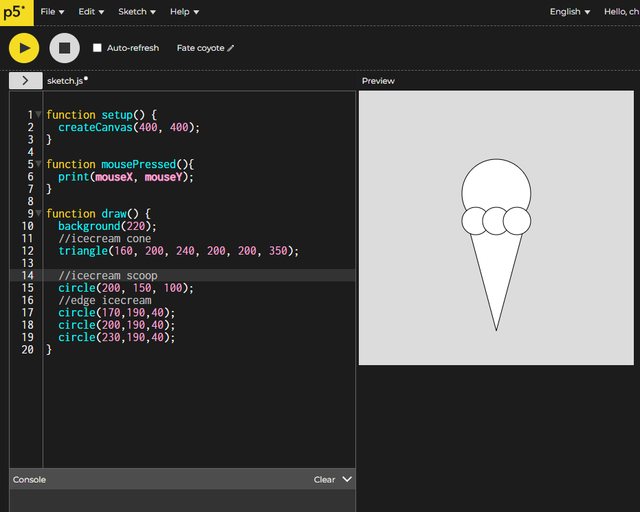
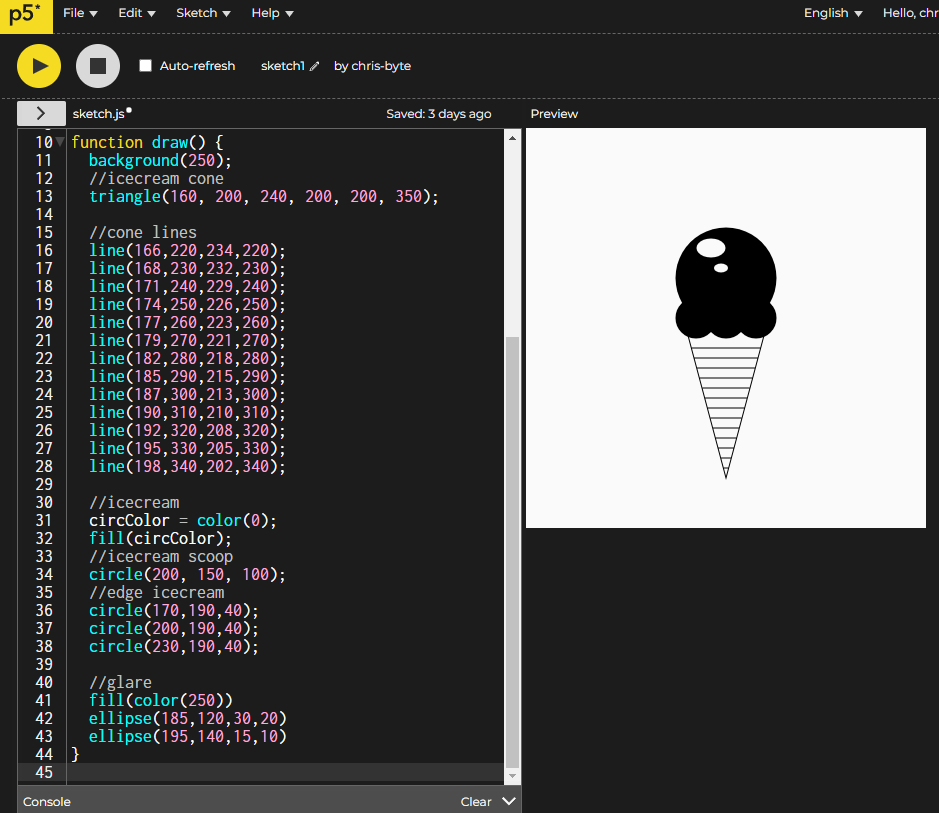
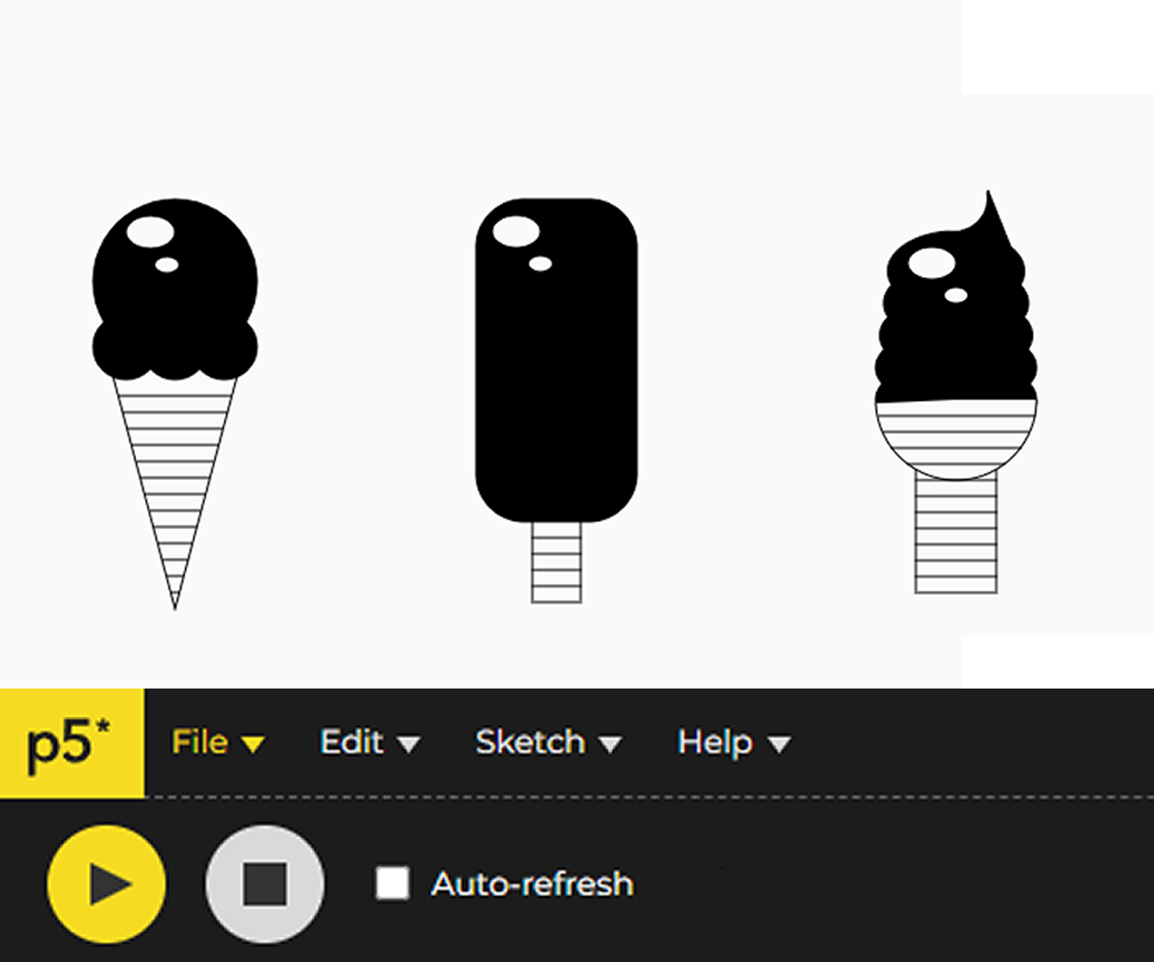
- As shown in the image above, I am first focusing on the ice cream cone, so I choose to use the triangle() function first and overlap the circle() functions to create a basic ice cream cone.
- Further explanation on individual functions can be found in the p5 reference
- Once you have your basic icon shape done, you can look through the functions in the reference to see if you can use any to create details on the icon that can be repeated in your other icons
- For mine, I chose to use line() to create stripes on the cone, fill() to add color, and ellipse() to draw a little “glare” on the top of the ice cream cone. The purpose of adding these is so I can implement the stripe, color, and glare details in the other icons, without changing the meaning of other icons.
Other Icons

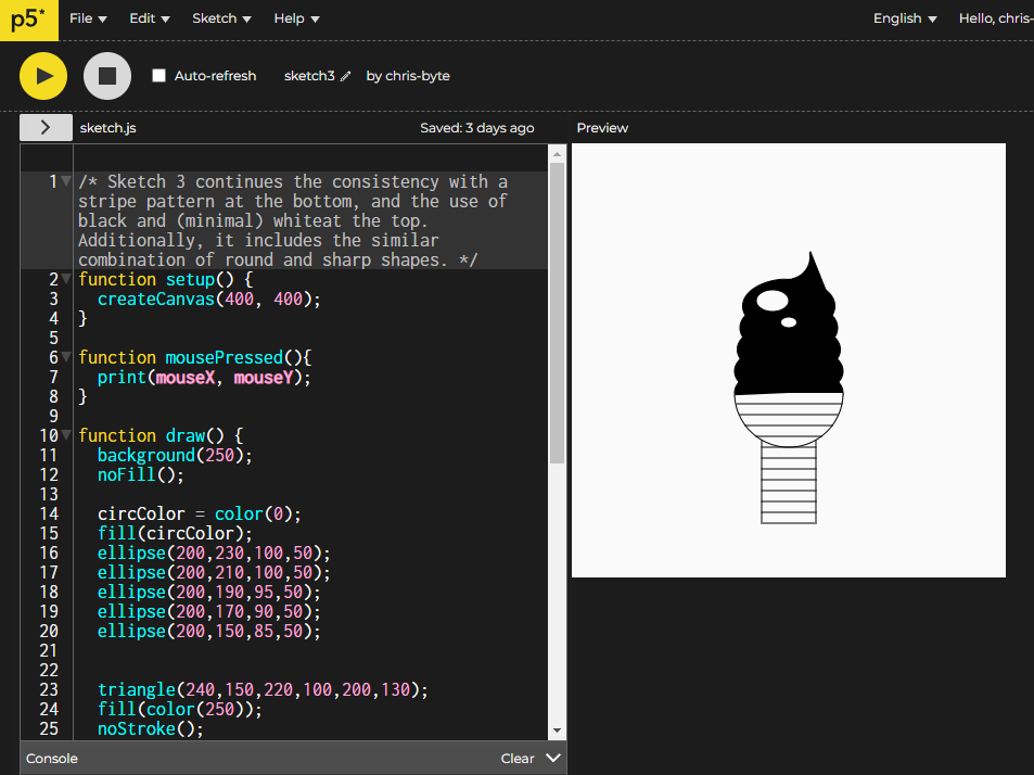
- Now that you know how to draw shapes on the canvas and use the reference to find helpful functions, you can click the “File” button on the top left and create a new file to move on to your next icons.
- You can repeat steps 3 to 5 in choosing how to create the icons, the most important thing to keep in mind is to continue a common trend, pattern, or detail in order to maintain consistency in your icons.