MAT 238 Week 2
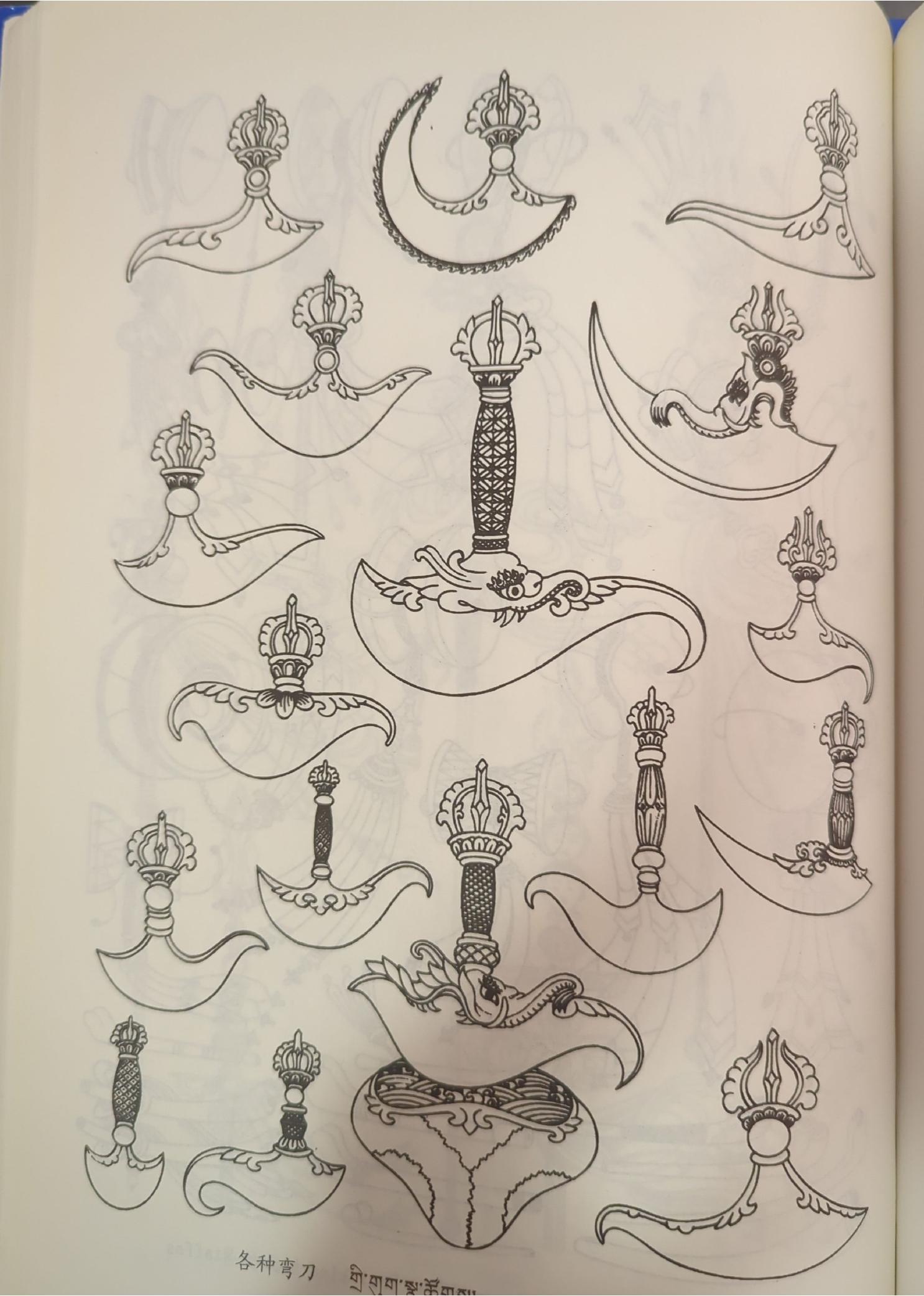
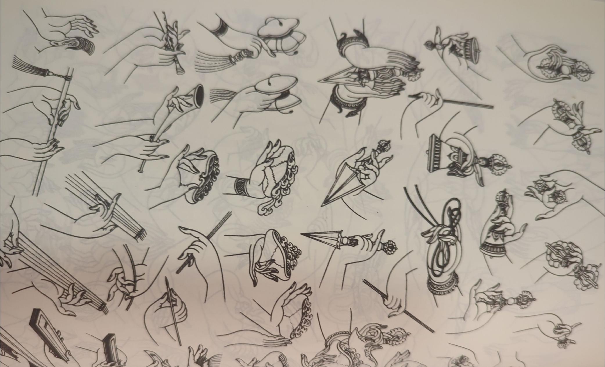
I was inspired by designs of knives from a tattoo reference book I have. However, I quickly realized that I would need something much simpler once I began to appreciate how much measuring was involved and how finicky it was to switch from sketch to design to make notches.
Sketch
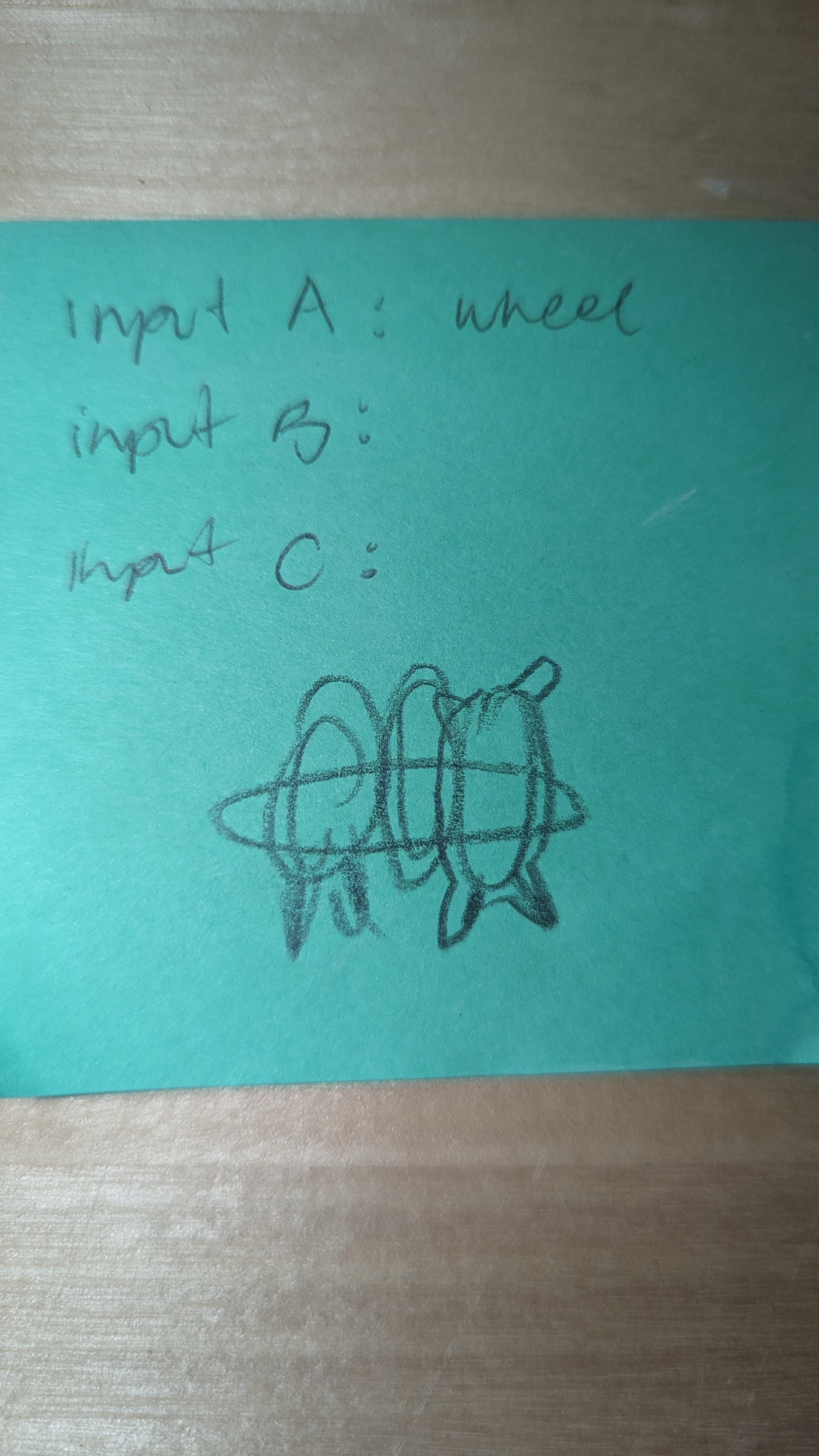
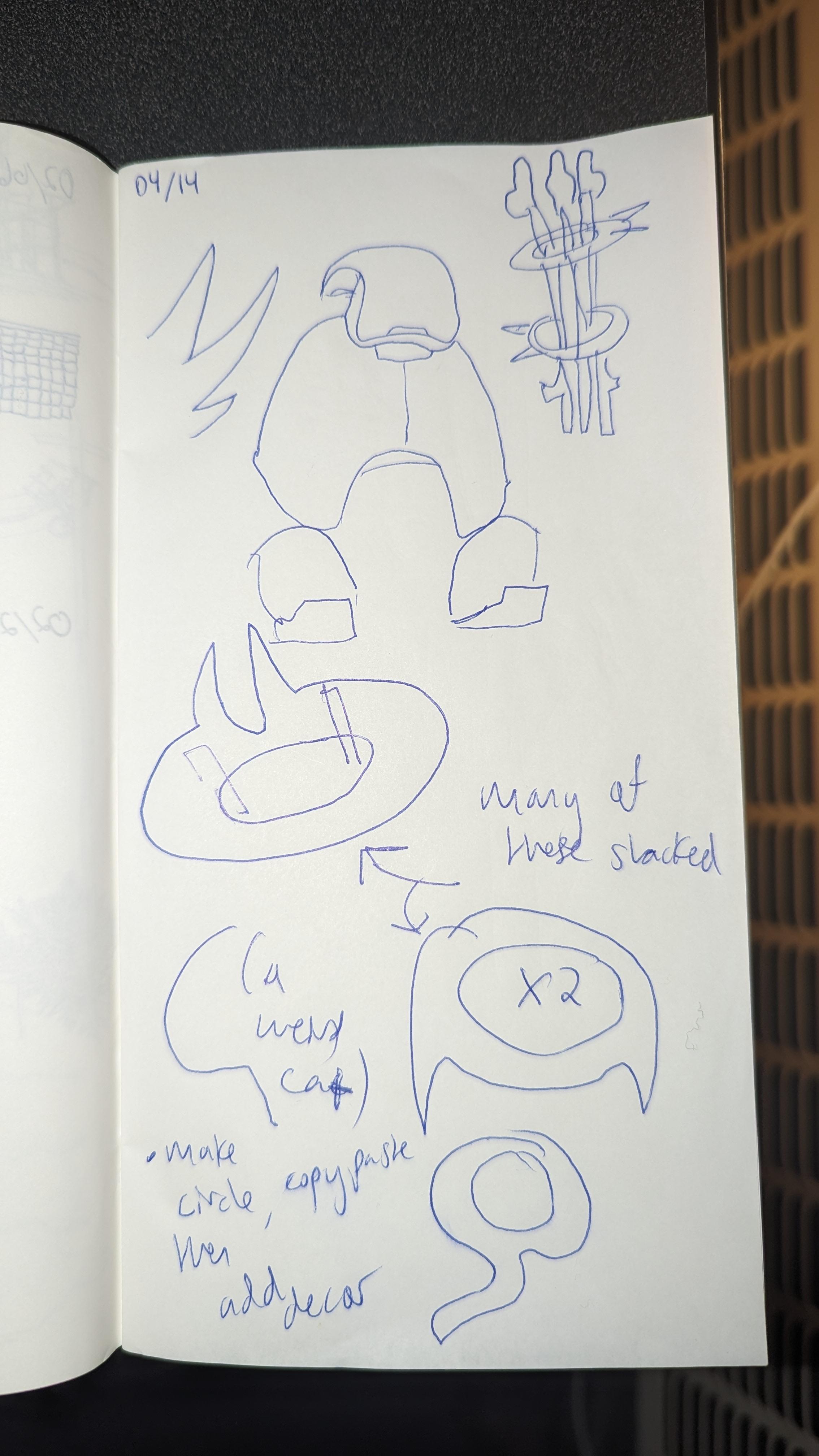
I wanted to do something with curves and I focused on something that would be the hilt of the knife I originally wanted. Once I started sketching, I realized if I put everything together with decor on the outside it might start looking like a four-legged animal.
Model
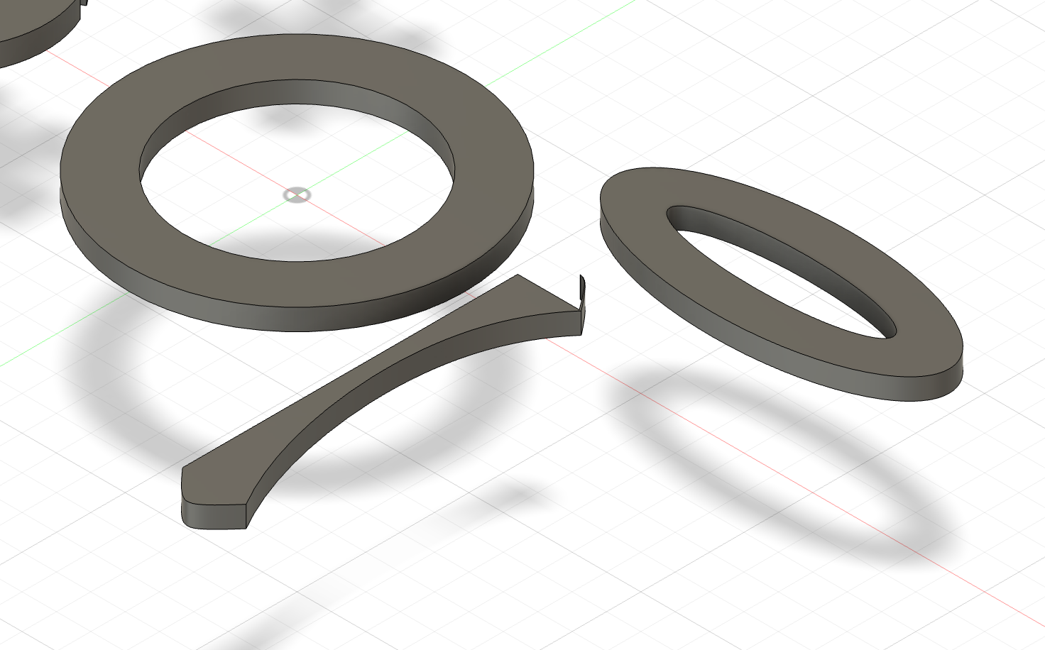
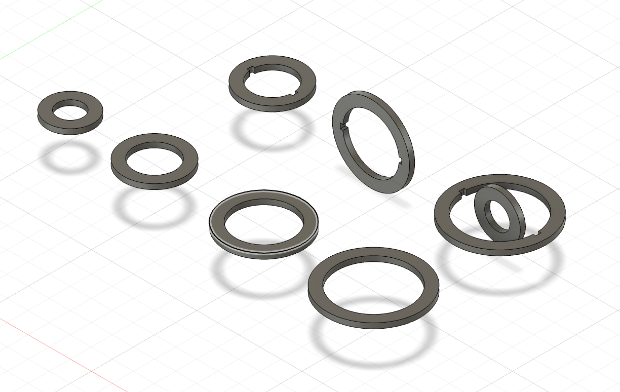

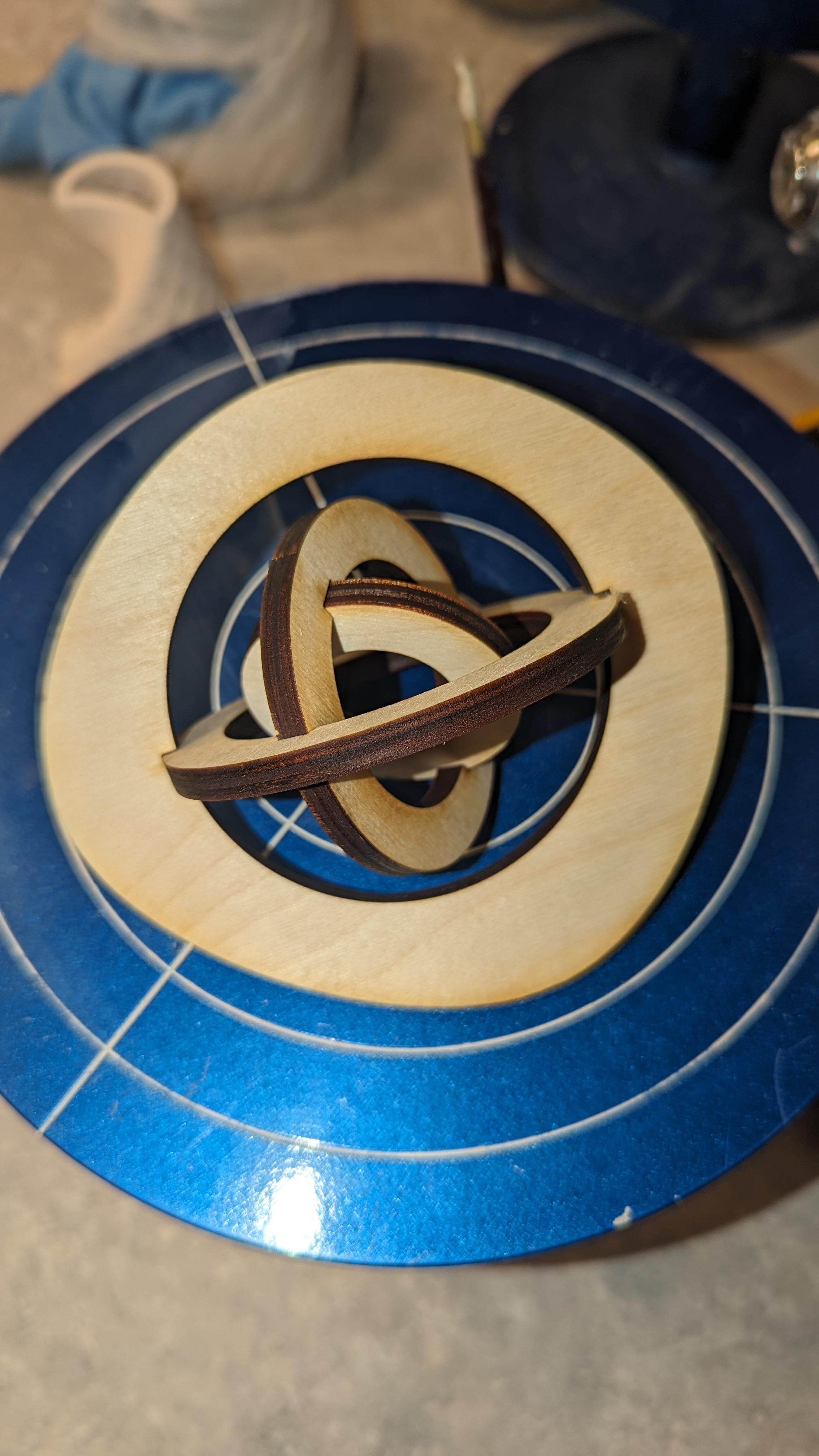
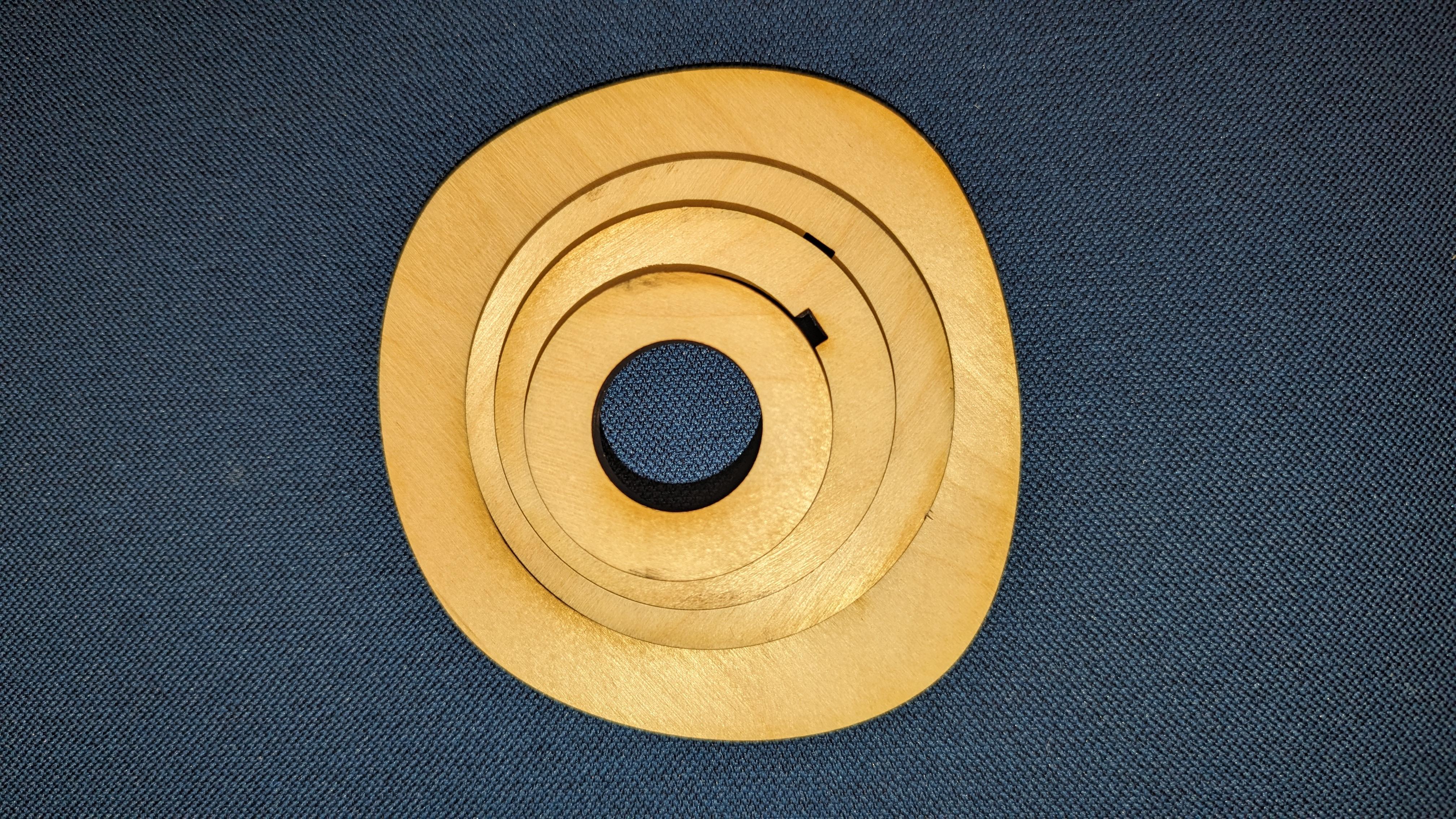
I realized I was in trouble pretty quickly when I started trying to make notches in the curved shapes I was doing. Whenever I edited a userParameter after extruding, things would disappear, which became very time-consuming. I started from scratch at least five times, each time able to reproduce what I had faster but each time realizing I should simplify what I was making even more. I needed Alejandro's help creating the notches on the round interior edge because I couldn't get the Rectangular Pattern functionality to work correctly. I originally wanted ellipses, circles, and straight lines to intersect, but I ditched everything but the circle and focused on measuring correctly so that the fits would work. I decided to go with simple interlocking circles. At the last second in Illustrator, I added some weird outline to the larger circle, because adding anything to the smaller circles risked messing up the fit.
Cut
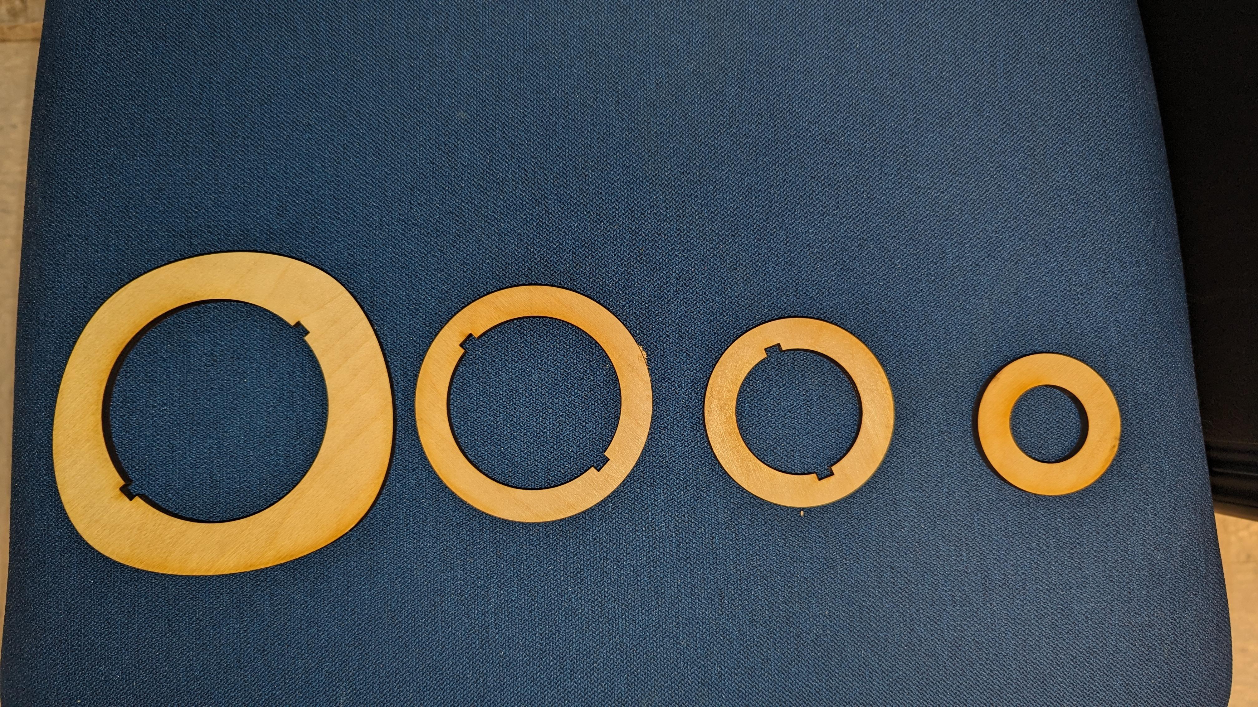
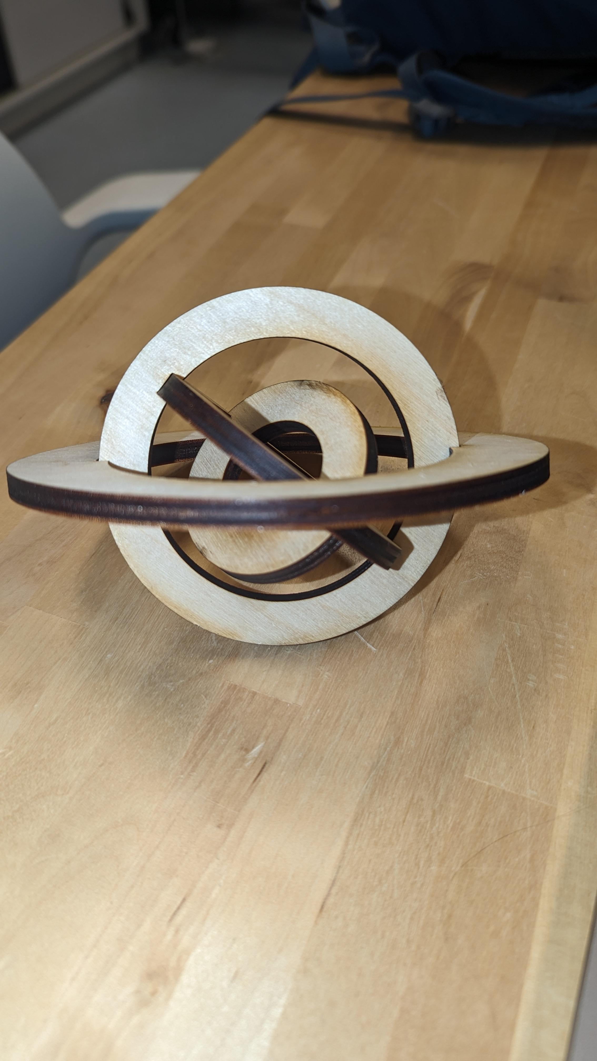
The cut was once again extremely fast with no cleanup. The circles made the press fit easier because they were a bit on the tighter side and I simply slid them in until they were stuck, it didn't matter that it wasn't 100% centered. I went later in the office hours so by then the laser cutter was tuned perfectly.
It even spins like a top (and stays together)! The video is too large to attach, though.
Reflection
In hindsight, I would have started with an EXTREMELY simple concept that left room to expand on, rather than starting with something I thought was simple and cutting scope til what remained was overly simple. Instead of diving right into what I wanted to make, I would have watched even more YouTube tutorials about how to make things adjacent to what I had in mind for my design, just so that I was far more comfortable with the Fusion workflow and the timeline in particular. Normally when I start learning new software, I try to find an example that is cool enough to motivate me through the drudge work of learning how to menu-dive. I learned from last week to try to keep it simple, but I underestimated the Fusion interface because it seemed so intuitive during Jennifer's walkthrough.