Linear Control Systems App for the HP Prime Calculator
by herwig9820 in Design > Software
5916 Views, 4 Favorites, 0 Comments
Linear Control Systems App for the HP Prime Calculator
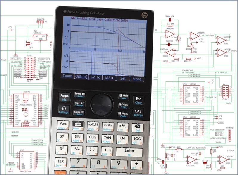
The main objective of this software project was creating a reliable, user friendly app for the HP Prime Calculator (Hewlett Packard's top-of-the-line graphic calculator) that can be used by engineering students while making calculations in the area of linear control systems. For instance, in electronics, many of the circuits built around operational amplifier chips (in short, opamps) behave like linear systems. Examples are integrators, first and second order systems, etc.
A second, equally important objective was to document the app functionality in a clear and concise way, including download and install instructions.
At the start, I created this App in the context of my 'Floating and Spinning Earth Globe' project (click here) - which won an instructables 'first prize', by the way.
The app is simply named 'Control Systems' and is a great help while studying frequency and time domain responses of relatively simple systems, where there is no real need for more advanced tools like MATLAB etc.
A few prerequisites, though
Of course it is obvious that, because of the specialised nature of the app, a certain level of domain knowledge is required from those working with the app. More especially, you should know about frequency response, time domain response, transfer functions (based upon Laplace transforms), Root Locus charts...
It's like flying an aircraft: the aircraft manual and the aircraft itself can be top, but if you're not a pilot ... I guess you get the message.
Additionally, some familiarity with the HP Prime calculator is highly recommended.
Supplies
- HP Prime Calculator
- HP Prime Connectivity kit (for installing the App)
- A windows computer (for installing the App)
Before You Begin

It is advised to have a HP Prime calculator, with this App installed, at hand.
Without, it will be difficult to follow and understand this tutorial.
As an alternative, HP (Hewlett Packard) also makes available Windows and Android versions of the calculator (HP Prime calculator app). You will need the (cheap, but) paying version, which allows communication with the HP Prime connectivity kit.
The Control Systems App software and a pdf version of this instructable can be downloaded from GitHub through this link (you won't need an account): https://github.com/Herwig9820/controlSystemsApp-HP-Prime .
You can find the app installation instructions at the end of the manual.
Overview

The 'Control Systems' app is used to study responses of control systems consisting of a process and a controller.
- In the frequency domain, the app calculates open loop responses of a linear process with and without controller and the resulting closed loop response (unity feedback loop)
- In the time domain, the app calculates the open loop and unity feedback loop response to reference changes as well as to disturbances (appearing between controller and process). It also calculates and visualizes the controller output. Input types: Dirac pulse, unit step and ramp
The ‘Control systems’ app takes as input the transfer function of a process as well as the settings of a controller and produces several plots typically used to study relative and absolute stability etc. Results are available in numerical form as well.
Plot types:
- Frequency domain: Nyquist, Nichols, Bode (magnitude + phase, magnitude only, phase only)
- Time domain: input, output, error signal, controller output
- Root Locus Plot
Note for those familiar with the HP Prime calculator:
Although the app type is ‘Parametric’, the app does not rely on the built in HP Prime parametric plot mechanism but on custom plotting routines, including custom mouse movement handling, key press detection and custom soft key menus to accomplish functionality that would not be possible otherwise. App parametric equations are only used in Numeric View. The app is entirely menu based (no need to type in commands).
A Few Sample Plots
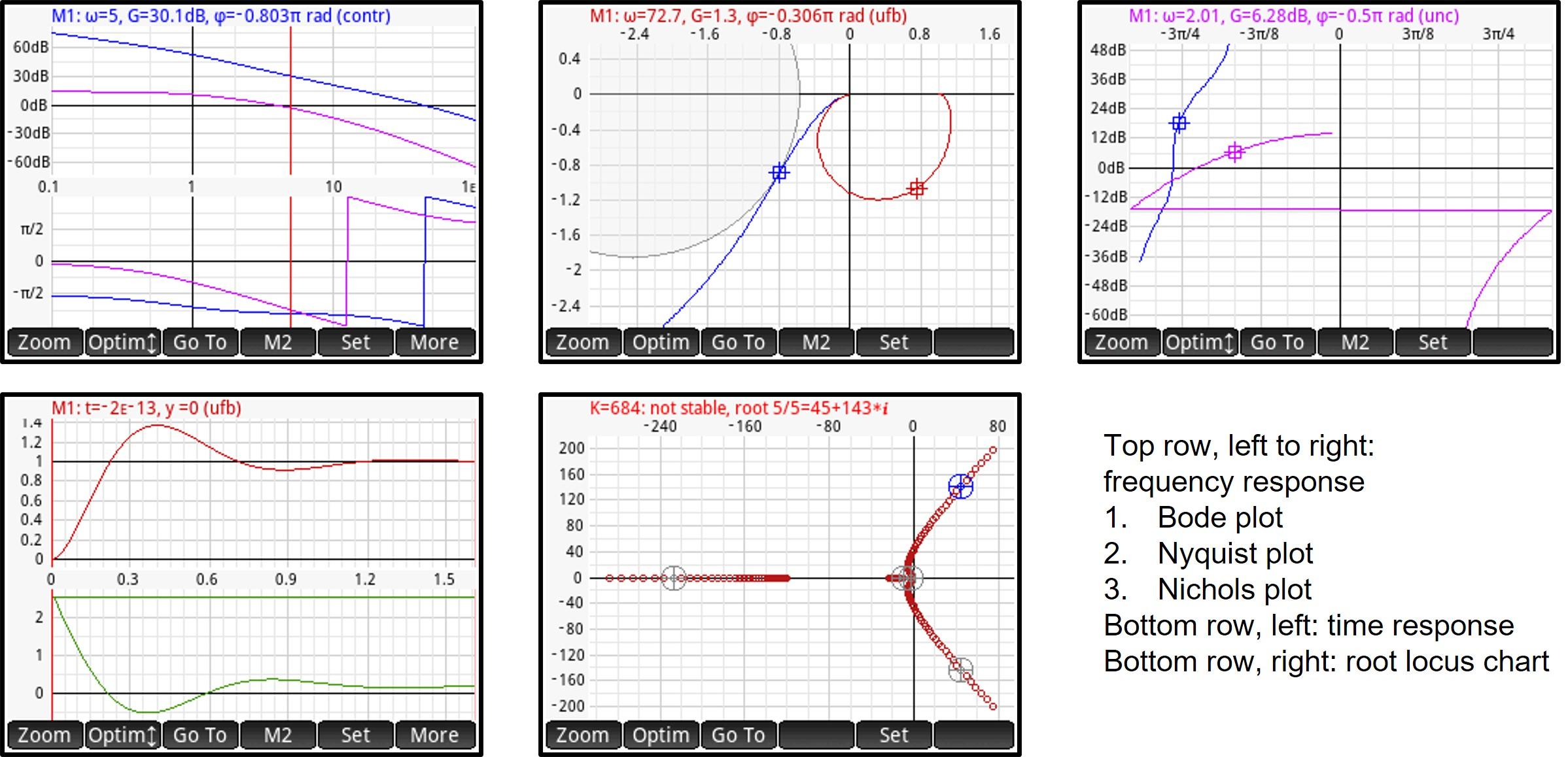
In the next steps, we will guide you through all these different plot types and how to use them.
Note that the scales indicate real frequency (log scale) and magnitude (log or dB scale) units. This would be impossible if the standard HP Prime plot mechanism would be used.
Process Transfer Functions
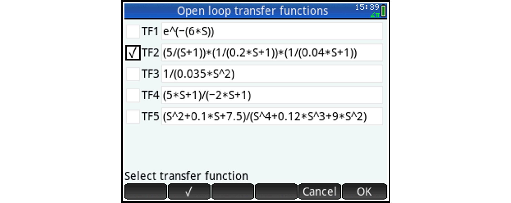
When starting the app or pressing the 'Symb' button, the HP Prime will not open the standard Symbolic View but will open the ‘Process Transfer Function (open loop)’ view.
You can enter a maximum of five Transfer functions (a transfer function is the Laplace transform of the time response of a process when a Dirac function is applied at its input at time = 0).
Select one process (radio buttons at the left) before pressing 'OK'.
- Use S (capital S) as the symbol to denote the complex variable (note that this will not refer to built in HP Prime HOME variable S).
- A time delay is entered as a factor e^(-T*S) in the numerator, with T being a number representing the time delay
Plot Setup and Angle Measure Selection
Press Shift-Plot to open the settings menu, which consists of 4 pages, each page being dedicated to a specific group of settings. In next steps, all settings will be discussed, one by one.
- Note that the HP Prime will not open the standard Plot Setup View (which you won’t need).
- Alternatively, while a plot is displayed, you can directly access the relevant settings (frequency domain, time domain or root locus) by tapping the 'Set' soft key.
Note: selecting an angle measure is not part of plot setup. Press Shift+Symb to open Symbolic Setup View and select the angle measure (standard HP Prime view).
Frequency Domain Settings (plot Setup Page 1)
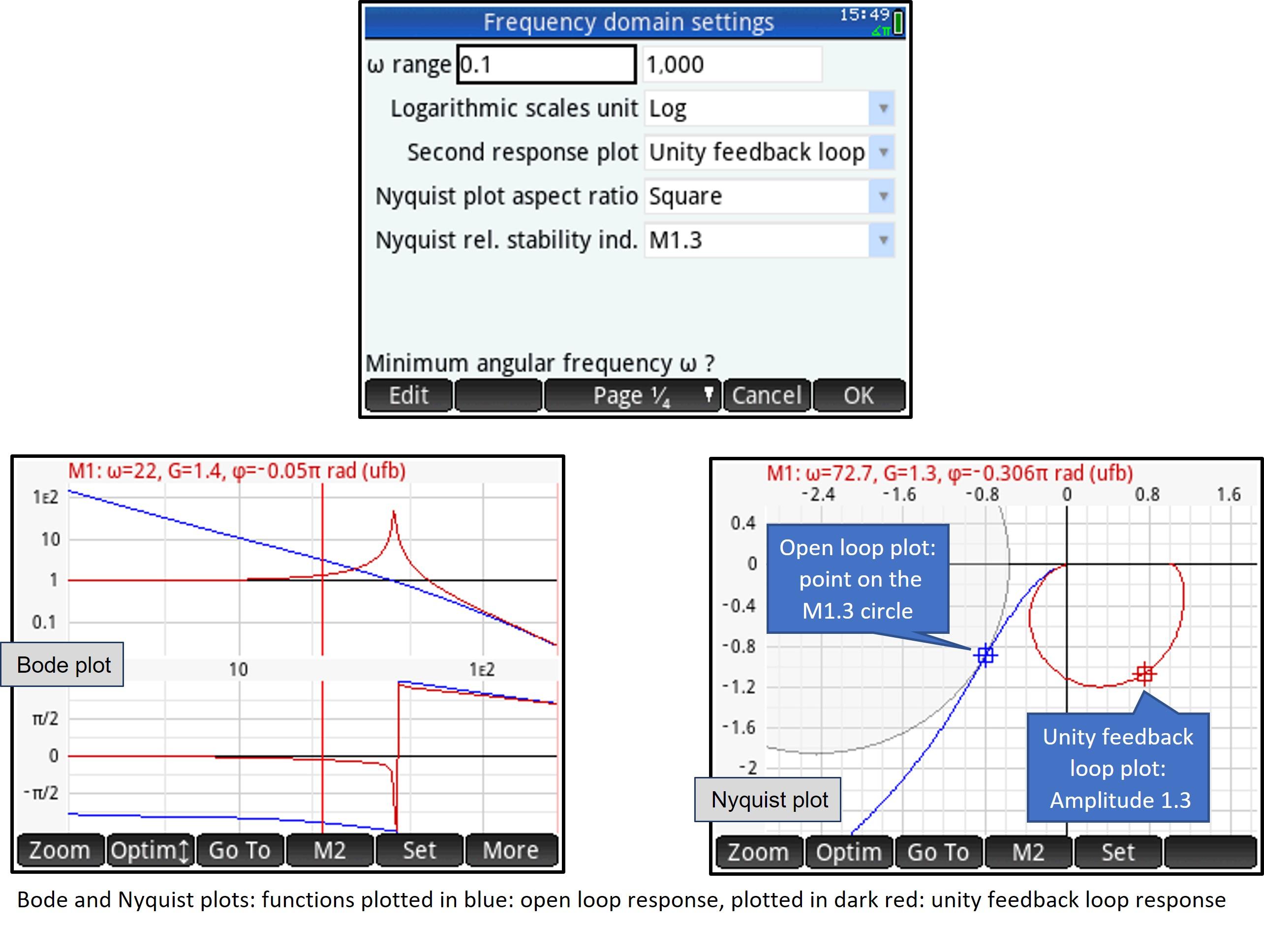
Angular frequency range
Enter minimum and maximum frequency
Logarithmic scales unit (for plot types with logarithmic magnitude scales)
- Log: logarithmic scale
- dB: decibel scale
Second response plot
- None: single plot only, of the open loop frequency response (process with controller, if controller present). The plot is drawn in blue.
- W/h controller: plots the open loop frequency response of the process without controller (only drawn if a controller present). The plot is drawn in purple.
- Unity feedback loop: plots the closed loop frequency response (unity feedback loop). The plot is drawn in dark red.
This setting effects all frequency domain plot types. For instance, in the Bode plot, with “unity feedback loop” selected, this produces the plot as shown in the figure, above.
Nyquist plot aspect ratio after optimizing
This setting will force a ‘square’ zoom (equal Real and Imaginary scales) each time the app optimizes the chart scales (Nyquist plot only).
- Free: no imposed aspect ratio
- Square: real and imaginary axis use same scale
Note that chart scales are sometimes optimized automatically (e.g. always after you changed plot setup). You can also manually optimize chart scales.
Nyquist plot: show M1.3 and ‘Deviation Ratio 1’ circles
- None: do not show any additional information
- M1.3: show M1.3 circle (all points on the open loop plot resulting in a unity feedback loop amplitude ratio of 1.3)
- M1.3, DR1: show M1.3 circle and ‘Deviation Ratio 1’ circle
A note on the ‘Deviation Ratio 1’ circle: when a disturbance signal is applied to the process, it depends on the angular frequency of that disturbance whether controlling the process (closed loop) will reduce the effect of that disturbance on the process output (compared with the uncontrolled, open loop process).
With the ‘Deviation Ratio 1’ circle shown, the open loop plot gives you following information:
- Points on the DR1 circle: controlling the process (closed loop) has no effect
- Points within the DR1 circle: controlling the process (closed loop) is harmful
- Points outside the DR1 circle: controlling the process (closed loop) contributes to have a stable process
Time Domain Settings (plot Setup Page 2)
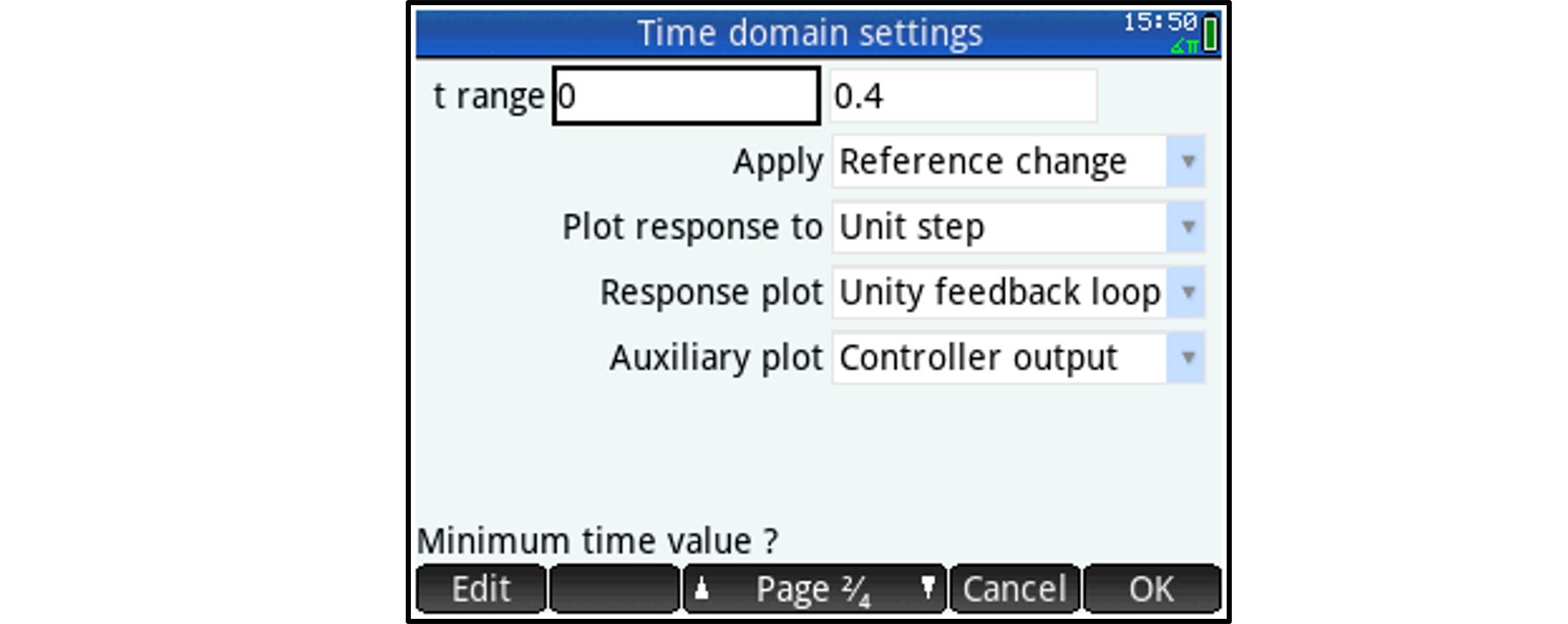
Time range
Enter minimum and maximum time
Apply reference change or disturbance as input
- Reference change: apply a reference change
- Disturbance: apply a disturbance between controller output and process input
Note that the input will be plotted in black if it is a reference change, and in dark yellow if it is a disturbance.
Input signal: response to
- Dirac pulse
- Unit step
- Unit ramp
Response plot
Plots the process output for
- Open loop
- Unity feedback loop
Note that process output is always plotted in red (for open loop as well as unity feedback loop response).
Auxiliary plot
- Error signal: show the error signal (controller input) on the optional second chart. This plot is drawn in gray
- Controller output: show controller output on the optional second chart. This plot is drawn in green
Root Locus Settings (plot Setup Page 3)
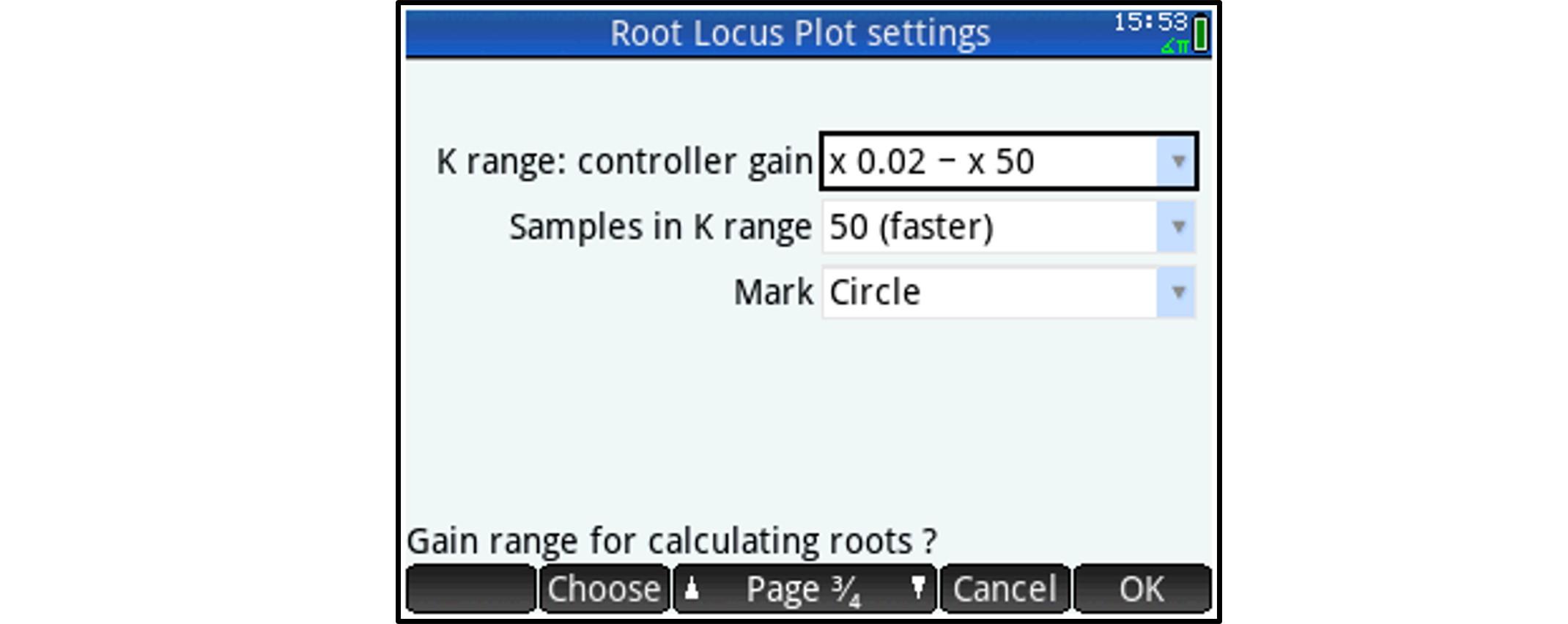
Gain range
Root locus plots take the controller open loop gain as a ‘center point’ (if no controller is present, then this center point gain will be ‘one’). With the gain range setting, you define how wide the app needs to set the gain range for calculating roots. Options:
- Controller gain x 0.5 to 2
- Controller gain x 0.2 to 5
- Controller gain x 0.1 to 10
- Controller gain x 0.05 to 20
- Controller gain x 0.02 to 50
- Controller gain x 0.01 to 1 (gain < controller gain only)
- Controller gain x 1 to 100 (gain > controller gain only)
Note that gain is not increased linearly (adding a fixed step) but by applying a calculated factor, based on gain range and sample size (see next).
Sample size
- Choose between 50, 100, 200, 500 or 1000 samples. The more samples, the slower the calculation.
Mark
- Dot
- Crosshair
- Circle
General Settings (plot Setup Page 4)
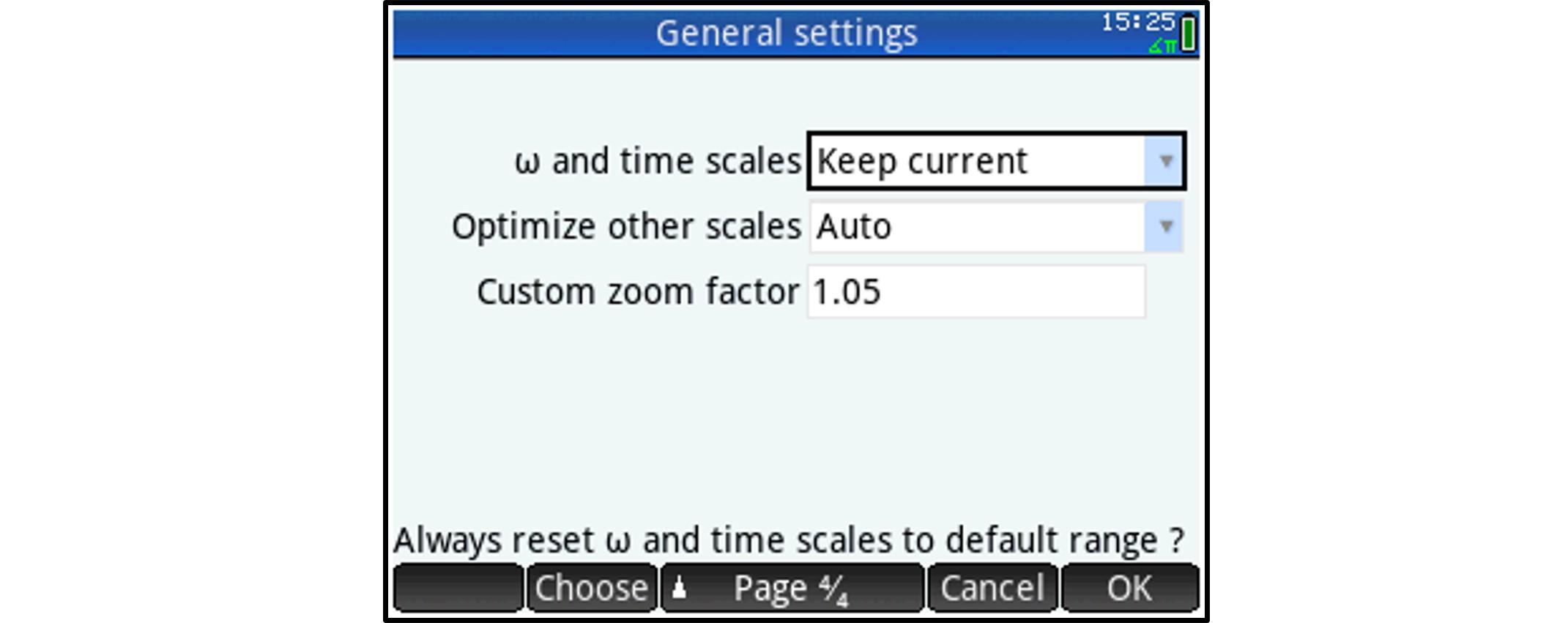
Set ω and time scales
- Keep current: do not change the angular frequency or time scales when re-plotting
- Default ω or t range: reset the corresponding (ω or time) scale, the first time a plot is performed after
- button 'Plot' is pressed to start a new plot
- button 'Symb' is pressed to edit transfer functions or button Symb Setup is pressed
- controller type is changed or controller settings are changed (View menu)
- plot type is changed (View menu)
Note that this setting affects the Bode and time domain response plots only. It has no impact on Nyquist or Nichols plots because these plots (which do not have frequency or time scales) always use the ω or time ranges defined in plot setup to create a plot.
The first time a plot is performed after a Plot Setup (this menu), ω or time scales for that plot will always be reset to their defaults (irrespective of this setting).
Optimize other scales
- Manual: scales are not optimized automatically when re-plotting
- Auto: optimize other (non- ω or time) scales, the first time a plot is performed after
- same actions as described under previous paragraph (‘Set ω and time scales’)
- zooming, dragging, layout change (Bode and time domain response plots only)
For Bode and time domain response plots, each time the ω or time range is reset to the default range, other scales are automatically optimized again as well.
Custom zoom factor
Enter a zoom factor between 1.05 and 10. This zoom factor will be applied when zooming in or out using the + or - buttons (only).
Selecting and Setting Up a Controller
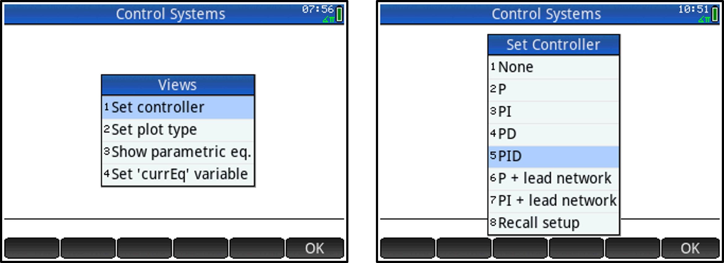
Press 'View'. A custom Views Menu will open.
Now, select option 1 (Set controller) and either
- select a controller type: you can either decide not to use a controller at all (see left picture, option 1), or select a controller with proportional (P), integrating (I) or derivative (D) terms applied to the error signal (or a combination of these terms – options 2 to 5). The derivative term can be replaced by a lead network as well (see further), which will attenuate the controller’s response for very high frequencies (options 6 and 7).
- recall a previously stored controller setup.
Selecting a Controller Type
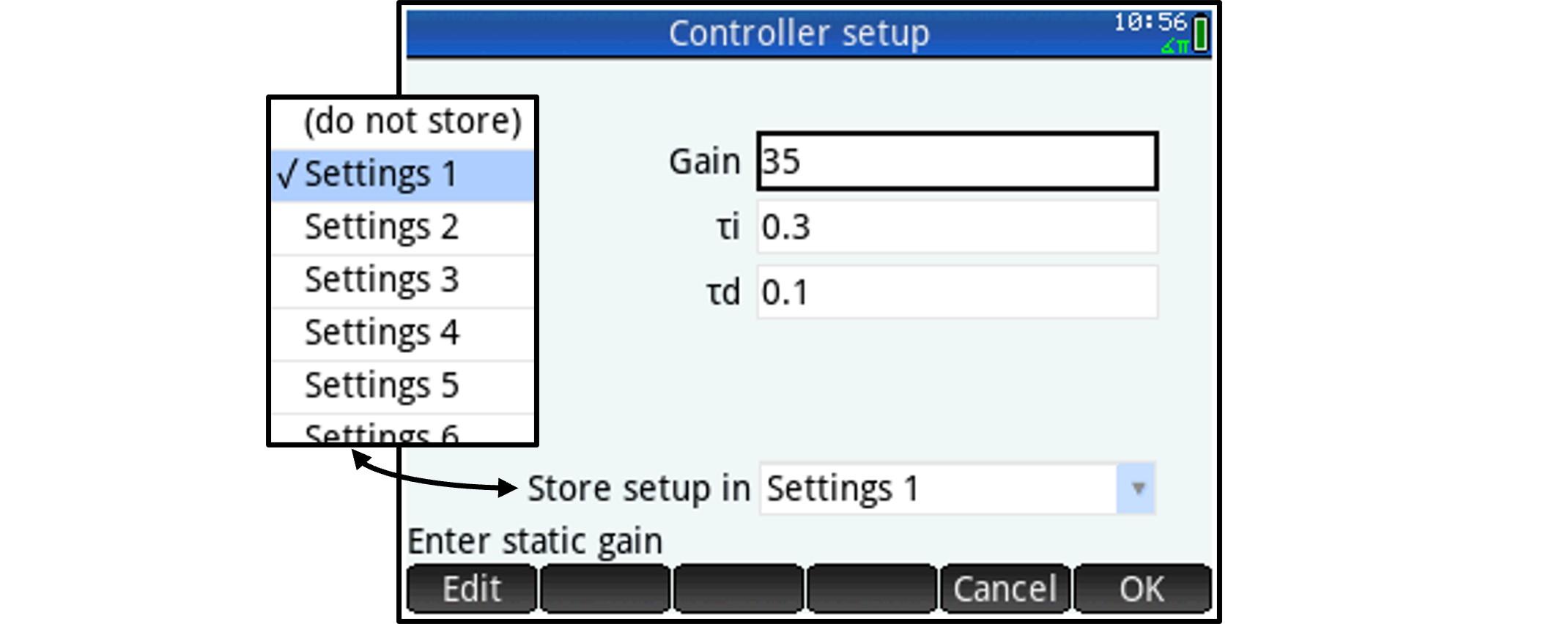
Example: select ‘PID controller’ in the ‘Set controller’ list (see previous step). The controller setup screen will be displayed (see picture).
- The currently active settings for static gain and integrator and differentiator time constants are displayed and can be changed.
You have the option to store this setup for later use (up to 9 setups can be saved) or you can select ‘do not store’ from the dropdown.
You can now change the static gain (proportional term) and the integrator and differentiator time constants.
The corresponding controller Transfer Function (which the app will construct) will then be:
C(S) = GAIN * (1 + 1 / τi S) * (1 + τd S)
Recalling a Previously Stored Controller Setup
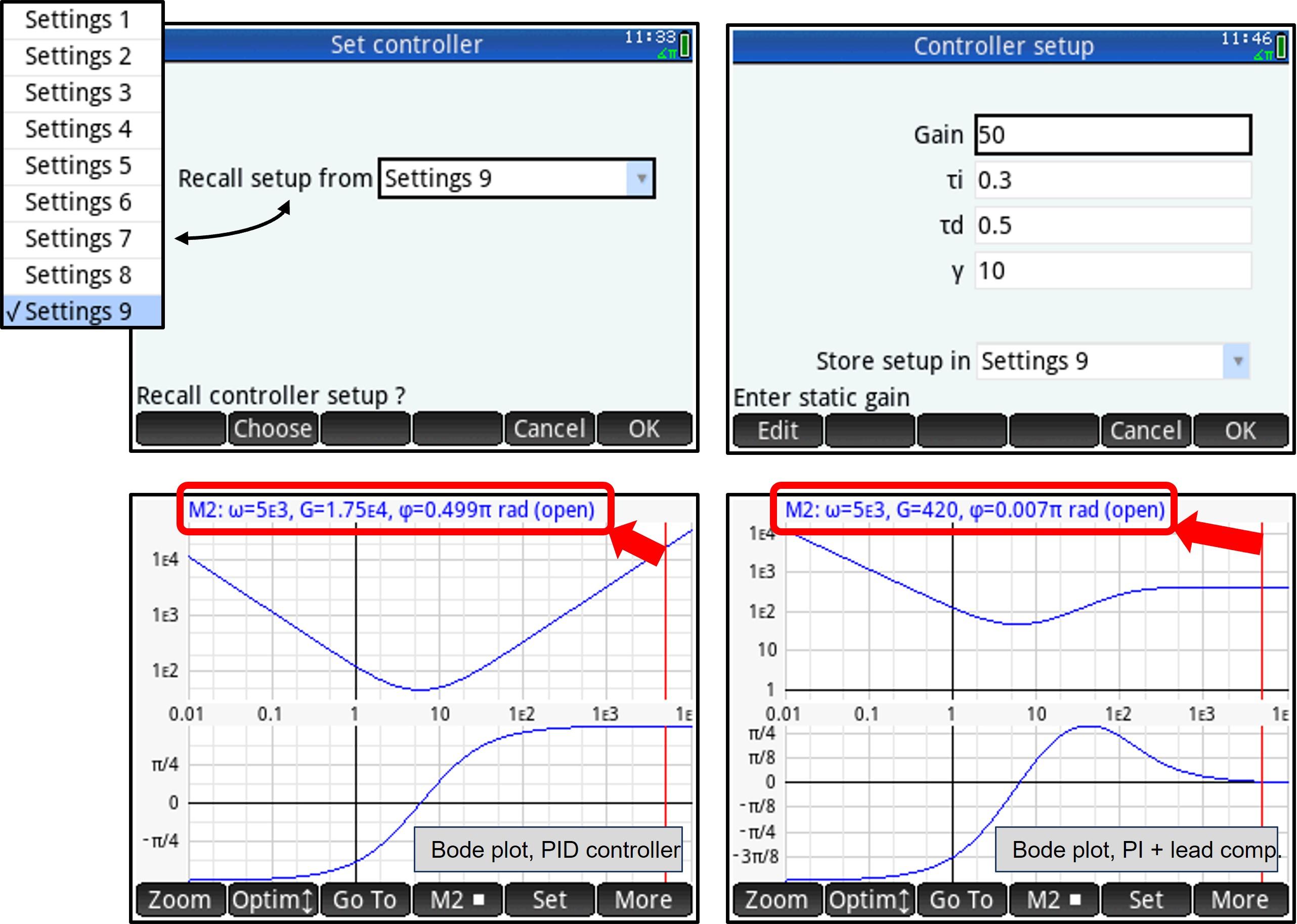
In the 'Views' menu, select option 1 (Set controller) and then select option 8 (Recall setup) in the ‘Set controller’ list.
Example: recall the controller setup previously stored in settings 9. The controller setup screen will be displayed:
According to this example, a ‘PI+lead network’ controller setup was stored in settings 9. This is essentially a PID controller with a correction (based on the value for γ) applied to the higher frequency range.
You can now change the static gain (proportional term), the integrator and differentiator time constants and the lead compensation factor γ.
The corresponding controller Transfer Function (which the app will construct) will be:
C(S) = GAIN * (1 + 1 / τi S) * (1 + τd S) / (1 + (τd / γ) S)
For γ = 1, this controller will behave like a PI-type controller. If γ is infinity, then the controller will behave like a PID controller.
For a given γ, the amplitude in the high frequency range will slowly approach γ times the static gain (GAIN * γ), and this for frequencies higher then γ / τd, instead of going to infinity as would be the case for a pure PID controller. The phase angle will approach zero for very high frequencies, instead of +90° (pure PID controller).
- Typically, γ ranges from 2 to 20.
- The lower γ, the lower the maximum phase lead. This maximum phase lead will also be obtained for a lower frequency.
The Bode diagrams above show amplitude and phase characteristics for two controllers with same values for gain, integrator and differentiator constants (resp. 35, 0.3 and 0.1). The left Bode diagram represents a pure PID controller, whereas the right plot represents a PI controller with lead compensation (γ = 12).
The right Bode diagram clearly shows that for ω = 5000 rad/s (marker 2), the indicated gain is 420, which is
35 * 12 = gain * y and the phase angle is almost 0°. The maximum phase lead (0.293 π rad) is reached for
ω = 39 rad/s.
Selecting a Plot Type
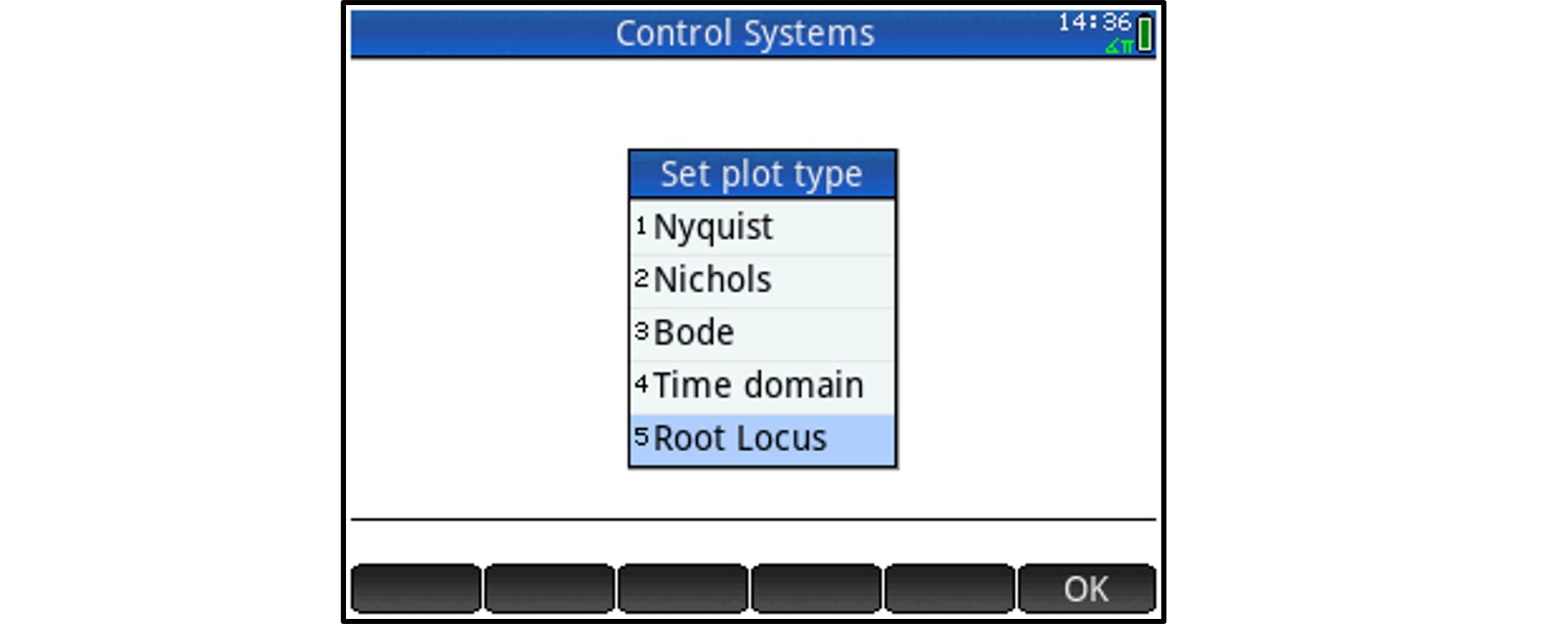
Now that we have selected a controller and specified its parameters, we can select a plot type.
Press 'View' to open the custom Views Menu and select option 2 (Set plot type).
Then, choose the desired plot type from the menu.
Plot types and associated functionality (zooming etc.) will be discussed globally in next sections.
Frequency Domain: Nyquist Plots
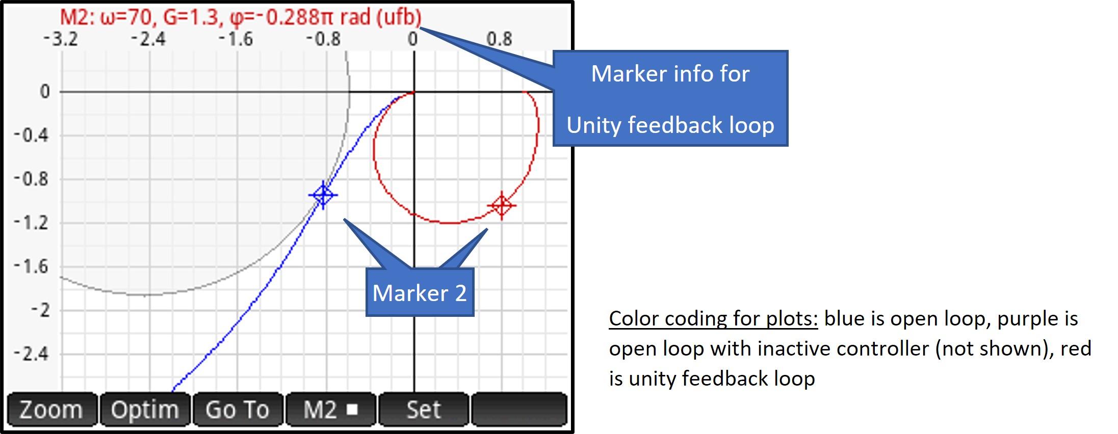
This is a polar plot, with linear scales, of the transfer function C(jω) * P(jω).
In the sample screenshot, the plot for the transfer function of the unity feedback loop is also shown, as is the M1.3 circle (see section about settings).
Frequency Domain: Nichols Plots
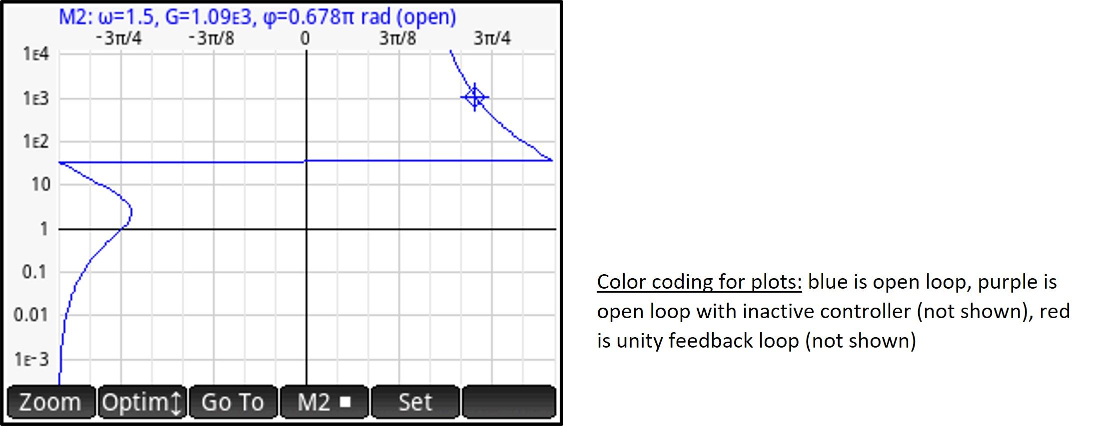
This is a magnitude / phase angle plot of the transfer function C(jω) * P(jω).
The magnitude (vertical scale) is logarithmic.
In the sample screenshot, no secondary response plot is selected (see section about settings).
Frequency Domain: Bode Plots
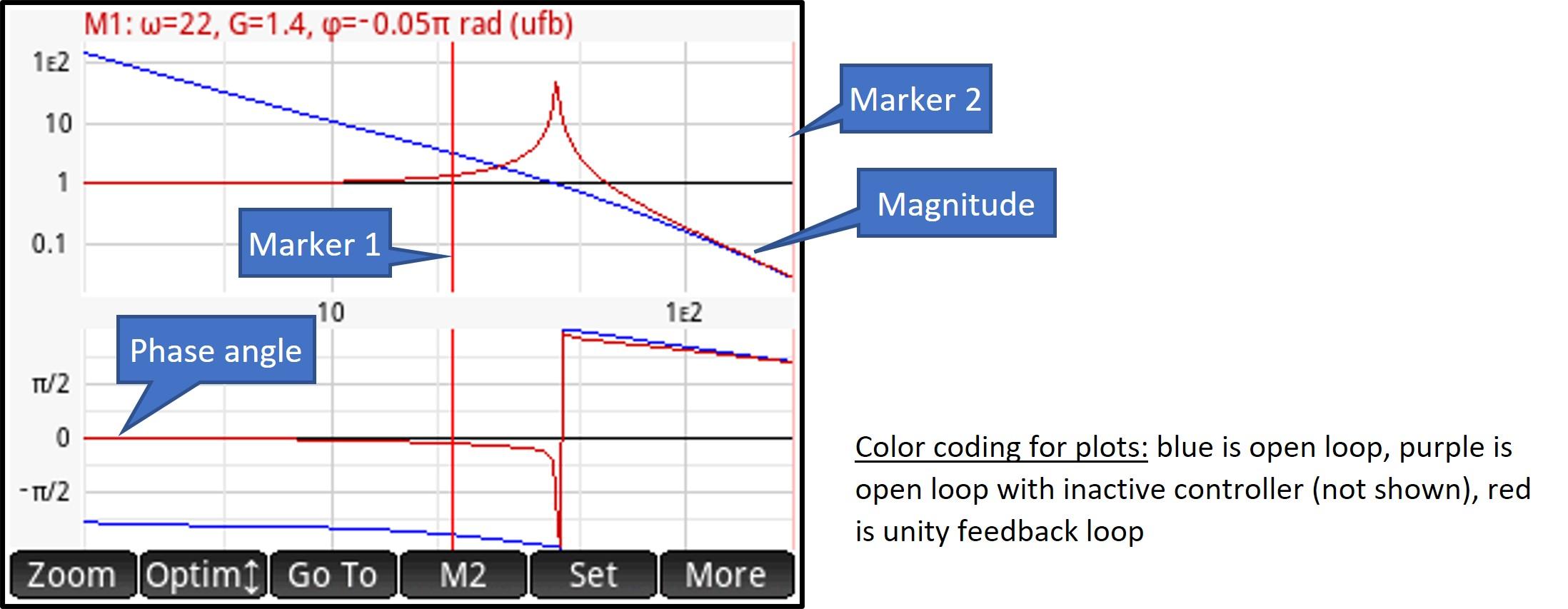
This is a frequency domain response plot for a given transfer function.
Magnitude (logarithmic or dB scale) and phase angle are plotted on separate charts.
Time Domain Response Plots
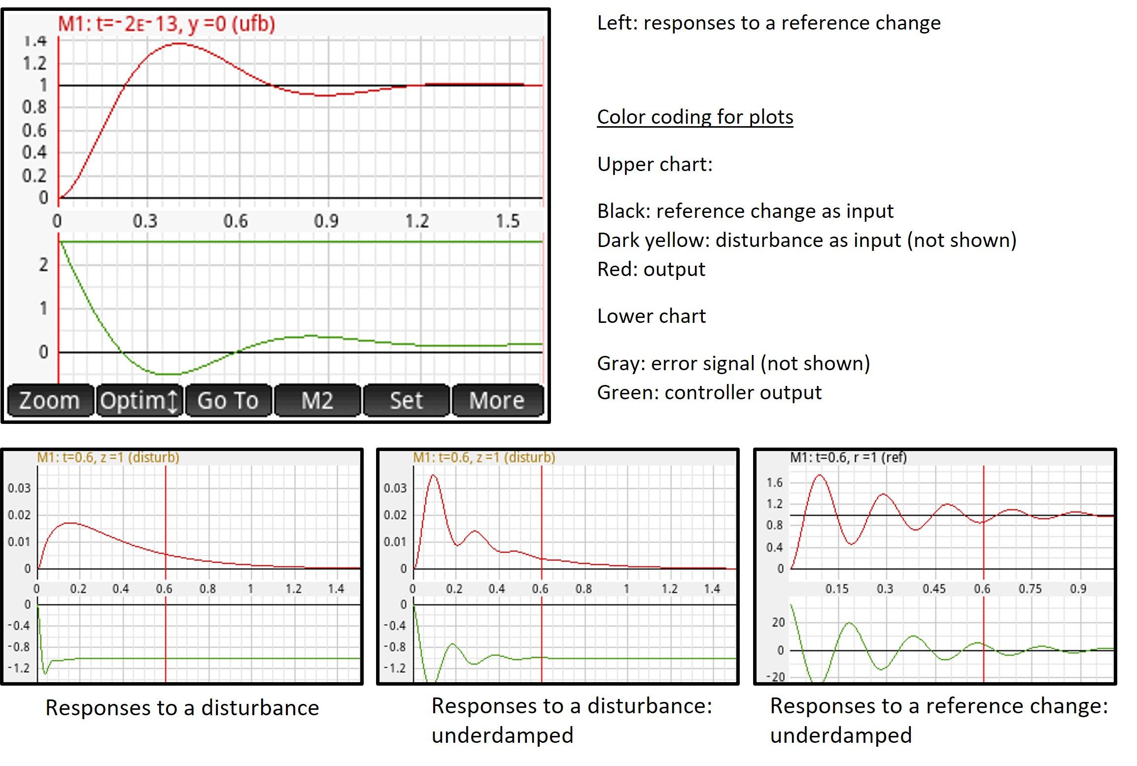
As mentioned before, you can choose between reference input change and disturbance, and the change can be a Dirac pulse, a unit step or a unit ramp.
In the examples shown here, the unity feedback response plot is shown, together with (lower chart) the controller output (you can also visualize the error signal).
Note: time domain response plots are based on the calculation of an Inverse Laplace Transform. Standard HP Prime function ‘invlaplace’ is used for that, but it is not always capable to perform the calculation. If it fails, you will receive an error message.
Frequency and Time Domain Plots: Markers

All frequency and time domain plots have two markers, labeled marker 1 (M1) and marker 2 (M2). Markers are associated with a set angular frequency (ω) or, for time domain response plots, with a set time.
- Bode plots and time domain response plots display these markers as two vertical lines. The active marker (if within the visible frequency range) is shown in a bright red color. The inactive marker is shown in a very light red color. Marker 1 is always positioned to the left of marker 2.
- Nyquist and Nichols plots display the markers as a cross hair with a square around it. For marker 2, this square is tilted 45 degrees. In order not to overload the screen, only the active marker (M1 or M2) will be visible (if two plots are currently shown, then each plot will have its active marker).
If the status line (see further) currently displays the change in magnitude and phase between the two marker positions for a plot, then the two markers (M1 and M2) for that plot are shown instead.
The status line on top of the chart displays more info about the active marker / about the markers.
Selecting the active marker
Tap the 'M2' softkey to alternate between marker 1 and 2. If marker 2 is active, a square dot will be shown to the right of the soft key ‘M2’ label.
For Bode plots and time domain response plots (only), you can also activate a marker by tapping on a marker and holding for a second. The marker position will not move.
Moving the markers
To move a marker, you can
- Tap the screen. This will move the active marker. If this would move the active marker beyond the other marker (M1 is always positioned left of M2), the other marker will become active and will be moved instead
- Press the left or right cursor keys (rocker wheel) to decrease or increase the set angular frequency (or time) for the active marker, moving that marker
- Press and hold the left or right cursor keys: after half a second, the active marker position will start moving left or right at a constant speed. This speed will increase with a factor ten after another 1.5 seconds
- Press Shift and then press the left or right cursor keys to move the active marker to the left or right border of the chart (Bode plots and time domain response plots) or to the outer ends of the plot (Nyquist and Nichols plots)
- Tap the 'Go To' softkey and enter an angular frequency or time (time domain response plots) to set markers. Then, tap 'OK'
Note that, as marker M1 is always positioned left of M2, a marker will never be able to move beyond the position of the other marker.
Frequency and Time Domain Plots: the Status Line
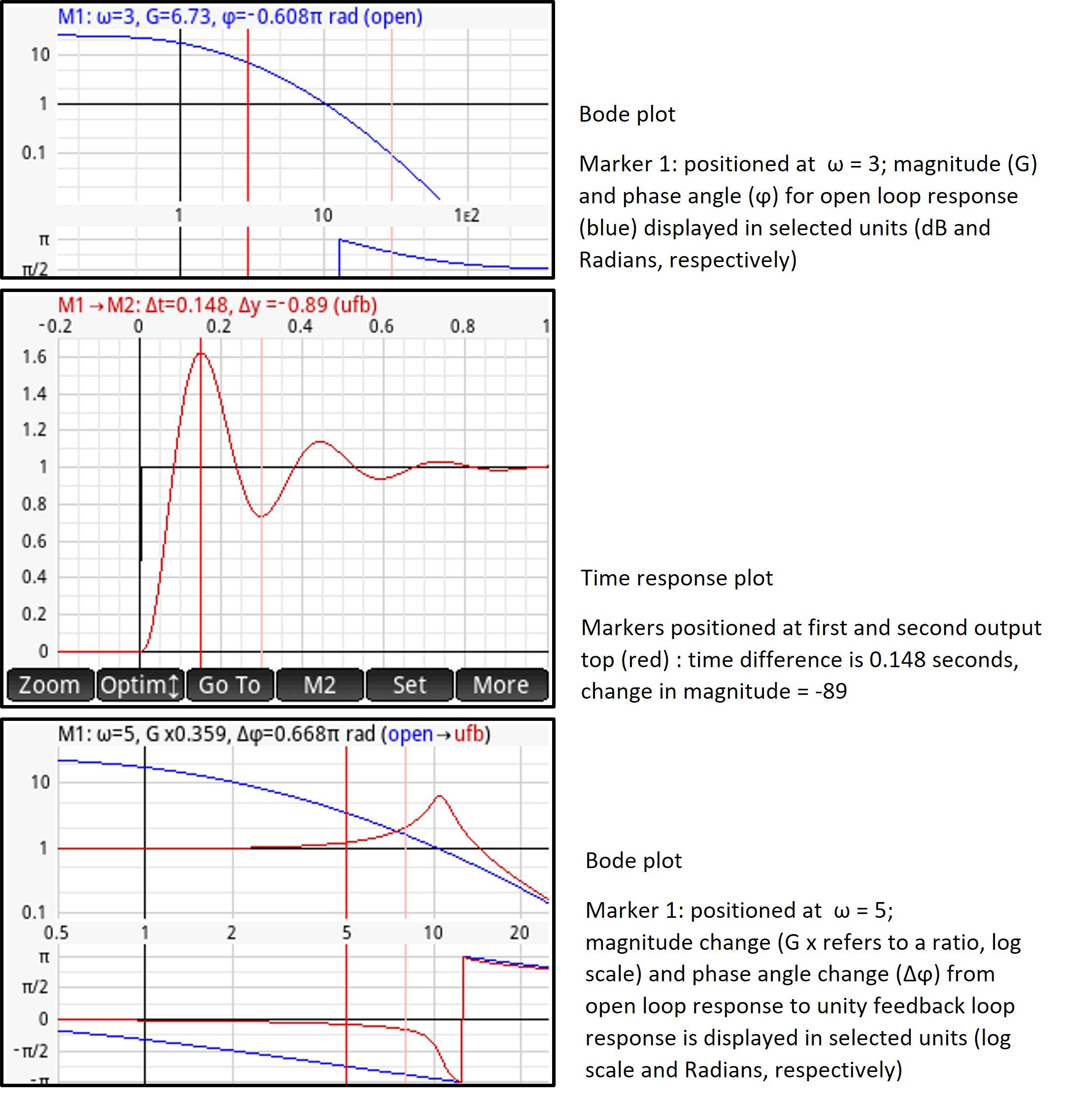
On top of the screen, a status line displays more information about the (active) marker(s).
Frequency domain response plots
- Magnitude and phase angle for a single plot (e.g. open loop plot), for the angular frequency at the active marker position
- Magnitude change (ratio) and phase angle change (difference) between the two plots currently shown (if applicable), for the angular frequency at the active marker position
- Magnitude change (ratio) and phase angle change (difference) for a plot, between the angular frequencies at marker 1 and marker 2
Time domain response plot
- Magnitude of the input (reference change or disturbance) at a point in time indicated by the active marker position
- Magnitude of the output at a point in time indicated by the active marker position
- Magnitude of the controller output / error signal (depending on Plot Setup) at a point in time indicated by the active marker position
- Magnitude change (difference) between two points in time as indicated by the two markers
Cycling through the information
To show information about the active marker: press the 'cursor up' key (rocker wheel) repeatedly.
- Frequency domain response plots: this first shows magnitude and phase for plot 1, and then, if currently two plots are displayed, for plot 2 (each time in the color of the plot). Finally, magnitude change (ratio) and phase angle change (difference) is displayed going from plot 1 to plot 2 (in black)
- Time domain response plots: this cycles through input magnitude, then output magnitude, and then error signal magnitude or controller output magnitude (depending on Plot Setup)
To show the change in magnitude (and, frequency domain plots only: phase angle) between the two marker positions M1 and M2: press the 'cursor down' key (rocker wheel) repeatedly.
- Frequency domain response plots): this first shows magnitude change (ratio) and phase angle change (difference) for plot 1, and then, if currently two plots are displayed, for plot 2
- Time domain response plots: this alternatively shows magnitude change for input and output plot (always as a difference, not a ratio)
Bode Plots and Time Domain Plots: Zooming

Zooming is performed by either
- Performing a two-finger pinch zoom gesture (the zoom is animated by shrinking / stretching the graphic object representing the plot)
- Pressing the '+' or '–' key. This will zoom in or out using a custom zoom factor as entered in plot Setup.
- Tapping the 'Zoom' softkey
Zooming is always performed horizontally (Bode plot: ω zoom, time domain: time zoom).
We will use the Bode plot to describe the zoom menu options, but the time domain response plot zoom works in the same way.
When tapping the 'Zoom' softkey, the zoom menu opens (see figure). Zooming options available:
- Align the plot with marker 1 or marker 2, but do not change the scale: you can then choose to align the left side of the scale, the right side of the scale or the center of the plot with the current position (angular frequency ω) of the selected marker
- Center on frequency: you will be asked to enter an angular frequency (ω) to center the plot
- Zoom to markers: rescale such that the current position of markers 1 and 2 (angular frequency ω) will coincide with the left and right border of the plot, respectively
- Zoom:select the zoom factor from the submenu. You can either zoom in or zoom out by a factor of 2, 5 or 10
- Zoom to ω range: enter an angular frequency range to zoom to
- Zoom to default ω range: plot according to the ω range defined in Plot Setup
Nyquist Plots: Zooming

Zooming is performed by either
- Performing a two-finger pinch zoom gesture (the zoom is animated by shrinking / stretching the graphic object representing the plot). If the zoom gesture is performed diagonally, the same zoom factor is used in the two dimensions. You can also zoom horizontally or vertically by performing a horizontal or vertical zoom gesture.
- Pressing the '+' or '–' key. This will zoom in or out using a custom zoom factor as entered in plot Setup.
- Tapping the 'Zoom' softkey. This opens the zoom menu for Nyquist plots (see figure)
Zooming options available:
- Center on active marker. If two plots are currently displayed, this will center on the active marker for the plot selected in the status line. Only when the app cannot decide (when the status line is currently displaying magnitude and phase angle difference between the two plots), you will be asked to choose a plot
- Center on (Re, Im) point: enter the coordinates of a point on the complex plane
- Zoom, horizontal zoom, vertical zoom: select the desired zoom factor from the submenu. You can either zoom in or zoom out by a factor of 2, 5 or 10
- Square: makes the horizontal and vertical scales equal
- Square, M1.3 circle: makes the horizontal and vertical scales equal and centers the plot around the M1.3 circle
The figure above shows a Nyquist plot, centered around the M1.3 circle. Marker 2 is active and shown for the two plots (open loop and unity feedback loop)
Nichols Plots: Zooming
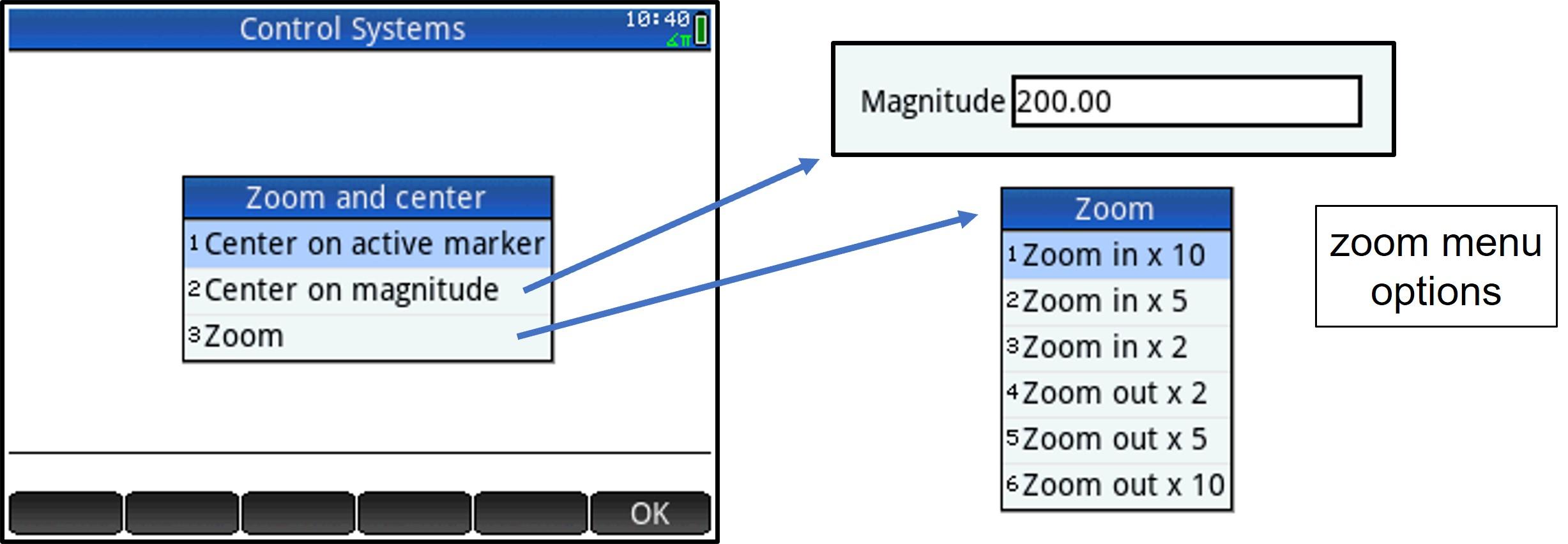
Zooming is always performed vertically (the horizontal scale is fixed and runs from -π to π radians, in the selected angle unit).
Zooming is performed by either
- Performing a two-finger pinch zoom gesture (the zoom is animated by shrinking / stretching the graphic object representing the plot)
- Pressing the '+' or '–' key. This will zoom in or out using a custom zoom factor as entered in plot Setup
- Tapping the 'Zoom' softkey. This opens the zoom menu for Nichols plots (see figure)
Zooming options available:
- Center on active marker (as with Nyquist plots, if two plots are currently displayed, this will center on the active marker for the plot selected in the status line)
- Center on magnitude: enter a magnitude to center the plot vertically
- Zoom (this will perform a vertical zoom only): select the desired zoom factor from the submenu. You can either zoom in or zoom out by a factor of 2, 5 or 10
Frequency and Time Domain Plots: Scrolling
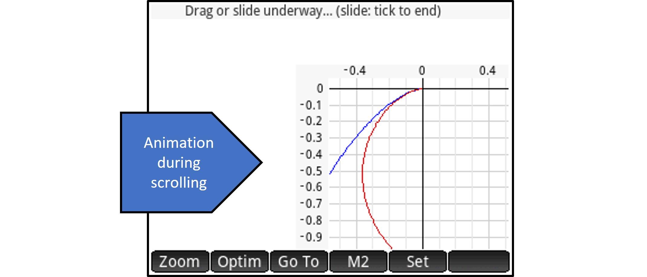
Place a finger on the screen and either
- drag the plot in the desired direction
- slide your finger. End the slide and re-plot by tapping the screen
Bode plot and time domain response plot: animated scrolling is always performed horizontally (Bode plot: ω zoom, time domain plot: time scroll).
Nichols plot: scrolling is performed vertically, as the horizontal scale is fixed and runs from -π to π radians, in the selected angle unit.
Frequency and Time Domain Plots: Optimizing

Optimizing adjusts the chart scales in such a way that the plot(s) fit(s) best on the charts.
- Bode plots and time domain response plot: this optimizes the vertical scale, based on the ω or time scale range displayed horizontally
- Nyquist plots: this optimizes the horizontal and vertical scales, based on the ω range selected for plotting
- Nichols plots: this optimizes the vertical scale, based on the ω range selected for plotting (the horizontal scale is fixed and runs from -π to π radians, in the selected angle unit).
Optimizing is either performed automatically (if enabled in Plot Settings – general settings) or manually.
To optimize the plots manually: tap the 'Optim' softkey.
If manually optimizing and currently two plots are shown, a popup will ask you to select the plot(s) to optimize for.
- Frequency domain plots (Bode, Nyquist, Nichols):
If currently two plots are being shown, you will be asked whether to optimize for the open loop plot, the secondary plot (as selected in Plot Setup) or both plots.
- Time domain response plots
You will be asked whether to optimize for the input plot, the process output plot or for both plots. The auxiliary plot (error signal or controller output, depending on Plot Setup) will always be optimized at that time.
Frequency and Time Domain Plots: Changing Chart Layout
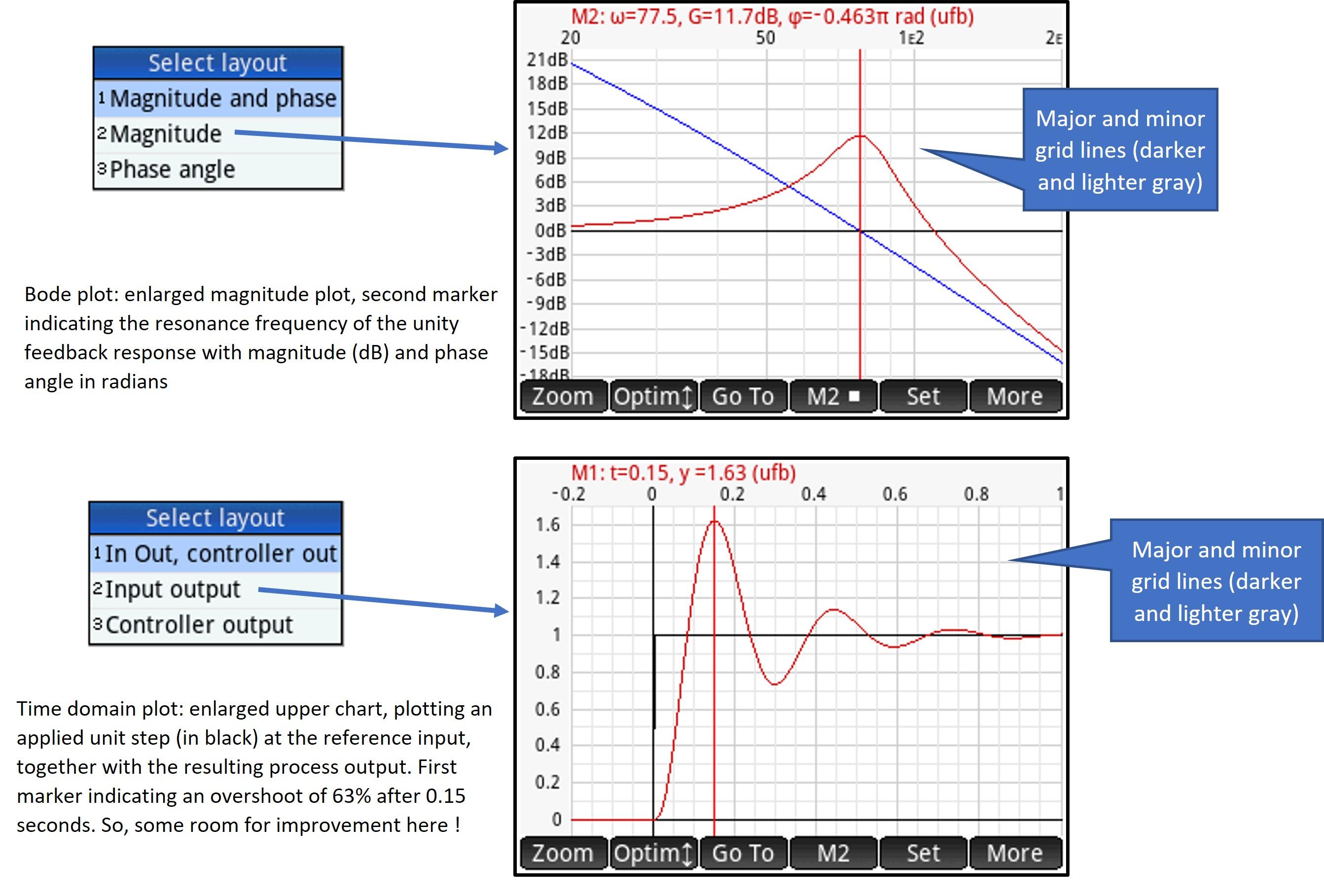
Bode plots and time domain plots normally draw two charts: an upper chart and a lower chart. What is actually plot can be selected in Plot Setup, but it comes down to:
- Bode plots: upper chart shows magnitude plots, whereas lower chart shows phase angle plots
- Time domain plots: upper chart plots reference change or disturbance, together with process output, whereas lower chart plots either error signal or controller output
However, you can enlarge the upper or the lower plot to occupy the whole screen: press the 'More' softkey and select a layout from the submenu that will open.
- Bode plot: select one of the options as shown in the figure above
- Time domain plot (currently plotting disturbance and process output on the upper chart and controller output on the lower chart): select one of the options as shown in the figure above
Alternatively, you can also press 'Shift' and then press the 'cursor up' key (rocker wheel) to toggle between two-chart display and the enlarged upper chart. Or press 'Shift' and then press the 'cursor down' key to toggle between two-chart display and the enlarged lower chart.
Root Locus Plots
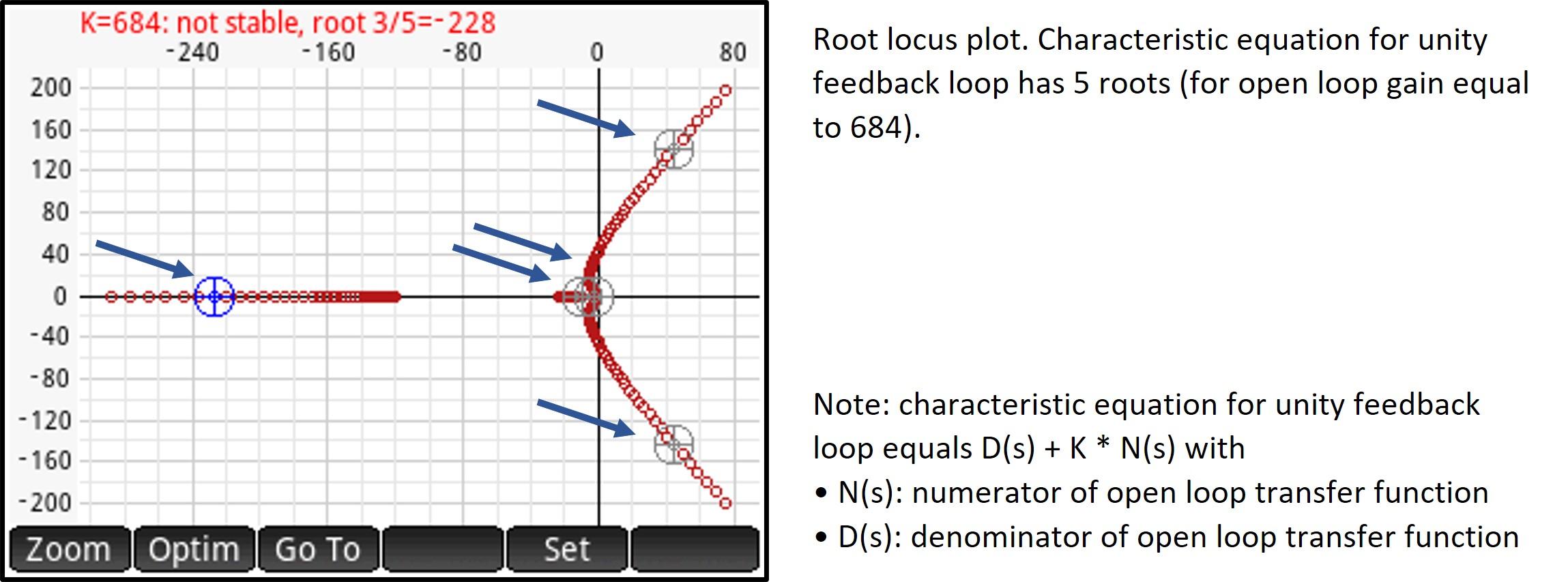
This is a scatter plot, in the complex plane, of the roots of the unity feedback loop characteristic equation, for a given range of open loop gain values, centered around the controller gain (see Plot Setup).
Roots are indicated by small circles in a dark red color (instead of circles, you can also select a crosshair or a dot marker).
Highlighting roots
The root locus plot allows you to highlight all the roots for a selectable open loop gain value and it will display information about these roots in the status line.
Highlighted roots are shown with a large dark gray circle, with a crosshair inside, around them. For one of the highlighted roots this large circle is shown in blue and more information about this root is displayed in the status line.
Viewing roots for a specific open loop gain
To change the selected open loop gain, you can
- Tap the screen, close to a root. This will select the open loop gain for that root and highlight all the roots for this open loop gain. The tapped root will be highlighted in blue, indicating that information about that root will be displayed in the status line
- Press the 'cursor left' or 'cursor right' keys (rocker wheel) to decrease or increase the open loop gain
- Press and hold the 'cursor left' or 'cursor right' keys: after half a second, the selected open loop gain will start decreasing or increasing at a constant speed. This speed will further increase after another 1.5 seconds
- Press 'Shift' and then press the 'left cursor' key to set the open loop gain to the lowest value in the open loop gain range, as selected in Plot Setup
If the currently selected open loop gain is greater than the ‘center position’ (which is the controller gain, see Plot Setup) then this center position will be selected instead
- Press 'Shift' and then press the 'right cursor' key to set the open loop gain to the highest value in the open loop gain range, as selected in Plot Setup
If the currently selected open loop gain is less than the ‘center position’ (which is the controller gain, see Plot Setup) then this center position will be selected instead
- Tap the 'Go To' softkey and the desired open loop gain. Then, tap 'OK'
Note that you can select any open loop gain value – this includes gain values outside the K-range selected for the plot.
The status line
The status line contains information about the selected root. More specifically, it displays
- The open loop gain (‘K’)
- The number of roots (characteristic equation of the unity feedback loop) and the selected root (s / n)
- The value of the root (either real or complex)
- Whether the system is stable (all roots having a negative real part) or not stable. If stable, the status line is green, if not it will turn red
To cycle through the roots for a selected open loop gain:
- Tap the screen, close to a root (note: this may change the selected open loop gain)
- Press the 'cursor up' or 'cursor down' keys (rocker wheel)
The selected root will be highlighted in blue and information about it will be displayed in the status line.
Root Locus Plots: Zooming, Scrolling and Optimizing

Zooming
Zooming is performed by either
- Performing a two-finger pinch zoom gesture (the zoom is animated by shrinking / stretching the graphic object representing the plot). If the zoom gesture is performed diagonally, the same zoom factor is used in the two dimensions. You can also zoom horizontally or vertically by performing a horizontal or vertical zoom gesture.
- Pressing the '+' or '–' key. This will zoom in or out using a custom zoom factor as entered in plot Setup.
- Tapping the 'Zoom' softkey. This opens the zoom menu for Root Locus plots:
Zooming options available:
- Center on highlighted root: the root currently highlighted in blue will be put in the middle of the chart. Scales will not change
- Center on (Re, Im) point: enter the coordinates of a point on the complex plane. The selected point will be placed in the middle of the chart. Scales will not change
- Zoom, horizontal zoom, vertical zoom: select the desired zoom factor from the submenu. You can either zoom in or zoom out by a factor of 2, 5 or 10
- Square: makes the horizontal and vertical scales equal
Scrolling
Place a finger on the screen and either
- drag the plot in the desired direction
- slide your finger. End the slide and re-plot by tapping the screen
Scrolling is animated by moving the graphic object representing the plot in the indicated direction before replotting occurs.
Optimizing
Optimizing adjusts the chart scales in such a way that the plot fits best on the chart.
Optimizing is either performed automatically (if enabled in Plot Settings – general settings) or manually.
To optimize the plots manually: tap the 'Optim' softkey.
If manually optimizing, you can choose how to optimize the plot (see figure): the second option will optimize the plot, only considering the highlighted roots (the roots for the selected open loop gain value).
Plots: Active Keys
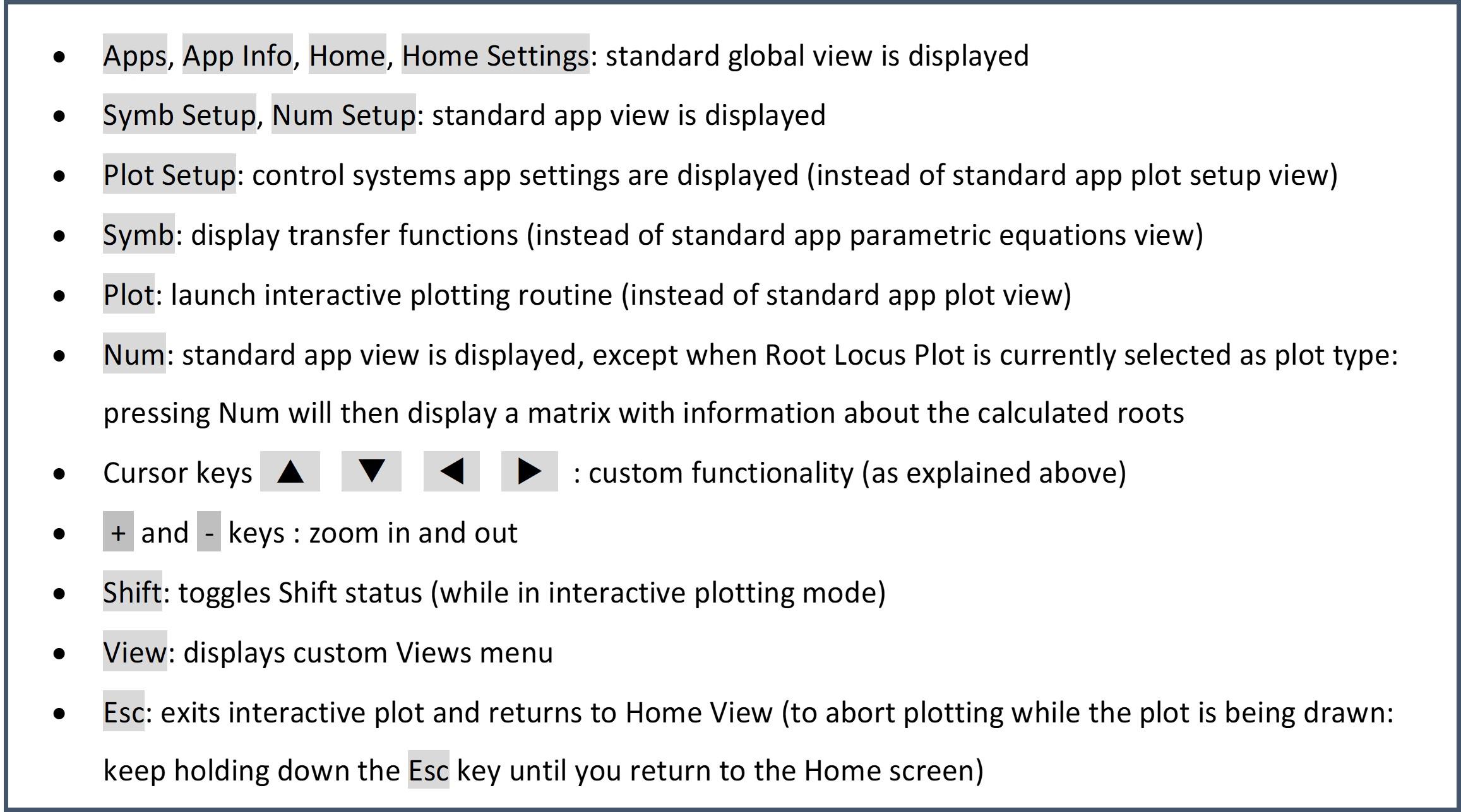
When a plot is currently displayed, the number of active keys is limited.
An active key means that a key press is detected by the Control Systems App, resulting in a specific action.
The active keys and the corresponding actions are listed in the figure, above.
The 'ON' key exits interactive plotting as well, but this is a HP Prime system function, so this key is not handled by the ‘control systems’ app.
All other keys have no function at all, except that pressing any key resets the Key Shift status.
Show Parametric Equations
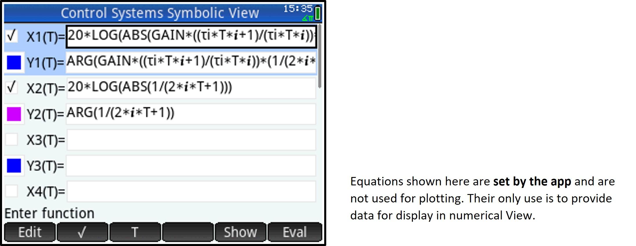
From the Home view, Press 'View' to open the custom Views Menu.
Then, select option 3 (Show parametric Eq.) to open the standard HP Prime Symbolic View, showing the parametric equations set by the ‘control systems’ app (see figure).
These equations are shown for your information only because they are set by the app, based on the controller settings and process transfer function entered.
Note that Root Locus plots do not use parametric equations.
Frequency domain response plots (Nyquist, Nichols, Bode)
In all equations, all instances of complex variable ‘S’ in the Transfer Functions are replaced with expression ‘i * T’ (i refers to the imaginary unit, T refers to the real variable T used as independent variable in the parametric equations).
- X1(T): and Y1(T): equations for open loop transfer function
- X2(T) and Y2(T): equations for transfer function for the second plot (if selected in Plot Setup)
Please refer to next section (Numerical view) for the definition of these equations
Time domain response plots
- X1(T): input value (reference change or disturbance, depending on Plot Setup)
- Y1(T): process output value
- X2(T): error signal value
- Y2(T): controller output value
Numerical View
Press Shift 'Num' to open Numeric Setup View and set numerical range etc. (standard HP Prime view).
Note: if the set plot type is Root Locus, then the settings in Numeric Setup View will have no effect.
Frequency and time domain plots
Press 'Num' to open Numerical View (standard HP Prime view).
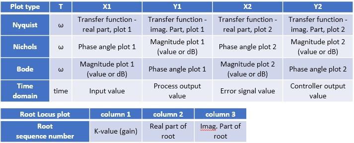
Information displayed in the respective table columns: see figure above.
Note: for frequency domain plots, columns X2, Y2 are set to ‘0’ if currently no secondary plot is selected (see ‘Second response plot’ in Plot Setup).
Root locus plots
Press 'Num' to view a read-only matrix with information about all roots calculated as per settings in Plot Setup.
The matrix contains all roots of the characteristic equation of the unity feedback loop transfer function, for a given range of open loop gain values, centered around the controller gain.
Information displayed in the respective table columns: see figure above.
Note that there will be as many entries for a given K value as there are roots.
Retrieving Equations

The Control Systems App calculates a set of equations as a base for plotting, based on the transfer functions and controller settings entered, the type of plot (frequency domain, time domain or root locus) and the current settings.
You can retrieve these equations, either to a special variable ‘currEq’ (current equation) or to the home screen.
Storing an equation in variable ‘currEq’
From the Home view, Press 'View' to open the custom Views Menu and select option 4 (Set ‘currEq’ variable).
Note that it is not possible to return a value to Home View from the Views menu.
Select which type of equation you want to retrieve. hen, select the equation you want. It will be stored in variable ‘currEq’. The process is illustrated in the figure on the left.
- Transfer functions (frequency domain):
The equations returned will be functions of i * T (imaginary unit x Home variable T, with T representing angular frequency)
Note: the open loop transfer function is the combined transfer function of controller and process
- Time domain equations (inverse Laplace Transforms):
The equations returned will be functions of Home variable T, representing time
Note: the input can either be a reference change or a disturbance (as defined in Plot Setup)
- Root Locus Plot equations
The equations returned will be functions of CAS variable s
Note: the characteristic equation for a unity feedback loop equals D(s) + K * N(s) with
- N(s): numerator of open loop transfer function
- D(s): denominator of open loop transfer function
Returning an equation to Home View
Execute app program ‘RetrieveEq’ (either type the program name or select it from the Control Systems App program catalog, as shown in the figure on the right).
You will be guided through the same menu options as described above.
The selected equation will be returned to Home View and it will be stored in variable ‘currEq’.
Note that you can also call this procedure from inside a user program.
Retrieving an Equation From Within a Program
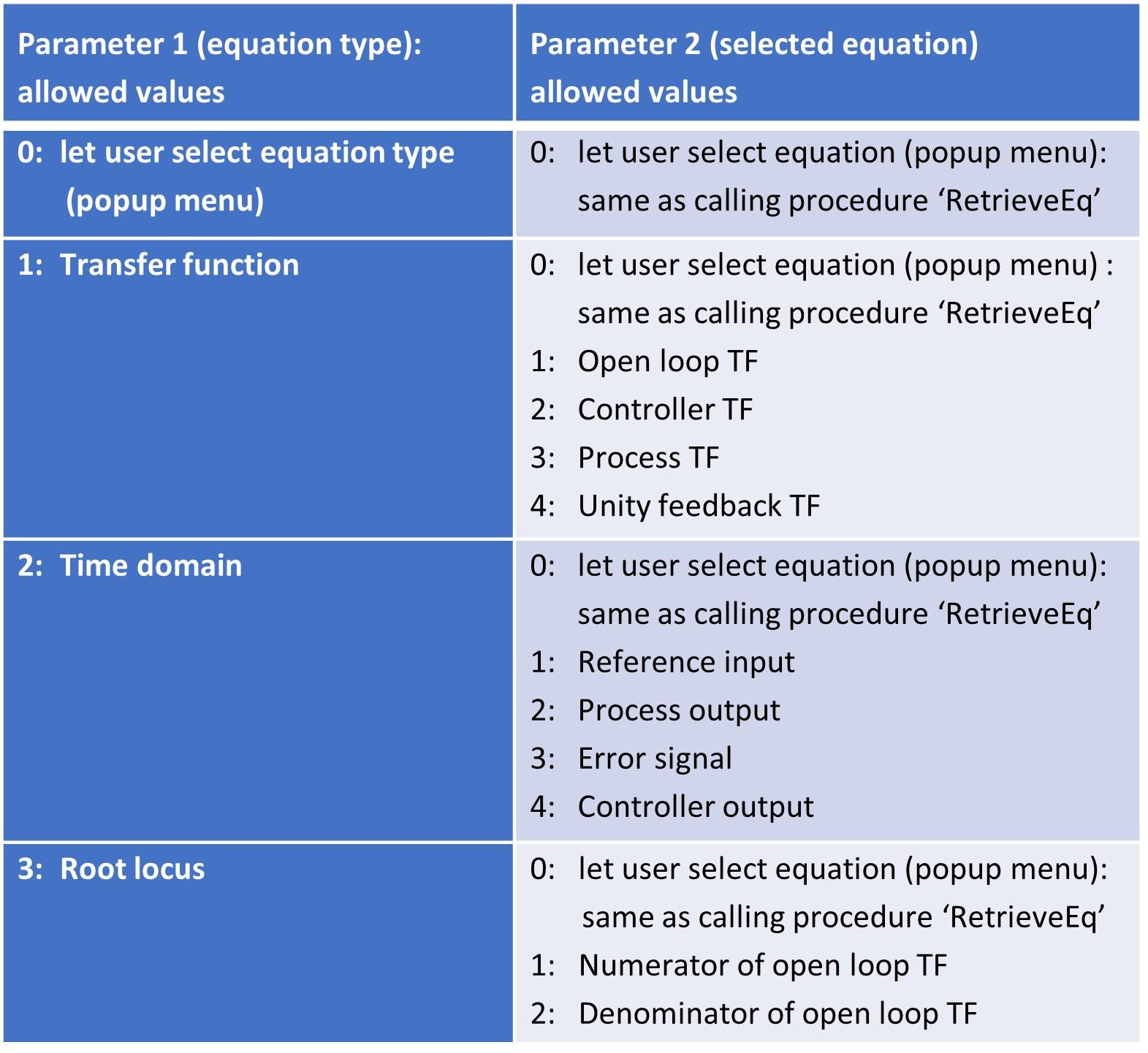
To retrieve and use an equation from within a user program, you may prefer to call function ‘RetrieveOneEq’ instead (available in the Control Systems App program catalog).
This procedure accepts two parameters: equation type and equation, allowing you to bypass user input required with procedure ‘RetrieveEq’, as outlined in the table above.
The selected equation will be returned to Home View and it will be stored in variable ‘currEq’.
A small demo program ‘CharEquationCoeff’ taking one parameter, demonstrating how to call procedure ‘RetrieveOneEq, is available from the user program catalog. Refer to the procedure comments for more information.
Utility “DrawGrid”
Use: draws a horizontal and vertical grid (either logarithmic, in dB or linear) on the HP Prime screen or any of the graphic objects (G0 to G9).
The program is called by the ‘control systems’ app, but it is an independent program that is available for general use from the user program catalog.
To draw a grid, use this syntax:
DrawGrid(graphicObject, range, pixelRange, horizontalScaleSettings, verticalScaleSettings);
With
GraphicObject: one of the graphic objects G0 to G9 (G0 represents the screen)
Range: {Xlow, Xhigh, Ylow, Yhigh}
List indicating lowest and highest values to be displayed in the grid. For linear scales, this corresponds to minimum and maximum values in Cartesian (user) coordinates.
Note: lowest values correspond to the lower left corner of grid
PixelRange: {Xlow, Xrange, Ylow, Yrange}
List indicating starting pixel and number of pixels to be used for the grid, in the horizontal (X) and vertical (Y) dimension.
Note: Xlow and Ylow correspond to the upper left of the grid
horizontalScaleSettings:
List containing various settings for the horizontal scale, formatted as
{ [scaleType, [printLabels, [labelsInGrid, [lineUnits, [scaleAsFraction, [log1only, [unitSymbol, [multSymbol, [color, [majorColor]]]]]]]]]] }
verticalScaleSettings:
List containing various settings for the vertical scale
Same list format as 'horizontalScaleSettings
The list elements for the horizontal and vertical scale settings:
1 scaleType
0 = logarithmic, 1 = dB (decibel), 2 = linear
Note: If scaleType is not present (empty list), the (vertical or horizontal) grid will not be drawn.
2 printLabels
0 = no value labels, 1 = print value labels.
Default if parameter is not present: print labels
3 labelsInGrid
0 = labels are printed outside the grid area, 1 = print labels within grid area. Note: label spacing is automatically determined.
Default if parameter is not present: outside
4 lineUnits
Minimum grid line spacing. Note that spacing will automatically increase (to the lowest possible multiple of lineUnits) if the grid would become too dense.
This parameter is used for dB and linear scales only, it is ignored for logarithmic (non-dB) scales – refer to the ‘log1only’ parameter for logarithmic scales.
Default if parameter is not present: 3 dB for dB scale, automatic grid lines for linear scale.
You may also refer to the default by entering value -1 for this parameter.
5 scaleAsFraction
0 = print regular value labels, 1 = print value labels as fractions, e.g. display ½ instead of 0.5 (only used for linear scales).
Default if parameter is not present: regular labels
6 log1only
Only used for logarithmic scales. 0 = draw grid lines for 1 EXP n to 9 EXP n.
1 = draw grid lines for 1 EXP n only (n: integer).
Note that grid lines are only drawn when the value range (scale) permits it.
Default if parameter is not present: draw grid lines for 1…9 EXP n
7 unitSymbol
Linear scales only. Unit symbol to be printed after the value label.
Default if parameter is not present: empty string
8 multSymbol
Linear scales only. Symbol to be printed as part of the value label. Especially useful with ‘scale as fraction’ display. For instance, with multSymbol = “π”, value 3/2 will be printed as 3π/2.
Default if parameter is not present: empty string
9 gridLineColor
Grid line color as an RGB value.
Default if parameter is not present: RGB(230, 230, 230) (light gray).
You may also refer to the default by entering value -1 for this parameter
10 majorGridLineColor
Major grid line color as an RGB value.
Default if parameter is not present: RGB(200, 200, 200) (darker gray).
You may also refer to the default by entering value -1 for this parameter.
Note: for the horizontal and vertical scale settings, minimum the list element needs to be supplied ('scaleType'). if not, the corresponding (vertical or horizontal) grid will not be drawn.
Example 1
A program executing these lines
RECT();
DrawGrid(G0, {0.01, 1000, 0.1, 100}, {30, 290, 13, 102}, {0}, {1} );
WAIT();
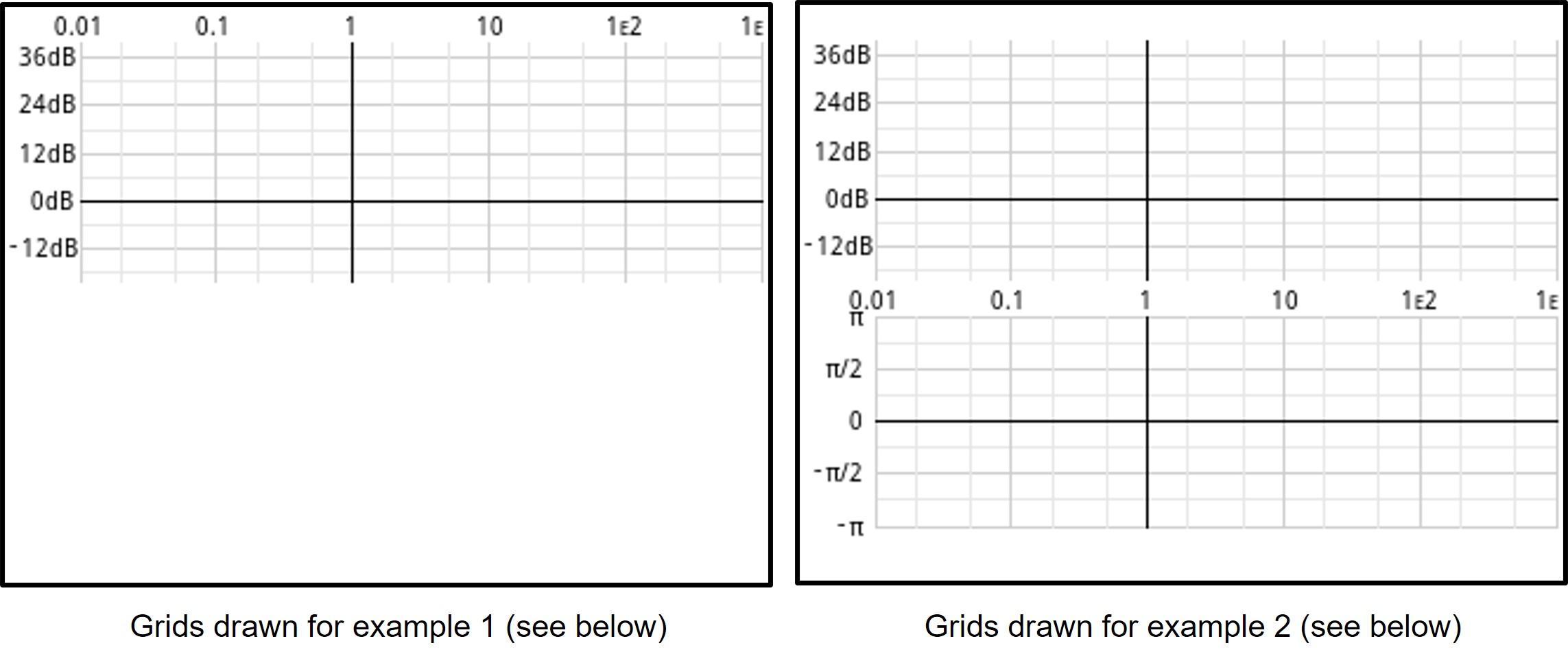
will display the grid as in the figure on the left.
Notes:
- The horizontal scale (from 0.01 to 1000) is logarithmic, whereas the vertical scale (from 0.1 to 100) is in dB (1 dB = 20 LOG(value), as requested by the last two parameters {0} and {1}
- Horizontal scale: the labels indicate the real values, not the logarithm of the values. When appropriate, scientific format is used
- Horizontal scale: note that vertical grid lines for 0.02, 0.05, 0.2, 0.5, 2, 5, 20, 50, … are also drawn. If the scale permits it, even more grid lines will be drawn (1…9 EXP n)
- Vertical scale: calibrated in dB. The lowest value (0.1) corresponds to -20 dB. As the (default) minimum scale unit of 3 dB would result in a very dense grid, labels are printed every 12 dB. So, the lowest label shown is the label for -12 dB
- Major grid lines (having a label) are drawn a little darker, to clearly indicate which line a label belongs to
Example 2
A program executing these lines
RECT();
DrawGrid(G0, {0.01, 1000, 0.1, 100}, {30, 290, 13, 102}, {0, 0}, {1} );
DrawGrid(G0, {0.01, 1000, -1, 1}, {30, 290, 130, 90}, {0, 1}, {2, 1, 0, 1/8, 1, 0, "", "π"} );
WAIT();
will display the two grids as in the figure on the tight.
This leaves some room for a status line at the top and a softkey line at the bottom.
Note that the second grid has a linear scale, calibrated in fractions of PI. The minimum grid line spacing is specified as 1/8, but it is automatically set to ¼ because of the scale given.
Also note that, as the two grids share the same horizontal scale, labels are only drawn once.
Sample program ‘TestGrid’
A small demo program 'TestGrid', taking no parameters, is available from the user program catalog.
It demonstrates calling grid utility 'DrawGrid',
Installation
Preliminary note: this app has been tested with HP Prime firmware versions 2.1.14425 (2020 01 16) and 2.1.14588 (2021 05 05).
Before you start installing: make sure your calculator is ON, connected to your computer via USB and visible in the HP connectivity kit.
- If the HP connectivity kit is not yet installed on your computer, you will need to install it first. Please refer to HP’s documentation.
Now, follow these instructions (please also refer to the figures):
- Download compressed folder 'HP Prime-control systems v3.01 20210517.zip' from GitHub through this link (you won't need an account): https://github.com/Herwig9820/controlSystemsApp-HP-Prime (note that you will also find a pdf version of this instructable there).
- Unzip the compressed folder.
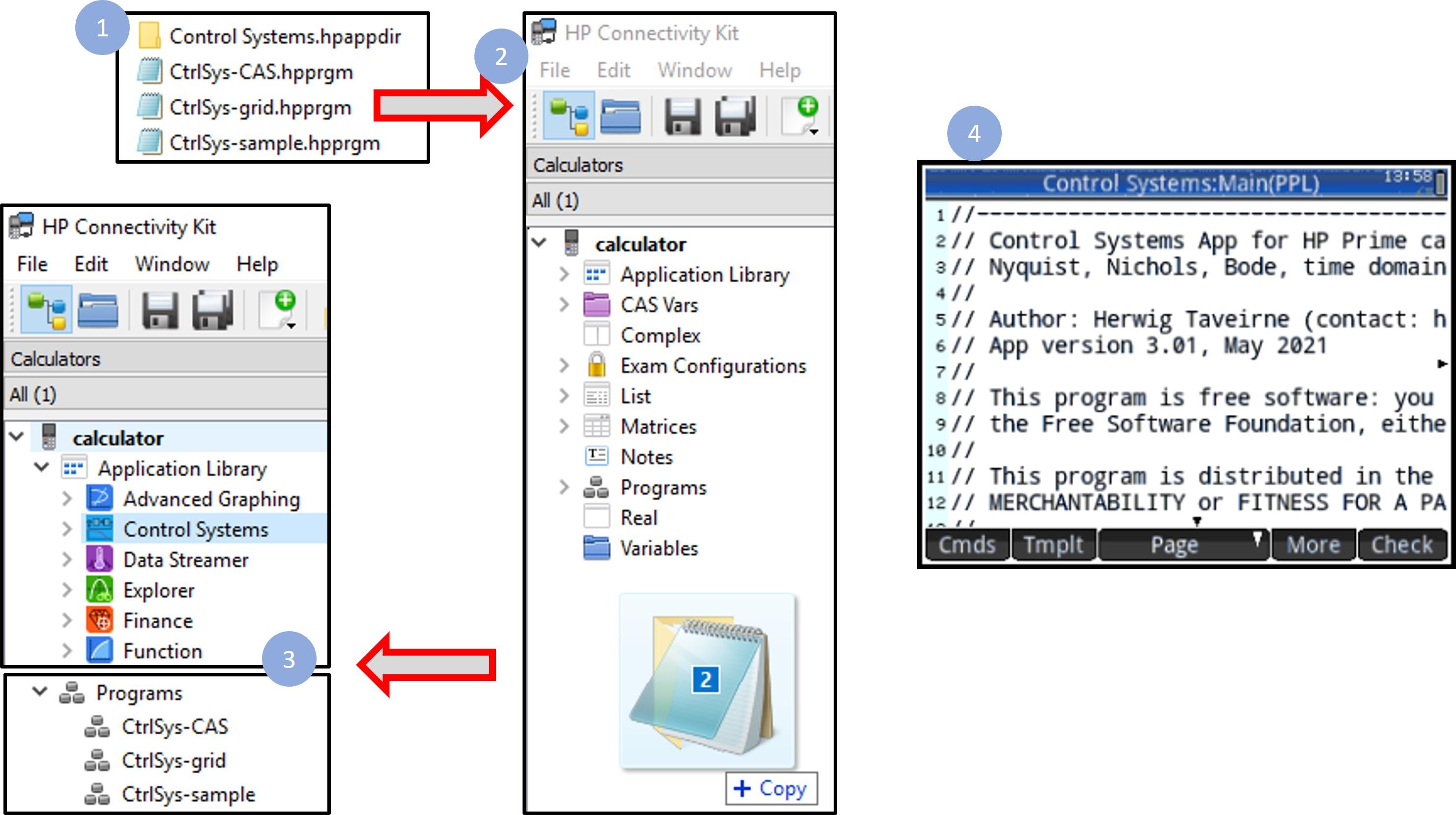
- Select the four items indicated in figure 1 (above), in Windows File Explorer.
- In the HP connectivity kit, make sure the ‘Calculators’ window is displayed. Then, drag the two items you selected earlier to the free space below the content tree (figure 2, above).
- Check that the ‘Control Systems’ app is present in the Application Library, and the other programs are present in the ‘Programs’ section of the content tree (figure 3, above).
- Press the 'Apps' button and select the Control System app. Exit again. Although the app is not operational yet at this stage, this is a necessary step to place the app in the program library.
- Open the calculator program catalog, select the Control Systems App and tap 'Edit'. Verify that you see the first program lines as shown in picture 4, above. Exit the program editor by pressing 'Esc'.
- Perform the same action for the three programs in the Program Catalog (if this step is not performed after installation, the App may not start correctly).
- Press the 'Apps' button again. Select the Control Systems App (it could be at the bottom) and press 'Start'. You should now see the app welcome screen.
- Press 'Enter'. You should now see the app (custom) Symbolic View, where you can enter Transfer Functions (see section about Process transfer functions).
The Control Systems app is now up and running.
That's All, Folks
This project might seem a little bit theoretical ... but the app I built has proven to be a really useful tool when dealing with (not-too-complex) linear systems, when one does not have access to more sophisticated tools like Matlab.
I have tried to make the program as user friendly as possible, and the instructions as clear as possible (although I realize that completeness is something that is very hard to achieve).
Anyway, I hope that the result of my work will be a learning opportunity for some and something useful for others.