Layered Wooden Sculptures
by watchmeflyy in Workshop > Laser Cutting
46112 Views, 361 Favorites, 0 Comments
Layered Wooden Sculptures
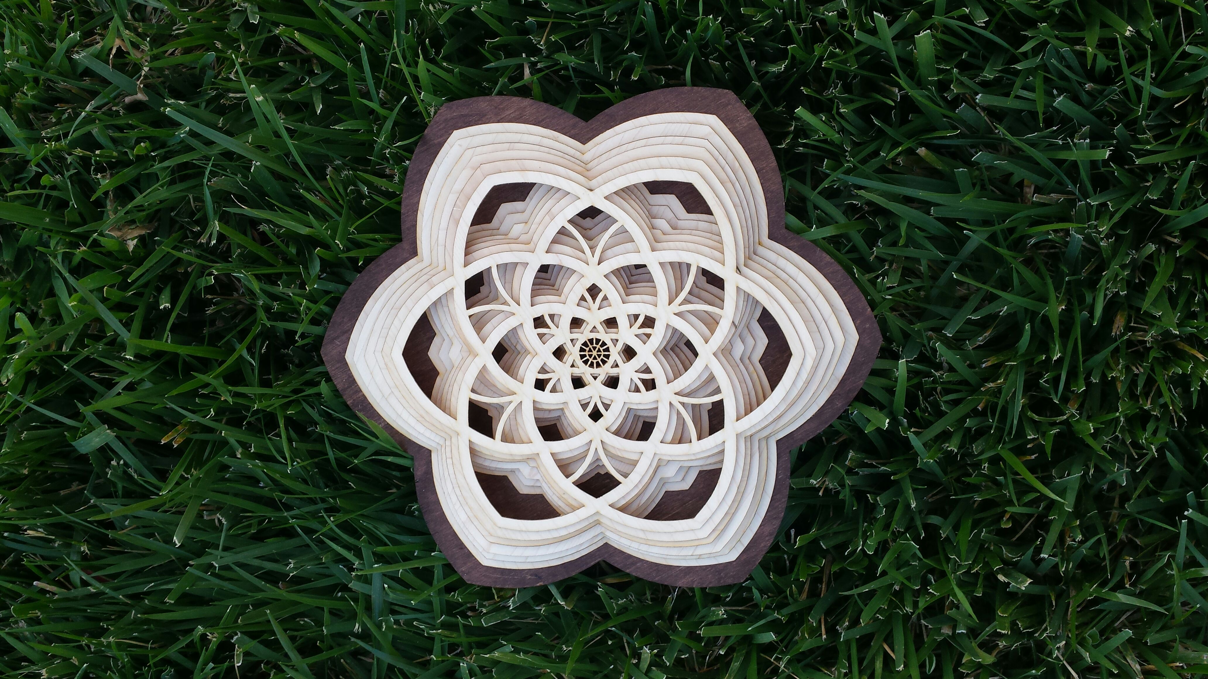
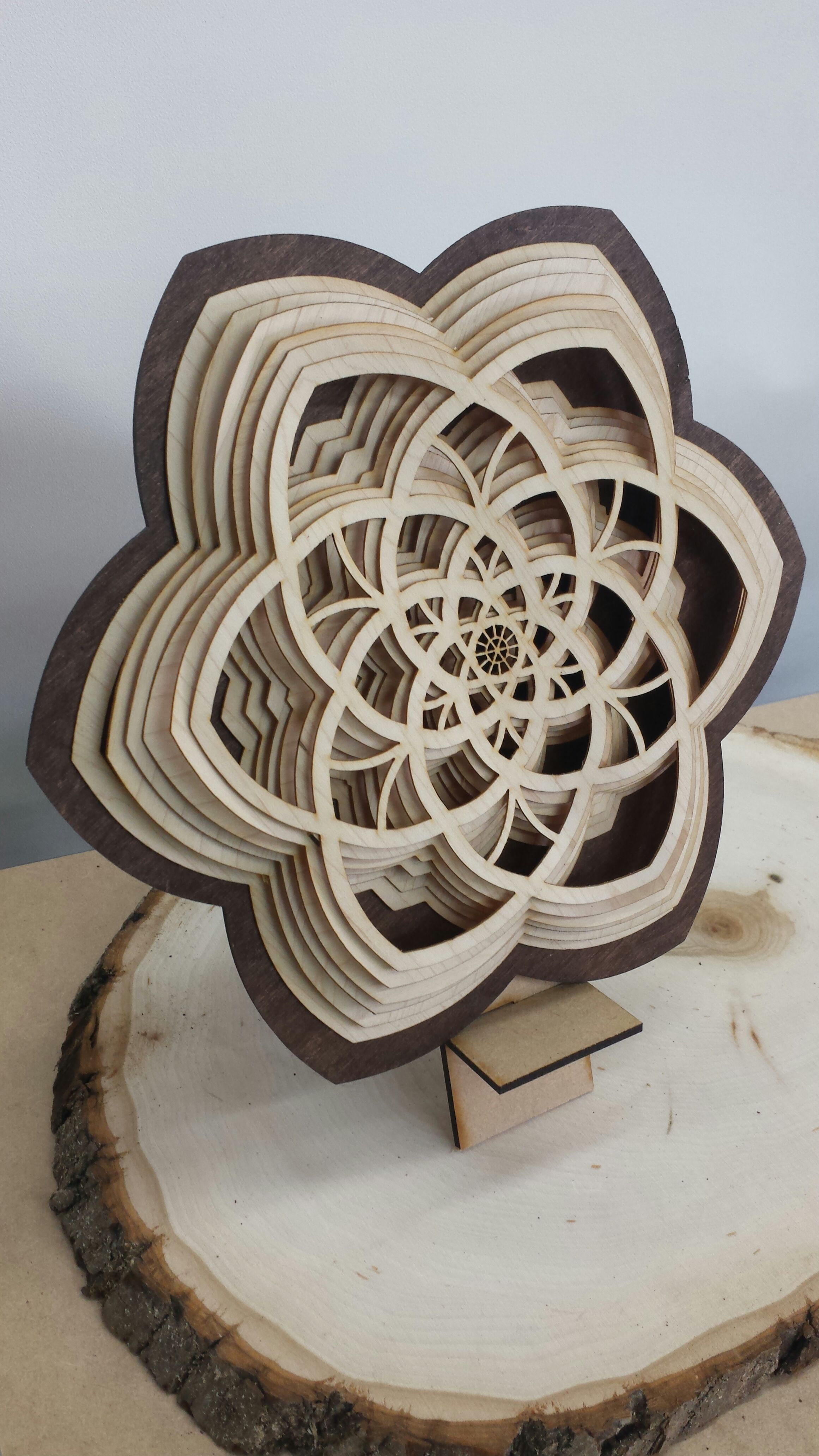
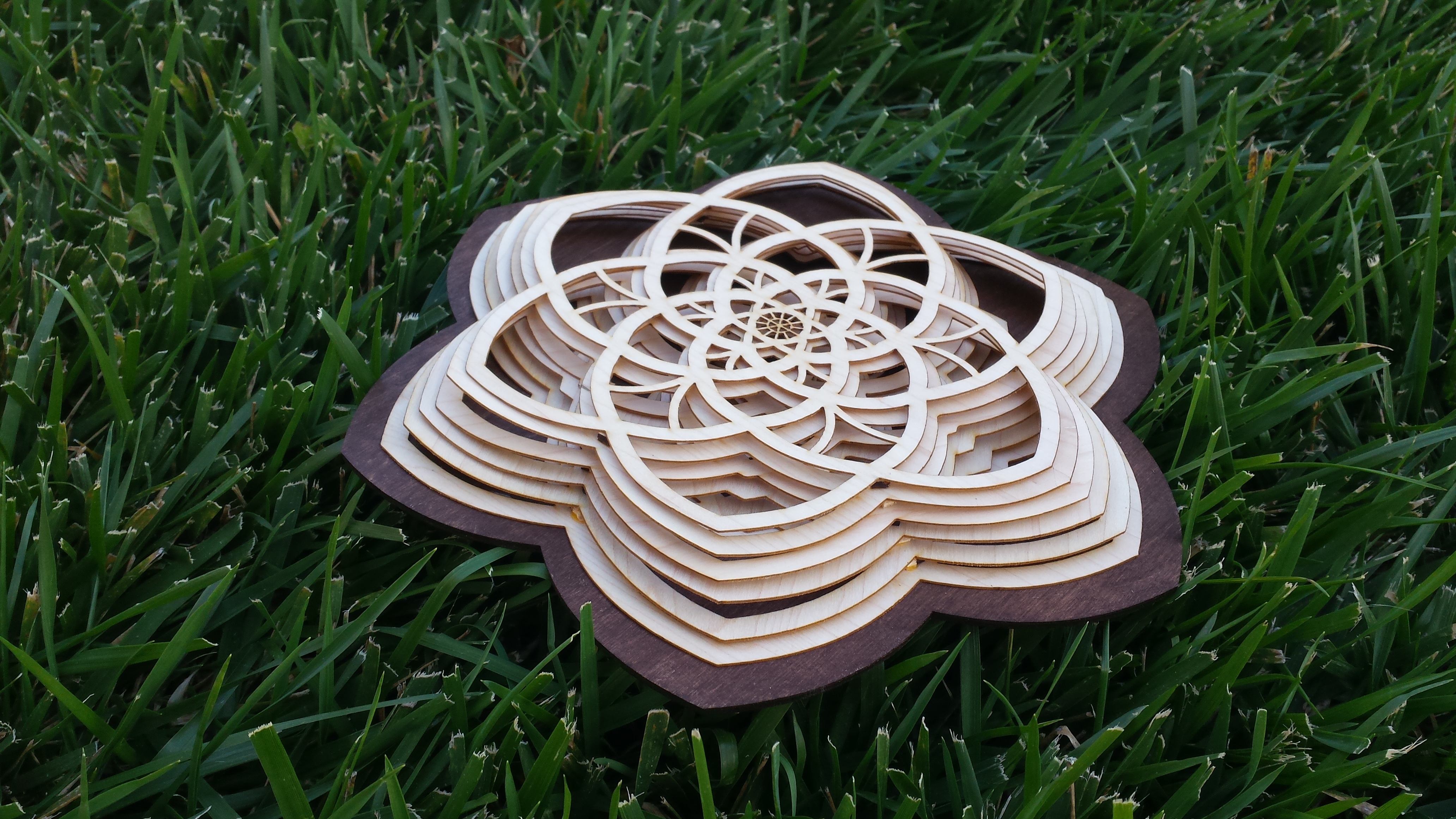
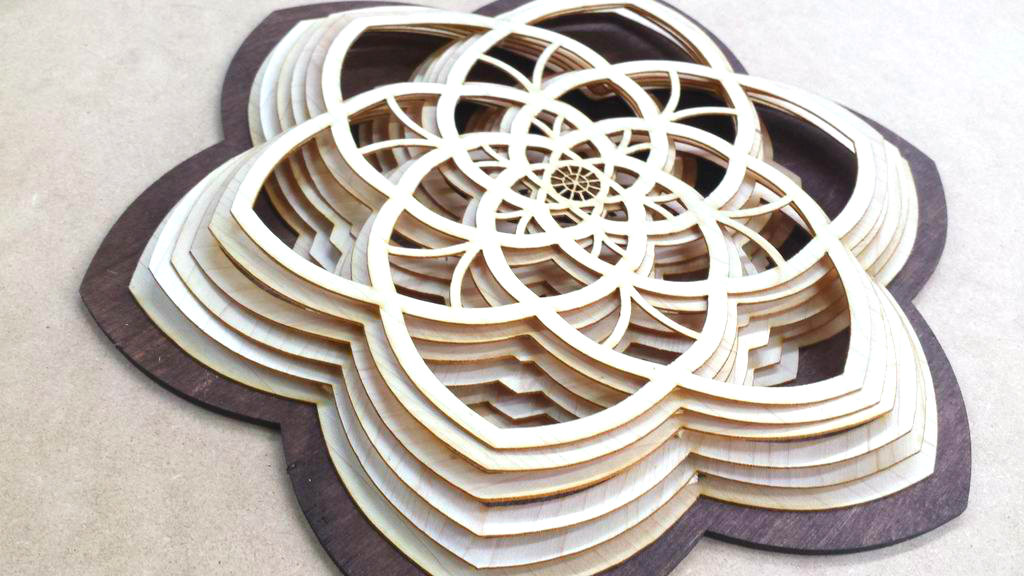
There's a brilliant artist named Gabriel Schama who creates breath-taking artwork with wood. When I first came across his wooden sculptures, I immediately felt inspired by his work. He laser cuts layers that make an intricate three-dimensional design when fully assembled, and I liked that concept. Since the layers introduce an additional field of depth to standard 2D art, I wanted to play around with the shadow side effects of that, and decided that spaced-out veneer might work well.
They do say that imitation is the highest form of flattery.
Materials
- veneer or other thin cutting material for your layers (I used 1/16" birch veneer)
- wood for the back frame (I used 1/8" thick birch plywood)
- any stains you might want to use (I stained the back frame since I like the light on dark background look, but you might like dark on light or something)
- laser cutter (I have access to an awesome makerspace called UMakers in Claremont, CA. They have a Full Spectrum cutter, hobby 20x12")
- vector graphics software (I used Adobe Illustrator, but Inkscape and other free softwares will work too. I'm just very comfortable with Illustrator, not to mention my bias for its nicer, more user-friendly interface.)
- glue
- spacers (for spacing my layers, I just snipped off pieces from scrap 1/8" plywood in an ad hoc fashion, but I know that some art students use professional foam+glue spacers of some sort)
- FILES are attached to this step
Downloads
Creating Guidelines
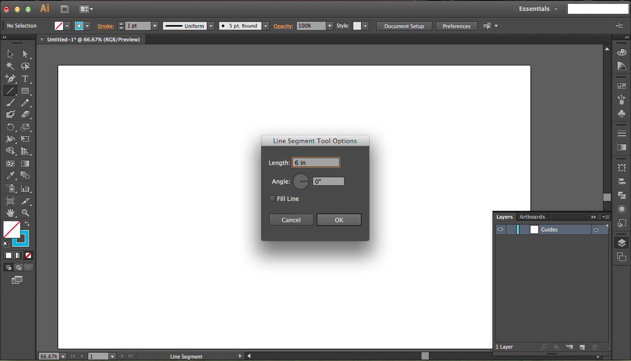
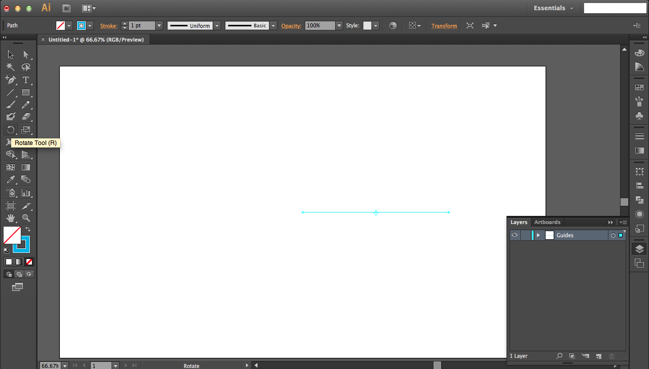
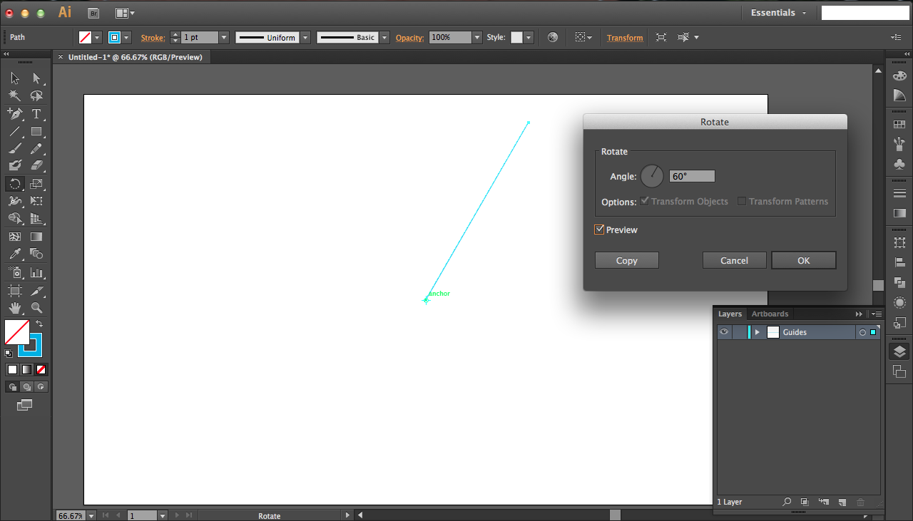
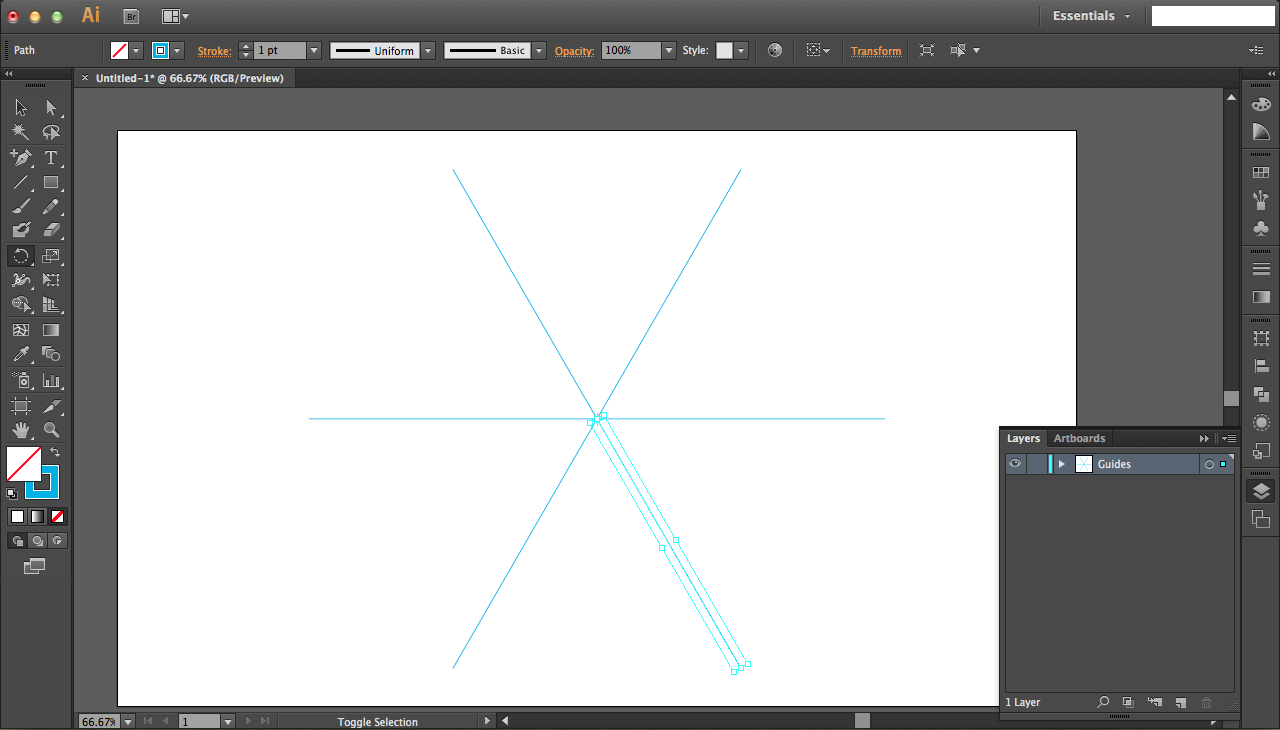
If you want just the files, they were attached on the previous step. Otherwise, read on!
Begin by making guides for your design, since it will be rotationally symmetric. Select the line tool and click on the center of the screen (there will be a green snap indicating that your mouse is indeed at the center). A menu will pop up for you to set the length and angle of the cut. Set the length arbitrarily long (6" is fine) and the angle should be 0.
Make the line a visibly bright color since it'll be a guideline. Set the layer name to Guides for future reference. Hold down the option key and click on this end of the line (at the center of the screen). Set angle to 60 and press COPY not ok. Press ctrl/command + D four additional times so that you have six final lines.
Center Design
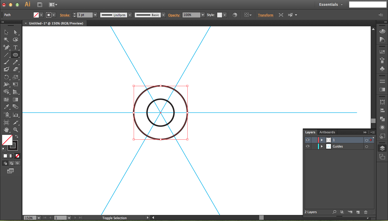
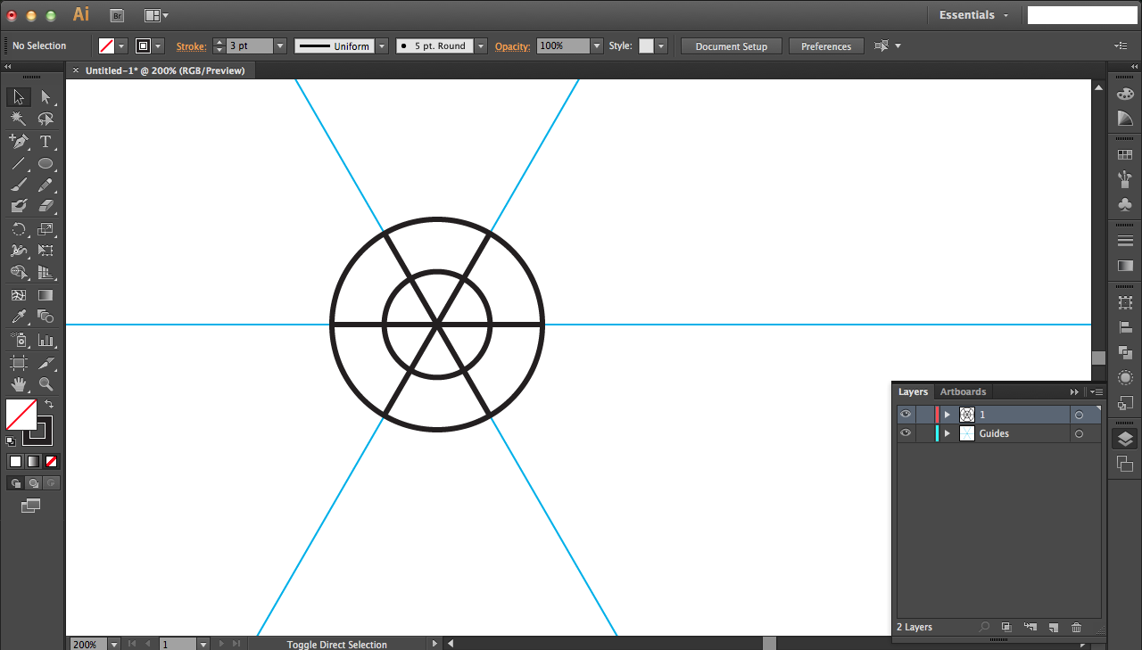
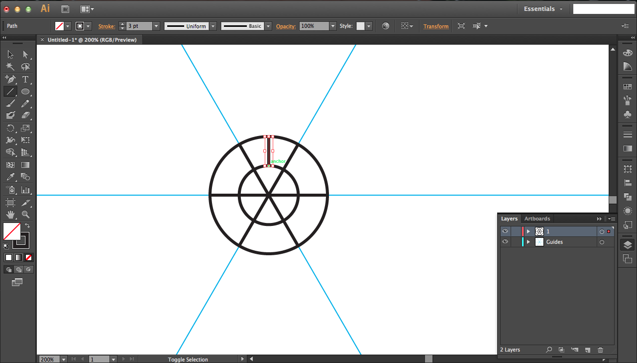
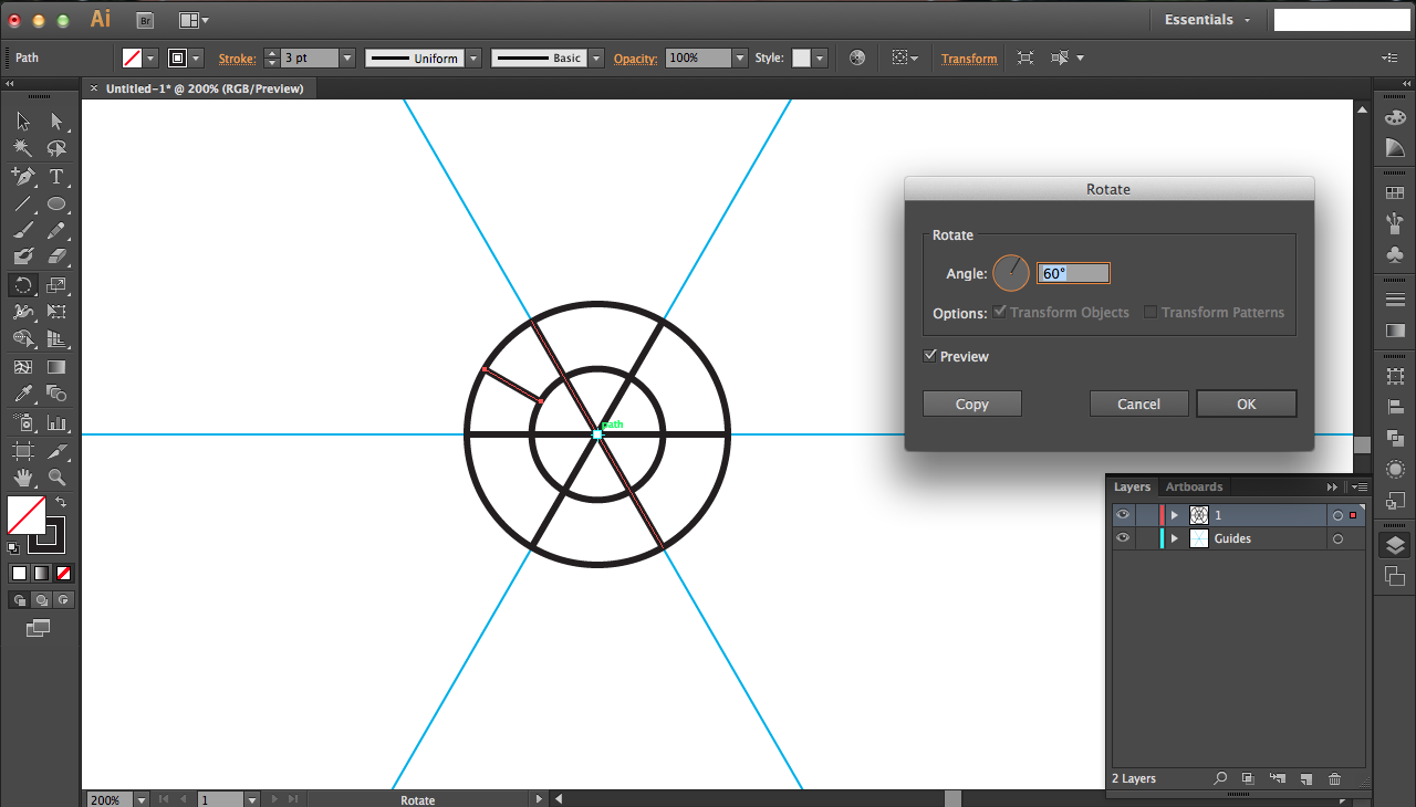
I wanted to make a center design for the first layer that wouldn't be propagated in the subsequent layers; it'd just create a nice shadow over the crevices of the next layers.
Now that guidelines are finished, create a new layer (bottom right menu button that looks like two intersecting diamonds) for drawing out your design. It's a new layer so that you don't interfere with the guidelines as much.
In that new layer, use the circle tool to create two concentric circles (size up to you). Then use the line tool to draw three equally spaced (rotational) lines going through the center. Use the smart grid automatic snapping to ensure that they all start and end while intersecting the bigger circle.
Draw a line that's centered horizontally (hold the shift key while making it so that it is perfectly vertical). Again, use the rotation tool to rotate the line 60 degrees and press COPY not ok. Press ctrl/command + D to duplicate this process four additional times.
First Layer of Petals
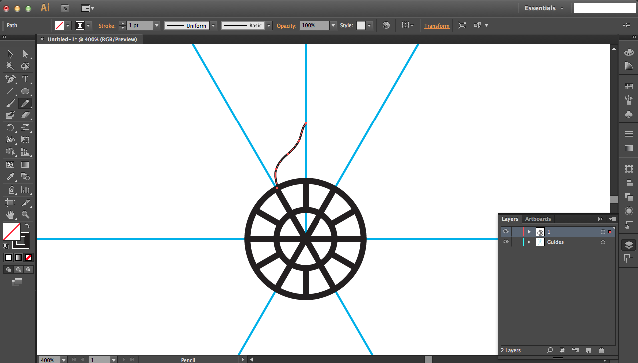
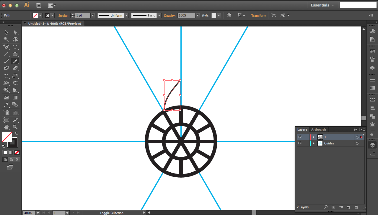
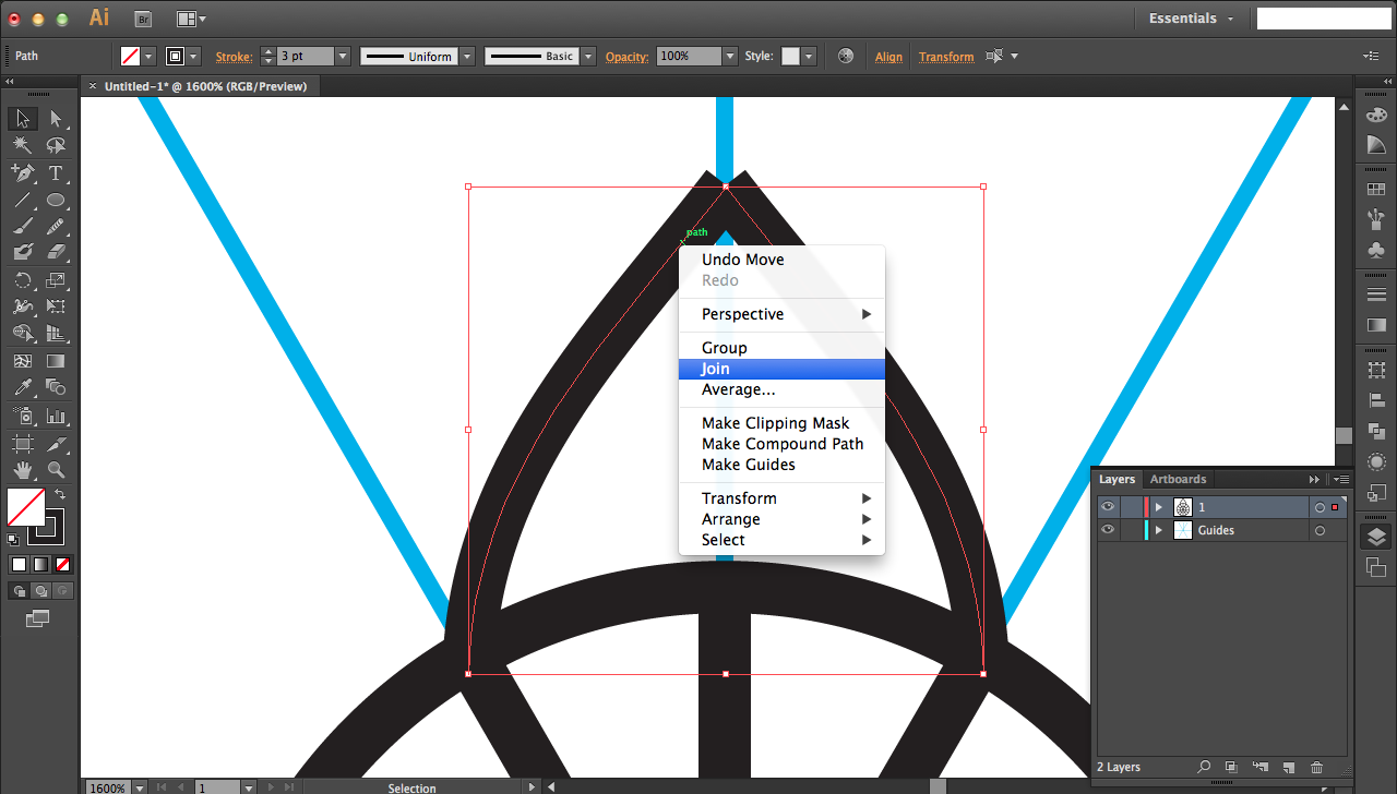
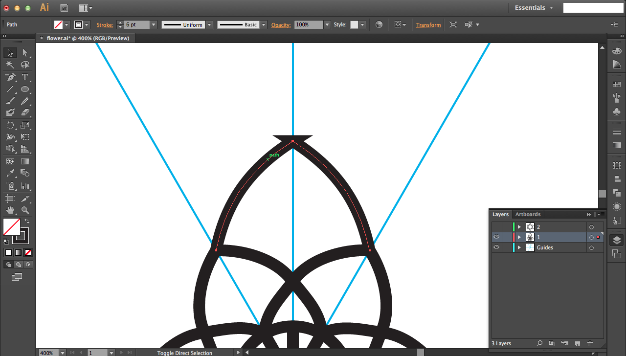
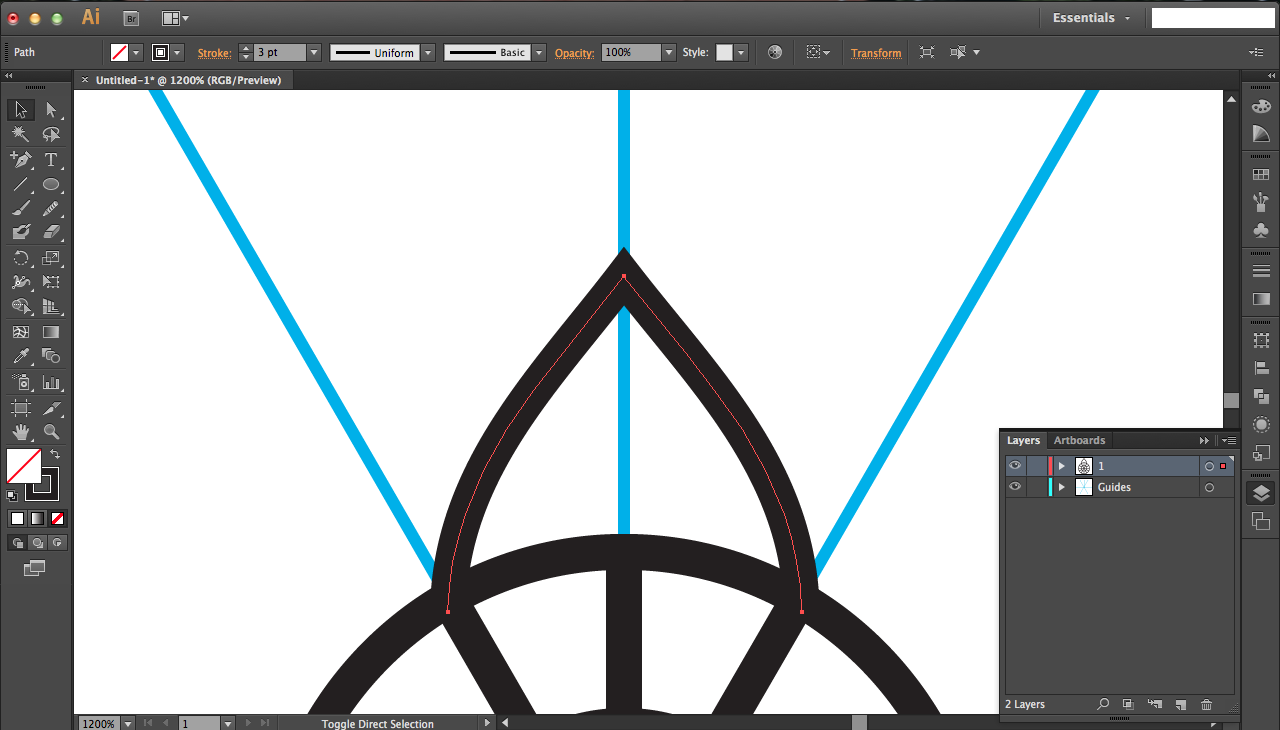
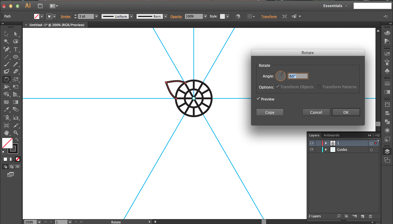
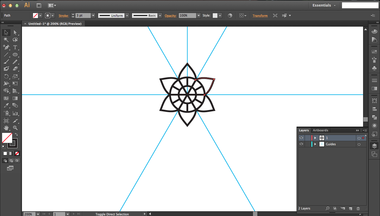
Use the pencil tool to sketch out a petal for your first layer. This doesn't need to be pretty; you can smooth it out later. Click and hold the pencil tool; it should pop out a menu of other tools. Choose the smooth tool (has horizontal lines running across the pencil). Smooth out your pencil path by clicking and dragging new paths along the pencil line.
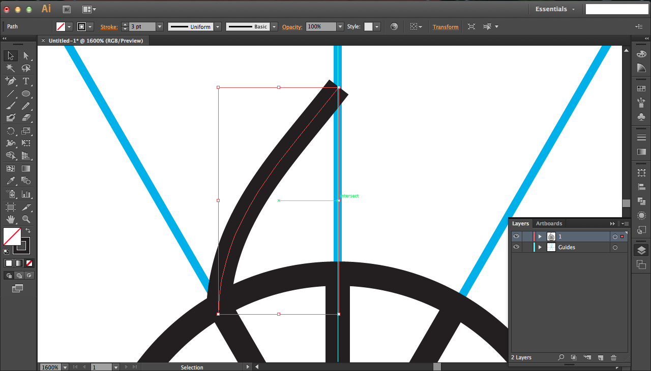
Use snaps to align your semi-petal perfectly. You want the top-right to be aligned with the blue vertical guideline and the bottom left should be aligned with the intersection of the circle and angled (~120 degrees from horizontal) blue line.
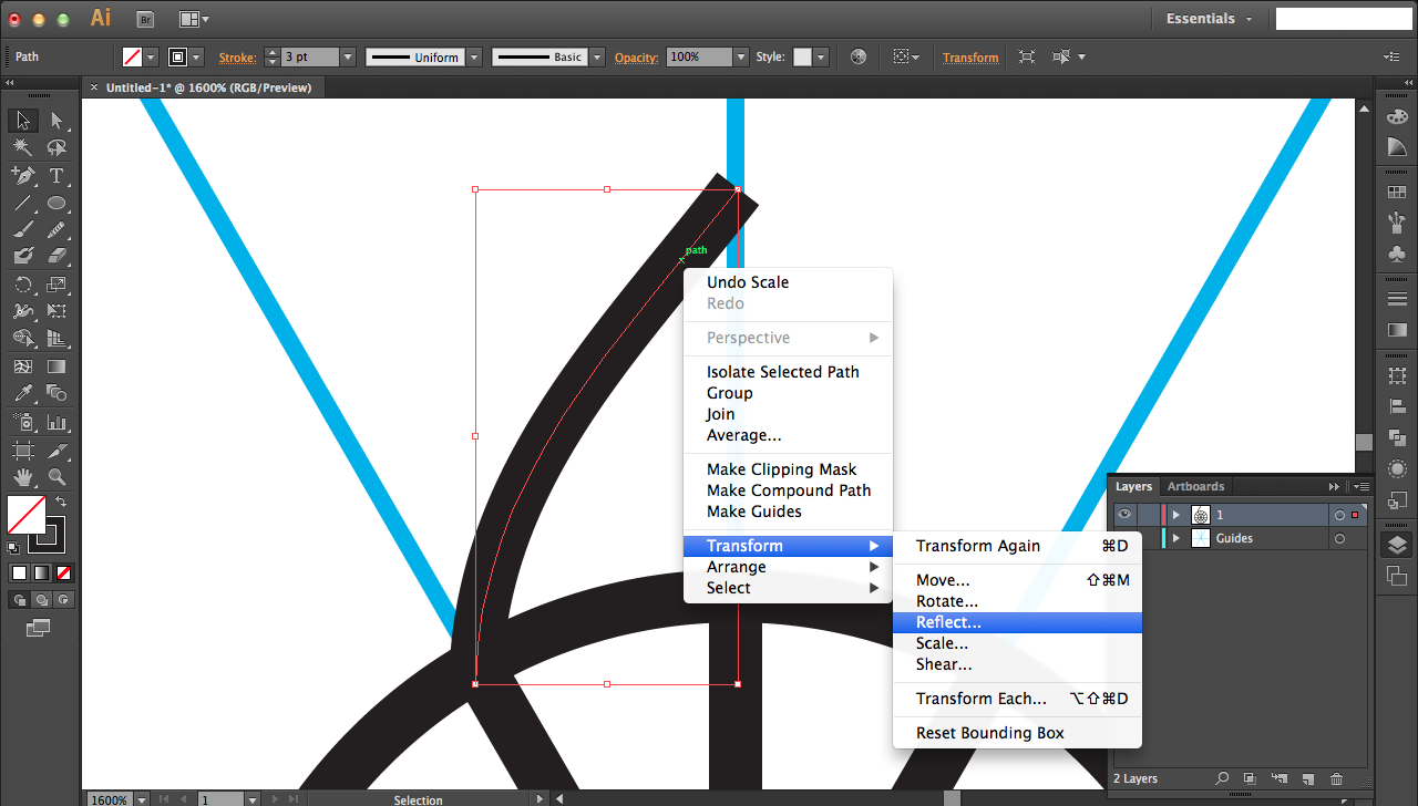
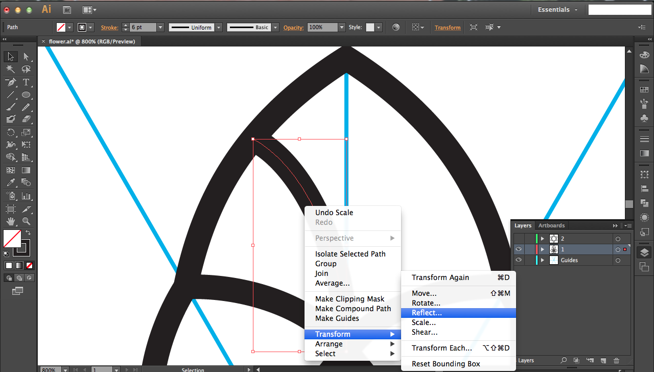
Since this is only half a petal, you want to right-click, go to transform, and select Reflect... In the resulting menu, select the vertical reflecting option and press COPY not ok to get a duplicate. Hold down shift while dragging the duplicate to the left and align the tops of the petal halves.
Select both petal halves and right-click to join them. This creates a nice, sharp point at the top (see seventh picture above for example). If your lines are even slightly offset, your join will result the sixth picture above. In this case, just unjoin (ctrl/command + Z) and try again to reposition perfectly before joining again.
Use the rotation tool to rotate the joined petal 60 degrees, just like you did for the guidelines. Press ctrl/command + D to duplicate that rotation four additional times to have six total petals. Then select all of them and press ctrl/command + G to group (or right-click to group).
Testing the Scaling Effect
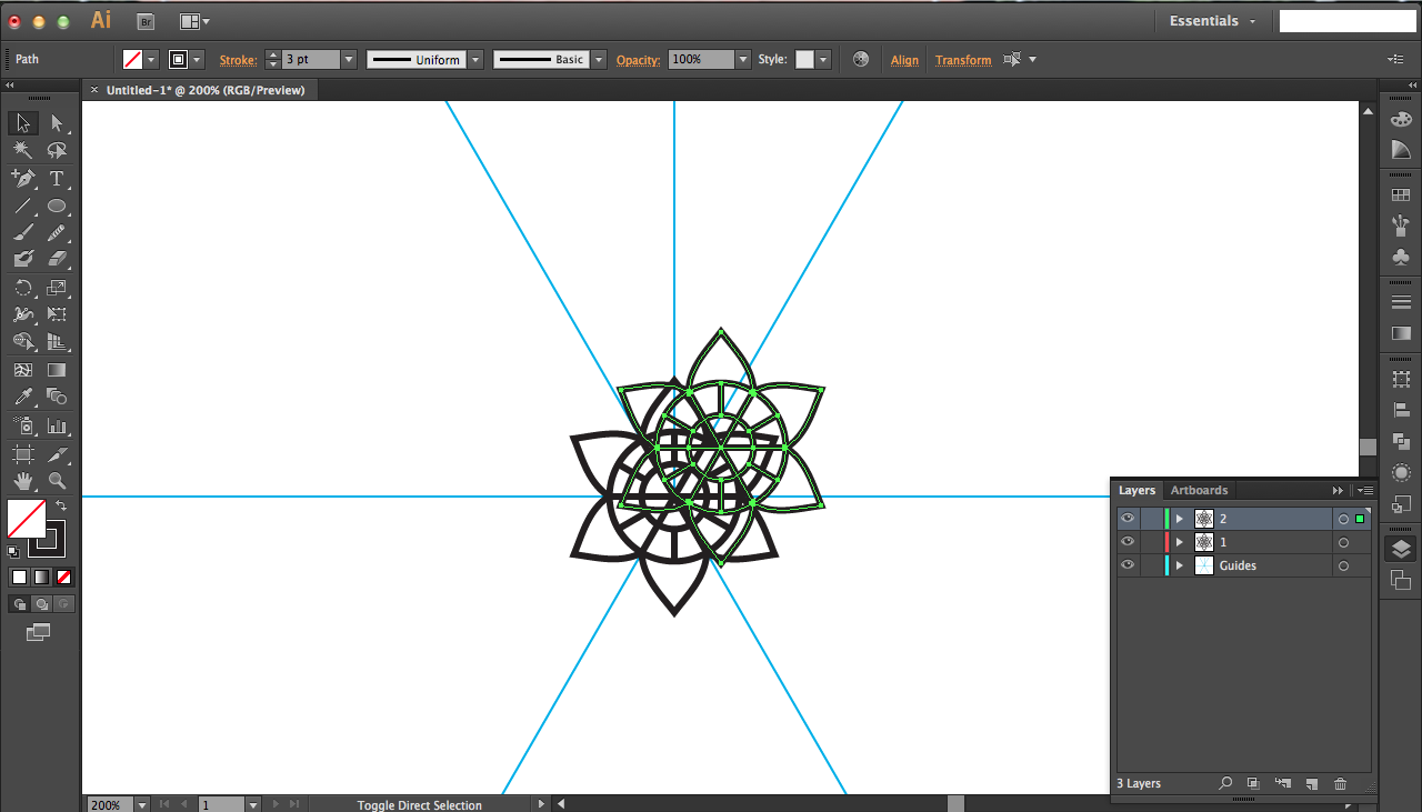
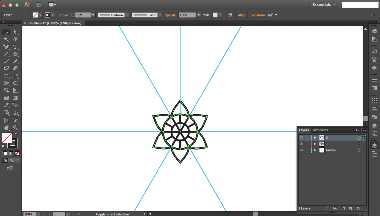
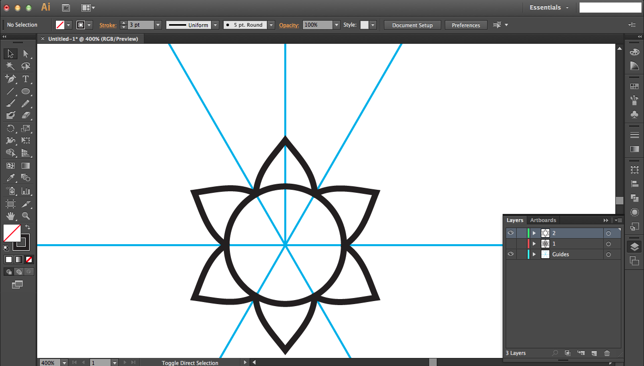
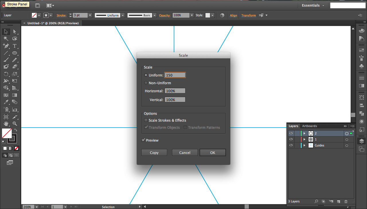
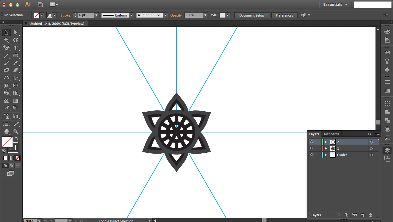
For your design, it's important to check that it'll be scalable, i.e. you can create bigger layers that will overlap and create a nice crevice in your artwork later. This means that jagged M-like shapes aren't a great idea, since increasing the size of the M scales the mountains and valleys differently, resulting in mismatched shapes when you scale layers bigger.
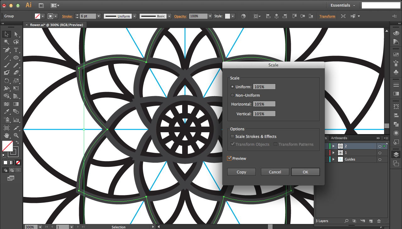
To test the scalability, make a copy of your first layer design and paste it in a new layer. Use the align tools in the upper tool bar to align it to the center of your screen (and thus center of guidelines; that's why it was important to have the lines in the center). Right-click to get the transform option, and click on Scale. Select and preview appropriate percentages for scaling (for the inner, smaller shapes 110-115% was a good range, while bigger designs had to be scaled smaller around 102-105% since bigger shapes scale up less radially) As long as you don't have weird gaps between layers (as in parts of the new layer, once scaled, no longer touches the previous layer) you're fine. Continue on.
Rotating and Second Layer of Petals
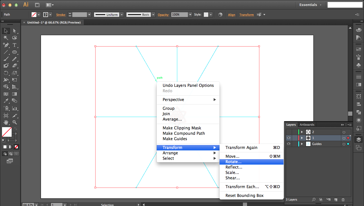
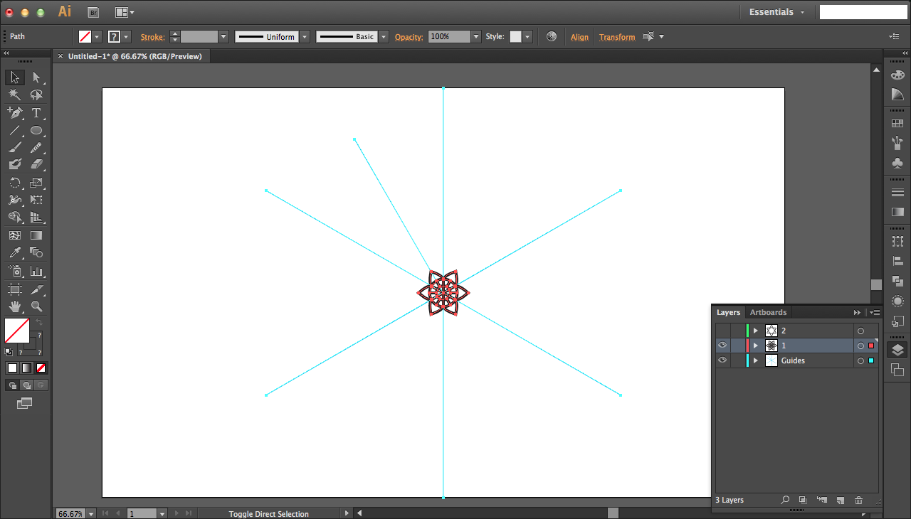
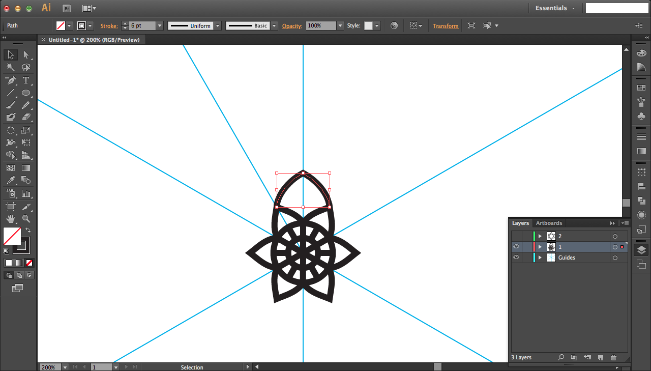
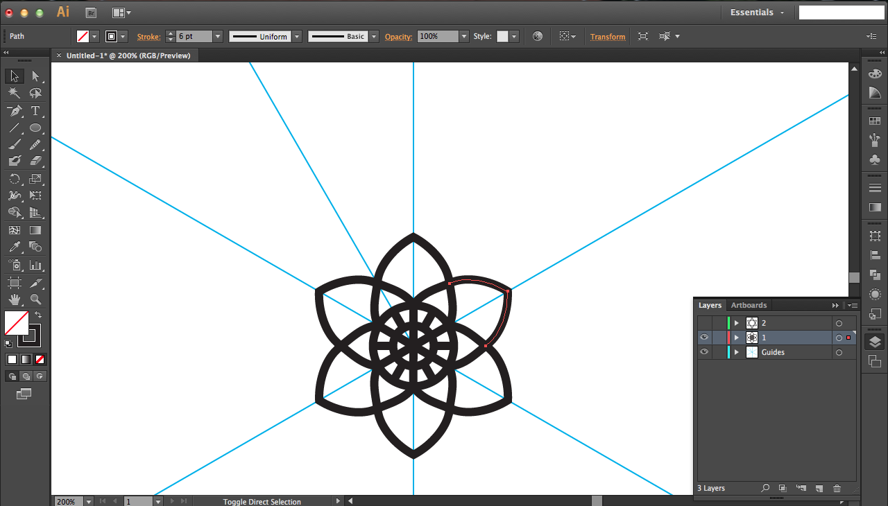
For the next layer of petals, you'll need to rotate everything so that the center line through the new petal is perfectly vertical. This makes it possible for you to vertically mirror half the petal to get a full petal.
Select all your shapes, guides and all (ctrl/command + A) and right-click, transform, rotate... Rotate by 30 degrees, and press OK not COPY this time since you don't need to duplicate.
Repeat the same steps to create your next, larger petal. Don't forget to join them too!
Decorative Layer of Petals and Finishing
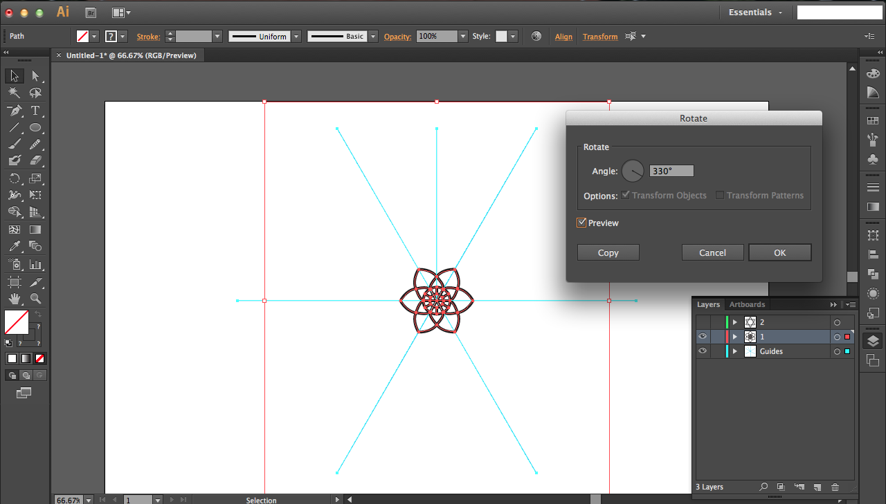
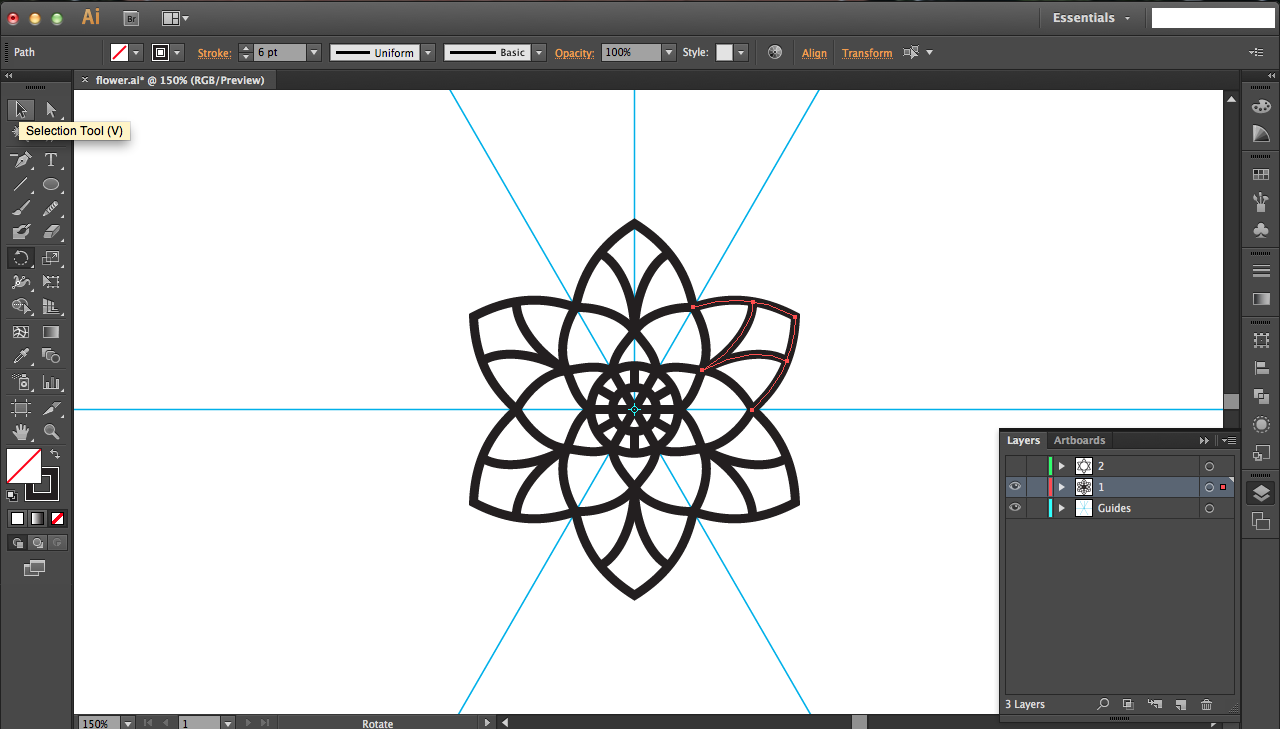
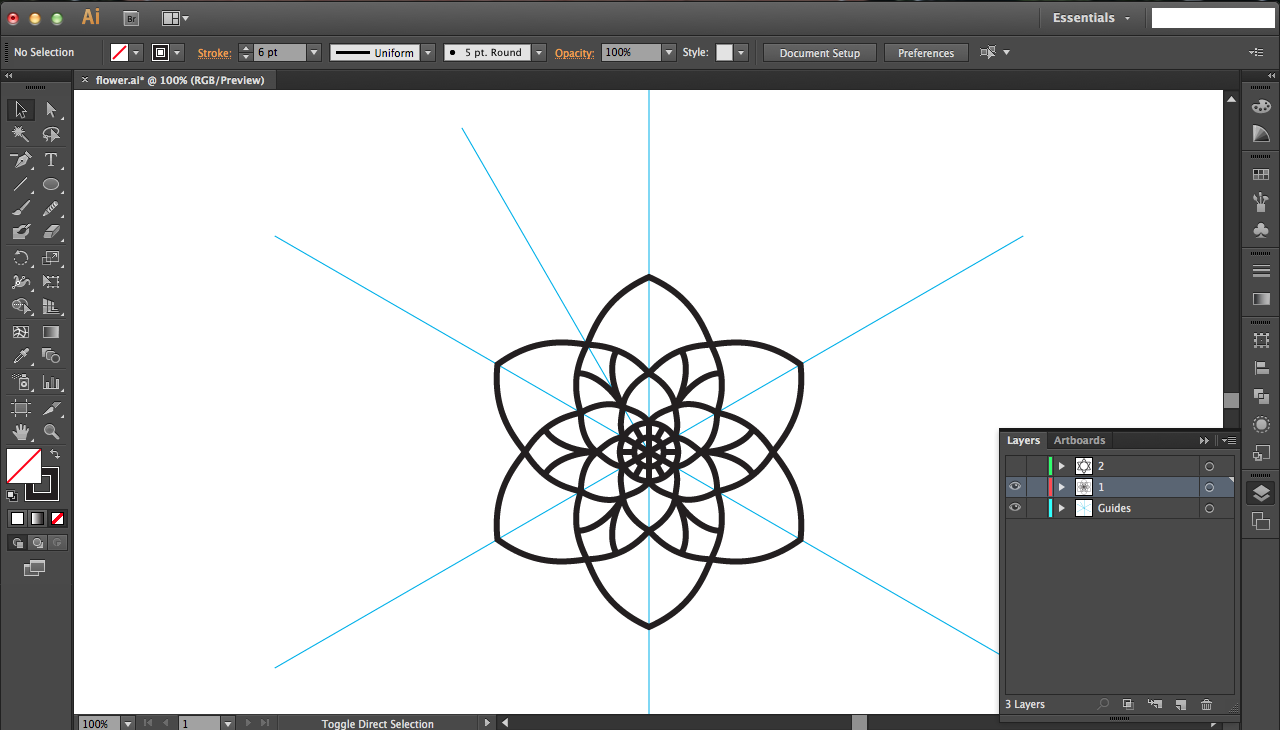
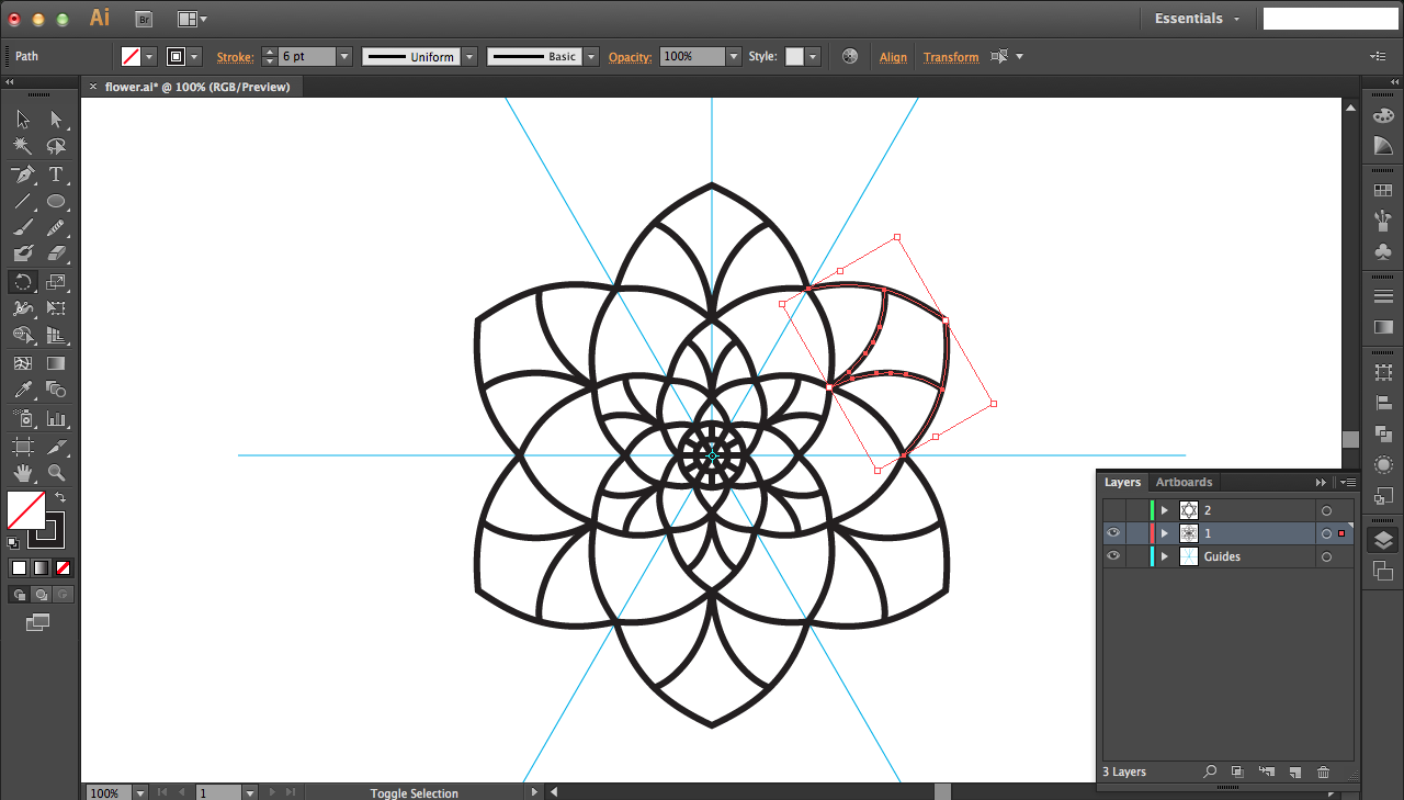
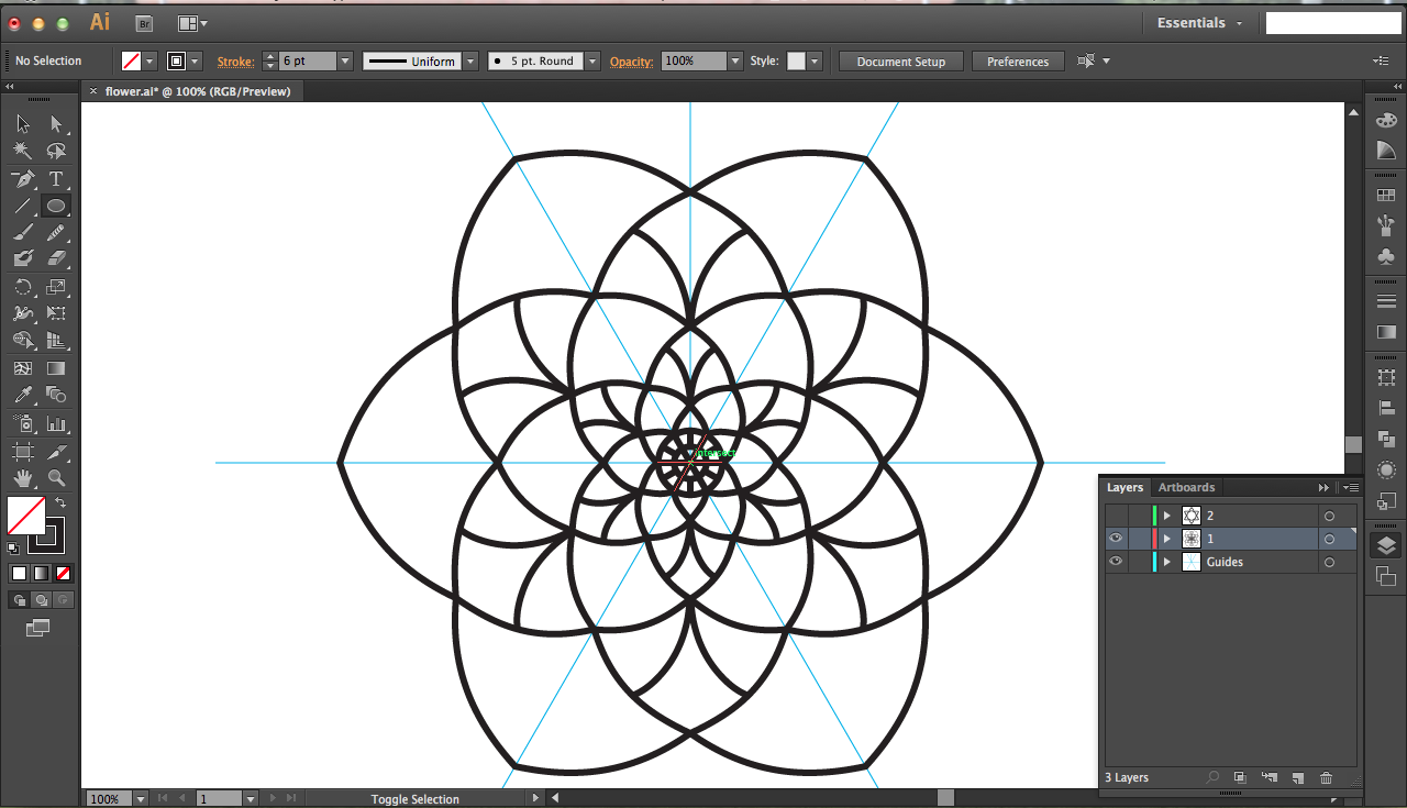
Remember when you rotated 30 degrees? Well for the next layer of petals, were going to undo that rotation by rotating 330 degrees.
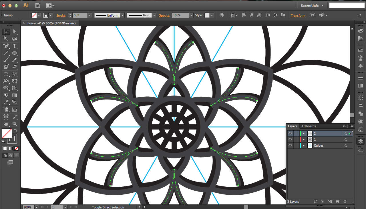
Make the same petal as you normally would, but add an interesting design inside the petal. In this case, I just made a simple stroke and mirrored it. Make sure the design isn't too complicated so that your laser doesn't have too much difficulty burning it (the scorch marks might interfere with the design if you have thin lines).
For the next round, rotate 30 degrees before starting; in case you haven't realized already, rotate 30 degrees and then 330 degrees, alternating for every other layer. Add a decorative layer (as described in the pictures above) every other layer as well.
Once all my petals were finished, I added a bounding circle for my first layer, since it would need an interface with the external frame for gluing it on.
Scaling to Offset Your Design
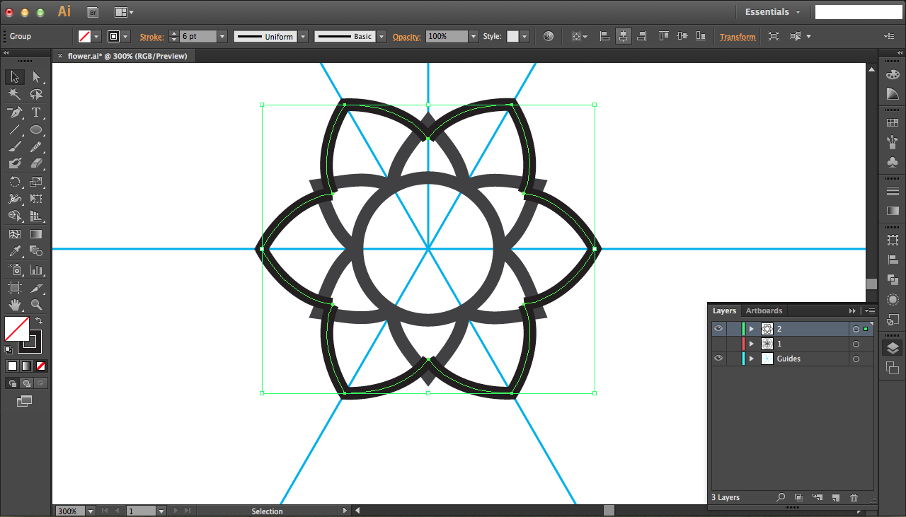
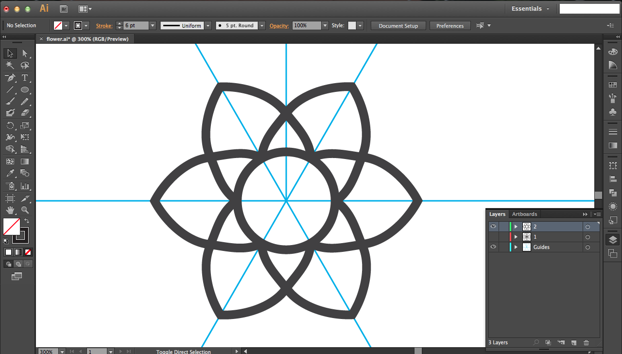
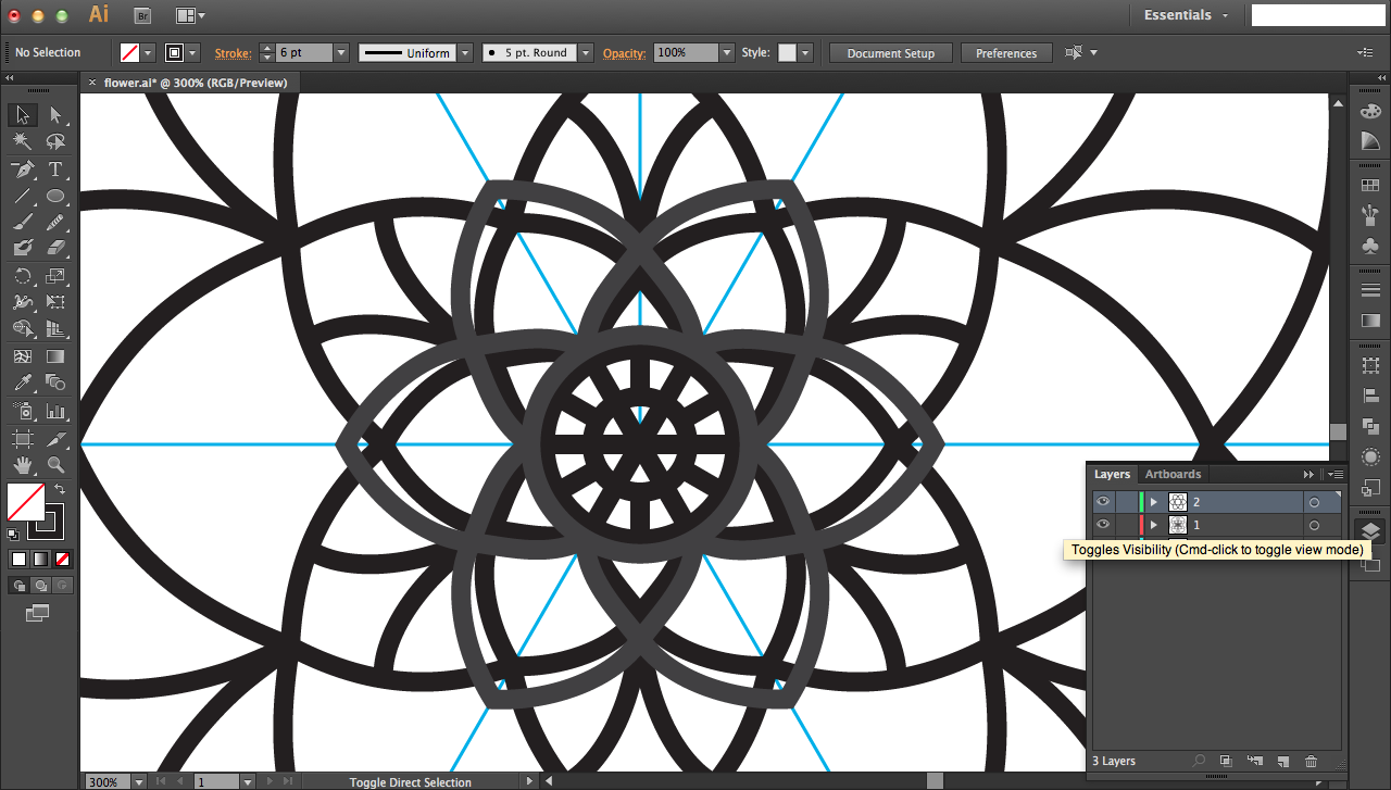
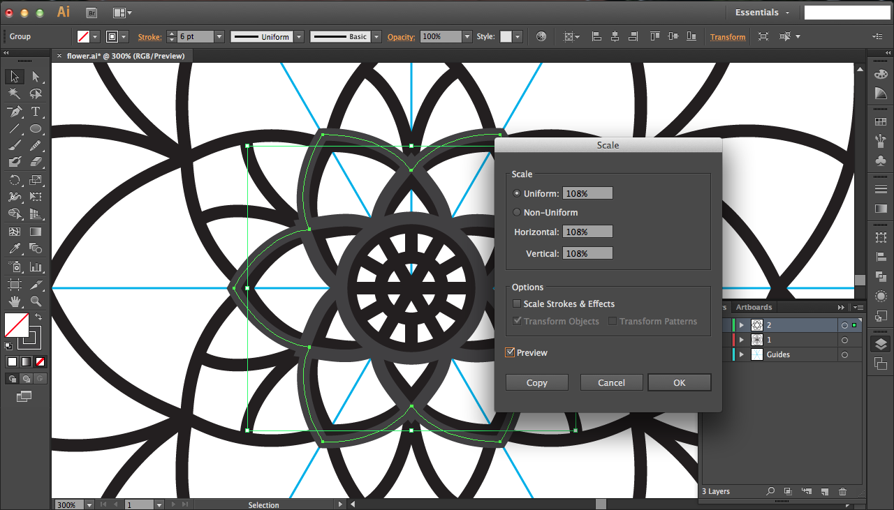
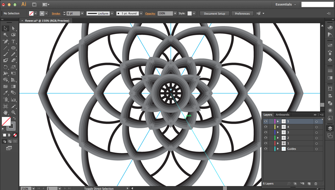
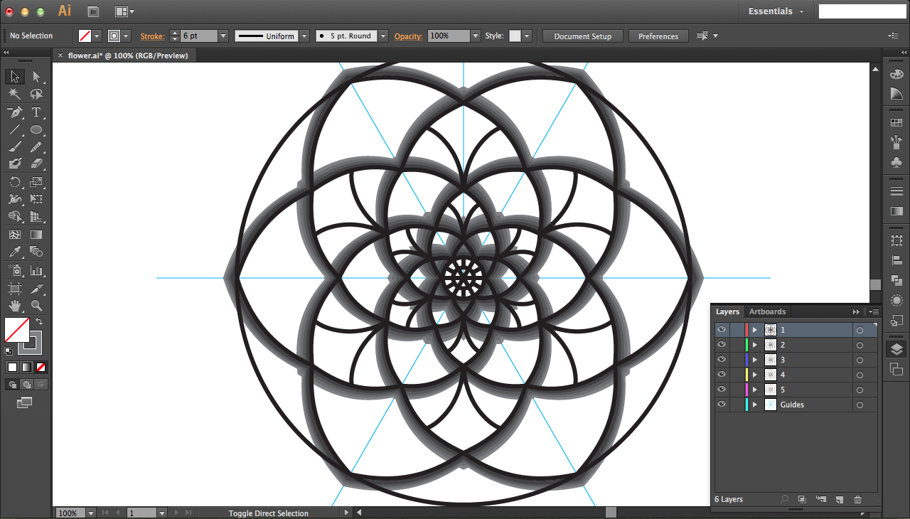
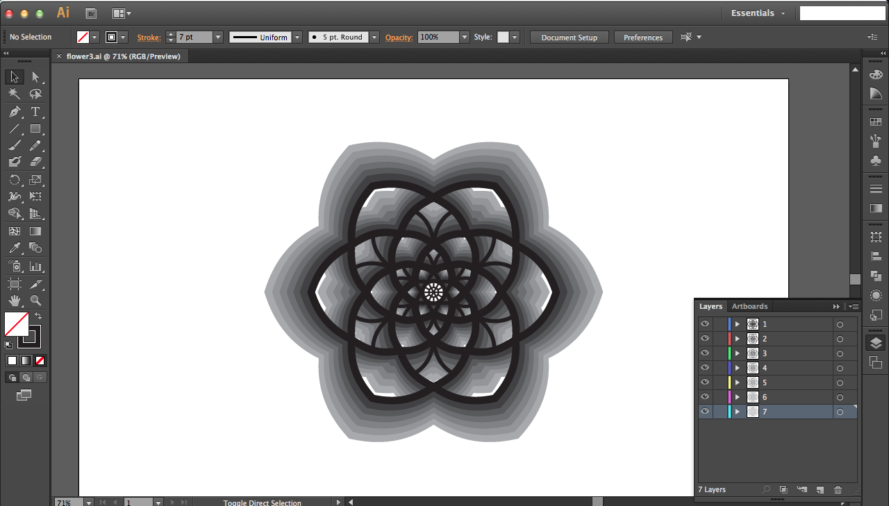
Now you need to offset your petals in the flower design so that you can generate your slightly offset flower layers (whole flower, not just petals) for laser cutting. See step 5 for more on how to do this (transcribed below for easier access, though pictures are still there), but in essence you'll copy one petal layer in your original design, scale it in your new offset layer, and repeat for all petal layers until your offset flower is complete. Then copy the first petal layer of your offset design into yet another layer, scale it, and repeat...
Begin by making a copy of your first layer design's first petal layer and pasting it in a new layer. Use the align tools in the upper tool bar to align it to the center of your screen (and thus center of guidelines; that's why it was important to have the lines in the center). Right-click to get the transform option, and click on Scale. Select and preview appropriate percentages for scaling (for the inner, smaller shapes 110-115% was a good range, while bigger designs had to be scaled smaller around 102-105% since bigger shapes scale up less radially). Once you've decided on a good scaling amount, click ok. Repeat for all of the petal layers in the design until your entire flower is finished. Copy this scaled version of the flower, petal layer by petal layer into another new layer, scaling each petal layer individually as described just above.
Quick tips:
- Be sure of your stroke size/thickness. You'll notice that this design's lines are much thinner than my actual, finished design (see last image above). I realized that once I offset the layers, even after 7 total layers, they have rather large gaps left over than could be filled by increasing stroke (see step 10 for how wide my stroke becomes)
- Make use of the eye button on the layers panel in the bottom right to toggle visibility of individual layers on and off; this will help you see each petal layer than you're working on more easily. Then you can turn on the original design to compare it to the offset layer than you're working on, but you can turn it off if you want to see only your offset design to see how it's coming along (might be slightly shifted, corners might not be joined, etc.).
- Color your layers differently so you can easily differentiate them -- otherwise all you'll see is a black blow rather than offset layers. I chose to go with a grayscale ombre.
- Copy and scale each petal layer individually instead of copying and scaling the entire design in one go. This is because you'll find out that you need to scale each petal layer differently, especially since bigger shapes scale up less radially.
- As you scale each petal layer individually, jot down really quickly what your percentage was to reference in the next offset layer. You might have to stray from these percentages as you progress, but they do serve as adequate guidelines. Generally, the bigger, outer layers will get smaller scaling percentages.
- I experimented with offsetting the inner petal designs too, but I also wanted to offset them inward rather than outward. As you can see it doesn't turn out well since the design is now too small to reach the extents of the petals. I ended up leaving the inner petal designs only in the top original layer, and that actually looked really good.
Fixing Layers
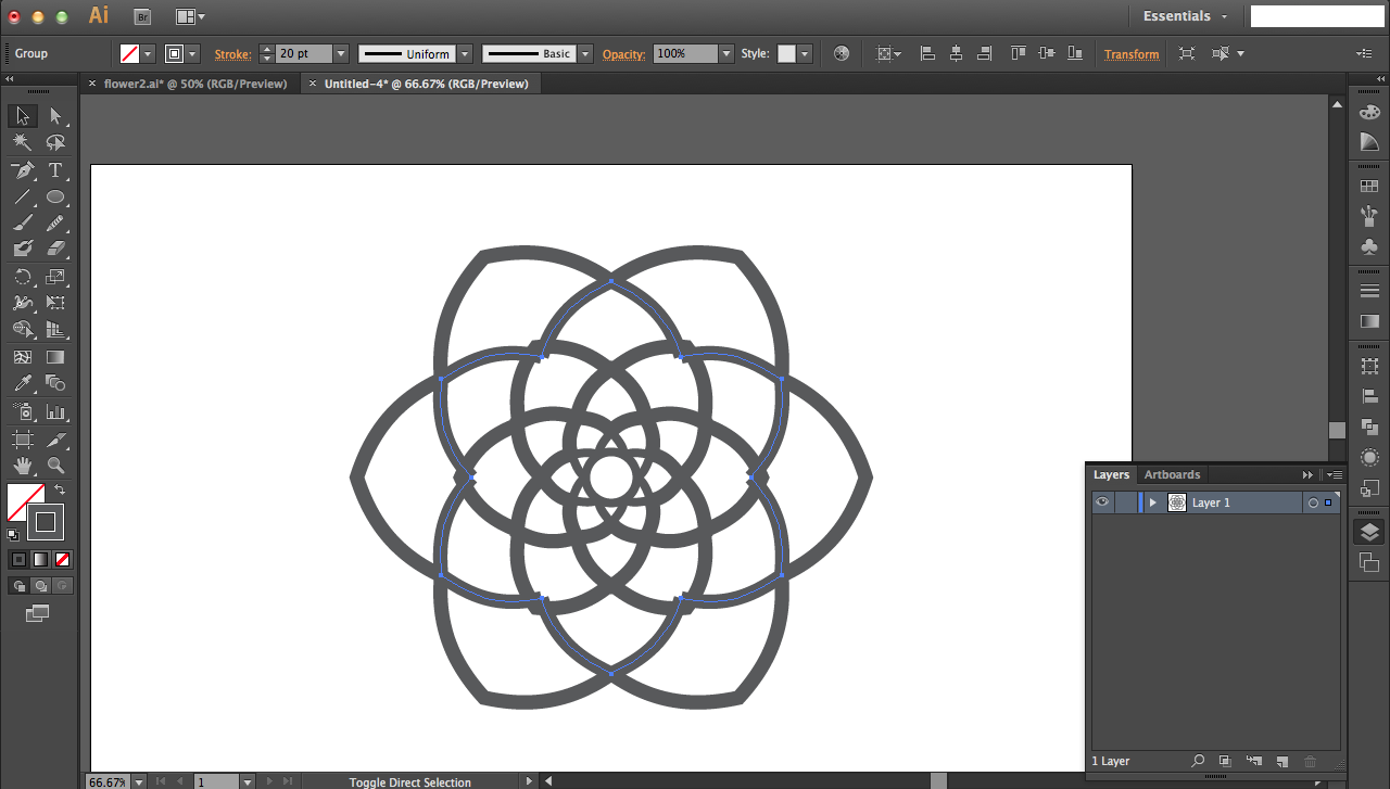
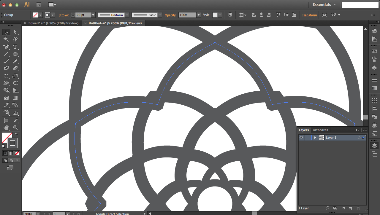
For some layers, you'll notice triangle gaps between petals. This occurs because your pencil strokes in the petals have rectangular edges. Fix this by selecting the petals (just that round of petals) and pressing join to join the edges and hopefully create a point like we do at the top of each individual petal. If the problem persists, use the brush tool (press hotkey B) to fill in the gaps.
Separating Layers for Laser Cutting
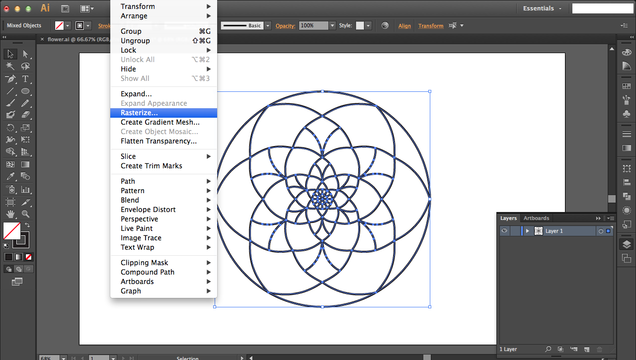
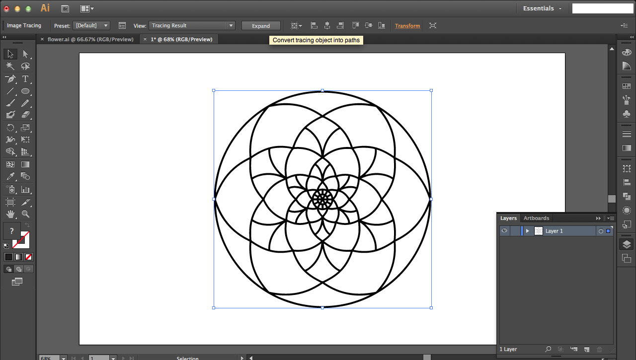
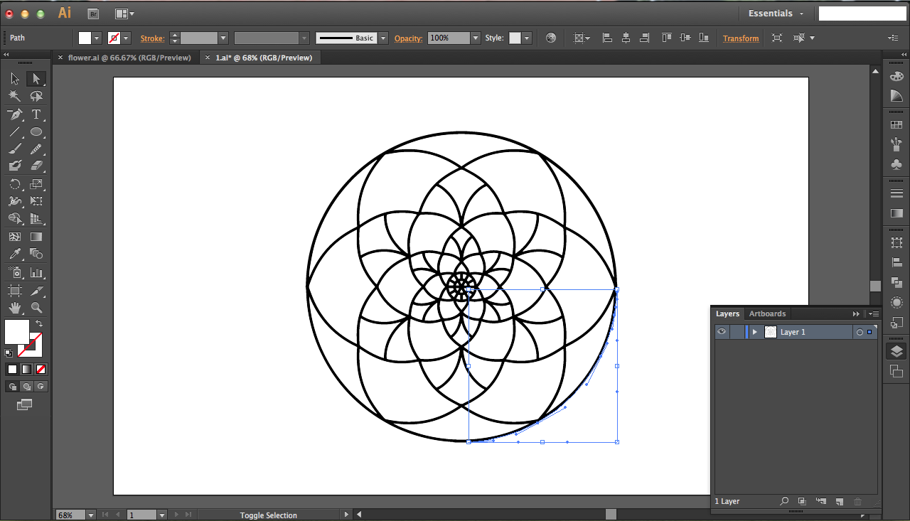
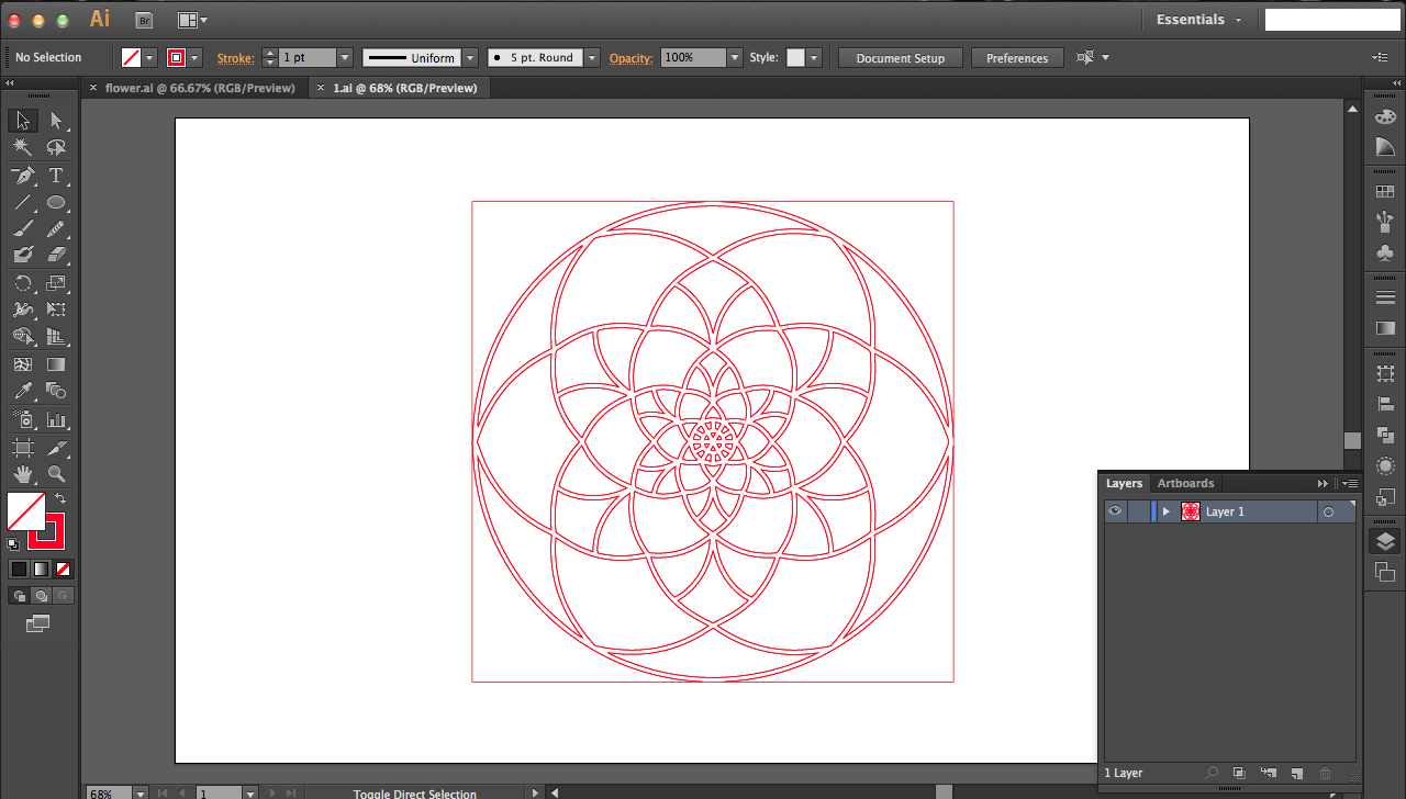
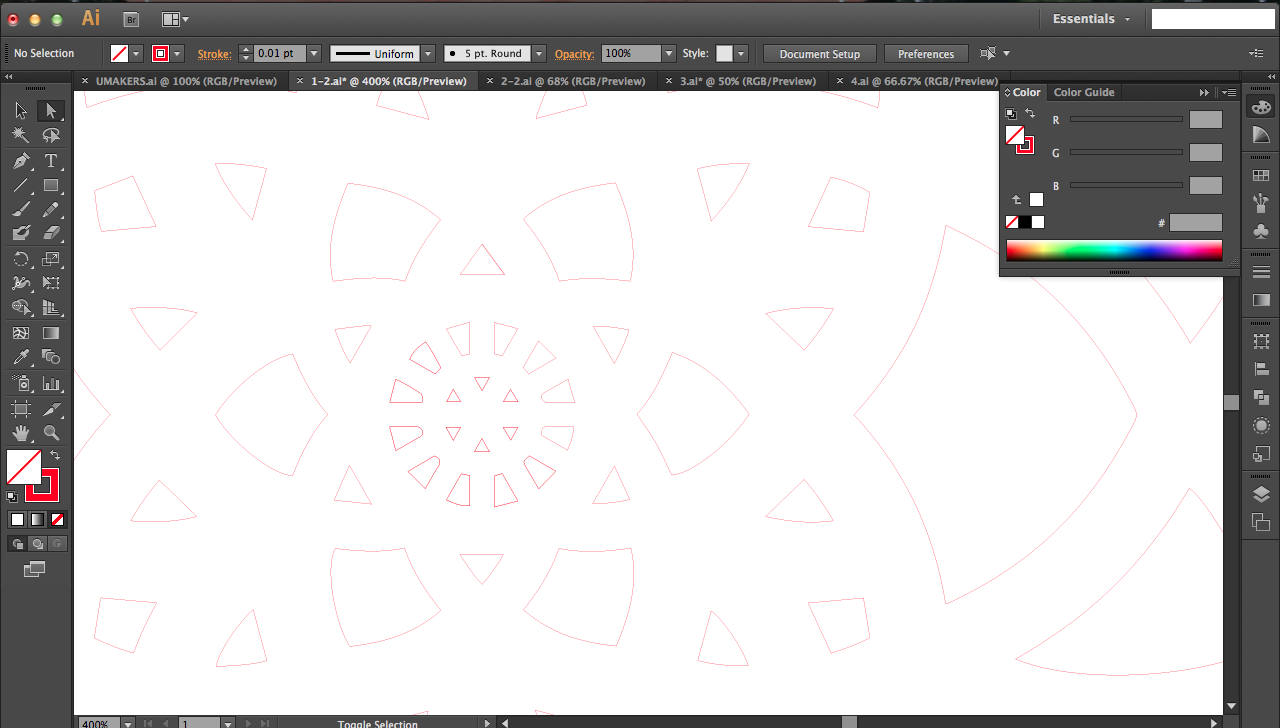
Now that you've designed each offset layer, you need to separate them for cutting them individually. Select everything in each layer one at a time into new files by clicking on the small circle icon to the right of the layer's name in the layers panel in the bottom right corner. This circle will say Target Layer when you hover over it. Copy and paste that layer's selection into a new file.
Go to the image tab on the top of your window and go down to Rasterize; this will pixilate your fill and paths. On the top bar you should see an option called Image Trace. Click on the drop down menu and select Sketched Art to vectorize the outlines. Once tracing is complete, click the Expand button, also on the top bar next to Tracing Results, to create paths around your design.
There will extraneous parts remaining from your image trace; it outlines the white spaces too but you only want paths around your black strokes. Get rid of them by clicking on the magic wand button and pressing on the white before pressing backspace to delete. Don't forget this step! See the third, fourth, and fifth pictures above for the problems that will result.
Depending on your laser cutter, the pre-processing may be different, but the standard is setting the inside fill to none and the outside stroke to RGB pure red (#FF0000) at 0.01" (or hairline). Do that by using the black mouse to click on your design and changing stroke and fill options on the upper left.
Completed files for the flower are attached to this step.
Downloads
Cutting and Cleaning
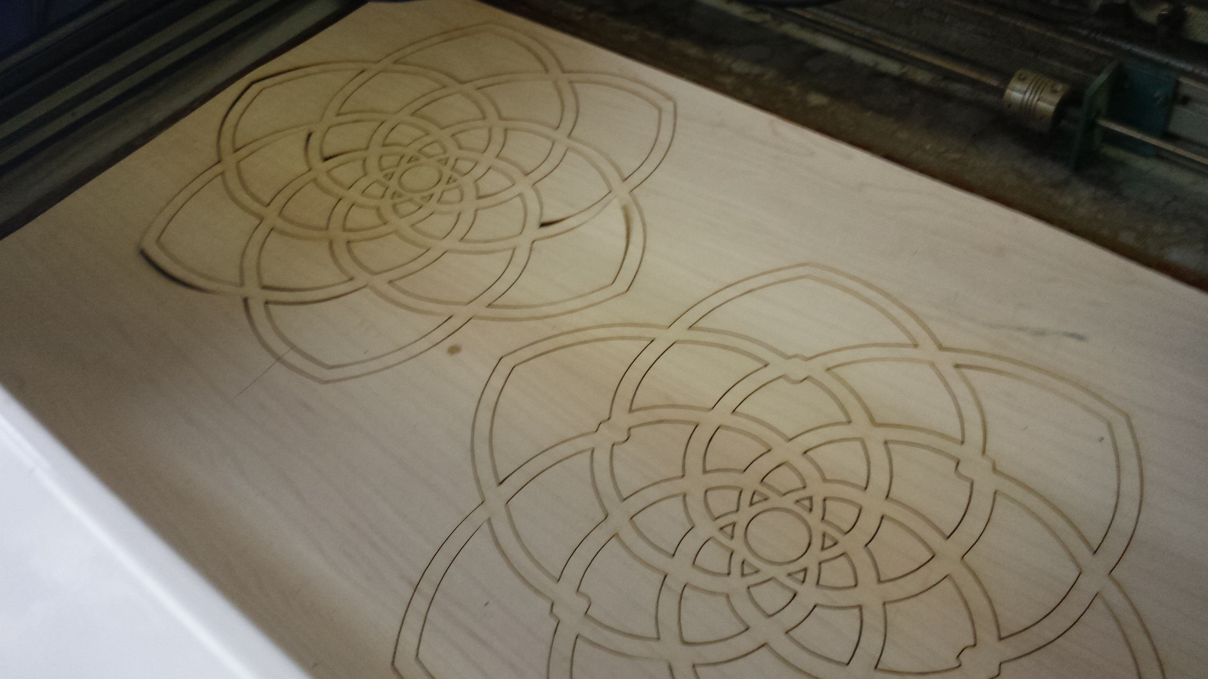
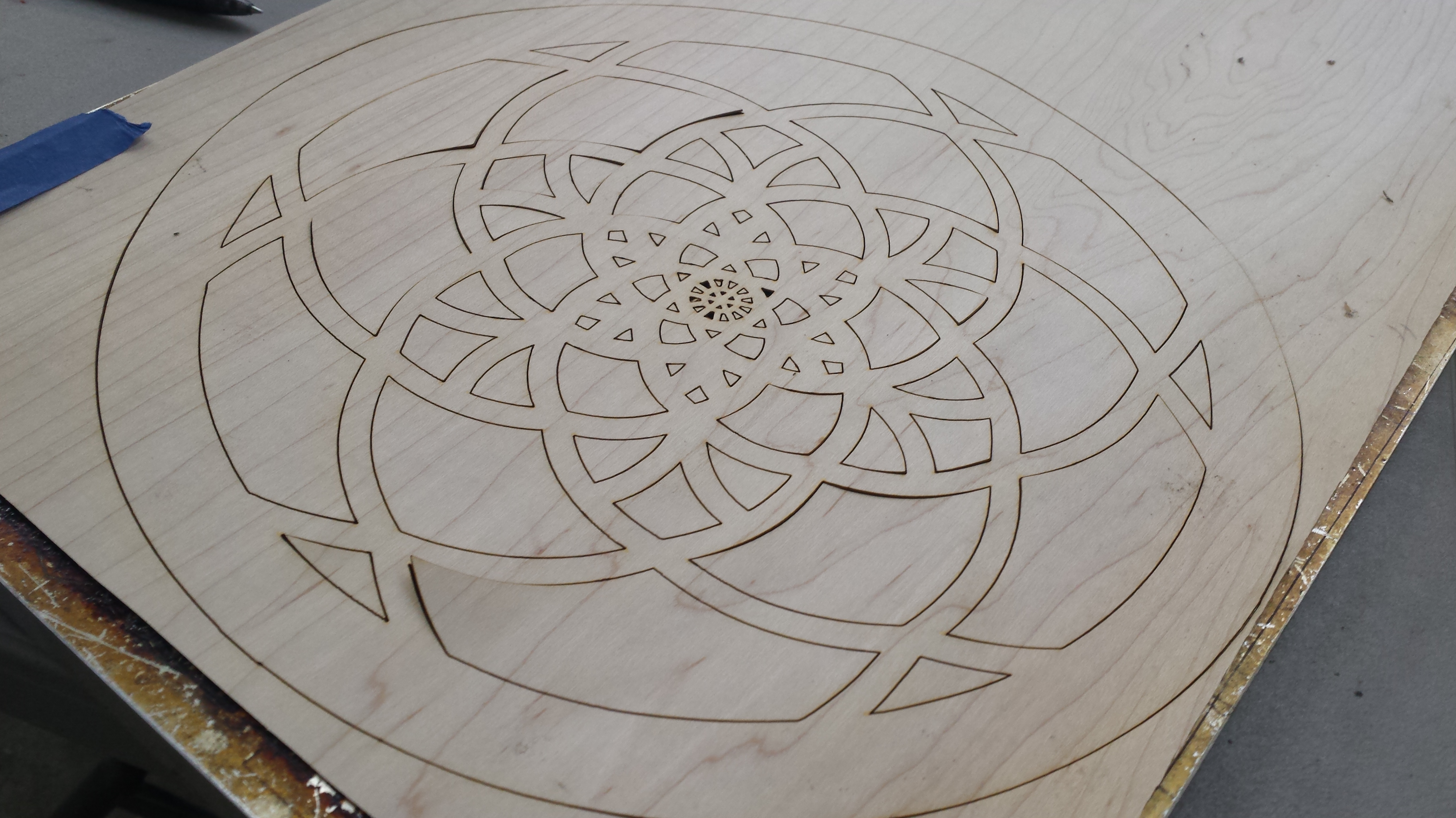
Send your designs to the laser cutter to be cut. Make sure that your cutter can accommodate all of your sizes, especially since you've offset them by scaling upward.
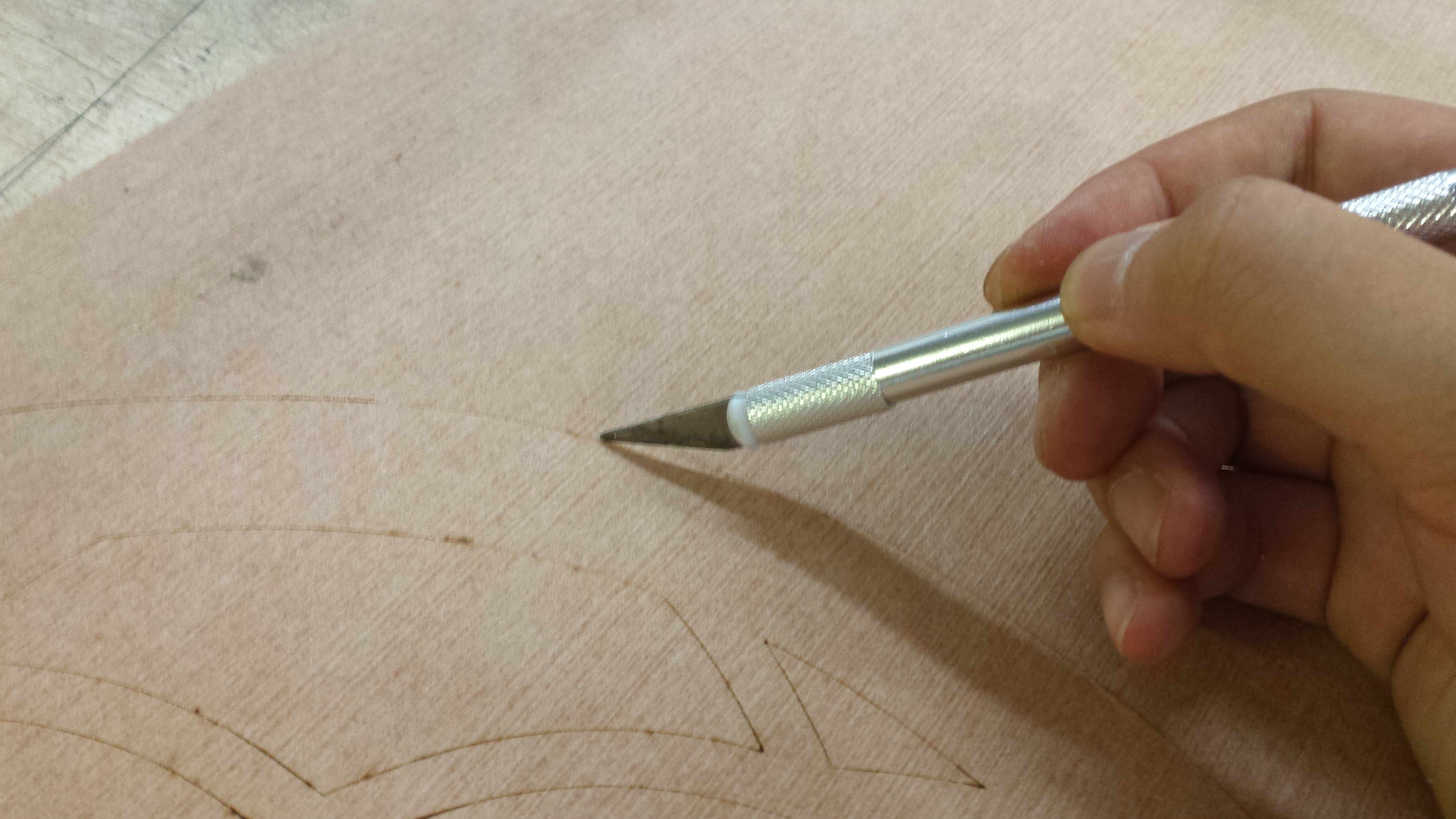
Since veneer can be a bit curled, use masking tape to hold down the corners. As you cut the veneer, be careful not to set power too high that you scorch the veneer. This may mean that you don't cut all the way through, but you can just use a blade to cut them free.
Gluing
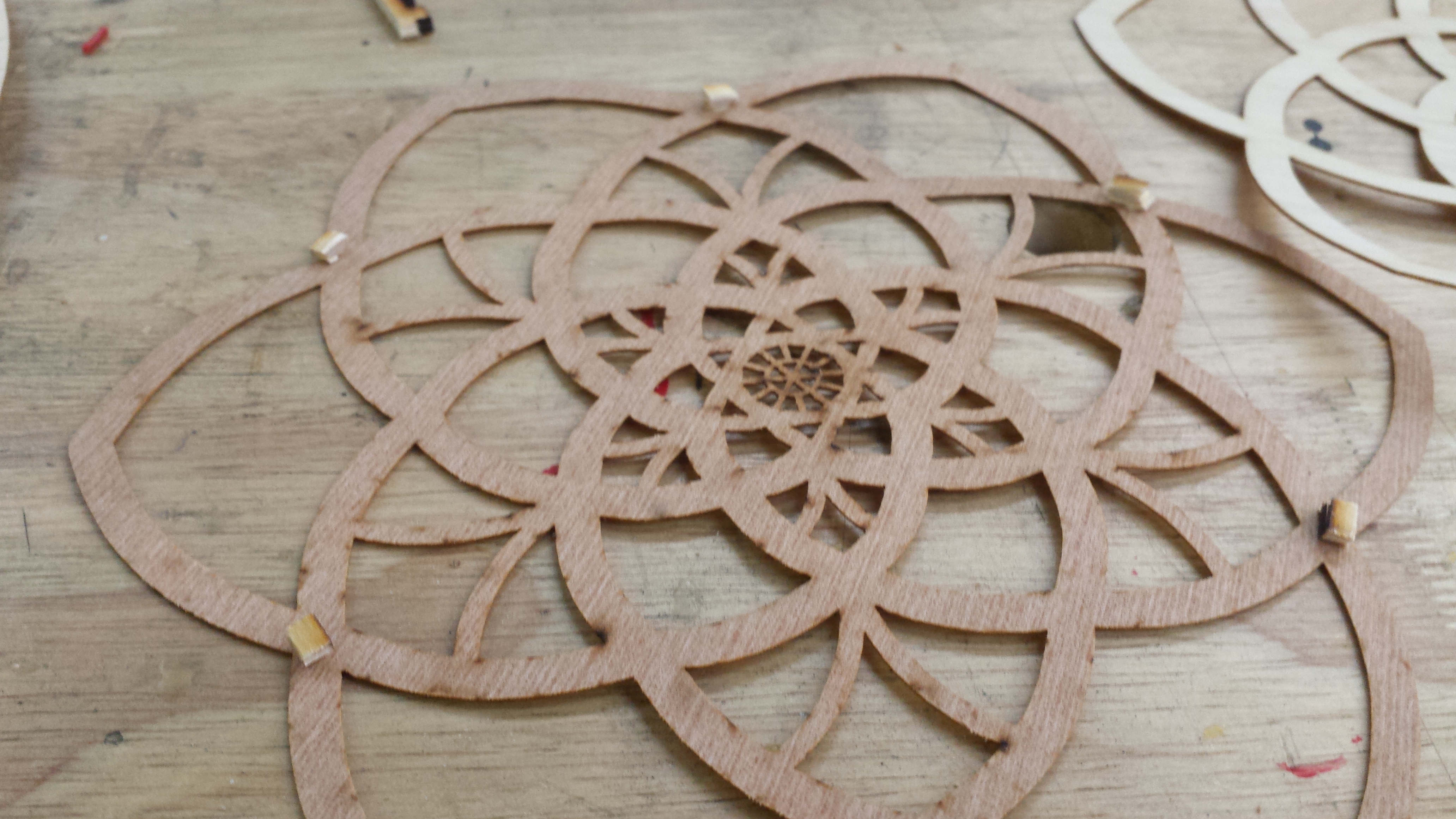
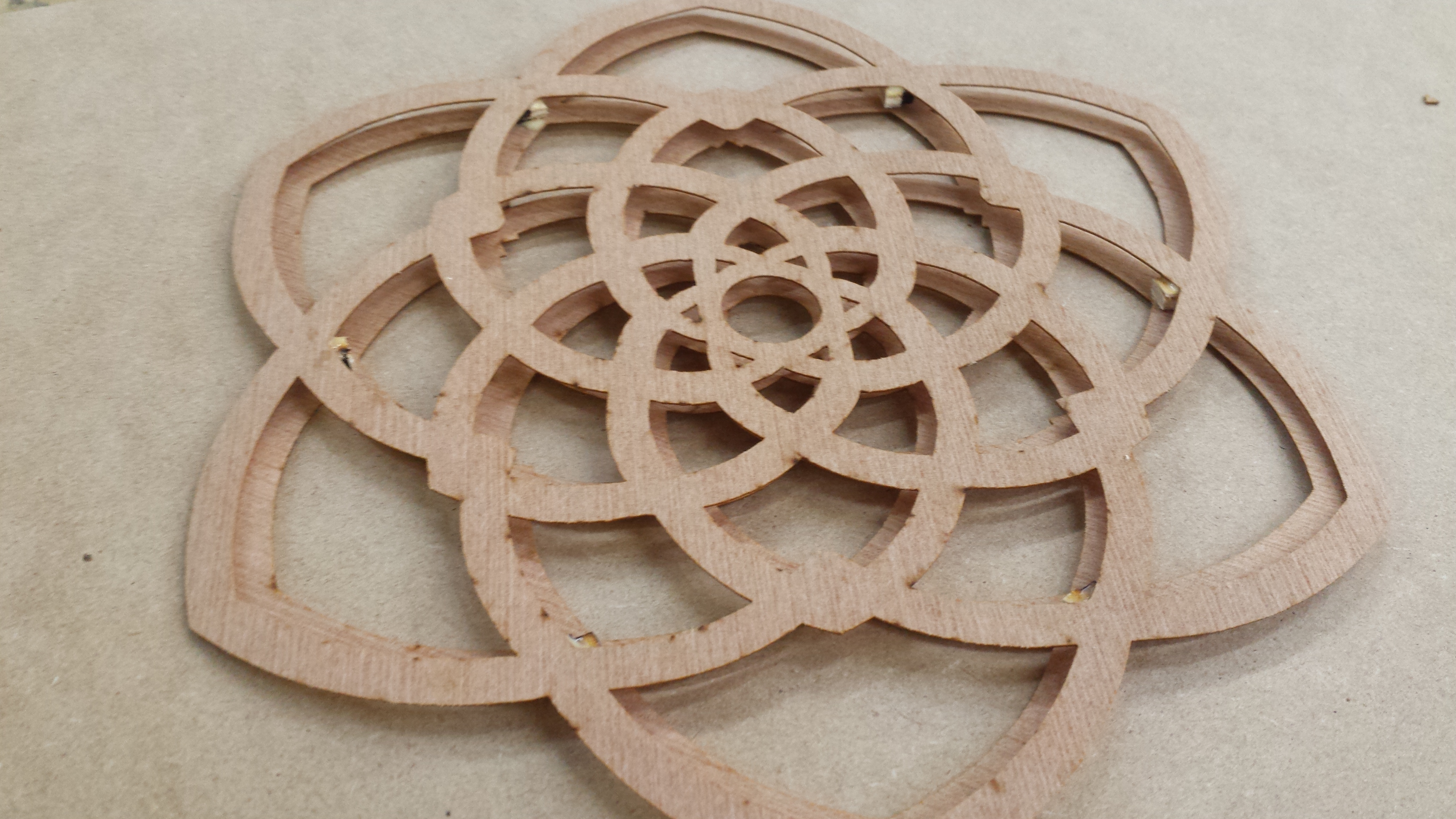
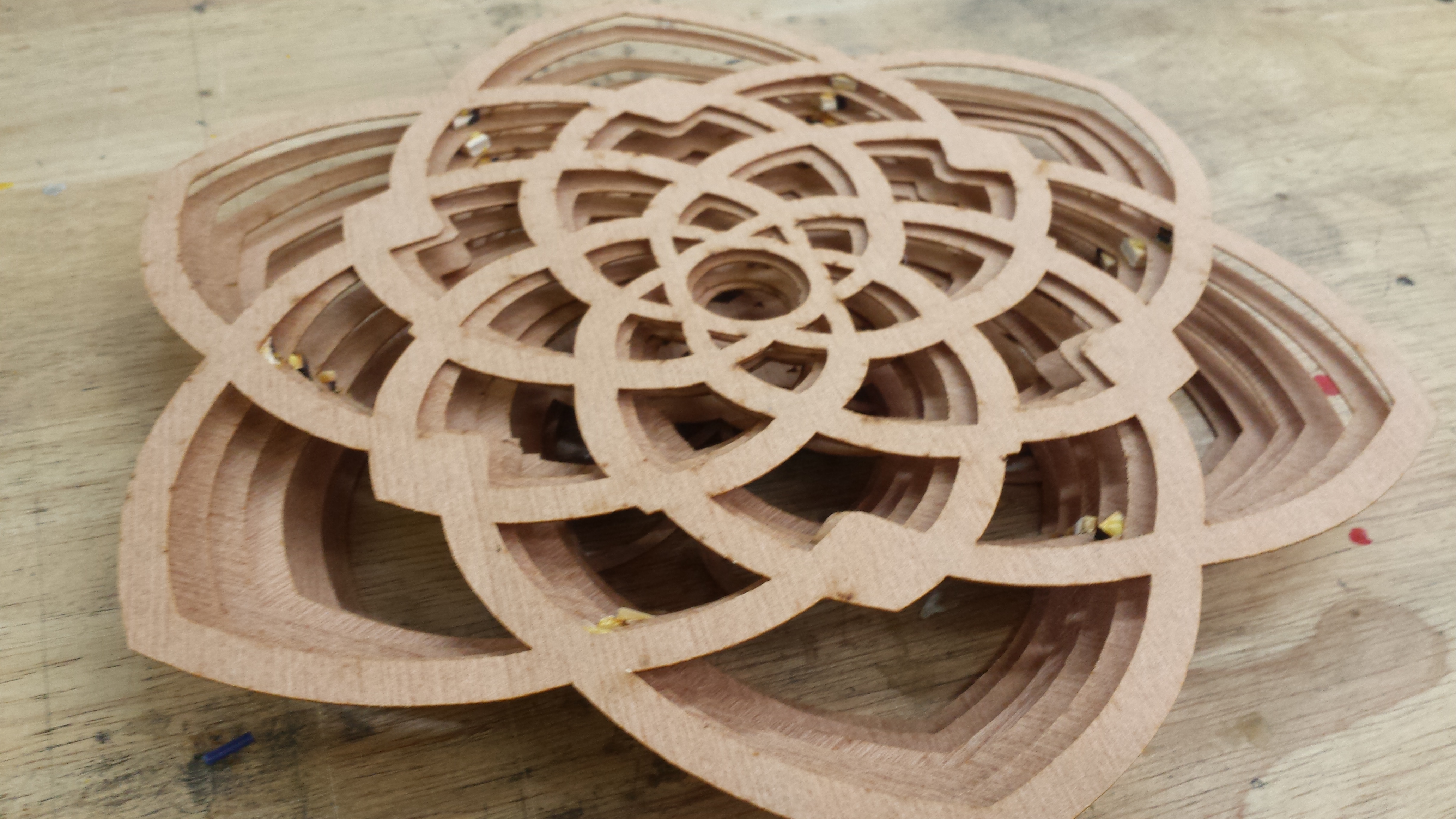

Start with your smallest layer. Put glue on one side of six spacers and stick them on the inner corners of the outermost layer of petals (see first image for what I mean). Stack something heavy to hold this down for drying ~15 minutes (I suggest using your stock wood since it'll definitely be big enough to cover the entire area of your design evenly). This is one set of two; glue your other layers in sets of two also before finally gluing them all together. This ensures that if you have slight misalignment for one of your layers, you won't propagate it as you add layers on top; instead, you only have two layers to work with at a time until you combine them all.
Back Frame
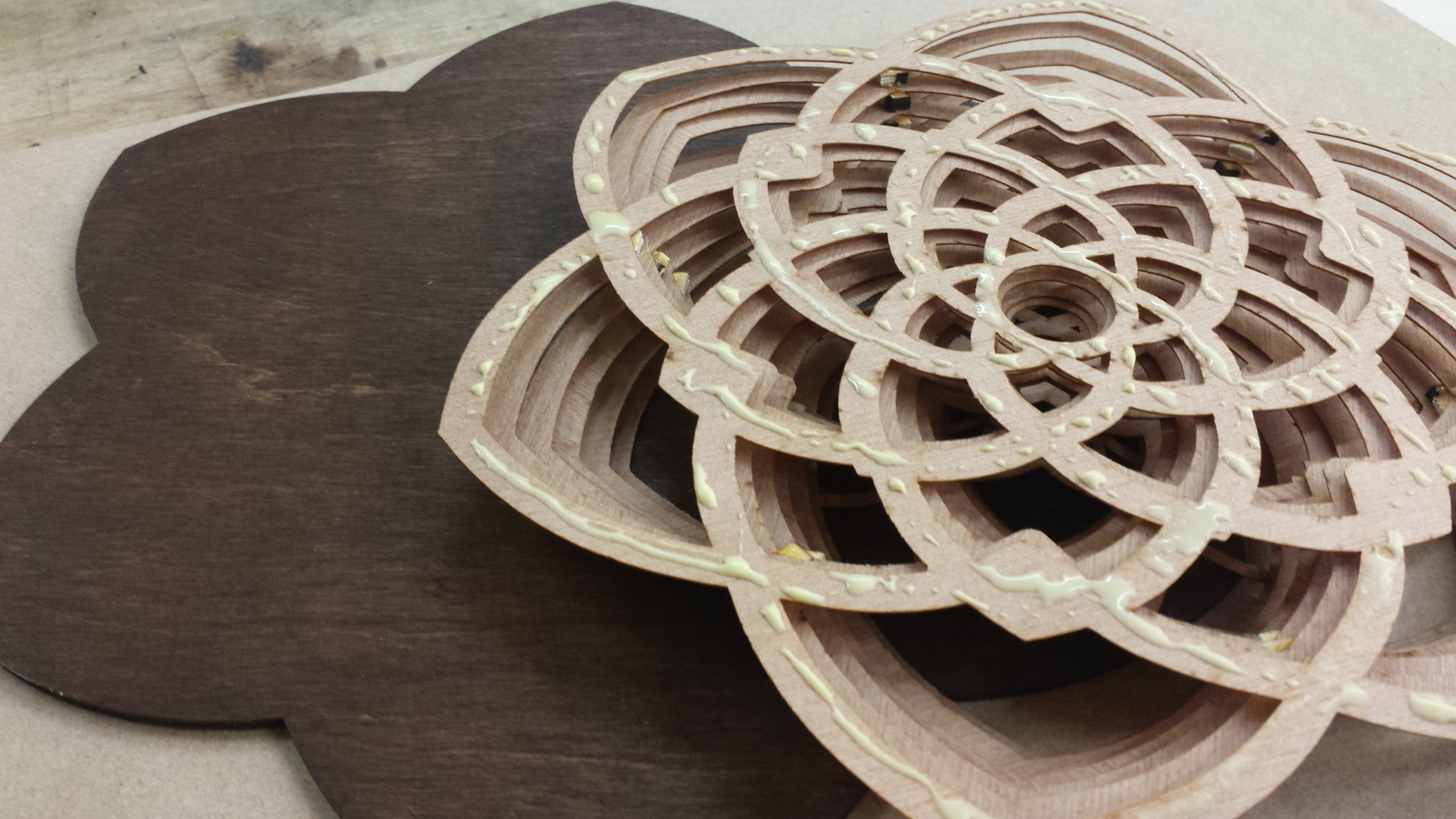
For stability I suggest a thicker backing for your plywood design. I later went back and quickly designed and cut a flower design that's slightly bigger than the biggest flower layer on not veneer, but 1/8" plywood. I used a dark walnut stain on it since I liked the light in dark background effect, and finally glued the entire flower design onto that plywood.
Step Back and Admire, Future Steps
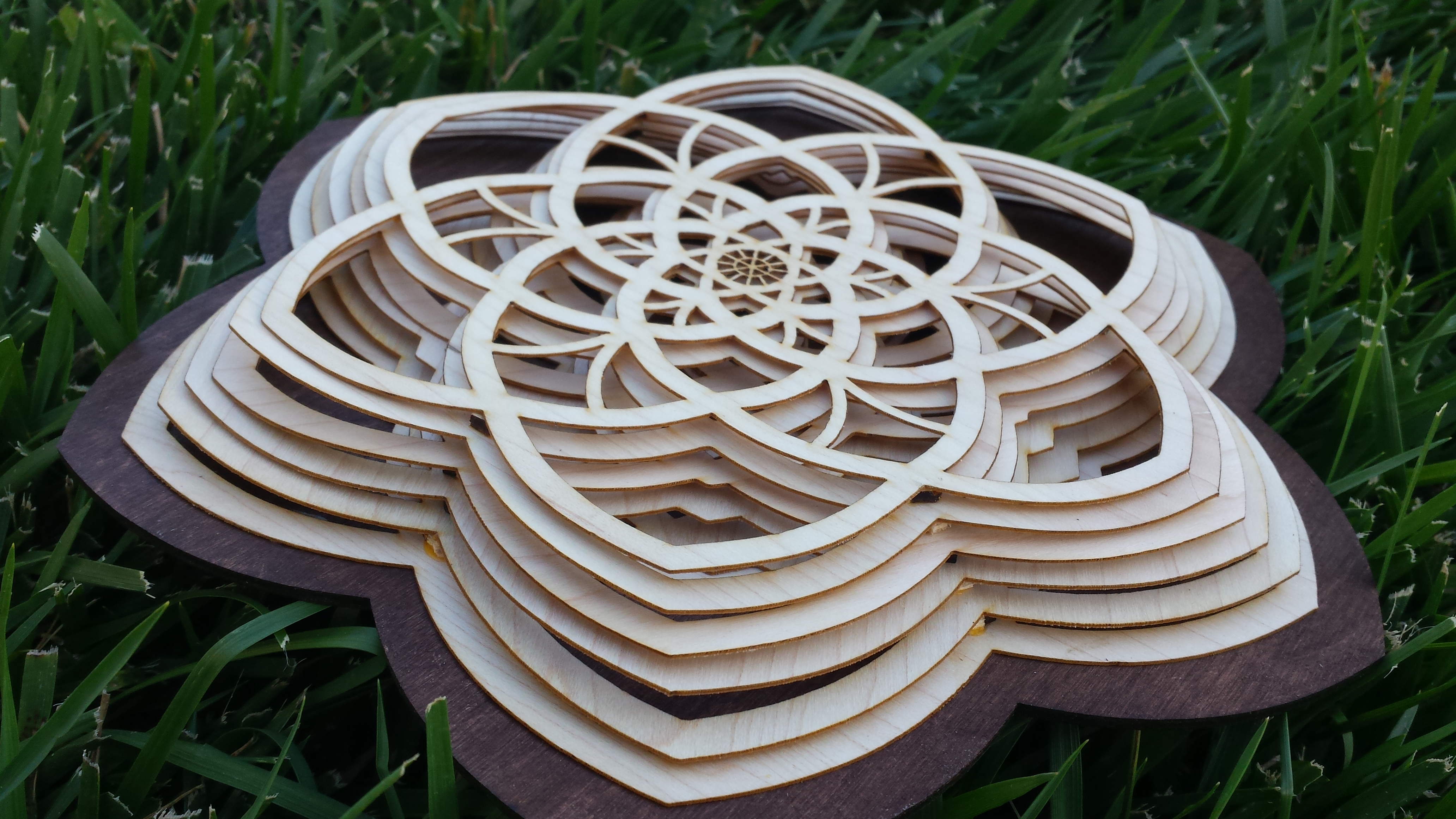
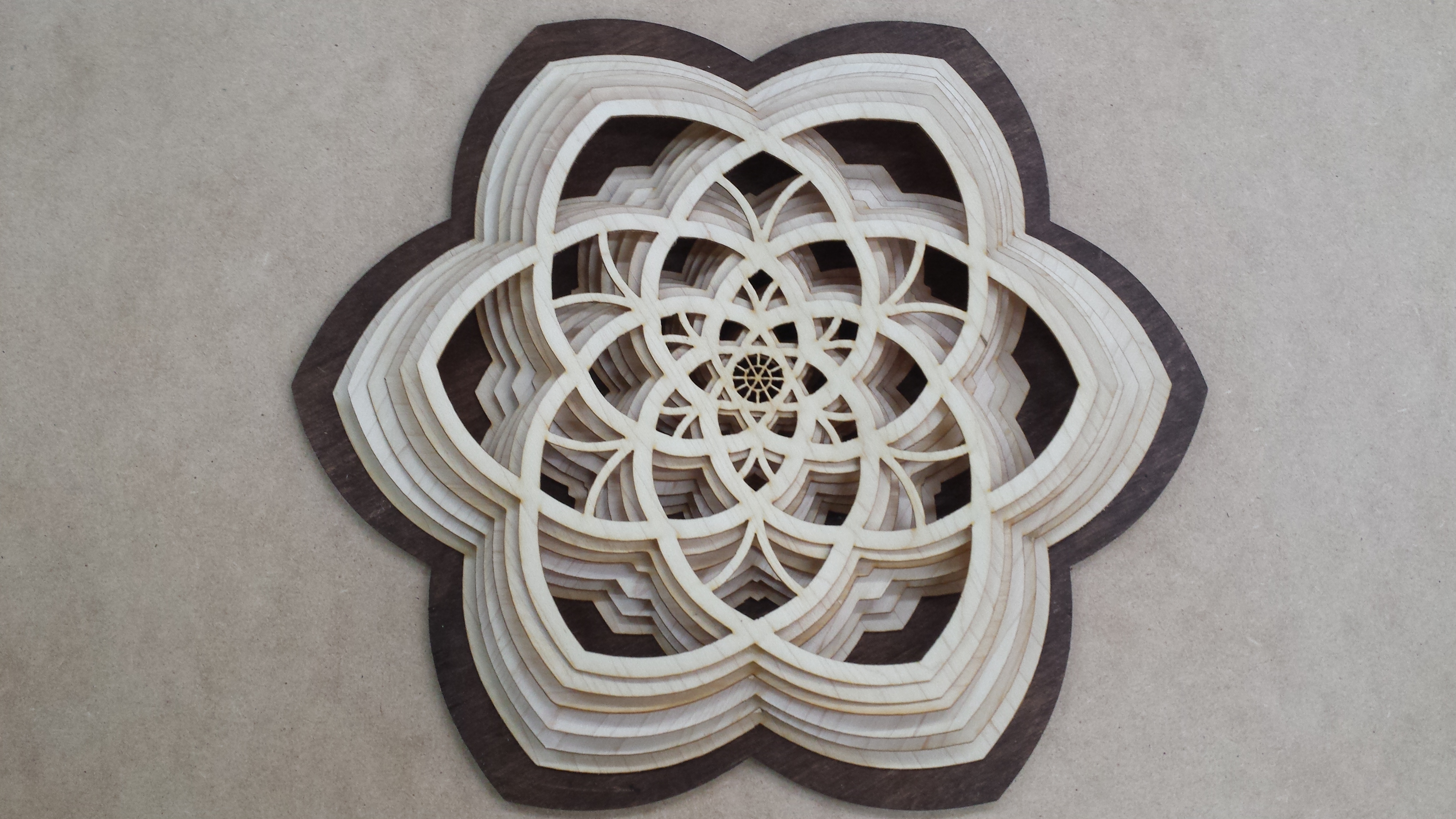
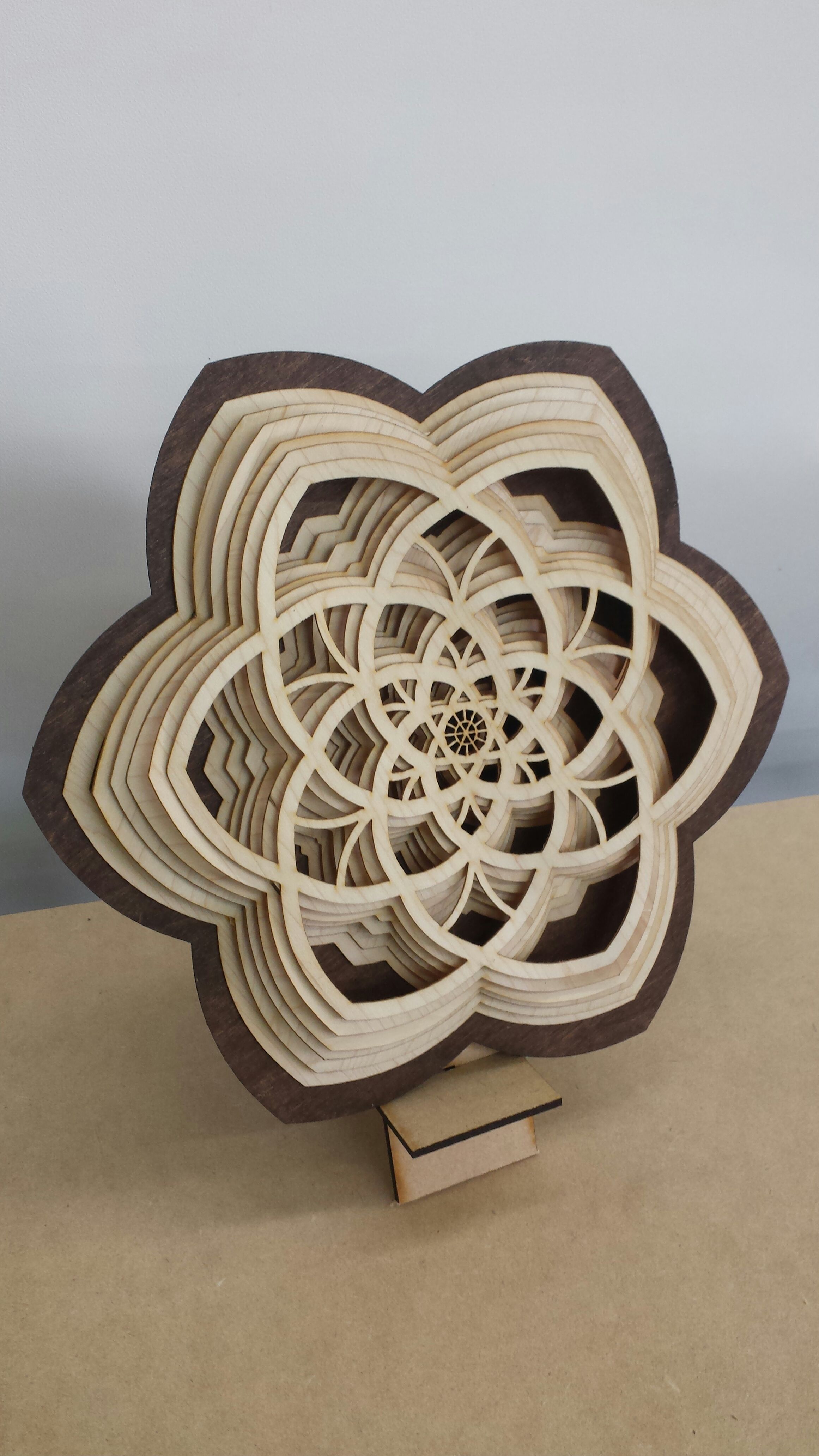
This is a fairly quick and simple project when you don't factor in the time to design the graphics, but I think the graphic design is the best part; there are so many possible variations if you change the design even just slightly. What if you changed the number of guidelines (I had 6 symmetric lines, but how about 8?) How about avoiding pointed tips and using rounded corners instead? Some other possibilities you might wanted to consider:
- You could turn this into a shape with 12 points and then install hands for a clock.
- Don't end at 6 layers like I did; see how far out you can make your design jut out of the wall (and thus make people's eyes jut out of their sockets..).
- Try out different patterns, or maybe scale down for each layer instead of scaling up.
- In terms of color scheme, a rainbow pattern or variety of stains would look pretty awesome.
- LEDs. Enough said. (I might actually try this out, TBD)
As always, leave questions and comments below and I'll get back to them as soon as I can. Enjoy.