King Snake Pen
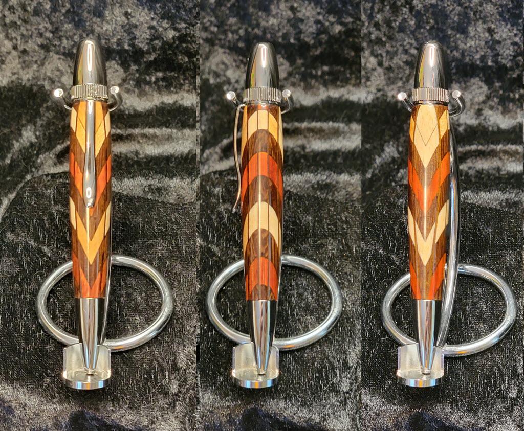
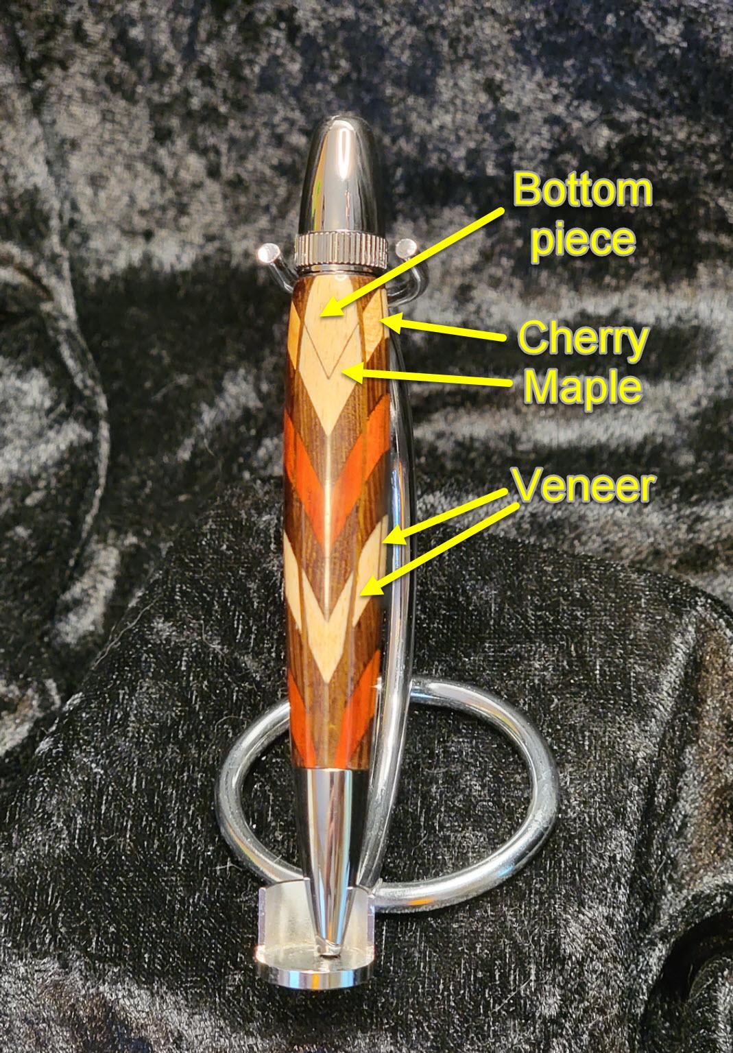
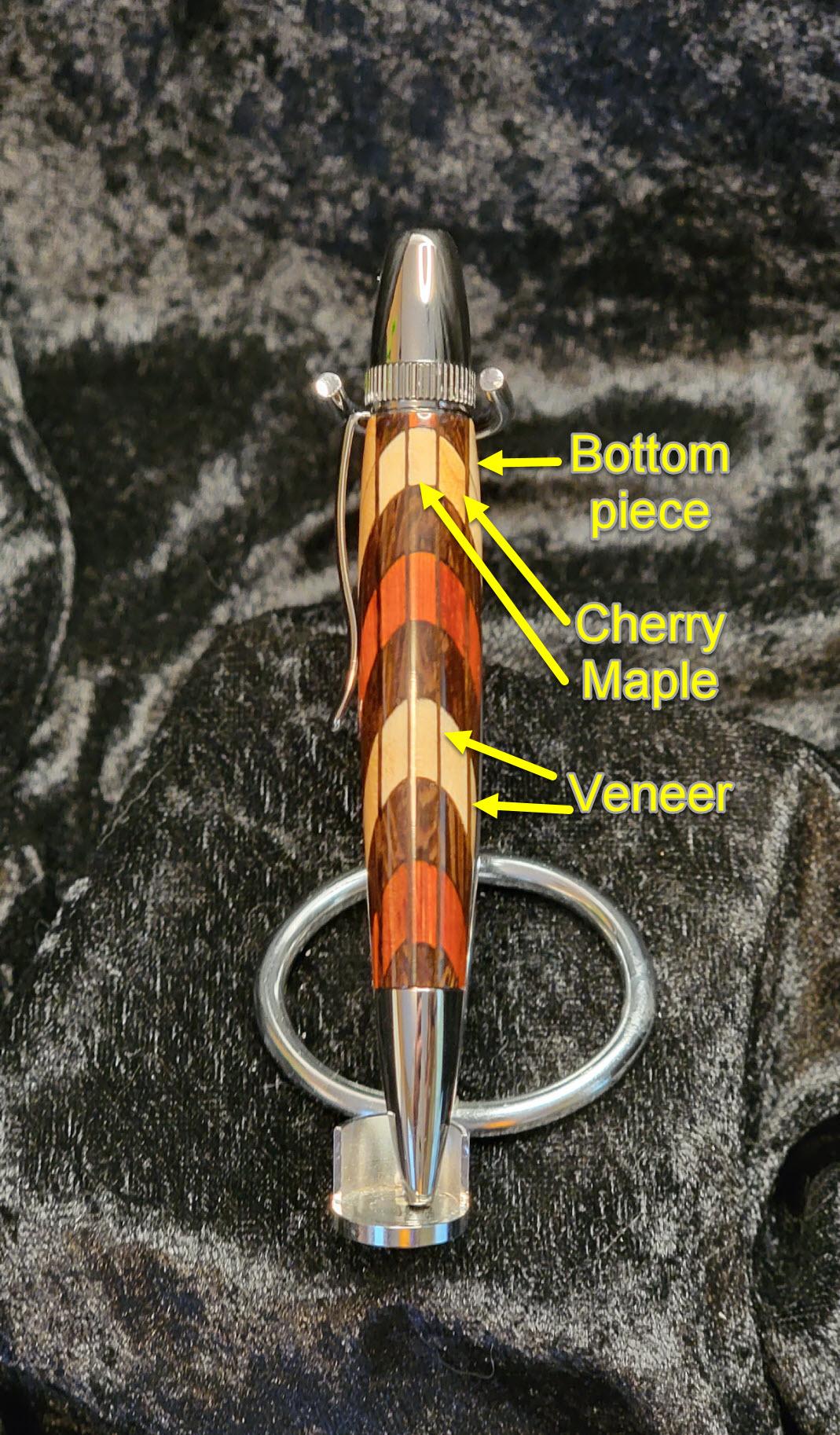
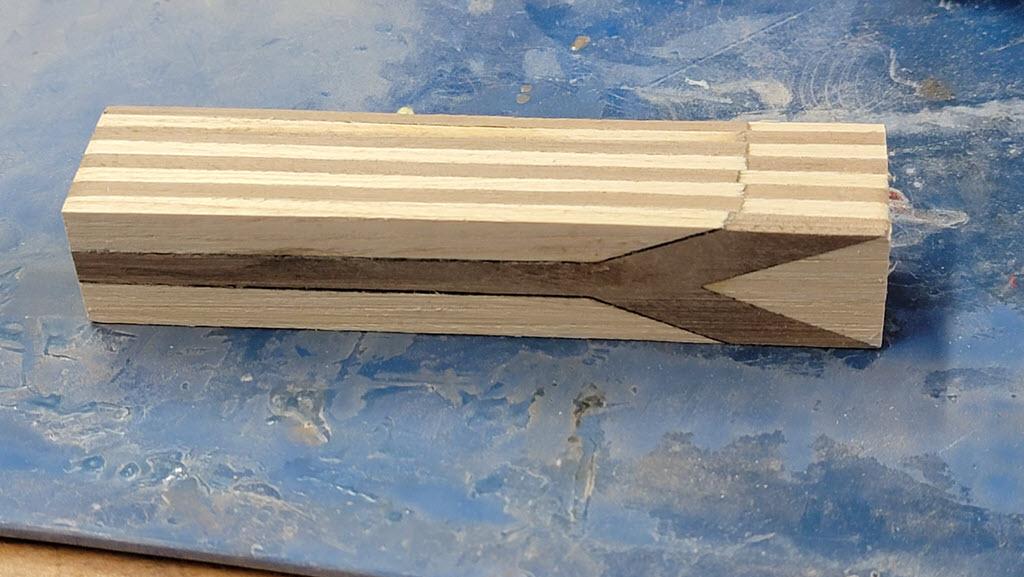
The photo shows front, side, and back view of a pen which is inspired by the Scarlet King Snake, indigenous in Florida where I grew up. My hope was that the red, black and yellow bands would be as visually striking in a pen as they are on the snake that inspired the design. The additional design element of arranging the colors as nested chevrons rather than as straight bands takes advantage of the way the curvature of the pen exposes different paths through the laminations turning adjacent layers into parabolas on the sides while keeping sharp points on top and bottom.
Of course, these techniques lend themselves to any number of inspirational sources that can be modeled with available colors of wood. The main thing is to make shapes that can be clamped or held together securely for gluing. The chevron pattern used here holds tight under pressure. Trying to glue dozens of hexagons or diamond shapes together, for example, would be a much higher degree of difficulty.
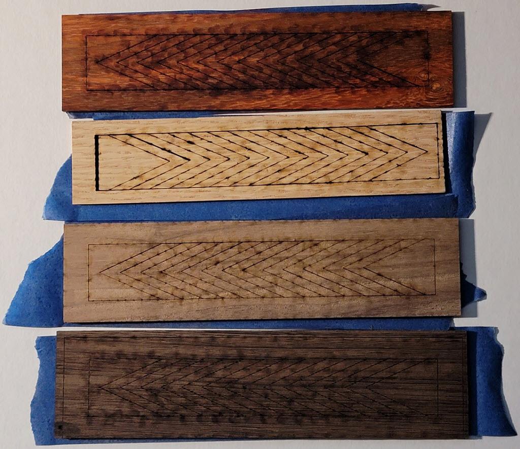
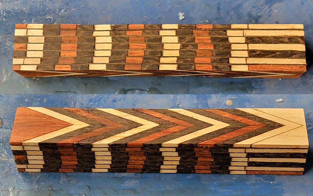
The pen laminations shown are assembled from 1/8" maple, cherry, wenge and paduk woods that have been cut on a Glowforge laser cutter.
Supplies
The wood was purchased from Ocooch Hardwoods who specialize in project-ready woods for laser cutting.
The pen kit is the Atlas Black Titanium from Woodcraft, but any pen kit would work. After lamination, the finished blank is 1 inch square so it is large enough for anything from a Slimline to a big Cigar pen.
Glue can be regular wood glue, cyanoacrylate, or anything that bonds wood well and has a minute or so of open time. I was able to use thin CA glue and activator for this project since the pieces were laser-cut and fit perfectly. A thicker gap-filling CA glue might be needed if the pieces are cut by hand or sanded after cutting. Just bear in mind that this helps make up only for minor occasional gaps and will show up as a wider and uneven seam in the finished pen.
Of course, there's the laser. Anything capable of cutting the thickness of wood stock you want to use is fine. Mine is a Glowforge so I could have used up to 1/4 inch wood for faster assembly, but thinner stock better emulated the snake scale look I was going for.
I used some dark veneer between the laminations. These provide structural strength because the stacked butt joints are fairly weak. The dark veneer colors used here provide boundary lines between the layers.
Clamps. Lots of clamps.
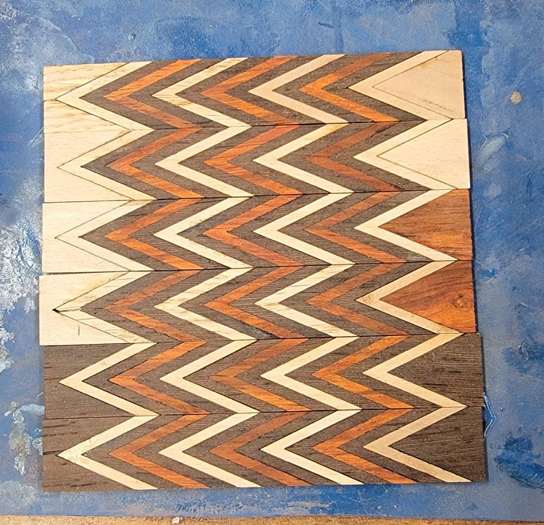
Laser Cutting the Workpieces
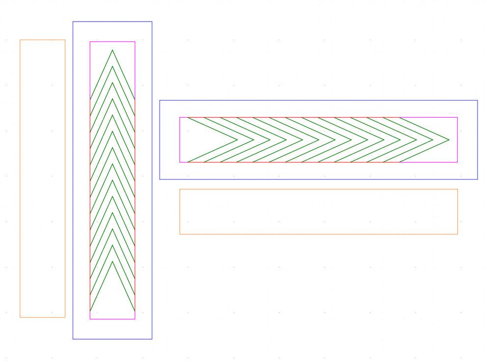
This should be the smallest section, right? Turns out there are a few helpful hints to pass along. I'll refer to the image shown and have attached the SVG cutfile for viewing in your favorite vector renderer if you prefer that.
The strategies I'll explain here overcome two issues with thin wood stock: it curls, and it scorches easily.
To help minimize scorching and keep the kerf as small as possible, the cutfiles have been designed so that the laser will never traverse the same line twice.
The problem with the wood curling is that any piece that falls to the print bed before it is completely cut may lose focus and not cut through completely on subsequent passes. The design intent is to not free any piece to fall down to the bed that still has incomplete interior cuts. In other words, cut from the inside out.
In this design that is accomplished following this cut order:
- The green lines that make up the chevron outlines.
- The red lines that free the chevrons to fall.
- The purple lines to free the end pieces.
- Finally, cut the outer frame if one is to be used. (These come in handy for sanding later.)
The yellow boxes are for the veneers.
The SVG file contains vertical and horizontal versions of the design as a convenience. Use the one oriented parallel to the wood that will be cut and delete the other.
Downloads
Assembling the Layers
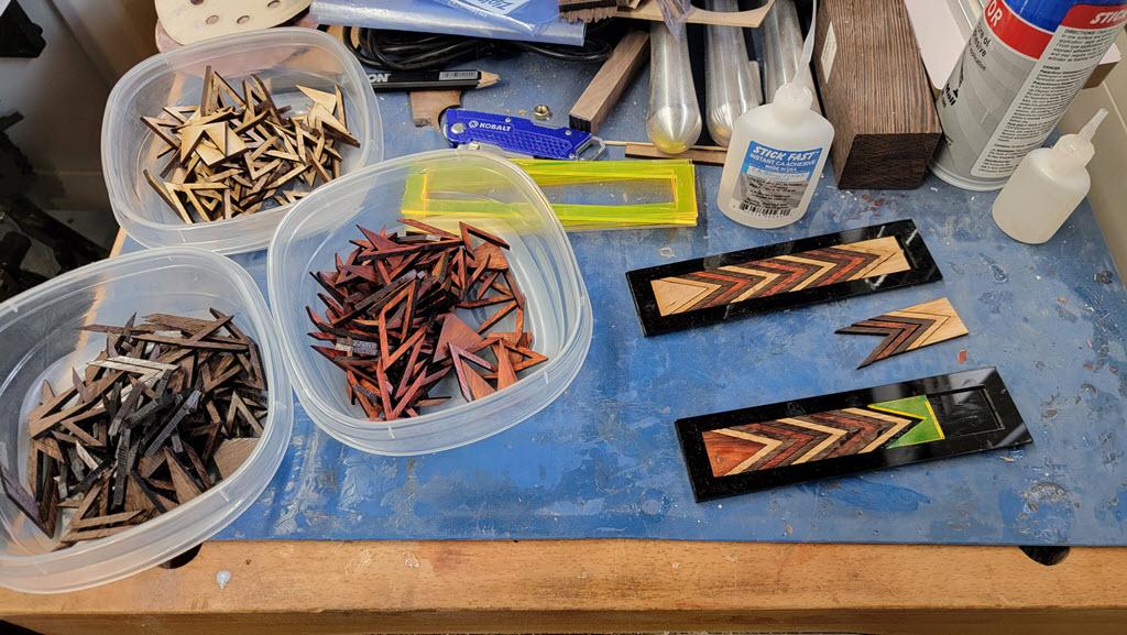
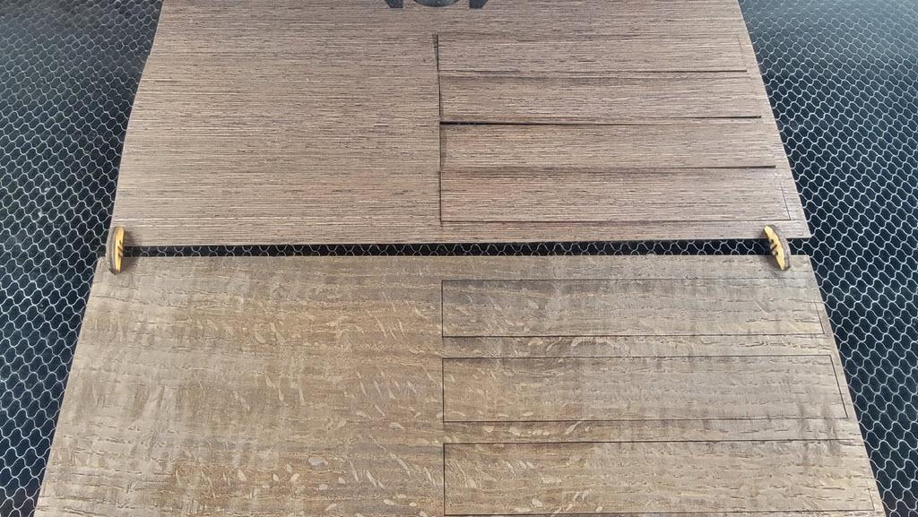
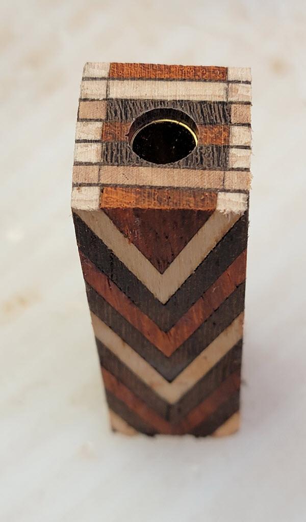
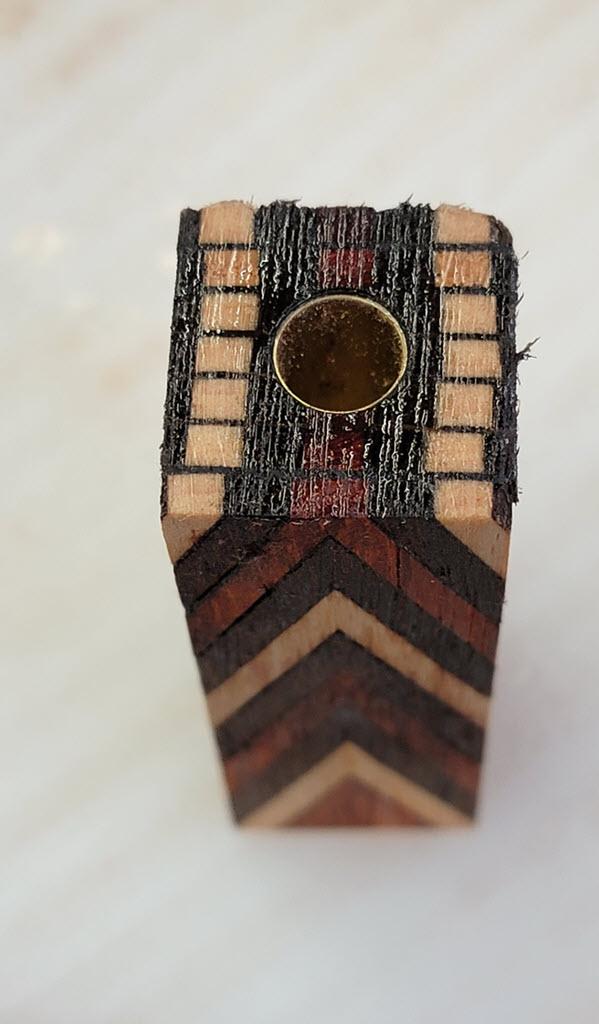
Once the pieces are cut, it's time to assemble the layers. The first photo shows them in dry-fit. At this point I knew some of the bottom portion (the right-most piece in the photo) of the blank would be kept so I wanted to sandwich the colors vertically in the same pattern as horizontally - paduk at the dead center, with wenge on either side, then the maple/cherry.
The design cuts the pieces to 1 inch wide and the idea is to get as close as possible to an exactly square blank. This is true even when making a slimline pen where only 4 or 5 layers get used, because it is going to be important later to drill the hole through the center of a design that varies vertically as well as horizontally. The hole in this case needs to go through the center paduk payer. (More on that in the later step on drilling.)
The other use for the top and bottom pieces with the irregular shapes is to provide a convenient handle to get the first few pieces cemented in without bonding them to your fingers. I started with the piece on the left because pushing into the inside of the V provides support on all sides. Pushing onto the outside of the V tends to split the chevrons.
One of the things I tried, which is visible in the photo, was making glue-up forms out of acrylic. My reasoning was that the glue would not stick and I could just peel the layers off. Turns out, that's not entirely true. CA glue doesn't stick to acrylic well enough to bond it for project work, but it sure does stick well enough to ruin the layers prying them out. I always said I'd never be that guy saying "do as I say, not as I do" yet here I am doing just that. Please do NOT make glue-up trays as shown here.
What I ended up doing was applying CA glue to the inside of the chevron with a micro-tip nozzle and spraying activator on the outside of the adjoining piece. Then I held these flat on the silicone mat a few seconds until the bond set. (The silicon mat, unlike the acrylic, had no problem with the glue sticking.)
Sanding, Sanding, Sanding
Once the layers are assembled, they need to be sanded flat for laminating. If the glue-up went smoothly, the joints themselves will be, well, smooth. If the joints are uneven they need to be sanded until they are smooth because any gap will be highly visible in the finished piece. Be aware though that variations in the thickness of the layers shows up as asymmetrical variations in the finished piece.
Not saying that's bad - maybe it is part of the design intent. But as a precaution, make a few more layers than you need to get to 1" thick so you can deliberately include or exclude the outliers.
Remember, those butt joints are weak so the layers may break apart during sanding. This is not a big problem since they can be easily reassembled with only minor sanding touch up on any new glue squeeze out. But if the layer does break apart, do not continue sanding the pieces intending to glue them up later. This rounds the edges along the glue joint, making the gap bigger and the joint weaker. Only sand complete and intact layers. And please don't ask me how I know to give that advice. No, really, don't ask.
Second Glue-up
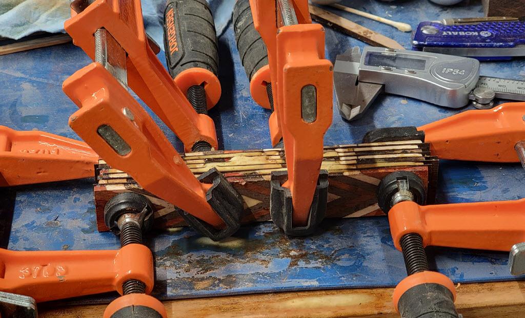
You know what they say - if there’s room for another clamp, you haven’t used enough clamps. In this case if I’d thought about it, I would have used clamps vertically on the ends to help keep the layers in register. Luckily I snuck by this time and the layers stayed close to true register.
Note the layers of veneer between the pattern layers. These provide structural stability with a face-glue joint that spans the stacked butt glue joints. As a design element, it provides some boundary lines to make the layers more resemble snake scales.
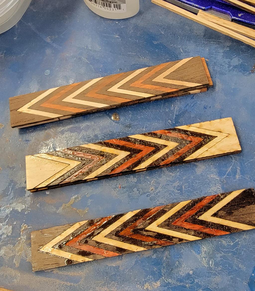
Inspection and Some Observations
After the second glue-up cured, I sanded away the squeeze-out to get a better look at the finished blank.
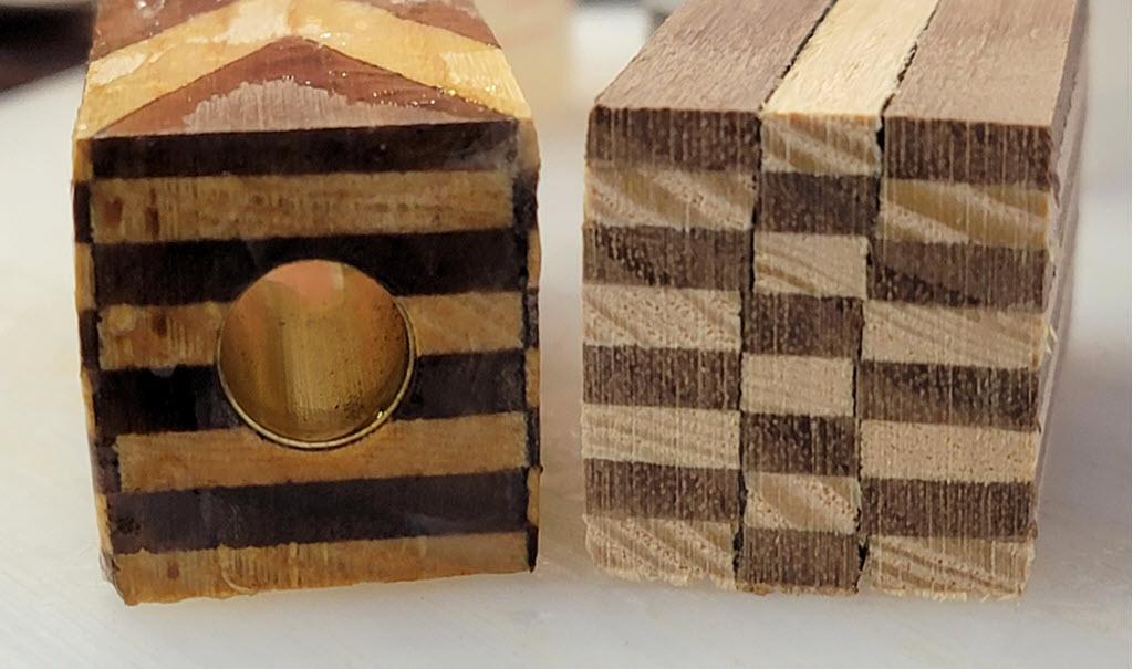
One important take-away is that the registration is imperfect. Some of that is by design (snake feature emulation again) and some of that is inevitable. After stacking 14 glue joints in each layer, the layers themselves are not all the same length. This is evident in the top two layers shown in the photo, which are closely aligned on the left but are off by about 3/32" on the right. It would be physically impossible to get those two to line up at every color.
Which means that a complex pattern with lots of layers comprised of lots of parts per layer will be almost impossible to keep in register throughout the stack. Plan for this and incorporate it into your design.
Or incorporate it after the fact into the name of your design. If you plan a geometric design pen and the pattern varies widely, you can rename it after something with lots of natural, organic pattern variation. Like, say, a snake.
Not that I did that. This was always a snake. That "red touch black, pat him on the back" pattern proves it, right?
Drill and Glue the Tube
After cutting the blank to size, it needs a hole drilled to match the brass tube. The standard pen-making advice applies: scuff up the tube, clean it with denatured alcohol or acetone, and use a small bottlebrush to clean out the hole in the blank.
More specific to this project though is that the hole will be precisely centered on both ends of the blank. Having the pattern asymmetrical is not that big a deal. Having the vertical lines on the side of the pen not line up along the pen's axis is.
Note also that a portion of the bottom (non-chevron shaped) pieces did end up in the finished blank. This is a 1-piece pen with a long barrel so it used most of the blank and I positioned it to capture as many red bands as would fit. This meant that the order of colors in those non-chevron bottom segments turned out to be important as well. More on this in Step 8 below.
After the glue dries, trim the ends flush with the tubes using your favorite method. This is standard pen-making stuff and I'm focusing on the bits specific to the design and lamination so I'll leave basic pen-making details out..
What is specific to this kind of project though is that the but joints in the layers are the weakest link and turning from square corners can stress those joints to the breaking point, possibly ruining hours of work. While I was trimming the ends of the blank I also sanded the corners mostly off. At this point the blank is still close to an inch in diameter with lots of wood to remove, so precision is not at all required when knocking the sharp edges off on the sander.
Turn and Finish the Pen
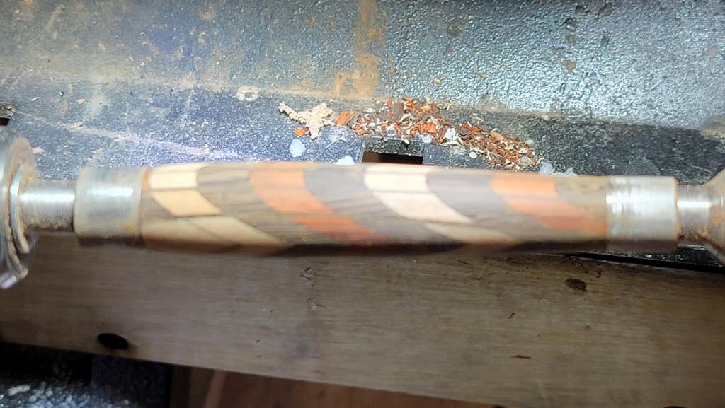
This is also standard pen turning stuff and I'm focusing more on the design and making of the blank so I'll be brief here. The main takeaway is that the pattern which emerges is dependent on the shape and contours produced on the lathe. In the first photo my camera was more fascinated by the sawdust in the dust collection hood than the workpiece, but this does show the gentle curve of the pen and how it has a smaller tip than top. These factors show up in the final pen as seen in the next set of photos.
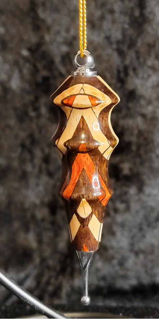
For comparison I've attached a photo of an ornament I made with the offcut from this same blank. The more extreme contours result in a more extreme design rendering as they cut sharp paths through the lamination. Nice as an ornament, perhaps less so as a pen. At least to my eyes.
Final Product
So let's see how all those design decisions played out, shall we?
Let me call your attention in the first photo to the thin line at the joint between the bottom piece and the first chevron. This is a butt joint with no veneer and the black line is the laser scorch residue. That line, and it's counterpart on the reverse side, are the only fine boundary lines in the pen and the reason I was willing to put maple on maple rather than a contrasting color here. Note that the boundary lines between any two colors along the long axis also have the same scorch residue but it disappears into the visual contrast between the layer colors. Just cutting a single color of wood and rejoining it in the same order produces these find boundary lines and can be quite elegant.
In the photos I also highlighted the mix of maple and cherry for the "yellow" bands. In the actual king snake (or coral snake) any variation in the darker colors is lost unless you look really close. But the variation of color in the yellow bands is usually evident at a distance. I cut a 2:1 maple-to-cherry ratio, mixed them all in a bag, and then drew randomly. I think if I'd tried to arrange them it would have come out less organic and more artificial looking.
Also, have a look at the veneer in both photos. The veneer lines are thinnest on the side where the barrel contour cuts through them at right angles. On the top though, the contour cuts the veneer at a shallow angle giving it much larger profile. With some experience it gets easier anticipating and using this effect in your designs.
Of course, you can also leverage CAD tools to visualize this for you. One method to do so is presented in my other Instructable, the Pen Mold Visualizer. Although that was written to visualize 3d printed pen casting molds, it's possible to load an SVG laser cutfile into Tinkercad, extrude the outlines into 3D parts, then apply the same die-cutting technique to visualize your lamination design.
The same effect that varies the veneer lines also turns the vertically stacked, rectangular color bands into parabolas on the sides. This effect was why I used chevrons - distinctly NOT snake-like - rather than straight color bands. To me, the parabolas are much more interesting than straight-edged layers. Which is why I'm careful to say this was inspired by the king snake, just like certain movies are inspired by actual events. There's an element of truth in there mixed with lots of artistic license.
Where to Now?
This technique opens a world of design options. Here is an example of a design that was much simpler to cut and laminate but the end result on the pen turned out to be surprisingly complex, as well as visually pleasing. There are only two colors and only 4 parts per layer (as opposed to 15 parts per layer in the snake pen). In this case though, the layers alternated colors. This shows up in the pen as a geometric design that alternates positive and negative versions of itself along the boundary lines.
Another option in a design with angled segments might be to flip layers end-for-end. If the layers have angled elements, this has the added benefit of lots of face joints that cross the butt joints, making the veneer purely optional. Use different thicknesses of wood than I did. Mix them into the same blank if you like.
There is literally no limit, so put on your design cap and see what you can come up with. Then be sure to post photos of it because it is going to be awesome!