In My Mind Light
Intro
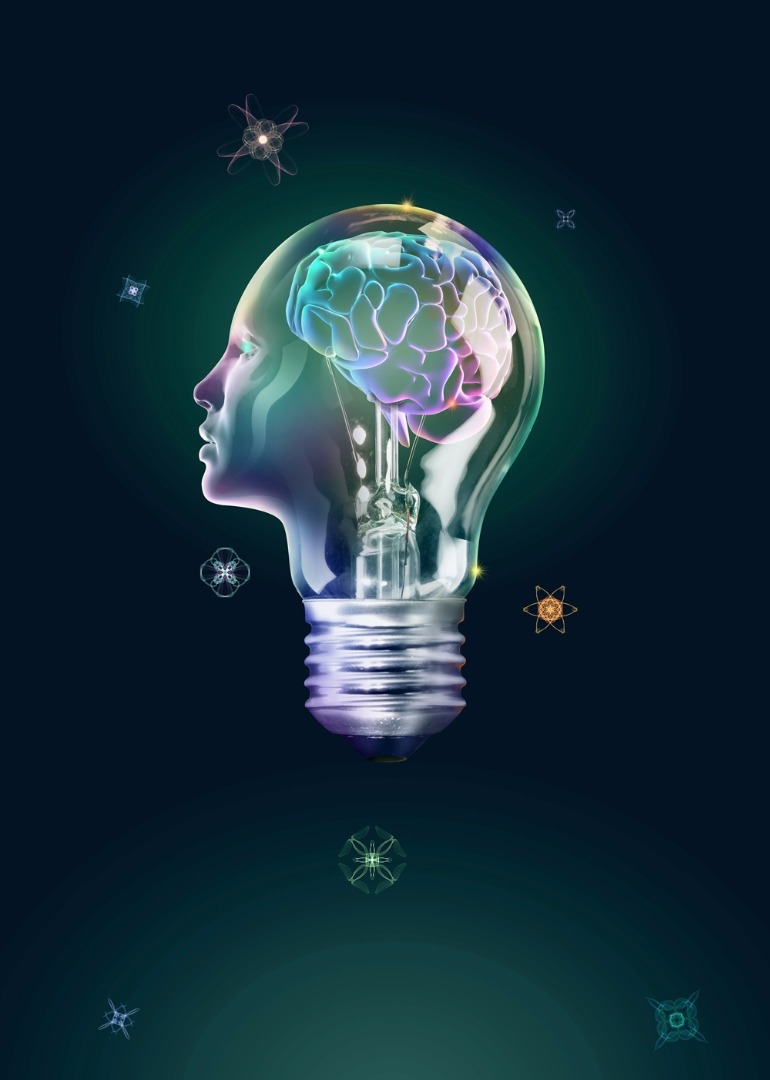
In this tutorial, Croatian artist Igor Scekic reveals the process of creating his artwork Language, Mind and Knowledge. The illustration was used in poster and brochure for the International Philosophical Conference in Zagreb in Igor's home country. The artwork was created in Adobe Photoshop using a combination of photo manipulation techniques to composite the lightbulb, face and brain into the work. If you want to follow the tutorial directly, you'll find links in this tutorial to where you can download the photos from. An additional touch was added with elements created with Silk. Silk is an online interactive generative art application. With Silk, it is possible to create very nice generative elements based on light painting - elements that could be used to spice up the artwork and add interesting details to it. A great thing about Silk is that it's a free application, so anyone can make their library of generative elements to be used in various artworks and designs. Igor notes that to follow this tutorial, you'll need at least an intermediate knowledge of Photoshop.
Time to complete 1-2 days
Software needed Adobe Photoshop (CS or later); Silk interactive generative art online application
Step: 1
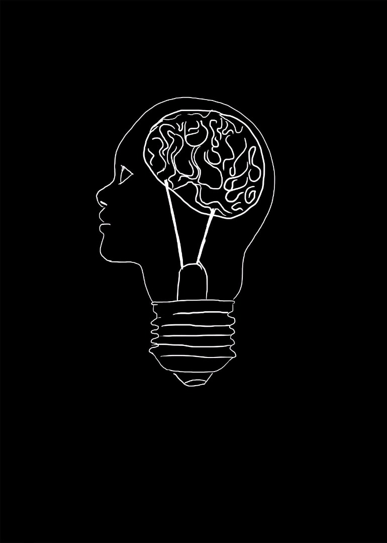
Sketching before actual work starts is a very useful way to set up the overall composition and decide the direction in which the project will be developed. For this project, the client wanted the concept to be based on the title of the event: Language, Mind and Knowledge. I decided that the illustration should consist of a lightbulb blended with a human face, which should show the brain inside. The brain represents the mind, the lightbulb represents the knowledge and the abstract light effects should represent language. Sketches shouldn’t be detailed and highly polished. In some cases it is enough just to block the positions of basic elements. It could be made on paper or directly in Photoshop - as in this case, where I used a black background to get a sense of the final artwork's contrast.
Step: 2
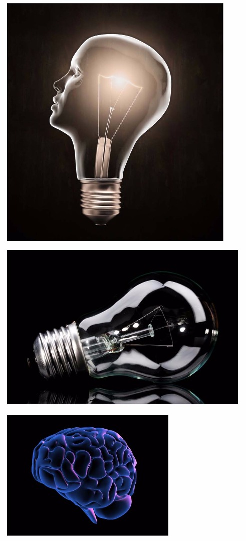
Unless you've got the time and budget for a shoot, finding quality stock photos is very important part of every photo manipulation. This illustration was created for a client in a very tight deadline, so it was very important to find appropriate stocks that didn’t require too much editing to look good. I could have created the blend of head and lightbulb from two images, but I was on a tight deadline. Luckily I found a stock composited image of this, but the overall shape isn't obviously a lightbulb - so I decided to improve this by replacing the outline and filament with that from a real bulb. The brain was purchased from Crestock. Open the stock photos in Photoshop. All elements should be cut out from background.
Step: 3
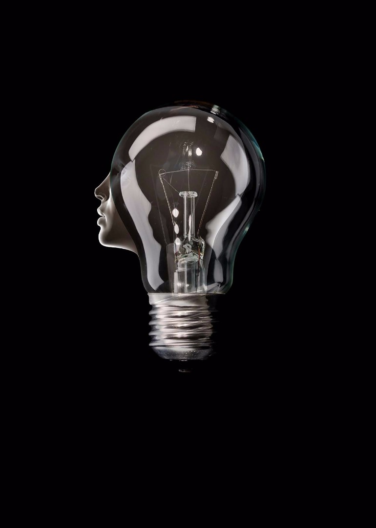
Copy and paste the lightbulb and lightbulb-with-a-face elements onto a black background in a new PSD file, calling the layers 'lightbulb' and 'face' respectively. It's important to adjust both elements to fit with each other, so that they can be blended well together. Put the 'lightbulb' layer above 'face' in the Layers panel and lower its opacity a bit (approx 60-70%) so the layer below it is visible. Use various transform options (Cmd/Ctrl + T) on both layers until everything is aligned well. There aren't any rules to make this work well - it depends mostly of selected photos. In this case, I used mostly rotate, distort and warp to adjust the face shape to align well with new lightbulb.
Step: 4
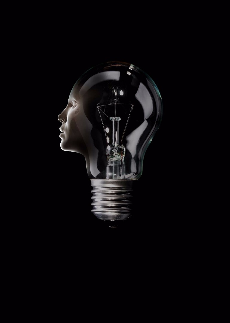
Step: 4 After both objects are well adjusted, it's time to add layer masks to both layers and erase some unnecessary parts. Using layer masks for erasing is non-destructive technique that allows us to refine and change mask whenever we need to. If erasing is done without mask we can’t bring back erased parts any more. Erasing on a mask can be done with the Brush tool (B) and with the Eraser tool (E). If you use the Brush tool, you can paint on the layer mask with a pure black colour to hide the parts you don’t need - and with a white colour to bring back anything you didn't mean to erase. With the Eraser tool, you use a white colour to hide/erase and black to bring it back. Mastering layer masks is great for controlling the selective transparency of a layer. By using a soft brush on the layer mask, I have masked parts of both layers to make them blend better.
Step: 5
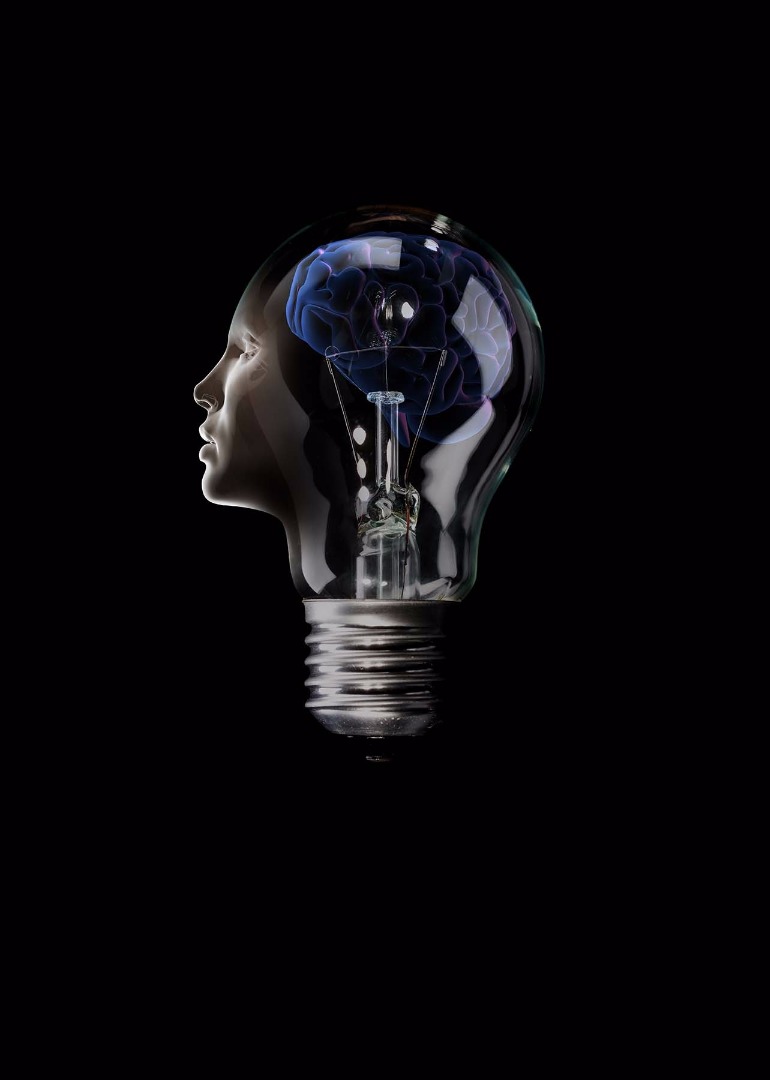
Step: 5
Now it is time to put brain inside of the lightbulb/head. Cut out the brain from the background and copy-and-paste it into the composition. It should be placed below the other layers - except the background of course - and transformed if needed. To achieve a transparent effect later, set this layer's blending mode to Screen. The results aren’t visible at this moment, but everything will be obvious when gradients will be added to background in the next step. The 'lightbulb' and 'face' layers should also have their blending modes set to Screen, so only light parts are visible. That way a glass effect is achieved: the dark part become invisible and only lighter areas than the background colour are visible. This technique is usable only when background is very dark. If I'd been using a lighter background, I'd need to have selected the metal part of the lightbulb and copied it to a separate layer with a Normal blending mode to avoid seeing background through it.
Step: 6
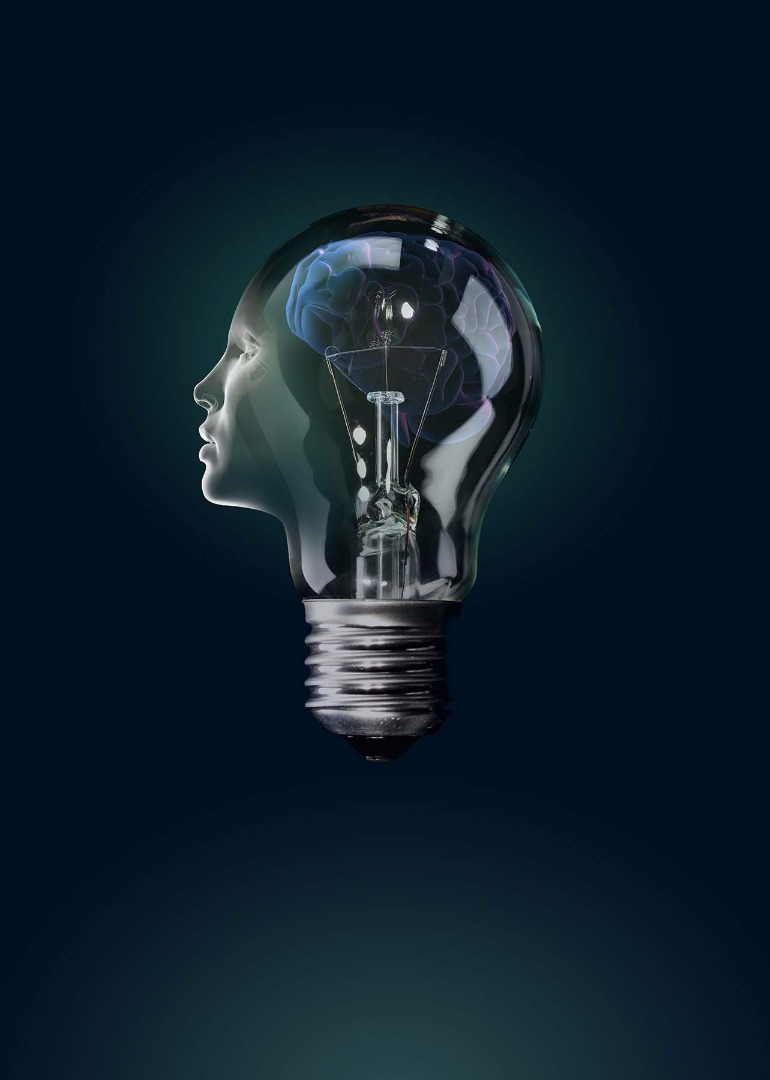
Placing bright white elements on a pure black background creates too much contrast. It's often better to use a very dark colour (not a dull gray) instead of pure black and some very bright colour with a low saturation instead of pure white. That way better colour balance is achieved. Create a layer of very dark blue (#000f1e) over the top of the background. On a new layer above this, create a circular gradient (G) with a green colour (#1e5446) using 'foreground to transparent' gradient type from the gradient templates. Don't drag the gradient to the edge of your document - it should fade towards the edges and blend with dark blue background colour. Make a new layer above the gradient layer and create another circular gradient. Centre of both gradients should be in approximately the same position. This time use a lighter, desaturated yellow colour (#d7ccb3) and drag a shorter line to create a smaller element. Add another radial gradient to bottom of the image, using the same green colour as before. Lowering the opacity of the gradient layers is always an option if they contrast too much with the background. Here I used an opacity of 66% for the bottom gradient, with the other gradients at 100%.
Step: 7
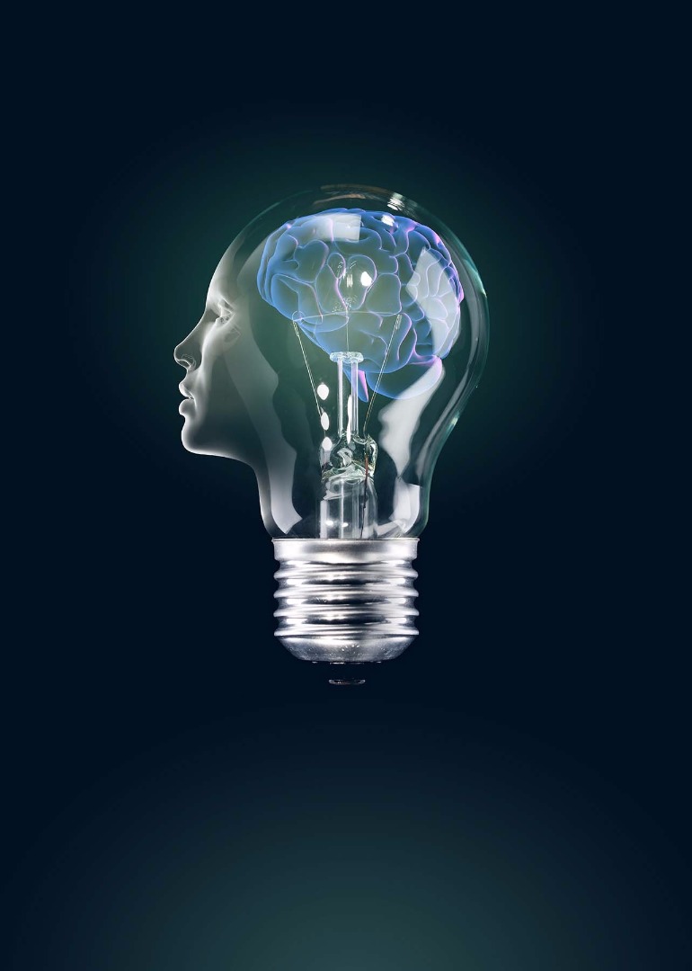
Now when all main elements are in their places, it's time to work on the details that needsrefining. Set the 'lightbulb' and 'face' layers' blending mode to Screen. The right side of the light bulb's metal screw base doesn't look so great - it would be much better if it looks same as left side. Copy the 'lightbulb' layer and flip it horizontally (Cmd/Ctrl + T, then right click > 'Flip horizontally'). Create a new mask on that layer and delete unnecessary parts with soft brush or eraser. Leave only part of the metal base visible and try to blend it seamlessly with main 'lightbulb' layer.
Step: 8
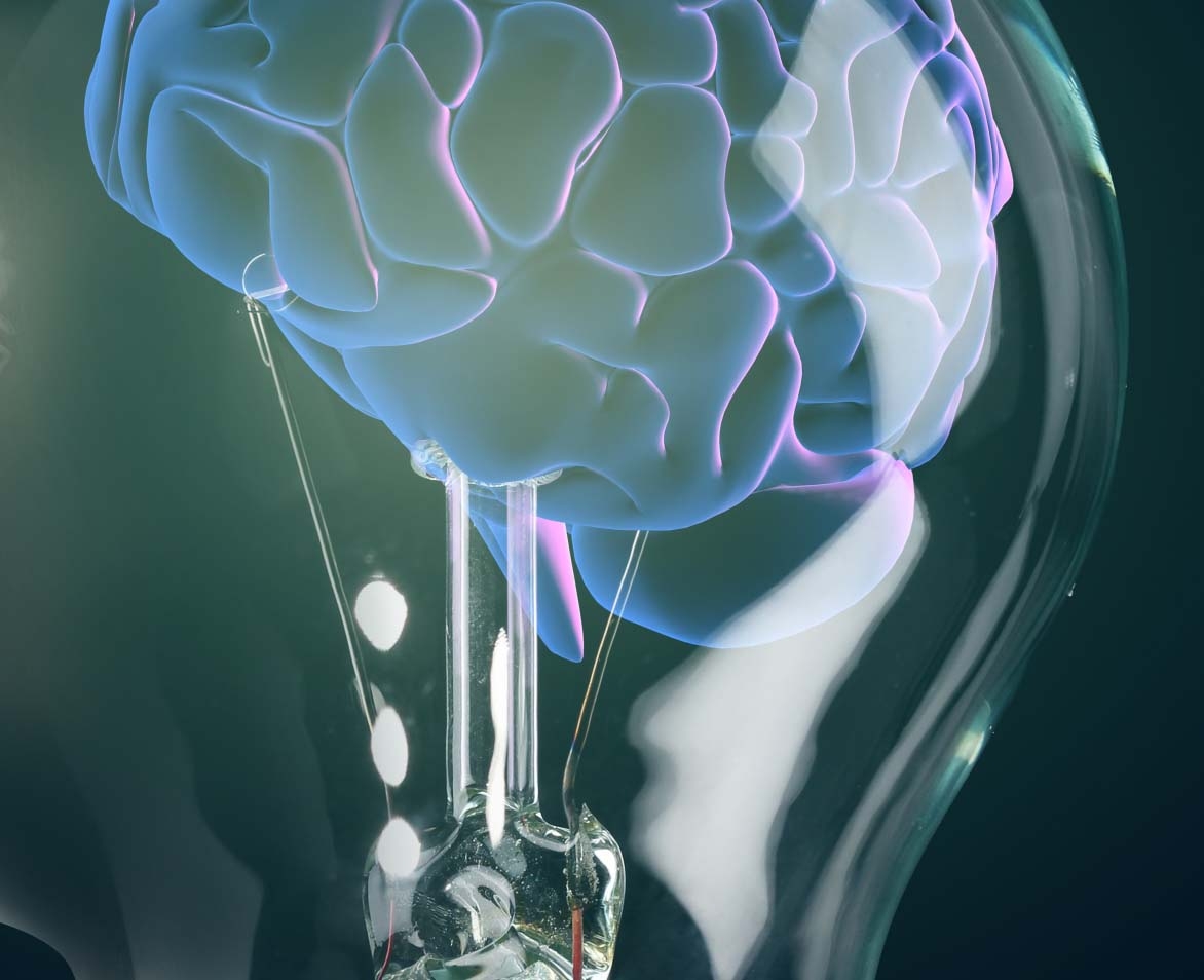
To have better a connection with the brain, parts around the tungsten filament of the lightbulb should be erased. Group both 'lightbulb' layers, add a layer mask to that group and erase unnecessary parts on this mask. Use a hard brush to achieve hard edges that look connected to the brain. You should also partially erase some reflections on the lightbulb using this mask, but with a soft brush.
Step: 9
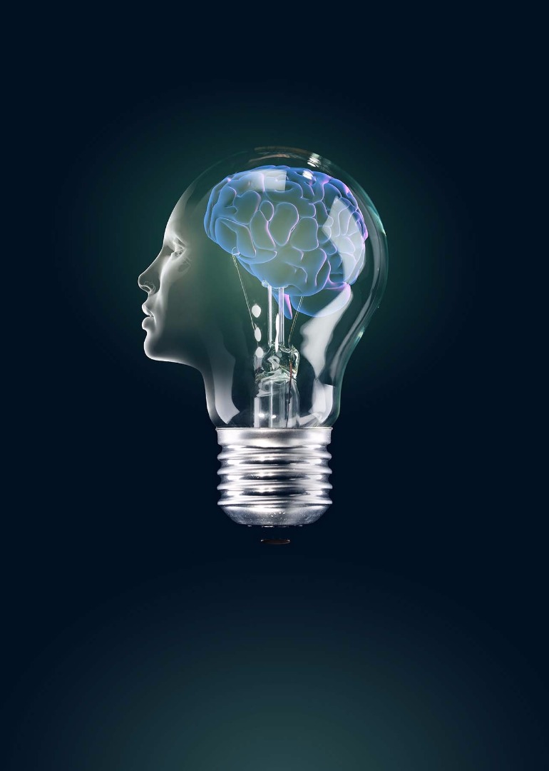
This is what the artwork looks like in full at this point.
Step: 10
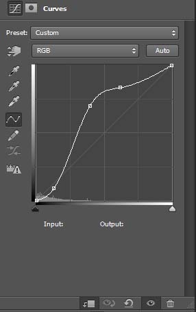
The brain needs better contrast. To do that, add a new Curves adjustment layer above the ‘brain’ layer. To do that hold Alt and - with the ‘Brain’ layer selected - press on the ‘Create new fill or adjustment layer’ in bottom part of the Layers panel. Choose ‘Curves’ and, in new layer dialog box, make sure the ‘Use previous layer to create clipping mask’ option is selected. I have used these settings for the Curves adjustment layer, but your settings may be different depending of stock photo you are using.
Step: 11

To add colour variance to the brain, create a new layer, set its blending mode to Color mode and paint with a soft brush and different colours. Iused green, pink and yellow colours, all in bright tones. It's important not to overdo it. Try to achieve subtle toning with nice colour gradation. There are no rules for doing that, just let your aesthetic judgement guide you. After colouring is done, I noticed that some areas of the brain could do with being lightened up a little for better contrast. To do this, add a new layer as a clipping mask on the ‘Brain’ layer and set its blending mode to Overlay. Paint with a soft brush and light colours on few areas to lighten them up a bit. Here I used slightly lighter tones of colours I used for colouring purposes.
Step: 12
Step: 12
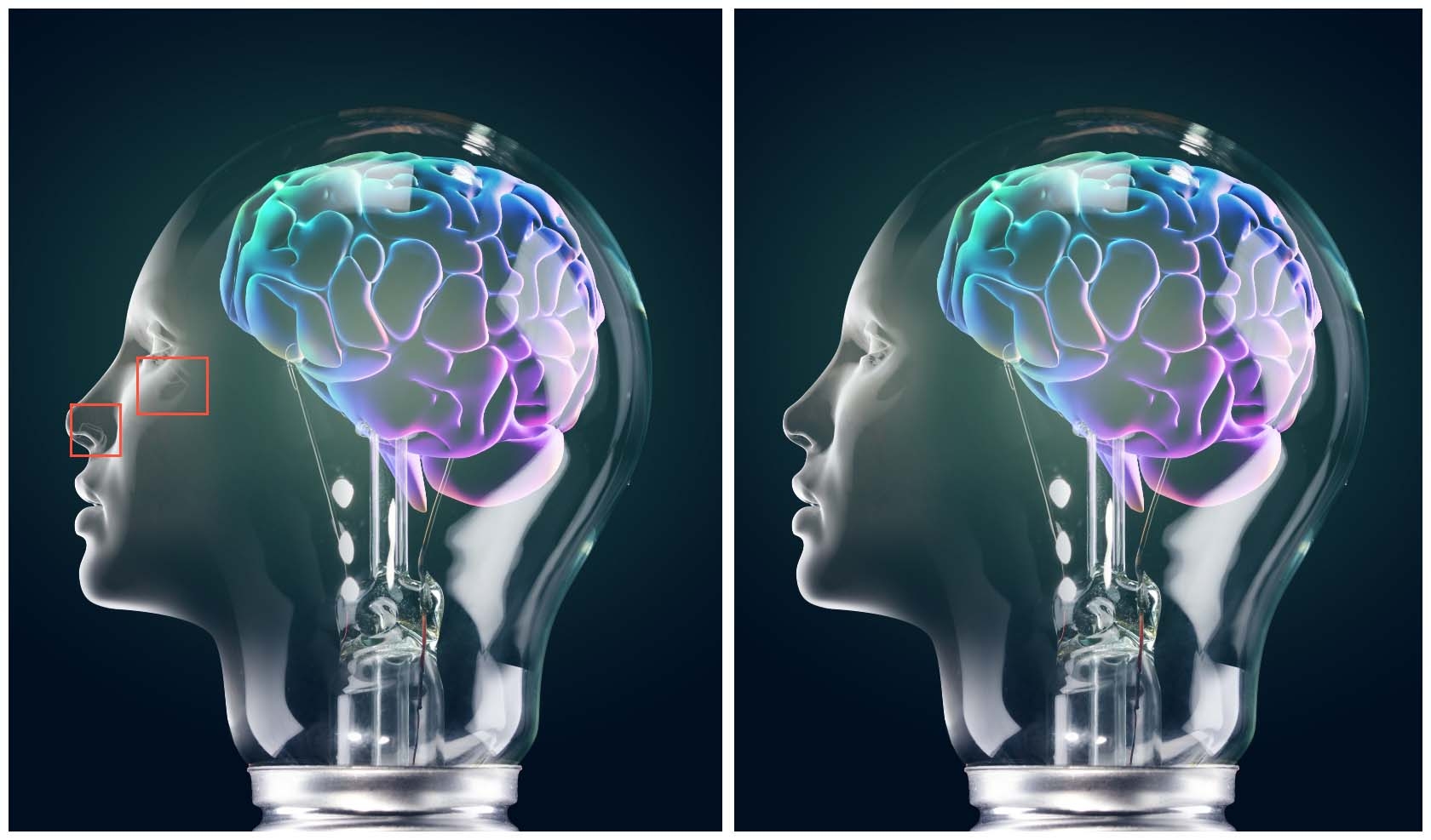
Now it is time to work on the ‘face’ layer. Some parts around the nose and eye need retouching. Put the ‘face’ layer temporarily on ‘Normal’ blending mode, so it's easy to accurately sample colours from that layer. Make a new clipping mask on ‘Normal’ mode above it. Sample colours around areas that needs to be overpainted and use soft brush for overpainting. After overpainting is done, the ‘Face’ layer should be set back to ‘Screen’ blending mode.
Step: 13
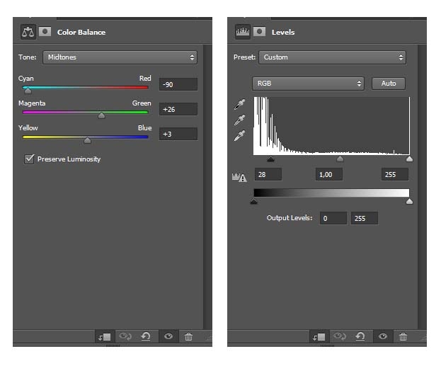
To adjust colours new Color Balance and Levels adjustment layers are added to base ‘Face’ layers as clipping masks. To weaken ‘Color balance’ adjustment layer intensity in parts around eyes, nose and lips delete that parts on layer mask with soft brush.
Step: 14
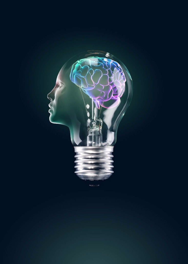
Since we are aiming for a glass effect, a slightly lighter part is required under the face(neck). I have painted it on new layer with a Normal blending mode, using light blue/green tones. To avoid a monotone look, add some colour to the face. This should be done on new clipping mask that is above all the other clipping masks for the ‘face’ layer. That new clipping mask should have a Color blending mode. Use a soft brush with red/yellow and pink tones.
Step: 15
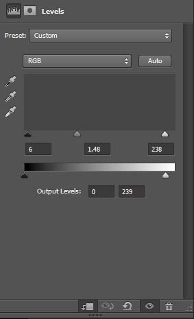
After working on the brain and face, it's time to work a bit on the lightbulb. It definitely requires some more contrast to fit better with other elements. This contrast should be added with a Levels adjustment layer, used as a clipping mask on the ‘lightbulb’ layer. Paint this on the metal screw base on a new clipping mask layer with dark grey and dark purple colours.
Step: 16
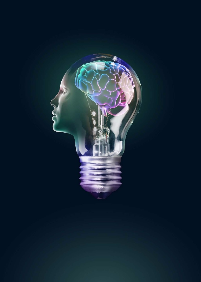
Additional colour variance to the 'lightbulb' layer should be added with same technique as with the brain and face. Create a new layer to use as a clipping mask with a ‘Color’ blending mode. For colouring, use yellow/orange, blue and pink - applied with a soft brush.
Step: 17
Step: 17
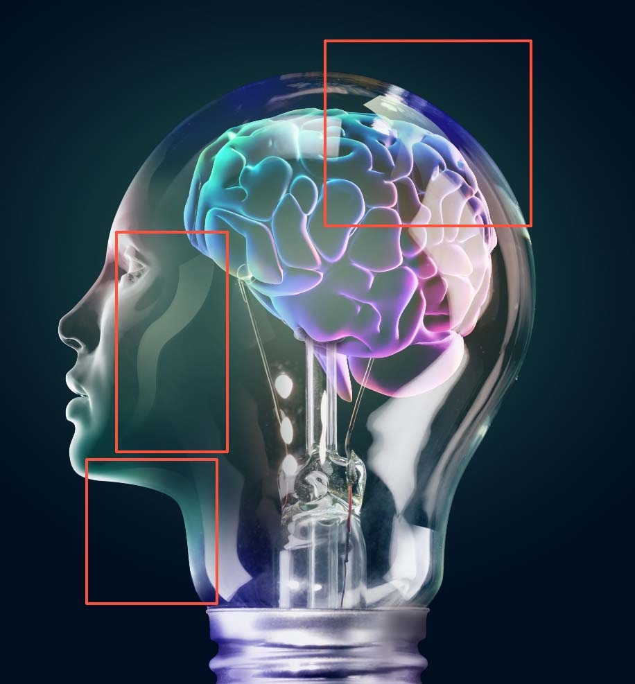
A few additional reflections would definitely be useful to make our ‘light bulb face’ a bit more interesting. Create the three shapes for the reflections with the Pen tool (P), each on its own layer - as shown - and colour them with bright yellow and green/blue colours.
Step: 18
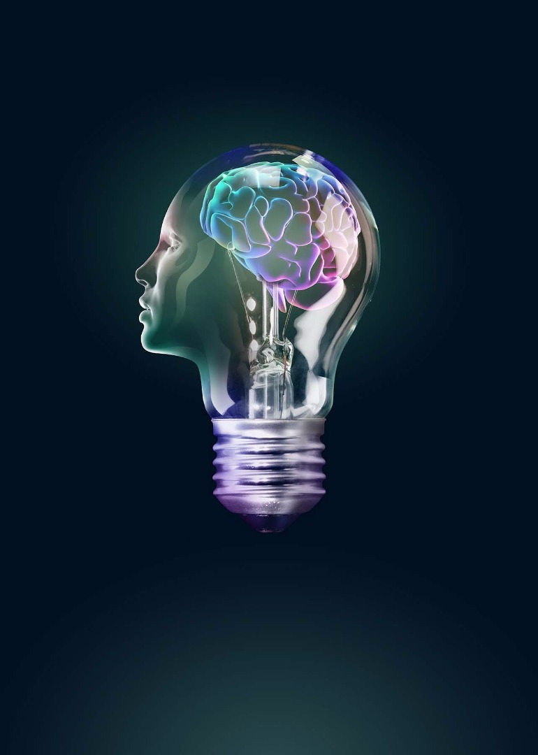
I've used different opacity settings for each layer (approx. 40, 60 and 80%), so I encourage you to experiment a bit and decide for yourself proper opacity for certain shape. Create layer masks on each reflection layer and delete some parts to give the impression gradual opacity of each reflection.
Step: 19
Step: 19
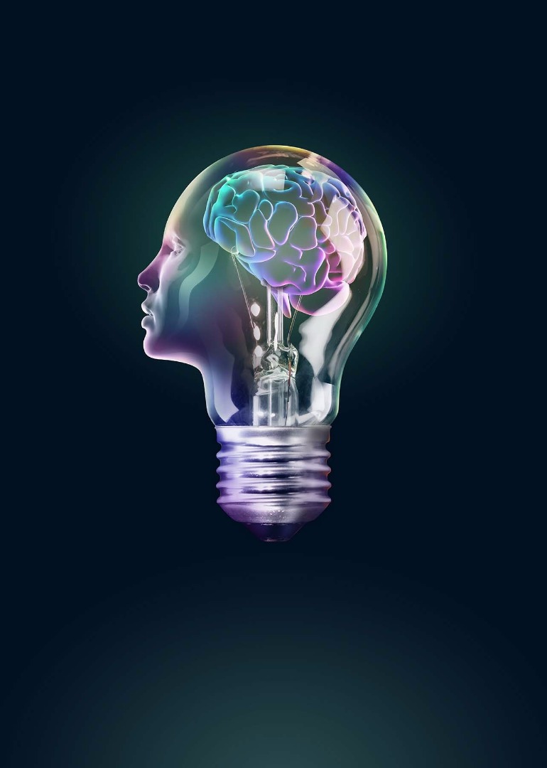
Create a new layer. Go to Layer > New > Group from layers and name the group ‘Additional colouring and lighting’. Add a layer mask in the shape of the combined light bulb and head to the group. The easiest way to do this is to duplicate the ‘face’, ‘brain’ and ‘lightbulb’ layers and merge the copies together. Hold down Cmd/Ctrl and click on that layer to get the selection. Click on ‘Add layer mask’ at the bottom of Layers panel. Now everything we do on all layers in this group will only be visible on areas above lightbulb/head. Turn off visibility of merged layers - it was only needed for making the mask. Create additional pink, green, blue and yellow parts on a new layer that's blending mode is set to Color. Create a new layer with a Normal blending mode and paint spots along the edge to add more brightness in bright yellow, green/blue, pink and orange colors to add more brightness to edges. I have also used one layer with an Overlay blending mode and painted it with a bright yellow colour to make the light edges even lighter. Finally, add bright red/orange colours of reflected lighting to the right side of the metal screw base.
Step: 20
Step: 20
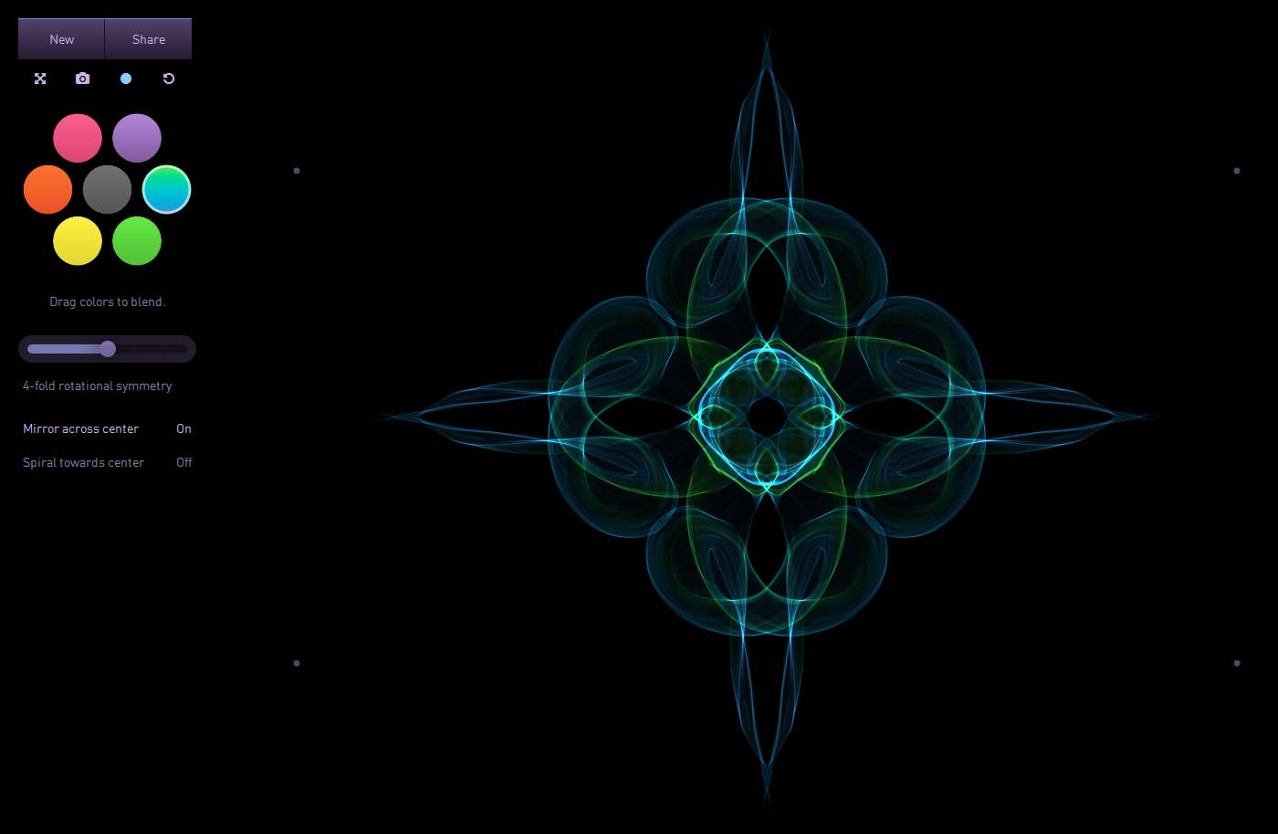
Now when our illustration is mostly finished, it's possible to bring it to the next level and put more visual interest into it. I did this by putting in generative light painting effects created using the free interactive generative art online applicationSilk. Silk is very easy to use in your web browser. In Controls it's possible to set colours, the type of symmetry and turn on and off the ‘Mirror across center’ and ‘Spiral towards center’ options.
Step: 21
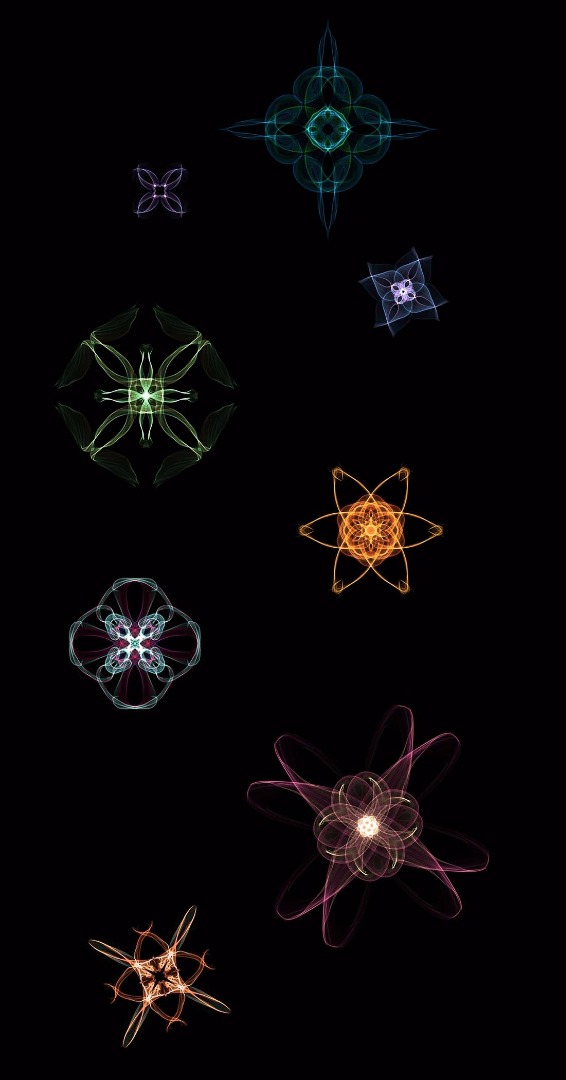
For all the elements I created here, I've used a few different symmetry types and had the ‘Mirror across center’ option turned on. Saved the elements onto your computer as a PNG image with a black background. Anything you make that looks good but doesn't fit the project, keep it for another project.
Step: 22
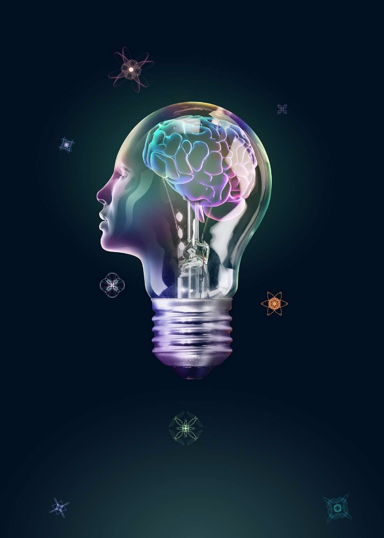
Since backgrounds of elements created with Silk are black it is very easy to put that elements into composition without cutting them from backgrounds. After selecting elements that will be used, open them all in Photoshop, select all and copy-and-paste them into the main file. Set the blending mode for all that elements to Screen, so that only the light parts are visible and black background invisible. Transform each element individually and move them around until the whole composition looks well-balanced.
Step: 23
Step: 23
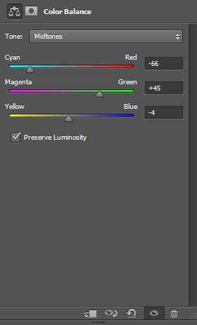
In most cases, as you finish it's useful to adjust the colours of the whole artwork at once. That way colours are better balanced. Apply a new Color Balance adjustment layer above all of the other layers with these settings
Step: 24
Step: 24
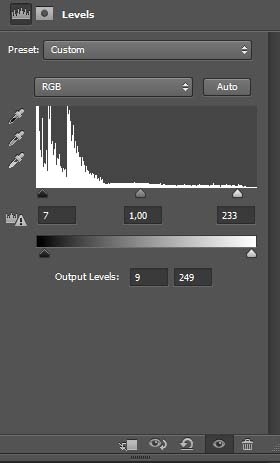
Overall contrast is adjusted with a Levels adjustment layer.
Step: 25

For an additional touch, I added few flares with different Photoshop brushes. And now the piece is finished.