Improve Your Digital Images (like for Instructables) for FREE Using GIMP
by DrPeper in Design > Digital Graphics
1343 Views, 15 Favorites, 0 Comments
Improve Your Digital Images (like for Instructables) for FREE Using GIMP
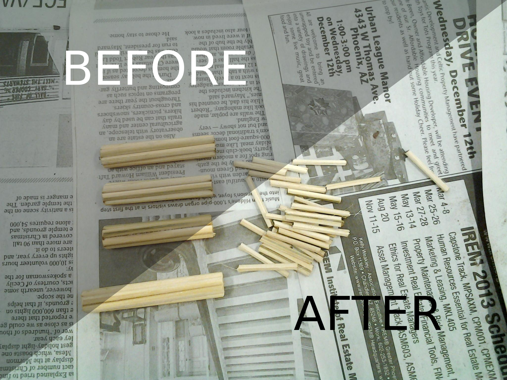
Ok, we've all seen them. Instructables that are great but the images are dull, muddy, or dim. I get lots of comments that most of my Instructable images are nice and bright, and it makes for a more fun to read and enjoyable Instructable. Well the secret is that they didn't start out that way.
We'll use GIMP to make them brighter and snappier. You don't have to sit down to learn everything that GIMP does to make brighter images. I'll walk you though some simple steps and you'll be done in no time. ANYBODY can do this. I taught my Mom how to do this for her Etsy product images and her eBay item images. She's 70 something and usually a technophobe.
I don't know why but I've gone through quite a few smart phones, all of them had decent (and they keep getting better) cameras, but the images end up dim and muddy. Almost always. I use my camera phone all the time, it's be best feature on phones now-a-days if you ask me. And I thought they were a gimmick when they first came out. "Who would ever use that", I would say. Well color me a convert. Now I won't buy a phone without at least one camera on it, preferably two.
I should mention at this point that I am a member of TechShop and a prolific "Maker". In fact "I made this at TechShop", this Instructable that is. I get asked at the shop all the time to help people make their images brighter and pop more. So now I can just point them to this Instructable.
I should also say that ONE of my *MANY* titles is that of a Graphic Designer. So I deal with digital images *EVERY* day. I would consider myself a bit of an expert on the subject. I get images from my clients all the time and theirs are muddy too. So the first thing that I do is what I call "washing" them. We can make your images better, brighter, and pop! For FREE no less!
We'll use "The GIMP" open source image editor. Why? Go to the next step!
A Case for Using "The GIMP" for Image Editing, and Open Source Software in General.

As a Graphic Design artist, I have access to the insanely overly-expensive Adobe Creative Suite, and particularly in this case Photoshop. And it's great. I can feel the power coursing through my skin every time I use it. I have some experience using the high end product, I certainly would consider myself an expert on the subject. But it's out of the question for most people.
Now about 3 years ago I decided to give the open source equivalents of Adobe Photoshop and Illustrator a try. For Photoshop the equivalent is "GIMP" (GNU Image Manipulation Program). The equivalent for Illustrator is Inkscape (wiki). Photoshop and GIMP are raster graphic editors. Raster graphics are what your camera takes. Illustrator and Inkscape are vector graphic editors, which is completely different. I use vector graphics (Inkscape primarily) to make all the illustrations for my Instructables. We won't deal with vector graphic editors in this Instructable, I just wanted to mention them because I'll be writing a vector graphic primer later.
So as I said I've used the best then decided to try open source. I was an instant convert. For 90% of what I do professionally, GIMP is *MORE* than competent. It gives me every bit as much of that "power coursing through my veins" feeling that Photoshop does. Now I use it primarily and then if I need to do something more complex, I'll boot up Photoshop (reluctantly). For the casual and non-professional user, it's got EVERYTHING you will need. I also found the learning curve for GIMP much shallower than Photoshop. So it's easier to learn.
Now anyone that poo-poo's or dismisses Open Source Software, is quite frankly an complete idiot. I've been in Information Technology for over 20 years and I can diagnose this affliction with some authority. I have a colorful metaphor. If you took an enormous pool stocked full of piraña that you starved for weeks, Open Source software would be the living creature you threw in the pool that survived to live alongside the piraña, that the piraña know better than to mess with anymore.
Now I come to my best points. The GIMP is FREE, it runs on Windows, MAC, and Linux. Plus you can run it from a thumb drive (USB key). So you can take it with you everywhere and not have to install it. You can take it to a friends house and run it without having to install it on their computer, they'll never even know it was there.
If you walk around with a thumb drive on you, this is one of the applications that I wouldn't live without. I would also recommend installing PortableApps (wiki) on your thumb drive. It makes installing portable applications way easy and it's beautiful. Personally it's installed on ALL of my thumb drives. I won't live without it.
So with that said, let's move on, shall we?
Image Editing With GIMP
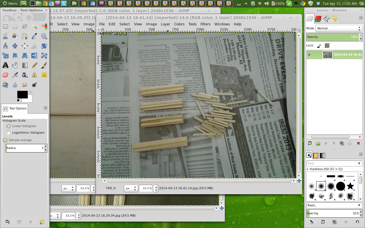


I should mention that for this Instructable, I'm using GIMP 2.8, well 2.8.4 to be somewhat exact.
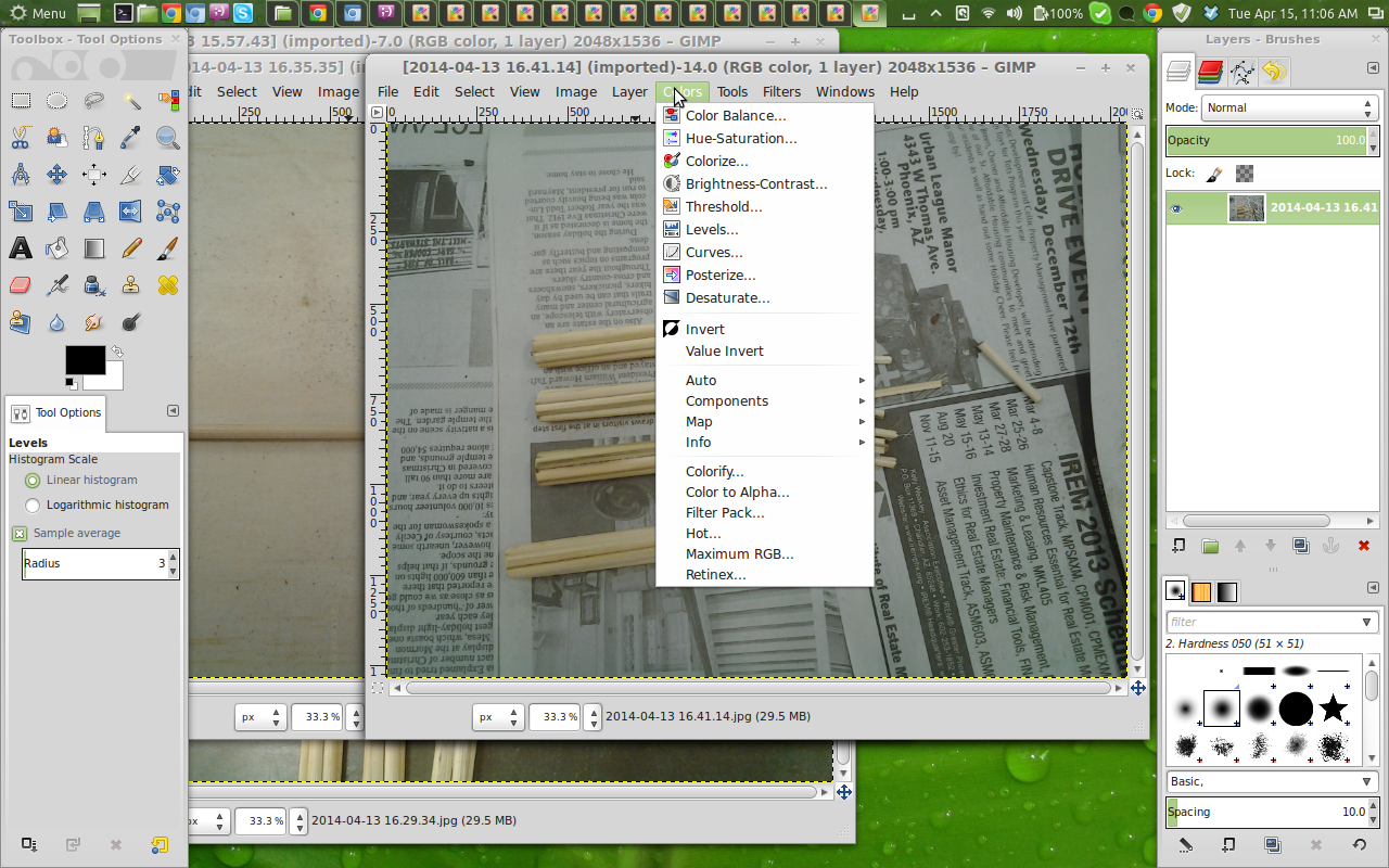
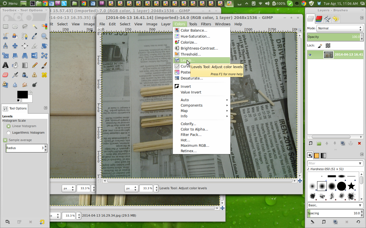
Once you have your image opened in GIMP, the first thing we want to do is open up the "color levels" dialog box. To do this we select "Colors" from the top menu, then "Levels". Intuitive right? Simple.
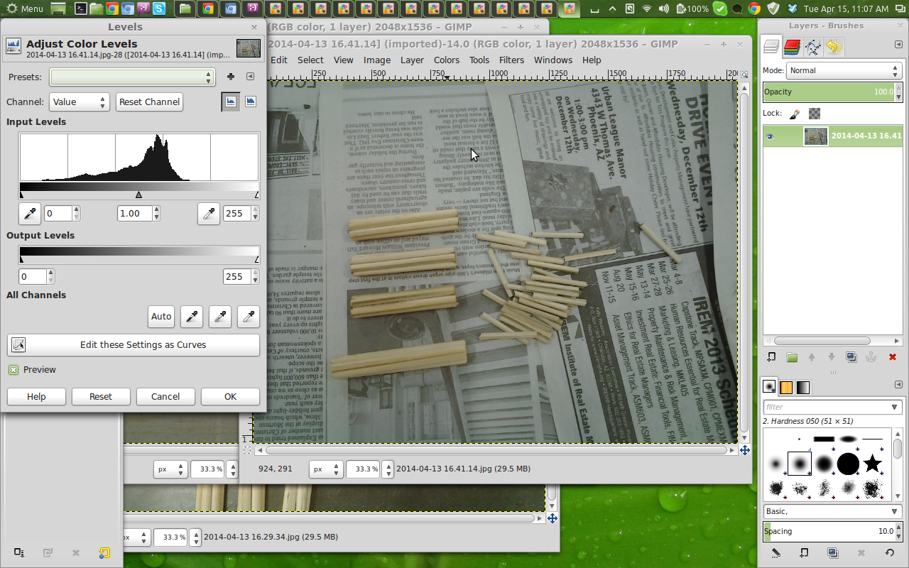
Now the Color Level dialog box is a bit daunting. It looks a bit like something a scientist would be looking at. But we don't need to know what everything does, we just need to move some sliders real quick.
In particular there is a box with some lines on it right below the words "Input Levels". It's a white box with some black lines in it. Actually this is called a histogram. Basically what this is, is a representation of the color levels in our image going from dark tones, to light tones.
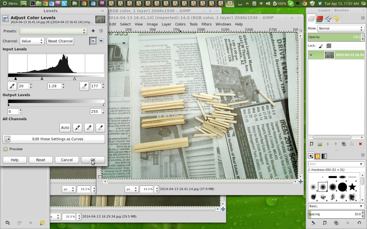
Underneath this box is 3 triangles. We are going to move these little buggers. Let's slide the left one (which is colored black) from the left to the right. Typically until it's under the left most portion of the black lines in the histogram above. You'll notice that our image has instantly gotten darker! That's not right, well wait we'll get to that, just trust me. Do the same for the right most triangle (which is white), move it from the right to the left until it's under the right most section of the black lines in the histogram above. Now our image has instantly gotten brighter! That's what we want. Lastly I usually move the middle (think of this as the average or medium) triangle (which is gray) just a smidge to the left. I play with this triangle the most to get the results that I want. But certainly feel free to play with all three of the sliders to get the results you want.
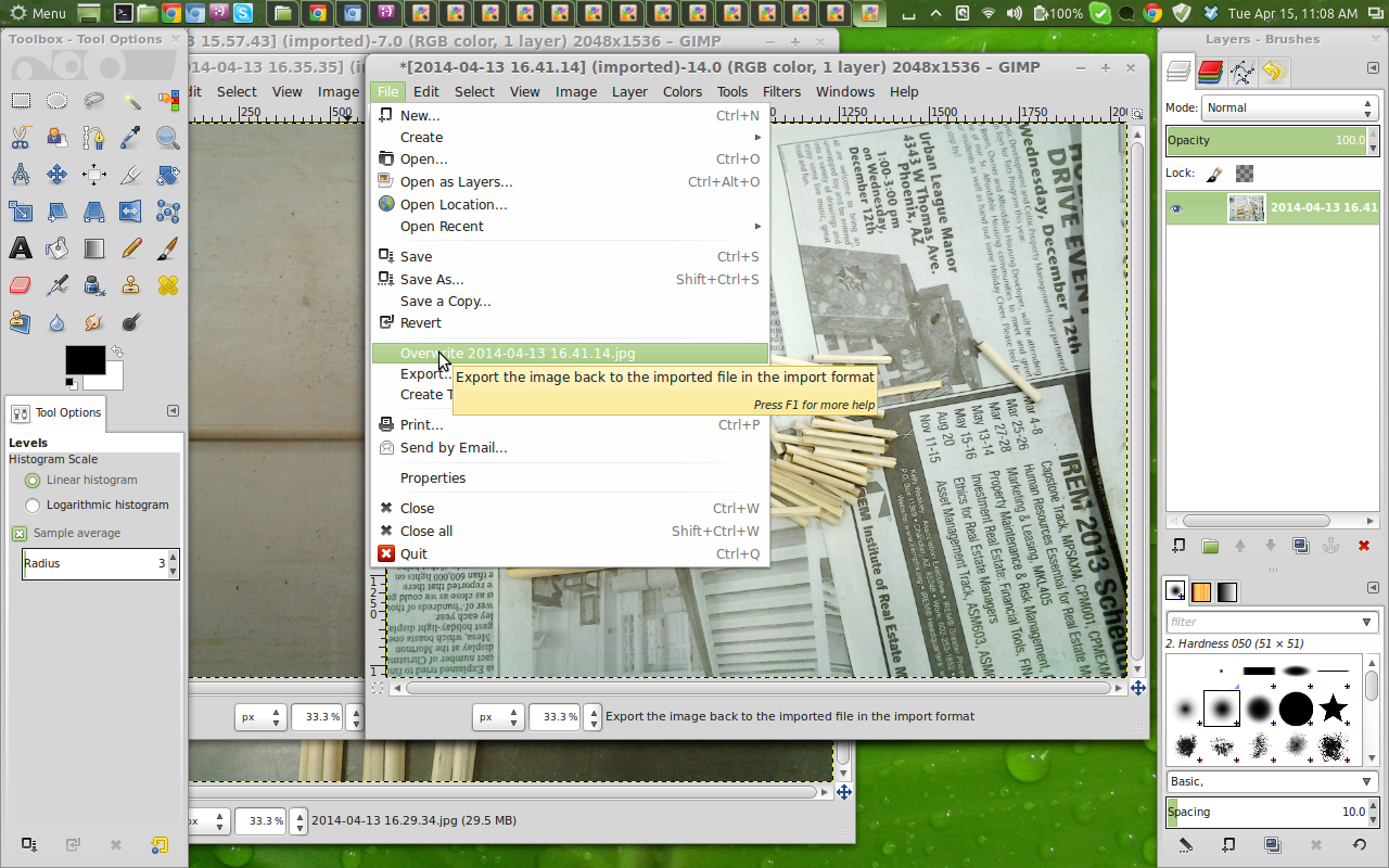
When you are done fidgeting with the color level triangles, click the "OK" button on the lower right of the dialog box. Now are color levels are set, we can save the image. Now you can save the image the same way you do everything else on the computer, by clicking the "file" top menu item. You can save this adjusted image as another file name, or most of the time I just click on "Overwrite (filename)". I've got the original image still on my camera to go back to if I need.
That's it, you are done! Your image is brighter and snapper than before. Now you can upload them to Instructables and revel in your glory!