How to Make an Infographic
by ell_ in Design > Digital Graphics
5574 Views, 31 Favorites, 0 Comments
How to Make an Infographic
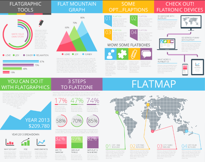
Always remember that infographics will vary from person to person. You may decide to include various other things that I have left out. The definition of an infographic is: "infographics are graphic visual presentations of information, data, or knowledge intended to present complex information quickly and clearly." The most important aspect of this definition is 'quickly and clearly'. Remember to keep the information short, sweet and to the point!
For this tutorial you will need access to Adobe programmes such as Illustrator and Photoshop. I prefer to use Illustrator for graphics because of the quality, and Photoshop for the design, however, you can use just one programme if it is easier for you.
In this tutorial, I have used a font from Creative Market, called Manhattan Darling, this can be found here as well as an infographic pack too. I may use other materials as well, some of these were found through other websites, or were mockups I have created previously.
Please note: negative comments will be ignored or flagged - this is a simple tutorial set up to help others who want to learn something new or improve their skills. Everything you see is this tutorial was created by myself, other than the given font and infographic pack, both of which can be found on Creative Market due to the respectful owners uploading them.
Three
Three is often referred to as 'the magic number'. All good things come in threes, right? When creating an infographic, there are three main parts that must be included.
- The Content - this is what puts the 'info' in 'infographic'. The content refers to all of the facts and statistics that you are going to be putting into your infographic. In order to make sure your information is accurate, use reliable sources and check all of the information you find.
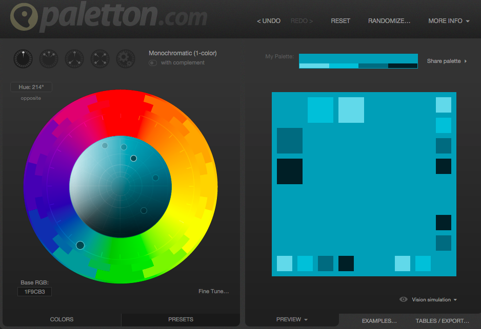
- The Visuals - this includes colours and the graphics you use, for example, data charts, graphs and symbols. The colour scheme should match and be consistent throughout. You can use various websites online to help you do this, one website I like to use is http://paletton.com/. Not only is it easy to use, but it does all the work for you, saving you time and stress! Using a lot of graphics, graphs and symbols makes the infographic easier to understand. This also applies to fonts too! Sans-serif fonts (like arial or helvectiva are examples) make the infographic easier to read. Sometimes sticking with the same font but varying the weight and size can be more effective than changing fonts completely.
- The Knowledge - last but not least, the information that you will include on your infographic. This is like part one. Try and keep the information simple, yet effective. Use simple terms and phrases that the audience will understand easily.
When you have completed all three steps, ask yourself 'is my infographic going to be detailed enough to engage with the audience?', 'is the information easy to understand?' and 'is the information I am providing memorable?'
If you answered yes, then you're ready to begin your infographic!
The Title

The title of your infographic has to be relevant and bold. The reader has to know what they're reading about! The title must also grab the attention of the reader as well to ensure that they are enticed to read on and find out about the topic. Use an interesting font that is not only effective, but easy to read and understand. Use the title to set the scene of your infographic. If you're going an infographic about movies, add in some film reels, or a camera!
The Introduction
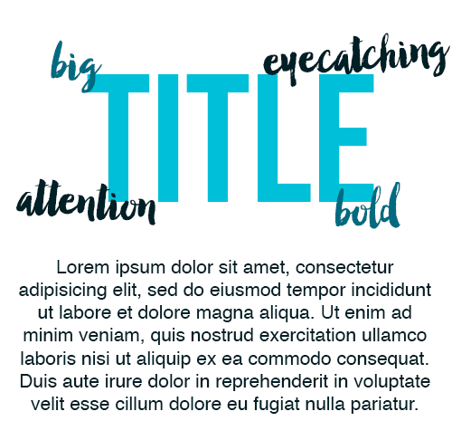
My infographics always include a short introductory paragraph that ensures the reader they know exactly what they're going to learn. For example, if my infographic is on films, I need to explain what films. For example, I may decide to include a lot of romance films but leave out sci-fi films. If a reader likes sci-fi but doesn't know that sci-fi will not be included, they will read on only to find they have wasted their time. The paragraph need only be three or four sentences at most, but leave out lengthy essays that are wasting the time of both yourself and your audience. Remember: infographics are short, sweet and to the point!
The Creation
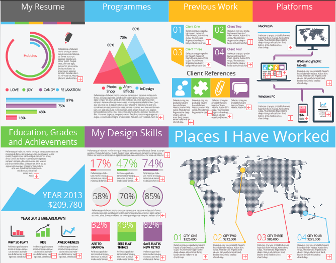
This step is called 'The Creation' because now it's over to you! All infographics are different, even if they're based upon the same topic. Switch it up entirely and do an infographic about a subject you aren't familiar with! An idea many graphic designers now use is an infographic CV. This enables employers to see how creative you are as well as being able to see all of the skills that they look for in an employee.
Remember to include a lot of symbols, pictures, statistics and figures to back up what you write. As well as this, use all of the space, within reason (remember to make the infographic clear!) to explain your chosen subject in detail.
The Order
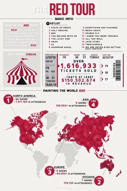
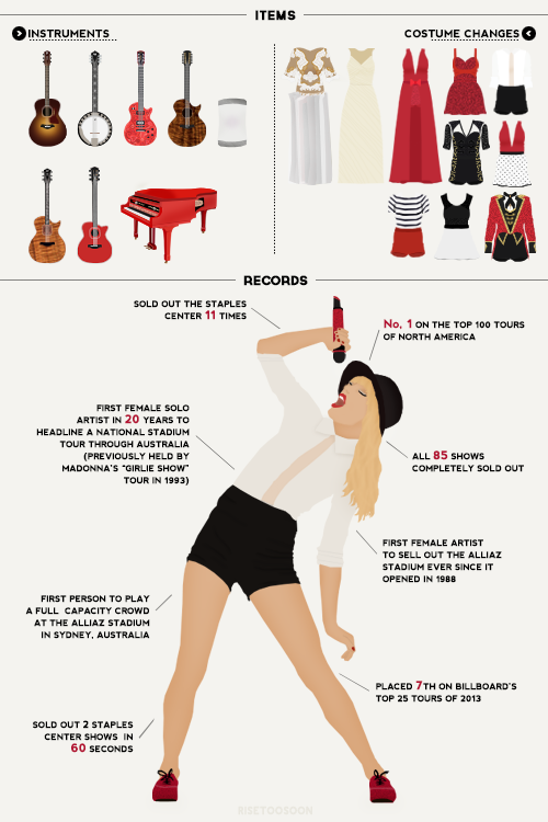
When you create an infographic, make sure each subtitle goes in order so the infographic flows. For example, if you're talking about films in the 1960s, don't jump to films in the 1980s or 1990s without warning.
Some popular topics are to do with celebrities. For example, if you were to do an infographic on Taylor Swift's tour Red, you may decide the order goes as follows:
- Title - what is your infographic about?
- Introduction - explain in three-four sentences about the topic
- Ticket Sales - how many tickets were sold all together? Could you compare this to previous tours?
- Tour Dates - when the tour start and finish? How many dates were included?
- Locations/Venues - what countries were included in the tour? If the tour went to London, what venue was used?
- Set List - what songs were performed on the tour?
- Instruments - what instruments did Taylor use whilst performing?
- Outfits - how many times did the artist change? What outfit went with what song?