How to Create a Cool Vaporwave Album Artwork
by Gunhelmet in Design > Digital Graphics
150644 Views, 30 Favorites, 0 Comments
How to Create a Cool Vaporwave Album Artwork

Greetings to all!
Kids those days love Tumblr. In fact there are a lot of exciting things between all the depressive stuff and devoted fandoms, like the spreading of countless art/music/fashion trends, such as the Vaporwave movement, which blends renaissance models, technology and a powerful color scheme to bring the aesthetic of an old-fashioned future. Because, why not? It's art.
So linking into my other little love, music, in this step-by-step I will show you some techniques to do your own Vaporwave/Tumblr-ish album artwork and also how to fetch it into your favorite tracks.
WHAT YOU WILL NEED
For this tutorial it will be used Photoshop CS5.1. You can also try the techniques with other image editor tool, such as GIMP.
The tools’ name may change.
Preparation: between 15 and 45 minutes
CREATING THE ARTWORK

1. Background
1.1 preparations
First of all I created a squared-size canvas, since the usual CD boxes have squared shapes.
Note: for this work the size is 1500 x 1500pixels with 300pixels/inch of resolution. You can also try a smaller or bigger size, keeping in mind that the regular measure is above than 600 x 600 pixels.
When you're doing a concept, it's always better to do a sketch first. In my case I wrote what I wanted to do. It's a good way to not getting frustrated in the middle of the work.
As that said, I started to paint my canvas, turning the original background into a light gray color (#d7d7d) to remind an old computer display, using the keyboard shortcut alt + backspace.
1.2 groundwork
To break that sad gray view, I selected a non-centered big square area using the Rectangular Marquee Tool and applied a gradient with a malachite color scheme. Bright and beautiful.¹
Tip: since you're the master, try to break the monochromic of your art piece using a lot of shocking colors to bring some of visual pollution and a neon-ish style to the canvas, reminding of the consumer society and all their brands, flashes and colors. Just as Tokyo at night or Times Square.
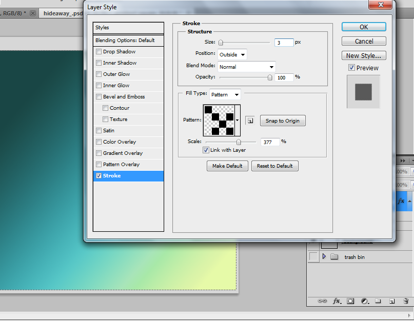
I also put a black-and-white outline, hinting that tartan line you should cut on a paper. Just for nostalgic. To make that, I put a patterned stroke on the layer, using this freely set I found on the internet (http://bit.ly/1gguQ1s). You may change it for another (or none) pattern, like floral prints and gradient strokes.²
Note: people usually don't like to use patterned strokes, and that's such a loss. Tartan patterns, floral patterns and even a picture styled as a stroke (also used in the last step) bring an unexpected visual to your artwork. And it's not hard to find something cool to add into your piece: Creative Market, deviantART and all design communities are cakes for your taste. Go hunting.
1.3 an awesome tip of randomness
Then let's Tumblr it. Just like that.
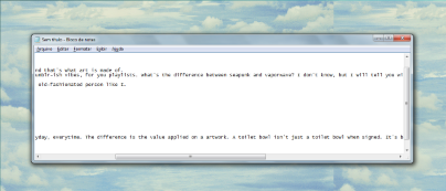
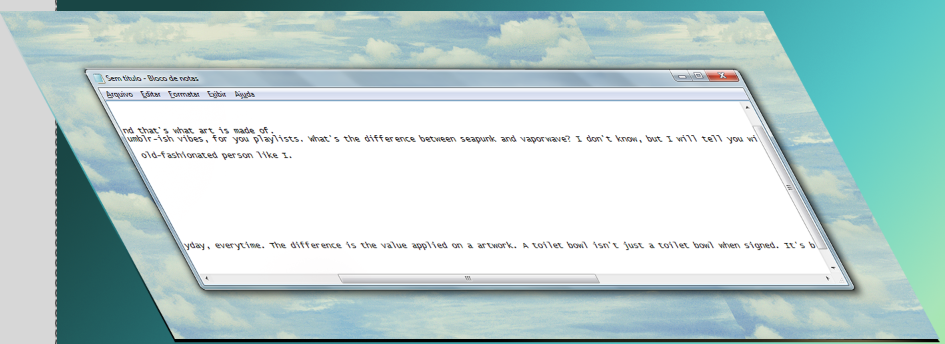
To stamp a mark at this piece, I picked a screenshot of my desktop: here is some obsolete technology and a Parnassian feel brought by the painted clouds in the background.¹
You can try to use daily things in an uncommon way to create some shock value. Icons, grids or even buildings are a good catch to do a kitsch yet technological look to your set.
Drag it to the Photoshop canvas. To this example I resized and inclined the picture, using the Transformation Tool in Distort mode.
To finalize the desktop composition I duplicated the layer and moved the above one to left and bottom, and added a gradient overlay in it, using another malachite color-scheme.²
Tip: to create a hint of depth I selected the notepad area of the desktop and right-clicked on it, creating a copy layer. Then I added a Bevel and Emboss effect, which is a nice effect when you want to create the idea of something from 90's. It's a lovely effect, and it will be used a lot of times on this tutorial.
LAY FIGURE


2. The model
2.1 preparation
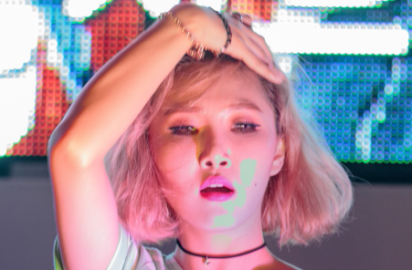
Vaporwave artworks commonly use Greek statues to bring a classical atmosphere. In this composition, though, a person picture will do the job: for that I’m using a CC (Creative Commons) photo from Peter Rowland’s Flickr (https://www.flickr.com/photos/pmrowla/)
There a lot of good images in that gallery, most of them of the kpop scenery. In the photo I chose there is Hwasa, an amazing singer from the Korean girl group MAMAMOO. She's only 19 and she already owns everything.
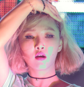
Well, back to the composition.¹
For the first step, I wanted to crave my mark: that's a random thing that looks pretty cool in the outcome: using the Healing Brush Tool, I selected some areas of the Iris and Sclera of the model and spread all over the eyes. It creates a dead/alien illusion, with the white dots pinched all over her eyes.²
Then I color-corrected the image a little bit. In this photo, the lights were just fine, so I didn't have to do a lot of adjustments.
Note: basically this is all by your taste. I like to use a lot of darken and darker color layers. And that's what I did for this example.
2.2 color adjustments
First of all I opened the photo. The effects were concentrated at the center of the frame, modifying just her and nothing more because my intention is to crop her by the silhouette in the end of the process.
Using the shortcut Ctrl + J, I duplicated the picture and turned into Color Mode to emphasize the original colors of the composition.
To create a little effect of TV spectrum, calling up to old TV screens, I doubled the original layer once more and moved a little bit to the side using the Move Tool. It was concluded turning the layer to Saturation Mode.
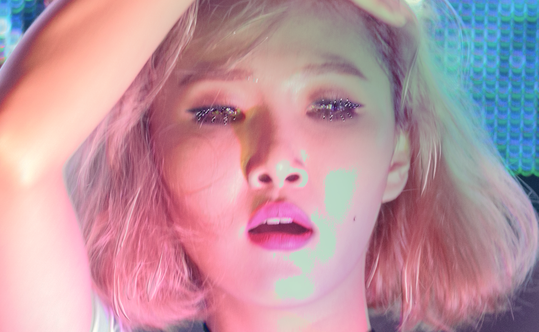
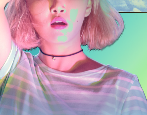
To simulate even further the effect of an old and uncalibrated television, I added two light green layers: with a soft brush, I spread a little hint of green (picked from Hwasa's shirt) on her chin and turned the layer to Darken Mode. I repeated this step, that time turning the layer to Darker Color though.
The green mixed to the light bounced on her skin, making a really cool effect.¹
Note: it's even better when you notice that actually matches with the malachite gradient of the first piece.
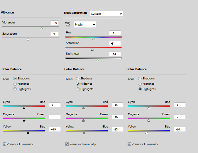
Now some image settings. I detached in three Adjustment Layers and a green-painted one on Darken Mode. The adjustments were made to bring brightness and power to the colors of the model.
Note: settings on the image.²
I also wanted to darken a little bit, so I used dark green (two shades darker than used before) and sprayed all over Hwasa's forehead. It matches to the malachite background and also creates a depth illusion.³
2.3 a pretty little trick
As you already noticed, I really like to use the Bevel and Emboss effect, so I merged all corrections made. Following that step I selected her collar and straws of her hair and created a copy layer by right-clicking on it and selecting Layer Via Copy. In this new layer, I applied the Bevel and Emboss effect.
It's a simply effect, but add some profundity and a kitsch feeling in the piece.
Tip: if you find the effect too bold, you can smudge or erase the edges of the layer.
2.4. beating it out
Right now the image looks pretty solid, but that's not enough when we treat about the Vaporwave movement. Here’s an easy way to break the monotony. To do that I selected some straws of her lashes using the Lasso Tool and, in 100% of zoom, printed the screen.¹
Note: as you can notice, I’m focusing on her eyes. That’s not a rule. Choose what your like to bring weirdness to your artwork.
As soon as you did a screenshot, just copy the image and throw onto you composition, merging when the eyes fits the right place.
That's it, let's gather all.
STITCHING THE COMPOSITION
3. Jointing the work
3.1 cropping edges
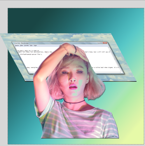
Drop your photo to the background previously done.
Resize the picture and apply to a good size that doesn't hide the background and harmonizes with the other elements.
For that model, I created a Mask on the layer and ROUGHLY erased the edges, excluding the background of the picture.¹
Note: you don't have to care about the tiny details once a harsh and tacky look contributes to the attainment of your artwork.
Once more, Bevel and Emboss effect has been used to create deepness.
3.2 more tricks
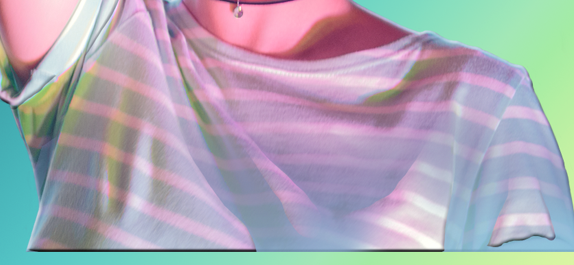
Now two shots: to dehumanize and make a little taste of a statue on Hwasa's cut, I painted the bottom of the picture with the same blue as the illuminated parts of her t-shirt, using the same default Soft Brush as used before.²
It got some gradient mood. To break that there’s the second step: selected some folding of her clothes (in the original layer) and copied them above the blue layer. A Bevel and Emboss touch, erasing the edges to cut the harshness of them.³
The visual has been set. So, why not typography touches?
THE TITLE OF THE PLAYLIST
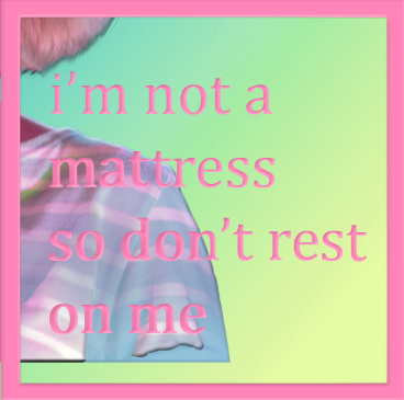
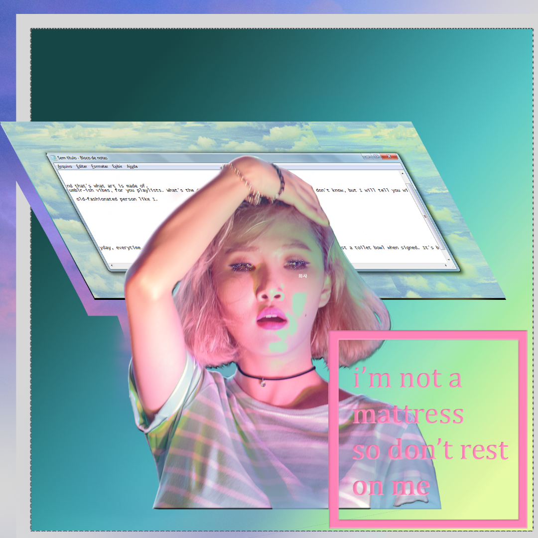
To conclude the art piece, I used two simply steps. In the first one I made a box using Shift + Rectangular Marquee Tool. Then, I intersected the box with another box, using Shift + Alt + Rectangular Marquee Tool. To finalize I colored it pink (extracted from Hwasa's skin) with Alt + Backspace.
After that, in the second step, I wrote the title of my playlist in Cambria inside the box using the same pink color. Merged it both and, guess what, Beveled again.¹
4. the cherry on top
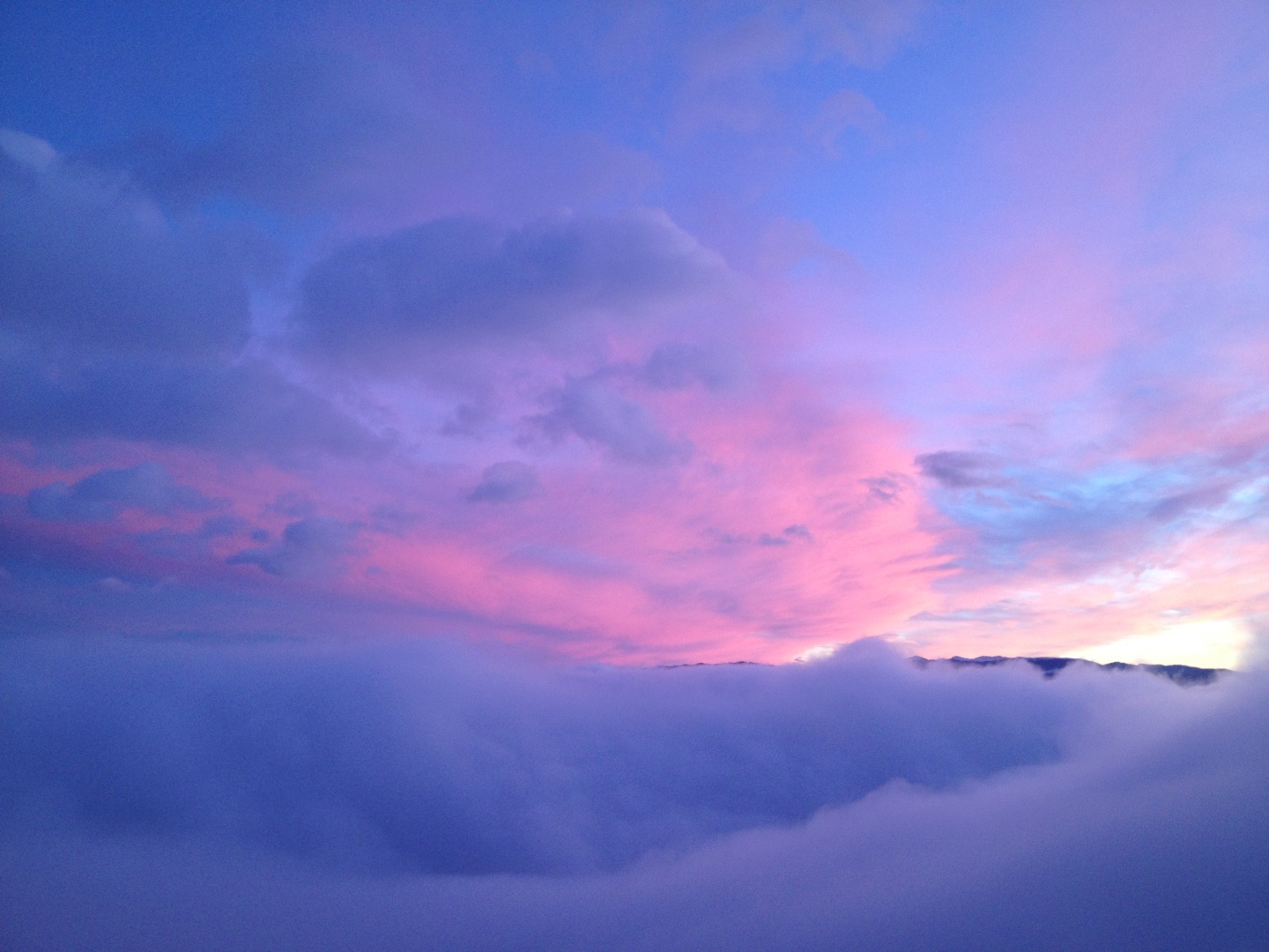
The ultimate touch is right there: to compose a transcendental form to the artwork, I decided to use a contrasting environment picture to bring an atmosphere of peace. To do that I'm using the Purple Blue Sunset Photo from PremiumCode's Huge Nature images pack. 50+ images! (available on Creative Market: http://bit.ly/1dTruCd).²
So I dragged the image over the Malachite Gradient Square from the first step and cut to make a Stroke-ish form. To end the process, I also softly erased the edges.
5. finishing the details
The piece is over. I also wrote with simply white font the name Hwasa in Korean above her eye. Also added a blue hint on the desktop excerpt area, using light blue in a Squared Noisy Brush by Rezkhan (http://bit.ly/1JT17ul).
Note: these were optional additions, since the structure was already done.³
Now, the real deal: how to include that awesome artwork on your CD/Playlist.
ADDING THE COVER
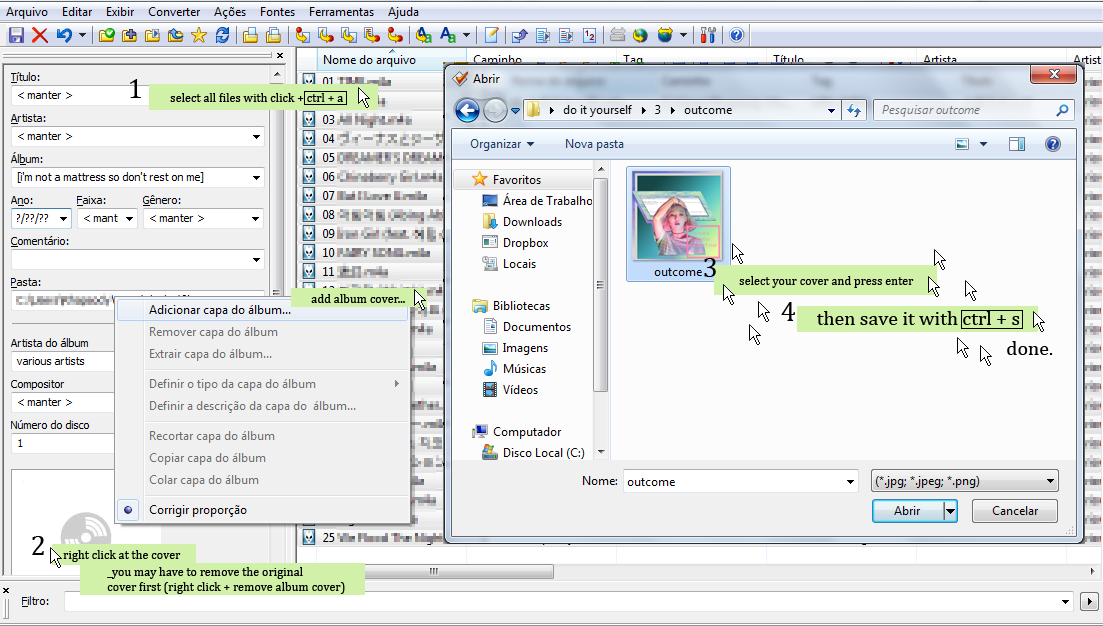
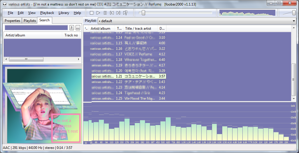
Let's simplify things. You can fetch an album artwork in a plenty ways, but we don't want to do complicated things right?
So let's left all the work for an amazing free software: Mp3Tag (http://www.mp3tag.de/en/).
This is a 100% freeware program, and needs only a few steps to achieve add the artwork on your songs.¹
1. Install and open Mp3Tag. Once you did that, drop your songs to the big empty area.
2. Select all the files, simply doing the keyboard shortcut Ctrl + A.
3. You will notice the original cover of the song. If it doesn’t have a cover, it will appear a white box with a circle in it. Right-click on that and select Add Album Cover...
4. An Open box will appear, and you just have to find the artwork you've done and press enter.
5. Save it using Ctrl + S. Really, don't forget to save. Wait to the message warning telling when it's end.
NOW YOU KNOW HOW TO HAVE A UNIQUE VAPORWAVE-ISH PLAYLIST.
6. Celebrate it.
Don't forget to use these techniques in your own projects (want some ideas? Check it out: http://bit.ly/1Tr1azq). You can add all those tips into you avatars, headers and, of course, CD covers. There are a lot of possibilities. You can also print the artwork to use as your own physical CDs, resizing it first to 120mmx120mm: the regular CD box size.²
Thank you for reading this little DO IT YOURSELF. I hope you like it as much as I enjoyed doing it. =^)
Don't forget to vote and favorite!
GUNHELMET