How to Analyze Heart Rate Monitor Data
by brianbarkey in Workshop > Science
19419 Views, 18 Favorites, 0 Comments
How to Analyze Heart Rate Monitor Data

I've been using a heart rate monitor (HRM) for years. I like it because it gives me an objective measure of how hard I've worked out. I have read the booklets included in the box when you buy your HRM. This is the 'Zone' system which is used to gauge how hard you should exercise.
However, as a data centric person I like to hoard data in the event it may be useful someday. And maybe it has. I show in this instructable how I record the data in MsExcel and of some of my simple analysis methods.
The Disclaimer. I am not a health professional. I don't even consider myself a health nut. I'm just a guy who likes to analyze data and go outside and play. I do not clam that any of this stuff will help you get thinner, stronger, or smell better. It may get you motivated to play with Excel. It may motivate you to get out more often, Use at your own risk!
Collect Data
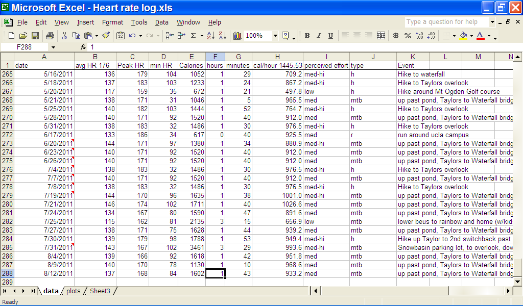
I have a Timex HRM which does not have a computer interface thus I have to enter my data by hand. Each HRM has a different sequence of buttons to access your data so I won't be describing the Timex setup here.
I just enter the data my HRM provided, Average, max, min heart rate calories burned and exercise time. I used to enter the 'time in zone' category but gave up as I was always above my zone and sometimes I didn't set the zone right. Actually I don't really use the zone feature as during my workouts (mountain biking, skiing, etc.) I can't be looking at my watch to see what zone I'm in.
In Excel I have one page devoted only to data.
The first row are my data headers. This can be locked from the Excel menu "Windows->Freeze Panes" to lock the panes at the grid point you have selected. If the panes are frozen in the wrong spot, just use "Windows->Unfreeze Panes".
I calculate 'Calories/hour" with the excel formula "=E2/(F2+G2/60)" where 'E' is the column for "calories, 'F' is hours and 'G' is minutes. I copy and paste older and similar workouts to save some typing.
My 'perceived effort' is purely subjective but usually correlates with "calories/hr" . I like to categorize my workouts with 'Type' and I also include a short description too.
What I Do With the Data
Now that I have data, of what use is it?
Mostly I find out that I'm getting old and slowing down! (But, I don't need an Excel analysis to tell me that!)
I use another page just for plots.
Copy and paste the data from the Data page.
Use the Chart Wizard to select the X-Y plot with the date as the x-axis and a corresponding data column as the y-axis. Excel automatically knows how to plot the date formats.
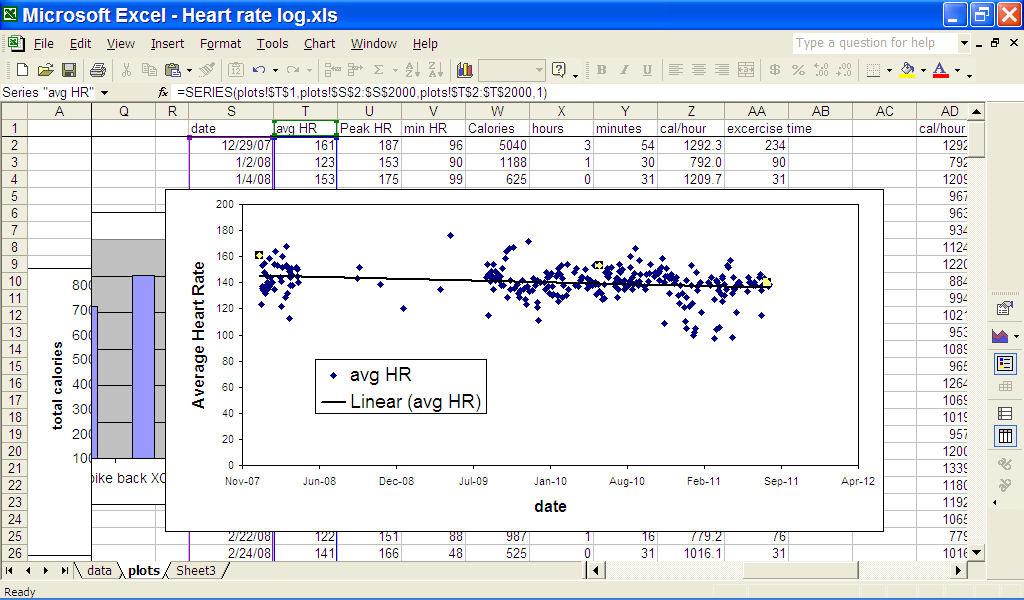
In this plot I use show my Average heart rate over the years. The line is a linear regression (or simply a mathematically defined line that bests fits all my data).
Select the chart, use the menu "Chart-> Add Trendline" and select the linear option.
From this I can see that my average heart rate is slowing down over the years.
More Plots
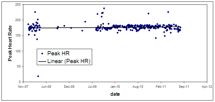
Any other column of data can be selected. Here I show my Max heart rate.
It seems pretty steady over the years. There are a few high value data points which I think are due to problems with the HRM strap. It loosens some times, and a way high max rate means I have to tighten it. Sometimes I don't workout so hard, hence the few lower values.
From this data I see that my max heart rate is about 175. It doesn't seem to have lowered as I got older. The standard equation to find your max heart rate is 220 - age. But this data shows a flat max heart rate, although this is only 5 years or so.
Calories/hour
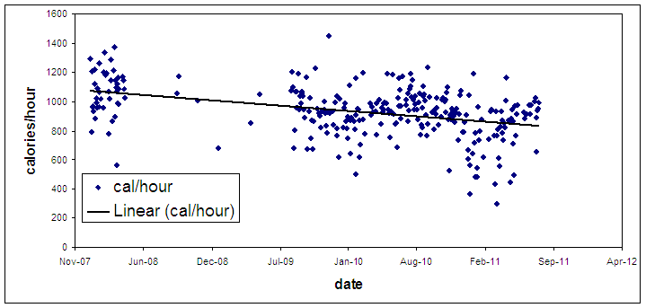
Here I see that 'm really slowing down. A high calories/hour means I'm working out really hard. My trendline is dropping quite a bit from about 1100 calories/hour to 900 calories/hour.
Am I slowing down? Getting lazier? More efficient?
Am I slowing down? Getting lazier? More efficient?
Using Type of Excercise
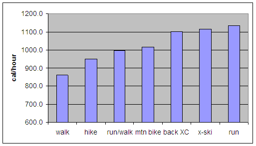
This plot takes more work. If there is enough interest in this instructable, I'll include instructions.
But I show here which of my exercises are most intense based on the average calories/hour for each exercise type. Running seems to be the hardest for me and of course walking is the easiest.
But I show here which of my exercises are most intense based on the average calories/hour for each exercise type. Running seems to be the hardest for me and of course walking is the easiest.
Conclusion

I hope this helps you analyze your HRM data. Another benefit I found is that I sometimes go out to exercise just to add another data point.
Perhaps someone with more exercise expertise can suggest another way to look at the data.
As I said, this is just for me. I don't think I have put out any 'bad' advise out there.
Perhaps someone with more exercise expertise can suggest another way to look at the data.
As I said, this is just for me. I don't think I have put out any 'bad' advise out there.