How to Turn a Photo Into a Pop Art Inspired Serving Tray
by Birdz of a Feather in Design > Photography
3512 Views, 36 Favorites, 0 Comments
How to Turn a Photo Into a Pop Art Inspired Serving Tray
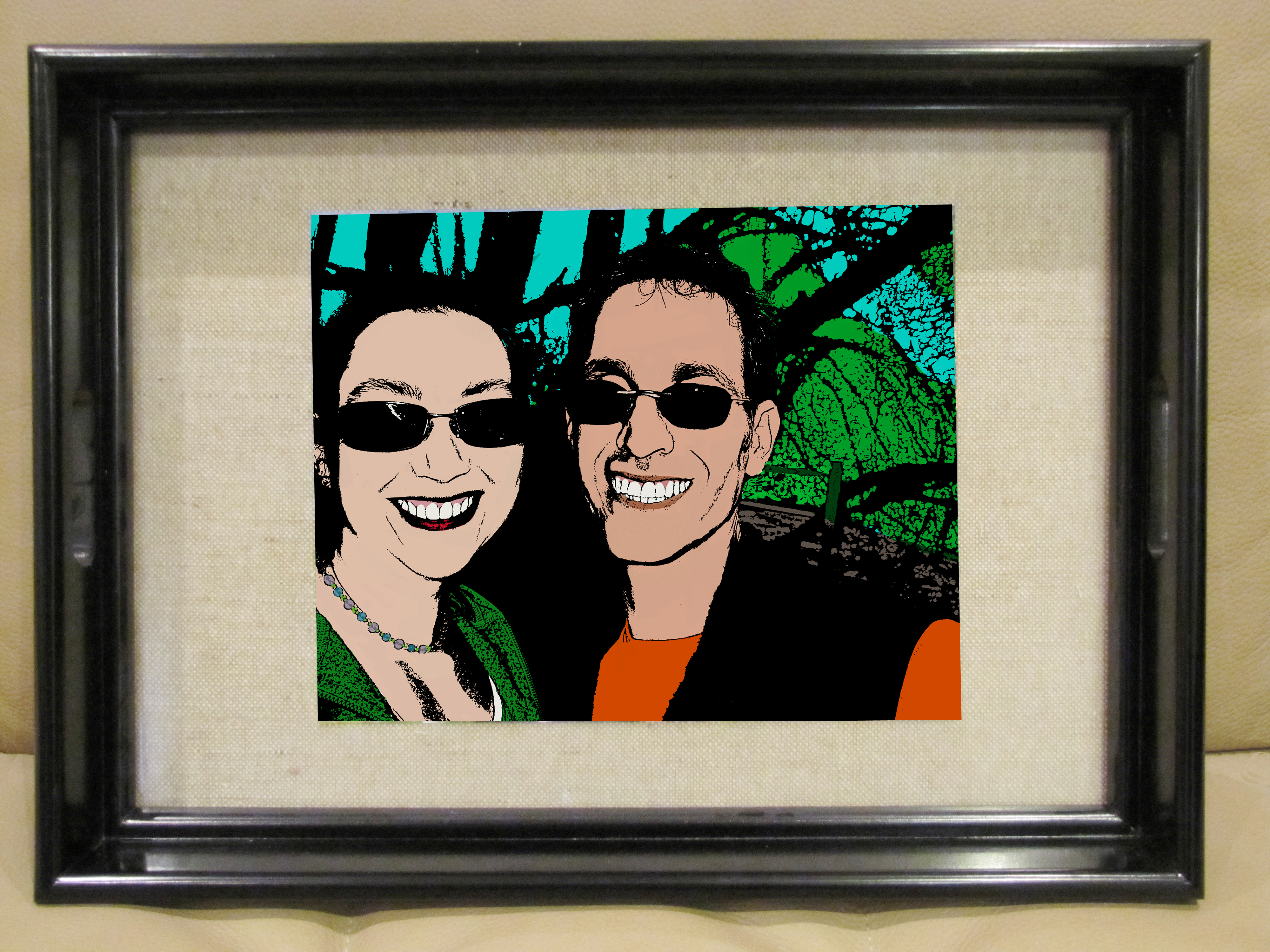
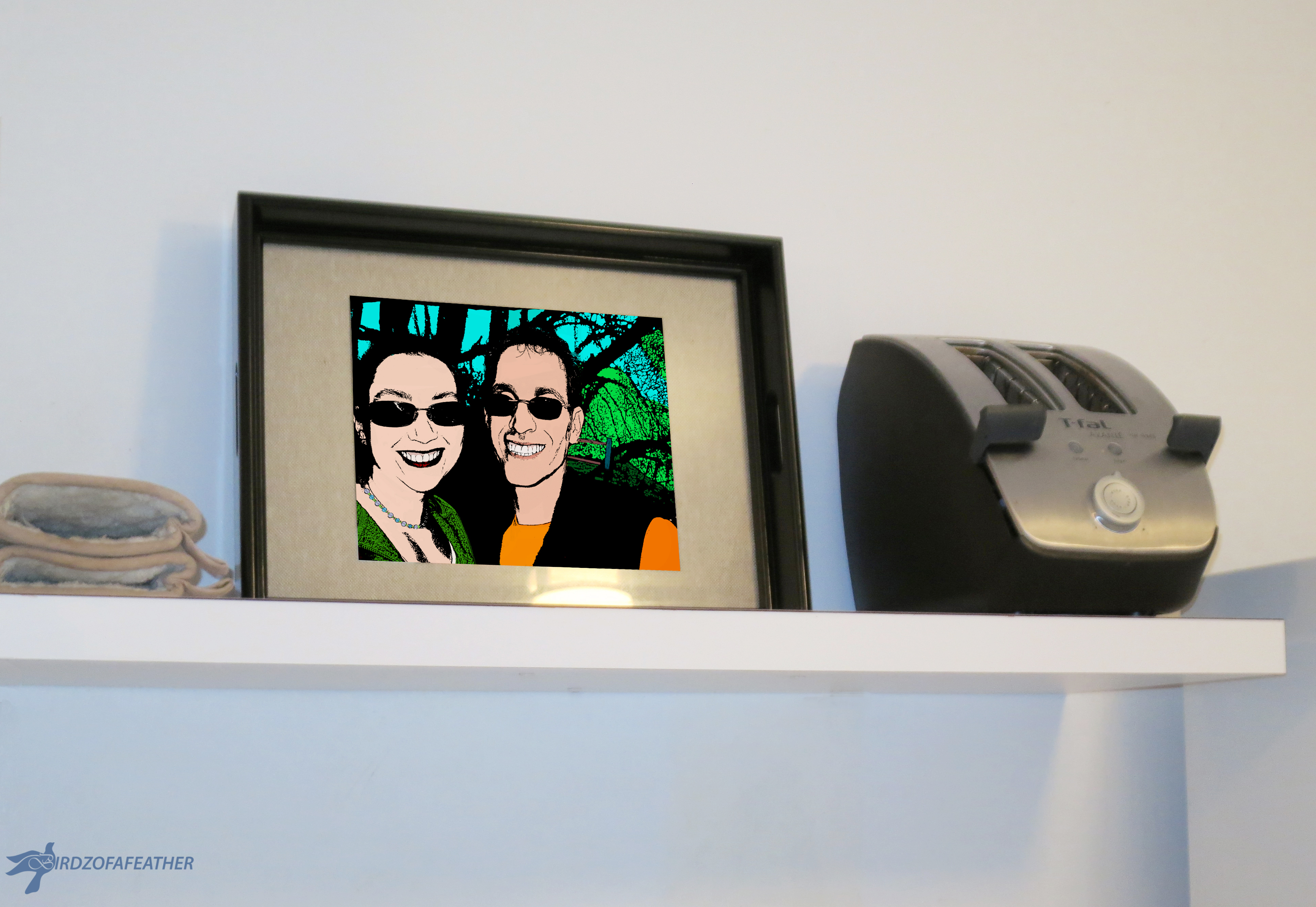
We still love using a camera to take photos (that is until I accidentally dropped and broke it a few days ago!) but the convenience of smart phones and electronic gadgets means it's not really necessary to print pictures in order to see them. It's a breeze to shoot, store and view pictures all on the same device.
With printing pictures becoming a thing of the past, I found a great way to enhance our home decor using a picture that would otherwise never see the light of day: I turn it into pop art and display it on a serving tray! It's a great way to preserve memories. For instance, in the example I'm showing you today, I used a picture taken during a vacation we took many years ago.
A pop art serving tray will give you double bang for the buck - it's functional as well as decorative! Use a tray that has removable glass and it will protect the picture. When it's not being used as a tray, it can sit propped up on a shelf so it doubles as an art piece in your space. In an all white kitchen, as shown above, the pop of colour can really add interest.
I equate this project to an electronic version of an adult colouring book and it's super fun to do!
What You'll Need
- Photograph
- Editing software
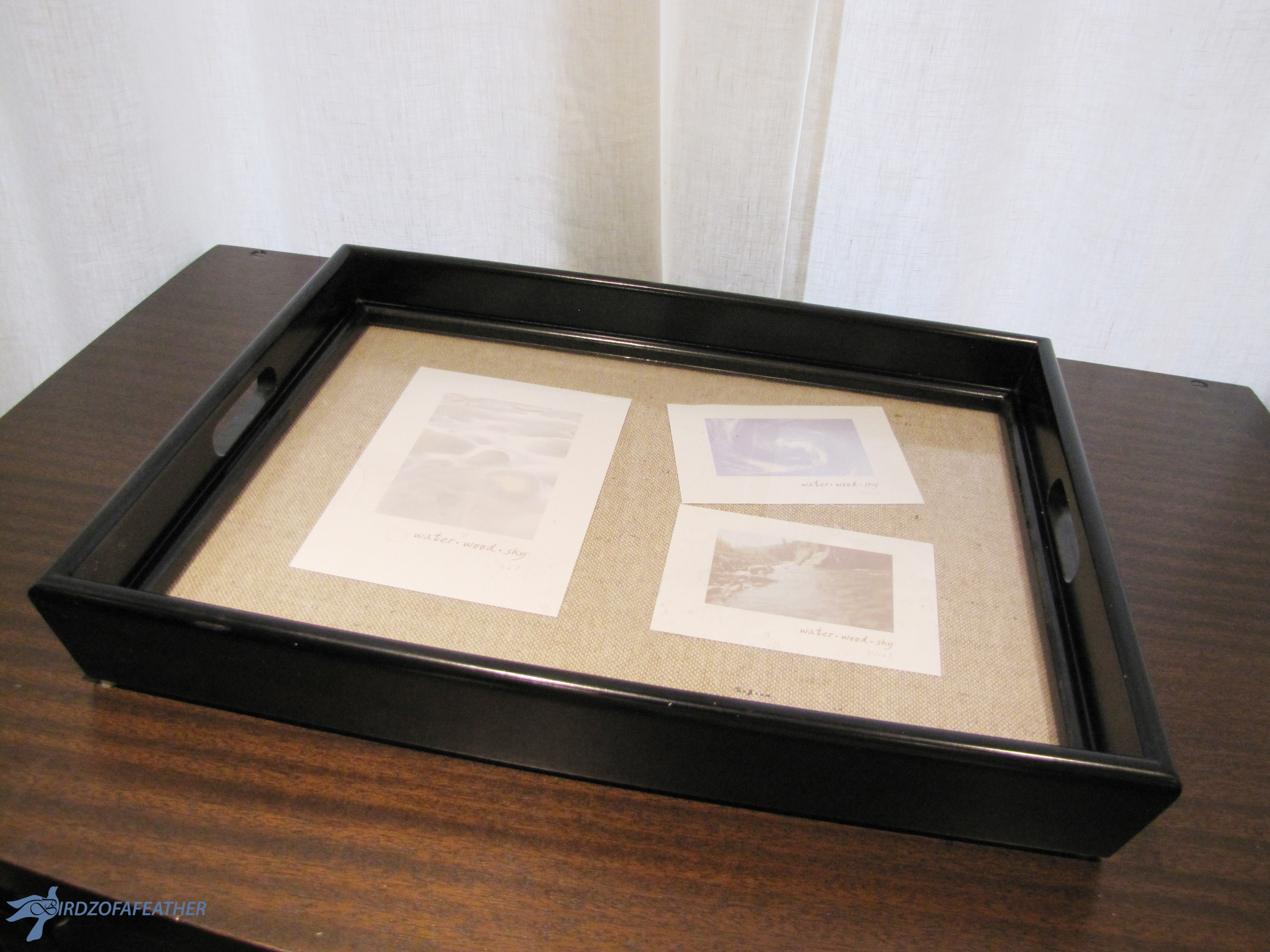
- Serving tray with glass insert (mine is 17" x 15 1/2")
I used Photoshop to transform a regular photo into pop art. I should point out that I didn't have any experience using Photoshop before I created this project. I spent some time googling how-to's and watching videos and then pieced together what I learned. If I can do it with zero experience, you can get a cool result too by following my I’ble! Later I'll give you a link to an awesome website where you can learn more about Photoshop.
By the way, I'm using an older version of Photoshop (CS5.5) so your menus may be different than mine. If you have any questions about where to find things in your own version, just google where to find 'x' in version 'x' (fill in the x's with your own particular info).
My tray is thrifted. If you want a similar one, try Homesense (the equivalent in the U.S. is Homegoods). The interior dimensions are 15" x 10 1/2" and I printed my final picture 8" x 10" to fit under the glass.
Watch This Video to See How It's Done!
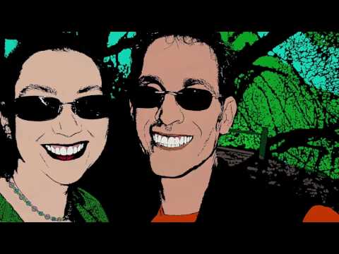
If you're a visual learner like me, take some time to watch the video above to see how to create your pop art portrait in Photoshop! Then continue to read the step-by-step details to on how to set the threshold and add layer masks to colorize your picture!
Duplicate Background Layer Twice
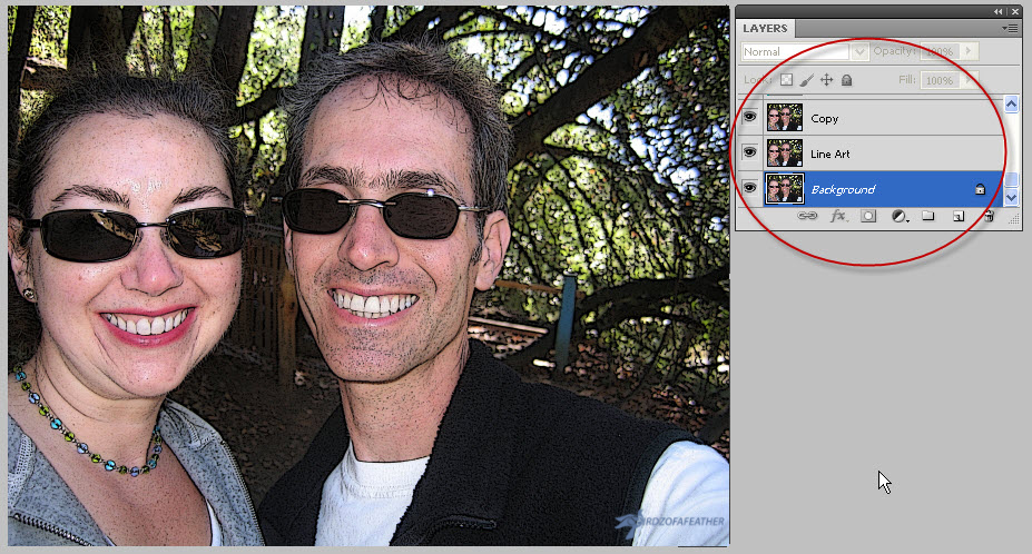
In this step we're going to change the threshold setting on two copies of the original photo so we can turn the picture into line art (black and white). We'll then apply a mask to the top layer so we can remove certain areas of it and see parts of the lower layer coming through. A mask is ideal to use because it won't permanently change anything; everything can be reversed if necessary.
Open your picture in Photoshop and make sure you have layers open (Window, Layers).
Duplicate the background layer twice (Control J on a PC, or Command J on a Mac) and rename the very top one 'Copy' and the other one below it 'Line Art'. I always leave the original photo as-is (background layer) and make duplicates so I can refer back to it if I have to. See picture.
Before you work with each layer, 'de-select' the eye icon on the other layers to hide them so that only the eye icon on the layer you are working with is active. If you forget to do this, you won't be able to see the changes you make.
Change Filter and Set Threshold on Copy Layer
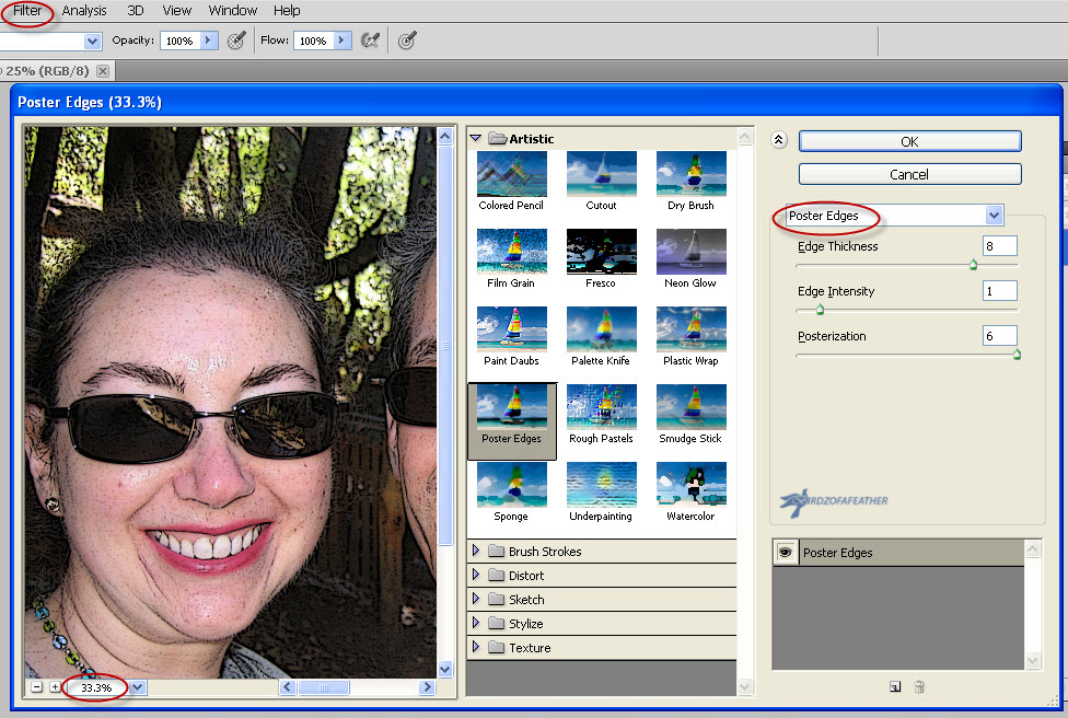
With the Copy layer selected, click on filter, filter gallery and adjust the view to 33% so you can see the changes that are being made as you adjust the picture. Click on artistic, poster edges. I chose 8 for the edge thickness, 1 for edge intensity and 6 for the posterization settings (first picture).
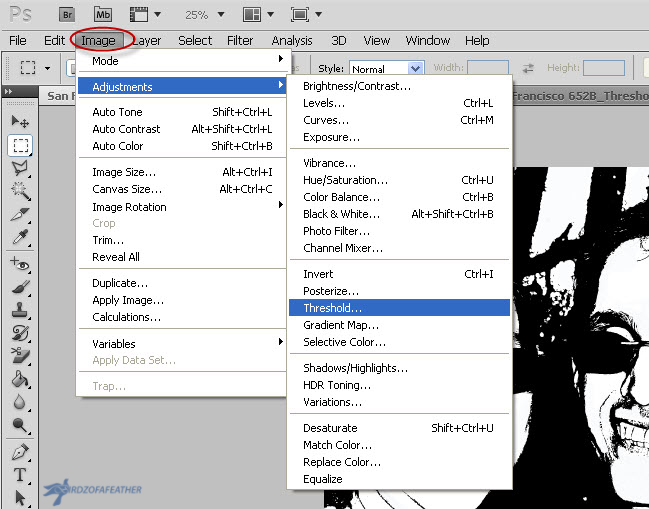
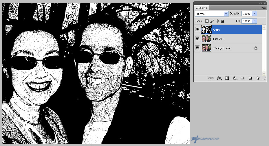
With the Copy layer still selected, head up to the menu bar and click Image, Adjustments, Threshold. I set mine to 125, but you may need to play with the settings for your particular picture. When you change the threshold of the picture you'll notice that it creates 'noise': those little specs of black that add clutter. You can see the noise most with the stubble on the face (second picture) but we're going to clean that up by changing the threshold on the line art layer too and then using a mask on the copy layer to remove it (see last picture).
Threshold for Line Art Layer
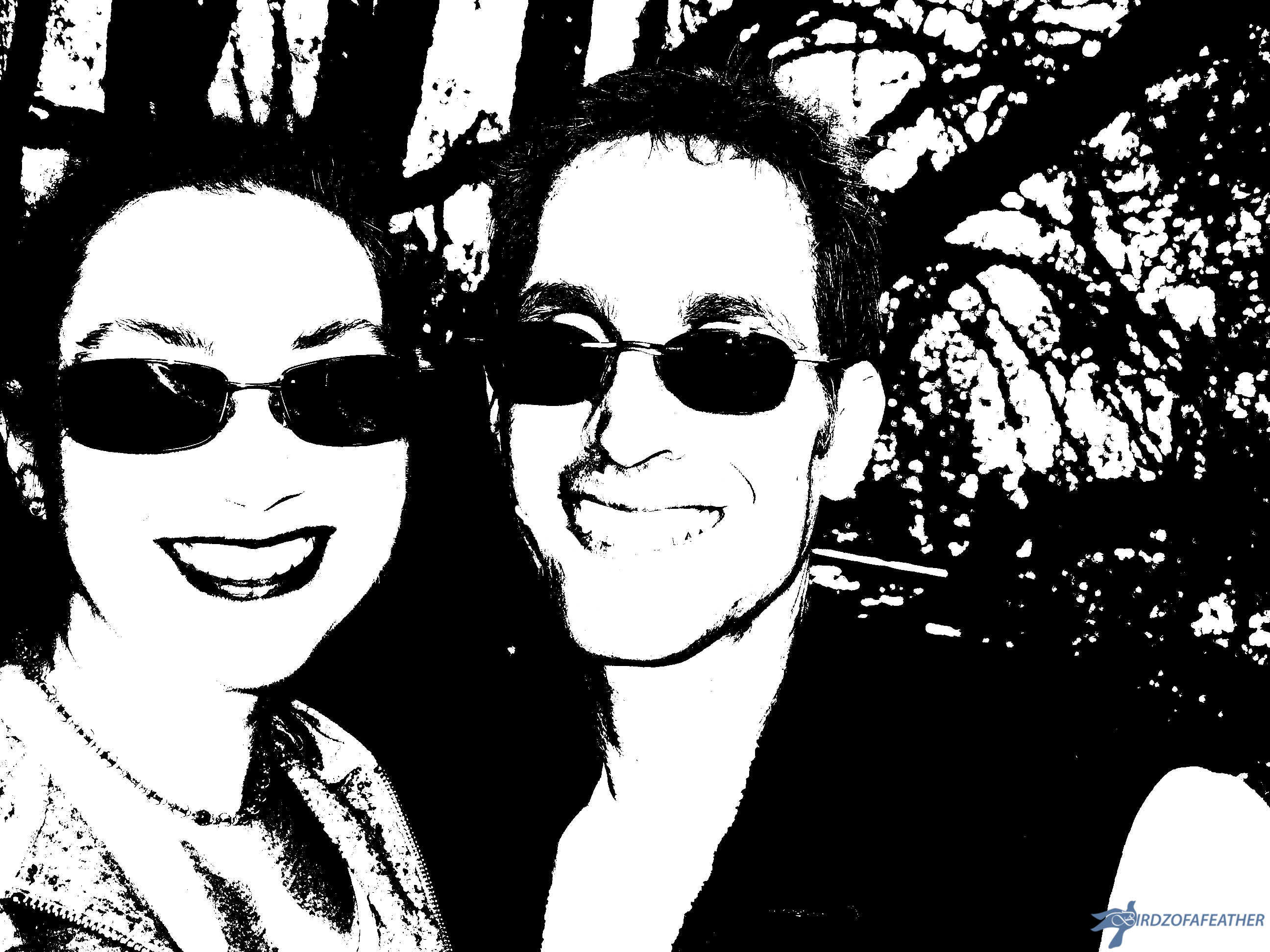
Click on the Line Art layer and do the same thing (Image, Adjustments, Threshold) but make this setting much lower so all the 'noise' in the face is either completely gone or greatly reduced.
Remove Noise by Using a Layer Mask
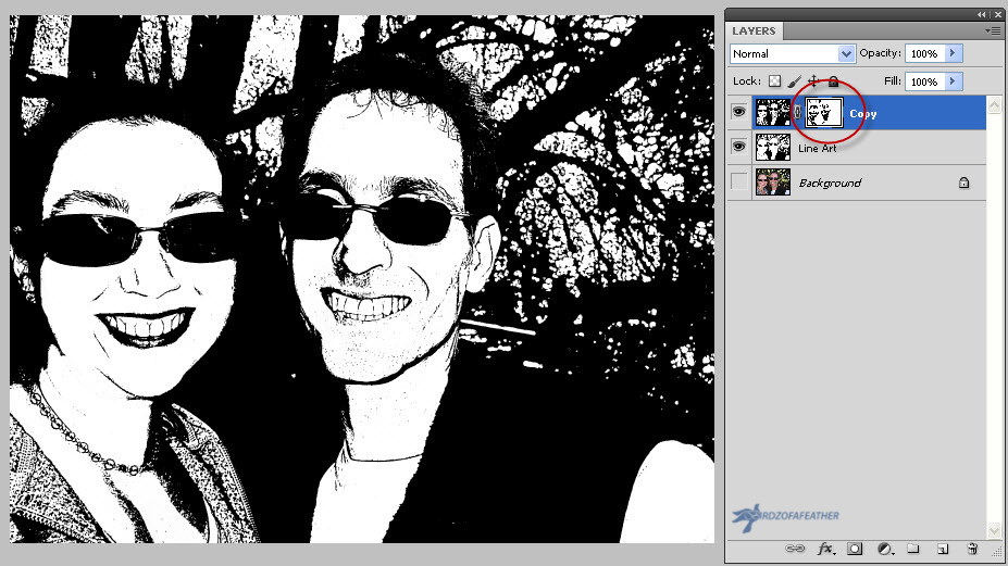
Using a layer mask is a non destructive way to make elements of your image appear or disappear. Click on the Copy layer and add a layer mask using the Add Layer Mask icon (it's the grey square icon with the white circle in the middle, or the 3rd icon from the left at the bottom of the layers panel). Once you add the mask, the copy layer will show an additional white thumbnail beside the thumbnail of the picture.
Use Black and White Foreground/Background Tools to Remove 'Noise'
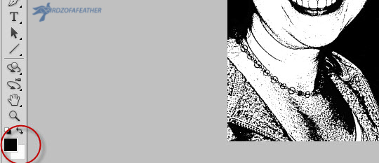
Before using the colour swatches, make sure opacity is set to 100% (opacity can be found in the tool bar above your picture). By using the black and white colour swatches, and the brush tool, we're going to remove some of the noise. Select the white thumbnail on the Copy layer and choose black as the colour swatch. Simply swipe the brush tool over areas of the face where you want to remove the noise. If you accidentally remove something that you want to restore, select the white colour swatch and swipe the brush where you want the graphic back. You can switch back and forth between black and white as needed.
As an aside, another way to undo accidental mistakes right away is to use the shortcut key control Z (command Z on a Mac) and it will undo your last step.
Before and After Comparison of Removing the Noise

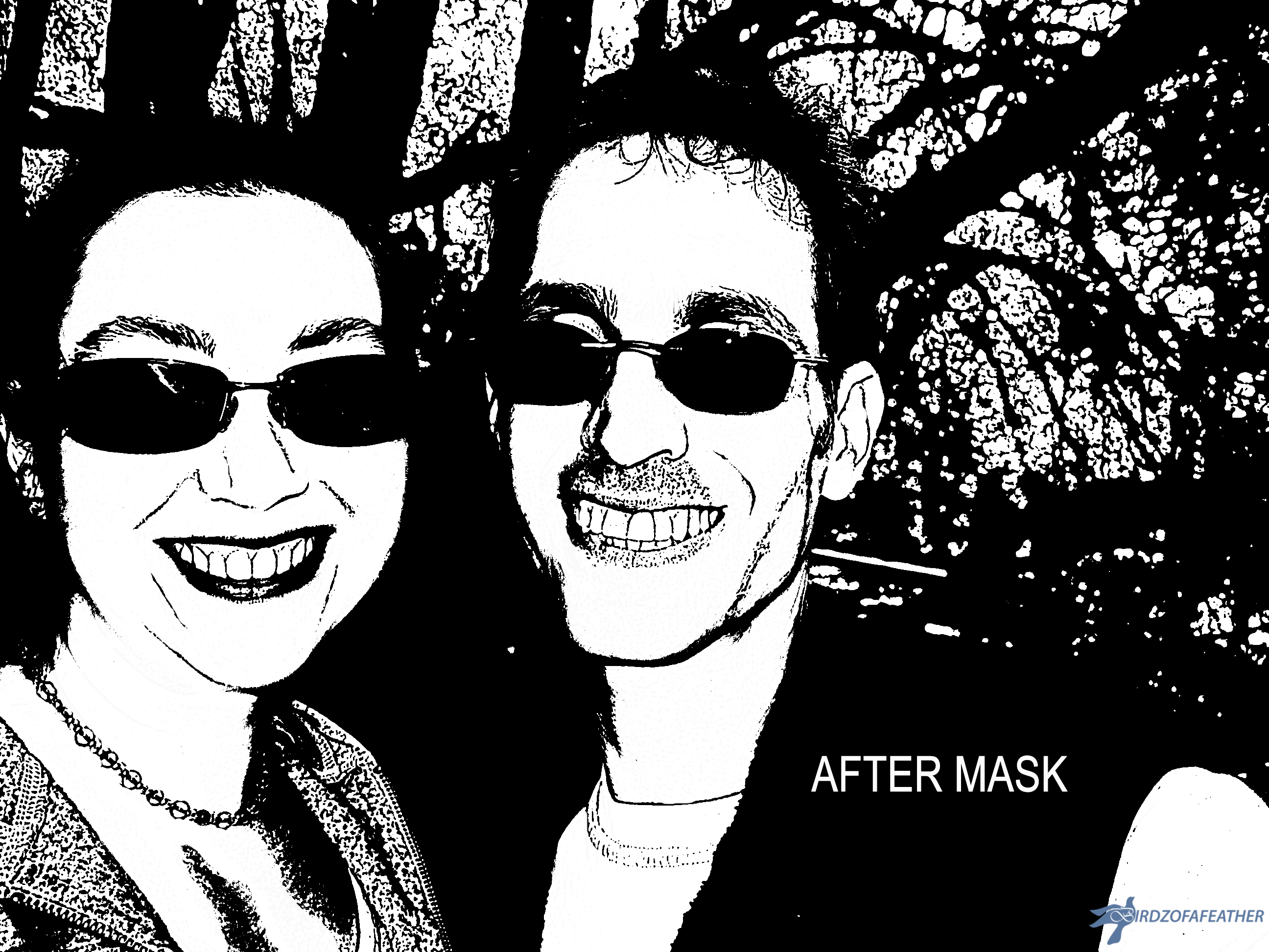
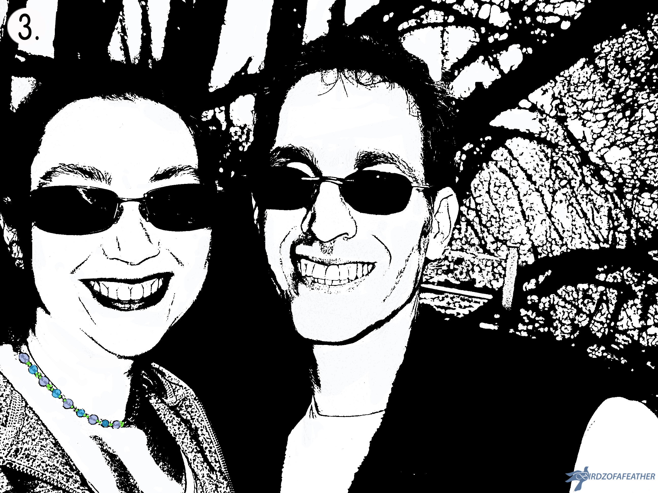
In the pictures above, you can see the difference removing the noise makes. When you are done cleaning up the noise, you'll end up with something like the second picture shown above.
You get a defined graphic look imparted by the poster edges added from the filter gallery to the Copy layer and the clean look of the lower threshold added to the Line Art layer.
Now for the fun part: the next step is to add the colour!
Using Masks to Add Layers of Colour to the Line Art
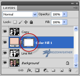
I used an adjustment layer to apply a colour mask for each element of the line art I wanted to colour by filling the mask with solid colour and then removing colour from areas that didn't need it.
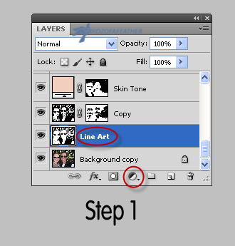
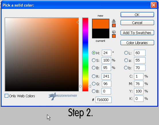
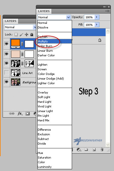
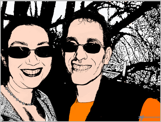
The first adjustment layer I did was the skin tone. I highlighted the line art layer and then clicked on the Adjustment icon (it's the black and white icon, or 4th from the left at the bottom of the layers panel), then I chose solid colour. I picked a skin tone in the orange family with the selector and clicked OK. Click on the Layers drop down menu and choose Multiply. See picture 1.
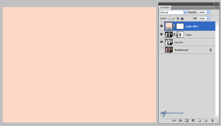
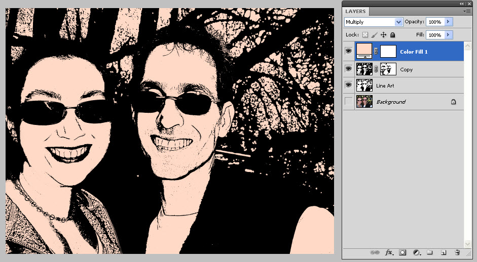
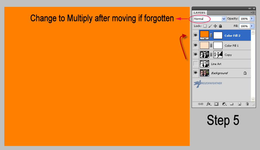
Then move the new layer above the 'Copy' layer. If you forget to click Multiply, when you do this you'll see nothing but solid colour (second picture). Don't worry, you can just select Multiply after it's moved and you'll see the rest of the line art showing through along with the chosen colour. See picture 3.
Removing Colour
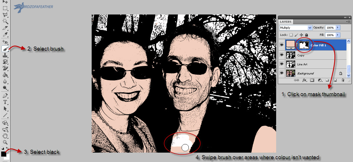
Now, follow the steps in picture 1 as follows:
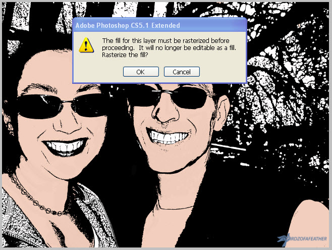
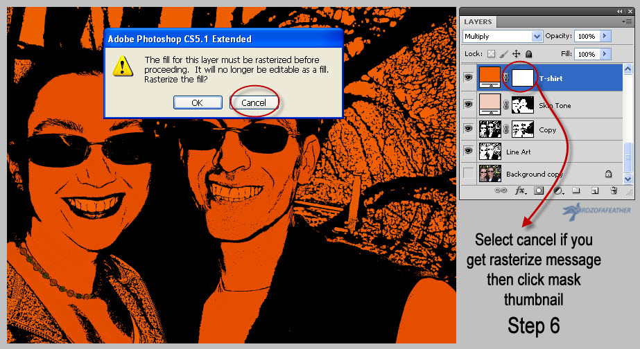
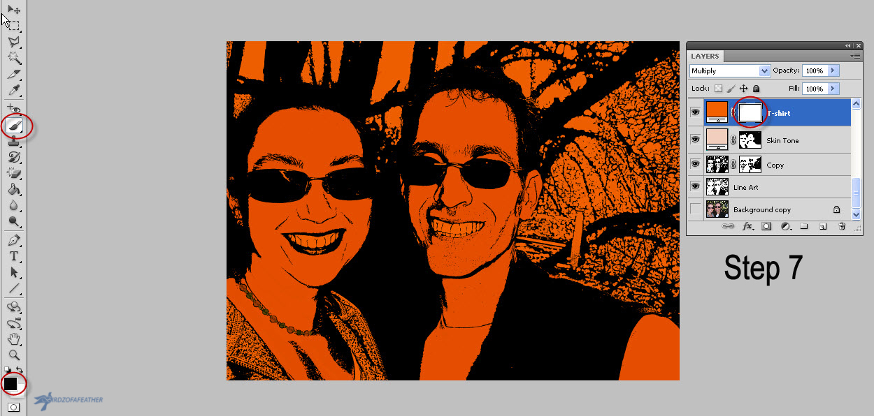
Click on the white thumbnail in the 'Color fill 1' layer (which you can rename to 'skin tone' if you like) and select the brush tool. If black isn't already your foreground colour, switch from white to black now. Then brush over the areas that you DON'T want to be skin tone. In my case, that was everywhere but the face and neck. If you click on your artwork after selecting the brush tool and get a message that reads 'the fill for this layer must be rasterized before proceeding', it means you forgot to click on the mask thumbnail (the second one to the right side of the layer). Click cancel and click on the mask then continue with the brush. See picture 2.
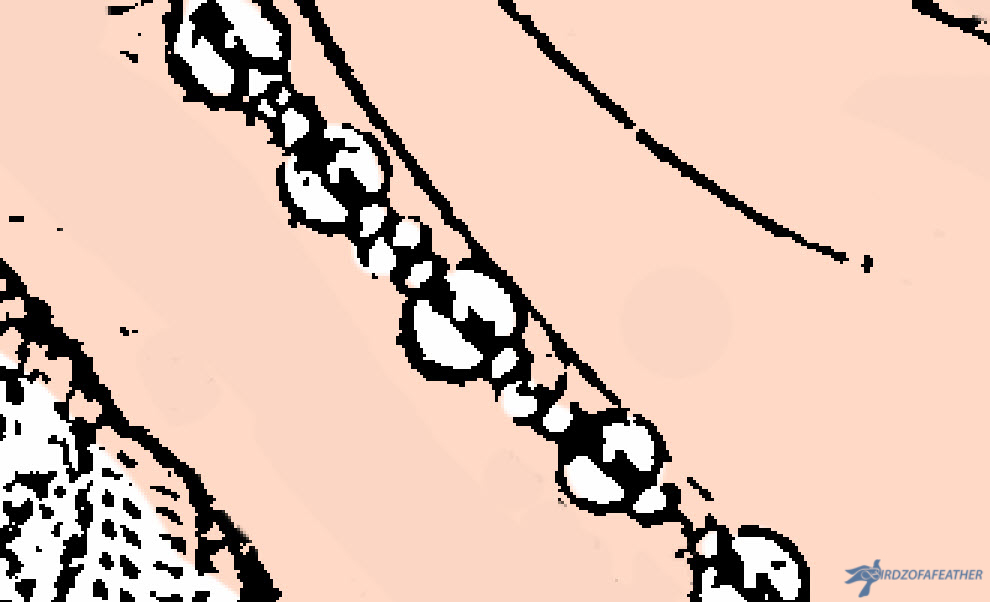
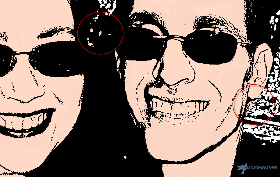
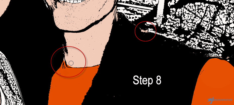
You will likely need to zoom in and enlarge your artwork to remove all the colour that isn't needed (like for the beaded necklace shown in the third picture). You'll also need to adjust the size of the brush (the keyboard shortcut is to use the right square bracket key to make a brush bigger and the left square bracket key to make it smaller). In the last picture, you can see some of the enlarged areas circled that need finessing. If you're still a little confused at this point, I'm going to review all these instructions again in Step 8 for the second layer of colour.
Wash, Rinse, Repeat (so to Speak)!
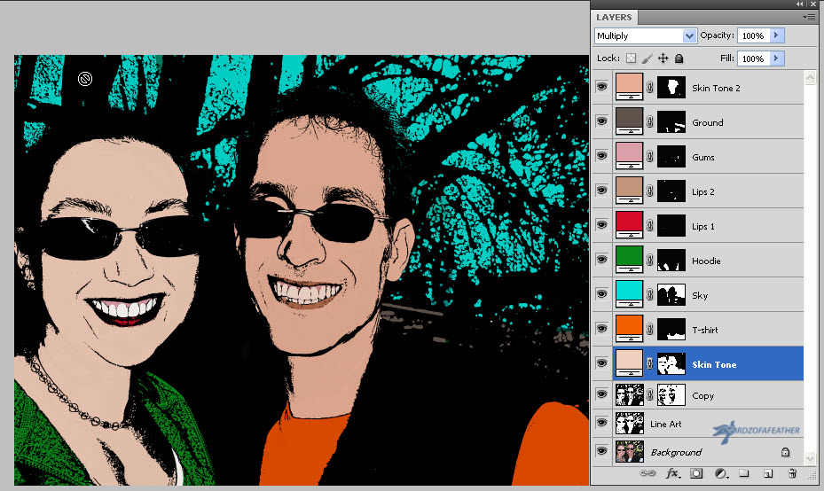
Now it's just a matter of repeating the same steps to colour your next layer (as you'll see reviewed again in the next step).
You can add whatever colours you like. You can make it simple and only do a few layer masks or add as many as you like to really make it pop - it's up to you!
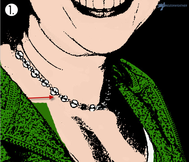
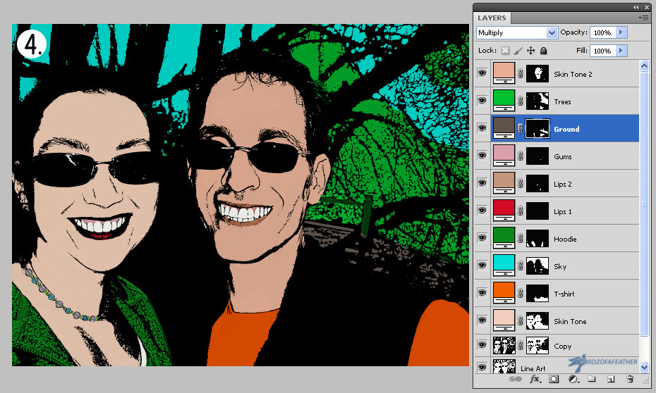
In the sample shown above, I used 9 layer masks: 1. Skin Tone (flesh), 2. T-shirt (orange), 3.Sky (blue), 4. Hoodie (green), 5. Lips (1 - red) 6. Lips (2 - natural) 7. Gums (mid-tone flesh) 8. Ground and 9. Skin tone (darker flesh tone for male). It can be helpful to rename the layers as you go. Later you'll see I also added some greenery in the trees.
Review of Steps to Add Layers and Colorize
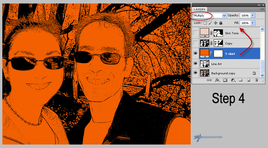
Using the second layer as an example, I painted over with the brush tool to hide all but the T-shirt leaving it orange (last picture).
Here again are the steps listed out so you can follow along with the pictures:
- Highlight the Line Art layer. Add adjustment Layer (the black and white icon, 4th from the left at the bottom of the layers panel).
- Select a colour from the colour picker.
- On the Layers drop down menu, select Multiply.
- Change the name of layer to reflect where you are placing the colour. Move the new layer to the top by dragging it.
- If you forget to select Multiply, the layer will look solid when you move it; in that case, just select multiply after it's moved.
- Click on the white thumbnail (don't forget to do this: if you are on the picture thumbnail instead, you will get a message asking if you want to rasterize before proceeding. Select cancel and then select the white thumbnail to get back on track).
- Select black as your colour. Use the brush tool to remove colour in the areas you don't want it. If you accidentally erase a colour, you can get it back by switching the colour swatch to white and wiping over those areas with the brush tool to restore it.
- Reduce the size of the brush tool in order to get into tighter areas where you want to remove colour. Also increase the zoom of the artwork itself so you can see better detail of what you're removing. The keyboard shortcut for zoom, is Control + (or Command + on a Mac). Control - (Command - on Mac) will zoom out the screen again.
Tips
To remove colour cleanly in areas where you don't want to erase it, move the brush away from the line (as shown above) instead of along it. You'll have better control. (Picture 1)
As you review your final work, you may notice there are areas you missed on the previous layer. In the second picture above you'll notice that I haven't done the teeth yet; they should be white. If you forget to remove a colour, you can always go back and fix it later. Just highlight the relevant layer (in this case the skin layer), click on the mask thumbnail then remove the colour as you normally would. (Picture 2)
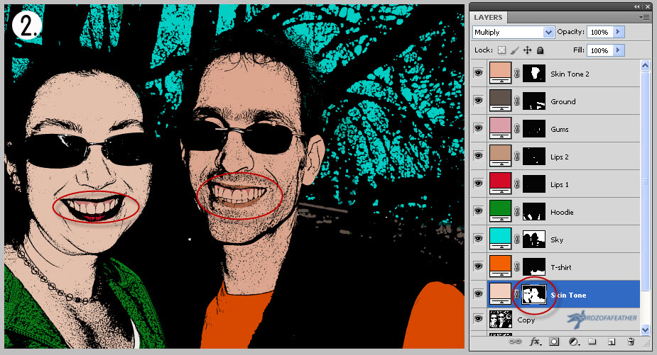
For the beaded necklace, I got lazy and just added colour directly onto the copy layer by resizing the brush to the same size as the beads, changing the opacity of the colour to be transparent (about 50%) and clicking once over each one. Just realize that if you do that, it will be a permanent change that can't be undone later - that's why a mask is better to use! (Picture 3)
If you have a lot of colour, it helps to rename all the layer masks to identify the target colour of each layer as you go. (Picture 4)
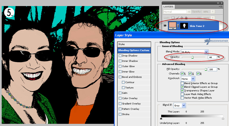
For my last layer, I decided to change the skin tone on the man but then realized it looked too dark. You can double click on the mask icon, then easily adjust the opacity of the colour with the slidebar (as you can see in the last picture, I changed the opacity to 49%). Alternately, if you prefer, you can click on the mask thumbnail and select a new colour altogether instead of playing with transparency! (Picture 5)
Learning More About Photoshop Layer Masks
If you want to learn more advanced techniques on how to use layer masks in Photoshop, check out the attached YouTube video from Phlearn. I found it a helpful review when I created this I'ble!
Phlearn is an excellent resource for learning more about any Photoshop technique in general, so you may want to subscribe to the channel while you're at it!
A Pop Art Tray Makes a Great Gift!
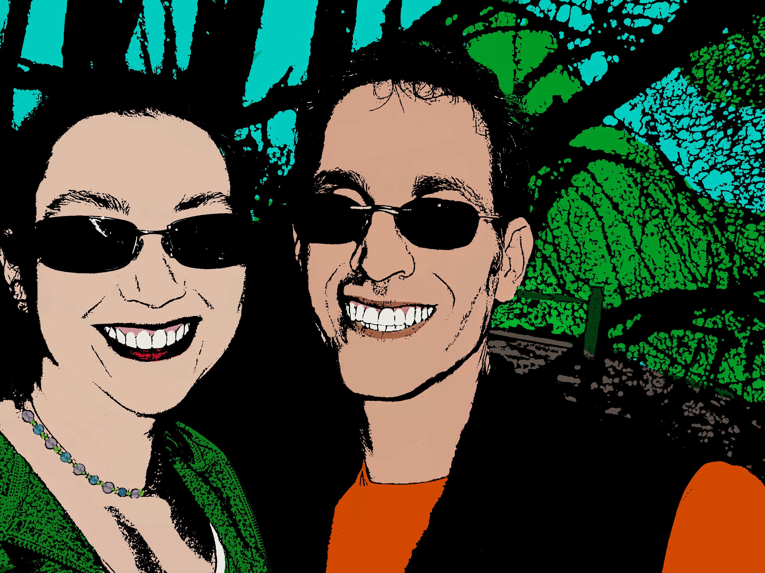
When my picture was complete, I printed it 8" x 10" through a photography store (you can scale your picture to any size that fits your particular tray). I removed the glass from the tray, popped the picture in and replaced the glass.
A pop art serving tray makes a unique and thoughtful gift; I made one for a friend using a picture of the kids. It's now a treasured keepsake that documents when the kids were young - and when I was still taller than them!

Fall Into Fabulous
One of the things I love most about blogging is connecting with other makers, and this Fall we’ve created something truly inspiring together.
Grab 16 digital goodies from top creators — planners, recipes, colouring books & more — including our Beginner Crochet e-Book!
Every dollar of our commission goes straight to Alzheimer’s research — a cause close to our hearts. Your purchase through this link means you’re not just treating yourself; you’re making a real difference.
Grab it now — the bundle is only available for a limited time! Let’s make this Fall fabulous and full of hope. 💜