How to Make a Sleek and Simple Website With Bootstrap 4
by Vixenary in Design > Websites
1589 Views, 3 Favorites, 0 Comments
How to Make a Sleek and Simple Website With Bootstrap 4
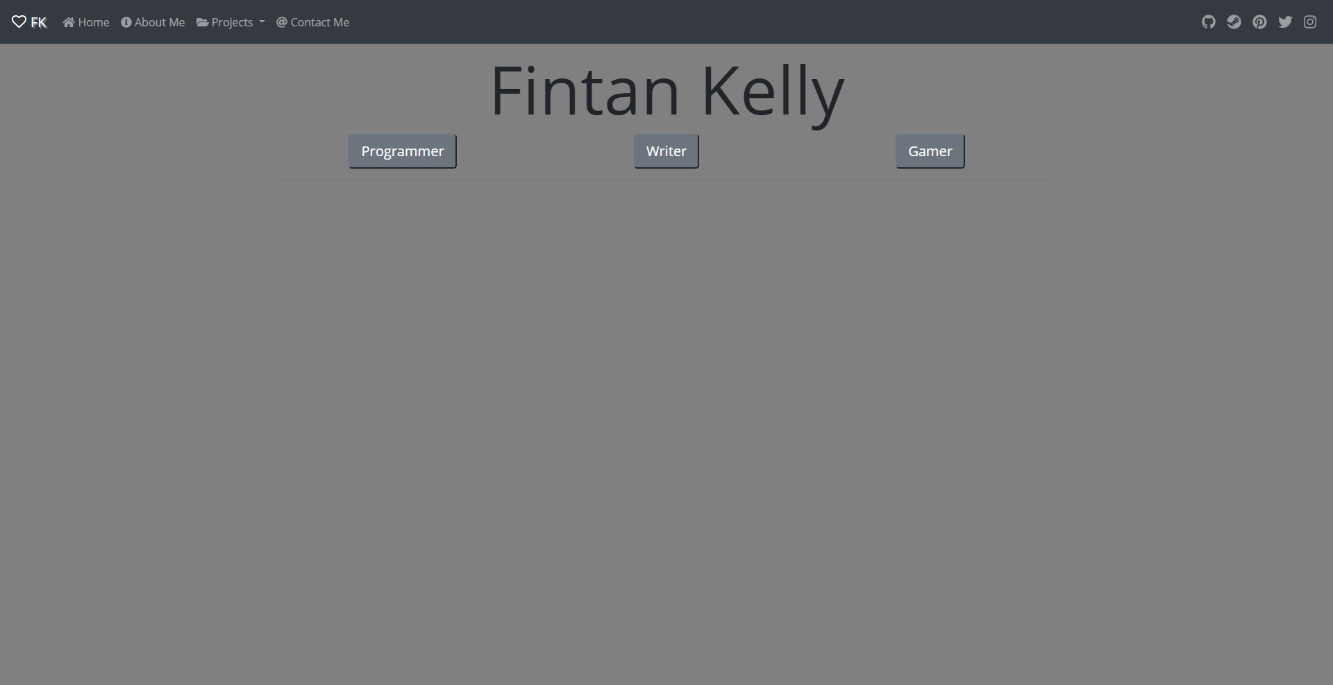
The purpose of this Instructable is to give those familiar with programming - HTML or otherwise - a simple introduction to making an online portfolio with Bootstrap 4. I’ll walk you through the initial setup of the website, how to create a few different content blocks, and a few problems you might run into.
The portfolio is broken into a number of smaller steps to try and make it more manageable: HTML frame, CSS frame, Javascript frame, navigation bar, and the homepage (with content blocks).
If my explanations for something still leave you confused, feel free to leave a comment with your questions, suggestions, or google the element you’re confused about. There are many resources available for programming websites and Bootstrap.
Note: This guide isn’t all-encompassing and shouldn’t be used as a substitute to learn how to program in HTML, CSS, or Javascript.
Required Resources
Optional Resources
If you would like to skip to the full example or take a look at the repository:
Note: I will be using Sublime in the pictures for my examples if you would like to follow along with the same text editor.
Setting Up
Folder Setup
- Create a folder somewhere where you can store everything we’re going to be downloading. This will be your root directory for the portfolio.
- Create a folder inside of that one named “bootstrap”
- Create another folder inside your root portfolio folder that’s name “jquery”
Portfolio Folder
|----- bootstrap
|----- jquery
Bootstrap 4
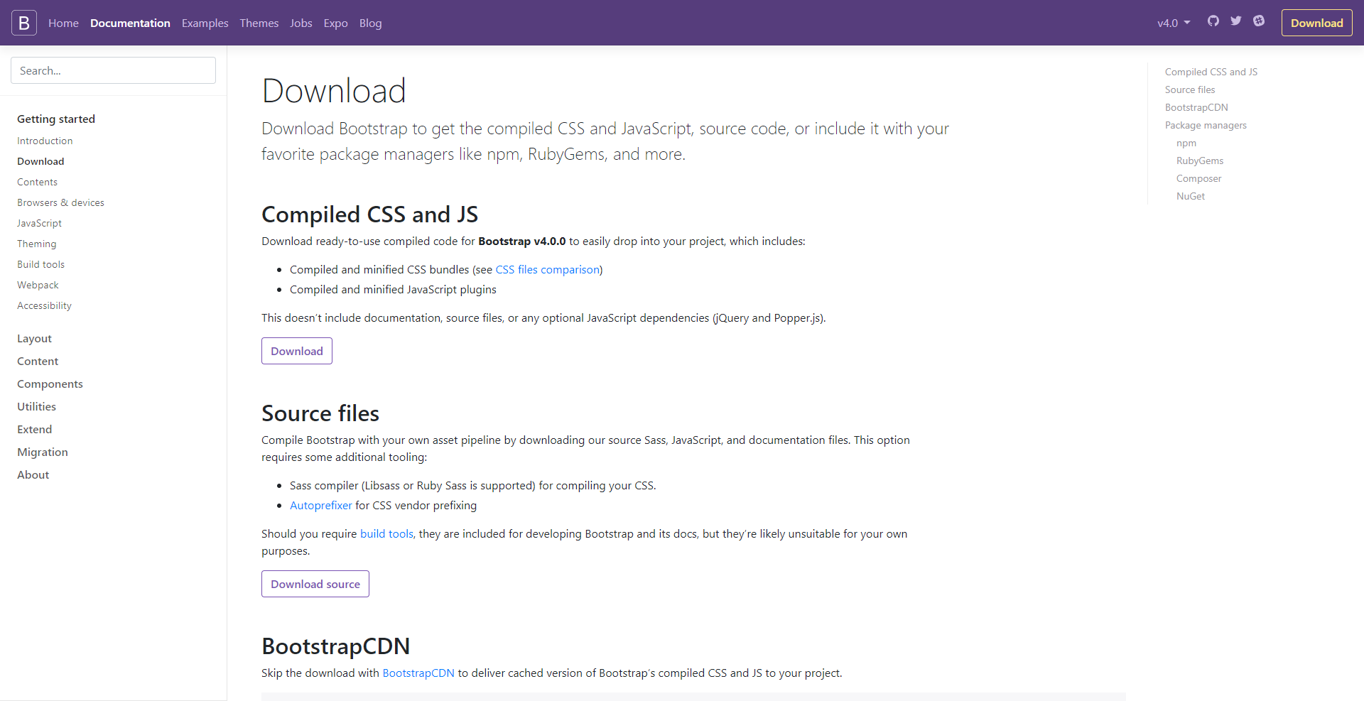
- Visit their website and click the “Download” button below the “Compiled CSS and JS” section.
- Save the .zip file in your “Downloads” folder or another convenient location.
- Open the .zip file and extract the “css” and “js” folders to the “bootstrap” folder that you made earlier.
jQuery
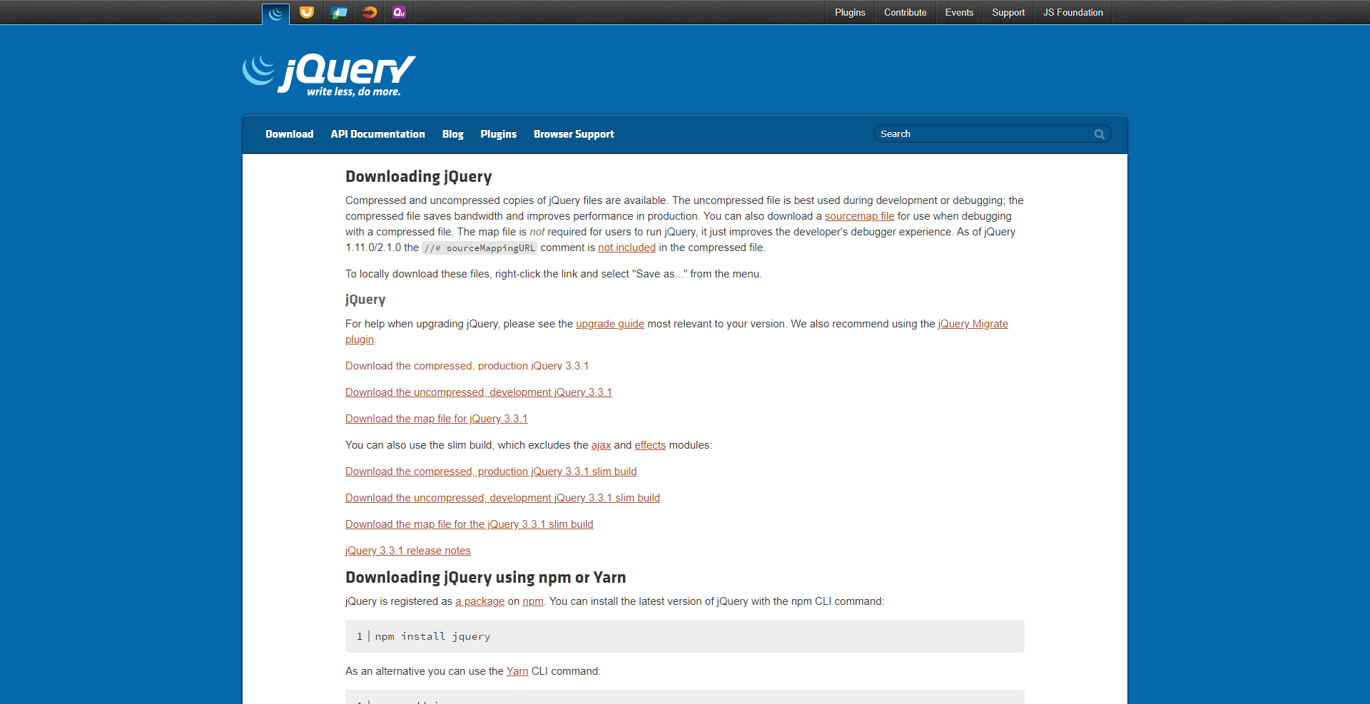
- Visit their website and download the “uncompressed, development jQuery 3.3.1”
- Save that file inside of the “jquery” folder you made earlier.
All of the frameworks are now ready for when we start working on the actual portfolio.
HTML Frame (index.html)
<!DOCTYPE html>
<html lang="en">
<head>
	<!-- Personal Details -->
	<title>Your Name</title>
	<link rel="shortcut icon" href="images/icon/heart-512.png" />
	<link rel="icon" href="images/icon/heart-512.png" />

	<!-- Structure Definitions -->
	<meta charset="utf-8">
	<meta name="viewport" content="width=device-width, initial-scale=1">

	<!-- Bootstrap 4.0 -->
	<link rel="stylesheet" href="bootstrap/css/bootstrap.css">

	<!-- jQuery 3.3.1 -->
	<script src="jquery/jquery-3.3.1.js"></script>

	<!-- Have to load Bootstrap JS after jQuery -->
	<script src="bootstrap/js/bootstrap.bundle.js"></script>

	<!-- Google Web Fonts: Open Sans -->
	<link rel="stylesheet" href="https://fonts.googleapis.com/css?family=Open+Sans">

	<!-- FontAwesome 5.0.8 -->
	<script defer src="https://use.fontawesome.com/releases/v5.0.8/js/all.js"></script>

	<!-- highlight.js -->
	<script src="hightlight/highlight.pack.js"></script>
	<link rel="stylesheet" href="highlightjs/styles/atelier-cave-dark.css">

	<!-- Personal Imports -->
	<link rel="stylesheet" href="style.css">
</head>
<body>
	<!-- Navigation Bar (Horizontal 100% Width, Z-Index: 9999) -->


	<!-- Homepage -->


	<!-- Javascript Calls -->
	<script src="javascript.js"></script>
</body>
</html>
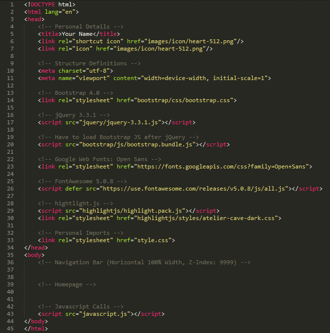
This frame is nothing overly complex, but I want to explain the general purposes of the setup.
Bootstrap JS After jQuery
There seems to be some sort of overlap between Bootstrap's Javascript file and jQuery's. I didn't test to see how extensive this overlap is, but one example is the dropdown functionality that I use in the navigation bar. If you load in Bootstrap first, the dropdown button doesn't work.
FontAwesome
If you've done any web development, chances are you know what FontAwesome is. However if that's not the case, it's an icon set that includes a toolkit for extra customization. It's incredibly useful if you're like me and have absolutely no artistic talent at all.
hightlight.js
This framework allows for dynamic code highlighting on web pages. You can import it like the rest of the frameworks I use if you only use common programming languages, but there's also an option to download a custom set of languages. I chose the latter option because of a few macroing and ini languages, but it's entirely up to you.
Note: Be aware of the places where I use hard-coded links to files like the two icons and highlight.js. Also, since only Bootstrap and jQuery are required, feel free to add or remove any other frameworks. If you do remove any, remember to remove the lines of code that correspond later on.
CSS Frame (style.css)
/*
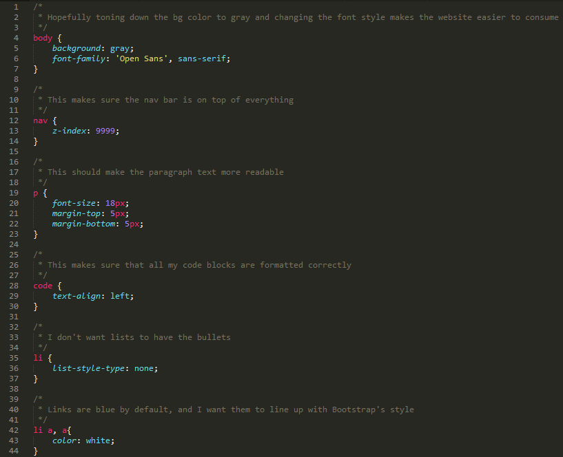
* Hopefully toning down the bg color to gray and changing the font style makes the website easier to consume */ body { background: gray; font-family: 'Open Sans', sans-serif; }/* * This makes sure the nav bar is on top of everything */ nav { z-index: 9999; }
/* * This should make the paragraph text more readable */ p { font-size: 18px; margin-top: 5px; margin-bottom: 5px; }
/* * This makes sure that all my code blocks are formatted correctly */ code { text-align: left; }
/* * I don't want lists to have the bullets */ li { list-style-type: none; }
/* * Links are blue by default, and I want them to line up with Bootstrap's style */ li a, a{ color: white; }
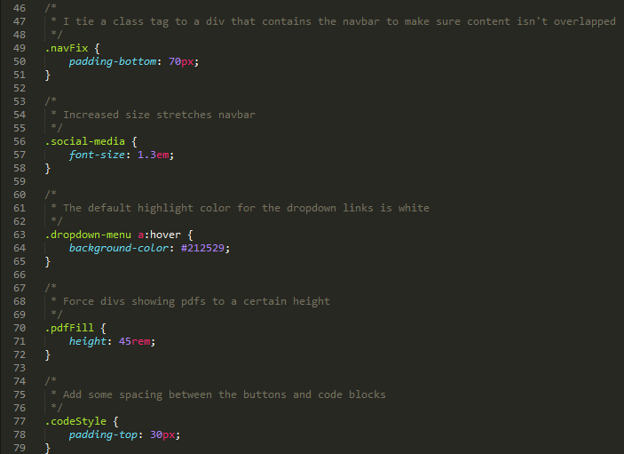
/* * I tie a class tag to a div that contains the navbar to make sure content isn't overlapped */ .navFix { padding-bottom: 70px; }
/* * Increased size stretches navbar */ .social-media { font-size: 1.3em; }
/* * The default highlight color for the dropdown links is white */ .dropdown-menu a:hover { background-color: #212529; }
/* * Force divs showing pdfs to a certain height */ .pdfFill { height: 45rem; }
/* * Add some spacing between the buttons and code blocks */ .codeStyle { padding-top: 30px; }
I included the content-based CSS elements in this frame to try and save you some time later on. They're all very simple and are mostly quality-of-life changes that make interacting with the portfolio easier for readers.
nav z-index
I have a very limited amount of web development experience, so I'm not sure if this is a common problem when implementing Bootstrap's navigation bar, but without any front-to-back orientation specification, the navigation bar will actually appear under other content like Bootstrap's Cards. This is most noticeable with the collapsible navbar, but I included the index change anyway for safety.
code alignment
Since I typically use Bootstrap's "justify-content-center" and "text-center" classes to align elements, I don't want my code to inherit that center-aligned nature. This is easily fixed by overwriting any alignment changes and making code tags left-aligned: this preserves tab-spacing in code.
navFix padding
When Bootstrap's navigation bar is stuck to the top of the page content will load under it. I believe this happens because the navbar is actually stuck to the top of the viewport instead of the page itself. Regardless this is fixed by increasing the space between the navbar and the rest of the content.
pdf height
The default height of pdf files is incredibly small. It's essentially unreadable, so I changed the height to try and give enough room for roughly one page at a time.
Javascript Frame (javascript.js)
/*
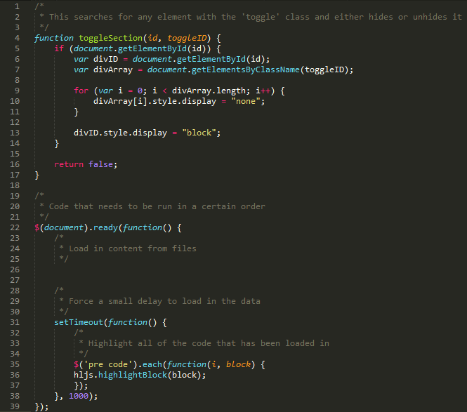
* This searches for any element with the 'toggle' class and either hides or unhides it */ function toggleSection(id, toggleID) { if (document.getElementById(id)) { var divID = document.getElementById(id); var divArray = document.getElementsByClassName(toggleID);for (var i = 0; i < divArray.length; i++) { divArray[i].style.display = "none"; }
divID.style.display = "block"; }
return false; }
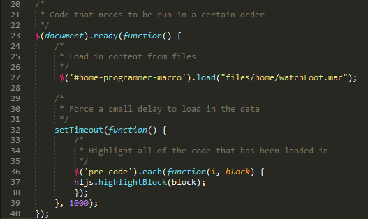
/* * Code that needs to be run in a certain order */ $(document).ready(function() { /* * Load in content from files */
/* * Force a small delay to load in the data */ setTimeout(function() { /* * Highlight all of the code that has been loaded in */ $('pre code').each(function(i, block) { hljs.highlightBlock(block); }); }, 1000); });
To make this portfolio easy to modify and manage, I decided to use a one-page format. It keeps everything local for the most part and makes the content load quicker.
toggleSection
I used class values to manage what content needs to be shown or hidden because most of the time I'm using divs to separate and group multiple elements together. You can use this to group together individual buttons as well, but it requires an extra check before setting the "block" display to allow for no content to be shown.
document loading
I included this because it's generally messy to include a bunch of independent programming code in regular HTML files. We can use this method of dynamic highlighting to force the process to take place after we load in content from other files.
$('#mq2-intro').load("files/tutorials/mq2/mq2-intro/content.html");This is an example of how we'll load in content.
Navigation Bar
<div class="navFix">
	<nav class="navbar navbar-expand-md bg-dark navbar-dark fixed-top">
		<!-- Brand -->
		<a class="navbar-brand" href="#" style="text-shadow: 2px 2px 2px #aaa;"><br>			<i class="far fa-heart"></i>
			Initials
		</a>

		<!-- Toggler/Collapsible Button (Mobile) -->
		<button class="navbar-toggler" type="button" data-toggle="collapse" data-target="#collapsibleNavbar"><br>			<span class="navbar-toggler-icon"></span><br>		</button>

		<!-- Navbar Links (Left Side) -->
		<div class="collapse navbar-collapse" id="collapsibleNavbar">
			<ul class="navbar-nav">
				<li class="nav-item">
					<a class="nav-link" href="#home" onclick="toggleSection('home', 'toggle');" data-toggle="collapse" data-target=".navbar-collapse.show"><br>						<i class="fas fa-home"></i>
						Home
					</a>
				</li>
				<li class="nav-item">
					<a class="nav-link" href="#about-me" onclick="toggleSection('about-me', 'toggle');" data-toggle="collapse" data-target=".navbar-collapse.show">
						<i class="fas fa-info-circle"></i>
						About Me
					</a>
				</li>
				<li class="nav-item dropdown">
					<a class="nav-link dropdown-toggle" href="#" id="navbarDropdownMenuLink" data-toggle="dropdown" aria-haspopup="true" aria-expanded="false">
						<i class="fas fa-folder-open"></i>
						Projects
					</a>
						<div class="dropdown-menu bg-dark" aria-labelledby="navbarDropdownMenuLink">
							<a class="dropdown-item text-white" href="#tutorials" onclick="toggleSection('tutorials', 'toggle');" data-toggle="collapse" data-target=".navbar-collapse.show"><br>								Tutorials
							</a>
						</div>
				</li>
				<li class="nav-item">
					<a class="nav-link" href="#contact" onclick="toggleSection('contact', 'toggle');" data-toggle="collapse" data-target=".navbar-collapse.show">
						<i class="fas fa-at"></i>
						Contact Me
					</a>
				</li>
			</ul>

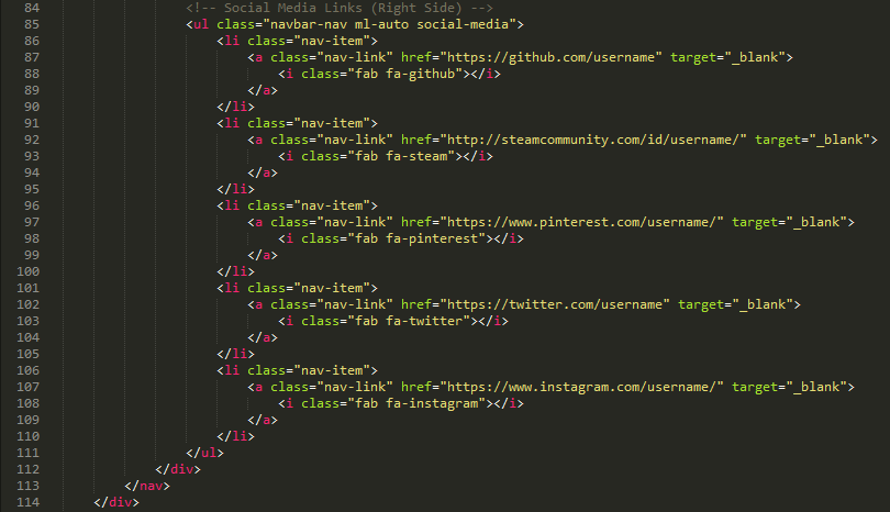
			<!-- Social Media Links (Right Side) -->
			<ul class="navbar-nav ml-auto social-media"><br>				<li class="nav-item">
					<a class="nav-link" href="https://github.com/username" target="_blank">
						<i class="fab fa-github"></i>
					</a>
				</li>
				<li class="nav-item">
					<a class="nav-link" href="http://steamcommunity.com/id/username/" target="_blank">
						<i class="fab fa-steam"></i>
					</a>
				</li>
				<li class="nav-item">
					<a class="nav-link" href="https://www.pinterest.com/username/" target="_blank">
						<i class="fab fa-pinterest"></i>
					</a>
				</li>
				<li class="nav-item">
					<a class="nav-link" href="https://twitter.com/username" target="_blank"><br>						<i class="fab fa-twitter"></i>
					</a>
				</li>
				<li class="nav-item">
					<a class="nav-link" href="https://www.instagram.com/username/" target="_blank">
						<i class="fab fa-instagram"></i>
					</a>
				</li>
			</ul>
		</div>
	</nav>
</div>
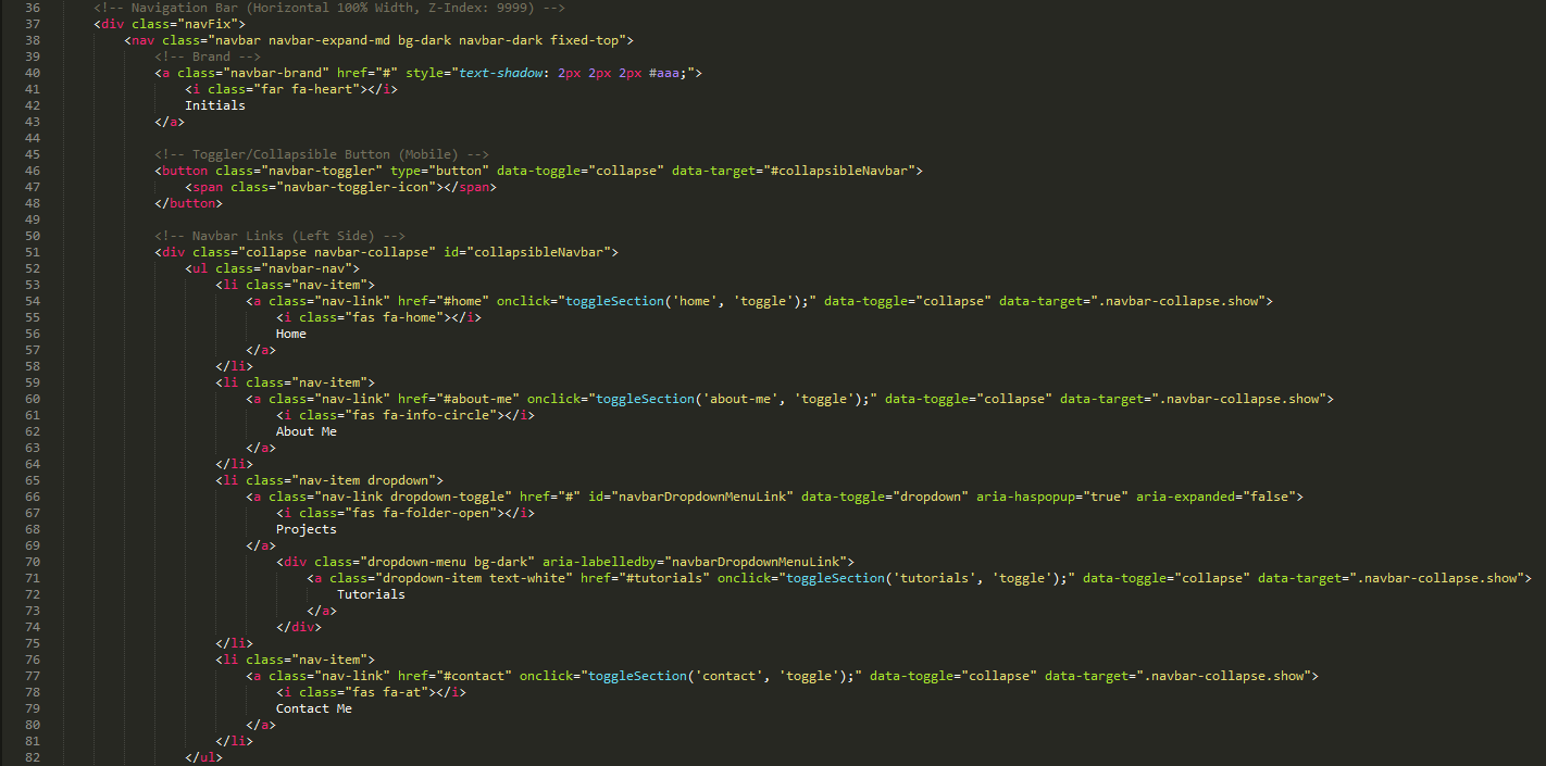
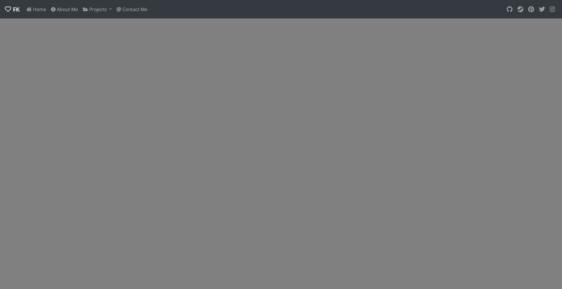
The navigation bar is the most complex element out of everything in the portfolio. The sheer combination of classes makes it kind of like a puzzle that requires you to continuously look at the rule book.
Bootstrap Functionality
Bootstrap functions essentially through different class values. Looking at the "nav" element itself, it's not too difficult to ascertain the purpose of each class:
<nav class="navbar navbar-expand-md bg-dark navbar-dark fixed-top">
Our "navbar" is the "md" (medium), "expand"able, "dark" option. And we "fixed" it to the "top." It looks confusing because it's a jumble of identifiers, but if you look at them as adjectives for the element, it becomes much easier to understand what's happening.
Brand
The brand is the typical logo and name that you see on every website in the top left. It's a tried-and-true design element that every user expects at this point.
Note: The "i" tags are actually the FontAwesome icons, and you get these tags from any icon's page.
Toggler/Collapsible Button (Mobile)
This button only shows up on mobile devices. But since we included in the "nav" declaration that the navigation bar needs to be expandable, these elements connect to each other through their IDs and "data-toggle" identifiers.
Navbar Links (Left Side)
These links entirely depend upon what categories you need for your portfolio. I included a few of the typical examples as a starting point, but no one is the same. You might not need a "Tutorials" section because you focus on crafting art sculptures. Each "li" item can be copied and pasted, so once you figure out what you need, it's easy to set the navigation up.
Note: You can technically create dropdown menus within other dropdown menus, but I wouldn't recommend it unless you're willing to add in more CSS and Javascript to make the interface look clean.
Navbar Links (Right Side)
By giving the right list of links the "ml-auto" class, Bootstrap evenly separates the two lists evenly. This creates the clean left and right side division. I decided to use this space for social media links because it's a very common and popular method to increase your presence. If that's not relevant, you can scrap these links for a search bar, login information, etc. But just remember that it's important space to use. And similar to the navbar links on the left side, you can copy and paste these as well.
Note: If you plan on using the links I already have setup, change the "username" in the actual "href" links themselves.
Homepage
<div class="toggle" id="home">
	<div class="container">
		<div class="row justify-content-center">
			<h1 class="display-1">Your Name</h1>
		</div>
		<div class="row justify-content-center" style="padding-bottom: 20px;">
			<img src="images/home/your_picture.png" class="img-fluid w-25 h-25" alt="Icon">
		</div>
		<div class="row text-center">
			<div class="col">
				<button type="button" class="btn-lg btn-secondary" href="#home-programmer" data-toggle="collapse" aria-pressed="true"><br>					Programmer
				</button>
			</div>
			<div class="col">
				<button type="button" class="btn-lg btn-secondary" href="#home-writer" data-toggle="collapse" aria-pressed="true"><br>					Writer
				</button>
			</div>
			<div class="col">
				<button type="button" class="btn-lg btn-secondary" href="#home-gamer" data-toggle="collapse" aria-pressed="true"><br>					Gamer
				</button>
			</div>
		</div> <hr style="padding-bottom: 30px;">
		<div class="collapse" id="home-programmer">
			<pre><code id="home-programmer-macro">
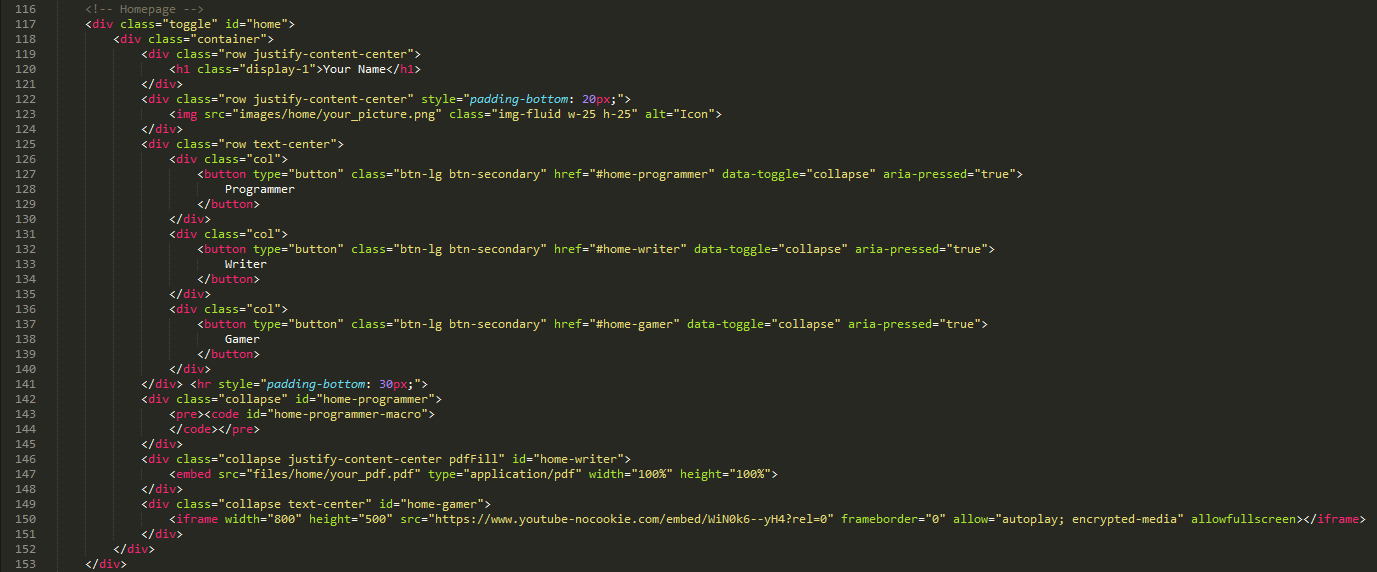
This section, and your subsequent pages of content, will depend on what you want to put in your portfolio. I obviously can't address every single content type, but I tried to include images, pdfs, videos, code blocks, some of the typical inclusions.
Table Format
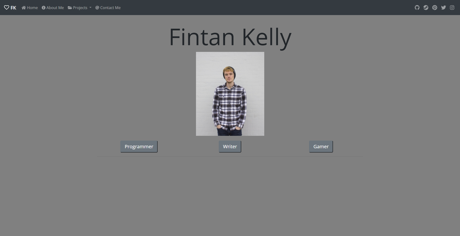
The homepage is set up to act as a table. I wouldn't rely on my amazing design skills to create your end product, but I added the different variations of row and column combinations to show that it is very dynamic and flexible. You can create 3 rows and 2 columns to have buttons on the left and content on the right, or you can do something completely different. It just takes a little experimentation.
Buttons
These function essentially like regular buttons do. The only real Bootstrap integration here stems from the styling to match up with the rest of the theme. Otherwise, create as many or as little buttons as you need to showcase your content and then make sure to match up the href links with the IDs for the divs.
Programming Code Content
The "code" tags are the default tags that highlight.js uses to manage all of the highlighting. If you remember from the javascript.js file, there's a section to load in content from other files.
$('#home-programmer-macro').load("files/home/watchLoot.mac");- The first part of this looks for the "id" of the element you want to insert the content into.
- The second part is the location of the file you want to load in.
Note: The content won't actually load in completely because there's a good chance you're editing this web page locally instead of on a server. This can be addressed by a number of different ways which I'll address at the end of the Instructable.
YouTube Video
The embedded "iframe" actually comes from YouTube itself. I won't extensively explain how to get them, but when you go to "Share" a video, there is an "Embed" option that will help you generate the code necessary to show your video on the web page.
Looking Forward
There's a very good chance that I didn't cover some element or content type that you want to include in your website. Thankfully there are many good options for you to take the next steps yourself.
Bootstrap's Documentation
Bootstrap's documentation is a great place to start if you're looking for elements that are pre-programmed and have examples you can copy and paste into your portfolio to experiment with. I didn't touch on Cards, Carousels, or Forms. I highly recommend that you look through the "Components" section to see the options.
W3Schools
W3Schools is a wonderful website where you can learn just about anything related to web programming and development. They're much smarter than I am, and they cover just about every HTML, CSS, and Javascript functionality you can think of.
Hosting Your Portfolio
This Instructable teaches your how to host your website on a few different platforms. These are the steps you need to take if you want to be able to show people, recruiters, etc. your portfolio.
Experiment and Have Fun
The only way you'll make a great portfolio is by experimenting and trying anything and everything that looks interesting. Many fancy design portfolios and websites use great transition effects or dynamic backgrounds, but none of them came pre-made.