How to Make a Graph in Excel
by prateekgpta in Circuits > Microsoft
4555 Views, 3 Favorites, 0 Comments
How to Make a Graph in Excel
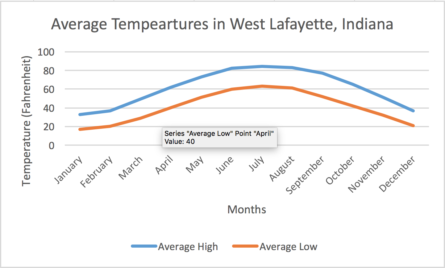
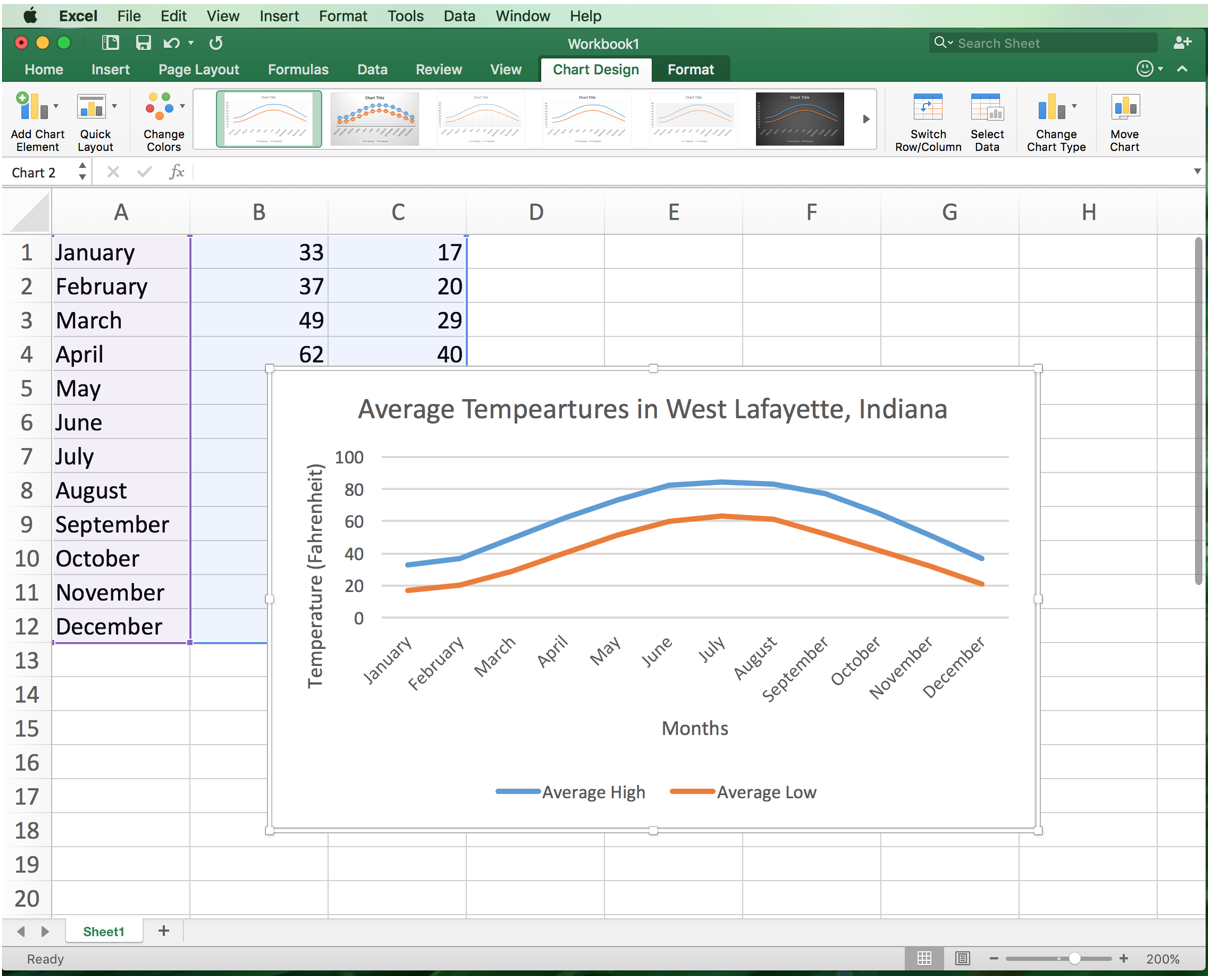
Microsoft Excel is a powerful mathematical tool used for various statistical analyses. One of the features of Excel is that is can make graphs to analyze data. We will use this program to make a simple line graph to display the average high and low temperatures every month in West Lafayette, Indiana.
Requirements:
Microsoft Excel 2016 (Mac version)
Launch Excel
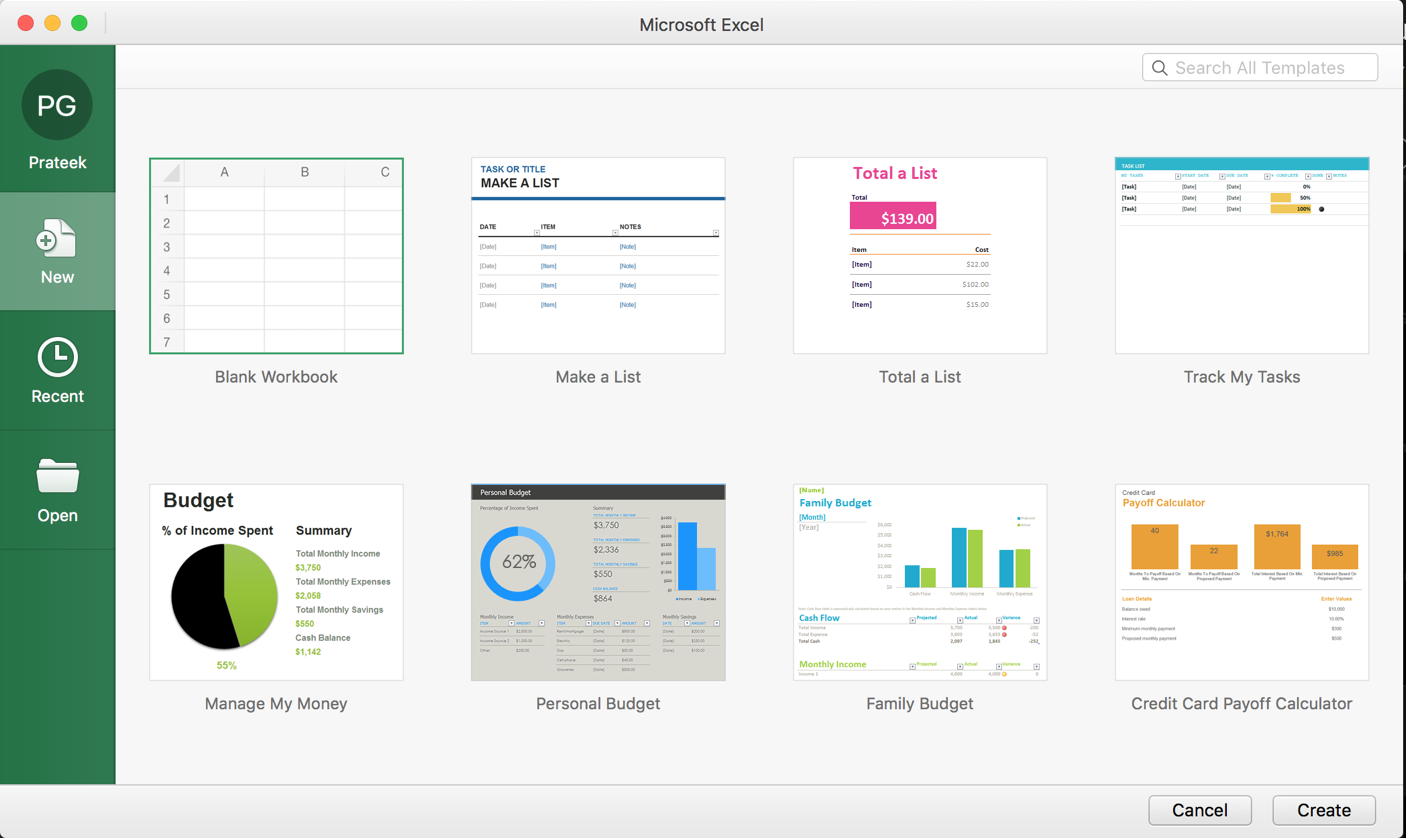
Launch Excel. You will be presented with a window as shown above. Make sure “Blank Workbook” is selected, then click the “Create” button in the bottom right corner.
Select Cell A1
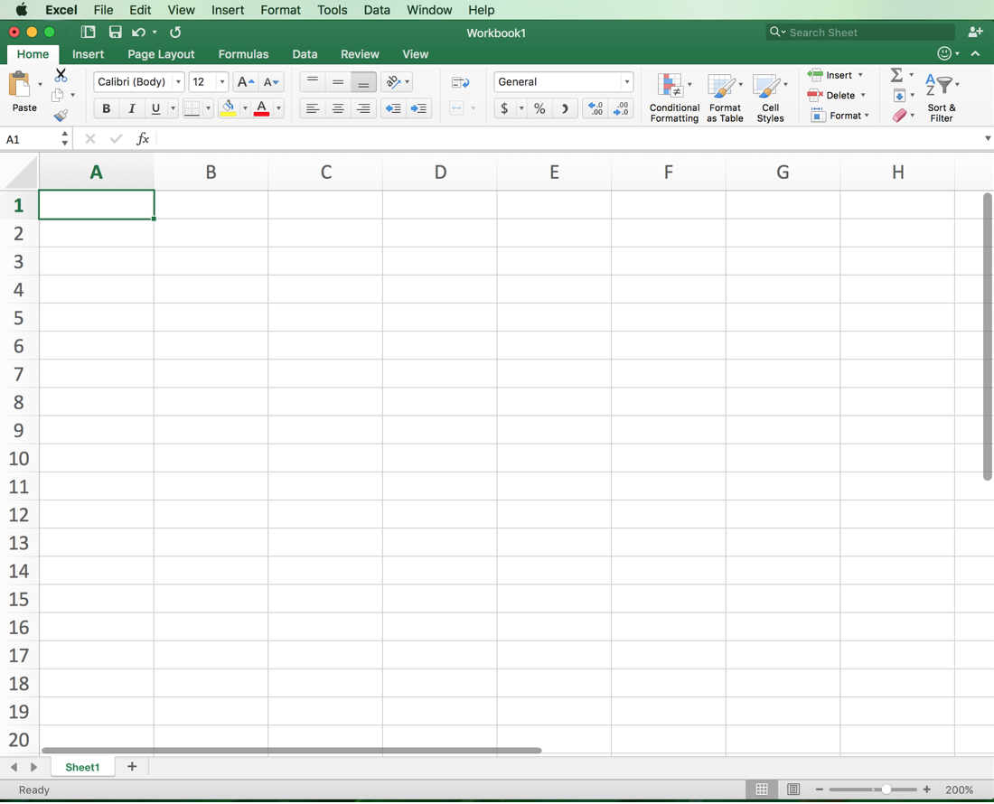
You will be presented with an Excel workbook with numerous cells. Each cell can store information. To create a graph, we need to make a table that contains the information to be graphed. Because we want the months of the year displayed on the x-axis, we will enter the months of the year in the first column of our table. Click on the top, left-most cell – cell A1.
Type "January"
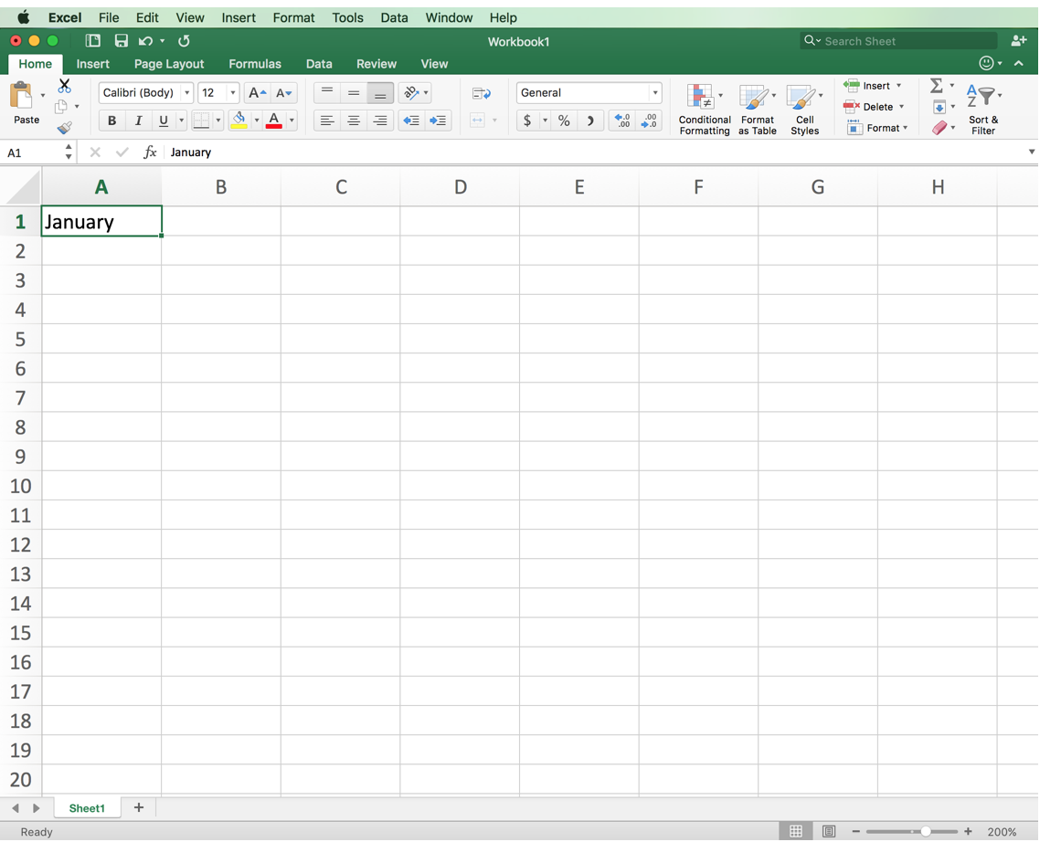
Type “January” in the cell A1.
Fill in the Remaining Months
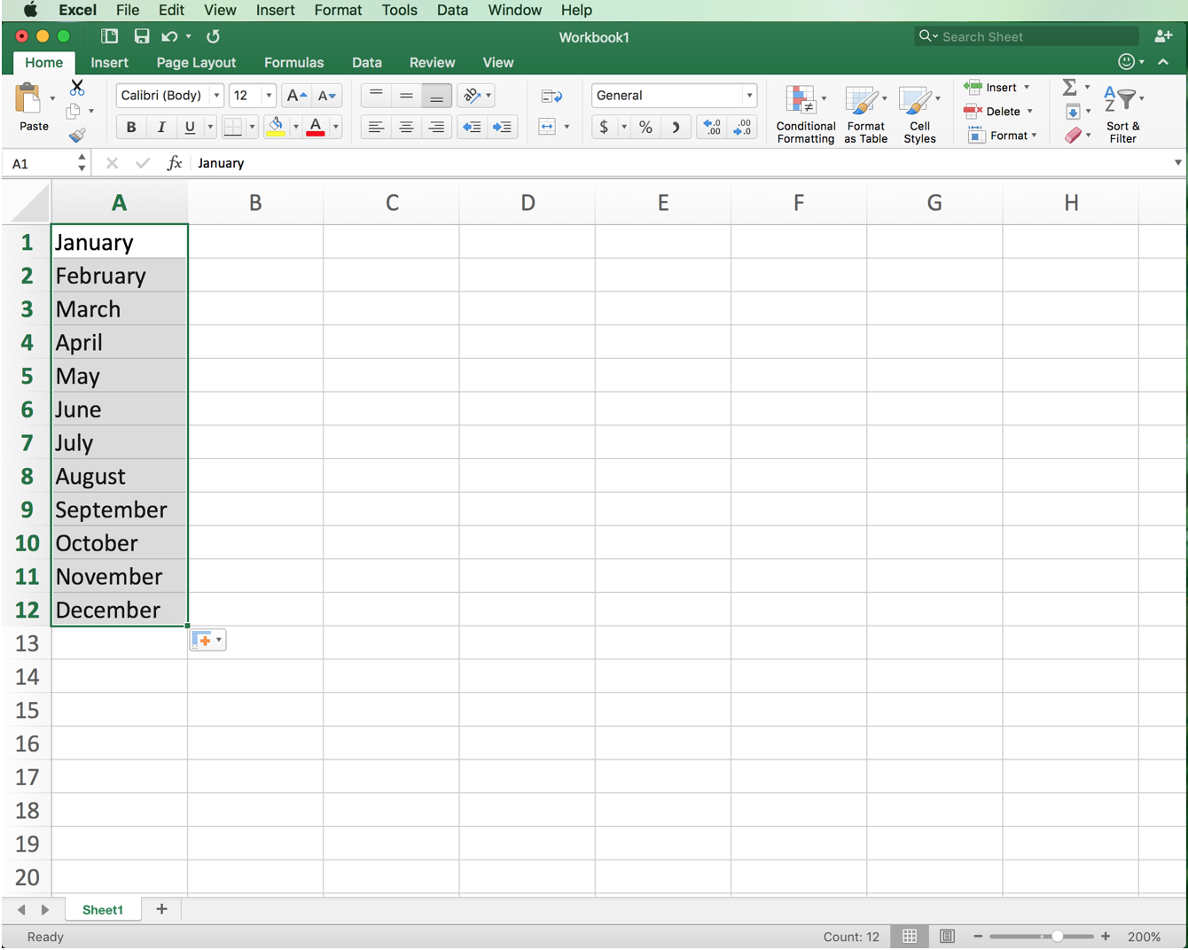
Excel is capable of understanding patterns. Because we typed “January” in the first cell, it recognizes that this is the first month of the year and it expects that the following cells in the column will contain the rest of the months. To get Excel to fill in the rest of the months, hover the curser in the bottom right corner of the cell. The curser should transform into a black cross shape. Click and drag downward until cells A1 through A12 are selected. Then release. The remaining months should be filled in.
If the months do not fill in on their own, then type each month in the cells as shown above.
Enter the Average High and Low Temperatures
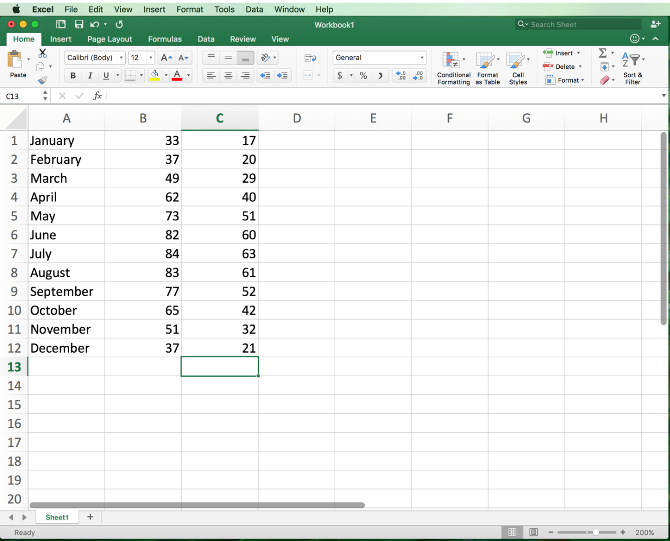

In Column B, type in the average high temperatures for each month. In Column C, type in the average low temperatures for each month. The average temperature for each month can be found in the table above.
Highlight the Table
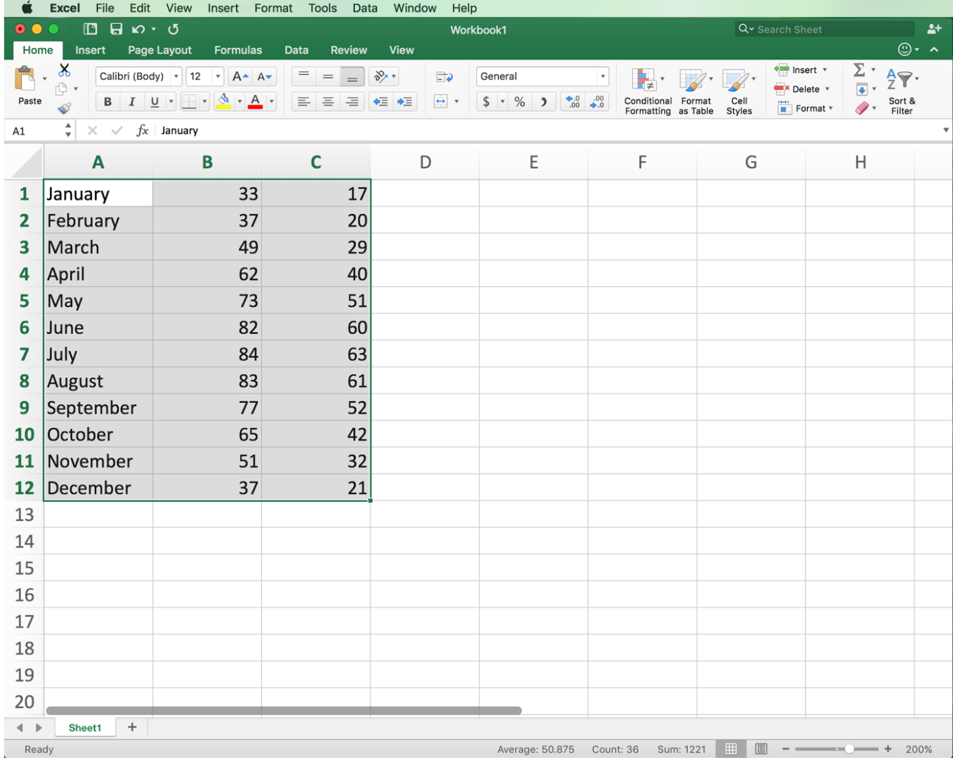
Click in cell A1. Then click and drag starting from the center of cell A1 across the entire table. The table should be highlighted completely as shown above.
Find the Line Chart Thumbnail
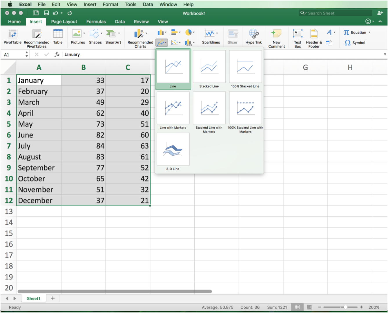
In the “Insert” tab, located at the top of the program, find the thumbnail for line chart. Click on that thumbnail.
Create a Line Graph
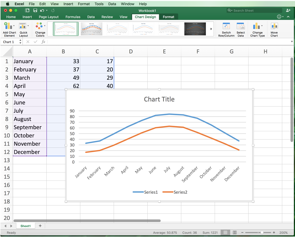
In the dropdown menu, click “Line.” This will generate a line graph of the data.
Title the Graph
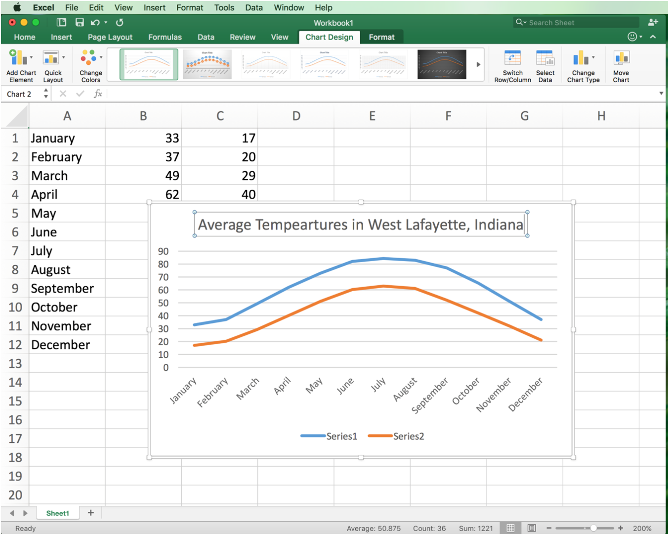
We now need to format this line graph for a presentation. We need to title the axes, make a meaningful legend, and also title the chart. To change the title, click on the textbox that says “Chart Title.” Then click again. This will place a curser in that cell, allowing you to type. Highlight the text by clicking and dragging across it and hit the delete button. This will remove the default text (“Chart Title”). Come up with a meaningful title and type it in the box (e.g., Average Temperatures in West Lafayette, Indiana.
Edit the Legend
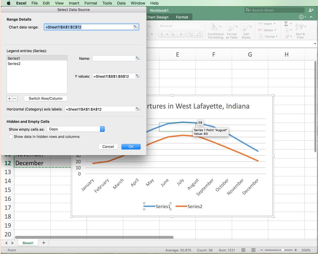
Now we will make a meaningful legend that will allow us to identify what each line on the chart corresponds to. When Excel puts in a legend, it marks the first column as “Series 1” and the second column as “Series 2,” as can be seen at the bottom of the chart. The first column contains the average high temperatures, so we need to replace “Series 1” with “Average High.” To do this, click on the legend. Then click on “Series 1.” This will put a box around it. Right click “Series 1” and click “Select Data.” This will open a new window.
Edit the Name for "Series 1"
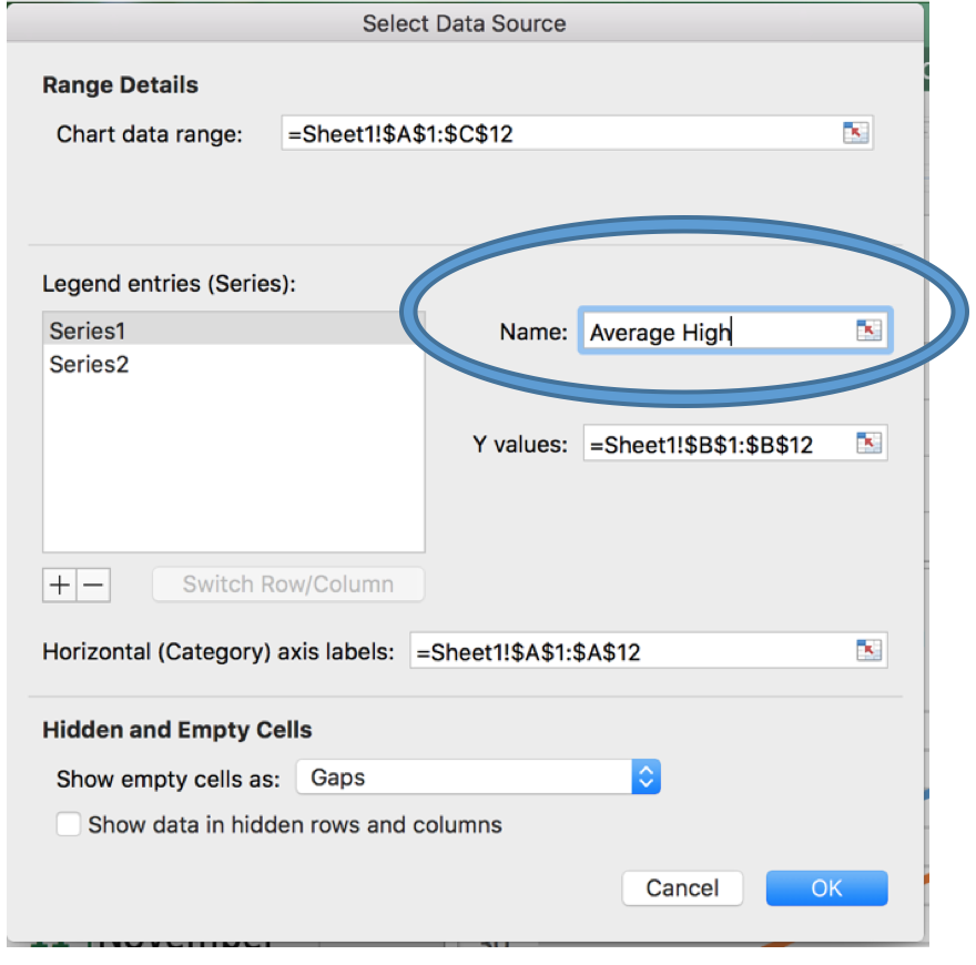
In the window that we opened in the previous step, there is a textbox titled “Name.” In that textbox, type in a meaningful title (e.g., Average High).
Select "Series 2"
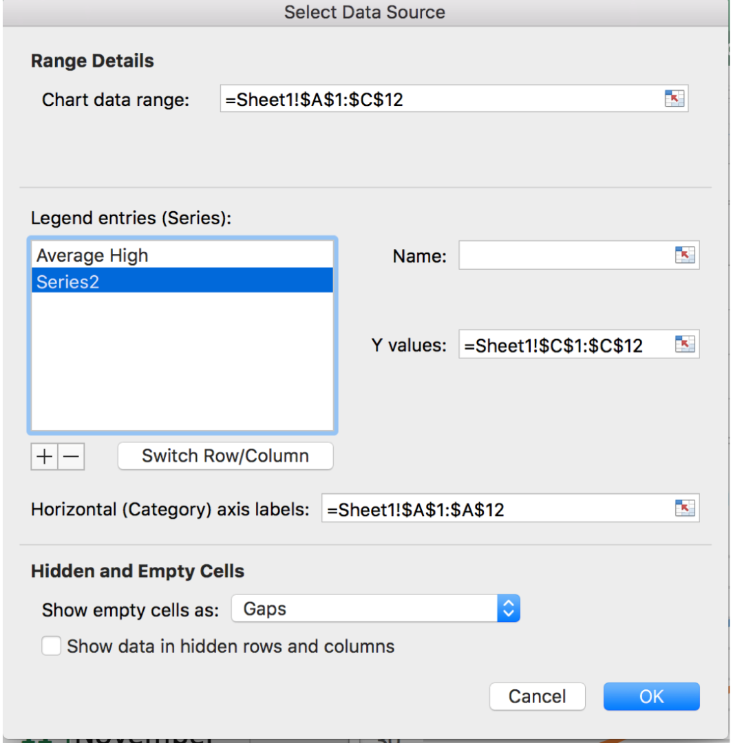
On the left-hand side of the window, there is a selection window, titled “Legend entries (Series).” Click on “Series 2” in that window.
Change the Name for "Series 2"
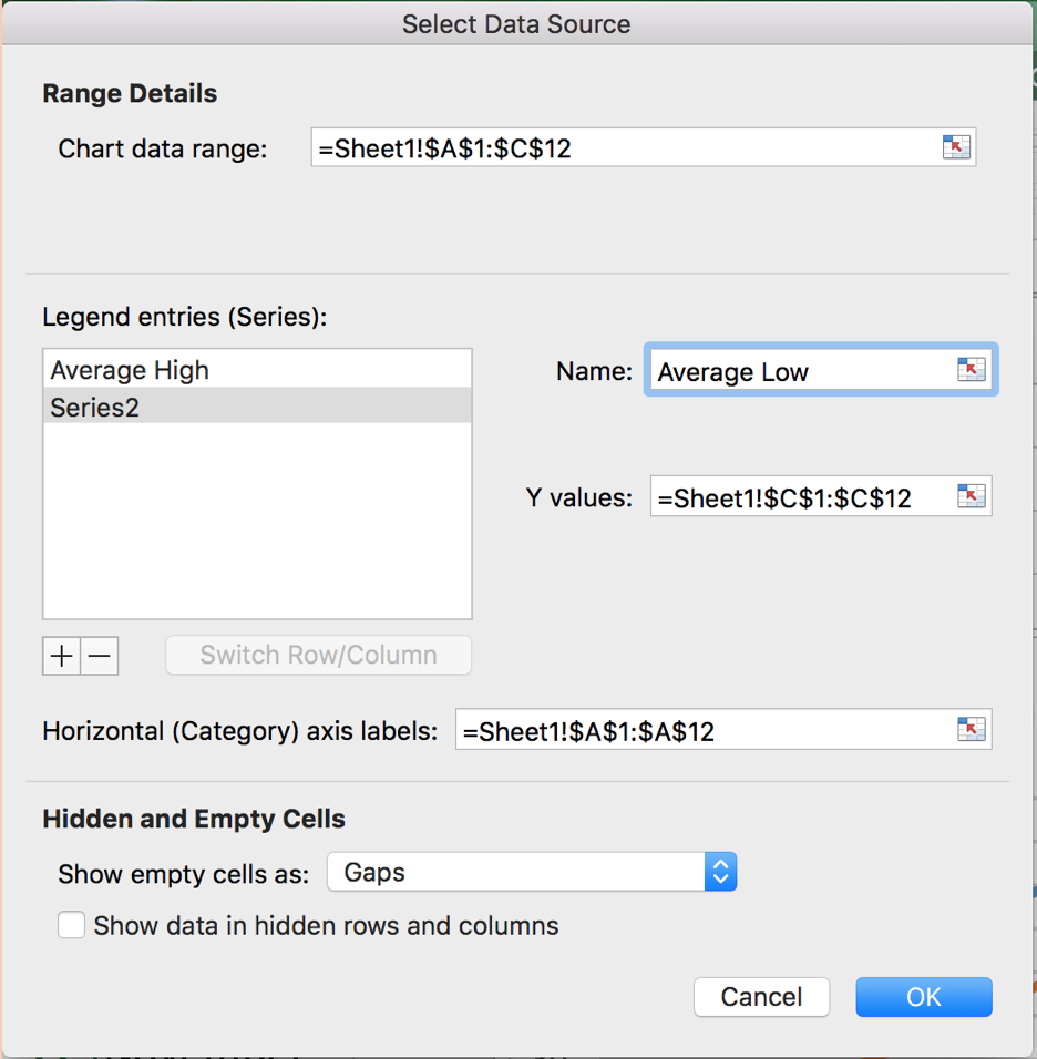
As in Step 11, type a meaningful name. As explained previously, Excel placed what was entered in the second column into series 2. Since what was entered in the second column was the average low temperatures, we should name this “Average Low.” Once you enter the name, click “OK” at the bottom of the window.
Add Textboxes for Axis Titles
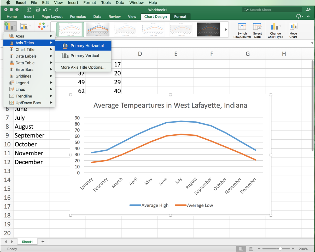
We now need to label the axes. To do this, first make sure the chart is selected. Then, go into the “Chart Design” tab at the top of the program. Click on the thumbnail on the left side that says “Add Chart Elements.” Go down to “Axes Titles,” then click Primary Horizontal. Do this again but instead of clicking “Primary Horizontal” click “Primary Vertical.” Doing this will create textboxes where axes titles can go.
Edit the Axis Titles
