How to Make Custom Fonts

Two years ago, I had watched a speech by Steve Jobs, where he talked, for a while, about introducing fonts to the Macintosh. For this, he used the knowledge he received from a calligraphy course he had taken during college. This made me wonder, what calligraphy is. And most importantly, I wanted to know the basics of typography - the art of arranging text to make it readable and visually appealing at the same time. During this process, I had also designed a few typefaces.
This project will teach you about the basic features of typography and also you will be able to make your own typeface.
Supplies
For this project you will need: -
- Computer
- Smartphone/ tablet/ iPad (To draw)
- Stylus
Typeface and Font
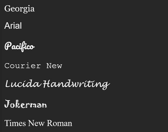
Before understanding fonts, we need to understand what a typeface is. So, a typeface is the design of the characters (I will be using the word "characters" for letters, numbers and symbols).
A font is the way the design, or a typeface is represented.
So, as an example -
Arial is a typeface
Arial 11pt Bold is a font
Few commonly used styles of typefaces are: -
- Serif - The characters have small lines, attached to the ends of larger strokes. Example - Georgia
- Sans Serif - The characters do not have smaller strokes (Sans is the French word for "without"). Example - Arial
- Script - Characters in this typeface will have a handwritten look. They can be cursive with non-uniform thicknesses. Example - Pacifico
- Monospaced - Each character will take the same amount of horizontal space, which makes it useful for programmers to keep the code neat. Example - Courier New
- Handwriting - Similar to Script typeface but has a more natural look. Example - Lucida Handwriting
- Decorative - Heavily designed and stylized, mostly used in titles. Not recommended for long paragraphs. Example - Jokerman
- Transitional - Fusion of both old and modern serif strokes. Example - Times New Roman
Choose the Typeface Style
From the styles given above, choose any one style to proceed with. You will be making a typeface with the chosen style. I recommend you, use Handwriting style. It is much easier than the other styles and much more beginner friendly.
Creating the Template
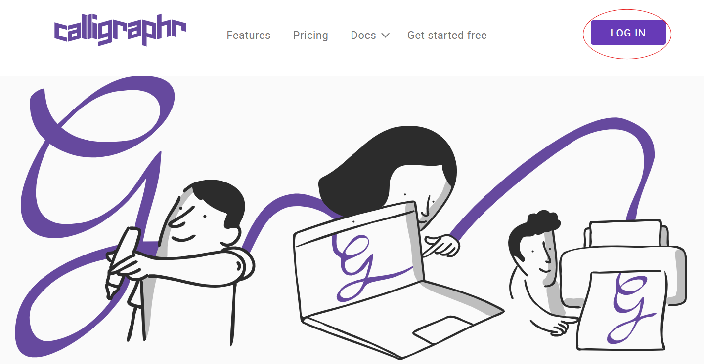
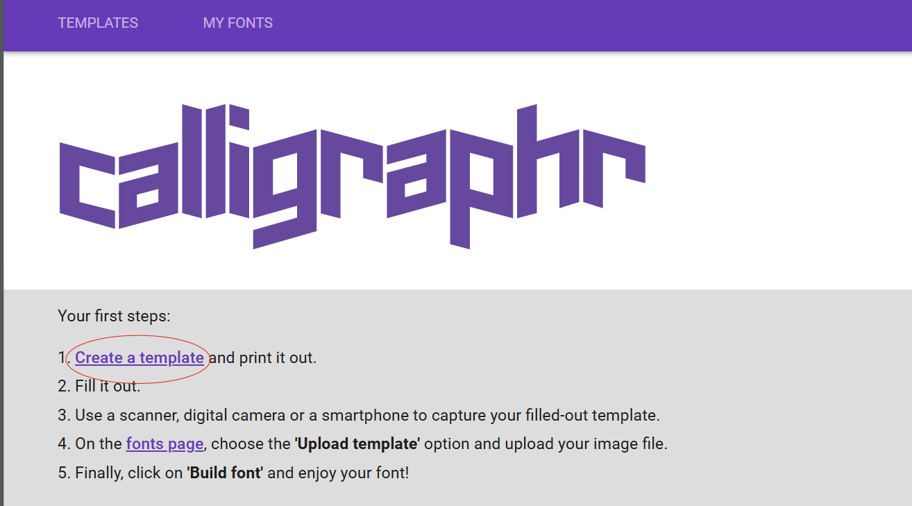
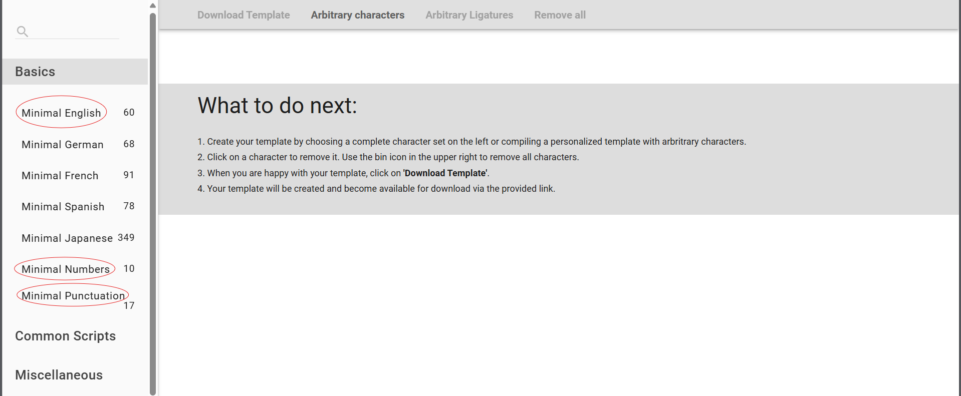
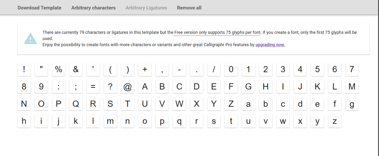


For this, you will need to go to a website - Calligraphr (Not affiliated)
- Login/ Sign up using your email.
- A page with "Calligraphr" written on it will appear. Click on create new template.
- In the left side of Create Template page, under "Basics", select - Minimal English, Minimal Numbers and Minimal Punctuation.
- A message will show, which says that - the free version only supports 75 characters. Remove a few, less used punctuations. For the simplicity of the text, I have removed - '%', '&', '(', ')', '+', '/', '=' and '@'. (Include parentheses if needed).
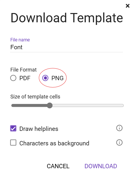
- Click on download template.
- A dialog box will open, Give the File name (any name), The File type should be PNG, do not change the size of cells.
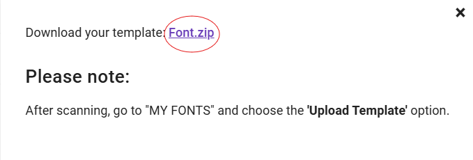
- Download the template. It is in .zip format, you would have to Extract (in Windows)/ Decompress (in Mac) after Right - clicking on the downloaded file.
Note: When you unzip the file. You may have the template divided into two. This is because the whole thing won't fit in one page, and you will have to draw a few characters separately.
Make the Characters Using Sketchbook
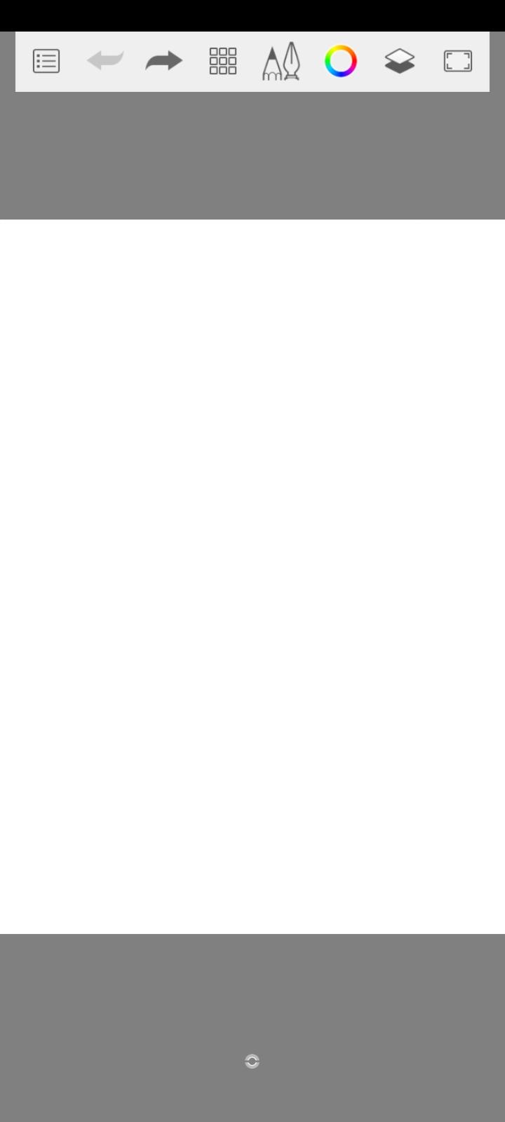
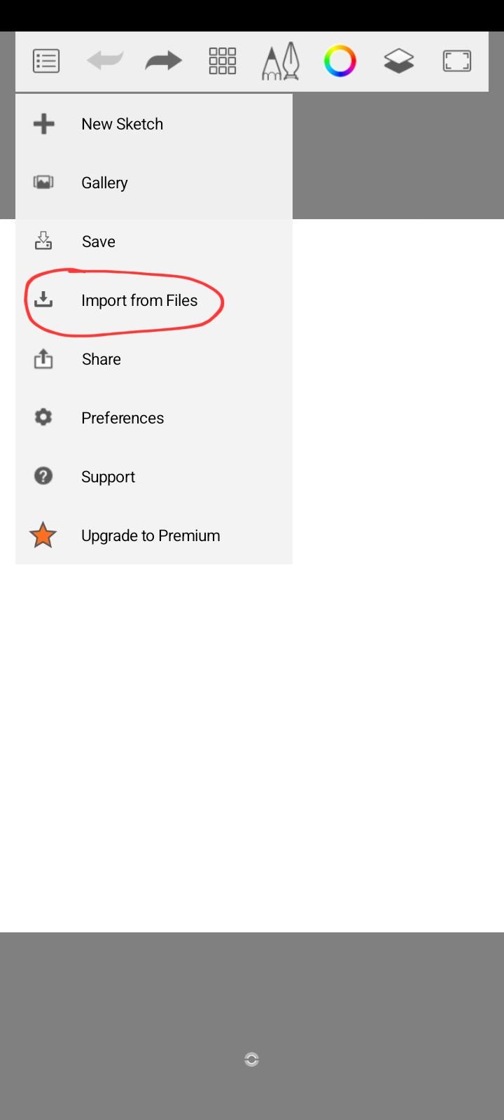
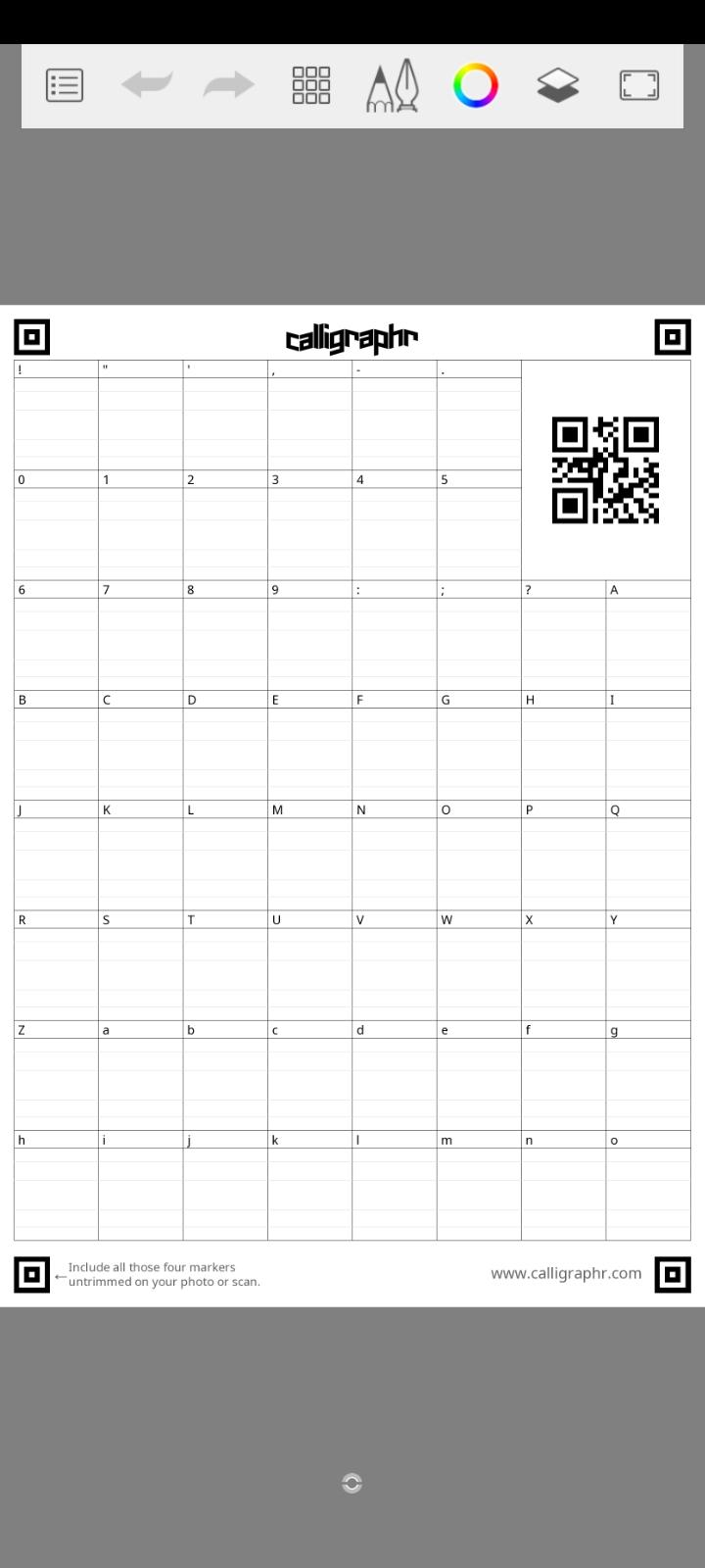
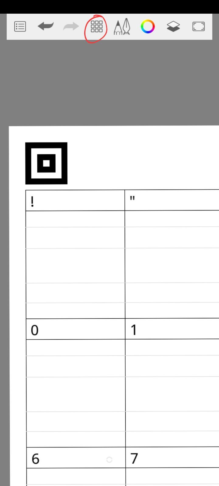
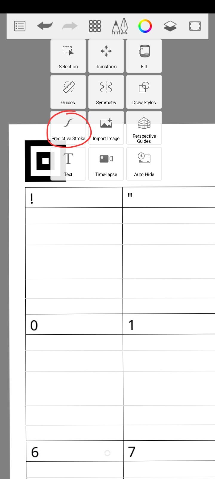
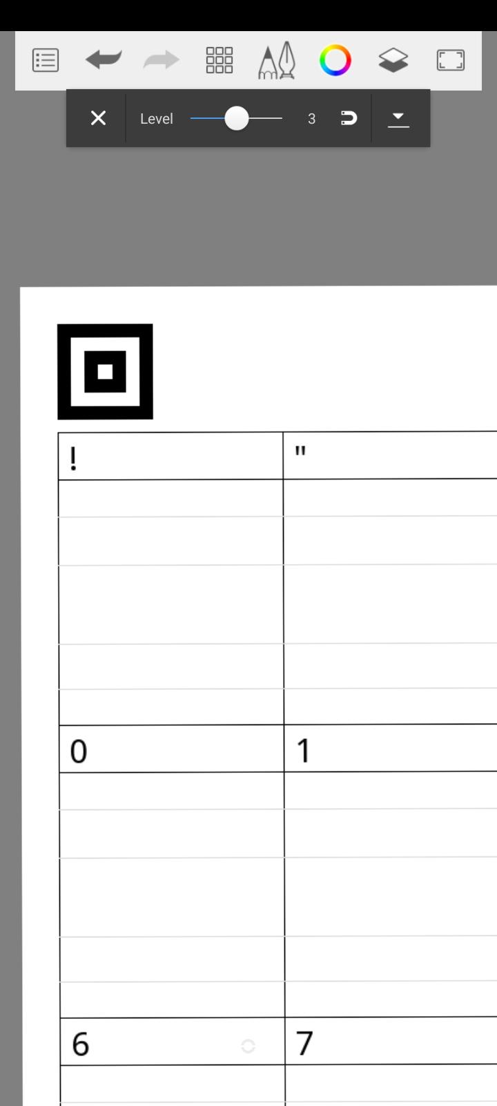

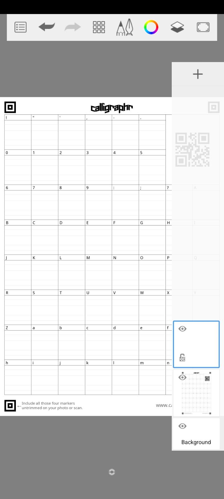
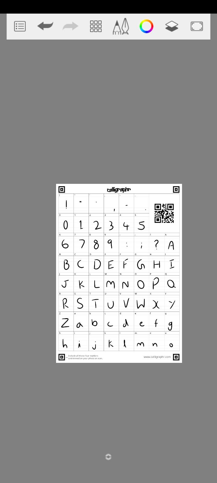
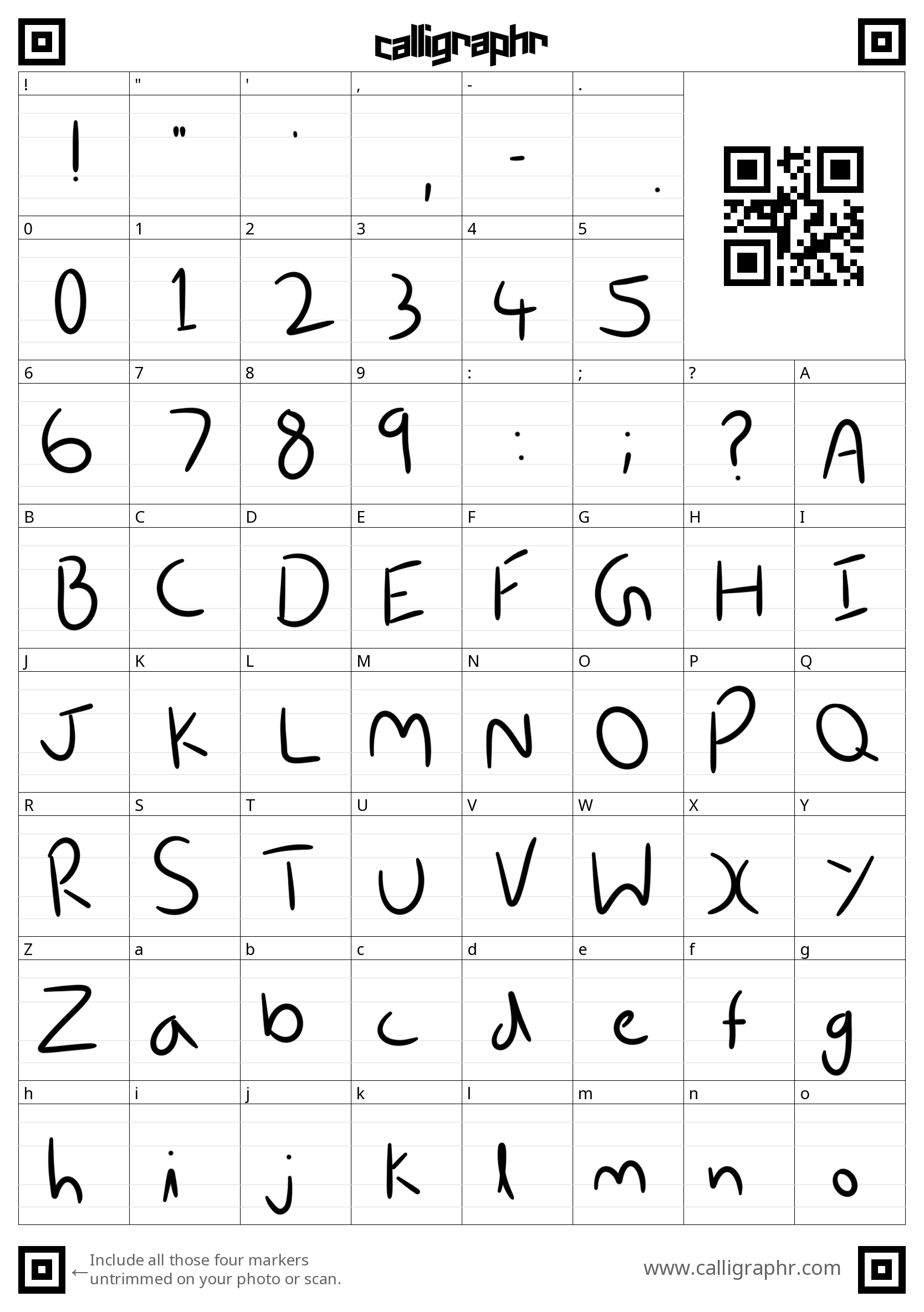
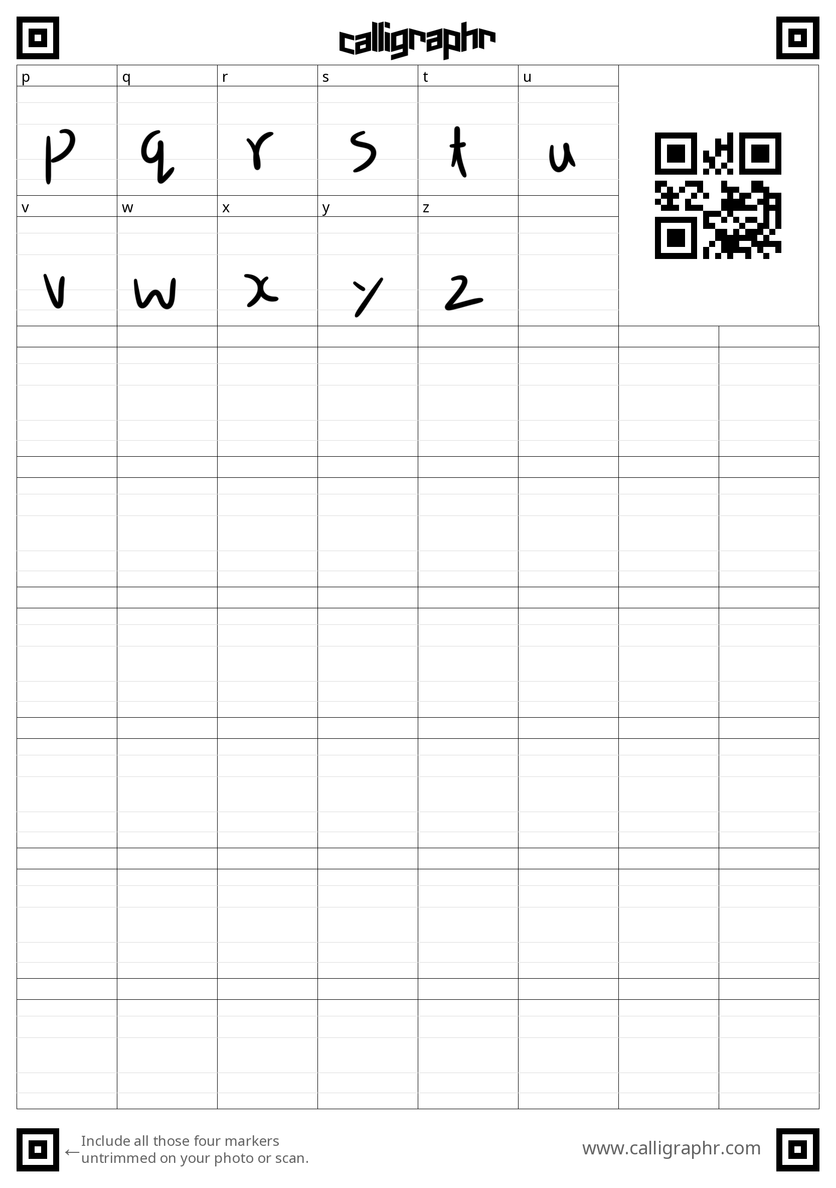
Autodesk Sketchbook is a great tool for making sketches and blueprints for construction, engineering etc. It has a variety of brushes which allow you to make different textures. Today, we will be using Sketchbook for drawing the characters because of its Predictive Stroke feature. This feature smoothens the strokes we draw, which is really helpful in our case.
Download Sketchbook on the device you picked to draw the characters on.
- Open Sketchbook.
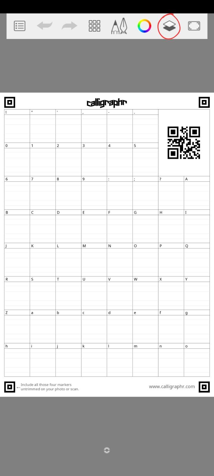
- Click the button, leftmost, in the toolbar. Then click on Import from Files. Select one page of the downloaded template.
- Select the 4th button from the left of the toolbar. Few features will appear.
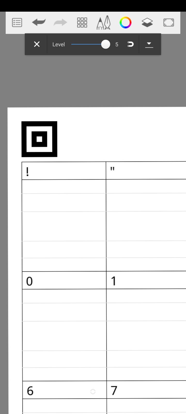
- Select on the Predictive Stroke option. You can adjust the level. More the level, smoother the lines will be.
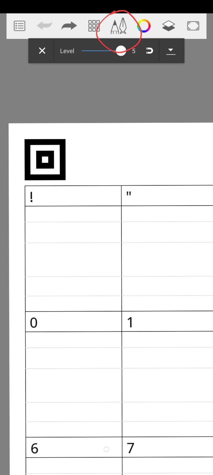
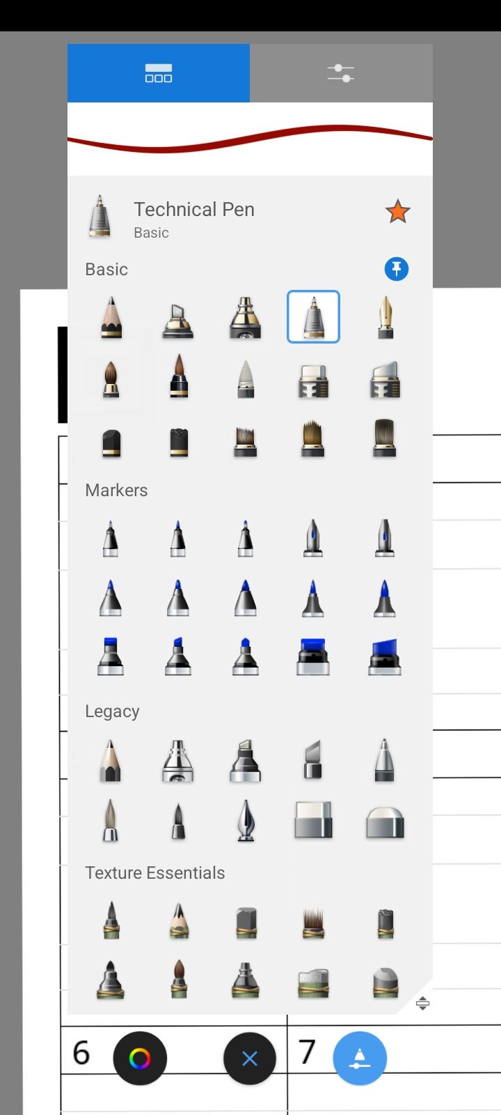
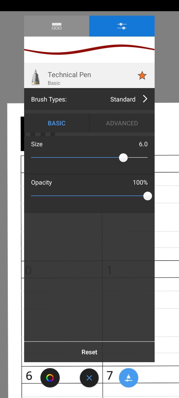
- Now select the button with the pencil and pen icon. A huge variety of brushes will appear. I recommend, the Technical Pen, which is a really simple pen which is used for writing in Sketchbook. You can take any other fancy pen, but the difficulty will increase.
- Adjust the size of the pen - to 6.0.
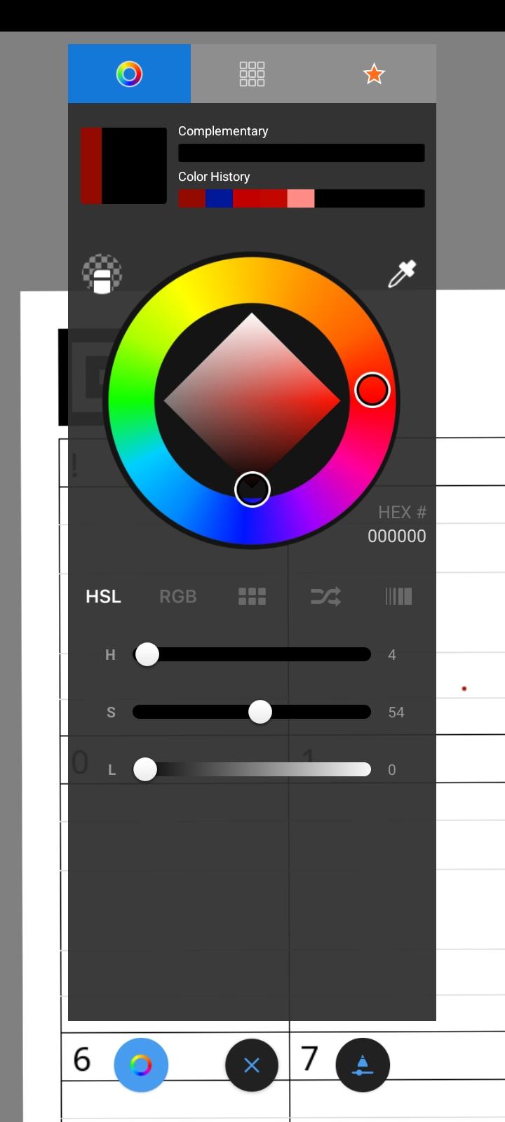
- There is a colorful ring icon beside the pen icon. Select it and set the color to black.
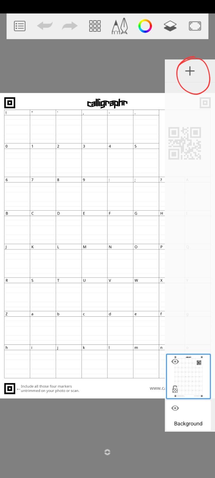
- Now, click on the second last button on the toolbar, which is the layers. Add a new layer, by clicking the plus button. A new layer is added as, if we made a mistake, we could erase it without interfering with the template.
- Now draw the characters according to the template, this may take some time. But the result is worth it.
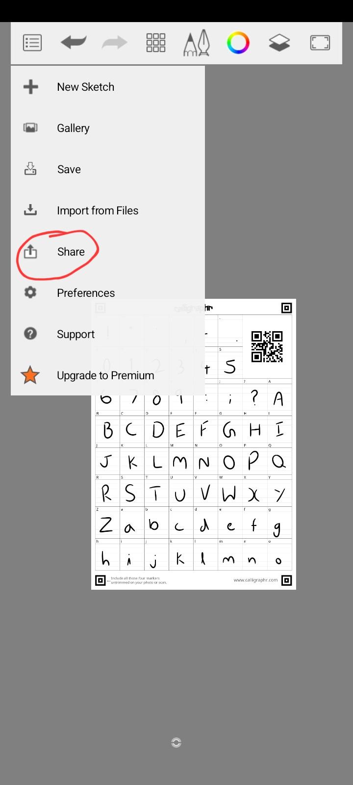
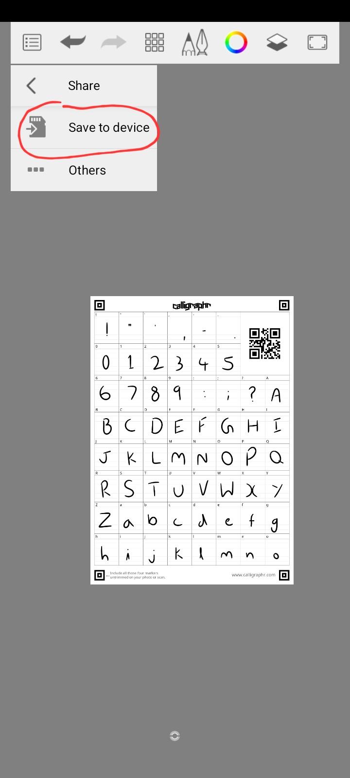
- To save the image of the finished template, click on the leftmost button, then on Share, and then on Save to device. Choose a file location.
Do the same with the other page of the template. To create a new sketch - Click on the leftmost button on the toolbar, and on New Sketch. (Save the current sketch if needed)
Making the Typeface
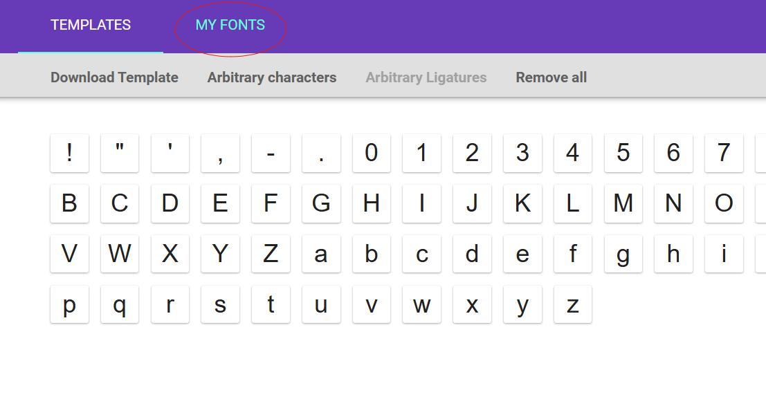

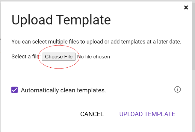
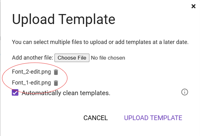
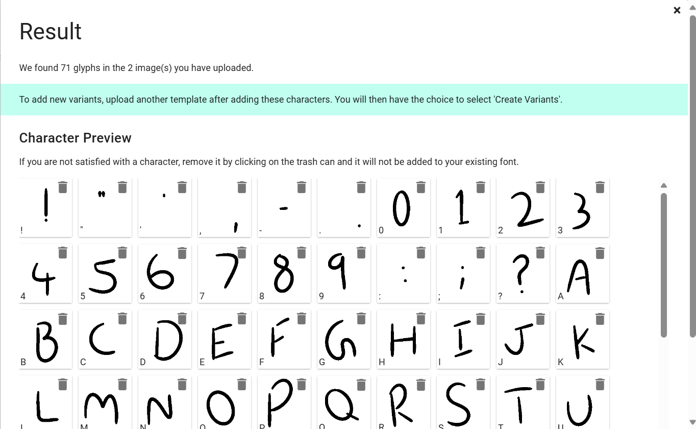
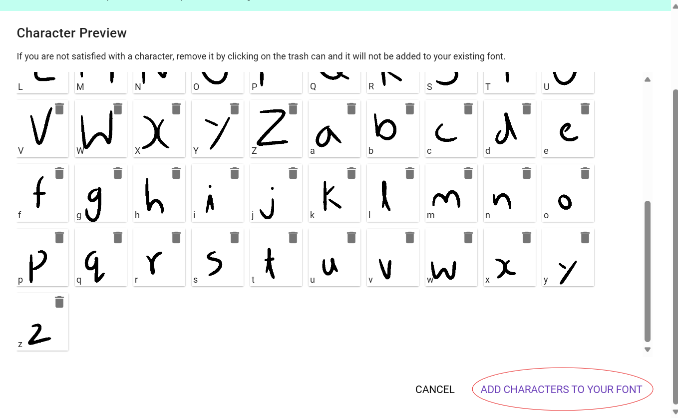
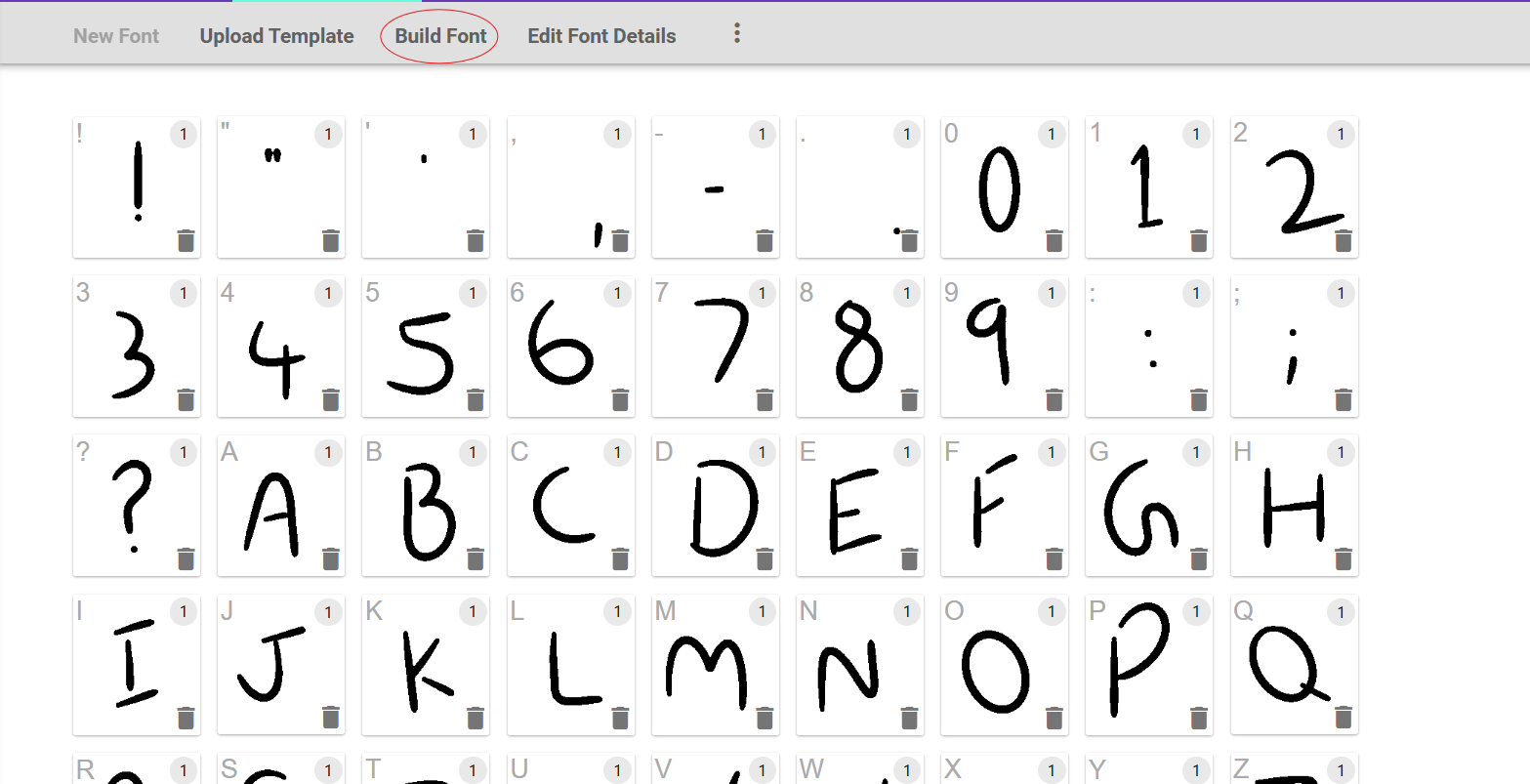
Back on Calligraphr, on the same page as the one where we downloaded the template from.
- Click on My Fonts. Some text appears saying - "No fonts yet".
- Click on Upload Template.
- A dialog box will appear. Choose the finished template files, with the text on it. Then click on Upload Template.
- Another dialog box will appear, which shows the result. Scroll down and click on - Add Characters To Your Font.
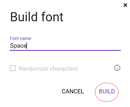
- Once that is done, it will show all the characters you made, on top of that, there will be an option called - Build Font. Click on it.
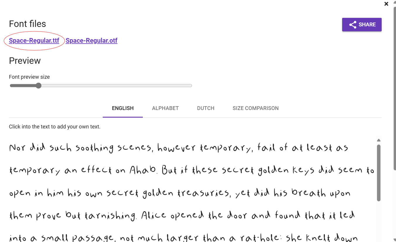
- It will ask for your Font name - Give it a creative name. I chose "Space" as the characters have a small space between some strokes, as you can see in letter "Y".
- After naming the font. Click on Build
- After that, your font is ready to be downloaded. Download the .ttf (TrueType Font) file.
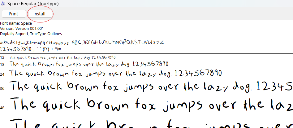
For using the font in other apps. You will have to install the Font.
On Windows: Open the .ttf file and click on "install".
On Mac: Open the application called "Font Book". Click on the plus icon. And choose the .ttf file which was downloaded.
Basic Features of Typography
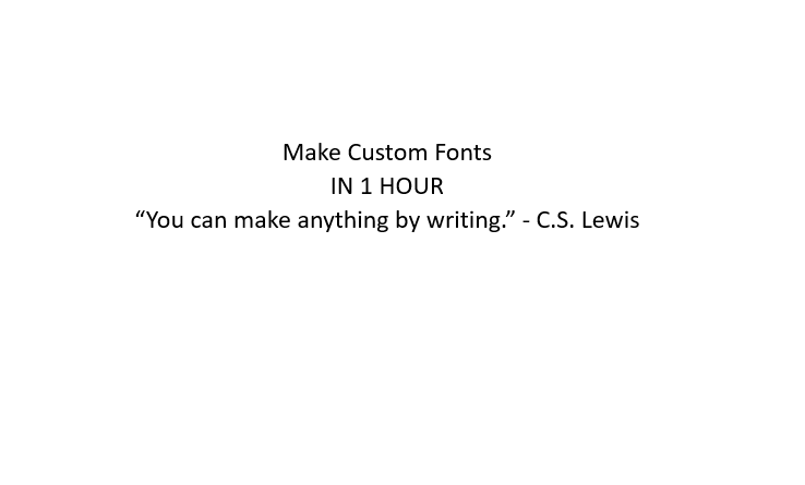
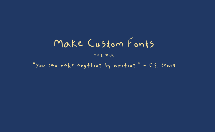
As you can see, I have two images, with the same text. The second one looks much better as I used the rules of typography to make it. I will tell what makes the difference between the two images.
- Font: In the first image, I used Calibri, for the text. Meanwhile, I used the fonts which I made for the second. I gave all of them a handwritten feel. Which looks much better that plain font.
- Hierarchy: In the first image, the size of the text remains the same. But in the second image, the size varies. This shows the order in which the text should go. More the size, earlier that text should be read. Hierarchy can also be shown with bold, italic and even different colors.
- Color: The first one is just black and white, while the other is blue with yellow. Even though, the colors of the first image are contrasting, it is not as good as the second image.
- Kerning: Kerning is the space between individual characters, in the first one, it is uniform. But if we arrange the spacing, we can get a decluttered look.
Conclusion
I love designing and making fonts. I had already made a few typefaces in the past which gave me some prior knowledge on typefaces. If you are really good at art and drawing, continue to make more advanced forms of typefaces (like Decorative). This is a really fun project, which takes really less time. If you made this project, please click on the "I Made It" button below.
Also, if there is any question or any difficulty, do write it in the comments.
I hope you enjoyed learning about typography. It is a vast field of art, which requires a lot of creativity.
Happy Building
:)