How To: Huge Baymax LED Halftone Wall Art
12502 Views, 155 Favorites, 0 Comments
How To: Huge Baymax LED Halftone Wall Art
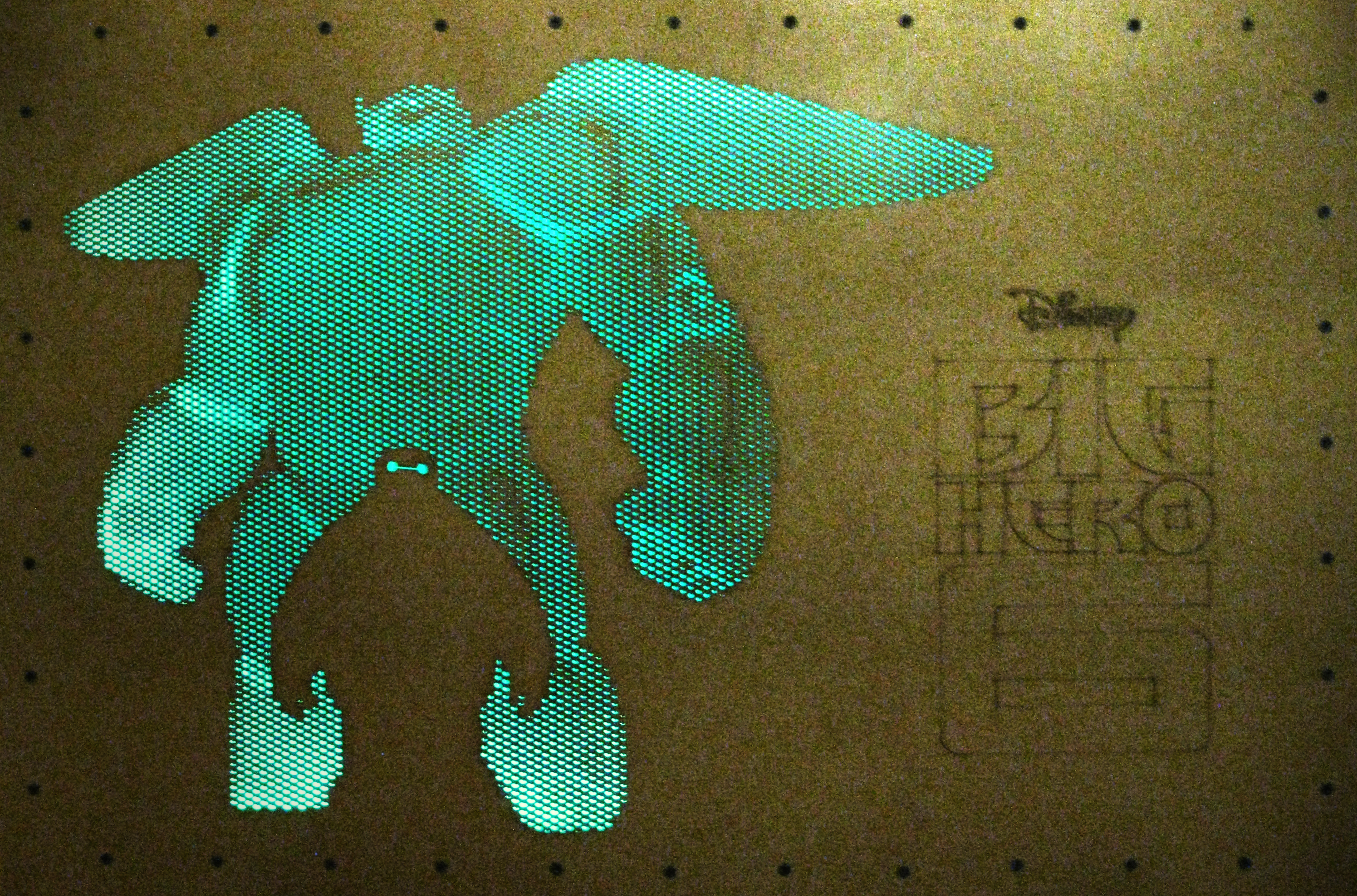
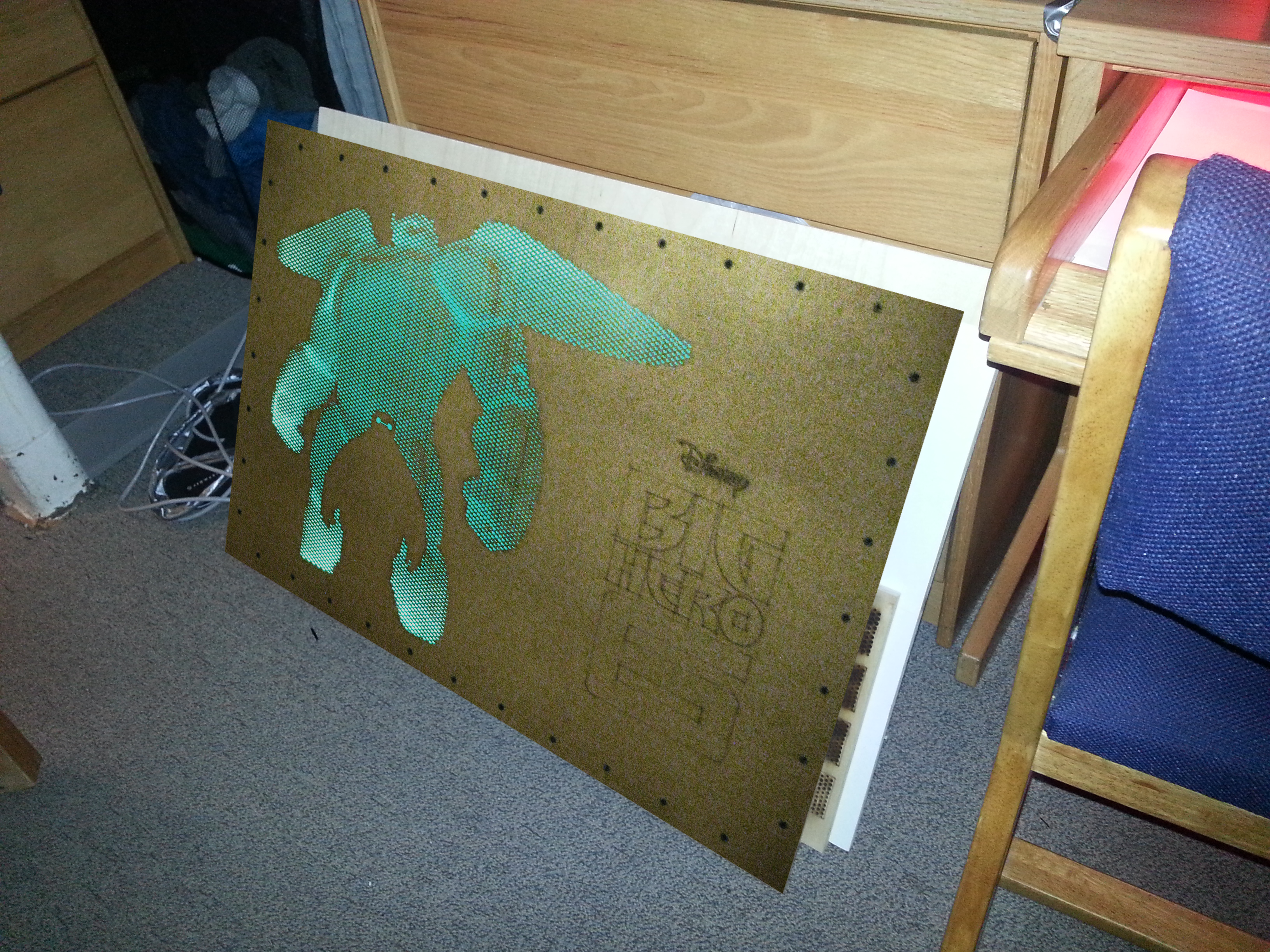
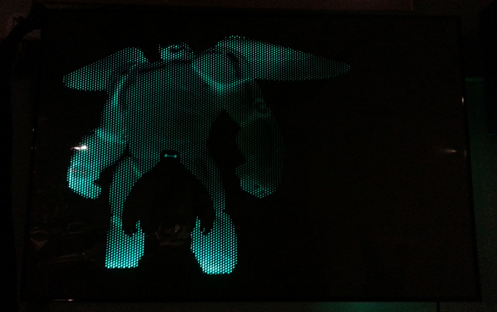
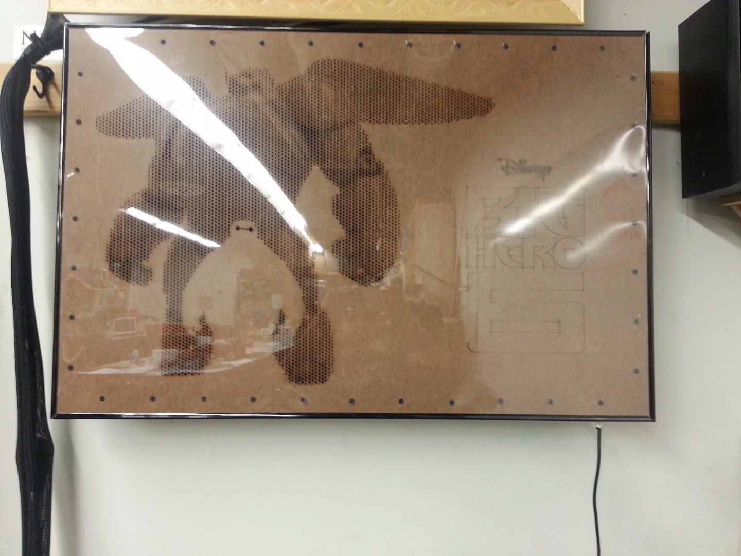
A 2 ft x 3 ft floating piece of wall art, featuring 2 versions of Baymax, from the Disney movie Big Hero 6. There's a small version of Baymax without his armor, and then a large, halftoned version of Baymax in full armor. The entire design is LED backlit, using an RGB LED strip.
The project is expected to take about 24 hours to complete including design time, or approximately 15 hours using this design (i.e. just assembly and manufacturing). In either case, this project can be put together in a weekend.
Total cost is conservatively $50, not including laser cutter access.
We'll also be covering some basic usage of Adobe Photoshop, Inkscape, and DraftSight, so the first part of this Instructable will be great if you're new to either of these softwares. However, I will provide a bit of a disclaimer: there are some different methods of doing what I've described, so in an effort to provide a survey of multiple topics I've suggested some methods which may take longer than absolutely necessary to do some tasks. However, these all serve as a learning experience, hopefully.
There's also a bit of introduction / information on laser cutters.
If you'd like to just skip to the laser cutting part, I've provided the final DXF, and you can jump to Step 9.
Author's Note: If you enjoy this Instructable, please consider voting for this entry here: https://www.instructables.com/contest/sprout/
Gathering Materials (and Software and Tools)
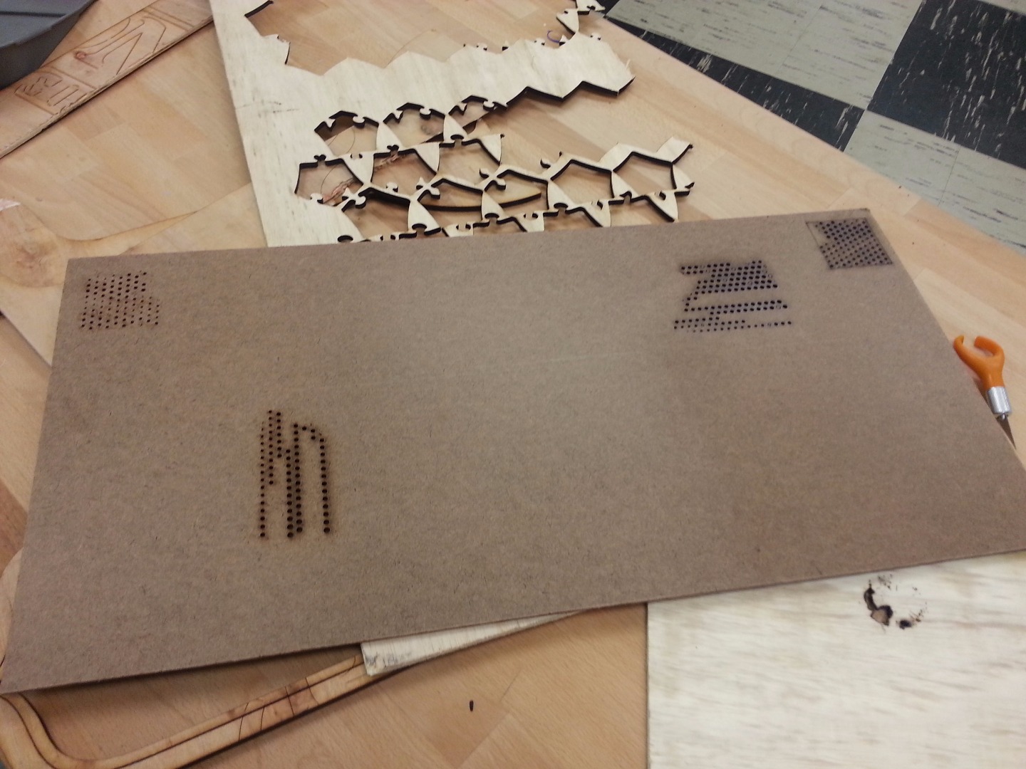
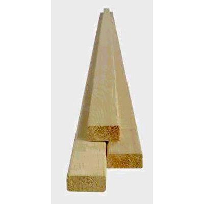
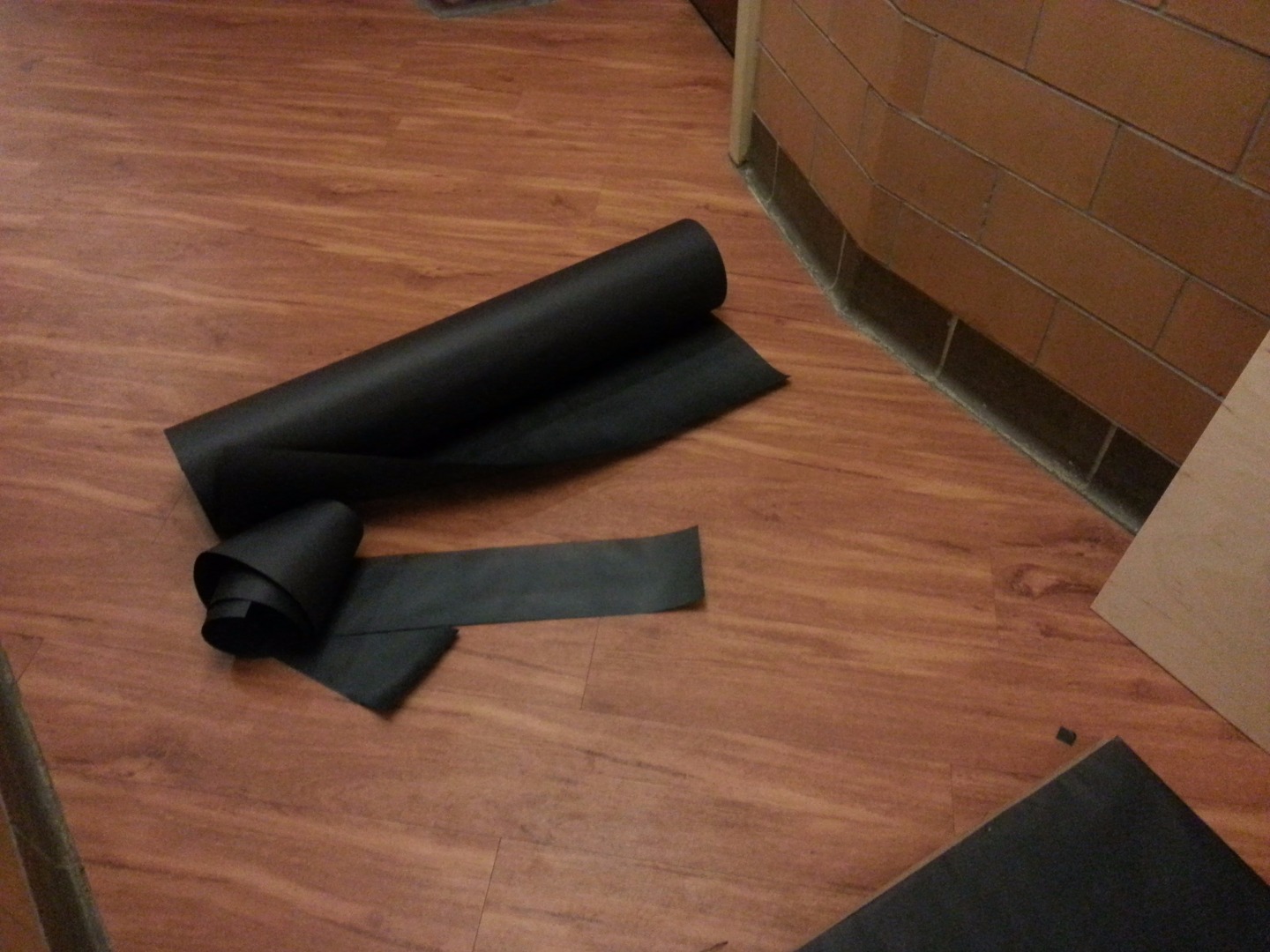

You'll need the following materials, softwares, and tools, some of which have a couple sources listed:
- Vector Editor. I used Inkscape, an open source software available here for free download on Windows, Mac, and Linux. You can also use Adobe Illustrator (among others), available here, but the screenshots following are from Inkscape.
- Image (Raster) Editor. I used Adobe Photoshop, which is available for purchase and free trial from here for Windows and Mac. You can also use GIMP, among others, available here, an open source software available here for free download on Windows, Mac, and Linux, but again the screenshots are from Adobe Photoshop.
- DXF Editor. I used DraftSight, which you can find here for free. Alternatively, something like AutoCAD will also do the trick. Inkscape also has some DXF editing capabilities, but I found them to be subpar for this task, and the interface isn't built quite as nicely for the usage.
- pstoedit, a free software to convert between CAD formats available for Linux and Windows available here.
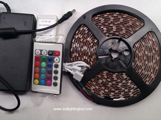
- LED Strip, power supply (optional: IR Remote and Sensor). I used the RGB LED kit from here, which comes with everything mentioned, but if you're willing to spend more money you can go with a large set of individually controllable LEDs (i.e. Adafruit Neopixels or Dotstars) with your own power supply, or alternatively a single color LED strip as here. I'll assume you're using the IR remote and sensor in this Instructable, but you can easily ignore them.
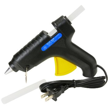
- Hot Glue w/ Gun. This will be used as adhesive, can be purchased from craft stores or here, among other places. Single / double sided tape will also work, i.e. here and here.
- 1/8" MDF, 2' x 4'. You can purchase some from your local home improvement store, or online here. This will be used for the front of your piece; you may want to consider replacing this with some colored acrylic, which you can get here, or a nice piece of unwarped, thick birch plywood, like here.
- 10' of 1" x 2" lumber. You'll need 2 pieces at least 2' in length, and 2 pieces at least 3' in length. In a pinch, you can also rip down a 2" x 4" with a table saw, as I did. You can find some at the local hardware store, i.e. here.
- 1 1/2" - 2" wood screws, about 50. The exact size isn't particularly important, as long as they're a bit shorter than the thickness of your front material (i.e. 1/8") and that of your backing wood (i.e. 2"). You can find some here. You'll also want to have a drill, along with the proper drill bit sizes for a pilot hole(s).
- Saw of some sort. Here, the more options the better. You can get away with using a hacksaw for the entirely of this project, but you will find that it's easier if you have access to a tablesaw, a bandsaw, and a miter saw.
- Sandpaper. It's important that the edges are smooth. The grit doesn't particularly matter, so long as it gives you a result that's smooth to the touch.
- Backing paper (optional, but highly recommended). I used something like here, but a variety of things will work. It's also not explicitly necessary, but helps make the piece more visible when not mounted on a wall. You may also want to consider a mirrored backing of some sort; mirrored acrylic like here, or perhaps aluminum foil could work.
- Laser cutter. Arguably the most important part of this project, the only way to reasonably cut out those holes is with a fairly sizeable laser cutter. I have access to a Rabbit 90W laser cutter with a 4' x 3' bed. If you don't have immediate access to one, you may be able to replicate this process on a CNC mill (or possibly waterjet). You can also likely find pay by the hour access to a laser cutter at your local hackerspace, or through a system like TechShop. If none of these options work for you, fear not! There are online services which will lasercut material for you! Perhaps the most famous of these is Ponoko. Thus, this project is accessible to everyone!
There are photos attached of some of the various items in bold.
Prepare Image Assets in Adobe Photoshop
Preparing the Baymax Render:
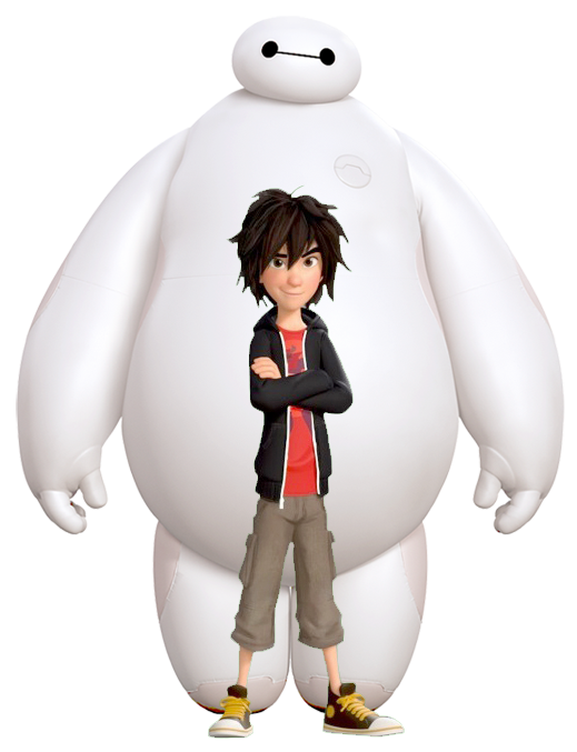
- Begin by taking inspiration from an image like the first one. I saw that it was an image of Hiro inside Baymax. I figured that it could be cool to have an image of Baymax inside one of himself; however, colors don't translate to through a laser cutter very well. So, I realized that I needed to make the entire image only back or white. No fear, halftoning is here!
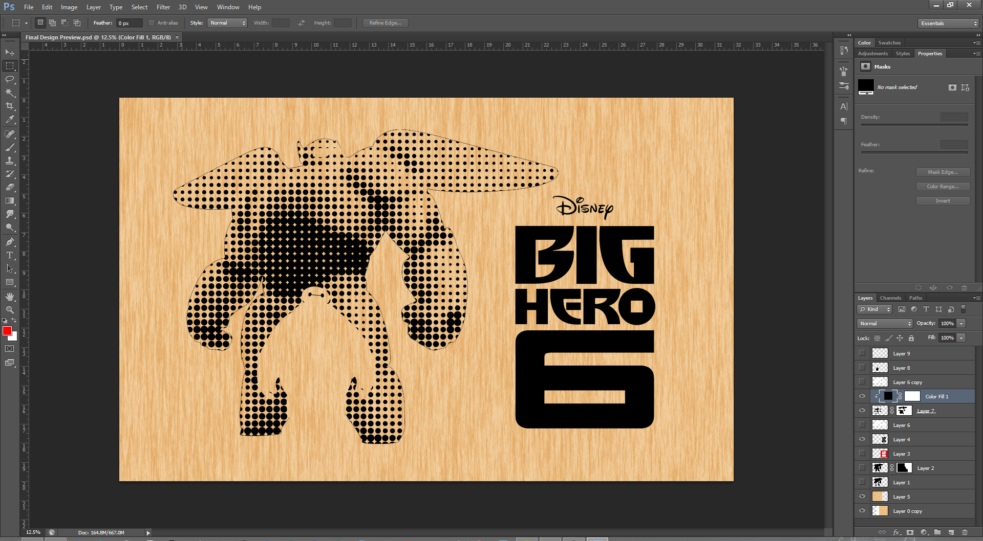
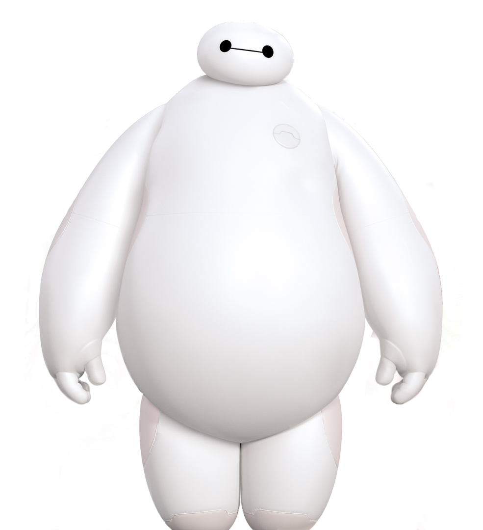
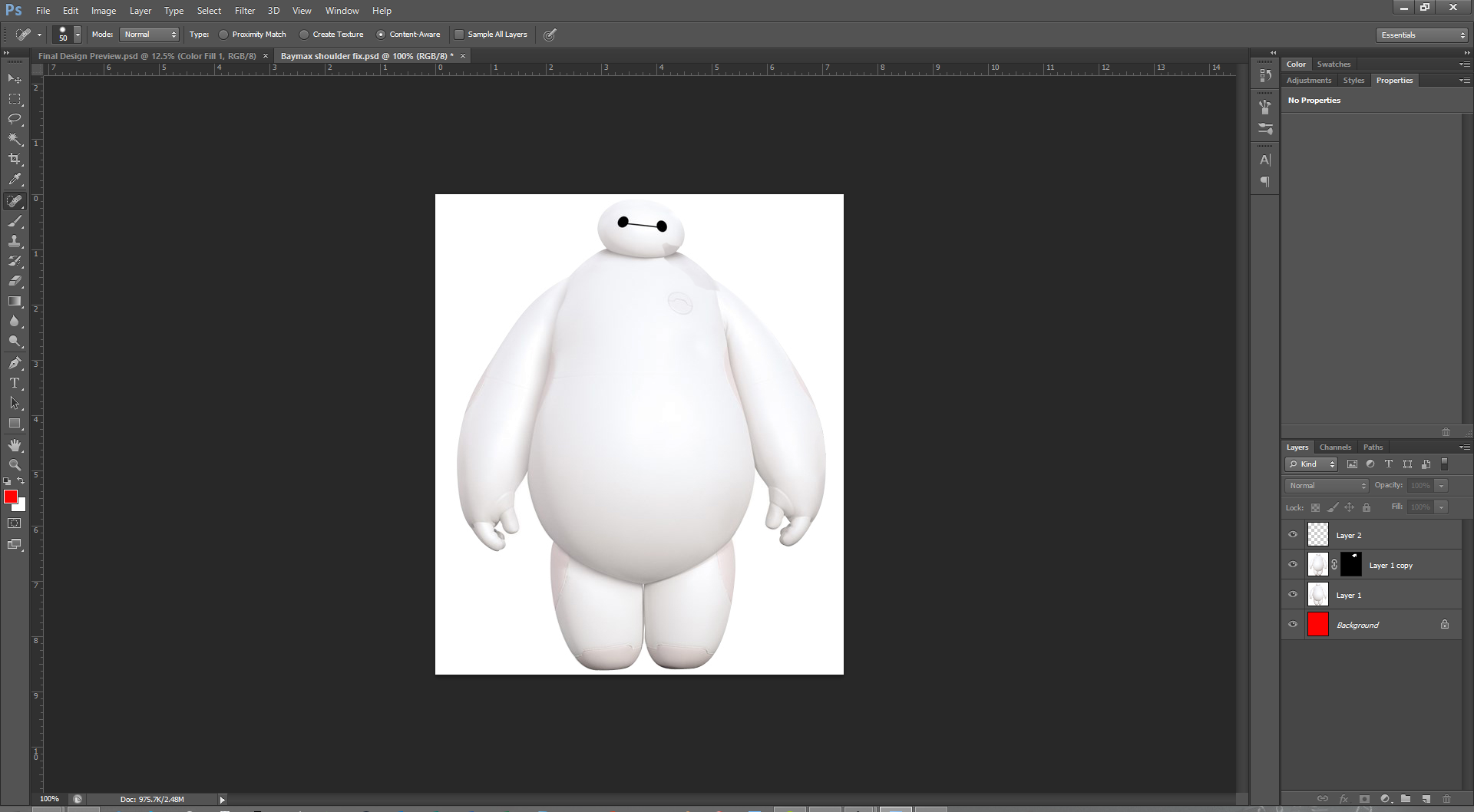
- I began by finding a render of Baymax without his armor. The best that I could find (quickly) was one with a lot of noise around the edges, as well as the feet cut off. I wanted to clean a lot of that up in order to make the image nice to work with, even though it wasn't explicitly necessary for the final result. I opened up the image in Adobe Photoshop. In the spirit of nondestructive editing, instead of using an eraser I decided to use a mask to hide the noise. This can be done with the masking tool, highlighted in the third image above.
- When masking, black will be things that are not visible, and white will be fully visible; shades of gray in between will scale the opacity. For this, we'll only be needing the black and white. You can use either the brush to brush on black, or the eraser tool with black in the background to achieve the same purpose. I used a hard (100% hardness) eraser at a fairly large size to get the bulk of the material, and then went in closely with a smaller eraser. To ensure that you're removing all that's necessary, I recommend placing a fully red layer (or other high contrast color) right underneath the layer that you're trying to mask. This helps you see where you still have junk left over on the sides.
- You will also notice that in the render above, Baymax is missing his feet. Again, though this wasn't explicitly necessary for the final design, I wanted to keep my options open. So, I found another image where he did have feet (in the same pose). I then used the pen tool to generate a selection around the legs (ignoring the rest of the body). You can find a guide on how to use the pen tool here, or a video here. The gist of it is that you'll be placing a series of nodes, and each node has lines coming off of it. Between all of the nodes there will be a spline generated, which will be tangent to the line coming through the nodes at each of the points. You can control the curvature of the spline with the spacing of the nodes, the length of the lines, and their orientation. Additionally, if you press ALT and move one of the lines, you can generate sharp turns, as is needed for the space between the legs.
- After you've generated a path around the legs, you'll want to go to the work paths tab (see image), right click on the path you've just generated, and make a selection from that path. You can leave the settings at their defaults. Click on layer with the legs, and while they're selected, press CTRL + J to duplicate the selection of legs. Arrange your Baymax render and his legs so that they form one complete silhouette. You can use the mouse to move around (press 'v' to access it).
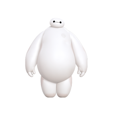
- Now that we have a complete, rendered Baymax silhouette, and you've learned how to mask and use the pen tool, I've uploaded a better render that I found online after some more searching, as the fourth image. Source here. It's a bit small, but it gets the job done.
- Anyway, now that Baymax is rendered, and there is no background (hide it by clicking the eye in the layers tab) I saved the document as a PNG file (so that there's transparency). Then I opened up a new document in Adobe Photoshop and found that when there's a white background behind Baymax, a few of his edges become difficult to distinguish from the white background. In particular, there's his head and right shoulder. To fix this, I duplicated Baymax, flipped him over (so that his left shoulder was over his right shoulder) using the Edit -> Transform -> Flip Horizontal command. I then applied a mask so that all we had left was his shoulder, and rotated and scaled it using the move tool so that there was a continuous shoulder that was easy to distinguish from a white background. You can see this in the third image.
- Now, save your masterpiece(s)!
Preparing the Baymax Armor:
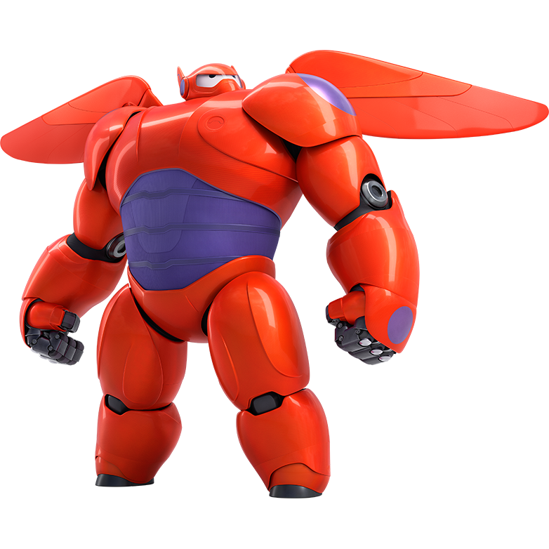
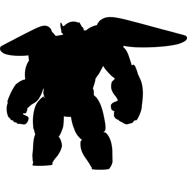
- For the armor, I got lucky and was able to find a rendered version of Baymax in the pose that I wanted. I've attached that as the fifth image above. Source here. All we'll want to do in this case is create a silhouette of Baymax, which you can do by importing the render into Adobe Photoshop, creating a fully black layer above the Baymax armor layer, and then pressing CTRL + ALT + G when your black layer is selected. This makes the black layer use the layer underneath as a clipping mask; in other words, you'll only see black wherever the layer beneath is defined, which is exactly what we want. Once that's done, save the silhouette. I've attached the silhouette and the PSD as well.
- You may also want a silhouette of Baymax without his armor, which you can make with the same process as above. However, I didn't find that I needed one.
Great! Now that we've prepared our assets in Adobe Photoshop, we get to move onto the vectorization of everything!
Downloads
Time to Vectorize!
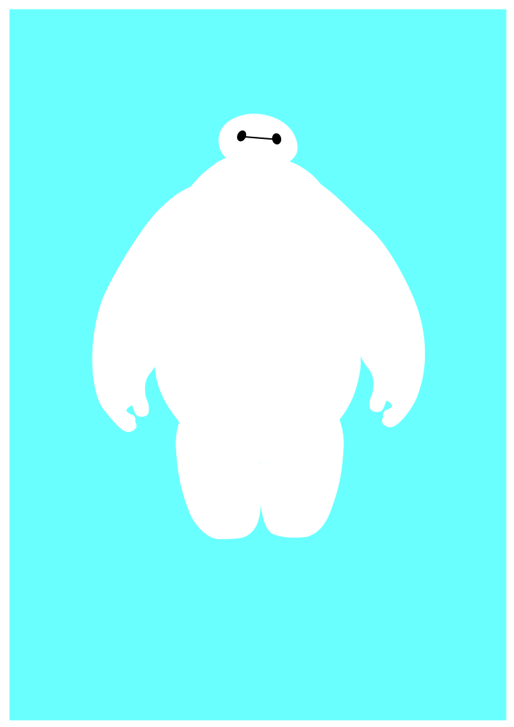
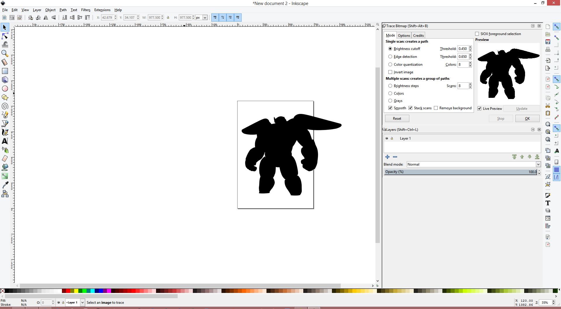
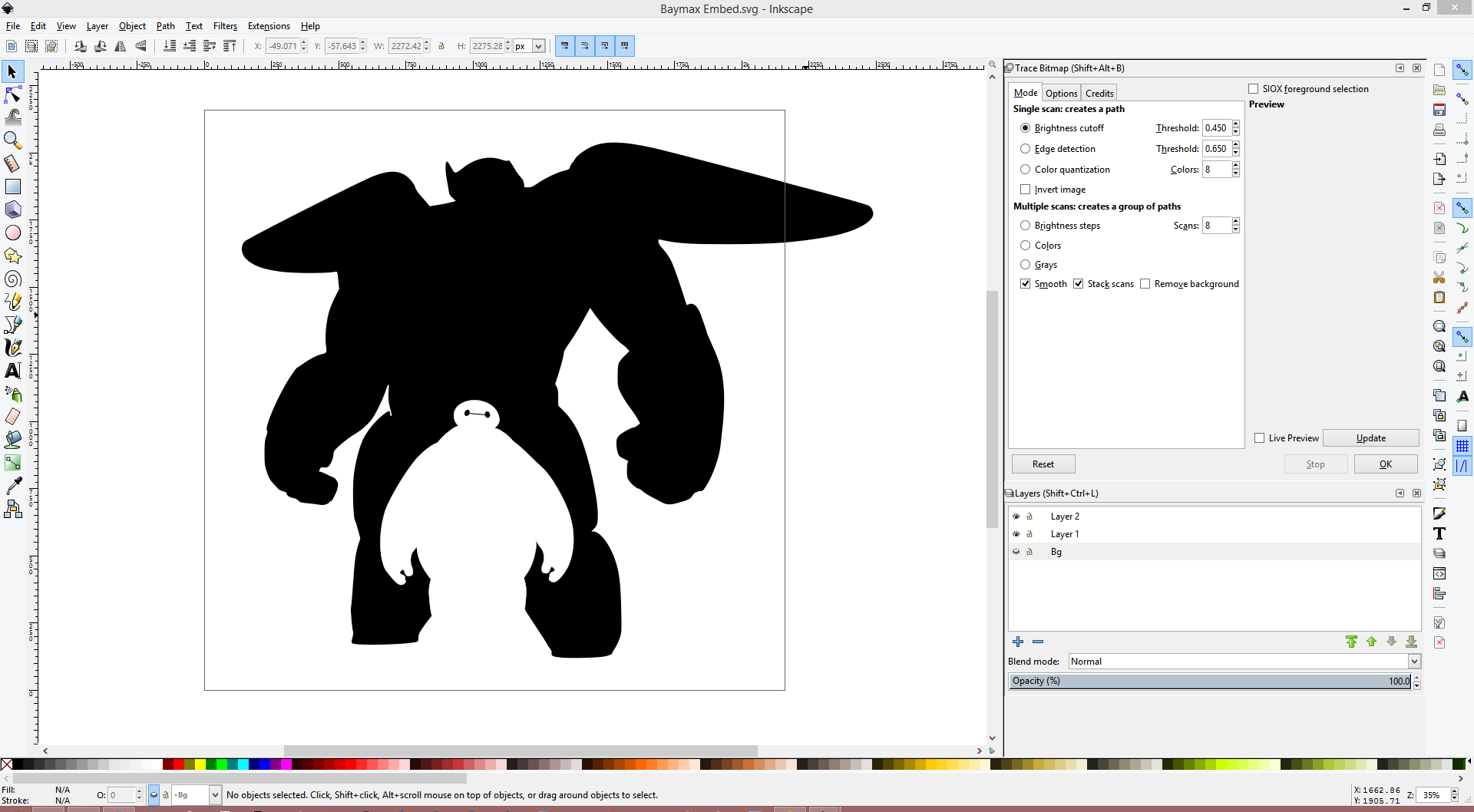
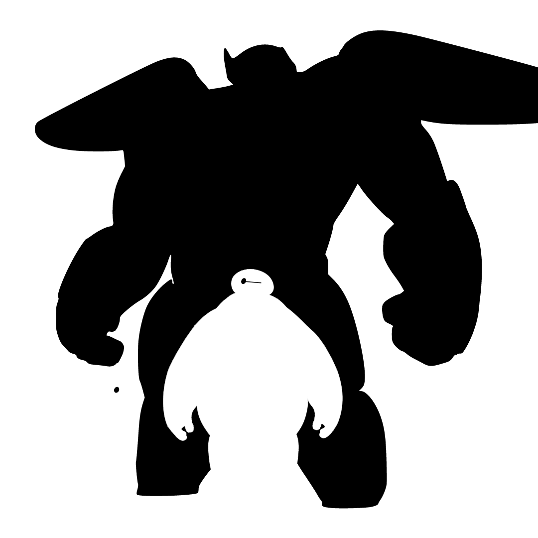
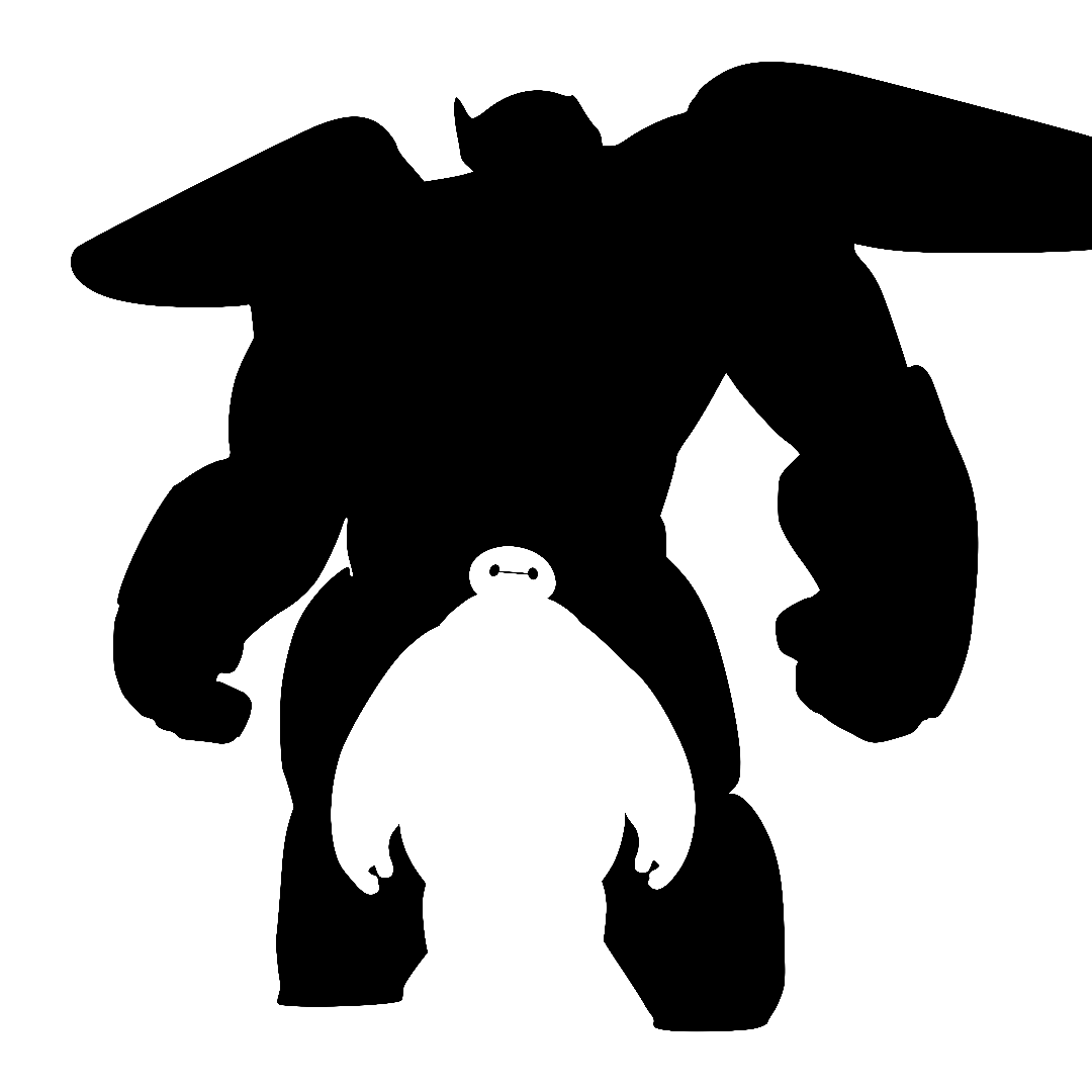
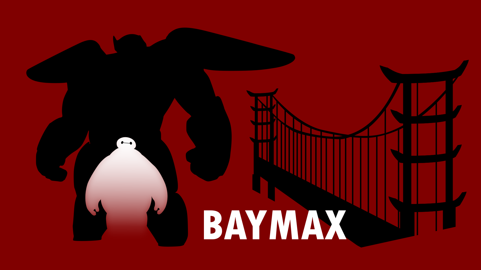
The problem with images in Adobe Photoshop is that they're raster images; that is, images are based on a pixel value instead of being defined mathematically, via relative values. That means that when you scale images, they get blurry or pixelated. What we're going to do is convert these raster images into a vector image, which is one composed of mathematical vector objects. We save these in a SVG (scaleable vector graphics) format. We can then make the images whatever scale we would like with no loss of resolution!
While it's fairly easy to find rendered images online, finding decent vectorized versions of graphics online is a nearly impossible task. That's why it's important that we learn to make our own.
Vectorizing Baymax, no armor:
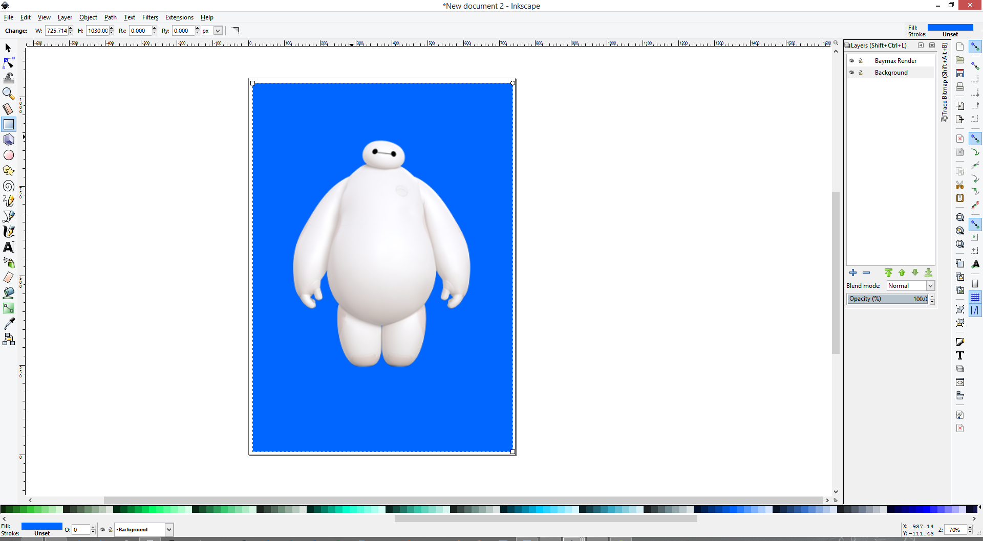
- We're going to begin by tracing out Baymax without armor in 2 colors, black and white. To do this, open up your Baymax (no armor) render into Inkscape. Bring up the layers panel with SHIFT + CTRL + L. You'll notice that while your image is in the canvas, there's no layers in the panel. To fix this, we're going to select our image with CTRL + A. Cut it out with CTRL + X. Make a new layer by pressing the blue "+" icon in the layers tab, and call it something sensible like "Baymax Render". Then, paste the render in with CTRL + V. Now, we can press the eyeball in the layers tab and we can turn the visibility on and off. Alternatively, you can simply create a new document and then import in your image with CTRL + I.
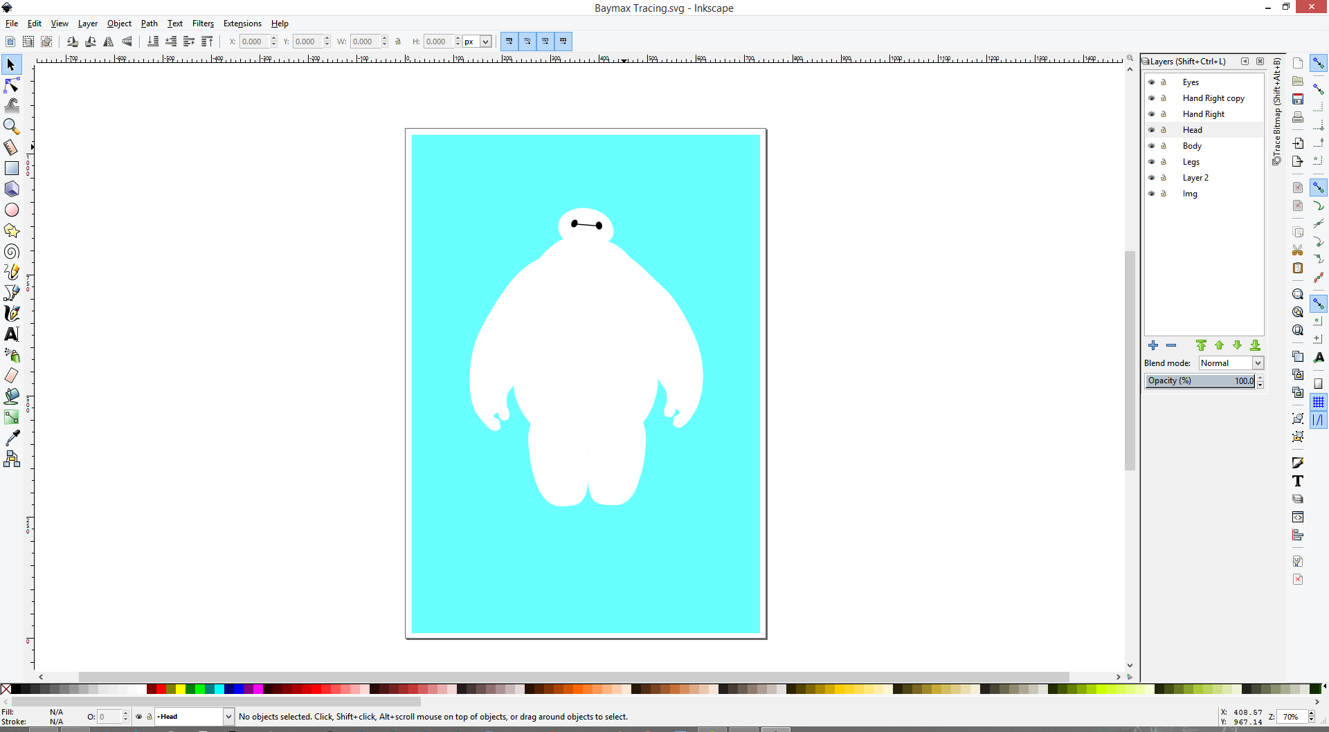
- We're also going to want to add some sort of a background to the render, so that we can easily distinguish between our vector and the render. Add a layer under the render layer, calling it something like "Background". Then, using the filled square tool, which is selected in the first screenshot, you'll want to add a nice contrasting color for the background. I choose a shade of blue which I found to be nice to look at. You might want to do the same since you'll be spending a lot of time looking at this.
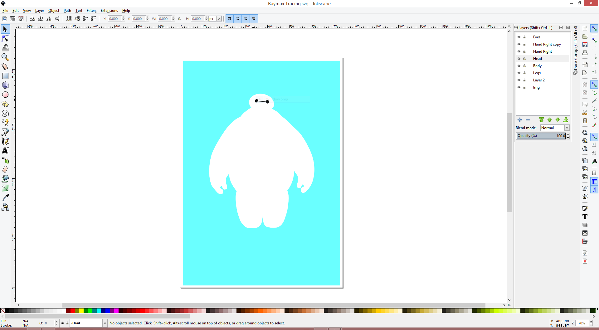
- We're now going to generate a vector in the shape of Baymax, going piece by piece (i.e. arms, head, etc.) We'll be using the same tool as we did to generate the path in Adobe Photoshop; that is, creating Bezier curves using the pen tool. The usage is similar to that in Adobe Photoshop, though still different enough to be worth mentioning. I have personally found my most efficient workflow to be by creating a quick path by just connecting straight lines (clicking points without dragging), and in some cases making very rough curves (clicking and dragging). I would then go back and adjust the nodes with the node selection tool. You can change the type of node by CTRL + clicking on the node, or alternatively by clicking on the icons at the top of the screen. There's a lot more detail to Inkscape's pen tool, and while the above can serve as a good foundation, you'll learn best through experimentation. You can find some more informative guides here and here. Check the second image attached for the locations of the tools.
- Once you've generated your path, you can change the fill and stroke. Bring up the menu with CTRL + SHIFT + F, and then play with it as you would like. For what we're doing here, we're going to want to use a pure white (255 255 255 255 RGBA, Red Green Blue Alpha) for the body, and pure black (0 0 0 0 RGBA) for the eyes. I would recommend putting each of the pieces on separate layers. You'll also want to not have any stroke on the pieces, so select the X for Stroke Paint.
- As you continue, you may find it useful to temporarily hide certain parts, which you can do by hitting the eye tool (provided each part is on a different layer). You can also lower the opacity of certain layers, which can help see both the tracing and the image at the same time
- Save your work!
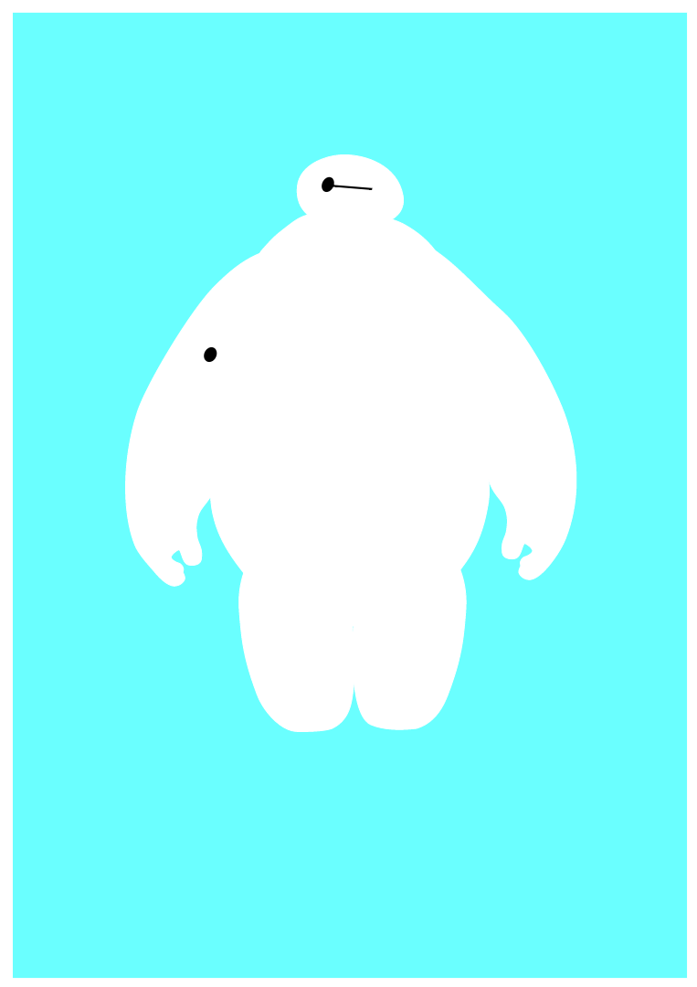
I've attached my version of the tracing to this step. There's additionally a PNG of the tracing.
Vectorizing Baymax with Armor's silhouette:
- This part will be a lot less time consuming, luckily. You'll want to create a new Inkscape document, and then import your Baymax with Armor's silhouette PNG into the document. The default PNG import options are fine.
- You'll now want to bring up the trace bitmap menu, which you can do with SHIFT + ALT + B. Check the live preview button if it's not already checked off, just so you get a sense of what the trace will result in. Since the image that we're working with is quite simple, again the default options for the bitmap trace will work. See the screenshot attached.
- Once you press OK, you likely won't notice any difference, other than perhaps the size of the selection changing (you'll notice you needed to have the image selected for the trace to work). Now you have the vector version of that PNG selected. You can move that aside, select the image, and then delete that. All you'll be left with now is a vector version of the silhouette that we were interested in. Perfect.
- Save your work!
Combining the two pieces:
- We're going to work off of the file we just created - that is, the silhouette. To do this, we're going to reopen it, and then Save As something like "Baymax Embed". This file will be the SVG of the two vectors combined.
- You'll want to now import the traced Baymax that we created in the first part of this step. You'll notice that the vector we just imported still has the background and such that we created. Additionally, you'll notice that the entire vector is a single object now. Inkscape has grouped all of the vectors in the imported document together for us. We're going to want to remove a few of the objects (namely the background and our starter render). To do this, we're going to right click on the group and hit enter group. This lets us edit the items inside the group. From here, select the background and the render, and remove them. You could also do this by saving the vector that we just imported with the background and render layers turned off.
- After you're removed the unwanted layers, right click somewhere in the empty space and hit return to parent. This takes you back to the "top level", from where the imported file is treated as a group again. We're now going to move it around using the selection tool (F1). With the group selected, you can use the scaling arrows on the corners to scale the image. If you hold CTRL while doing so, the aspect ratio is maintained. Holding SHIFT ensures that the scaling is done relative to the center of the selection. Move and scale the group until you've found a position and scale that you approve of. I've attached a screenshot of my final choice, as well as the associated SVG and PNG.
- Save your work!
It was at this point that I decided to have a little fun with Inkscape, and decided to trace a version of the San Fransokyo bridge as well, to make a nice wallpaper. I've attached the PNG and SVG files for that to this as well. Making it involved a lot of the same procedure as the Baymax tracing, but there was some fun with gradients that you're welcome to explore on your own. Source for the bridge here.
Preparing the Image Assets in Adobe Photoshop (part 2)
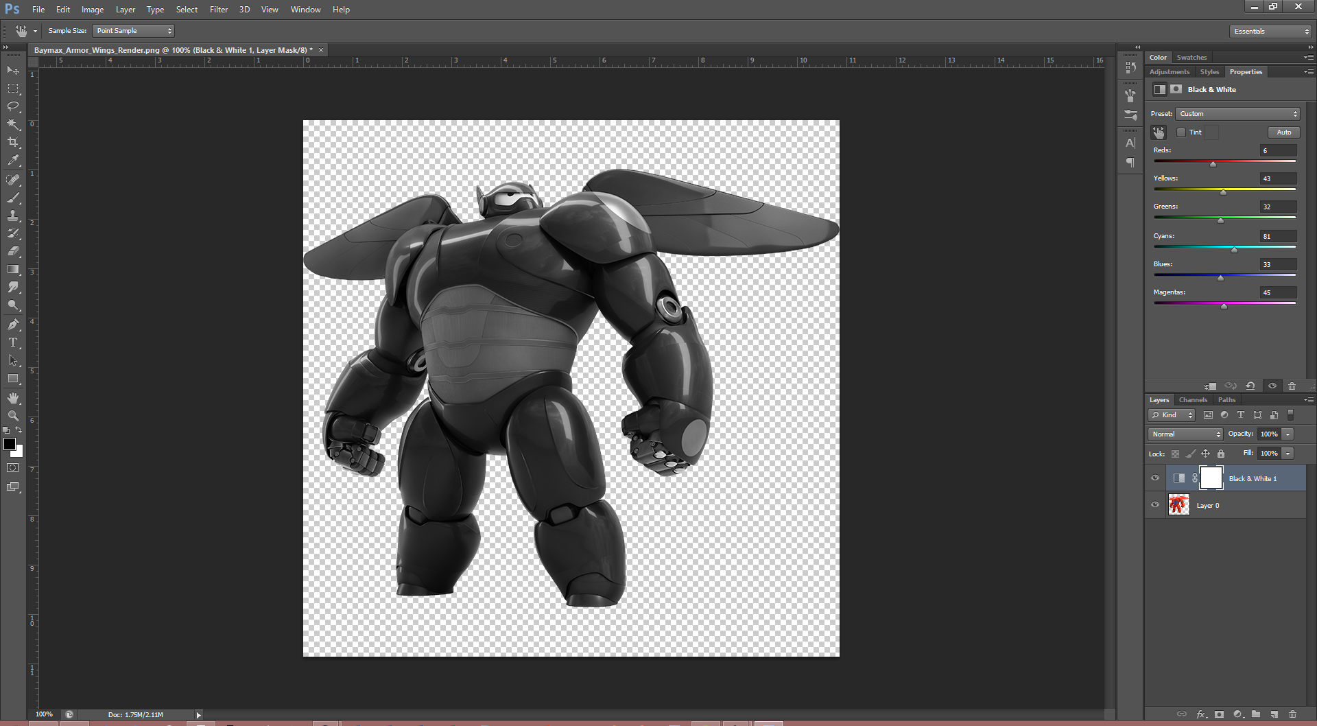
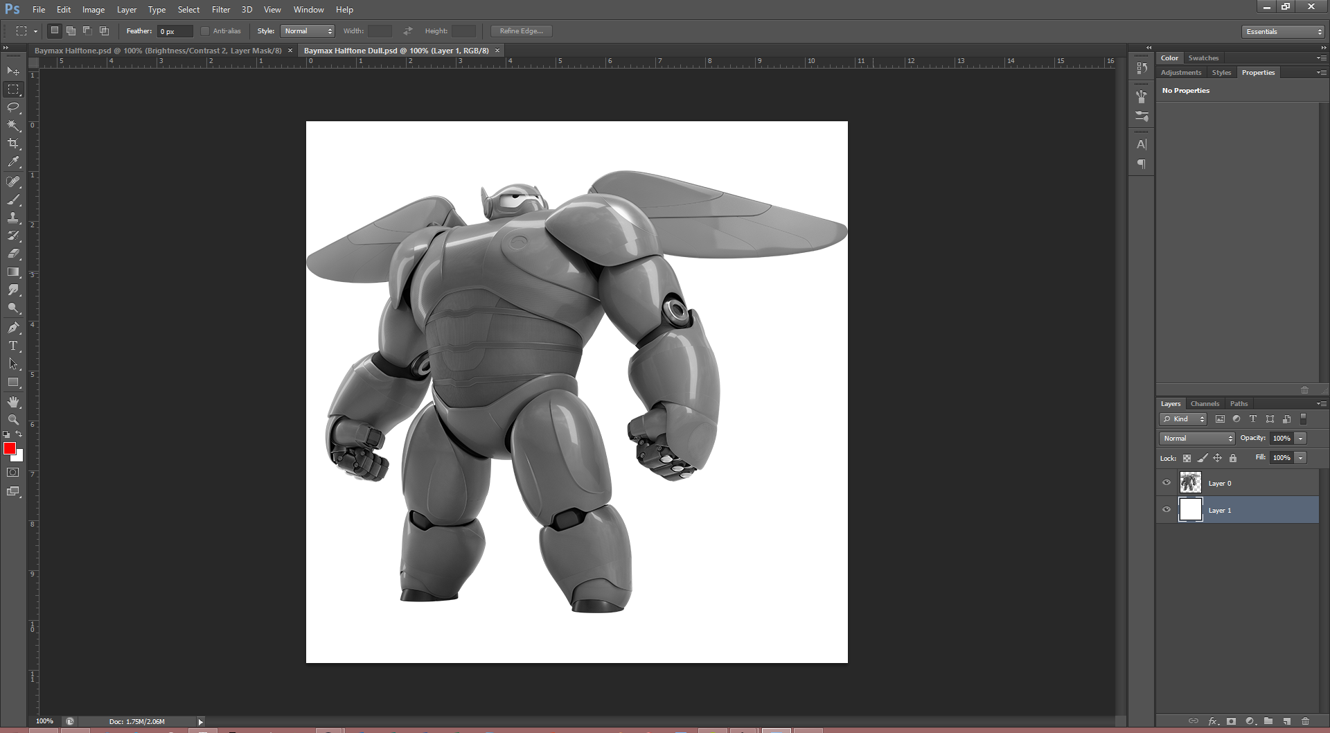
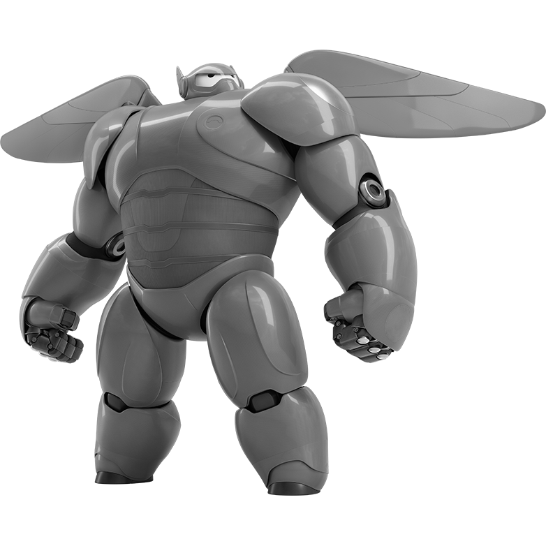
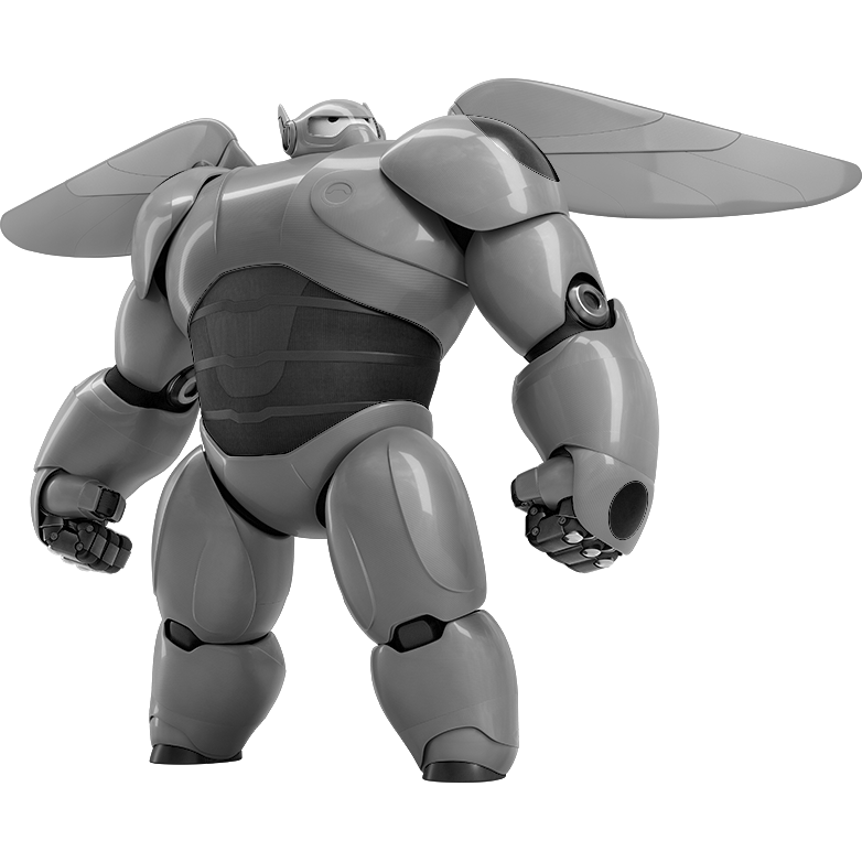

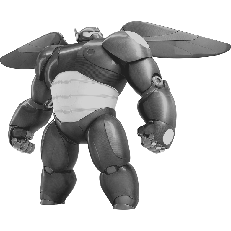
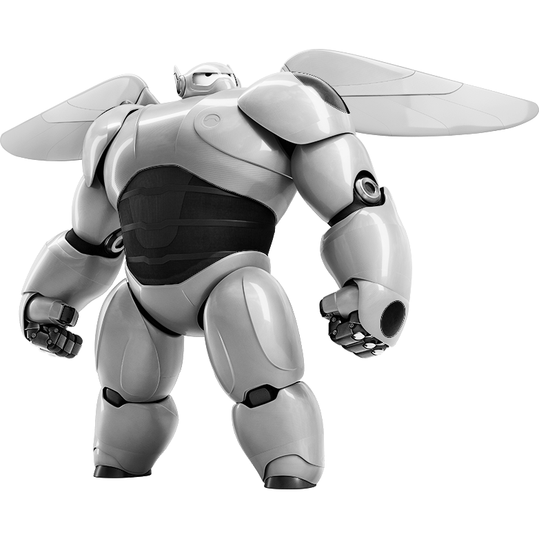
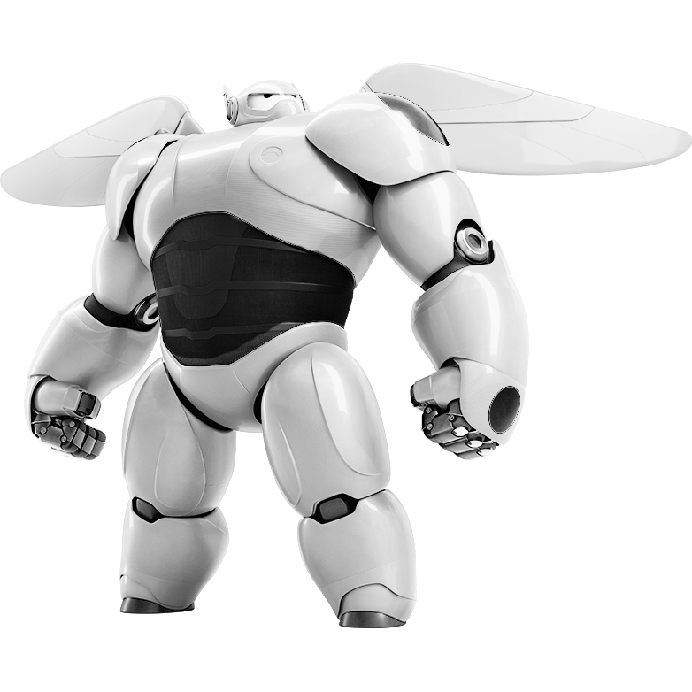
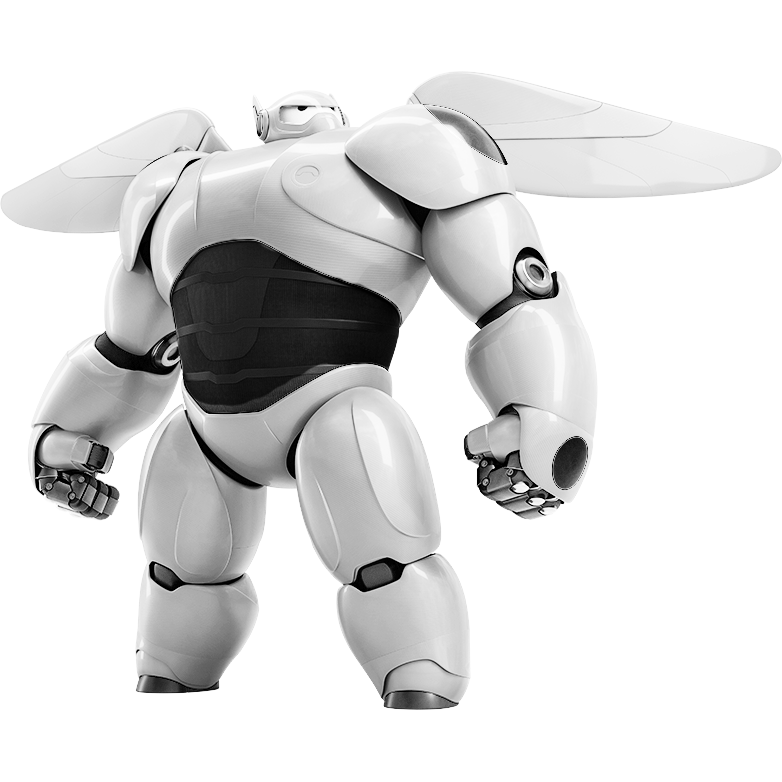
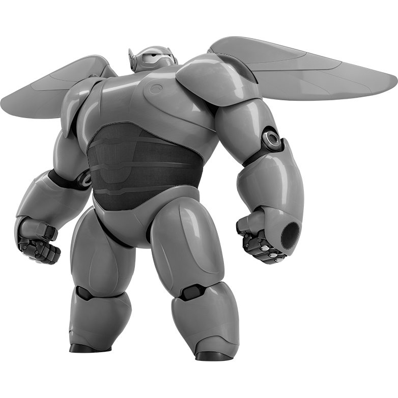
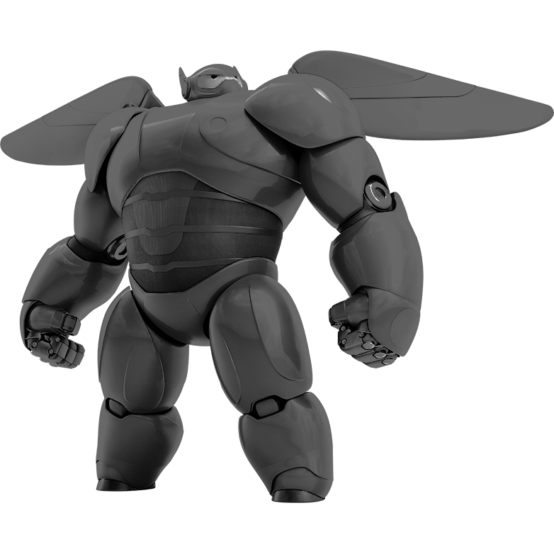
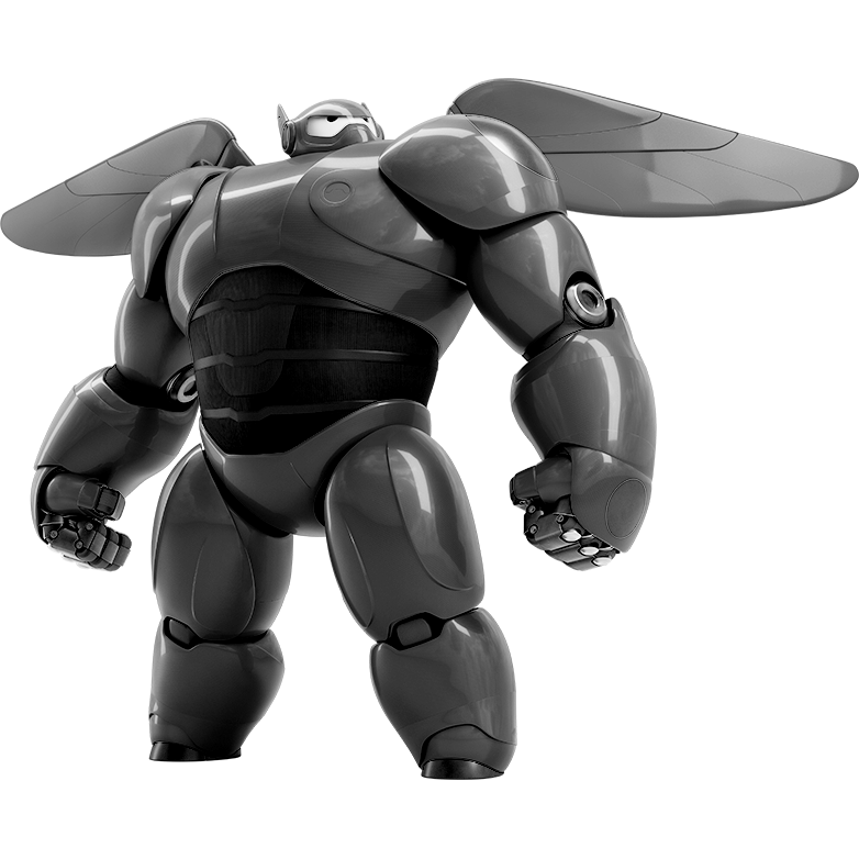
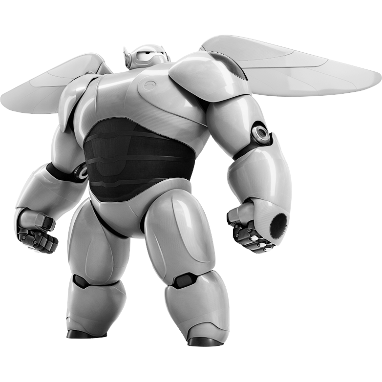
So, I said that we were done with the Adobe Photoshop elements. There's still one thing left, however - the generation of the dot pattern itself. Since we're going to want to have our final SVG file be only black and white, it makes sense that we'll want to convert the Baymax with Armor image from color into grayscale. The problem is, converting an image to grayscale isn't a well defined procedure; there's seemingly infinite ways of adjusting the various color channels in order to achieve different effects when converting a color image to grayscale. I tried a bunch of them, and below I've listed first the one that I ended up going with, and then additionally other options that resulted in different, interesting, but ultimately unused effects.
You may wish to produce different versions, as I did, and then experiment with them all in the next step.
Option 1:
- Open up the Baymax with Armor render into Adobe Photoshop, as seen in the first image. We're then going to want to apply a black and white filter. This can be found by clicking on the half moon icon on the bottom right, to the left of the folder. I've pointed this icon out in the first screenshot. You should then see the adjustment screen that is in the screenshot. At this point, you'll want to play with each of the sliders until the version you see on your screen is to your liking.
- I ended up going with a version where there was very little contrast - that is, the blue and reds appeared almost the same shade of gray. The highlights and shadows were still left intact. There's also an interesting tool that I've pointed out in the screenshot; you can use that by clicking on a particular point on the image and then moving left and right. This will change the slider for the color that you select on the image, which might be more intuitive than adjusting the sliders originally.
- After we've had our fun with the black and white filter, we don't need to do anything more (for this option). You can see the final result in the second screenshot (in Adobe Photoshop with a bunch of things merged), and in the third image alone.
- Save your work!
Other options:
- You could consider making the blues a little darker than the reds, keeping the entire image dark.
- Make the blues very dark, and make the reds light. Then, make the eyes completely black (or don't).
- Do the same as the above, but making the reds very light.
- Invert the entire thing, making the reds very dark and the blues very light. This will make most of the highlights light as well.
- Or, remove all of the highlights, and make the entire thing (both blues and reds) very dark.
For some of the options involving highlights and shadows, I added additional effects with mostly random toying with Brightness/Contrast and Curves filters, both of which can be found in the same menu as the Black and White filter. Though I won't go into detail on these, I've attached the PSD file which (though unorganized) contains many of the options I've listed above. I've additionally attached PNGs for all of the versions which I produced. There's a lot of pictures here - but remember that the first one is the one I ended up using for the final product.
Downloads
RASTERBATION TIME
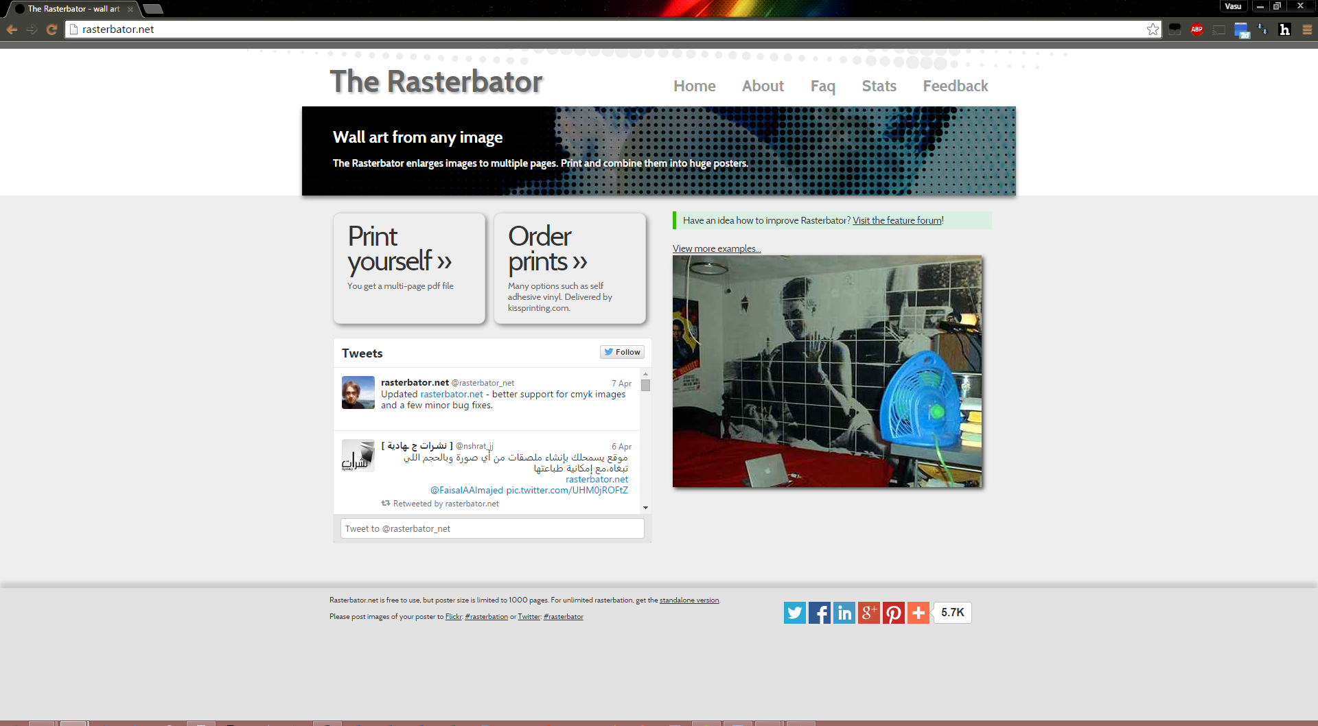
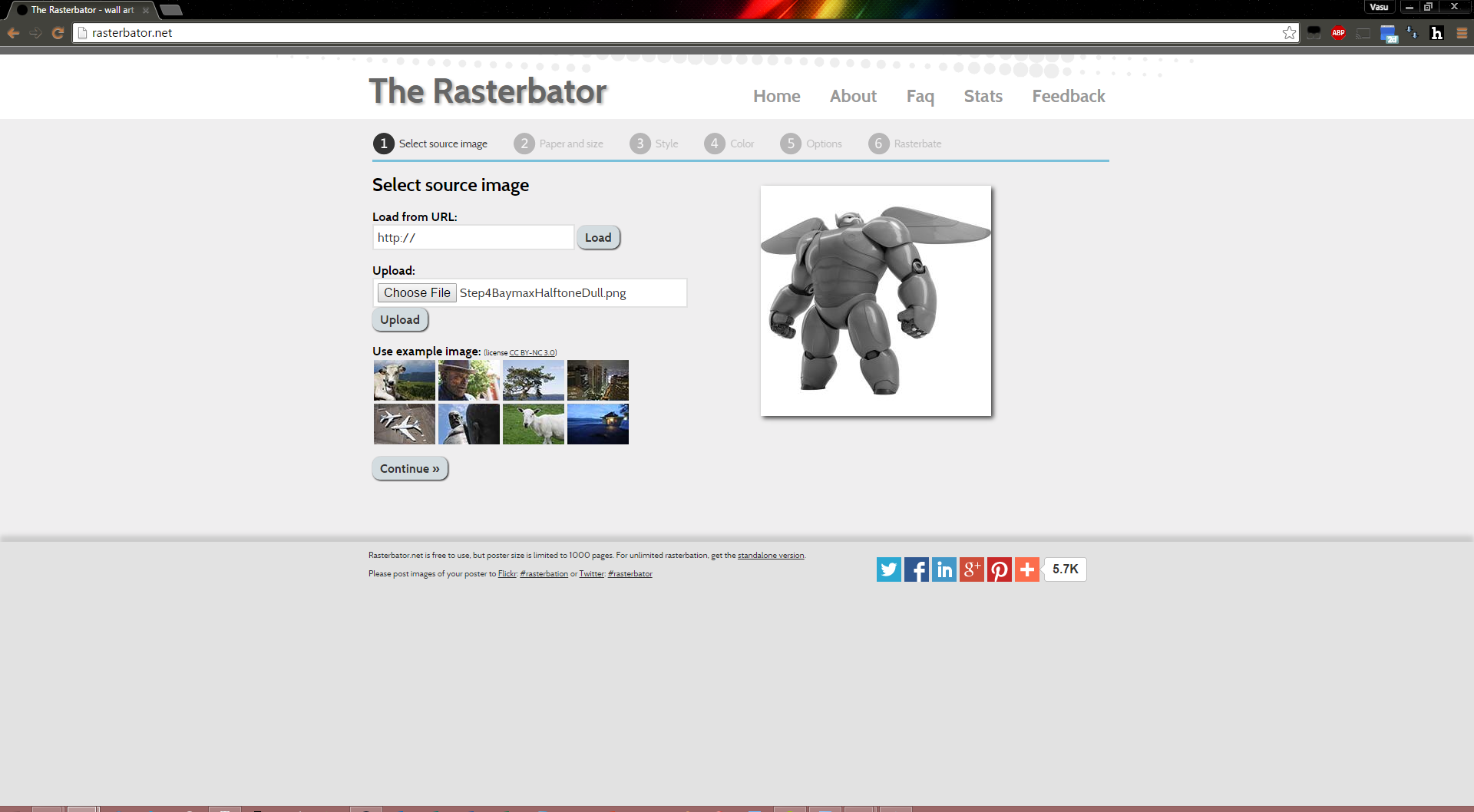
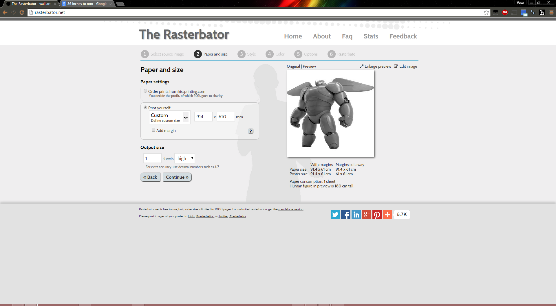
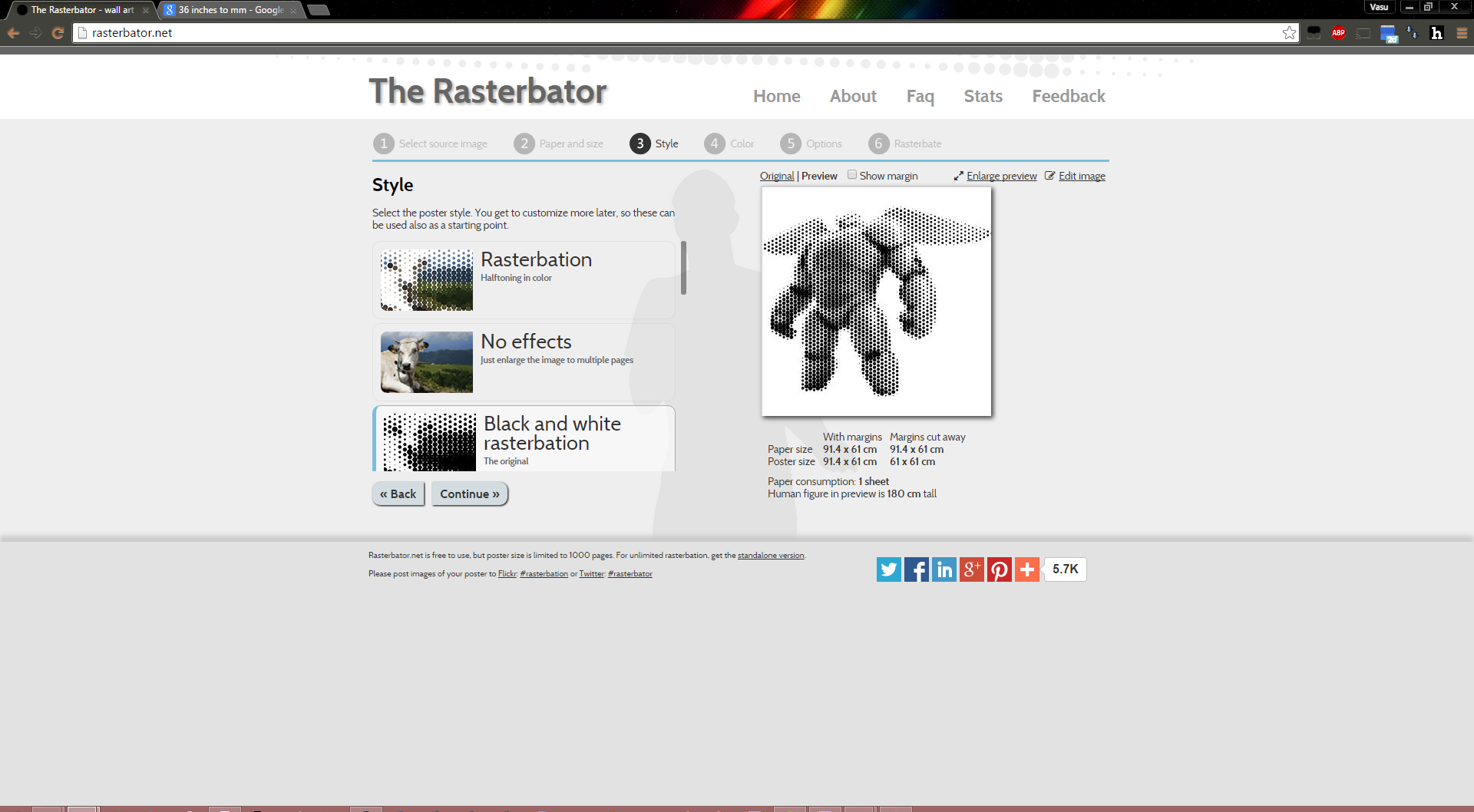
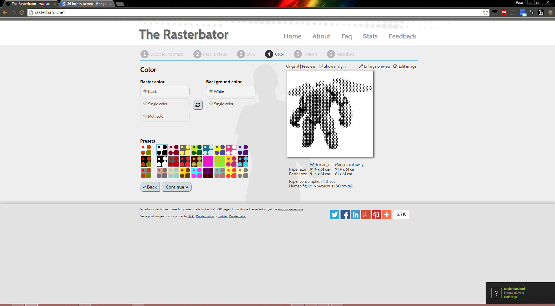
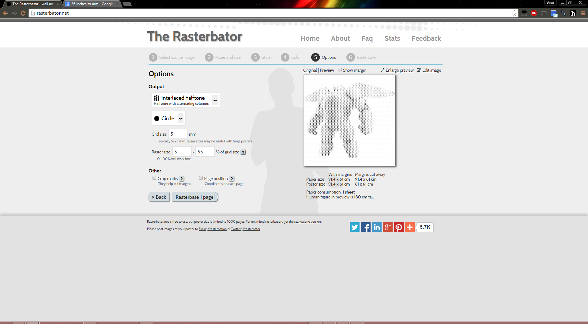
Now it is time to use the images we created in the previous step to finally make our dots. I used the Rasterbator to achieve these results. The site is linked here.
If you've ever watched low resolution video, you'll know that it looks pretty terrible when you're up close, but acceptable as you go further back (that is, it starts to form an image). This is part of the reason TVs are the same resolution as laptops; TV's will appear to be low resolution from up close since their pixels are so big, but as you go further back the image appears to be seamless. We're trying to achieve the same effect; the final product won't resemble much up close, but it'll look amazing from afar. The pictures I've got really don't do it justice. Essentially, we're trying to take an image and tile it using various shapes. More information on this process can be found here.
- Choose to create your own Rasterbation from the black and white version of Baymax in his armor that you created in the last step.
- Use a custom paper size. Make the paper size the same size (or slightly larger) than the final sheet that you'll be working on. Since I knew that I would be using a 2' x 3' piece of wood, that's what I ended up setting the dimensions to. This is important, or else you'll have too few (or too many) dots. Make sure to not select any of the options for margins or cutting marks.
- You'll want to choose the original (black and white) rasterbation option.
- Now comes the experimentation portion. You'll want to mess with all of the settings on the next page (that is, grid size / shape, minimum and maximum fill) in order to get the dot pattern that you're looking for. For small sizes, the preview will work well. For larger sizes, you'll just have to guess, try it (rasterbate), and then adjust as necessary.
A few things to keep in mind, since this rasterbation will be made for a lasercutter:
- We don't want to compromise the integrity of the material. Thus, 100% maximum size is too big, if your image has a good amount of dark in it, as the Baymax version that I went with does. Try to not go over about 80%.
- Keep in mind that the laser cutter will take all of these holes and make them slightly bigger so, once you've found a design that you like, you'll likely want to make all of the holes slightly smaller by adjusting the minimum and maximum values down a little.
- A minimum of 0% will work, but you may find that making a higher minimum makes the entire design show up a little better. That one's up to you.
- Lasercutters can maintain accuracy down to a few thousandths of an inch (.003") on the lower end, and even greater accuracy on the higher end (.0005" - .001"). So, don't be afraid to make your grid size / hole size small. Decreasing the grid size is essentially the same as adding resolution on a TV / phone / screen.
I tried a bunch of options, but the settings I ended up using (for the image that I went with per the last step) were as follows:
- Grid shape: Interlaced halftone
- Shape: Circle
- Grid size: 5mm
- Minimum Fill: 5%
- Maximum Fill: 55%
I found these settings to produce a good balance between visibility of the image and remaining material (adjusting for a little laser cutter overcut). Your mileage may vary, so experiment with a few different settings until you get something that you like.
I've attached the final rasterbation as the first file, with the other variations that I tried after that (in no particular order). In case the order is mixed up, it's Step5Rasterbation(10).pdf. Please note that the paper sizes vary across the files. The last few PDFs that I've attached feature the design that I went with at full scale, except produced on US letter paper. This allowed me to print out the design and see how it would look in real life rather than on a monitor. While it didn't account for the lasercutting size boost, it's still useful to get an understanding of the final design. Again, in case the order is messed up, Step5Rasterbation(11-12).pdf.
Downloads
Inkscaping! (again)
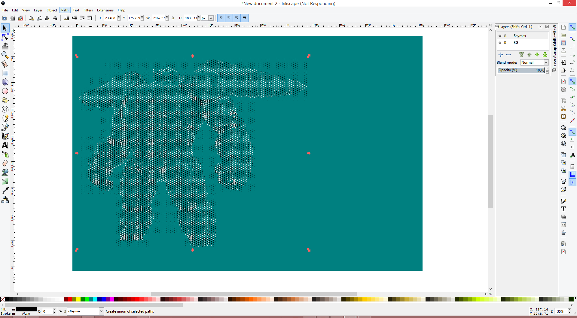

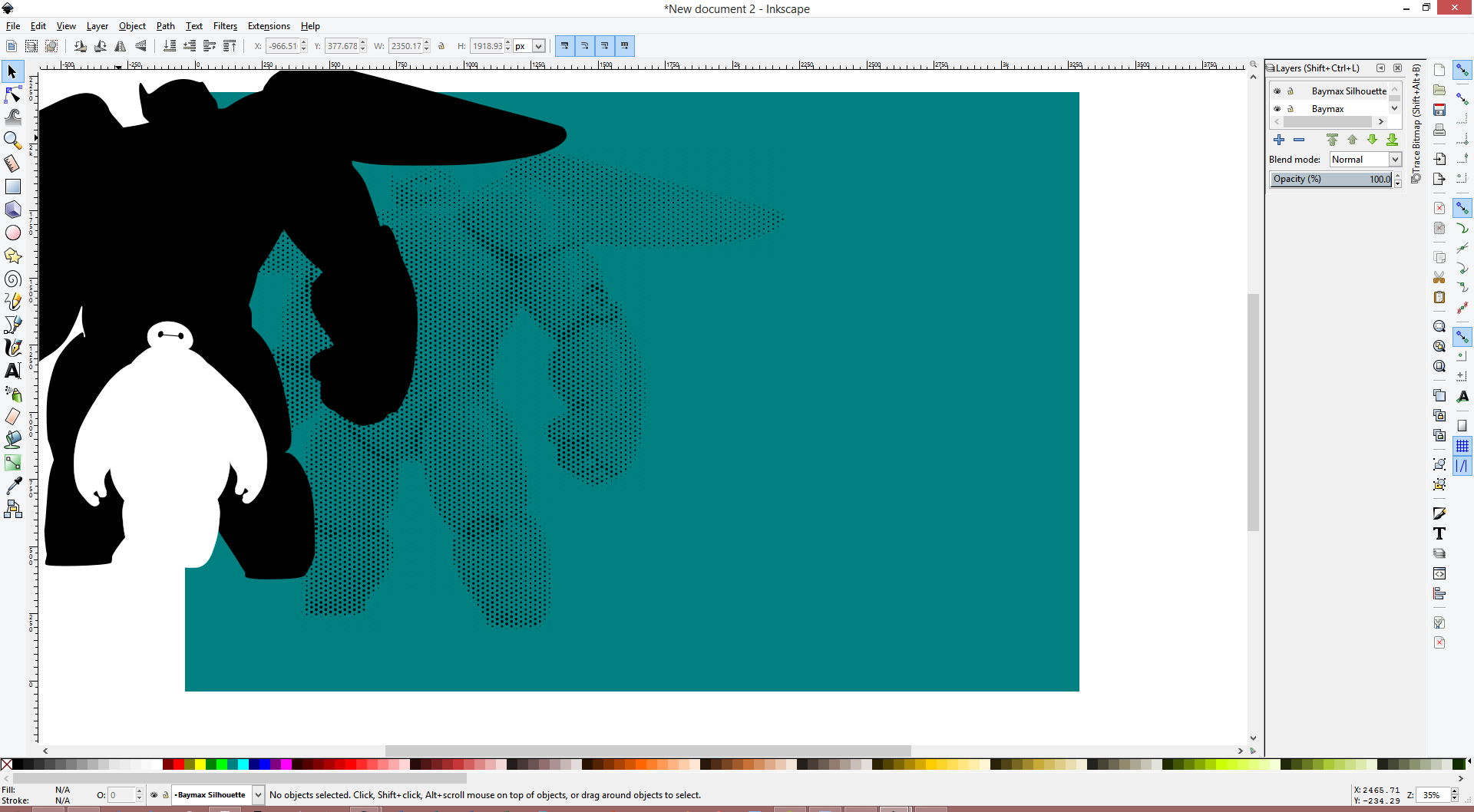
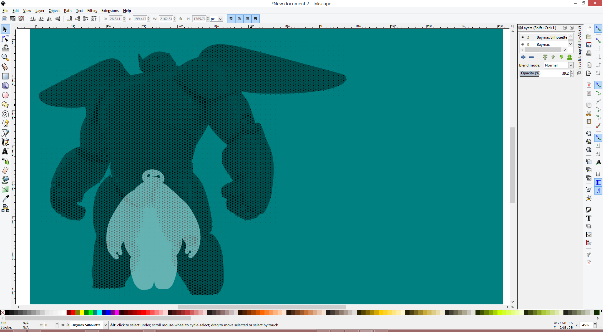
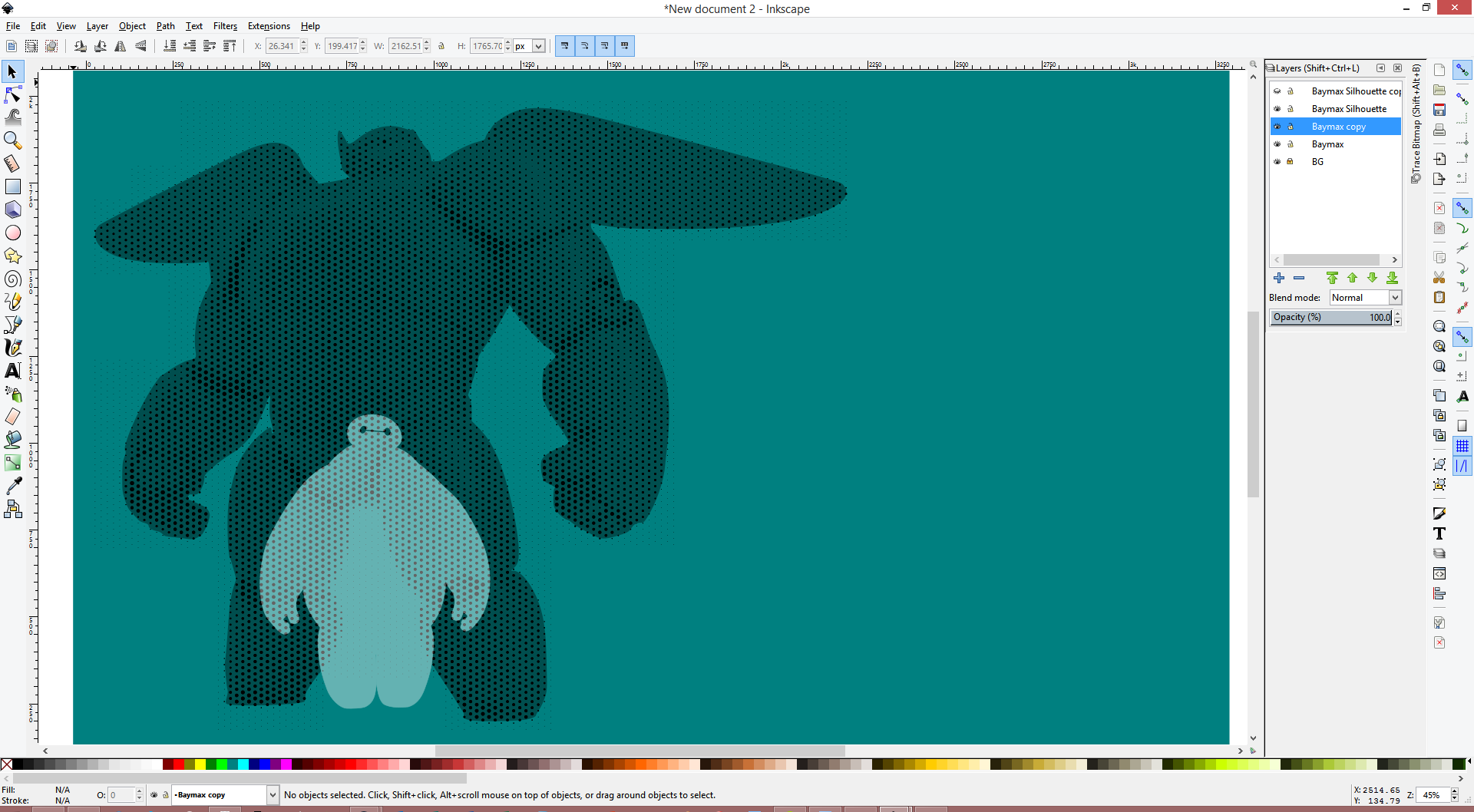
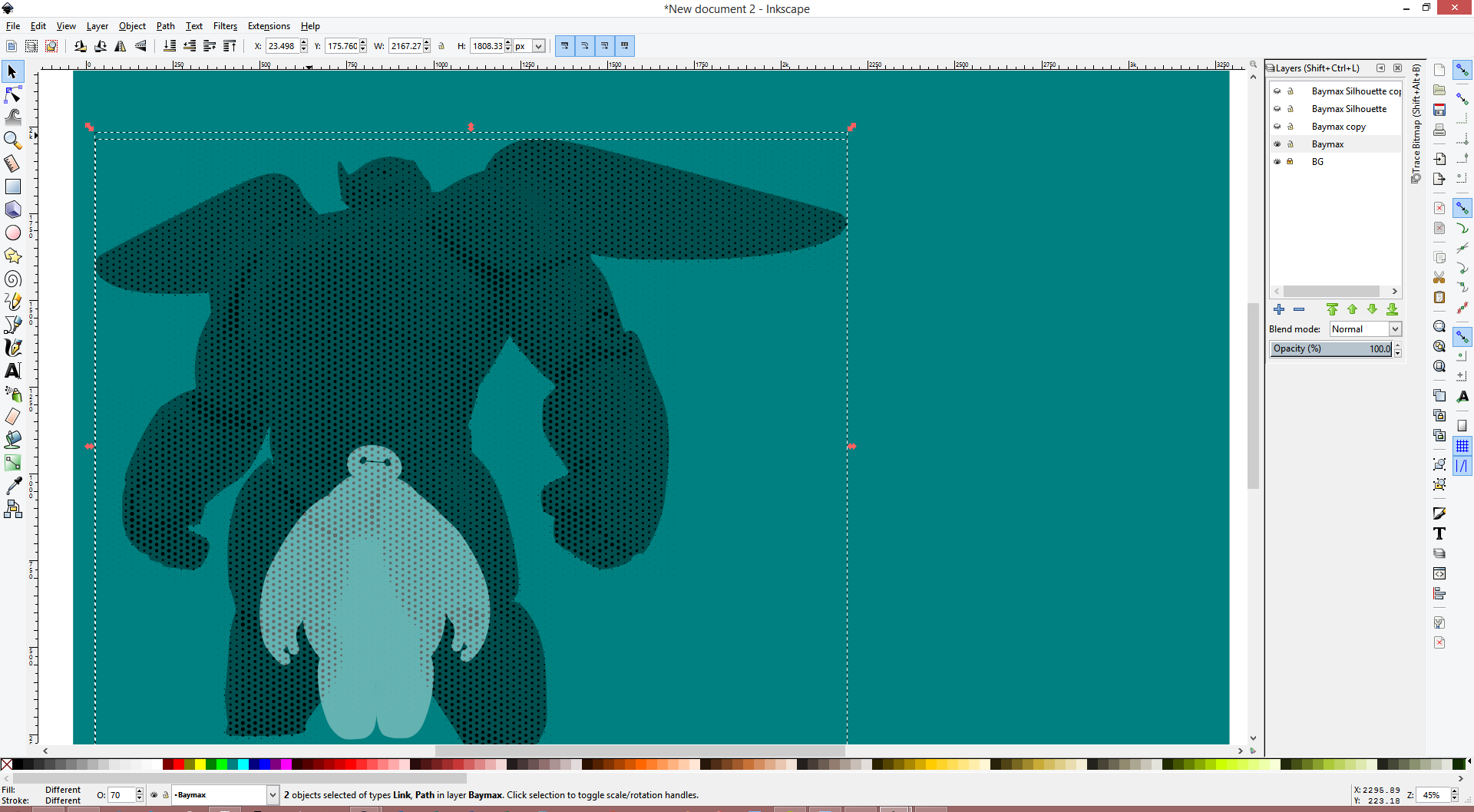

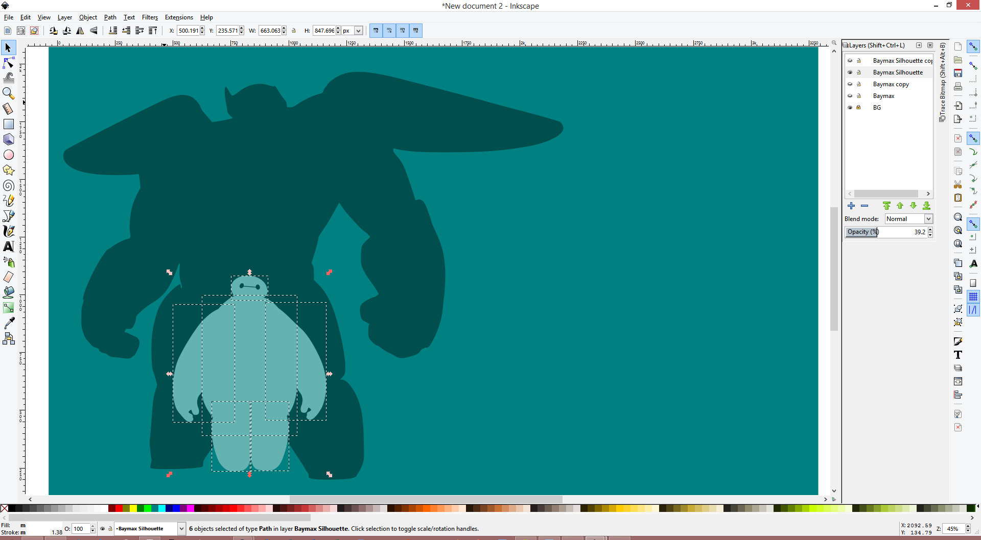
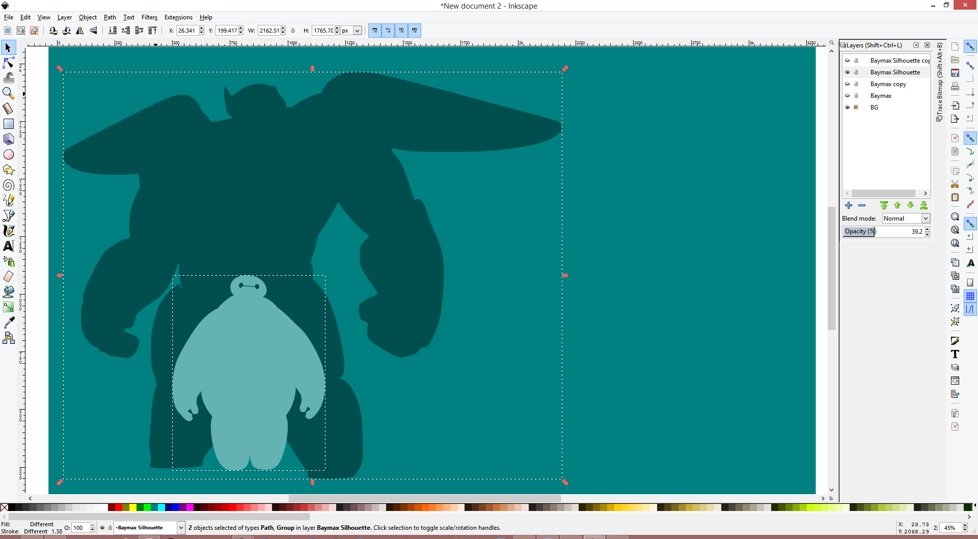
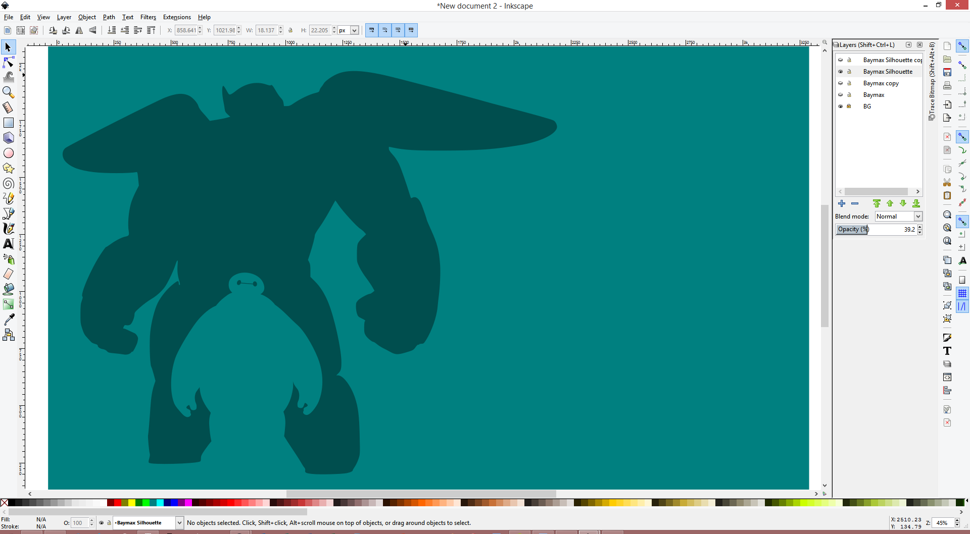
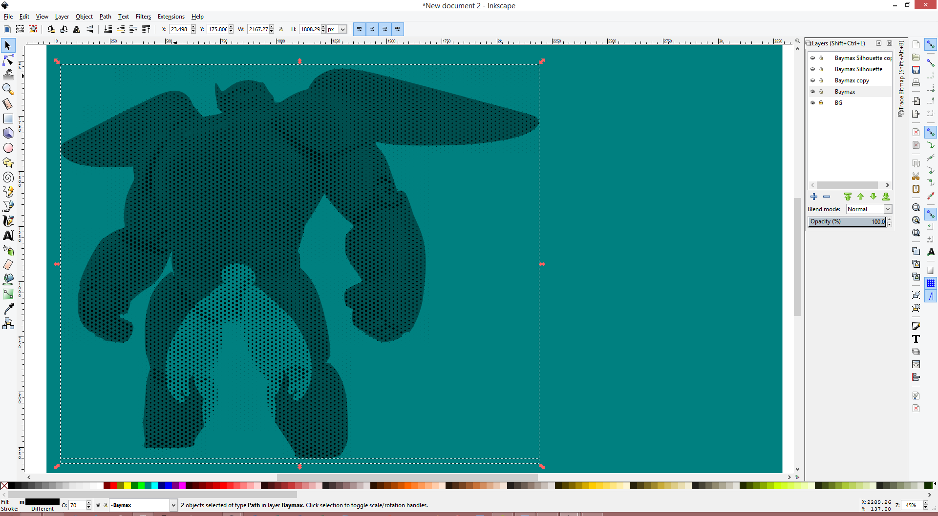
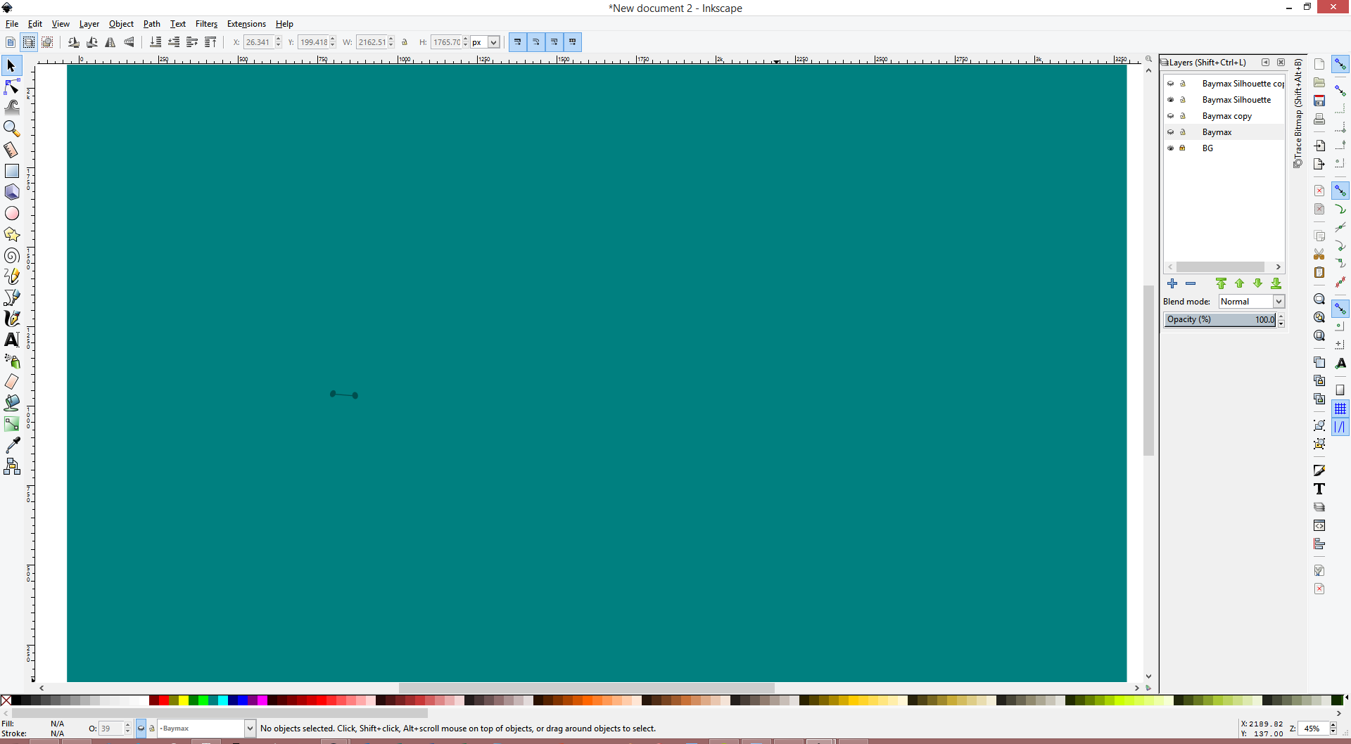
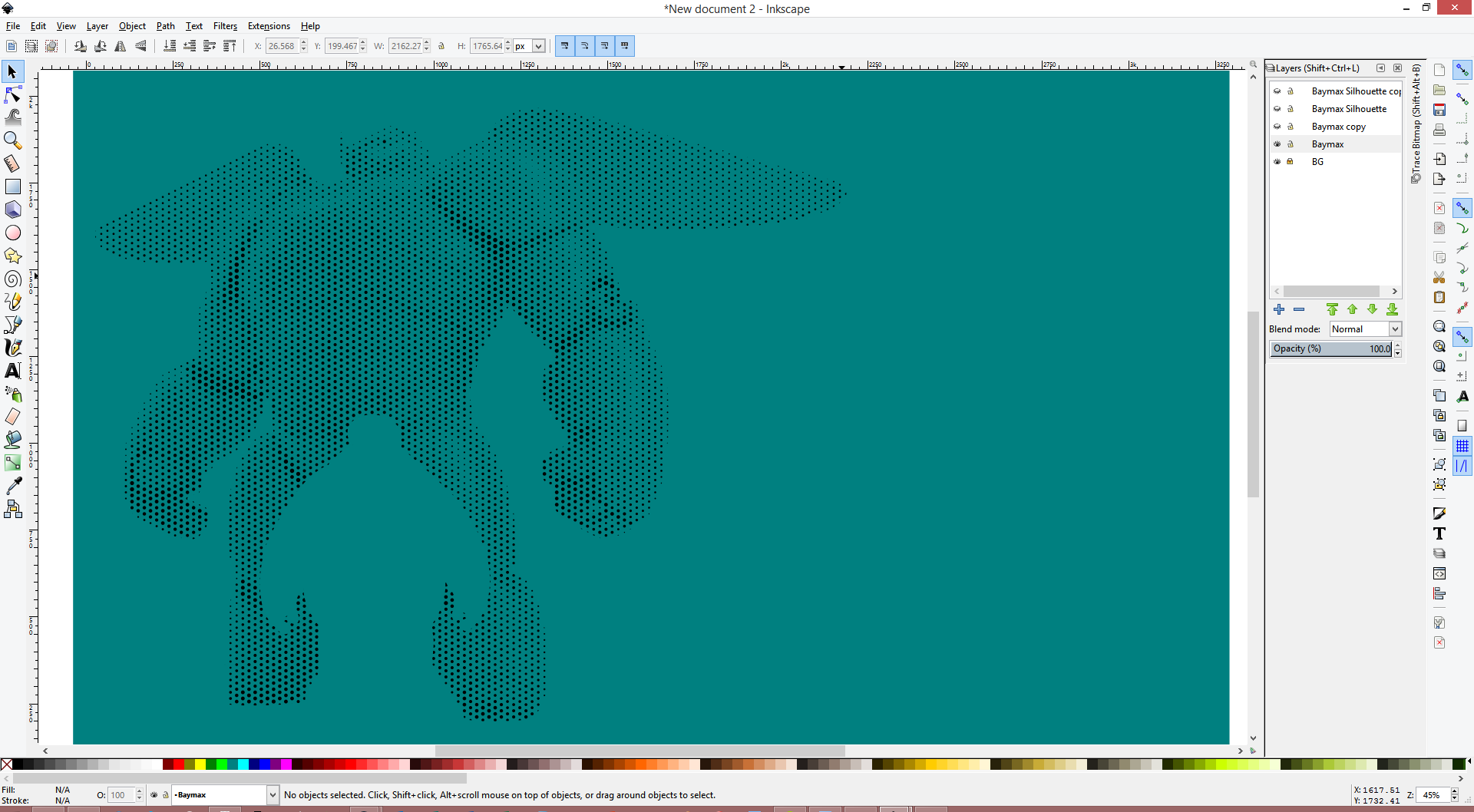
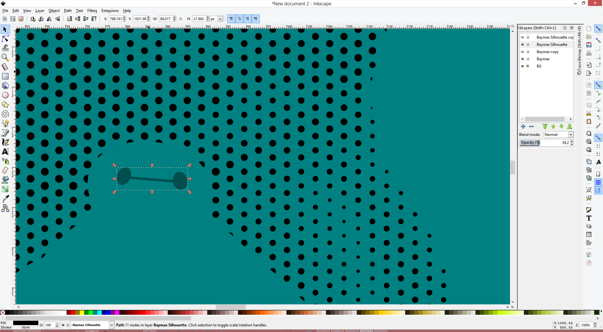

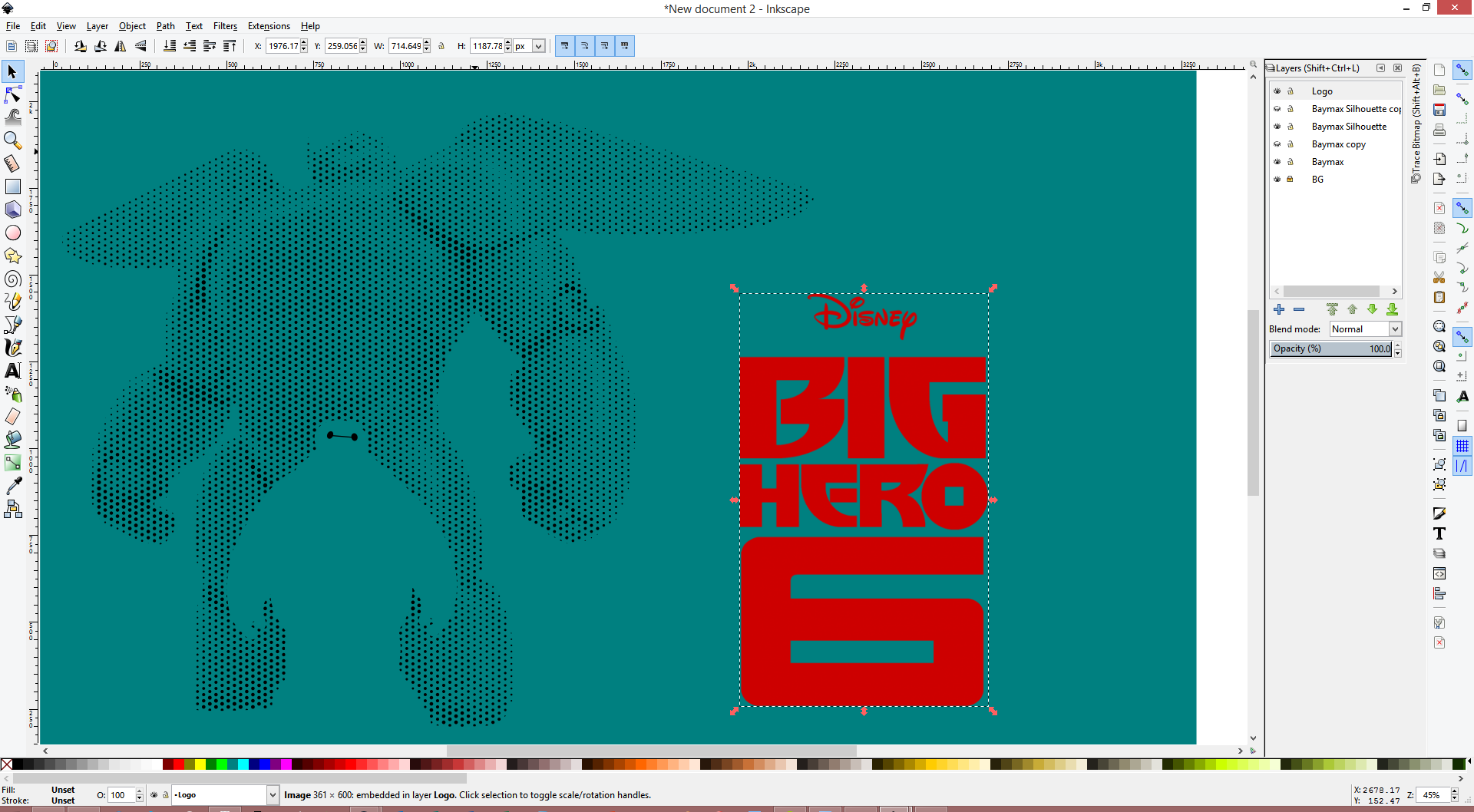
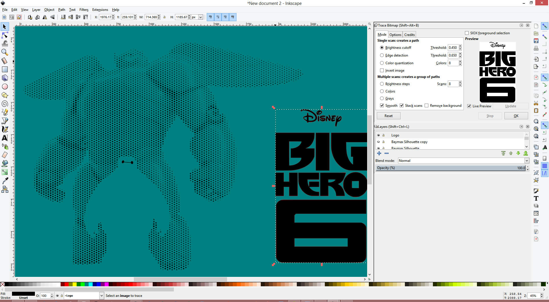
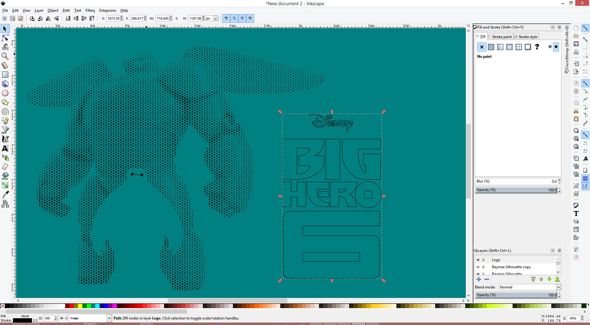
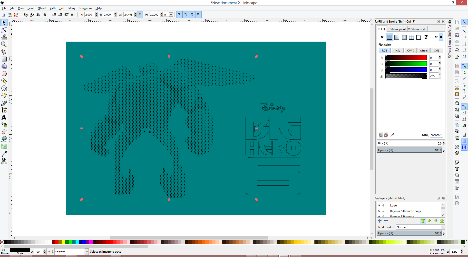
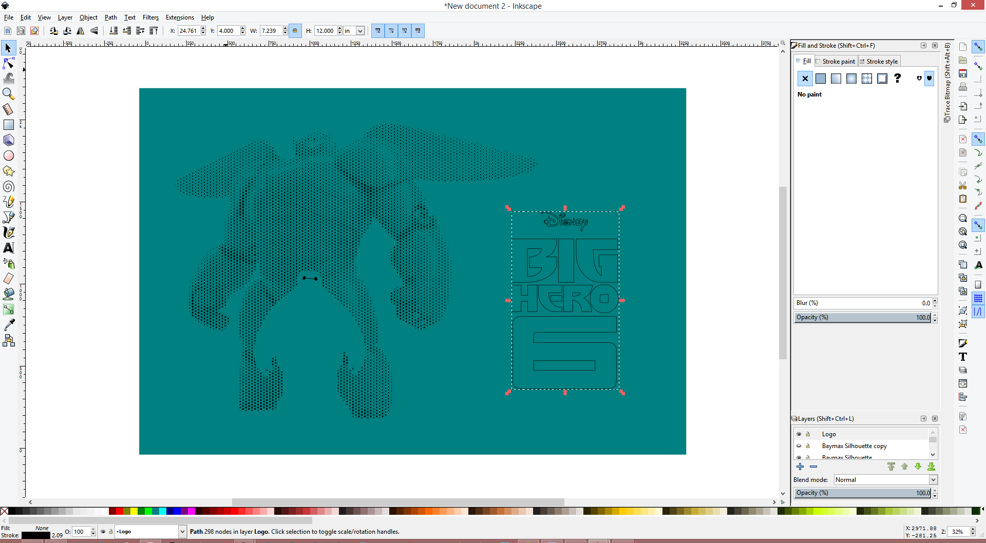

Okay, so there was a little more inkscaping in our future as well. Maybe a lot more.
Disclaimer: We will be working with a lot of dots in this process. Some of the operations will take a long time (upwards of 15 minutes on my overclocked machine). Inkscape will appear to not respond. Please do not be alarmed. Go make yourself a nice cup of coffee, grab a beer, or just take a break for a few minutes. There's still a ways to go.
Preparing Baymax:
- Make a new document in Inkscape.
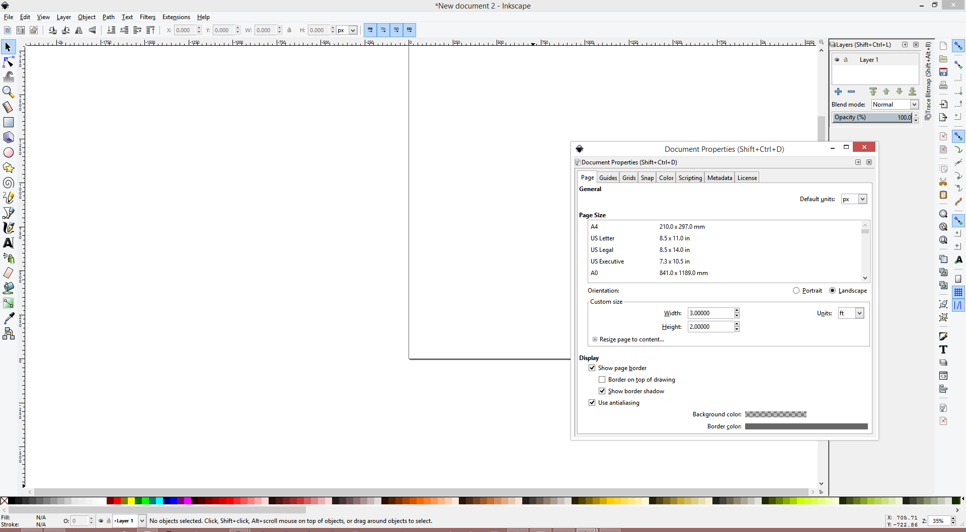
- Go into document properties (CTRL + SHIFT + D) and change the width and height to be the size of the final piece. I wanted to make mine 3' wide x 2' tall, which is the same aspect ratio as many posters. So I did.
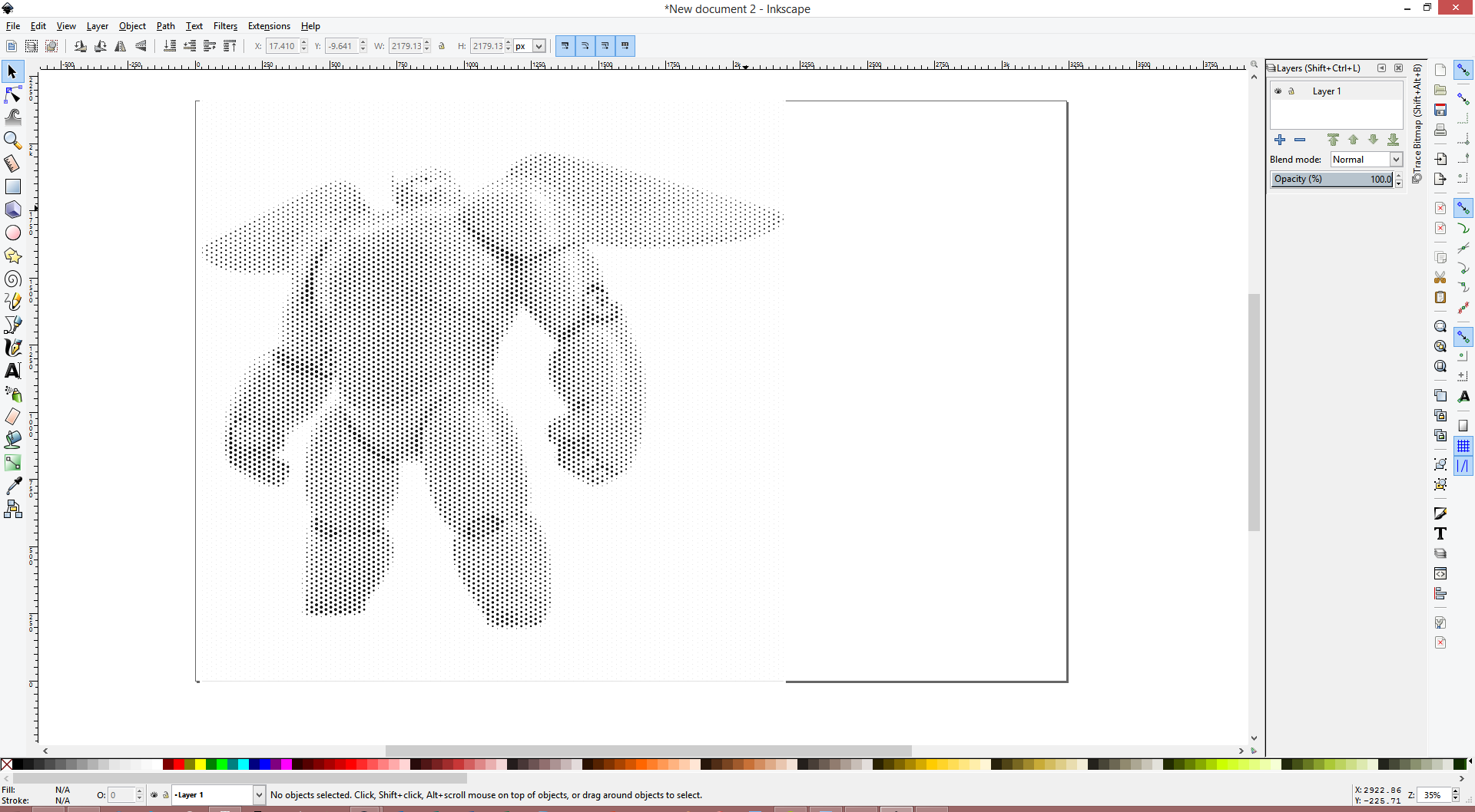
- You'll now want to import the PDF which was the result of the rasterbation from the previous step. As it happens, the Rasterbator gives us everything as nice vectors in the PDF, so we save the trouble of tracing everything! The default import settings are fine. Already you'll notice operations beginning to take a long time.
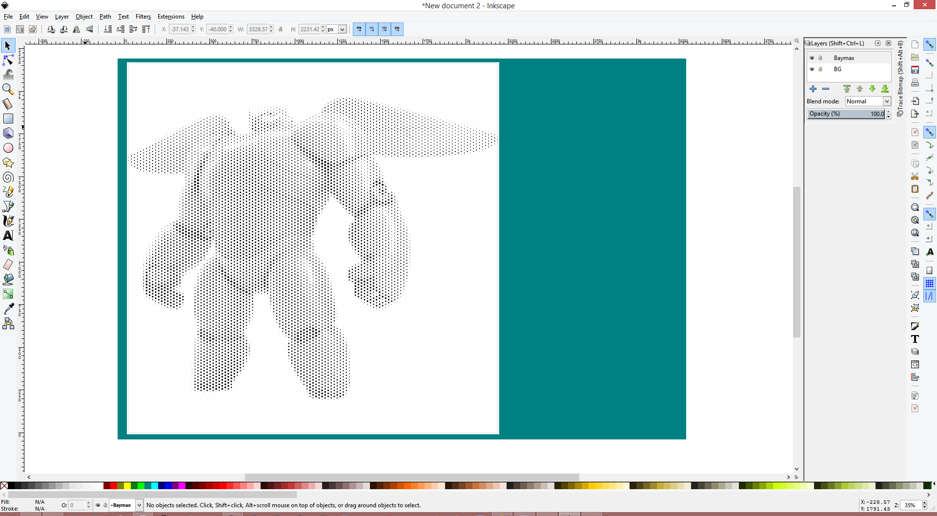
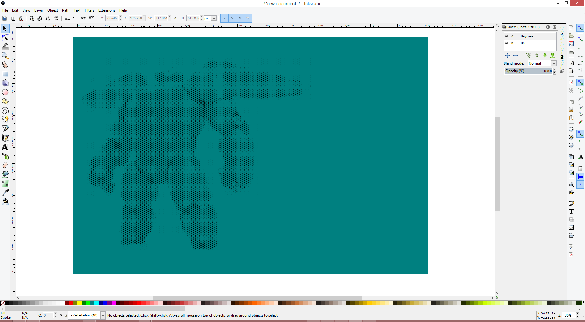
- After you've imported the Baymax dotted version, we're going to add a nice background to the image, again with a rectangle on a layer beneath. This will make the entire thing nicer to look at, and serve as a contrast between the white we want, and any residual white that may be floating around. I've added one in the third image.
- We're now going to attempt to reduce the number of dots in the image, as well as clean up the imported PDF. Unfortunately, the PDF generated by the Rasterbator isn't perfect for our needs, and comes with a couple of excess features. Luckily, these are easy to remove, and since the entire PDF is in a group, it's easy to do it very quickly. Right click on the PDF, and enter the group (as before).
- In particular, the Rasterbator added a solid white background to this image, as well as very small margins around the edges. I'm not sure if this happens to all Rasterbations or just the ones that I did, but it's trivial to remove nevertheless. Simply click on them with the selection tool, and press delete to remove. If you have many dots around your image (as a function of setting a nonzero minimum for the fill) and are unable to click on these items, then you may find it beneficial to remove them first. You can do this also by selecting large areas of them, and just deleting. You may want to zoom in to get more granular control. While it's not critical that all excess dots are removed, you need to remove any of the white areas which I mentioned. See the images for what my version with the background and some dots removed looks like.
- Now, go back to the parent (right click -> go to parent), and then right click on the PDF group and ungroup it. This will also take a while.
- We're now going to select all of the dots, and then union them all. You can either press CTRL + +, or go to Path -> Union. This operation will take quite a while, so be patient. Inkscape has to calculate a lot of intersections. There's something like 10,000 dots that we're working with. While writing this Instructable, I noted a time of over 20 minutes.
- Now, we're going to create a new layer, and then import the SVG with Baymax inside Baymax w/ Armor's silhouette. Then, move and scale the group as necessary so that it covers the Baymax dots as best as you can. I haven't been able to find a better method than simply eyeballing it, but with enough zoom and lowered opacity it works pretty well (see picture).
- We're now going to duplicate our Baymax silhouette layer, as well as the layer with the dots. Do this by right clicking on the layer name, and then pressing duplicate current layer. This will give us a backup, and allow us to maintain the original layer when it gets consumed in operations. You'll want to hide away the duplicates, so just turn their visibility off.
- We're now going to prepare the "clipping mask" that we're creating with our silhouette. Hide the other layer containing the Baymax dots, so all that we're seeing now is the Baymax silhouette layer, and the background. We're now going to right click and ungroup the silhouette. Keep right clicking and ungrouping both the silhouette and Baymax itself until you can select individual paths (that is, you can't ungroup any further). This will allow us to perform vector operations on them.
- We're now going to select all of the white components of the Baymax (that is, everything but the eyes), and union (CTRL + +, or Path -> Union) them together. Then, select the silhouette and the white Baymax pieces, and do a difference (CTRL + -, or Path -> Difference).
- Now, with your Baymax silhouette's layer selected, right click on the Baymax silhouette (not the eyes) and press Move to Layer. Move it to the layer containing your Baymax dots, which I've called Baymax.
- Unhide the layer containing the Baymax dots (that is, the one that we just moved the silhouette to). We'll now select the silhouette and the dots, and do an intersection on them (CTRL + *, or Path -> Intersection).
- Go back to the layer with the eyes (where we took the silhouette from), and select all of the eye pieces (SHIFT + click), and union them all. Then, move the path over to the layer with the dots, and union those together.
- Save your work!
Preparing the logo:
- We're now going to add the movie logo to the other side of the piece. I found a PNG of the logo here, and it's also attached as one of the images.
- Repeat the same process as before to trace the logo. In short, open up the tracing menu, use the default settings, and delete the image.
- Now, select the vector that was just traced, and take off the fill via the fill & stroke menu. Additionally, thicken the stroke a little (increase the pixel size).
Moving everything together:
- We're nearly there! We now need to just move the vectors around to their final positions. We can click on each of the vectors and position them with absolute coordinates. You'll want to keep a bit of a border around the piece so that you can attach LEDs and the wood framing, so I went with a 2" margin around the edges. I locked the aspect ratio for the vectors, and then adjusted the values accordingly. Baymax ended up being a height of 20.00", at x, y of (2.00", 2.00").
- I moved the logo to be a height of 12", y of 4", and x of 36 - 4 - (whatever the width of the logo was, at a height of 12").
- Save your work!
Postscripts and Pstoedit
Only a little more to go!
Our goal is to convert the SVG that we're looking at now into a .DXF. Unforatunely, Inkscape's DXF writer isn't the greatest, and there are quite a few bugs when we convert from SVG to DXF directly. Instead, we'll want to save as a .EPS, and then convert to DXF from there using a program called pstoedit. Online converters may work, but I haven't tried them between EPS and DXF. However, they all seem to suffer from the same bugs when converting from SVG to DXF, so those are a no-go either. We'll be using the tool available here.
- Save the SVG that we're working on as a DXF. Make sure to hide the background. The default options are fine.
Windows users:
- Download pstoedit, and install the binary.
- Depending on your version of pstoedit (32 bit or 64 bit), append the following to your system PATH, per here: ";C:\Program Files\pstoedit\", or ";C:\Program Files (x86)\pstoedit\". Include the semicolon, ignore the quotes.
- You'll also need to install a few dependencies. Navigate to the pstoedit site, linked above, and see the additional plugins section.
Linux users:
- pstoedit may already come installed on your distribution. You can check this by opening up a Terminal and typing in pstoedit. If you get a usage error, you're in good shape.
- If it's not installed, you should be able to install it from a package manager or repository. "sudo apt-get install pstoedit" worked on my Ubuntu based system.
- Worst comes to worst, you can compile from source available here. Sorry, no help there.
Mac users:
- I don't have a Mac, but I assume the process is largely the same as in Linux. In the worst case, open a Windows instance via Parallels or Bootcamp and follow the above instructions.
Assuming you've now got pstoedit installed, open a terminal / shell and navigate to the directory containing your EPS file. You can do this by figuring out where you've stored it, and then doing "cd [PATH NAME HERE]". Once you've navigated to the appropriate directory, do the following command, per here:
"pstoedit -dt -f dxf:-polyaslines ${epsfile (input name)} ${dxffile (output name)}"
You've now got a proper DXF file from the SVG that we started with! I've attached my result on the next step.
Downloads
Coloring the DXF
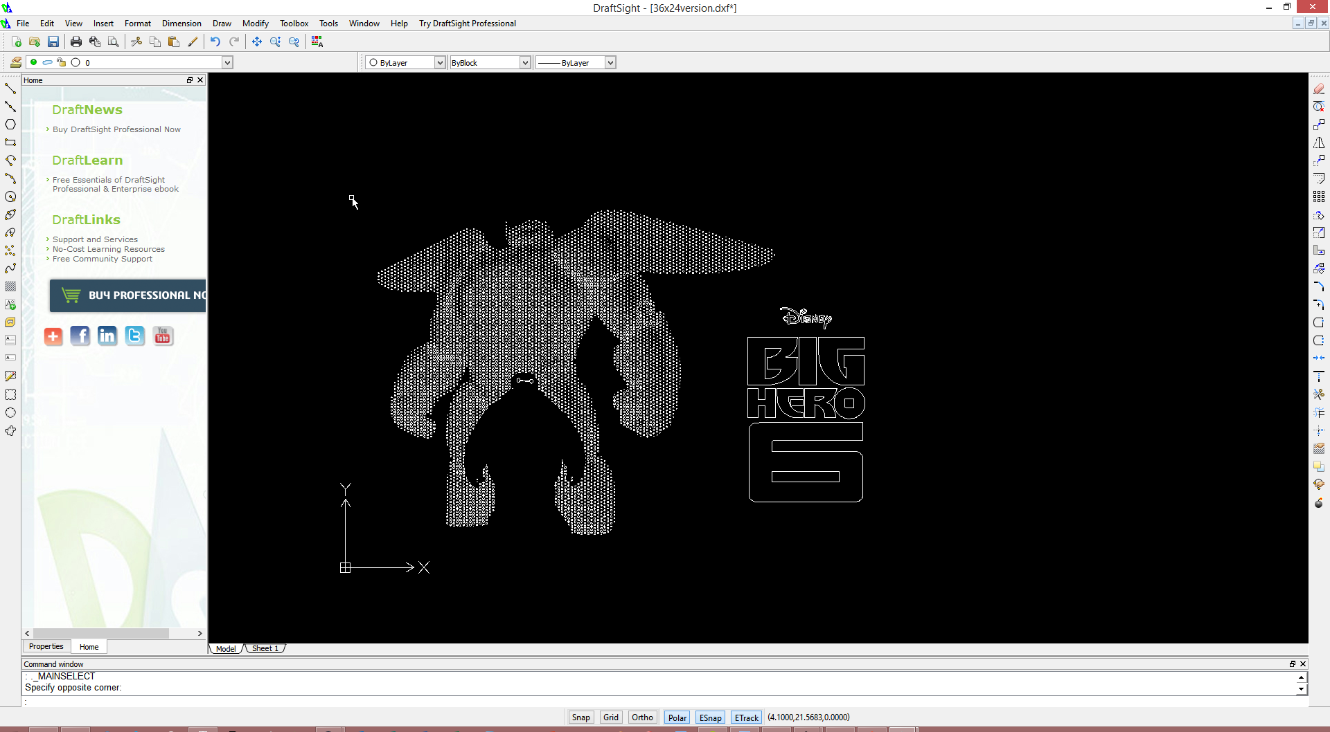
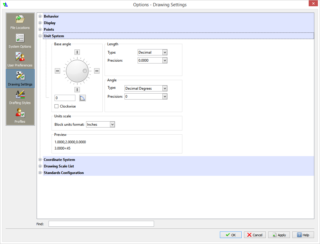
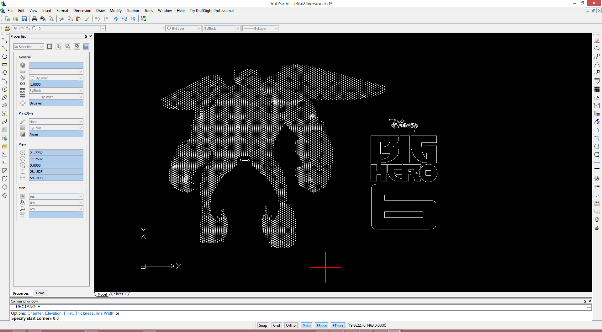
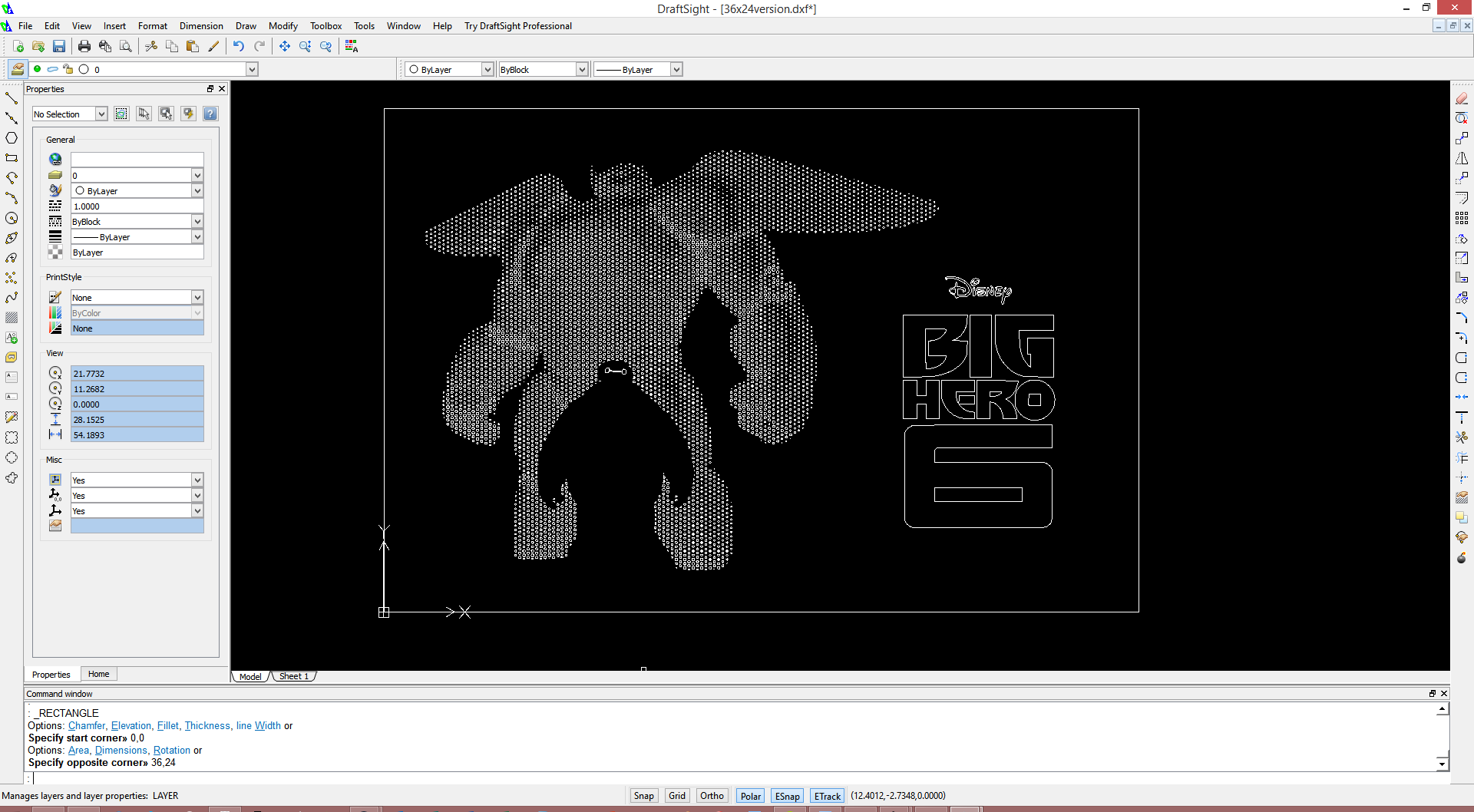
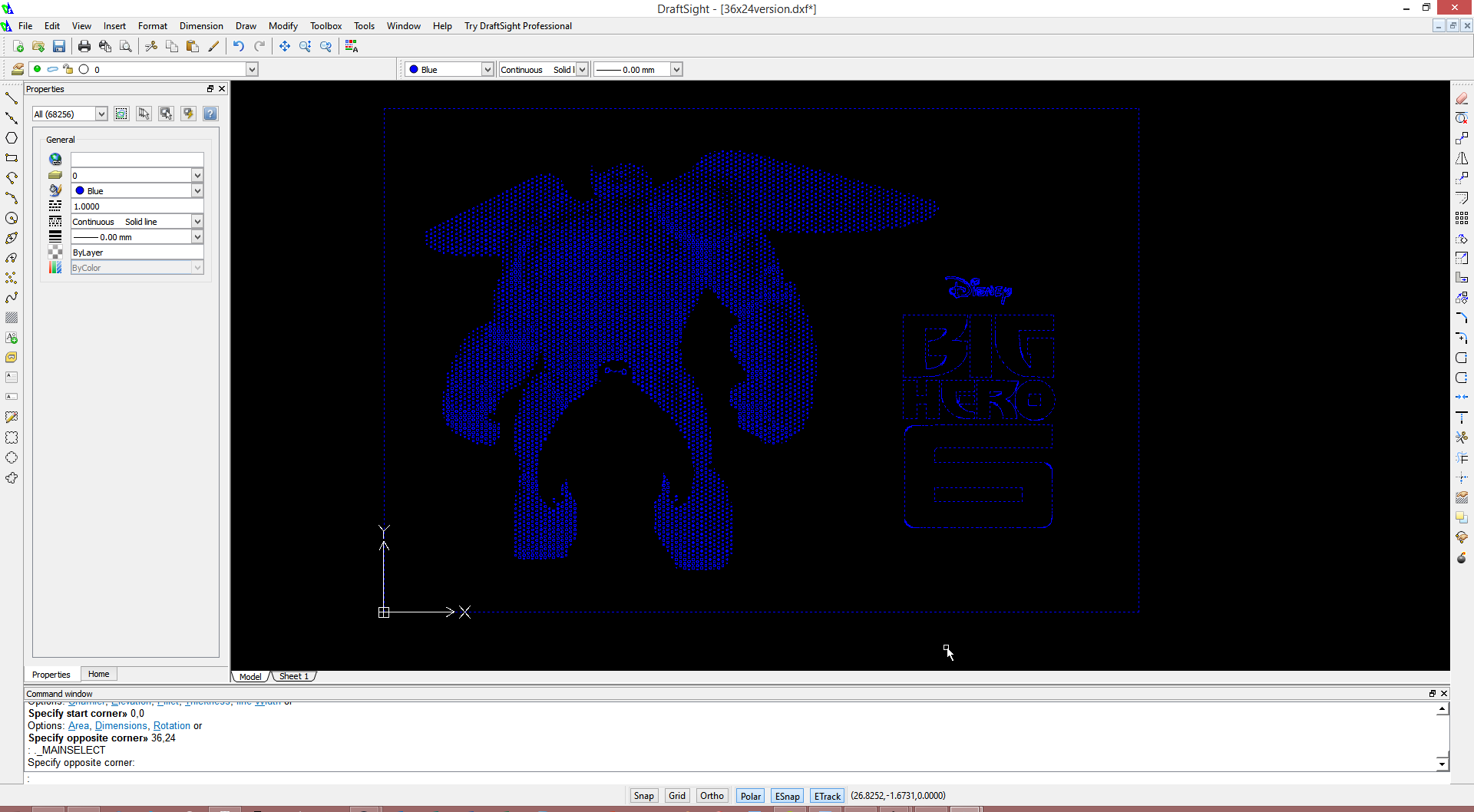

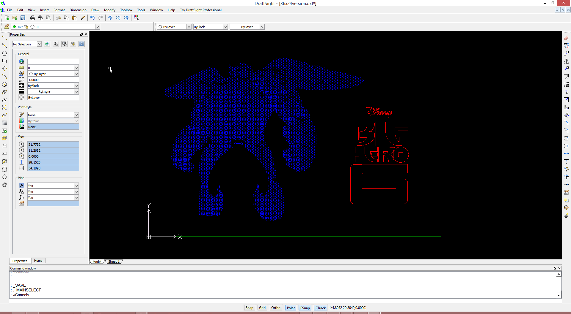
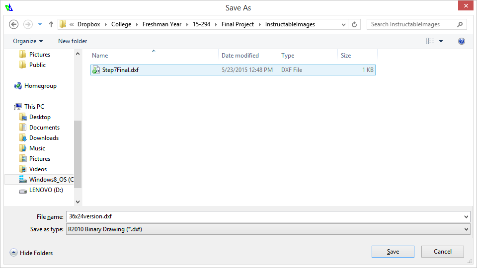
Now it's time to open up the DXF in a DXF editor of some sort. I'm using DraftSight. Our goal here is to color different parts of our file with different colors, as well as assign a uniform linetype and lineweight. The different colors will allow us to control the order of laser cutting with some more granularity. More on that later.
- Open up the DXF we just generated into DraftSight. I've attached mine as the first file.
- If the scale seems a bit weird, don't worry. Zoom in with the mouse wheel until the image fills a sizeable portion of the screen. Then, we're going to go into document settings, which you can do by Tools -> options. Go to Drawing settings -> unit systems, and change Block units format to be Inches instead of the default. Press OK.
- Create a rectangle by going to Draw -> Rectangle. You'll now be prompted to either click on the screen or type in values into the command line. We're going to use the latter. Simply type in "0,0" (no spaces), and press enter. Then, for the second coordinate, you'll want "36,24", as that is the size of the piece we are working with.
- Now, with a click and drag of the mouse, select of the elements in the drawing. We're going to color all of the items a certain color (i.e. Blue). Additionally, we'll change the line weight to be 0.000", and the linetype to be Continuous. All of this can be accomplished via the top bar, or the properties menu if you're so inclined.
- Now, select only the logo, and change it's color to something else. The linetype and lineweight will stay the same.
- Finally, change the rectangle's color to be a third thing.
- Save your work! My laser cutter likes the R2010 Binary Drawing format the best, so that's what I use. You may find that other formats work better for your laser cutter, but this is a pretty safe bet for most sane ones.
I've attached my colored and uncolored 36x24 version, as well as a smaller 12" wide version colored. I've also attached an example of Inkscape's poor DXF output.
Imma Firin Mah Lazor
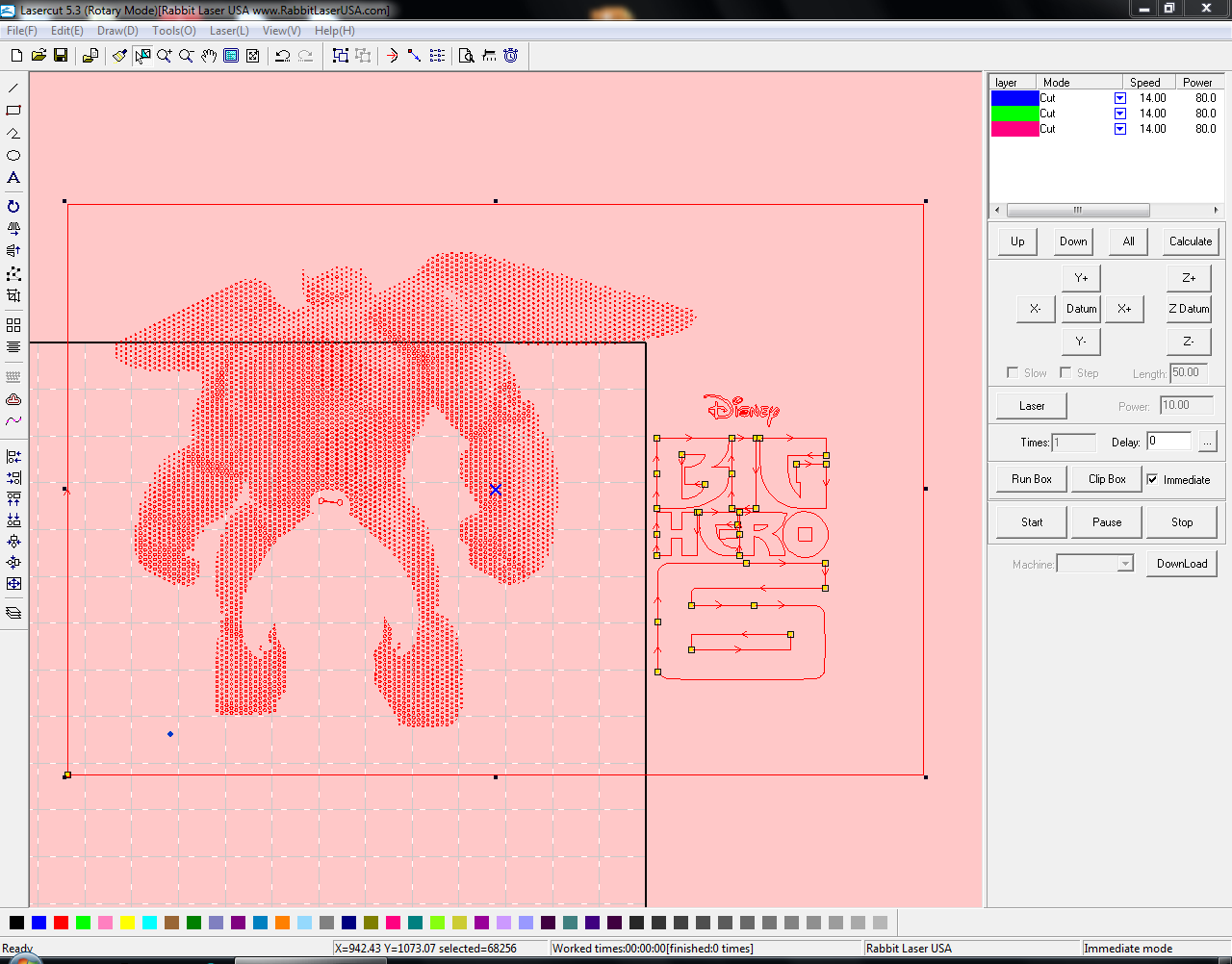
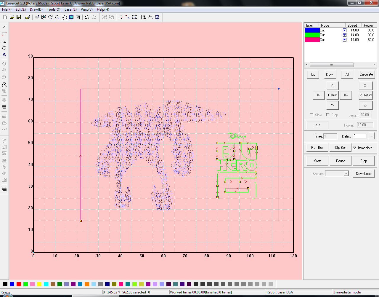
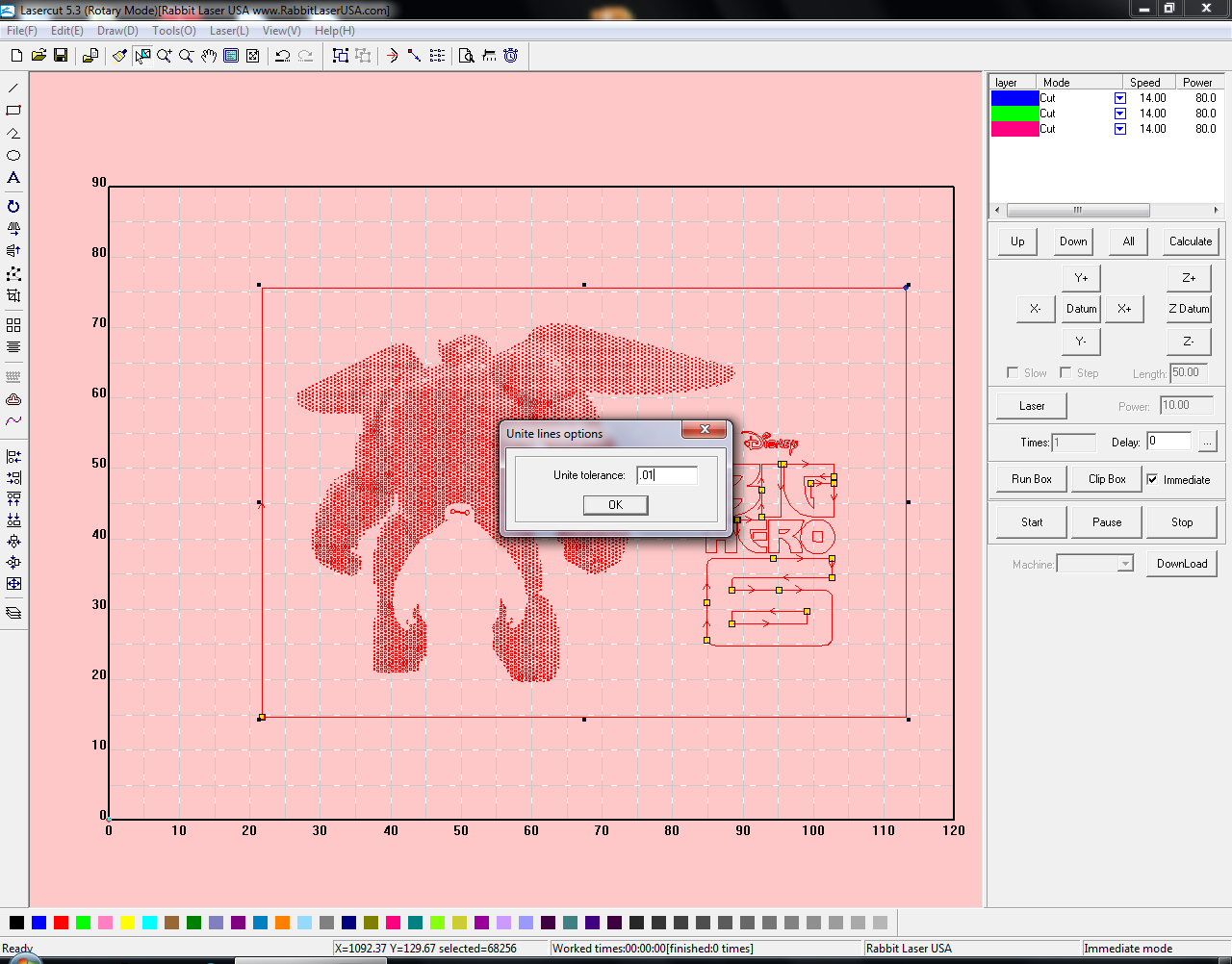
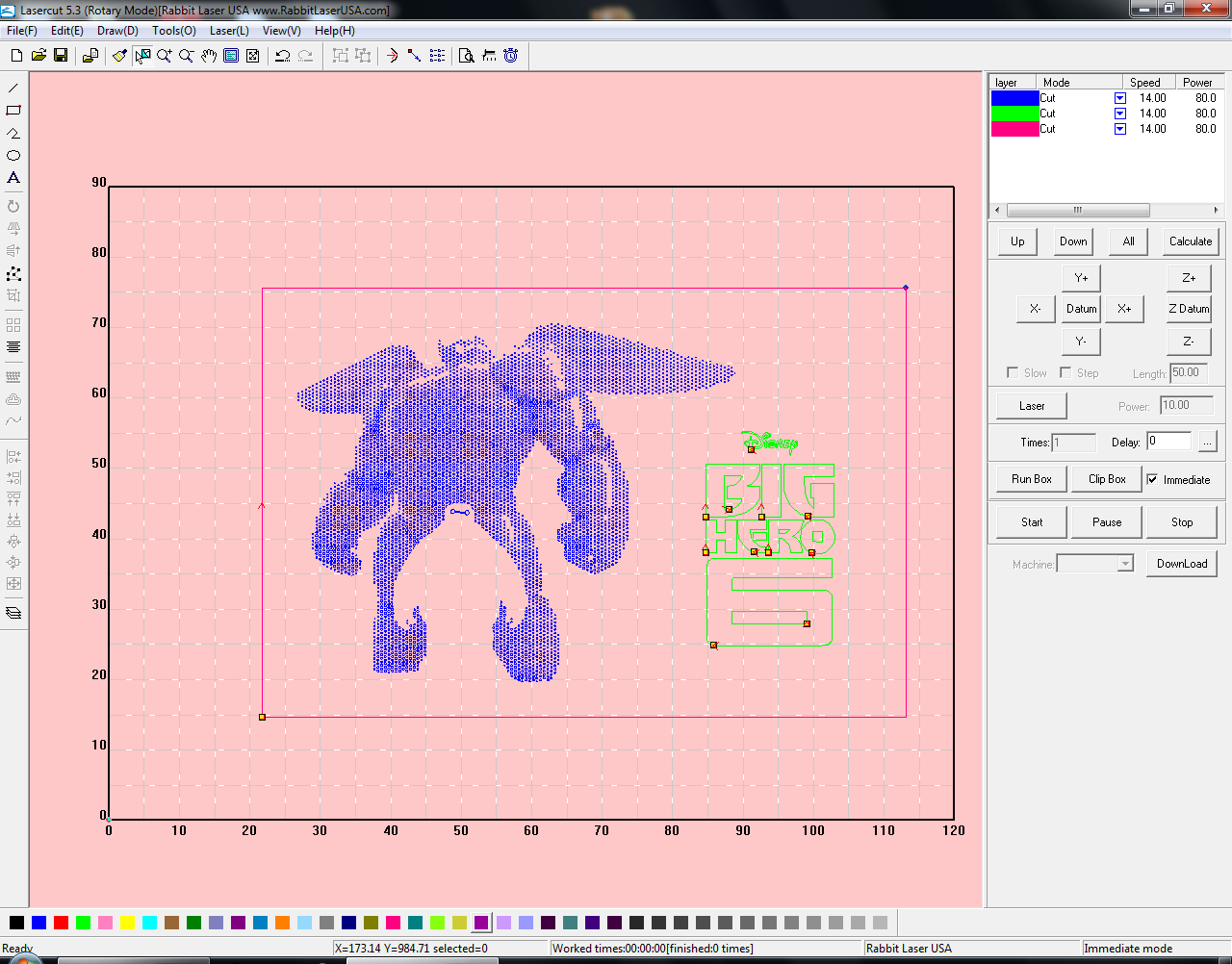
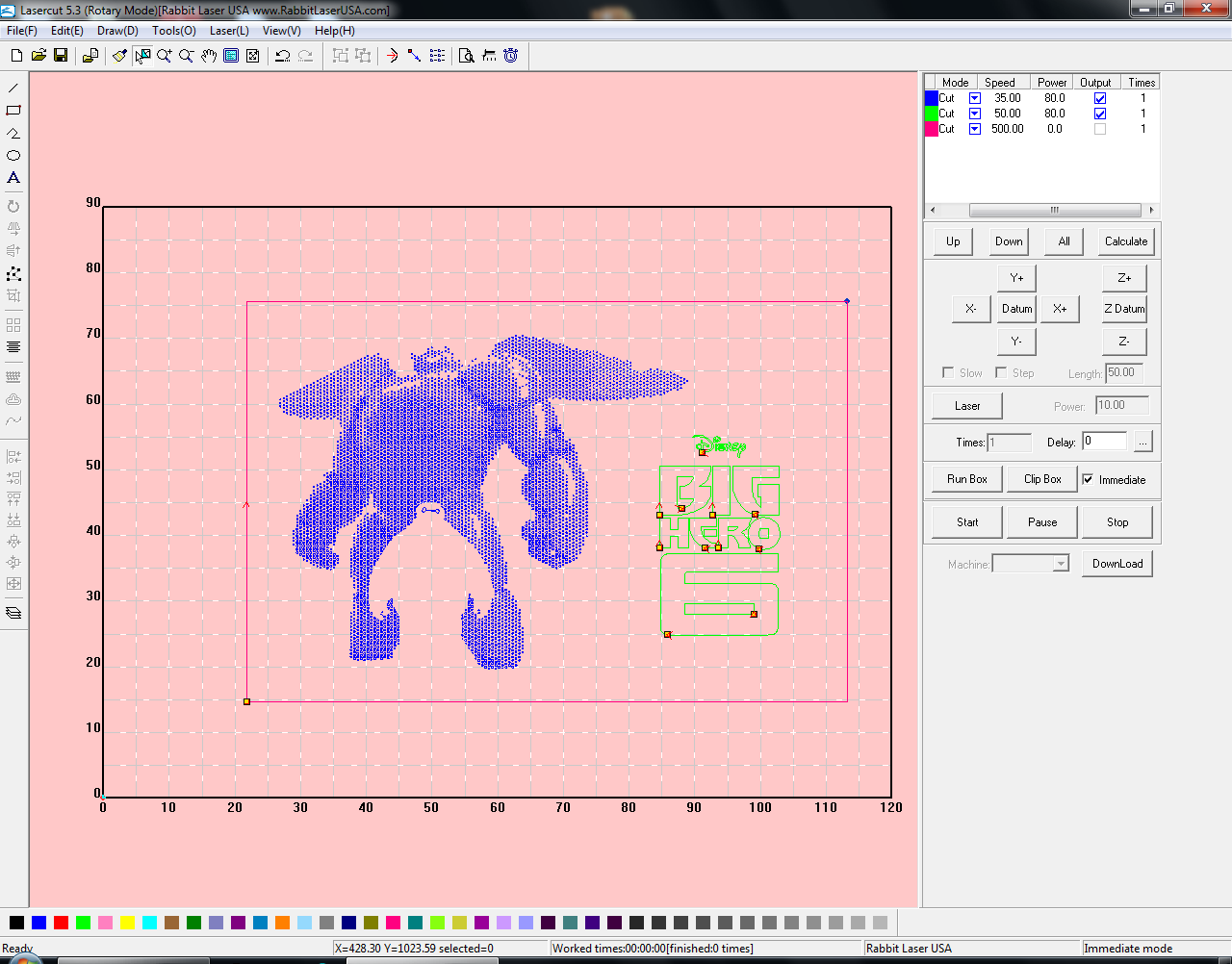
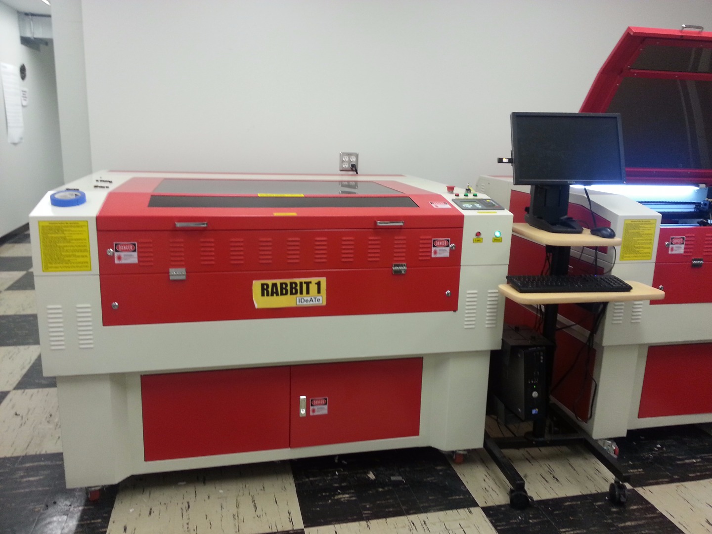

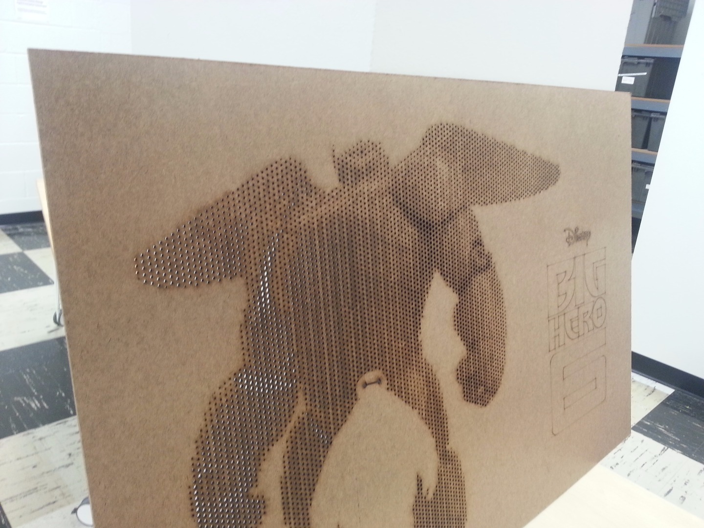
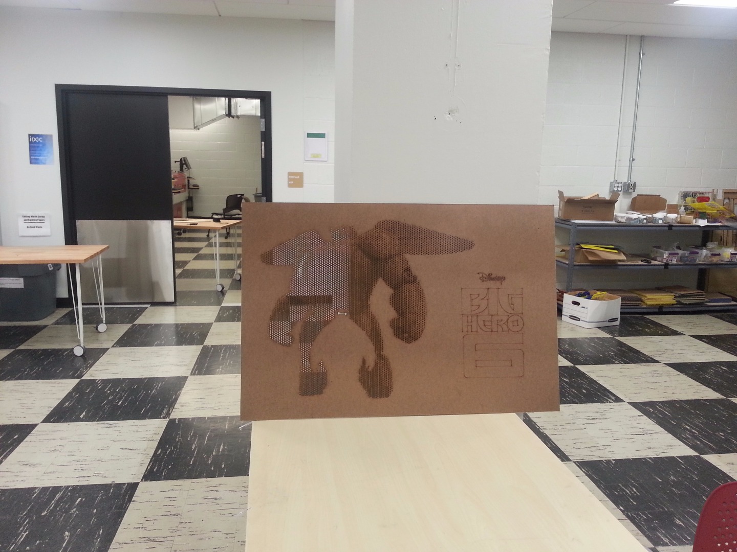
Before we actually cut our piece, we're going to want to size it down to the correct size. You'll note that you need a 2' x 4' piece of 1/8" MDF for this Instructable per the first page (though it'll work just fine with other sizes), but I've mentioned repeatedly that the final design will be 2' x 3'. You're going to want to cut your sheet down to size using some sort of saw. Ideally a tablesaw if you have access to one, but otherwise a bandsaw or even a simple hacksaw will do the trick (though perhaps not as cleanly). You can always go back with sandpaper and clean up the edge if you would like. After this, you should be left with a 2' x 3' piece of material, and a 2' x (slightly under) 1'.
Now that we've generated our DXF file (and have our piece), we can move over to the laser cutter. This process will likely vary greatly depending on the laser cutter, but I've attempted to outline a basic process which should apply to most sensible systems. There's a brilliant Instructable here which goes into much greater detail than I will about how to use lasercutters.
Note: If you don't know settings for the material that you'll be cutting, put in the 2' x 1' material into the laser cutter, and import a test DXF file into the laser cutter program. My laser cutter used some proprietary software written by the manufacturer. I used a 2" x 2" section of the final drawing as my test DXF file, and I've provided that DXF here as well. If you do know the settings, follow the steps below with the final DXF, and use the 2' x 3' piece. Even if you do know the settings, I'd still recommend testing them out on the small piece just to be sure.
- Adjust your piece on the laser cutter's bed so that it fits and is square with the bed. Then, in software, move the drawing around until it matches where your piece is positioned.
- You're now going to want to do some sort of "unite lines" procedure, which will essentially tell the laser cutter program to optimize the cut path. In other words, it'll cut completely around polygons without turning the laser off, instead of turning the laser on / off for each line. This also means that the laser will cut the vertices (as it should). With the number of dots that we're working with, this process will take a while.
- Each of the colors should appear as a different layer in the lasercutter program. The program should allow you to apply different cutting settings to each of the color layers. If you don't know the settings, here is where you experiment with different values.
- We'll want to set the dots to cut all the way through, the logo to cut very lightly, and the outer rectangle to not cut at all. Why did we draw the outer rectangle, then? Well, it looks nice, doesn't it? Also, the outer rectangle is the exact same size as the piece that we are working on, so when we run the box of the drawing it'll follow this rectangle instead, which will help you square your piece and ensure that only what you want will actually be cut.
- Make sure all of the appropriate safety gear is turned on (i..e blowers), and that you know where your fire extinguisher is.
- Start cutting!
On my fairly powerful laser cutter (90W), the cutting ended up taking close to 2 hours. I likely could have gotten it down to 1 - 1.5 if I had increased both speed and power, but I figured that I'd much rather be safe than sorry with the material. I also only had one piece, so I wasn't going to take risks with it
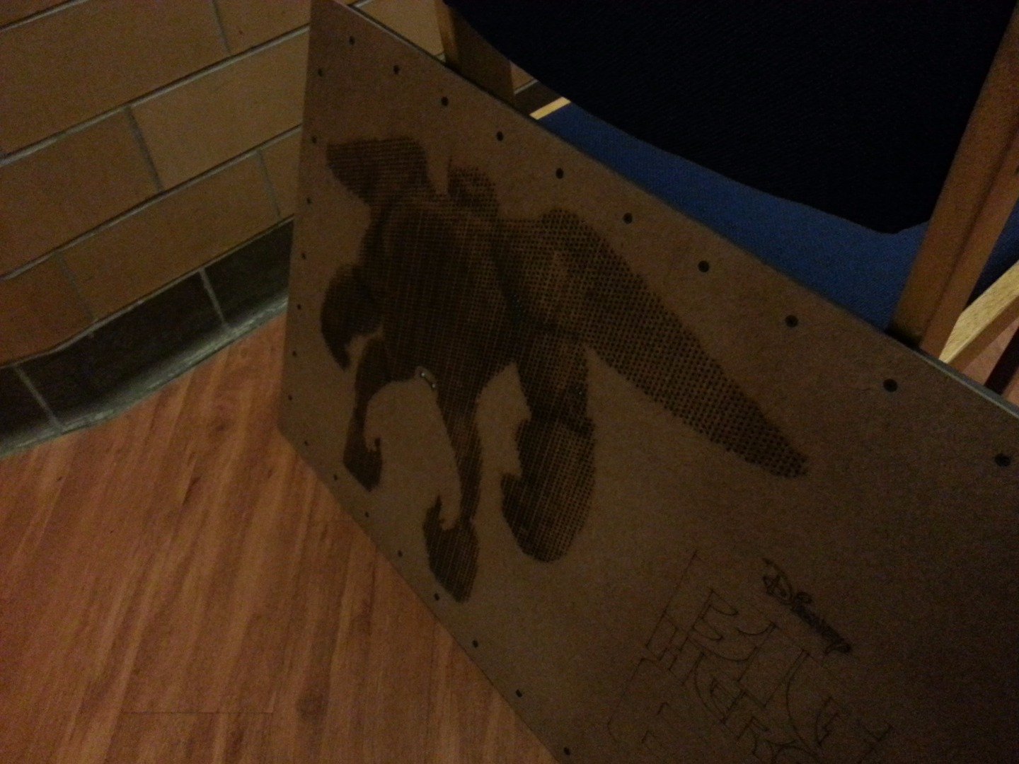
Time for a bit of post processing. When my laser cutter finished cutting, there were still a few holes where the material inside hadn't fallen out inside the laser cutter. I gave the entire piece a good bashing against the top of a large trash can. This was able to remove most of the cutouts, but not all. I had to go back to the rest with a small rod of some sort to poke them out (with ease). It wasn't difficult, but since there were a lot of holes this did take a bit of time. I found that using a small screwdriver or xacto knife works the best. Depending on the look that you're going for, you may also want to use some sandpaper to remove some of the burn marks around the bigger holes. I found that leaving them there added to the gradient (and saved me time), so I left them as is.
Downloads
Let's Make It Float!
At this point, we've got the front of our piece completely laser cut and polished. We're now going to add the wood backing that makes the entire thing appear to float off of the wall. This part was heavily eyeballed, and it worked just fine. Unfortunately, I don't have any photos of this process.
- Find a nice, large table and lay it down so that the front of the piece is touching the table. We'll be using the back of the piece for layout.
- Assuming you're using 1" x 2" bars, begin by cutting down 2 bars to the width of the piece, and 2 bars to the length of the piece. For the size that I was working with, this ended up being 2x 2' pieces, and 2x 3' pieces. I would recommend a miter saw for this step, but a hacksaw, circular saw, bandsaw, or a number of other tools will do the job.
- Place one of the longer frame pieces on the bottom of the front piece on the table. Now, using a ruler, move up the piece so that there is a 3/4" offset from the bottom face of the frame piece to the bottom of the front piece. You can adjust this offset value depending on the offset you created in the DXF file, making it smaller or larger as necessary.
- Place both of the shorter pieces in the same fashion; perpendicular to the bottom frame piece, and 3/4" away from the sides.
- This is where your joinery experiences comes in. If you want a quick and easy solution, you can use what I did - that is, just screw perpendicularly at the ends. Alternatively, you may want to use a nicer joinery method, such as mortise and tenons, or dovetail joints. If you're going to use the latter, I'm assuming you have the knowhow to create the frame yourself. The method I'll describe is the former.
- With a pencil, mark off lines where the short frame pieces (the side closer to the edge of the front piece) intersect the bottom frame piece. When this is done, the top and bottom frame pieces will sandwich the side pieces above and below. Then, cut on these lines.
- Now place the top frame piece in the same manner - 3/4" offset from the top of the front piece. Place the two side frame pieces, draw the lines, and cut.
- Finally, place both the top and bottom frame pieces on the front piece, 3/4" from the edge, and place the side frame piece so that you can figure out how long they need to be, based on the positioning of the top and bottom frame pieces.
- Then, cut on these lines.
Now that we've got all four of our pieces cut to length, we're going to want to join them at the edges. For this, you'd ideally use a corner vise of some sort. However, I didn't happen to have one handy, so I just used a triangle and clamps. Remove the front piece (so that it doesn't get sawdust on it), and then clamp two of the touching edge pieces to the table that you're working on. Use a triangle to make sure that the edge is square. Drill a couple of pilot holes with a small drill bit, so that they're parallel to the short pieces and perpendicular to the long pieces. Then, screw this joint in using wood screws. Repeat on all four corners. Congrats, your frame is finished!
Attaching the Frame
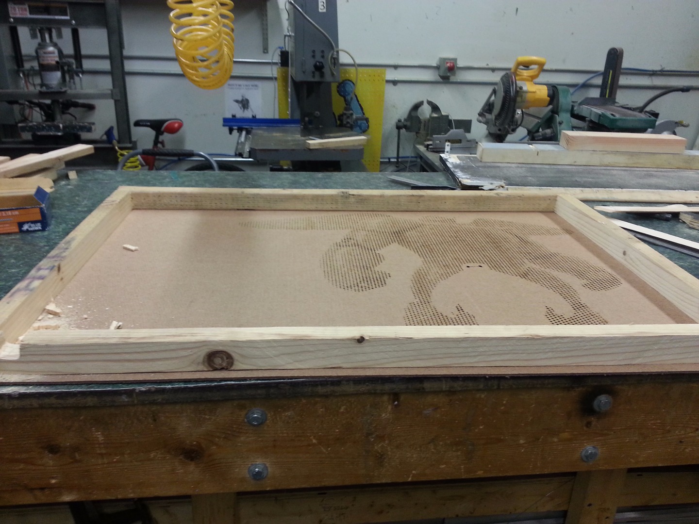
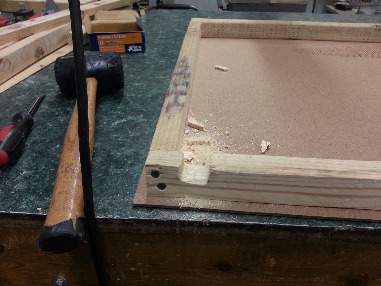
Now that we've got a completed frame, we're going to attach it to the front piece
- Put the frame down on a table, making it square with one of the table corners.
- Place the front piece on top of the frame, this time with the proper side up (the one that you want to see). Adjust it using a ruler so that there's the magical 3/4" offset on all four sides.
- Clamp both pieces together to the table.
- Only a couple of screws are necessary to keep the front piece attached to the frame. However, I decided to overkill it slightly, and figured that it would make for a nice look when finished. Thus, I marked out holes along every 3" on all of the sides, offset 1 1/4" from the sides. Use a pencil to mark out the holes, and then use a punch to get an indentation. You want these holes to be perfect.
- I ignored the holes at the very corners, as those would have gone through the screws I used to join the edges. If you're using a different joinery method, however, feel free to put screws here.
- Again, use pilot holes to make sure the screws go in well, and then put a screw into each hole. I found it easiest to use two drills and do a couple holes at a time - first the top and bottom most ones for the side that I was working on, and then slowly working my way towards the center of each side.
Now we'll need to put a small cutout for the wires that'll stick out of the piece. I chose to make the cutout in the bottom right corner, underneath the Big Hero 6 logo. I ended up just using a hacksaw to make a small cutout, roughly 1" wide and 1" deep. It's really not necessary to be particularly precise in this part. After you've made the vertical cutouts with the hacksaw, you can try to make small diagonal cuts as well, or use something like a Dremel with a cutoff blade, or a chisel, or even a screwdriver to remove the material inside. This part is up to your creativity. Have fun with this part!
The important thing to do after you've removed some material is make sure that the edges are all smooth. Wires will be rubbing against the edges, so it's vital that they don't get cut and shorted.
LEDs!
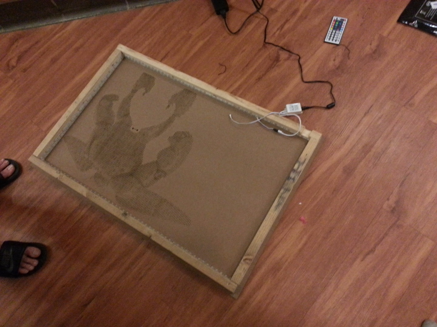
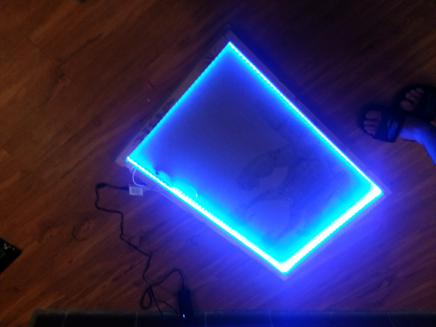
We're nearly done. We just need to attach the LEDs now!
The LED strip that I bought had adhesive tape already on the back of it. All that you need to do is peel back the tape a little, and adhere the strip to the wood framing. You'll want to adhere it so that it's on the inside of the frame, and not on the front piece itself. This is so that the LED strip can bend at a 90 degree angle around the vertices. The important part here is that the connector coming off of the LED strip should be near the cutout we just made. The direction that you go with the LEDs doesn't matter. The wood that we chose is thick enough to hold multiple wraps of the LED strip. I was able to get nearly 2x around the entire thing with the complete strip that I bought.
If the LED strip you have doesn't come with self adhesive backing, then you can use some double sided tape on the back of the strip. In fact, some of the strips come with very poor quality backing, and so it might be a good idea to apply your own tape anyway.
Once you've applied the LED strip, we're going to want to attach the power supply and the IR controller. I first placed the IR controller so that it was connected to the LED strip and I was able to stick about 2" of the receiver out of the hole that we made. Then, using some double sided tape, I stuck it to the back of the front piece. You might find it a better idea to use hot glue here, to ensure that it doesn't come off easily - I found that the double sided tape doesn't adhere particularly well to the back of the MDF. The exact position doesn't really matter - just make sure that it's well away from the actual holes that we've cut out, so that it's impossible to see through the piece.
We're going to want to do a similar procedure with the power supply. Stick as much of the power cable through the hole as you can. I was able to get roughly 2' of cable out of the hole. Then, stick the other end into the IR receiver, and attach the power supply to the MDF at some point. You may find it handy to stick it to one of the sides, so that you can use the frame to support the power supply instead of just the MDF back.
Finally, tape the IR sensor to the bottom of the frame somewhere, outside the hole. The exact positioning doesn't quite matter. You could also leave it freehanging; the latter will provide better reception, but it'll be visible from more angles.
Finishing Touches
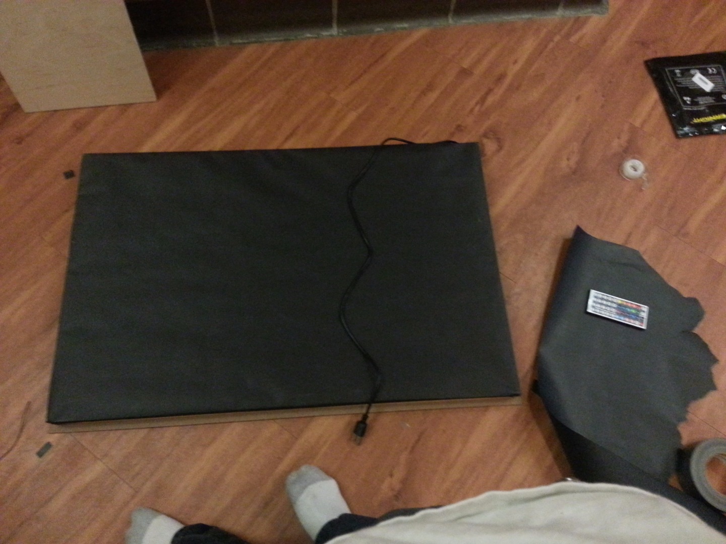
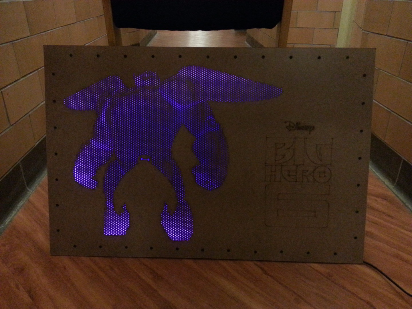
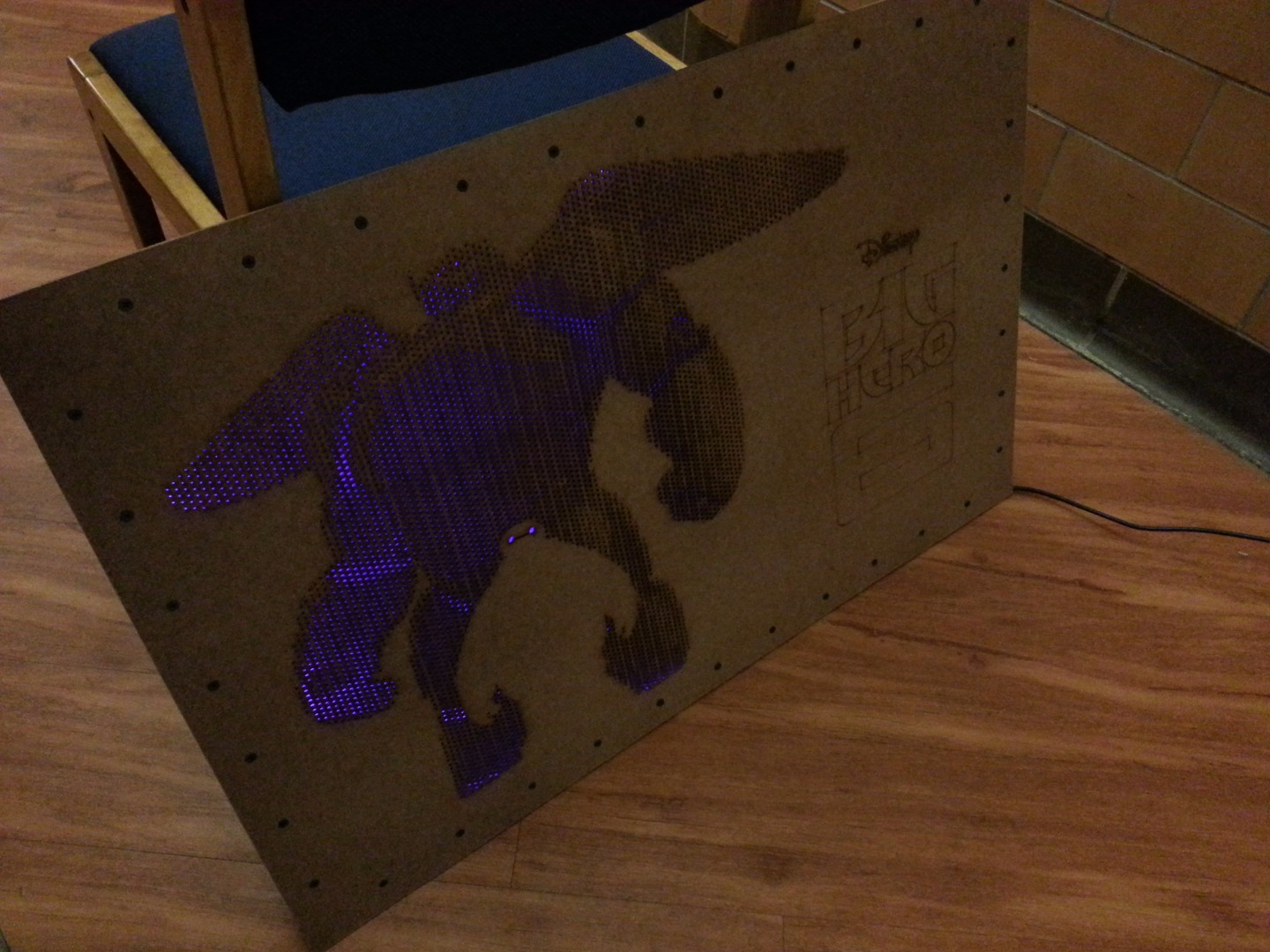
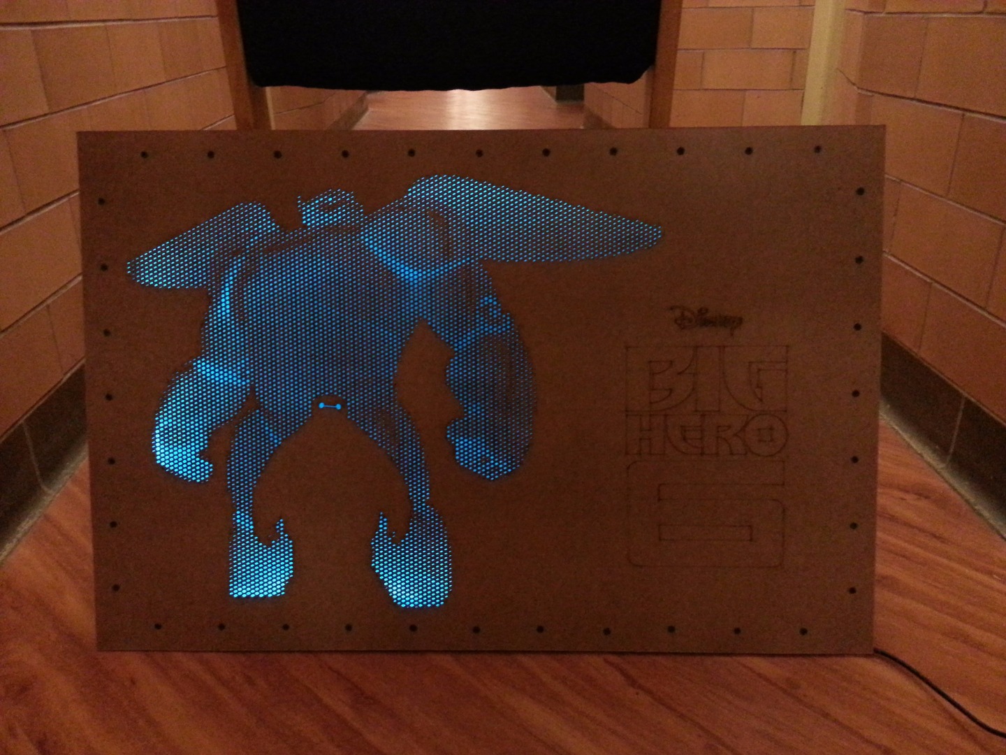
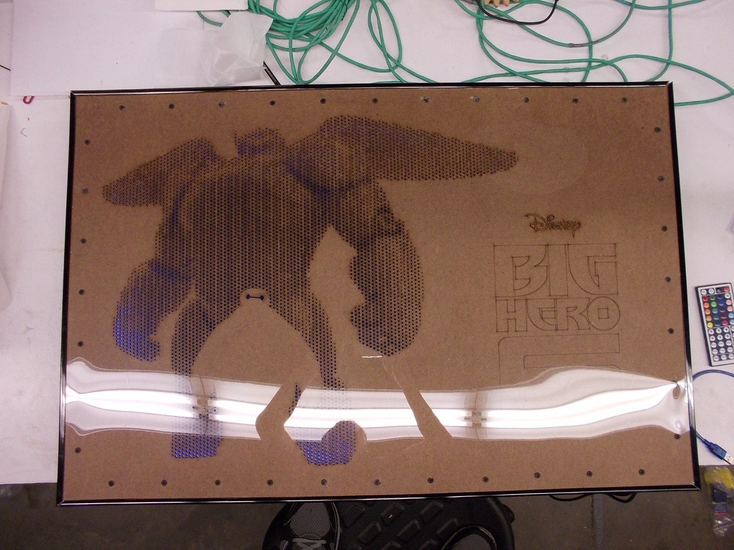
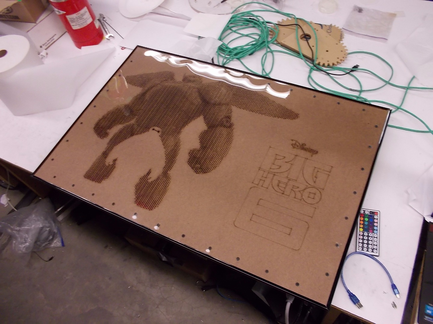


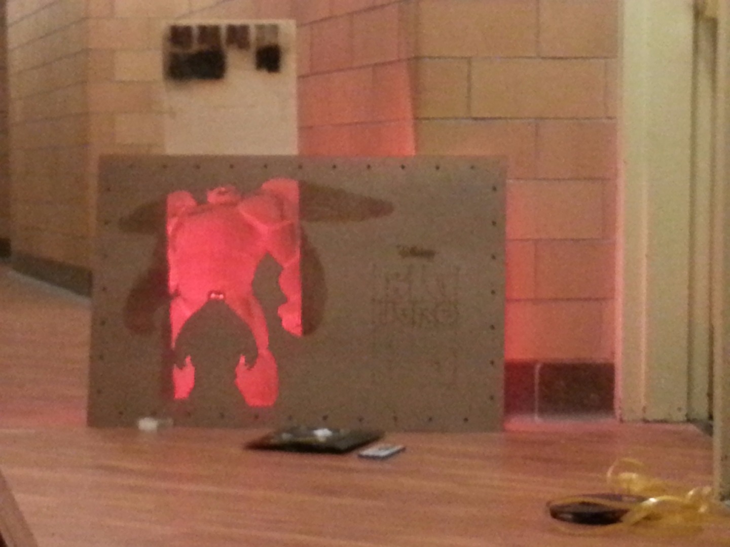
Now, you must step away and admire your masterpiece. Light it up with the remote and watch it glow!
At this point, you're welcome to hang up the piece. Stick a couple of screws into studs in the wall, and hang it against the top of the frame.
Below, I've suggested a series of modifications you can make to this project, in order to enhance it, customize it, and make it your own.
- Add some sort of black paper as a backing. This will make it so that the piece lights up very nicely even when it's not against a wall. You can place the frame against a giant roll of black paper, and use a knife to cut a perimeter roughly 1" larger than the frame on all sides. Then, cut out the corners, and use double sided tape to adhere it to the frame.
- Find a poster frame for the size that you made, and use the plastic and framing to add some gloss to the front, as well as protect the front piece.
- Use some one sided film (i.e. car tint film) and some mirrored acrylic (or other reflective material) to create an infinity glass type view inside the piece. See the instructable here.
- Use an Arduino or other microcontroller with 3 transistors in order to control each of the channels yourself instead of through an IR receiver. You can then hook this up to the internet for maximum fun! If you've got a strip like the Neopixels or Dotstars, you're half way there already.
- Add some sensors to only light up the piece when there are people nearby.
- Paint it!
- Make the entire thing battery operated, for fun on the go! You can also hide the cable through the wall using a kit similar to TV wiring.
I hope you've enjoyed this Instructable, and hopefully have learned something. Please let me know if you catch any mistakes I may have made, or if you have any suggestions for improvement.