How to Design and Laser Cut a Steampunk Building and Country Cottage for Wargame Terrain
by greylightmay in Workshop > Laser Cutting
3486 Views, 15 Favorites, 0 Comments
How to Design and Laser Cut a Steampunk Building and Country Cottage for Wargame Terrain
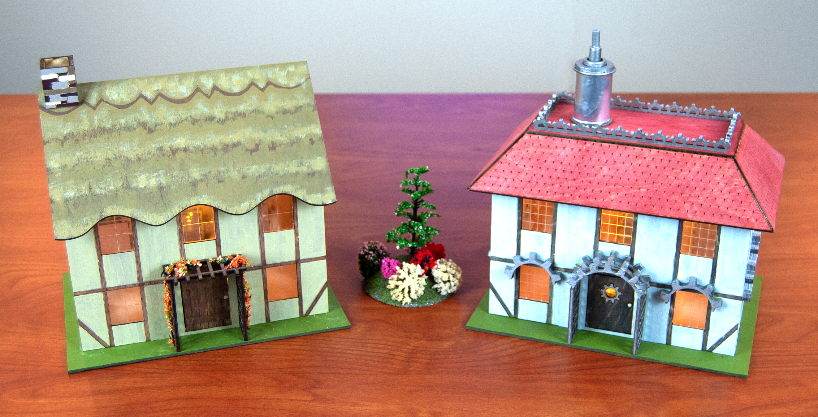
In this instructable I show how to modify the same basic scale model and give it two different looks: steampunk and country cottage. These models are scaled for 28mm miniatures, such as Warhammer and Warmahordes. The design is done in Adobe Illustrator, the parts are cut on a laser cutter and it is painted using the same Citadel paints I use for my Hordes miniatures.
The roofs come off the buildings and the doors open and close, to assist with game play.
Tools and Materials
Tools:
Access to a laser cutter
Vector drawing software (I use Adobe Illustrator)
Tools for painting and gluing (I use 4" granite blocks for support during gluing)
Materials:
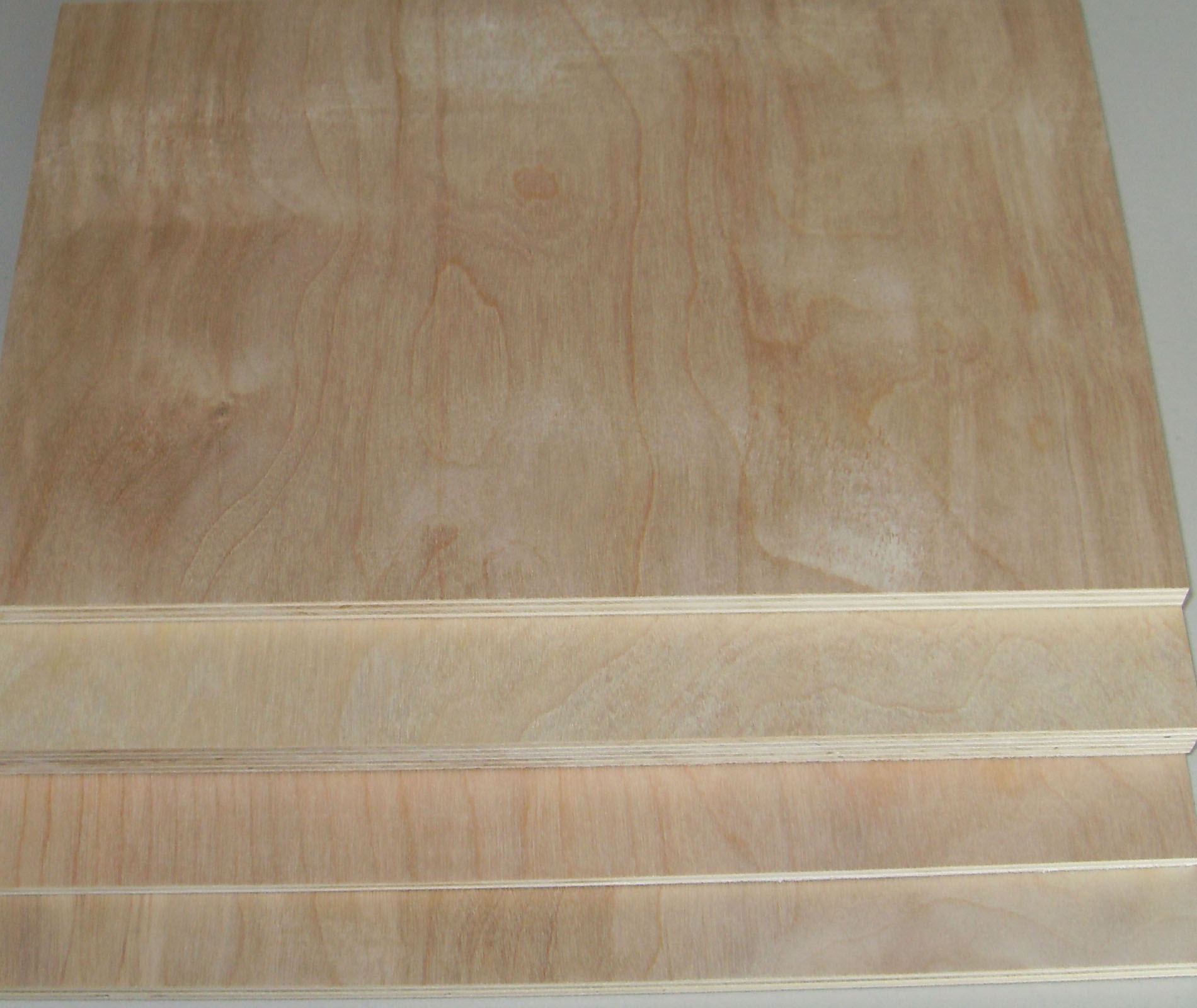
1/8" Baltic birch plywood
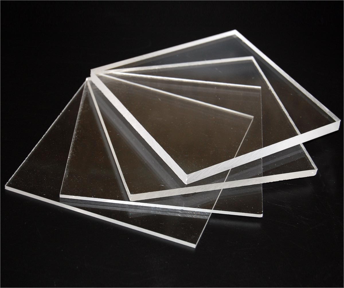
1/" clear acrylic
acrylic paints (I use Citadel paints)
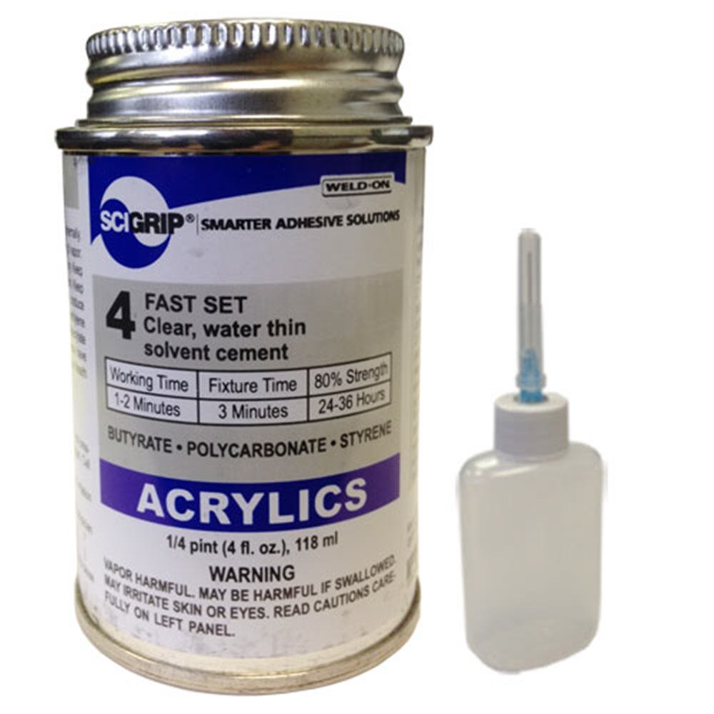
Weldon chemical solvent to fuse acrylic
wood glue
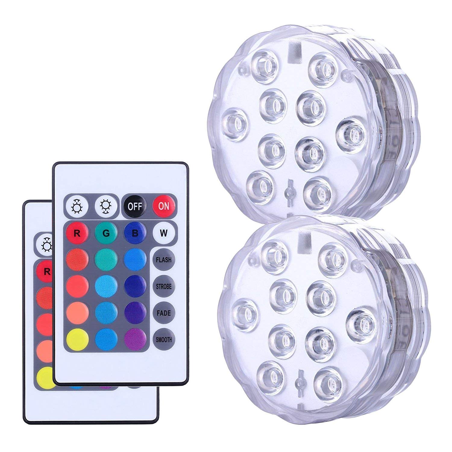
LED lights with remote control
Assemble Reference Materials
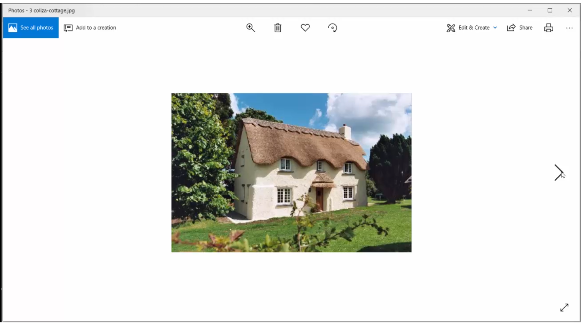
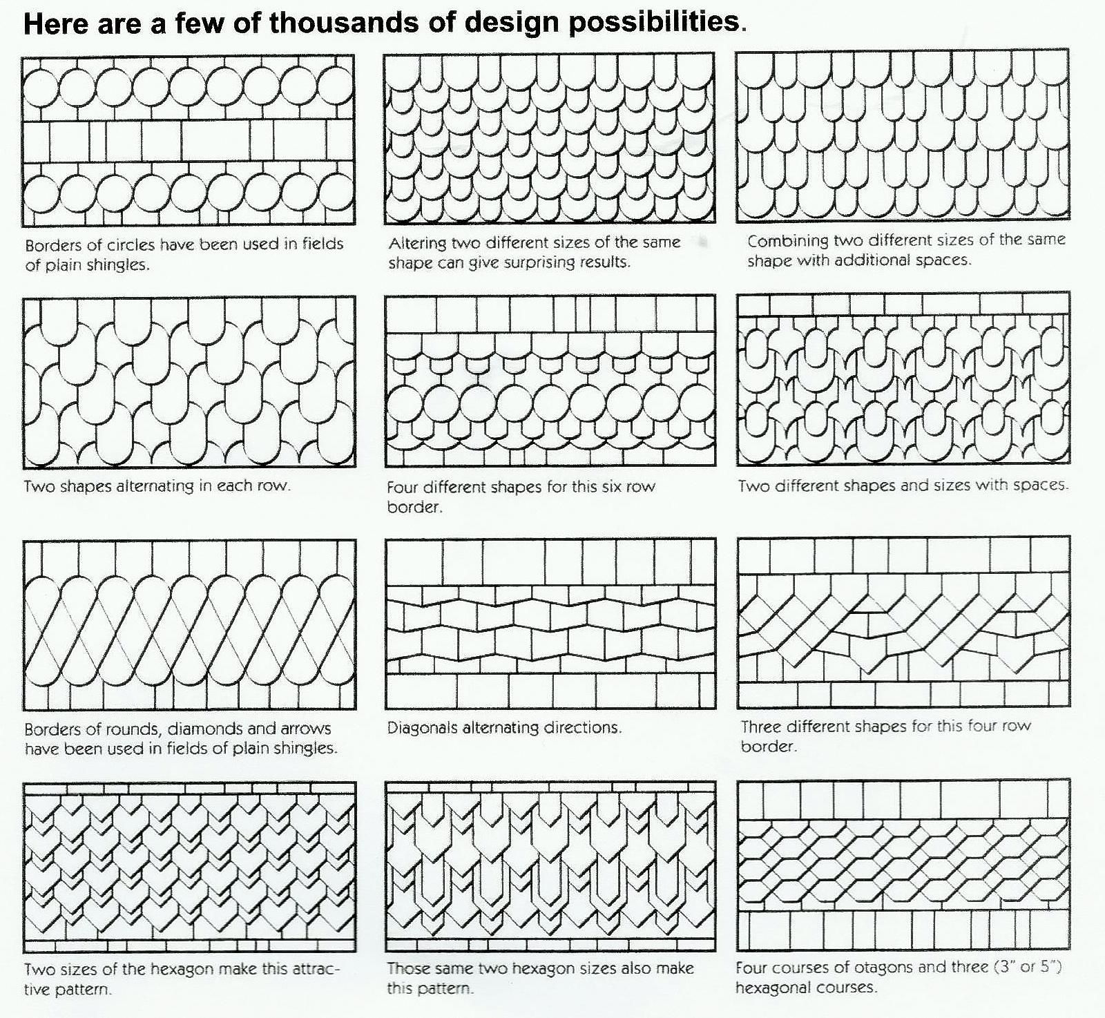
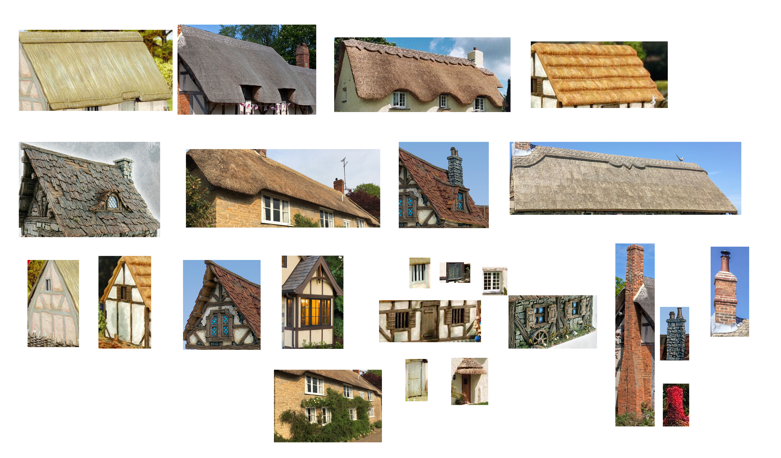
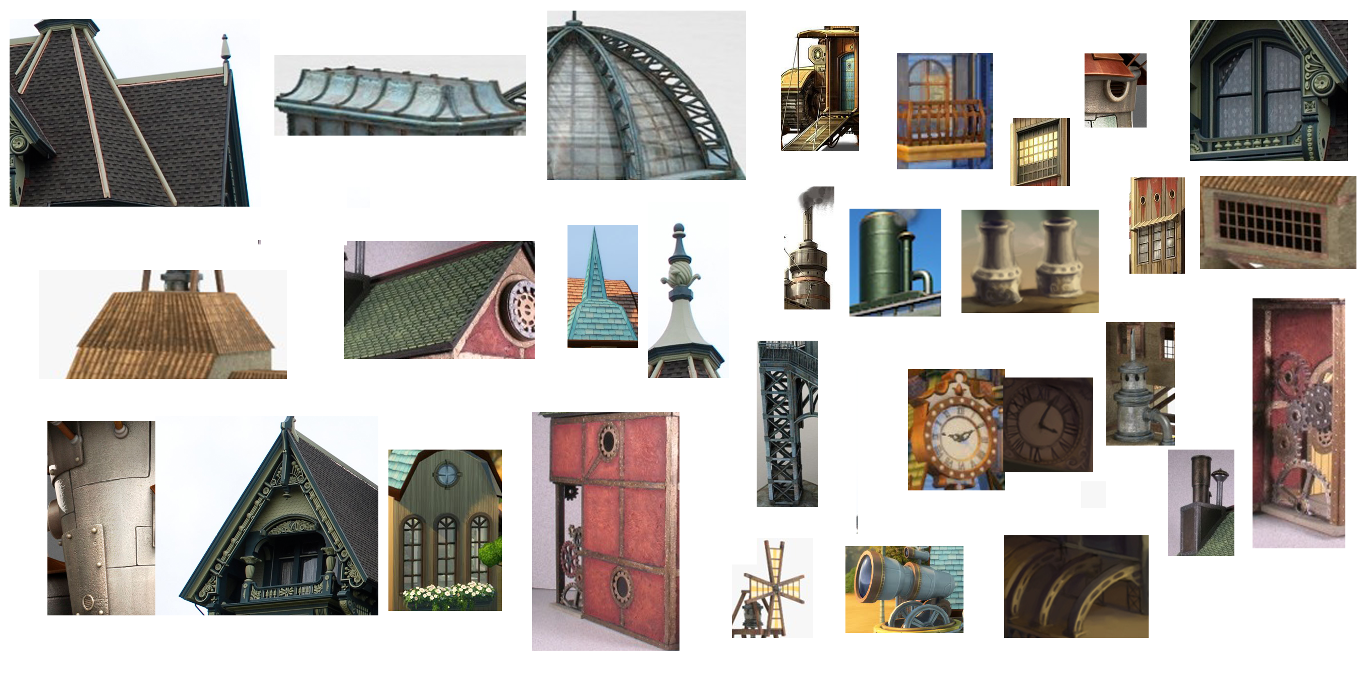
I begin every scale model project with an image search, in which I look for images that contain elements or ideas I may want to incorporate in my design. In this case, I created a folder of country cottage images and a second folder with steampunk building images. I also look for graphics that may help with particular parts of the design, like shingle patterns.
Then I create a reference collage for each design, cutting and pasting portions of images and organizing them by topic: roofs, walls, chimneys and so on. This gives me one place to go to see what I've decided are the most inspiring ideas! For example, I noticed several mansard style roofs in the steampunk images, so I decided to create one for my steampunk design. I also noticed that both styles are compatible with the visible timber wall structures seen in many Tudor and Victorian styles. This allows me to use the same wall design for both, though I will use different roof styles, accessories and color schemes.
Design the Shared Components
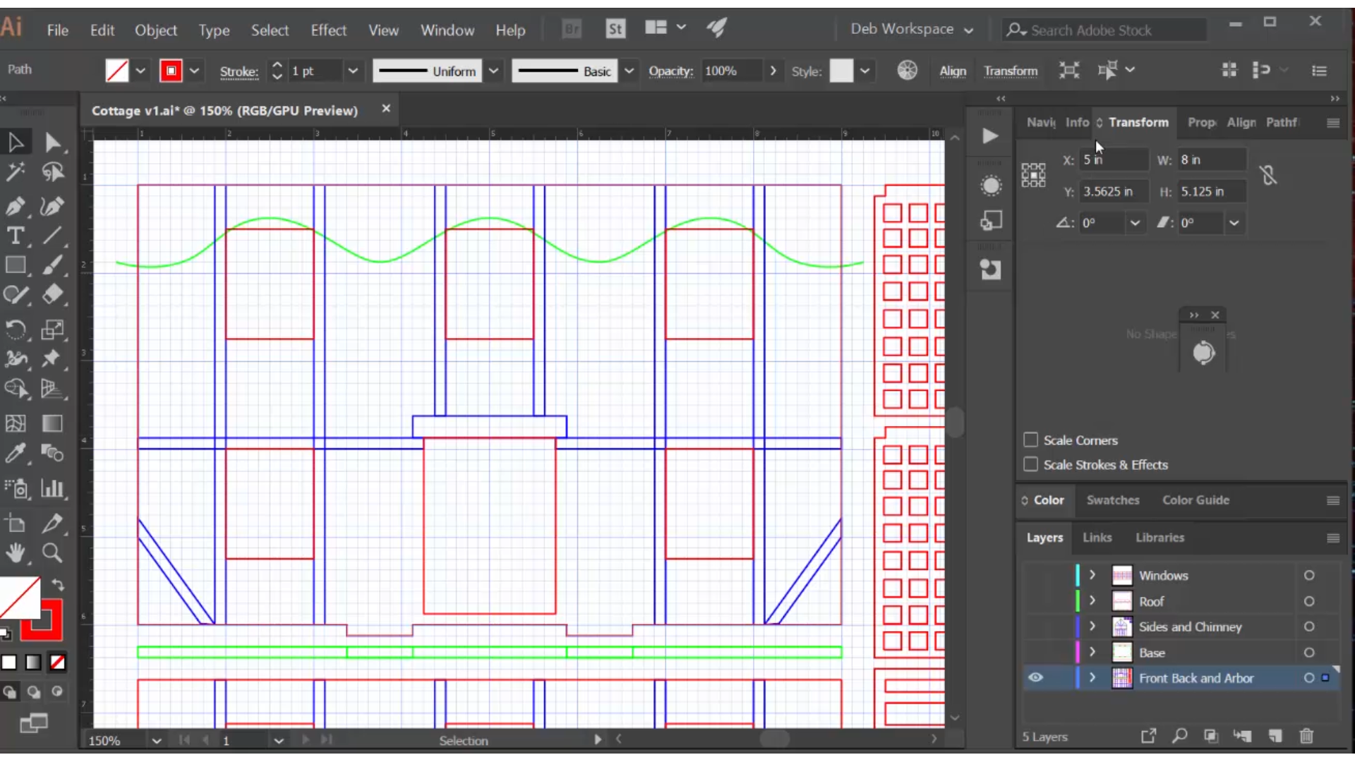
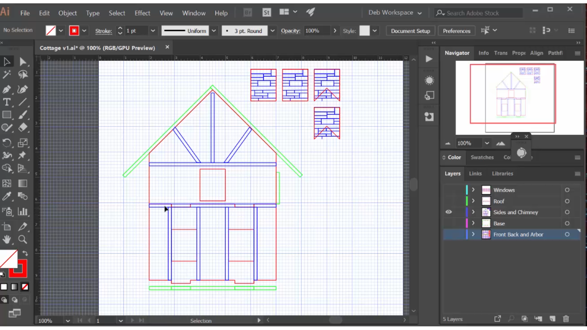
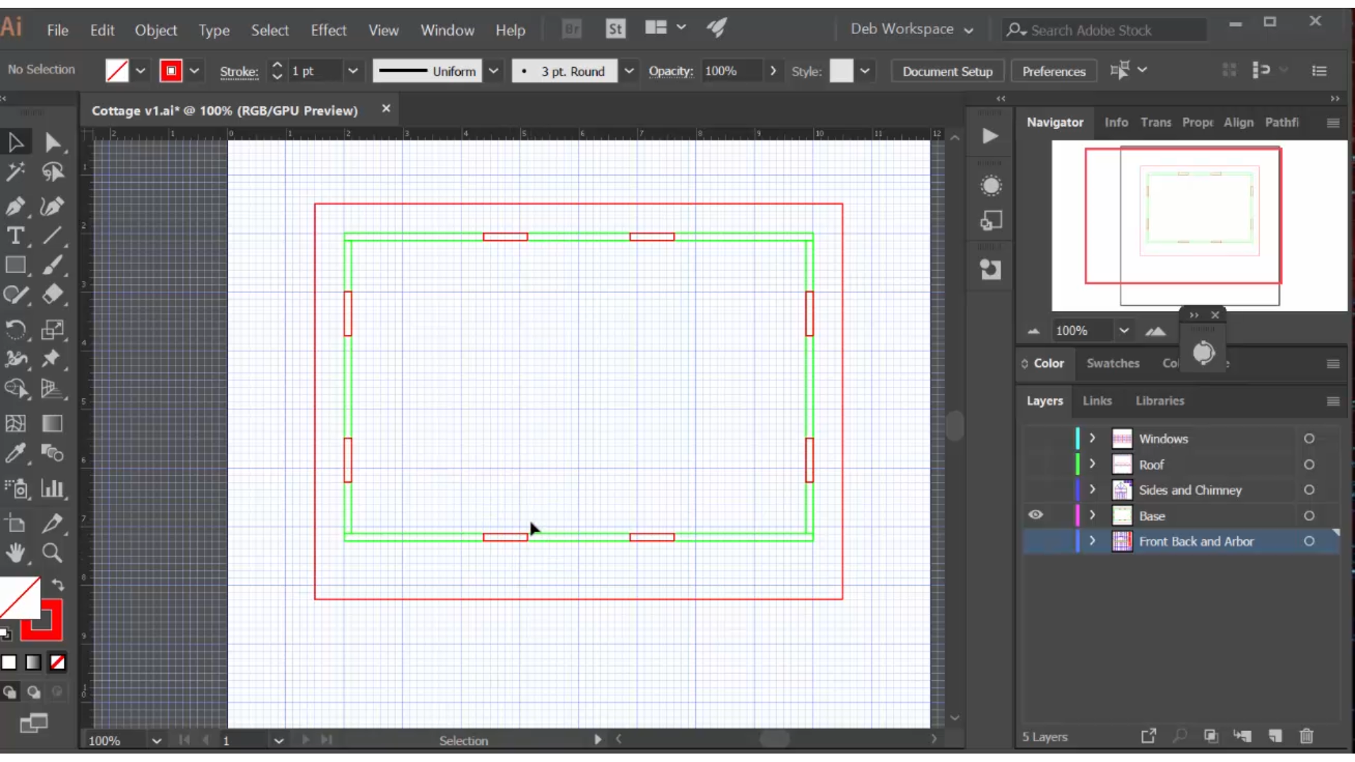
(For detailed instructions on how to create a scale model in Illustrator, check out another of my Instructables:
https://www.instructables.com/id/How-to-Design-a-3... )
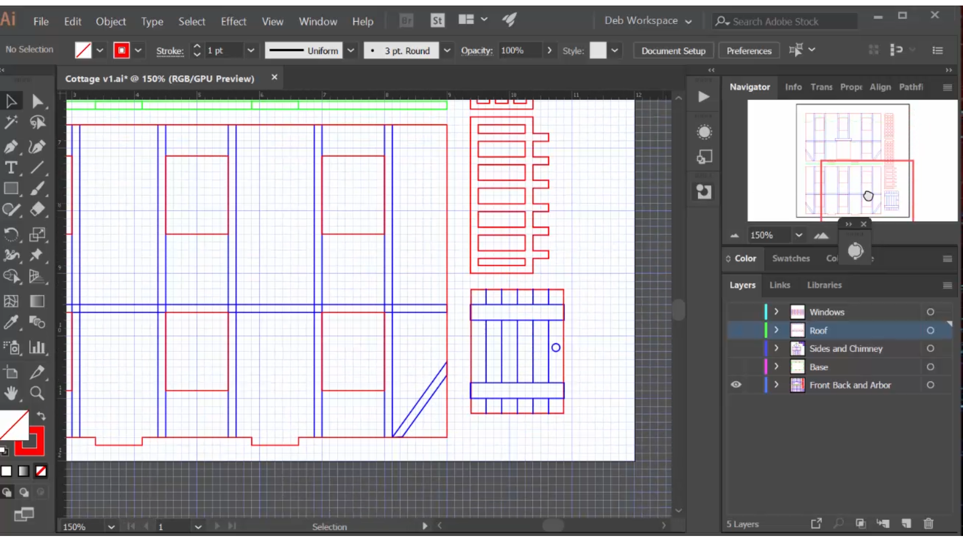
In these drawings, which are capable of driving a laser cutter, the red lines are cut lines, the blue lines are engraving lines, and the green lines are for reference only.
I begin by designing the walls, starting with the front and then the back, which is identical to the front except for an extra window where the door is. The engraving lines for the timber design were based on the reference photos. The overall scale of this building is very similar to the art deco one I created in this Instructable:
https://www.instructables.com/id/How-to-Design-and...
I begin by designing the cottage, which has a traditional gable roof, so the side walls have a peak that I filled with timber engraving.
An important part of my method is that I create a 'side view' for each component, which here are literally 'bottom-up views' of each wall, including a rectangle that shows the placement of the bottom tabs. I then copy and paste these into the base drawing, arrange them with butt joints, and then turn the tab rectangles from green to red, which will cut slots in the base. This ensures perfect placement of the slots with no measuring required!
Design the Distinctive Components of the Country Cottage
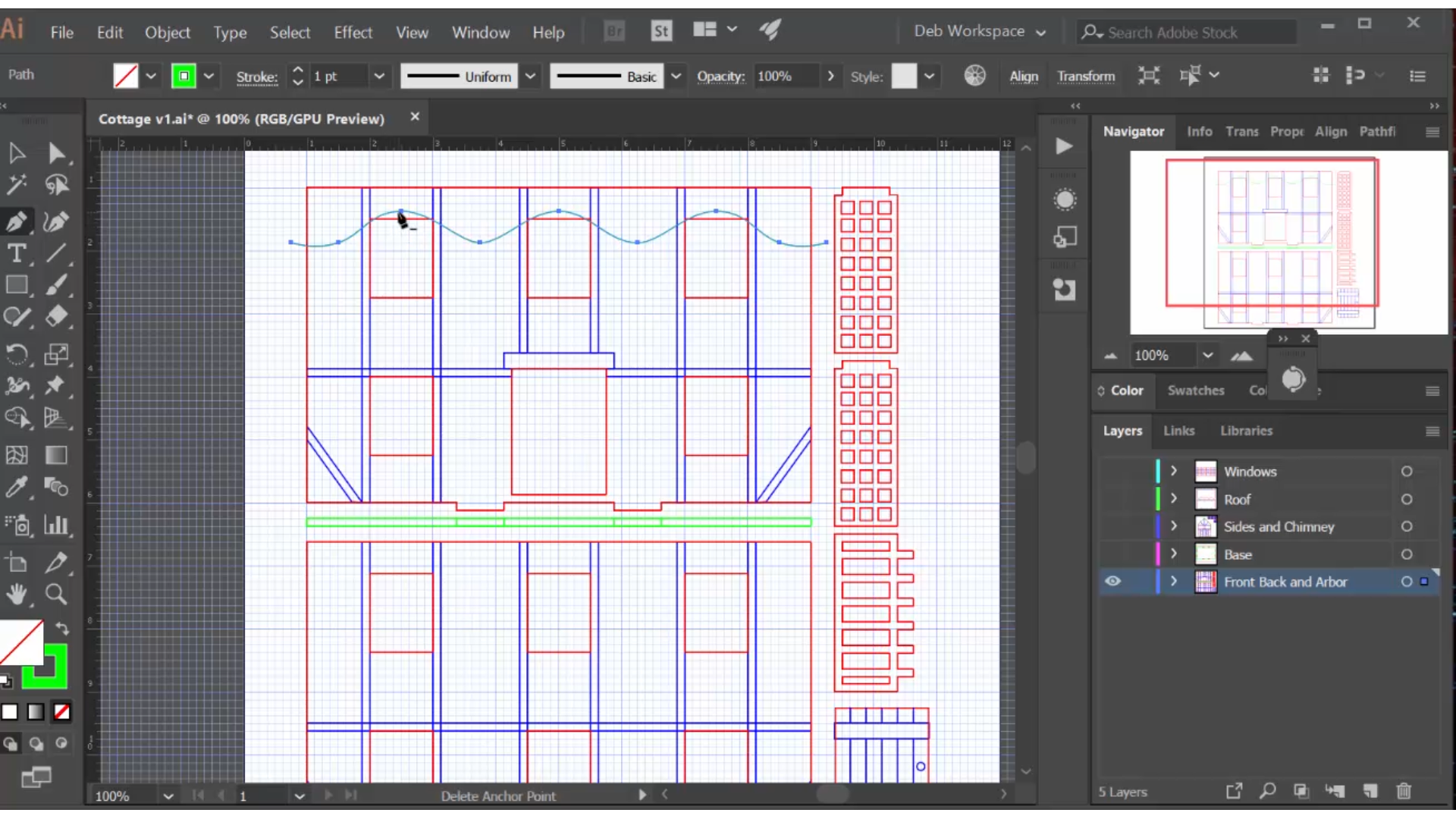
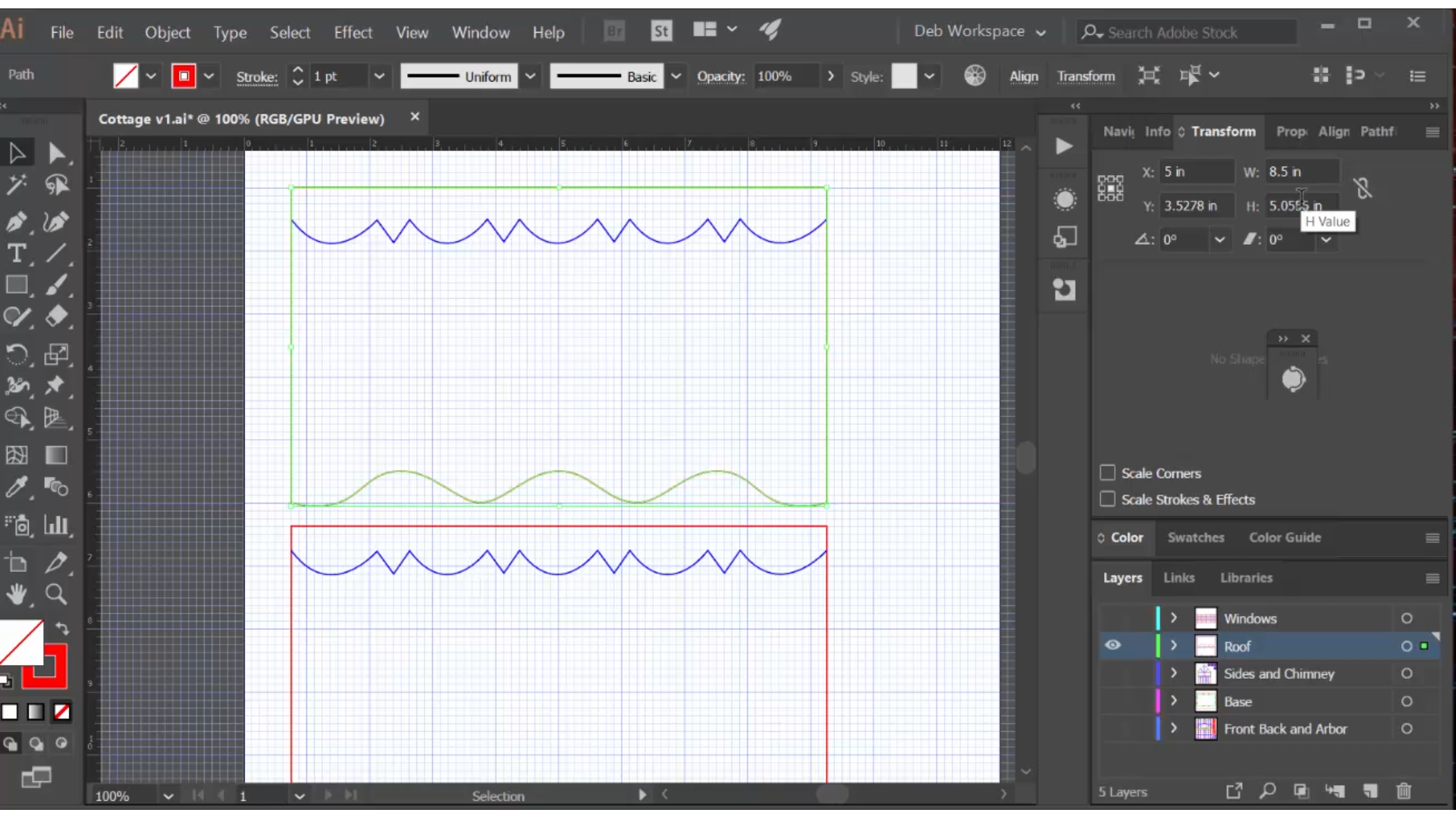
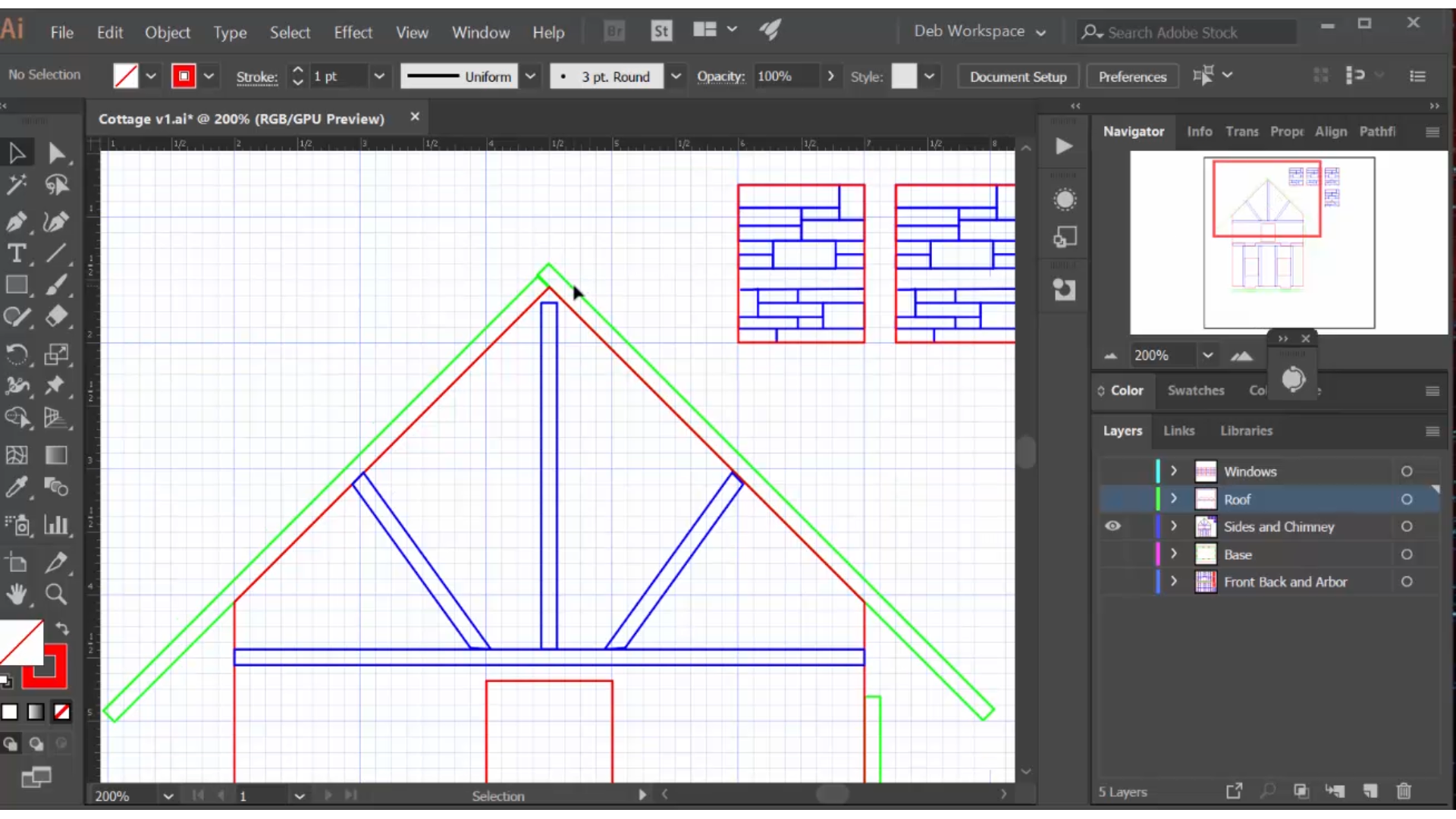
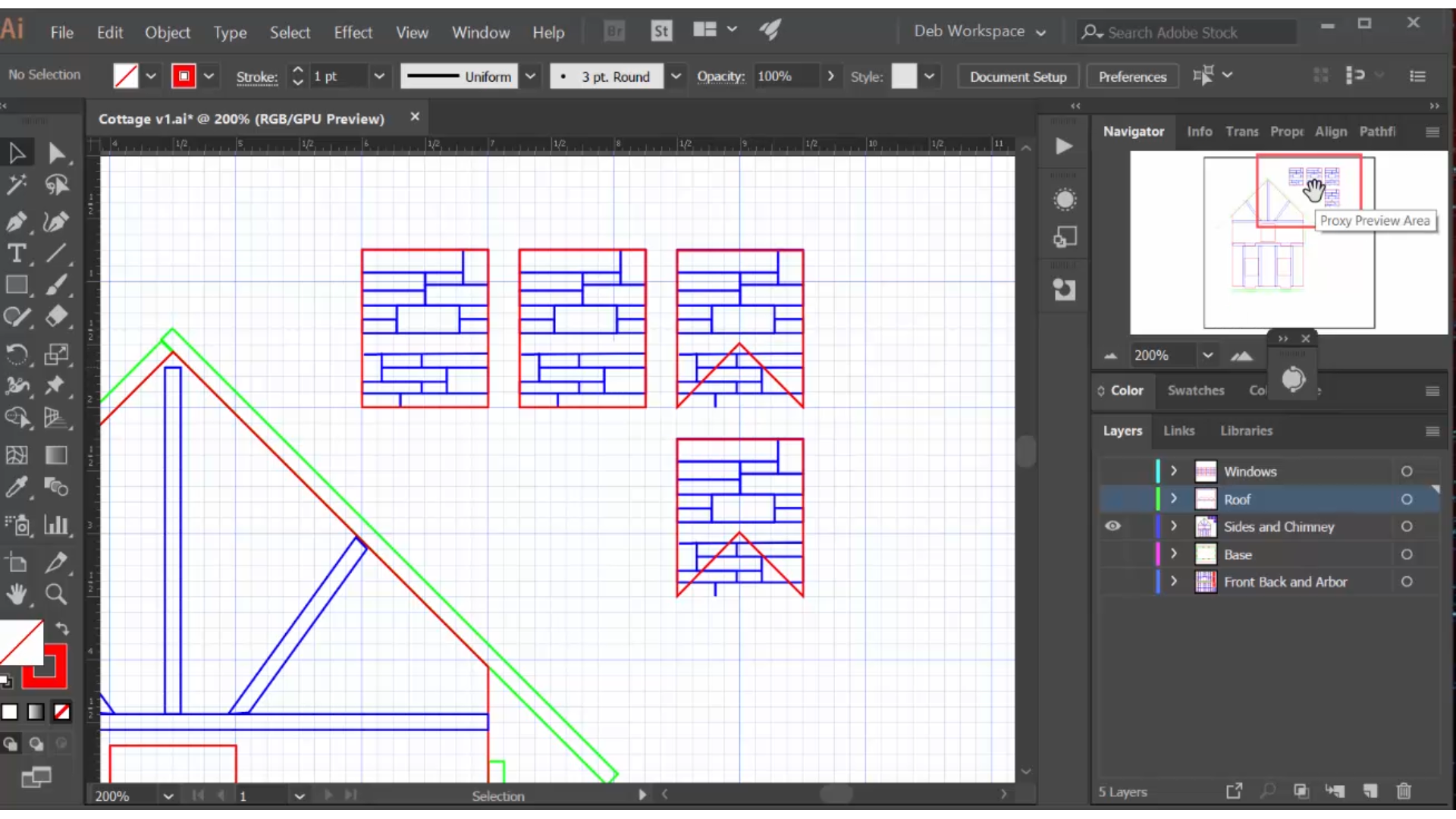
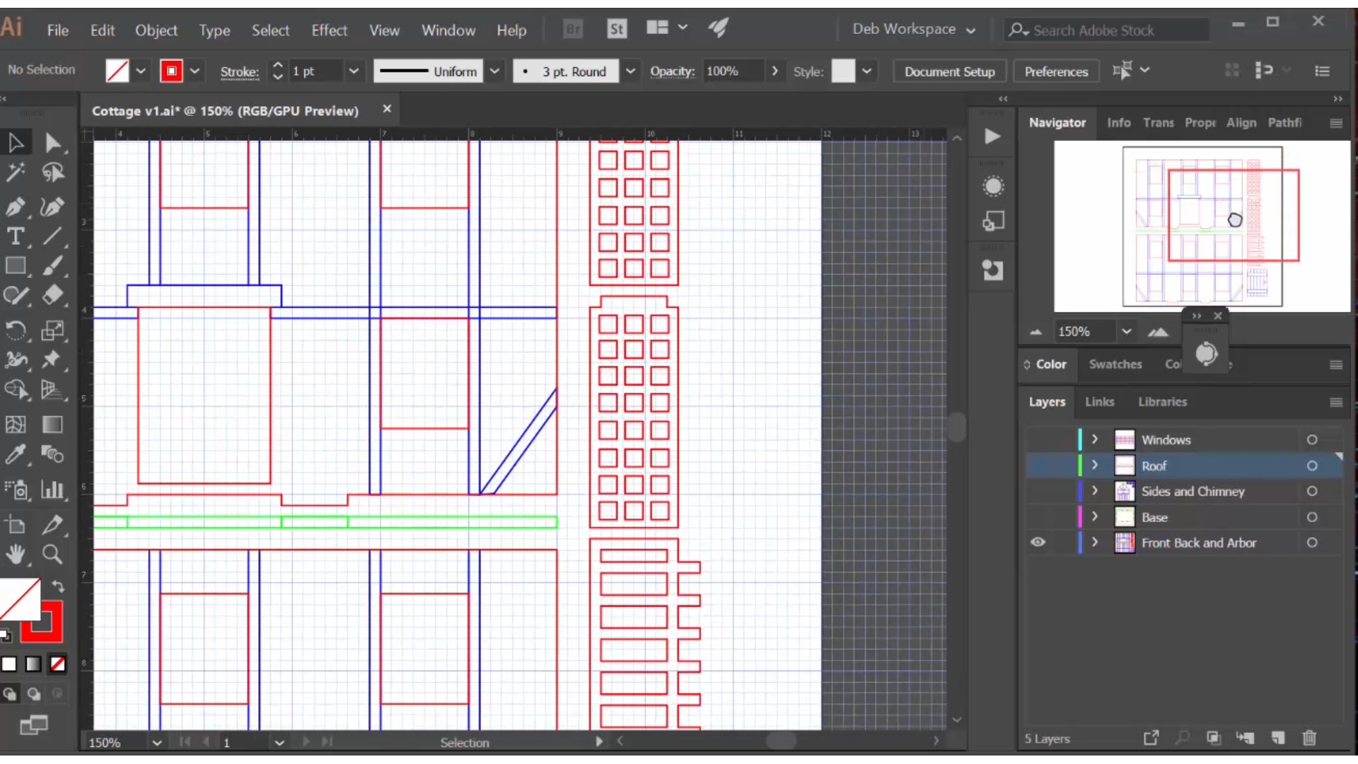
The most outstanding aspect of the cottage is how the thatched roof curves around the windows. I create the curved line by drawing it directly over the front wall. I use a pen tool to rough it into place, then use the direct selection tool to select each anchor point, convert it to 'smooth' and then use the handles to adjust it in place.
I then move that curve to a new layer where I create the roof pieces. The height of the roof pieces are fit in place on the side wall layer. One is 1/8" longer than the other because of the butt joint at the top. Once again, by fitting it visually I avoid doing the math, and head off potential mistakes.
Another element of the roof is the ornate cap, which I draw with a pen tool based on the reference photos. This will be engraved to guide the painting process.
Even the angle in the bottom of the chimney I draw right in place on the roof, and then move to the side to create the chimney pieces. The engraved stone design is pulled in from my stained glass chapel project:
https://www.instructables.com/id/How-to-Design-and...
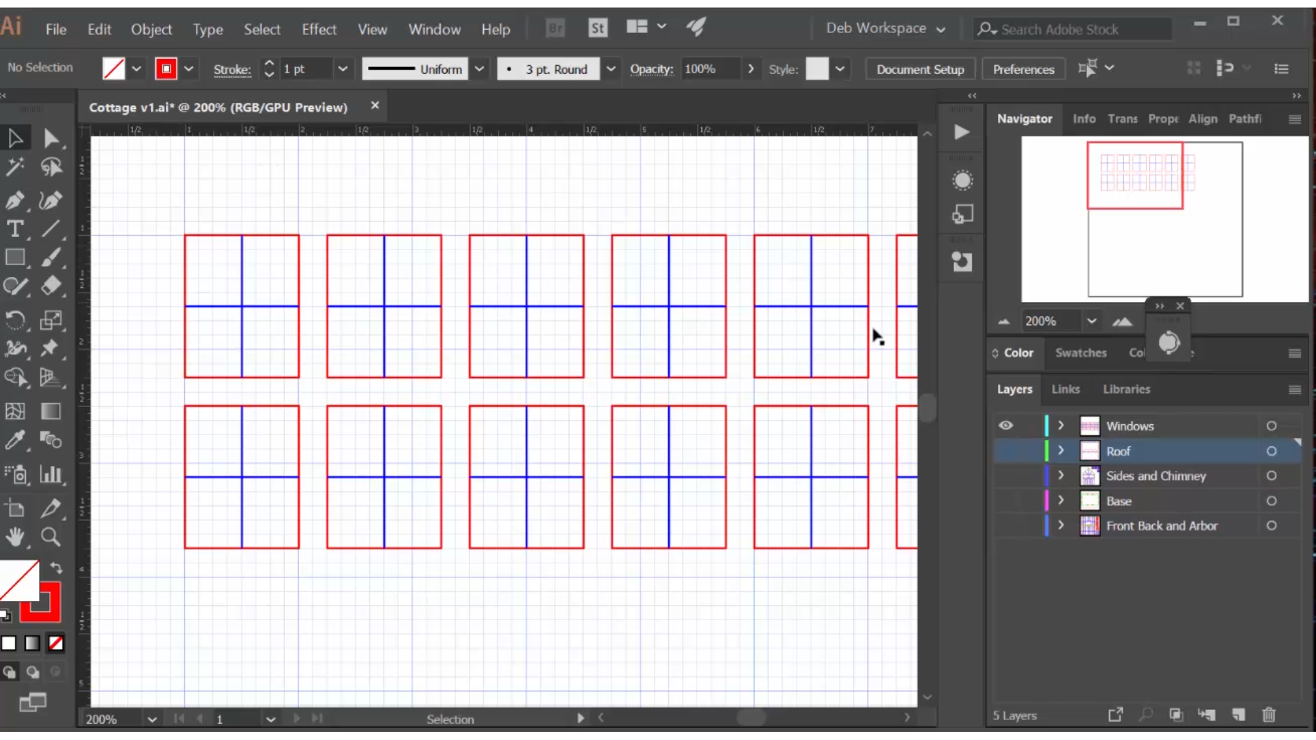
To dress up the front I create a simple wooden arbor and the door has a simple wood design. The windows are also simple, with four panes. The drama of the country cottage comes from the roof!
Design the Distinctive Components of the Steampunk Building
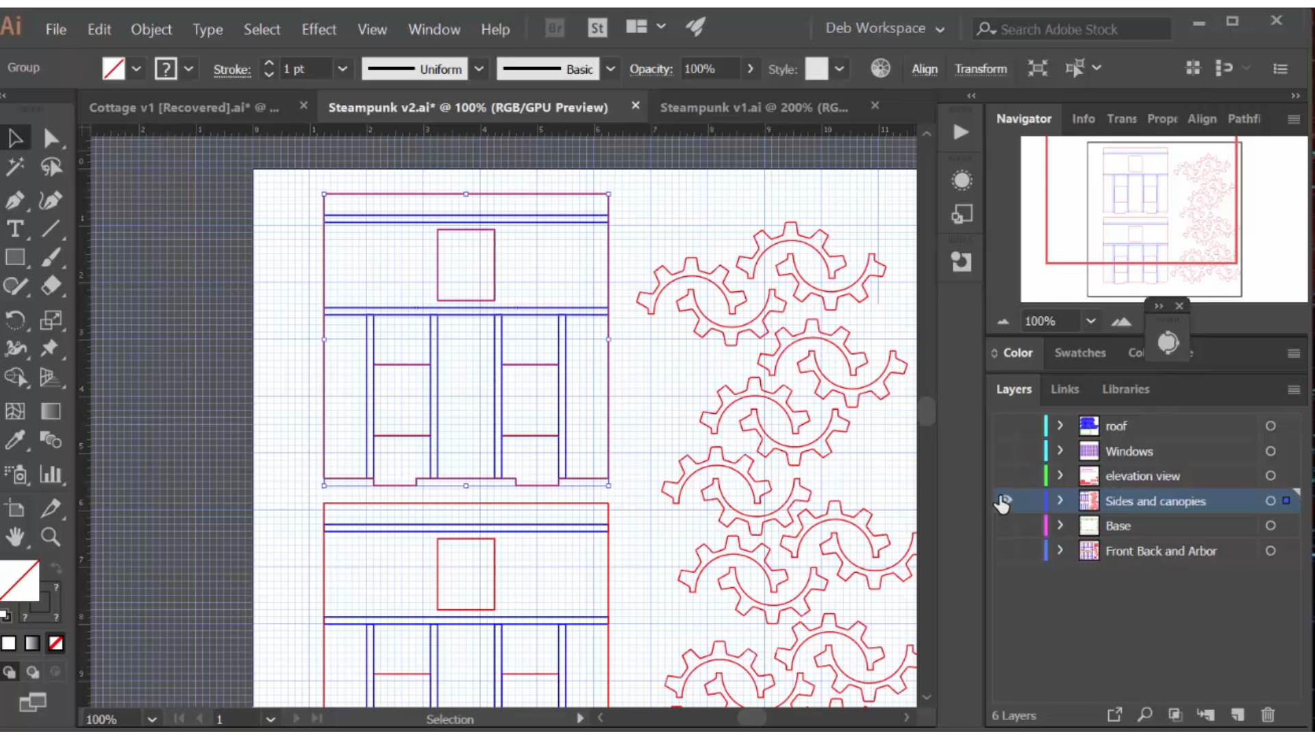
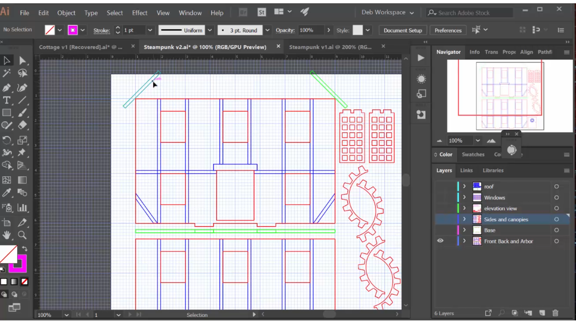
Because the steampunk building has a mansard roof, the side walls need to be modified. The height is the same as that of the front and back walls.
Gears are used as a design motif: as canopies over the windows, as the top of the arbor and in railings on the flat portion of the roof.
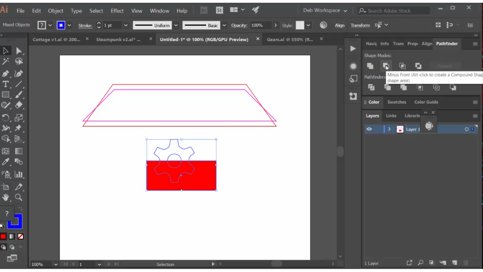
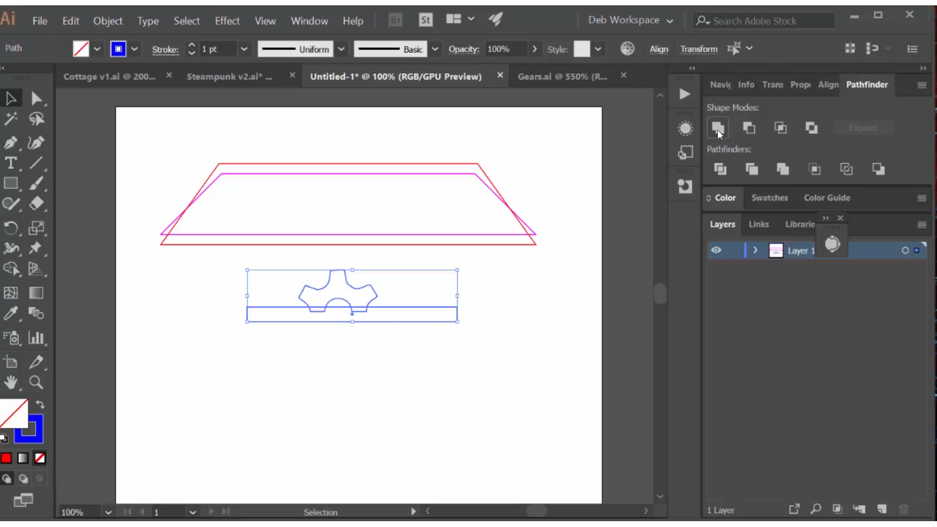
I pulled a simple gear from a prior project and cut it in half by layering a rectangle over the bottom, selecting both pieces and using the pathfinder>minus front function. This half can then be 'attached' to a railing by drawing a long skinny rectangle at the bottom, selecting both pieces and using the pathfinder>unite function to make them one piece. Remember, the laser cutter will cut every red line so it is important to unite components you want to stay together.
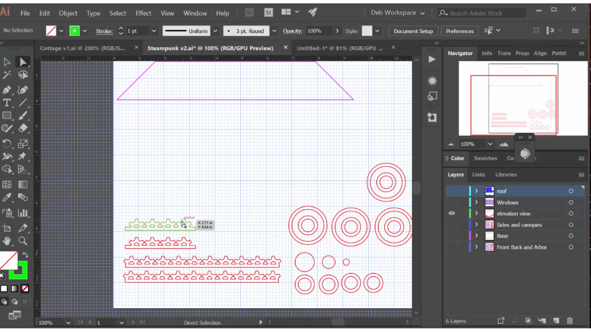
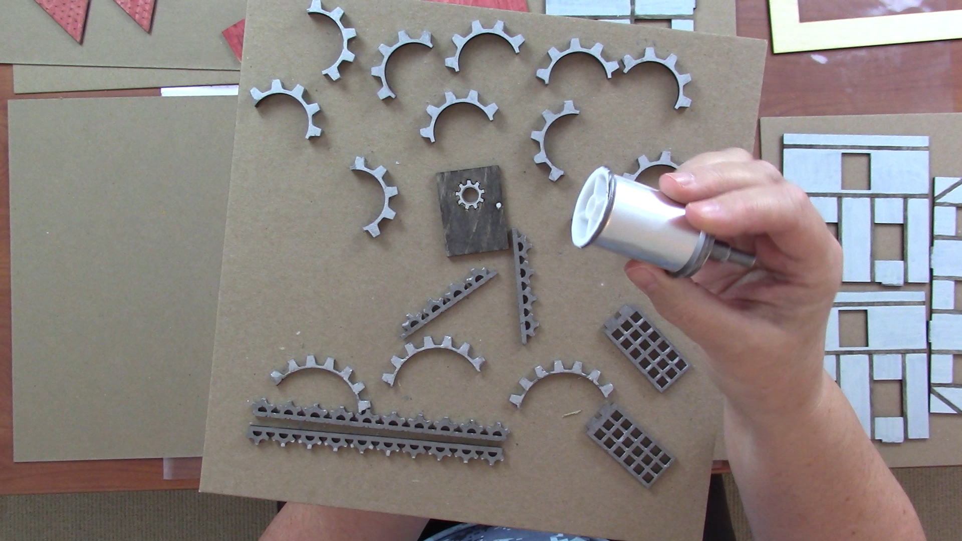
All of the gear components were made with some combination of copying, duplicating and these pathfinder functions. I also cut a series of circles and rings to experiment with in the creation of the steam tank that replaces the chimney in this design. These and pieces of dowel rod will be attached to an empty thread spool to create the steam tank.
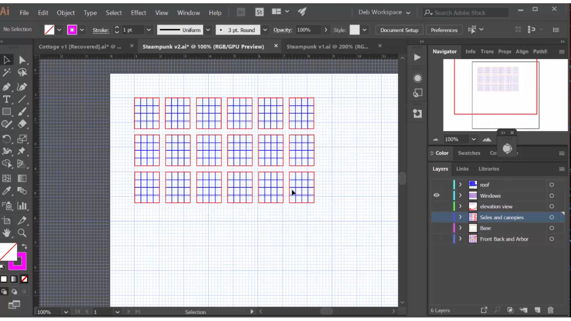
The windows have 16 panes, consistent with the more industrial look of steampunk.
The Mansard Roof: Using a 2D Drawing Tool to Design in the Third Dimension
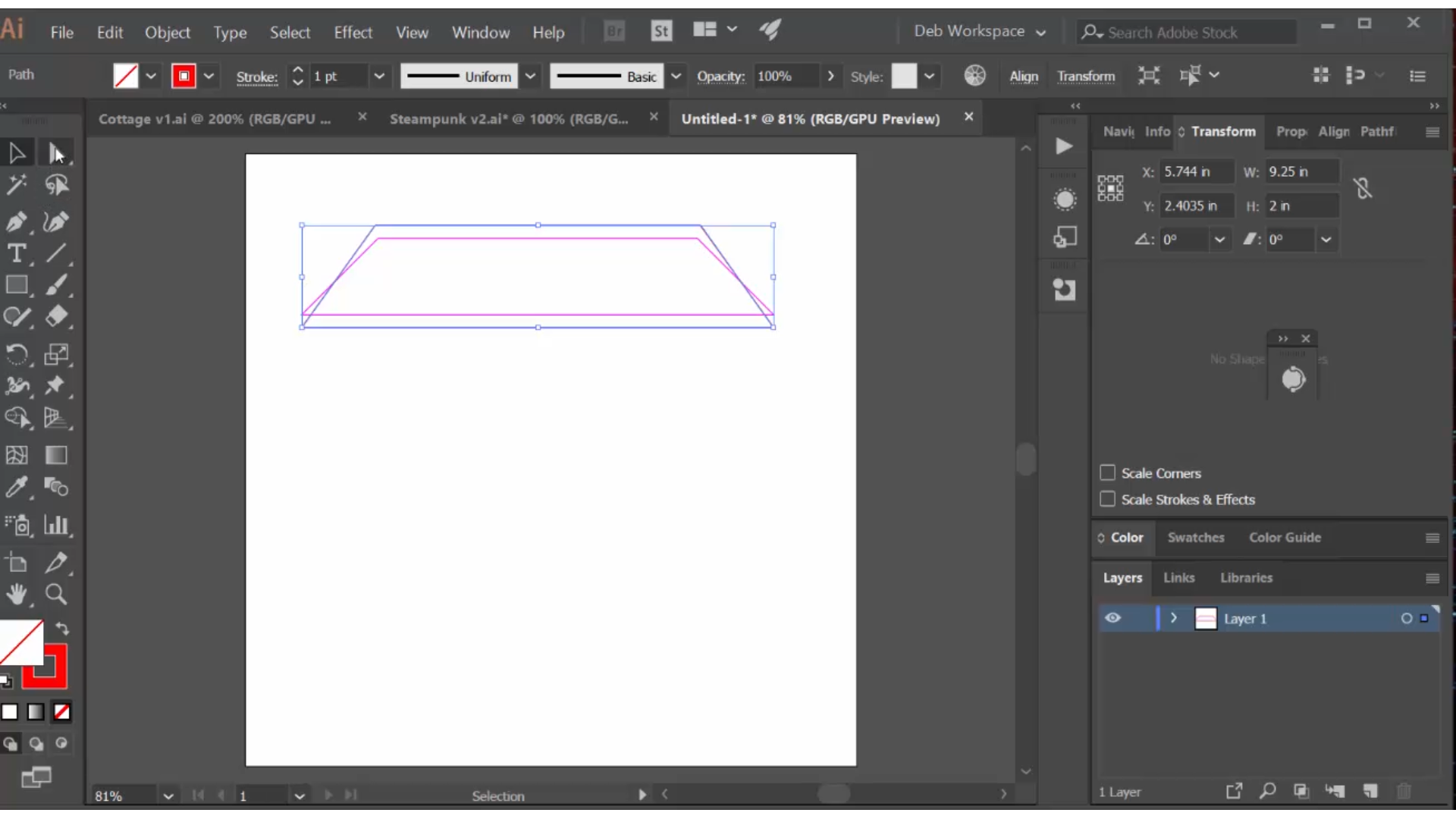
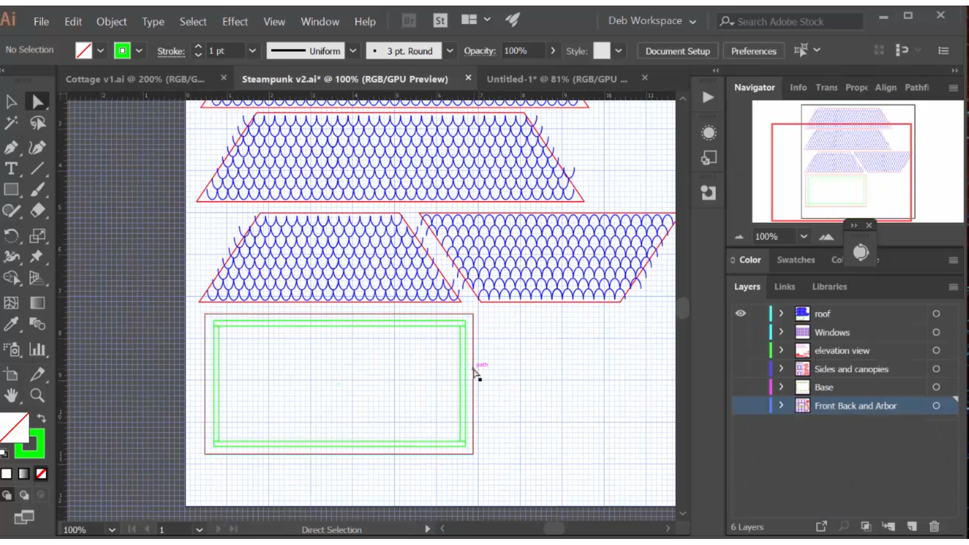
As I've mentioned, I'm a visual designer and I avoid math whenever possible, but Illustrator is a 2D drawing tool with very limited 3D capabilities. How could I get the right dimensions and angles on the mansard roof? I'm sure there are other ways to do this, but this is the approach I settled on and the results were good.
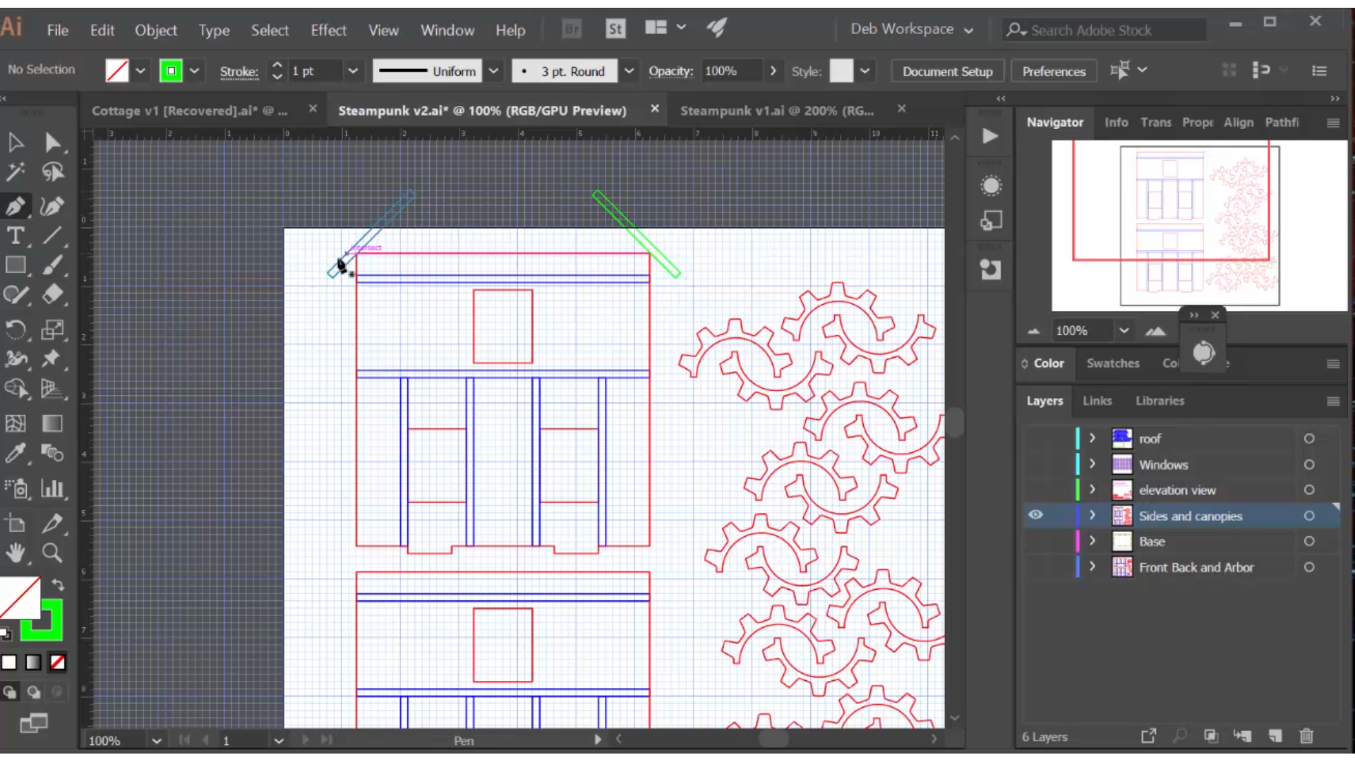
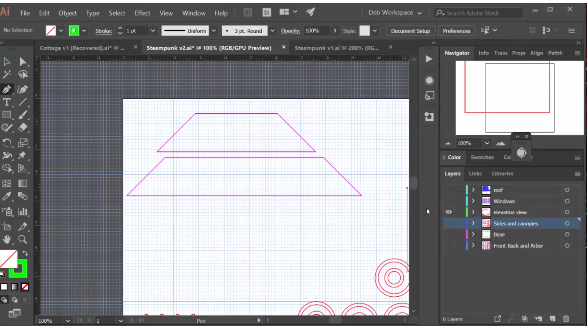
I started on my front wall and drew two 2" by 1/8" (the thickness of the wood) segments and rotated them 45 degrees, putting them in place on the roof. Then I used my pen tool to click around these two sides, creating a trapezoid shape that represented the 'front view' of my roof. I saved this to a new layer. Then I did the same for my sides, creating a side view of my roof, and moved that to another layer. My task now is to rotate these 'views', which are leaning back at a 45 degree angle, upright into the shapes I need to cut on my laser cutter.
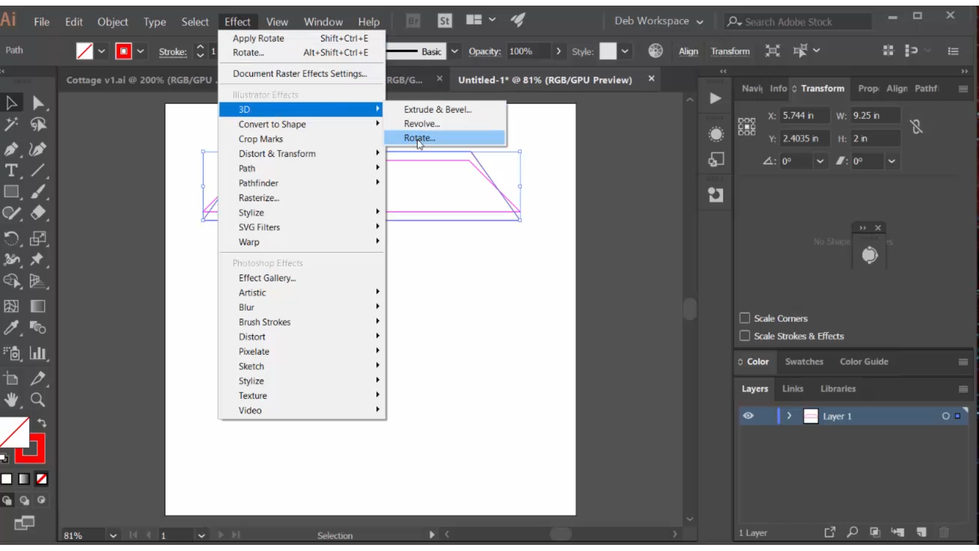
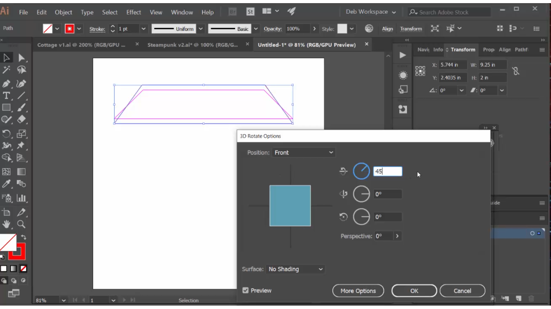
For each, I went through this process: I created a new shape that was 2" high (I had determined this from the start, when I created my 2" segments), and whose bottom length matched my view. The dimension I didn't know was the size of the top. I knew it was bigger than that of my view, I just don't know how much bigger. So I started at an arbitrary size and then selected effect>3D>rotate>position>front and set it to rotate back 45 degrees. Illustrator shows you what that shape looks like when rotated back 45 degrees. I then used the direct selection tool to move the top points as necessary to get a perfect fit; it took about three iterations to get it just right. These taller trapezoid shapes are the ones that I added shingle engraving lines to, and the top dimensions of the front and side pieces become the dimensions of the flat roof segment, which I left plain.
Laser Cut and Paint the Components
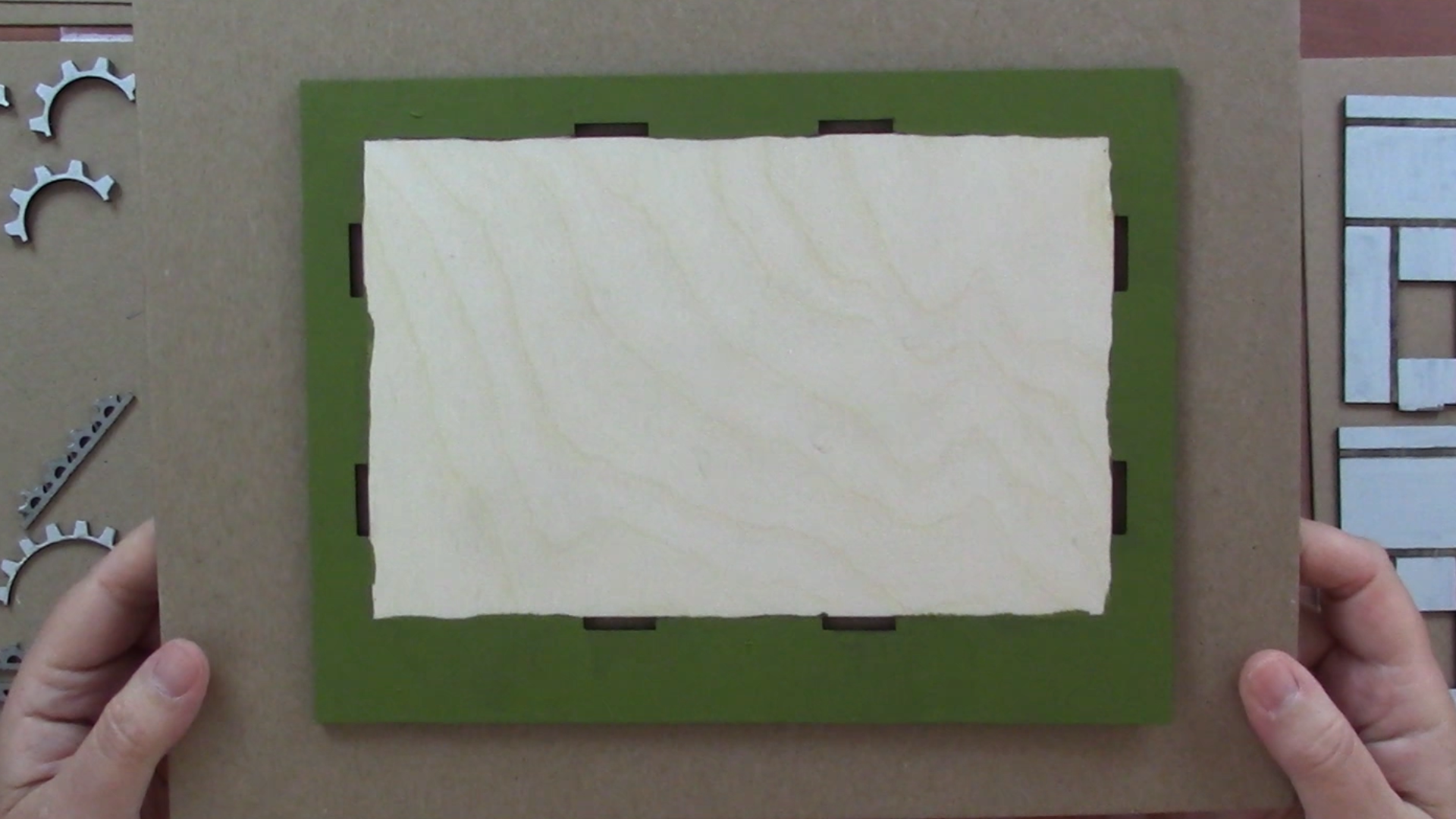
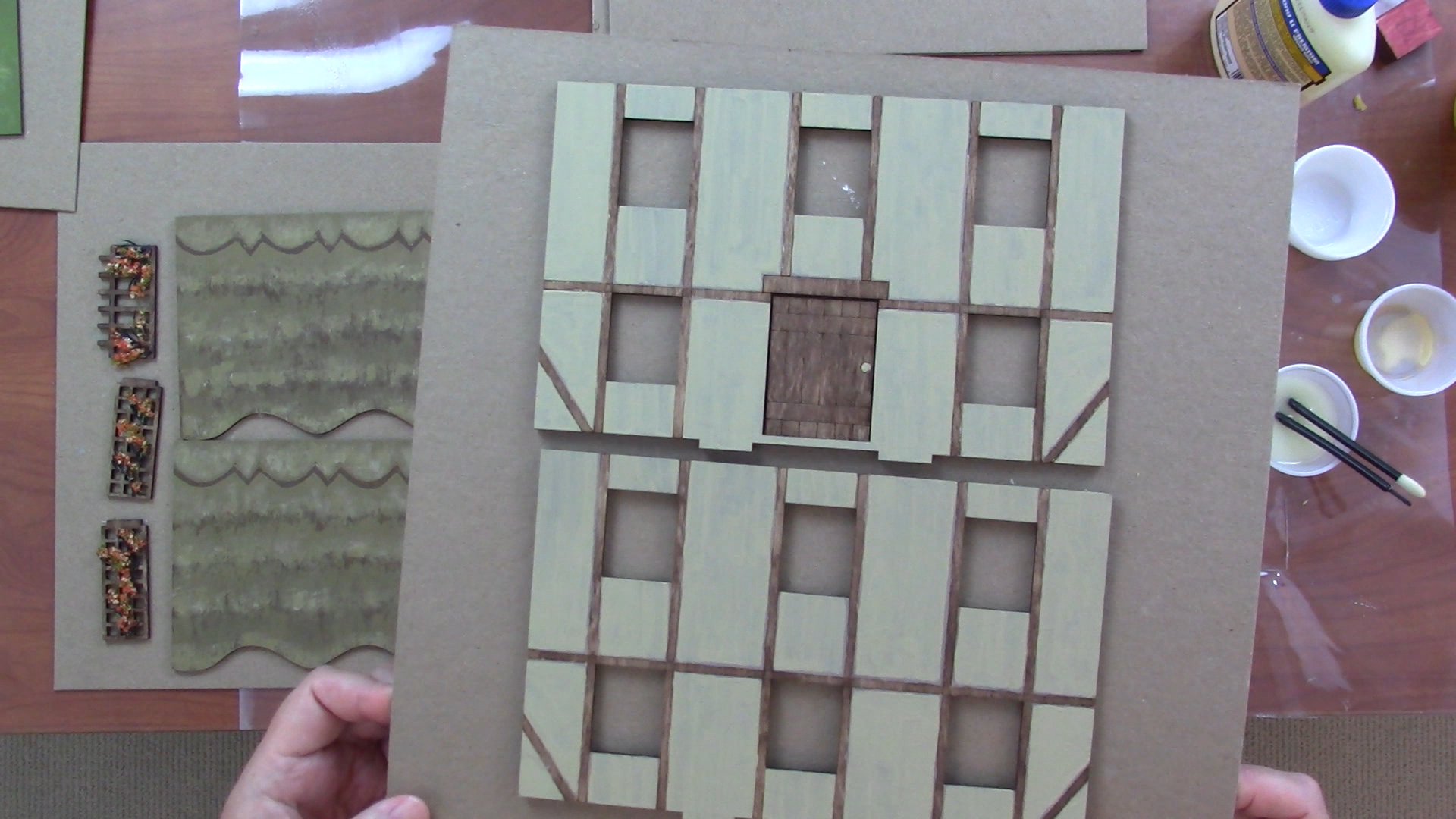
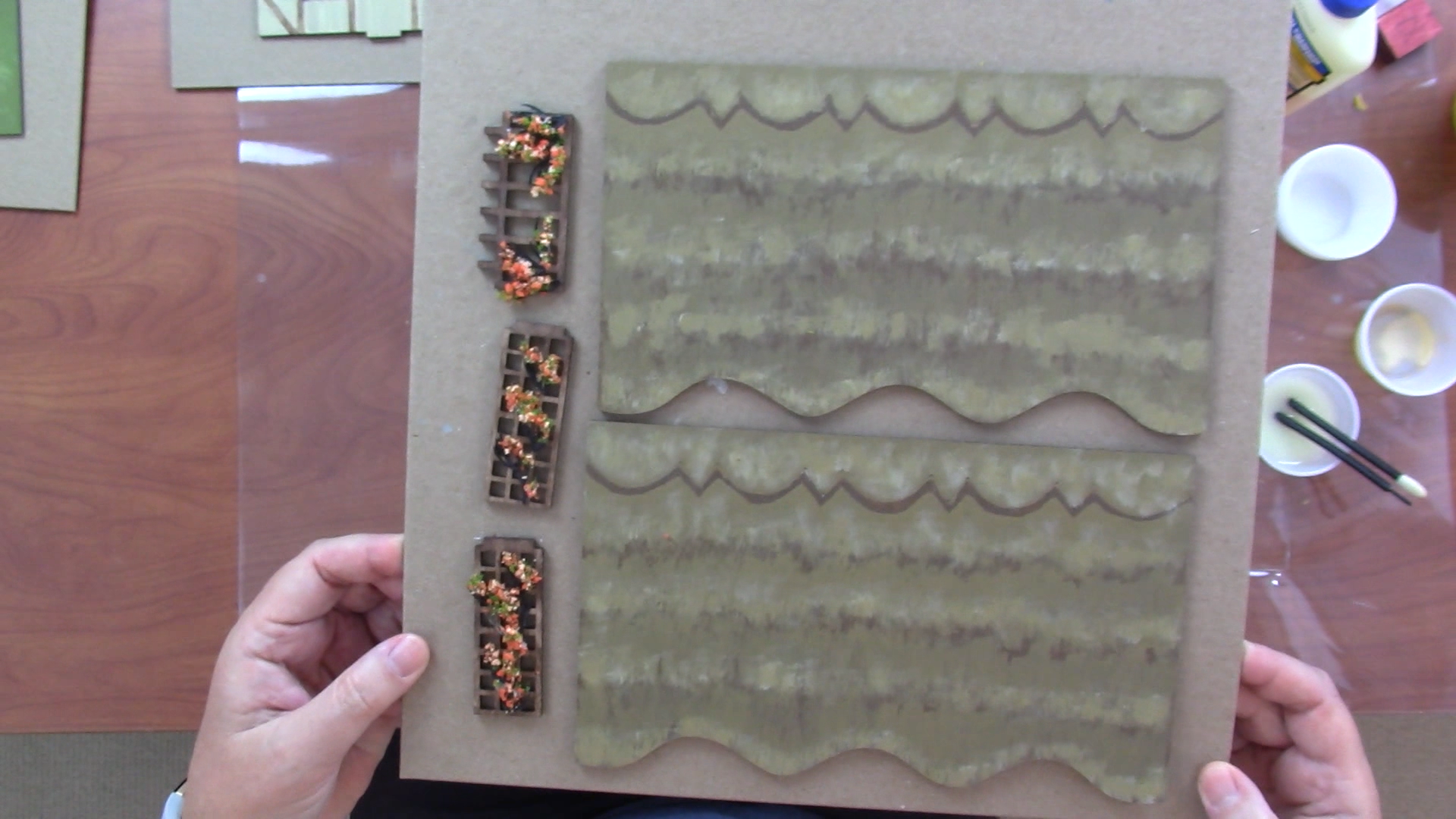
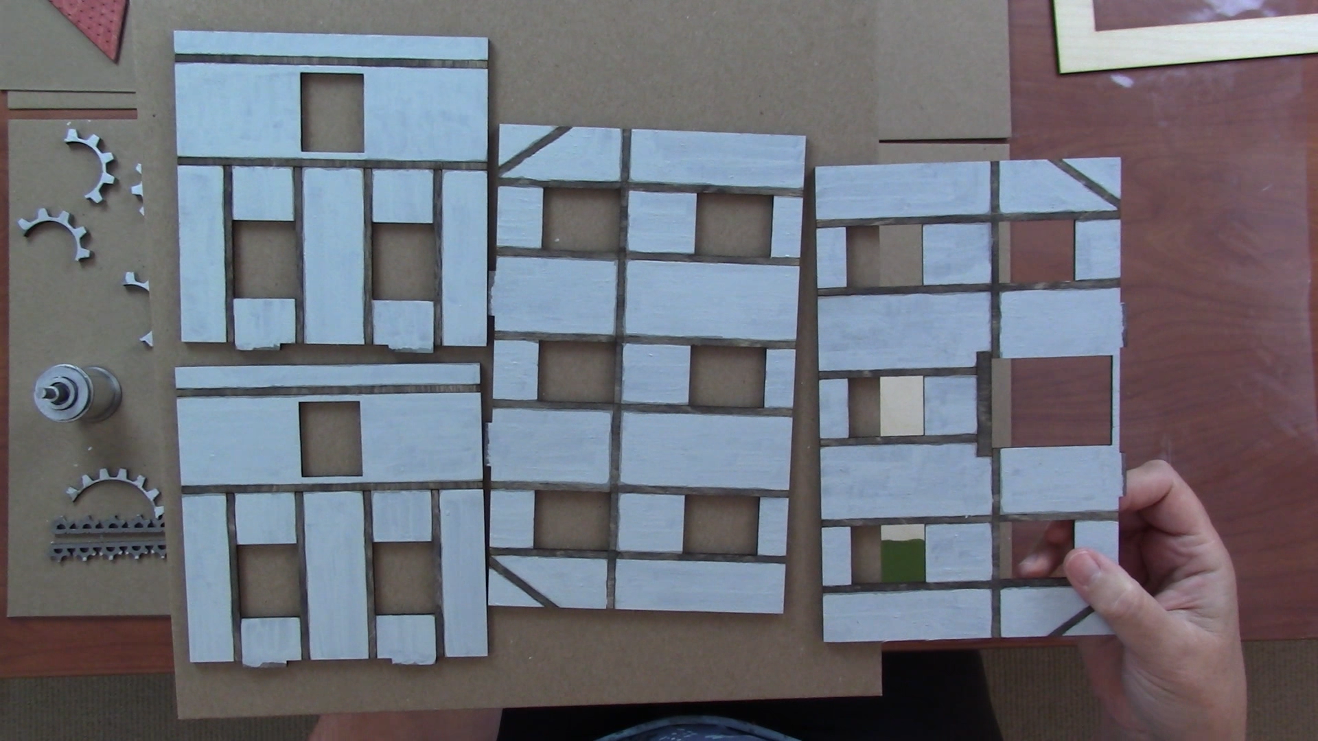
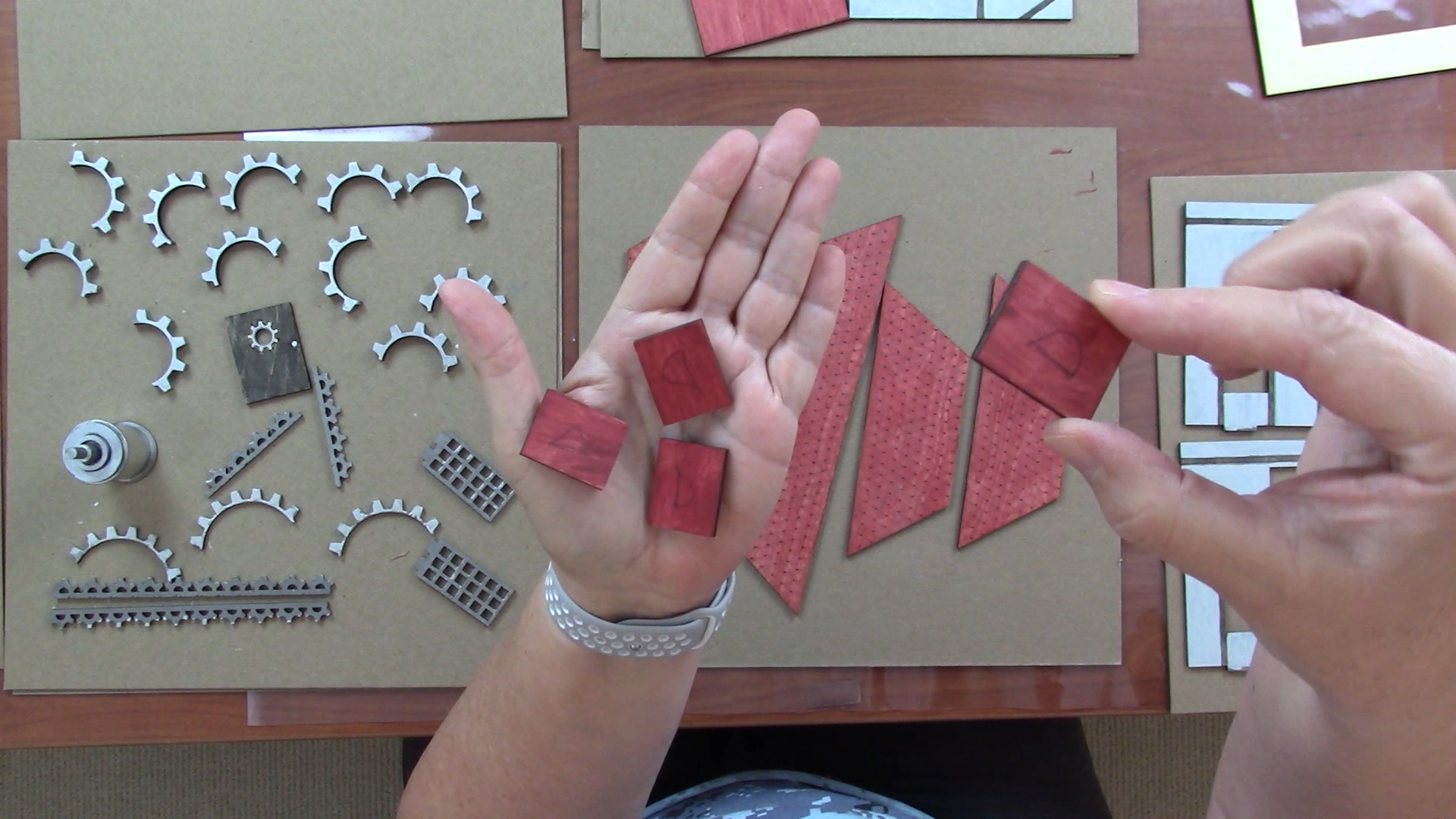
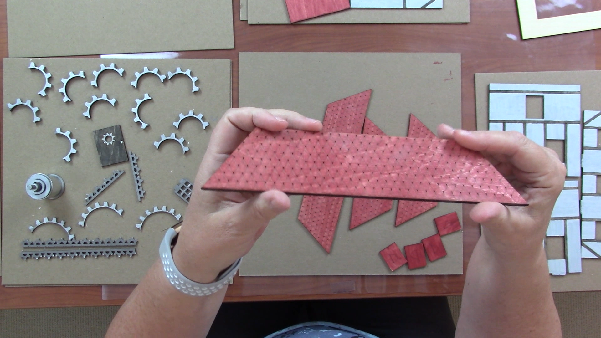
The bases of both buildings are identical; I painted the outside green and left the interior floor natural.
I used warm colors -- browns, golds and creams -- for the cottage and cool grays and brick red for the steampunk building.
I painted the panels of the walls with multiple layers of paint, starting with a base paint for coverage and adding several layer paints. I did the timbers last, with a single coat of Citadel shade paint, which is transparent and allows the wood grain to show through. I used Agrax Earthshade on the cottage and Nuln Oil for the steampunk building.
The most challenging part of painting the cottage was the roof, because I wanted a 3D effect on the roof cap and a thatched roof look overall. I used some dry brush techniques for the thatching.
The roof of the steampunk building also required some care, because I wanted the shingle design to show through the brick red paint. To achieve this I did a paint test with varying amounts of acrylic glaze added, to see what ratio would give me the transparency I was looking for, then I applied that mixture overall with a rather large brush.
Citadel has really wonderful metallic paints and I used them for all the 'metal' components of the steampunk design. I also glued a strip of craft metal around my thread spool to get a really shiny steam tank for the top.
The door has nuln oil stain for the wood with metallic paint on the window gear.
Assemble Your Steampunk Building
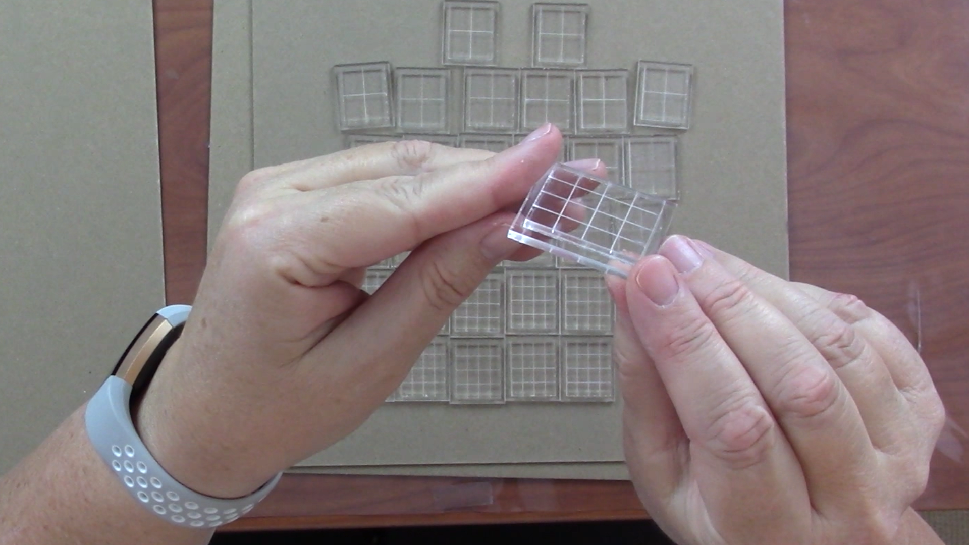
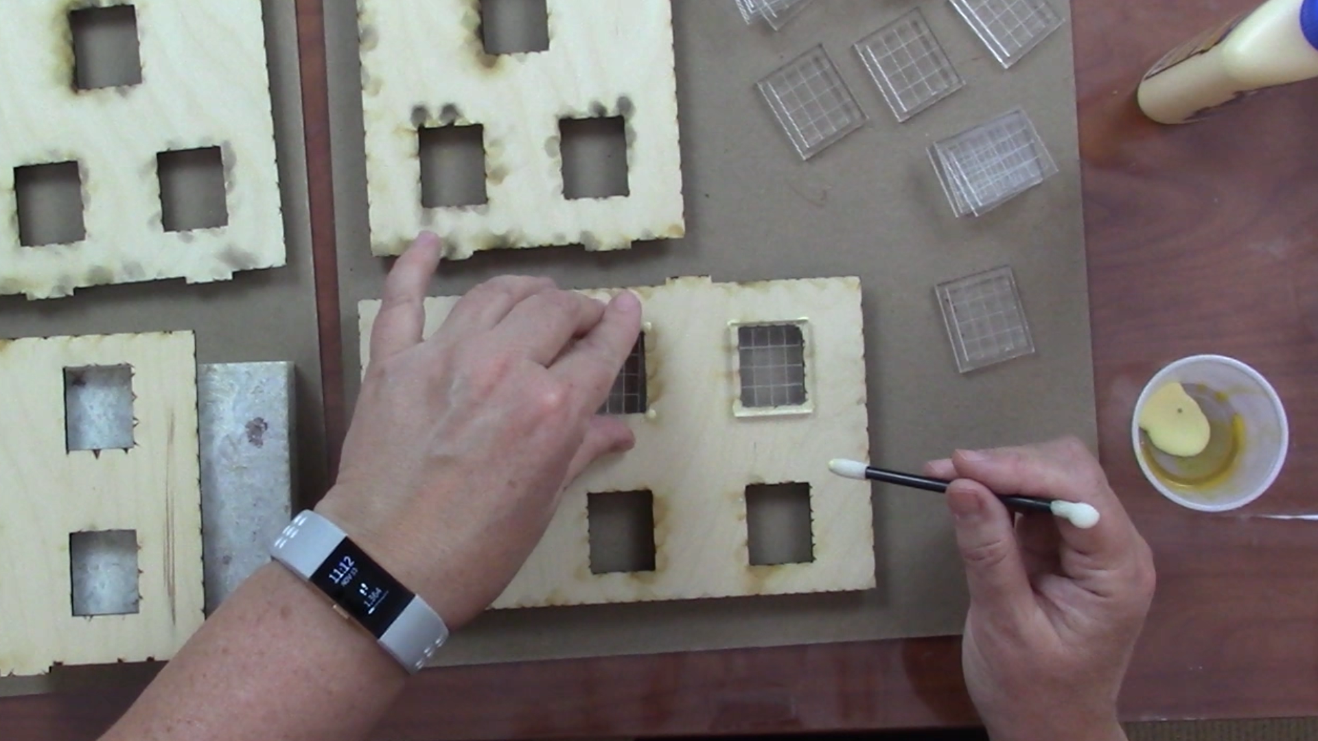
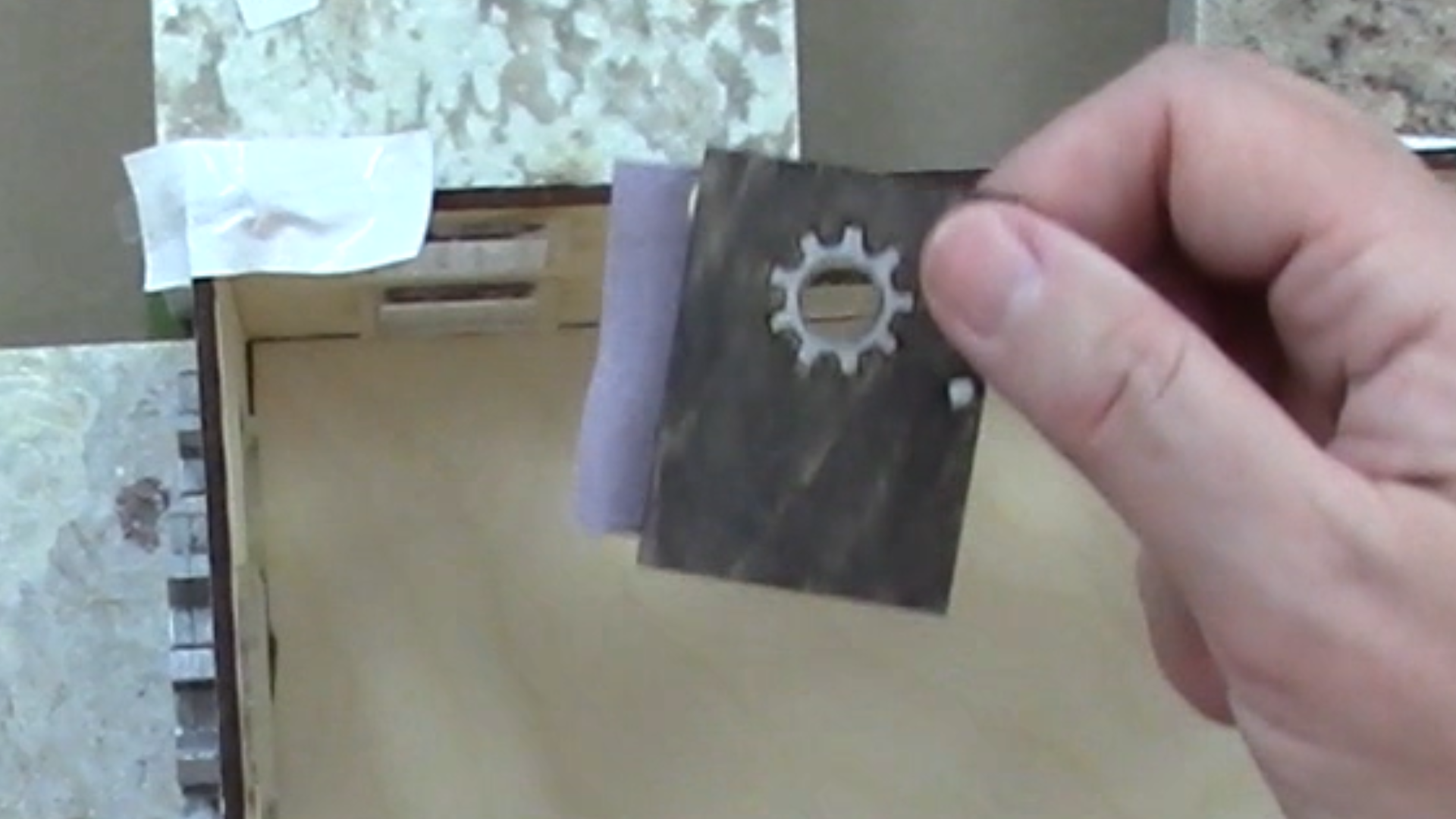
The first thing I did was fuse the windows together. I cut a second layer of clear acrylic just a bit larger than the windows to act as a flange to hold the windows in place, like real windows in a building. I used Weldon chemical solvent to fuse each window to its clear backing.
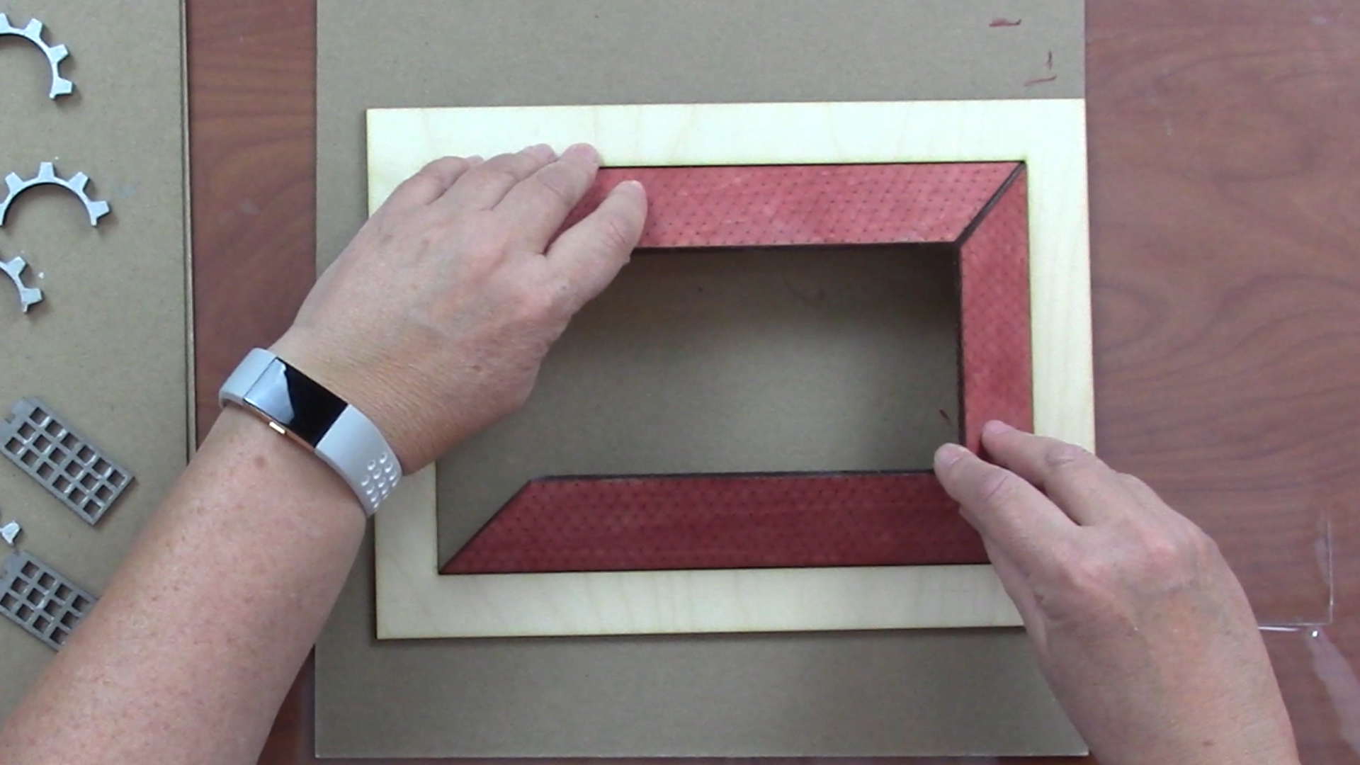
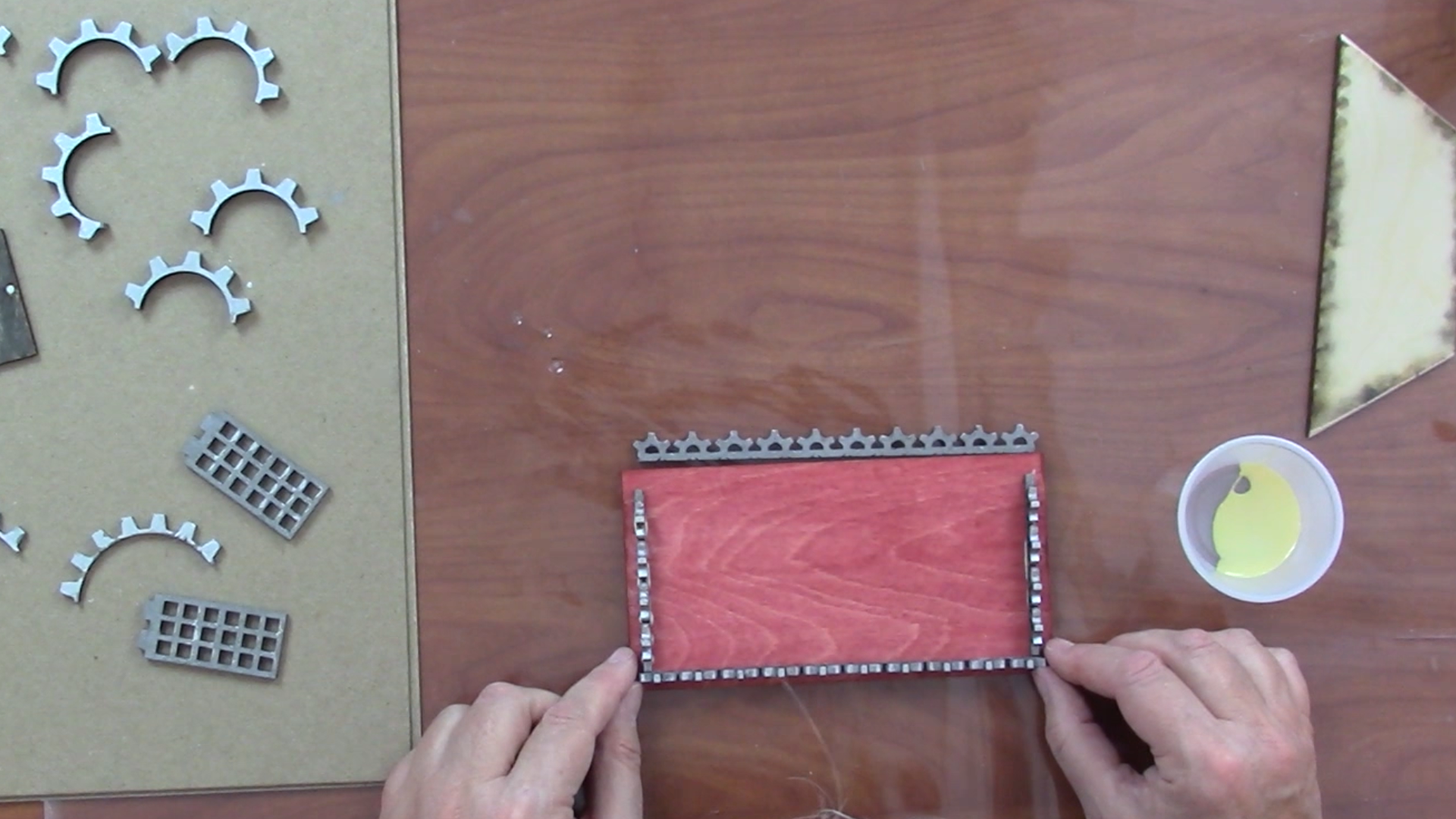
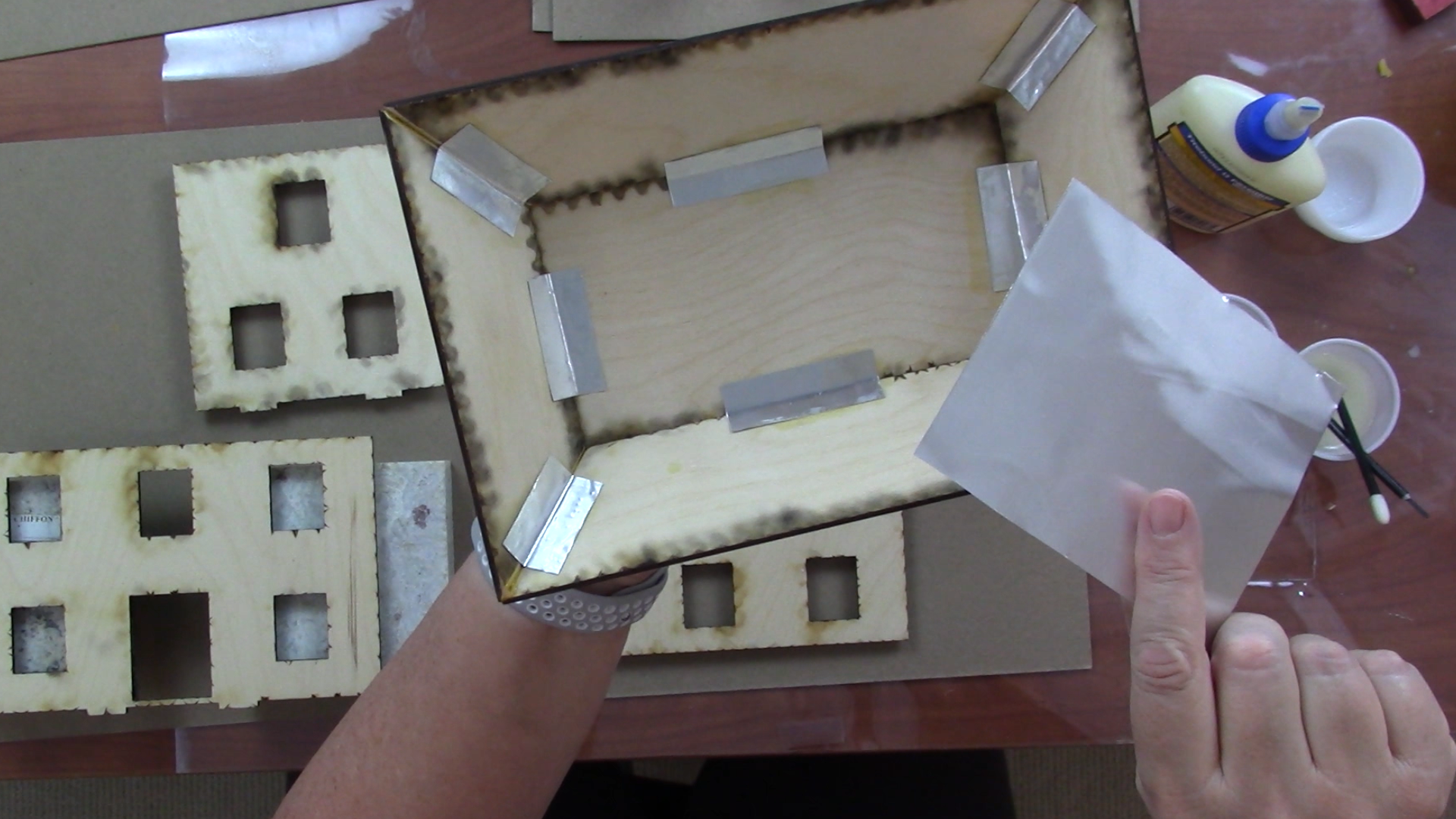
I assembled the mansard roof in stages. First I hand sanded the edges to an angle so they fit together and I had a flatter surface to glue to. I glued these four sides together, aided by a jig I cut that was just slightly larger than the bottom footprint. While the four sides were drying, I glued the rails to the top of the flat section, then I glued it to the bottom half of the roof. I also used strips of craft metal to reinforce the seams in the roof.
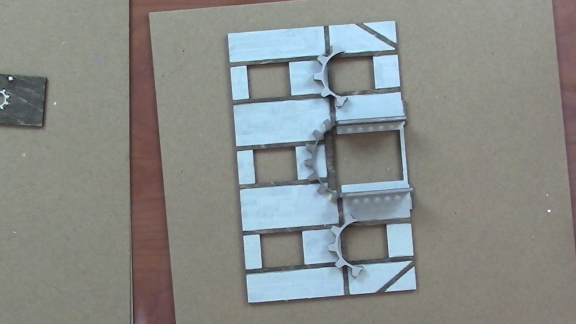
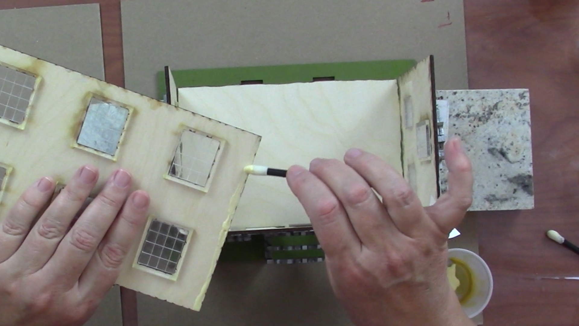
I glued the canopies over the windows and the arbor around the front door. Then I glued the windows in place. When the windows were dry, I glued the walls together, using granite blocks to hold them in place as they dried.
I used a strip of ultra-suede as hinges for the door. I glued one side on, and when it was dry I glued the door in place. Since the roof is designed to be removable, it is not glued on.
Assemble Your Country Cottage
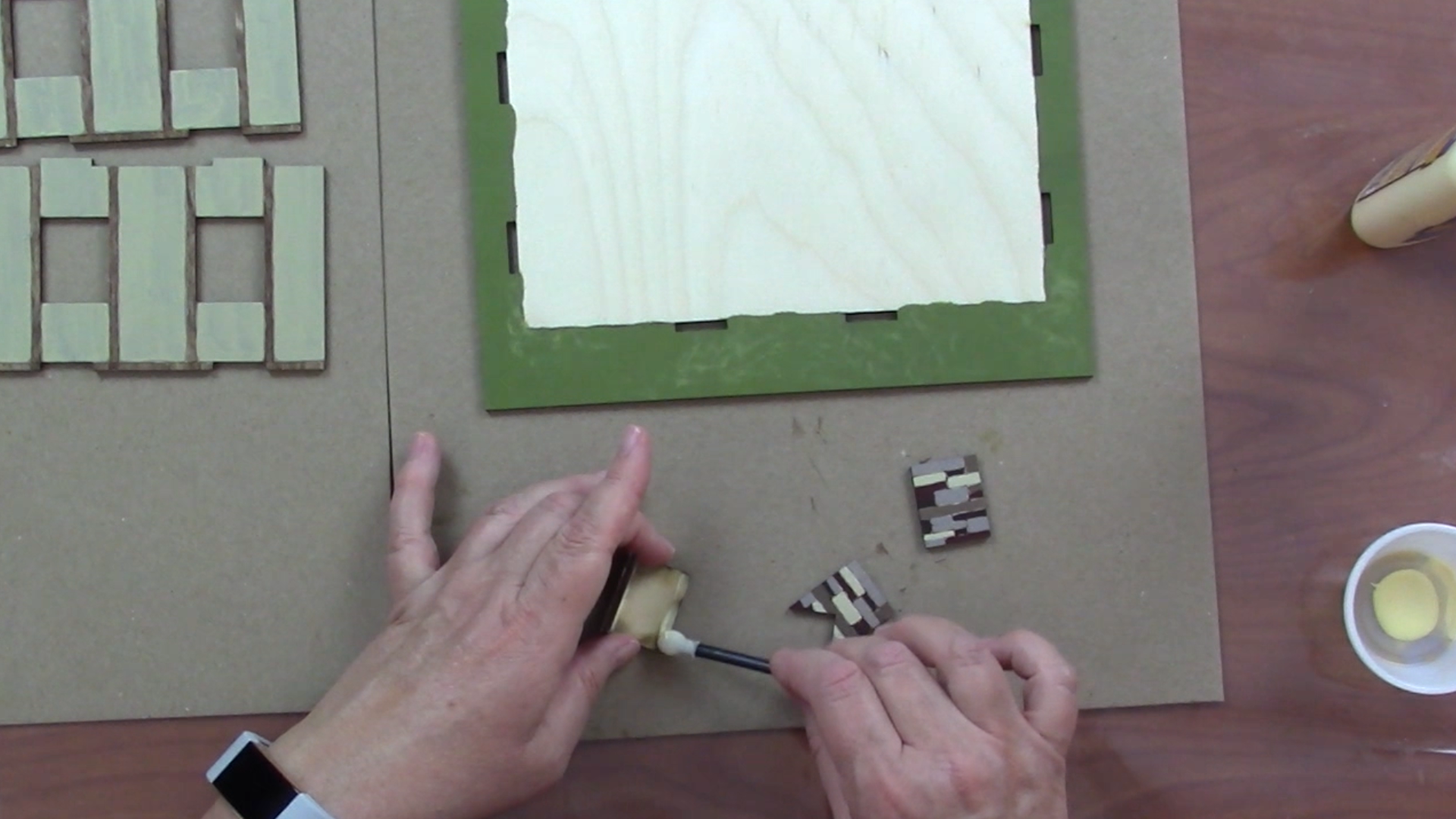
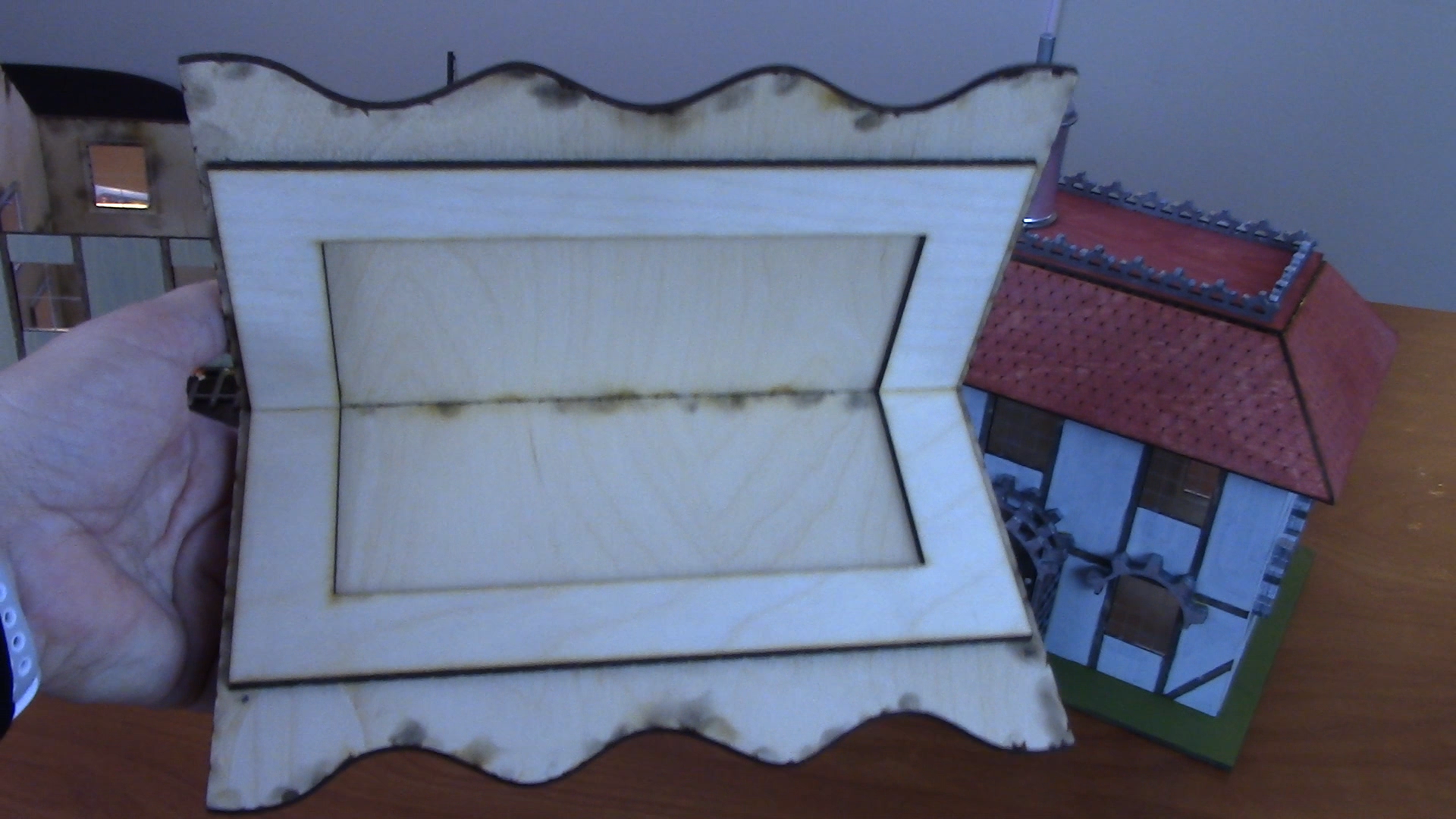
The country cottage goes together just as the steampunk building with a few minor differences. One is you need to assemble the chimney, and then glue it to the roof. The other difference is how to assemble the roof.
My original design had the side walls made-up of two pieces, with the top half designed to be glued into the roof and with tabs on the bottom that fit into the top of the bottom half of the side wall. This design would make the roof very strong. But I realized during assembly that for this design to work, the side walls needed to be on the outside of the butt joints and the front and back walls to the inside - opposite of how I had designed the base! I corrected my drawing, but since I had hours of painting effort invested, I made an adjustment the makes the current version work: I cut the ends off the roof jig for my mansard roof and glued them into the roof. This both reinforces the roof and fills the gap caused by my design error. You can see how I made this adjustment, and how I could have avoided this mistake altogether, in my video tutorial. Rather than hide these kinds of 'challenges', I like to show them because they demonstrate 1) that everyone makes mistakes and 2) the importance of being flexible in how you respond to them!
Light and Enjoy Your Buildings!
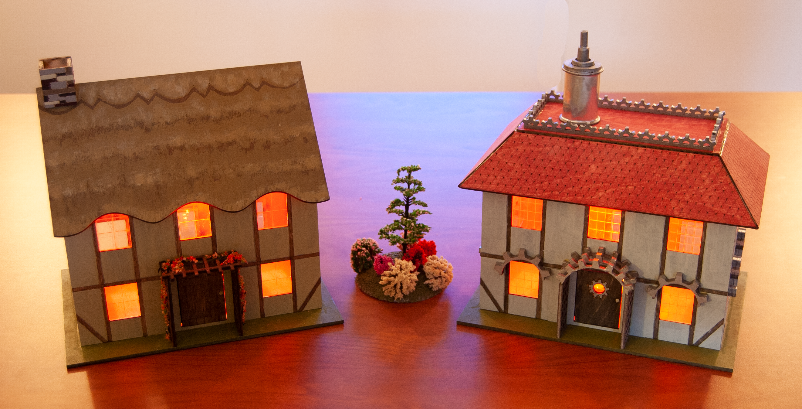

I like to use LEDs that are run by remote and allow you to change color and intensity, because then you can get a warm, candlelit effect in your buildings. I bought these on Amazon for about $5 apiece.
You can learn more about my design, painting and assembly process in my video tutorial!!