How to Create a Histogram Chart in Excel
by dbcochran75 in Circuits > Computers
315 Views, 0 Favorites, 0 Comments
How to Create a Histogram Chart in Excel
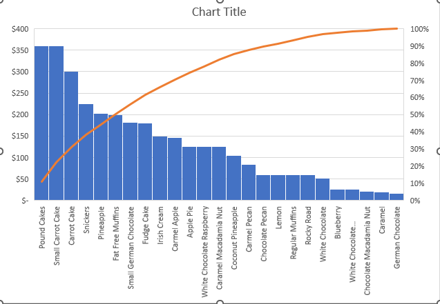
Here we will discuss how to create a statistical chart called a Pareto Chart inside of Microsoft Excel.
Disclaimer- No safety hazards are present in this project.
Supplies
- A computer supporting Microsoft Windows 10
- A valid subscription to Microsoft 365 containing Microsoft Excel
- Data
Lets Get Started

Turn on your computer and click on the search bar, then click Excel.
Opening Excel
Once open, click on the new workbook button located on the top left corner of the screen.
Adding the X Axis Data
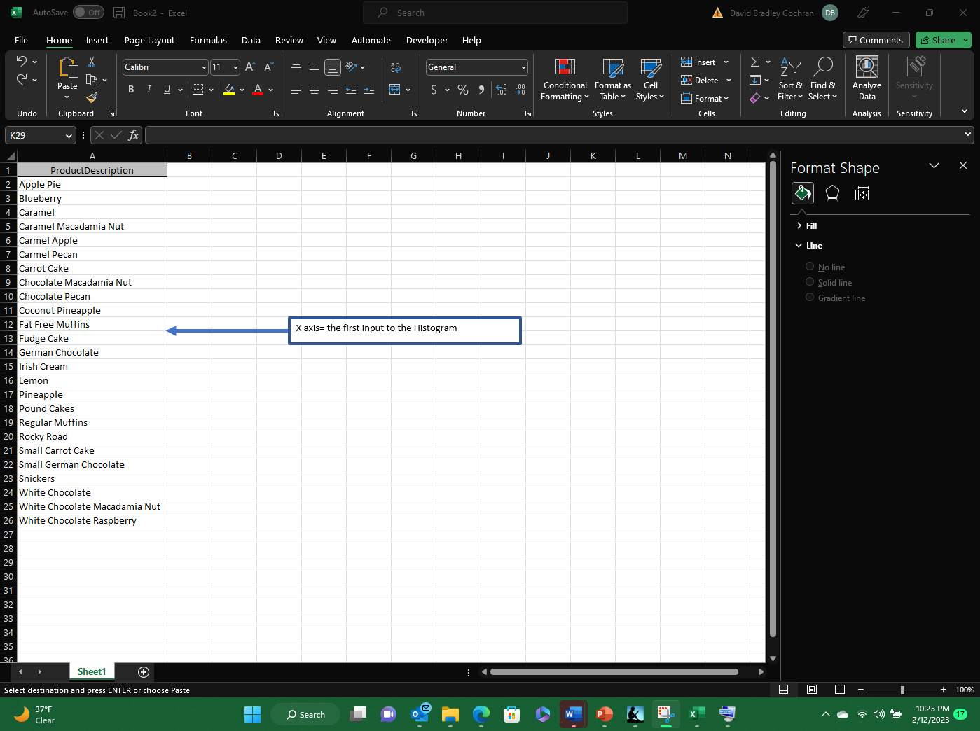
Start with added the first data input needed to create the Pareto Chart. The first data input is considered the X axis input.
Adding the Y Axis Data
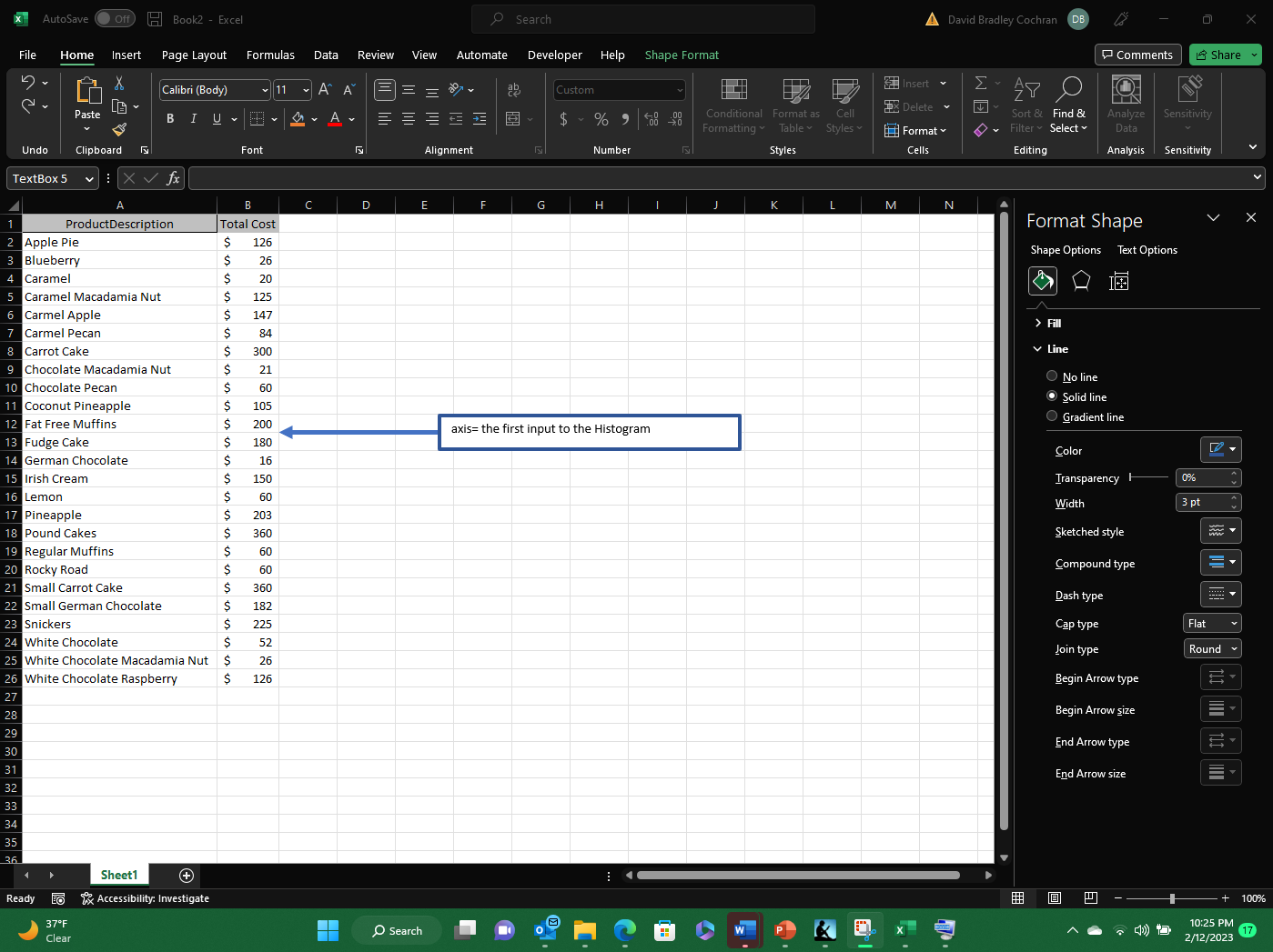
Next add the second data input needed to create the Pareto Chart. This is considered the Y axis input.
Grouping the Data Inputs
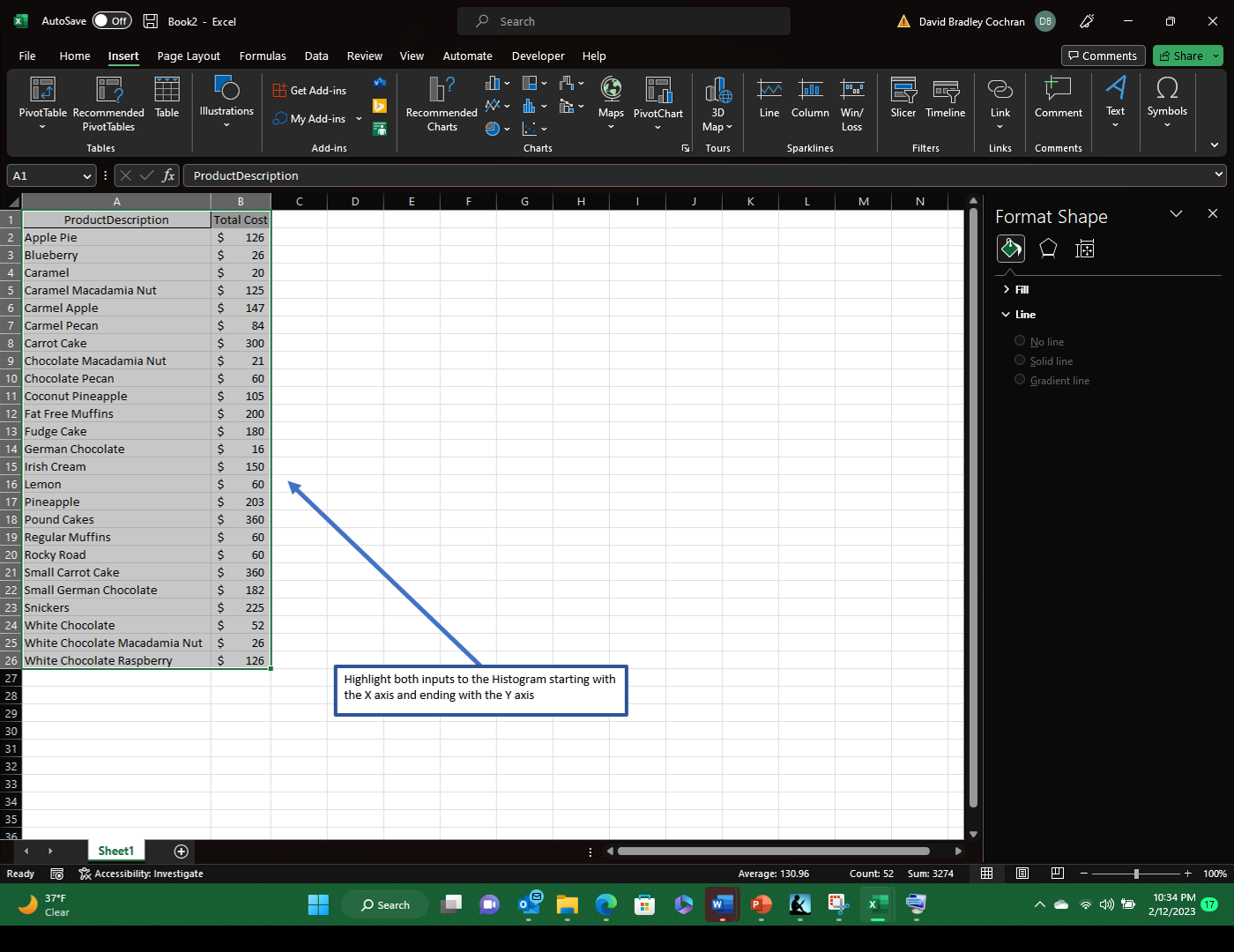
Now highlight the two data inputs including the titles of each column. Start with the first column or the X axis and sweep to the second column or the Y axis.
Creating the Pareto Chart
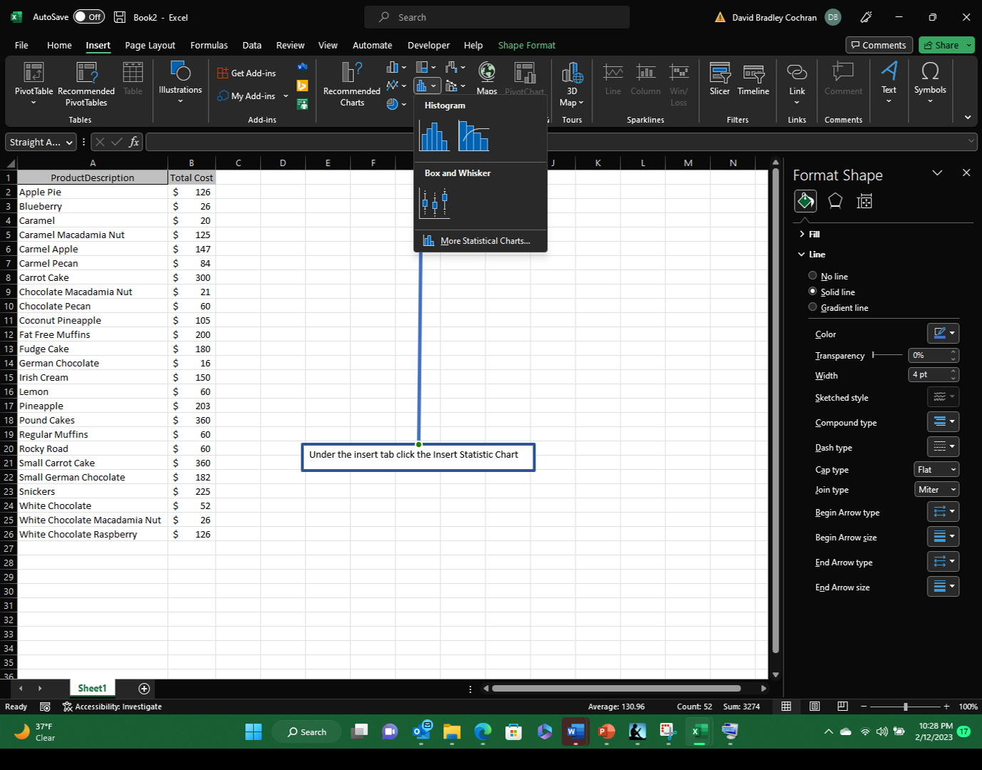
Next, Click on the insert tab at the top of the page. Within the insert tab, click on the Insert Statistic Chart box. Then click on the His
Benefiting From the Pareto Chart
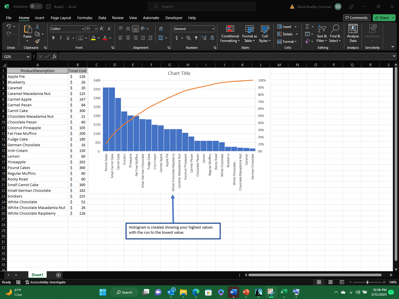
Enjoy the valuable data that the Pareto Chart can provide.